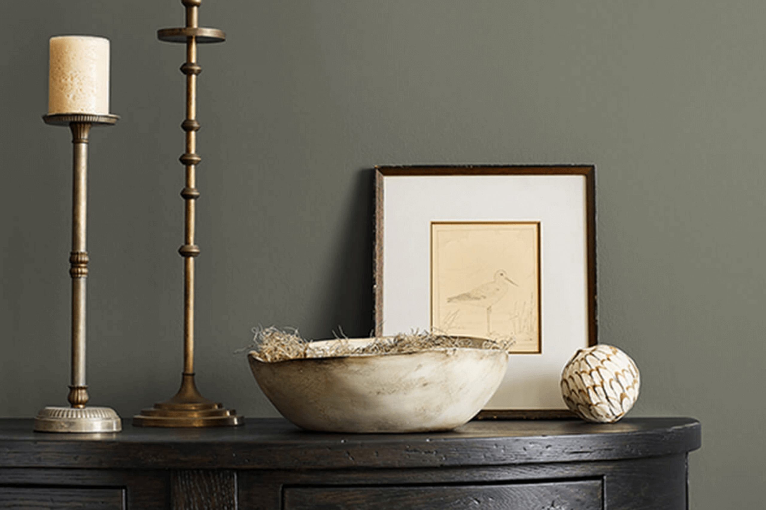
As you start planning your next painting project, you might be considering the deep, robust tones of SW 6202 Cast Iron by Sherwin Williams. If you’re anything like me, choosing the right color can be both thrilling and a bit overpowering. What draws me to Cast Iron is its flexibility and classic appeal. This shade isn’t just black; it’s a soft, charcoal gray that adds a subtle depth to any room without overpowering it.
In my experience, Cast Iron works exceptionally well in areas where you want to create a statement without using a bright color. It pairs beautifully with a wide range of decor styles, from modern to rustic. Whether you are looking to repaint your living room, bedroom, or even your kitchen cabinets, this color provides a refined backdrop that enhances other elements of your room.
Moreover, I’ve noticed that in different lighting, SW 6202 Cast Iron shows off unique undertones that can shift from a pure, deep gray to shades with hints of blue or green, making it a dynamic choice no matter the setting.
As you prepare to choose your paint, keep in mind how this color could transform your room, offering elegance and a grounding presence.
What Color Is Cast Iron SW 6202 by Sherwin Williams?
The color Cast Iron by Sherwin Williams is a bold, deep gray that exudes a sense of strength and stability. This shade has a flexible appeal, making it an excellent choice for various design styles. Its dark undertone provides a grounding effect, allowing it to work well in modern and minimalist interiors, as well as more rustic and industrial settings.
When incorporating Cast Iron into a room, it pairs beautifully with natural materials like wood and leather, which help to warm up the coolness of the gray. Textures such as wool, linen, and jute also complement this color nicely, adding a cozy layer to the aesthetic. In a modern setting, sleek metals like stainless steel or brushed nickel can create a crisp, clean look when set against a Cast Iron backdrop.
This color can be an ideal choice for living rooms or bedrooms where a strong, but not overpowering, background is desired. It’s also an excellent option for exterior uses, like on front doors or shutters, giving a home a distinguished and stylish presence from the street. In sum, Cast Iron is a flexible and appealing color that works well with a wide range of styles and materials, enhancing the overall feel of a room without overpowering it.
Is Cast Iron SW 6202 by Sherwin Williams Warm or Cool color?
Cast Iron by Sherwin Williams is a deep, charcoal gray color that brings a strong sense of groundedness to any room. This color is dark and consistent, which makes it excellent for creating a solid, quiet backdrop in areas. Homes benefit from this shade because it serves as a flexible neutral, pairing well with brighter colors for a pop or softer tones for a more subtle scheme.
Using Cast Iron in a home setting works well for emphasizing other elements. For example, in a living room, walls painted this color can make artworks or light-colored furniture stand out beautifully.
It’s also practical for rooms used for relaxation or focus, like home offices or reading nooks, because its dark tone does not reflect light aggressively, keeping the atmosphere calm and easy on the eyes. Additionally, Cast Iron is helpful for creating a sense of depth in smaller rooms when used on an accent wall or for adding a touch of drama without overpowering a room. This makes it a favorite for modern and minimalistic home designs.
Undertones of Cast Iron SW 6202 by Sherwin Williams
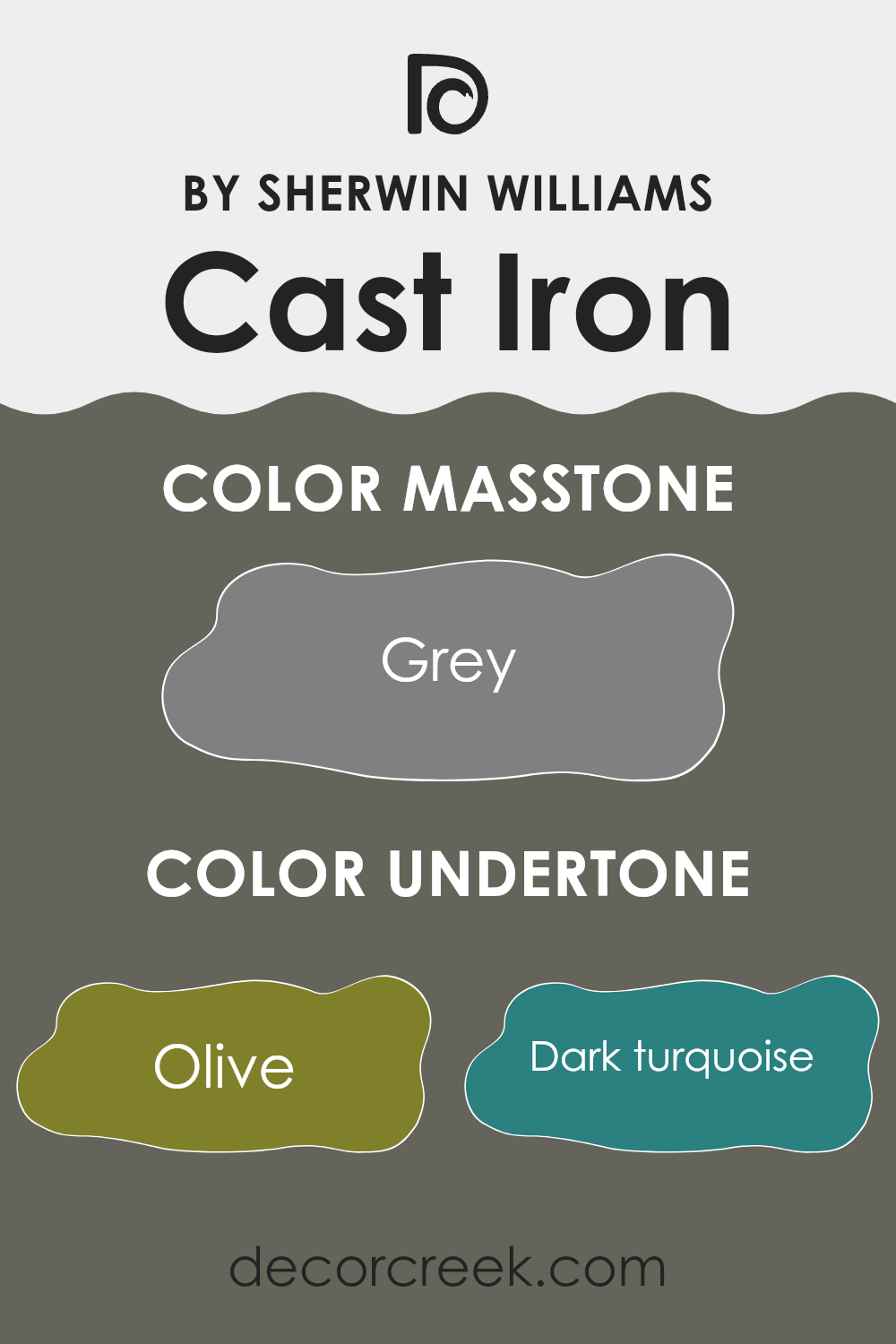
The color Cast Iron, a deep, neutral gray, has a complex character that subtly shifts in appearance depending on its environment. When considering paint for interior walls, understanding the undertones of a color is crucial, as they greatly influence the overall look and feel of a room.
Undertones are secondary colors that influence the main hue of the paint. Though Cast Iron is primarily gray, it includes undertones across a wide spectrum, such as olive, dark turquoise, and purple. These hidden hues can make the gray appear warmer or cooler depending on the lighting and surrounding colors.
In natural light, Cast Iron might lean towards its cooler undertones like dark turquoise or purple, giving a wall a crisper appearance. In artificial lighting, however, warmer tones like olive or brown might become more pronounced, creating a cozier feel. This makes Cast Iron an adaptable choice for areas, as it can harmonize with various decor styles and preferences.
In interior design, using Cast Iron on walls can offer a neutral backdrop that highlights other colors or design elements. For instance, pairing it with furnishings in light turquoise or mint can bring out a refreshing contrast, while accompanying it with dark green or navy elements can enhance a room’s depth and sophistication.
By paying attention to these undertones, you can more effectively determine the overall ambiance they will contribute to the room, ranging from subtle shifts in mood to more significant impacts on style and spatial perception.
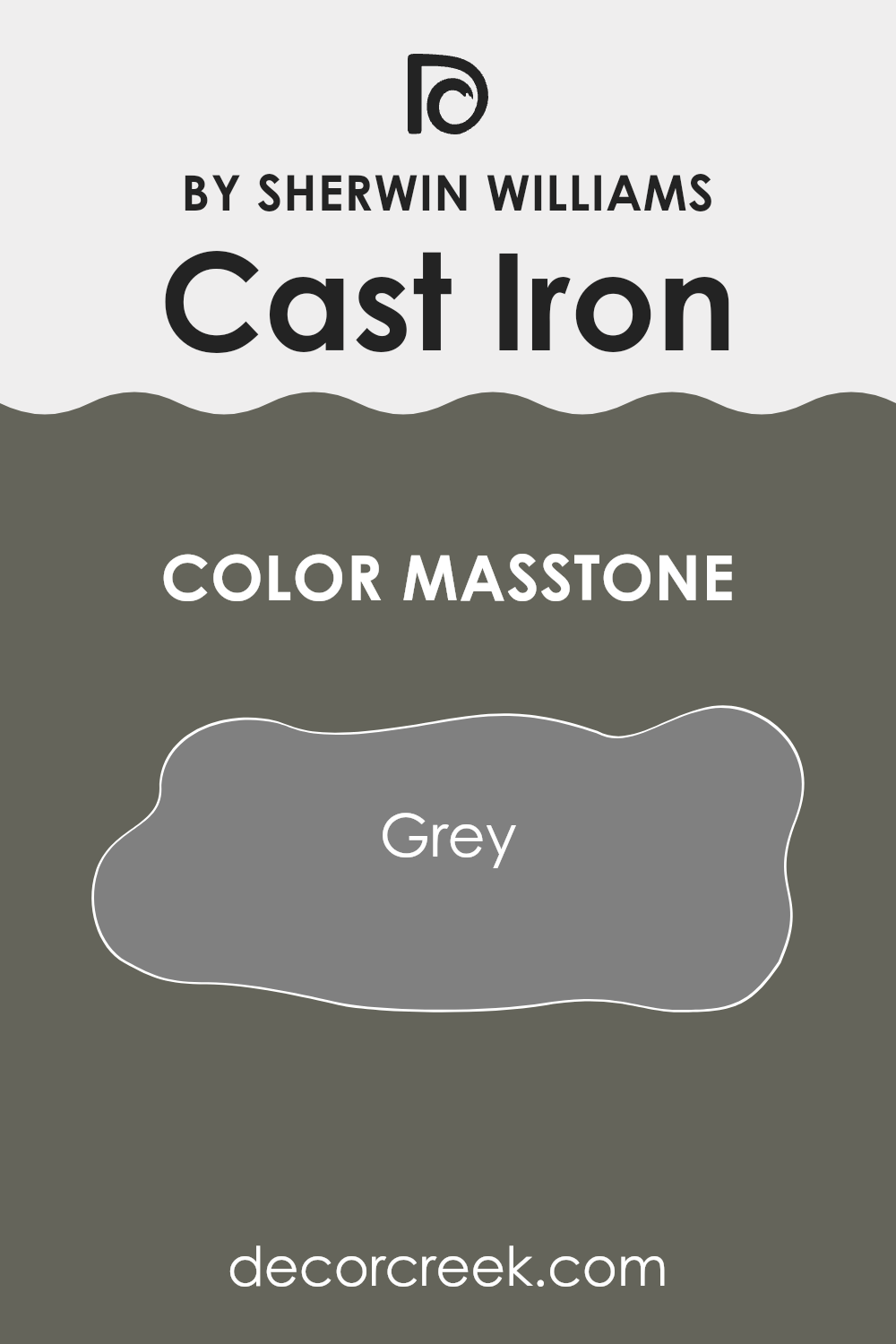
What is the Masstone of the Cast Iron SW 6202 by Sherwin Williams?
Cast Iron is a flexible grey color by Sherwin Williams, resembling the shade often seen in classic cast iron materials. This makes it a great choice for a variety of areas in homes. Its neutral tone serves as a solid foundation, allowing it to pair well with almost any decor style—from modern to traditional.
This color has the advantage of hiding imperfections on walls better than lighter shades. Because of its medium darkness, it doesn’t show dirt or smudges easily, making it practical for high-traffic areas like hallways and living rooms. Grey also has a calming effect, creating a relaxed atmosphere which is ideal for areas where you unwind.
Moreover, Cast Iron can work as a backdrop for brighter colors or interesting textures, helping other elements in the room to stand out. Whether it’s used in a small setting like an accent wall or throughout a larger area, its adaptability makes it a popular choice for anyone looking to update their home.
How Does Lighting Affect Cast Iron SW 6202 by Sherwin Williams?
Lighting significantly impacts the way colors appear in different environments. A color might look one way under the bright sun and quite differently under artificial lighting. This change occurs due to the varying wavelengths in different light sources which can enhance or mute certain hues.
The color Cast Iron, a deep charcoal gray, is an excellent example to discuss in terms of lighting effects. Under artificial light, such as LED or fluorescent bulbs, Cast Iron tends to look more solid and uniform. Artificial lighting generally provides a consistent intensity that can make this dark shade appear even and less complex.
In natural light, however, Cast Iron shows more depth. Sunlight can bring out the subtle undertones in the color, sometimes revealing bluish or brownish hints that are not as noticeable under artificial light. This makes the color more dynamic and can add a unique character to the room depending on the time of day.
The orientation of the room also affects how colors like Cast Iron appear:
– North-faced rooms: These rooms get less direct sunlight, which can make Cast Iron look more uniform and slightly cooler. The lack of intense light may mean the color appears almost black.
– South-faced rooms: These rooms enjoy abundant sunlight, which can warm up the color. Here, Cast Iron might look lighter and reveal more of its deep gray qualities rather than just black.
– East-faced rooms: Morning light is cooler and can make Cast Iron look sharper and more defined in the mornings but might fade into a softer gray as the day progresses.
– West-faced rooms: Evening light is warmer, and thus, rooms facing this direction might make the color Cast Iron appear softer and slightly lighter in the later parts of the day.
In summary, lighting and room orientation play crucial roles in how colors like Cast Iron are perceived. Whether it’s under artificial conditions or natural light, and depending on the room’s directional exposure, this color can offer a range of appearances from stark and bold to soft and nuanced.
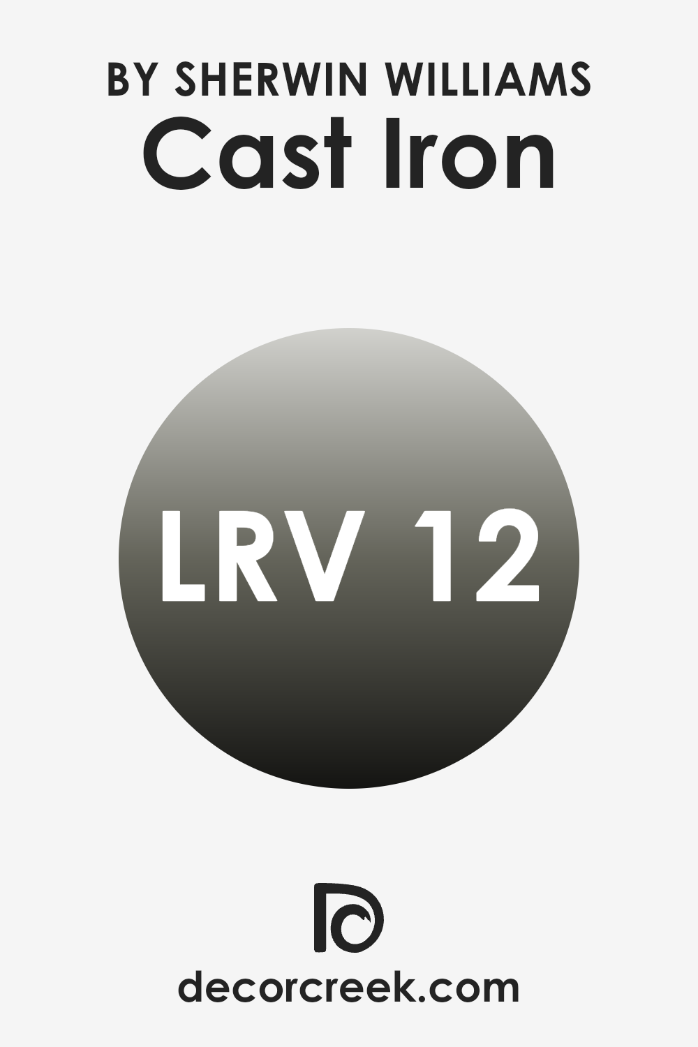
What is the LRV of Cast Iron SW 6202 by Sherwin Williams?
LRV stands for Light Reflectance Value, which measures the amount of light a paint color reflects back into a room as opposed to absorbing it. This value is expressed on a scale from 0, which is pure black and does not reflect any light, to a maximum value near 100, indicating white which reflects most of the light it receives.
A higher LRV can make a room feel brighter and more open because more light is bouncing around the room. Conversely, a lower LRV can make a room feel cozier and more enclosed, as less light is reflected. For the color with an LRV of 12.498, like the one mentioned, expect it to have a significantly dark shade.
This lower LRV means it will absorb more light, thus not brightening the room much. Colors with low LRV can make large areas feel smaller and more intimate, which might be suitable for creating a focal point in a room or for use in areas intended for relaxation and less activity.
However, such dark colors might not be ideal if your aim is to make a small room appear larger. This dark shade will also show a strong presence on the walls, yielding a bold visual effect, making it an excellent choice for making a strong style statement or for adding depth to a room.
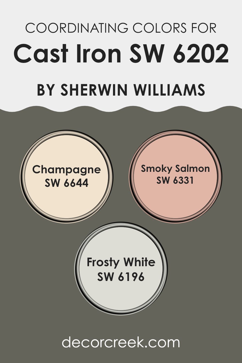
Coordinating Colors of Cast Iron SW 6202 by Sherwin Williams
Coordinating colors are complementary shades chosen to harmonize with a main color, enhancing the overall aesthetic of a room. They work by balancing each other, ensuring the colors in the room blend smoothly without overpowering the senses. For instance, the deep and muted hue of a color like Cast Iron can be perfectly complemented by lighter and softer tones, creating a balanced palette. These coordinating shades not only add visual depth but also bring out the best features of the primary color.
Taking Cast Iron, a robust color, as a primary, one can harmoniously pair it with colors like Champagne, Smoky Salmon, and Frosty White. Champagne is a soft, muted yellow that offers a subtle contrast to Cast Iron’s strength, imparting a comfortable glow to any room.
Smoky Salmon, a gentle blend of pink and orange hues, provides a warm touch that is both inviting and pleasantly soothing against a darker background. Lastly, Frosty White serves as an excellent neutral counterbalance, brightening up rooms and allowing the darker tones to stand out more prominently without overpowering the environment. These shades together create a cohesive look, making any room feel coherently styled and delightful.
You can see recommended paint colors below:
- SW 6644 Champagne
- SW 6331 Smoky Salmon
- SW 6196 Frosty White
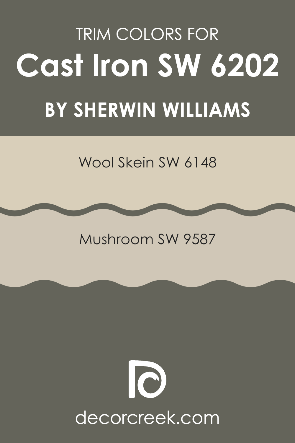
What are the Trim colors of Cast Iron SW 6202 by Sherwin Williams?
Trim colors are specific shades used to highlight or complement the main color of a room, often applied to elements like door frames, moldings, and baseboards. In the case of a rich color like Cast Iron by Sherwin Williams, choosing the right trim colors can enhance the overall look and feel of the room by providing a contrasting or harmonious balance.
When working with a deep hue like Cast Iron SW 6202, selecting lighter or neutral trim colors such as Wool Skein SW 6148 and Mushroom SW 9587 can provide a pleasing contrast that emphasizes the features of the room and adds visual interest. Wool Skein SW 6148 is a soft, warm neutral with yellow undertones that offers a subtle contrast, making it a fine choice for areas using Cast Iron as it helps to brighten and open up the area.
Mushroom SW 9587, on the other hand, is a warm, earthy beige that provides a gentle, calming effect against the stronger backdrop of Cast Iron, creating a harmonious and inviting atmosphere. By using these two colors as trims, the overall aesthetic achieves a well-rounded and appealing look, bringing together the varying tones for a cohesive design.
You can see recommended paint colors below:
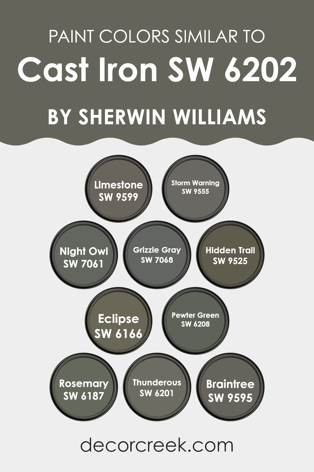
Colors Similar to Cast Iron SW 6202 by Sherwin Williams
Similar colors play a vital role in interior design as they help create a cohesive and harmonious look that gently transitions from one room to another. Utilizing hues that bear a resemblance to Sherwin Williams’s Cast Iron ensures that decorations and furnishings blend smoothly, avoiding any jarring clashes and promoting a unified theme.
When colors such as Limestone, Storm Warning, Night Owl, and others relate closely to a primary shade like Cast Iron, they introduce subtle variations that add depth and interest to decors without overpowering the senses. Limestone is a muted beige that provides a soft backdrop, making it perfect for a calm and welcoming environment.
Storm Warning is a deeper gray, offering a mysterious yet comforting feel; an excellent choice for adding a touch of drama. Night Owl serves as an intense, near-charcoal hue that is fantastic for creating focal points without stark contrast. Grizzle Gray and Hidden Trail fall into a medium gray category, flexible enough to work in most areas while keeping a sleek and modern look.
Eclipse is a bold, almost black shade ideal for a refined look in a study or living room. For those inclined towards subtle green undertones, Pewter Green enhances rooms with its earthy vibe. Rosemary bridges the gap between green and gray, providing an olive tone that is natural and refreshing.
Thunderous, closely related to Cast Iron, is a dark gray with soft blue undertones lending a cool, calm feeling to areas. Lastly, Braintree’s lighter touch is a soothing gray, excellent for rooms needing a lighter feel without sacrificing character. Each of these shades complements Cast Iron by building on its base to create environments rich in layers and visual appeal.
You can see recommended paint colors below:
- SW 9599 Limestone
- SW 9555 Storm Warning
- SW 7061 Night Owl
- SW 7068 Grizzle Gray
- SW 9525 Hidden Trail
- SW 6166 Eclipse
- SW 6208 Pewter Green
- SW 6187 Rosemary
- SW 6201 Thunderous
- SW 9595 Braintree
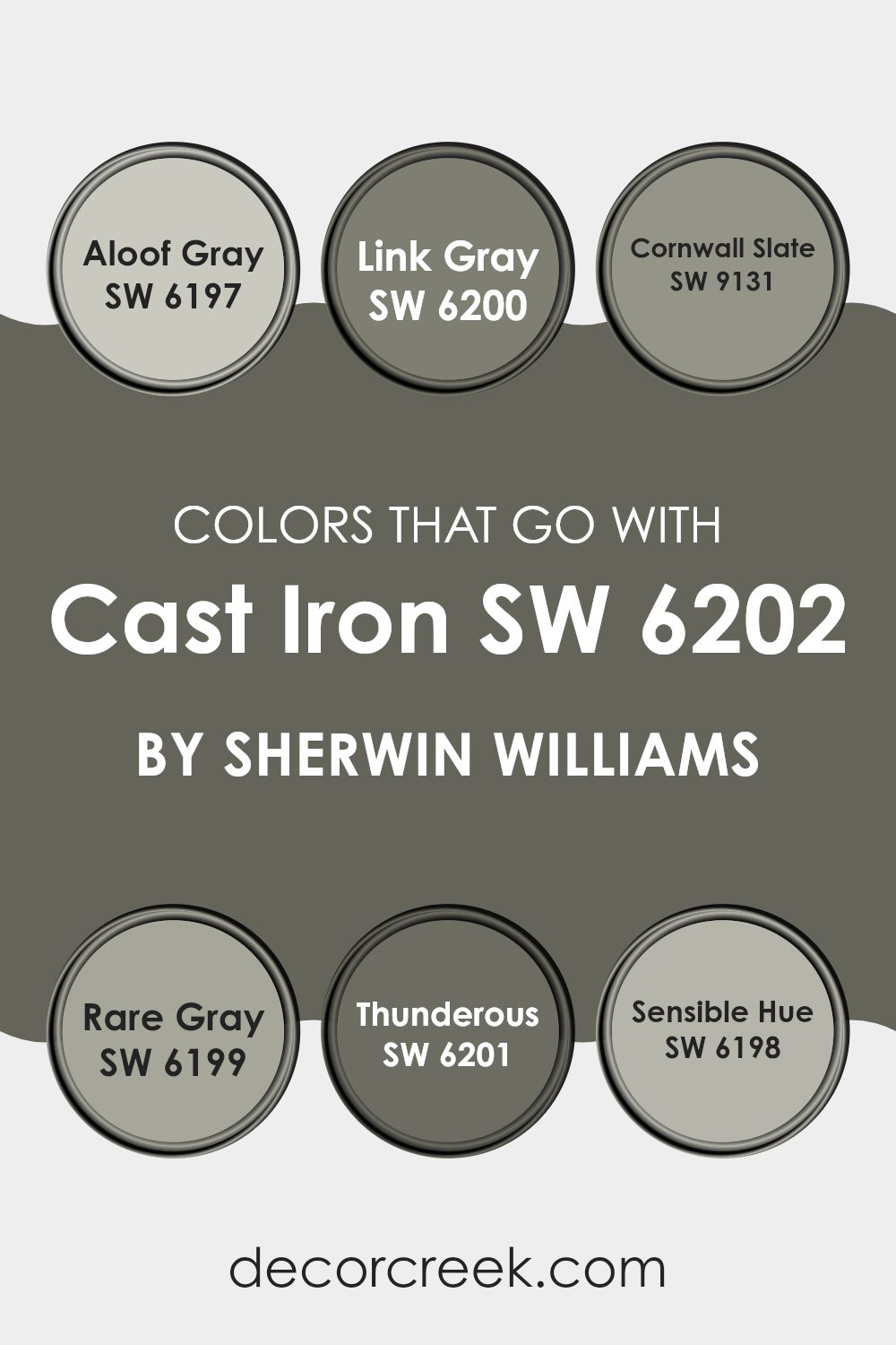
Colors that Go With Cast Iron SW 6202 by Sherwin Williams
Choosing the right colors to complement Cast Iron SW 6202 by Sherwin Williams is crucial because it ensures that the overall aesthetic of your room is harmonious and pleasing to the eye. Cast Iron is a deep, charcoal gray that can act as a strong foundation when paired with the right shades.
By selecting complementary colors, you can create a cohesive look that enhances the visual appeal and atmosphere of any room. The colors that pair well with Cast Iron SW 6202, such as Aloof Gray, Link Gray, and others, have their unique tones, which can help to balance the depth of Cast Iron with lighter or contrasting hues to prevent the room from feeling too heavy or monotonous.
Aloof Gray SW 6197 is a gentle gray with a soft, almost silvery undertone that creates a light, airy feel, making it perfect to offset the denseness of Cast Iron. Similarly, Link Gray SW 6200 is a muted gray with green undertones, providing a subtle hint of color that enriches areas without overpowering them.
For a bolder contrast, Cornwall Slate SW 9131, with its deep bluish-gray tones, adds depth and interest to areas, making it great for creating focal points. Rare Gray SW 6199 is another interesting option; it flirts with the boundaries of gray and green, offering an earthy vibe that warms up the coolness of Cast Iron.
Thunderous SW 6201, similar to Cast Iron but lighter, ensures a smooth gradient transition between darker and lighter tones on your walls, making it ideal for adjacent rooms or accent walls. Lastly, Sensible Hue SW 6198 strikes a balance with its gray-green mix, adding a touch of nature-inspired freshness to complement the robust Cast Iron. All these colors work together to provide flexibility in design choices, ensuring that each room carries a touch of personality while maintaining a unified look throughout your home.
You can see recommended paint colors below:
- SW 6197 Aloof Gray
- SW 6200 Link Gray
- SW 9131 Cornwall Slate
- SW 6199 Rare Gray
- SW 6201 Thunderous
- SW 6198 Sensible Hue
How to Use Cast Iron SW 6202 by Sherwin Williams In Your Home?
Cast Iron by Sherwin Williams is a flexible and robust gray paint color that can add a touch of elegance to any room in your house. Its deep gray shade works well in many different settings, making it a popular choice for homeowners looking to add some modern flair to their room.
You can use Cast Iron in your living room on accent walls for a dramatic statement, or in your bedroom for a cozy, grounding effect that pairs nicely with soft linens and warm wood tones. It’s also an excellent color for exterior use, giving your home’s facade a sleek, contemporary look.
In the kitchen, cabinets painted with Cast Iron can create a stylish contrast against lighter walls or countertops. Likewise, it’s a great option for bathrooms, where it provides a clean, strong backdrop for white fixtures and bright towels. Regardless of where you apply it, this color is durable and easy to maintain, ideal for busy family homes.
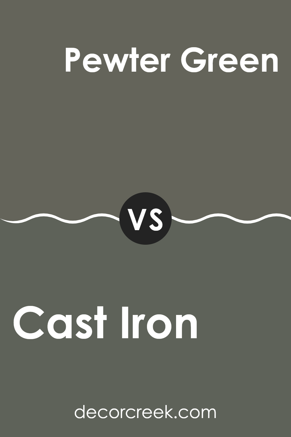
Cast Iron SW 6202 by Sherwin Williams vs Pewter Green SW 6208 by Sherwin Williams
Cast Iron and Pewter Green, both from Sherwin Williams, offer distinct moods due to their different tones. Cast Iron is a deep charcoal with a hint of blue, giving it a strong, stable look. This makes it great for creating a bold, commanding feel in a room, perfect for accent walls or exterior trims.
On the other hand, Pewter Green has a more subdued green-gray tone, which lends a softer and more subdued atmosphere, suitable for a calming bedroom or a peaceful office area.
While Cast Iron is darker and cooler, Pewter Green provides a touch of warmth due to its green undertones. Both colors work well in modern home décor, but the choice between them depends on whether you want the stark, clear presence that Cast Iron offers, or the gentle, soothing effect of Pewter Green.
You can see recommended paint color below:
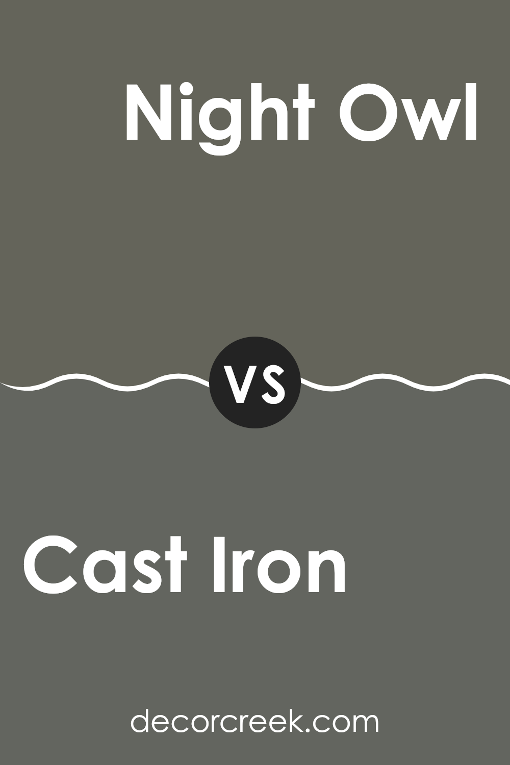
Cast Iron SW 6202 by Sherwin Williams vs Night Owl SW 7061 by Sherwin Williams
Cast Iron SW 6202 is a solid gray shade with hints of blue, giving it a strong and somewhat cold feel, perfect for achieving a modern or industrial look. This color works well in areas that aim for a sturdy and clean appearance, such as kitchens or modern bathrooms.
In contrast, Night Owl SW 7061 is a deeper, almost charcoal gray with green undertones, giving it a more enigmatic vibe. This color is great for creating a cozy atmosphere and is especially suited for rooms like living rooms or bedrooms where a sense of comfort is desired.
Both colors share a basic gray base but Cast Iron leans towards a cooler tone while Night Owl offers a warmer, more inviting presence. Their uses in interior design will differ based on the mood and functionality one wants to achieve in the room.
You can see recommended paint color below:
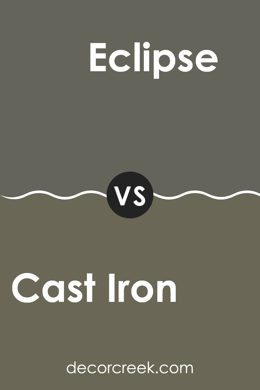
Cast Iron SW 6202 by Sherwin Williams vs Eclipse SW 6166 by Sherwin Williams
The two colors, Cast Iron and Eclipse, are both from Sherwin Williams and offer distinct shades for those looking to paint their rooms. Cast Iron is a deep gray that brings to mind the classic hue of traditional iron materials.
It offers a strong and grounding essence, perfect for creating a solid, understated background in any room. On the other hand, Eclipse is also a gray color but with a lighter, softer tone. This color leans more towards a mid-tone gray, providing a gentle and calm look, which is ideal for those who prefer a more muted backdrop that still retains some warmth.
While both colors are gray, Cast Iron is notably darker and more intense, making it suitable for accent walls or furniture, whereas Eclipse works well as a main color scheme due to its lighter and more adaptable nature.
You can see recommended paint color below:
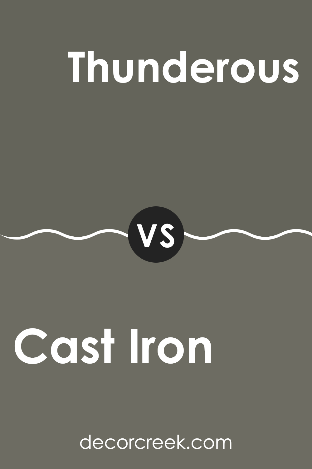
Cast Iron SW 6202 by Sherwin Williams vs Thunderous SW 6201 by Sherwin Williams
Cast Iron and Thunderous are two distinct colors from Sherwin Williams. Cast Iron is a deep, dark gray that gives a strong and solid feel to any room. It’s akin to the color of traditional cast iron cookware—almost black but with a hint of steeliness. This shade can make a dramatic statement in a room, particularly when used on walls or large furniture pieces.
On the other hand, Thunderous is a shade lighter than Cast Iron. It still falls in the gray family but comes with a softer, more muted tone. This color can be seen as more flexible, working well in various lighting conditions and complementing a broad range of decor styles. It offers a gentler alternative for those who might find Cast Iron too bold.
Together, these colors can work well in a single room, where Thunderous could lighten the mood set by the heavier feel of Cast Iron, offering balance and contrast.
You can see recommended paint color below:
- SW 6201 Thunderous
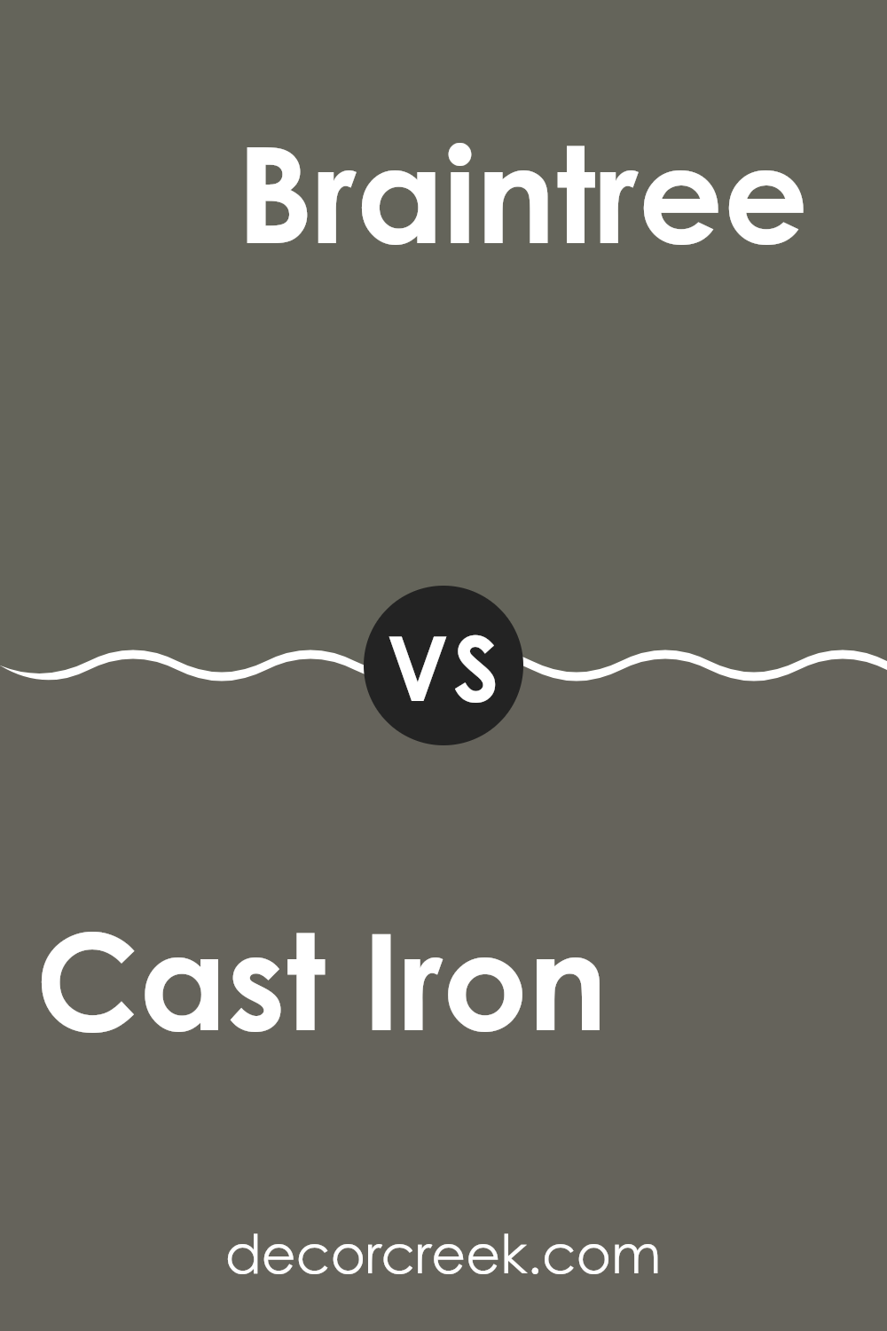
Cast Iron SW 6202 by Sherwin Williams vs Braintree SW 9595 by Sherwin Williams
The colors Cast Iron and Braintree from Sherwin Williams have distinct tones that set them apart. Cast Iron is a deep, dark gray that provides a strong, almost slate-like appearance. It’s a color that brings to mind the strength and solidity of iron, making it a great choice if you’re looking for something bold yet neutral.
On the other hand, Braintree is a lighter, softer gray with a subtle warmth to it, conveying a more inviting and gentle appearance. This color could be perfect for areas where you want a calm and airy feel, as it reflects more light and adds a sense of openness.
When deciding between these two, think about the mood you want to set for the room. Cast Iron could be ideal for creating a dramatic or modern vibe, while Braintree is better suited for creating a relaxed and welcoming environment. Both colors work well in various settings, allowing for flexible design choices.
You can see recommended paint color below:
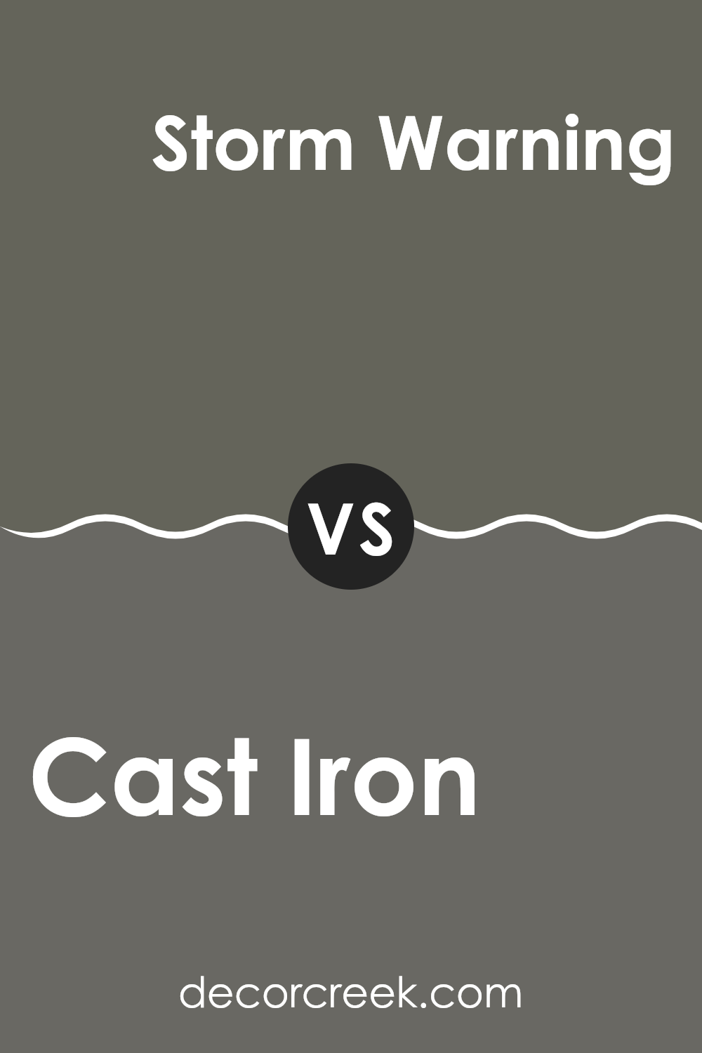
Cast Iron SW 6202 by Sherwin Williams vs Storm Warning SW 9555 by Sherwin Williams
Comparing the two colors from Sherwin Williams, Cast Iron and Storm Warning, highlights an interesting contrast in hue and mood. Cast Iron is a solid, deep gray that has the strength and classic presence of old cast iron pans. It’s a reliable and sturdy color that can serve as a strong background in any room, providing a steady base against which brighter colors can pop.
On the other hand, Storm Warning has a darker, more ominous gray tone, reminiscent of a cloudy sky just before a storm. This color is more intense and could be used to create a dramatic effect in a room. It commands attention and could dominate lighter colors when paired together.
Both colors share a gray base, but the deeper, almost black undertone in Storm Warning sets it apart from the softer and more neutral gray of Cast Iron. Each color would be ideal for different decorating styles or purposes, with Cast Iron suitable for a more subdued, classic look and Storm Warning fit for a bolder, more striking approach.
You can see recommended paint color below:
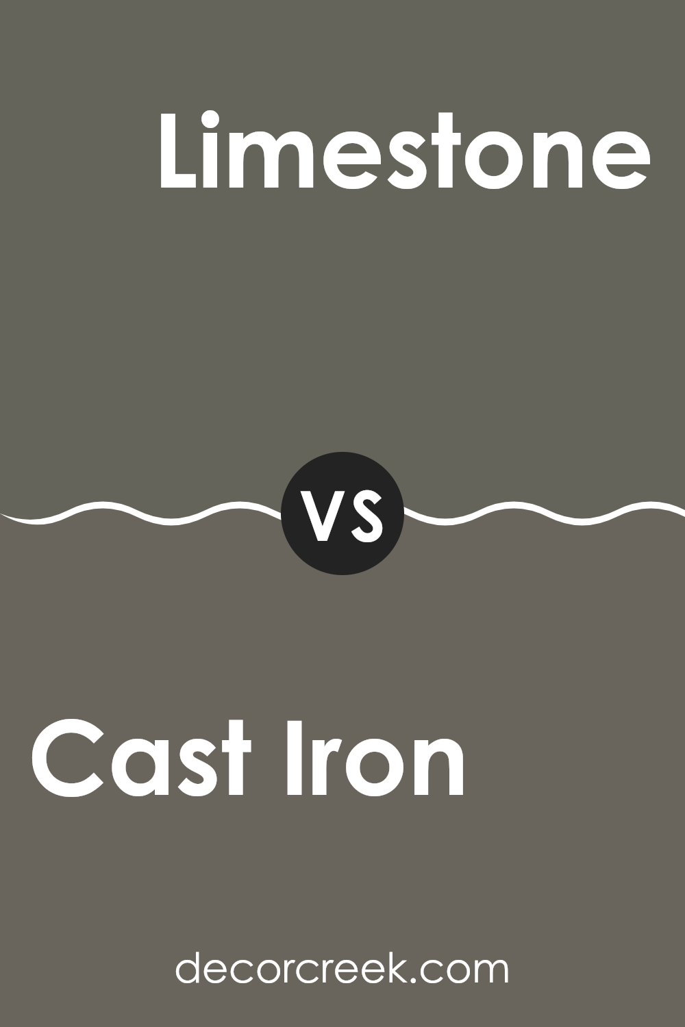
Cast Iron SW 6202 by Sherwin Williams vs Limestone SW 9599 by Sherwin Williams
Cast Iron and Limestone by Sherwin Williams are two distinct shades that can significantly alter the mood of a room. Cast Iron is a deep, dark gray that almost mirrors the color of traditional cast iron. This makes it a strong choice for creating a bold, grounded feeling in a room. It’s particularly effective in areas where you want to make a statement, such as on cabinetry or as an accent wall.
On the other hand, Limestone is a much lighter, beige-gray color. It’s closer to a neutral tone, which makes it very flexible for various decorating styles. Limestone works well in areas where you want to keep things light and airy, enhancing the visual openness of a room.
It’s ideal for walls in a living room or bedroom to keep the environment feeling open and relaxed. Together, these two colors could work well if you’re looking to balance a strong feature color with a softer, lighter shade to maintain harmony in your decor.
You can see recommended paint color below:
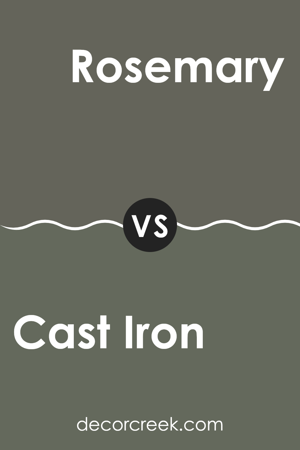
Cast Iron SW 6202 by Sherwin Williams vs Rosemary SW 6187 by Sherwin Williams
Cast Iron is a dark shade, almost like a deep charcoal, offering a strong, moody feel to areas. It’s perfect for areas where you might want something bold and impactful without going fully black. This dark gray can make a significant statement on accent walls or cabinets, especially when paired with lighter colors to balance its intensity.
On the other hand, Rosemary is a muted green that brings a cozy, earthy vibe to any room. This color resembles a soft, faded sage, which can make areas feel more relaxed and inviting. It’s great for those looking to add a touch of nature indoors, fitting well in bedrooms, bathrooms, or kitchens.
Both Cast Iron and Rosemary bring unique atmospheres to interiors. While Cast Iron adds depth and drama, Rosemary offers a lighter, refreshing touch. Depending on what feeling you want to achieve in your room, either could be the perfect choice.
You can see recommended paint color below:
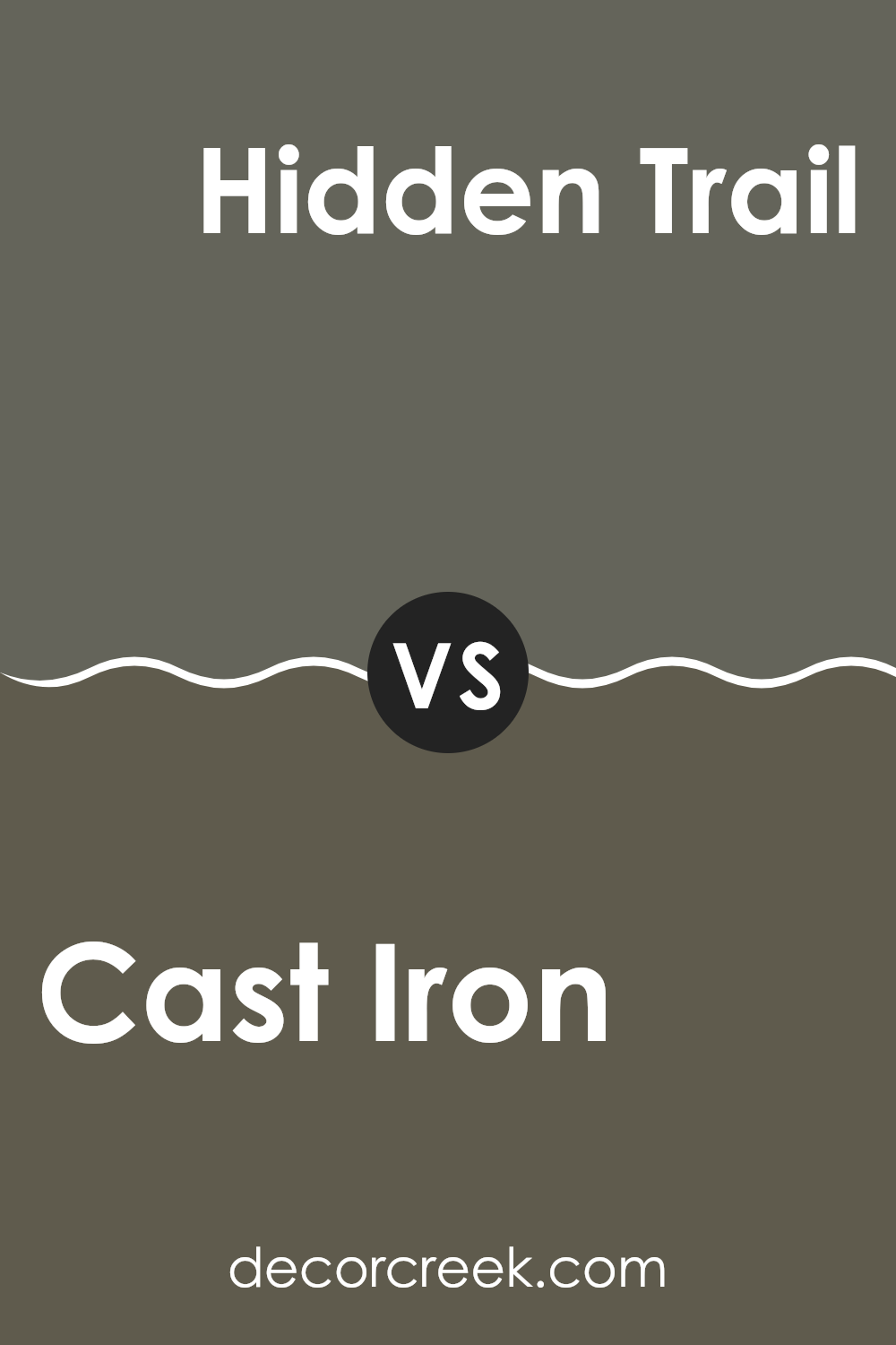
Cast Iron SW 6202 by Sherwin Williams vs Hidden Trail SW 9525 by Sherwin Williams
Cast Iron by Sherwin Williams is a deep gray with hints of blue, giving it a strong and steady look that feels grounded. It’s a color that suggests stability and can anchor a room, making it a great choice for both modern and traditional interiors.
In contrast, Hidden Trail is also part of the gray family but leans towards taupe, with warmer brown undertones that give it a cozy and welcoming vibe. This color works well in areas where you want to add warmth without overpowering the room with too much intensity.
While Cast Iron can make a bold statement and pairs well with bright and cool tones for a crisp look, Hidden Trail offers a softer approach, blending seamlessly with a variety of decor styles and colors, making it very flexible for different rooms and settings. Together, these colors can complement each other well, with Cast Iron providing a striking balance to the gentle warmth of Hidden Trail.
You can see recommended paint color below:
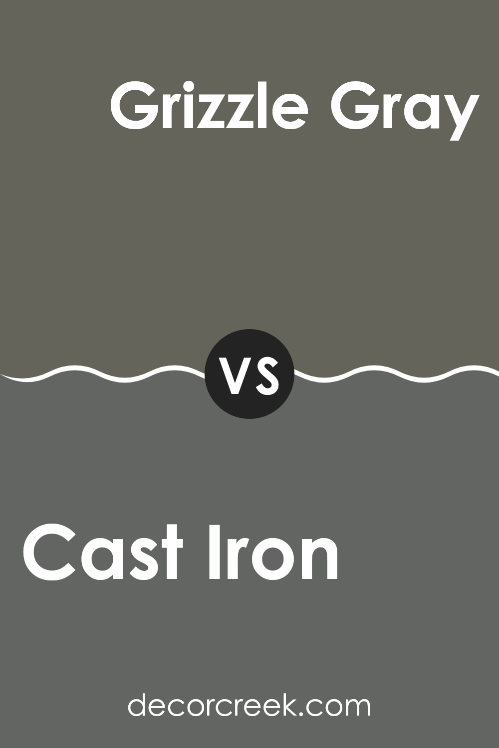
Cast Iron SW 6202 by Sherwin Williams vs Grizzle Gray SW 7068 by Sherwin Williams
The two shades of gray from Sherwin Williams, Cast Iron and Grizzle Gray, offer subtle but distinct differences that could impact the feel of a room. Cast Iron is a deep, dark gray that echoes the color of its namesake, suggesting strength and durability. It’s perfect for creating a bold statement and anchors a room with its almost black undertones.
In contrast, Grizzle Gray is a lighter, mid-tone gray. This color still holds some depth but is softer and more flexible, which makes it easier to pair with a wide array of decor styles and other colors. It provides a less intense backdrop than Cast Iron, lending itself to a more open and airy feel in a room.
Choosing between the two depends on the desired impact and room use. Cast Iron suits a dramatic, cozy aesthetic, while Grizzle Gray is better for a lighter, more relaxed environment. Both colors offer the simplicity and neutrality gray is known for, but their impact is notably different.
You can see recommended paint color below:
In wrapping up my thoughts on SW 6202 Cast Iron by Sherwin Williams, I must say I’m quite impressed with this paint color. Cast Iron is a deep, dark gray that looks almost like the color of storm clouds. It’s really cool because it adds a bold touch without being too loud, making it perfect for a bedroom or a living room.
I’ve learned that this color works well in lots of different styles of homes, from modern apartments to cozy countryside houses. It’s especially good at hiding marks and smudges, which is super helpful in homes with kids or pets. Plus, it pairs beautifully with brighter colors like blues and yellows, which means you can get creative with your decorations.
Another great thing about Cast Iron is its ability to make white trimmings or furniture stand out, giving a very sharp and clean look to the room. I noticed that in areas with lots of natural light, this color looks even more dynamic, changing tones throughout the day.
Overall, SW 6202 Cast Iron by Sherwin Williams is a fantastic choice if you want a color that’s strong but not too dark, and easy to work with when decorating. It’s definitely a paint color worth considering for anyone looking to refresh their home with something new and exciting.
Ever wished paint sampling was as easy as sticking a sticker? Guess what? Now it is! Discover Samplize's unique Peel & Stick samples.
Get paint samples

