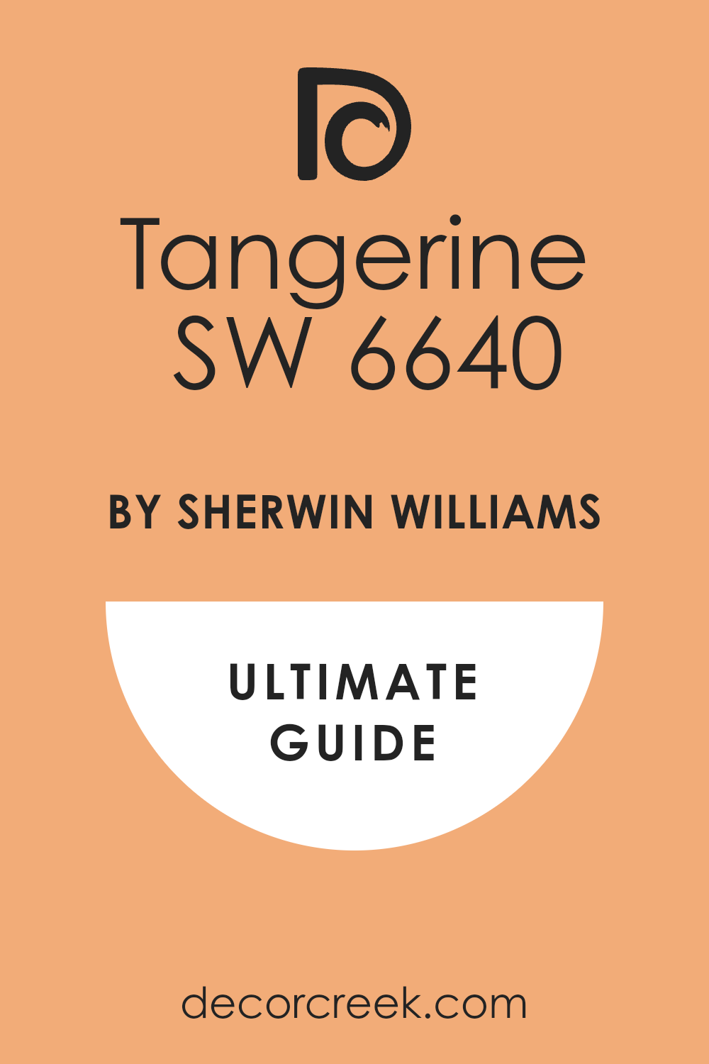
When I first saw SW 6640 Tangerine by Sherwin Williams, it was like a burst of sunshine on a grey day. This vibrant, energetic orange hue has a way of livening up any space, inviting creativity and brightness into rooms that need a little spark.
I’ve noticed that Tangerine works exceptionally well when you’re looking to add a playful yet sophisticated touch to your decor.
Using this color, you can create a range of atmospheres, from a cozy, inviting reading nook to a lively, spirited kitchen.
It pairs beautifully with neutral shades, deep blues, and greens, providing a balance that can fit into various design styles, whether you lean towards something modern, traditional, or eclectic.
I personally love how it adds a sense of joy and enthusiasm to the space. It’s not just a color; it’s a mood lifter, making it a perfect choice if you want to give your home a fresh, cheerful look.
If you’re thinking about refreshing a room or simply adding a splash of color, SW 6640 Tangerine by Sherwin Williams could be the perfect way to go.
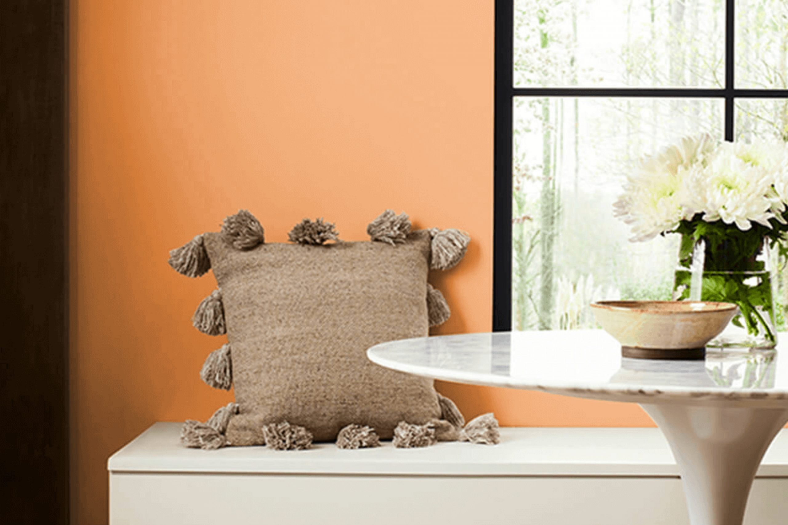
What Color Is Tangerine SW 6640 by Sherwin Williams?
Tangerine is a vibrant and energizing shade of orange that bursts with life and warmth. This color is perfect for adding a cheerful pop of color to any space. Its vivacious hue is very versatile and can brighten up areas that receive less natural light.
The lively nature of Tangerine makes it a fantastic choice for kitchens and dining areas where it induces a welcoming, cozy atmosphere. Additionally, creative spaces like craft rooms or children’s play areas benefit from this stimulating color, encouraging enthusiasm and creativity.
Tangerine works exceptionally well in modern, eclectic, or bohemian interior styles where bold colors and dynamic aesthetics are celebrated. It pairs beautifully with neutral tones such as warm whites, soft grays, or earthy browns, which help to balance its intensity.
For materials, Tangerine complements natural textures like light woods, wicker, or bamboo, enhancing their natural warmth. Fabrics such as linen or cotton in simple patterns work well to keep the space feeling fresh and not overwhelmed by the strong color.
Adding elements in turquoise or teal can create a refreshing contrast, making the space more lively and inviting.
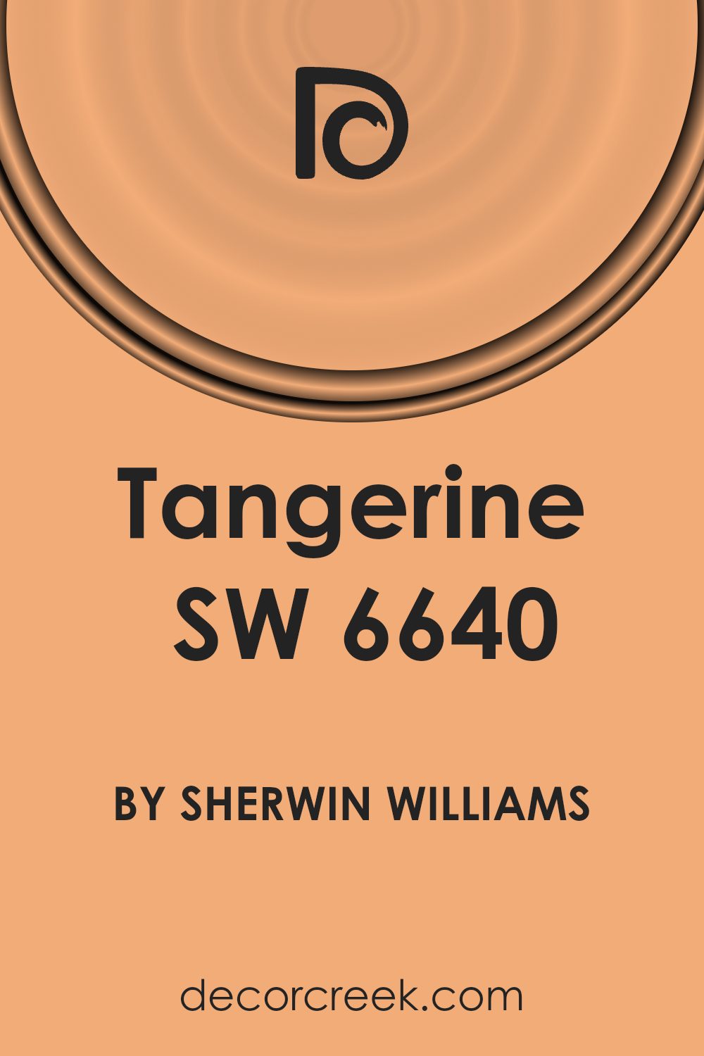
Is Tangerine SW 6640 by Sherwin Williams Warm or Cool color?
Tangerine SW 6640 by Sherwin Williams is a vibrant and cheerful orange color that brings a bold splash of energy to any room. This warm hue is perfect for adding a pop of color and creating a lively atmosphere in homes.
When used in a living room, kitchen, or playroom, Tangerine can make spaces feel more welcoming and fun. It’s especially useful for brightening up a dull area or adding a sense of playfulness.
However, because it’s quite a strong color, it’s wise to use it in moderation. Accent walls or decor items like cushions, vases, or curtains in this shade can strike the right balance without overwhelming the space.
Pairing Tangerine with neutral colors like white, gray, or beige can help tone it down while maintaining its vibrant character.
Tangerine can also stimulate appetite and conversation, making it a great choice for dining areas. Overall, this lively shade is a fantastic choice for anyone looking to add some joy and energy to their home.
Undertones of Tangerine SW 6640 by Sherwin Williams
TangerineSW 6640 is a vibrant and dynamic color that carries multiple undertones, adding depth and complexity to its appearance. Undertones are subtle colors that lie beneath the surface of the main color, influencing how it looks under different lighting conditions and when paired with other colors.
For TangerineSW 6640, these undertones include pale pink, yellow, orange, light gray, light purple, mint, grey, light green, olive, light blue, and lilac.
These undertones have a significant impact on how we perceive the color. For instance, yellow and orange undertones can make the color appear warmer and more inviting, while light blue and mint undertones might give it a fresher, crisper feel.
The presence of gray or light gray can tone down the intensity, making it more muted and easier to use in various settings.
When used on interior walls, the undertones of TangerineSW 6640 can greatly affect the mood and atmosphere of a room. The warmth of orange and yellow undertones creates a cozy and welcoming feel, ideal for living rooms or dining areas. Light purple and lilac undertones can add a touch of subtle cheerfulness, perfect for a creative space or a child’s room.
In different lights, these undertones might become more pronounced or recede, changing the color dynamics throughout the day. This makes TangerineSW 6640 a versatile choice for those looking to add both warmth and character to their interiors.
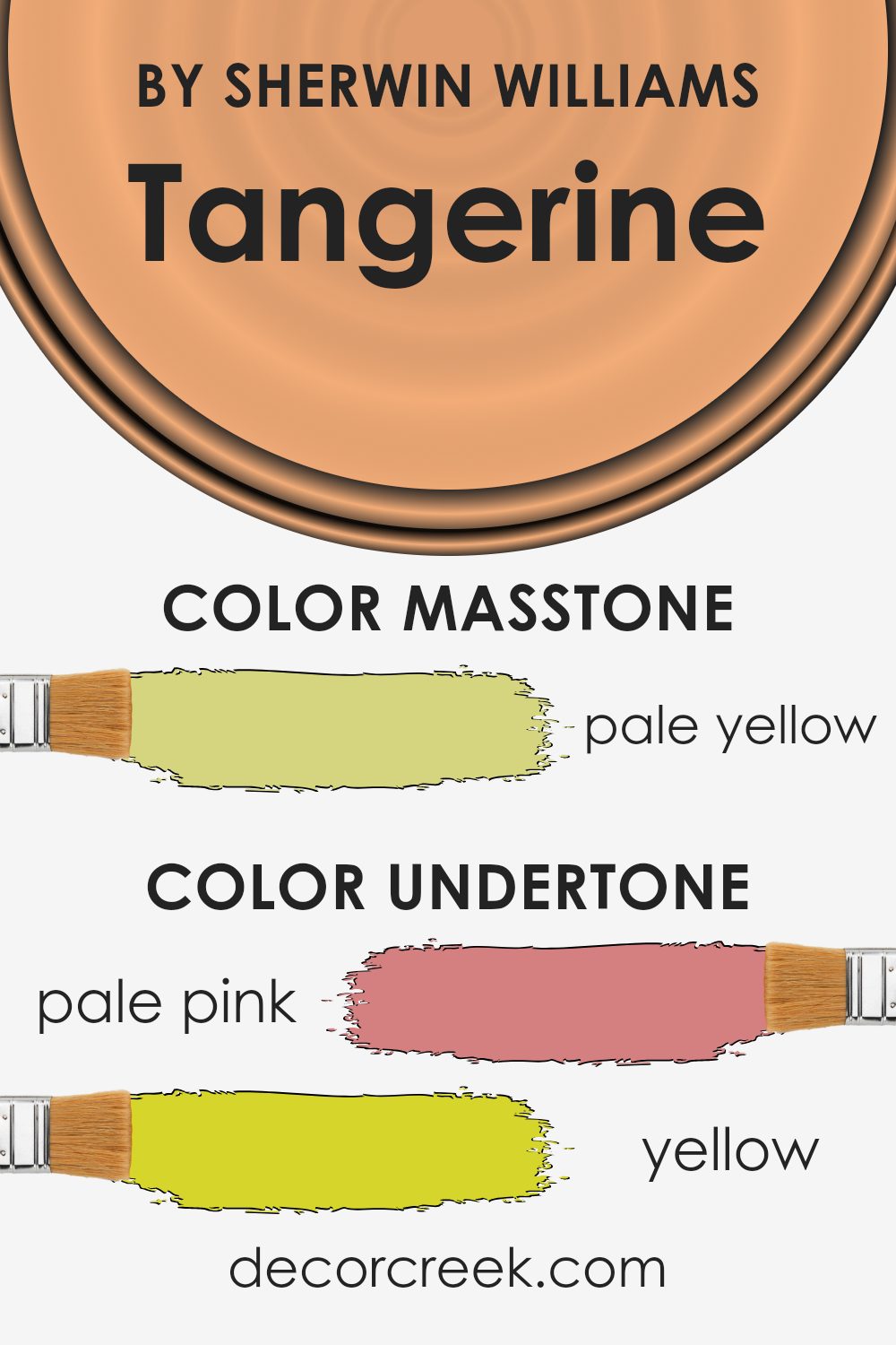
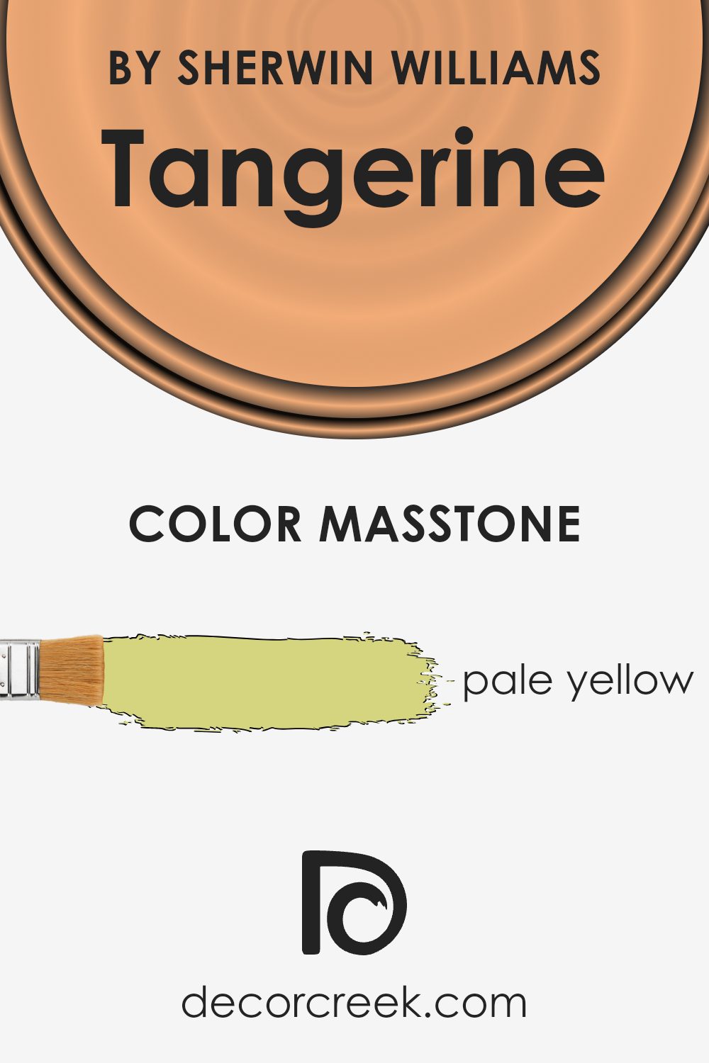
What is the Masstone of the Tangerine SW 6640 by Sherwin Williams?
Tangerine SW 6640 by Sherwin Williams has a masstone of pale yellow, which appears as a light, creamy shade of yellow. This particular shade has a warm and inviting aspect, which makes it excellent for use in homes where a cozy and welcoming atmosphere is desired.
In living spaces, pale yellow can help in making the room feel more open and bright, an effect that is particularly beneficial in smaller or dimly lit areas. The color can work well in bedrooms too, providing a gentle and cheerful ambiance which can be soothing and pleasant.
Kitchens and bathrooms also take on a fresh and clean appearance with this hue, offering a subtle yet rejuvenating backdrop. The versatility of pale yellow allows it to be paired with various decor styles and colors, ranging from neutral tones to more vibrant hues.
Moreover, this color tends to bring a feeling of positivity and increases visual clarity, making it a solid choice across both modern and classical home designs.
How Does Lighting Affect Tangerine SW 6640 by Sherwin Williams?
Lighting plays a crucial role in how we perceive colors in our surroundings. Different light sources can significantly alter the appearance of a color. For example, a color like Tangerine, a vibrant orange hue, can look very different under various lighting conditions.
In artificial light, such as light from incandescent bulbs, Tangerine tends to appear warmer and deeper, enhancing its orange tones. This makes the color feel cozy and inviting, ideal for living spaces and dining areas where you want to create a welcoming atmosphere.
In contrast, under fluorescent lighting, which emits a cooler, bluish tone, Tangerine might look slightly muted, losing some of its warmth and vibrancy.
Natural light brings out the truest color, but the appearance can still vary depending on the time of day and the direction the room faces. In north-faced rooms, which receive less direct sunlight and have a cooler, bluish light, Tangerine may appear slightly subdued and less intense. This could make it a good choice for spaces where you want a touch of color without overwhelming brightness.
South-faced rooms receive more intense, direct light for most of the day, which can amplify the brightness and vibrancy of Tangerine, making it appear more vivid and energetic. This is ideal for spaces where you want to create a lively, dynamic vibe.
In east-faced rooms, the morning light can make Tangerine look bright and cheerful, perfect for starting the day with a burst of energy. However, as the day progresses and the natural light diminishes, the color may lose some of its punch.
West-faced rooms experience the opposite effect; the color may start more muted in the morning, but as the sun sets, the warm evening light can make Tangerine glow, bringing out its cozy, inviting qualities.
Thus, when choosing colors like Tangerine for your home, considering how lighting—both natural and artificial—will affect its appearance throughout the day is essential to achieve the desired effect in each room.
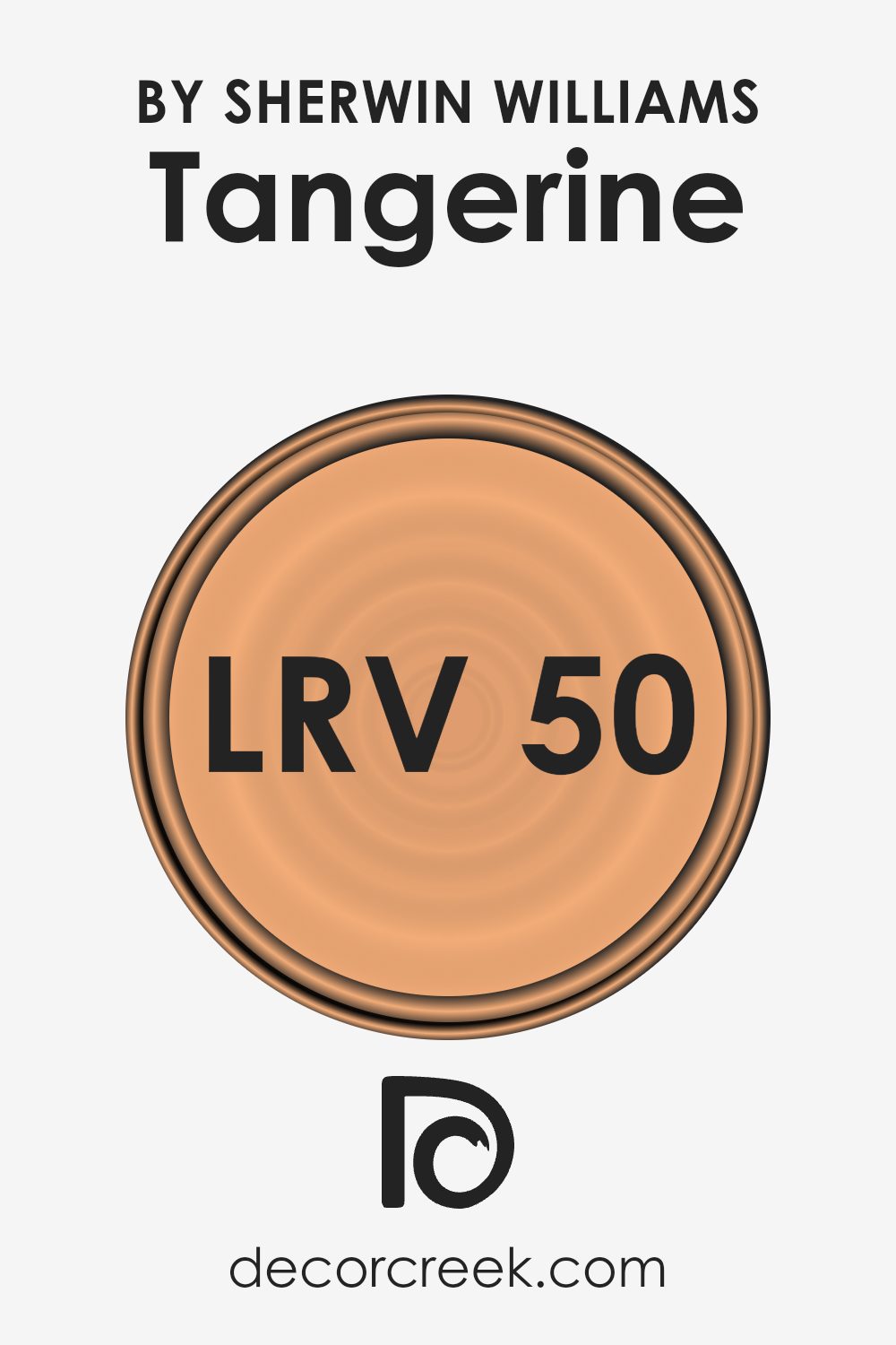
What is the LRV of Tangerine SW 6640 by Sherwin Williams?
LRV stands for Light Reflectance Value. It is a measure of the percentage of light a paint color reflects back into the room as opposed to absorbing it. This value can greatly affect how a color looks in your space depending on the natural and artificial light available.
Colors with higher LRVs are generally lighter, making them feel more open and airy. On the other hand, colors with lower LRVs tend to be darker and can make a room feel more enclosed.
Considering the LRV of 49.846 for the Tangerine color by Sherwin Williams, it falls near the middle of the scale. This means it neither reflects light as much as lighter colors nor absorbs light like darker shades. In practical terms, this moderate LRV makes Tangerine a versatile color that can work well in various lighting conditions, offering a balance between warmth and brightness.
How this color impacts your room will largely depend on other elements such as room size, lighting sources, and furnishings.
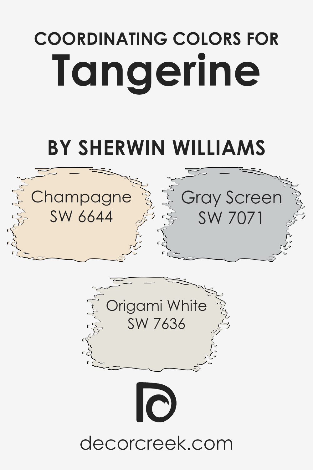
Coordinating Colors of Tangerine SW 6640 by Sherwin Williams
Coordinating colors are shades that harmonize well with a main color, enhancing the overall aesthetic of an interior space. When paired correctly, these colors create a balanced and appealing look.
For example, Tangerine by Sherwin Williams can be complemented by colors such as Champagne, Origami White, and Gray Screen, which serve to either contrast or complement the vibrant hue depending on the desired effect.
Champagne is a soft, muted yellow that offers a gentle contrast to the boldness of Tangerine, providing a calming balance while still maintaining a cheerful ambiance. Origami White is a clean and crisp white color that works well to bring out the brightness of Tangerine, helping to lighten the space and add a sense of freshness.
Gray Screen, on the other hand, is a subtle gray that pairs nicely by adding a modern and neutral background, allowing the Tangerine color to stand out as a lively focal point without overwhelming the senses. These coordinating colors help in achieving a cohesive look that enhances both the visual appeal and the mood of a room.
You can see recommended paint colors below:
- SW 6644 Champagne (CHECK A SAMPLE)
- SW 7636 Origami White (CHECK A SAMPLE)
- SW 7071 Gray Screen (CHECK A SAMPLE)
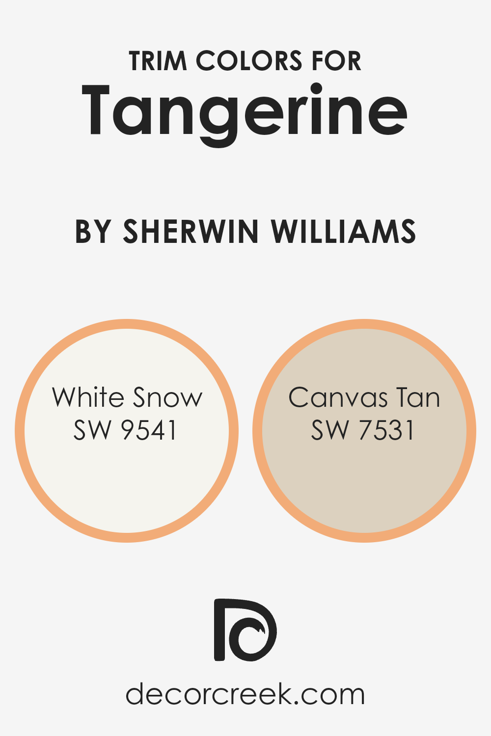
What are the Trim colors of Tangerine SW 6640 by Sherwin Williams?
Trim colors play a crucial role in enhancing the overall aesthetic of a room, as they are used on features like doorframes, moldings, window casings, and baseboards to accentuate and complement the main wall colors.
For a vibrant color such as Tangerine by Sherwin Williams, choosing the right trim colors can help ground the look and ensure that the room feels harmonious rather than overwhelming.
Using a trim color like White Snow or Canvas Tan can add a subtle contrast that highlights the boldness of the Tangerine while also tying together the space.
White Snow is a clean and bright white shade that offers a fresh and airy look. It pairs nicely with more saturated colors, providing a crisp border that makes the wall color pop. Canvas Tan, on the other hand, is a soft, warm beige that gives a more muted contrast.
It works well to soften the intensity of stronger colors, bringing warmth and a natural feel to the room. Both of these trim colors offer versatility and can effectively complement a vigorous and lively shade like Tangerine, ensuring the room feels balanced and inviting.
You can see recommended paint colors below:
- SW 9541 White Snow (CHECK A SAMPLE)
- SW 7531 Canvas Tan (CHECK A SAMPLE)
Colors Similar to Tangerine SW 6640 by Sherwin Williams
Similar colors play a crucial role in creating a harmonious and appealing visual experience, especially in design and home decor. When colors are closely related on the color wheel, they produce a cohesive look that is pleasing to the eye, making any space feel well put together.
For example, colors similar to Tangerine SW 6640 by Sherwin Williams have a vibrant and warm feel that can brighten up any room.
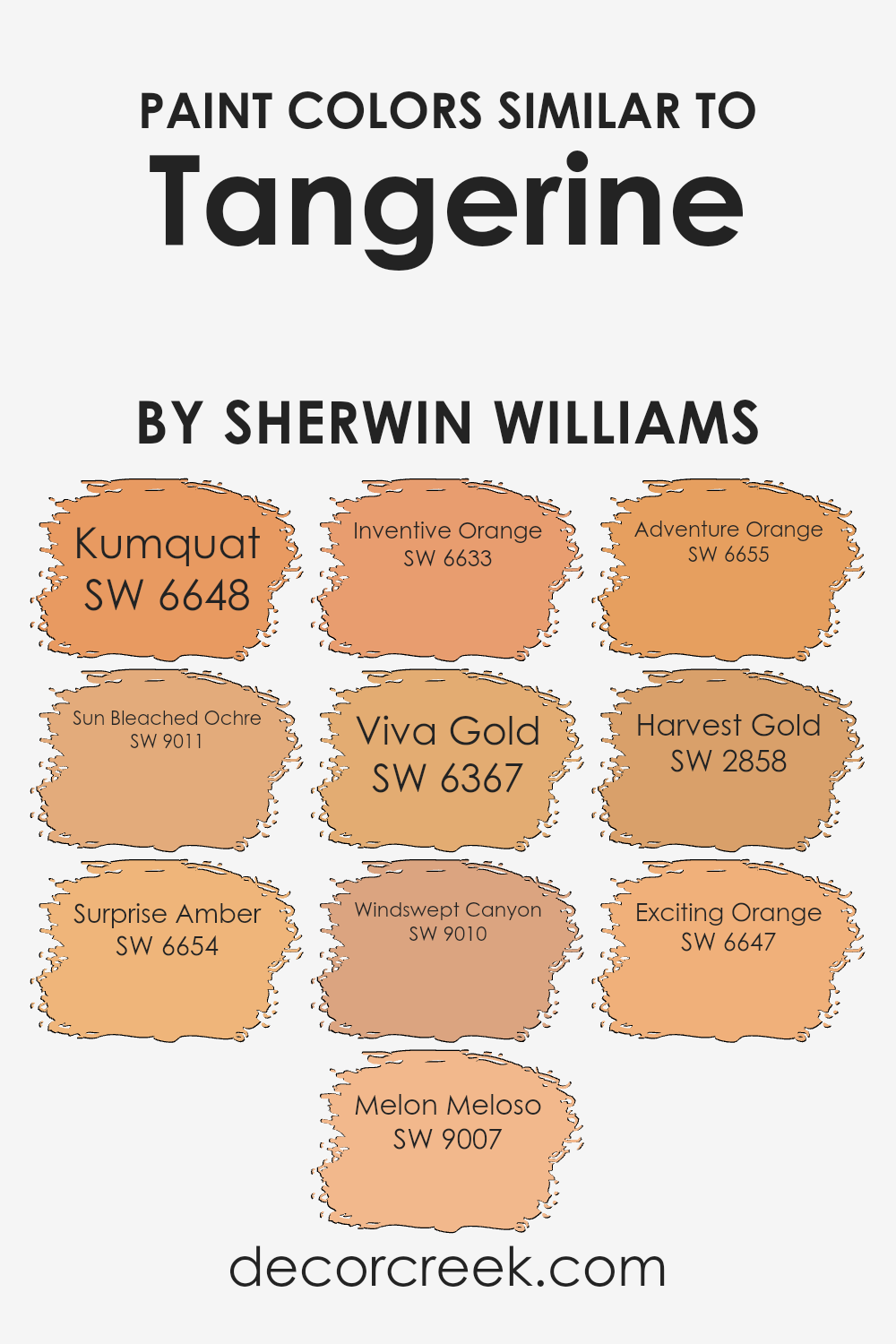
First, let’s talk about Kumquat SW 6648, which has a lively citrus tone that brings a fresh and energetic vibe to interiors. Surprise Amber SW 6654 offers a golden hue that radiates warmth and comfort, perfect for creating a cozy atmosphere.
For a softer approach, Melon Meloso SW 9007 provides a gentle peachy tint that can soften any space with its subtle charm. Inventive Orange SW 6633 stands out with its bold and dynamic orange shade, adding a punch of excitement to a room.
Colors like Viva Gold SW 6367 contribute a deep, golden yellow that enriches environments with its richness. If you’re looking for a muted earth tone, Windswept Canyon SW 9010 offers a dusty orange that works well in spaces that aim for a natural feel.
Adventure Orange SW 6655 is another energetic shade that injects fun and vibrancy wherever it’s used. Meanwhile, for those who love muted yellows, Harvest Gold SW 2858 provides a yellowish tint that captures the essence of autumn.
Sun Bleached Ochre SW 9011 has a soft, washed-out golden color that evokes a sense of calm and simplicity, while Exciting Orange SW 6647 is a perfect match for those seeking a vivid and striking orange to liven up their space.
Using similar colors like these ensures that the environment remains energetic yet harmonious, with each color complementing the other to create a cohesive and inviting atmosphere. Whether one opts for the juicy vibrancy of Kumquat or the gentle warmth of Sun Bleached Ochre, these shades work together beautifully to craft spaces that are both lively and relaxing.
You can see recommended paint colors below:
- SW 6648 Kumquat
- SW 9011 Sun Bleached Ochre (CHECK A SAMPLE)
- SW 6654 Surprise Amber (CHECK A SAMPLE)
- SW 9007 Melon Meloso (CHECK A SAMPLE)
- SW 6633 Inventive Orange (CHECK A SAMPLE)
- SW 6367 Viva Gold (CHECK A SAMPLE)
- SW 9010 Windswept Canyon (CHECK A SAMPLE)
- SW 6655 Adventure Orange (CHECK A SAMPLE)
- SW 2858 Harvest Gold
- SW 6647 Exciting Orange
Colors that Go With Tangerine SW 6640 by Sherwin Williams
Choosing the right colors to complement TangerineSW 6640 by Sherwin Williams is essential for creating a harmonious and visually appealing space. When colors work well together, they can enhance the overall look and feel of a room, providing a cohesive appearance that ties together various elements of the decor.
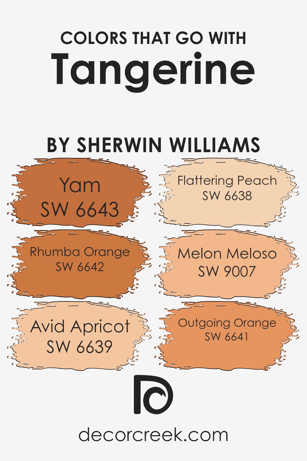
For instance, using shades like Yam SW 6643 and Rhumba Orange SW 6642 can add depth and warmth, making the space feel welcoming and cozy. These colors can act as bold contrasts or subtle enhancements depending on their application and the accompanying decor elements.
Yam SW 6643 is a deep, warm orange that can add a rich layer to your color scheme, making spaces feel more intimate and snug. Rhumba Orange SW 6642 is slightly more vibrant, adding a punch of energy and brightness that can liven up any area.
Avid Apricot SW 6639 offers a softer, more subdued hue for a gentle and sunny vibe, while Flattering Peach SW 6638 provides a light, creamy orange that brings a fresh and airy feel to the environment.
Melon Meloso SW 9007 has a playful, yet gentle touch that works wonderfully in areas that need a subtle splash of color without overwhelming the senses. Lastly, Outgoing Orange SW 6641 has a cheerful and lively presence that can make focal points stand out or add a fun, dynamic splash to spaces that need a bit of rejuvenation.
These complementary colors, when used wisely, can greatly enhance the beauty and effectiveness of TangerineSW 6640 as the primary shade in your decor palette.
You can see recommended paint colors below:
- SW 6643 Yam (CHECK A SAMPLE)
- SW 6642 Rhumba Orange (CHECK A SAMPLE)
- SW 6639 Avid Apricot (CHECK A SAMPLE)
- SW 6638 Flattering Peach (CHECK A SAMPLE)
- SW 9007 Melon Meloso (CHECK A SAMPLE)
- SW 6641 Outgoing Orange (CHECK A SAMPLE)
How to Use Tangerine SW 6640 by Sherwin Williams In Your Home?
Tangerine SW 6640 by Sherwin Williams is a vivid, energizing shade that can add a lively pop of color to any room. This vibrant orange hue is perfect for creating a cheerful atmosphere in your home.
You can use it to paint an accent wall in your living room or bedroom, instantly making the space feel more welcoming and upbeat. Because it’s such a bold color, pairing it with neutral tones like white, gray, or beige can help balance it out.
In addition to walls, Tangerine can also be used on furniture or decor items. For instance, painting a bookshelf or a coffee table in this bright orange can make it a standout piece in your room. It’s also great for smaller accessories like vases, lampshades, or cushions, which can give your space a fresh and stylish look without overwhelming it.
If you like having fun with home decor, Tangerine by Sherwin Williams offers a wonderful opportunity to add a burst of energy to your living environment.
Tangerine SW 6640 by Sherwin Williams vs Adventure Orange SW 6655 by Sherwin Williams
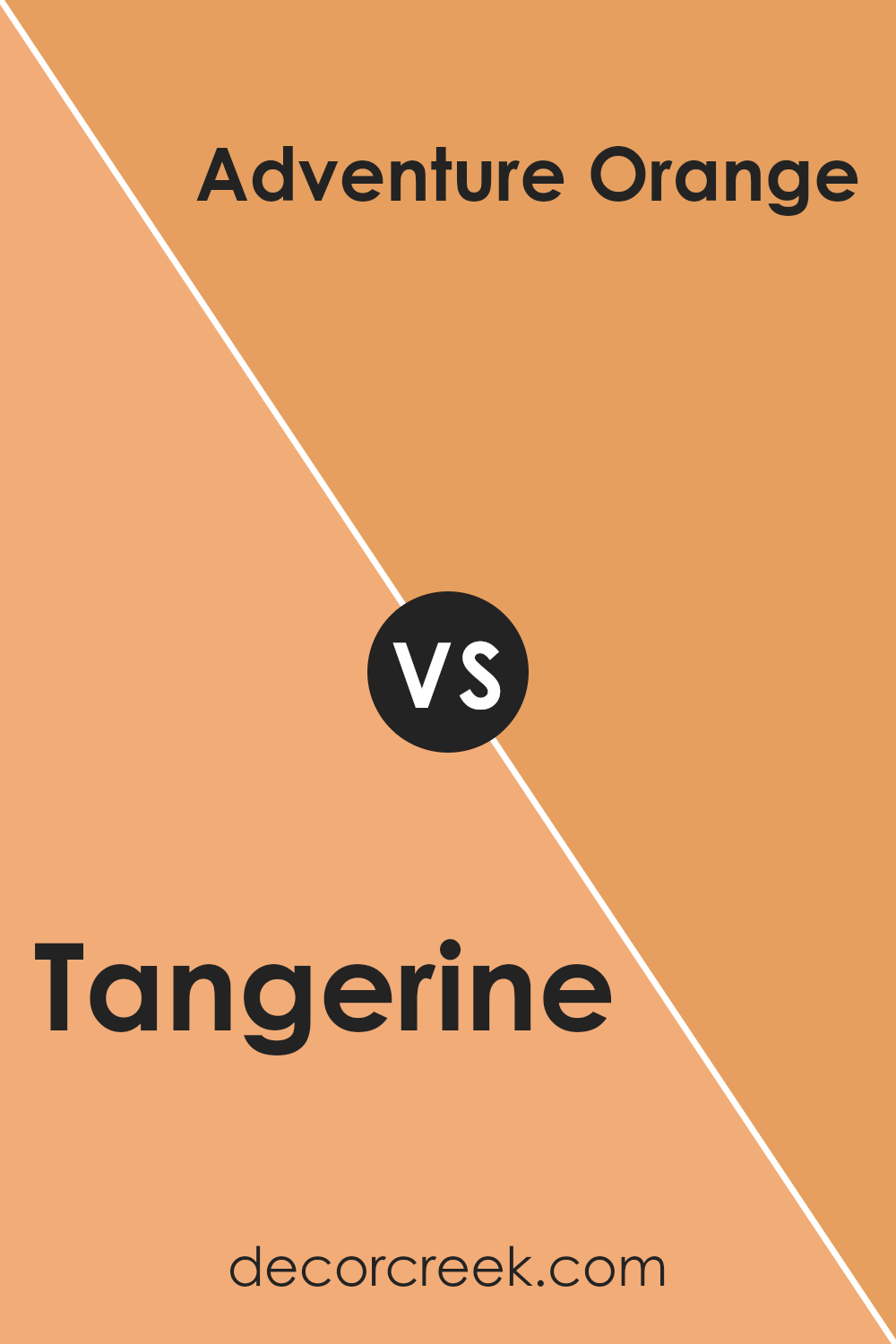
Tangerine SW 6640 by Sherwin Williams is a vibrant, energetic orange that carries a bright and playful vibe. It is lively, making it a great choice for spaces where you want to inject a sense of joy and vivacity.
On the other hand, Adventure Orange SW 6655 is a more muted orange. It leans slightly towards a burnt orange, giving it a more subdued and cozy feel compared to Tangerine. This makes Adventure Orange a better option for areas where you prefer a warm, welcoming atmosphere without the bold intensity of Tangerine.
Both colors bring warmth to any space, but Tangerine is punchier, while Adventure Orange offers a more relaxed warmth.
You can see recommended paint color below:
- SW 6655 Adventure Orange (CHECK A SAMPLE)
Tangerine SW 6640 by Sherwin Williams vs Melon Meloso SW 9007 by Sherwin Williams
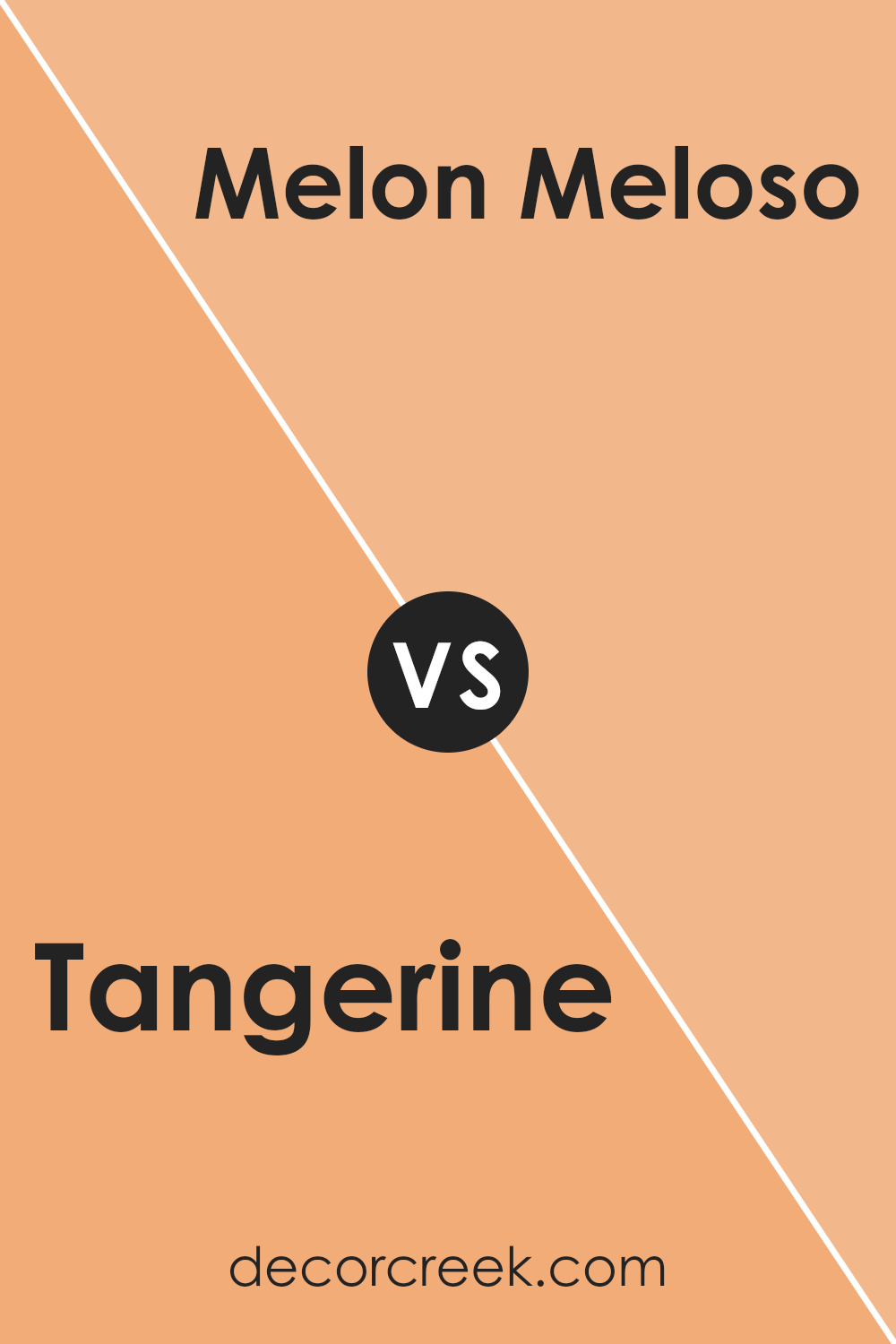
Tangerine SW 6640 by Sherwin Williams is a vibrant, deep orange color that brings a lot of energy to a space. It has the boldness typical of a true orange, making it a great choice if you want to add a lively burst of color to your decor. This shade is particularly good for areas where you want to evoke feelings of excitement or enthusiasm.
On the other hand, Melon Meloso SW 9007 by Sherwin Williams is a softer, creamsicle-like color. It’s much lighter than Tangerine, offering a gentler and warmer touch to interiors. This color leans towards a soothing, sweet orange, making it ideal for creating a cozy and inviting atmosphere.
It’s perfect for places in the home where you want to relax.
Both colors are great options for adding warmth to a space but serve different moods and effects. The choice between them would depend on whether you prefer a bold statement or a subtle touch.
You can see recommended paint color below:
- SW 9007 Melon Meloso (CHECK A SAMPLE)
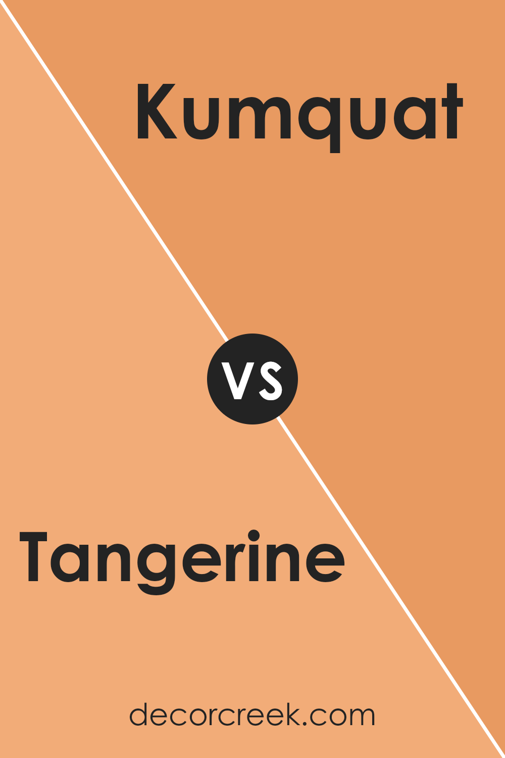
Tangerine SW 6640 by Sherwin Williams vs Kumquat SW 6648 by Sherwin Williams
Tangerine SW 6640 and Kumquat SW 6648, both by Sherwin Williams, offer unique takes on vibrant, warm hues. Tangerine is a vivid, bold orange that brings a cheery and energetic vibe to any space, great for making a lively statement in a room.
It’s the kind of color that can instantly brighten up an area and add a dash of youthful vibrancy.
On the other hand, Kumquat is slightly deeper and richer, resembling the actual fruit’s distinctive color. This shade leans a bit more towards a reddish-orange, making it an excellent choice for those who prefer something striking yet not too bright. It offers warmth and coziness, ideal for creating a welcoming atmosphere.
Both colors are dynamic and can add a lot of personality to a space. While Tangerine is more about zest and liveliness, Kumquat provides a more grounded, warm feel, perfect for spaces where you want comfort mixed with a touch of energy.
You can see recommended paint color below:
- SW 6648 Kumquat
Tangerine SW 6640 by Sherwin Williams vs Harvest Gold SW 2858 by Sherwin Williams
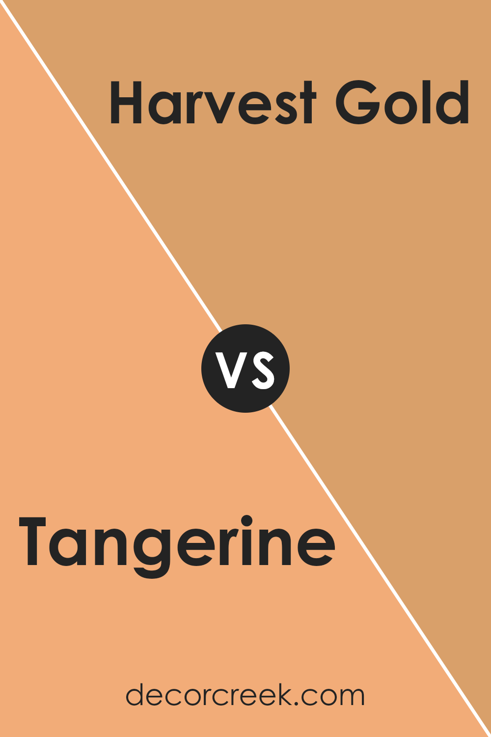
The main color, Tangerine, is a vibrant and lively orange. It has a youthful energy and a boldness that can really make a space pop. This color is perfect for livening up any room or being an accent to draw the eye.
In contrast, Harvest Gold is a warm, muted yellow. It’s less intense and provides a soft, cozy feeling, ideal for creating a more relaxed and welcoming environment. While Tangerine is bright and attention-grabbing, Harvest Gold is more understated and comforting.
Both colors work well for different purposes; Tangerine to energize and excite, and Harvest Gold for comfort and warmth. They could also complement each other in a space that aims for a balance between stimulation and relaxation.
You can see recommended paint color below:
- SW 2858 Harvest Gold
Tangerine SW 6640 by Sherwin Williams vs Sun Bleached Ochre SW 9011 by Sherwin Williams
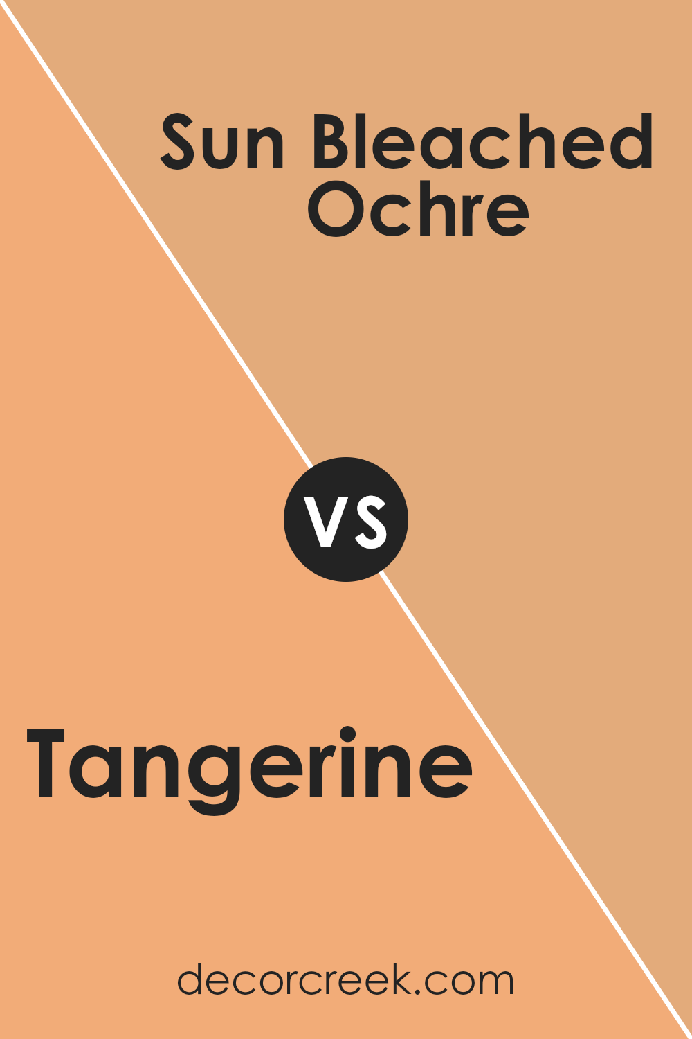
The main color, Tangerine, is a vibrant, energetic orange that really stands out. It has a lively feel to it that can add a fun and cheerful touch to any room. This shade is perfect if you want to make a bold statement or add some brightness to your space.
On the other hand, Sun Bleached Ochre has a much softer and muted tone. It’s a warm yellow with a subtle hint of brown, making it feel calm and cozy. This color is great for creating a comfortable and inviting atmosphere in a room.
Both colors bring warmth to a space, but Tangerine does it with a punch of energy, while Sun Bleached Ochre does it in a more gentle and understated way. Depending on the mood you want to set in your room, either of these colors could be a great choice.
You can see recommended paint color below:
- SW 9011 Sun Bleached Ochre (CHECK A SAMPLE)
Tangerine SW 6640 by Sherwin Williams vs Viva Gold SW 6367 by Sherwin Williams
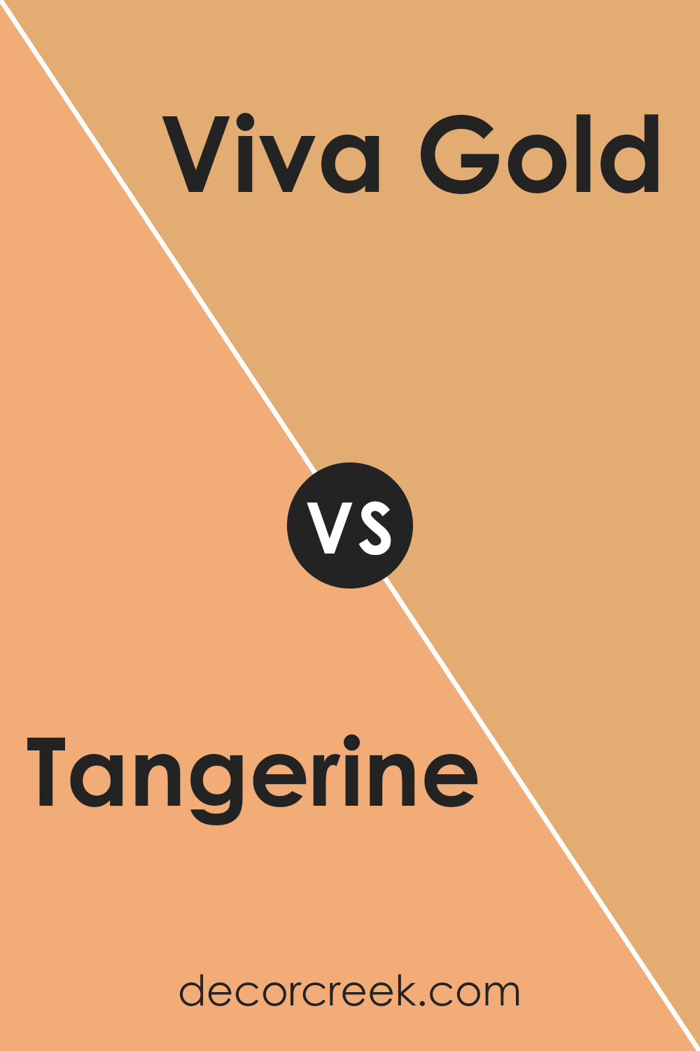
The main color Tangerine is a vibrant orange, full of energy and pop. It’s a color that stands out and brings a youthful, fun vibe wherever it’s used, perfect for spaces that need a cheerful touch. It seems to convey excitement and can liven up any room with its bold presence.
On the other hand, Viva Gold is a muted yellow-orange shade that offers a more tempered look compared to the fiery Tangerine. It suggests warmth and coziness, making it ideal for creating a welcoming atmosphere. Viva Gold is subtle enough to be versatile yet still adds a nice splash of color.
Overall, while both colors belong to the orange family, Tangerine is louder and more outgoing, and Viva Gold is softer and more understated. Their impact in a space will differ significantly with Tangerine injecting a burst of energy and Viva Gold providing a soothing warmth.
You can see recommended paint color below:
- SW 6367 Viva Gold (CHECK A SAMPLE)
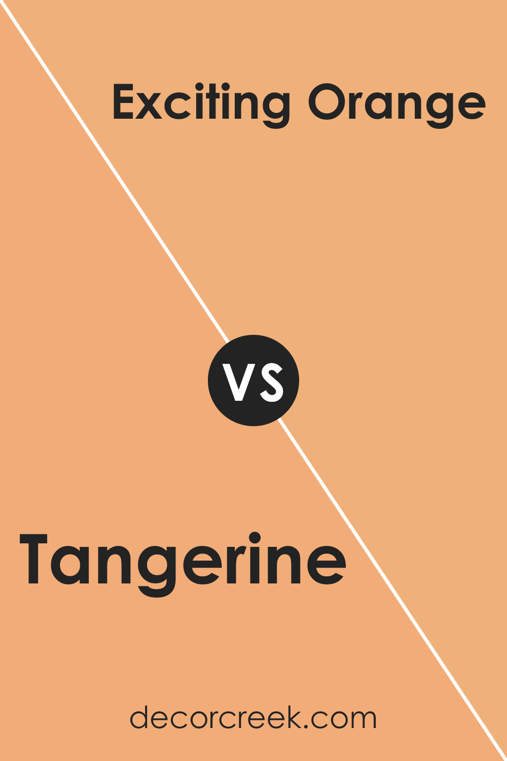
Tangerine SW 6640 by Sherwin Williams vs Exciting Orange SW 6647 by Sherwin Williams
Tangerine SW 6640 and Exciting Orange SW 6647 by Sherwin Williams are both vibrant, warm hues that instantly add energy to a space. Tangerine is a true orange color that is bright and cheerful. It has a sunny vibe that makes it perfect for a kitchen or playroom where you want a happy, inviting atmosphere.
On the other hand, Exciting Orange is a slightly deeper shade. It leans towards a red-orange, giving it a bit more depth than Tangerine. This makes it a great choice for areas where you want to make a bold statement, like an accent wall in a living room or dining room.
Both colors are lively and can perk up a space, but the choice between them depends on how much impact you want the color to have. Tangerine is lighter and more straightforward, while Exciting Orange offers a bit more drama with its richer, deeper tone.
You can see recommended paint color below:
- SW 6647 Exciting Orange
Tangerine SW 6640 by Sherwin Williams vs Windswept Canyon SW 9010 by Sherwin Williams
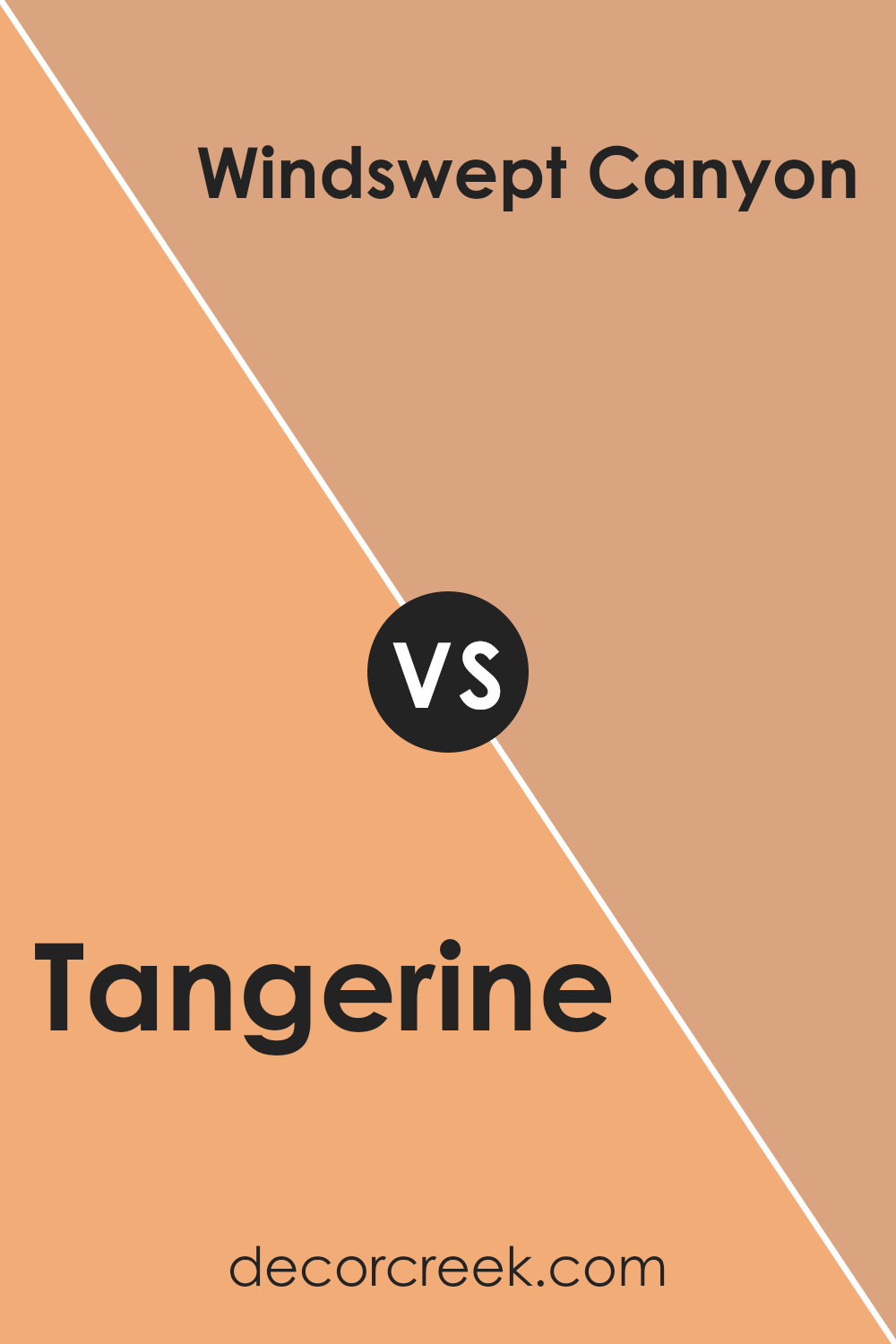
The main color, Tangerine, is a vibrant, energetic orange that really stands out. It’s a bold color that brings a lot of life and warmth to any space. If you’re looking to create a cheerful, inviting atmosphere, Tangerine is a great choice. It works well in areas like kitchens and living rooms where you want to add a splash of brightness.
On the other hand, Windswept Canyon is a much more subdued and earthy tone. This color is a soft beige with hints of gray, making it very neutral and easy to match with other colors. It gives a calm, cozy feel to a room and is perfect for spaces where you want a more relaxed and quiet mood, like bedrooms or offices.
Both Tangerine and Windswept Canyon have their unique appeal, depending on what kind of vibe you want for your space. Tangerine is more for areas where you want energy and vibrancy, while Windswept Canyon is better for creating a peaceful, subtle backdrop.
You can see recommended paint color below:
- SW 9010 Windswept Canyon (CHECK A SAMPLE)
Tangerine SW 6640 by Sherwin Williams vs Inventive Orange SW 6633 by Sherwin Williams
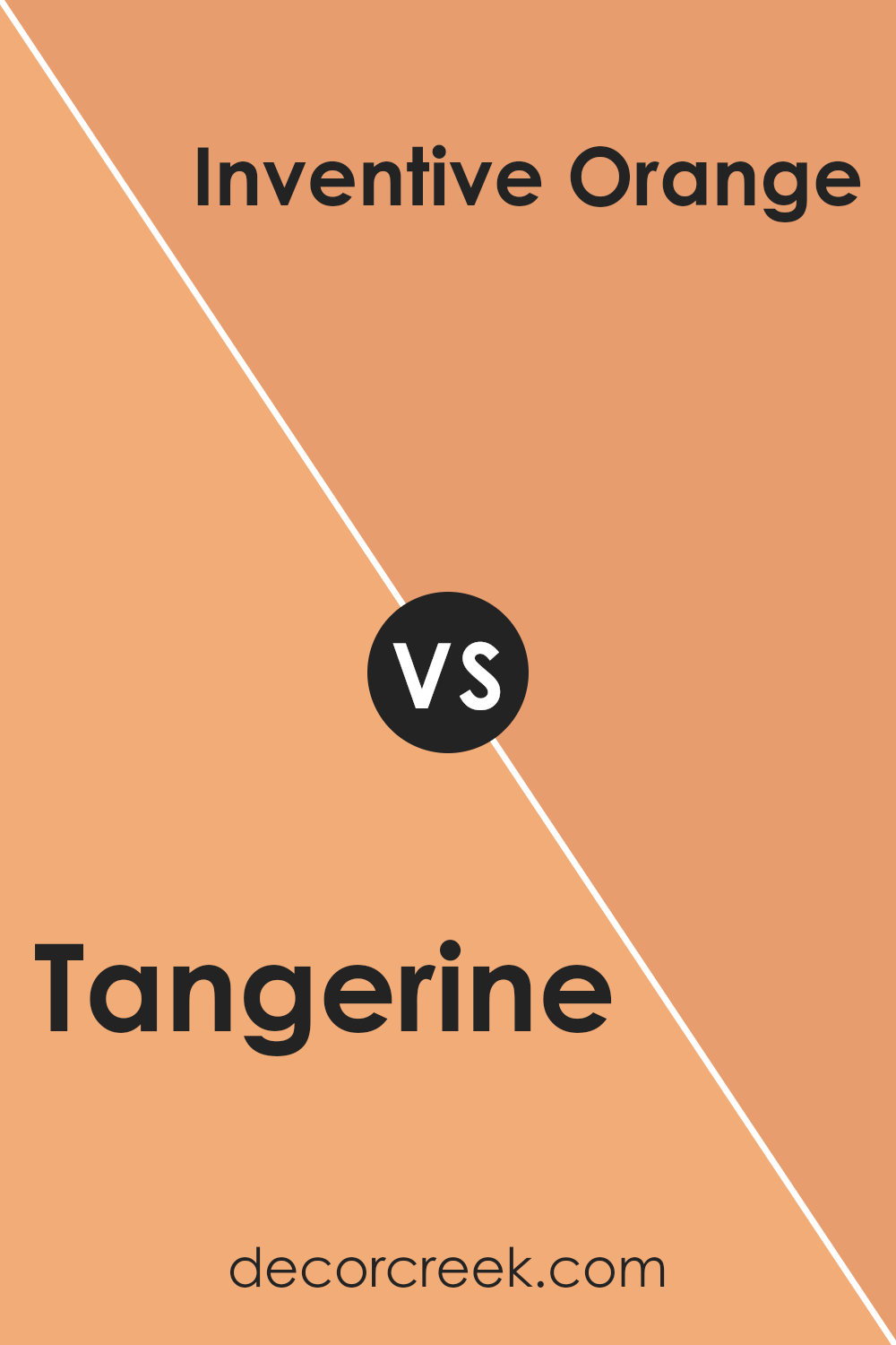
The main color, Tangerine, is a vibrant and bright shade of orange that brings a burst of cheerfulness to any space. It has a lively, energetic vibe that can instantly brighten up a room.
On the other hand, Inventive Orange is slightly softer and less intense than Tangerine. It has a warm, inviting quality, making it perfect for creating a cozy atmosphere.
While Tangerine is bold and can be the focal point in a design, Inventive Orange is more subdued, serving well as a complementary color that enhances other hues without overpowering them.
Both colors warm up a space, but Tangerine does it with a bit more punch, whereas Inventive Orange does it with a gentle touch. These colors are great choices for anyone looking to add warmth and energy to their decor.
You can see recommended paint color below:
- SW 6633 Inventive Orange (CHECK A SAMPLE)
Tangerine SW 6640 by Sherwin Williams vs Surprise Amber SW 6654 by Sherwin Williams
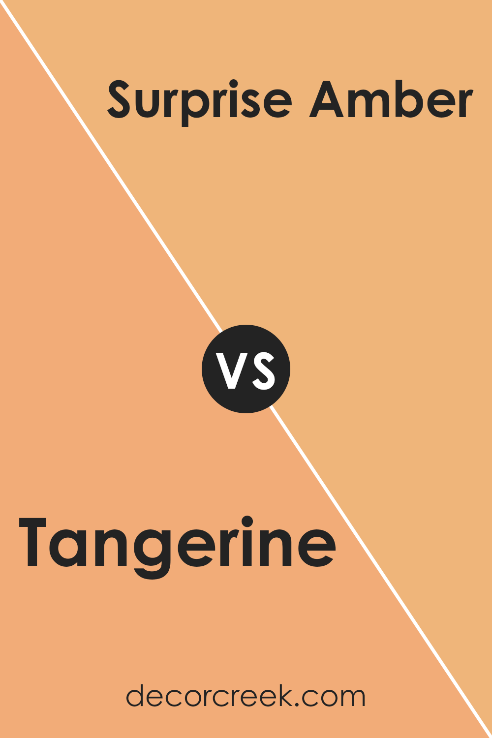
Tangerine and Surprise Amber are both warm, inviting colors that belong to Sherwin Williams’ vibrant palette. Tangerine is a bold, bright orange that carries a lot of energy and zest. It’s perfect if you want to create a lively and cheerful atmosphere in a space.
On the other hand, Surprise Amber is a softer, more muted shade. It lies somewhere between orange and a light brown, offering a subtler warmth compared to Tangerine. This color works well in areas where you want a cozy yet not too overpowering ambiance.
While Tangerine is more likely to be the center of attention, Surprise Amber serves as a gentle background hue that complements spaces with its understated charm. These colors could work wonderfully together in a room, with Tangerine as an accent and Surprise Amber as a soothing base.
You can see recommended paint color below:
- SW 6654 Surprise Amber (CHECK A SAMPLE)
Conclusion
In conclusion, SW 6640 Tangerine by Sherwin Williams is a bright and cheerful orange paint that can add a splash of energy to any room. This color is perfect for those who want to make their space lively and fun.
It works really well in places like playrooms, kitchens, or any area where you want to feel happy and excited.
The color Tangerine is bold and can make a big statement, so it’s good to think about how much of it you want to use. You might want to paint just one wall with Tangerine and choose softer colors for other walls to balance things out.
Also, it matches nicely with lots of other colors. White or light gray can calm it down a bit, while blues or greens can make your room look really cool and colorful.
In addition, this color can make small spaces seem brighter and bigger, so it’s a great choice if you’re trying to make a small room feel more open. Just remember, Tangerine is a strong color, so a little can go a long way.
It’s a fun and happy color that can make anyone smile when they walk into the room. So if you like bright colors and want to add some energy to your home, SW 6640 Tangerine could be the perfect choice for you.
Ever wished paint sampling was as easy as sticking a sticker? Guess what? Now it is! Discover Samplize's unique Peel & Stick samples.
Get paint samples


