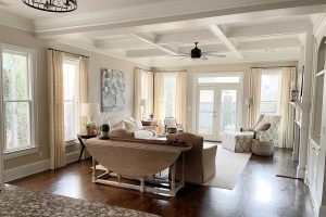
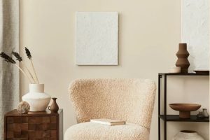
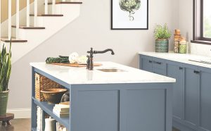
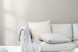
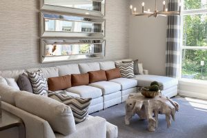
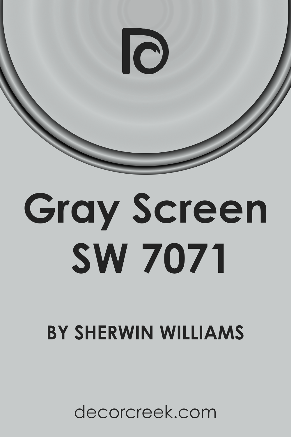
If you’re in the market for a paint color that brings a fresh, modern feel to any space, make sure to consider SW 7071 Gray Screen by Sherwin-Williams. This particular shade of gray is light and airy, making it a perfect choice for anyone looking to update their room with a sleek and subtle backdrop.
Unlike some grays that lean toward blue or green, Gray Screen offers a balanced, neutral palette that works beautifully in a variety of settings, whether it’s a cozy bedroom, a busy kitchen, or a tranquil bathroom.
What sets Gray Screen apart is its versatility. It can complement a wide range of decor styles, from contemporary to rustic. Furthermore, its light reflection quality can help make small spaces appear larger and more inviting.
This shade pairs well with both bright colors and muted tones, allowing you to create a space that reflects your personal style.
Whether you’re aiming to achieve a calm and collected ambiance or looking to set a more dramatic mood with bold accents, Gray Screen provides a reliable foundation that can transform your home into a place of comfort and style.
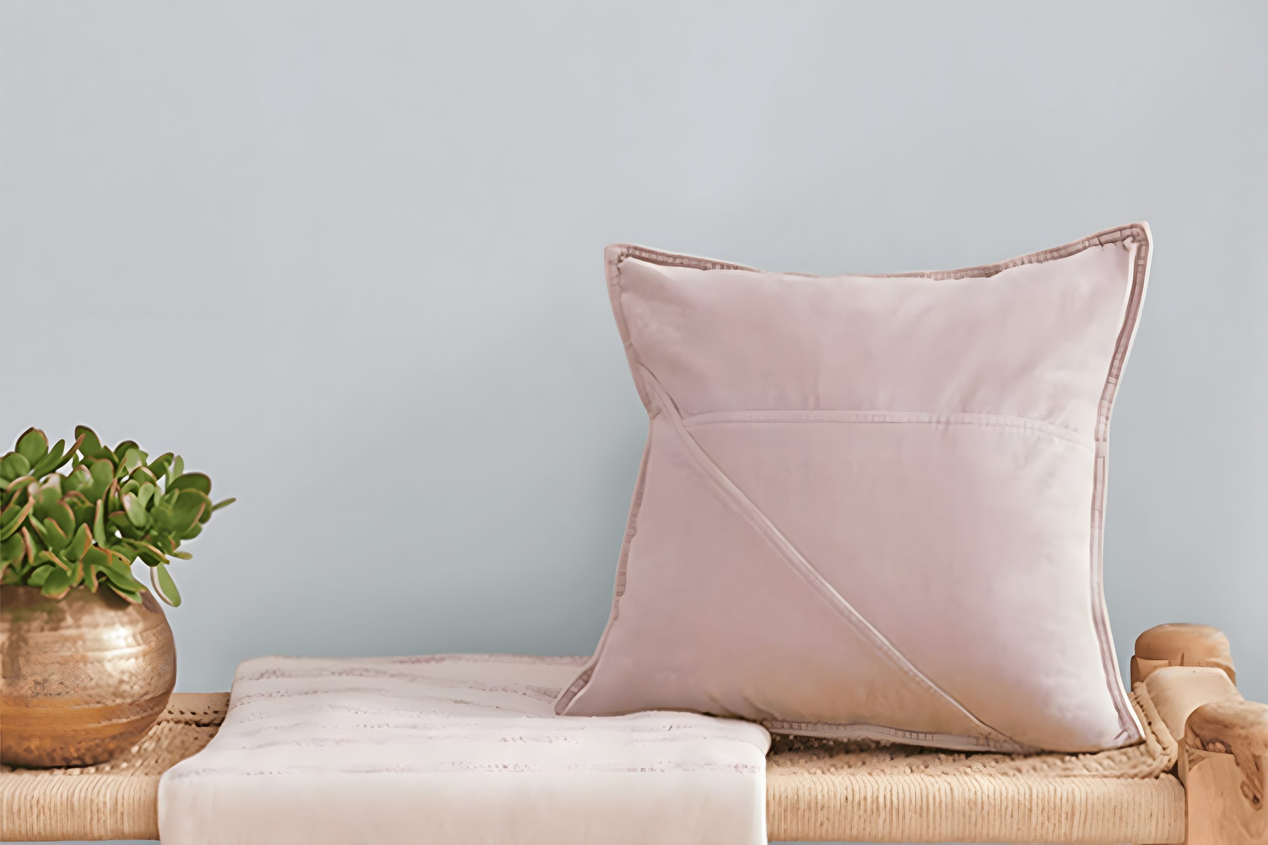
What Color Is Gray Screen SW 7071 by Sherwin Williams?
Gray Screen SW 7071 by Sherwin Williams is a unique shade of gray that brings a soft, airy feel to any space. This color stands out because it has a balance of cool undertones, making it versatile and easy to integrate into various interior designs.
It’s not just any gray; it’s a refreshing and light hue that can make small rooms feel larger and give a sense of calm in busier areas.
This particular gray works exceptionally well in modern and minimalist interior styles, as its subtlety complements sleek lines and simple forms. It’s also a great choice for Scandinavian themes, where light colors and natural light play a pivotal role.
Gray Screen pairs wonderfully with a range of materials and textures, enhancing its versatility. It goes hand in hand with natural wood, adding warmth to spaces, and contrasts beautifully with metallic finishes like brass or chrome, adding a touch of elegance.
With soft textiles, such as linen or wool, it creates a cozy atmosphere that invites relaxation.
Incorporating Gray Screen into your home can achieve a harmonious balance, blending seamlessly with various elements to create a space that feels both inviting and stylish. Whether it’s used as a primary color for walls or as an accent, it provides a perfect backdrop for letting your decor stand out.
Ever wished paint sampling was as easy as sticking a sticker? Guess what? Now it is! Discover Samplize's unique Peel & Stick samples.
Get paint samples
Is Gray Screen SW 7071 by Sherwin Williams Warm or Cool color?
Gray Screen by Sherwin Williams is a soft, subtle color that has a unique way of transforming home spaces. It’s a blend that sits perfectly between gray and blue, giving it a cool, soothing vibe. This particular shade is fantastic for anyone looking to create a calm and serene environment in their home.
It works exceptionally well in rooms with plenty of natural light, where it can show its true colors, shifting subtly between its gray and blue undertones as the day goes on.
Because of its versatility, it can be paired with a wide range of decor styles and colors, from bright and bold to soft and neutral. This makes it an ideal choice for living rooms, bedrooms, and even home offices, creating a backdrop that’s both inviting and stylish.
In spaces with less light, it brings depth and sophistication, proving it’s more than just a basic gray. Whether used on all walls for a cohesive look or on a feature wall to add interest, Gray Screen adds just the right amount of color to make a room feel designed and complete.
Undertones of Gray Screen SW 7071 by Sherwin Williams
Gray Screen, referred to by its code SW 7071 from Sherwin Williams, is a flexible and popular paint choice for interior walls. This color is known for its calming and subtle character, which stems from its unique undertones.
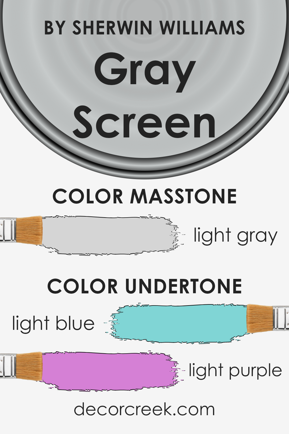
Specifically, it carries light blue and light purple undertones, which add depth and dimension to the base gray.
Undertones are essentially subtle colors that lie beneath the primary color of the paint. They can significantly influence how we perceive the main color, especially under different lighting conditions.
For example, in a room with ample natural light, the light blue undertones can make the walls appear more airy and refreshing, contributing to a serene and open atmosphere. In contrast, artificial lighting might highlight the light purple undertones, adding a warm and cozy feeling to the space.
The undertones in Gray Screen play a crucial role in its versatility and appeal. Depending on the room’s orientation, the time of day, and the lighting conditions, this color can shift from a cool, soothing gray to having a subtle hint of warmth.
This chameleon-like quality makes it an exceptional choice for various spaces, from bedrooms and bathrooms to living areas. It harmonizes well with a wide range of décor, providing a sophisticated backdrop that enhances both modern and traditional designs.
What is the Masstone of the Gray Screen SW 7071 by Sherwin Williams?
Gray Screen SW 7071 by Sherwin Williams has a masstone of light gray, which is a very soft and subtle color. This particular shade is excellent for creating a serene and calming atmosphere in any home.
Its light gray tone, similar to #D5D5D5, works well in spaces that get a lot of sunlight, as it reflects light beautifully, making rooms feel more spacious and airy. The versatility of this color means it matches well with a wide range of decor styles and colors, from bold and bright hues to softer, more muted tones.
Whether you’re painting a bedroom, living room, or even a home office, this gentle gray can help in establishing a peaceful and inviting space.
It’s particularly effective for those looking to achieve a modern and minimalist look, as it provides a clean and neutral background that allows other elements of the room to stand out.
How Does Lighting Affect Gray Screen SW 7071 by Sherwin Williams?
Lighting plays a crucial role in how we perceive colors in our surroundings. The color Gray Screen SW 7071 by Sherwin Williams is no exception. Depending on the type of light—whether artificial or natural—the appearance of this color can significantly change.
In artificial light, such as LED or incandescent bulbs, the color Gray Screen can look different based on the temperature of the bulb. Cooler bulbs might make it appear more bluish, enhancing its cooler tones, whereas warmer bulbs could bring out slight warmth, softening its appearance.
This means the same color can shift from feeling slightly cooler to a bit cozier with just a change in light source.
Natural light, on the other hand, changes the perception of this color throughout the day. Morning light, which is generally softer and warmer, can make Gray Screen look more inviting and less stark.
By midday, with the sun at its peak, the color may appear brighter and more true to its base tone, due to the greater intensity of natural light. As the sun sets, the color might take on a softer, almost ethereal quality, thanks to the dimming natural light.
The direction of the room also greatly influences how Gray Screen is perceived:
- North-faced rooms receive less direct sunlight, which can make this color appear cooler and slightly more shadowed, emphasizing its gray aspects.
- South-faced rooms bathe in abundant sunlight, making the color warmer and more vibrant, often softening the gray to reveal any hidden undertones.
- East-faced rooms enjoy the morning light, making Gray Screen look softer and lighter in the mornings but cooler in the afternoons as the direct sunlight moves away.
- West-faced rooms capture the evening light, which can make this color appear warmer and more welcoming in the afternoons and evenings.
Overall, the perception of Gray Screen SW 7071 by Sherwin Williams significantly changes under different lighting conditions and room orientations, demonstrating the dynamic nature of color under various lighting.
What is the LRV of Gray Screen SW 7071 by Sherwin Williams?
LRV stands for Light Reflectance Value, a measure that tells us how much light a color will reflect or absorb once applied to a surface. Think of it like this: on a scale from 0 to 100, where 0 is a pitch-black room and 100 is a bright, sunny day, the LRV number helps you understand how light or dark a color will look in your space.
This measure is super helpful when choosing paint colors for your home, as it gives a good indication of how bright or dim a room will feel once the walls are painted.
Colors with higher LRVs will make a room feel more open and airy because they reflect more light, whereas colors with lower LRVs will create a cozier or more enclosed feel because they absorb more light.
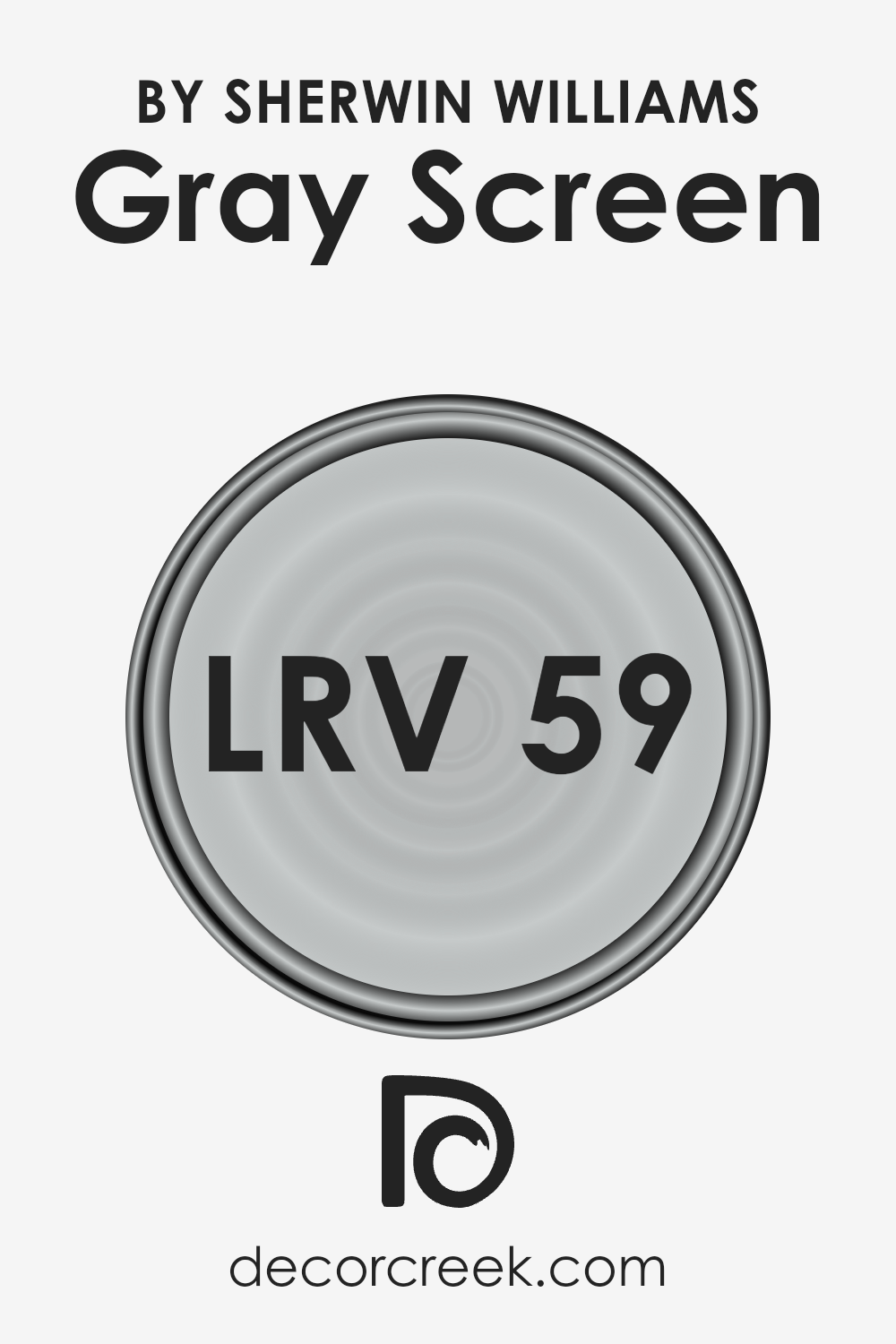
The Gray Screen, with an LRV of 58.547, sits in the middle of the scale, meaning it’s a medium-light color. This LRV value suggests that while it will reflect a fair amount of light, it won’t brighten a room as much as a color with a higher LRV might.
This makes it a versatile choice for many spaces, as it can add depth and interest without overwhelming a room with brightness. In spaces with plenty of natural light, this color will appear lighter and more vibrant, enhancing the sense of space.
In rooms with less natural light, it will take on a richer, more saturated look, contributing to a more intimate and cozy atmosphere. Therefore, understanding the LRV of Gray Screen helps in predicting how it will influence the overall mood and feel of the space it occupies.
LRV – what does it mean? Read This Before Finding Your Perfect Paint Color
Coordinating Colors of Gray Screen SW 7071 by Sherwin Williams
Coordinating colors are a palette of hues that work harmoniously with a primary color to enhance the aesthetics of a space. When chosen thoughtfully, these coordinating shades ensure that the environment feels balanced and visually appealing.
This concept of color coordination is particularly useful when decorating interiors, designing visuals, or setting up any visual space. For example, when working with a sophisticated neutral like Gray Screen by Sherwin Williams, selecting the right coordinating colors is key to achieving a cohesive look.
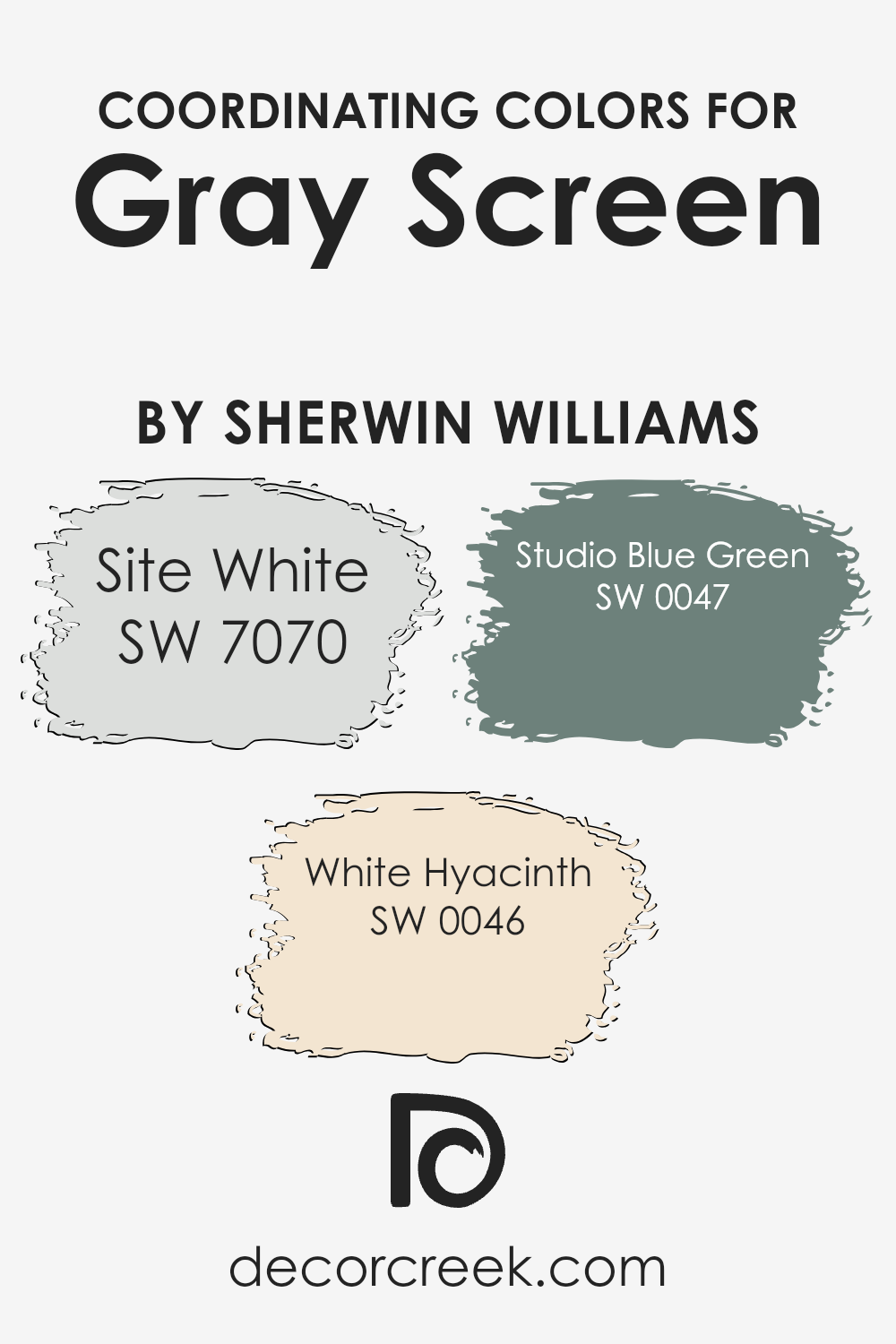
As coordinating colors for Gray Screen, Site White, White Hyacinth, and Studio Blue Green are excellent choices. Site White is a soft, airy white with a subtle warmth to it, making it perfect for creating a sense of openness and light in a room.
It’s an ideal match for Gray Screen, offering a clean backdrop that allows other elements of the design to stand out. White Hyacinth, on the other hand, adds a touch of delicate brightness. This color has a fresh, crisp feel to it, enhancing spaces with a rejuvenating vibe.
Lastly, Studio Blue Green brings a serene and slightly moody atmosphere. This unique hue combines the calming qualities of blue with the rejuvenating aspects of green, creating a depth that complements the cool tones of Gray Screen beautifully.
Together, these colors form a versatile palette that can transform any space into an elegant and harmonious environment.
You can see recommended paint colors below:
- SW 7070 Site White (CHECK A SAMPLE)
- SW 0046 White Hyacinth (CHECK A SAMPLE)
- SW 0047 Studio Blue Green (CHECK A SAMPLE)
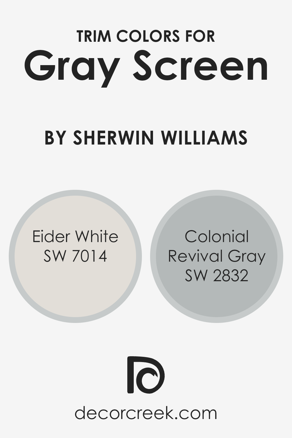
What are the Trim colors of Gray Screen SW 7071 by Sherwin Williams?
Trim colors are essentially accent colors applied to molding, door frames, window frames, and other architectural features to enhance the overall aesthetics of a room or an exterior. When used thoughtfully, trim colors can create a striking contrast, highlight architectural details, or subtly blend with the main color to produce a harmonious look.
For a versatile and contemporary shade like Gray Screen by Sherwin Williams, choosing the right trim colors is crucial in achieving the desired ambiance and style. It can elevate the space, making the walls appear more refined, and bring a sense of completion to the decor.
Eider White SW 7014 is a soft, whitish-grey that can serve as a subtle trim color next to Gray Screen, providing a light but warm contrast that maintains a minimalist and cohesive look. It’s particularly effective in spaces where you want to maintain a bright and airy feel without creating too stark of a contrast.
On the other hand, Colonial Revival Gray SW 2832 offers a deeper, more pronounced contrast as a trim color. This medium tone, with its balanced gray hue, outlines and defines architectural elements beautifully against Gray Screen, adding depth and character to the space.
Using Eider White or Colonial Revival Gray as trim colors alongside Gray Screen can significantly impact the space’s visual appeal, enhancing its sophistication and style.
You can see recommended paint colors below:
- SW 7014 Eider White (CHECK A SAMPLE)
- SW 2832 Colonial Revival Gray
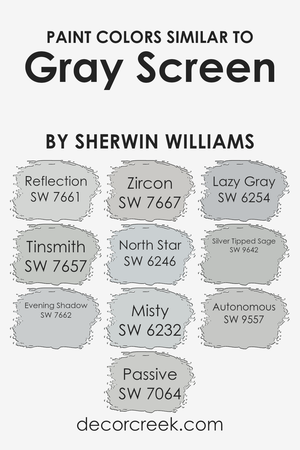
Colors Similar to Gray Screen SW 7071 by Sherwin Williams
Selecting similar colors is essential in creating a cohesive look in any space. When colors harmonize well, like the variations inspired by Gray Screen from Sherwin Williams, they bring a sense of balance and unity to the decor.
Using colors with subtle differences allows for depth and complexity without overwhelming the senses. For instance, incorporating shades like Reflection, a calm and clear gray, ensures the space maintains a serene and open feel.
Tinsmith, another gentle gray, provides a touch of warmth, perfect for those seeking a cozy yet sophisticated atmosphere. Evening Shadow, a slightly deeper tone, offers a hint of mystery and elegance, making it ideal for accent walls or furniture pieces.
Moving through the spectrum, Passive adds a tranquil backdrop, mirroring the quietude of a misty morning. Zircon, with its muted neutrality, bridges the gap between cold and warm tones, making it incredibly versatile.
North Star, a light, airy gray, brings a refreshing and uplifting vibe, reminiscent of the early dawn sky. Misty, with its soft and ethereal quality, adds an element of spaciousness. Lazy Gray, slightly bolder, injects a dynamic contrast, while still keeping the space grounded.
Silver Tipped Sage introduces a subtle green undertone, offering a unique twist on the traditional gray palette. Lastly, Autonomous, a robust gray with hints of blue, anchors the space, providing depth and focus.
Together, these colors create a harmonious blend, proving that the power of similar hues lies in their ability to bring sophistication and dimension to any room.
You can see recommended paint colors below:
- SW 7661 Reflection (CHECK A SAMPLE)
- SW 7657 Tinsmith (CHECK A SAMPLE)
- SW 7662 Evening Shadow (CHECK A SAMPLE)
- SW 7064 Passive (CHECK A SAMPLE)
- SW 7667 Zircon (CHECK A SAMPLE)
- SW 6246 North Star (CHECK A SAMPLE)
- SW 6232 Misty (CHECK A SAMPLE)
- SW 6254 Lazy Gray (CHECK A SAMPLE)
- SW 9642 Silver Tipped Sage (CHECK A SAMPLE)
- SW 9557 Autonomous (CHECK A SAMPLE)
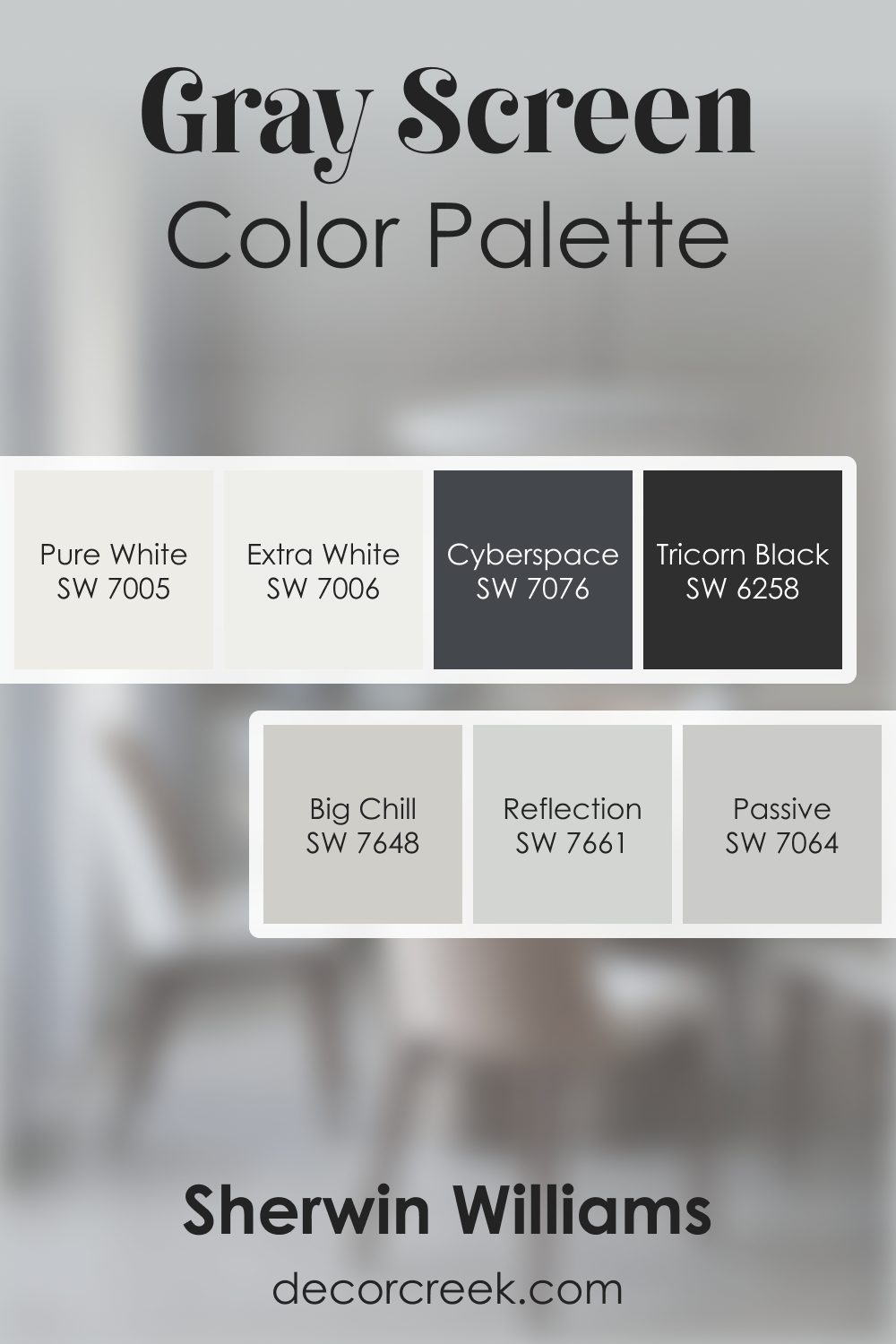
Gray Screen SW 7071 by Sherwin Williams Color Palette
Gray Screen offers a crisp, cool feeling that pairs beautifully with modern decor. Big Chill and Reflection bring soft blue-gray notes that add personality. Extra White and Pure White brighten the palette, keeping it fresh.
Passive provides a delicate, airy gray transition, while Tricorn Black and Cyberspace add bold accents.
This palette feels clean, modern, and quietly stylish.
How to Use Gray Screen SW 7071 by Sherwin Williams In Your Home?
Gray Screen SW 7071 by Sherwin Williams is a popular paint color that brings a unique vibe to any home. It lives up to its name by displaying a soft, soothing gray with just a hint of blue undertones.
This blend makes it incredibly versatile and an excellent choice for various spaces within a house. One can use it in a bedroom to create a calm and peaceful retreat, perfect for relaxing after a long day.
Its lightness adds a breathable, open feel to small rooms, making them appear larger and more inviting.
In a living space or den, Gray Screen can serve as a neutral backdrop, allowing your furniture and decor to stand out. It pairs beautifully with both warm and cool tones, enabling a wide range of styling options.
For a modern look, combine it with stark whites or deep blacks. Incorporating natural elements like wood, stone, and plants can introduce a refreshing contrast to the gentle gray, resulting in a cozy and balanced aesthetic.
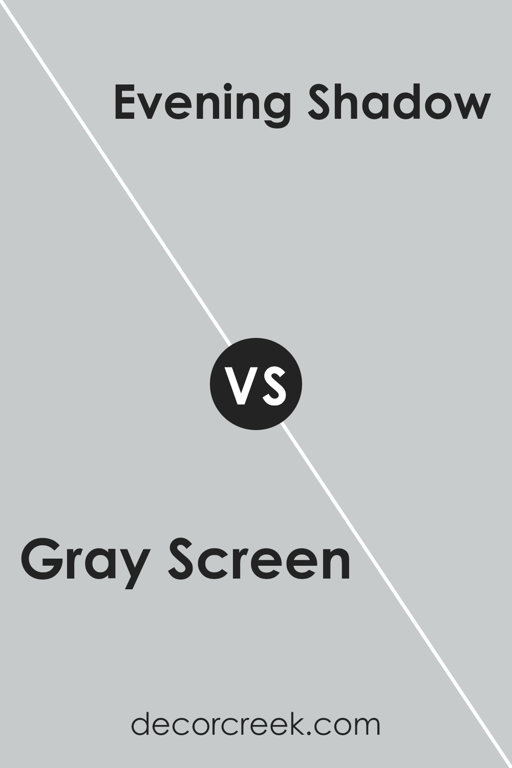
Gray Screen SW 7071 by Sherwin Williams vs Evening Shadow SW 7662 by Sherwin Williams
Gray Screen and Evening Shadow are two interesting shades offered by Sherwin Williams. Gray Screen is a light gray that strikes a balance between cool and warm tones, making it versatile for various spaces.
It’s like the color of a cloudy sky, providing a soft, soothing background that’s easy to pair with other colors.
Evening Shadow, on the other hand, leans towards a slightly cooler, more muted tone. It’s like the shade of the sky as evening begins to set in, offering a tranquil and serene vibe.
This color can bring a calm, understated elegance to a room, making it feel more spacious and open.
When comparing the two, Gray Screen is a bit warmer and lighter, making it a great choice for creating a cozy yet bright space. Evening Shadow, being cooler and a bit more reserved, is perfect for adding a touch of sophistication.
Both colors work well in modern and traditional settings, but your choice would depend on the mood you’re aiming to achieve in your space.
You can see recommended paint color below:
- SW 7662 Evening Shadow (CHECK A SAMPLE)
Gray Screen SW 7071 by Sherwin Williams vs Zircon SW 7667 by Sherwin Williams
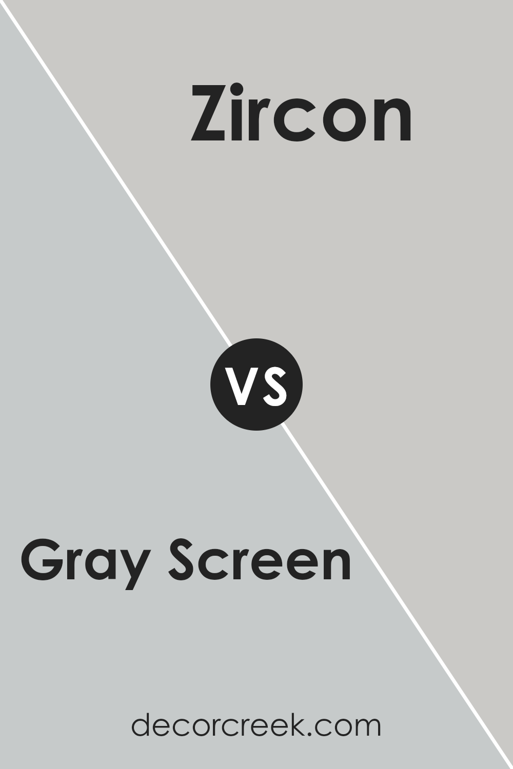
Gray Screen and Zircon are two elegant colors by Sherwin Williams that both offer a serene and sophisticated palette, though they have their subtle differences. Gray Screen is a cool, light gray that brings a soft, airy feel to any space.
It’s great for creating a soothing, open environment, making rooms feel more spacious and light-filled. On the other hand, Zircon is a slightly warmer gray with hints of blue, giving it a bit more depth compared to Gray Screen.
This color is excellent for adding a touch of coziness to a room without darkening it too much, making it perfect for spaces where you want a bit of warmth without sacrificing the light, neutral feel.
Both colors work beautifully in various settings, from modern to traditional, and can complement a wide range of decor styles. However, the choice between them depends on the atmosphere you want to create – cooler and more open with Gray Screen, or slightly warmer and inviting with Zircon.
You can see recommended paint color below:
- SW 7667 Zircon (CHECK A SAMPLE)
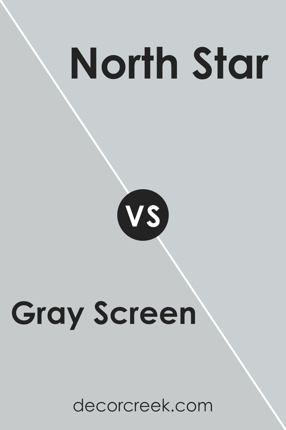
Gray Screen SW 7071 by Sherwin Williams vs North Star SW 6246 by Sherwin Williams
The main color, Gray Screen, and the second color, North Star, both from Sherwin Williams, offer distinct vibes for any space. Gray Screen is a light gray shade. Its subtle cool undertones bring a serene and peaceful energy to rooms, making it perfect for a calming effect.
It’s great for areas where you want to relax, like bedrooms or living rooms.
On the other hand, North Star is a bit different. While it’s also on the cooler side, this color leans more towards a soft, light blue-gray. It carries a refreshing feel, similar to a breezy, clear day. North Star can brighten up a space while maintaining a soothing atmosphere.
It’s a match for spaces that need a touch of cheer without overwhelming brightness.
When choosing between the two, consider the mood you’re aiming for. Gray Screen is more neutral, offering a clean, minimalist look. North Star, with its hint of blue, adds a gentle splash of color, ideal for creating a cozy, inviting space.
You can see recommended paint color below:
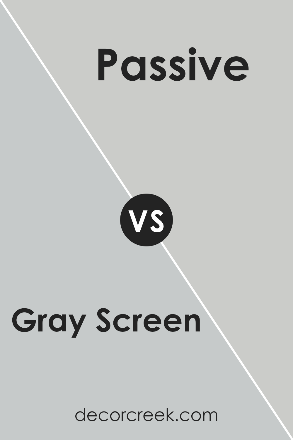
Gray Screen SW 7071 by Sherwin Williams vs Passive SW 7064 by Sherwin Williams
Gray Screen and Passive, both from Sherwin Williams, are two cool-toned grays that share a similar vibe but cater to different tastes and spaces. Gray Screen sits on the lighter side of the spectrum, offering a hint of blue that brings a soft, airy feel to any room.
It’s like a gentle morning sky, making it perfect for creating a serene and open atmosphere. On the other hand, Passive is a bit deeper, with a subtle gray base that leans towards a neutral, calming presence.
This color has the power to make spaces feel more grounded and composed without overwhelming them.
While both colors work beautifully in modern and traditional décor, Gray Screen tends to lighten up spaces with its subtle blue undertones, whereas Passive offers a more straightforward gray approach, giving a clean, timeless appeal.
Choosing between them depends on the desired mood and the specific characteristics of the space you’re looking to enhance.
You can see recommended paint color below:
- SW 7064 Passive (CHECK A SAMPLE)
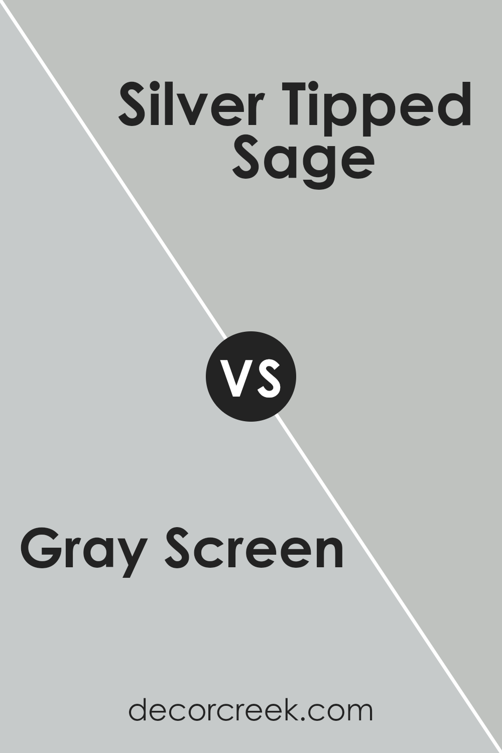
Gray Screen SW 7071 by Sherwin Williams vs Silver Tipped Sage SW 9642 by Sherwin Williams
Gray Screen and Silver Tipped Sage, both from Sherwin Williams, are distinct yet subtly connected colors. Gray Screen is a soft, cool gray with a subtle blue undertone that gives it a serene, calming vibe.
It’s versatile, making it suitable for any room looking for a touch of sophistication without overwhelming the space. On the other hand, Silver Tipped Sage introduces a slightly more complex character.
This color leans towards a muted green with gray influences, providing a hint of nature and freshness to the setting. While it’s equally elegant, Silver Tipped Sage brings a warmer, more organic feel compared to the cooler, more neutral Gray Screen.
Both colors offer unique perspectives on modern neutrality, with Gray Screen aligning with cooler, minimalistic designs and Silver Tipped Sage appealing to those seeking a soft, natural touch in their surroundings.
Together or alone, they provide a chic, updated look with understated elegance.
You can see recommended paint color below:
- SW 9642 Silver Tipped Sage (CHECK A SAMPLE)
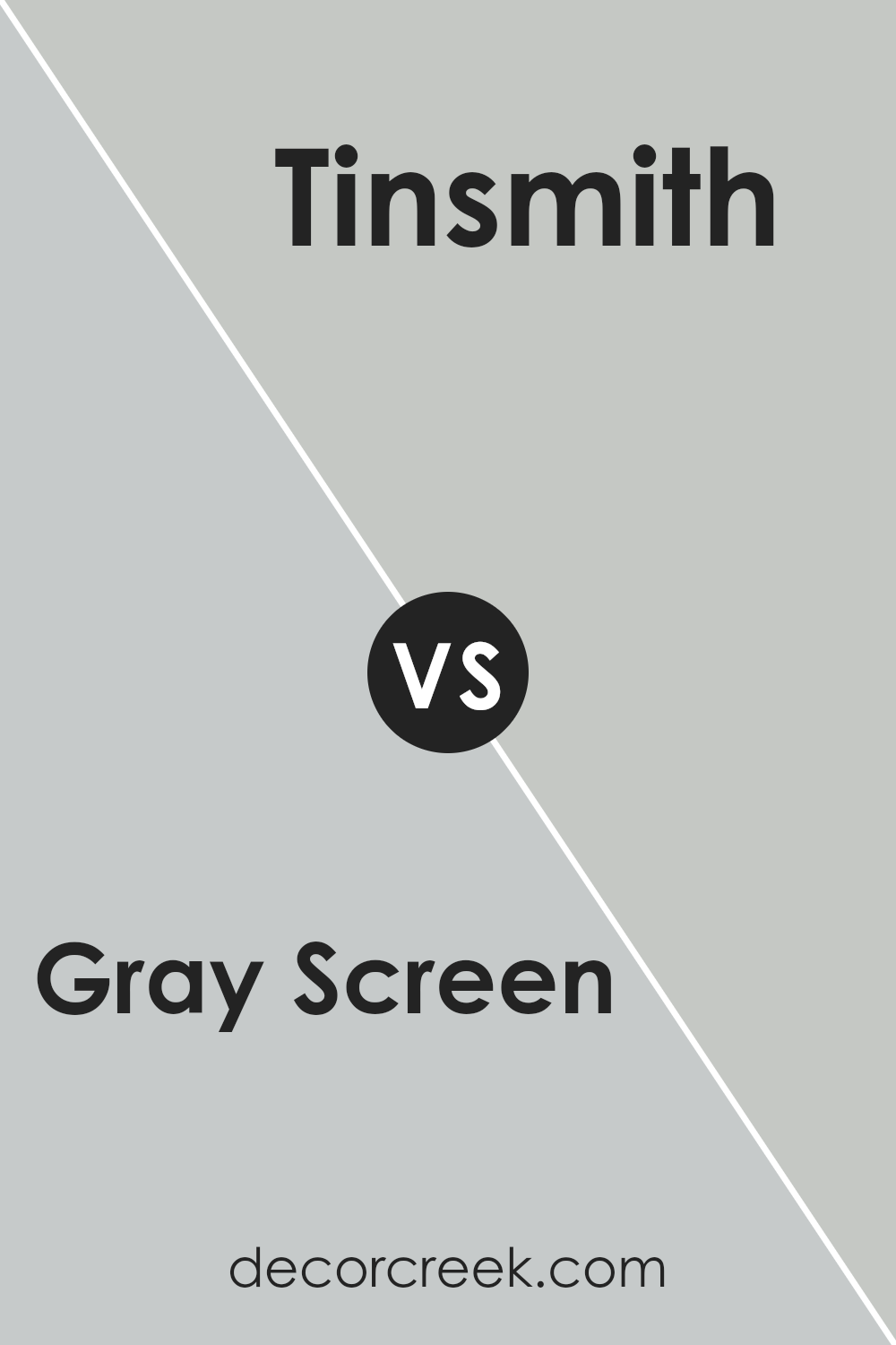
Gray Screen SW 7071 by Sherwin Williams vs Tinsmith SW 7657 by Sherwin Williams
Gray Screen and Tinsmith, both by Sherwin Williams, offer subtle yet distinct vibes for walls. Gray Screen leans towards a cool, soft gray with just a hint of blue, making it feel fresh and tranquil. Perfect for creating a serene space, it’s like a calm, cloudy day in your room.
On the other hand, Tinsmith steps a bit lighter, with a more muted gray that brings an airy brightness. It’s like the gentle light of dawn, offering a sense of clarity and openness without overwhelming the senses.
This color works wonders in spaces where you want to add a touch of coziness while keeping the mood uplifted and light.
Both colors share a minimalist charm, yet their individual undertones set them apart. Gray Screen’s cooler, subtle blue base adds depth and a touch of sophistication. Tinsmith, with its softer approach, brings in more light, offering a more spacious feel.
Ideal for different moods and settings, these grays can transform any room depending on the ambiance you’re aiming for. Whether you’re going for a peaceful retreat or a bright, welcoming nook, these shades have got you covered.
You can see recommended paint color below:
- SW 7657 Tinsmith (CHECK A SAMPLE)
Gray Screen SW 7071 by Sherwin Williams vs Reflection SW 7661 by Sherwin Williams
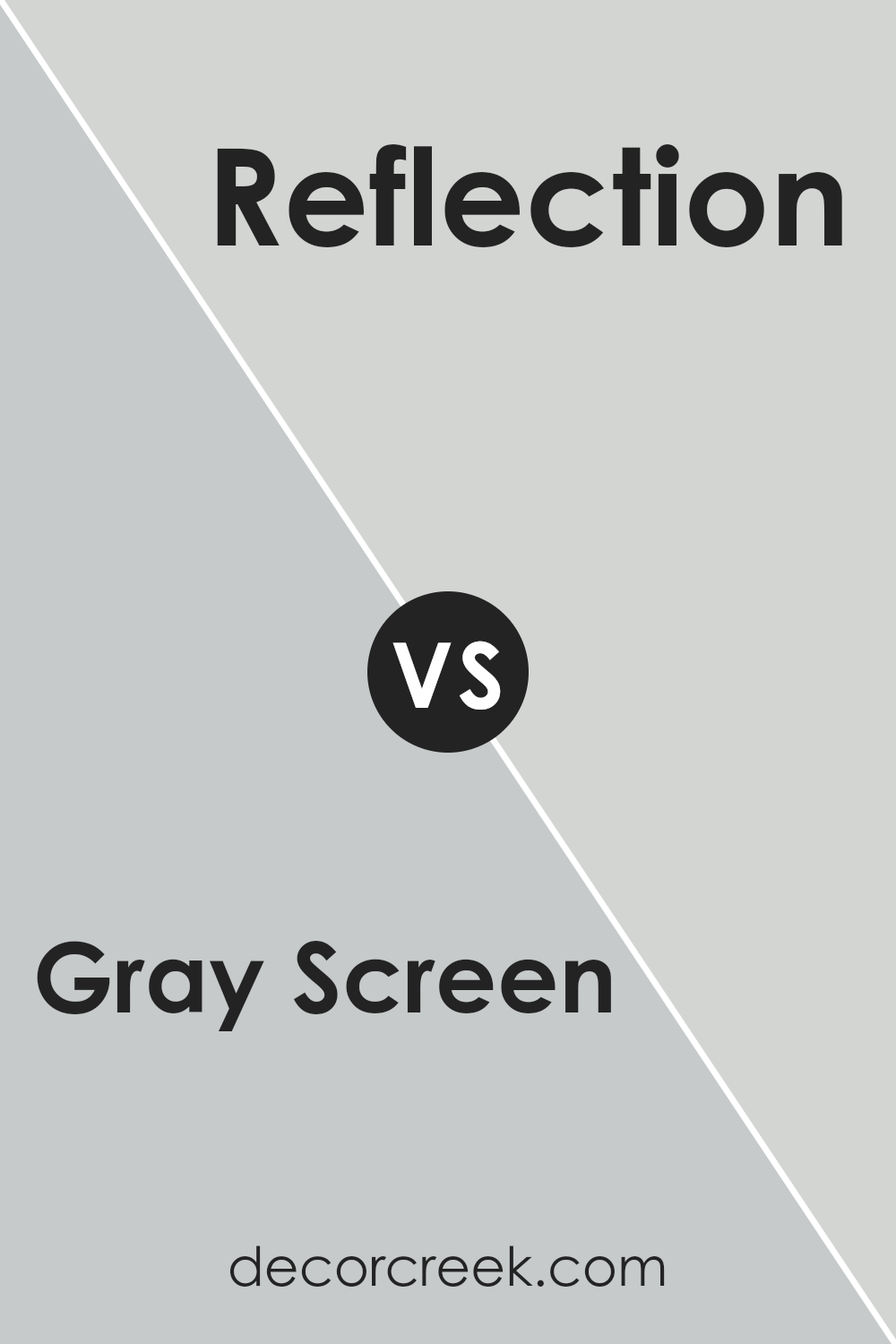
Gray Screen SW 7071 and Reflection SW 7661 by Sherwin Williams are both unique and beautiful colors that carry their own distinct vibes. When you look at Gray Screen, you’re met with a cool, light gray that gives off a subtle, airy feel.
It’s like looking at an early morning sky, clear and full of possibilities. This color can make spaces feel more open and relaxed.
On the other hand, Reflection is a bit warmer and lighter. It’s almost like the gentle hue of a cloud covered in sunlight. This color adds a soft, calming touch to any room, making it perfect for creating a peaceful and serene atmosphere.
Reflection tends to reflect more light, making spaces not only feel brighter but also more inviting.
While both colors are in the gray family, Gray Screen sits a bit cooler and might remind you of a shadowy, serene scene. Reflection, with its warmer tones, feels more like a quiet, sunlight morning.
Each has its charm, deciding on one over the other really depends on the mood you’re aiming to achieve in your space.
You can see recommended paint color below:
- SW 7661 Reflection (CHECK A SAMPLE)
Gray Screen SW 7071 by Sherwin Williams vs Autonomous SW 9557 by Sherwin Williams
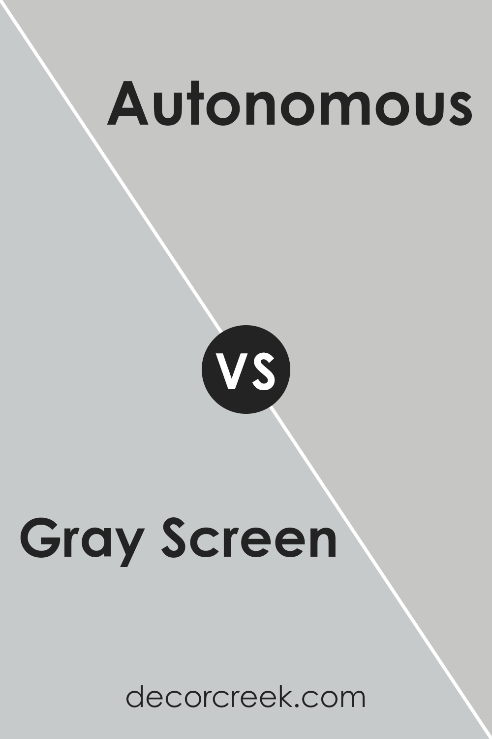
Gray Screen and Autonomous, both by Sherwin Williams, are two unique colors that serve different design needs. Gray Screen is a soft, light gray that has a calming effect, perfect for creating a serene, airy space.
It reflects light beautifully, making it a great choice for smaller rooms or areas with limited natural light. On the other hand, Autonomous is a deeper, more complex hue that leans towards a darker blue-gray.
This color adds depth and sophistication to a space, making it ideal for accent walls or rooms where a more dramatic effect is desired. While Gray Screen brings a breezy, open feel, Autonomous offers a sense of strength and grounding.
Depending on your room’s purpose and your personal style, either color could be the perfect fit. Gray Screen works best for a light, minimalist aesthetic, whereas Autonomous suits a bold, dynamic design approach.
You can see recommended paint color below:
- SW 9557 Autonomous (CHECK A SAMPLE)
Gray Screen SW 7071 by Sherwin Williams vs Lazy Gray SW 6254 by Sherwin Williams
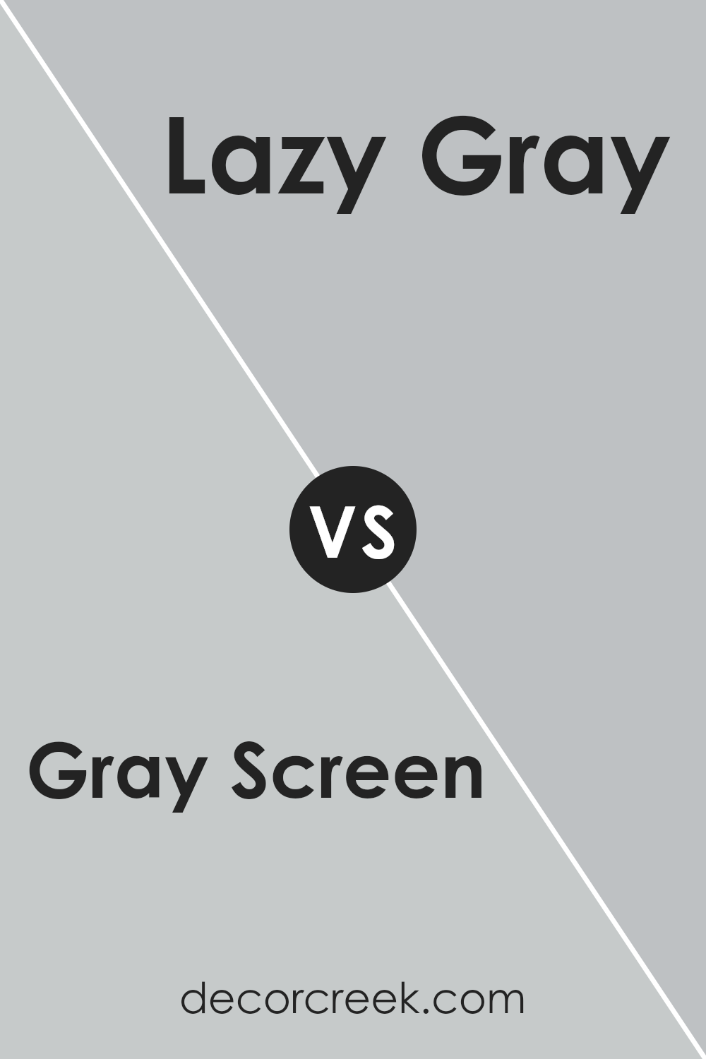
Gray Screen and Lazy Gray, both by Sherwin Williams, offer unique takes on gray. Gray Screen is a cooler tone that feels airy and light, making a space feel more open. It has a hint of blue, which adds a serene, calming vibe to any room.
On the other hand, Lazy Gray is a warmer gray with subtle undertones that can offer a cozy, more inviting atmosphere. It’s versatile for use in various rooms, creating a soft, welcoming environment.
While both colors share the gray base, Gray Screen leans towards a crisper, fresher look due to its cooler undertones. Lazy Gray, however, brings warmth and a hint of comfort, making spaces feel snug.
Whether you’re going for a modern, airy feel with Gray Screen or a cozy, nurturing environment with Lazy Gray, each color brings its distinct charm to interiors.
You can see recommended paint color below:
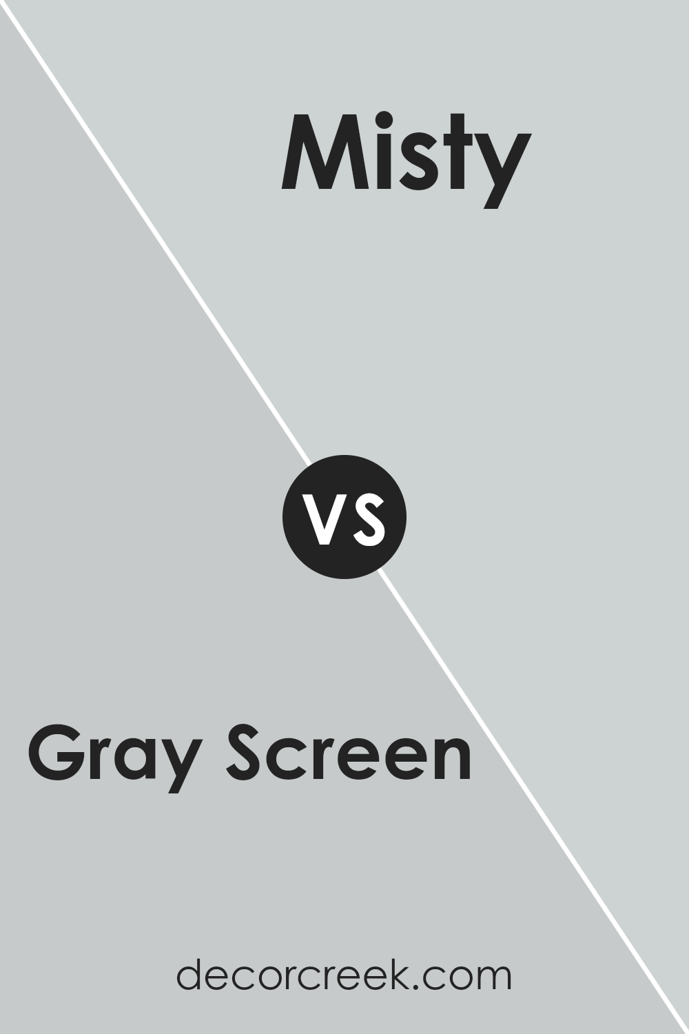
Gray Screen SW 7071 by Sherwin Williams vs Misty SW 6232 by Sherwin Williams
Gray Screen and Misty are two colors by Sherwin Williams that bring different vibes to spaces. Gray Screen is a soft, versatile gray with a bit of blue undertone, making it cool and calming. It’s like a gentle blanket of mist over a cityscape, offering a modern yet timeless feel.
This color works well in spaces where you want to add a bit of sophistication without going too dark or overwhelming.
On the other hand, Misty has a lighter, airier feel. It’s a pale blue with gray undertones, reminiscent of a serene sky on a foggy morning. Misty is perfect for creating a peaceful, relaxing atmosphere in any room. It’s especially good in places where you want to feel relaxed and refreshed.
Both colors share a cool and calm palette but in different shades and vibes. Gray Screen leans more towards a muted gray with a hint of blue, while Misty is definitely on the lighter, softer side of blue.
Choosing between them depends on the mood you’re aiming for – sophisticated and modern with Gray Screen, or light and serene with Misty.
You can see recommended paint color below:
Conclusion
Gray Screen, a paint color by Sherwin Williams, stands out as a versatile and stylish choice for those looking to update their spaces. Its unique balance between cool and warm tones allows it to complement a wide array of decor styles and settings, making it a go-to option for homeowners and designers alike.
Whether applied to a cozy bedroom, a bright living area, or even an exterior facade, this shade brings a sense of calm and sophistication that’s hard to match.
The adaptability of Gray Screen also means it can seamlessly integrate with various color palettes, from soft neutrals to more vibrant accents.
This quality makes it an excellent backdrop for artwork and furniture, allowing personal styles to shine through without overwhelming the senses. Its popularity is a testament to its timeless appeal, promising to keep spaces looking fresh and modern for years to come.

Ever wished paint sampling was as easy as sticking a sticker? Guess what? Now it is! Discover Samplize's unique Peel & Stick samples.
Get paint samples


