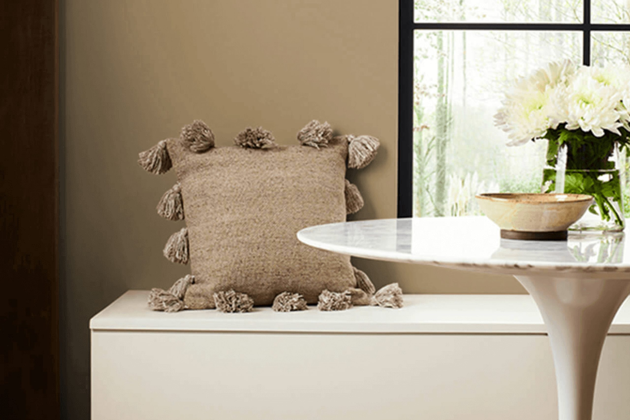
I recently stumbled upon SW 9538 Tangled Twine by Sherwin Williams, and it truly piqued my interest. The color stands out with its rich, complex hue, resembling a blend of earthy tones that remind me of robust burlap or the soft, seasoned wood you might find on a well-loved farmhouse porch. In home decor, I see it as a versatile choice that can add warmth to spaces that need a touch of coziness, without overwhelming them with a color that’s too bold or out of place.
What intrigues me most about Tangled Twine is how it reflects natural light. Depending on the time of day, the color shifts subtly, offering glimpses of deeper undertones in dim light and a bright, welcoming aura when the sun hits it just right. This chameleonic quality makes it an excellent candidate for living areas or bedrooms where the play of light can be truly appreciated.
I think the potential of Tangled Twine lies in its ability to pair beautifully with a wide range of colors and materials—from stark whites and soft creams to rich leathers and rustic metals. Whether you’re looking to refresh a room or find a new go-to neutral, Tangled Twine offers a beautiful alternative to the usual suspects that dominate paint swatches.
I’m excited to share how you too can enhance your home with this unique shade.
What Color Is Tangled Twine SW 9538 by Sherwin Williams?
Tangled Twine by Sherwin-Williams is a warm, earthy taupe that brings a cozy and inviting vibe to any space. This color, a blend of brown and gray, has a natural, soft appearance that works well in various interior styles, particularly in rustic, modern farmhouse, and Scandinavian designs.
In a rustic setting, Tangled Twine pairs beautifully with natural materials like rough-hewn wood, stone, and leather, enhancing the homey and relaxed feel of the space. In modern farmhouse interiors, it complements white shiplap walls and aged woods, creating a balanced look that’s both fresh and comfortable.
For Scandinavian styles, this color matches well with light woods, minimalist furniture, and clean lines, providing a subtle warmth to the typically cool palette. Tangled Twine also works wonderfully with a variety of textures. It looks stunning against soft, plush fabrics like velvet or wool in darker or neutral shades, providing a gentle contrast.
This color also teams well with metallic finishes like brass or copper, adding a touch of glamour without overwhelming the space. In terms of textiles, combining it with linens or chunky knits can enhance the comfort factor, making any room feel more inviting. This versatile shade is perfect for creating a cozy, grounded atmosphere in your home.
Is Tangled Twine SW 9538 by Sherwin Williams Warm or Cool color?
Tangled Twine by Sherwin Williams is a unique paint color that brings a cozy warmth to any room. This shade is a blend of green and gray, making it a versatile choice for homes. It’s not too bold, but has just enough depth to make walls stand out in a subtle, welcoming way.
In living rooms, Tangled Twine sets a friendly, relaxed tone, encouraging people to sit down and unwind. It works especially well in spaces with natural light, as the sunlight makes the color look softer and more inviting. This color also pairs nicely with wooden furniture and accents, enhancing a natural, earthy vibe.
In a kitchen, using Tangled Twine can add a touch of warmth, making the space feel homey and lived-in. It contrasts beautifully with white cabinets or works harmoniously with darker tones.
Overall, Tangled Twine is a great choice for creating a comfortable, appealing environment in your home without being overpowering. Its subtle hue blends well with different styles and decorations, making it a practical and attractive option for many spaces.
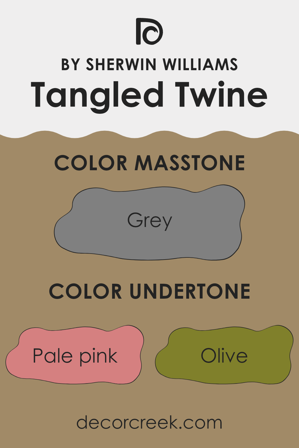
Undertones of Tangled Twine SW 9538 by Sherwin Williams
Tangled Twine by Sherwin Williams is a unique paint color that brings a sophisticated blend of subtle shades to your walls. This color might appear simple at first glance, but it contains various undertones that can significantly influence its appearance under different lighting conditions and in different settings.
The undertones in a paint color are secondary colors that influence the primary shade. For example, if a color has olive undertones, it might look slightly more yellow or green depending on the light. With Tangled Twine, undertones like pale pink, olive, and mint contribute to a slightly earthy yet vibrant feel, making the color versatile for any room.
When applied to interior walls, the complex undertones of Tangled Twine interact with both natural and artificial light to create varying effects throughout the day. Morning light might highlight its olive or pale yellow undertones, giving a fresh and comforting vibe, while evening light might draw out more of the pale pink or light purple, adding a subtle warmth to the room.
This adaptability makes Tangled Twine an excellent choice for spaces where the mood needs to shift comfortably from bright and energizing in the daylight to more cozy and welcoming by night. The complexity of its undertones—ranging from cooler shades like mint and light blue to warmer tones like orange and light purple—ensures that it pairs well with a variety of decor styles and colors, offering flexibility in interior design options.
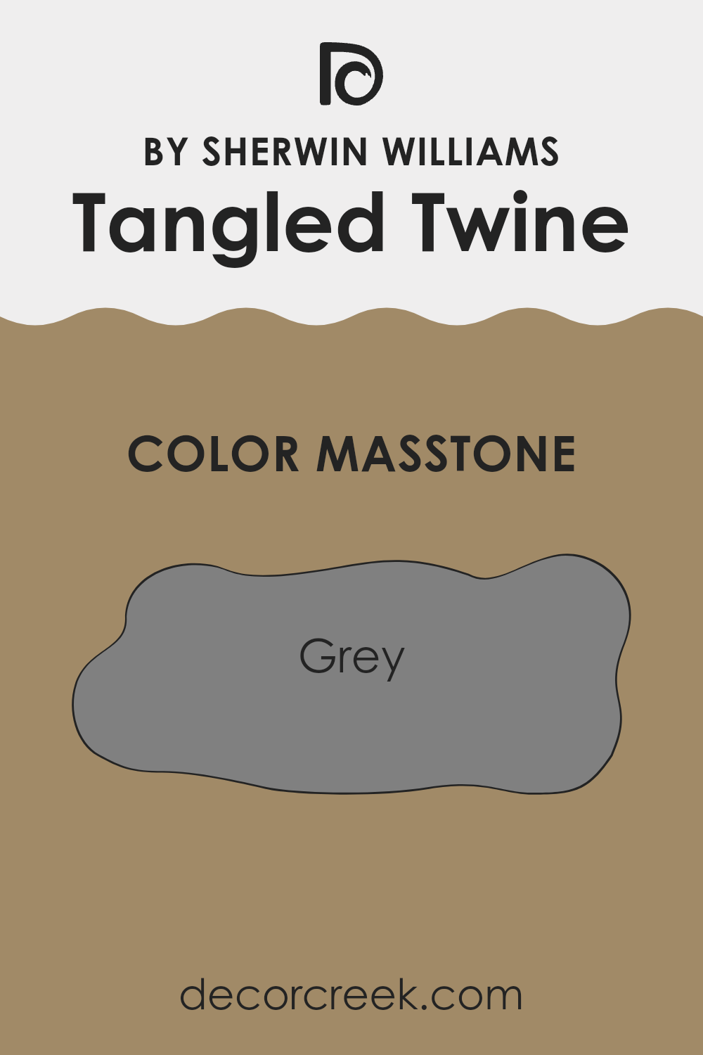
What is the Masstone of the Tangled Twine SW 9538 by Sherwin Williams?
Tangled Twine by Sherwin Williams is a versatile gray color with the masstone being Grey (#808080). This mid-tone gray offers a balanced and neutral backdrop that suits almost any decorating style.
It’s particularly effective in creating a calm and inviting atmosphere in homes. Because it’s a pure gray, it blends well with both cool and warm colors, allowing homeowners to mix various decor elements without clashes. This color can make small rooms appear larger and brighten dim spaces, as gray naturally reflects more light than darker shades.
In living rooms, bedrooms, or even kitchens, Tangled Twine provides a steady and calming presence. It also acts as a great canvas for brighter colors or patterns in furniture or accessories, showing off your personal style without overpowering the space. Overall, its adaptability makes it an excellent choice for anyone looking to refresh their home with a new paint color.
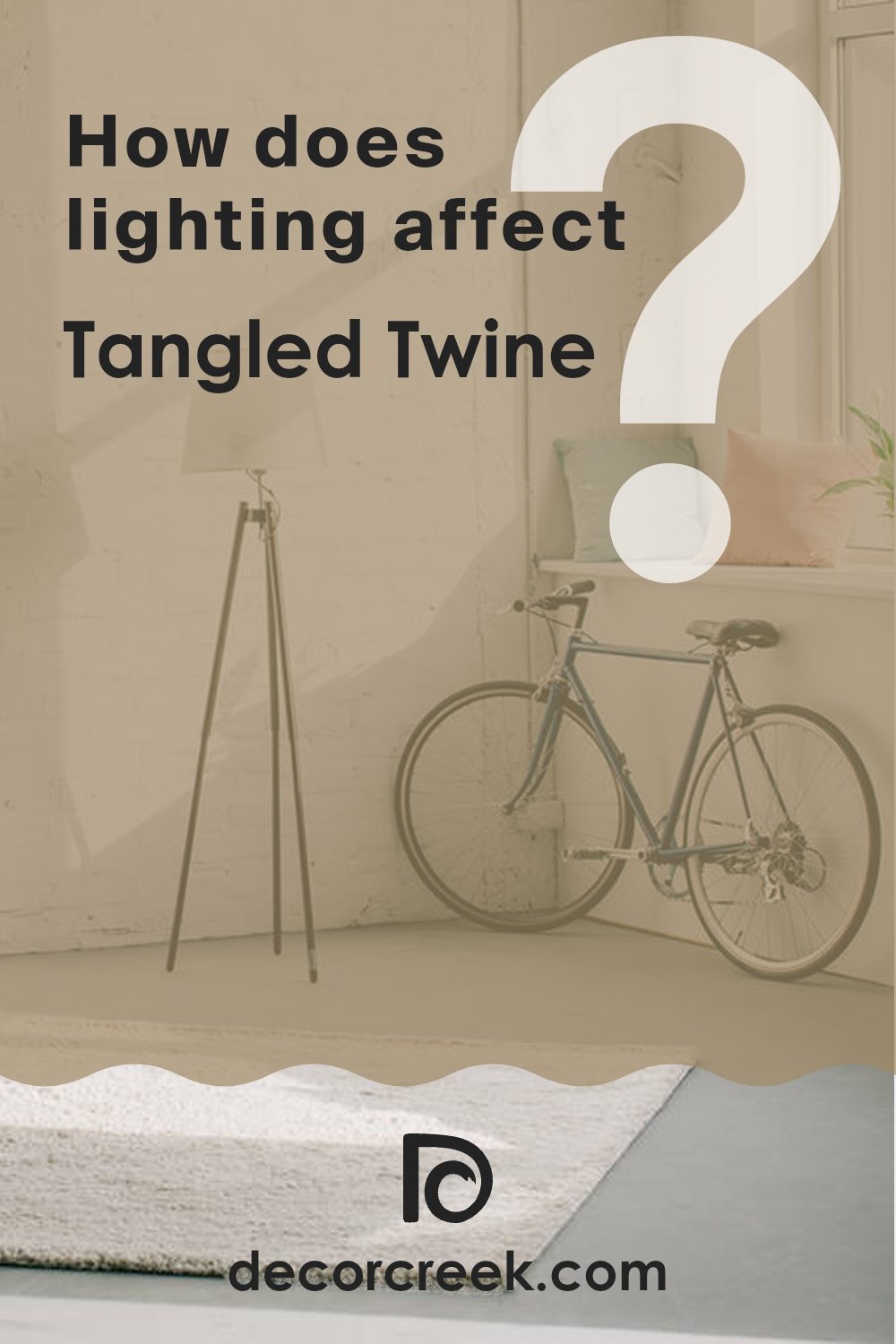
How Does Lighting Affect Tangled Twine SW 9538 by Sherwin Williams?
Lighting has a crucial impact on how colors appear, influencing their brightness and hue depending on the light source. Different light sources can make the same color look different in various settings.
Natural light provides the clearest reflection of colors, but its effect varies throughout the day and depends on the room’s orientation. Artificial light, which comes from bulbs and fixtures, can bring out different aspects of a color depending on the type of light — fluorescent lights tend to bring out cooler tones, while incandescent bulbs can warm up a color.
Taking the color Tangled Twine as an example, its appearance considerably shifts under various lighting conditions. This is a nuanced color that can appear more muted or more vibrant depending on the light.
In a north-facing room, where light is cooler and more subdued, Tangled Twine might appear slightly darker and less vibrant. This cooler, indirect light doesn’t enhance warm tones and might make the color look more muted.
South-facing rooms enjoy abundant, bright light most of the day, which can make Tangled Twine look warmer and more lively. This natural brightness can really highlight the depth of the color, making it appear more dynamic and rich.
In an east-facing room, the color will be influenced by the warm, yellow light of the morning. This means Tangled Twine could look especially warm and welcoming in the morning, then fade to a softer, more shadowy version as the day progresses.
Similarly, in a west-facing room, the color will change through the day, looking more subdued during the morning and then glowing with the reddish, golden tones of the setting sun. Evening light can make Tangled Twine look very warm and cozy.
Artificial lighting, like warm LED or incandescent lights, can enhance the warm qualities of Tangled Twine, making it feel more welcoming, while cooler LED or fluorescent lights might pull out the subtler, cooler undertones of the color. The choice of lighting can significantly influence how this color is perceived and can be used strategically to create the desired atmosphere in a room.
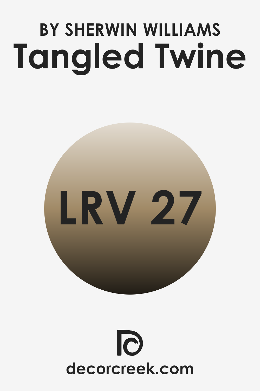
What is the LRV of Tangled Twine SW 9538 by Sherwin Williams?
LRV, or Light Reflectance Value, is a measure used to determine how much light a paint color reflects or absorbs when applied to a surface. A higher LRV means the color reflects more light, making it appear lighter and potentially making a space feel more open and airy.
Conversely, a lower LRV indicates that the color absorbs more light, which can make the color appear deeper and the space more cozy or closed in. This value is critical for determining how a color will look in different lighting conditions, which can drastically change the appearance of the paint once it’s on your walls.
The specific LRV of 26.757 for the paint color being discussed means it has a somewhat low capacity to reflect light, placing it on the darker side of the scale. In practical terms, this means it could make a small room feel smaller or more intimate due to its ability to absorb more light than it reflects. On the walls, this rich and deep hue might create a warm and enveloping feel, making it ideal for areas meant to foster a cozy atmosphere, such as a bedroom or a den.
However, careful consideration is needed regarding lighting, as the low LRV might necessitate additional light sources to prevent the space from feeling too dark.
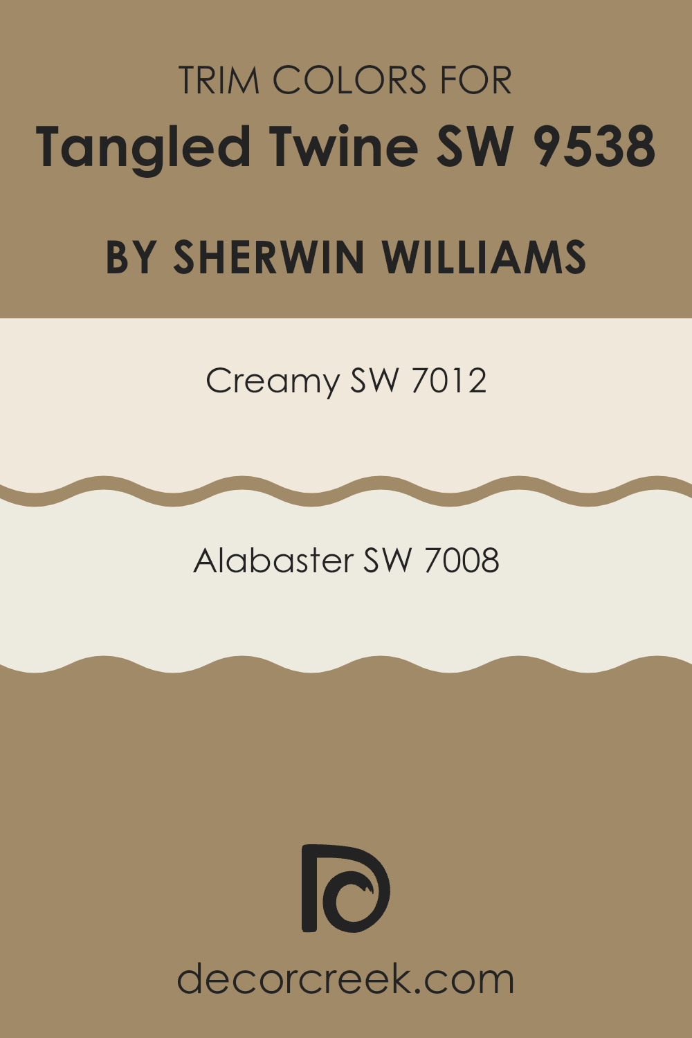
What are the Trim colors of Tangled Twine SW 9538 by Sherwin Williams?
Trim colors, like SW 7012 – Creamy and SW 7008 – Alabaster by Sherwin Williams, play a crucial role in framing and accentuating the main color of your walls. In this case, using these shades as trim colors enhances the aesthetics of Tangled Twine SW 9538, ensuring that the overall appearance remains balanced and harmonious.
Trim colors are important because they define clear boundaries and transitions between different surfaces, adding depth and finishing touches to the space which makes the primary color stand out more prominently.
SW 7012 – Creamy is a soft, warm white that adds a gentle contrast against richer and darker shades like Tangled Twine. It is subtle yet effective in creating a cozy and welcoming atmosphere. On the other hand, SW 7008 – Alabaster is a true white that provides a sharper contrast, giving a fresh and clean look that complements the more muted tones of Tangled Twine beautifully. This color combination ensures that the walls are visually interesting and neatly presented.
You can see recommended paint colors below:
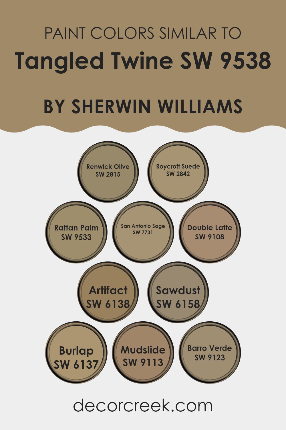
Colors Similar to Tangled Twine SW 9538 by Sherwin Williams
Similar colors play a vital role in creating a harmonious and balanced visual experience, especially in interior decorating. By selecting shades that are closely related on the color spectrum, you can achieve a subtle and cohesive look that’s pleasing to the eye. Colors like Renwick Olive, Roycroft Suede, and Rattan Palm offer a natural feel that can make spaces feel more welcoming and warm.
These shades are not just limited to one tone; for instance, Renwick Olive embodies a muted green that mimics natural foliage, while Roycroft Suede captures the soft, rich essence of aged leather. Rattan Palm, on the other hand, suggests the gentle warmth of sundried palm leaves.
Continuing with similar hues, San Antonio Sage and Double Latte bring a soft, earthy touch to the palette, perfect for creating a cozy atmosphere. San Antonio Sage is a gentle gray-green that reflects a sage plant’s dusty leaves, and Double Latte is a comforting milky brown that can create a mellow backdrop for any room.
Further down the color line, colors like Artifact, Burlap, and Mudslide present deeper, richer browns. Artifact offers a hint of ancient clay pots, Burlap provides the texture of woven fabric in a color form, and Mudslide resembles the deep and dark soil after rain.
The inclusion of Sawdust and Barro Verde enriches this collection; Sawdust carries the pale, dusty beige of fresh woodworking, while Barro Verde evokes the feeling of fertile wet earth, both working well to anchor a nature-inspired palette. These similar shades, while individually unique, collectively create spaces that are cohesive and provide an inviting ambiance.
You can see recommended paint colors below:
- SW 2815 Renwick Olive
- SW 2842 Roycroft Suede
- SW 9533 Rattan Palm
- SW 7731 San Antonio Sage
- SW 9108 Double Latte
- SW 6138 Artifact
- SW 6158 Sawdust
- SW 6137 Burlap
- SW 9113 Mudslide
- SW 9123 Barro Verde
How to Use Tangled Twine SW 9538 by Sherwin Williams In Your Home?
Tangled Twine SW 9538 by Sherwin Williams is a warm, inviting paint color that can give a cozy touch to any room in your home. Its earthy green-brown tone makes it great for creating a comforting feel, ideal for relaxing spaces like living rooms or bedrooms.
You can use Tangled Twine on a central wall to add a mild but appealing backdrop for artwork and photographs, enhancing their colors without being too bold or overpowering. This color also works well in a kitchen or dining area, as its natural hue complements wooden furniture and cabinetry beautifully, giving a cohesive look.
For a smooth, stylish finish, consider pairing it with lighter shades such as creams or off-whites, which will help light up the room and make it appear larger. Accessories in bright colors like blues or yellows can also stand out nicely against a Tangled Twine background, adding a cheerful splash of color to your decor.
Tangled Twine SW 9538 by Sherwin Williams vs Artifact SW 6138 by Sherwin Williams
Tangled Twine and Artifact, both by Sherwin Williams, are warm, inviting hues but they offer distinct atmospheres due to their differing tones. Tangled Twine is a soft, muted green with a subtle touch of gray.
This color has an earthy feel, bringing to mind a gentle, natural vibe that’s easy on the eyes and soothing in spaces like living rooms or bedrooms. On the other hand, Artifact has a richer, taupe-like quality. This color leans toward a brownish-gray tone, providing a stronger but still neutral backdrop.
It’s ideal for creating a cozy and welcoming feeling, perfect for areas where conversation and warmth are key. Both colors are versatile and can complement various decor styles, whether you aim for a light and fresh look with Tangled Twine or something more grounded using Artifact. They work well together or separately, depending on the mood and style you aim to achieve in your space.
You can see recommended paint color below:
- SW 6138 Artifact
Tangled Twine SW 9538 by Sherwin Williams vs Sawdust SW 6158 by Sherwin Williams
Tangled Twine and Sawdust by Sherwin Williams are two distinct colors each with its own charm. Tangled Twine is a deep, rich green with a hint of gray, giving it a grounded and earthy feel. It’s perfect for creating a cozy and inviting atmosphere in any space.
On the other hand, Sawdust is a warm tan shade that evokes a sense of simplicity and warmth. This color works well in settings where you want a neutral backdrop that still offers a touch of warmth. Both colors can make a room feel welcoming, but they do so in different ways.
Tangled Twine leans towards a more natural, forest-like ambiance, making it ideal for an accent wall or paired with wood finishes. Sawdust, with its subtle golden undertones, is excellent for broader areas, helping to add light and openness to a room. These colors work well independently but can also complement each other in a space that aims for an organic and comforting aesthetic.
You can see recommended paint color below:
- SW 6158 Sawdust
Tangled Twine SW 9538 by Sherwin Williams vs Barro Verde SW 9123 by Sherwin Williams
The two colors, Tangled Twine and Barro Verde, both from Sherwin Williams, offer distinct hues that can significantly influence the ambiance of a space. Tangled Twine is a muted, greenish-grey tone that has a subtle, soothing effect, making it perfect for crafting cozy and inviting interiors. This color can work well in bedrooms or living areas where a gentle backdrop is desired.
In contrast, Barro Verde presents as a deeper, more earthy green. It brings a splash of natural vitality to any room, well-suited for spaces that aim to have a connection with nature or an outdoor feel. It’s particularly great for accent walls or in rooms with lots of plants and natural light.
Together, Tangled Twine and Barro Verde can complement each other nicely. Tangled Twine’s quieter tone can balance the bolder presence of Barro Verde, especially in a home that celebrates varied but harmonious uses of green. Mixing these two can create a visually interesting space that feels both grounded and refreshing.
You can see recommended paint color below:
- SW 9123 Barro Verde
Tangled Twine SW 9538 by Sherwin Williams vs Mudslide SW 9113 by Sherwin Williams
Tangled Twine and Mudslide, both from Sherwin Williams, offer distinct tones that could enhance various spaces in unique ways. Tangled Twine is a gentle, muted green with a touch of gray, giving it a soft, soothing presence that’s versatile for areas like living rooms or bedrooms. It pairs well with natural materials and light woods, creating a calm, welcoming atmosphere.
On the other hand, Mudslide has a rich, deep taupe color that provides a warm and cozy feel. It’s an excellent choice for creating a comfortable, inviting space, ideal in family rooms or dining areas. Mudslide works well with stronger, darker furniture and can make large, open spaces feel more intimate.
Both colors provide a neutral base, but while Tangled Twine leans towards a fresher, lighter vibe, Mudslide offers a denser, warmer embrace. Depending on the room and the mood you want to set, each color has its unique charm and functionality.
You can see recommended paint color below:
- SW 9113 Mudslide
Tangled Twine SW 9538 by Sherwin Williams vs Burlap SW 6137 by Sherwin Williams
Tangled Twine and Burlap are two colors offered by Sherwin Williams, both reflecting earthy, natural tones, but with different shades. Tangled Twine is a soft green hue that brings a subtle, muted green to the walls, resembling the color of moss or sage.
It gives a room a gentle, soothing feel without being overly bright. On the other hand, Burlap is more in the realm of warm browns, suggesting the raw color of a burlap sack or sandy earth. It’s a neutral color that creates a cozy, welcoming ambiance, perfect for spaces where you want a touch of warmth.
While Tangled Twine leans towards a cooler, leafy vibe that can refresh the appearance of a space, Burlap has a hearty, grounding effect, potentially making a room feel more enclosed and secure. Choosing between them would depend on the mood you want to set: cooler and lightly spirited with Tangled Twine or warm and solid with Burlap. Both colors work well in natural light and can effectively complement wood furniture and other natural elements.
You can see recommended paint color below:
- SW 6137 Burlap
Tangled Twine SW 9538 by Sherwin Williams vs San Antonio Sage SW 7731 by Sherwin Williams
Tangled Twine and San Antonio Sage are two distinct colors by Sherwin Williams that both bring their unique charm to a space. Tangled Twine is a deep, earthy green with a hint of brown, giving it a warm and cozy feel. It’s the kind of color that makes a room feel welcoming and comfortable, perfect for living areas and bedrooms where you want a grounded, soothing atmosphere.
On the other hand, San Antonio Sage leans more towards a subtle, soft green, lighter and less intense than Tangled Twine. It has an airy quality that brightens spaces and pairs well with different decor styles. San Antonio Sage works beautifully in spaces where you want a lighter, fresher feel, such as bathrooms and kitchens.
While both are shades of green, their tones and the moods they create are quite different. Tangled Twine offers depth and warmth, whereas San Antonio Sage provides a lighter, gentle touch to interiors. The choice between them depends on the ambiance you want to achieve in your room.
You can see recommended paint color below:
- SW 7731 San Antonio Sage
Tangled Twine SW 9538 by Sherwin Williams vs Rattan Palm SW 9533 by Sherwin Williams
Tangled Twine and Rattan Palm are two paint colors offered by Sherwin Williams that share a natural, earthy vibe but differ in their overall tone and warmth. Tangled Twine is a deeper, olive green hue that conveys a sense of richness and depth. This color is ideal for spaces where a more subdued, cozy atmosphere is desired, such as living rooms or bedrooms. It pairs well with natural wood and other dark tones.
On the other hand, Rattan Palm is a lighter, beige color with a soft yellow undertone, offering a brighter and airier feel. It works beautifully in spaces that aim to be open and inviting, like kitchens and bathrooms. Rattan Palm is great for creating a light, welcoming environment and complements a wide range of décor styles.
In summary, while both colors draw inspiration from natural elements, Tangled Twine leans towards a darker, more muted green, suitable for intimate, quieter settings. Rattan Palm offers a lighter, friendlier palette that enhances the sense of space and light in a room.
You can see recommended paint color below:
Tangled Twine SW 9538 by Sherwin Williams vs Renwick Olive SW 2815 by Sherwin Williams
Tangled Twine and Renwick Olive, both by Sherwin Williams, offer distinct tones that could freshen up any space. Tangled Twine is a unique shade that blends grey with subtle hints of green, giving it a versatile and neutral appearance. This color is great for those who prefer something that isn’t too bold but still adds character to a room.
On the other hand, Renwick Olive is a deeper, richer color, closer to a traditional olive shade. It has a warm, earthy vibe that makes spaces feel cozy and welcoming. This color works well in areas where you want to add a touch of nature-inspired comfort.
Both colors are quite different in their impact and mood. Tangled Twine is lighter and more understated, making it easier to pair with a wide range of decor styles. Renwick Olive, being bolder and deeper, commands more attention and suits spaces that aim for a stronger style statement. Depending on what atmosphere you want to create, each color has its own charm and utility.
You can see recommended paint color below:
- SW 2815 Renwick Olive
Tangled Twine SW 9538 by Sherwin Williams vs Double Latte SW 9108 by Sherwin Williams
Tangled Twine and Double Latte by Sherwin Williams are two distinct shades suitable for adding warmth and depth to any space. Tangled Twine is a muted green with subtle gray undertones. This color is versatile, creating a cozy yet fresh environment. It works well in spaces that aim for a natural, calm feel, complementing wood tones and neutral fabrics beautifully.
On the other hand, Double Latte is a richer, deeper shade, leaning towards a creamy, dark beige. It offers a comforting warmth that makes rooms feel inviting and snug. Double Latte pairs nicely with a wide range of colors, from bold hues to soft pastels, making it excellent for living areas or bedrooms where a hint of coziness is desired.
Both colors provide unique atmospheric effects but cater to different aesthetic preferences. While Tangled Twine leans towards a cooler, subtle environment, Double Latte is perfect for creating a soft, warm, and welcoming space.
You can see recommended paint color below:
- SW 9108 Double Latte
Tangled Twine SW 9538 by Sherwin Williams vs Roycroft Suede SW 2842 by Sherwin Williams
Tangled Twine and Roycroft Suede, both by Sherwin Williams, offer distinctive tones that could enrich any space depending on your preference and the mood you want to achieve. Tangled Twine is a gentle, muted green that gives off a calm and restful feeling, ideal for creating a welcoming and peaceful environment. It’s especially great in spaces where you want to promote relaxation such as bedrooms or a quiet reading nook.
On the other hand, Roycroft Suede provides a richer, deeper hue; it’s a warm, earthy brown that adds a touch of coziness and comfort to any area. This color works well in living rooms or dining areas, where a sense of warmth and gathering is appreciated.
Each color offers its own unique appeal—Tangled Twine is more about lightness and freshness, while Roycroft Suede brings depth and warmth, making them suitable for different intentions or room characteristics.
You can see recommended paint color below:
- SW 2842 Roycroft Suede
Overall, SW 9538 Tangled Twine by Sherwin Williams seems like a fantastic choice if you want to make your home feel cozy and warm. Whether you’re freshening up a single room or redoing the whole house, this color could be the perfect choice. I’m excited to see how it looks in person and maybe even try it out in my own home one day!
Ever wished paint sampling was as easy as sticking a sticker? Guess what? Now it is! Discover Samplize's unique Peel & Stick samples.
Get paint samples

