Introducing SW 9533 Rattan Palm by Sherwin-Williams, a color that embodies the warmth and natural elegance of the landscapes it draws inspiration from. As a part of Sherwin-Williams’ extensive palette, Rattan Palm stands out for its ability to bring a touch of earthiness and sophistication to any space.
This particular shade captures the essence of the rattan palm’s versatile hues, offering a vibrant yet grounded option for decorators, homeowners, and designers alike.
The charm of Rattan Palm lies in its adaptability. Whether you’re aiming to create a serene retreat, a lively gathering space, or an inviting workspace, this color provides a solid foundation that complements a wide range of decor styles, from rustic to modern, minimalist to bohemian.
Its rich, natural tones help to foster a sense of comfort and calmness, making it an excellent choice for living areas, bedrooms, and even home offices where a soothing atmosphere is desired.
Furthermore, Rattan Palm’s compatibility with both light and dark colors adds to its versatility. It pairs beautifully with neutral shades, bringing depth and warmth to spaces, while also standing strong alongside bold, vibrant colors, contributing to dynamic and energizing designs.
For those looking to embrace the beauty of the natural world within their interior spaces, SW 9533 Rattan Palm by Sherwin-Williams offers a perfect palette to start with, promising to transform any room into a cozy, stylish haven.

What Color Is Rattan Palm SW 9533 by Sherwin Williams?
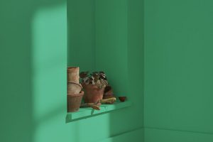
Rattan Palm by Sherwin Williams is a warm, inviting hue that captures the essence of natural materials and the coziness of sunlight filtered through a tropical canopy. This color is a subtle blend of beige and yellow, reminiscent of the sturdy yet flexible rattan palm used in furniture and décor, imparting a sense of relaxed sophistication and earthy charm to any interior.
This versatile shade works wonderfully in a variety of interior styles, especially those that aim to create a serene, welcoming atmosphere. It is particularly suited for Bohemian, Coastal, and Rustic interiors, where its natural tones can complement organic textures and materials.
In Bohemian spaces, it pairs well with vibrant textiles and eclectic furnishings, enhancing the warmth and layered aesthetics of the style. In Coastal settings, it evokes the softness of sandy beaches, blending seamlessly with blues, greens, and whites for a calm, refreshing look.
For Rustic interiors, it forms a perfect backdrop for distressed wood, stone, and metal accents, reinforcing the connection to nature and simplicity.
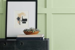
When it comes to materials and textures, this color is incredibly adaptable. It pairs wonderfully with natural wood grains, from pale oaks to rich walnuts, enhancing their warmth and character. Linen and cotton fabrics in simple, unbleached finishes work beautifully against this backdrop, as do woven rattan and jute for added texture and depth.
For a touch of elegance, metallic accents in brushed gold or copper can introduce a hint of luxury without overwhelming the inherent simplicity and charm of Rattan Palm.
Ever wished paint sampling was as easy as sticking a sticker? Guess what? Now it is! Discover Samplize's unique Peel & Stick samples.
Get paint samples

Is Rattan Palm SW 9533 by Sherwin Williams Warm or Cool color?
Rattan Palm SW 9533, by Sherwin Williams, is a warm, earthy hue that simultaneously evokes the natural elegance and rustic charm of its namesake. This color draws inspiration from the versatile rattan palm, known for its strong, flexible vines used in furniture and decor, mirroring the adaptability and resilience of this material in its design applications.
The beauty of this shade lies in its capacity to bring a cozy, inviting atmosphere to any space, making it ideal for creating a serene retreat or a welcoming social area within homes.
As a neutral yet distinctive color, it acts as a perfect backdrop for various design aesthetics, from modern minimalism to bohemian and everything in between. It pairs wonderfully with lush greens, bright whites, and rich wood tones, complementing natural light and adding depth and warmth to interiors.
Applying Rattan Palm to walls or accent pieces fosters a connection to nature, making rooms feel more open and airy yet grounded. Its versatility in design enables it to work harmoniously in living rooms, bedrooms, and even kitchens, crafting spaces that feel balanced and harmonious.
This color’s unique ability to adapt yet stand out is what makes it a cherished choice for creating comfortable, stylish, and personalized living environments.
Undertones of Rattan Palm SW 9533 by Sherwin Williams
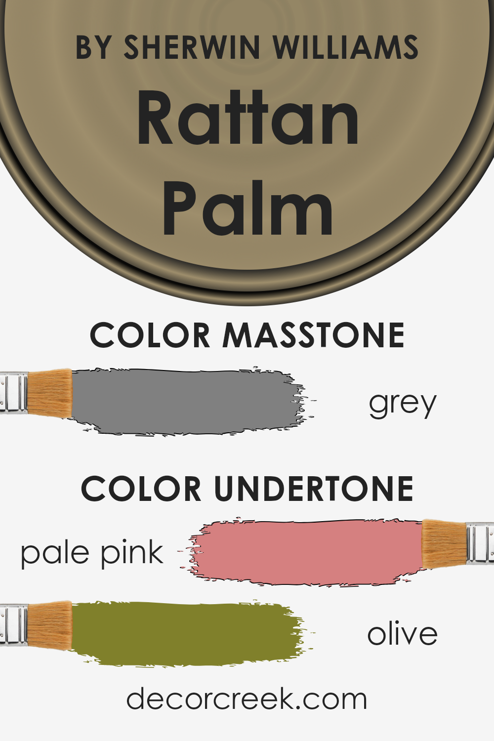
Rattan Palm, a captivating paint color, is more complex than it first appears, owing to its intriguing undertones of pale pink and olive. These undertones play a vital role in the color’s perception, subtly influencing its character and the mood it creates within a space. The pale pink undertone brings a warmth and softness to the color, making it feel more inviting and cozier.
This gentle hue can add a hint of serene elegance to rooms, softening the ambiance without overwhelming it with overtly pink tones.
On the other hand, the olive undertone introduces a touch of earthiness and natural vigor, grounding the color and preventing it from feeling too ethereal. This undertone adds depth and complexity, ensuring the color offers a connection to the natural world, thus enhancing a room’s welcoming atmosphere.
The combination of these undertones allows Rattan Palm to adapt and shift in appearance under different lighting conditions, making it a versatile choice for interior walls.
In the context of interior design, these undertones affect how Rattan Palm is perceived in a space. During daylight, the natural light may highlight the olive undertone, promoting a feeling of freshness and vitality.
In artificial light, the pale pink undertone might become more pronounced, enveloping the room in a cozier, more intimate ambiance. This chameleon-like quality makes Rattan Palm an excellent choice for those seeking a color that responds dynamically to its environment, subtly changing mood from day to night.
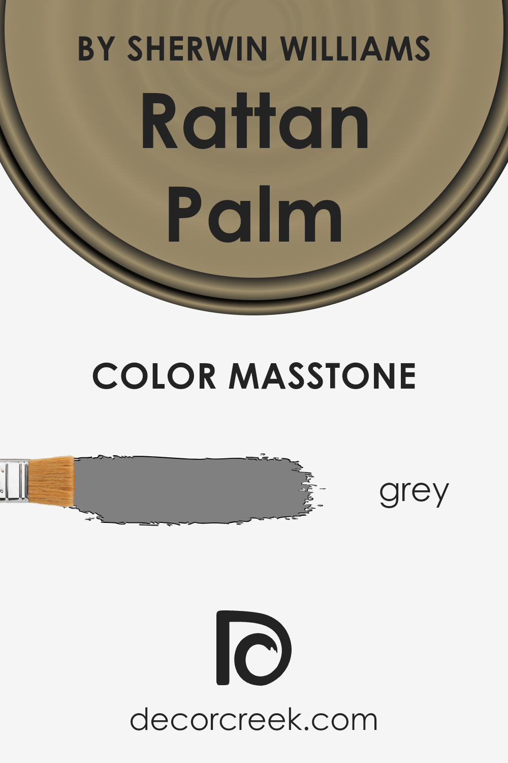
What is the Masstone of the Rattan Palm SW 9533 by Sherwin Williams?
Rattan Palm SW 9533, with a masstone of Grey (#808080), offers a versatile and sophisticated palette that can transform any home. This particular grey has a balanced, neutral tone, making it an excellent choice for those aiming to create a serene and refined ambiance.
The beauty of this hue lies in its adaptability; it can complement a wide range of decor styles, from modern minimalism to cozy, rustic themes. Its neutrality acts as a perfect backdrop, allowing furniture, artwork, and accents to stand out, while also offering the flexibility to pair with bolder colors for a striking contrast.
This makes it particularly effective in spaces that aim for a timeless look, as it does not overpower but rather enhances the room’s features. Additionally, Grey (#808080) has a calming effect, making it ideal for bedrooms and living spaces where relaxation is key.
Its ability to reflect light can also make smaller rooms feel more spacious and airy, further highlighting its utility in home design.
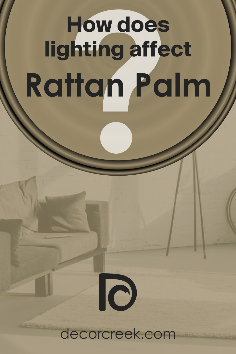
How Does Lighting Affect Rattan Palm SW 9533 by Sherwin Williams?
Lighting plays a pivotal role in the perception of colors, as it can significantly alter their appearance. This phenomenon occurs because light sources vary in their color temperatures, which are measured in Kelvins. Natural light, for instance, has a dynamic color temperature that changes from the warm red hues of sunrise and sunset to the bright, cool blue midday light.
Artificial light, on the other hand, ranges from the warm yellow glow of incandescent bulbs to the cooler, more neutral whites of LEDs. The interaction between the color temperature of light and pigments in paint causes our perception of color to shift based on the lighting conditions.
Taking a specific color as an example, such as the warm, neutral shade akin to “Rattan Palm,” its appearance can be quite dynamic under different lighting settings. Under artificial light, especially those with a warmer color temperature, this shade will likely appear cozier and richer, enhancing its natural, earthy tones.
In contrast, under cooler, daylight LED bulbs, the color might present itself as slightly muted, with its warmer undertones becoming less pronounced and its natural vibrancy toned down.
In rooms facing different directions, the influence of natural light shifts dramatically through the day. North-facing rooms receive less direct sunlight, casting a cooler, more consistent light that may make the color appear slightly more subdued and cooler than it would in a brightly lit showroom.
South-facing rooms bask in abundant sunlight, enriching and warming the color, allowing its depth and vibrancy to shine through beautifully, especially during midday.
East-facing rooms enjoy the warm glow of morning light, which can bring out the cozy, inviting qualities of the color in the morning, turning it more neutral and subdued as the day progresses.
Conversely, west-facing rooms are flooded with the intense, warm light of the setting sun, which can dramatically accentuate the warmth and richness of the color, making it appear bolder and more vibrant during the afternoon and evening.
The ever-changing nature of light, both natural and artificial, thus plays a crucial role in the perception of color, influencing its appearance and the mood it creates within a space.
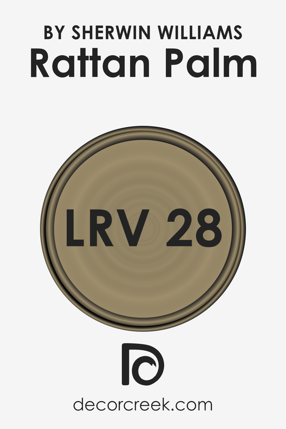
What is the LRV of Rattan Palm SW 9533 by Sherwin Williams?
Light Reflectance Value (LRV) is an important metric used to determine how light or dark a paint color will appear when applied to walls or other surfaces. The LRV scale ranges from 0 to 100, with 0 absorbing all light (completely black) and 100 reflecting all light (pure white).
This value is critical when selecting paint colors, as it influences both the atmosphere of a room and the perception of its size. A higher LRV can make a space feel larger and brighter since more light is reflected around the room.
Conversely, colors with lower LRVs create a cozier and more intimate ambiance by absorbing more light. Understanding a color’s LRV helps in making informed decisions about the mood and visual perception you want to achieve in a space, factoring in the amount of natural or artificial light it receives.
With an LRV of 27.787, the specific color mentioned falls on the darker side of the spectrum, absorbing more light than it reflects. This characteristic means that when used on walls, it can significantly influence the feel of the room, imparting a warm, rich, and intimate atmosphere.
It may make large spaces feel more inviting and smaller spaces even cozier, though care should be taken with lighting to ensure the space doesn’t become too dark. In spaces with ample natural light, this color can add depth and warmth without overpowering, while in poorly lit areas, strategic lighting will be crucial to avoid a claustrophobic effect.
The LRV indicates that this color is versatile enough for various design styles but will always introduce a strong presence and character to the space.
LRV – what does it mean? Read This Before Finding Your Perfect Paint Color
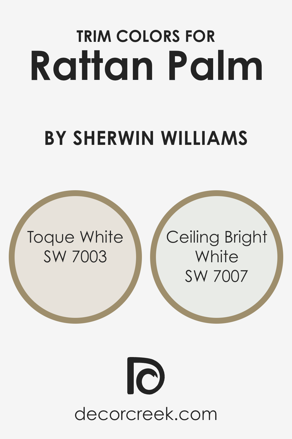
What are the Trim colors of Rattan Palm SW 9533 by Sherwin Williams?
Trim colors play a crucial role in interior and exterior design by accentuating the architectural features and defining the spaces within a room. When paired with a distinct color like Rattan Palm by Sherwin Williams, the choice of trim color can either subtly complement the main hue or introduce a striking contrast, thereby enhancing the overall aesthetic appeal.
The right trim color not only frames Rattan Palm beautifully but also ensures a cohesive and harmonious look. It’s about creating a balanced visual weight that draws the eye, offering a pleasing transition from the wall color to the different elements of a room such as door frames, skirting boards, and window sills.
Choosing Toque White or Ceiling Bright White as trim colors for Rattan Palm by Sherwin Williams presents two distinctly tasteful approaches. Toque White is a soft, warm white that brings a gentle, inviting contrast to the deeper, earthy tones of Rattan Palm, ensuring a smooth visual transition that ties the room together with a touch of elegance.
On the other hand, Ceiling Bright White offers a crisp, stark contrast that makes the colors pop, giving the space a fresh, vibrant feel. This combination can significantly influence the perception of size and space within the room, making it feel more open and airy.
Each color, with its unique undertone and brightness, plays an essential role in achieving the desired atmosphere and style when used alongside Rattan Palm.
You can see recommended paint colors below:
- SW 7003 Toque White
- SW 7007 Ceiling Bright White
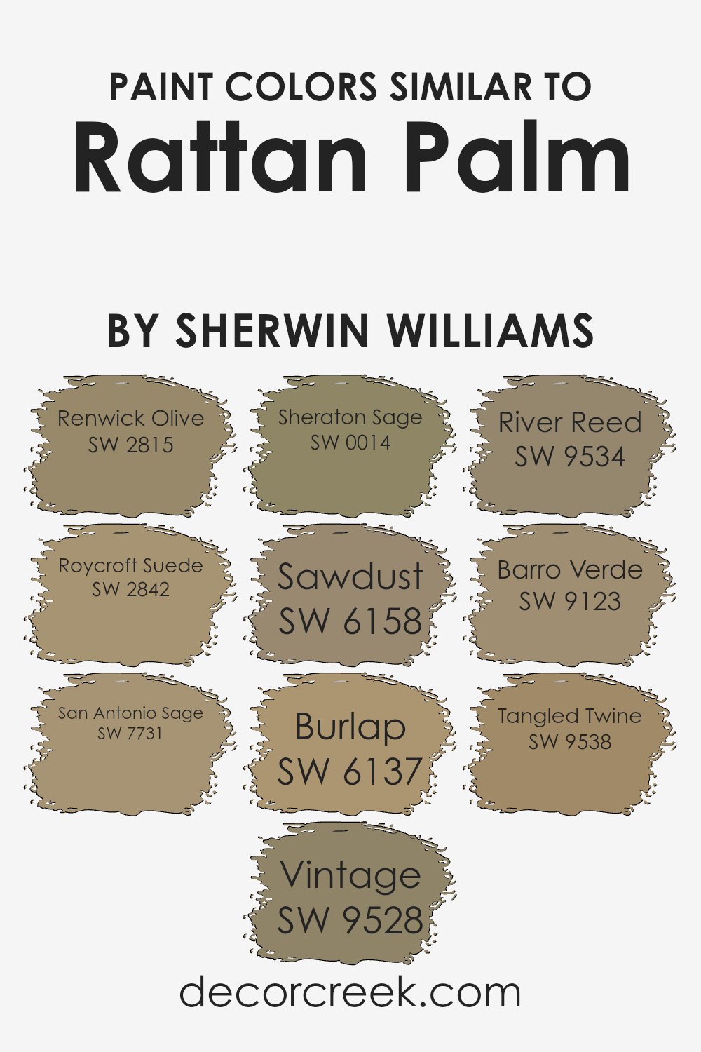
Colors Similar to Rattan Palm SW 9533 by Sherwin Williams
Similar colors play a crucial role in creating visually cohesive and harmonious spaces. They can enhance the atmosphere of a room, subtly tying together diverse elements for a unified aesthetic. For instance, colors akin to Rattan Palm by Sherwin Williams, such as Renwick Olive, exhibit an earthy, warm undertone that brings a sense of stability and grounding.
Roycroft Suede, on the other hand, deepens the palette with its richer, more luxuriant hue, invoking an air of sophistication and tradition. San Antonio Sage adds a soft, muted quality, making it perfect for creating a serene and calming environment.
Vintage offers a slightly aged look, evoking nostalgia and timelessness, while Sheraton Sage leans into the subtle elegance of lighter greens, providing a fresh and airy feel.
Sawdust introduces a lighter, more neutral option that complements wood tones beautifully, enhancing natural textures. Burlap further embraces the theme of naturality with its robust, earth-inspired color that adds depth and warmth. River Reed has a flowing, gentle quality that suggests a connection with nature and tranquility.
Barro Verde stands out with its unique blend of green and brown, suggesting the richness of wet earth, and thus, infusing spaces with a grounding, comforting vibe. Lastly, Tangled Twine, with its nuanced, complex shade, bridges the gap between green and brown, offering versatility and an organic feel.
Together, these colors illustrate the importance of selecting similar hues that can enrich and diversify a space while maintaining a cohesive look and feel.
You can see recommended paint colors below:
- SW 2815 Renwick Olive
- SW 2842 Roycroft Suede
- SW 7731 San Antonio Sage
- SW 9528 Vintage
- SW 0014 Sheraton Sage
- SW 6158 Sawdust
- SW 6137 Burlap
- SW 9534 River Reed
- SW 9123 Barro Verde
- SW 9538 Tangled Twine
How to Use Rattan Palm SW 9533 by Sherwin Williams In Your Home?
Rattan Palm is a captivating paint color from Sherwin Williams that embodies warmth and versatility, making it an exceptional choice for those looking to infuse their homes with a cozy yet sophisticated ambiance. This rich, inviting hue has the unique ability to add depth and character to a space, creating a comforting backdrop for both everyday living and entertaining.
Imagine transforming your living room or bedroom into a serene oasis, where Rattan Palm serves as the perfect wall color, setting off natural wood furniture and textiles in earthy tones or soft whites, enhancing the room’s overall warmth.
It’s equally striking in a kitchen or dining area, where it can complement wooden cabinetry or contrast beautifully with modern fixtures and appliances, adding a touch of elegance and timeless appeal.
Beyond walls, Rattan Palm can be used on accent pieces, such as a painted bookshelf or kitchen island, offering a subtle yet impactful pop of color. It pairs well with a wide range of decor styles, from rustic to contemporary, making it a versatile choice for those seeking to create a cohesive look throughout their home.
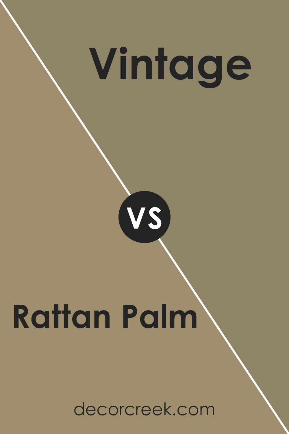
Rattan Palm SW 9533 by Sherwin Williams vs Vintage SW 9528 by Sherwin Williams
Rattan Palm is a warm, earthy hue, reminiscent of the natural fibers and materials it’s named after. This color embodies a sense of organic coziness and comfort, making it ideal for creating a welcoming and serene space. Its richness is grounded in subtle brown undertones, offering a sophisticated yet down-to-earth vibe that’s versatile for various decor styles.
On the other hand, Vintage is a lighter, airier color, carrying a soft, muted quality that speaks of elegance and timeless charm. It leans more towards a neutral palette, providing a perfect backdrop for accents of any color.
Vintage’s gentle presence can open up spaces, making it a great choice for rooms seeking a touch of brightness without overwhelming the senses.
Together, Rattan Palm and Vintage complement each other beautifully, with Rattan Palm providing depth and warmth, while Vintage offers a contrasting lightness, creating a harmonious balance that can enrich any living space.
You can see recommended paint color below:
- SW 9528 Vintage
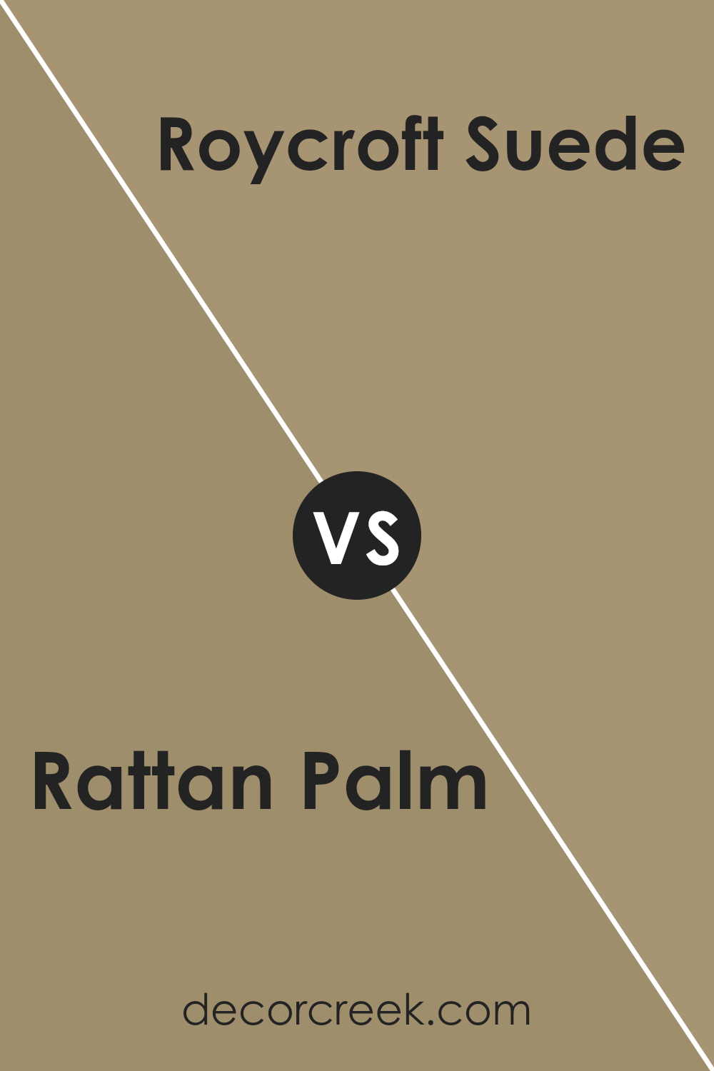
Rattan Palm SW 9533 by Sherwin Williams vs Roycroft Suede SW 2842 by Sherwin Williams
Rattan Palm and Roycroft Suede, two distinct hues from Sherwin Williams, offer unique visual experiences. Rattan Palm is a warm, muted hue that evokes feelings of comfort and simplicity. Its natural earthiness lends itself well to spaces seeking a touch of organic charm, providing a soft backdrop that complements a wide array of decor styles.
On the other hand, Roycroft Suede ventures into a deeper, richer territory. This color captures the essence of sophistication with its velvety depth, making it ideal for creating an ambiance of refined elegance. Its luxurious undertone offers a perfect solution for areas in the home aimed at making a statement or fostering an intimate atmosphere.
While both colors share an inherent warmth, their individual characteristics and intensities provide different thematic directions, from the understated and comforting to the bold and luxurious.
You can see recommended paint color below:
- SW 2842 Roycroft Suede
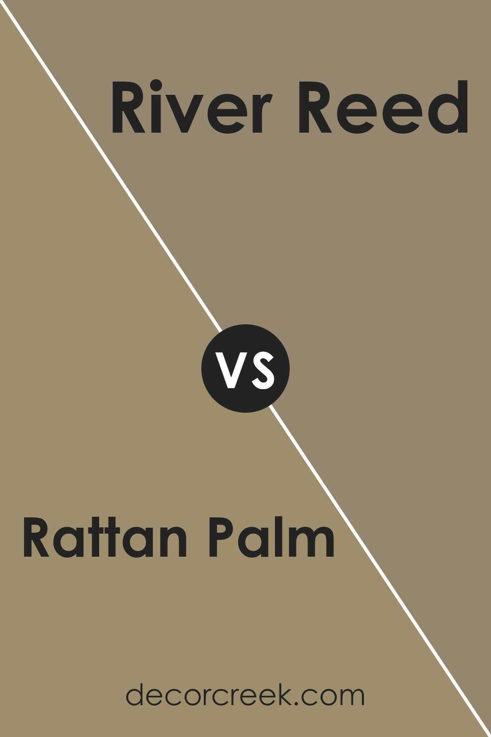
Rattan Palm SW 9533 by Sherwin Williams vs River Reed SW 9534 by Sherwin Williams
Rattan Palm and River Reed, both by Sherwin Williams, are nuanced shades that subtly stand apart. Rattan Palm offers a warm, inviting atmosphere, evoking the natural, rustic charm of woven rattan under a soft, golden sunlight. Its hue is reminiscent of sandy beaches and serene, sunlit afternoons, making it a perfect choice for creating a comforting and cozy ambiance in any space.
On the other hand, River Reed introduces a slightly cooler, more subdued tone. This color takes inspiration from the serene and calming qualities of a gently flowing river, surrounded by lush reeds. It’s a shade that speaks of tranquility and subtle elegance, lending itself beautifully to spaces intended for relaxation and calm.
Together, these two colors complement each other, with Rattan Palm bringing warmth and brightness, while River Reed offers a soothing, natural contrast, perfect for creating harmonious and balanced aesthetic environments.
You can see recommended paint color below:
- SW 9534 River Reed
Rattan Palm SW 9533 by Sherwin Williams vs Renwick Olive SW 2815 by Sherwin Williams
Rattan Palm and Renwick Olive, both by Sherwin Williams, present a palette that bridges the warmth of nature with subtle elegance. Rattan Palm exudes a soft, creamy warmth, akin to the sunlit hues of natural rattan fibers. Its light, inviting tone offers a neutral backdrop with just enough depth to add a cozy feel to spaces without overwhelming them with color.
On the other hand, Renwick Olive steps into the realm of earthy sophistication. This color draws from the rich, muted greens of olive groves, providing a deeper and slightly more complex character. Its understated green undertones evoke a sense of calm and connection to the natural world, making it ideal for creating serene, grounded spaces.
When comparing these two, Rattan Palm offers brightness and lightness, perfect for airy, luminous rooms, while Renwick Olive brings depth and an organic feel, suited for creating a refined, nurturing environment.
Together, they complement each other, with Rattan Palm uplifting spaces with its gentle warmth and Renwick Olive anchoring them in earthy depth.
You can see recommended paint color below:
- SW 2815 Renwick Olive
Rattan Palm SW 9533 by Sherwin Williams vs Sheraton Sage SW 0014 by Sherwin Williams
Rattan Palm is a warm, inviting shade that bridges the gap between beige and soft yellow, offering a hint of earthiness akin to sunlit natural fibers. This color exudes an understated elegance and a welcoming ambiance, perfect for creating light, airy spaces that feel grounded yet open. It pairs beautifully with both bright and muted accents, serving as a versatile backdrop for various design styles.
Sheraton Sage, on the other hand, introduces a serene, sophisticated green with gray undertones, reminiscent of the muted tones found in heritage gardens and vintage textiles. This color promotes tranquility and balance, making it ideal for creating peaceful, refined spaces.
Its subtle sage hue evokes a sense of nature while maintaining an air of classic charm, easily complementing both traditional and modern decors.
Comparatively, Rattan Palm offers warmth and light, enhancing spaces with a sunny disposition, while Sheraton Sage brings a calming, nature-inspired element, excellent for crafting soothing retreats. Each color, rooted in nature but diverging in its expression, accommodates distinct aesthetic and emotional landscapes within interior design.
You can see recommended paint color below:
- SW 0014 Sheraton Sage
Rattan Palm SW 9533 by Sherwin Williams vs San Antonio Sage SW 7731 by Sherwin Williams
Rattan Palm and San Antonio Sage, both by Sherwin Williams, epitomize the warmth and Earthiness inherent to natural landscapes, yet they impart distinctly different moods and visual temperatures within a space.
Rattan Palm embodies a lighter, warmer hue, reminiscent of sunlit, sandy shores and dried grasses gently swaying in a summer breeze. This color offers a welcoming ambiance, perfect for creating cozy, light-filled interiors that feel open and airy.
Conversely, San Antonio Sage leans into the cooler spectrum of Earth tones, drawing inspiration from the muted shades of desert sagebrush and olive groves at dusk. It provides a more subdued, grounding effect, ideal for spaces intended to evoke calmness and tranquility. This color can serve as a sophisticated backdrop, lending an aura of serene elegance to any room.
When comparing these two, the choice between Rattan Palm and San Antonio Sage hinges on the desired emotional and aesthetic impact within a space.
Rattan Palm introduces brightness and warmth, fostering an inviting, cheerful atmosphere, while San Antonio Sage offers depth and serenity, perfect for creating a peaceful, refined setting.
You can see recommended paint color below:
- SW 7731 San Antonio Sage
Rattan Palm SW 9533 by Sherwin Williams vs Tangled Twine SW 9538 by Sherwin Williams
Main color, Rattan Palm, presents as a warm, inviting neutral with an earthy base that evokes a sense of calm and coziness. This hue carries subtle undertones that can beautifully complement natural materials and soft textiles, making it a versatile choice for spaces seeking both comfort and a touch of elegance.
In contrast, Tangled Twine leans towards a deeper, more pronounced neutral palette. While it shares the earthiness of Rattan Palm, it introduces a slightly more intense and grounding effect. Tangled Twine offers a rich backdrop that can anchor a room, providing depth and a sophisticated contrast when paired with lighter tones and textures.
Both colors celebrate the beauty of natural elements, yet each brings its unique atmosphere to a space. Rattan Palm is lighter and more adaptable, perfect for creating airy, serene environments. Tangled Twine, on the other hand, offers strength and character, ideal for making bold yet harmonious statements.
Together, these colors can create a balanced and inviting space, blending warmth and depth with natural elegance.
You can see recommended paint color below:
- SW 9538 Tangled Twine
Rattan Palm SW 9533 by Sherwin Williams vs Burlap SW 6137 by Sherwin Williams
Rattan Palm and Burlap, both by Sherwin Williams, offer an inviting palette that leans towards natural and earthy tones. Rattan Palm presents itself as a warm, muted hue that captures the essence of its namesake.
It embodies the light, sandy beige found in the fibers of rattan furniture, suggesting a soft, neutral backdrop suitable for spaces aiming for a relaxed, but subtly sophisticated vibe. This color is ideal for creating a serene, light-filled room that feels open and airy.
On the other hand, Burlap takes a deeper, richer approach. It evokes the raw, natural texture of its namesake fabric. This color is darker and more saturated than Rattan Palm, offering a stronger presence and depth.
Burlap provides a sense of grounding, making it a perfect choice for areas where a touch of robust warmth is desired. It’s especially suited for spaces that aim to feel cozy and enveloping, adding a layer of comfort without overwhelming the senses.
Together, Rattan Palm and Burlap could complement each other beautifully, with Rattan Palm offering a lighter contrast to the more intense and earthy Burlap. This combination can create a balanced, harmonious environment that plays on the strengths of nature-inspired hues.
You can see recommended paint color below:
- SW 6137 Burlap
Rattan Palm SW 9533 by Sherwin Williams vs Barro Verde SW 9123 by Sherwin Williams
Rattan Palm and Barro Verde, both from Sherwin Williams, encapsulate a natural and earthy palette, yet each brings a distinct vibe to interiors. Rattan Palm, a soft, muted hue, echoes the gentle warmth of sunlit, woven rattan fibers, providing spaces with a cozy, inviting feel.
It seamlessly blends warmth with a light neutrality, making it versatile for rooms seeking a subtle hint of color without overpowering the senses.
Barro Verde, on the other hand, delves into the depth of nature’s palette with its richer, earthy green tones. It evokes the essence of natural clay gardens and lush landscapes, offering a more pronounced statement.
Barro Verde brings spaces to life with its vibrant yet soothing green undertones, ideal for creating an oasis of tranquility or a backdrop that connects the interior with the natural world outside.
While Rattan Palm tends to lift spaces with its light, airy quality, Barro Verde anchors them with its grounding, serene ambiance. Both colors offer a touch of nature but cater to different aesthetic and emotional moods within a space.
You can see recommended paint color below:
- SW 9123 Barro Verde
Rattan Palm SW 9533 by Sherwin Williams vs Sawdust SW 6158 by Sherwin Williams
Rattan Palm is a warm, neutral shade that leans towards a creamy beige, presenting a light and airy feel. Its base tone suggests an easygoing elegance that can seamlessly integrate into various spaces, promoting a sense of calm and openness. The color evokes the natural beauty and simplicity of its namesake, making it an ideal choice for creating a serene and inviting atmosphere.
On the other hand, Sawdust occupies a similar spectrum but edges closer to a richer, deeper hue. It embodies a more pronounced earthiness, reminiscent of the natural wood tones its name suggests. This color brings to mind the comfortable warmth of woodworking shops and the tactile pleasure of natural materials.
It offers a slightly more assertive presence than Rattan Palm, grounding spaces with its robust character while still maintaining a connection to natural elements.
Though both colors are inspired by the natural world, Rattan Palm offers a lighter, breezier approach, while Sawdust provides depth and warmth, making each suited to different aesthetic goals and atmospheres.
You can see recommended paint color below:
- SW 6158 Sawdust
Conclusion
Rattan Palm by Sherwin Williams, recognized by its code SW 9533, encapsulates the warmth and natural elegance that homeowners seek when aiming for a comforting and grounded atmosphere in their living spaces.
This particular hue captures the essence of the serene and earthy elements inspired by the rattan palm itself, offering a versatile option that bridges the gap between modern sophistication and rustic charm.
The color exudes a sense of calm and is adaptable enough to complement a wide range of decor styles, from contemporary to traditional, making it a popular choice for those looking to inject a touch of organic warmth into their interiors without overwhelming the space.
In conclusion, Rattan Palm SW 9533 stands out in Sherwin Williams’ palette as a testament to the growing trend towards nature-inspired interiors. Its ability to harmonize with various design elements and materials highlights its versatility and appeal.
Whether applied in living rooms, bedrooms, or as an accent in more confined spaces, it brings a sense of tranquility and grounding that is much sought after in today’s fast-paced world. This color not only enhances the aesthetic appeal of a home but also contributes to creating a serene and inviting environment, proving that a thoughtful choice in wall color can indeed transform the ambiance of any room.
Ever wished paint sampling was as easy as sticking a sticker? Guess what? Now it is! Discover Samplize's unique Peel & Stick samples.
Get paint samples