If you’re considering refreshing your room and pondering over the perfect shade of paint, you may want to check out Sherwin Williams’ SW 7016 Mindful Gray. As someone who has tackled numerous home renovation projects, I’ve learned a few crucial points about this particular color that could help you in making a more informed decision. First, don’t be misled by the name—though “gray” is in the title, Mindful Gray actually carries warm undertones that can bring a cozy and inviting feel to any room.
This is especially important to note because lighting can significantly impact how this color appears; it might look different from morning to night or in a room with less natural light. Secondly, compatibility is key. Mindful Gray has a chameleon-like quality—it adapts well with various textures and complementary colors, which makes it an adaptable choice for almost any room, whether it’s your kitchen, living room, or a bedroom.
Before you decide to repaint your entire home, consider testing it in a small area to see how it interacts with elements of your décor and the changing light throughout the day.
Choosing a paint color is no small decision, and with Mindful Gray, you have a potentially beautiful option that needs careful consideration to truly shine in your room.
Is Mindful Gray SW 7016 Right for My Home?
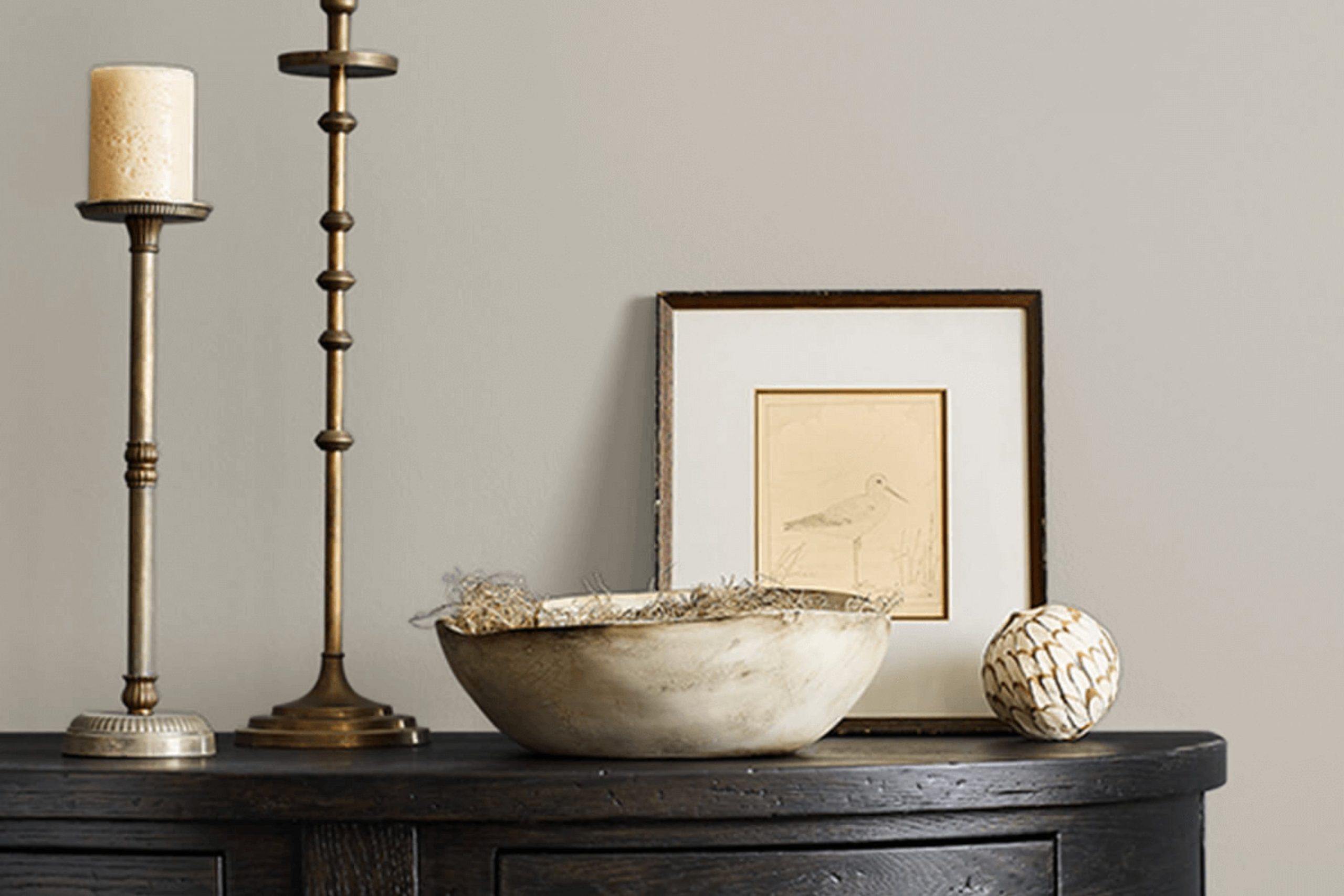
Mindful Gray is a warm, gentle gray shade that feels cozy yet fresh. This color has a balance of beige undertones that make it adaptable for various decorating styles. I find it quite flexible — it blends smoothly in most settings.
In my experience, Mindful Gray works wonderfully in minimalist, modern, and even traditional rooms. It serves as a neutral backdrop that allows furniture and art to stand out. When I used it in a room filled with light, the color offered a soothing, soft quality without feeling cold, which sometimes happens with grays. In a room with less natural light, it provided depth and warmth, creating an inviting feel.
As for pairing with materials, this color goes hand in hand with natural wood, adding a touch of warmth to the room. It also looks stunning against white trim or white furniture, providing a subtle contrast. Textures like linen or velvet make the color stand out, giving the room a layered look. I’ve also mixed it with metallic finishes like brushed nickel and aged brass, which enhance the room without feeling too much.
I enjoy using Mindful Gray because it’s a straightforward choice that maintains its charm in different settings, easily supporting varying design preferences.
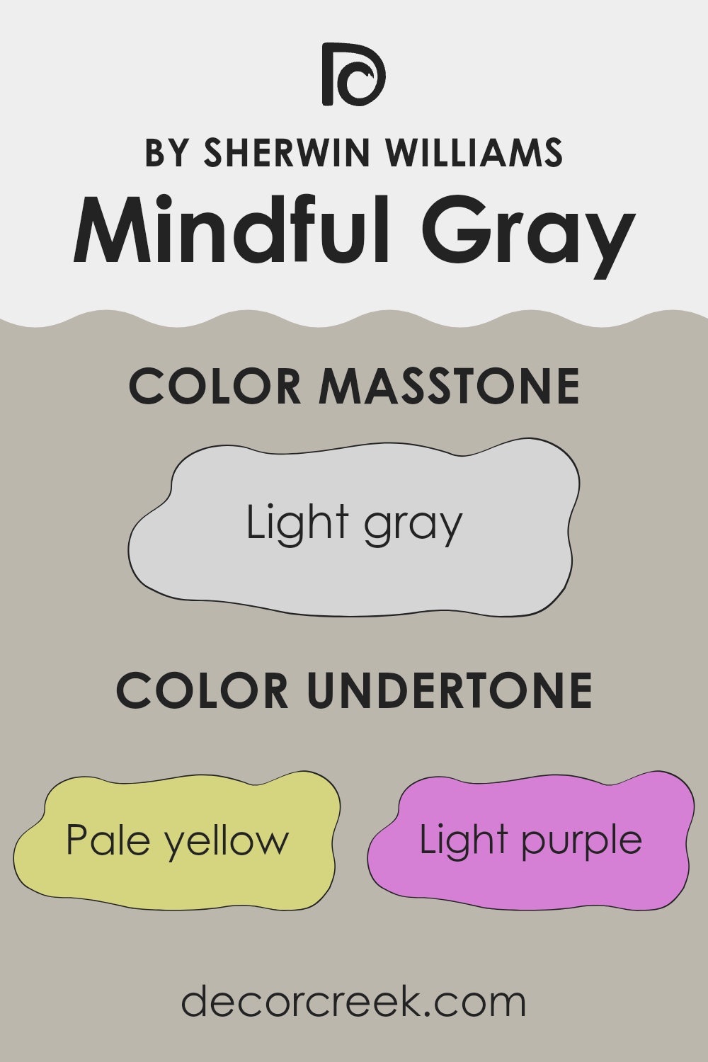
What are the right undertones of Mindful Gray SW 7016 ?
Mindful Gray is an adaptable shade that strikes a balance between gray and beige, making it a popular choice for interior walls. The subtleties of its undertones play a significant role in how the color presents itself in different lighting conditions, lending a dynamic quality to any room.
One of the key aspects of Mindful Gray’s undertones is their range from pale yellow to lilac, which includes hints of light purple, pale pink, light blue, mint, and classic gray. These undertones can subtly influence the feel and appearance of a room. For example, the pale yellow undertone can add a hint of warmth in sunlight, making a room feel cozy and welcoming. In contrast, the light blue and mint undertones might make the color appear cooler, which can help a small room seem more open and airy.
Using paint with diverse undertones like Mindful Gray allows walls to interact interestingly with different types of light throughout the day. In natural light, the color might lean toward its cooler undertones, creating a calm, refreshing atmosphere. Meanwhile, in artificial lighting, the warmer tones such as pale pink and lilac could become more noticeable, giving the room a softer, gentle vibe.
Overall, the combination of undertones in Mindful Gray means that it adjusts its character from morning to night and from one room to another, offering flexibility in use and an appealing backdrop for various decor styles.
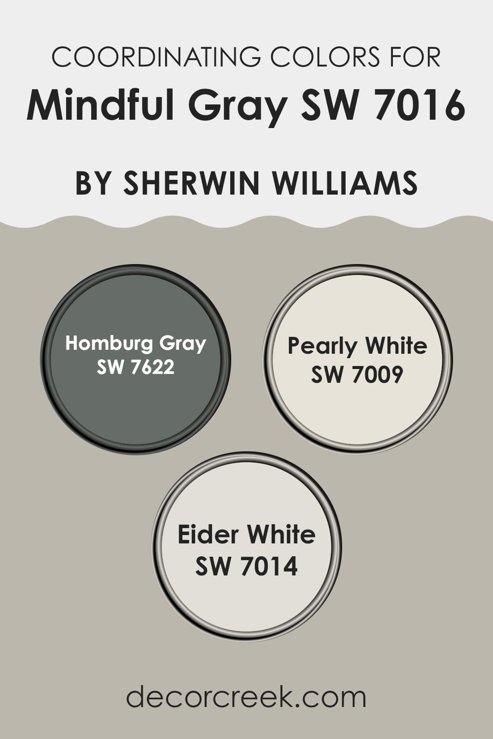
Best Coordinating Colors to use with Mindful Gray SW 7016 by Sherwin Williams this year.
Coordinating colors are those that harmonize well with a main color, enhancing the overall aesthetic of a room without feeling too strong. The key to working with coordinating colors is to select hues that complement the main shade, creating a visually appealing palette. For example, when using an adaptable neutral like Mindful Gray from Sherwin Williams, choosing the right coordinating colors can balance and enrich the color scheme.
Homburg Gray is a deeper, more substantial shade that pairs nicely with the lighter Mindful Gray, offering an excellent option for those looking to add depth to their color scheme. It works well for accent walls or furniture, providing a strong but harmonious contrast. On the lighter side, Pearly White is a soft, airy color that brings a subtle brightness to rooms, making it perfect for trim or ceiling colors that offer a fresh, clean look without clashing.
Lastly, Eider White provides a slightly cooler undertone, which helps create a gentle transition between the more pronounced shades in a room. It’s an excellent choice for creating a cohesive look when used on adjacent walls or larger surfaces. These colors together form a palette that enhances the base color, allowing for a balanced and visually pleasing environment.
You can see recommended paint colors below:
- SW 7622 Homburg Gray
- SW 7009 Pearly White
- SW 7014 Eider White
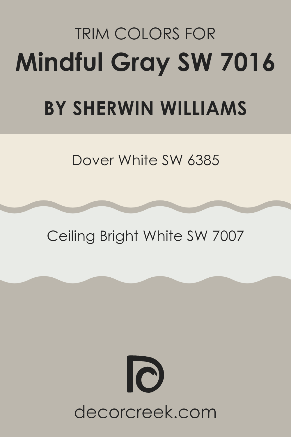
Trendy Trim Colors of Mindful Gray SW 7016 by Sherwin Williams to use this year.
Trim colors are used to highlight the architectural features of a room, such as doors, window frames, and crown molding, by providing a contrasting shade to the main wall color. When Mindful Gray is painted on the walls, choosing the right trim colors can emphasize the beauty of the gray shade and create a clean, finished look.
SW 6385 – Dover White and SW 7007 – Ceiling Bright White are excellent choices for trim colors as they offer a subtle yet striking contrast against Mindful Gray, pulling together an aesthetic that feels cohesive and pleasing to the eye.
Dover White (SW 6385) is a warm, creamy white with a soft character that complements the cool undertones of Mindful Gray without creating an overly stark contrast, thus ensuring the room feels inviting. Ceiling Bright White (SW 7007), on the other hand, is a pristine and crisp white color that gives a fresh, clean backdrop for Mindful Gray, enhancing the perceived light and airiness of the room. Both colors assist in defining rooms clearly, adding a touch of brightness around the edges and making the wall color pop in an understated yet impactful way.
You can see recommended paint colors below:
- SW 6385 Dover White
- SW 7007 Ceiling Bright White
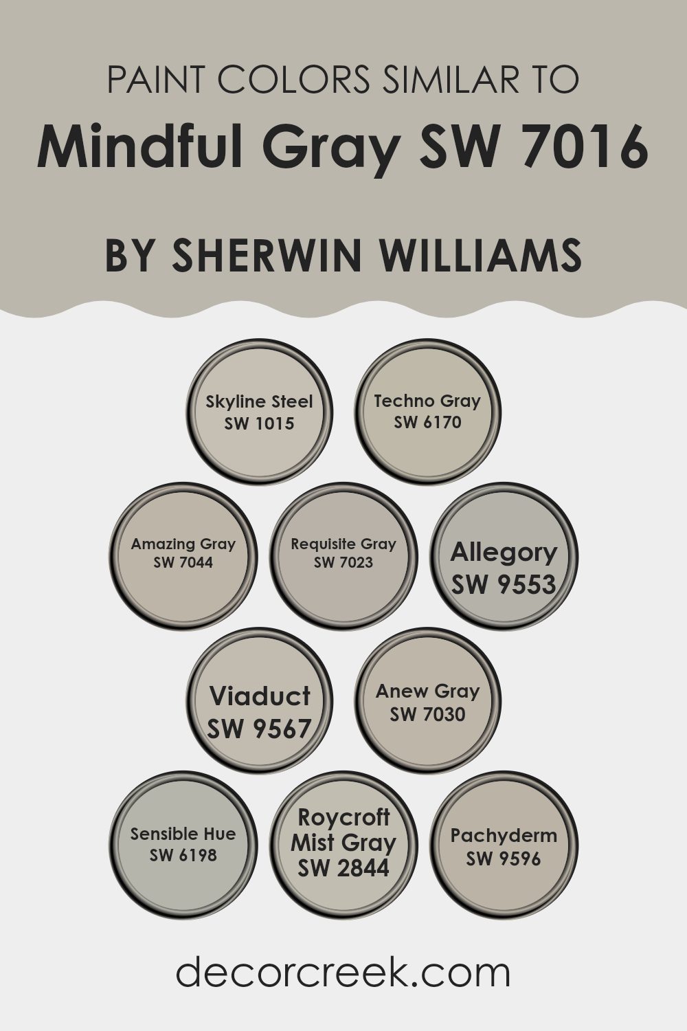
Evergreen Colors Similar to Mindful Gray SW 7016 by Sherwin Williams
When redecorating a room, choosing the right color palette is not only essential for aesthetic harmony but also for creating a cohesive ambiance. Similar colors to Mindful Gray by Sherwin Williams, such as Skyline Steel, Techno Gray, and Amazing Gray, offer subtle variations that can complement one another beautifully. These colors are close in hue, maintaining a balance that’s pleasing to the eye, which makes blending them across different rooms or furniture pieces seamless and effective.
Skyline Steel has a gentle metallic undertone that imparts a clean, contemporary feel, ideal for modern living rooms. Techno Gray steps it up a notch with deeper hints, giving a more pronounced but still neutral backdrop that works well in technology-driven or minimalist areas. Amazing Gray’s slightly warmer tones provide a welcoming atmosphere, perfect for common areas like the living room.
Requisite Gray adds just a tad more depth, making it well-suited for accent walls or coordinating with brighter colors. Allegory, with its soft and muted poise, is ideal for creating a restful bedroom environment. Viaduct, on a similar note, offers a sturdy, foundational gray that pairs well with a range of decor styles.
Anew Gray, with a touch of warmth, is adaptable, fitting various settings from kitchens to hallways. Sensible Hue stands out with its slightly greenish cast, offering a unique twist to neutral schemes. Roycroft Mist Gray, reminiscent of a foggy morning, adds an air of mystery and depth without feeling too intense, perfect for cozy nooks or dens.
Lastly, Pachyderm, the boldest among them, provides a strong anchor, great for highlighting focal points or as a statement piece against lighter tones. Each of these colors, while distinct, shares a foundational similarity to Mindful Gray, ensuring they work harmoniously within your decor plans.
You can see recommended paint colors below:
- SW 1015 Skyline Steel
- SW 6170 Techno Gray
- SW 7044 Amazing Gray
- SW 7023 Requisite Gray
- SW 9553 Allegory
- SW 9567 Viaduct
- SW 7030 Anew Gray
- SW 6198 Sensible Hue
- SW 2844 Roycroft Mist Gray
- SW 9596 Pachyderm
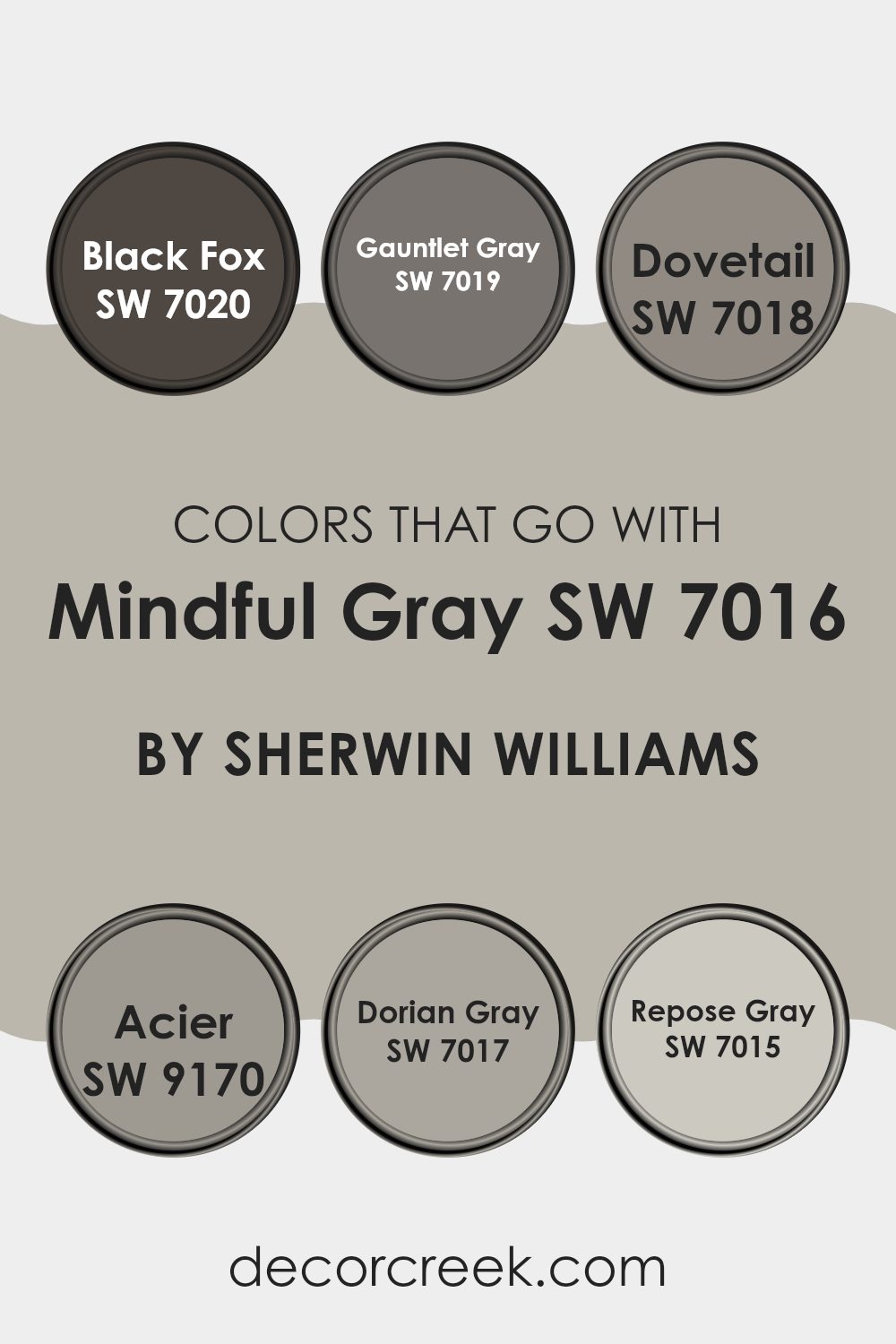
Colors that Go With Mindful Gray SW 7016 by Sherwin Williams
Choosing the right colors to pair with Mindful Gray SW 7016 by Sherwin Williams is crucial for reaching a harmonious and appealing design in any room. Mindful Gray is an adaptable mid-tone gray that serves as a perfect neutral backdrop, making it essential to pick coordinating colors that enhance its beauty and balance the overall look of the room.
For example, Black Fox SW 7020 presents a deep, almost black gray that offers a striking contrast to the lighter Mindful Gray, ideal for creating bold statements in detailing or furniture. Similarly, Gauntlet Gray SW 7019, a darker gray, provides a solid, grounding effect when used alongside Mindful Gray, particularly in areas that demand a touch of gravity.
Dovetail SW 7018 brings a warmer tone to the ensemble, adding a cozy feel when paired with Mindful Gray, suitable for living rooms or bedrooms. Acier SW 9170 offers a slate-like shade, giving a subtle difference that helps in defining rooms gently but clearly. Dorian Gray SW 7017, a slightly darker shade than Mindful Gray, blends well to offer minimal contrast, great for a fluid visual flow in larger rooms.
Lastly, Repose Gray SW 7015 is lighter and can brighten rooms while still complementing the cool undertones of Mindful Gray, perfect for maintaining a light and airy atmosphere. All these shades work together to create a cohesive palette that enhances the atmosphere without feeling too intense.
You can see recommended paint colors below:
- SW 7020 Black Fox
- SW 7019 Gauntlet Gray
- SW 7018 Dovetail
- SW 9170 Acier
- SW 7017 Dorian Gray
- SW 7015 Repose Gray
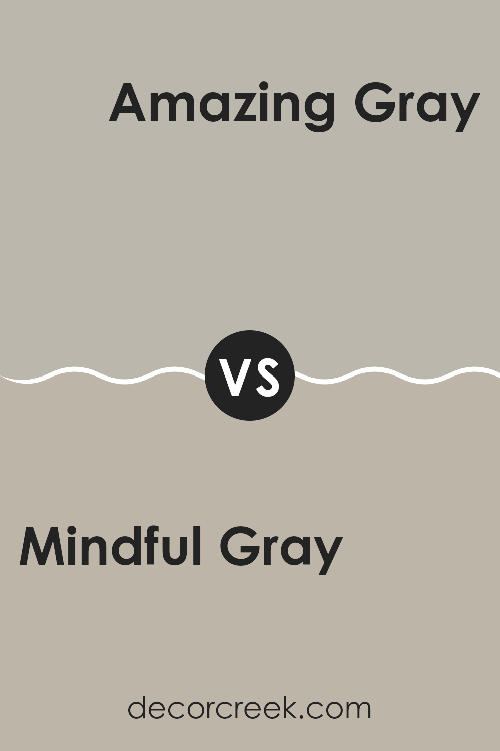
Mindful Gray SW 7016 by Sherwin Williams vs Amazing Gray SW 7044 by Sherwin Williams
Mindful Gray and Amazing Gray are both popular paint colors by Sherwin Williams, ideal for creating a warm and welcoming atmosphere in any home. Mindful Gray has a slightly greener undertone compared to Amazing Gray, giving it a cooler feel.
This makes Mindful Gray a great choice for rooms that get a lot of light, as it helps balance the brightness. On the other hand, Amazing Gray has a warmer taupe undertone, offering a cozier feel, which is perfect for rooms with less natural light or for creating a snug, inviting environment.
Both shades are adaptable and neutral, meaning they can work well with various decor styles and color schemes. While they are quite similar, the choice between them may depend on the specific mood or look you want to achieve in your room.
You can see recommended paint color below:
- SW 7044 Amazing Gray
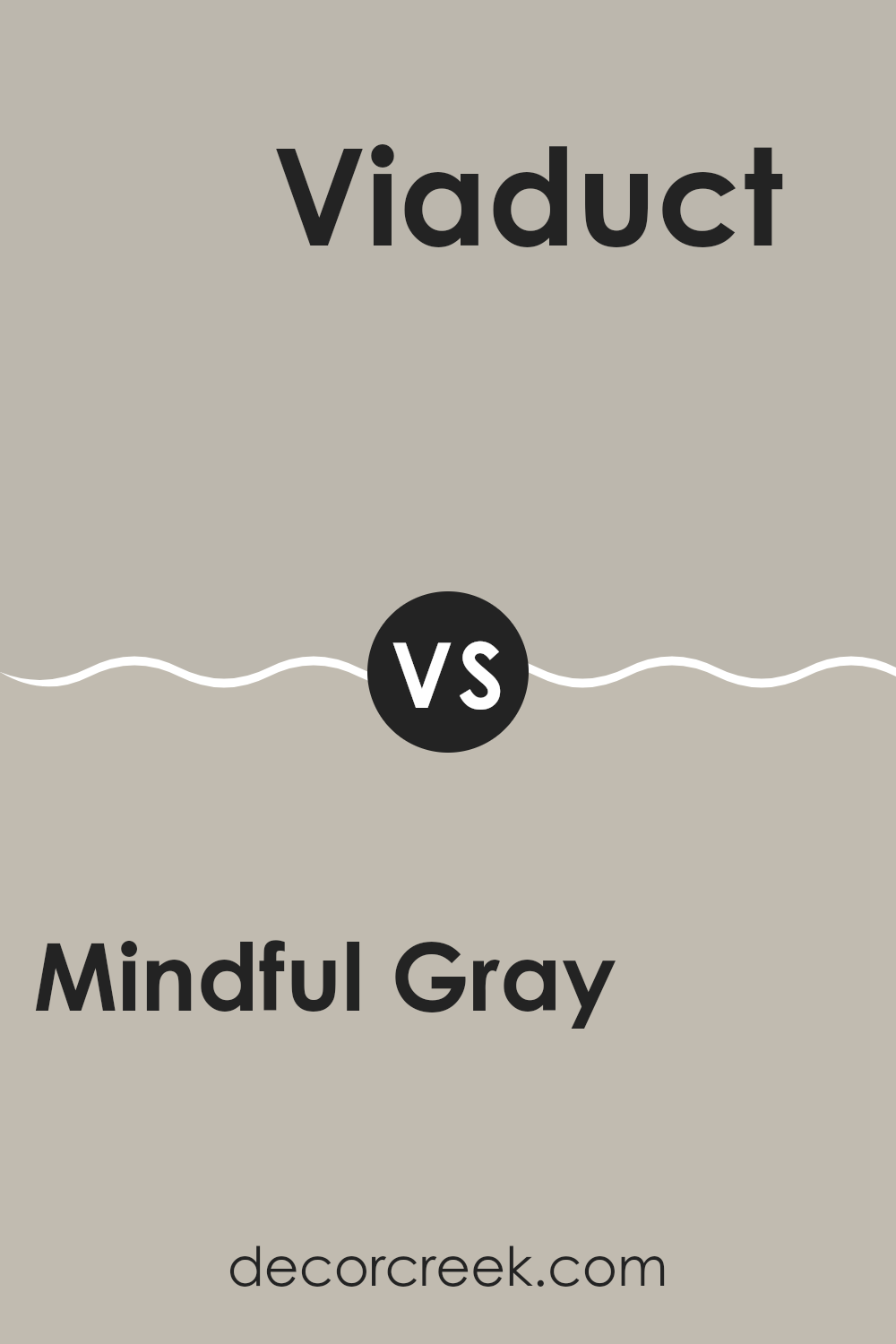
Mindful Gray SW 7016 by Sherwin Williams vs Viaduct SW 9567 by Sherwin Williams
Mindful Gray is a neutral shade, balancing between gray and beige. This makes it an adaptable color that can fit well in various settings, whether it’s a living room or a bedroom. It provides a soft, soothing backdrop that is easy on the eyes and pairs well with a wide range of decor styles.
On the other hand, Viaduct is a darker, more defined gray. It has a modern feel and is perfect for creating dramatic, bold looks in a room. Due to its deeper tone, Viaduct can make a room feel more grounded and defined. It’s ideal for accent walls or for use in areas where you want to make a strong visual statement.
Both colors are great choices depending on your needs: Mindful Gray for a gentle, light atmosphere, and Viaduct for a more striking, defined room.
You can see recommended paint color below:
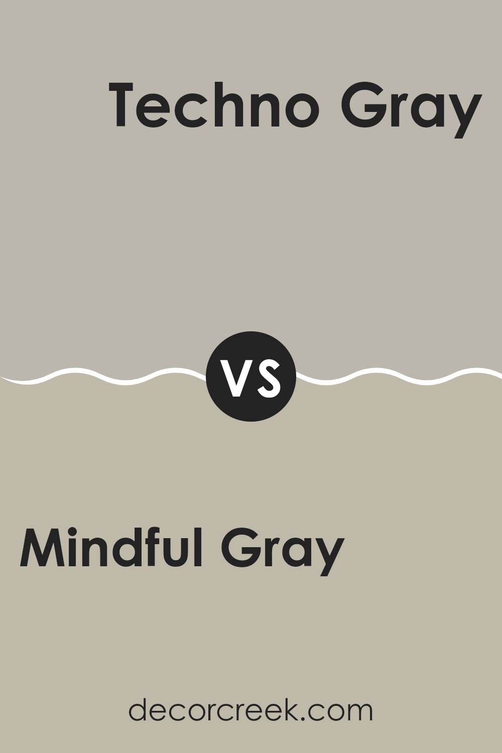
Mindful Gray SW 7016 by Sherwin Williams vs Techno Gray SW 6170 by Sherwin Williams
Mindful Gray and Techno Gray by Sherwin Williams are two popular colors that share some similarities yet have distinct differences. Mindful Gray is an adaptable, warm gray with a slight hint of green undertone, making it a cozy and inviting color for any room. It’s light enough to keep rooms looking bright but also has enough depth to provide a comforting presence.
Techno Gray, on the other hand, is a darker shade that leans more toward a true, neutral gray. It lacks the warmer undertones found in Mindful Gray, instead presenting a cooler, more balanced gray. This makes it excellent for modern settings or areas where a bold, yet understated elegance is desired.
Both colors offer a neutral palette, but Mindful Gray offers a hint of warmth, making it softer and more adaptable, while Techno Gray stands out in rooms that call for a sharper, more straightforward gray tone.
You can see recommended paint color below:
- SW 6170 Techno Gray
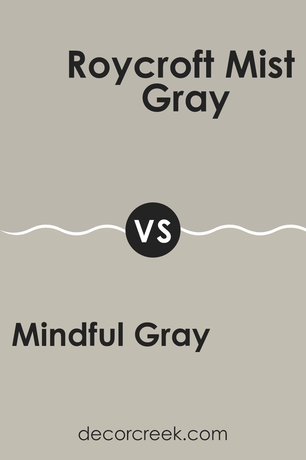
Mindful Gray SW 7016 by Sherwin Williams vs Roycroft Mist Gray SW 2844 by Sherwin Williams
Mindful Gray and Roycroft Mist Gray are both from Sherwin Williams, but they offer different tones that can greatly affect the mood of a room. Mindful Gray stands out as a warmer gray with a soft, welcoming feel. It has a balance of beige and gray, making it adaptable for different rooms and lighting situations.
On the other hand, Roycroft Mist Gray leans toward a cooler tone, appearing slightly more reserved and subtle compared to Mindful Gray. It works well in rooms where a calm and understated backdrop is preferred. Overall, if you’re looking for a gray color that brings a bit of warmth to your room, Mindful Gray is the better choice.
For a cooler and more subtle gray, Roycroft Mist Gray is the way to go. Both colors are quite neutral, so they can fit in various design styles and pair well with many decor elements.
You can see recommended paint color below:
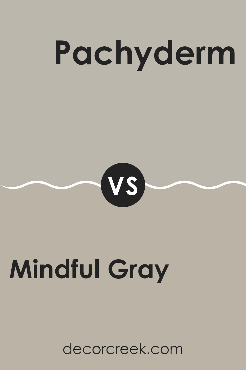
Mindful Gray SW 7016 by Sherwin Williams vs Pachyderm SW 9596 by Sherwin Williams
Mindful Gray and Pachyderm by Sherwin Williams are two distinct colors that can create different moods in a room. Mindful Gray is a soft, light gray with warm undertones, making it a flexible choice that can work well in many rooms whether you’re aiming for a relaxed or more formal vibe. It reflects light beautifully, which can make smaller rooms appear larger and more inviting.
Pachyderm, on the other hand, is a much darker shade. It’s a rich, deep gray with hints of brown, giving it a grounding and cozy feel. This color is ideal for creating a dramatic effect or accentuating a specific area in a room. Because of its intensity, it might be better suited for larger rooms or as a feature wall to avoid making a small room feel too closed in.
Both colors offer their unique charm, with Mindful Gray providing a lighter, airier feeling, and Pachyderm offering depth and warmth. The choice between the two would depend on the atmosphere you’re looking to achieve and the characteristics of the room you’re decorating.
You can see recommended paint color below:
- SW 9596 Pachyderm
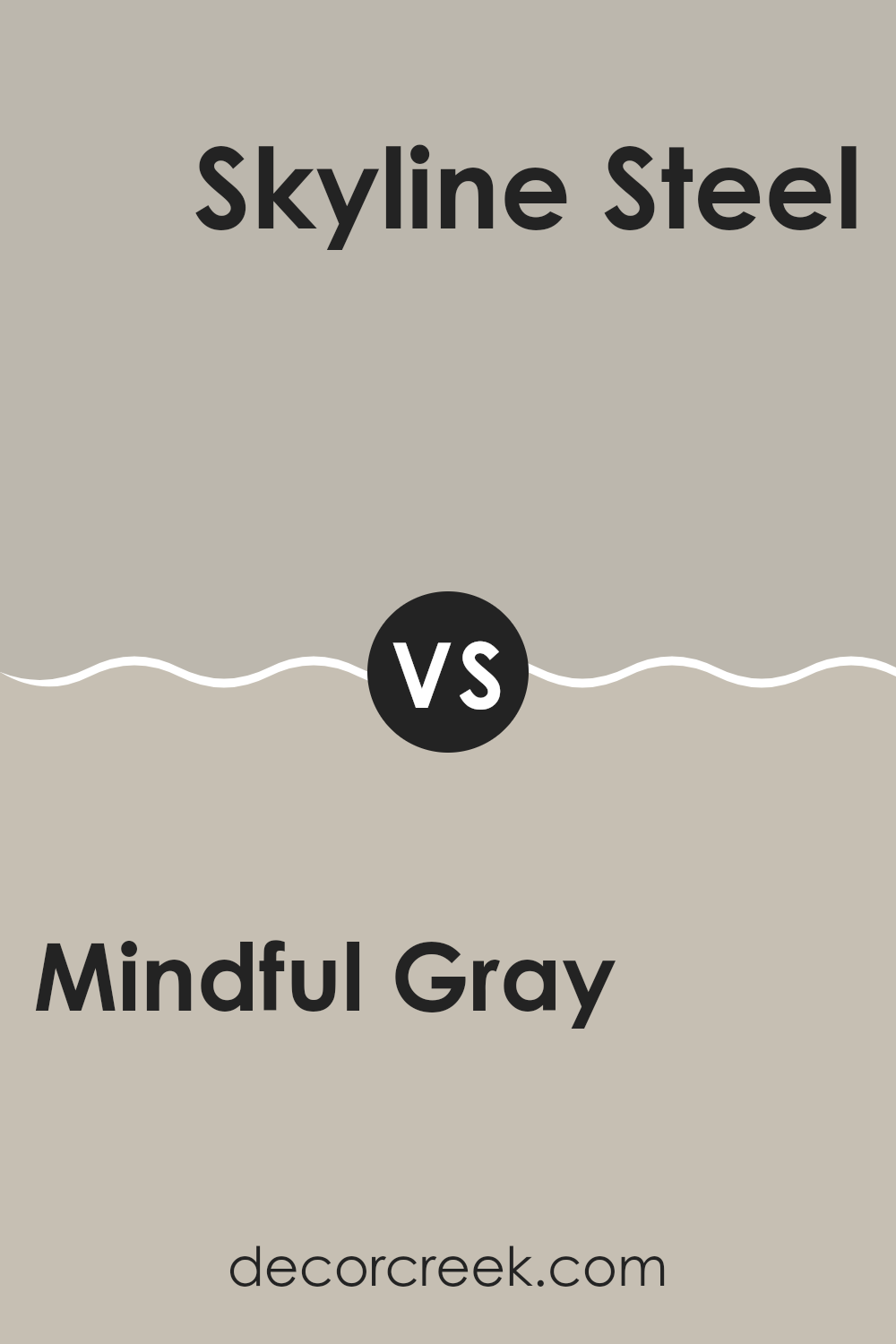
Mindful Gray SW 7016 by Sherwin Williams vs Skyline Steel SW 1015 by Sherwin Williams
Mindful Gray and Skyline Steel are two popular colors from Sherwin Williams. Mindful Gray is a warm, soft gray that has a peaceful feel to it, making it a flexible choice for almost any room in your home. It comfortably balances between a light and medium shade, providing just enough depth to create a cozy atmosphere without feeling too heavy.
On the other hand, Skyline Steel is a lighter gray that leans slightly toward the cooler side. It has a clean and fresh look, perfect for modern rooms that aim for a minimalistic and airy feel. This color can help make a small room seem larger because of its bright and reflective qualities.
Both colors complement each other well. While Mindful Gray offers warmth and subtlety, Skyline Steel provides a crisper, brighter counterpoint. They can be used together to create a nuanced palette that adds depth and interest to your interiors without feeling too intense.
You can see recommended paint color below:
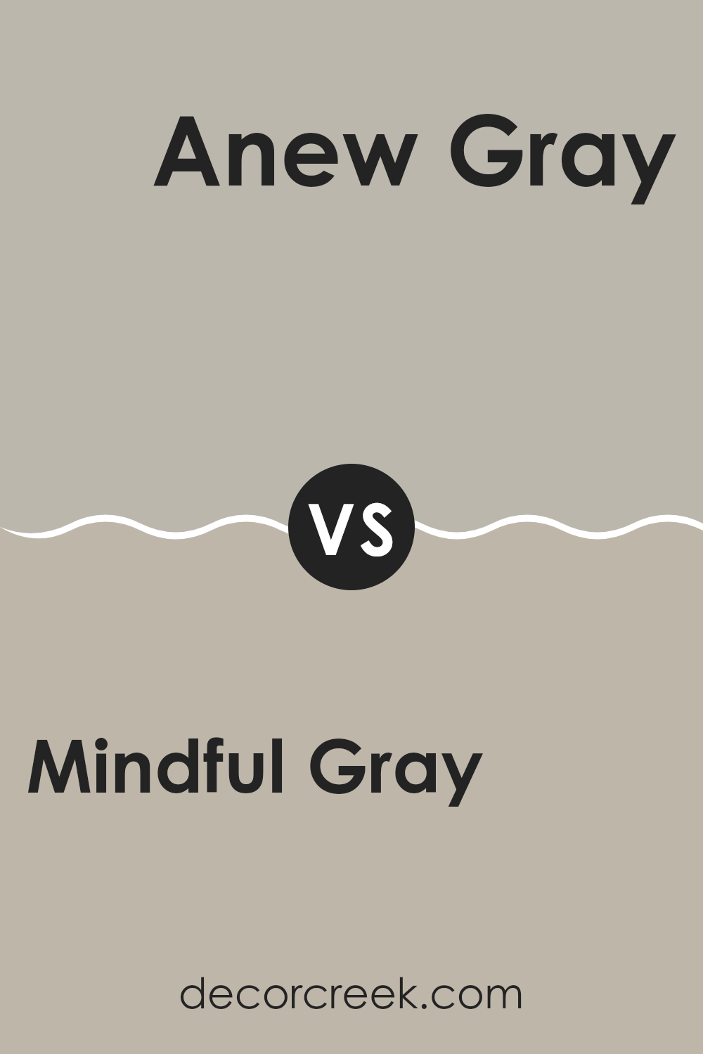
Mindful Gray SW 7016 by Sherwin Williams vs Anew Gray SW 7030 by Sherwin Williams
Mindful Gray and Anew Gray are both popular shades from Sherwin Williams. Mindful Gray has a slightly cooler tone, giving it a fresh and modern feel that works well in many rooms. This color is adaptable, making it a good choice for living rooms, bedrooms, or home offices.
On the other hand, Anew Gray has warmer undertones, creating a cozier and more inviting atmosphere. It’s ideal for rooms where you want a comforting and welcoming vibe, such as family rooms or dining areas. Both colors are quite neutral, which means they can easily pair with various decor styles and color schemes.
However, their subtle differences in warmth can impact the mood and feel of a room. Whether you choose Mindful Gray for its crispness or Anew Gray for its warmth, both colors are stylish and practical choices for home interior design.
You can see recommended paint color below:
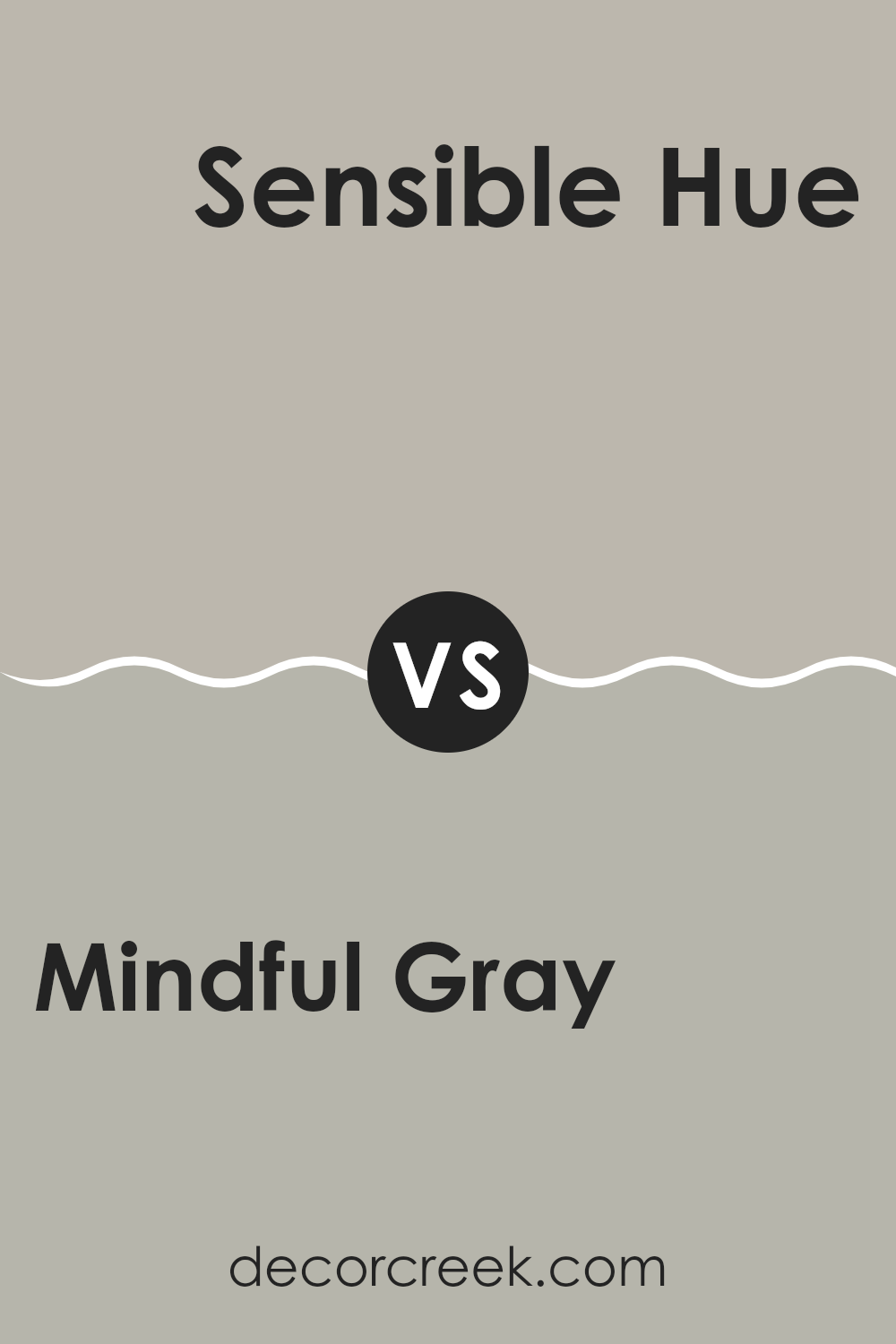
Mindful Gray SW 7016 by Sherwin Williams vs Sensible Hue SW 6198 by Sherwin Williams
Mindful Gray and Sensible Hue, both by Sherwin Williams, are distinct yet complementary shades. Mindful Gray offers a warm, soft neutral tone that blends gray with a hint of beige. This makes it highly adaptable for various rooms, providing a cozy backdrop that looks welcoming in both light and dark settings.
On the other hand, Sensible Hue is slightly darker and leans more toward the green-gray spectrum. This color can add subtle depth to rooms, giving a fresh yet calming effect without feeling too intense. When compared, Mindful Gray appears a bit lighter and warmer, making it ideal for rooms where you want to keep things light and airy. Sensible Hue, with its cooler undertones, is a great choice for creating a grounded, soothing atmosphere.
Together, these colors can work well in different rooms to achieve a balanced and harmonious look. Their shared gray base ensures they complement each other, making them a good pair for color schemes in a home.
You can see recommended paint color below:
- SW 6198 Sensible Hue
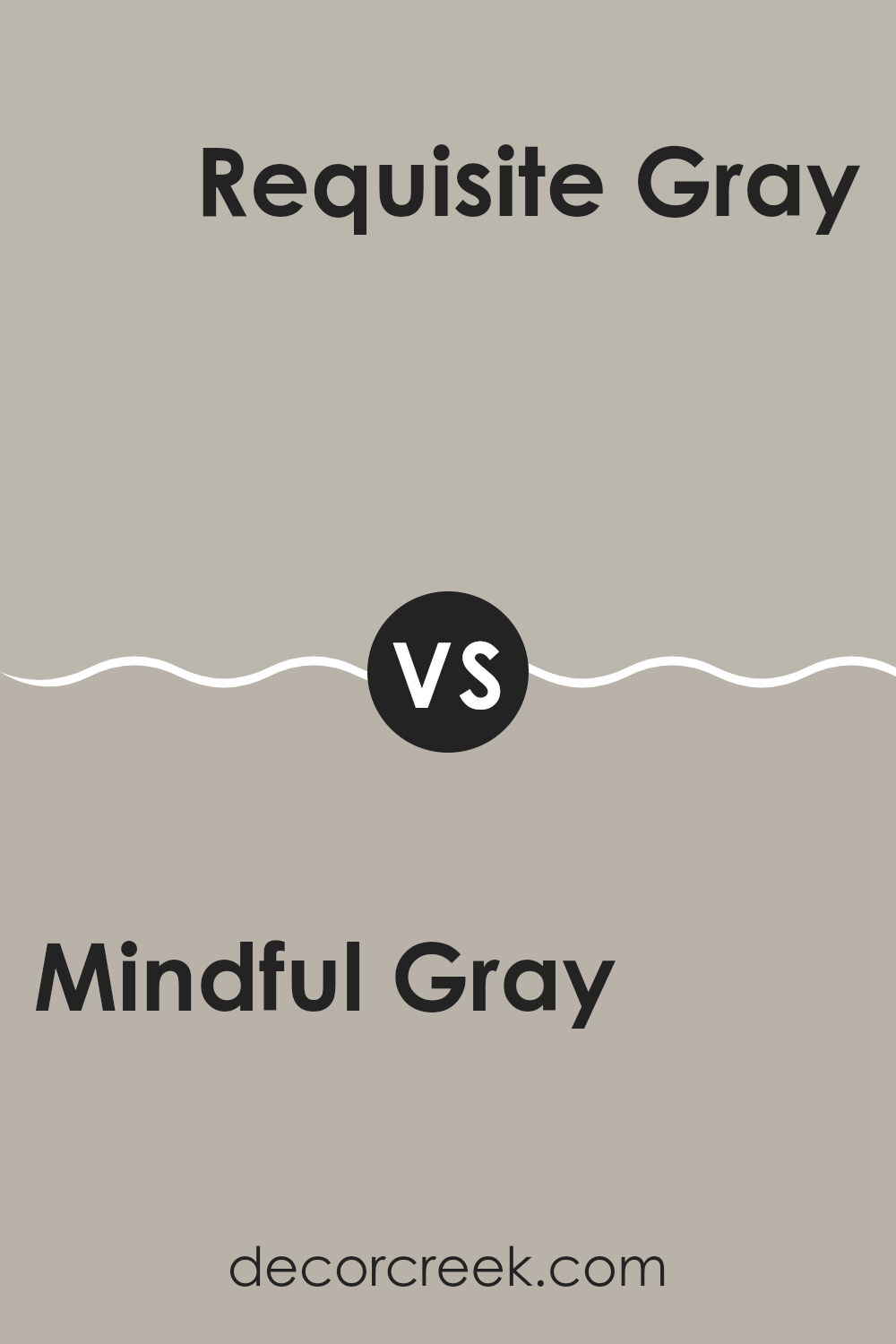
Mindful Gray SW 7016 by Sherwin Williams vs Requisite Gray SW 7023 by Sherwin Williams
Mindful Gray and Requisite Gray are two popular shades from Sherwin Williams that both offer a subtle elegance to any room. Mindful Gray is a lighter, soft gray with a warm undertone, making it ideal for creating a cozy and inviting atmosphere in rooms like the living room or bedroom. Its lightness brings a sense of airiness that can make small rooms appear larger.
On the other hand, Requisite Gray is a deeper shade, providing a more pronounced gray tone that leans slightly toward taupe. This color is excellent for adding depth and character to an area, making it a great choice for larger rooms or accent walls that need a bit more impact. Requisite Gray’s richer tones also help hide marks and smudges better than lighter shades.
Both colors are adaptable and pair well with a variety of decor styles, but your choice between them could depend on the mood you want to set and the size of your room.
You can see recommended paint color below:
Mindful Gray SW 7016 by Sherwin Williams vs Allegory SW 9553 by Sherwin Williams
Mindful Gray and Allegory are two distinct colors from Sherwin Williams that each offer their unique appeal. Mindful Gray is a soft, warm gray with a touch of beige, making it a perfect neutral that goes well in almost any room. It’s subtle enough to work as a background color but has enough depth to stand alone on walls, serving well in living rooms or bedrooms.
On the other hand, Allegory is a deeper, richer hue that resembles a dark sage or olive green. This color is excellent for adding a touch of nature-inspired calmness to a room without feeling too strong or heavy. It’s particularly suited for rooms where a hint of color can add depth and interest, such as dining rooms or home offices.
The main difference between the two lies in their visual impact and the mood they set. While Mindful Gray provides a gentle, neutral backdrop, Allegory offers a more distinct, earthy presence. Both colors are adaptable and can be used to create a cozy, welcoming atmosphere in a home.
You can see recommended paint color below:
- SW 9553 Allegory
Writing a conclusion about SW 7016 Mindful Gray by Sherwin Williams makes me really appreciate what a great color it is for any room. This shade isn’t just gray; it’s got a warm touch that makes rooms feel cozy and welcoming. When I tested it on walls, it blended beautifully with different lighting throughout the day. In the morning, it’s soft and gentle, and by evening, it carries a strong, reassuring presence.
Mindful Gray works great with other colors. Whether you pair it up with bright, fun colors in a kid’s room or more muted, calm colors in a living area, it holds its own. That’s why parents and kids both like it. It’s not too bold but has enough depth to make decorations stand out. This gray finds a way to support any color and furniture style, making everything look just right.
Using Mindful Gray has made me realize how much a good paint choice can make a house feel like a home. It simply fits wherever you put it – kitchens, bathrooms, bedrooms, you name it! So, if you’re thinking about a new color for your walls, Mindful Gray is definitely a smart pick.
It’s easy to see why so many people love this shade. It’s just the right kind of gray that makes every room shine a bit brighter.

Ever wished paint sampling was as easy as sticking a sticker? Guess what? Now it is! Discover Samplize's unique Peel & Stick samples.
Get paint samples

