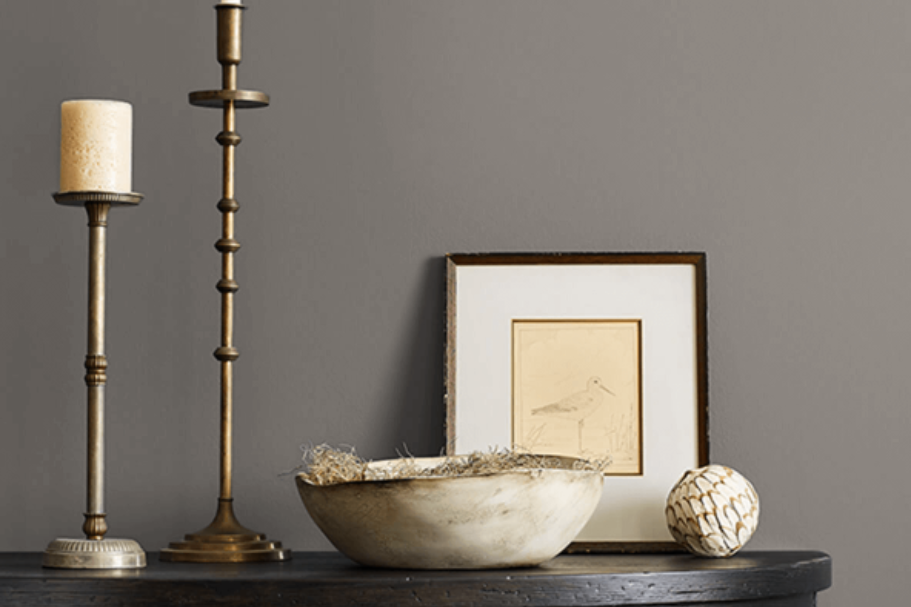
SW 7019 Gauntlet Gray by Sherwin Williams stands out as a sophisticated choice for those looking to add a touch of elegance to their space. This shade of gray offers a perfect balance between warmth and coolness, making it incredibly versatile for various design styles and settings.
Whether you’re aiming to refresh your living room, bedroom, or any part of your home, Gauntlet Gray brings a modern and refined look that can easily complement different color schemes and decor elements.
Not only does this color provide a solid foundation for a room’s aesthetic, but it also introduces a serene and inviting atmosphere. In this article, we’ll explore how SW 7019 Gauntlet Gray by Sherwin Williams can transform your home, providing tips on pairing it with other colors and utilizing it in different spaces for an effect that’s both stylish and comfortably chic.
Get ready to see how this unique shade can make a distinctive difference in your decorating endeavors, offering a blend of functionality and beauty that suits various tastes and preferences.
What Color Is Gauntlet Gray SW 7019 by Sherwin Williams?
Gauntlet Gray is a sophisticated, deep shade that strikes a perfect balance between warm and cool tones, making it incredibly versatile for interior design. This rich color has the ability to anchor a room, lending it a sense of sturdiness and stability without overwhelming the senses. It’s a color that can bring elegance and a contemporary feel to any space.
In terms of interior styles, Gauntlet Gray works remarkably well in modern and minimalist designs due to its sleek and refined nature. It also fits seamlessly into industrial and rustic themes, where its depth can complement natural materials like wood, metal, and leather, enhancing their textures and adding an extra layer of sophistication.
In spaces aiming for a cozy, welcoming atmosphere, such as farmhouse or shabby chic designs, Gauntlet Gray can serve as a beautiful contrast to softer, lighter colors, grounding the space while still keeping it airy and open.
When it comes to pairing with materials and textures, Gauntlet Gray is equally flexible. It looks stunning against smooth, matte finishes, which can help to amplify its modern edge. For a warmer, more textured look, combining it with natural wood or stone can create a beautiful, earthy vibe. Fabrics like linen, wool, and even velvet can also pair beautifully with Gauntlet Gray, adding a touch of luxury and comfort to the overall interior scheme.
This color is a true chameleon, capable of enhancing a wide variety of materials and textures while fitting into numerous interior styles.
Ever wished paint sampling was as easy as sticking a sticker? Guess what? Now it is! Discover Samplize's unique Peel & Stick samples.
Get paint samples

Is Gauntlet Gray SW 7019 by Sherwin Williams Warm or Cool color?
Gauntlet Gray by Sherwin Williams is a rich, deep gray that offers versatility and sophistication to any space in your home. This particular shade stands out for its ability to adapt to various interior styles, from modern to traditional. Its strength lies in the balance it strikes — not too dark, yet bold enough to make a statement. This color brings a sense of calmness and grounding, making it perfect for living areas, bedrooms, and even exterior spaces.
Because of its neutral yet impactful nature, Gauntlet Gray pairs exceptionally well with a wide range of colors. Whether combined with bright whites for a crisp, clean contrast or used alongside warmer tones for a cozy feel, it enhances the overall aesthetic of your home.
Furniture and decor in natural wood tones, as well as metallic accents, particularly stand out against this backdrop, allowing for various design opportunities. Incorporating Gauntlet Gray into your home can effortlessly create a sophisticated and inviting ambiance, making it a popular choice for those looking to update their space.
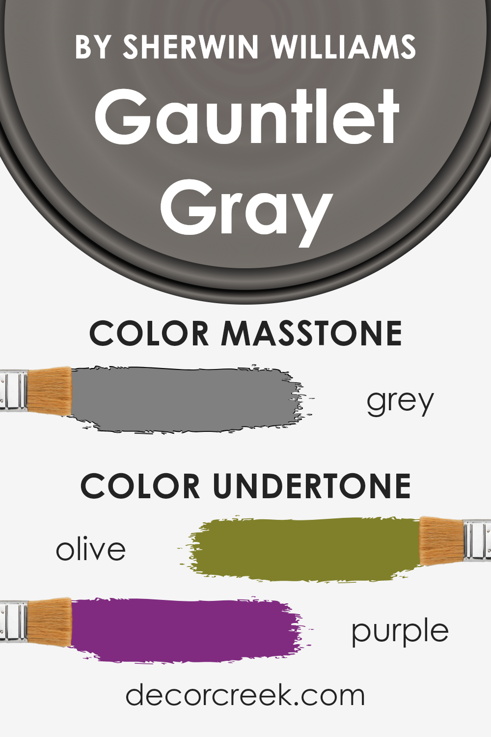
Undertones of Gauntlet Gray SW 7019 by Sherwin Williams
Gauntlet Gray by Sherwin Williams is a rich, sophisticated color that at first glance appears simply as a deep, warm gray. However, this color carries beneath its surface subtle tones that add complexity and depth. These undertones, specifically olive and purple, can significantly influence the way this paint color is perceived and how it interacts with its environment.
The olive undertone imbues the color with a muted warmth, making it versatile and welcoming. It’s this hint of greenish-yellow that can help the color harmonize with natural materials and soft textures, giving rooms a settled and grounding feeling. On the other hand, the purple undertone introduces a touch of coolness and mystery, adding a layer of richness and sophistication.
This balance between warm and cool allows Gauntlet Gray to adapt to various lighting conditions and decorative styles with surprising agility.
When applied to interior walls, these undertones of olive and purple play a pivotal role in determining the mood and atmosphere of a space. In rooms with plenty of natural light, the olive tones can become more pronounced, enhancing the feeling of connection to the natural world. In contrast, in spaces with cooler, artificial lighting, the purple undertones might stand out more, giving the room a more refined and elegant character.
Overall, the unique blend of undertones in Gauntlet Gray means it can offer more than just a simple gray backdrop. It reacts dynamically with both light and surrounding colors, changing subtly throughout the day and imparting a layered, sophisticated vibe to interiors.
This interplay of undertones ensures that walls painted in this hue are never dull or flat but are instead full of life and depth.
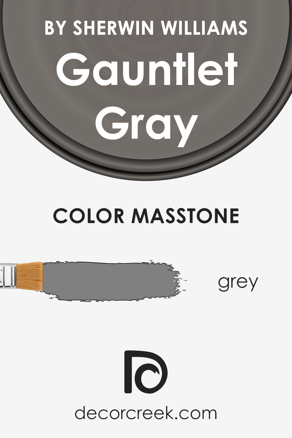
What is the Masstone of the Gauntlet Gray SW 7019 by Sherwin Williams?
Gauntlet Gray (SW 7019) by Sherwin Williams has a masstone, or base color, that aligns with gray (#808080). This deep gray shade brings a strong but neutral element into any space, making it a versatile option for homes. Its balanced intensity allows it to work beautifully in various settings, whether you’re aiming for a cozy, intimate feel or a bold, modern statement.
Due to its neutral base, Gauntlet Gray pairs well with a wide range of colors, from bright and vibrant to soft and subtle, allowing for flexibility in decorating styles and color schemes.
The nature of this gray means it can adapt to both natural and artificial lighting, shifting subtly to match the mood of the day and the vibe you want to achieve. In rooms with plenty of sunlight, it can appear softer and more inviting, while in spaces with less light, it adds depth and sophistication.
This makes Gauntlet Gray a smart choice for main living areas, bedrooms, or even home offices, blending seamlessly with furniture and accessories of all types. Its grounded, calming presence helps create spaces that feel both stylish and comfortable, making it a go-to color for homeowners looking to update their interiors.
How Does Lighting Affect Gauntlet Gray SW 7019 by Sherwin Williams?
Lighting plays a crucial role in how we perceive colors. The same paint can look entirely different under various types of light, due to how light affects our color perception. A shade like Gauntlet Gray by Sherwin Williams is no exception, showing diverse aspects under artificial and natural lighting, and its appearance can significantly change depending on the room’s orientation.
- Artificial light can influence the color in ways that create warmer or cooler effects, depending on the type of bulbs used. In artificial light, our gray can either lean towards a warmer, more inviting tone or appear as a cooler, more distant shade. It all comes down to the color temperature of the light bulb: warm lights bring out a cozy, slightly more brownish hue, while cool lights highlight its steely, more austere aspects.
- Under natural light, Gauntlet Gray reveals its true character, but this again varies throughout the day and depending on the room’s direction. North-facing rooms receive less direct sunlight, making the color appear as a solid, steady gray with subtle, cool undertones as the generally softer, bluish light emphasizes its cooler aspects. In south-facing rooms, flooded with warm, direct sunlight for the majority of the day, the color can warm up, unveiling a softer, more welcoming side, with hidden depths and warmer undertones peeking through.
- East-facing rooms capture the morning light, which is cooler and bluer, making the paint look crisper and more vivid. As the day progresses, the intensity of the natural light diminishes, and so does the perceived vibrancy of the color. Conversely, in west-facing rooms, the color might spend the morning appearing more neutral or muted, but as the sun sets and the light becomes warmer and more golden, the walls can seem to glow, bringing out a lively, dynamic quality in the gray.
In summary, Gauntlet Gray’s appearance is highly dependent on the interplay between light source and room orientation. This interplay can transform it from a cool, detached shade into a warm, inviting hue, showcasing the complex, multifaceted nature of this particular color under different lighting conditions.
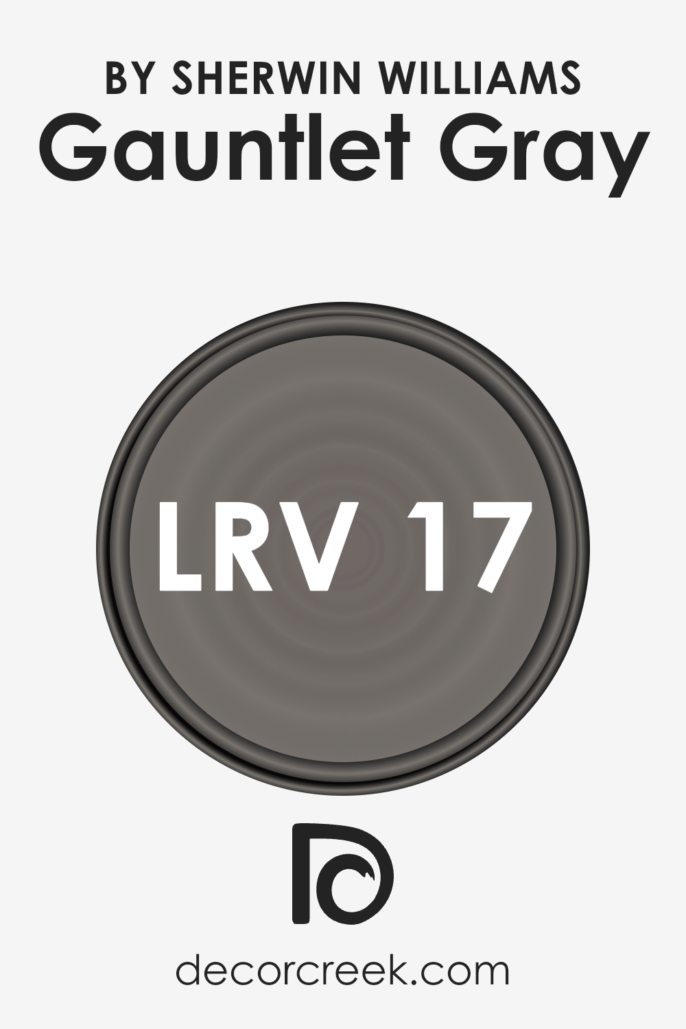
What is the LRV of Gauntlet Gray SW 7019 by Sherwin Williams?
LRV stands for Light Reflectance Value, which is a measure of the percentage of light a paint color reflects from or absorbs into a painted surface. Simply put, it’s a scale from 0 to 100, where 0 is complete absorption (total black, absorbing all light) and 100 is total reflection (pure white, reflecting all light). LRV is important because it helps people understand how light or dark a paint color will appear once applied to the walls of a room.
Higher LRV colors will make rooms feel brighter and more open since they reflect more light, while lower LRV colors, absorbing more light, can make a room feel cosier but smaller.
The LRV of 17.428 for the specified color means it is on the darker end of the scale. This low LRV indicates that the color will absorb a significant amount of light rather than reflecting it, making the space feel more intimate or enclosed.
This characteristic impacts how one might use this color in a room. It’s ideal for creating a dramatic or cozy atmosphere but might not be the best choice for a small, dimly lit room as it could make the space feel even smaller and darker. When using a color with such a low LRV, lighting becomes particularly important; incorporating various light sources can help balance the ambiance of the room.
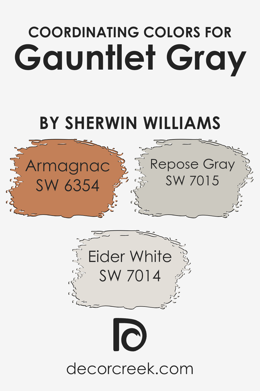
Coordinating Colors of Gauntlet Gray SW 7019 by Sherwin Williams
Coordinating colors are shades that harmoniously blend with a primary color, enhancing the overall aesthetic and bringing a cohesive look to any space. When it comes to finding the perfect partners for Gauntlet Gray by Sherwin Williams, a sophisticated and versatile hue, there are specific coordinating colors that work wonders. These colors, carefully selected, ensure a balanced and pleasing palette that can elevate the decor of any room.
- Armagnac SW 6354 is a rich, warm terracotta that provides a striking contrast to Gauntlet Gray, adding warmth and depth to spaces that favor a bold, inviting ambiance. It’s a shade that sings of earthy roots and spicy undertones, perfect for creating a cozy nook or a dramatic accent wall.
- Eider White SW 7014, on the other hand, is a soft, clean white with a whisper of gray. This light and airy color brings a refreshing lift to the denser Gauntlet Gray, illuminating spaces with a serene and open feel.
- Then there’s Repose Gray SW 7015, a light to medium gray that shares a kinship with Gauntlet Gray but in a lighter tone. This color is the bridge between the warm and cool elements in your palette, offering a harmonious flow from room to room.
Together, these coordinating colors create a balanced scheme that enhances the beauty and complexity of Gauntlet Gray, making any space feel thoughtfully designed and utterly inviting.
You can see recommended paint colors below:
- SW 6354 Armagnac
- SW 7014 Eider White
- SW 7015 Repose Gray
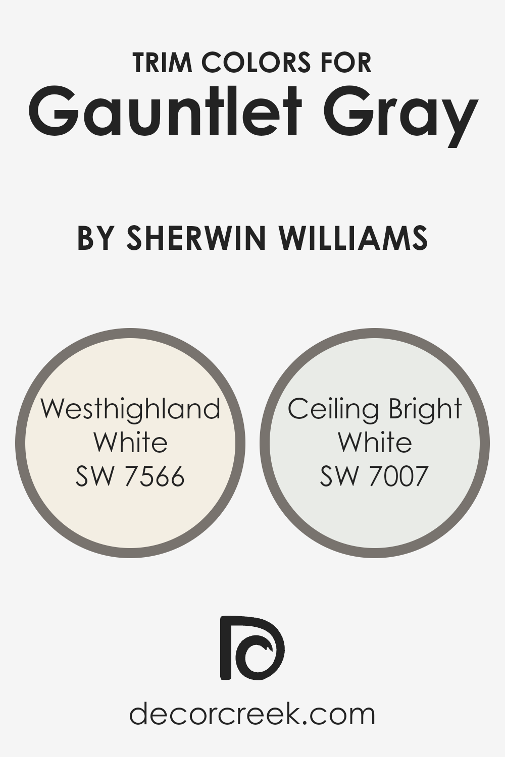
What are the Trim colors of Gauntlet Gray SW 7019 by Sherwin Williams?
Trim colors, when paired with a main hue like the sophisticated Gauntlet Gray by Sherwin Williams, serve to frame and highlight the architectural details of a room, giving it a polished look. Choosing the right trim color can either subtly complement the primary color or create a striking contrast, thereby enhancing the overall visual appeal of the space.
For Gauntlet Gray, a deep and robust color, selecting the right trim colors is crucial to accentuate its elegance without overwhelming it. Simultaneously, these trim colors can help in creating a seamless flow from room to room, maintaining a cohesive look throughout the home.
For a harmonious blend, Westhighland White SW 7566 is a warm, inviting choice that soothes the boldness of Gauntlet Gray, bringing a soft, creamy texture to the mix that gently highlights the room’s edges and corners. It’s like adding a touch of sunlight to the cool, shadowed hues of Gauntlet Gray, providing a comfortable transition between wall and trim.
On the other hand, Ceiling Bright White SW 7007 offers a crisp, pure contrast that can make the walls pop spectacularly. This particularly bright shade of white adds a fresh, clean edge to the rooms, acting as a stunning frame that allows the depth of Gauntlet Gray to stand out even more beautifully. Both these colors support the primary paint in transforming the space into one that feels thoughtfully designed and effortlessly elegant.
You can see recommended paint colors below:
- SW 7566 Westhighland White
- SW 7007 Ceiling Bright White
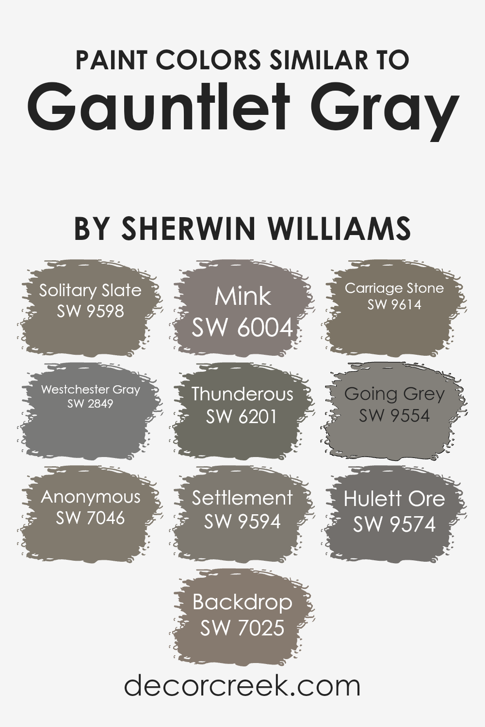
Colors Similar to Gauntlet Gray SW 7019 by Sherwin Williams
Choosing similar colors is a smart move when aiming for a cohesive and stylish look. Colors close to Gauntlet Gray, like Solitary Slate and Westchester Gray, offer a soothing spectrum of cool tones, ideal for creating a serene and harmonious space. These shades play well together, bringing depth and complexity to interiors without overwhelming the senses.
For instance, Solitary Slate has a subtle bluish undertone, making it a perfect complement to the cooler, almost charred look of Westchester Gray, which hints at a steelier finish.
Adding layers with colors like Anonymous and Backdrop enriches a design scheme by introducing slight variations in intensity and warmth.
- Anonymous leans towards a soft, earthy gray, gently weaving in a sense of groundedness, while Backdrop provides a slightly warmer, deeper backdrop, offering a rich foundation for the palette.
- Mink and Thunderous introduce a luxurious depth, with Mink’s velvety richness and Thunderous’s dramatic flair setting a sophisticated tone. Settlement, Carriage Stone, Going Grey, and Hulett Ore extend the palette further into the realm of nuanced grays.
- Settlement whispers of ancient stones, Carriage Stone evokes the timeless elegance of old-world craftsmanship, Going Grey offers a lighter, airier alternative, and Hulett Ore hints at the natural minerals found in the earth, grounding the scheme with its natural, elemental beauty.
Together, these colors create a versatile and inviting space that feels both cohesive and distinctly layered.
You can see recommended paint colors below:
- SW 9598 Solitary Slate
- SW 2849 Westchester Gray
- SW 7046 Anonymous
- SW 7025 Backdrop
- SW 6004 Mink
- SW 6201 Thunderous
- SW 9594 Settlement
- SW 9614 Carriage Stone
- SW 9554 Going Grey
- SW 9574 Hulett Ore
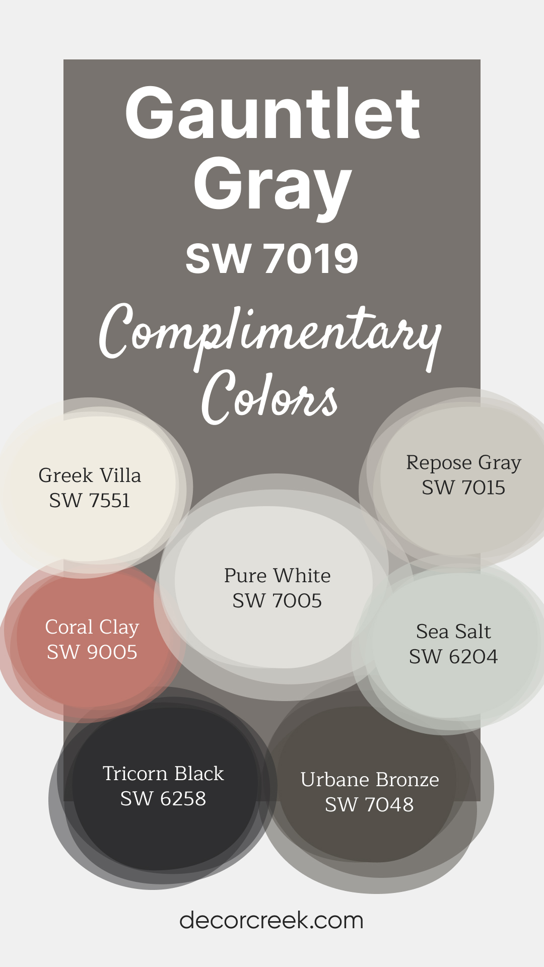
Complimentary Colors for Gauntlet Gray SW 7019 Paint Color by Sherwin Williams
If you’re looking for a palette that blends timeless beauty with modern appeal, these Sherwin Williams shades are an excellent choice. Gauntlet Gray and Urbane Bronze offer depth and sophistication, while Greek Villa and Pure White bring brightness and balance. For a subtle touch of color, Sea Salt and Coral Clay add a refreshing and inviting feel.
Pairing these shades is easy thanks to their versatile tones. Whether you prefer a bold contrast with Tricorn Black or the understated appeal of Repose Gray, these colors offer endless possibilities to enhance your walls and accents effortlessly.
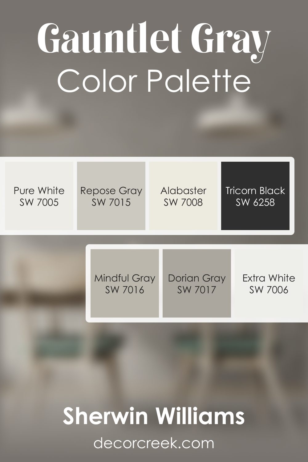
Gauntlet Gray SW 7019 by Sherwin Williams Color Palette
This palette centers on Gauntlet Gray, a rich tone that adds structure and confidence to any room. Pure White and Extra White bring brightness that keeps the palette feeling fresh. Dorian Gray and Mindful Gray offer gentle transitions, helping your rooms feel connected without sharp contrast.
Repose Gray adds a smooth, soft note that works well in open layouts. Tricorn Black introduces a bold edge for accents, lighting fixtures, or doors.
Alabaster gives a warm counterpoint that softens the overall look. This palette creates a clean, steady mood that works beautifully with modern furniture, warm wood tones, and simple styling.
How to Use Gauntlet Gray SW 7019 by Sherwin Williams In Your Home?
Gauntlet Gray SW 7019 from Sherwin Williams is a versatile and rich color that can beautifully transform any space in your home. Imagine your living room with this deep, warm gray as an accent wall – it adds a cozy yet sophisticated touch. Kitchens also benefit from this shade, on cabinets or walls, to create a welcoming and stylish atmosphere.
In the bedroom, Gauntlet Gray offers a serene backdrop, ideal for relaxing after a long day. Pair it with white trim or soft pastels for a balanced, soothing look. For those looking to add a bit of drama and elegance to their dining area, using this shade can truly elevate the space, making dinners feel more intimate and inviting.
Gauntlet Gray works well in modern, minimalist, and even rustic decor styles.
It’s a color that can help unify different elements in a room, making it feel more cohesive. Whether as the main color scheme or an accent, it’s sure to add depth and character to your home.
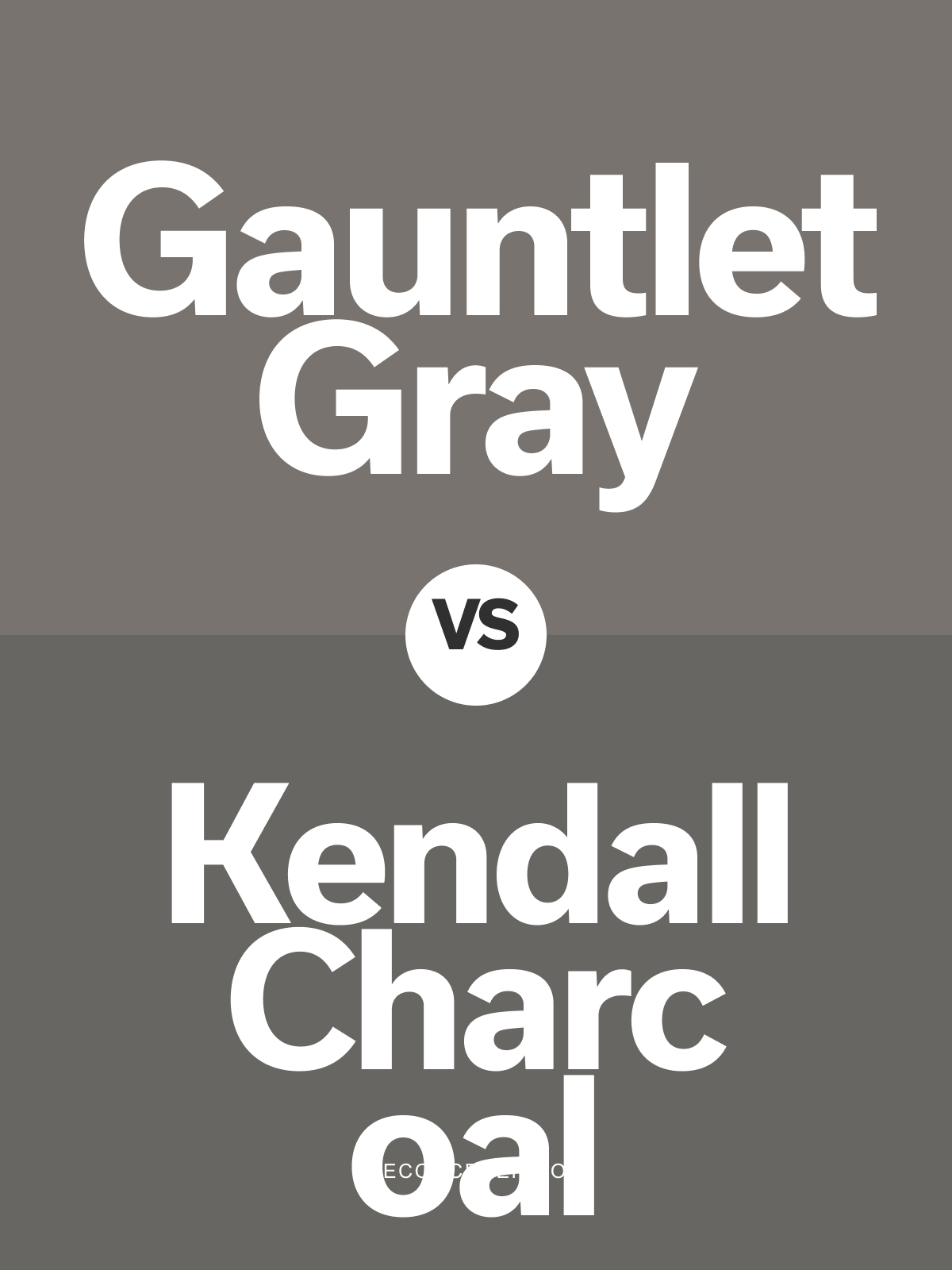
Gauntlet Gray SW 7019 vs Kendall Charcoal HC-166 by Benjamin Moore
Gauntlet Gray SW 7019 by Sherwin Williams and Kendall Charcoal HC-166 by Benjamin Moore are rich, dark grays that bring depth and sophistication to any room. Gauntlet Gray is a warm, medium-dark gray with subtle brown undertones, adding an inviting, grounded feel. Kendall Charcoal leans slightly cooler with a deeper, almost charcoal-like richness, creating a bold, classic look.
Gauntlet Gray works well in both modern and traditional spaces, where a balanced warm gray is desired. Kendall Charcoal is ideal for accent walls or cabinetry, where its bold tone can create a stunning focal point. Both shades pair beautifully with crisp whites and metallic accents, adding elegance and style.
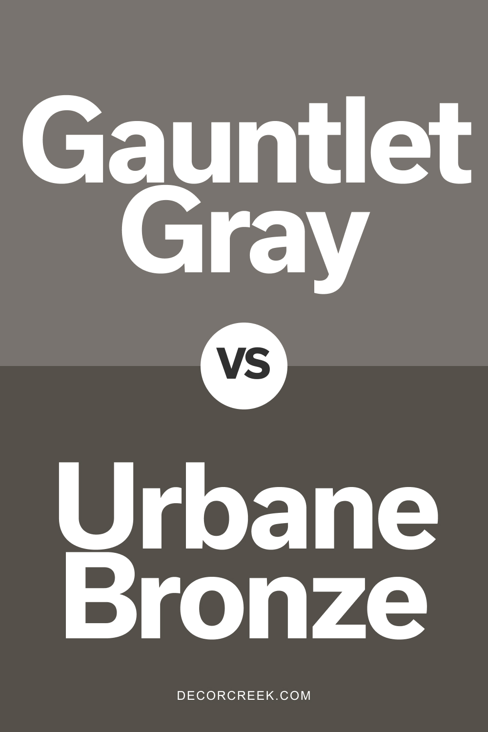
Gauntlet Gray SW 7019 vs Urbane Bronze SW 7048 by Sherwin Williams
Gauntlet Gray SW 7019 and Urbane Bronze SW 7048 are two sophisticated, warm grays by Sherwin Williams with unique tones. Gauntlet Gray is a medium-dark gray with warm brown undertones, perfect for creating a cozy, inviting look. Urbane Bronze is a darker, richer gray with earthy, bronze undertones, giving spaces a dramatic, bold feel.
Gauntlet Gray is ideal for walls or open spaces where a warm, approachable gray is desired. Urbane Bronze works well as an accent wall color or on cabinetry, adding depth and character. Both shades complement whites, wood, and warm metallics, creating a balanced, timeless look.
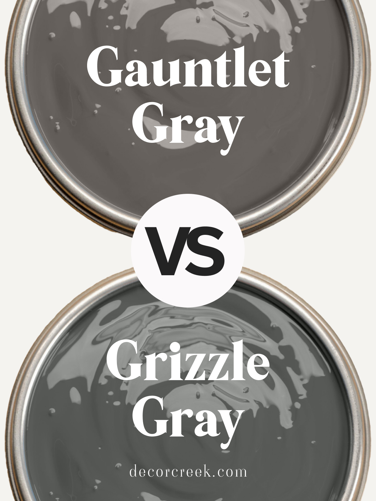
Sherwin Williams Grizzle Gray SW 7068 vs Gauntlet Gray SW 7019
Grizzle Gray SW 7068 and Gauntlet Gray SW 7019 are deep, bold grays with distinct personalities. Grizzle Gray is a cooler, darker gray with subtle green undertones, giving it a modern, moody look. Gauntlet Gray is a warm, medium-dark gray with brown undertones, bringing a cozy, grounded feel.
Grizzle Gray is ideal for contemporary spaces or accent walls where a dramatic, cool tone is desired. Gauntlet Gray is perfect for traditional or transitional rooms, where its warm undertones add comfort and depth. Both shades pair beautifully with white trim and natural wood for a refined, stylish look.
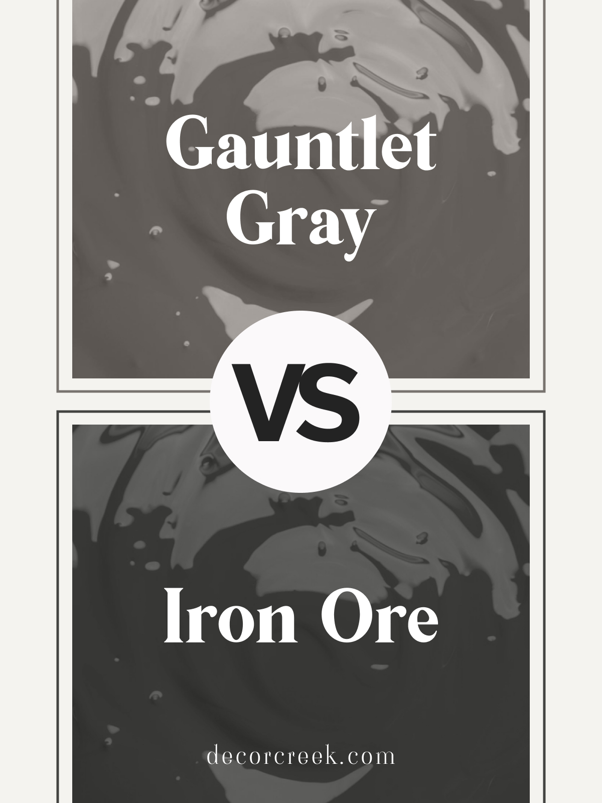
SW Iron Ore SW 7069 vs Gauntlet Gray SW 7019 by Sherwin Williams
Iron Ore SW 7069 and Gauntlet Gray SW 7019 by Sherwin Williams are two dark, striking colors with different undertones. Iron Ore is a near-black gray with a cool, bold feel, adding depth and modern sophistication to any space. Gauntlet Gray is a medium-dark gray with warm brown undertones, creating a softer, more approachable look.
Iron Ore works beautifully for accent walls, cabinetry, or exterior trim, where a dramatic, sleek finish is desired. Gauntlet Gray is ideal for interior walls or larger spaces needing a warm, cozy touch. Both colors pair wonderfully with whites and light neutrals, creating a stylish, balanced feel.
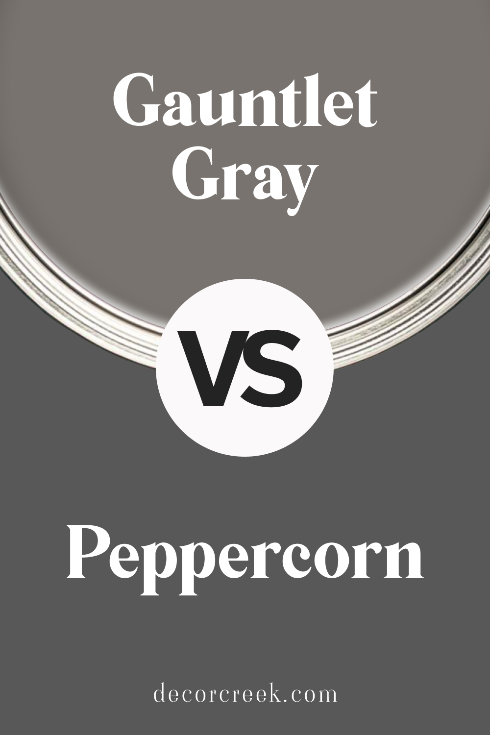
Gauntlet Gray SW 7019 vs Peppercorn SW 7674 by Sherwin Williams
Gauntlet Gray SW 7019 and Peppercorn SW 7674 by Sherwin Williams are two popular dark grays with unique vibes. Gauntlet Gray is a medium-dark warm gray with subtle brown undertones, giving it a cozy, inviting look. Peppercorn is a darker, cooler gray with a hint of charcoal, adding depth and a modern touch.
Choose Gauntlet Gray for a softer, warmer aesthetic in living rooms or bedrooms. Peppercorn is perfect for accent walls, kitchens, or exteriors, where a bold, dramatic look is desired. Both shades pair well with white trim and natural wood accents, creating a balanced, refined look.
Dovetail SW 7018 vs Gauntlet Gray SW 7019 by Sherwin Williams
Dovetail SW 7018 and Gauntlet Gray SW 7019 by Sherwin Williams are warm grays with different levels of depth. Dovetail is a medium, warm gray with a subtle brown undertone, providing a soft, balanced look. Gauntlet Gray is a darker, richer warm gray that adds a bit more depth and drama to spaces.
Dovetail is perfect for creating a warm, cozy feel in living rooms or bedrooms, while Gauntlet Gray works well for accent walls or exterior trim, where a bolder, richer gray is desired.
Both colors pair beautifully with whites and light neutrals, adding a refined, welcoming ambiance to any space.
Repose Gray SW 7015 vs Gauntlet Gray SW 7019 by Sherwin Williams
Repose Gray SW 7015 and Gauntlet Gray SW 7019 by Sherwin Williams are two versatile grays with distinct tones. Repose Gray is a lighter, warm gray with subtle taupe undertones, making it perfect for a fresh, neutral backdrop. Gauntlet Gray is a darker, warmer gray with brown undertones, adding depth and a cozy feel to rooms.
Repose Gray is ideal for open spaces or areas where a light, airy color is needed. Gauntlet Gray works well on accent walls or in rooms needing a bit more warmth and richness. Both shades pair beautifully with white trim and soft wood tones, creating a balanced and timeless look.
Chelsea Gray HC-168 vs Gauntlet Gray SW 7019 by Benjamin Moore and Sherwin Williams
Chelsea Gray HC-168 by Benjamin Moore and Gauntlet Gray SW 7019 by Sherwin Williams are two sophisticated, dark grays with unique characteristics. Chelsea Gray is a true medium-dark gray with a neutral undertone, adding elegance and versatility to any room. Gauntlet Gray is a warm, brown-toned gray, bringing a cozy and inviting feel.
Chelsea Gray is ideal for spaces needing a balanced, neutral gray that adapts to both modern and classic decor.
Gauntlet Gray suits traditional or cozy settings, adding depth with a touch of warmth. Both colors look stunning with white trim and wood accents, creating a refined and harmonious look.
Gauntlet Gray SW 7019 by Sherwin Williams vs Hulett Ore SW 9574 by Sherwin Williams
Gauntlet Gray is a rich, deep gray with warm undertones that gives a cozy yet sophisticated feel to any space. It’s versatile, making it perfect for living rooms, bedrooms, or even kitchens, adding a touch of elegance wherever it’s applied.
On the other hand, Hulett Ore has a warmer, softer appearance, with a brownish-gray tone that brings a welcoming, comfortable vibe to rooms. It’s more of a subtle color, ideal for those looking to create a serene and inviting atmosphere without going too dark or too light.
While Gauntlet Gray provides a stronger statement with its deeper, more pronounced gray, Hulett Ore offers a softer approach, making spaces feel grounded yet airy
. Both colors work wonderfully in homes looking for that modern touch, with Gauntlet Gray leaning more towards a bold, dramatic effect and Hulett Ore leaning towards a gentle, nurturing environment.
You can see recommended paint color below:
- SW 9574 Hulett Ore
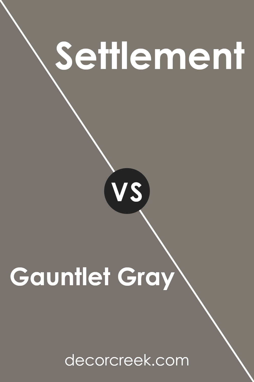
Gauntlet Gray SW 7019 by Sherwin Williams vs Settlement SW 9594 by Sherwin Williams
Gauntlet Gray and Settlement are two distinct shades from Sherwin Williams, each with its unique charm. Gauntlet Gray stands out as a deep, rich gray with subtle brown undertones. This color is versatile, easily fitting into modern and traditional spaces alike. It’s the kind of gray that adds depth and sophistication, making it perfect for accent walls or cabinets.
On the other hand, Settlement has a lighter, more airy feel. It’s a soft, warm gray with beige undertones that evoke a sense of calm and coziness. Settlement is great for creating a relaxed, inviting atmosphere in rooms like living spaces or bedrooms.
While Gauntlet Gray brings a bold, dramatic look, Settlement offers a gentle, nurturing vibe. Choosing between them depends on the mood you want to set: Gauntlet Gray for drama and elegance; Settlement for comfort and serenity.
You can see recommended paint color below:
- SW 9594 Settlement
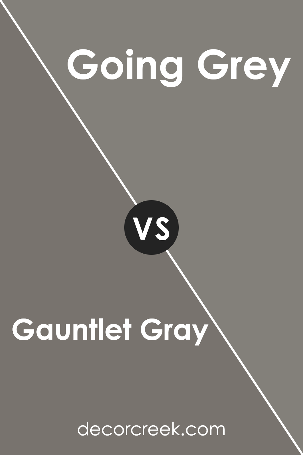
Gauntlet Gray SW 7019 by Sherwin Williams vs Going Grey SW 9554 by Sherwin Williams
Gauntlet Gray and Going Grey are both colors by Sherwin Williams, but they have different vibes. Gauntlet Gray is a deeper, almost charcoal-like color. It’s strong and can give a room a solid, grounded feel. Think of it as the kind of color that’s perfect for a statement wall or to add a bit of drama to a space. It’s quite versatile, working well in many areas, from bedrooms to living rooms.
On the other hand, Going Grey is lighter. It’s closer to a soft, subtle gray that can open up a room, making it feel more spacious and airy. It’s ideal for creating a calm, soothing environment. You might find it perfect for areas like bathrooms or kitchens, where you want a clean, fresh look.
In essence, if you’re going for a bold and sophisticated vibe, Gauntlet Gray is your go-to. But if you prefer something gentler and more tranquil, Going Grey is likely more up your alley. Both colors have their unique charm, depending on what feeling you want to achieve in your space.
You can see recommended paint color below:
- SW 9554 Going Grey
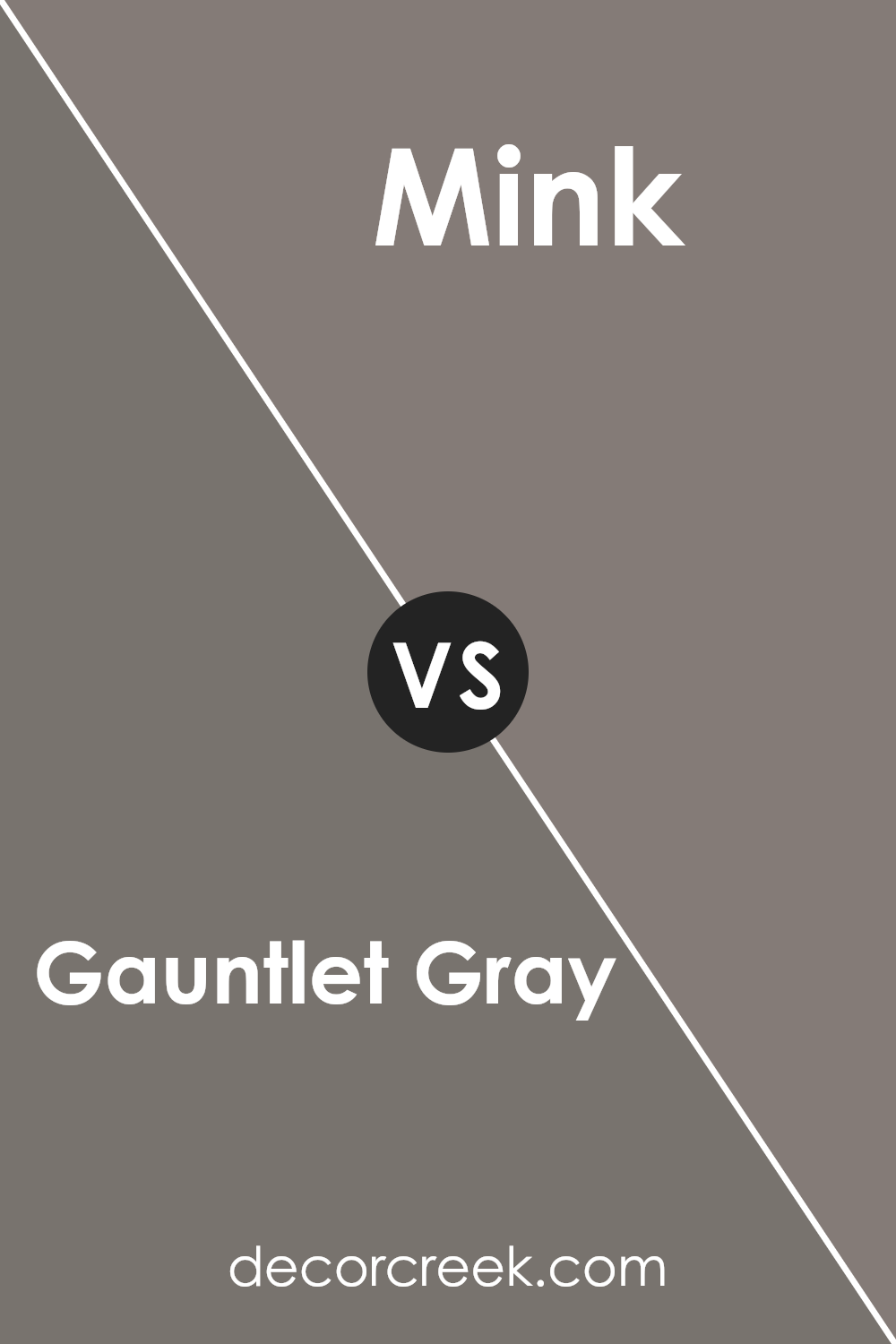
Gauntlet Gray SW 7019 by Sherwin Williams vs Mink SW 6004 by Sherwin Williams
When comparing Gauntlet Gray and Mink, both from Sherwin Williams, you’ll find they share some similarities but also have distinct differences. Gauntlet Gray is a deeper, more intense color. It’s a strong gray with a noticeable presence, offering a bold statement in any space.
On the other hand, Mink leans toward a softer, warmer tone. This color combines elements of brown and gray, resulting in a versatile hue that can easily warm up a room while maintaining a sense of sophistication.
Gauntlet Gray works well in modern and contemporary spaces, providing a striking backdrop that can make lighter colors pop. Mink, with its welcoming warmth, suits a variety of decorating styles, from rustic to traditional, and can add depth and coziness to a space without overwhelming it.
Both colors offer unique attributes: Gauntlet Gray for its impactful depth and Mink for its inviting warmth, making them suitable for different moods and settings.
You can see recommended paint color below:
- SW 6004 Mink
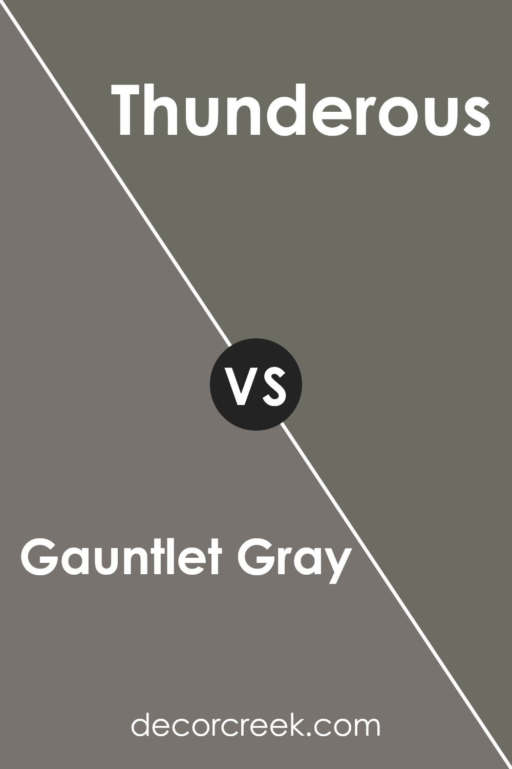
Gauntlet Gray SW 7019 by Sherwin Williams vs Thunderous SW 6201 by Sherwin Williams
Gauntlet Gray and Thunderous, both by Sherwin Williams, are two distinct colors. Gauntlet Gray is a deep, charcoaly gray with a hint of warmth, making it versatile for various spaces.
It’s dark enough to add sophistication yet not so overpowering as to make a room feel closed in. On the other hand, Thunderous is a lighter, more muted gray with subtle blue undertones, giving it a cooler feel.
This color can make spaces feel airy and open, bringing a calm and serene atmosphere. While both colors could be used in similar settings, like living rooms or bedrooms, Gauntlet Gray offers a bolder statement and suits spaces that can handle a darker shade. Thunderous, being lighter, works well in smaller spaces or rooms that need a more lifted, spacious vibe. Each color brings its unique mood, with Gauntlet Gray leaning towards a dramatic, cozy feel and Thunderous providing a serene, calming effect.
You can see recommended paint color below:
- SW 6201 Thunderous
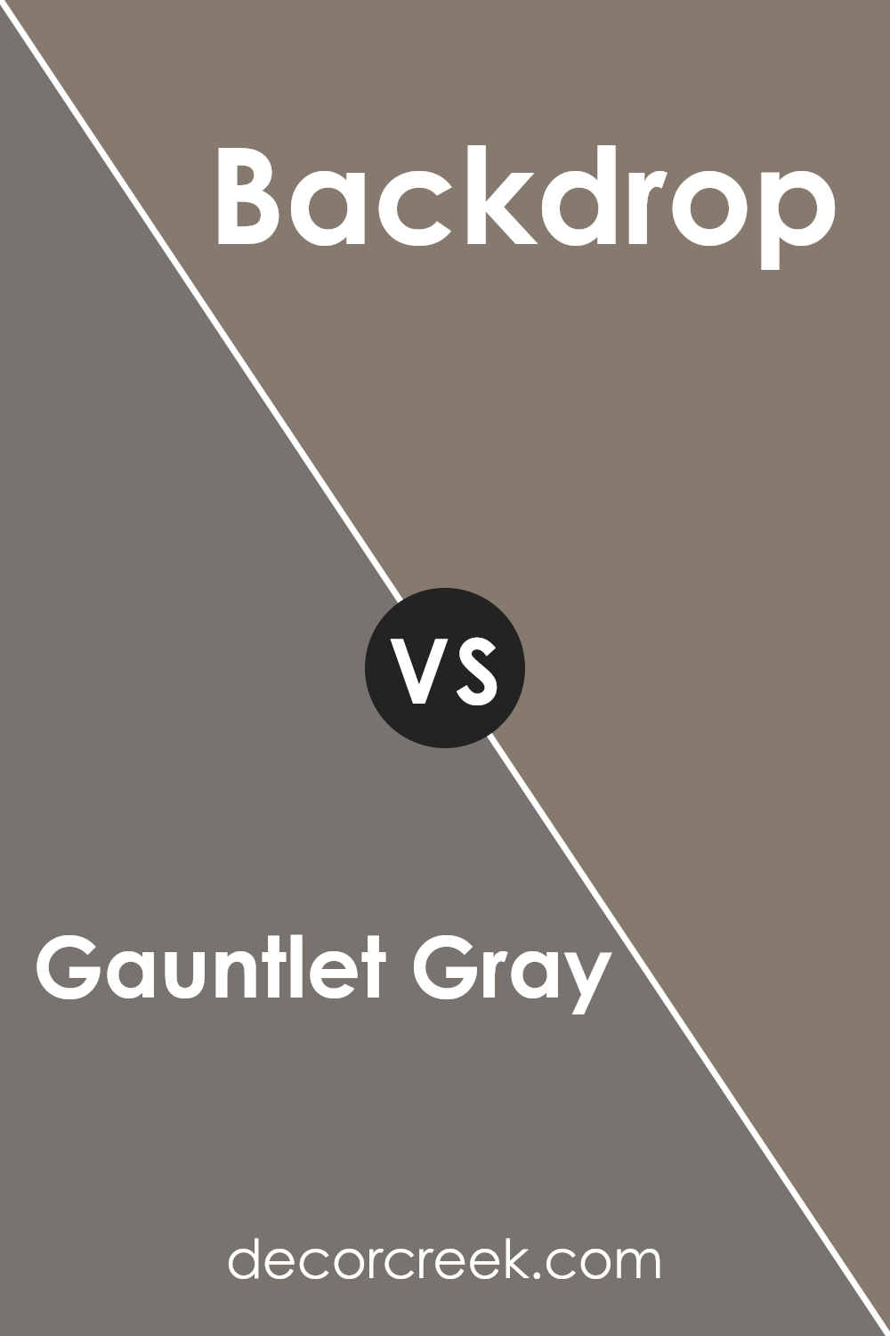
Gauntlet Gray SW 7019 by Sherwin Williams vs Backdrop SW 7025 by Sherwin Williams
Both Gauntlet Gray and Backdrop are popular choices from Sherwin Williams, but they bring distinct vibes to your space. Gauntlet Gray sits on the darker side, offering a bold, sophisticated look that can act as a strong background for both modern and traditional settings. Its deep tones are perfect for creating a sense of elegance and can make your furniture and decor pop.
On the other hand, Backdrop is a bit lighter, providing a softer, more neutral base. This color is incredibly versatile, making it an excellent choice for any room, whether you’re aiming for a cozy feel in a bedroom or a crisp, clean look in a living room. It has a calming effect, perfect for those seeking a serene ambiance.
While both colors share a gray base, Gauntlet Gray leans towards creating drama and depth, whereas Backdrop offers a subtle, soothing atmosphere. Depending on the mood you want to achieve and the natural light in your space, either of these options can enhance your home beautifully.
You can see recommended paint color below:
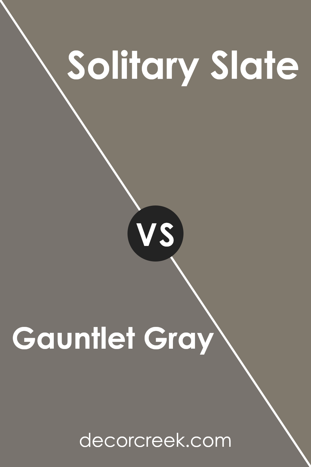
Gauntlet Gray SW 7019 by Sherwin Williams vs Solitary Slate SW 9598 by Sherwin Williams
Gauntlet Gray and Solitary Slate, two colors from Sherwin Williams, offer distinct vibes for any space. Gauntlet Gray is a deep, warm gray that adds a cozy sophistication to rooms. It’s like a hug from a friend – familiar and comforting. This color pairs well with bright whites for a crisp contrast or can be combined with warm wood tones to enhance its welcoming nature.
On the other hand, Solitary Slate offers a cooler, more neutral gray. It brings a modern and serene atmosphere to the table, perfect for creating a calm and collected space. Think of it as that cool breath of fresh air in a busy world. It’s excellent for spaces that aim for a minimalist look or where focus and clarity are desired.
Both colors share a gray base, but the warm undertones of Gauntlet Gray versus the cooler hints in Solitary Article set them apart. While Gauntlet Gray wraps you in warmth, Solitary Slate keeps things light and airy. Depending on the mood you want to set, either color can transform your room into a welcoming retreat or a serene escape.
You can see recommended paint color below:
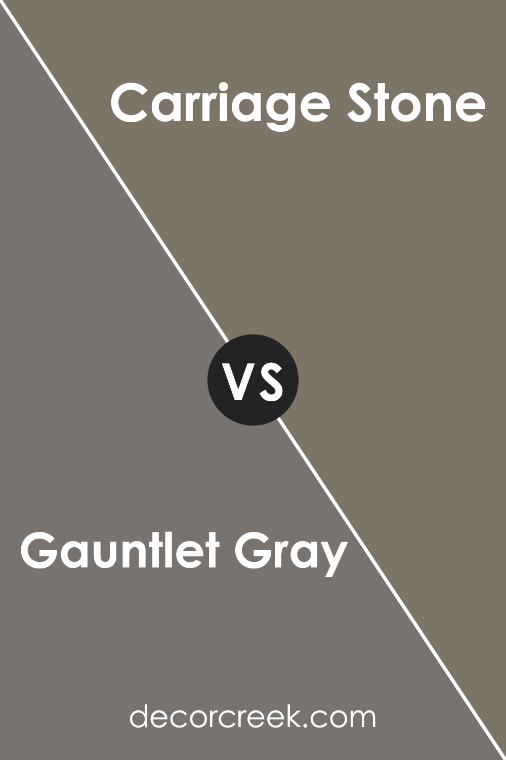
Gauntlet Gray SW 7019 by Sherwin Williams vs Carriage Stone SW 9614 by Sherwin Williams
Gauntlet Gray and Carriage Stone are two beautiful colors from Sherwin Williams, each with its unique charm. Gauntlet Gray offers a deep, rich tone that leans into the sophistication of dark gray with warm undertones. It’s perfect for those looking to add a bold, grounding effect to a room. On the other hand, Carriage Stone steps in with a lighter, more subtle gray that carries a soft, welcoming appeal.
It’s ideal for creating a serene, peaceful ambiance in a space, making it feel open and airy. While Gauntlet Gray adds drama and depth, making a strong statement, Carriage Stone offers a gentle touch, enhancing spaces with a hint of warmth and comfort.
Both colors work beautifully in different contexts—Gauntlet Gray standing out in spaces that can handle its intensity, and Carriage Stone shining in areas where a light, calming effect is desired. Together, they cater to a wide range of tastes, either as complementary tones or as individual choices for distinct looks.
You can see recommended paint color below:
- SW 9614 Carriage Stone
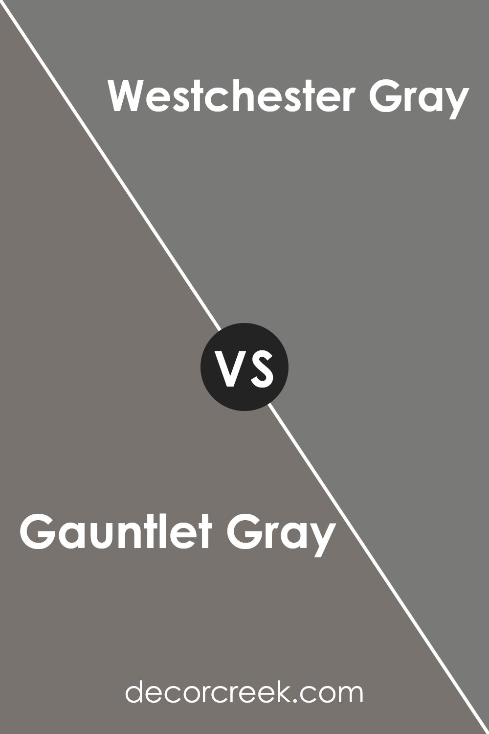
Gauntlet Gray SW 7019 by Sherwin Williams vs Westchester Gray SW 2849 by Sherwin Williams
Gauntlet Gray and Westchester Gray are two shades from Sherwin Williams that offer distinctive vibes despite their gray foundation. Gauntlet Gray is the darker of the two, providing a robust and sophisticated feel. It’s perfect for creating a statement in a space, adding depth and a sense of coziness to rooms. This color works well in areas that benefit from a strong, grounding presence, such as living rooms or bedrooms, offering a backdrop that highlights decor and furniture.
On the other hand, Westchester Gray is lighter, bringing a more flexible and airy feel to spaces. It’s well-suited for areas where you want to keep things light and open, such as kitchens and bathrooms. This shade can make small spaces appear larger and more inviting, without adding the weight that darker colors sometimes bring.
Both colors are versatile and can complement a wide range of decor styles, from modern to traditional. The choice between Gauntlet and Westchester Gray ultimately depends on the atmosphere you want to create. Whether you’re leaning towards the drama and elegance of Gauntlet Gray or the breezy, spacious feel of Westchester Gray, both options offer a chic and stylish palette for your home.
You can see recommended paint color below:
- SW 2849 Westchester Gray
Gauntlet Gray SW 7019 by Sherwin Williams vs Anonymous SW 7046 by Sherwin Williams
Gauntlet Gray and Anonymous by Sherwin Williams are two popular colors, but they have unique differences. Gauntlet Gray is a rich, deep gray that carries a subtle brown undertone, making it warm and inviting. This color can add sophistication and a sense of grounding to any space. It’s perfect for someone looking to create a cozy yet refined ambiance in their home.
On the other hand, Anonymous is a lighter shade of gray with a slightly green undertone. This color is versatile and neutral, giving rooms a fresh, airy feel without making the space feel cold. Anonymous works well in spaces that need a touch of modernity while still keeping a natural, earthy vibe.
While both colors belong to the gray family, Gauntlet Gray offers depth and warmth, perfect for creating a statement or cozy retreat, whereas Anonymous provides a more subdued, refreshing look, suitable for brightening spaces and adding a subtle touch of nature. Depending on the mood you want to set and the natural light in your space, you might choose one over the other.
You can see recommended paint color below:
- SW 7046 Anonymous
Conclusion
In summary, Gauntlet Gray by Sherwin Williams is a versatile and sophisticated shade of gray that offers a perfect balance between warmth and coolness, making it a great choice for any space seeking elegance and a touch of modernity. It’s a color that pairs well with a wide array of decor styles, from contemporary to traditional, and it has the ability to create a cozy, inviting atmosphere without overpowering a room.
Its adaptability means it can be used in various settings, including living rooms, bedrooms, and kitchens, providing a neutral backdrop that complements both bold and subdued color palettes.
Overall, Gauntlet Gray stands out as a go-to option for homeowners and designers aiming for a chic, refined look in their projects. Its ability to fit seamlessly into different spaces while adding depth and character is noteworthy.
Whether applied as a main color scheme or as an accent, Gauntlet Gray demonstrates a timeless aesthetic that enhances the beauty and sophistication of any interior design. This shade by Sherwin Williams proves to be a solid choice for those looking to update their space with a hue that is both stylish and practical.
Ever wished paint sampling was as easy as sticking a sticker? Guess what? Now it is! Discover Samplize's unique Peel & Stick samples.
Get paint samples
