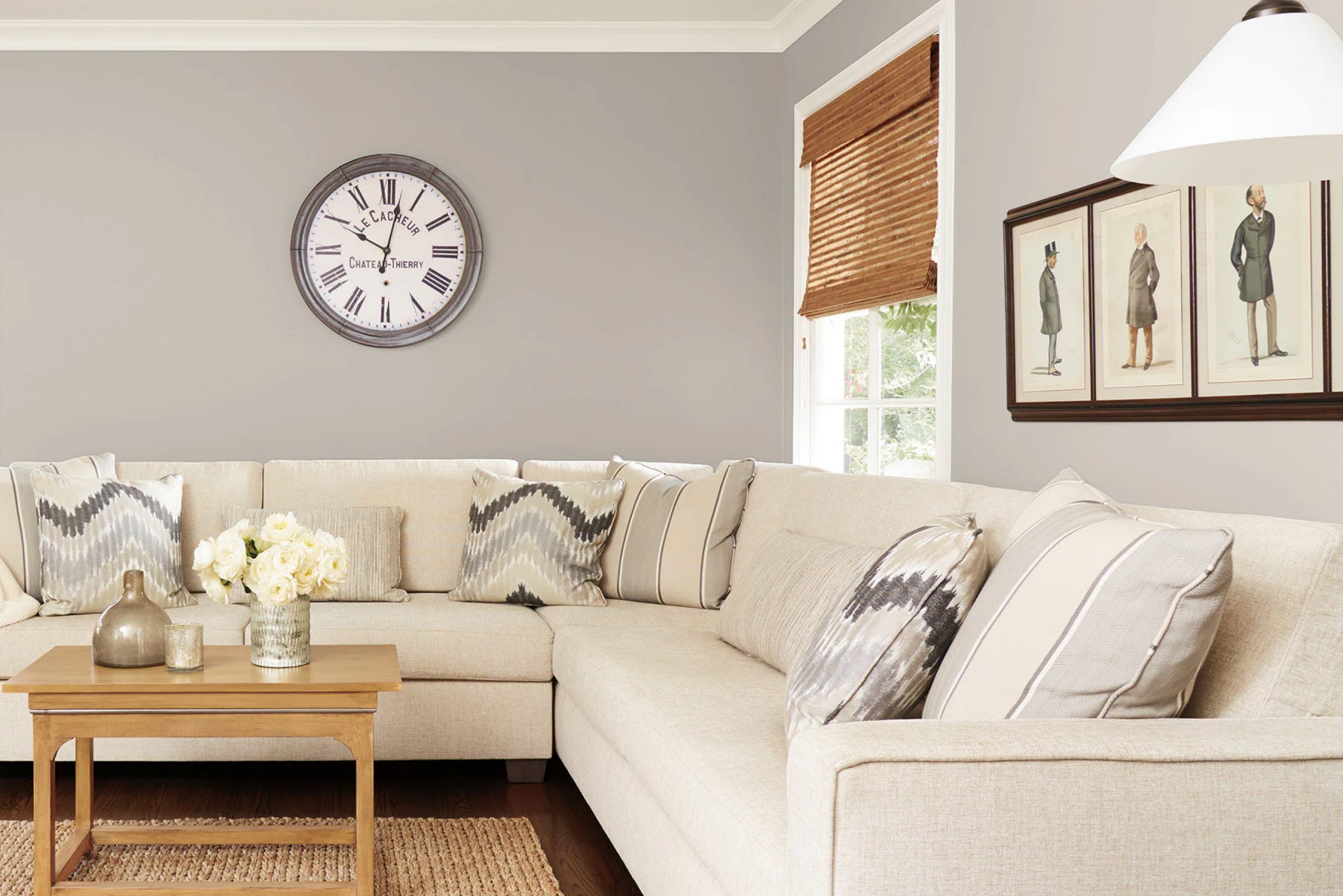
When you’re looking for a paint color that seamlessly fits almost any space, Sherwin Williams’ SW 7023 Requisite Gray is an excellent choice. I recently had the opportunity to use this versatile shade in a variety of settings, from bedrooms to home offices, and I was impressed with its adaptability. Requisite Gray strikes that perfect balance between warm and cool tones, making it a reliable choice regardless of your decorating style or the room’s lighting.
What really stands out about Requisite Gray is its ability to blend with other colors. Whether you pair it with bold hues or stick to a more neutral palette, it provides a solid foundation that pulls everything together. Its sophistication in subtly enhancing the space without overwhelming it is truly remarkable.
I found that it acts almost like a chameleon, adjusting its presence under different lighting conditions, which I really appreciate in my busy household where natural light varies widely.
So, if you’re considering a fresh coat of paint, Requisite Gray is more than just a safe bet. It offers a timeless appeal while keeping the space feeling current and refreshed.
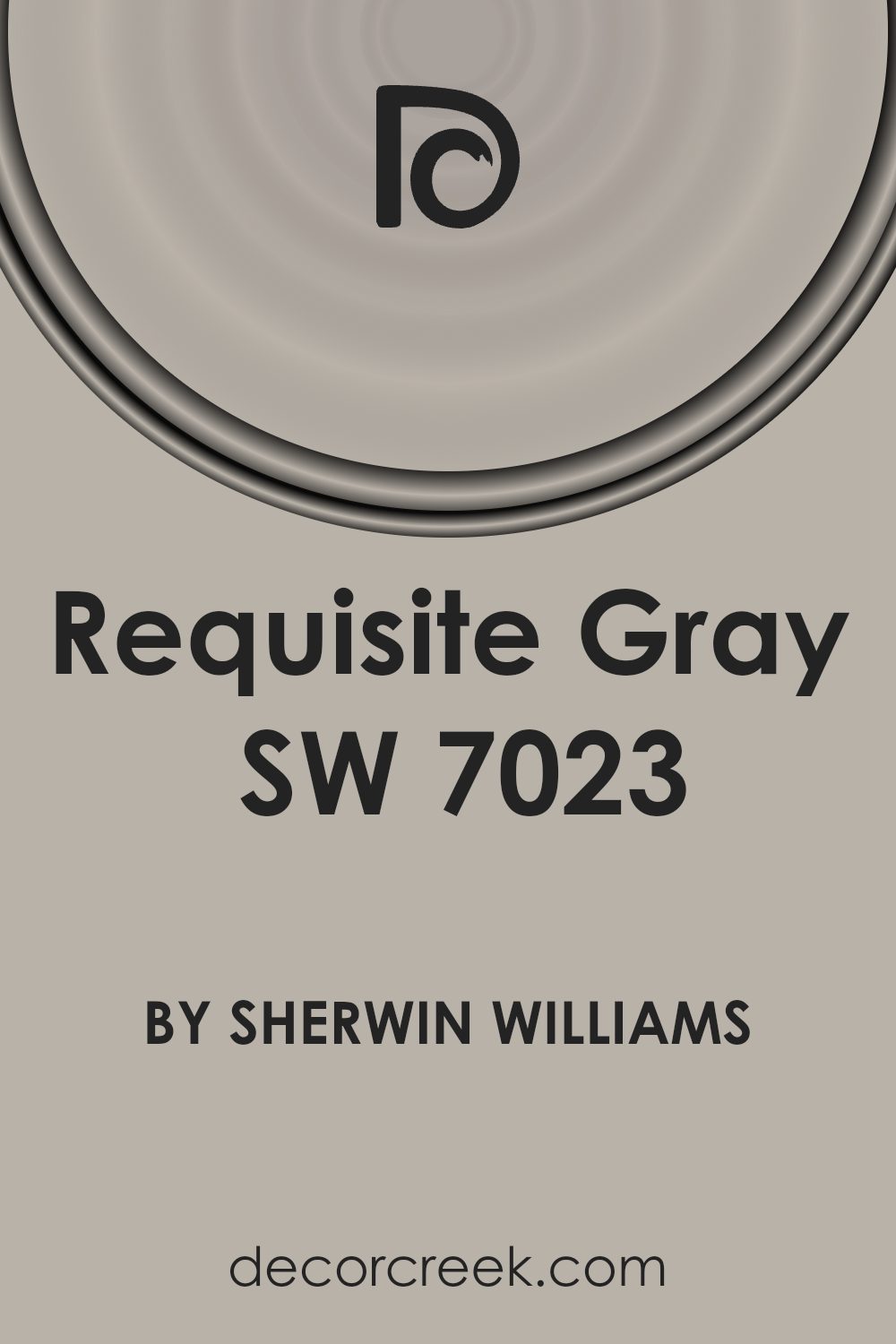
What Color Is Requisite Gray SW 7023 by Sherwin Williams?
Requisite Gray is a versatile and modern gray hue that stands out for its warm undertones, making it a cozy choice for any living space. This shade strikes a balance between gray and beige, often referred to as “greige,” making it a perfect neutral that can adapt to a variety of décor styles and preferences.
This color works exceptionally well in minimalist, contemporary, and even rustic interiors. Its neutrality allows it to act as a backdrop that complements bolder colors or as a standalone color that exudes a clean and calm atmosphere. In minimalist settings, it pairs beautifully with crisp whites and blacks to create a clean, uncluttered look.
In terms of materials, Requisite Gray goes well with natural wood, bringing out the rich tones of oak or walnut. It also looks stunning when combined with metal finishes like brushed nickel or aged brass, adding a touch of elegance without being too flashy. For textures, consider soft, plush fabrics such as velvet or wool to contrast with the color’s subtle warmth, or use linen and cotton to keep the feel light and airy.
Overall, Requisite Gray is a reliable choice for those looking to create a fresh, modern look in their home, pairing well with various materials and enhancing different interior styles.
Is Requisite Gray SW 7023 by Sherwin Williams Warm or Cool color?
Requisite Gray is a popular paint color from Sherwin Williams that offers a versatile and neutral shade for home interiors. This gray has a warm tone, making it cozy and inviting, perfect for rooms where you want a calming vibe without being too dark. It works well in various spaces such as living rooms, bedrooms, and even kitchens, offering a subtle backdrop that complements a wide range of décor styles and furniture colors.
One of the advantages of using Requisite Gray is its ability to balance other colors. Whether paired with bright accents like blues and yellows or softer tones like creams and light woods, it maintains harmony in the space. This color also has excellent coverage and can help hide imperfections on walls, making spaces look neat and well-maintained.
Homeowners often choose Requisite Gray because it provides a modern look while still feeling warm and welcoming. It’s an ideal choice for anyone looking to refresh their home with a color that is both stylish and practical.
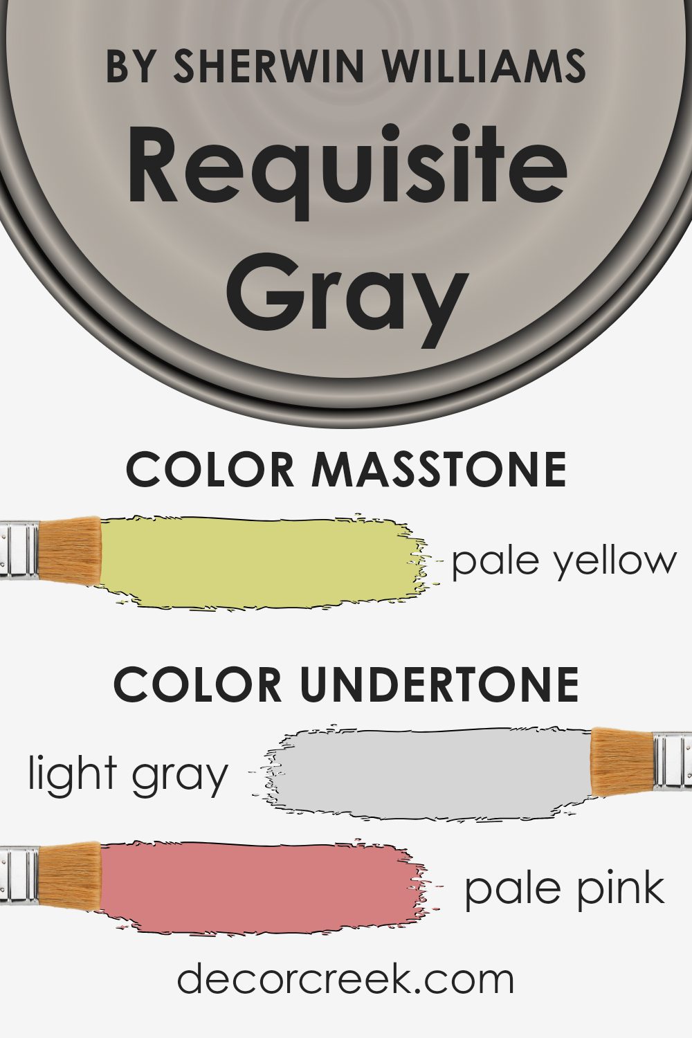
Undertones of Requisite Gray SW 7023 by Sherwin Williams
Requisite Gray is a versatile paint color that often appears differently depending on the light and surrounding colors. The undertones in any paint color can subtly influence its appearance in different environments. This particular gray has a complex mix of undertones, including light gray, pale pink, light purple, mint, light blue, grey, lilac, yellow, orange, light green, and olive. Each of these undertones can bring out a different aspect of Requisite Gray when used on interior walls.
For example, in a room with a lot of natural light, the light blue and mint undertones might make the walls seem cooler and more refreshing. However, in a space with warmer artificial lighting, the pale pink and orange undertones could give the walls a softer, cozier feel.
The presence of light purple and lilac undertones can add a gentle hint of color, which prevents the gray from feeling too cold or industrial.
The light green and olive undertones can lend a subtle earthiness to the room, helping it to feel more connected to natural elements outside.
This can be particularly effective in spaces that include a lot of houseplants or natural wood finishes.
Understanding the ways these undertones interact in different lighting conditions helps in choosing accessories and additional colors for the room. This ensures that everything works harmoniously together, enhancing the beauty and functionality of the space.
It’s all about balance and finding the right elements that highlight the best qualities of Requisite Gray.
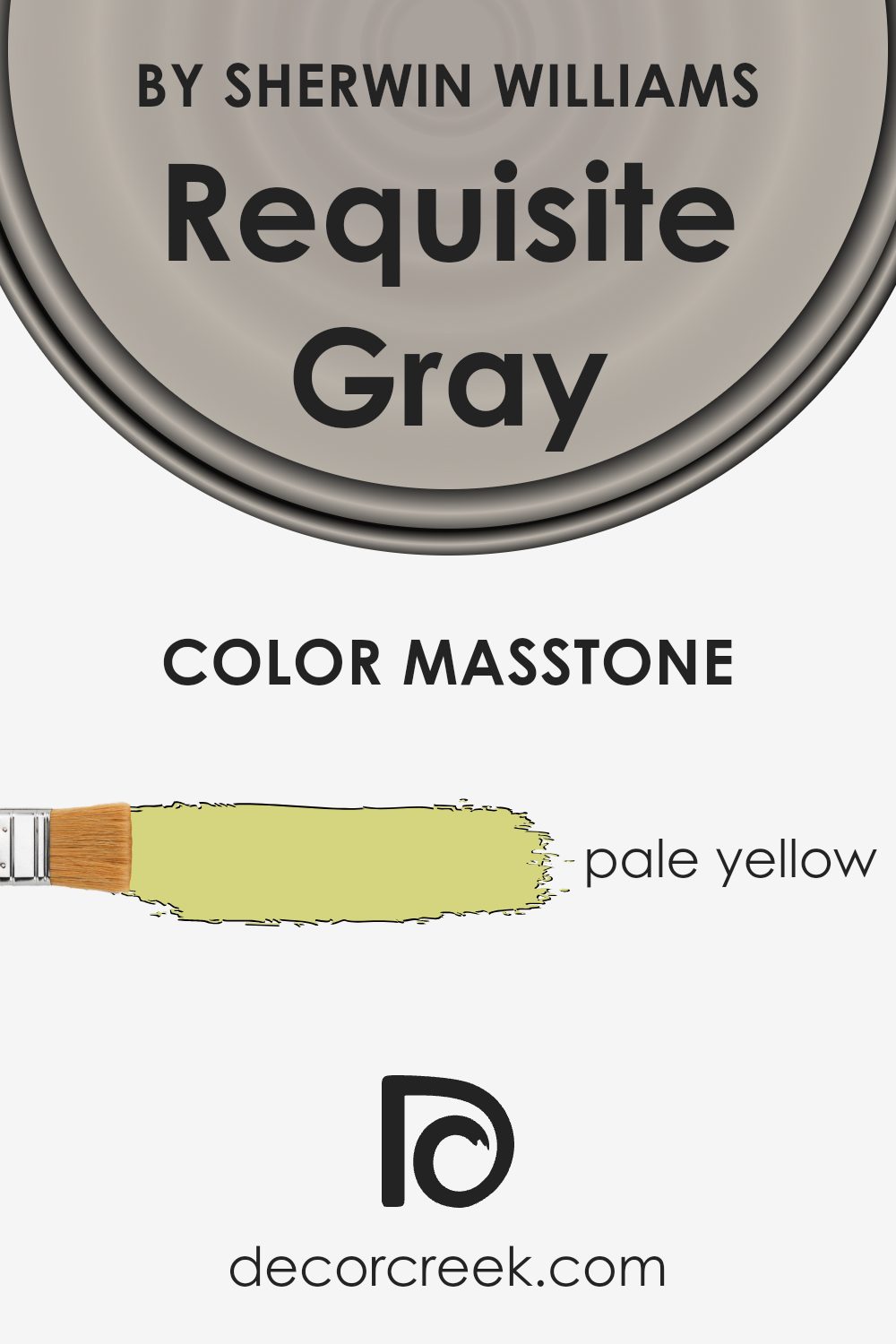
What is the Masstone of the Requisite Gray SW 7023 by Sherwin Williams?
Requisite Gray SW 7023, despite its name, has a masstone that is pale yellow, rather than gray. This unique shade can paint a cheerful and inviting vibe across any room. Pale yellow tends to reflect more light, which can make small spaces seem larger and more open.
This color is versatile enough to use in various rooms, including kitchens and living areas, where you might want a cozy, welcoming atmosphere. It’s a great choice if you prefer colors that aren’t too bold but still add a touch of warmth to your surroundings.
The light-heartedness of the pale yellow can also be paired effectively with darker colors, providing a balanced contrast that isn’t overwhelming. It pairs well with both traditional and modern decor, making it a reliable option for many homes. Its ability to brighten rooms is beneficial in spaces that get less natural light, helping to make them look livelier.
How Does Lighting Affect Requisite Gray SW 7023 by Sherwin Williams?
Lighting plays a critical role in the perception of color in any space. Different light sources can dramatically alter the way colors appear. Natural sunlight provides the truest representation of colors, while artificial lights can add various tints.
The color Requisite Gray by Sherwin Williams is a versatile shade that adapts differently depending on the type of light it is exposed to. Under artificial lighting, such as LED or fluorescent lights, Requisite Gray may appear slightly cooler, revealing more of its subtle blue or green undertones. This makes it a good choice for spaces aiming for a crisp and clear look without being too stark.
In natural light, Requisite Gray will look truer to its swatch color. It presents itself as a warm, inviting gray that blends well with a variety of decorating styles. The color can either pull more beige or more gray depending on the direction of the light and time of day.
In rooms facing north, natural light is cooler and more diffuse, making Requisite Gray appear slightly more muted and cooler, which could make a room feel more reserved yet still cozy. In south-facing rooms, where sunlight is warmer and more abundant, the color can warm up significantly, providing a softer and more welcoming ambiance.
In east-facing rooms, morning light can make Requisite Gray look very warm and lively, which could brighten up the space significantly in the morning. As the day progresses, the color will become more neutral and subdued. Conversely, in west-facing rooms, the color will start more neutral in the morning and gain warmth and depth in the afternoon to evening as sunlight becomes golden.
Thus, Requisite Gray by Sherwin Williams is quite adaptive and can be used effectively in various rooms with different lighting conditions to achieve desired effects.

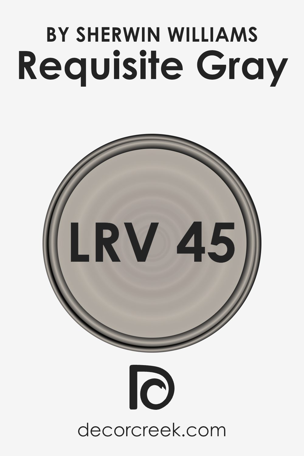
What is the LRV of Requisite Gray SW 7023 by Sherwin Williams?
LRV stands for Light Reflectance Value, a measure used to describe the percentage of light a paint color reflects when light shines upon it. It is a practical way to judge how light or dark a color will appear once applied to walls.
A higher LRV means the color reflects more light, making spaces appear brighter, while a lower LRV means the color absorbs more light, which can make a room look cozier but smaller. This scale helps in making informed choices about how a paint color will influence the ambience and aesthetics of a room under different lighting conditions.
With an LRV of 44.873, Requisite Gray reflects a moderate amount of light. This makes it neither too bright nor too dark, offering a balanced option for spaces that don’t have an abundance of natural light but also aren’t overly dim.
In rooms with ample sunlight, Requisite Gray will appear lighter and more airy, whereas in less lit spaces, it will present a more solid and grounding effect.
This versatility makes it suitable for various rooms and lighting situations, acting as a neutral backdrop that complements diverse decor styles and furnishings.
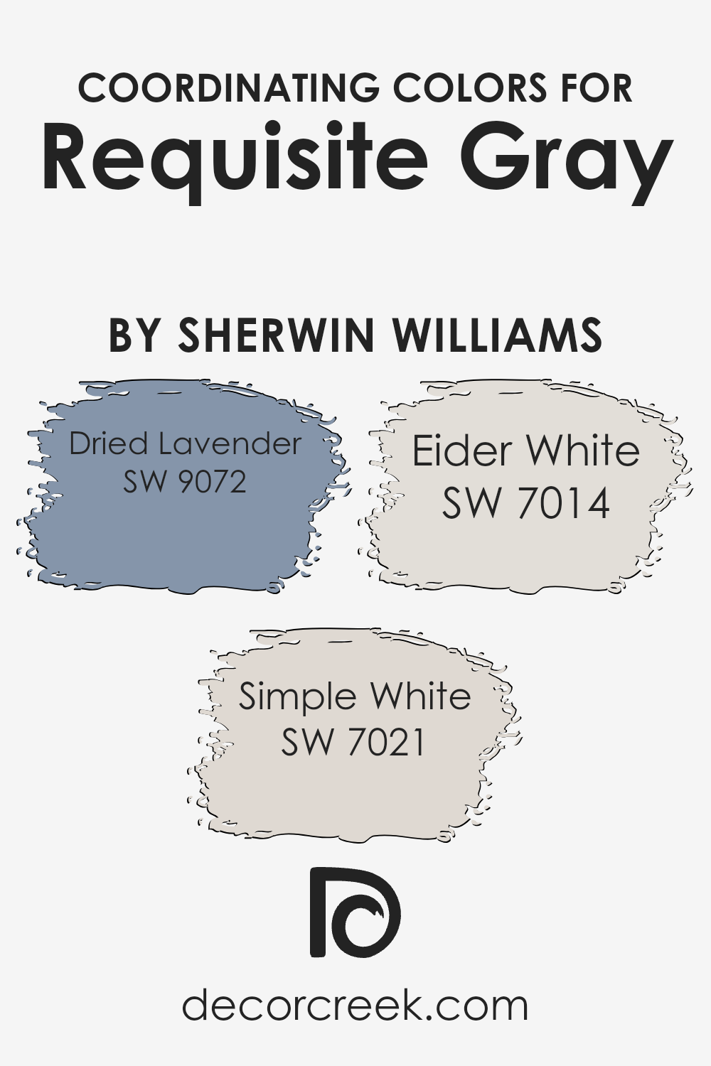
Coordinating Colors of Requisite Gray SW 7023 by Sherwin Williams
Coordinating colors are chosen to complement a main color, enhancing the overall aesthetic of a space without overwhelming it with contrast. Essentially, they are different colors that work together seamlessly to create a balanced and harmonious look. For Requisite Gray, which is a versatile and warm gray shade, the coordinating colors have been carefully selected to highlight its subtle undertones while contributing to a cohesive design.
The coordinating color Dried Lavender adds a muted purple hue that gently contrasts with the neutrality of Requisite Gray, offering a touch of calmness and a slightly playful vibe to the environment. Simple White, on the other hand, is a clean and bright shade that brings light and a sense of freshness to spaces dominated by Requisite Gray, making it an excellent choice for trims and ceilings to provide a crisp finish.
Lastly, Eider White is a softer white with a hint of gray, blending beautifully with Requisite Gray to create a soft, seamless transition in spaces that favor a more muted color palette. These colors together foster a pleasing visual flow from room to room, ensuring that the space feels connected and thoughtfully designed.
You can see recommended paint colors below:
- SW 9072 Dried Lavender
- SW 7021 Simple White
- SW 7014 Eider White
What are the Trim colors of Requisite Gray SW 7023 by Sherwin Williams?
Trim colors are the accent colors applied to trimming elements like door frames, window frames, and skirting boards, contrasting with or complementing the primary wall colors. The choice of trim color can significantly influence the overall look and feel of a room by defining architectural details and bringing coherence to the design.
With Requisite Gray as the main hue, it creates a neutral backdrop that can be perfectly accented with well-chosen trim colors such as Alabaster and Colonial Revival Gray from Sherwin Williams, each providing unique aesthetic contributions.
Alabaster, with its clean, creamy tone, offers a gentle contrast that can help brighten and subtly highlight the soft, gray nuances of a room painted in Requisite Gray. This combination can make a room feel airier and more open, enhancing natural light. Colonial Revival Gray, on the other hand, is a slightly deeper shade that blends smoothly with Requisite Gray, providing a visually cohesive and harmonious appearance. This color can help in creating a more defined look without overwhelming the space, maintaining a calm and welcoming atmosphere.
You can see recommended paint colors below:
- SW 7008 Alabaster
- SW 2832 Colonial Revival Gray

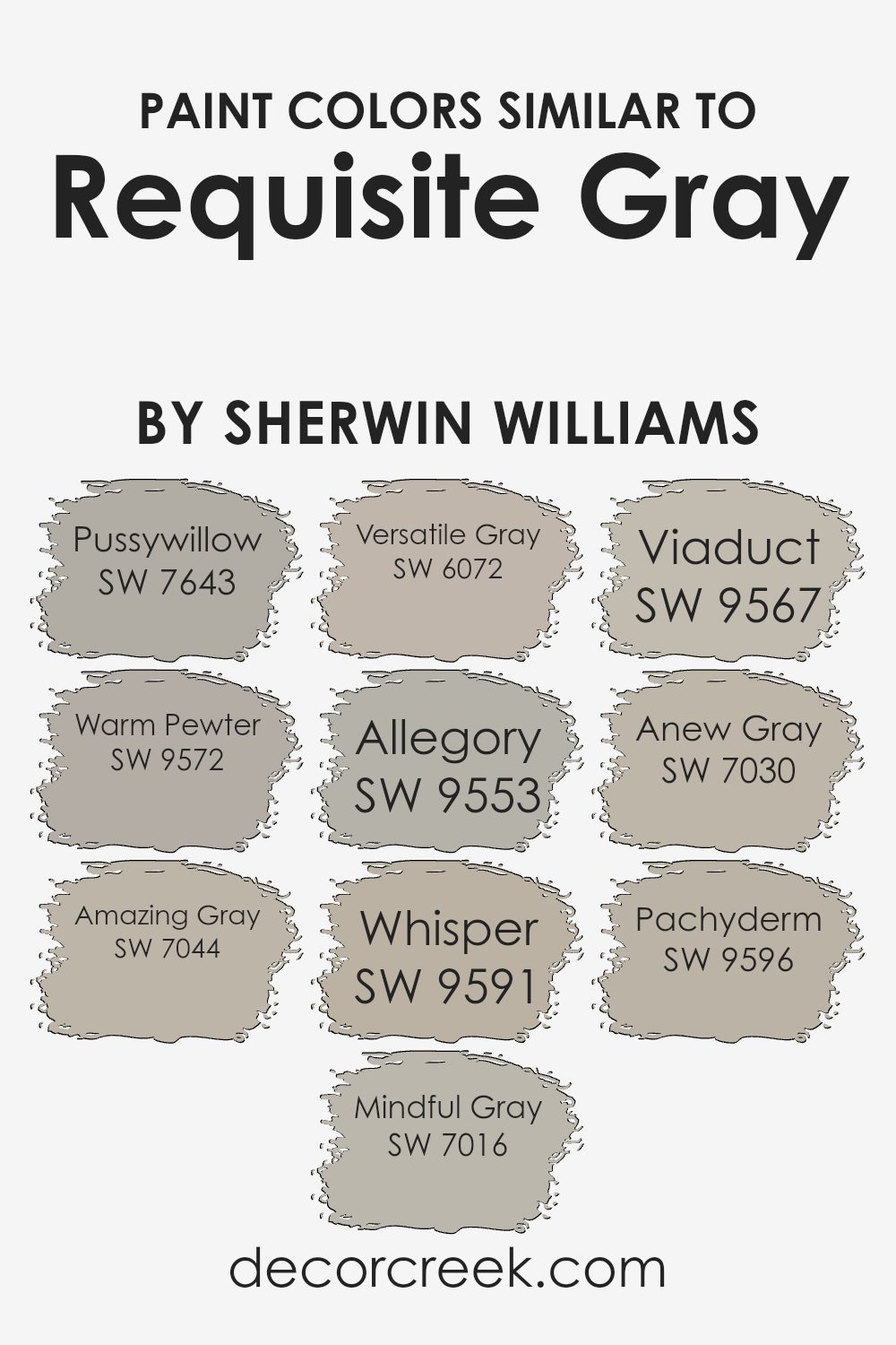
Colors Similar to Requisite Gray SW 7023 by Sherwin Williams
When decorating your home, using similar colors can create a harmonious and cohesive atmosphere. Shades that lie close to each other on the color spectrum provide a subtle contrast yet still maintain a uniform feel throughout the space. For instance, colors similar to Requisite Gray by Sherwin Williams, such as Pussywillow and Amazing Gray, work well together because they share the same undertones.
Pussywillow is a gentle gray that provides a soft backdrop for any room, lending a mild and soothing aura. On the other hand, Amazing Gray is slightly deeper, offering just enough depth to enhance spaces with a touch of warmth.
Other shades like Mindful Gray and Anew Gray give a balanced neutral look with their versatile tones. Mindful Gray is a soft, warm gray that has a calming presence, perfect for creating a relaxed environment. Anew Gray, being a tad darker, pairs beautifully with lighter shades to provide a nice, layered effect.
Versatile Gray and Warm Pewter lean towards a more subdued color scheme. Warm Pewter, with its slightly earthier tone, adds a cozy feel, while Versatile Gray is ideal for those looking for a neutral option that still adds character without overwhelming the space. Together, these colors work in harmony to create inviting and comfortable environments.
You can see recommended paint colors below:
- SW 7643 Pussywillow
- SW 9572 Warm Pewter
- SW 7044 Amazing Gray
- SW 7016 Mindful Gray
- SW 6072 Versatile Gray
- SW 9553 Allegory
- SW 9591 Whisper
- SW 9567 Viaduct
- SW 7030 Anew Gray
- SW 9596 Pachyderm
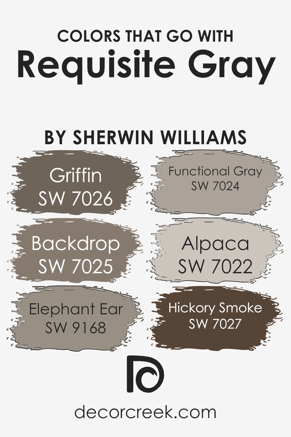
Colors that Go With Requisite Gray SW 7023 by Sherwin Williams
Choosing the right colors that complement Requisite Gray SW 7023 by Sherwin Williams is crucial for achieving a harmonious and aesthetically pleasing interior space. When paired wisely, these colors can enhance the muted sophistication of Requisite Gray, enabling it to fit seamlessly into various decor styles and settings.
For instance, Griffin SW 7026 is a deep, moody gray that can add a layer of depth to Requisite Gray, making it ideal for creating a cozy and comforting atmosphere in living areas or bedrooms. On the other hand, Backdrop SW 7025 offers a slightly warmer gray tone that helps soften the overall look, perfect for spaces that aim for a modern yet inviting vibe.
Colors like Elephant Ear SW 9168 provide a subtle brown undertone, which pairs well with Requisite Gray’s cool base to add warmth and natural elements to a room. Functional Gray SW 7024 is another complementary choice, slightly darker and cooler, lending itself well for accent walls or furniture, boosting the visual interest in a space subtly.
Alpaca SW 7022, with its lighter, taupe-like quality, offers a soft contrast that is particularly useful in smaller rooms to create the illusion of space. Lastly, Hickory Smoke SW 7027, the darkest of the shades, allows for dramatic effects, perfect for highlighting architectural features or furniture pieces against the neutrality of Requisite Gray. By effectively using these colors, one can easily create a cohesive and inviting living environment.
You can see recommended paint colors below:
- SW 7026 Griffin
- SW 7025 Backdrop
- SW 9168 Elephant Ear
- SW 7024 Functional Gray
- SW 7022 Alpaca
- SW 7027 Hickory Smoke
How to Use Requisite Gray SW 7023 by Sherwin Williams In Your Home?
Requisite Gray by Sherwin Williams is a versatile gray paint color that can give your home a fresh, modern look. It has a warm tone, which makes it inviting and perfect for almost any room. You can use it in your living room to give a cozy yet stylish background that goes well with different decor styles, from contemporary to classic.
In bedrooms, this shade creates a calm setting that’s ideal for relaxing. It’s also a great choice for kitchens and bathrooms where you want a clean, updated look without being too cold or stark.
Because Requisite Gray is neutral, it pairs nicely with brighter colors like blues and greens for a lively space, or with soft whites and beiges for a more subtle and refined feel. It’s also easy to apply and goes well with both natural and artificial light, helping to keep your space looking good all day long. Whether you are giving your walls a new coat of paint or refreshing your cabinets, this color is a smart pick.
Requisite Gray SW 7023 by Sherwin Williams vs Warm Pewter SW 9572 by Sherwin Williams
Requisite Gray and Warm Pewter are two distinct colors by Sherwin Williams. Requisite Gray is a light gray with a warm undertone, making it quite versatile for use in various spaces. It tends to give off a welcoming vibe and can easily blend with different types of decor.
On the other hand, Warm Pewter leans towards a deeper gray with a slight brownish tint. This makes Warm Pewter feel warmer and cozier compared to Requisite Gray. It’s great for creating a more inviting and comforting atmosphere in a room.
Both colors are neutral, meaning they work well with many other shades, but their underlying tones set them apart in terms of the mood and style they can help achieve in a space. Whether you choose Requisite Gray for its lighter, breezier feel or Warm Pewter for its deeper, warmer presence, both colors offer unique possibilities for interior design.
You can see recommended paint color below:

Requisite Gray SW 7023 by Sherwin Williams vs Allegory SW 9553 by Sherwin Williams
Requisite Gray and Allegory, both by Sherwin Williams, offer distinct tones for different vibes in home decor. Requisite Gray is a soft, warm gray with a comforting presence.
It’s versatile, making it a great choice for various spaces, easily pairing with both bright and subdued accents. On the other hand, Allegory is a deeper, cooler gray that gives a more pronounced statement. It’s perfect for creating a cozy, inviting atmosphere in rooms. Given its depth, Allegory can make smaller spaces feel a bit tighter but works wonders in larger or well-lit areas, enhancing the room’s character.
In conclusion, while Requisite Gray provides a lighter, more adaptable background, Allegory steps in with a moodier, richer hue.
You can see recommended paint color below:
- SW 9553 Allegory
Requisite Gray SW 7023 by Sherwin Williams vs Anew Gray SW 7030 by Sherwin Williams
Requisite Gray and Anew Gray by Sherwin Williams are two similar yet distinct shades of gray that can influence the atmosphere of any room differently. Requisite Gray has a slightly cooler undertone, making it ideal for spaces where you want a modern and crisp feel. It pairs well with brighter colors, providing a subtle backdrop that allows other colors to stand out.
On the other hand, Anew Gray is warmer and softer, making it perfect for creating a welcoming and comfortable space. This color works especially well in living areas and bedrooms where a cozy vibe is desired. It blends seamlessly with both light and dark accents, giving decorators flexibility in designing a room.
Both colors are versatile, but the choice between them depends on the desired mood and the specific functional needs of the space. Where Requisite Gray brings a more defined and sleek appearance, Anew Gray offers a gentler and more inviting touch.
You can see recommended paint color below:
Requisite Gray SW 7023 by Sherwin Williams vs Pachyderm SW 9596 by Sherwin Williams
Requisite Gray and Pachyderm by Sherwin Williams are two distinct shades that can set very different moods in a space. Requisite Gray is a neutral, light gray color that has a warm undertone, making it perfect for creating a cozy and welcoming atmosphere in almost any room. It’s versatile and subtle, meaning it won’t overpower your space but will complement various decor styles and color palettes.
On the other hand, Pachyderm is a much darker shade, with a deep, gray-brown tone that adds a strong presence to a space. This color is ideal if you’re looking to make a statement or define an area distinctly.
It works well in large spaces or on accent walls where its depth can be fully appreciated without making the room feel smaller or crowded.
Both colors offer unique options for decorating, with Requisite Gray providing a soft backdrop and Pachyderm offering a bold focal point. Depending on your needs, either could be a perfect choice.
You can see recommended paint color below:
- SW 9596 Pachyderm
Requisite Gray SW 7023 by Sherwin Williams vs Whisper SW 9591 by Sherwin Williams
Requisite Gray and Whisper are both paint colors from Sherwin Williams but they differ notably in their tones and usage. Requisite Gray is a warm, light gray with a touch of brown, making it appear cozy and welcoming. This color works well in many areas of a home, from living rooms to bedrooms, as it provides a subtle, neutral backdrop that pairs easily with a variety of decor styles.
On the other hand, Whisper is much lighter, almost bordering on off-white with soft gray undertones. It’s an excellent choice for spaces where you want to enhance natural light, such as kitchens and bathrooms. Because of its very light shade, Whisper can help small rooms feel larger and more open.
When choosing between these two, consider the amount of natural light in your room and the mood you want to set. Requisite Gray adds warmth, while Whisper can make a space feel airy and fresh.
You can see recommended paint color below:
Requisite Gray SW 7023 by Sherwin Williams vs Mindful Gray SW 7016 by Sherwin Williams
Requisite Gray and Mindful Gray, both by Sherwin Williams, have subtle differences that make them suitable for various spaces. Requisite Gray is a slightly darker shade than Mindful Gray. It leans more towards a beige-gray mix, adding warmth to rooms, which makes it great for spaces where a cozy feel is desired, like living rooms or bedrooms.
On the other hand, Mindful Gray is lighter and cooler, making it more versatile for both small and large areas. It reflects more light, which can help in making a small room appear bigger. When paired in decor, Mindful Gray works well as a base or main wall color, while Requisite Gray can be an excellent choice for accent walls or furniture, adding depth and contrast to the interior design.
Both colors are soft and subtle, making them easy to integrate into most color schemes without overwhelming the space.
You can see recommended paint color below:
Requisite Gray SW 7023 by Sherwin Williams vs Versatile Gray SW 6072 by Sherwin Williams
Requisite Gray and Versatile Gray are both gray paint shades from Sherwin Williams, each with its own unique tone. Requisite Gray is a light to medium gray that balances warm and cool tones, making it easy to pair with a wide variety of decor colors. It’s a great option for rooms where you want a modern, neutral backdrop that isn’t too stark.
Versatile Gray, on the other hand, is a slightly darker shade of gray with a warmer, more beige-like undertone. This color can give a cozy and inviting feeling to spaces, particularly in rooms with less natural light or where a softer, warmer ambiance is desired. It’s often used in living areas and bedrooms to create a comfortable, welcoming atmosphere.
Both colors are flexible and useful for different purposes around the home, depending on the mood you want to create and the existing colors in your furniture and decorations.
You can see recommended paint color below:
Requisite Gray SW 7023 by Sherwin Williams vs Amazing Gray SW 7044 by Sherwin Williams
When comparing Requisite Gray and Amazing Gray from Sherwin Williams, both colors are versatile and widely used grays that provide a neutral backdrop for any room. Requisite Gray is a bit darker and cooler, offering a calm, subtle presence that pairs well with both bright and muted accents. This makes it a great choice for spaces where you want a touch of modernity without overwhelming the room.
On the other hand, Amazing Gray is lighter and warmer, creating a cozy and inviting atmosphere. Its warmth makes it ideal for living spaces and bedrooms where comfort is a priority. Amazing Gray also works beautifully with both wood tones and varied color palettes, providing a flexible foundation for decor changes.
Both colors can refresh a space, but the choice between them depends on your preference for warmth versus coolness and how light or dark you want your room to feel. Each offers its own unique mood, with Requisite Gray leaning more towards a stark, clean look and Amazing Gray exuding a gentle, welcoming vibe.
You can see recommended paint color below:
Requisite Gray SW 7023 by Sherwin Williams vs Viaduct SW 9567 by Sherwin Williams
Requisite Gray and Viaduct are two distinctive shades offered by Sherwin Williams. Requisite Gray is a warm gray that strikes a balance between gray and beige, often referred to as “greige.” It’s a versatile color that works well in various spaces, imparting a soft, neutral backdrop that pairs easily with both warm and cool tones.
On the other hand, Viaduct is a darker shade, reflecting more depth and boldness. It has a cooler tone compared to Requisite Gray, lending a more pronounced presence in a room. Viaduct can make a strong statement whether used for an accent wall or throughout a space, and it tends to stand out more compared to the subtler, more laid-back vibe of Requisite Gray.
Overall, choosing between these colors depends on the desired impact and the existing colors in your space. Requisite Gray is ideal for those seeking a light, airy feel, while Viaduct suits a setting where a dramatic, more imposing color is preferred.
You can see recommended paint color below:
Requisite Gray SW 7023 by Sherwin Williams vs Pussywillow SW 7643 by Sherwin Williams
Requisite Gray and Pussywillow by Sherwin Williams are both popular shades of gray, but they have unique qualities that set them apart. Requisite Gray is a lighter gray that provides a soft, neutral backdrop ideal for a variety of spaces.
It’s a versatile color that pairs well with both warm and cool tones, making it a go-to choice for creating a balanced look. On the other hand, Pussywillow is a deeper shade, coming across as a richer, more intense gray. This makes it perfect for adding a bit of drama or grounding an otherwise light room. Pussywillow works well in areas that benefit from a stronger color presence, providing a striking contrast when used with lighter shades.
Both colors are stylish options that can enhance any decor, but your choice depends on the mood and atmosphere you aim to achieve in your space.
You can see recommended paint color below:
In conclusion, SW 7023 Requisite Gray by Sherwin Williams is a great paint color. It’s not too dark or too light, making it perfect for all sorts of rooms. Whether you want to paint your living room, bedroom, or even the kitchen, this color creates a warm and cozy feel without being too bold.
What I really like about Requisite Gray is that it goes well with many different colors. This means you can use it with furniture and decorations you already have. It’s also good at hiding little marks and scuffs, which is helpful in a busy home. Plus, it makes small rooms look a bit bigger and more open, which is a nice bonus.
Using this paint can really change the look of a home in a simple but effective way. It’s like giving your room a comfy sweater that makes it feel more inviting.
So, if you’re thinking about a new color for a room in your house, I think Requisite Gray is a smart choice. It’s easy to see why many people choose it for their homes.
Ever wished paint sampling was as easy as sticking a sticker? Guess what? Now it is! Discover Samplize's unique Peel & Stick samples.
Get paint samples

