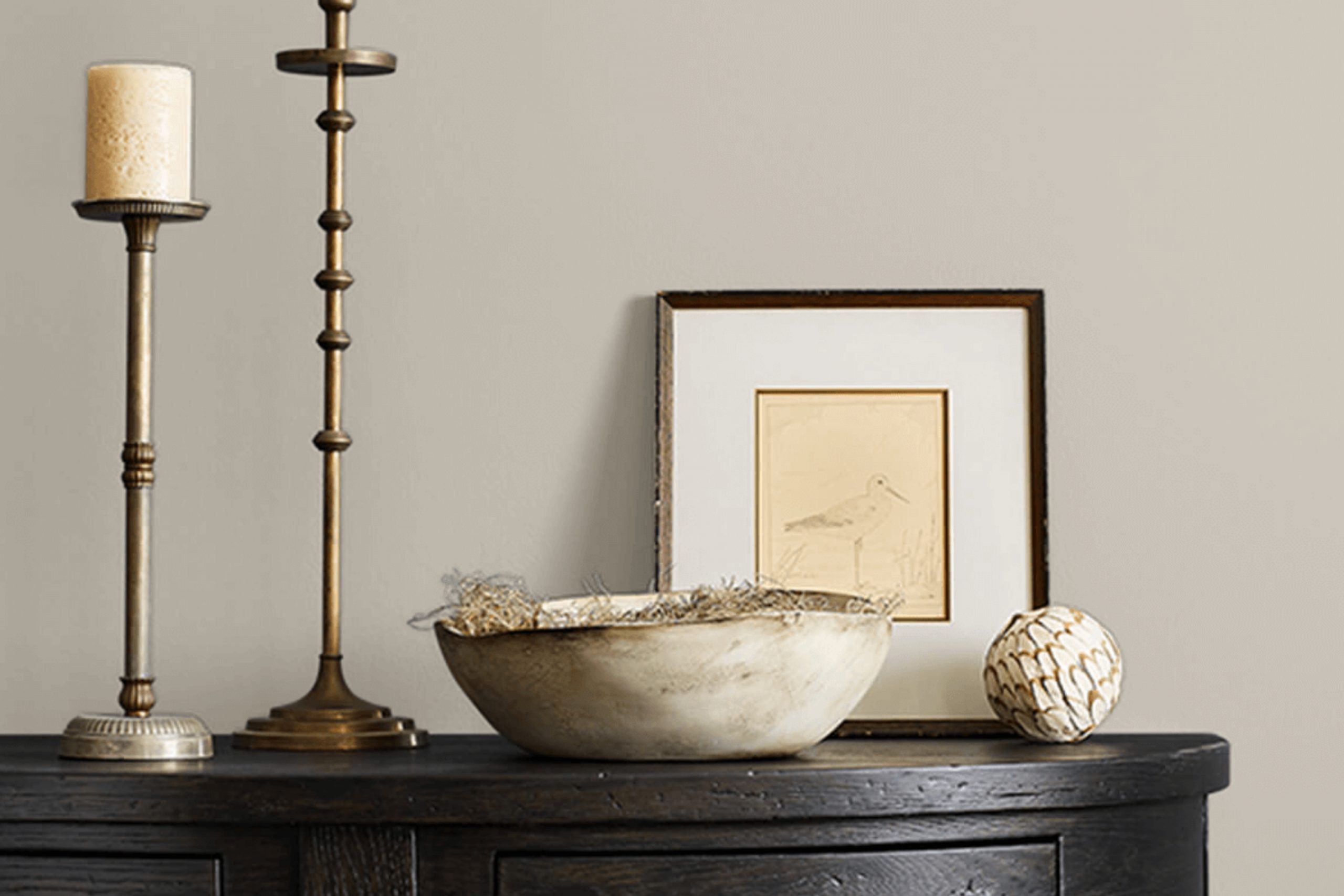
When you see SW 9567 Viaduct by Sherwin Williams, you notice its unique blend of versatility and subtle sophistication. Imagine a bridge between modern and classic, with a color that quietly commands attention without overpowering a space. Viaduct is a soft, muted hue that effortlessly harmonizes with various design elements, making it a favorite choice for many.
Picture a calm, overcast day where the skies are serene, yet filled with potential. This is the essence of Viaduct. It brings a feeling of calmness and stability but also serves as a backdrop for brewing creativity. Whether you’re thinking about refreshing a living room, adding a touch of elegance to a bedroom, or creating an inviting atmosphere in an office, Viaduct holds its own and enhances the environment.
It’s not just a color; Viaduct crafts an environment. It works well with different textures and materials, complementing wood grains, metal finishes, and more. It’s a tone that supports your choices in decor, allowing personal style to shine through. You might pair it with bold accent colors or soft neutrals, and it will settle in beautifully.
In my experience, SW 9567 Viaduct invites reflection and inspires subtle change. It’s an enduring choice, adaptable and reliable, serving as an effortlessly suitable foundation. It encourages a space where comfort meets style, offering endless possibilities.
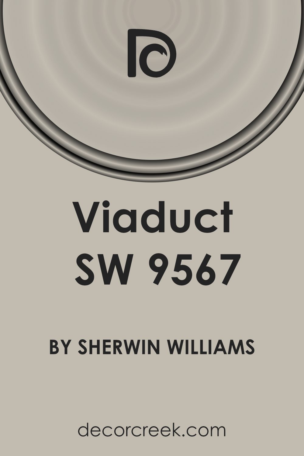
What Color Is Viaduct SW 9567 by Sherwin Williams?
Viaduct SW 9567 by Sherwin Williams is a medium, earthy gray with warm undertones. This versatile color provides a calm and neutral backdrop that works well in various interior styles. It fits perfectly in modern and contemporary settings, where clean lines and understated decor are key. Its neutral nature also complements industrial styles, enhancing concrete floors and exposed beams with its muted elegance.
In a rustic or farmhouse setting, Viaduct brings out the warm, cozy elements, pairing beautifully with natural wood finishes and soft textiles. For a minimalist style, Viaduct’s soft tones provide a quiet base that allows furniture and decor to be the focal points without overwhelming the space.
When it comes to pairing with materials and textures, Viaduct shines with natural elements. It goes well with wood, whether it’s dark-stained walnut or light oak. Metal accents, such as brushed nickel or wrought iron, stand out against this subtle gray.
fabrics like wool, cotton, and linen add depth and warmth, while stone surfaces, such as slate or granite, harmonize with its earthy undertones. Overall, Viaduct SW 9567 is a flexible and inviting color choice suitable for a wide range of decor and styles.
Is Viaduct SW 9567 by Sherwin Williams Warm or Cool color?
Viaduct SW 9567 by Sherwin Williams is a versatile color often used in home design. It’s a soft, neutral gray that works well in various spaces. This color can create a cozy and inviting atmosphere in living rooms or bedrooms. It has a calming effect without feeling dull or cold, making it suitable for everyday living spaces.
When applied in a kitchen or dining area, Viaduct can complement stainless steel appliances and modern furnishings while balancing brighter accent colors. In a bathroom, it pairs well with white fixtures and can enhance a clean, spa-like environment.
This particular shade of gray is adaptable because it fits both modern and traditional decor, blending effortlessly with other colors and styles. Whether you’re painting an entire room or just an accent wall, Viaduct SW 9567 can add a touch of elegance and warmth without overpowering the space. Its neutrality provides flexibility for decorating, making it a popular choice among homeowners.
Undertones of Viaduct SW 9567 by Sherwin Williams
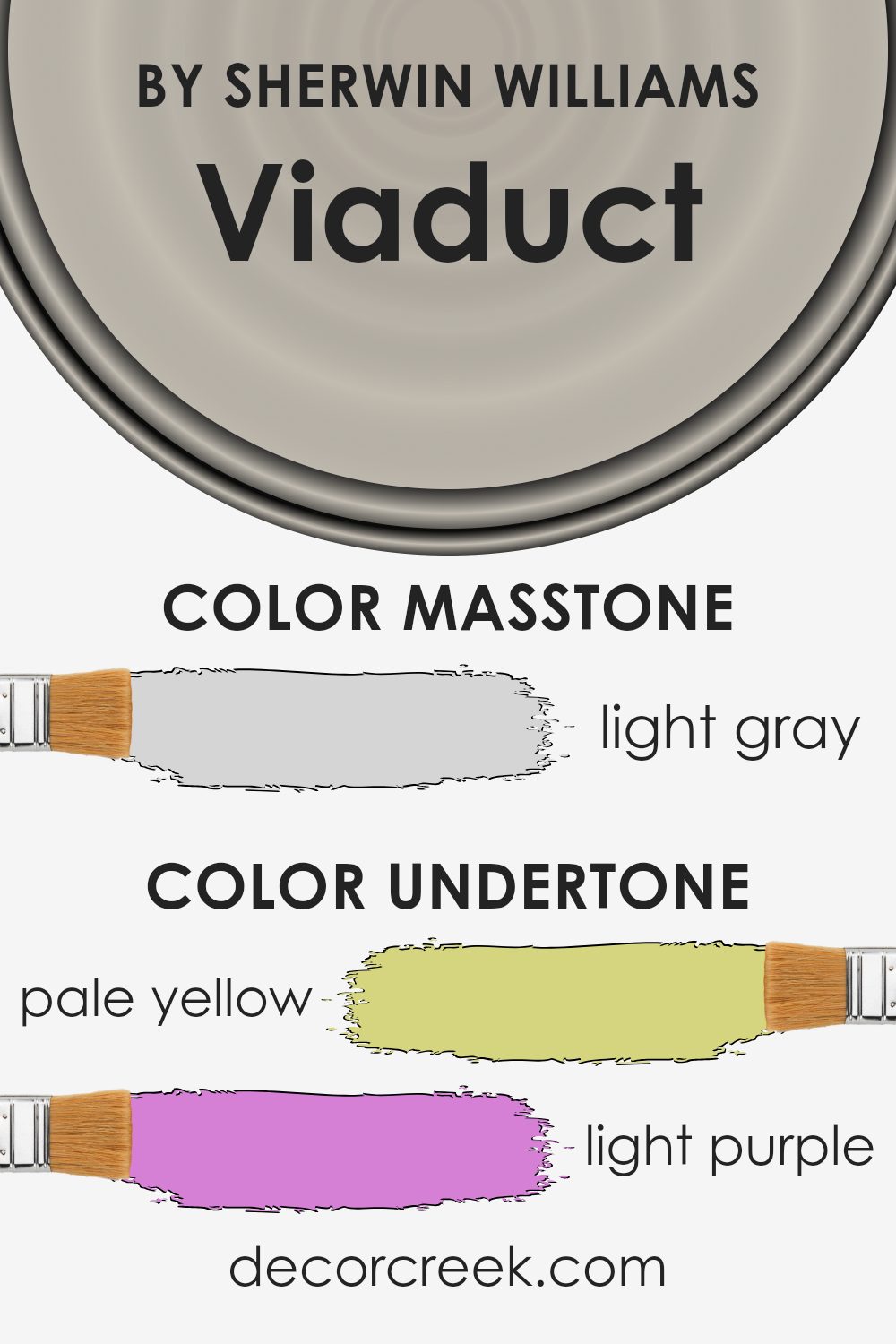
Viaduct SW 9567 by Sherwin Williams is a unique color with complex undertones that include pale yellow, light purple, light blue, pale pink, mint, lilac, and grey. These undertones play a significant role in how we perceive the color. Undertones are the subtle hues beneath the main color. They can change how a color looks depending on the lighting and the surrounding colors.
The pale yellow undertone can give the paint a warm and inviting feel, brightening up a room when sunlight hits the walls. Light purple and lilac add a hint of softness and elegance, which can create a calming atmosphere.
Light blue and mint undertones introduce a refreshing and cool effect, which can help make a space feel more open and airy. The pale pink brings a gentle warmth, adding a touch of comfort. Grey undertones contribute a neutral balance, making the color versatile and easy to pair with other shades.
In an interior setting, these undertones can affect the mood of a room. Depending on the light and decoration, the walls painted in this color can appear warmer or cooler, more inviting or more restful, making it a flexible choice for different rooms and styles.
What is the Masstone of the Viaduct SW 9567 by Sherwin Williams?
Viaduct SW 9567 by Sherwin Williams is a light gray color with the hex code #D5D5D5. It’s a versatile shade that fits well in many home settings. Since it’s a light neutral, it creates a sense of openness and airiness, which can make rooms feel more spacious. This color can be used in living rooms, bedrooms, or kitchens to create a calm and inviting atmosphere.
Light gray like Viaduct is also very adaptable when it comes to pairing with other colors. It goes well with both bold and soft shades, making it easy to change up decor without needing to repaint. You can add brighter accents or keep everything neutral for a more cohesive look.
Viaduct also does well with natural light, reflecting it softly and enhancing the luminosity of a room. This makes it a practical choice for homes with plenty of windows, bringing out a subtle elegance without seeming overwhelming.

How Does Lighting Affect Viaduct SW 9567 by Sherwin Williams?
Lighting plays a crucial role in how we perceive color. The same color can look quite different depending on the lighting conditions. Natural light changes throughout the day, affecting how we see colors. Artificial light can also influence color perception depending on the type of bulb used.
**Viaduct SW 9567** by Sherwin Williams is a color that can look different under various lighting conditions. In natural light, this shade appears in its most true form. However, the orientation of the room and the time of day can affect its appearance.
In north-facing rooms, natural light is often cooler and less intense. This can make Viaduct SW 9567 look slightly muted or cooler. The color might appear more subdued in these spaces because the sunlight is more diffused.
In south-facing rooms, the light is typically warmer and more intense, especially during midday. This can make the color appear warmer and more vibrant. The increased brightness highlights the depth of the color, making it feel more lively.
East-facing rooms get bright morning light, which can make Viaduct SW 9567 look fresher and brighter in the early hours. As the sun moves throughout the day, the color might appear deeper and slightly cooler when lit by the afternoon light.
West-facing rooms experience the opposite effect of east-facing rooms. The morning light can be softer and cooler, while the afternoon and evening light is warmer. This means Viaduct SW 9567 might appear more subdued in the morning, gaining warmth and richness in the afternoon and evening.
Under artificial light, the color can change based on the type of bulb. Incandescent bulbs cast a warm light, which can enhance the warm tones in Viaduct SW 9567, while fluorescent or LED lights can make it appear cooler. Understanding these variations helps in choosing the right setting for the desired atmosphere.

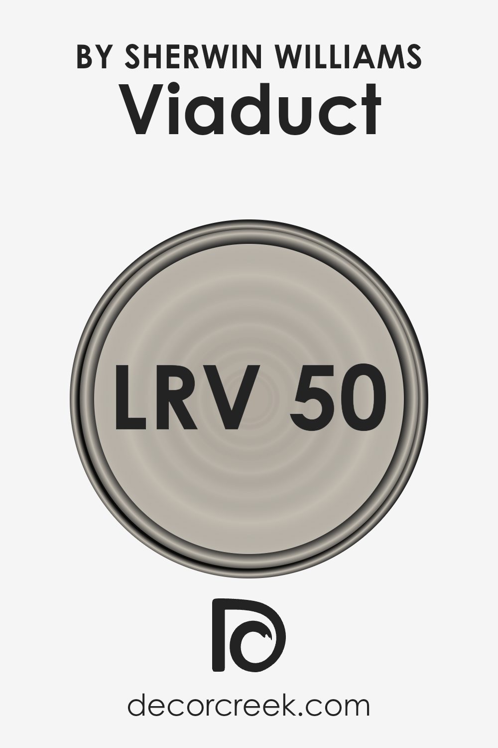
What is the LRV of Viaduct SW 9567 by Sherwin Williams?
LRV stands for Light Reflectance Value, which is a measure of how much light a color reflects. The LRV scale ranges from 0 to 100, with 0 being absolute black, which absorbs all light, and 100 being pure white, which reflects all light. Colors with higher LRV values reflect more light and can make a space feel brighter and more open.
Meanwhile, colors with lower LRV values absorb more light, making rooms feel cozier and more intimate. LRV is important to consider when choosing paint colors, as it affects how the color will look once it’s on the wall. Natural and artificial lighting, the size of the room, and the function of the space will all influence how the LRV of a paint color interacts with its environment.
With the LRV of 50.169, Viaduct from Sherwin Williams is right around the midpoint of the scale, meaning it reflects a moderate amount of light. This value suggests that the color won’t make a room feel overly bright or stark but will maintain a balanced light level that feels comfortable. In a larger room with lots of natural light, Viaduct can maintain its color integrity without being washed out.
In smaller or dimly lit spaces, it won’t overpower the room or make it feel too dark. Because it sits in the middle of the LRV scale, this color offers great versatility, working well in a variety of different room types and lighting conditions, making it a practical choice for different spaces in a home or office.
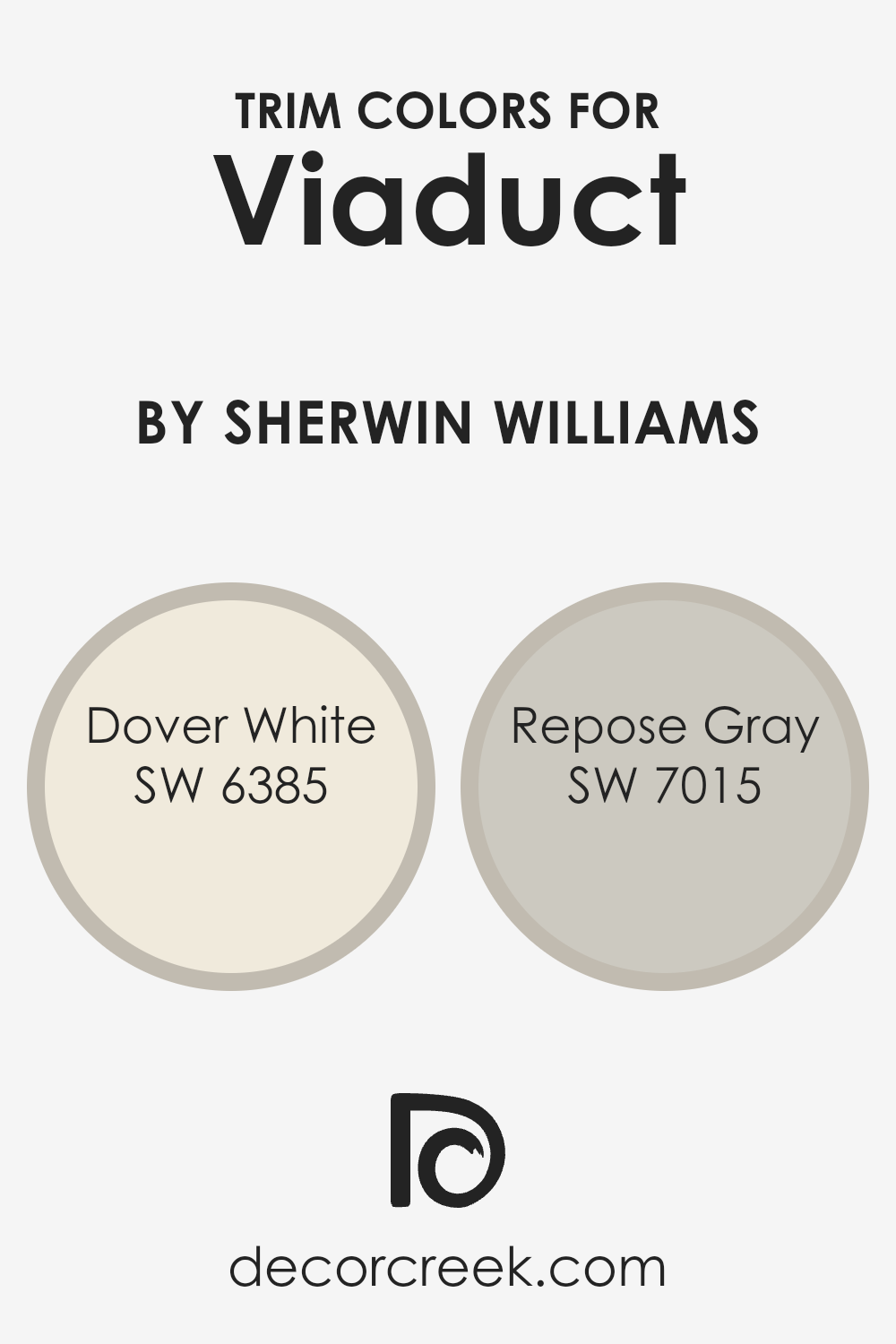
What are the Trim colors of Viaduct SW 9567 by Sherwin Williams?
Trim colors play an essential role in defining and emphasizing a space by outlining windows, doors, and other features, bringing out the beauty of the main wall color. For Viaduct SW 9567 by Sherwin Williams, selecting the right trim color is key to enhancing the overall appearance of a room. These colors help outline architectural details, add contrast, and can make the main wall color stand out even more.
Since Viaduct SW 9567 has its unique tone, pairing it with suitable trim colors like Dover White and Repose Gray can add depth and interest to any space. The harmonious combination ensures a polished and cohesive look, creating a room that feels well put together.
Dover White (SW 6385) is a warm and inviting white with a gentle creamy undertone. It’s versatile and works well with many color schemes, offering a soft touch without overwhelming the primary wall color. On the other hand, Repose Gray (SW 7015) is a light, neutral gray that leans slightly warm with subtle undertones.
It creates a calm backdrop, making it an excellent complement for pairing with stronger colors like Viaduct SW 9567. Both colors add subtle elegance and contrast, helping highlight architectural elements while tying the space together beautifully.
You can see recommended paint colors below:
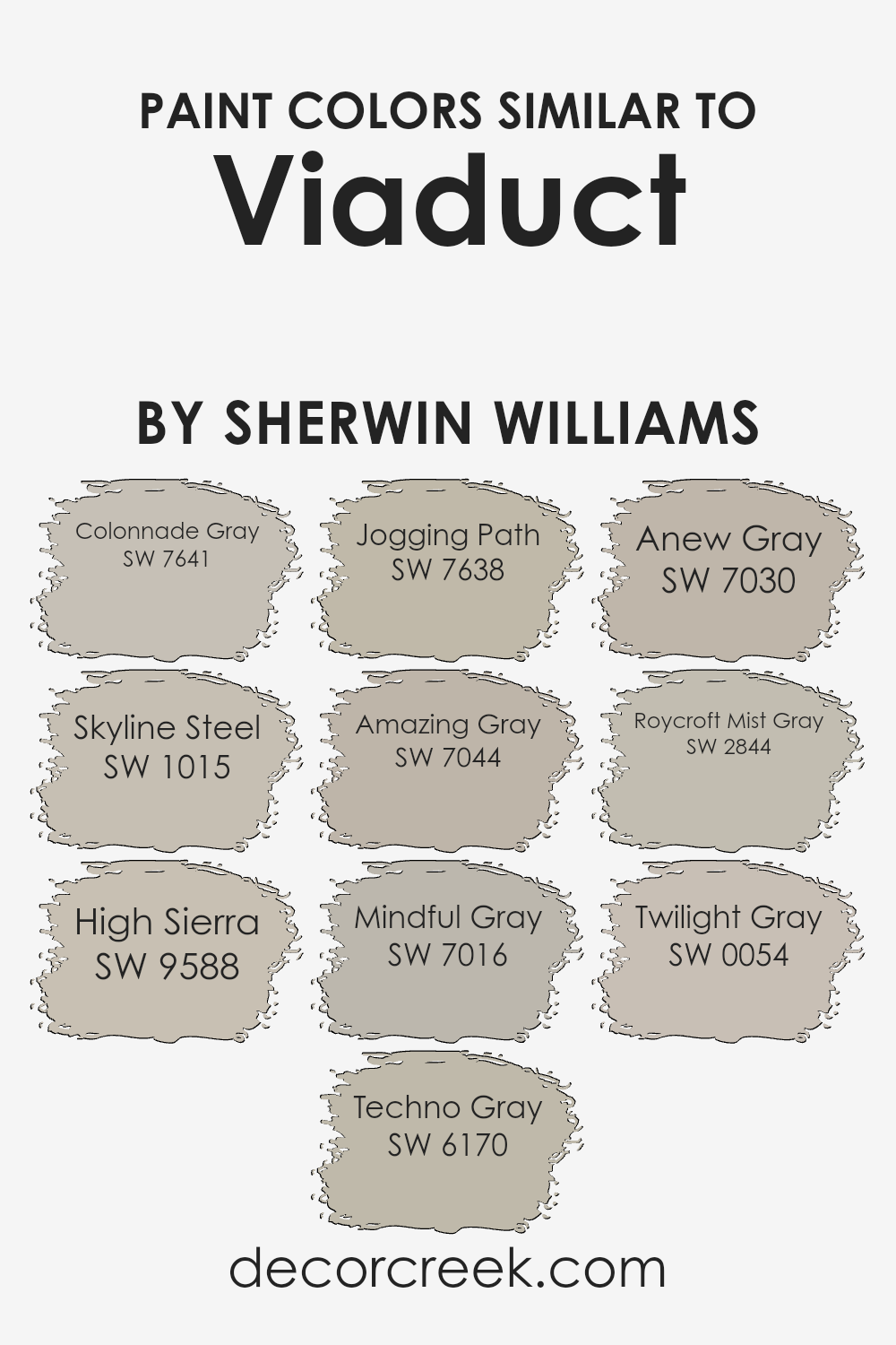
Colors Similar to Viaduct SW 9567 by Sherwin Williams
Similar colors are essential because they create a sense of harmony and cohesion in any space. When used together, they can make a room feel more balanced and inviting. Colors like Colonnade Gray and Skyline Steel blend well with each other, offering a soft, neutral backdrop for any room.
High Sierra adds a touch of earthy warmth, while Techno Gray brings a subtle, cool undertone. Jogging Path and Amazing Gray both have a calming effect, perfect for relaxing environments. Mindful Gray and Anew Gray are versatile and adaptable, making them excellent choices for any area of the home.
Roycroft Mist Gray provides a hint of historic charm, while Twilight Gray is deeper, adding a touch of drama without being overwhelming. These colors work effectively with each other because they share similar tones and shades, which helps to unify the overall look of a space.
By incorporating these colors, you can achieve a cohesive and aesthetically pleasing atmosphere. Whether used on walls, furniture, or accents, these similar colors are reliable choices, ensuring that spaces feel connected and well-thought-out. They can tie different elements together spontaneously, making them essential in design projects.
You can see recommended paint colors below:
- SW 7641 Colonnade Gray
- SW 1015 Skyline Steel
- SW 9588 High Sierra
- SW 6170 Techno Gray
- SW 7638 Jogging Path
- SW 7044 Amazing Gray
- SW 7016 Mindful Gray
- SW 7030 Anew Gray
- SW 2844 Roycroft Mist Gray
- SW 0054 Twilight Gray
How to Use Viaduct SW 9567 by Sherwin Williams In Your Home?
Viaduct SW 9567 by Sherwin Williams is a versatile paint color that can work well in many areas of a home. It’s a neutral shade that offers a subtle and calming presence, making it a great choice for any room. In the living room, it can create a warm and inviting atmosphere, helping furniture and decor to stand out without clashing.
In a bedroom, Viaduct can promote a restful environment, providing a perfect backdrop for colorful bedding or art.
For kitchens and dining areas, this color pairs beautifully with a variety of cabinet finishes and countertop materials, allowing you to have flexibility with design elements. This makes it easy to update the look of these spaces by simply changing accessories. In bathrooms, Viaduct can be used to create a clean and fresh look, harmonizing well with both light and dark fixtures. Its adaptability makes it an excellent choice for any home.
Viaduct SW 9567 by Sherwin Williams vs Jogging Path SW 7638 by Sherwin Williams
Viaduct by Sherwin Williams is a deep, muted gray with subtle hints of blue. It provides a cool, calming backdrop that works well in modern and minimalist spaces. It’s perfect for adding a touch of depth without being overwhelming.
On the other hand, Jogging Path is a softer, warmer gray with green undertones. This color feels more earthy and natural, bringing a comfortable and inviting feel to a room. It’s versatile and pairs nicely with both warm and cool accents. While Viaduct leans more towards an industrial vibe, Jogging Path has a cozier, more relaxed atmosphere.
Both colors are neutral, making them suitable for different styles, but the choice between them depends on whether you prefer the cool sophistication of Viaduct or the warm embrace of Jogging Path.
You can see recommended paint color below:

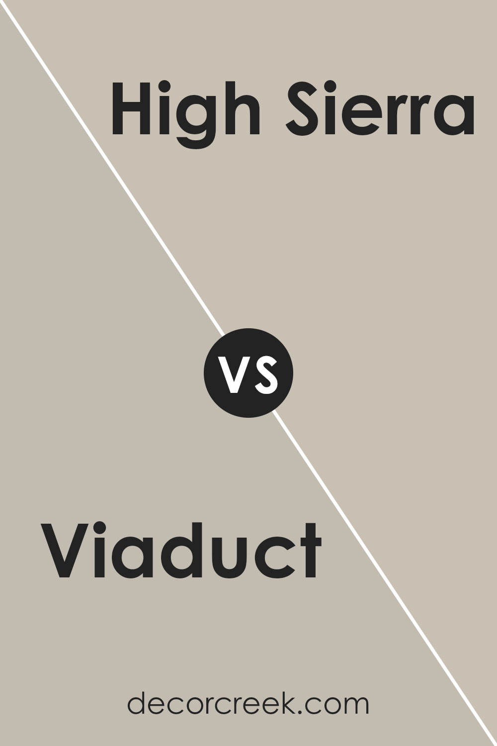
Viaduct SW 9567 by Sherwin Williams vs High Sierra SW 9588 by Sherwin Williams
Viaduct and High Sierra are two distinct colors by Sherwin Williams. Viaduct is a strong, muted gray with earthy undertones. It suggests stability and solidity. It’s versatile and works well in modern or industrial spaces, giving a room a grounded feel.
On the other hand, High Sierra is a lighter, softer gray with a hint of warmth. It feels more approachable and can brighten a space while maintaining a sense of coziness. This color is great for more casual, comfortable settings, creating an inviting atmosphere.
Both colors are neutral and can pair well with a variety of other shades, but they create different moods. Viaduct can give a room a more sophisticated and urban edge, while High Sierra feels more relaxed and inviting. Choosing between the two would depend on whether you want a room to feel more structured or more open and welcoming.
You can see recommended paint color below:
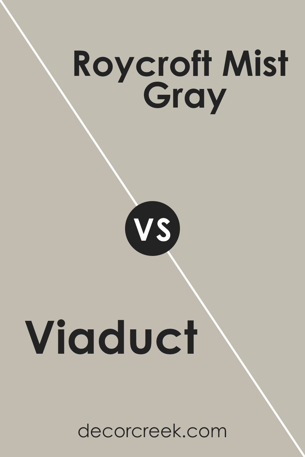
Viaduct SW 9567 by Sherwin Williams vs Roycroft Mist Gray SW 2844 by Sherwin Williams
Viaduct SW 9567 and Roycroft Mist Gray SW 2844 by Sherwin Williams offer unique but distinct moods to any space. Viaduct is a deep, rich gray that adds a strong, solid feel to a room. It can create a cozy and grounded atmosphere.
On the other hand, Roycroft Mist Gray is a lighter, softer shade with a hint of blue. It feels more airy and can make a room feel more open and relaxed. While Viaduct serves as a bold, dramatic base, Roycroft Mist Gray offers a subtle touch that brightens spaces, making them appear larger and more inviting.
Both colors are versatile, but Viaduct leans towards creating an intimate environment, whereas Roycroft Mist Gray is better suited for adding lightness and a sense of calm. Depending on the desired ambiance, choosing between these shades can significantly impact a room’s overall vibe.
You can see recommended paint color below:
- SW 2844 Roycroft Mist Gray
Viaduct SW 9567 by Sherwin Williams vs Techno Gray SW 6170 by Sherwin Williams
Viaduct and Techno Gray are two colors by Sherwin Williams that offer unique vibes and can be used to create different moods in a space. Viaduct is a warm, earthy shade with a hint of brown and grey, making it feel cozy and inviting.
It’s versatile and pairs well with natural elements like wood and greenery. On the other hand, Techno Gray has a cooler tone with a subtle green undertone. It has a modern and calming effect that works well in contemporary spaces. While Viaduct adds a touch of warmth and comfort, Techno Gray provides a more relaxed, sophisticated feel.
Both colors are neutral enough for a variety of settings but have distinct characters. Viaduct leans towards creating a welcoming atmosphere, while Techno Gray offers a sleek, clean look ideal for a modern aesthetic. Choose Viaduct for warmth or Techno Gray for a cooler, refined look.
You can see recommended paint color below:
- SW 6170 Techno Gray
Viaduct SW 9567 by Sherwin Williams vs Colonnade Gray SW 7641 by Sherwin Williams
Viaduct SW 9567 is a warm and earthy tone that draws inspiration from natural landscapes. It’s a deep, muted brown with subtle hints of green, creating a cozy and grounded atmosphere. This color works well in spaces where you want to feel enveloped in warmth and comfort, like a living room or study.
On the other hand, Colonnade Gray SW 7641 is a versatile and neutral gray with a slight beige undertone. It’s lighter and more adaptable than Viaduct, making it a great choice if you need a backdrop that can complement a variety of furniture and decor styles. Colonnade Gray can create an airy and open feeling in a room, making it suitable for spaces like bedrooms or kitchens.
While Viaduct adds depth and coziness, Colonnade Gray offers a fresh, clean slate. Both colors serve different purposes and can set the tone for a room’s overall feel.
You can see recommended paint color below:
Viaduct SW 9567 by Sherwin Williams vs Twilight Gray SW 0054 by Sherwin Williams
Viaduct (SW 9567) by Sherwin Williams is a deep, moody shade of gray with warm undertones, giving it a rich and comforting presence. It brings a touch of earthiness into a space, which can make a room feel cozy and inviting. On the other hand, Twilight Gray (SW 0054) is a cooler gray with blue undertones.
It has a smoother and more muted appearance, often creating a calming and subtle backdrop.
While Viaduct feels robust and grounded, Twilight Gray offers a softer vibe. Viaduct can make a bolder statement in a room, perfect for accent walls or rooms where you want to create depth. Twilight Gray, however, works well for creating a light, airy feel, suitable for more expansive spaces as it reflects more light. Choosing between them depends on whether you want warmth and richness or a calm and gentle ambiance.
You can see recommended paint color below:
- SW 0054 Twilight Gray
Viaduct SW 9567 by Sherwin Williams vs Anew Gray SW 7030 by Sherwin Williams
Viaduct SW 9567 by Sherwin Williams is a soft, muted shade that offers a subtle backdrop, providing a sense of calm and neutrality. It’s slightly darker and cooler than many typical neutrals, making it versatile for various settings without being overwhelming. Anew Gray SW 7030, on the other hand, is a warm greige that balances beige and gray tones.
It bridges warm and cool tones, making it adaptable to different decor styles and great for brightening spaces with its welcoming warmth.
When compared, Viaduct leans more towards the cooler, relaxing end of the color spectrum, whereas Anew Gray feels more inviting with its warmer undertones. Both colors work well in homes and complement different accent colors. They can each be used alone for a minimalistic look or paired with bolder hues for contrast, depending on the desired feel of the room.
You can see recommended paint color below:
Viaduct SW 9567 by Sherwin Williams vs Skyline Steel SW 1015 by Sherwin Williams
Viaduct SW 9567 by Sherwin Williams is a deep, earthy gray with warm undertones. It’s a versatile color that can give a space a cozy and grounded feeling. This color works well in living rooms or bedrooms where you want a warm, inviting atmosphere.
On the other hand, Skyline Steel SW 1015 is a much lighter shade of gray. It has a more subtle and neutral tone, making it an excellent choice for spaces where you want a calm, airy feel. While both colors are part of the gray family, Viaduct is richer and more intense, creating a more dramatic effect, while Skyline Steel is lighter and more understated.
If you’re looking for a bold, warm color, Viaduct would be a great choice. If you prefer something softer and more minimal, Skyline Steel would be more appropriate. Both can complement different design styles and themes.
You can see recommended paint color below:

Viaduct SW 9567 by Sherwin Williams vs Amazing Gray SW 7044 by Sherwin Williams
Viaduct SW 9567 and Amazing Gray SW 7044 are two neutral paint colors by Sherwin Williams that offer different vibes for a space. Viaduct is a darker, cooler gray with hints of blue, giving it a more modern and industrial feel. It’s a strong choice for those who want a bold but versatile color that stands out.
On the other hand, Amazing Gray is a medium-toned warm gray. It has subtle brown undertones, which make it a cozy and welcoming choice. This color works well in spaces where a softer and more inviting atmosphere is desired.
When choosing between them, consider the mood you want to create. Viaduct works well in contemporary settings and pairs nicely with metal finishes and sleek furniture. Amazing Gray is perfect for creating a warm, homely ambience and pairs well with wood tones and traditional décor. Both colors are versatile and excellent neutrals, but each has its unique character.
You can see recommended paint color below:
Viaduct SW 9567 by Sherwin Williams vs Mindful Gray SW 7016 by Sherwin Williams
Viaduct (SW 9567) by Sherwin Williams is a rich, neutral color that leans towards a darker gray with a hint of warmth. It can provide a strong, bold backdrop without feeling stark or cold. It’s an excellent choice for spaces that need a grounding element and can work well in modern, industrial, or even traditional settings.
On the other hand, Mindful Gray (SW 7016) is a lighter, softer gray with a touch of warmth. It often feels more versatile due to its lighter tone, making it suitable for various spaces. This color is particularly good for rooms where you want a subtle, clean look without being too dark or overwhelming.
While both colors belong to the same family of neutrals, Viaduct is deeper and more dramatic, whereas Mindful Gray offers a gentle, airy feel. Each can create a different mood in a room depending on the look you aim to achieve.
You can see recommended paint color below:
Conclusion
After learning all about Sherwin Williams’ SW 9567 Viaduct color, I feel like I really understand why it’s a great choice for painting projects. This color is a cool gray, kind of like the color of a cloudy sky or smooth pebbles by a stream. It’s not too dark and not too light, which means it can fit nicely in almost any room of your house.
If you like a calm and cozy feeling in your living room, this shade can help make that happen. It also works well in bedrooms because it can make them feel comfy and restful—a perfect setting for a good night’s sleep. In offices, it helps create a place where you can think clearly and concentrate.
One of the coolest things about SW 9567 Viaduct is how it can match with a lot of other colors. You could pair it with bright colors for a fun look or with other soft shades for something more gentle. Since it’s a color that doesn’t shout, it lets other parts of the room, like furniture and decorations, stand out too.
Choosing this color can make your rooms look and feel just right, like they’re welcoming you in. That’s why I think SW 9567 Viaduct is so special!
Ever wished paint sampling was as easy as sticking a sticker? Guess what? Now it is! Discover Samplize's unique Peel & Stick samples.
Get paint samples

