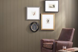
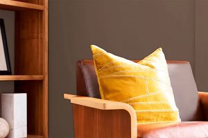
Sherwin Williams’ SW 9540 Timber Beam emerges as a formidable contender, offering a unique blend of these desired qualities. This article delves into the nuanced characteristics of Timber Beam, a color that has garnered attention for its ability to transcend traditional boundaries of design and application.
Timber Beam is not just a paint color; it’s a statement of elegance and earthiness, capable of transforming any room into a haven of comfort and style. Its rich, deep tone echoes the natural beauty of wood and earth, making it an ideal choice for those seeking to create a cozy, inviting atmosphere.
Whether applied in a living room, bedroom, or dining area, it promises to add a layer of warmth and sophistication.Moreover, Timber Beam’s adaptability is one of its standout features.
It complements a wide range of decor styles, from rustic farmhouse to sleek modern, and pairs beautifully with both light and dark accents.
This article aims to explore the dynamics of SW 9540 Timber Beam, offering insights into its application, compatibility with other colors, and tips for creating harmonious spaces.
Join us as we uncover the potential of this Sherwin Williams hue to revolutionize interior spaces with its charming allure.
What Color Is Timber Beam SW 9540 by Sherwin Williams?
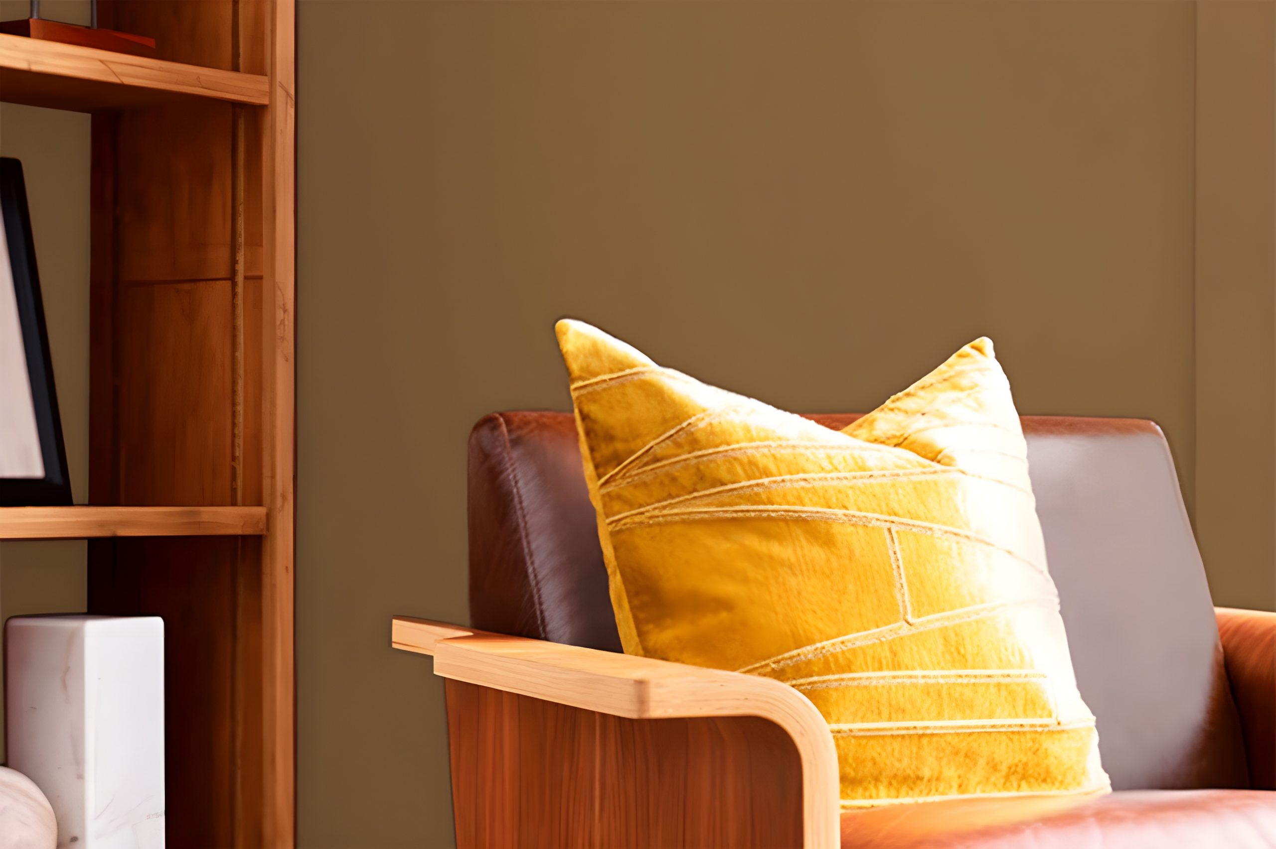
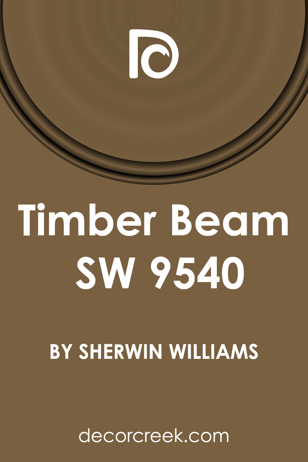
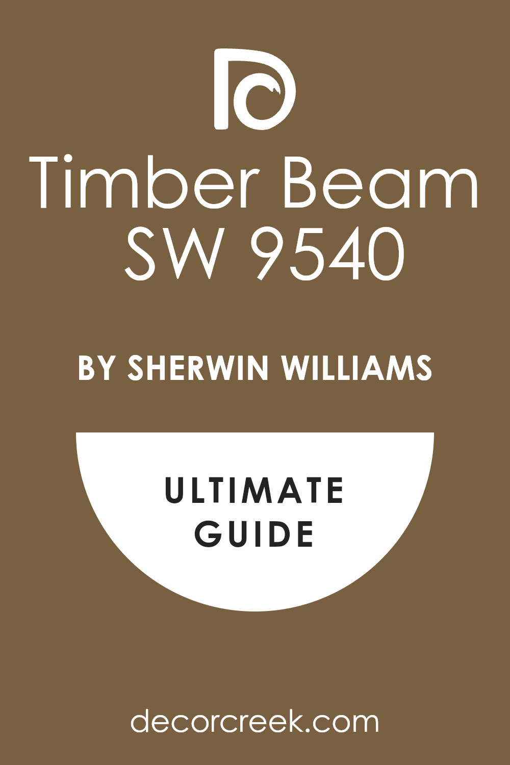
Timber Beam by Sherwin Williams is a rich, earthy hue that evokes the warmth and natural beauty of aged wood.
This sophisticated color has a deep, robust quality that bridges the gap between brown and a deep, reddish mahogany, making it exceptionally versatile for interior design. Its depth adds a layer of coziness and comfort to spaces, ideal for creating inviting atmospheres.
This color works exceptionally well in interior styles that emphasize natural elements and textures. It is particularly suited for rustic aesthetics, where its woodsy tone complements natural stone, unfinished wood, and organic textures.
Timber Beam also excels in traditional settings, adding a touch of elegance and grounded sophistication with its deep, rich tone.
When applied in modern and contemporary designs, it can serve as a striking contrast color, especially when paired with sleek materials like metal, glass, or polished stone, adding warmth and balance.
The best materials and textures to pair with this color include soft, plush fabrics like velvet or wool in neutral shades, which can help to soften its depth. Lighter woods, natural linens, jute rugs, and ceramic accents in complementary tones can also enhance its warmth, creating a layered and cohesive space.
For a bold and luxurious look, incorporating brass or gold accents can amplify its richness, offering a refined and inviting interior.
Ever wished paint sampling was as easy as sticking a sticker? Guess what? Now it is! Discover Samplize's unique Peel & Stick samples.
Get paint samples
Is Timber Beam SW 9540 by Sherwin Williams Warm or Cool color?
The Timber Beam color by Sherwin Williams envelops spaces in a rich, earthy warmth that instantly transforms any room into a welcoming haven. This deep, nuanced shade draws inspiration from the natural elegance and robustness of wood, bringing an element of the outdoors inside.
Its soothing presence makes it an excellent choice for creating a cozy and comfortable environment, whether it’s used in a living room, bedroom, or dining area.
The versatility of this color allows it to work beautifully with a wide range of décor styles, from rustic farmhouse to modern minimalist, making it a timeless addition to any home.
When applied to walls, Timber Beam serves as a stunning backdrop that complements both light and dark furnishings, allowing them to stand out or blend seamlessly, depending on the desired effect.
It also enhances the architectural features of a space, adding depth and dimension that can make a room feel more grounded and expansive.
Lighting plays a pivotal role in how this color is perceived; under natural light, it can appear warmer, bringing a sun-kissed glow to interiors, while artificial light can accentuate its deeper, more intimate tones.
Incorporating this color into a home not only elevates the aesthetic but also creates a sense of comfort and serenity, making it an ideal choice for those seeking to craft inviting spaces.
Undertones of Timber Beam SW 9540 by Sherwin Williams
Timber Beam, a captivating color, embodies a rich depth that brings warmth and character to spaces. The unique complexity of this hue comes from its carefully balanced undertones.
Brown and grey play pivotal roles in shaping the overall perception of the color, subtly influencing its application and impact within interior spaces.
Brown undertones infuse Timber Beam with an earthy, grounded feel, adding a sense of coziness and comfort to rooms.
This warmth makes it particularly inviting in living areas and bedrooms, where creating a peaceful, welcoming atmosphere is often desired.
The brown underpinning also enhances the natural connection in spaces, complementing wooden furniture and textures, thereby reinforcing a cohesive look.
On the other hand, grey undertones introduce a neutral, sophisticated edge. This cooler component tempers the warmth of brown, ensuring the color remains versatile and contemporary.
The presence of grey allows Timber Beam to adapt to various lighting conditions, subtly shifting in hue and intensity throughout the day.
This adaptability makes the paint color an excellent choice for rooms with varying natural light, as it can maintain balance without leaning too heavily towards warmth or coolness.
The interplay of brown and grey undertones in Timber Beam affects how it graces interior walls, offering a layered richness that can anchor a room while still maintaining a serene, uncluttered feel.
This duality ensures that the color can complement a wide range of décor styles, from rustic to modern, making it a universally appealing choice for enhancing the character of any home.
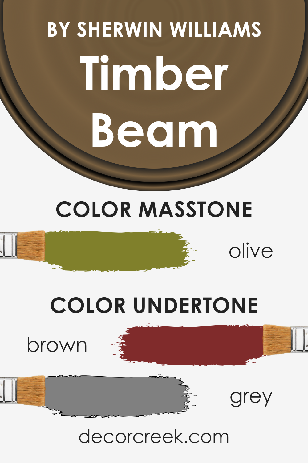
What is the Masstone of the Timber Beam SW 9540 by Sherwin Williams?
The color Timber Beam by Sherwin Williams, with its masstone of Olive (#80802B), brings a rich, earthy warmth into the home. This hue, rooted in the depth of olive green with subtle brown undertones, promises a connection to nature and a sense of groundedness.
In interior spaces, Timber Beam acts as a sophisticated backdrop that complements natural wood finishes, enhancing the texture and natural beauty of wooden furniture and flooring.
Its deep yet muted tones offer a versatile palette that harmonizes with a wide range of colors, from soft creams and whites for a light and airy feel, to rich burgundies and navy blues for a more dramatic and enveloping ambiance.
In living spaces, Timber Beam can create a cozy, inviting atmosphere, perfect for rooms where relaxation and gathering occur.
Its application on walls can make large spaces feel more intimate, while in smaller areas, it can add depth and character without overwhelming the senses.
The olive masstone ensures that Timber Beam works seamlessly in a variety of lighting conditions, subtly shifting in appearance to reveal warmer or cooler undertones throughout the day. This adaptability makes it a favored choice for creating sophisticated and versatile home environments.
How Does Lighting Affect Timber Beam SW 9540 by Sherwin Williams?
Lighting plays a critical role in how we perceive colors, fundamentally affecting both the intensity and hue of a color in any given space. This interaction between light and color can dramatically alter the appearance and ambiance of a room, making understanding this relationship crucial in interior design.
A particular color, when applied in interiors, can showcase a wide spectrum of shades under different lighting conditions. Artificial light varies significantly in color temperature, ranging from warm yellows to cool whites.
Warm lighting can make colors appear more vibrant and cozy, whereas cool lighting can render them muted or even stark.
Natural light, on the other hand, changes throughout the day and is influenced by the room’s orientation (north, south, east, or west), which can further complicate color perception.
Taking a specific color as an example, like a warm, earthy hue, this tone will inherently carry a sense of warmth and richness. Under artificial light, particularly warm white LEDs or incandescent bulbs, the color can appear even warmer, accentuating its cozy essence.
This makes it an excellent choice for living spaces where warmth and comfort are desired.
In natural light, the appearance of this color can vary dramatically. North-faced rooms receive less direct sunlight, making the color appear slightly cooler and more subdued, which could enhance the depth of the tone while maintaining its warmth.
South-faced rooms bathe in abundant daylight, potentially brightening the color and highlighting its vibrant undertones, making the space feel airy and lively.
East-faced rooms enjoy the morning light, which can make the color appear softer and slightly warmer in the morning, transitioning to cooler tones as the day progresses.
Conversely, west-faced rooms capture the warm, golden light of the afternoon and evening, deeply enhancing the color’s warmth and richness, adding a cozy glow to the room during these times.
Understanding how lighting affects colors, especially in terms of natural and artificial light as well as room orientation, is essential for making informed decisions in interior design.
It ensures that the chosen colors truly complement the space, reflecting the desired mood and atmosphere in every light condition.
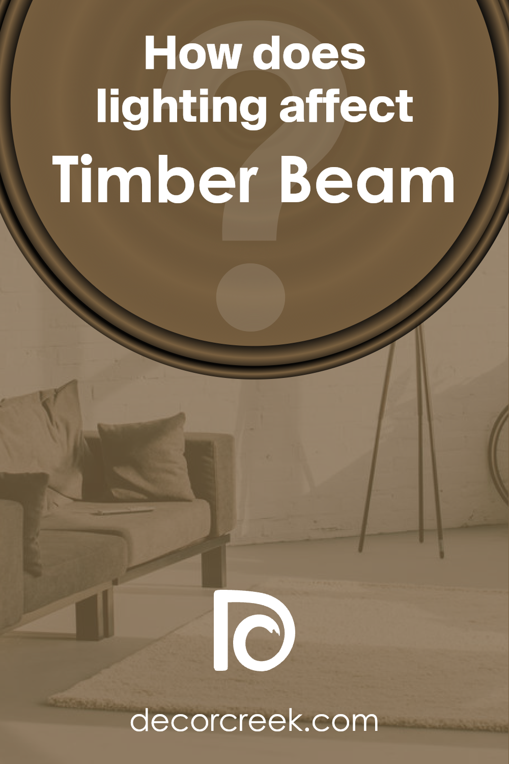
What is the LRV of Timber Beam SW 9540 by Sherwin Williams?
LRV, which stands for Light Reflectance Value, plays a crucial role in the world of paint and interior design. Essentially, it measures the percentage of light a paint color reflects back into the room, on a scale from 0 (absolute black, absorbing all light) to 100 (pure white, reflecting all light).
This value is pivotal because it influences how light or dark a color appears once applied to walls, impacting the ambiance and visual temperature of a room.
A higher LRV means the color will reflect more light, making spaces appear larger and more open, whereas lower LRV colors absorb more light, creating cozier or more enclosed feelings.
Understanding the LRV of a paint color can help in making informed decisions that align with the desired aesthetic and functional outcomes of a space.
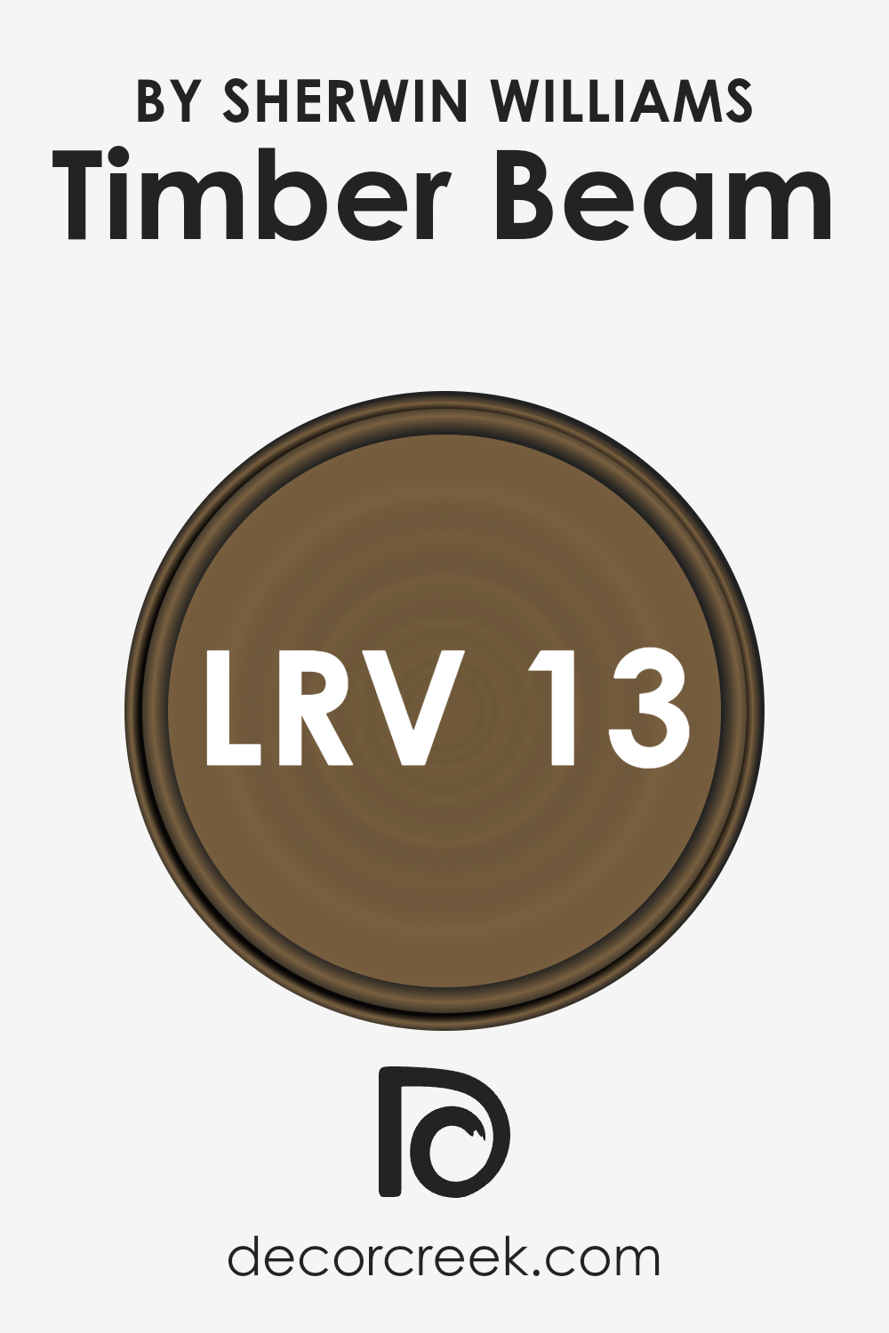
In the case of a color with an LRV of 12.825, such as the one mentioned, it falls on the lower end of the scale, indicating it is a relatively dark shade. This means it will absorb a significant amount of light rather than reflecting it, profoundly affecting the way the color manifests on walls.
In rooms with ample natural light, this dark hue can add depth and drama, accentuating architectural features and creating a focal point. However, in smaller or less well-lit spaces, it could potentially make the room feel smaller or dimmer than intended.
This particular value suggests that the color is best used with careful consideration of the room’s lighting, size, and function, ensuring it complements rather than overwhelms the space.
Incorporating lighter-colored furnishings or accents can help balance the darkness of the walls, creating a harmonious and aesthetically pleasing interior.
LRV – what does it mean? Read This Before Finding Your Perfect Paint Color
What are the Trim colors of Timber Beam SW 9540 by Sherwin Williams?
Trim colors play a significant role in enhancing the aesthetic appeal and architectural details of a space, particularly when paired with a prominent wall color like Timber Beam by Sherwin Williams.
These colors, applied to elements like door frames, moldings, and baseboards, create a visual frame that complements and contrasts with the wall color, thereby defining and accentuating the overall design theme.
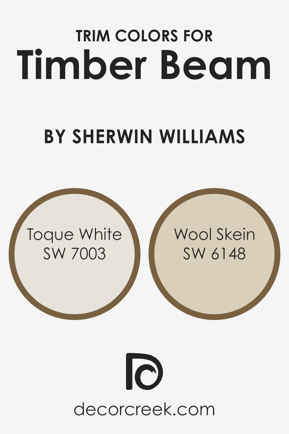
When Toque White (SW 7003) and Wool Skein (SW 6148) are used as trim colors alongside Timber Beam, they not only underscore the warm, earthy tones of the latter but also add a layer of sophistication and depth to the décor. These trim colors have the power to balance the ambiance, making the space feel cohesive yet dynamic.
Toque White, a soft and serene shade, imparts a subtle, light contrast against the deeper hues of Timber Beam, ensuring that the space remains airy and bright. This particular shade has the ability to blur the boundaries between classic and contemporary designs, bringing a fresh yet timeless feel to the interior.
On the other hand, Wool Skein, with its muted warmth and slightly more pronounced color depth, offers a gentle nod to the natural undertones of Timber Beam. This color harmonizes with the earthiness of Timber Beam, fostering a welcoming and comforting environment.
Together, these trim colors enrich the visual texture of a room, highlighting the architectural craftsmanship while also allowing the bold character of Timber Beam to stand out gracefully.You can see recommended paint colors below:
- SW 7003 Toque White (CHECK A SAMPLE)
- SW 6148 Wool Skein (CHECK A SAMPLE)
Colors Similar to Timber Beam SW 9540 by Sherwin Williams
Similar colors play a crucial role in design and aesthetics, offering a palette that harmonizes while allowing for depth and contrast.
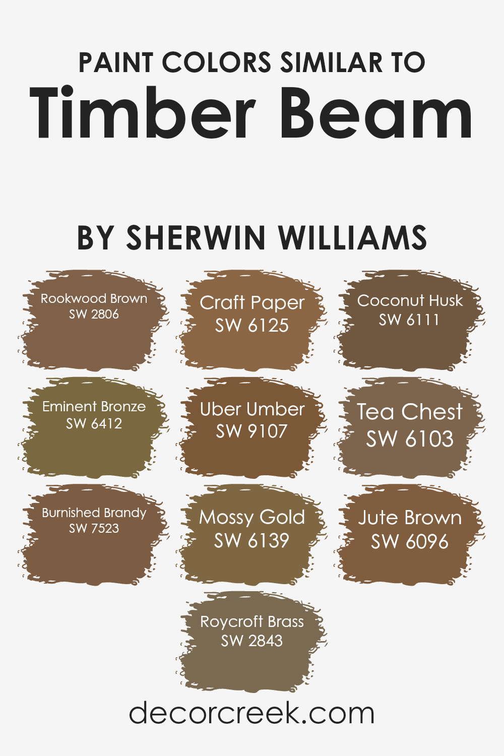
Colors akin to Timber Beam by Sherwin Williams, such as Rookwood Brown and Eminent Bronze, exemplify how varying shades within the same color family can create a cohesive yet dynamic look.
Rookwood Brown brings a rich, deeply earthy touch that evokes a sense of stability and grounding, while Eminent Bronze lends a slightly lighter, refined metallic sheen, introducing subtle variation without straying from the underlying warmth that characterizes this family of colors.
Continuing with this theme, Burnished Brandy and Roycroft Brass add layers of sophistication and old-world charm, respectively.
Burnished Brandy, with its inviting depth, enhances spaces with a cozy, enveloping feel, whereas Roycroft Brass shines a bit brighter, injecting a dose of cheerfulness into the mix.
As we venture further into the realm of similar colors, like Craft Paper and Uber Umber, we find that these shades contribute to an earth-toned palette that’s both versatile and warmly inviting.
Craft Paper has a soft neutrality that makes it a perfect backdrop for various decor styles, while Uber Umber adds a darker, more intense element, creating focal points and adding gravity to a room’s design.
The remaining colors, Mossy Gold through Jute Brown, weave in golden hues and deeper brown undertones, enriching the visual texture and lending each space a unique yet harmonious identity.
Mossy Gold, for instance, brings a touch of nature indoors with its subtle greenish undertone, whereas Jute Brown offers a lighter, more nimble option for those seeking warmth without heaviness.
Together, these colors form a palette that is endlessly adaptable, reflecting the natural world’s complexity and beauty in a way that is both accessible and profoundly impactful.
You can see recommended paint colors below:
- SW 2806 Rookwood Brown
- SW 6412 Eminent Bronze (CHECK A SAMPLE)
- SW 7523 Burnished Brandy (CHECK A SAMPLE)
- SW 2843 Roycroft Brass
- SW 6125 Craft Paper (CHECK A SAMPLE)
- SW 9107 Uber Umber (CHECK A SAMPLE)
- SW 6139 Mossy Gold
- SW 6111 Coconut Husk (CHECK A SAMPLE)
- SW 6103 Tea Chest (CHECK A SAMPLE)
- SW 6096 Jute Brown (CHECK A SAMPLE)
How to Use Timber Beam SW 9540 by Sherwin Williams In Your Home?
Timber Beam by Sherwin Williams is a warm, rich color that brings a sense of natural elegance and cozy warmth into any space it graces.
This particular hue, nestled comfortably within earthy tones, has the unique ability to make rooms feel more inviting and snug, making it an excellent choice for those looking to create a welcoming atmosphere in their homes.
Its depth and versatility allow it to pair beautifully with a wide range of decor styles, from rustic to modern minimalist.
Homeowners can use Timber Beam to add character and warmth to living rooms, bedrooms, or dining areas. When applied to walls, it serves as a stunning backdrop that complements natural wood furnishings, metallic accents, and richly textured fabrics, enhancing the aesthetic appeal of the interior.
It’s also ideal for creating a focal point, whether by painting an accent wall or using it on kitchen cabinets to add a touch of sophistication.
For those who appreciate the beauty of subtle, earthy tones, Timber Beam offers a perfect balance of comfort and style, transforming any home space into a more inviting and harmonious environment.
Timber Beam SW 9540 by Sherwin Williams vs Tea Chest SW 6103 by Sherwin Williams
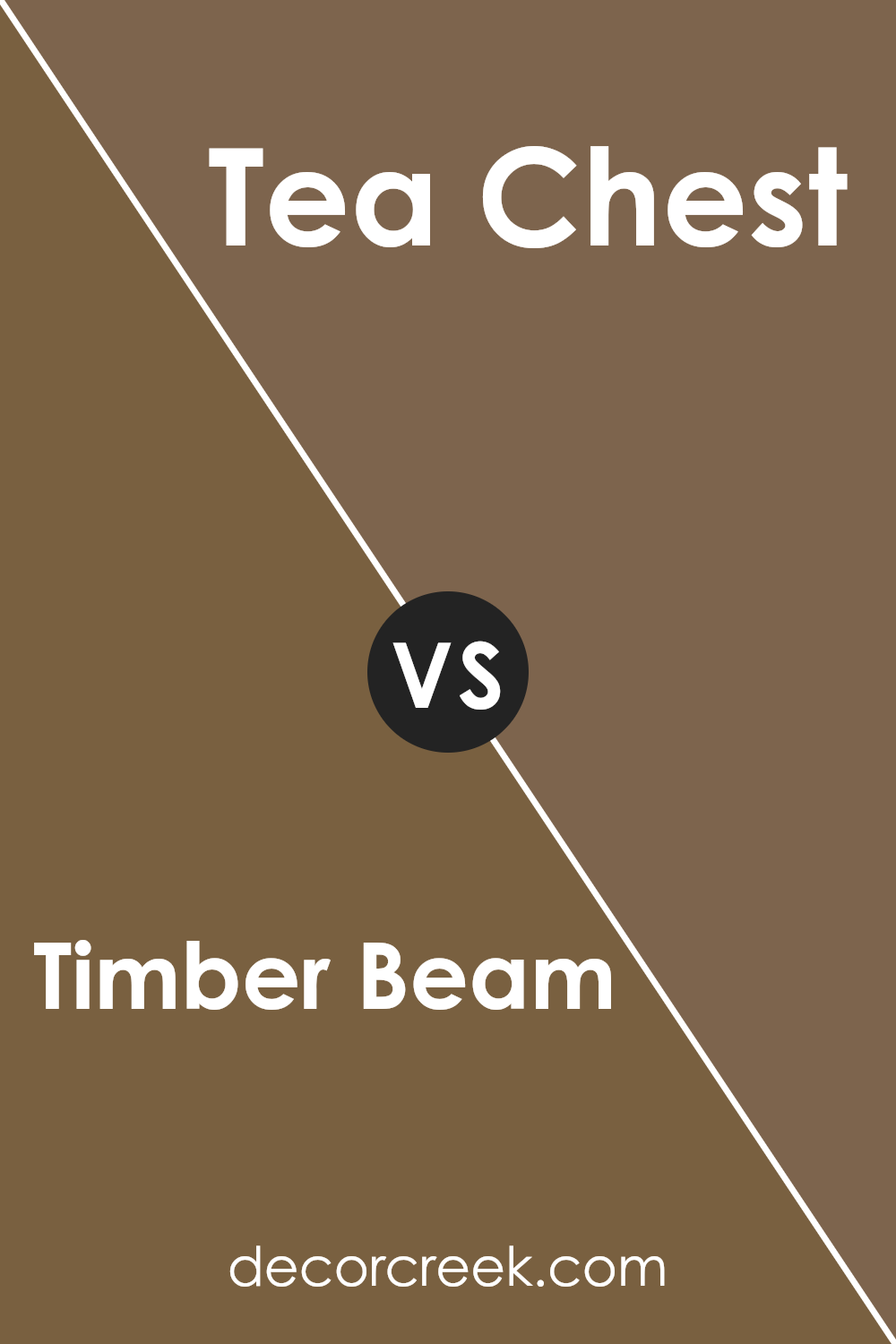
Timber Beam and Tea Chest, both from Sherwin Williams, are distinguished by their warmth and depth, yet each offers a unique ambiance to interior spaces. Timber Beam presents as a deep, robust brown, imbued with a rustic charm that evokes the natural strength and solidity of wood.
Its rich hue is versatile, lending itself to both cozy, intimate settings and more formal, sophisticated areas. On the other hand, Tea Chest is a shade lighter, with a warm, inviting tone that blends brown’s earthiness with a subtle hint of red.
This color manages to strike a balance between comfort and elegance, making it ideal for creating welcoming spaces that also carry an air of refinement.
While both colors share a foundational warmth, Timber Beam leans towards a more pronounced, bold statement, whereas Tea Chest offers a softer approach, facilitating a range of design aesthetics from the traditional to the contemporary.
You can see recommended paint color below:
- SW 6103 Tea Chest (CHECK A SAMPLE)
Timber Beam SW 9540 by Sherwin Williams vs Uber Umber SW 9107 by Sherwin Williams
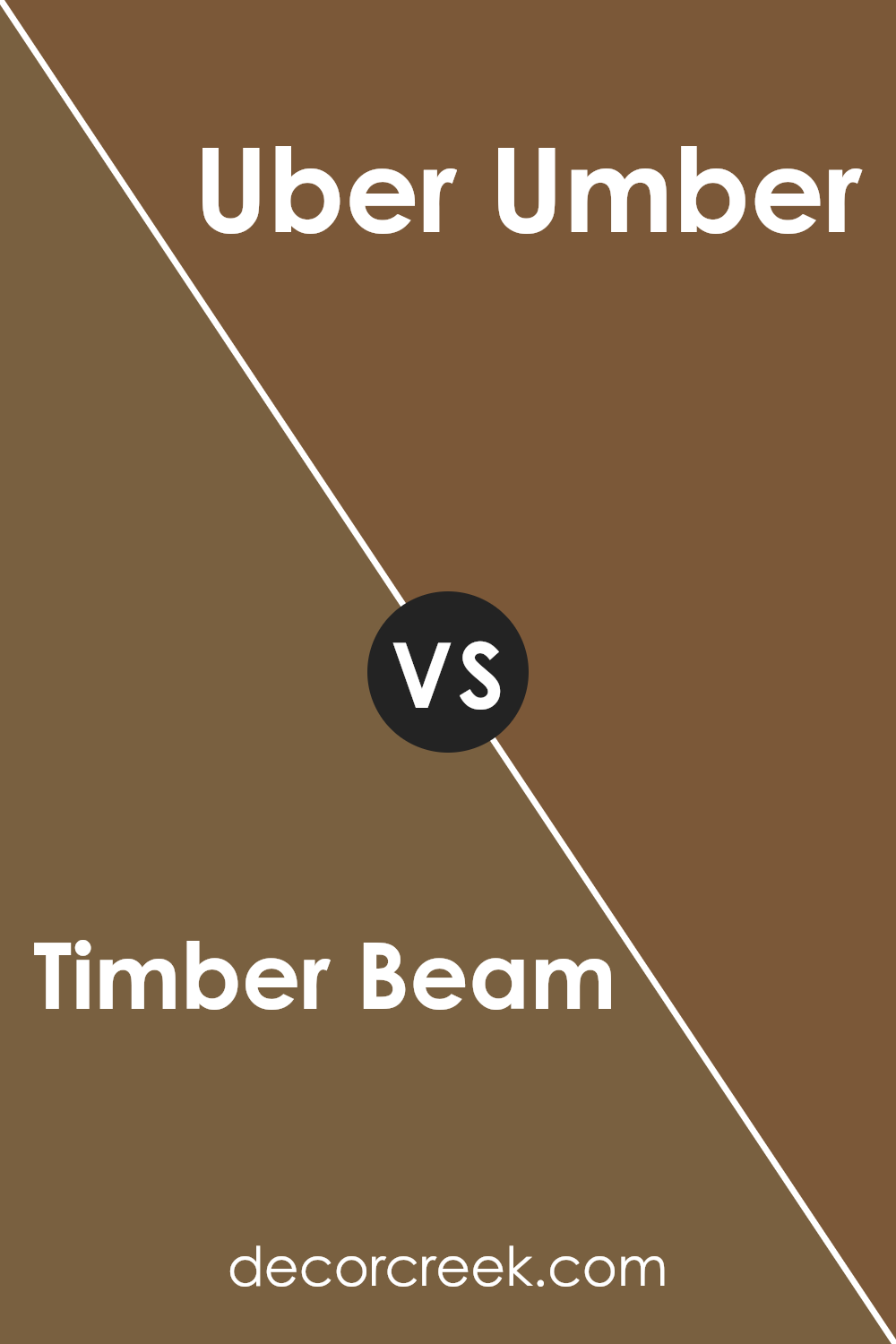
Timber Beam and Uber Umber, both by Sherwin Williams, are distinct yet harmonious colors perfect for creating warm, inviting spaces.
Timber Beam is a deep, rich hue that encapsulates the essence of natural wood and earthy elements, presenting a sense of solidity and traditional charm.
Its depth makes it ideal for accent walls or for creating a cozy, intimate ambiance in any room. In contrast, Uber Umber has a lighter, more subdued quality.
While it still draws inspiration from natural earth tones, its lighter, more nuanced approach makes it versatile for broader applications.
It can serve beautifully as a complementary background color to Timber Beam, enhancing the latter’s depth without competing for attention.
Together, these colors offer a palette that blends seamlessly, allowing for spaces that feel grounded yet spacious, with Uber Umber serving as the perfect backdrop to the boldness of Timber Beam.
You can see recommended paint color below:
- SW 9107 Uber Umber (CHECK A SAMPLE)
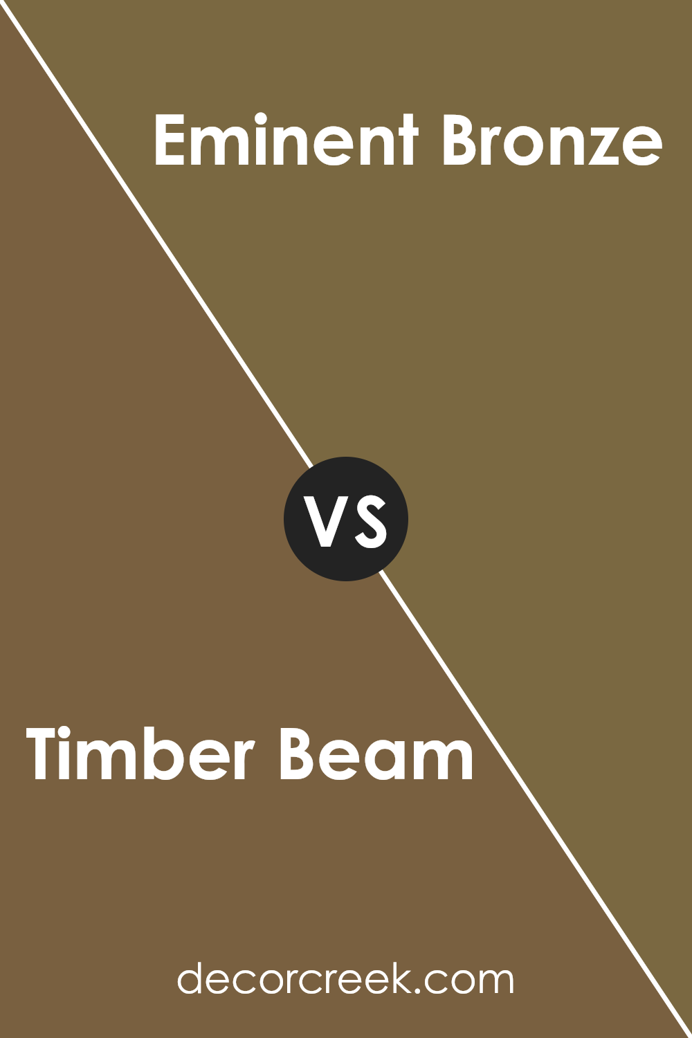
Timber Beam SW 9540 by Sherwin Williams vs Eminent Bronze SW 6412 by Sherwin Williams
Timber Beam and Eminent Bronze, both from Sherwin Williams, offer distinct color palettes that add warmth and sophistication to any space. Timber Beam is a resonant, deep brown that speaks of earthy robustness and natural elegance.
It provides a strong foundation in design, reminiscent of aged wood and rich soil, making it ideal for creating a cozy, inviting atmosphere.
On the other hand, Eminent Bronze leans towards a unique blend of brown and gray with a subtle hint of green undertone, portraying a more nuanced, complex character.
This color is perfect for those looking to introduce a touch of sophisticated neutrality into their environment, striking a balance between warmth and urban chic.
While Timber Beam brings a traditional, comforting vibe to interiors, Eminent Bronze offers a modern twist with its cooler undertones.
Together, these colors can complement each other beautifully, catering to a broad spectrum of design preferences from rustic elegance to contemporary minimalism.
You can see recommended paint color below:
- SW 6412 Eminent Bronze (CHECK A SAMPLE)
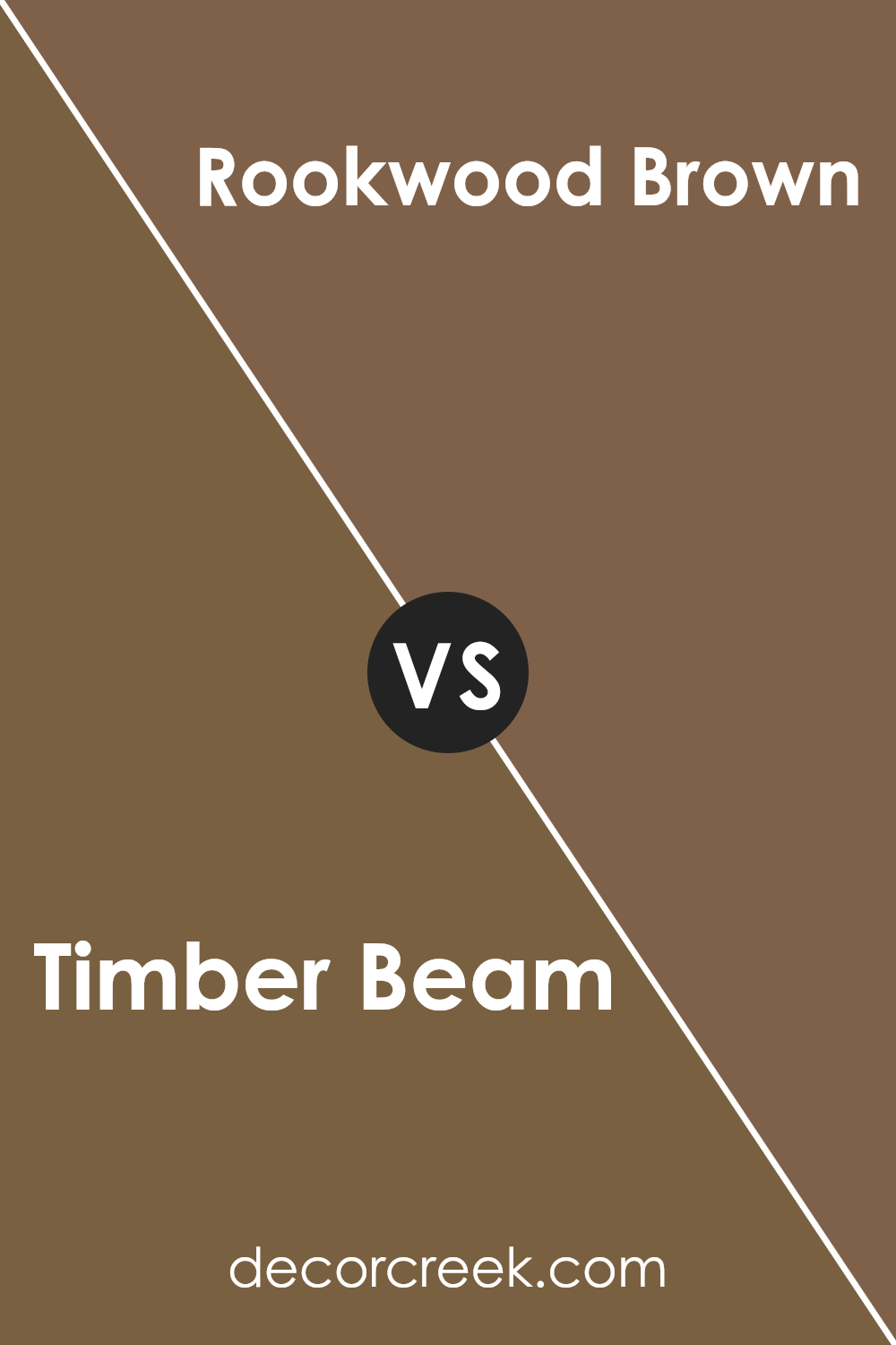
Timber Beam SW 9540 by Sherwin Williams vs Rookwood Brown SW 2806 by Sherwin Williams
Timber Beam and Rookwood Brown, both by Sherwin Williams, embody the warmth and richness of nature but in distinctly different tones. Timber Beam presents as a deep, warm brown that leans slightly towards a soft, earthy hue.
It suggests the comforting and inviting feel of a cozy, rustic cabin, making it ideal for spaces where a sense of solace and warmth is desired.
Rookwood Brown, on the other hand, dives into a darker, more intense color palette.
It holds a stronger, more traditional brown tone that exudes a classic elegance. This color has a profound depth that can anchor a room, providing a sophisticated backdrop that pairs well with a wide range of décor.
While both colors share a base in the brown family, their differing intensities and undertones offer unique possibilities for interior spaces. Timber Beam, with its lighter, warmer feel, brightens rooms and introduces an airy, welcoming atmosphere.
Rookwood Brown, with its richer, deeper tone, creates a more dramatic and grounded ambiance. Choosing between them depends on the desired mood and style of the room.
You can see recommended paint color below:
- SW 2806 Rookwood Brown
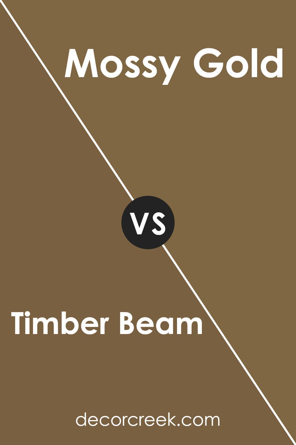
Timber Beam SW 9540 by Sherwin Williams vs Mossy Gold SW 6139 by Sherwin Williams
Timber Beam and Mossy Gold, both from Sherwin Williams, present a fascinating duo that highlights nature’s varied palette. Timber Beam embodies the warmth and depth of aged wood, exuding an earthy, rich tone that is both welcoming and sophisticated.
Its deep brown hue offers a solid, grounding base, making it an excellent choice for creating an inviting and cozy atmosphere in spaces seeking a touch of rustic elegance. On the other hand, Mossy Gold offers a lighter, more whimsical touch.
As its name suggests, it captures the unique blend of green and gold found in moss-covered rocks and woodland treasures, bringing an organic, lively feel to any setting. This color is perfect for spaces that aim to have a bright, airy, and natural ambiance.
Together, Timber Beam and Mossy Gold demonstrate a harmonious balance, contrasting the robust, earthy grounding of the former with the light, refreshing vibrancy of the latter.
This comparison showcases how two distinct colors can inspire a range of thematic interior designs, from the deeply traditional to the casually contemporary.
You can see recommended paint color below:
- SW 6139 Mossy Gold
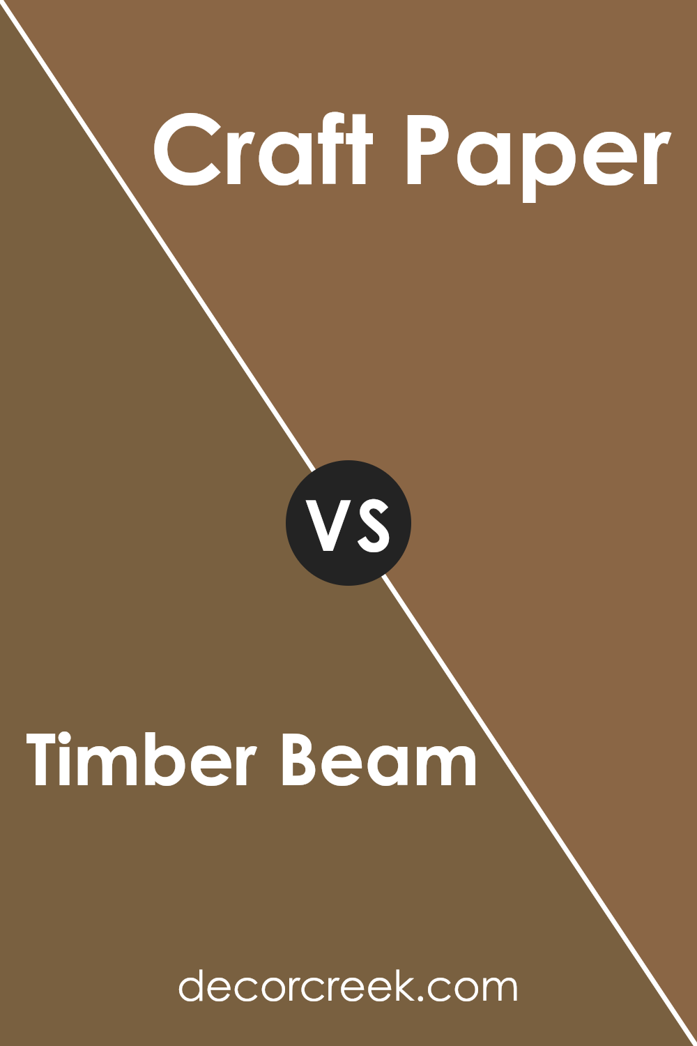
Timber Beam SW 9540 by Sherwin Williams vs Craft Paper SW 6125 by Sherwin Williams
Timber Beam and Craft Paper are two distinctive shades that belong to the warm, earthy spectrum of colors, both offering unique aesthetic appeals. Timber Beam is a deeper, more robust hue, evoking the essence of aged wood and rich soil.
It embodies a certain strength and solidity, making it an excellent choice for areas that require a grounding element or a touch of sophistication.
On the other hand, Craft Paper takes a lighter approach. Its color mirrors the natural, muted tone of craft paper itself, providing a soft, nurturing background that exudes comfort and simplicity.
While both colors share an earthy base, Timber Beam presents a darker, more intense option, whereas Craft Paper leans towards a soothing, more subdued ambiance.
Together, they could create a harmonious balance within a space, perfectly blending strength with softness, depth with lightness.
You can see recommended paint color below:
- SW 6125 Craft Paper (CHECK A SAMPLE)
Timber Beam SW 9540 by Sherwin Williams vs Coconut Husk SW 6111 by Sherwin Williams
Timber Beam and Coconut Husk, both Sherwin Williams colors, offer unique hues suitable for various settings. Timber Beam is a deep, rich brown with a warm undertone, reminiscent of the natural color found in aged wood.
This color provides a sense of coziness and sophistication, making it perfect for spaces aiming to evoke comfort and warmth. It pairs well with earthy tones and serves as an excellent accent wall color or for furniture pieces to add depth to a room.
On the other hand, Coconut Husk presents a slightly lighter shade of brown with subtle green undertones, giving it a unique twist compared to traditional browns. This color is versatile, leaning towards a natural, earthy palette that can bring a calming and organic feel to any space.
It’s ideal for creating a serene and inviting environment, suitable for both modern and rustic designs.
Comparatively, Timber Beam offers a darker, more traditional brown, while Coconut Husk provides a lighter, slightly nuanced alternative, making each color suitable for various design needs and preferences.
You can see recommended paint color below:
- SW 6111 Coconut Husk (CHECK A SAMPLE)
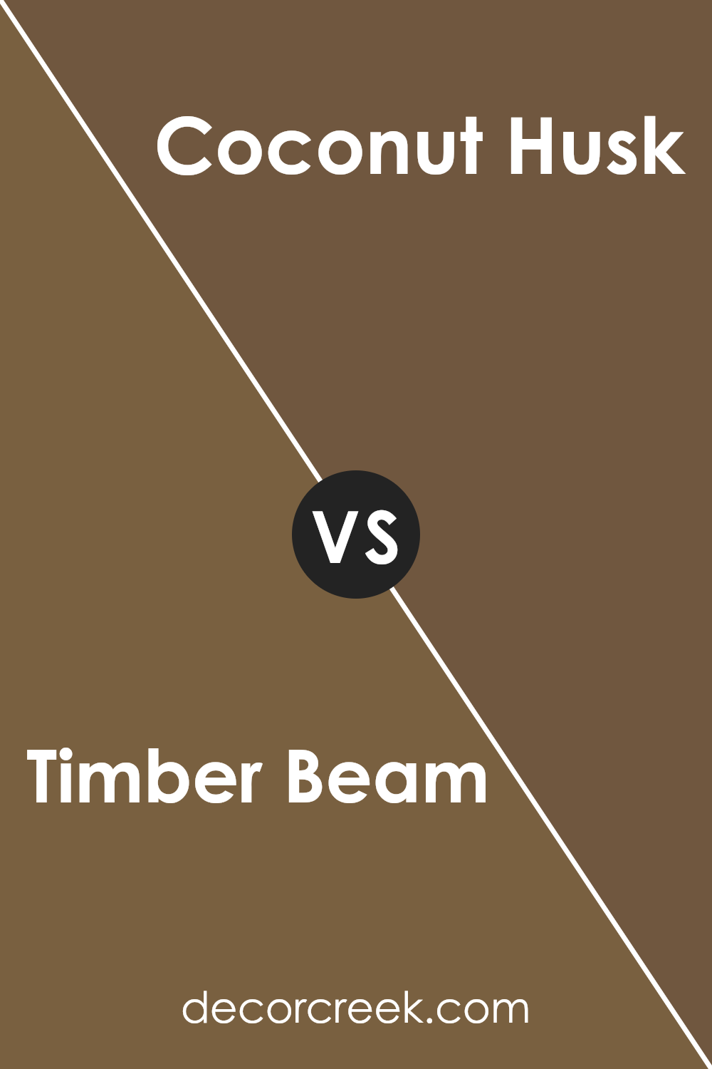
Timber Beam SW 9540 by Sherwin Williams vs Roycroft Brass SW 2843 by Sherwin Williams
Timber Beam and Roycroft Brass are two captivating hues from Sherwin Williams, each offering a unique ambiance for interior spaces. Timber Beam is a deep, warm brown that evokes the natural elegance of aged wood, creating a cozy and inviting atmosphere.
Its richness in tone makes it ideal for spaces that aim to feel grounded and enveloped in warmth, perfect for living rooms or bedrooms seeking a soothing retreat.
Roycroft Brass, on the other hand, is a sophisticated blend of amber and bronze, yielding a hue that reminds one of antique brass artifacts. This color brings a certain historical charm and depth to rooms, fostering an environment filled with character and a touch of nostalgia.
It’s particularly well-suited for spaces that aim to capture an old-world elegance or an artisanal vibe.
While both colors share a warmth that can enhance the aesthetic appeal of a room, Timber Beam leans towards a more earthy, solid foundation, whereas Roycroft Brass offers a shimmering, refined finish that can brighten spaces with its subtle glow.
Together, they could complement each other, with Timber Beam providing a robust base and Roycroft Brass adding ornate highlights.
You can see recommended paint color below:
- SW 2843 Roycroft Brass
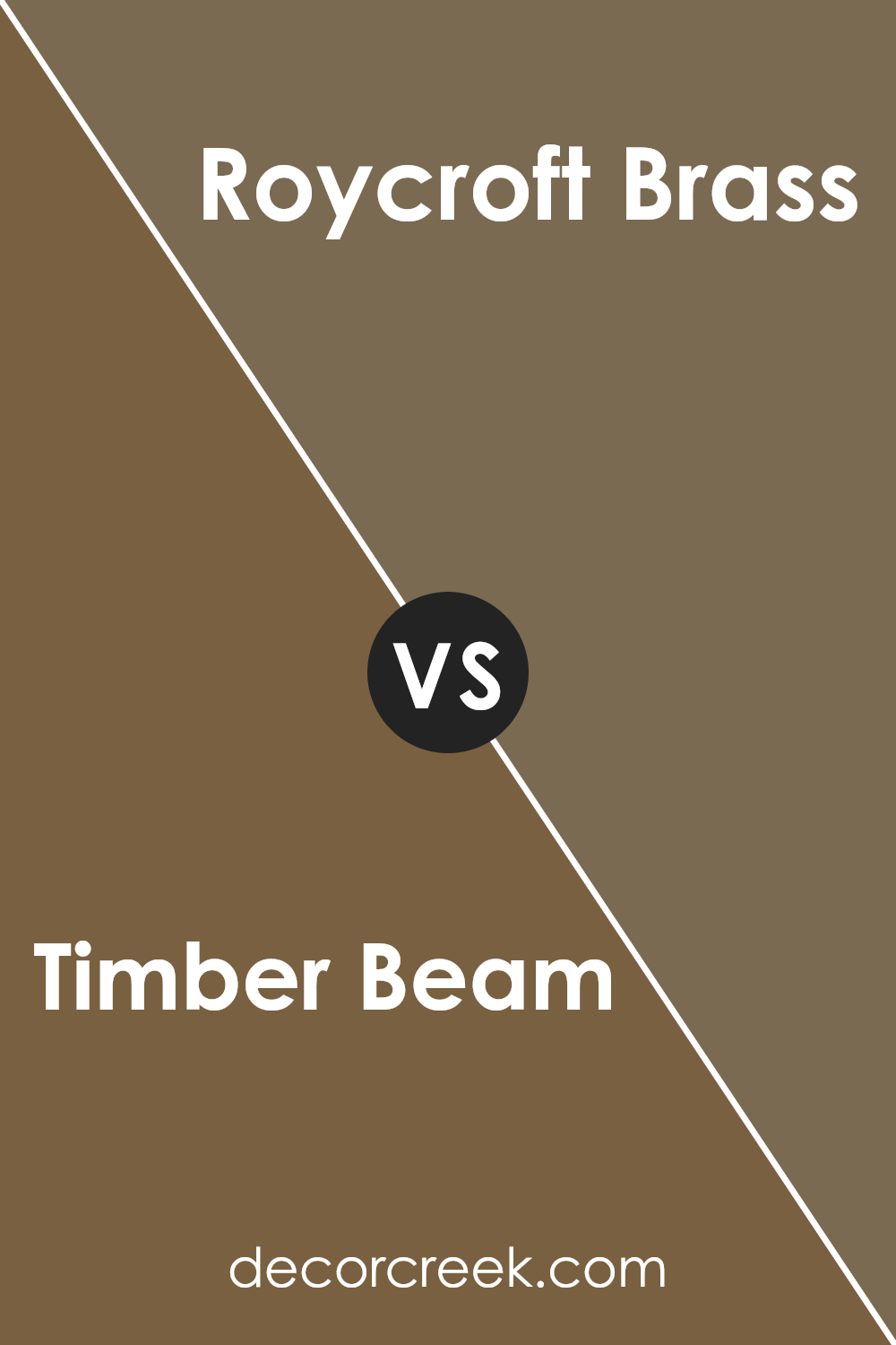
Timber Beam SW 9540 by Sherwin Williams vs Jute Brown SW 6096 by Sherwin Williams
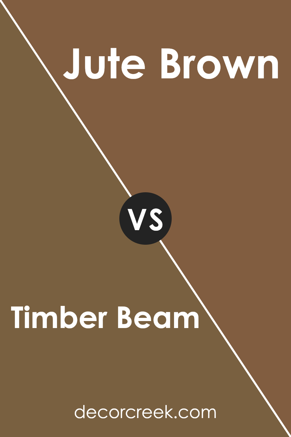
Timber Beam and Jute Brown, both by Sherwin Williams, are captivating hues that embody the warmth and organic essence of nature, yet they present subtle differences in their visual appeal and ambiance.
Timber Beam is a deep, rich color, reminiscent of the dark, sturdy bark of an old-growth forest tree. Its deep tone exudes an aura of strength and reliability, making it a perfect choice for creating a focal point or accentuating architectural details within a space.
Jute Brown, on the other hand, carries a lighter, more versatile shade that hints at the fibrous textures of natural jute. This color offers a softer approach to introducing warmth into a room, suitable for creating a cozy, inviting atmosphere.
Its earthy quality allows for easy pairing with a wide range of complementary colors, from soft neutrals to bold tones.
While both colors share an earthy base, Timber Beam leans towards a more intense and dramatic presence, offering depth and character to spaces.
Jute Brown, conversely, offers adaptability and a slightly more subdued warmth, perfect for those looking to inject natural elements into their decor without overwhelming the space.
Together, they encapsulate the essence of nature’s palette, each appealing to different aesthetic preferences and design needs.
You can see recommended paint color below:
- SW 6096 Jute Brown (CHECK A SAMPLE)
Timber Beam SW 9540 by Sherwin Williams vs Burnished Brandy SW 7523 by Sherwin Williams
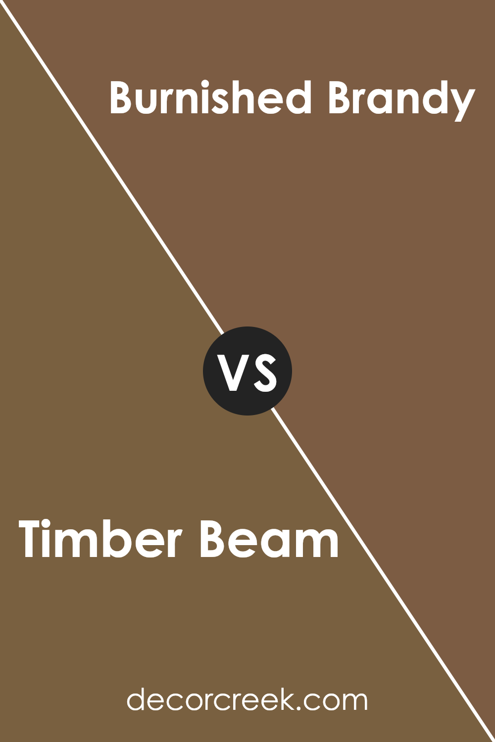
Timber Beam and Burnished Brandy, both from Sherwin Williams, present a warm and inviting palette, yet they offer distinct vibes due to their unique undertones and depth. Timber Beam is a deep, rich brown that evokes the natural elegance of aged wood.
Its depth adds a robust character to spaces, making it an excellent choice for creating a strong, grounded ambiance. It’s the kind of color that pairs well with a variety of textures and finishes, offering versatility in decor.
On the other hand, Burnished Brandy has a slightly more reddish tone, reminiscent of the warm glow of a fine brandy. This color brings a cozy, sophisticated warmth to interiors, infusing spaces with a sense of welcoming comfort.
Its vibrancy is less intense than Timber Beam, allowing for a softer yet equally refined atmosphere.
In essence, Timber Beam offers a robust, earthy foundation, ideal for those looking to ground their space with a touch of nature’s depth. Burnished Brandy, while also warm, leans towards a more luminous, inviting quality, perfect for creating a snug, inviting nook.
Each color, in its right, provides a unique opportunity to craft spaces that are both rich and inviting, albeit through different aesthetic pathways.
You can see recommended paint color below:
- SW 7523 Burnished Brandy (CHECK A SAMPLE)
Conclusion
Timber Beam SW 9540 by Sherwin Williams represents a warm, inviting hue ideal for adding depth and sophistication to spaces. This color, part of Sherwin Williams’ collection, is particularly well-suited for creating cozy atmospheres in homes and offices alike.
Its rich, earthy tone brings a sense of calm and comfort, making it a popular choice for those looking to create a serene and welcoming environment.
The versatility of Timber Beam allows it to stand as a statement piece when used on accent walls, or it can blend harmoniously with a variety of decor styles and color schemes when applied as a primary wall color.
As Timber Beam continues to gain popularity, it is evident that this color transcends mere aesthetic appeal, offering functional benefits as well. Its ability to make spaces feel more grounded and connected to nature appeals to a wide audience.
Moreover, this color’s adaptability in various lighting conditions showcases its depth, transforming spaces into sophisticated and timeless areas.
Whether one is aiming for a modern, rustic, or traditional look, Timber Beam serves as a solid foundation, demonstrating its significant role in the world of interior design.
Ever wished paint sampling was as easy as sticking a sticker? Guess what? Now it is! Discover Samplize's unique Peel & Stick samples.
Get paint samples


