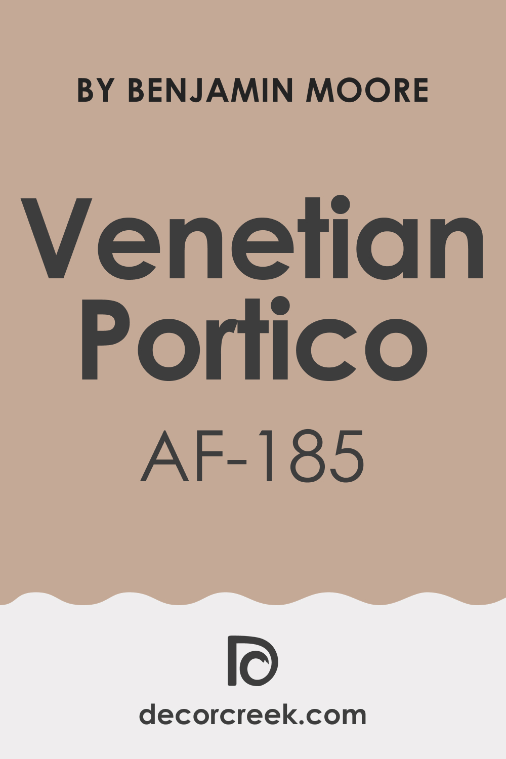
Venetian Portico AF-185, a paint color by Benjamin Moore, is a testament to the brand’s commitment to creating shades that bring both warmth and sophistication to any space. This particular hue, part of their Affinity Collection, is designed to inspire and transform living spaces with its unique blend of subtlety and depth.
Venetian Portico AF-185 is more than just a color; it’s a mood-setter, a statement of elegance, and a bridge between traditional and modern design elements.
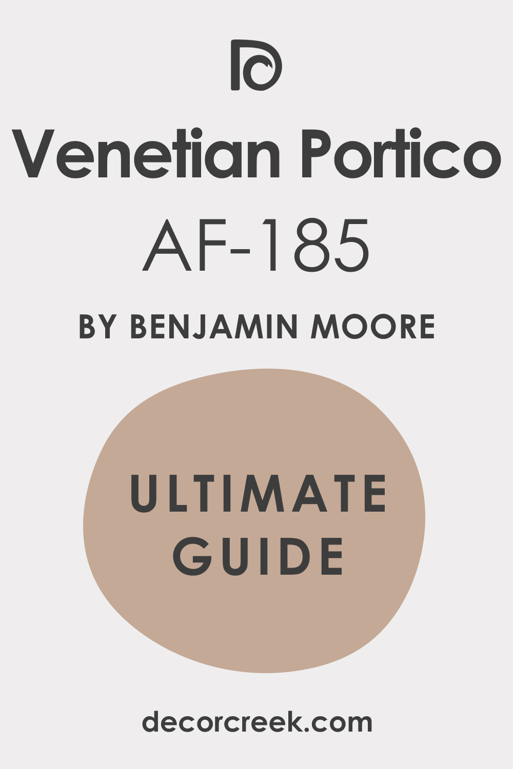
What Color Is Venetian Portico AF-185?
Venetian Portico AF-185 is a complex and nuanced color, exuding an aura of refined elegance. This shade can be best described as a soft, muted taupe, blending the calming qualities of gray with the warmth of beige. Its versatility makes it ideal for a variety of interior styles, particularly those that lean towards contemporary, transitional, or even classic.
It pairs exceptionally well with natural materials like wood, stone, and leather, and works harmoniously alongside textures such as linen, silk, and velvet, adding a touch of understated luxury to any room.
Is Venetian Portico AF-185 a Warm Or Cool Color?
Venetian Portico AF-185 straddles the line between warm and cool, making it an incredibly adaptable color. Its beige undertones lend a cozy warmth, ideal for creating inviting spaces, while the grayish aspects offer a cooler, more modern feel.
This duality allows it to work well in various home settings, complementing different decor styles and room functions. Whether in a sunny living room or a dimly lit study, Venetian Portico adjusts its character to enhance the space’s existing elements.
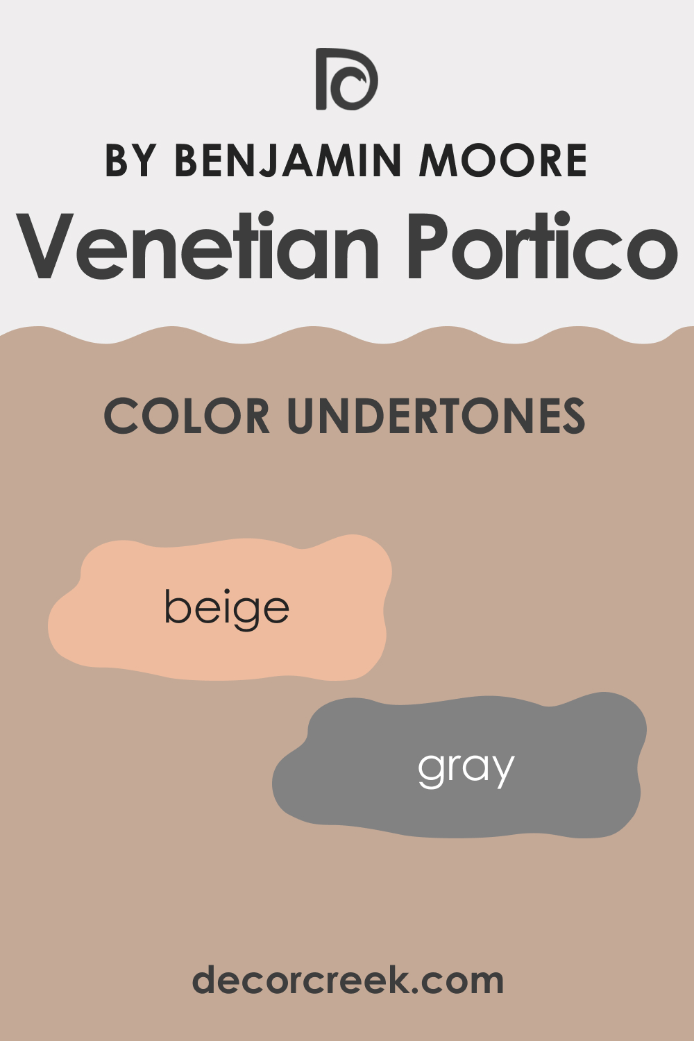
Undertones of Venetian Portico AF-185
The undertones of Venetian Portico AF-185 play a significant role in its overall appearance and how it interacts with other elements in a room. This color possesses a subtle blend of gray and beige undertones, which gives it a chameleon-like quality, adapting to different lighting and decor. These undertones bring a layer of complexity, making the color appear more dynamic and engaging.
On interior walls, these undertones help create depth and sophistication, allowing the color to serve as a versatile backdrop or a stand-alone feature in various settings.
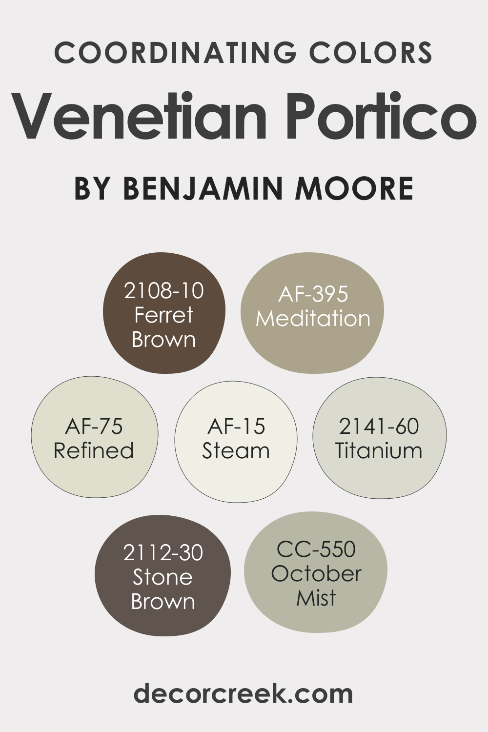
Coordinating Colors of Venetian Portico AF-185
Coordinating colors are essential in creating a cohesive and aesthetically pleasing color scheme. For Venetian Portico AF-185, suitable coordinating colors include:
- AF-75 Refined – A light, airy gray that complements the subtlety of Venetian Portico.
- AF-395 Meditation – A serene, mid-tone gray with a calming presence.
- BM 2108-10 Ferret Brown – A deep, rich brown that provides a striking contrast to the muted tones of Venetian Portico.
- BM 2141-60 Titanium – A cool, modern gray that enhances the contemporary aspect of Venetian Portico.
Additionally, here are some more coordinating colors to consider:
- AF-15 Steam
- 1495 October Mist
- BM 2112-30 Stone Brown
How Does Lighting Affect Venetian Portico AF-185?
Lighting plays a crucial role in how Venetian Portico AF-185 is perceived in a space. Under natural light, the color can appear more vibrant and dynamic, revealing its warm undertones in south-facing rooms and its cooler aspects in north-facing rooms. In east and west-facing rooms, the color transitions beautifully throughout the day, adapting to the changing light.
Under artificial light, Venetian Portico maintains its depth, making it ideal for evening settings where it can create a cozy, inviting atmosphere.
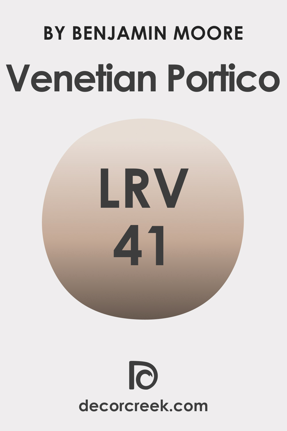
LRV of Venetian Portico AF-185
The Light Reflectance Value (LRV) of Venetian Portico AF-185 is 41, indicating that it is a mid-tone color. LRV measures the percentage of light a color reflects, affecting how light or dark it appears on walls. With an LRV of 41, Venetian Portico strikes a balance, neither too dark nor too light, making it a versatile choice for various spaces.
This LRV level allows it to absorb some light, giving it a rich, inviting quality without overpowering a room.
LRV – what does it mean? Read This Before Finding Your Perfect Paint Color
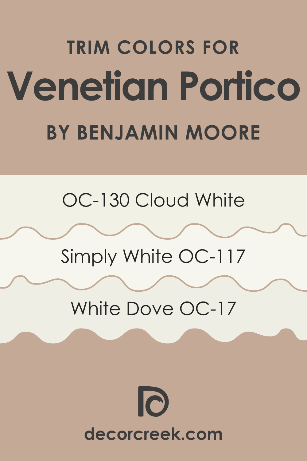
Trim Colors for Venetian Portico AF-185
Trim colors are crucial for framing and accentuating the main wall color. For Venetian Portico AF-185, shades of white such as:
- White Dove OC-17 – A soft, warm white that creates a subtle contrast.
- Simply White OC-117 – A clean, bright white for a more striking delineation.
- Cloud White OC-130 – A muted white with a hint of creaminess.
These whites work well with Venetian Portico, highlighting its depth and versatility.
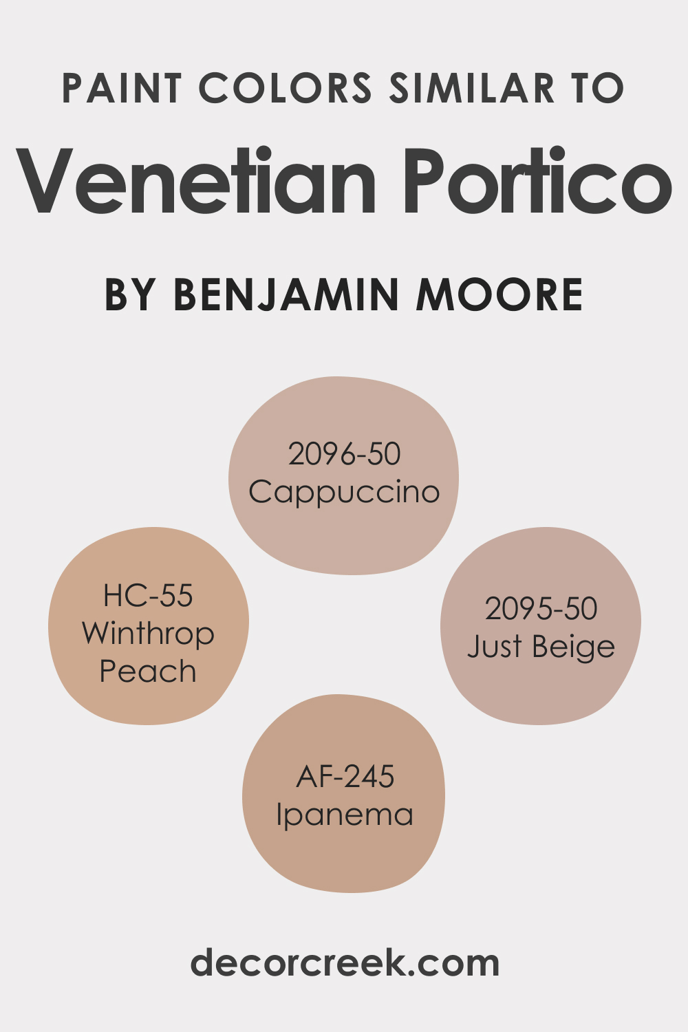
Colors Similar to Venetian Portico AF-185
Knowing similar colors to Venetian Portico AF-185 can help in creating harmonious color schemes or finding alternatives. Similar colors include:
- BM 2096-50 Cappuccino – A cozy beige reminiscent of a warm, frothy cappuccino.
- AF-245 Ipanema – Echoes the sandy shores, offering a warm, inviting presence.
- HC-55 Winthrop Peach – A soft, subtle peach, bringing a gentle warmth.
- BM 2095-50 Just Beige
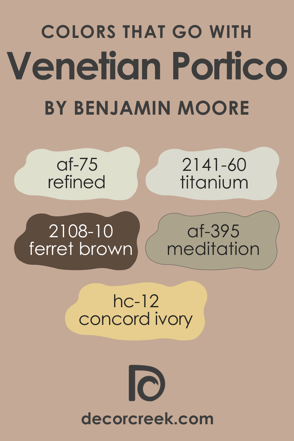
Colors That Go With Venetian Portico AF-185
When choosing colors to complement Venetian Portico AF-185, consider:
- AF-75 Refined – Enhances the neutral aspect of Venetian Portico.
- AF-395 Meditation – Offers a serene, calming effect.
- BM 2108-10 Ferret Brown – Provides depth and contrast.BM 2141-60 Titanium – Adds a modern, cool tone.
- HC-12 Concord Ivory
These colors create a balanced, harmonious palette that enhances the sophisticated nature of Venetian Portico AF-185.
How to Use Venetian Portico AF-185 In Your Home?
Venetian Portico AF-185 by Benjamin Moore is a versatile color suitable for various rooms and design styles. Its neutral taupe hue makes it an excellent choice for living rooms, bedrooms, kitchens, and even exteriors. This color aligns beautifully with contemporary, transitional, and even traditional interior designs.
In spaces with abundant natural light, it radiates warmth, while in dimly lit areas, it offers depth and sophistication. Its adaptability makes it an ideal choice for creating a cohesive color flow throughout the home.
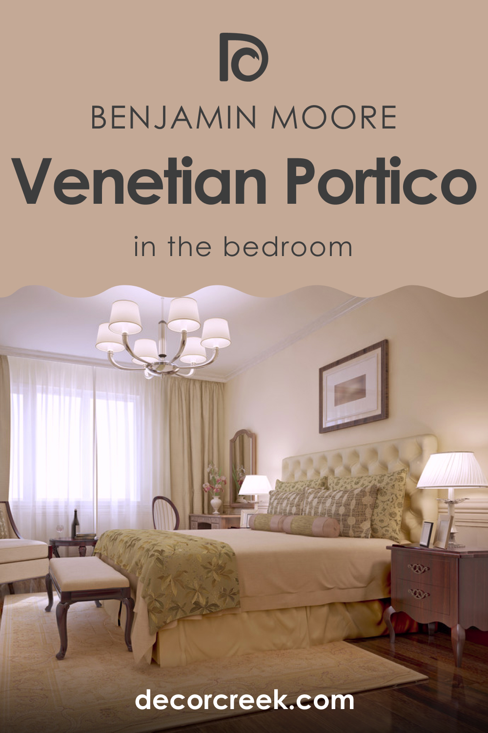
How to Use Venetian Portico AF-185 in the Bedroom?
In the bedroom, Venetian Portico AF-185 creates a serene and restful environment. Its warm undertones provide a cozy ambiance, ideal for relaxation. Pair it with crisp white linens and soft textures to enhance the room’s comfort. It works well with both dark and light furniture, allowing flexibility in styling and decor.
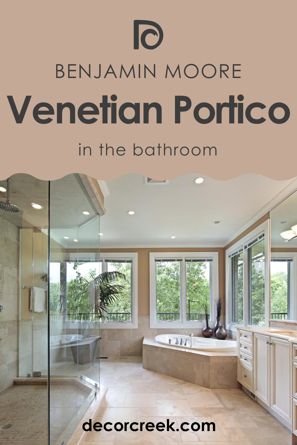
How to Use Venetian Portico AF-185 in the Bathroom?
Venetian Portico AF-185 in the bathroom offers a spa-like feel, turning the space into a tranquil retreat. Its neutral yet warm tone pairs well with white fixtures, marble countertops, and chrome or brass fittings. For a more luxurious look, add accents in muted gold or soft grays. This color is versatile enough to complement both modern and traditional bathroom designs.
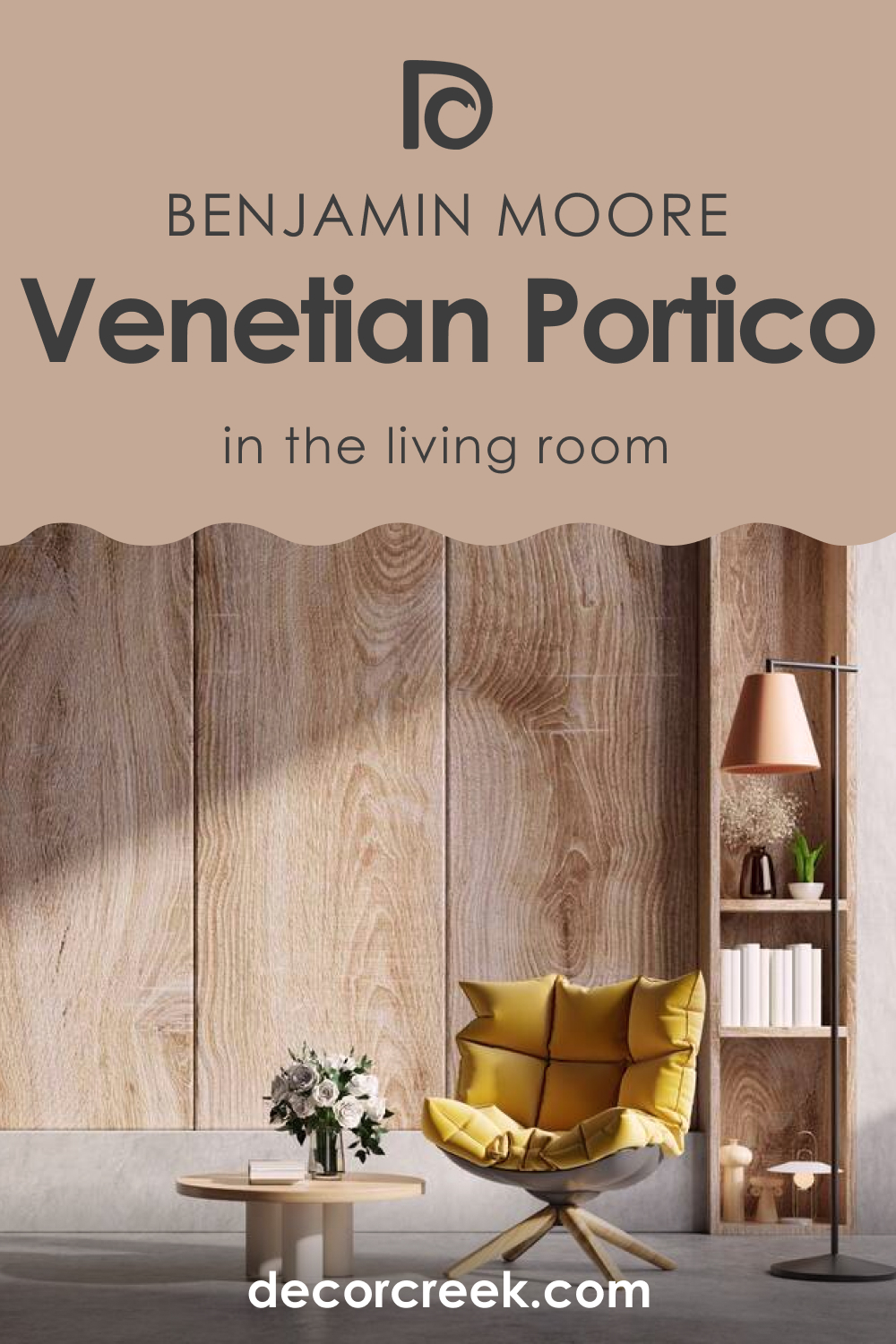
How to Use Venetian Portico AF-185 in the Living Room?
In a living room, Venetian Portico AF-185 provides a sophisticated backdrop that complements various decor styles. It’s perfect for rooms that aim for a balanced, neutral aesthetic without being too stark. This color works well with natural wood tones, metallic accents, and a range of fabric textures. It’s especially striking when paired with bold statement pieces or colorful artwork.
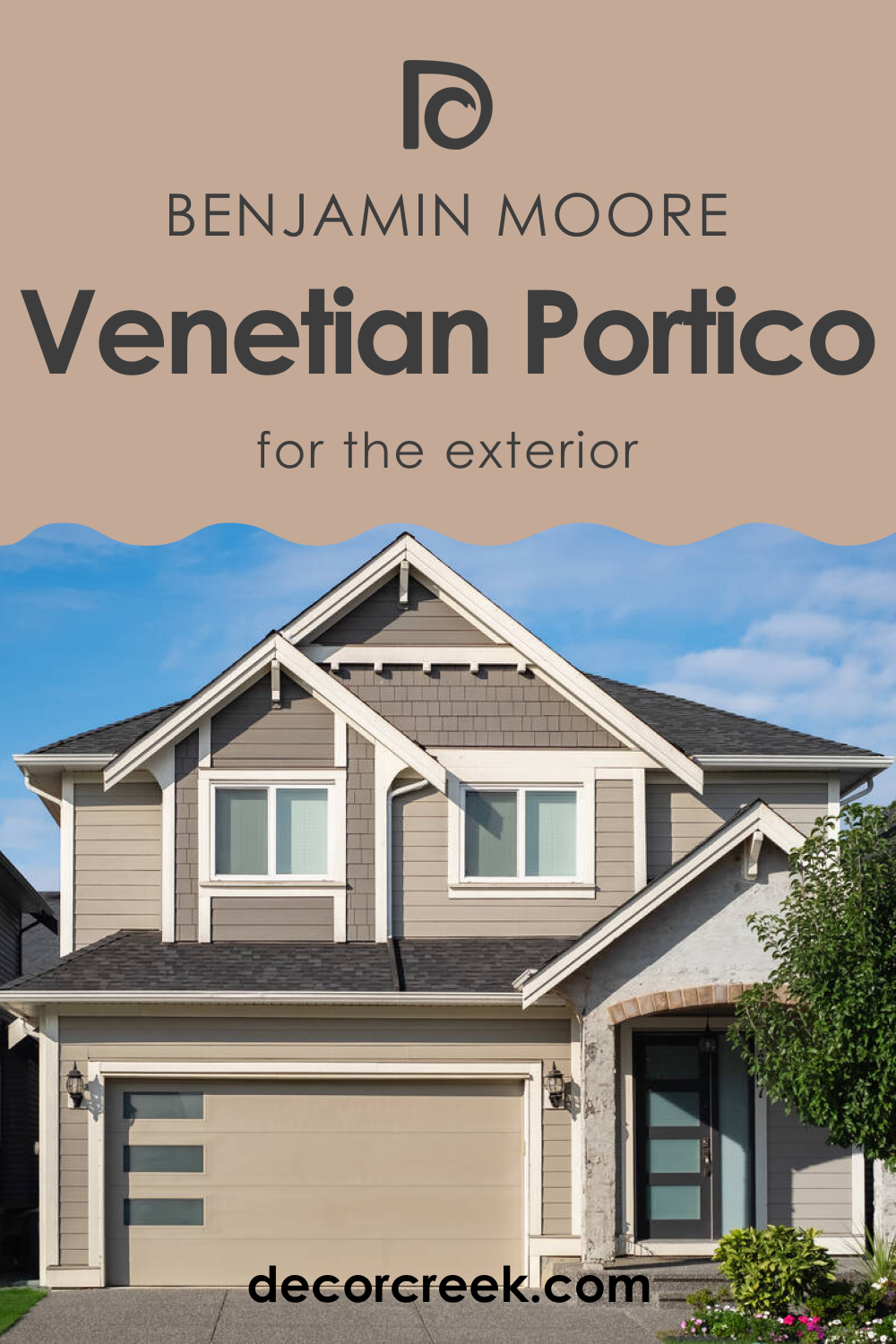
How to Use Venetian Portico AF-185 for an Exterior?
For exteriors, Venetian Portico AF-185 offers a timeless and elegant look. It’s a great alternative to traditional beige or gray, providing a unique warmth and sophistication. This color pairs well with white trims, natural stone, and dark roofing materials. It’s suitable for various architectural styles, from classic to contemporary.
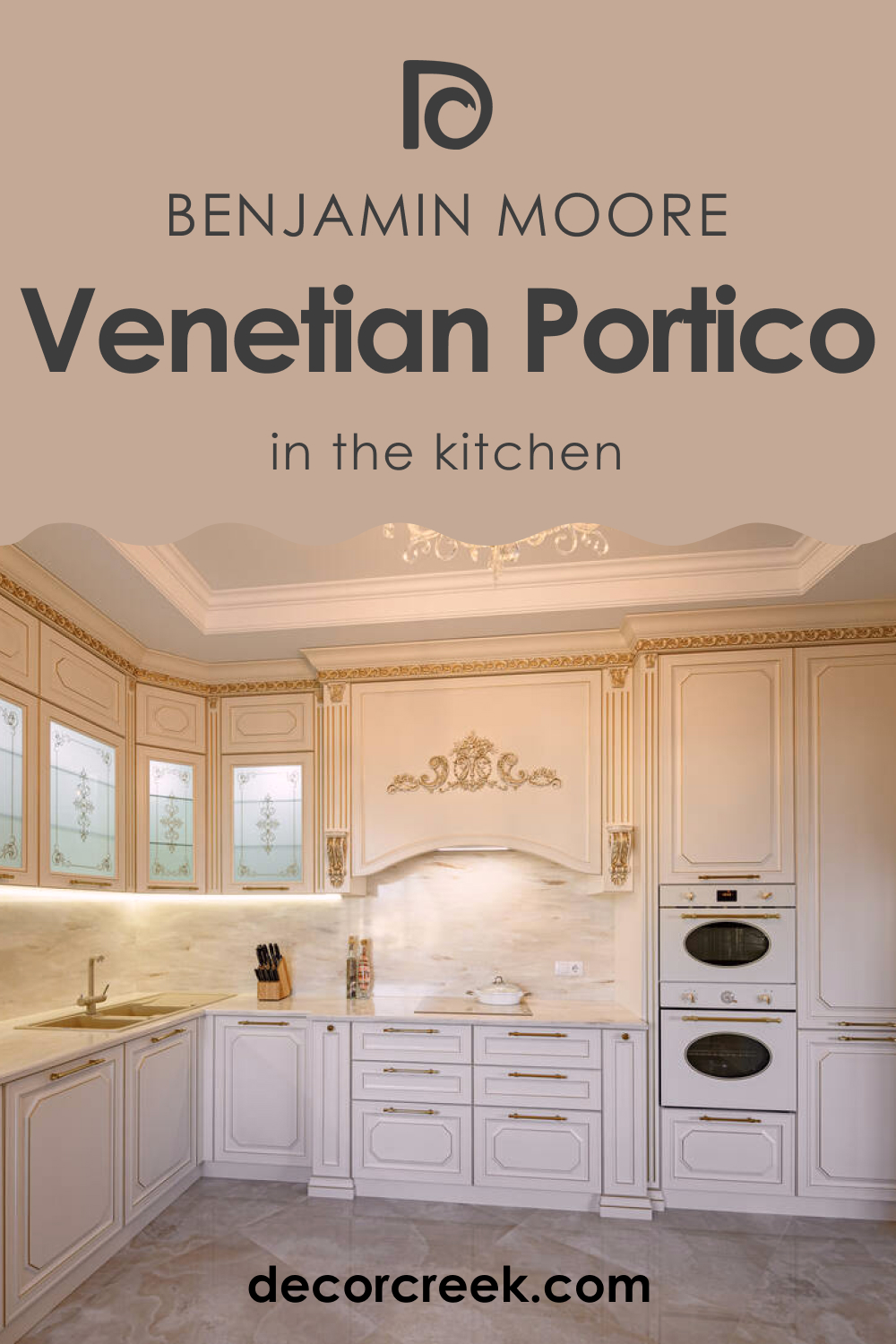
How to Use Venetian Portico AF-185 in the Kitchen?
Venetian Portico AF-185 in the kitchen creates a warm and inviting atmosphere. It works beautifully as a wall color, especially in open-concept spaces where it can seamlessly integrate with living areas. Pair it with white or dark cabinetry for a striking contrast, or with wooden cabinets for a softer, more organic look.
How to Use Venetian Portico AF-185 on Kitchen Cabinets?
Using Venetian Portico AF-185 on kitchen cabinets is an excellent way to add depth and sophistication to the space. This color complements stainless steel appliances and natural stone countertops brilliantly. It’s versatile enough to fit into a modern, sleek kitchen or a more traditional, rustic setting. Pair it with light-colored walls for a balanced look or go bold with contrasting colors for a more dramatic effect.

Comparing Venetian Portico AF-185 With Other Colors
Comparing different colors, such as Venetian Portico AF-185 with other hues, is crucial in understanding their unique properties and potential impact in a space. This comparison aids in selecting complementary colors for a cohesive design scheme and in visualizing how a particular color will interact with existing decor. It also helps in appreciating the subtleties of undertones and how they influence the overall ambiance of a room.
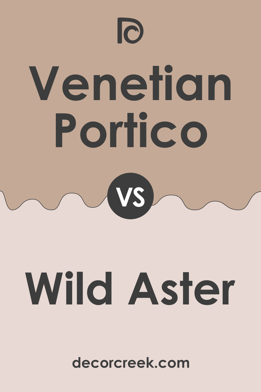
Venetian Portico AF-185 vs. BM 1240 Wild Aster
Venetian Portico AF-185 and Wild Aster present a study in contrast. While Venetian Portico is a neutral, muted taupe, Wild Aster is a soft, playful pink with a more whimsical and light-hearted appeal. Venetian Portico offers versatility and understated elegance, suitable for creating a serene and sophisticated atmosphere. In contrast, Wild Aster brings a cheerful and inviting energy, ideal for spaces that aim for a more youthful and vibrant look.
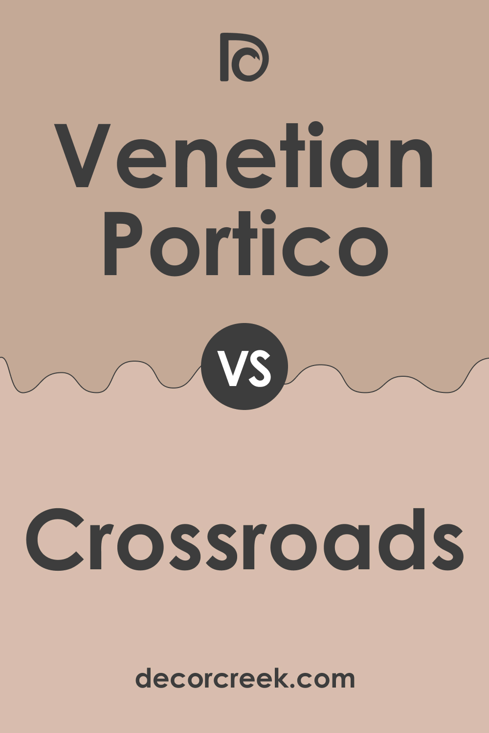
Venetian Portico AF-185 vs. BM 1226 Crossroads
Comparing Venetian Portico AF-185 with Crossroads reveals a distinction between taupe and a deeper, more saturated brown. Crossroads, with its richer and warmer tones, provides a strong and earthy presence in a room, making it ideal for accent walls or cozy, intimate spaces. Venetian Portico, on the other hand, offers a lighter, more neutral backdrop, perfect for larger areas and for pairing with a wide range of decor styles.
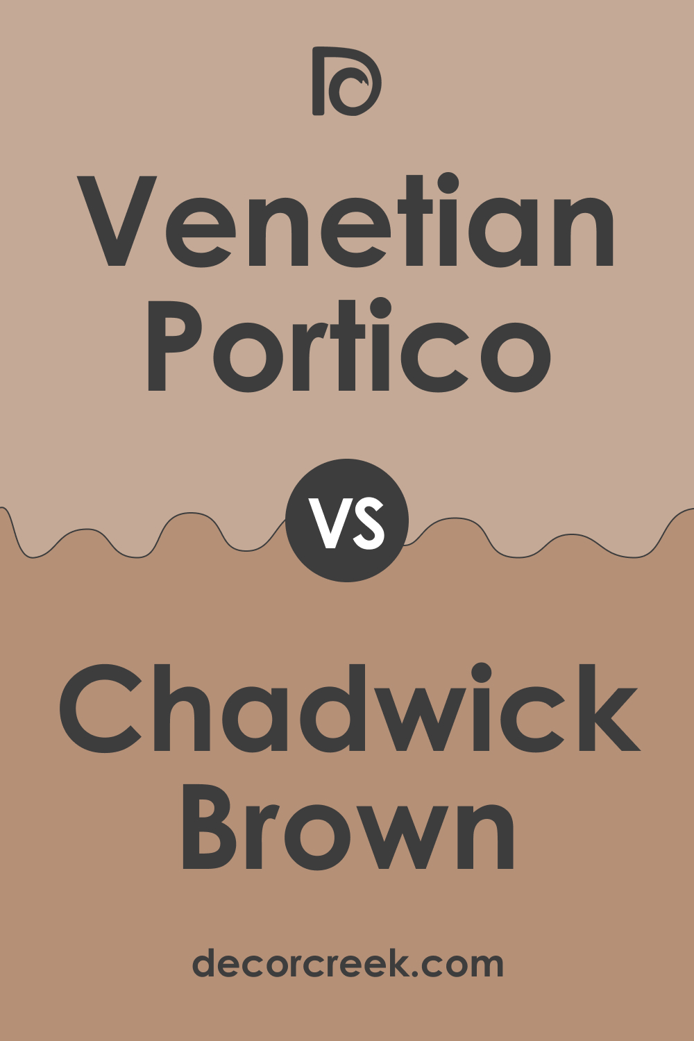
Venetian Portico AF-185 vs. BM 1160 Chadwick Brown
Chadwick Brown stands out as a darker, more traditional brown compared to the softer Venetian Portico AF-185. Chadwick Brown’s depth makes it suitable for creating a focal point or adding gravity to a space, whereas Venetian Portico is more apt for providing a neutral, calming background, adaptable to various design aesthetics.
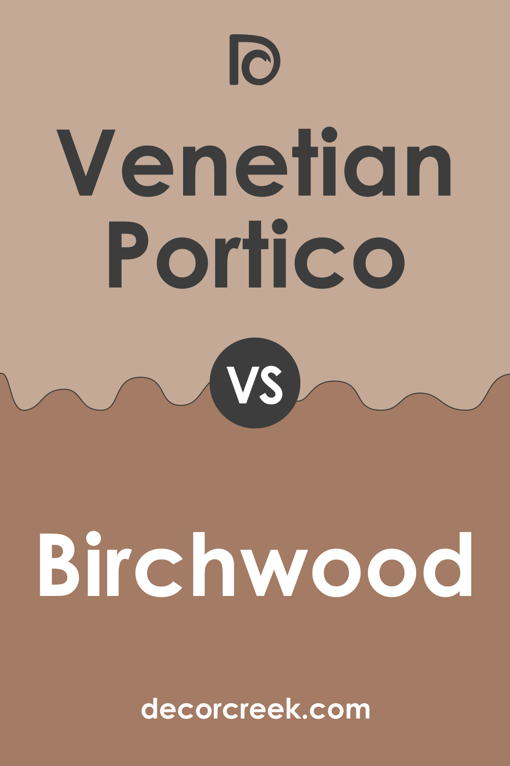
Venetian Portico AF-185 vs. BM 1161 Birchwood
Birchwood, in comparison to Venetian Portico AF-185, leans towards a paler, more beige tone. While Venetian Portico exhibits a balance between gray and beige, Birchwood offers a lighter, creamier approach, suitable for spaces seeking a brighter, more open feel. Venetian Portico’s depth allows for a more sophisticated and grounded ambiance.
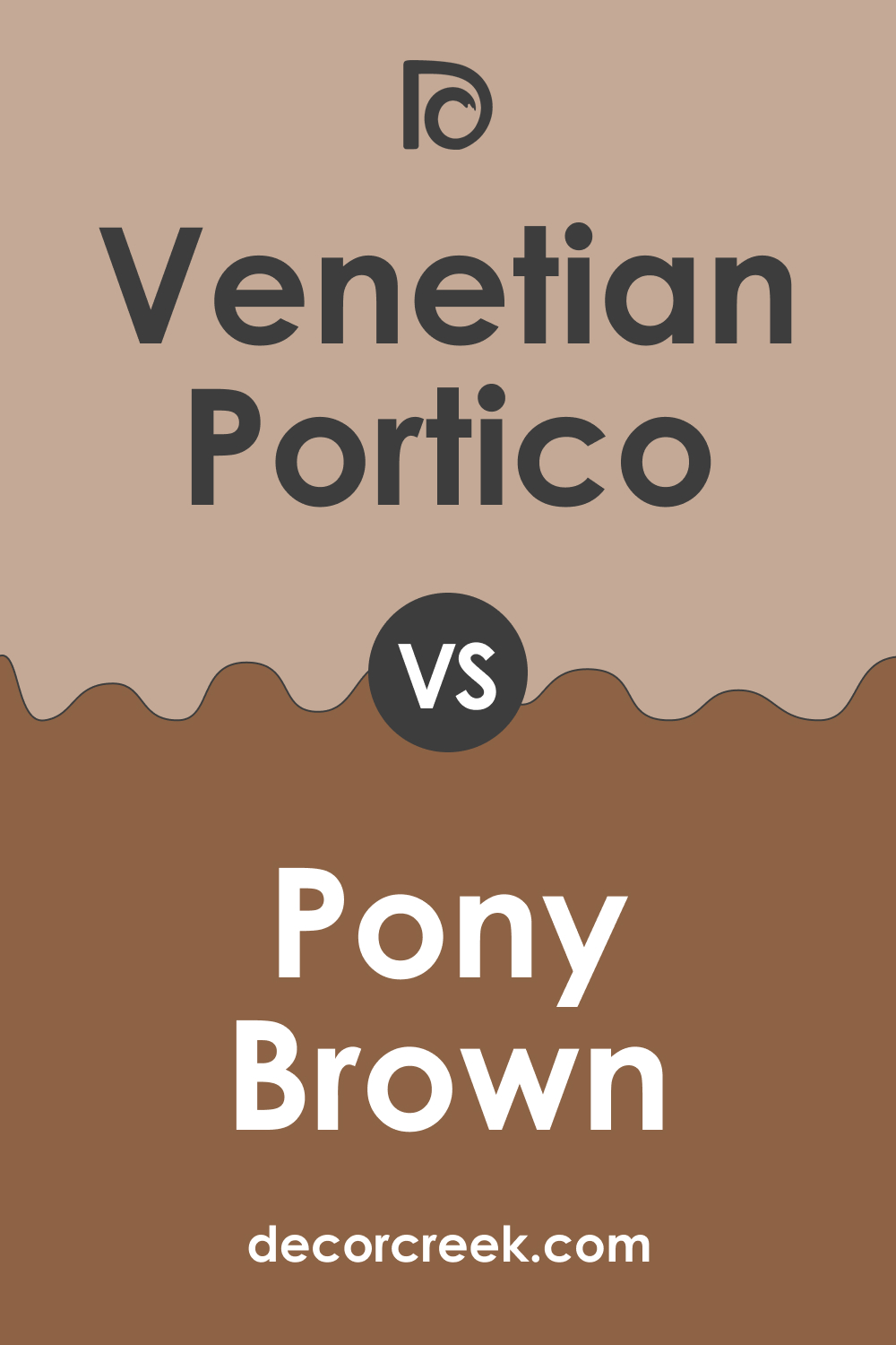
Venetian Portico AF-185 vs. BM 2163-20 Pony Brown
Pony Brown, a deeper and more robust brown, contrasts significantly with Venetian Portico AF-185. While Pony Brown lends a sense of solidity and warmth, ideal for creating cozy, enveloping spaces, Venetian Portico maintains a lighter, more flexible profile, suitable for a variety of settings and as a base for layering different textures and colors.
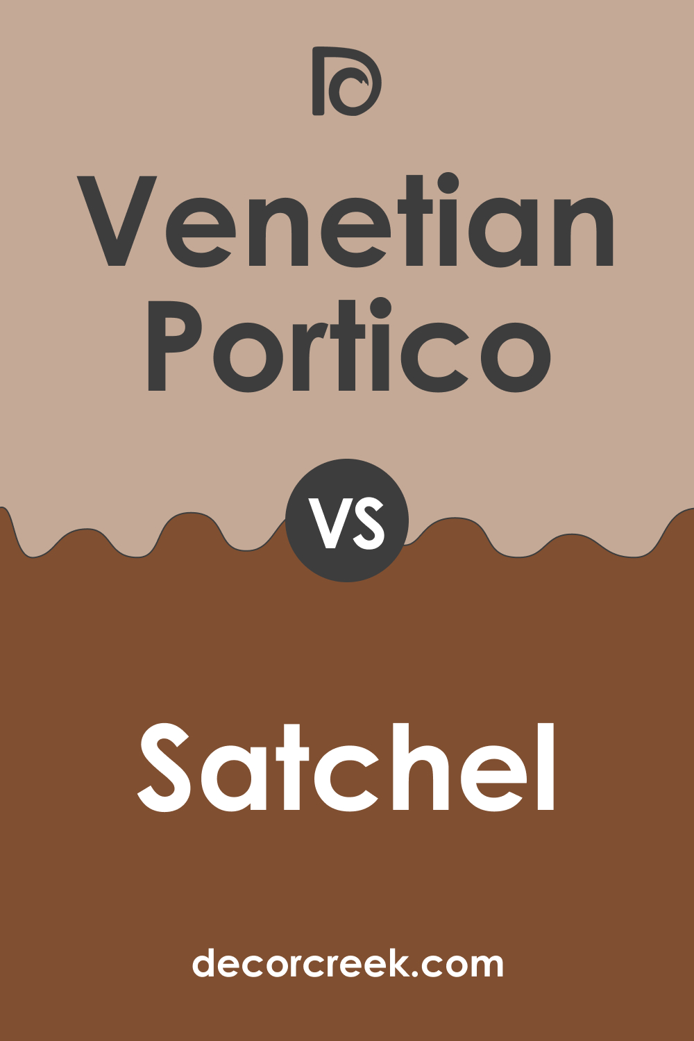
Venetian Portico AF-185 vs. AF-240 Satchel
Satchel, compared to Venetian Portico AF-185, is a richer, more saturated color, leaning towards a darker, earthier palette. This deep tan color provides a bolder backdrop, well-suited for rooms that can handle stronger color without feeling overwhelmed. Venetian Portico, with its muted taupe, offers a softer and more neutral option, excellent for creating a tranquil and elegant atmosphere.
Conclusion
In conclusion, comparing Venetian Portico AF-185 with a range of other Benjamin Moore colors highlights its unique position as a versatile and sophisticated neutral. Its ability to complement various decor styles and its adaptability in different lighting conditions make it a valuable choice for designers and homeowners.
Understanding these color comparisons enables the creation of balanced and harmonious color schemes in interior spaces, ensuring that each room not only looks aesthetically pleasing but also resonates emotionally with its occupants.
Ever wished paint sampling was as easy as sticking a sticker? Guess what? Now it is! Discover Samplize's unique Peel & Stick samples.
Get paint samples


