In the diverse palette of home decoration, color selection plays a vital role in setting the ambiance of a space. Among the multitude of shades available, “Tea Leaf” by Sherwin Williams, designated as SW 9604, emerges as a unique and refined choice for interior and exterior design.
This color encapsulates the essence of tranquility and natural elegance, making it a perfect candidate for those looking to infuse their spaces with a touch of serenity and sophistication.
The beauty of Tea Leaf lies in its versatile nature; it can be seamlessly integrated into various design schemes, whether you’re aiming for a classic, modern, or eclectic look. Its subtle undertones provide a warm and inviting atmosphere, making it an ideal backdrop for living rooms, bedrooms, and even kitchens.
The color’s adaptability is further enhanced when paired with complementary hues, offering endless possibilities for creating a cohesive and inviting aesthetic throughout your home.
Choosing Tea Leaf is more than just selecting a paint color; it’s about embracing a lifestyle that values calmness and understated elegance. Its ability to transform spaces into havens of peace and beauty makes it a favorite among design professionals and homeowners alike.
As we delve deeper into the specifics of SW 9604 Tea Leaf by Sherwin Williams, let’s explore how this color can elevate your living space to new heights of style and comfort.

What Color Is Tea Leaf SW 9604 by Sherwin Williams?
Tea Leaf, an elegant hue by Sherwin Williams, offers a sophisticated blend of green with subtle undertones of brown, resulting in a color that echoes the serene, rich shades found in nature. This versatile color manages to capture both the freshness of spring and the warmth of autumn, making it an ideal choice for those seeking to bring a sense of the outdoors into their interiors.
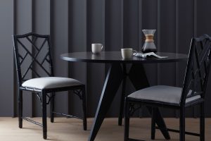
Perfectly suited to a range of interior styles, Tea Leaf thrives in spaces inspired by natural elegance. It pairs exquisitely with rustic themes, where its organic feel enhances wood grains and natural stone textures, lending a sense of groundedness to the décor.
In modern and contemporary settings, this color serves as a stunning backdrop for bold, geometric designs and metallic accents, adding depth and warmth to otherwise minimalistic interiors.
Materials like linen, wool, and silk bring out Tea Leaf’s luxurious side, while its compatibility with natural wood, leather, and woven textures underscores its versatility. The color complements furniture and accessories in both dark and light woods, enhancing the material’s natural beauty.
For a refined palette, it pairs beautifully with creamy neutrals, soft grays, or even rich navy, allowing for a range of design expressions from calming and cohesive to dynamic and contrasting.
In summary, Tea Leaf’s adaptable nature makes it a superb choice for various interior styles, from the rustic charm to modern sophistication, harmonizing with a wide array of materials and textures to create spaces that are both welcoming and stylish.
Ever wished paint sampling was as easy as sticking a sticker? Guess what? Now it is! Discover Samplize's unique Peel & Stick samples.
Get paint samples

Is Tea Leaf SW 9604 by Sherwin Williams Warm or Cool color?
Tea Leaf by Sherwin Williams is a captivating color that brings a sense of tranquility and sophistication to any home. As a hue inspired by nature, it possesses an organic depth that can transform spaces into serene retreats or energizing areas, depending on its application and accompanying decor.
This color, deeply rooted in the essence of vitality and growth, functions wonderfully in both contemporary and traditional settings, providing a flexible backdrop for a wide array of design styles.
Its rich green undertones offer a refreshing contrast to neutral palettes, adding a layer of complexity and visual interest to interiors. When used in living rooms or bedrooms, it creates a calming atmosphere that encourages relaxation and comfort.
In more active spaces like kitchens and dining areas, it injects vibrancy without overwhelming the senses, promoting a welcoming environment ideal for gathering and entertainment.
Additionally, Tea Leaf works exceptionally well with natural light, showcasing varying shades throughout the day that highlight its dynamic character. Pair it with natural wood elements, metallic accents, or textured fabrics to enhance its beauty and create a cohesive, inviting home environment that feels both grounded and elevated.
Its versatility in complementing a wide range of materials and colors makes it a superb choice for those looking to infuse their spaces with a touch of nature’s elegance.
Undertones of Tea Leaf SW 9604 by Sherwin Williams
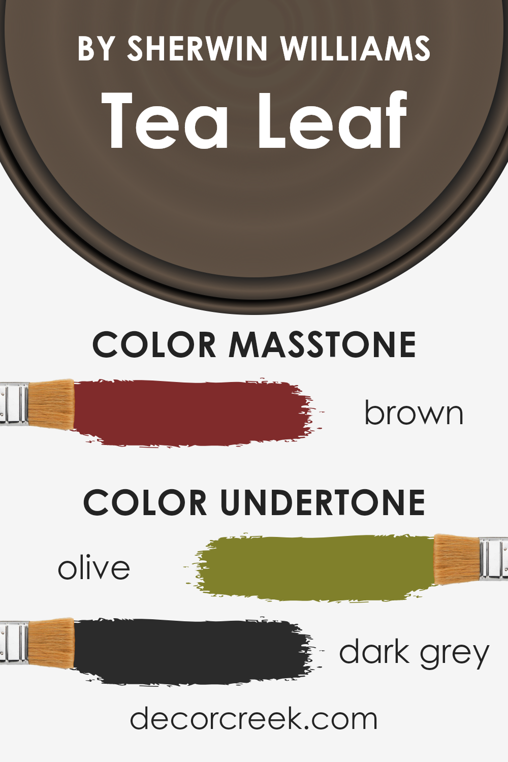
Tea Leaf, a distinguished paint color, comes to life with an intriguing mix of undertones that add depth and complexity to its appearance. These undertones, specifically olive and dark grey, play a significant role in how the color is perceived, subtly influencing the ambiance of a space.
Olive undertones contribute a touch of natural warmth and richness, reminiscent of the earthy hues found in nature. This characteristic enables Tea Leaf to imbue spaces with a sense of comfort and grounding. Meanwhile, the dark grey undertones introduce a layer of sophistication and neutrality.
This cooler counterbalance to the warmth of olive ensures the color remains versatile and harmonious, preventing it from overwhelming a room.
The interaction between these undertones and light is where the magic truly happens. Natural light can highlight the olive warmth, making the color feel more alive and dynamic, whereas artificial light might emphasize the cooler, darker grey aspects, lending a room a more refined and serene atmosphere.
On interior walls, this nuanced blend allows Tea Leaf to adapt beautifully to different settings and decor styles, from the cozy and inviting to the minimal and elegant. Its ability to resonate differently, depending on lighting and accompanying colors, means it can create a range of ambiances – from a sophisticated backdrop that deepens during evening light to a lively canvas that plays with the sun’s rays during the day.
Ultimately, Tea Leaf’s undertones enrich its adaptability, making it a compelling choice for those seeking depth and versatility in their space.
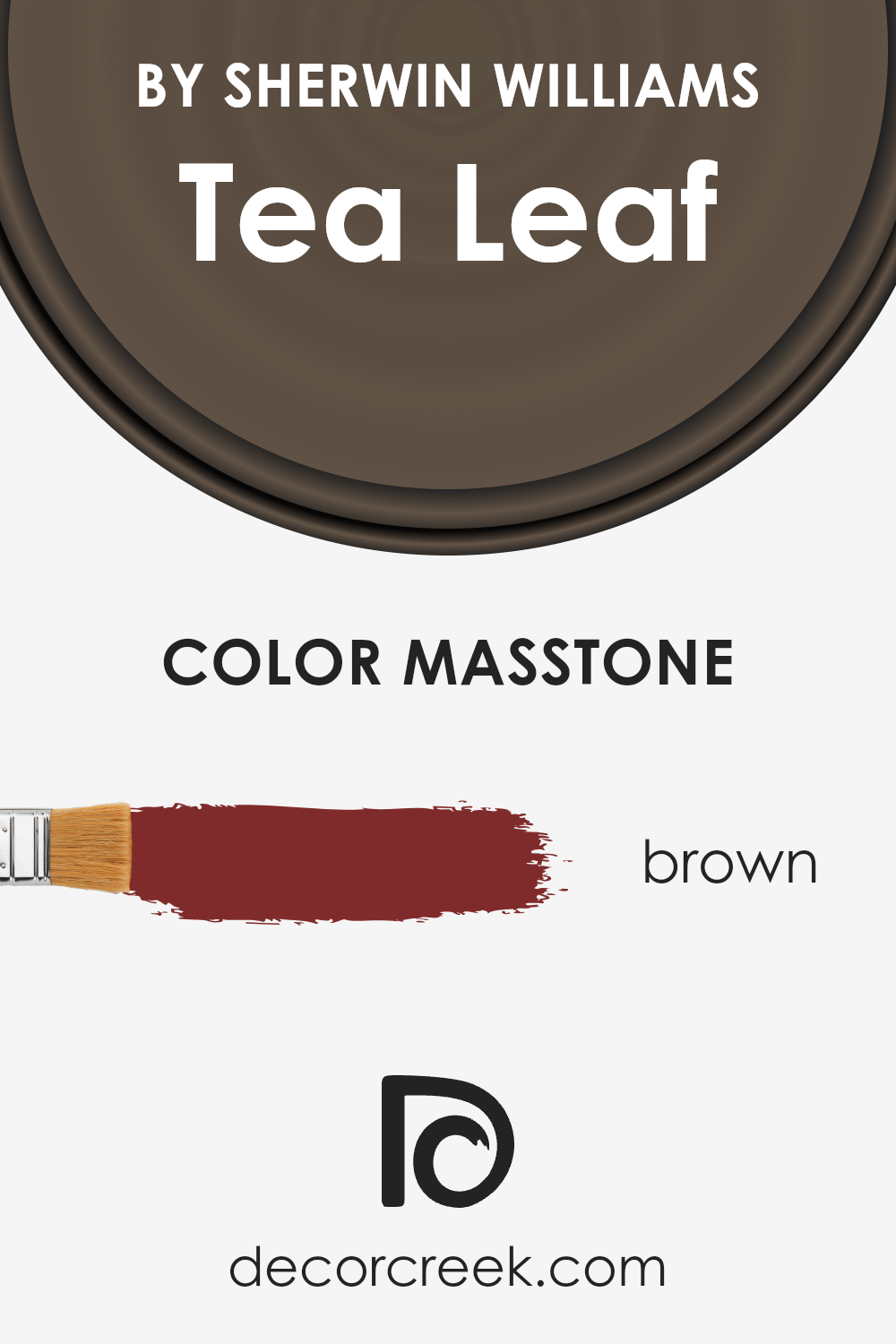
What is the Masstone of the Tea Leaf SW 9604 by Sherwin Williams?
The Tea Leaf color, with its rich masstone resembling Brown (#802B2B), boasts an inherently warm and comforting hue. This deeply satisfying tone introduces a sense of serenity and earthiness into any space, making it particularly effective in creating inviting environments within homes.
Its natural brown essence contributes to a grounded feel, easily blending with various textures and materials, from soft fabrics to rustic wood finishes.
When applied to living areas, this color can enhance the room’s cozy factor, making it perfect for spaces where relaxation is key. In bedrooms, its soothing quality supports a tranquil atmosphere conducive to rest and rejuvenation. Furthermore, in dining areas, the Tea Leaf hue fosters a convivial environment, encouraging gatherings and conversations.
ts versatility also extends to matching with a wide range of complementary colors, from soft creams for a gentle contrast to bold greens, referencing its namesake, for an organic, vibrant look.
The adaptability and warmth of Tea Leaf make it an exemplary choice for those seeking to infuse their homes with a sense of calm and comfort.
How Does Lighting Affect Tea Leaf SW 9604 by Sherwin Williams?
Lighting dramatically influences the perception of colors, affecting their warmth, coolness, and overall appearance in a space. This phenomenon is crucial when considering paint choices for interiors, such as the sophisticated hue often referred to as Tea Leaf. Understanding how this color interacts with light can help create the desired ambiance in a room.
In artificial light, the perception of this color can vary significantly depending on the type of bulbs used. Incandescent lighting, emitting a warmer glow, tends to enrich this hue, making it appear warmer and more vibrant.
On the other hand, fluorescent lighting, known for its cooler tone, might lend the color a slightly greener or cooler appearance, potentially diminishing its warmth and making it lean towards a more muted, natural aesthetic.
Natural light, ever-changing throughout the day, also plays a pivotal role. In north-faced rooms, which receive less direct sunlight and often exude a cooler light, the color may appear more subdued and slightly darker, emphasizing its more understated and serene qualities. This makes it ideal for creating a peaceful and restful ambiance.
Conversely, in south-faced rooms bathed in ample sunlight throughout the day, the color can reveal its full warmth and depth, becoming vibrant and lively. The abundant natural light enhances its welcoming and cozy attributes, making the space feel inviting.
East-faced rooms enjoy the morning sunlight, which is softer and warmer. Here, the color would likely glow softly in the morning, bringing out its cozy, welcoming character, before transitioning to a more muted tone as the day progresses and the natural light shifts away.
Lastly, west-faced rooms receive the evening light, which is warmer and more golden. In such settings, this color could truly come alive in the afternoons and evenings, glowing warmly and creating an inviting, comforting space.
In summary, lighting conditions – artificial or natural, and the direction of the room, significantly influence how we perceive this sophisticated hue, enabling it to adapt and morph, offering a versatile choice for a myriad of spaces.

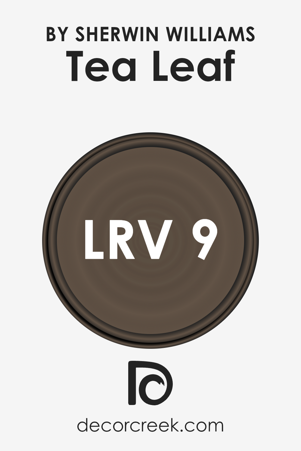
What is the LRV of Tea Leaf SW 9604 by Sherwin Williams?
LRV, or Light Reflectance Value, is a crucial metric that measures the percentage of light a paint color reflects from or absorbs into a surface. It is a scale that ranges from 0 (absolute black, absorbing all light) to 100 (pure white, reflecting all light). This value helps in determining how light or dark a color will look on the walls of a room and can significantly impact the ambience and visual temperature of the space.
Higher LRV means the color reflects more light, enhancing brightness and making a room feel more open and airy. Conversely, a lower LRV suggests that the color absorbs more light, creating a cozy or more intimate space.
With an LRV of 9.218, Tea Leaf falls on the darker end of the spectrum, indicating it is a deep, rich color that absorbs a significant amount of light. This characteristic means that Tea Leaf will bring warmth and depth to a room, creating an enveloping and cozy atmosphere.
However, due to its low LRV, it is also crucial to consider the room’s natural lighting before applying it to walls. In spaces with limited natural light, this color may appear even darker, dramatically transforming the room’s feel.
In well-lit, ample spaces, the color can add a sophisticated, grounded touch without overpowering the room.
Thus, the LRV value is fundamental in deciding how this particular color will interact with a space, influencing both the mood and perceived size of the room.
LRV – what does it mean? Read This Before Finding Your Perfect Paint Color
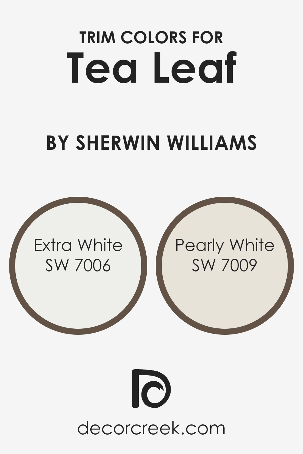
What are the Trim colors of Tea Leaf SW 9604 by Sherwin Williams?
Trim colors play a pivotal role in interior and exterior design by framing the main wall color, creating contrast, and enhancing architectural details. When considering a unique and somewhat bold color like Tea Leaf by Sherwin Williams, choosing the right trim color becomes even more crucial. The objective is to select a trim color that complements Tea Leaf without overwhelming it or causing a visual clash.
This careful balance ensures that the main color stands out while the trim subtly ties together the overall design aesthetic. Trim colors can either quietly support the main hue or, when chosen with contrast in mind, make a strong, deliberate statement.
For a color like Tea Leaf, SW 7006 – Extra White and SW 7009 – Pearly White are excellent trim choices for different reasons. Extra White is a clean, bright white with a crisp finish that can make the green undertones of Tea Leaf pop, giving a fresh and contemporary vibe to the space.
It’s perfect for creating a sharp contrast that highlights architectural features or for lending a more modern edge to the room. On the other hand, Pearly White offers a softer approach.
Its warm undertones provide a more subtle transition from the wall to trim, promoting a harmonious blend with Tea Leaf.
This color is ideal for those looking to soften the intensity of the main color, ensuring a space that feels both inviting and cohesive.
You can see recommended paint colors below:
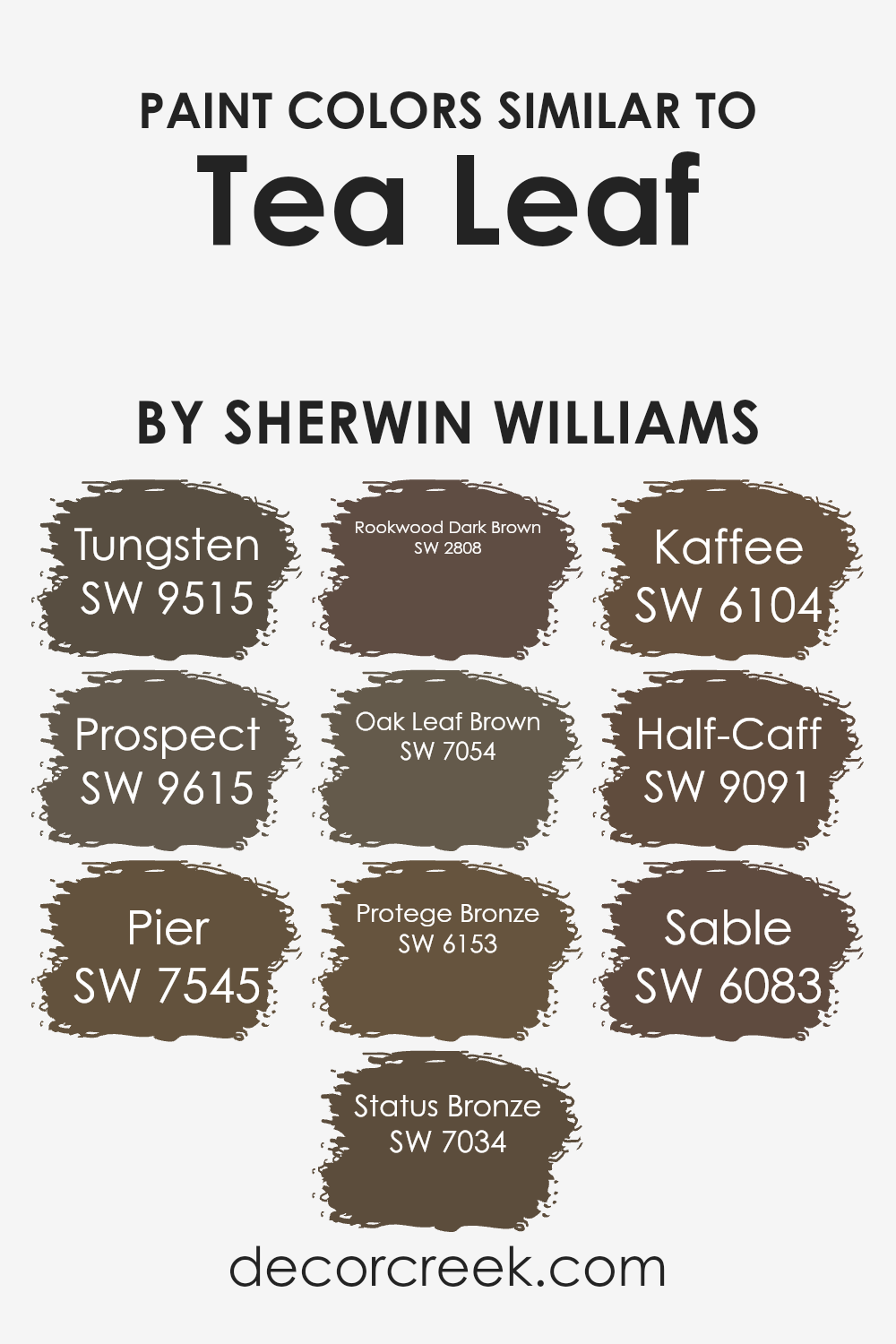
Colors Similar to Tea Leaf SW 9604 by Sherwin Williams
In the realm of interior design, the significance of similar colors lies in their power to create a harmonious and cohesive aesthetic. Colors that share a close relationship on the color wheel not only complement each other but also offer a subtle variation that can enhance the depth and texture of a space.
For instance, Tungsten and Prospect are shades that draw inspiration from the natural world, embodying the coolness of stone and the warmth of soil, respectively. These nuances enable designers to weave a visual story that is both rich and inviting.
On the other hand, colors like Pier and Status Bronze extend this palette into realms of relaxation and sophistication. Pier, with its gentle nod to the serene moments by the sea, and Status Bronze, which brings an air of refined elegance, showcase how similar colors can cater to different moods and settings.
Rookwood Dark Brown, Oak Leaf Brown, and Protege Bronze further enrich this palette by offering deeper, earthier tones that ground the design.
Meanwhile, Kaffee, Half-Caff, and Sable introduce shades that bridge the divide between the bold and the subtle, allowing for a design that can be both dynamic and harmonious.
This interplay of similar colors demonstrates their invaluable role in creating spaces that are visually cohesive yet distinctly layered.You can see recommended paint colors below:
- SW 9515 Tungsten
- SW 9615 Prospect
- SW 7545 Pier
- SW 7034 Status Bronze
- SW 2808 Rookwood Dark Brown
- SW 7054 Oak Leaf Brown
- SW 6153 Protege Bronze
- SW 6104 Kaffee
- SW 9091 Half-Caff
- SW 6083 Sable
How to Use Tea Leaf SW 9604 by Sherwin Williams In Your Home?
Tea Leaf, a captivating hue by Sherwin Williams, embodies the perfect blend of sophistication and natural tranquility. This versatile green shade, imbued with a subtle earthiness, creates a sense of calm and connection to the natural world.
Its ability to introduce a serene, inviting atmosphere makes it an excellent choice for any homeowner looking to infuse their space with a touch of grounded elegance.
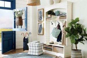
When considering how to incorporate Tea Leaf into your home, its adaptability truly shines. It serves as an exceptional choice for living rooms or bedrooms, where its restful qualities can transform these areas into peaceful sanctuaries.
In a study or home office, Tea Leaf can foster concentration and creativity, thanks to its organic inspiration. For a more dynamic impact, consider pairing it with crisp whites or rich, dark woods to accentuate its depth and complexity.
Whether applied as a statement wall, through accents, or for a full-room immersion, Tea Leaf brings a refreshing and harmonious vibe to any home, making spaces feel more open, airy, and connected to the outdoors.
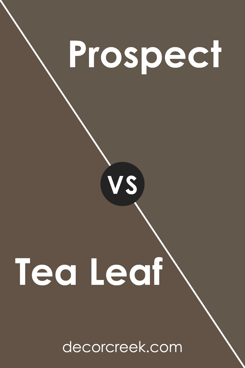
Tea Leaf SW 9604 by Sherwin Williams vs Prospect SW 9615 by Sherwin Williams
Tea Leaf and Prospect , both from Sherwin Williams, embody distinct moods and aesthetics in interior design. Tea Leaf presents as a serene, earthy hue, mirroring the tranquility of a lush forest floor.
Its depth adds a layer of sophistication and warmth, making it ideal for spaces aiming to evoke comfort and natural beauty.
Contrastingly, Prospect offers a lighter, more refreshing take. It leans towards a subdued vibrancy, reminiscent of early morning mists in a meadow. This color brings an air of openness and lightness to spaces, perfect for enhancing the feeling of spaciousness in any room.
While Tea Leaf anchors a room with its rich, comforting tones, suggesting a snug retreat, Prospect uplifts and brightens, suggesting renewal and clarity.
Together, they could complement each other beautifully, with Tea Leaf providing depth and Prospect offering contrast, making a space that is both grounded and airy.
Choosing between them depends on the desired ambiance: cozy and enveloping, or fresh and invigorating.
You can see recommended paint color below:
- SW 9615 Prospect
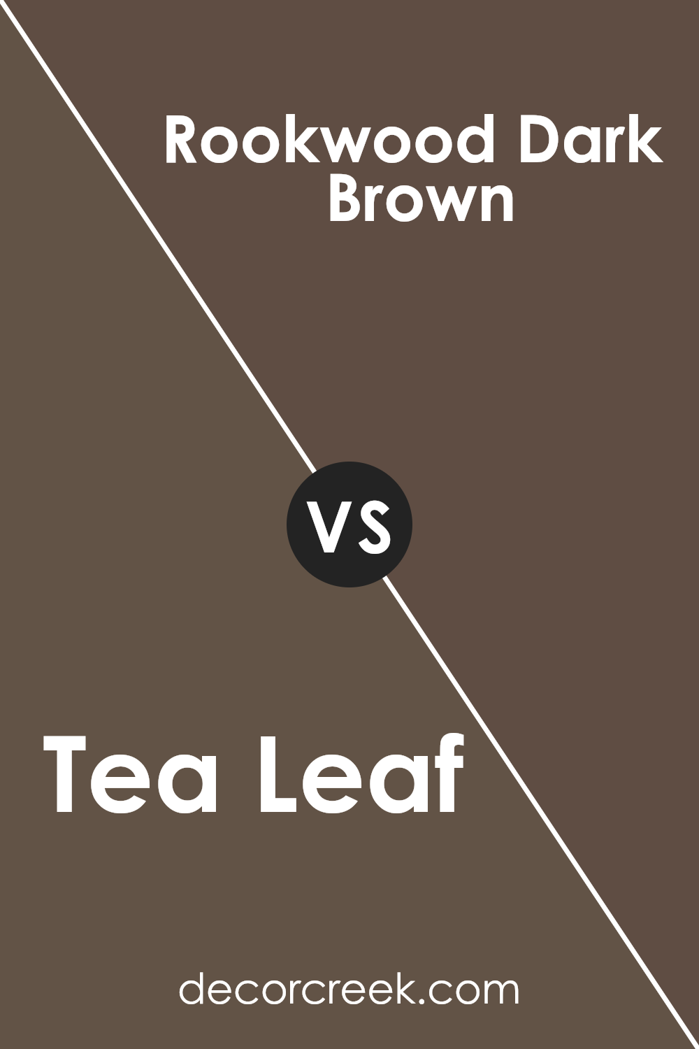
Tea Leaf SW 9604 by Sherwin Williams vs Rookwood Dark Brown SW 2808 by Sherwin Williams
Tea Leaf and Rookwood Dark Brown by Sherwin Williams present a compelling study in contrast within the natural-inspired palette. Tea Leaf offers a gentle, muted green with gray undertones, echoing the serenity and softness of a well-tended garden in the early morning light. This color evokes a sense of peacefulness and subtle vitality, making it an ideal choice for spaces intended for relaxation and rejuvenation.
On the other hand, Rookwood Dark Brown is a deeply saturated, rich brown that speaks to the earthiness and robust character of an old-growth forest. Its depth provides a strong anchor in any color scheme, offering warmth and sophistication.
Rookwood Dark Brown’s potency makes it a favorite for creating dramatic accents or enveloping a room in a cozy, inviting atmosphere.
Together, these colors could be used to create a space that balances the tranquility of nature with the grounding presence of the earth, each enhancing the other’s beauty without overshadowing it.
You can see recommended paint color below:
- SW 2808 Rookwood Dark Brown
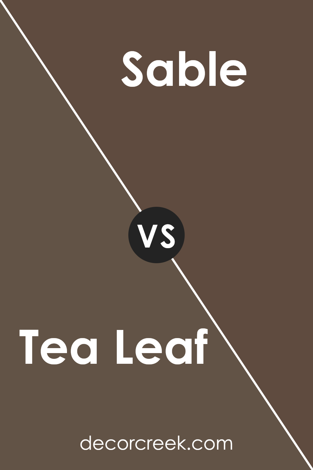
Tea Leaf SW 9604 by Sherwin Williams vs Sable SW 6083 by Sherwin Williams
Tea Leaf and Sable by Sherwin Williams are distinct hues that offer different vibes for interior spaces. Tea Leaf is a soothing, muted green with soft, gray undertones, presenting a calm and serene atmosphere. It’s reminiscent of the subtle tones found in nature, making it perfect for creating a tranquil and relaxing environment.
This color works well in spaces aimed at relaxation and rejuvenation, like bedrooms and reading nooks.
On the other hand, Sable is a rich, deep brown that exudes warmth and elegance. Its dark, chocolatey undertones provide a strong sense of sophistication and comfort, making it ideal for creating cozy and inviting spaces.
Sable works particularly well in living areas, libraries, or dining rooms, where its depth can add character and a sense of luxury.
While both colors come from the earthy spectrum, Tea Leaf’s lightness and green base offer a refreshing and airy quality, contrasting with Sable’s dense, warm coziness. Their different tones can complement each other well, allowing for versatile design schemes that balance freshness with depth.
You can see recommended paint color below:
- SW 6083 Sable
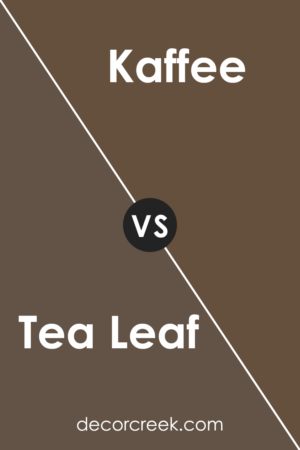
Tea Leaf SW 9604 by Sherwin Williams vs Kaffee SW 6104 by Sherwin Williams
Tea Leaf and Kaffee by Sherwin Williams are two distinct hues that cater to different aesthetic preferences and environments. Tea Leaf is a sophisticated, muted green with gray undertones, offering a sense of calm and an organic feeling to spaces.
Its versatility makes it suitable for both contemporary and traditional settings, allowing it to act as a neutral backdrop or a subtle statement color.
Kaffee, on the other hand, is a deep, rich brown that exudes warmth and comfort. This color is reminiscent of dark roasted coffee beans and brings a cozy yet elegant atmosphere to a room.
Kaffee’s depth makes it ideal for creating a focal point or enhancing the ambiance in a space that seeks to be both inviting and sophisticated.
When comparing the two, Tea Leaf provides a lighter, more refreshing vibe, perfect for spaces that aim to be serene and airy. Kaffee offers a stronger presence, ideal for conveying sophistication and timeless comfort.
Both colors showcase Sherwin Williams’ ability to capture the essence of natural elements in paint, offering unique character and mood to interior designs.
You can see recommended paint color below:
- SW 6104 Kaffee
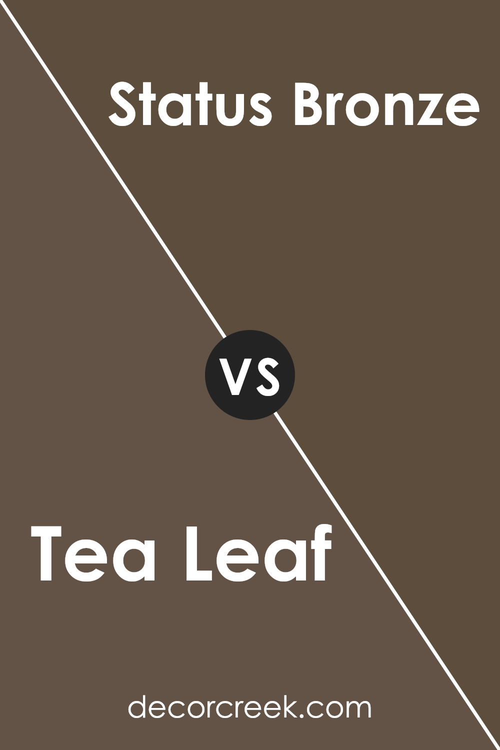
Tea Leaf SW 9604 by Sherwin Williams vs Status Bronze SW 7034 by Sherwin Williams
Tea Leaf and Status Bronze , both from Sherwin Williams, showcase a rich depth in the world of paint colors. Tea Leaf presents itself as a soothing, muted green, reminiscent of the serene aspect of nature. Its subtle undercurrents can evoke a sense of calm and rejuvenation, making it a perfect choice for spaces intended to relax and heal.
On the other hand, Status Bronze steps into the room with a bolder statement.
This color leans towards a warm, earthy bronze tone that speaks of sophistication and timeless elegance. Status Bronze has the unique ability to make a space feel both grounded and luxuriously inviting.
While Tea Leaf whispers of morning dew on fresh leaves, Status Bronze narrates evenings by the fireside.
Both colors offer distinct atmospheres: Tea Leaf is ideal for creating a light, airy space, whereas Status Bronze is perfect for crafting an ambiance filled with warmth and depth. Together, they bridge the gap between tranquility and opulence in any interior design palette.
You can see recommended paint color below:
- SW 7034 Status Bronze
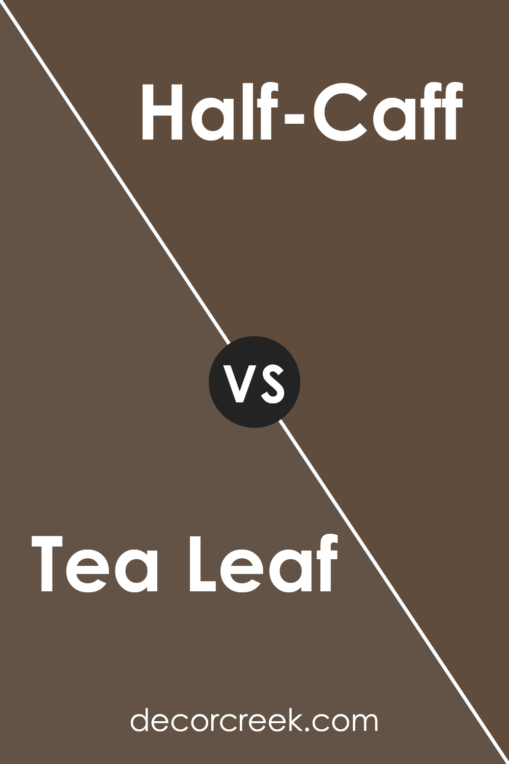
Tea Leaf SW 9604 by Sherwin Williams vs Half-Caff SW 9091 by Sherwin Williams
Tea Leaf and Half-Caff , both by Sherwin Williams, reside in the same color family but navigate different emotions and environments. Tea Leaf presents as a muted, sage green, embodying a sense of calm and restoration. It brings an organic, natural feel to any space, with its gentle green hues suggesting growth and tranquility.
On the other hand, Half-Caff offers a warmer palette, closer to a medium taupe with undercurrents of brown. This color strikes a balance between warmth and sophistication, creating cozy, inviting environments with its earthy, rich tones.
While Tea Leaf leans towards cooler, refreshing vibes, making it ideal for spaces where calm and serenity are desired, Half-Caff steps into a realm of warmth and comfort, perfect for creating intimate, welcoming areas.
Both colors offer versatility but cater to different aesthetics; Tea Leaf might complement spaces with lots of natural light and plant life, whereas Half-Caff suits areas with warm lighting and wooden furnishes better, emphasizing richness and warmth.
Together, they can even complement each other, grounding spaces with their earthy tones yet providing contrasting warmth and coolness.
You can see recommended paint color below:
- SW 9091 Half-Caff
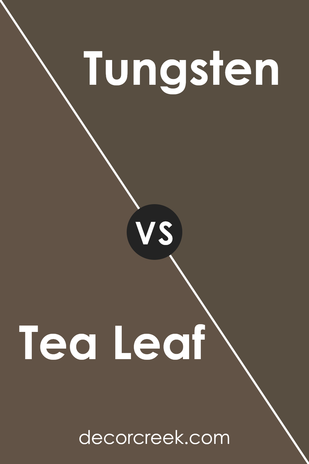
Tea Leaf SW 9604 by Sherwin Williams vs Tungsten SW 9515 by Sherwin Williams
The Tea Leaf and Tungsten paints, both by Sherwin Williams, present a compelling study in color contrasts and harmonies. Tea Leaf embodies a soft, muted green with undertones that suggest a warmth, evoking the natural essence of a shaded garden or the subtle patina of aged foliage. It exudes a calming and organic vibe, making it ideal for spaces intended for relaxation and tranquility.
In contrast, Tungsten opts for a cooler, more reserved character. This color leans towards a deep, sophisticated gray with a hint of blue undertone, imparting a sleek and contemporary finish. Tungsten’s strength lies in its versatility, able to anchor rooms with a modern flair or add depth to more traditional settings.
When juxtaposed, Tea Leaf’s inherent warmth plays off against Tungsten’s cool sophistication, offering an exquisite balance between earthiness and urbanity. While Tea Leaf invites a serene, naturalistic feel, Tungsten asserts a bold, refined statement.
Together, they can create a dynamic and visually compelling environment, each enhancing the other’s unique qualities.
You can see recommended paint color below:
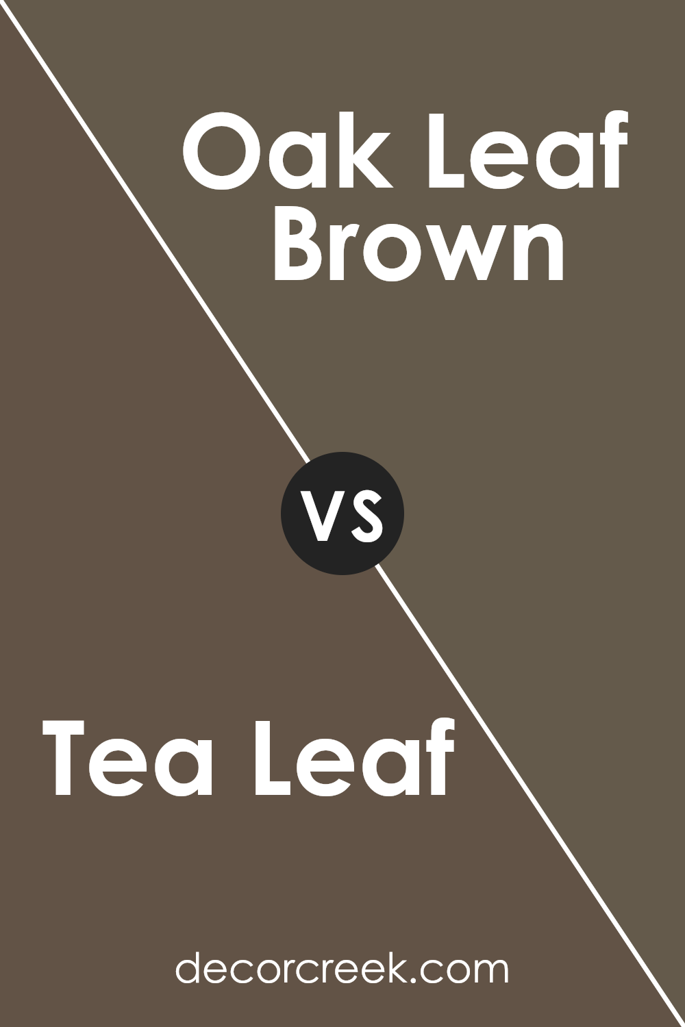
Tea Leaf SW 9604 by Sherwin Williams vs Oak Leaf Brown SW 7054 by Sherwin Williams
Tea Leaf and Oak Leaf Brown , both from Sherwin Williams, present a fascinating comparison in the realm of natural-inspired hues. Tea Leaf is a muted, soft green with a gentle, earthy essence that brings to mind the tranquil impression of a lush garden in early morning.
Its subtle undertones can infuse spaces with a sense of serenity and freshness, making it a versatile choice for creating a calming atmosphere.
On the other hand, Oak Leaf Brown speaks to the richness and warmth of nature’s grounding elements. This color has a deeper, more robust presence, embodying the hearty essence of tree bark or the fertile soil of a well-tended garden.
Its brown tones are rich yet subdued, capable of adding depth and warmth to interiors without overwhelming them.
When comparing the two, Tea Leaf offers a lighter, more refreshing vibe, ideal for spaces needing a touch of subtle vibrancy. Oak Leaf Brown, with its earthy, warm embrace, is suited for areas where a cozy, nurturing feel is desired.
Together, these colors could complement each other beautifully, echoing the natural harmony found in the outdoors.
You can see recommended paint color below:
- SW 7054 Oak Leaf Brown
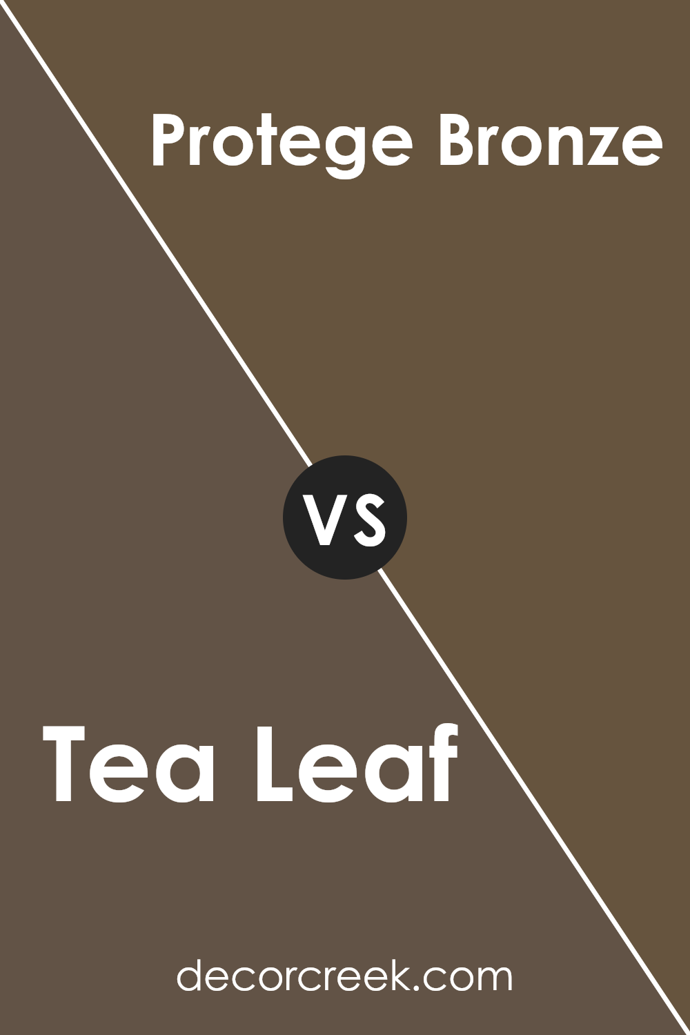
Tea Leaf SW 9604 by Sherwin Williams vs Protege Bronze SW 6153 by Sherwin Williams
Tea Leaf and Protege Bronze , both offered by Sherwin Williams, each cast a unique spell in the palette of interior design. Tea Leaf, subtle and serene, is reminiscent of a gentle, verdant landscape at dawn, providing spaces with a breath of calm and understated elegance.
This color meshes well with light and airy decor, bringing out the vibrancy in natural light and fostering a sense of growth and renewal.
Conversely, Protege Bronze swims in deeper, richer waters, evoking the elegance of aged copper or the warm embrace of a setting sun. It’s a color that speaks of strength and stability, offering a comforting anchor in any space it graces.
This welcoming, earthy shade pairs beautifully with a wide range of colors, from soft neutrals to vibrant hues, enabling a versatile approach to interior styling.
In essence, while Tea Leaf offers a whisper of nature’s tranquility, Protege Bronze responds with a statement of robust warmth, showcasing the dynamic range that Sherwin Williams brings to the world of interior decor.
You can see recommended paint color below:
- SW 6153 Protege Bronze
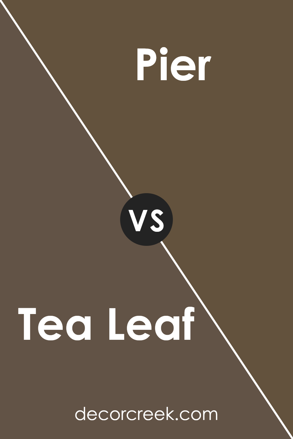
Tea Leaf SW 9604 by Sherwin Williams vs Pier SW 7545 by Sherwin Williams
Tea Leaf and Pier , both from Sherwin Williams, are distinct hues that offer unique atmospheres to spaces they adorn. Tea Leaf, a muted green with earthy undertones, brings a serene and natural feel to interiors, reminiscent of a tranquil garden.
Its subtle vibrancy makes it versatile for various settings, blending well with both contemporary and traditional decor.
On the other hand, Pier is a warm, welcoming beige that leans towards a soft, sandy tone. It exudes comfort, making spaces feel open and airy, yet cozy. This color is excellent for creating a neutral backdrop that can either stand alone or support bolder accents.
While Tea Leaf introduces a touch of nature and freshness, Pier provides a solid foundation for a range of design directions, from minimalistic to eclectic. Each color has its charm, with Tea Leaf offering a hint of color and Pier acting as a timeless neutral.
You can see recommended paint color below:
- SW 7545 Pier
Conclusion
Tea Leaf SW 9604 by Sherwin Williams emerges as a captivating color option for those seeking to infuse their spaces with a sense of tranquility and organic elegance. This versatile shade, with its subtle blend of earthy tones, offers a warm and inviting atmosphere that can transform any room into a serene retreat.
Its ability to harmonize with a variety of decor styles and color palettes makes it a favored choice among homeowners and interior designers alike.
The color’s adaptability ensures it is equally at home in traditional settings as it is in more contemporary spaces, enhancing the aesthetic appeal of furnishings and accessories while also serving as a soothing backdrop for daily life.
The allure of Tea Leaf lies not only in its aesthetic versatility but also in its capacity to create an ambiance of comfort and sophistication. This color reflects a growing appreciation for nature-inspired hues that bring the outside in, promoting a sense of wellbeing and connection to the natural world.
In spaces where this color is applied, it tends to elevate the overall design scheme, adding depth and character without overwhelming the senses.
Whether used as a dominant color scheme or as an accent, it exudes a timeless charm and a promise of tranquility, making it an exemplary choice for any interior space looking to achieve a balance between beauty and harmony.
Ever wished paint sampling was as easy as sticking a sticker? Guess what? Now it is! Discover Samplize's unique Peel & Stick samples.
Get paint samples