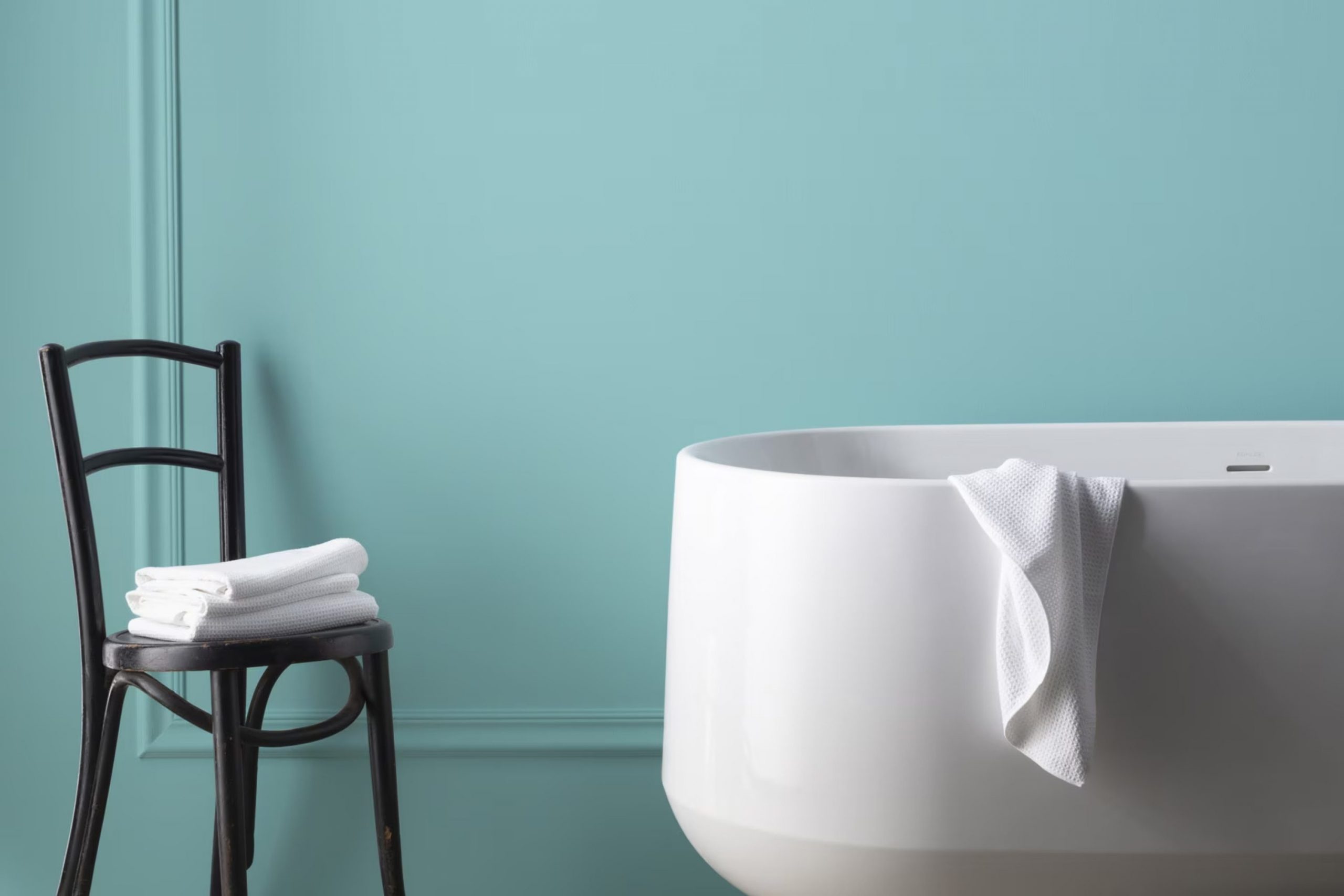
When choosing a paint color for my recent home renovation, I decided on 2051-50 Tranquil Blue by Benjamin Moore. I was looking for a shade that could add peace and calm to my room without being too strong. Upon applying the first coat, the color welcomed me with its soft, airy quality that perfectly balanced depth with lightness. It turned out to be the ideal backdrop for both relaxing and entertaining.
This shade of blue has a gentle clarity that pairs beautifully with a wide range of decor styles, from modern minimalistic to cozy and rustic. I found it not only adaptable but also forgiving; small imperfections were less noticeable, making it a practical choice for busy areas.
Its understated elegance has had a refreshing effect on my living area, bringing a fresh but soothing atmosphere that changes subtly with the lighting throughout the day.
Whether it’s morning brightness or the soft glow of evening lamps, Tranquil Blue maintains its charming appeal, making my home feel both welcoming and stylish.
What Color Is Tranquil Blue 2051-50 by Benjamin Moore?
Tranquil Blue 2051-50 by Benjamin Moore is a gentle and refreshing shade that reminds you of a quiet day by the sea. This adaptable hue has a soothing effect, making it a great choice for rooms where you want to relax and unwind. The light and airy quality of this color makes it ideal for creating a calm and welcoming atmosphere in your home.
This particular shade of blue works exceptionally well in a variety of interior styles. It is a perfect match for coastal designs, where its ocean-like tones complement themes of natural light and breezy layouts. In modern and minimalist interiors, Tranquil Blue adds a soft touch of color that is not too strong, maintaining a clean and crisp look. It also fits beautifully in traditional settings, especially when paired with white trimmings and classic furnishings.
When it comes to materials and textures, Tranquil Blue pairs splendidly with natural wood, helping to bring out its warm tones. Linen and cotton fabrics in white or light neutral colors also go well with this shade, enhancing its light, airy feel. For a more dynamic look, you can contrast it with darker colors like navy or charcoal, or add metallic accents such as brass or silver for a bit of shine.
This color is adaptable enough to blend with various accessories, creating a cohesive yet stylish interior.
Is Tranquil Blue 2051-50 by Benjamin Moore Warm or Cool color?
Tranquil Blue 2051-50 by Benjamin Moore is a vibrant yet soothing shade of blue that has a calming effect in any home area. This particular tone has just enough brightness to energize a room while also providing a relaxing atmosphere, making it adaptable for both living areas and bedrooms.
Its cooling presence works well in sunny environments where it can balance out natural light with its gentle hue. This color pairs beautifully with soft whites and grays, creating an airy and open feel.
It’s also effective in smaller rooms, such as bathrooms or hallways, to give the illusion of a larger area. Additionally, this shade encourages a clean and orderly mood, ideal for creating a stress-free zone conducive to unwinding after a long day. Overall, Tranquil Blue is perfect for those looking to create a peaceful vibe in their home without going too dark or intense.
Undertones of Tranquil Blue 2051-50 by Benjamin Moore
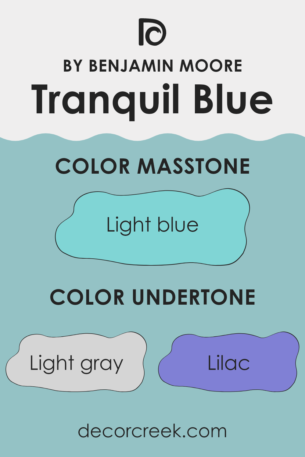
Tranquil Blue is a subtle and adaptable shade from Benjamin Moore, influenced by a variety of undertones that affect how it is perceived in different settings. Undertones are secondary colors that enhance the primary color tone. For instance, Tranquil Blue features undertones of light gray, lilac, mint, and more. Each undertone can subtly shift the color’s appearance depending on lighting and surrounding elements.
Light gray adds a neutral softness, making the blue less intense and easier on the eyes. Lilac and light purple lend a slight warmth to the color, which can make the area feel more inviting. In contrast, mint and light turquoise bring a refreshing vibrancy, making the blue appear fresher and crisper. This means in a brightly lit room, Tranquil Blue might seem more lively due to these greener undertones.
When applied to interior walls, these undertones play an important role. In natural light, the paint may lean towards its cooler mint or turquoise undertones, giving the room a fresh feel. However, under artificial lighting, the warmer lilac or pale pink may become more noticeable, offering a cozy atmosphere.
This chameleon-like quality makes Tranquil Blue a flexible choice for various rooms, adapting its mood to the existing decor and lighting conditions. Overall, understanding and considering these undertones can help in achieving the desired effect and mood when choosing this paint for different interiors.
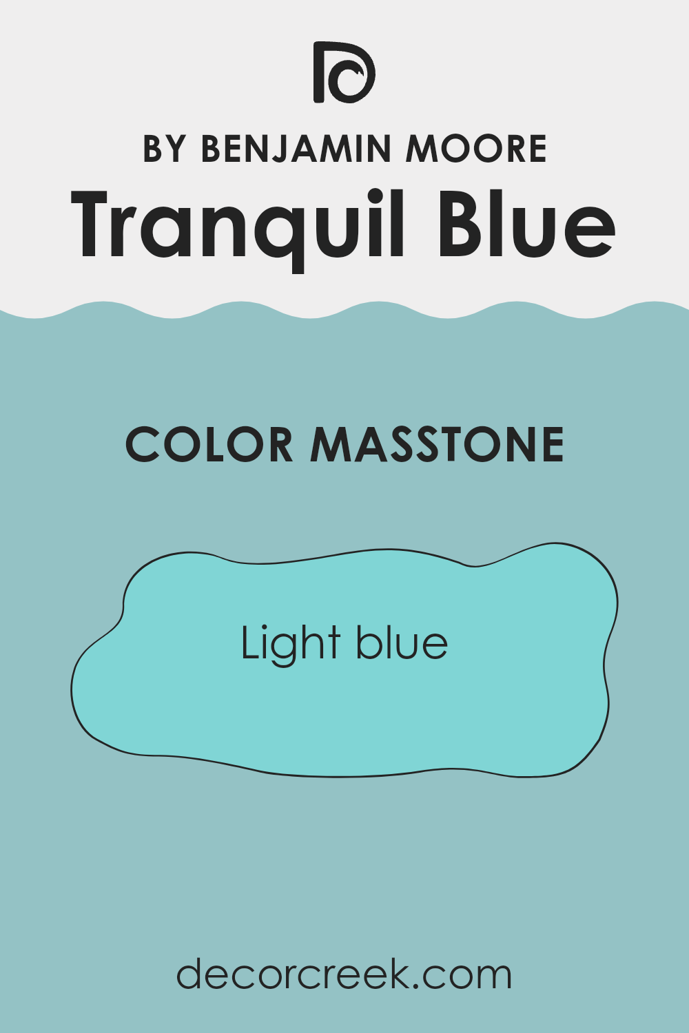
What is the Masstone of the Tranquil Blue 2051-50 by Benjamin Moore?
Tranquil Blue 2051-50 by Benjamin Moore, showing a light blue shade (#80D5D5), is a delightful choice for home interiors. This gentle color creates a clean and inviting atmosphere in any room.
Its light blue tone has a cooling effect, making it perfect for areas like the living room or bedroom where a calm and peaceful mood is desired. This color also helps make smaller areas appear larger and more open because of its ability to reflect light.
It pairs beautifully with white trimmings or furniture, bringing a fresh and airy feel to the décor. Furthermore, the subtleness of Tranquil Blue allows it to fit well with various styles, whether you aim for a modern look or prefer something more traditional. It’s adaptable and gentle, offering a simple yet effective way to brighten up interiors without making them feel too strong with color.
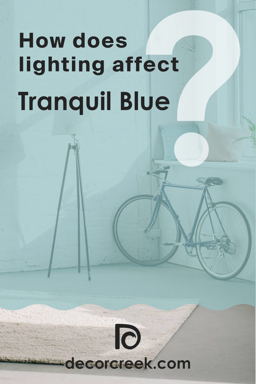
How Does Lighting Affect Tranquil Blue 2051-50 by Benjamin Moore?
Lighting plays a crucial role in how we perceive colors in any area. A shade like Tranquil Blue 2051-50 from Benjamin Moore can appear differently depending on the type and direction of light it receives. This variation can significantly influence the mood and character of a room.
In natural light, Tranquil Blue tends to look brighter and more lively, especially in south-facing rooms where sunlight is abundant throughout the day. The color can show a refreshing and uplifting quality in such conditions, making the room feel airy and pleasant. In contrast, north-facing rooms receive less direct sunlight, which can make the same Tranquil Blue appear slightly more subdued and cooler. This gives the room a calmer and more relaxed mood.
Artificial light, whether warm yellow or cool white, also changes how Tranquil Blue appears. Warmer lighting can soften the blue, making it look more gentle and soothing—perfect for rooms like the living room or bedroom where a restful feeling is preferred. Cooler lighting, on the other hand, enhances the blue tones, giving the shade a sharper and more vivid look, which suits functional areas like a kitchen or home office.
The look of Tranquil Blue also shifts throughout the day in east- and west-facing rooms. In east-facing rooms, morning light can make the color look bright and cheerful, while in the afternoon, it may appear softer as daylight fades. In west-facing rooms, the color might seem cooler in the morning but become richer and warmer in the evening as it catches the golden tones of the setting sun.
Understanding how light affects color helps in choosing the right room orientation and lighting type for shades like Tranquil Blue, ensuring the color always appears at its best throughout the day.
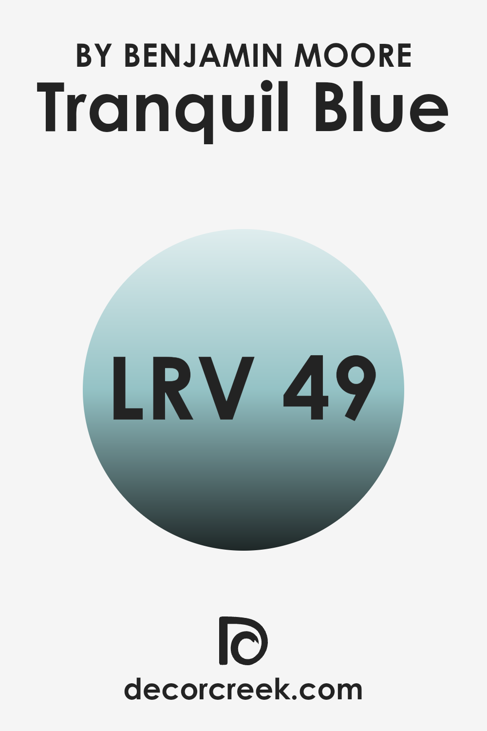
What is the LRV of Tranquil Blue 2051-50 by Benjamin Moore?
LRV stands for Light Reflectance Value, which measures how much light a paint color reflects back into a room versus how much it absorbs. This value is shown on a scale from 1 to 99, where a higher number means the color reflects more light. LRV is an important factor to consider when selecting paint because it can strongly influence the mood and brightness of a room.
A color with a high LRV will make an area feel more open and airy, while a lower LRV can make it feel cozier and more intimate since it absorbs more light. The LRV of Tranquil Blue is 48.8, placing it in the middle range of the scale.
This means it doesn’t reflect or absorb light excessively, making it adaptable for various settings and lighting conditions. In well-lit areas, Tranquil Blue will appear lighter and help maintain a feeling of openness. In dimmer rooms, this shade may look more muted, providing a calming effect without making the room feel too dark.
Overall, it’s a balanced choice for those wanting a mix of brightness and gentle character in their color palette.
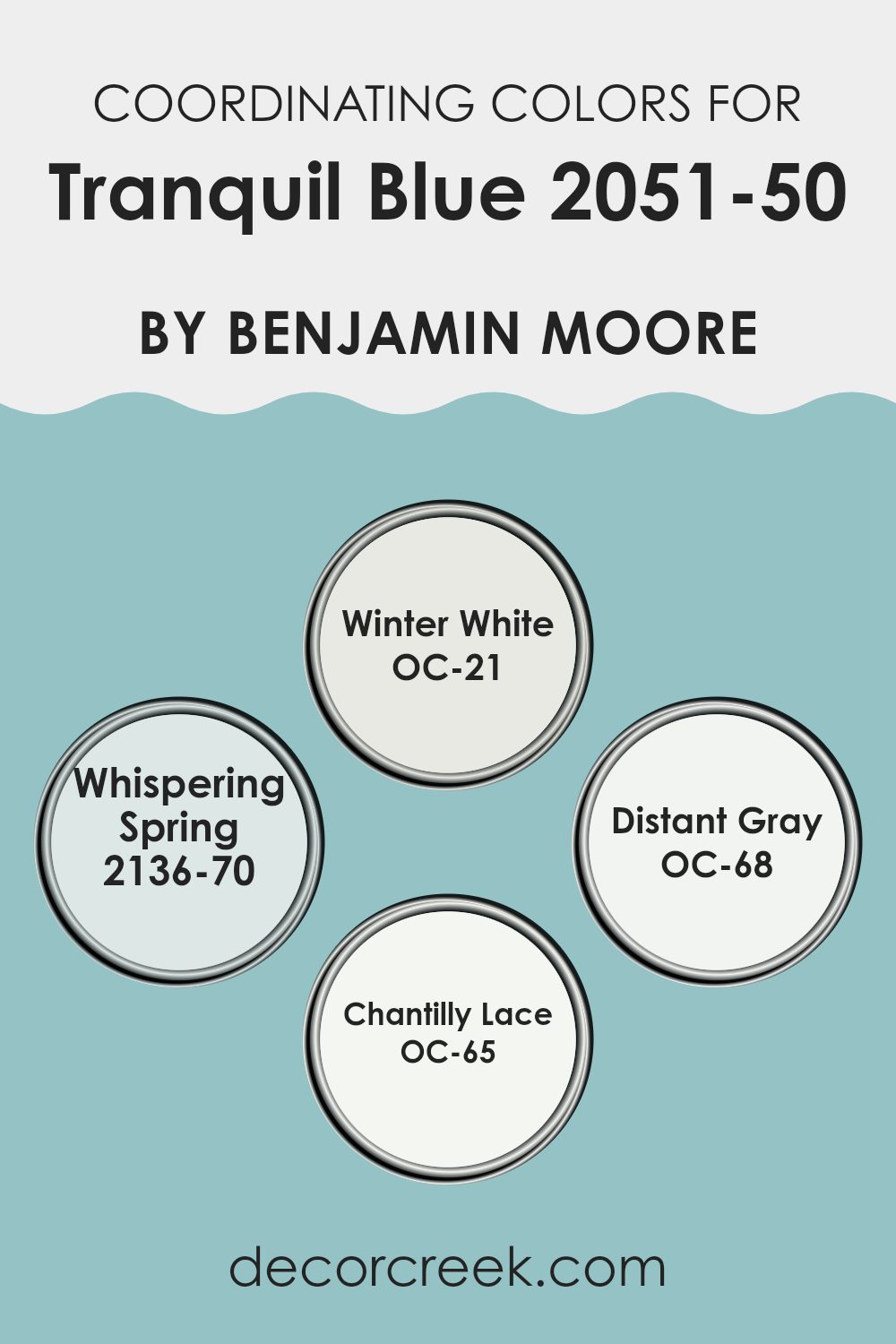
Coordinating Colors of Tranquil Blue 2051-50 by Benjamin Moore
Coordinating colors work with a main color to create stylish and harmonious color schemes for your room. For instance, if your primary paint choice is a subtle shade similar to Benjamin Moore’s Tranquil Blue, selecting coordinating colors like OC-21 Winter White, 2136-70 Whispering Spring, OC-68 Distant Gray, and OC-65 Chantilly Lace can enhance the overall aesthetic without competing for attention.
These coordinated tones can be used in different ways, such as on trim, doors, accent walls, or even furniture, to support the dominant hue and create a cohesive appearance. OC-21 Winter White is a soft, creamy white that offers a gentle contrast to stronger hues. It brightens a room effectively without creating a harsh difference.
2136-70 Whispering Spring is a delicate light blue with a touch of lavender, adding a subtle breath of color that complements a cooler primary tone like blue. OC-68 Distant Gray is a clean, pale gray that works beautifully as a neutral base, helping other colors stand out softly. Lastly, OC-65 Chantilly Lace is another bright white with a slightly crisp tone, ideal for highlighting features or details in a room so they don’t fade into the background. By combining these shades, you create a smooth color flow that adds depth and personality to your interior.
You can see recommended paint colors below:
- OC-21 Winter White
- 2136-70 Whispering Spring
- OC-68 Distant Gray
- OC-65 Chantilly Lace
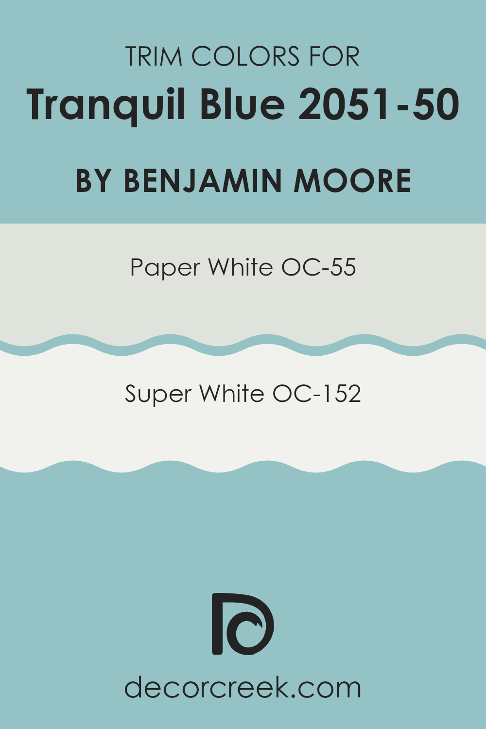
What are the Trim colors of Tranquil Blue 2051-50 by Benjamin Moore?
Trim colors are chosen to complement the main color of a wall or exterior by providing a crisp, clean border or accent. These carefully selected shades highlight architectural details, door frames, and windowsills, making them stand out against the primary tone.
For a color like Tranquil Blue by Benjamin Moore, selecting the right trim color is essential because it helps define the area and makes the blue stand out without feeling too strong. OC-55 Paper White is a soft, almost airy white that provides a gentle contrast without clashing.
It pairs beautifully with Tranquil Blue, subtly supporting the color while letting it remain the focus. OC-152 Super White, on the other hand, offers a brighter, more pronounced highlight for the blue walls, creating a sharper and more defined boundary that draws attention to the architecture or decorative features of a room. Both shades are excellent choices because they enhance the beauty of the wall color while adding to a fresh and welcoming feel.
You can see recommended paint colors below:
- OC-55 Paper White
- OC-152 Super White
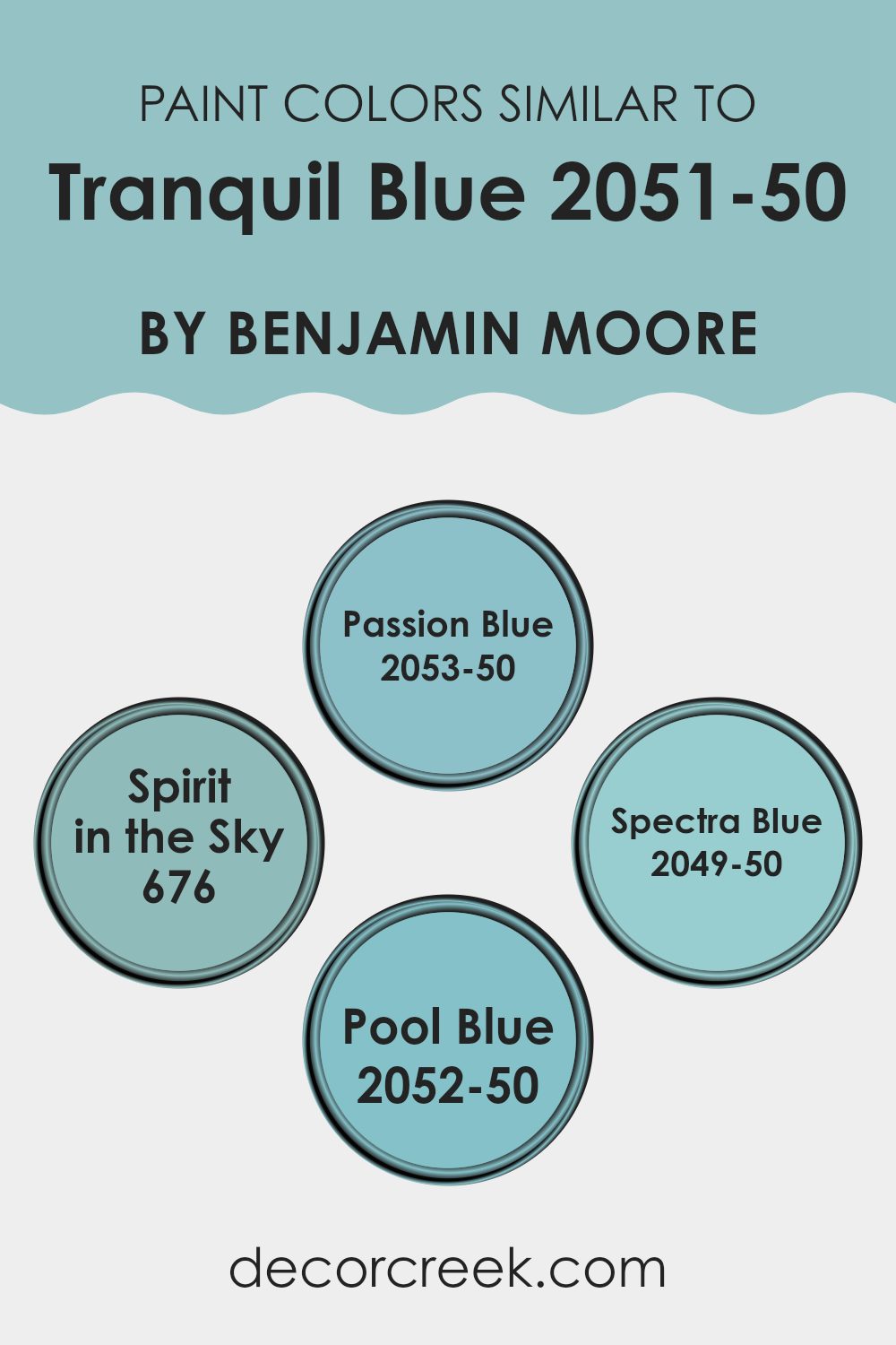
Colors Similar to Tranquil Blue 2051-50 by Benjamin Moore
Similar colors are important in design because they help create a unified and balanced look in any area, whether it’s a home, office, or public setting. When hues are closely related on the color wheel, they blend naturally when used together, offering a subtle and soothing visual experience.
For example, Tranquil Blue by Benjamin Moore pairs beautifully with shades like Passion Blue, Spirit in the Sky, Spectra Blue, and Pool Blue. These tones share a common base but vary slightly in depth and brightness, allowing them to complement each other while enhancing the overall design without being too strong.
Passion Blue is a lively hue that brings a refreshing energy to its surroundings, making it a great choice for brightening an interior. Spirit in the Sky offers a lighter, more airy touch, ideal for creating a relaxed and calm atmosphere. In contrast, Spectra Blue has a deeper richness that adds definition and character to an area, giving it more depth and sophistication.
Pool Blue, with its fresh and clear quality, makes any room feel open and inviting. Using these similar shades together results in a pleasant visual harmony, filling the interior with a balanced and welcoming color flow.
You can see recommended paint colors below:
- 2053-50 Passion Blue
- 676 Spirit in the Sky
- 2049-50 Spectra Blue
- 2052-50 Pool Blue
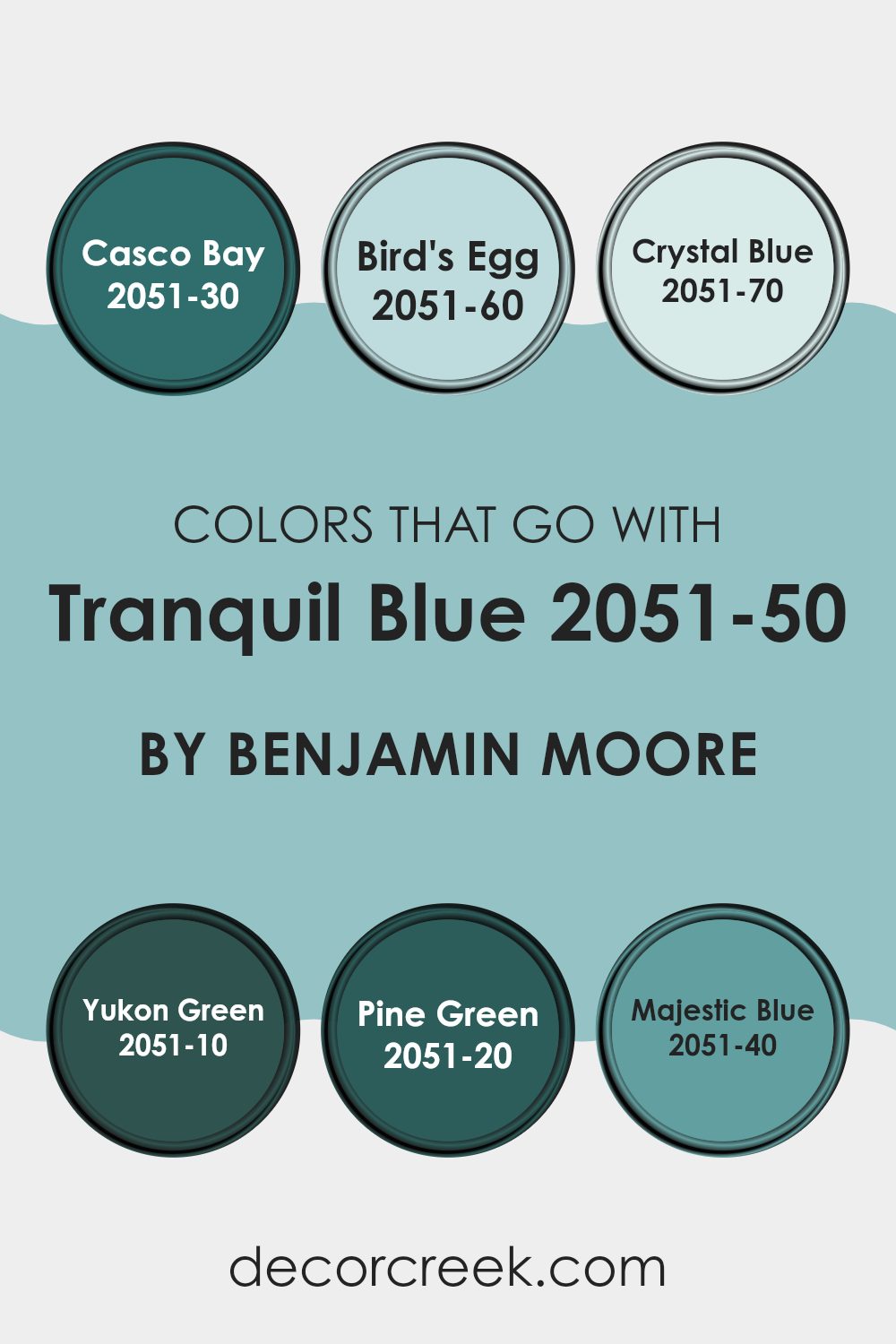
Colors that Go With Tranquil Blue 2051-50 by Benjamin Moore
Choosing the right colors to complement Tranquil Blue 2051-50 by Benjamin Moore is crucial because it helps create a cohesive and visually appealing look in any area. Colors that pair well with Tranquil Blue, such as Casco Bay, Bird’s Egg, Crystal Blue, Yukon Green, Pine Green, and Majestic Blue, work together to enhance the overall aesthetic and can set a specific mood or atmosphere in a room.
For example, blending Tranquil Blue with other shades ensures a balanced color scheme that can make interiors feel more inviting and comfortable.
Casco Bay is a deep, rich blue that adds a strong presence when combined with the lighter Tranquil Blue, providing a stunning contrast. Bird’s Egg, on the other hand, is a soft, pale blue that offers a subtle enhancement to the freshness of Tranquil Blue, making it ideal for achieving a relaxed vibe. Crystal Blue is very light, almost airy, bringing a gentle uplift that brightens areas without feeling too strong.
Moving to the greens, Yukon Green introduces a lush, forest-like feel that pairs naturally with Tranquil Blue for a grounding, earthy effect. Pine Green is darker and brings intensity and depth to the palette, perfect for adding a touch of nature-inspired boldness. Lastly, Majestic Blue is a vibrant blue that injects energy and liveliness into the mix, brilliant for creating dynamic and lively areas.
By carefully selecting combinations with these colors, one can easily set the tone for both harmony and style in decorating.
You can see recommended paint colors below:
- 2051-30 Casco Bay
- 2051-60 Bird’s Egg
- 2051-70 Crystal Blue
- 2051-10 Yukon Green
- 2051-20 Pine Green
- 2051-40 Majestic Blue
How to Use Tranquil Blue 2051-50 by Benjamin Moore In Your Home?
Tranquil Blue 2051-50 by Benjamin Moore is a soothing shade of blue that adds a fresh, calm atmosphere to any room. Ideal for creating a relaxing area, this color works well in bedrooms where you want a restful vibe or bathrooms for a spa-like feel.
You can also use it in a home office to help maintain a calm, focused environment. This blue pairs beautifully with white trim and can be matched with light woods for a breezy, airy look, or darker furniture for a more grounded feel.
If you’re afraid of committing to a full room of blue, consider using it as an accent wall or on cabinetry for a subtle pop of color. Accessories like cushions, rugs, and curtains in this shade can tie a room together without feeling too strong. Overall, Tranquil Blue is an adaptable choice that can easily freshen up your living area.
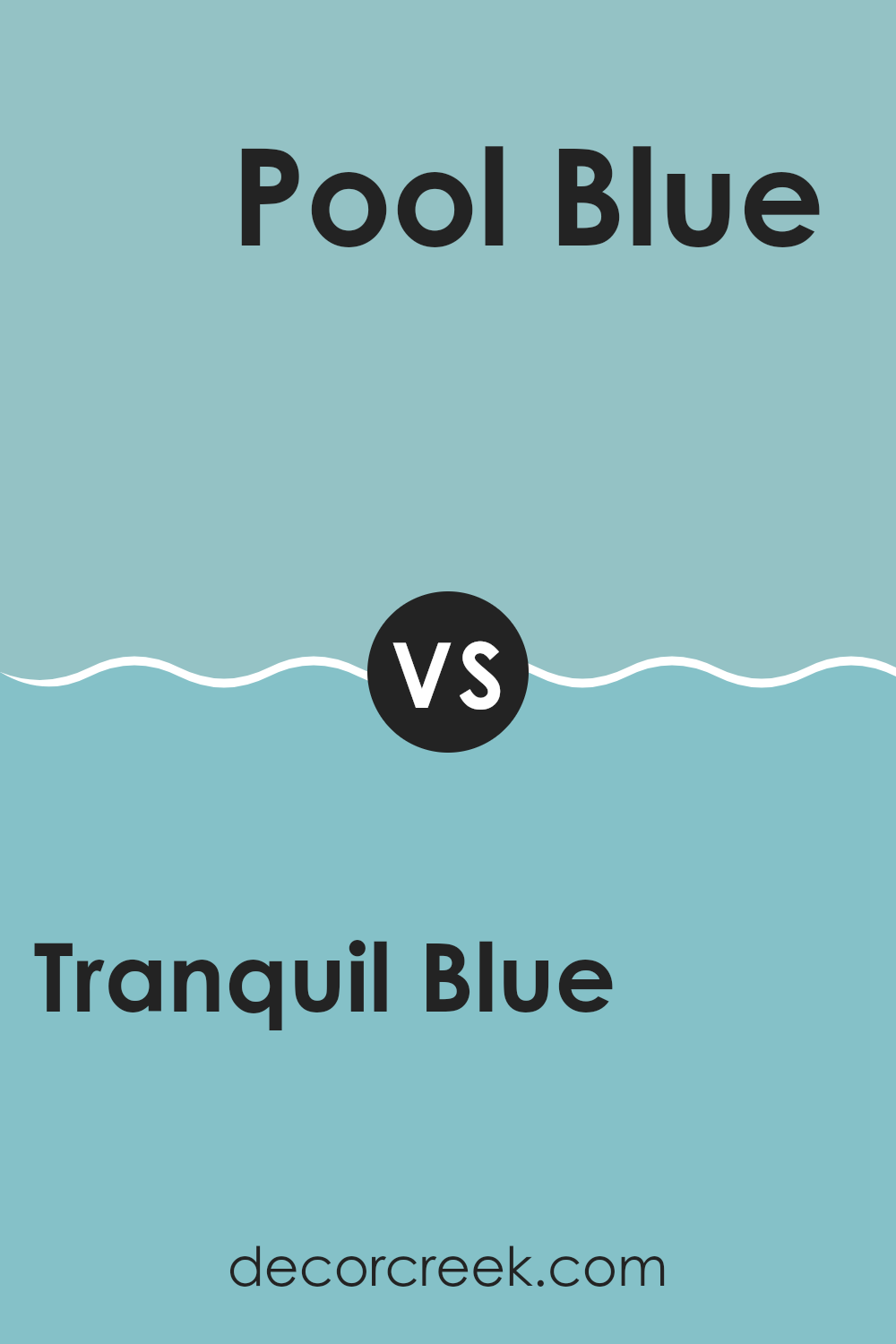
Tranquil Blue 2051-50 by Benjamin Moore vs Pool Blue 2052-50 by Benjamin Moore
The colors Tranquil Blue and Pool Blue by Benjamin Moore are both soothing and refreshing, yet they offer subtly different moods. Tranquil Blue is a soft, airy blue with a hint of gray, giving it a gentle and calming quality that makes it perfect for creating a peaceful area. It tends to bring a light, open feel to rooms and works well in places meant for relaxation.
On the other hand, Pool Blue is brighter and more vibrant. This shade has a clearer, more energetic blue that captures the refreshing qualities of a swimming pool. It’s great for adding a lively and cheerful touch to any room, making it ideal for more playful or active settings.
Both colors have their unique charm and can greatly influence a room’s atmosphere. Tranquil Blue is more subdued and quiet, while Pool Blue adds movement and vivid energy.
You can see recommended paint color below:
- 2052-50 Pool Blue
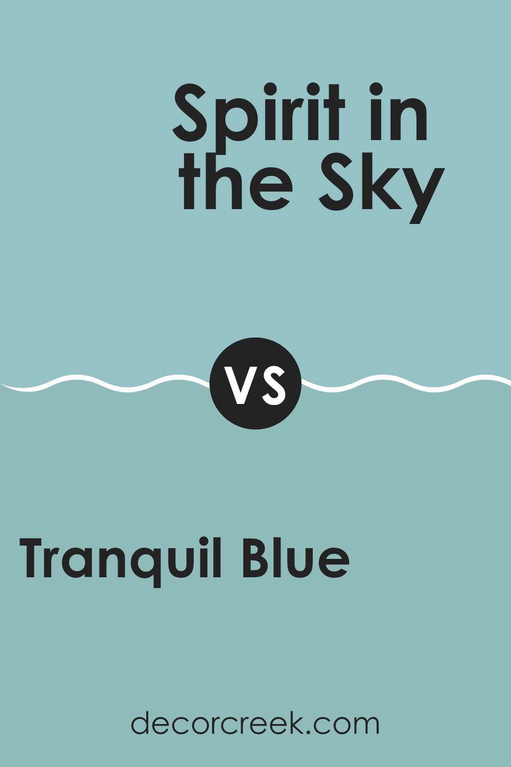
Tranquil Blue 2051-50 by Benjamin Moore vs Spirit in the Sky 676 by Benjamin Moore
Tranquil Blue and Spirit in the Sky are two paint colors by Benjamin Moore that offer distinct tones for different moods and areas. Tranquil Blue is a soft, pastel blue with a gentle, soothing presence—like the calm of a clear morning sky. It’s ideal for creating a relaxed atmosphere in rooms such as bedrooms or bathrooms.
In contrast, Spirit in the Sky is a brighter and more vivid blue. This shade feels energetic and expressive, resembling the vibrant blue of a sunny afternoon sky. It’s a great option for an area where you want a cheerful, uplifting vibe.
While both share a blue foundation, Tranquil Blue leans toward a muted, peaceful tone, while Spirit in the Sky brings a livelier, more dynamic energy. Depending on your room’s purpose and the mood you wish to set, you can opt for the soothing calm of Tranquil Blue or the spirited brightness of Spirit in the Sky.
You can see recommended paint color below:
- 676 Spirit in the Sky
Tranquil Blue 2051-50 by Benjamin Moore vs Passion Blue 2053-50 by Benjamin Moore
Tranquil Blue and Passion Blue, both by Benjamin Moore, are unique in their shades and the feel they give to an area. Tranquil Blue is a soft, light blue that brings a peaceful and calm ambiance to any room.
It’s like looking up at a clear sky on a sunny day, giving off a refreshing and calm vibe. On the other hand, Passion Blue is a bit darker and leans towards a more vibrant and energetic blue. It’s similar to the color of the ocean on a bright day, making any area feel lively and full of energy.
If you want a room to have a relaxed and airy feel, Tranquil Blue is a great choice. For a room where you want more dynamism or a cheerful burst, Passion Blue would be better. Both colors offer a way to brighten up an area but in slightly different emotional tones.
You can see recommended paint color below:
- 2053-50 Passion Blue
Tranquil Blue 2051-50 by Benjamin Moore vs Spectra Blue 2049-50 by Benjamin Moore
Tranquil Blue and Spectra Blue by Benjamin Moore are two distinct shades that each bring their own unique vibe. Tranquil Blue is a light, airy blue with soft, calming qualities, making it perfect for creating a peaceful and refreshing area. It’s subtle enough not to overpower a room and works well in areas meant for relaxation, like bedrooms or bathrooms.
On the other hand, Spectra Blue is a deeper, more vibrant shade. It packs more of a punch and is great for adding a bold splash of color to any room. This makes it a good choice for places where you want more energy and vitality, such as kitchens or entertaining areas.
Both colors offer a clean, crisp look, but the choice between them depends on what kind of mood you want to set. Tranquil Blue is more about softness and light, while Spectra Blue is about depth and energy.
You can see recommended paint color below:
- 2049-50 Spectra Blue
Choosing the right paint color for your room can be really fun but also pretty tricky. I just read about a color called 2051-50 Tranquil Blue by Benjamin Moore, and it’s a really nice shade that might be perfect for someone looking to make their room feel calm and happy. This color kind of reminds you of a clear sky on a sunny day.
I learned that Tranquil Blue is not too bright, but also not too dull, making it a great choice for almost any room—whether it’s your bedroom or even the kitchen. It’s a color that makes you feel relaxed, like when you’re sitting by the lake and looking out at the water.
Using this color seems like a wonderful idea because it goes well with lots of different tones for decorations and furniture. You could use white or gray, or even some fun colors like yellow or green, and they’d all look great with it.
To sum it up, Benjamin Moore’s 2051-50 Tranquil Blue sounds like an excellent pick for anyone wanting to refresh their room without making things too bold or flashy. It’s like choosing the perfect background for a beautiful picture—it makes everything else stand out in just the right way.
Ever wished paint sampling was as easy as sticking a sticker? Guess what? Now it is! Discover Samplize's unique Peel & Stick samples.
Get paint samples

