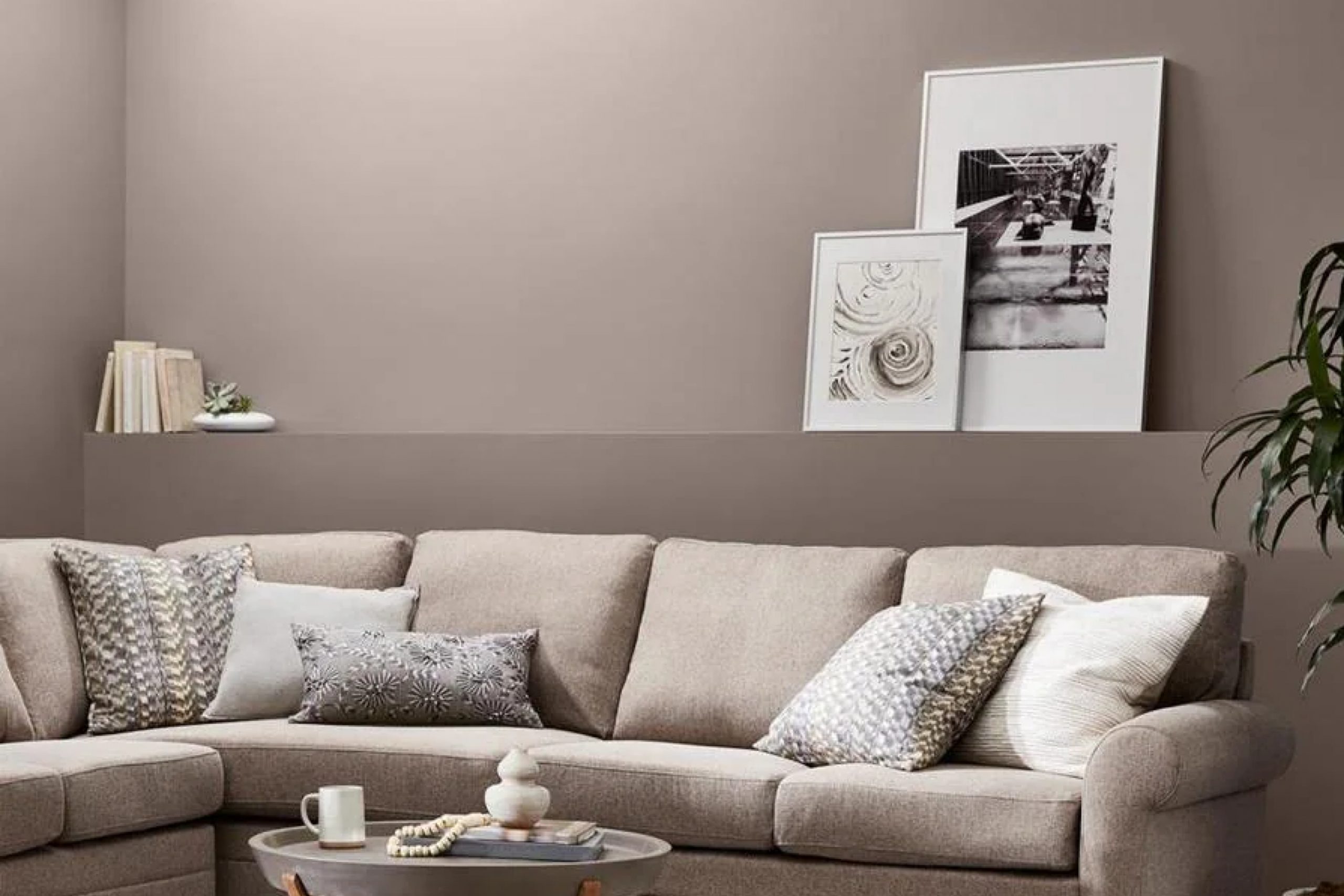
When I first came across SW 6038 Truly Taupe by Sherwin Williams, I found a shade that exudes warmth and elegance in a surprisingly subtle way. It’s a color that seems to sit comfortably between gray and brown, making it incredibly versatile for various spaces.
I noticed how its understated appeal adds a touch of sophistication to any room. Whether I’m updating a living room, refreshing a bedroom, or even sprucing up an office space, Truly Taupe offers a gentle grounding effect without overpowering the other elements in the room.
I appreciate how this color works effortlessly with different styles and palettes. For those who, like me, often change decor accessories or furniture, this shade offers a flexible backdrop that complements everything from vibrant accents to more muted tones.
It also pairs beautifully with natural materials like wood and linen, enhancing a sense of coziness and comfort.
In my experience, SW 6038 Truly Taupe is more than just a neutral. It acts as a friendly support for other design choices, assisting me in creating spaces that feel balanced and inviting.
Whenever I apply it as a wall color or an accent feature, it brings a calm yet modern vibe into the room, making it an ideal choice for almost any setting.
What Color Is Truly Taupe SW 6038 by Sherwin Williams?
Truly Taupe by Sherwin Williams is a warm, earthy neutral color. It has a balance of grey and brown undertones, making it versatile and easy to match with a variety of styles. This color works especially well in traditional, rustic, or transitional interiors.
In a traditional setting, it adds a sense of warmth and comfort. It enhances rustic decor by highlighting natural wood tones and adding to the cozy atmosphere. In a transitional style, it provides a neutral backdrop that allows for mixing modern and classic elements seamlessly.
Truly Taupe pairs wonderfully with natural materials and textures. Think of pairing it with rich, wooden furniture, which brings out its earthy tones. Textiles like wool and linen complement this color beautifully, adding softness and interest to any room.
Metal accents in bronze or copper can also enhance the warmth of Truly Taupe and provide an appealing contrast.
For contrast, consider accents of creamy whites or soft pastels, which can lighten the space and add freshness. This color also works well with darker colors like navy or deep green to create a striking look. Overall, Truly Taupe is a versatile choice that brings warmth and comfort to a variety of interior spaces.
Is Truly Taupe SW 6038 by Sherwin Williams Warm or Cool color?
Truly Taupe SW 6038 by Sherwin Williams is a versatile color that can work well in many homes. It is a warm neutral shade, which means it can pair nicely with a variety of other colors. This taupe has a subtle balance of gray and beige tones, making it a popular choice for those who want a cozy yet modern look.
In living rooms, Truly Taupe can create a welcoming and comforting atmosphere. It’s perfect for bedrooms, as it provides a calm environment for relaxation.
This color works great as a backdrop because it complements both light and dark furnishings. In spaces with lots of natural light, it can highlight the warmth of the room. Meanwhile, in areas with less light, it doesn’t feel too dark or heavy.
Truly Taupe’s adaptability allows it to suit different decors, from traditional to contemporary, making it a reliable choice for homeowners.
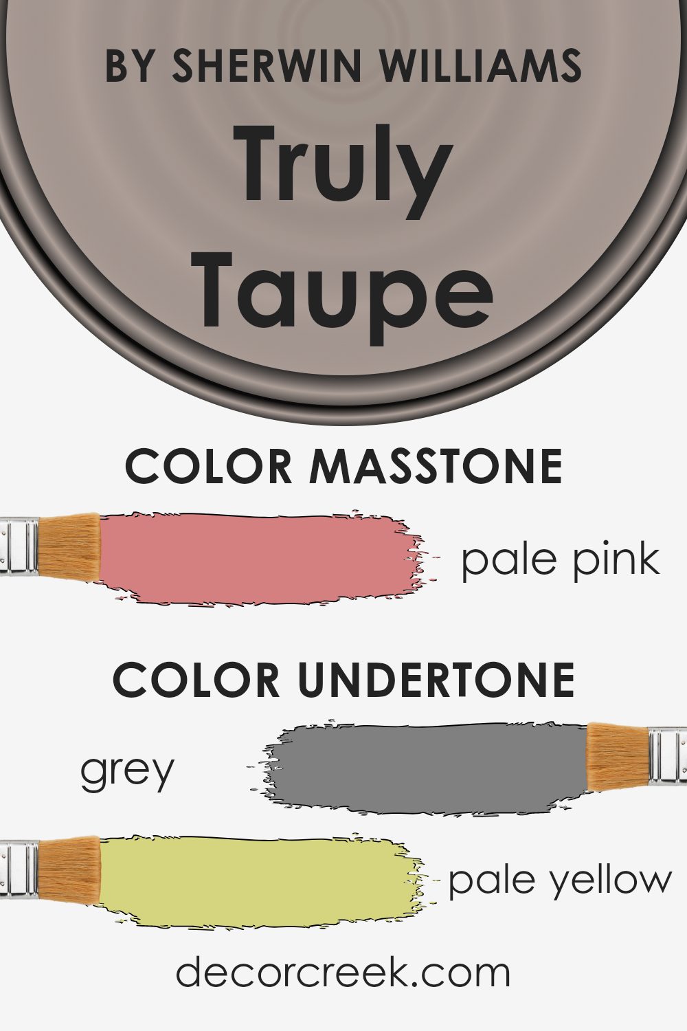
Undertones of Truly Taupe SW 6038 by Sherwin Williams
Truly Taupe by Sherwin Williams is a versatile color with rich undertones that affect its appearance. This taupe, SW 6038, is made complex by subtle hints of colors like grey, pale yellow, mint, light purple, and light gray. These undertones add depth and variation, making the color a wonderful neutral choice for interior walls.
The grey undertone provides a neutral base, making the shade appear calm and balanced. Pale yellow and light green touch it with warmth, creating a cozy and inviting feel.
Light purple and lilac undertones introduce a hint of coolness, which can give a room a soft, soothing vibe. The light blue and mint accents lend a refreshing note, while the olive and brown bring a grounded, earthy feel.
When applied to interior walls, Truly Taupe can change subtly with different lighting conditions.
In natural daylight, it might lean more towards a warm hue due to the yellow and pale green undertones. In artificial or cooler light, the gray and purple undertones become more apparent, giving the room a cooler appearance. This color provides a versatile backdrop, it complements a wide range of furnishings and decor styles, allowing for a cohesive and harmonious interior design.
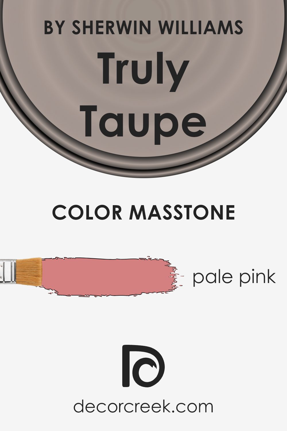
What is the Masstone of the Truly Taupe SW 6038 by Sherwin Williams?
Truly Taupe by Sherwin Williams is a versatile paint color with a soft and subtle hue. Its masstone—pale pink—gives it a unique warmth that can influence how the color looks in different spaces. In a home, this pink undertone adds a touch of warmth and comfort, making rooms feel inviting and cozy. Whether it’s a living room, bedroom, or even a kitchen, Truly Taupe can create a welcoming atmosphere.
The pale pink undertone plays well with natural light, often shifting slightly depending on the time of day, which adds dimension and interest to the walls. In bright daylight, the color can seem more vibrant, while in the evening, it takes on a softer, more muted appearance.
This makes it an excellent choice for creating a space that feels both fresh and relaxed. Pairing it with neutral or complementary colors can enhance its warmth and help tie a room together harmoniously.
How Does Lighting Affect Truly Taupe SW 6038 by Sherwin Williams?
Lighting plays a crucial role in how we perceive colors. The same color can look very different under various lighting conditions. Let’s consider the color Truly Taupe (SW 6038) by Sherwin Williams. This is a warm, neutral shade that can appear different depending on the light source and direction.
In natural sunlight, colors appear more vivid and true to their base tones. In artificial lighting, such as LED or incandescent lights, colors can look warmer or cooler based on the bulb’s color temperature.
Truly Taupe, with its warm undertone, may appear slightly warmer under incandescent lights, which often give off a yellowish hue. Under cool LED lights, it might look more muted or grayish.
The orientation of a room also changes how colors look. In north-facing rooms, where light tends to be cooler and more consistent throughout the day, Truly Taupe might appear a bit grayer or subdued. This is because north light has less direct sunlight and often a blue tint, influencing the warm tones of Truly Taupe to tone down.
In south-facing rooms, which receive warm, bright light all day, Truly Taupe would show its warmth more clearly. The color might look more vibrant and inviting because of the warm sunlight enhancing its underlying tones.
In east-facing rooms, the light is brightest in the morning. Truly Taupe will look warmer and more inviting in the morning light when it is more direct and potentially softer in the afternoon as the light becomes more diffuse.
West-facing rooms receive the most light in the late afternoon and evening. In the morning, Truly Taupe might seem a bit muted, but as the afternoon light intensifies, the color can look richer and more dynamic.
The appearance of Truly Taupe can shift subtly with different lighting and room orientations, making it important to test paint samples in various lighting conditions before making a decision.
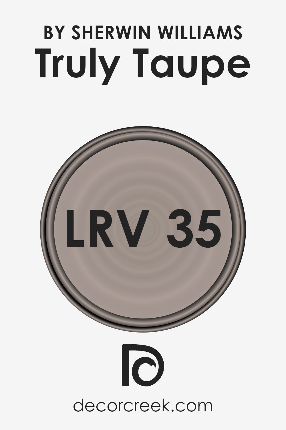
What is the LRV of Truly Taupe SW 6038 by Sherwin Williams?
LRV stands for Light Reflectance Value, which is a measure of how much light a paint color reflects or absorbs. The scale ranges from 0, which means the color absorbs all light and is completely black, to 100, which reflects all light and is pure white.
The LRV gives you an idea of how dark or light a color will appear on your walls. A lower LRV indicates a darker color that absorbs more light, making rooms feel cozier but possibly smaller.
Higher LRVs suggest lighter colors that reflect more light, which can make spaces feel larger and more open.
For the color Truly Taupe from Sherwin Williams, which has an LRV of 35.462, the color is in the mid-range on the scale.
This means it leans towards the darker side, but not excessively so. It will absorb a decent amount of light, providing a warm and snug atmosphere in a room. While it won’t make the room feel too small, it also won’t reflect as much light as lighter colors, so it won’t significantly brighten up a space either.
This balance of light absorption and reflection makes the color versatile, suitable for various rooms depending on the desired feel and lighting.
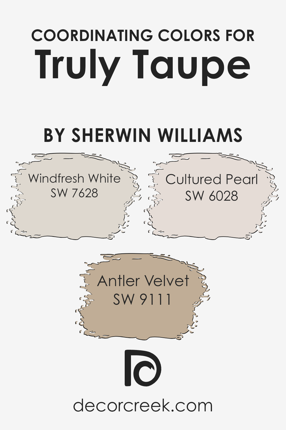
Coordinating Colors of Truly Taupe SW 6038 by Sherwin Williams
Coordinating colors are hues that complement each other when used together, creating a balanced and pleasing look. They work by sharing similar tones, whether through contrasting or harmonizing shades, to create a cohesive visual flow.
Truly Taupe by Sherwin Williams is a versatile neutral that pairs beautifully with a variety of colors. To enhance Truly Taupe, consider using Windfresh White, Antler Velvet, and Cultured Pearl as coordinating colors.
Windfresh White is a soft, airy white that brings a sense of lightness and openness, perfect for making spaces feel larger and brighter. Antler Velvet, on the other hand, is a warm, earthy brown that provides a cozy and grounded feel, complementing the taupe with its rich undertones.
Cultured Pearl is a delicate shade of light pink that adds a gentle touch of warmth, ensuring the palette feels inviting and comfortable.
When these colors are paired with Truly Taupe, they come together to create a welcoming and harmonious setting ideal for almost any room in your home. By using this combination, you’ll achieve an overall look that feels unified and aesthetically pleasing without overpowering your space.
You can see recommended paint colors below:
- SW 7628 Windfresh White
- SW 9111 Antler Velvet
- SW 6028 Cultured Pearl
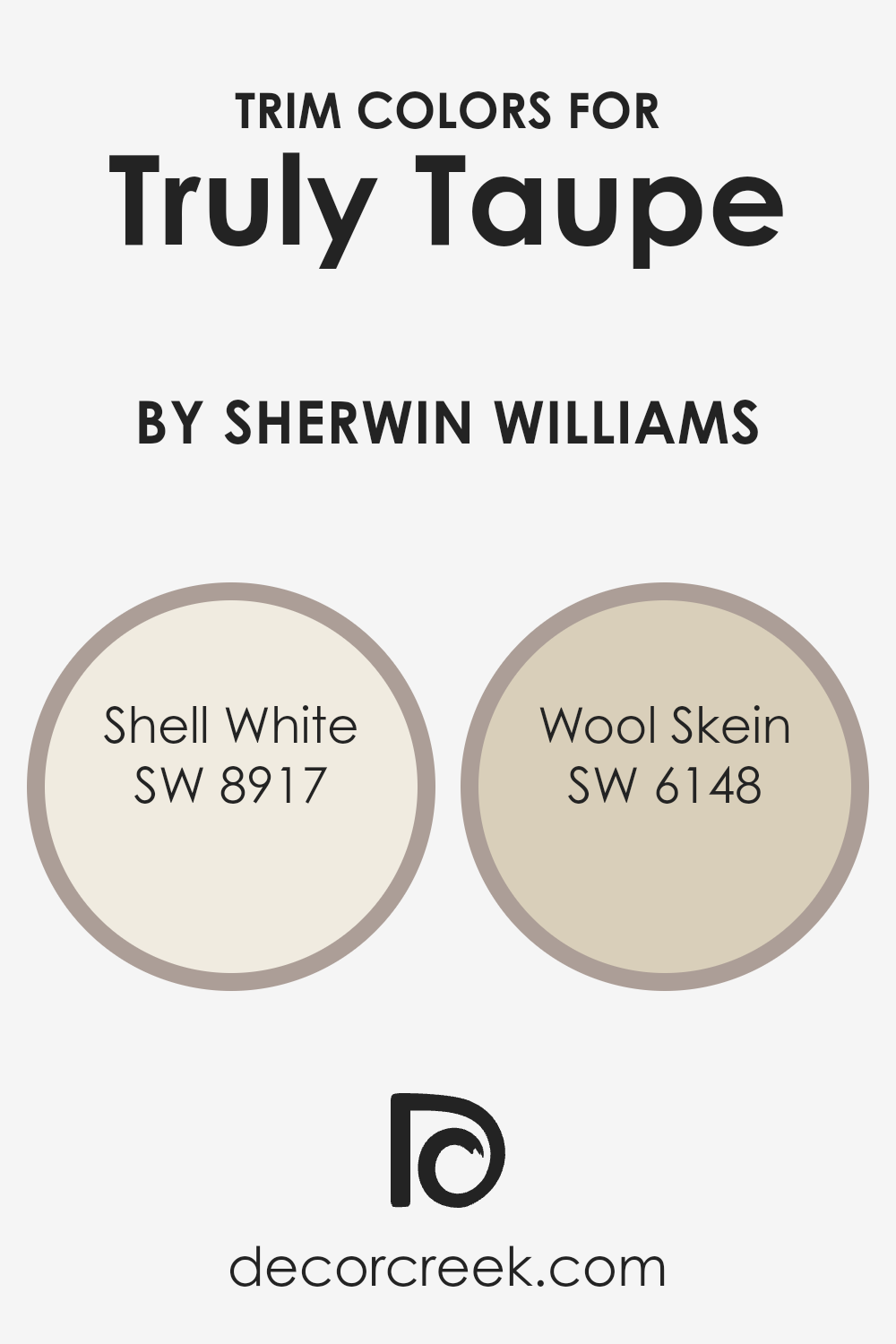
What are the Trim colors of Truly Taupe SW 6038 by Sherwin Williams?
Trim colors are the finishes applied to areas like baseboards, window frames, and door trim that complement or contrast with the main wall color, adding depth and character to a room. For Truly Taupe by Sherwin Williams, trim colors are essential because they define the boundaries and highlight architectural details, making the taupe walls stand out even more.
A good trim color can enhance the overall appearance and mood of the room, creating a cohesive design. Choosing the right trim color helps in balancing the room’s color scheme and ensuring that the main color is well-supported, allowing its warmth and subtle nuances to shine.
Shell White (SW 8917) is a soft, off-white with a hint of warmth, offering a clean and fresh look. It can create a bright contrast against the muted tones of Truly Taupe, helping to lighten the space.
Wool Skein (SW 6148) is a versatile, neutral hue with a gentle earthy tone that complements the taupe effortlessly.
It adds warmth without overpowering, creating a cozy and inviting atmosphere. Both these trim colors can highlight features and provide a polished finish to any room using Truly Taupe as the main color.
You can see recommended paint colors below:
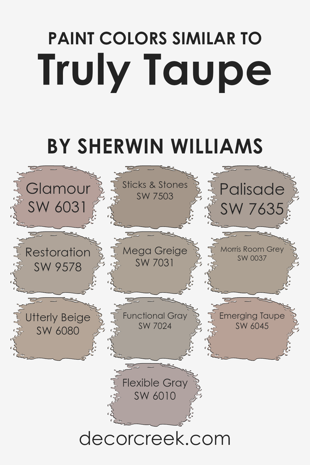
Colors Similar to Truly Taupe SW 6038 by Sherwin Williams
Similar colors play a crucial role in design and decoration as they help create a harmonious and cohesive atmosphere in a space. When colors are close in hue, like those similar to Truly Taupe, they provide a subtle and seamless transition between different elements of a room.
This collection of hues comes together to offer both variety and unity, ensuring that each shade complements the others without overwhelming the senses.
Glamour is a soft, delicate shade that brings a touch of elegance without dominating the space. Restoration offers a comforting, calming presence with its gentle undertones. Utterly Beige adds warmth, making spaces feel inviting and cozy. Flexible Gray serves as a neutral tone, striking the perfect balance between warmth and coolness.
Sticks & Stones brings a natural, earthy quality that grounds a room. Mega Greige enhances depth with its rich, muted tones.
Functional Gray offers a practical, versatile gray that pairs well with various colors. Palisade introduces a subtle depth that enhances dimension in a room. Morris Room Grey brings a classic, timeless appeal with its dignified tone. Emerging Taupe rounds out the palette with its harmonious blend of warmth and subtle gray undertones, making it an excellent background color.
You can see recommended paint colors below:
- SW 6031 Glamour
- SW 9578 Restoration
- SW 6080 Utterly Beige
- SW 6010 Flexible Gray
- SW 7503 Sticks & Stones
- SW 7031 Mega Greige
- SW 7024 Functional Gray
- SW 7635 Palisade
- SW 0037 Morris Room Grey
- SW 6045 Emerging Taupe
Colors that Go With Truly Taupe SW 6038 by Sherwin Williams
Choosing colors that match Truly Taupe SW 6038 from Sherwin Williams can make spaces more inviting and visually pleasing. Truly Taupe is a versatile color that can be paired with several shades to enhance its warmth and earthiness.
For instance, Poised Taupe SW 6039 has a balanced gray-brown tone that complements Truly Taupe by adding depth without overpowering it.
Armadillo SW 9160 is a darker, more muted brown, offering a grounded feel that pairs wonderfully with the lighter presence of Truly Taupe. Temperate Taupe SW 6037 is a soft, warm color that can brighten up the overall palette, creating a sense of harmony and coziness.
Otter SW 6041 brings in a deep richness with its dark brown hue, which pairs beautifully with the soft nature of Truly Taupe, providing a strong contrast.
Angora SW 6036 is paler and lighter, offering a subtle backdrop that accentuates the characteristics of Truly Taupe, making spaces feel airy.
Lastly, Nutshell SW 6040 with its warm, rich tone, introduces a hint of energy that supports the calmness of Truly Taupe, making it stand out.
Together, these colors work in harmony, creating a space that feels interconnected, warm, and cohesive.
You can see recommended paint colors below:
- SW 6039 Poised Taupe
- SW 9160 Armadillo
- SW 6037 Temperate Taupe
- SW 6041 Otter
- SW 6036 Angora
- SW 6040 Nutshell

How to Use Truly Taupe SW 6038 by Sherwin Williams In Your Home?
Truly Taupe SW 6038 by Sherwin Williams is a warm, neutral paint color that can be a great choice for various spaces in your home. Its soft tone makes it perfect for creating a cozy and inviting atmosphere. You can use this color in living rooms to provide a calm backdrop that works well with both modern and traditional furniture.
Pair it with white trim for a clean, crisp look, or use it alongside other warm colors for a more cohesive feel.
In the bedroom, Truly Taupe can help create a restful environment conducive to relaxation. You can complement it with soft bedding and wooden accents to enhance the cozy vibe. This versatile taupe can also work in a home office, where it provides just enough warmth without being distracting.
It’s ideal for those who prefer a neutral palette that still feels modern and stylish.
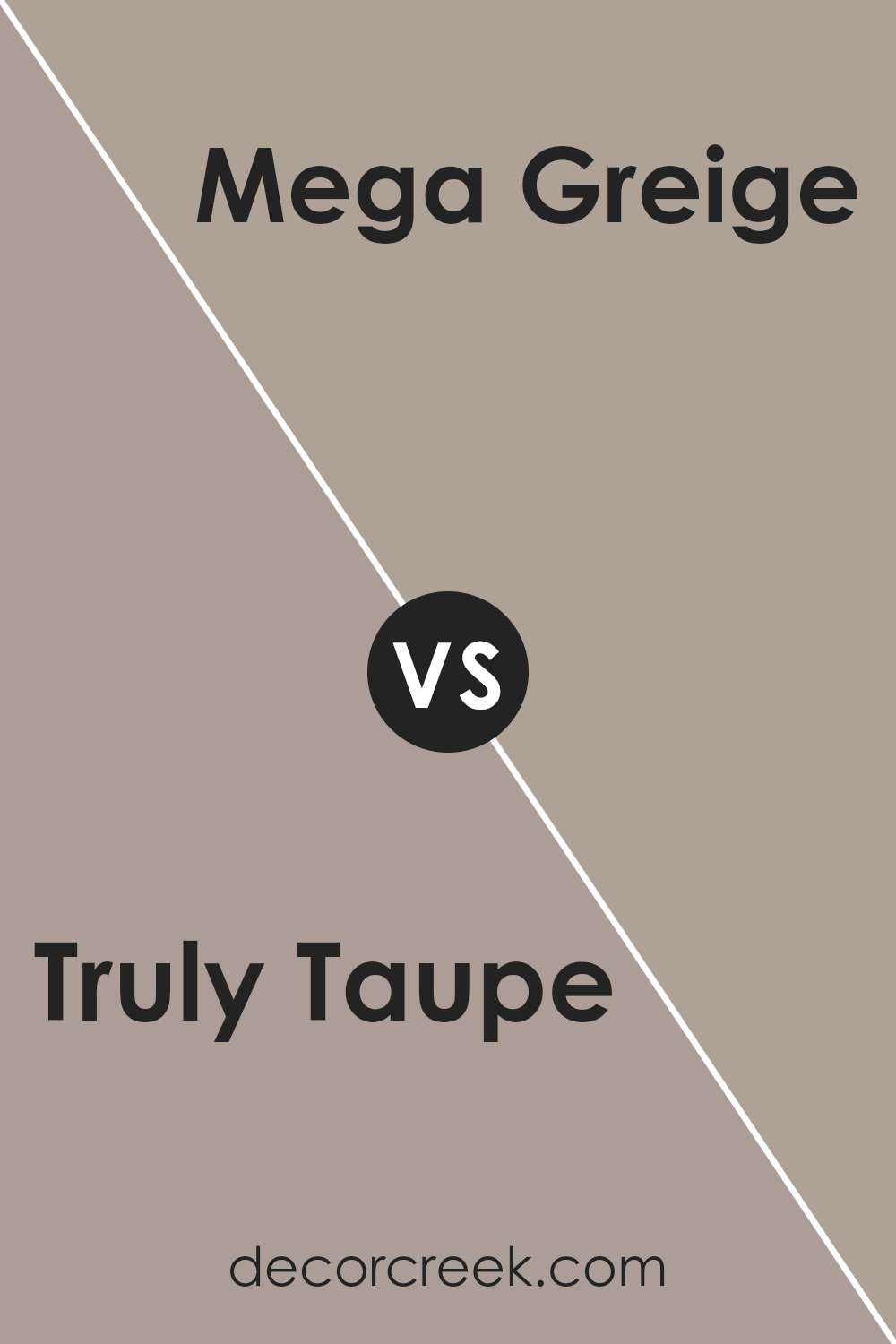
Truly Taupe SW 6038 by Sherwin Williams vs Mega Greige SW 7031 by Sherwin Williams
Truly Taupe SW 6038 is a soft, warm neutral that sits comfortably between grey and brown. It carries a subtle warmth, making it versatile for many spaces. It’s often used to add a cozy yet modern touch to a room. It pairs well with both warm and cool colors, providing a balanced and welcoming atmosphere.
Mega Greige SW 7031, on the other hand, leans more towards a deeper and richer grey tone. It has a slightly cooler undertone compared to Truly Taupe and is ideal for those looking for a more pronounced neutral with a hint of depth. Mega Greige pairs well with crisp whites and other bold colors to create a contrast or complement deeper tones.
Both colors are versatile, but Truly Taupe is better suited for spaces needing warmth, while Mega Greige suits those looking for a more defined neutral that adds depth.
You can see recommended paint color below:
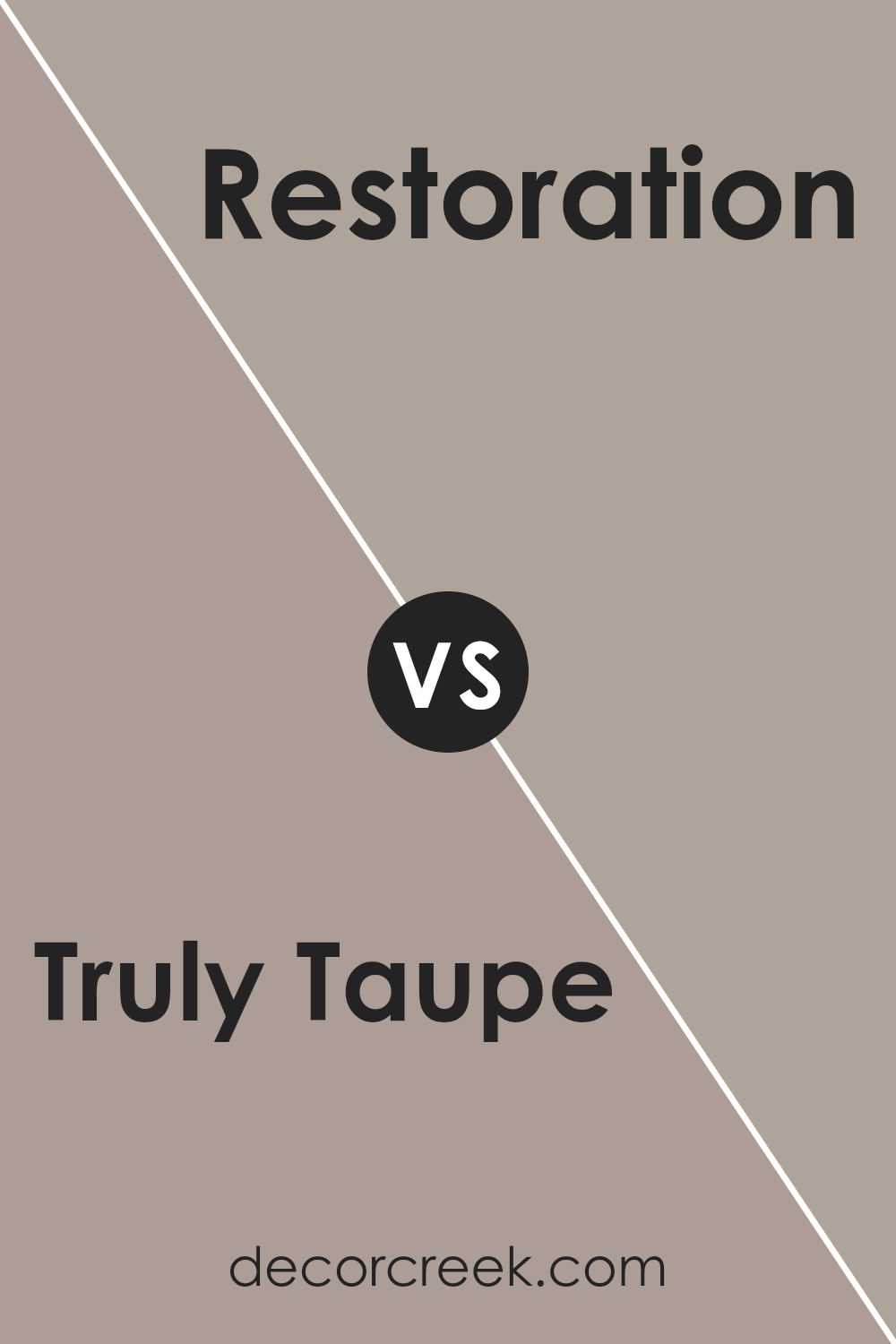
Truly Taupe SW 6038 by Sherwin Williams vs Restoration SW 9578 by Sherwin Williams
Truly Taupe SW 6038 by Sherwin Williams is a soft, warm taupe color. It combines shades of beige and gray, making it versatile for many spaces. It’s a calming, neutral tone that works well in living rooms or bedrooms, creating a cozy and inviting atmosphere.
On the other hand, Restoration SW 9578 is a muted blue-gray. This color offers a cooler, more relaxing vibe, reminiscent of a calm sea or a cloudy sky. It’s perfect for spaces where you want to add a bit of color without it being too bold.
When you compare the two, Truly Taupe brings warmth and coziness, while Restoration offers a cool and peaceful feel. Both are great choices depending on the mood you want in your space. Truly Taupe is earthy and grounding, while Restoration feels airy and soothing. They both complement different styles and preferences.
You can see recommended paint color below:
- SW 9578 Restoration
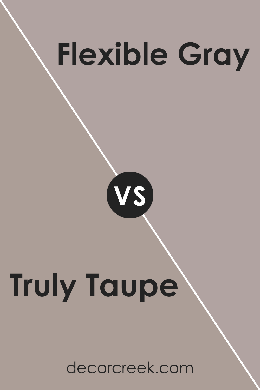
Truly Taupe SW 6038 by Sherwin Williams vs Flexible Gray SW 6010 by Sherwin Williams
Truly Taupe SW 6038 and Flexible Gray SW 6010 are two versatile paint colors by Sherwin Williams. Truly Taupe is a warm, earthy shade with a slight brown undertone, making it a cozy and inviting choice for any room. It pairs well with natural materials like wood and complements a range of other colors.
On the other hand, Flexible Gray is a cooler, neutral gray with subtle hints of both warm and cool undertones. This makes it a great backdrop for modern and minimalist spaces, as it balances well with bolder accent colors.
Both colors are adaptable and can be used throughout a home. Truly Taupe is excellent for creating a welcoming and comfortable space, whereas Flexible Gray offers a more contemporary and clean look. Choosing between them depends on the desired mood and the other colors and materials in your space.
You can see recommended paint color below:
- SW 6010 Flexible Gray
Truly Taupe SW 6038 by Sherwin Williams vs Emerging Taupe SW 6045 by Sherwin Williams
Truly Taupe (SW 6038) and Emerging Taupe (SW 6045) by Sherwin Williams are both warm, earthy colors that belong to the taupe family, but they have distinct differences. Truly Taupe is a medium-toned taupe that offers a mix of brown and gray, giving it a neutral appearance that works well as a versatile backdrop. It provides a cozy and inviting ambiance to a space, ideal for living rooms or bedrooms.
Emerging Taupe, on the other hand, is slightly darker and richer. It leans more towards a brown hue with subtle gray undertones.
This color can add depth and a touch of drama to a room without feeling overwhelming. While both colors can complement a variety of decor styles, Truly Taupe might be chosen for a lighter, airy feel, while Emerging Taupe can be used for a more intimate and bold look. Both colors are suitable for creating a grounded and welcoming environment.
You can see recommended paint color below:
- SW 6045 Emerging Taupe
Truly Taupe SW 6038 by Sherwin Williams vs Utterly Beige SW 6080 by Sherwin Williams
Truly Taupe (SW 6038) and Utterly Beige (SW 6080) are both part of the Sherwin Williams palette, but they offer different vibes. Truly Taupe is a medium-toned brown with a hint of gray, giving it a more muted and understated look. It’s a great choice for creating a comfortable and neutral background in a room.
On the other hand, Utterly Beige is lighter and warmer, carrying more yellow undertones. This shade tends to give spaces a brighter and more inviting feel. While Truly Taupe can add an element of subtle depth due to its cooler undertones, Utterly Beige will naturally make spaces feel sunnier and more open.
When deciding between the two, consider the amount of natural light in your space and the mood you want to create. Truly Taupe is perfect for a cozy, mellow atmosphere, while Utterly Beige suits areas where you want warmth and openness.
You can see recommended paint color below:
Truly Taupe SW 6038 by Sherwin Williams vs Glamour SW 6031 by Sherwin Williams
Truly Taupe SW 6038 and Glamour SW 6031 are both beautiful colors by Sherwin Williams, but they have different vibes. Truly Taupe is a warm, neutral color that gives off a cozy and inviting feel. It’s perfect for living spaces where you want to relax and feel comfortable. It pairs well with both warm and cool colors, making it versatile.
On the other hand, Glamour is a rich, deep shade with a hint of burgundy or plum. It feels bold and dramatic, making it a great choice for accent walls or spaces where you want to make a statement. While Truly Taupe is more subtle and cozy, Glamour adds a luxurious and striking element to a room.
In short, if you’re looking for something calm and neutral, go with Truly Taupe. If you want bold and rich, Glamour is the way to go. Both colors have their unique charm and can enhance your home in different ways.
You can see recommended paint color below:
- SW 6031 Glamour
Truly Taupe SW 6038 by Sherwin Williams vs Palisade SW 7635 by Sherwin Williams
Truly Taupe (SW 6038) and Palisade (SW 7635) by Sherwin Williams are two distinctive colors, each bringing its own charm to a space. Truly Taupe is a warm and inviting shade, often described as a blend of brown and gray. It works well in both modern and traditional settings, adding a cozy and neutral touch without being overpowering.
In contrast, Palisade is a cooler gray with subtle hints of green. This color offers a calm and relaxed vibe, making it a great choice for areas where you want a soothing atmosphere.
It is more understated compared to Truly Taupe, providing a subtle backdrop that pairs nicely with various accent colors.
While Truly Taupe adds warmth and earthiness, Palisade brings a cool, gentle elegance. Choosing between them depends on whether you want warmth or a cool, calming environment.
Both colors are versatile, easily complementing various styles and furnishings.
You can see recommended paint color below:
- SW 7635 Palisade
Truly Taupe SW 6038 by Sherwin Williams vs Functional Gray SW 7024 by Sherwin Williams
Truly Taupe SW 6038 by Sherwin Williams is a warm, earthy shade that offers a cozy and inviting feel. This taupe has a slight reddish undertone, making it a perfect choice for spaces where you want to create a sense of warmth and comfort. It’s great for living rooms or bedrooms where a calming, enveloping atmosphere is desired.
Functional Gray SW 7024, on the other hand, is more of a neutral gray with a cooler undertone. This shade is versatile and works well in modern or minimalist spaces. It provides a clean, understated backdrop that complements a variety of decor styles without being too overpowering.
When comparing the two, Truly Taupe adds warmth and coziness, while Functional Gray brings a sense of modern simplicity and neutrality. Both are excellent choices, depending on whether you’re aiming for warmth and coziness or a sleek, neutral setting.
You can see recommended paint color below:
Truly Taupe SW 6038 by Sherwin Williams vs Morris Room Grey SW 0037 by Sherwin Williams
Truly Taupe SW 6038 and Morris Room Grey SW 0037, both by Sherwin Williams, are neutral colors but offer distinct vibes. Truly Taupe is a warm, inviting shade with subtle brown undertones. It brings a cozy and welcoming feel to a space, making it ideal for living rooms or bedrooms where comfort is key.
On the other hand, Morris Room Grey is a cooler, more classic gray with blue undertones. It has a calming effect and can make a room feel fresh and clean, suitable for bathrooms or modern kitchens. While Truly Taupe adds warmth and softness, Morris Room Grey offers a timeless, elegant look.
Both colors are versatile and can easily pair with other shades, but they each create different moods: one is nurturing and warm, and the other calm and refined. Choosing between them depends on the atmosphere you want to create in your space.
You can see recommended paint color below:
Truly Taupe SW 6038 by Sherwin Williams vs Sticks & Stones SW 7503 by Sherwin Williams
Truly Taupe (SW 6038) and Sticks & Stones (SW 7503) by Sherwin Williams are two popular neutrals. Truly Taupe is a soft, muted beige with warm undertones, giving spaces a cozy and inviting feel. It’s versatile and works well in various settings, adding warmth without being overpowering.
In contrast, Sticks & Stones has a slightly deeper tone, falling between beige and gray. This color offers a grounded, earthy vibe, making it an excellent choice for those who want a more substantial neutral. It complements natural materials like wood or stone, enhancing the organic feel of a room.
Both colors are part of the neutral palette, making them flexible choices for different styles. Truly Taupe is ideal if you want a light, airy backdrop, while Sticks & Stones serves as a strong foundation that pairs well with rich, bold accents. Choosing between them depends on whether you prefer a softer or more defined neutral.
You can see recommended paint color below:
Conclusion
After spending some time with SW 6038 Truly Taupe by Sherwin-Williams, I can share that it’s a color that feels both warm and calm. Imagine a color that’s not too bright and not too dark, like when the sun sets and paints the sky soft shades. Truly Taupe is like that—it fits perfectly in many places, whether it’s a living room, a bedroom, or even a hallway.
One of the reasons why I like Truly Taupe is its ability to match with many other colors. You can pair it with whites, blues, or even brighter colors, and it still looks good. It’s like having a friend who gets along with everyone!
This color also helps create a comfortable environment. It doesn’t shout for attention, and that makes it nice to be around. It’s almost like a gentle hug for your room. When you use Truly Taupe, your home feels cozy and inviting. Everyone can feel relaxed and happy being around it.
In conclusion, SW 6038 Truly Taupe by Sherwin-Williams is special because it fits easily in various settings, matches with lots of other colors, and creates a comfortable environment for everyone to enjoy.
If you’re thinking about painting, I think you’d enjoy the warmth and charm that Truly Taupe brings to a home!
Ever wished paint sampling was as easy as sticking a sticker? Guess what? Now it is! Discover Samplize's unique Peel & Stick samples.
Get paint samples

