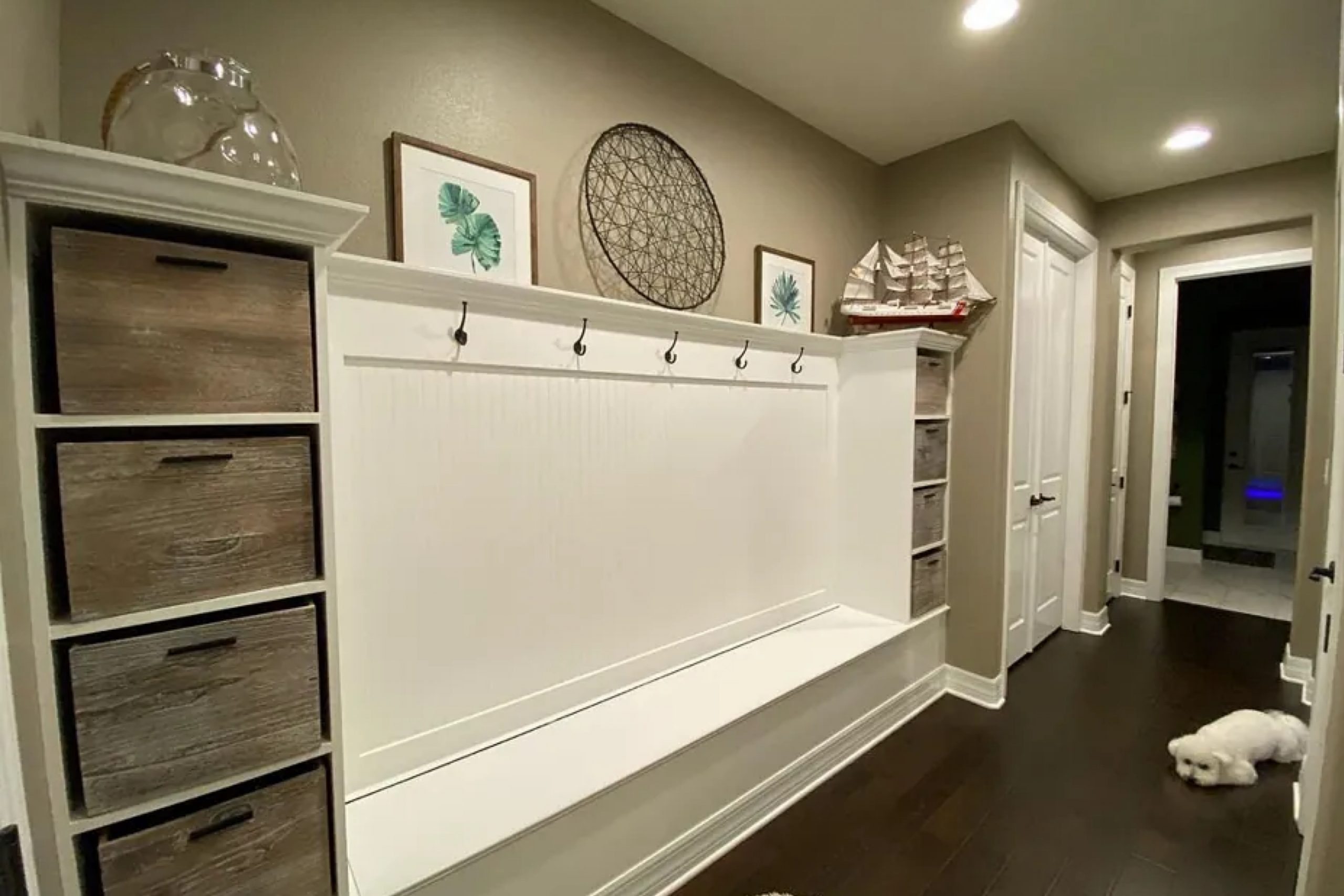
Morris Room Grey (SW 0037) by Sherwin Williams caught my eye for its calm and balanced feel. It sits right between warm and cool, making it easy to use in many spaces. The color has a quiet, refined look that helps a room feel peaceful without standing out too much.
I enjoyed how Morris Room Grey adapts to different lighting conditions throughout the day. In the morning, it feels refreshingly light, while in the evening, it takes on a cozier tone. I love how it pairs seamlessly with both traditional and modern furnishings.
Whether you’re updating a bedroom, living room, or kitchen, this shade provides a beautiful backdrop.
What I appreciate most is how Morris Room Grey works with other colors. It’s an excellent partner for soft pastels, deep navy blues, or even bold reds. This versatility means I get to experiment with various accent pieces and textiles without worrying about clashing tones.
Choosing the right paint can dramatically impact the mood and appearance of a room, and Morris Room Grey has become my go-to choice. Its timeless appeal and adaptability make it a fantastic option for any project.
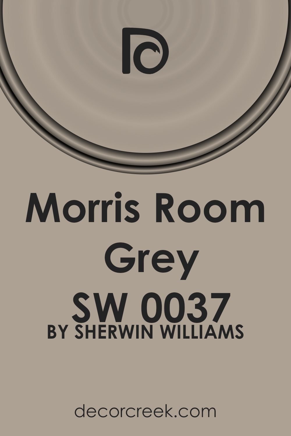
What Color Is Morris Room Grey SW 0037 by Sherwin Williams?
Morris Room Grey by Sherwin Williams is a soft, warm gray with a hint of green, giving it a classic and timeless appeal. This shade creates a cozy and inviting atmosphere, making it perfect for both traditional and contemporary interiors. Its subtle undertones can adapt to various lighting conditions, sometimes appearing as a muted gray or taking on a slightly greener tint in brighter settings.
This color works well in spaces designed around classic, farmhouse, or transitional styles. It complements vintage furnishings and antique pieces, adding to the charm and character of the room.
In modern interiors, Morris Room Grey offers a gentle contrast to bold design elements, bringing balance and harmony to the space.
This versatile gray pairs wonderfully with natural materials such as warm woods, leather, and stone, enhancing the earthy and organic feel of the room. For a softer look, combine it with linen or cotton textiles in neutral tones like cream or beige. Accents in deep navy or muted gold can add a touch of elegance, while greenery introduces a lively and fresh aspect.
Overall, this shade is ideal for living rooms, dining areas, and bedrooms, where it can make the space feel intimate and welcoming without overpowering other design elements.
Is Morris Room Grey SW 0037 by Sherwin Williams Warm or Cool color?
Morris Room Grey SW 0037 by Sherwin Williams is a popular paint color known for its versatile, neutral tone. This shade is a soft, muted grey with subtle hints of warmth, making it a great choice for many spaces in a home. Its calming quality can create a welcoming and comfortable atmosphere in any room. Whether used in living rooms, bedrooms, or even kitchens, it pairs well with various furniture styles and color accents.
Morris Room Grey works well with lots of different colors, allowing homeowners to add their personal touch with colorful accessories like cushions, curtains, or artwork. It also works nicely with natural materials like wood and stone, bringing a cozy feeling to spaces.
This grey is an excellent backdrop that doesn’t overpower the room but rather complements everything around it. Its understated elegance offers a timeless appeal, making it a favorite choice for those looking to create a harmonious and balanced home environment.
Undertones of Morris Room Grey SW 0037 by Sherwin Williams
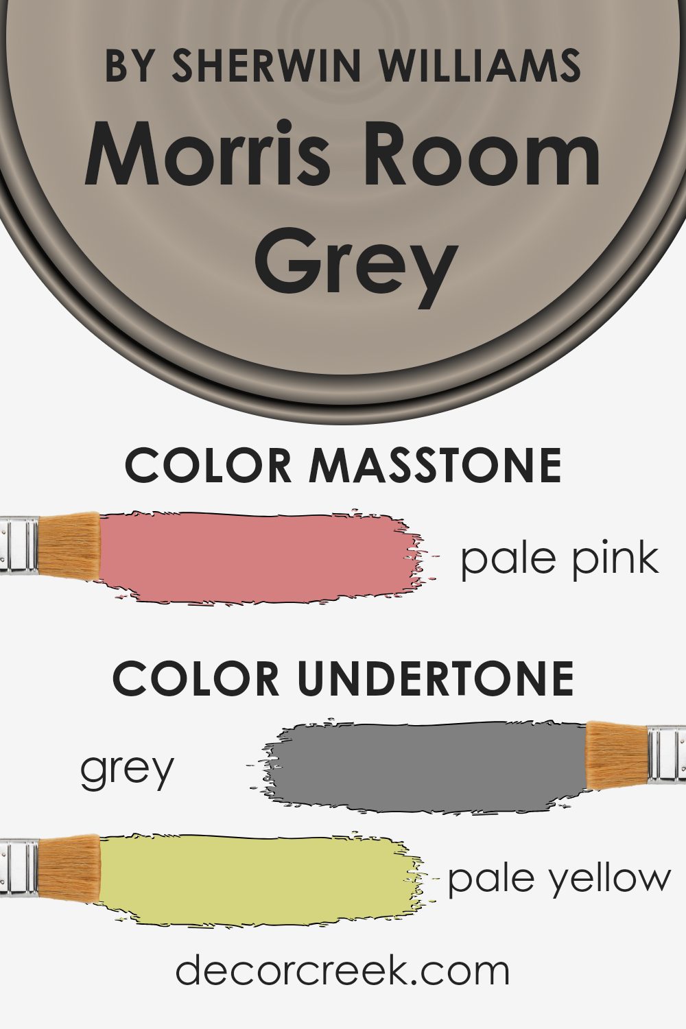
Morris Room Grey by Sherwin Williams is a complex color because it has a variety of undertones. When you look at a paint color, you are not just seeing the main color; undertones subtly influence how you perceive it. Morris Room Grey includes undertones of gray, pale yellow, mint, light purple, lilac, light gray, light blue, orange, olive, yellow, light green, pink, purple, fuchsia, violet, red, and brown.
These undertones can make the color appear different depending on the lighting and the surrounding decor. For example, in a room with lots of natural light, the pale yellow and mint undertones might become more noticeable, giving the space a soft, warm feel.
In contrast, under artificial light, the lilac and light purple undertones might stand out more, bringing a cooler, slightly muted atmosphere.
On interior walls, these mixed undertones make the color highly versatile. It can complement a wide range of furniture and decor styles, making it perfect for both modern and traditional settings.
The interplay of colors helps Morris Room Grey adapt to different environments, meaning it can look unique from one room to the next, allowing it to be flexible and stylish in various spaces.
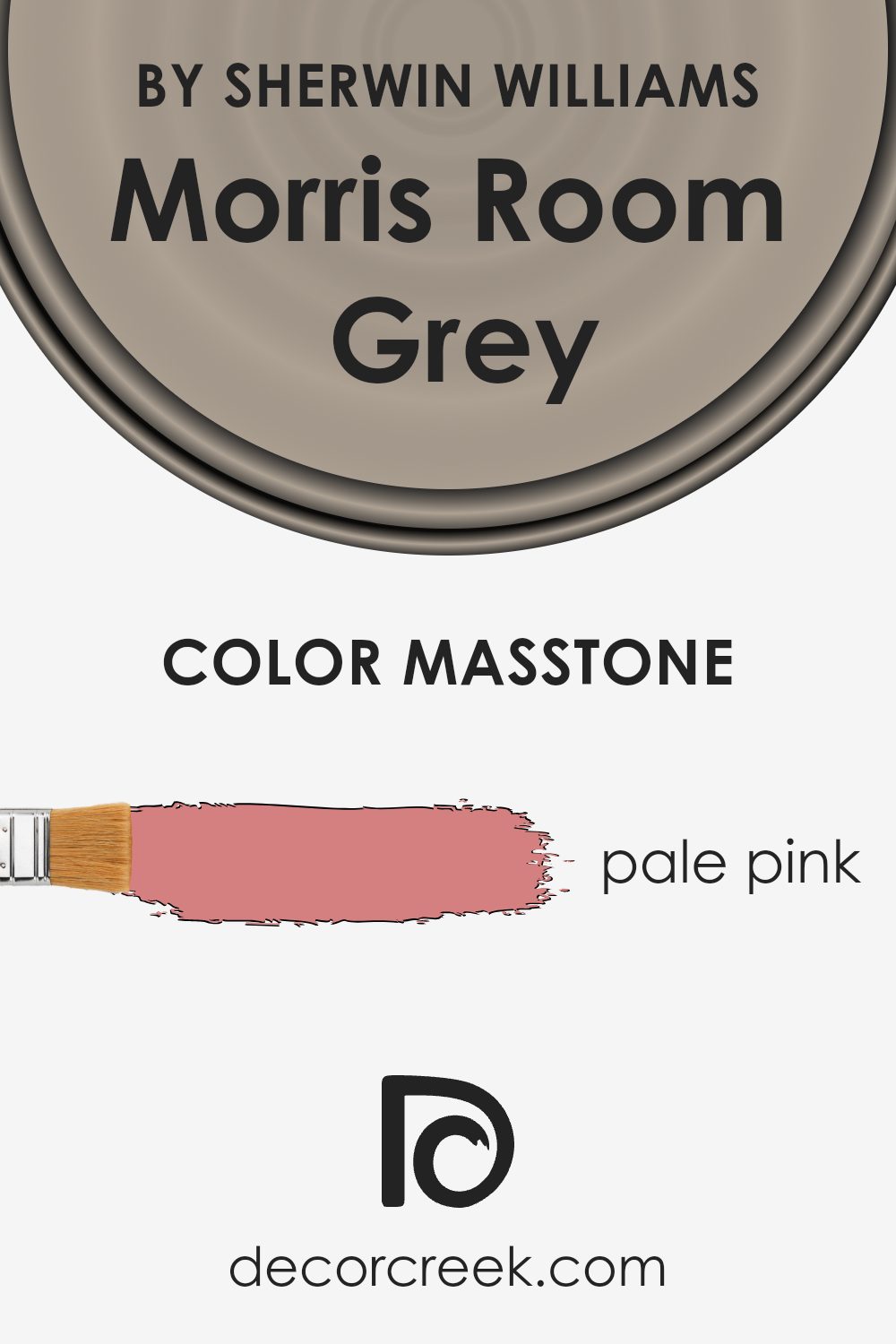
What is the Masstone of the Morris Room Grey SW 0037 by Sherwin Williams?
Morris Room Grey by Sherwin-Williams, known as SW 0037, has a special undertone that makes it unique. Its masstone, a pale pink hue (#D58080), plays a crucial role in how this color works in a home setting. The subtle pink influence softens the overall appearance of the grey, making it feel warmer and more inviting. This pink hue adds a gentle warmth, making spaces feel cozy and comfortable.
In living rooms or bedrooms, Morris Room Grey can provide a soothing backdrop that feels both relaxed and elegant. The pale pink undertone can softly reflect natural and artificial light, giving a gentle glow to the interior spaces. This effect can make a room feel open and airy, while still maintaining a warm atmosphere.
In homes with a lot of natural light, the pink undertone becomes more pronounced, offering a soft and welcoming environment that complements a variety of furnishings and decor styles.
How Does Lighting Affect Morris Room Grey SW 0037 by Sherwin Williams?
Lighting plays a big role in how we perceive color. Different types of light can make colors look different from one moment to the next. For example, sunlight changes throughout the day and can make a color look brighter or more subdued. Morris Room Grey by Sherwin Williams is a soft, muted shade of grey that can look different depending on the light.
In artificial light, such as fluorescent or LED lighting, Morris Room Grey may appear more consistent but can take on a cooler or warmer tone depending on the bulb. Warm white bulbs tend to bring out a softer, warmer side of the grey, while cool white bulbs might make it look slightly bluer.
When considering natural light in north-facing rooms, Morris Room Grey can appear cooler and more subdued. North-facing rooms get indirect light, which tends to make colors appear a bit muted. In these spaces, Morris Room Grey keeps its calm characteristic and may look like a gentle grey-blue.
South-facing rooms get a lot of strong natural sunlight, especially in the middle of the day. Under these conditions, Morris Room Grey can look warmer, with hints of its underlying tones coming through. The light is bright and direct, enhancing the depth of the color and giving it a slightly more vibrant appearance.
In east-facing rooms, the morning light is soft and golden, and Morris Room Grey can take on a warm glow in the early hours. As the day goes on, the room loses direct sunlight, and the color can look more neutral.
West-facing rooms get the best light in the late afternoon and evening. The warm, golden-hour light can make Morris Room Grey look rich and warm, enhancing its subtle warm undertones. During the morning, when less light enters, the color may seem cooler and more subdued.

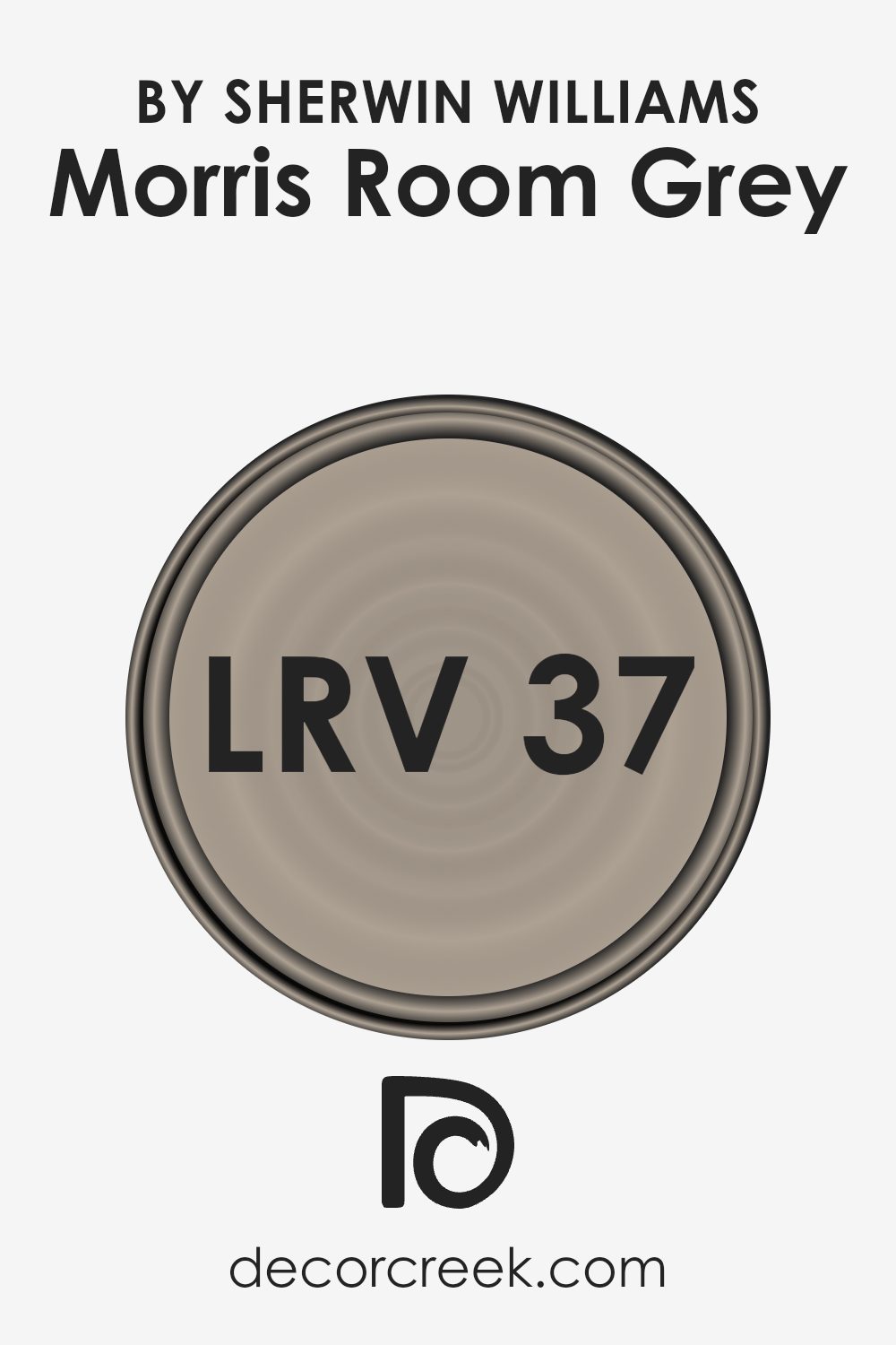
What is the LRV of Morris Room Grey SW 0037 by Sherwin Williams?
LRV, or Light Reflectance Value, is a measure of how much light a color reflects. It is a scale from 0 to 100, where 0 is absolute black (which reflects no light) and 100 is pure white (which reflects all light). When it comes to paint colors, LRV helps predict how light or dark a color will appear in a space.
A higher LRV means the color will reflect more light, making a room feel brighter and more open. Conversely, a lower LRV means the color absorbs more light, making a space feel cozier and more intimate.
For Morris Room Grey, which has an LRV of 36.586, this indicates a mid-range light reflectance. This value means the color will reflect some light but also absorb quite a bit. In a room, this grey may feel warm and welcoming rather than stark or overly bright. It’s a good balance for spaces where you want some warmth but also want to keep a sense of lightness.
Rooms with moderate natural lighting will show this color as true to its tone, maintaining its classic and comfortable feel without being too intense or too subdued.
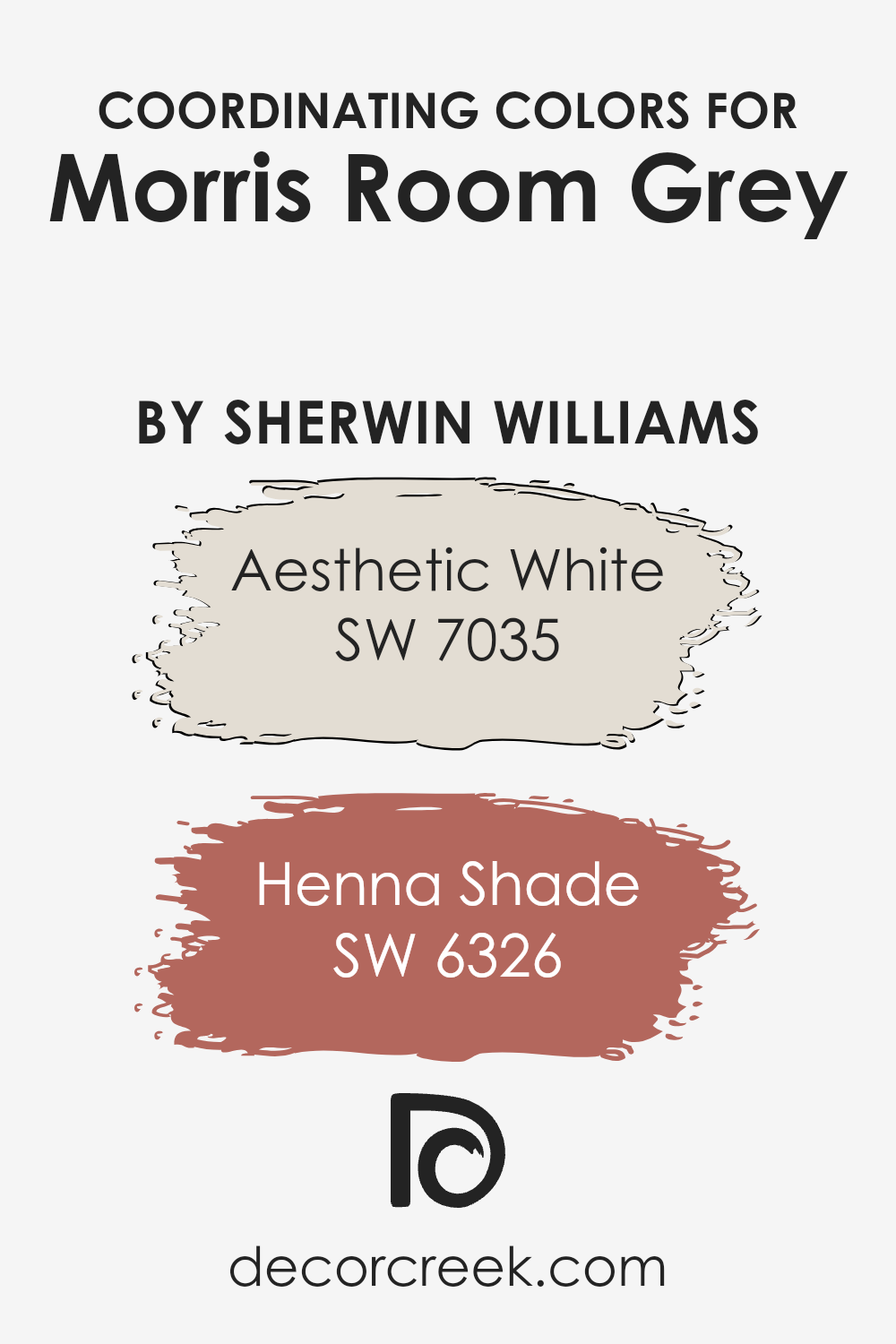
Coordinating Colors of Morris Room Grey SW 0037 by Sherwin Williams
Coordinating colors are hues that work well together to create a harmonious look in a space. They complement each other by either contrasting in a pleasing way or sharing similar undertones that tie the whole room together.
For example, Morris Room Grey by Sherwin Williams is a sophisticated and timeless color that acts as a solid base for many color palettes. Choosing coordinating colors such as SW 7035 Aesthetic White and SW 6326 Henna Shade can bring out the best in Morris Room Grey by providing balance and interest.
Aesthetic White is a soft and warm off-white color, perfect for creating a calm and inviting atmosphere. It pairs beautifully with Morris Room Grey, providing a light contrast that keeps the space feeling airy and open.
On the other hand, Henna Shade is a rich, earthy red that adds a bold touch to any room. This vibrant hue creates a striking contrast with Morris Room Grey, adding warmth and depth.
By combining these colors thoughtfully, you can create a room that feels both unified and lively, showcasing the versatility and classic appeal of Morris Room Grey without overwhelming the senses.
You can see recommended paint colors below:
- SW 7035 Aesthetic White
- SW 6326 Henna Shade
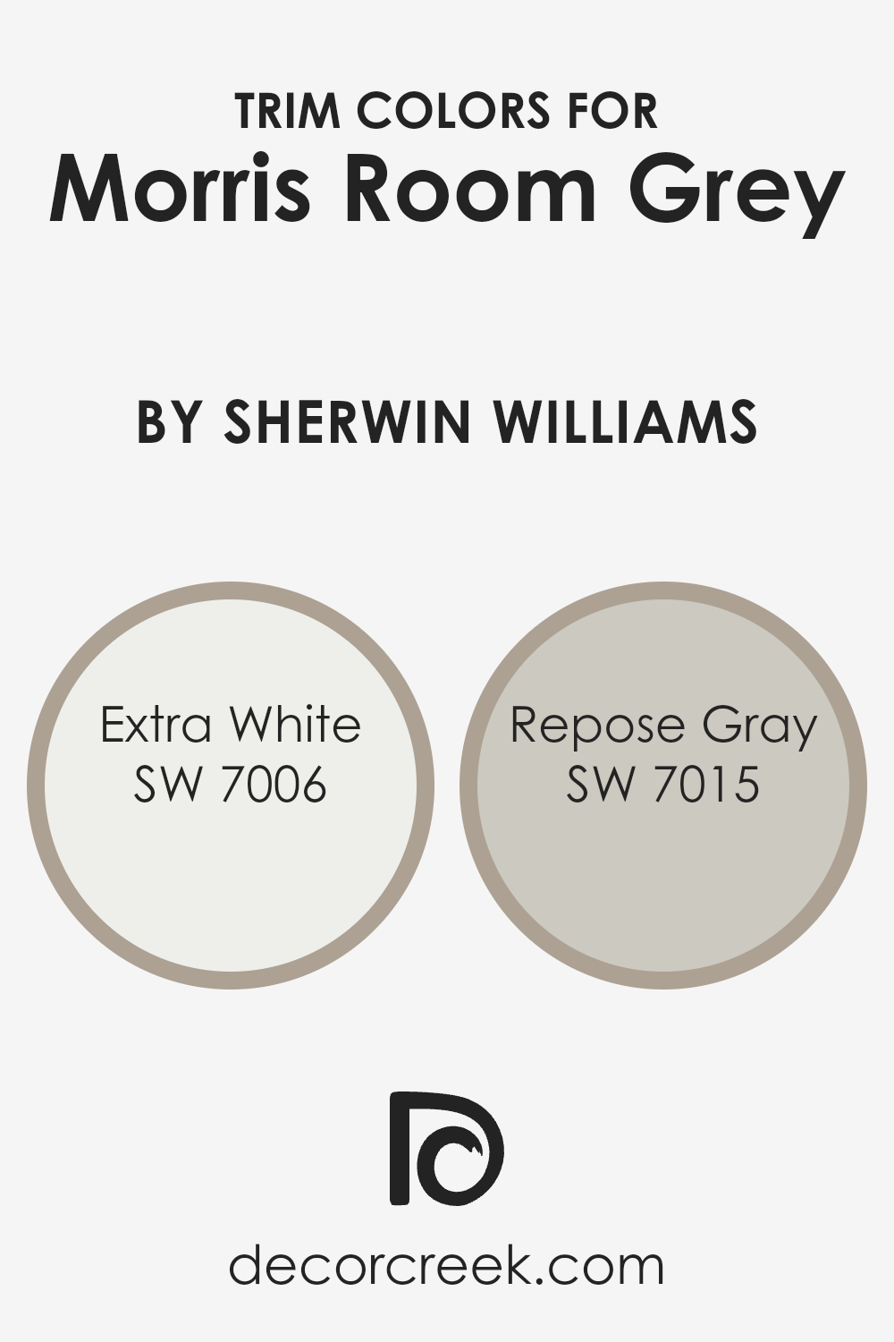
What are the Trim colors of Morris Room Grey SW 0037 by Sherwin Williams?
Trim colors are the colors used for painting the details such as baseboards, door frames, window frames, and moldings in a room. They serve as an important design element by defining and accentuating the architectural details of a space.
For a wall color like Morris Room Grey by Sherwin Williams, using trim colors like Extra White and Repose Gray can significantly impact the overall look of the room. Trim colors can make a subtle or bold statement, depending on their contrast with the wall color.
In this case, they highlight the sophistication and richness of Morris Room Grey, enhancing the room’s character.
Extra White, identified as SW 7006, is a bright, clean shade that offers a crisp and modern look. It is an excellent choice to create a strong contrast if used as a trim color with Morris Room Grey, making the room feel airy and open.
On the other hand, Repose Gray, labeled as SW 7015, is a soft and versatile gray with a slight warm undertone. It can complement Morris Room Grey by providing a gentle contrast that adds subtle depth, perfect for achieving a cohesive and balanced aesthetic.
By using these colors for trim work, you can emphasize the elegant features of your space while adding a touch of refinement.
You can see recommended paint colors below:
Colors Similar to Morris Room Grey SW 0037 by Sherwin Williams
Similar colors are crucial in design because they create harmony and balance in a space. They work by complementing each other and providing subtle variations that enhance the overall aesthetic. When it comes to Morris Room Grey by Sherwin Williams, similar colors offer delightful options that maintain the same calm and neutral feel.
For instance, Fawn Brindle is a warm greige that adds a cozy touch to any room, while Taupe Tone brings a deeper, more grounded feeling with its classic and understated appeal. Perfect Khaki offers a light, earthy hue that can brighten up a space without straying far from a neutral palette, and Restoration is a gentle shade with hints of beige that adds warmth and comfort.
Continuing with these soothing neutral tones, Utterly Beige is versatile and works well in various settings, providing a soft backdrop. Intellectual Gray, a medium-toned grey, adds a modern touch with its cool undertones. Mega Greige is rich and deep, perfect for creating an inviting atmosphere.
Tony Taupe offers a lighter alternative with its balanced mix of warm and cool tones. Meanwhile, Stone Lion provides a subtle, earthy feel, and Gray Area acts as a perfectly balanced, cool grey, making it an excellent choice for those who prefer a neutral look.
Together, these colors create a cohesive and pleasing environment while adding subtle layers of depth and interest.
You can see recommended paint colors below:
- SW 7640 Fawn Brindle
- SW 7633 Taupe Tone
- SW 9612 Perfect Khaki
- SW 9578 Restoration
- SW 6080 Utterly Beige
- SW 7045 Intellectual Gray
- SW 7031 Mega Greige
- SW 7038 Tony Taupe
- SW 7507 Stone Lion
- SW 7052 Gray Area

How to Use Morris Room Grey SW 0037 by Sherwin Williams In Your Home?
Morris Room Grey SW 0037 by Sherwin Williams is a versatile paint color that can bring a sense of calmness and warmth to a home. This shade is a soft, muted grey with subtle hints of green, making it a great choice for creating a cozy atmosphere.
It’s perfect for living rooms or bedrooms, where you want a relaxing environment. Since it’s a neutral color, it pairs well with various other colors and materials, such as wood or stone.
Homeowners might use Morris Room Grey in a dining room, creating an inviting space for family meals and gatherings with friends. In a home office, this color can help maintain focus and provide a pleasant backdrop for virtual meetings. Its adaptability also makes it suitable for trims and moldings, adding depth without overwhelming the space. Because of its gentle tone, it works well with both traditional and modern decor styles, offering a timeless feel.
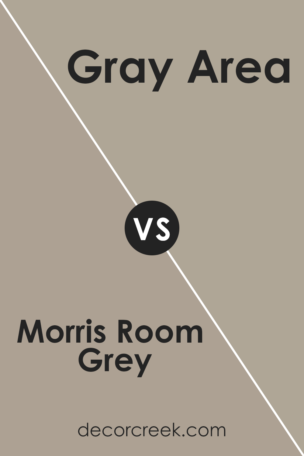
Morris Room Grey SW 0037 by Sherwin Williams vs Gray Area SW 7052 by Sherwin Williams
Morris Room Grey (SW 0037) and Gray Area (SW 7052) are two shades of grey from Sherwin Williams, but they have distinct characteristics. Morris Room Grey is a warmer grey with subtle undertones that can make a space feel cozy and inviting. It often works well in traditional settings, adding a touch of comfort and classic elegance.
On the other hand, Gray Area is a more neutral and cooler grey. It has a softer, more modern feel and can create a clean and crisp look in a room. This shade is versatile and pairs well with contemporary decor, providing a sleek backdrop that highlights other colors and textures.
While both colors are grey, Morris Room Grey tends to evoke warmth and a traditional vibe, whereas Gray Area leans towards a cooler, modern aesthetic. The choice between them depends on whether you want a warm, homey atmosphere or a cool, modern look.
You can see recommended paint color below:
- SW 7052 Gray Area
Morris Room Grey SW 0037 by Sherwin Williams vs Stone Lion SW 7507 by Sherwin Williams
Morris Room Grey and Stone Lion are both neutral colors from Sherwin Williams, but they have distinct characteristics. Morris Room Grey is a muted, soft grey with green undertones. It has a calming and classic feel, often used to create a timeless look in a room. It’s a versatile shade that works well in different lighting conditions.
On the other hand, Stone Lion is a warm taupe. It leans more towards beige with brown undertones, giving it a cozy and inviting vibe. This color is great for adding warmth to a space without being overwhelming.
While Morris Room Grey offers a cooler, more restrained palette suitable for subtle backdrops, Stone Lion provides warmth and is perfect for creating a welcoming atmosphere. Both colors complement various styles and furnishings but cater to different moods; one is more understated, and the other is more earthy and warm.
You can see recommended paint color below:
- SW 7507 Stone Lion
Morris Room Grey SW 0037 by Sherwin Williams vs Fawn Brindle SW 7640 by Sherwin Williams
Morris Room Grey (SW 0037) and Fawn Brindle (SW 7640) are both neutral colors by Sherwin Williams, but they offer different vibes. Morris Room Grey is a classic gray that leans slightly towards the cooler side. It has a timeless and traditional feel, making it a nice choice for spaces that want a hint of formality and calm.
On the other hand, Fawn Brindle is a warm greige, a mix of gray and beige. This color feels cozier and more inviting, bringing warmth into a room. It often works well in living spaces where you want to create a welcoming atmosphere.
While Morris Room Grey can add a touch of elegance with its cool undertones, Fawn Brindle is versatile for creating a snug environment. Both colors are great for walls, but the choice between them depends on whether you want a cooler or warmer feel in your space.
You can see recommended paint color below:
Morris Room Grey SW 0037 by Sherwin Williams vs Restoration SW 9578 by Sherwin Williams
Morris Room Grey and Restoration are both beautiful colors from Sherwin Williams, but they have distinct personalities. Morris Room Grey is a classic, warm grey with slight green undertones, which gives it a timeless and cozy feel. It’s perfect for creating a relaxed and inviting atmosphere in living rooms or bedrooms.
On the other hand, Restoration is a soft, muted green with a hint of blue. This subtle green brings a touch of nature indoors, making it an excellent choice for those who love a natural and calm vibe.
While Morris Room Grey works well as a neutral backdrop, Restoration adds a gentle pop of color that’s refreshing yet understated. Both colors pair well with natural wood tones or crisp whites, offering flexibility in interior design. Choosing between them depends on whether you prefer the warmth of grey or the cool tranquility of green.
You can see recommended paint color below:
- SW 9578 Restoration
Morris Room Grey SW 0037 by Sherwin Williams vs Taupe Tone SW 7633 by Sherwin Williams
Morris Room Grey and Taupe Tone are both popular paint colors by Sherwin Williams, offering distinct yet complementary vibes. Morris Room Grey is a soft, muted gray with a classic feel. It creates an understated backdrop that fits well in traditional or modern spaces, offering a neutral base for various styles
. On the other hand, Taupe Tone blends gray and brown, resulting in a warm and inviting hue. This makes it perfect for cozy, welcoming environments like living rooms or bedrooms.
While Morris Room Grey leans cooler due to its pure gray nature, Taupe Tone provides warmth with its earthy undertones. This fundamental difference makes Morris Room Grey more versatile for minimalist or more modern interiors, whereas Taupe Tone brings an element of comfort and coziness. Both colors are neutral, allowing them to pair well with bolder accents or other neutrals, depending on the desired atmosphere.
You can see recommended paint color below:
Morris Room Grey SW 0037 by Sherwin Williams vs Perfect Khaki SW 9612 by Sherwin Williams
Morris Room Grey and Perfect Khaki, both by Sherwin Williams, offer distinct color vibes for any space. Morris Room Grey is a medium-toned gray with a balanced, neutral feel. It provides a classic and timeless look, versatile enough for various styles, from traditional to modern.
On the other hand, Perfect Khaki is a warm, earthy hue with subtle beige undertones. It brings a cozy and welcoming atmosphere, ideal for spaces seeking a touch of warmth. While Morris Room Grey offers a neutral backdrop that allows other elements to shine, Perfect Khaki adds a soft, natural touch, making any room feel more inviting.
When deciding between these two, consider whether you want a versatile gray that blends seamlessly or a warm khaki that adds depth and comfort to the space. Both colors have their unique charm and can be chosen based on the mood you wish to create.
You can see recommended paint color below:
- SW 9612 Perfect Khaki
Morris Room Grey SW 0037 by Sherwin Williams vs Tony Taupe SW 7038 by Sherwin Williams
Morris Room Grey and Tony Taupe by Sherwin Williams are two versatile colors with distinct characteristics. Morris Room Grey is a muted, cool-toned grey that exudes an understated elegance. It works well in spaces where a calm and soothing atmosphere is desired. The color’s subtlety allows it to pair effortlessly with other colors, making it a flexible choice for various interior styles.
On the other hand, Tony Taupe is a warm, earthy tone that brings a sense of coziness to a room. This taupe shade has brown undertones that provide warmth and a welcoming feel. It is ideal for spaces where you want to create an inviting and comfortable environment.
While Morris Room Grey offers a more neutral, modern look, Tony Taupe introduces warmth and approachability. The choice between these colors depends on whether you prefer a cool, neutral setting or a warm, inviting ambiance. Both colors can complement a variety of furnishings and accents.
You can see recommended paint color below:
Morris Room Grey SW 0037 by Sherwin Williams vs Mega Greige SW 7031 by Sherwin Williams
Morris Room Grey (SW 0037) and Mega Greige (SW 7031) are two distinctive colors from Sherwin Williams, each bringing its own feel and vibe to a space. Morris Room Grey is a muted, cool grey that leans slightly green, offering a soft and timeless look. It’s perfect for creating a calm atmosphere in any room.
In contrast, Mega Greige is a warm, earthy color that mixes grey and beige tones. This versatile shade brings warmth and comfort and can complement various styles and furnishings.
While Morris Room Grey fits well in spaces aiming for a more subtle and relaxed aesthetic, Mega Greige adds coziness and friendliness. They both serve as excellent neutrals, but their undertones cater to different décor needs. Morris Room Grey works well in traditional and modern settings, whereas Mega Greige can add a welcoming touch to living areas and bedrooms. Both colors offer a sophisticated base but suit different moods and settings.
You can see recommended paint color below:
Morris Room Grey SW 0037 by Sherwin Williams vs Intellectual Gray SW 7045 by Sherwin Williams
Morris Room Grey (SW 0037) and Intellectual Gray (SW 7045) are both versatile colors from Sherwin Williams, but they offer different vibes. Morris Room Grey is a softer, classic shade with a touch of warmth, making it a great choice for creating a cozy, inviting space. It’s a traditional color that fits well in historical or vintage-inspired settings.
On the other hand, Intellectual Gray is a bit darker and has more depth. It’s a modern, neutral color that works well in contemporary spaces, providing a sleek and stylish look. While Morris Room Grey complements classic furniture and warm tones, Intellectual Gray pairs well with bolder colors and modern decors.
Both colors are neutral, making them adaptable, but choosing between them depends on the atmosphere you want. If you prefer a warmer, more traditional look, go with Morris Room Grey. If a modern, sophisticated vibe is what you’re after, Intellectual Gray is the better option.
You can see recommended paint color below:
Morris Room Grey SW 0037 by Sherwin Williams vs Utterly Beige SW 6080 by Sherwin Williams
Morris Room Grey and Utterly Beige are two distinct colors from Sherwin Williams that offer different vibes for interior spaces. Morris Room Grey is a muted, classic shade that leans towards a warm, greenish-grey.
It’s an excellent choice for creating a cozy and grounded atmosphere, making it ideal for living rooms or bedrooms where you want a calming backdrop. It pairs well with traditional decor styles and can be complemented by deeper greens or browns.
On the other hand, Utterly Beige is a warm, soft beige that brings a sense of warmth and lightness to a room. It’s versatile and can work well in a variety of settings, from living rooms to hallways. This color tends to enhance natural light, making spaces feel more open and airy. When combined, these two colors can complement each other, with Utterly Beige offering light and brightness and Morris Room Grey providing depth and sophistication.
You can see recommended paint color below:
Conclusion
When I think about SW 0037 Morris Room Grey by Sherwin Williams, it feels like finding an old, cozy sweater in the back of your closet. It’s a warm and inviting color that reminds me of rainy days spent indoors with a good book and a cup of hot chocolate. The shade of grey is not too dark or too light, making it feel just right, like Goldilocks finding her perfect chair.
This grey has a special knack for making any room feel welcoming. Whether it’s a living room where you hang out with family or a bedroom where you go to rest, Morris Room Grey can make it feel comfy. It’s like giving the walls a gentle hug, creating a soothing place where you can relax after a long day at school.
What I like most is that the grey works like a blank canvas, letting you add your favorite things without clashing. Whether you put up your favorite superhero posters or beautiful drawings, the color lets them shine. It fits in, no matter what colors or styles you like.
In the end, Morris Room Grey feels like a good friend who is always there to make you feel at home. It’s a friendly color that can turn any room into your favorite place.
Ever wished paint sampling was as easy as sticking a sticker? Guess what? Now it is! Discover Samplize's unique Peel & Stick samples.
Get paint samples

