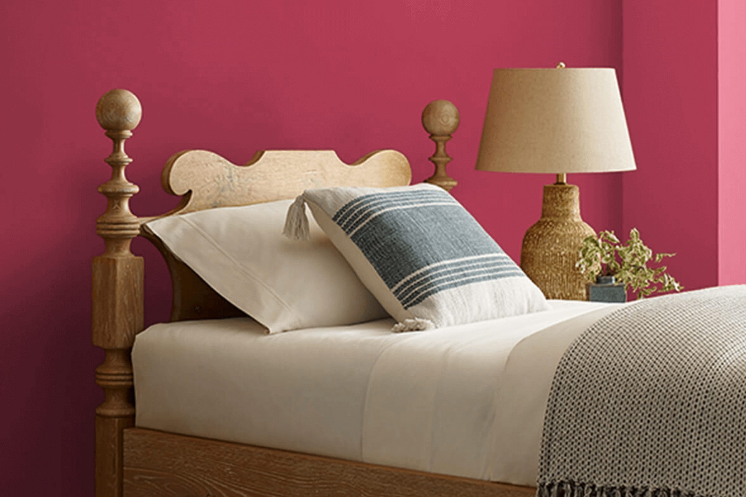
When I think of SW 6587 Valentine by Sherwin Williams, it’s like a lively dance of warmth and energy. This vibrant shade of red immediately pulls me in with its spirited character. It radiates a sense of passion and comfort all at once, making it a striking choice for any space needing a touch of dynamic charm.
While some reds can feel overwhelming, Valentine manages to strike the perfect balance—it’s bold without being brash. It somehow carries both a sense of elegance and a playful hint, making it versatile for various settings.
Be it a cozy living room, a chic dining area, or an accent wall that needs a touch of flair, Valentine can breathe life into the room.
I appreciate how this color seems to tell a story; it’s full of life, yet there’s a refinement to it. It doesn’t just sit on the wall—it interacts with the light and the surrounding decor, creating rich layers of mood and atmosphere.
Valentine has the power to change how a space feels, bringing warmth and vibrancy that encourages connection and lively conversation.
This red brings out the best in both modern and classic interiors, blending effortlessly or standing boldly, depending on how you want to use it. It’s an invitation to enjoy the present moment and to fill any space with a sense of joyous energy.
What Color Is Valentine SW 6587 by Sherwin Williams?
Valentine SW 6587 by Sherwin Williams is a warm, inviting shade of pink with a hint of red. It’s a bold and cheerful color that can bring energy and liveliness to a room. This color works beautifully in spaces where you want to create a sense of warmth and comfort, such as living rooms, bedrooms, or even dining areas.
Valentine is perfect for eclectic and bohemian interior styles, where vibrant colors and patterns play together in harmony. It can also work well in traditional spaces, adding a playful twist to more classic designs.
To complement this shade, consider using materials like rich, dark woods, which can provide a nice contrast and balance the brightness of the pink. Soft fabrics like velvet or wool in neutral tones will add a cozy and elegant touch.
For textures, natural fibers like jute or sisal can ground the vividness of Valentine and create an earthy feel. Pairing it with metallic accents, such as brass or gold, can add a touch of glamour and sophistication.
In terms of other colors, Valentine pairs nicely with soft whites, grays, and even some shades of green, offering a versatile backdrop for various decorative styles.

Is Valentine SW 6587 by Sherwin Williams Warm or Cool color?
Valentine SW 6587 by Sherwin Williams is a warm and inviting color. This shade of pink has a cozy and welcoming feel, perfect for creating a comfortable atmosphere in the home. It works well in living rooms and bedrooms, where it adds a touch of charm and coziness.
The color can brighten up small spaces and make them seem more open, yet still retain a sense of comfort. It pairs nicely with neutral tones like white or gray, offering a soft balance without overwhelming the space.
Furniture in natural wood tones complements Valentine SW 6587, creating a harmonious look. This pink shade also works well with metallic accents, like gold or brass, adding a subtle touch of elegance. In children’s rooms, it brings a playful yet soothing effect, creating cheerful environments. Overall, Valentine SW 6587 adds warmth and personality to any room, making it a delightful choice.
Undertones of Valentine SW 6587 by Sherwin Williams
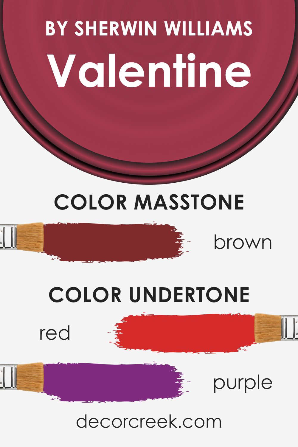
Valentine SW 6587 by Sherwin Williams is a complex color with a blend of undertones that create a rich and dynamic appearance. The primary undertone is a strong red (#D52B2B), which gives the color its warm and passionate base.
This red is balanced by hints of purple (#802B80) and pink (#D52B80), adding depth and a subtle vibrancy. These undertones influence how the color appears under different lighting conditions—making it feel warm and energetic in some lights, while more muted and calm in others.
The presence of olive (#80802B) and orange (#D5802B) undertones can add an earthy or warm quality, making the color suitable for creating a cozy atmosphere. Grey (#808080) and pale pink (#D58080) subtlety mellow the vibrancy, lending a more relaxed and balanced feel.
Dark grey (#2B2B2B) and navy (#2B2B80) add a grounding aspect, while dark green (#2B802B) and dark turquoise (#2B8080) introduce an understated sophistication.
When used on interior walls, these undertones make the color adaptable, working well in various settings.
In bright rooms, it appears more vivid and lively, while in dimmer spaces, it takes on a softer, more inviting tone. The hues come together to offer flexibility, allowing the color to enhance both modern and traditional interiors.
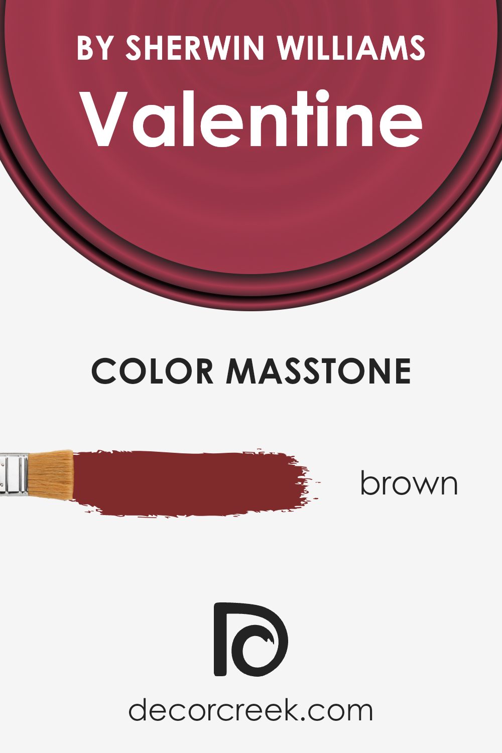
What is the Masstone of the Valentine SW 6587 by Sherwin Williams?
Valentine SW 6587 by Sherwin Williams is a rich and warm brown hue. Its masstone, or the primary color you see, is a deep brown (#802B2B). This makes Valentine a versatile choice for any home. It brings a cozy and welcoming feel to a room, ideal for living spaces where you want to feel comfortable and relaxed.
The brown undertones give it a classic and earthy vibe, making it an excellent backdrop for various design styles. You can pair it with neutral colors like beige or cream for a soft, luxurious look, or add some contrast with lighter tones to create a dynamic effect.
This color is particularly effective in spaces with good natural light, as it adds depth and character without feeling overwhelming. Its grounding presence can make large rooms feel more intimate and smaller spaces feel warm and inviting.
How Does Lighting Affect Valentine SW 6587 by Sherwin Williams?
Lighting plays a crucial role in how we perceive color. Different types of lighting can change the appearance of colors, making them look warmer, cooler, brighter, or more subdued. Sherwin Williams’ Valentine SW 6587 is a vibrant and warm red hue that can look different depending on the lighting conditions.
In natural light, Valentine tends to show its true red color. However, how it appears can be influenced by the direction the room faces. In north-facing rooms, the light tends to be cooler and can add a blue tint to colors, which might make Valentine appear slightly deep or less intense.
In south-facing rooms, where the light is more consistent and warmer throughout the day, Valentine can appear more vivid and true to its rich red nature. This warmer light enhances the warmth in the red and can make the room feel cozy and inviting.
East-facing rooms get warm morning light, which can make Valentine look bright and cheerful in the mornings. However, as the day progresses and the direct sunlight fades, the color might seem more mellow and slightly cooler.
West-facing rooms will experience the opposite, where afternoon and evening light is warmer and more intense. In the mornings, Valentine might look more subdued, but as the day moves towards evening, it will be seen as more glowing and saturated due to the warm light of the setting sun.
Under artificial light, the perception of Valentine will depend on the type of bulbs used. Incandescent and warm LED lights can enhance its warm tones, making it look rich and inviting.
In contrast, cool white or daylight bulbs can tone down its warmth, leading to a slightly more balanced or muted appearance. Thus, the choice of lighting—natural or artificial—significantly influences how Valentine SW 6587 is seen in any given space.

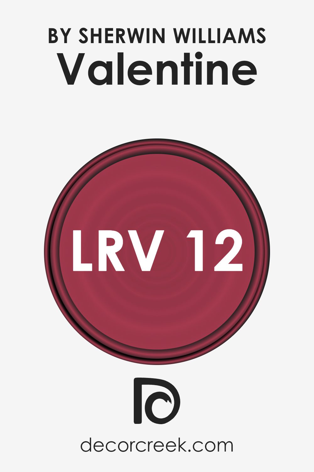
What is the LRV of Valentine SW 6587 by Sherwin Williams?
Light Reflectance Value, or LRV, measures how much light a color reflects or absorbs. It ranks from 0 to 100, with 0 being completely black, reflecting no light, and 100 being pure white, reflecting all light. Colors with lower LRV like 11.552, such as Valentine, absorb more light and reflect less, making them appear darker and richer on walls.
This can make a room feel cozy and intimate, but it might also make a space look smaller and absorb natural light, needing additional lighting sources to balance the effect.
In the case of Valentine, its LRV of 11.552 means it’s quite a dark shade. This can make walls seem warm and enveloping, perfect for creating a snug and inviting atmosphere.
However, because it doesn’t reflect a lot of light, it might not be the best choice for a small room unless you want a more enclosed feel. In larger spaces, it could add depth and can be beautifully offset with lighter furnishings or trims to prevent the space from feeling too dark.
Choosing Valentine for a feature wall can add a pop of color without overpowering the entire room.
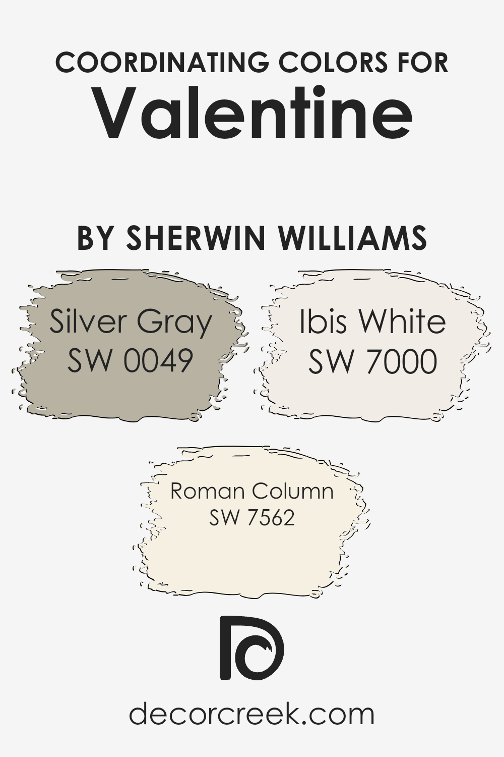
Coordinating Colors of Valentine SW 6587 by Sherwin Williams
Coordinating colors are hues that work well together to create a harmonious look in a space. They are chosen to complement a main color, ensuring a balanced and aesthetically pleasing palette. For example, Sherwin Williams’ Valentine is a rich, romantic shade of red. To create a cohesive design, consider pairing it with coordinating colors like Silver Gray, Roman Column, and Ibis White.
Silver Gray is a timeless neutral with a hint of blue, adding a touch of cool elegance to any room. It pairs beautifully with the warm richness of Valentine, offering a calming contrast.
Roman Column is a soft, creamy off-white that provides a gentle warming effect, creating a cozy and inviting atmosphere. It enhances the warmth of Valentine without overwhelming the space.
Ibis White, a pure and crisp white, adds a touch of brightness and cleanliness, making the colors feel fresh and invigorating. These coordinating colors help balance the boldness of Valentine, ensuring that the overall design feels welcoming and cohesive.
When used together, these hues create a space that feels balanced, yet lively.
You can see recommended paint colors below:
- SW 0049 Silver Gray
- SW 7562 Roman Column
- SW 7000 Ibis White
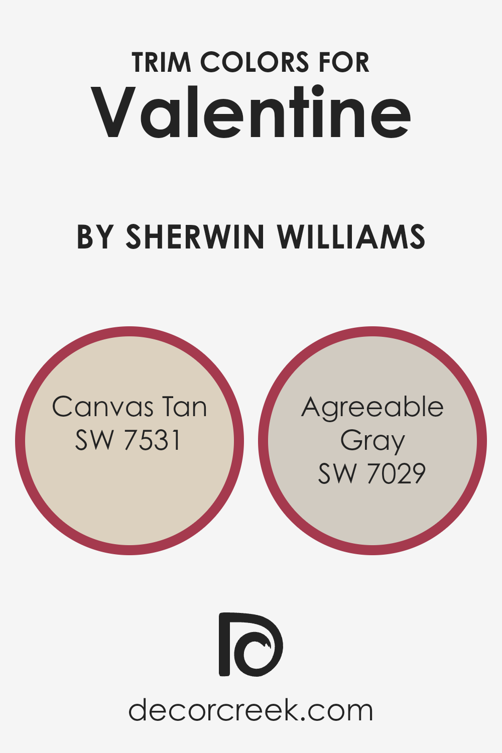
What are the Trim colors of Valentine SW 6587 by Sherwin Williams?
Trim colors are essentially the shades used on the details and borders of a room, such as the moldings, doors, and window frames. They create contrast with the main wall color to highlight architectural features and add depth to a room.
When using Sherwin Williams’ Valentine SW 6587 as the primary wall color, it’s important to select trim colors that complement and balance the pink hue. Trim colors are key in tying a room’s aesthetic together, providing seamless transitions between walls, ceilings, and floors.
They can either blend subtly or stand out to highlight unique design features.
Canvas Tan SW 7531 is a versatile off-white that offers a warm, earthy touch, making it a soft yet distinct choice for trim.
It provides a subtle framework against Valentine pink, highlighting the color beautifully without overpowering it.
Agreeable Gray SW 7029, a well-loved neutral gray, exudes warmth with its beige undertones that perfectly accompany the more vibrant Valentine.
This shade offers a muted contrast, grounding the playful essence of the pink with grace and subtle harmony, ensuring the space feels cohesive and inviting.
You can see recommended paint colors below:
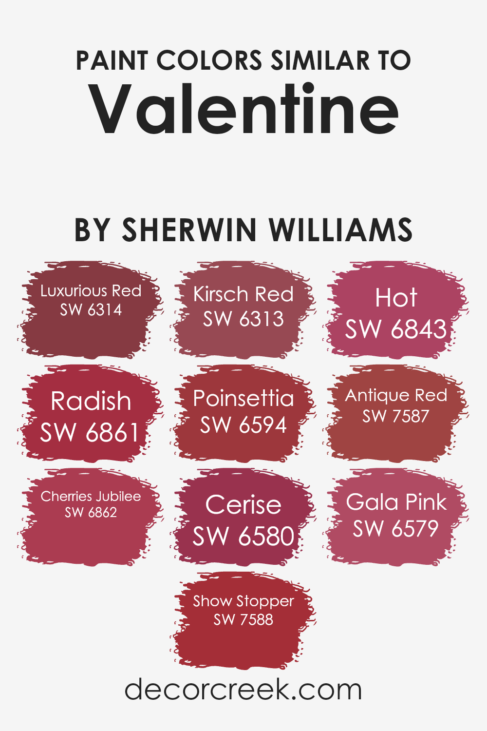
Colors Similar to Valentine SW 6587 by Sherwin Williams
Similar colors play a vital role in creating a cohesive and harmonious design. When you stick to a palette of related shades, it ensures a smooth and unified look, making any space or project feel balanced and put together. For example, the Sherwin-Williams shade Valentine is a rich, warm color that pairs beautifully with its similar hues, offering endless possibilities for creating a warm and inviting atmosphere.
Luxurious Red is a deep, seductive red that adds an intense, passionate vibe to any setting. Radish is a vibrant red with a hint of pink, perfect for adding a pop of brightness.
Cherries Jubilee offers a cheerful and lively shade, reminiscent of fresh-picked cherries, while Show Stopper grabs attention with its boldness. Kirsch Red is a classic cherry hue that exudes energy.
Poinsettia captures the spirit of its namesake flower with its festive brightness, and Cerise presents a vivid pinkish-red that’s both playful and engaging.
Hot provides a spicy pink that energizes a room, whereas Antique Red has a more muted, vintage feel. Lastly, Gala Pink is a softer pink-red, offering a lighthearted yet sophisticated touch.
Integrating these colors creates a space full of energy, warmth, and cohesiveness.
You can see recommended paint colors below:
- SW 6314 Luxurious Red
- SW 6861 Radish
- SW 6862 Cherries Jubilee
- SW 7588 Show Stopper
- SW 6313 Kirsch Red
- SW 6594 Poinsettia
- SW 6580 Cerise
- SW 6843 Hot
- SW 7587 Antique Red
- SW 6579 Gala Pink
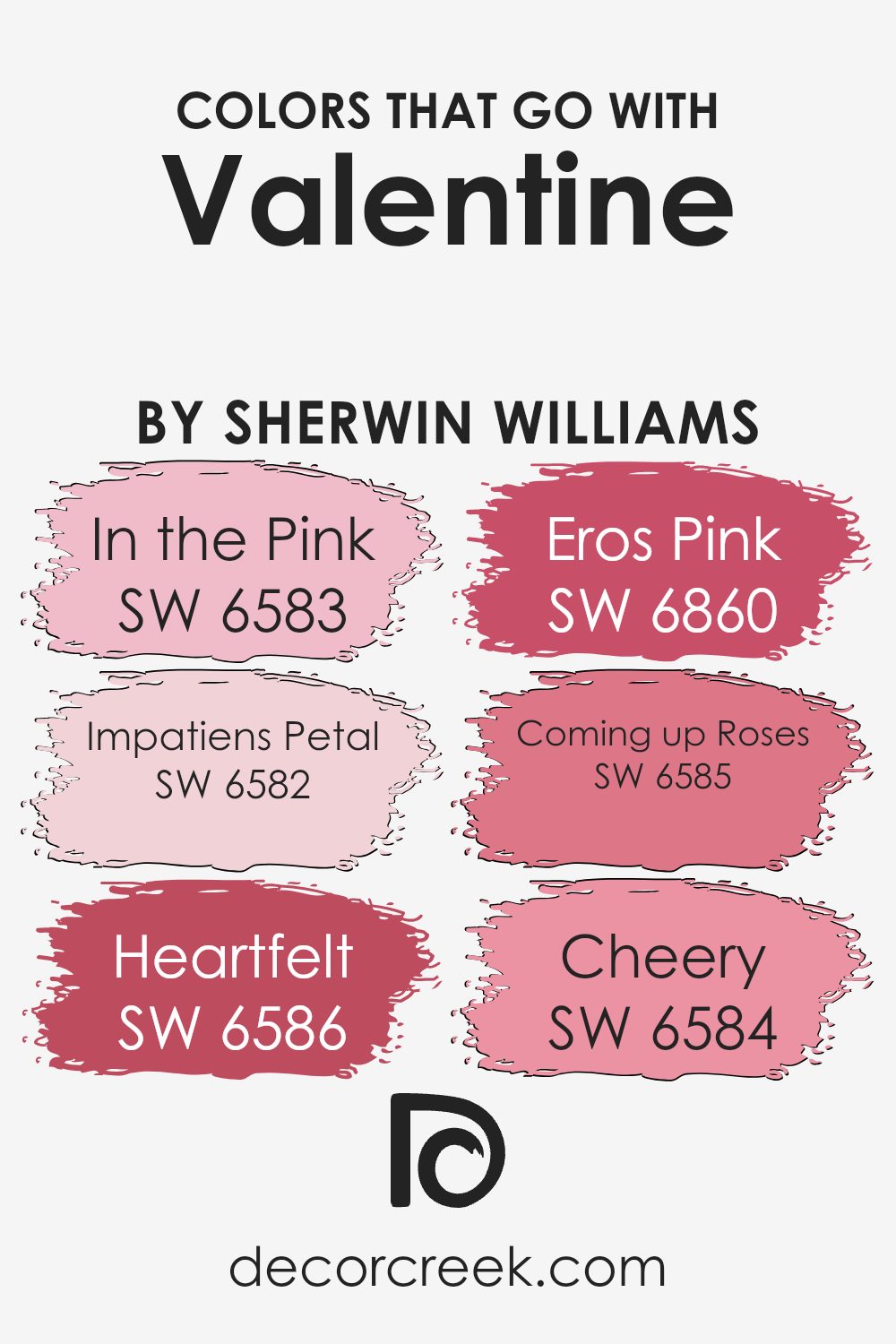
Colors that Go With Valentine SW 6587 by Sherwin Williams
Valentine SW 6587 by Sherwin Williams is a warm, inviting pink that can create a cozy and romantic atmosphere in any space. When paired with complementary colors, it can enhance the mood of the room and bring out its unique charm.
One beautiful match is SW 6583 – In the Pink, a soft and gentle shade that adds a light and airy feel when placed next to the more intense Valentine hue. This pairing can make any space feel brighter and more welcoming.
SW 6582 – Impatiens Petal is another lovely companion, providing a delicate and fresh pink touch that balances well with the richness of Valentine. SW 6586 – Heartfelt offers a richer and deeper pink tone, which can add depth and dimension when used alongside Valentine.
SW 6860 – Eros Pink stands out with its bold, playful quality, perfect for adding a pop of energy. SW 6585 – Coming up Roses presents a more subdued, yet still vibrant pink, which blends seamlessly with Valentine’s intensity.
Lastly, SW 6584 – Cheery is an uplifting and bright pink that can inject a sense of joy and warmth. Together, these colors complement the main hue, bringing harmony and a joyful ambiance to any space.
You can see recommended paint colors below:
- SW 6583 In the Pink
- SW 6582 Impatiens Petal
- SW 6586 Heartfelt
- SW 6860 Eros Pink
- SW 6585 Coming up Roses
- SW 6584 Cheery
How to Use Valentine SW 6587 by Sherwin Williams In Your Home?
Valentine SW 6587 by Sherwin Williams is a warm, rosy pink that can add charm to any room in your home. This color works well in living rooms or bedrooms, creating a cozy and inviting atmosphere. You can use it as the main color on your walls or as an accent to brighten up a space.
Pair it with crisp whites or soft grays for a balanced look. In a bedroom, this shade can be calming and romantic, perfect for creating a restful retreat. In a kitchen, it can add a little fun and energy.
If you’re unsure about painting an entire room, consider using Valentine SW 6587 on a single accent wall or on cabinets for a pop of color. Adding decor items like pillows, rugs, or curtains in the same shade can tie the look together, making your space feel more harmonious and well-designed.
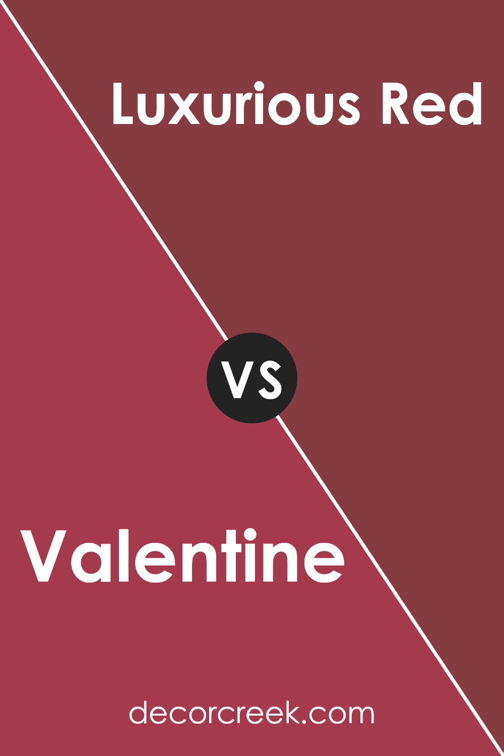
Valentine SW 6587 by Sherwin Williams vs Luxurious Red SW 6314 by Sherwin Williams
Valentine (SW 6587) by Sherwin Williams is a vibrant and lively shade of pink that brings energy and warmth to any space. It is bold without being overwhelming, making it a popular choice for feature walls or accents in a room. This color can instantly add a cheerful and inviting atmosphere, fitting for playful or creative spaces.
On the other hand, Luxurious Red (SW 6314) is a deeper, richer shade of red with a classic and elegant feel. This color has a more dramatic presence and can create a cozy, sophisticated atmosphere. It is often used in dining rooms, living rooms, or areas where a touch of luxury is desired.
While Valentine is bright and energetic, Luxurious Red offers a more subdued, yet striking, appearance. Choosing between these two depends on whether you want a lively and fun vibe or a warm and rich feel in your space.
You can see recommended paint color below:
- SW 6314 Luxurious Red
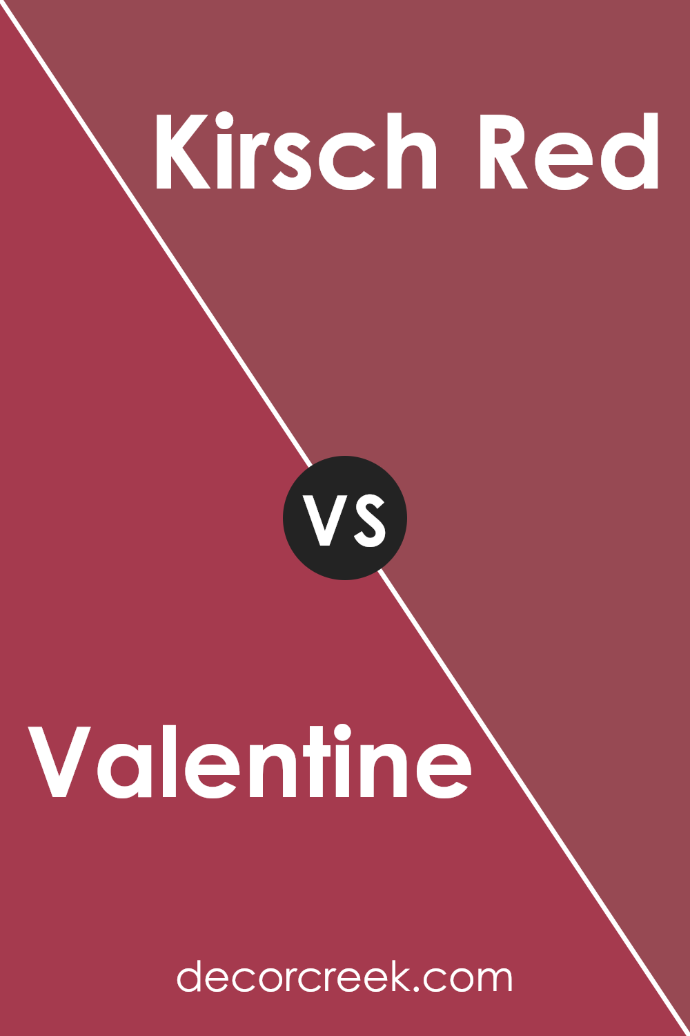
Valentine SW 6587 by Sherwin Williams vs Kirsch Red SW 6313 by Sherwin Williams
Valentine and Kirsch Red are two bold shades from Sherwin Williams, each with distinct qualities. Valentine is a lively, vibrant pink with a playful energy. Its bright and cheerful tone makes it perfect for adding a pop of color to any space, creating a fun and inviting atmosphere.
In contrast, Kirsch Red is a deep, rich red that conveys warmth and intensity. This classic red can bring a sense of drama and elegance to a room, making it suitable for areas where you want to create a strong impression.
While Valentine exudes a sense of joy and youthfulness, Kirsch Red offers a more intense and passionate feel. Both colors can make a statement, but they do so in different ways. Valentine is ideal for those looking to brighten a space, while Kirsch Red is perfect for adding bold depth and warmth.
You can see recommended paint color below:
- SW 6313 Kirsch Red
Valentine SW 6587 by Sherwin Williams vs Hot SW 6843 by Sherwin Williams
Valentine (SW 6587) by Sherwin Williams is a warm, romantic pink with a touch of subtlety. It’s a color that brings a sense of comfort and can be used to create a cozy and inviting atmosphere in a space. It complements well with neutral tones, adding a gentle pop of color without overwhelming the senses.
On the other hand, Hot (SW 6843) is a much bolder and more vibrant pink. It’s energetic and lively, perfect for making a statement or adding a playful touch to a room. This color demands attention and can be used as an accent to inject fun and excitement into a space.
While Valentine brings warmth and subtlety, Hot brings energy and boldness. Both colors can be used to enhance a room, but the choice between them depends on whether you prefer a more calming, cozy environment or a lively, spirited one.
You can see recommended paint color below:
- SW 6843 Hot

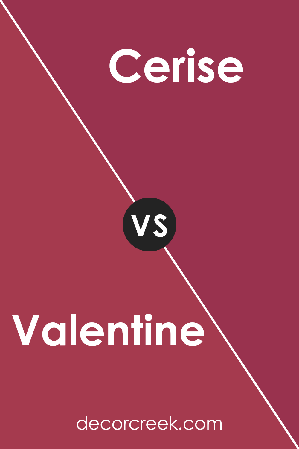
Valentine SW 6587 by Sherwin Williams vs Cerise SW 6580 by Sherwin Williams
Valentine and Cerise, both from Sherwin Williams, are vibrant pink shades that add warmth and energy to any space. Valentine is a bold and lively pink with a rich undertone, ideal for making a statement. It works well in spaces where you want to add excitement and draw attention, like an accent wall or a lively entryway.
On the other hand, Cerise is a slightly softer, but still vivid, pink. While it also has a warm tone, it is a bit more subdued compared to Valentine. Cerise can be used in spaces where you want a cheerful yet calming effect, such as a bedroom or a cozy living area.
Both colors can brighten a room, but Valentine is the go-to for bold statements, whereas Cerise offers a balance between brightness and a softer presence. Pairing these colors with neutral tones can help them stand out beautifully in any setting.
You can see recommended paint color below:
- SW 6580 Cerise
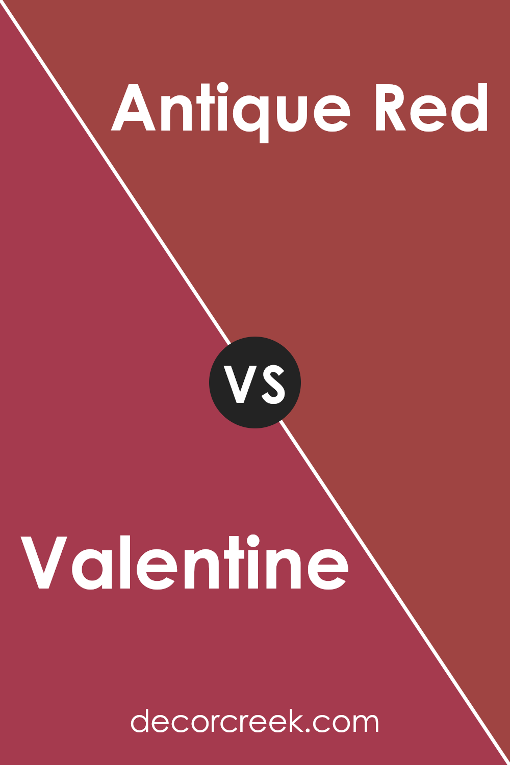
Valentine SW 6587 by Sherwin Williams vs Antique Red SW 7587 by Sherwin Williams
Valentine (SW 6587) and Antique Red (SW 7587) by Sherwin Williams are two shades of red but have distinct personalities. Valentine is a bright, vibrant pinkish-red that feels lively and cheerful. It’s a fun color that can energize a space and create a playful atmosphere.
On the other hand, Antique Red is a deeper, more subdued color with a classic and rich character. It leans towards a maroon or burgundy shade and exudes warmth and depth.
While Valentine works well in spaces where you want to emphasize energy and passion, Antique Red suits more formal or cozy settings, where a touch of elegance and warmth is desired.
Pair Valentine with light, neutral colors to create contrast and let it stand out, while Antique Red pairs beautifully with deep earth tones and gold accents for a sophisticated look.
Both colors bring their own unique effects to a room, adding their distinct flair.
You can see recommended paint color below:
- SW 7587 Antique Red
Valentine SW 6587 by Sherwin Williams vs Gala Pink SW 6579 by Sherwin Williams
Valentine by Sherwin Williams is a vibrant pink hue, full of energy and warmth. It’s a bold choice for anyone looking to create a lively atmosphere. The color has a strong presence and can easily become the focal point of a room.
On the other hand, Gala Pink is slightly softer, offering a more gentle and subtle pink. It has a sweeter, more understated vibe compared to Valentine.
While both colors fall within the pink family, Valentine commands attention with its vivacity, making it ideal for an accent wall or a playful touch in a space.
Gala Pink, with its softer tone, can work well for larger areas, providing a cozy and inviting feel.
Both colors add charm, but Valentine is for those who prefer a punch of color, while Gala Pink is suited for a softer, pleasing appearance.
You can see recommended paint color below:
- SW 6579 Gala Pink
Valentine SW 6587 by Sherwin Williams vs Poinsettia SW 6594 by Sherwin Williams
Valentine and Poinsettia by Sherwin Williams are both vibrant shades of red, each with its unique appeal. Valentine is a lively, warm pinkish-red that exudes energy and passion. It’s bright and adds a cheerful touch to any space, making it perfect for creating a lively atmosphere in living rooms or kitchens.
On the other hand, Poinsettia is a deeper, richer red with a slightly cooler undertone. This color has a classic feel, reminiscent of the festive holiday plant it’s named after. It brings depth and elegance to a room, making it suitable for dining areas or accent walls where you want a touch of luxury.
While Valentine pops with a youthful and spirited vibe, Poinsettia offers a more traditional and bold presence. Choosing between them depends on whether you want to create a playful space or one with a more dramatic and classic look.
You can see recommended paint color below:
- SW 6594 Poinsettia
Valentine SW 6587 by Sherwin Williams vs Cherries Jubilee SW 6862 by Sherwin Williams
Valentine (SW 6587) and Cherries Jubilee (SW 6862) by Sherwin Williams are both vibrant shades of red with distinct characteristics. Valentine is a bright and cheerful pinkish-red, perfect for adding a lively and fun touch to any space. It’s playful and energetic, making it suitable for areas where you want to encourage activity and creativity, like a playroom or an accent wall in a vibrant living area.
On the other hand, Cherries Jubilee offers a deeper, bolder red shade with a hint of sophistication. It’s more intense and can create a dramatic effect in any room. This color works well in dining rooms or spaces where you want to make a strong impression.
While both colors are striking in their own right, Valentine leans towards a youthful exuberance, whereas Cherries Jubilee provides a rich, classic feel. Choosing between them depends on whether you prefer a lively or a more dramatic atmosphere.
You can see recommended paint color below:
- SW 6862 Cherries Jubilee
Valentine SW 6587 by Sherwin Williams vs Radish SW 6861 by Sherwin Williams
Valentine and Radish, both from Sherwin Williams, are two distinct shades of red. Valentine is a warm, rosy pink with a soft, romantic vibe. It can create a cozy and inviting atmosphere, making it perfect for bedrooms or living spaces where you want a touch of warmth without being too bold.
On the other hand, Radish is a more vibrant, intense red. It grabs attention and adds energy to a room. This striking shade is ideal for accent walls or areas where you want to make a strong impact. While Radish can inspire enthusiasm and passion, it’s best used in moderation if you’re not looking for an overwhelming space.
When compared, Valentine offers a subtler, more delicate feel, whereas Radish stands out with its brilliant intensity. Both colors can bring their own unique charm to a space, depending on the mood and effect you want to achieve.
You can see recommended paint color below:
- SW 6861 Radish

Valentine SW 6587 by Sherwin Williams vs Show Stopper SW 7588 by Sherwin Williams
Valentine SW 6587 and Show Stopper SW 7588 by Sherwin Williams are both bold reds but offer different vibes. Valentine is a bright, rosy red with a soft touch that feels warm and inviting. It’s like a cheerful hug that brings energy to any room. It’s perfect for spaces where you want a friendly, welcoming atmosphere.
In contrast, Show Stopper is a more intense and vibrant red. It’s deeper and richer, making a striking statement. It’s the color you’d use to create a focal point or to add drama to a space. This red demands attention and works well for those who love making bold design choices.
Both colors are great for adding personality to a room, but they serve different purposes. Valentine is more approachable and cozy, while Show Stopper makes a daring, confident splash. Choose Valentine for warmth and Show Stopper for a dramatic impact.
You can see recommended paint color below:

Conclusion
After reading about SW 6587 Valentine by Sherwin Williams, I’ve come to a simple understanding that this color is like a friendly hug. It’s a warm shade of pink that reminds me of a cozy blanket or a sweet candy. Imagine painting a room with this color; it would feel inviting and cheerful. Valentine is a color that makes any place feel happy and welcoming.
This color fits well in different rooms. In a living room, it could make gatherings feel more fun and comfortable. In a bedroom, it could create a snug feeling, perfect for relaxing after a long day. Even in a kitchen, it might make cooking and eating more joyful.
What’s great about Valentine is how it pairs nicely with other colors. It can go with soft neutrals like beige or cream or even bold colors like navy blue or deep green. This makes it easy for people to use in homes, no matter what kind of style they like. Even for kids, it’s a fun and bright color that can make them smile.
In a nutshell, SW 6587 Valentine is a lovely, happy shade that can bring a dash of joy and comfort to any room. It’s like adding a bit of sunshine and sweetness to our homes.

Ever wished paint sampling was as easy as sticking a sticker? Guess what? Now it is! Discover Samplize's unique Peel & Stick samples.
Get paint samples

