When it comes to choosing the perfect paint color for your space, the vast array of options can be overwhelming. However, among the many shades available, SW 0049 Silver Gray by Sherwin Williams stands out as a unique and versatile choice.
This article aims to provide a thorough overview of Silver Gray, helping you understand why it might just be the ideal selection for your next project.Silver Gray is not just another gray.
It’s a nuanced shade that balances between a light, airy feel and a touch of elegance. Its versatility makes it a favorite among homeowners and professionals alike, as it effortlessly complements a wide range of decor styles and color schemes.
Whether you’re looking to freshen up your living room, bedroom, or any space in need of a makeover, Silver Gray offers a soothing backdrop that’s both modern and timeless.Moreover, this color isn’t just about aesthetic appeal.
The quality of paint provided by Sherwin Williams ensures that Silver Gray not only looks good but also lasts, offering durability and coverage you can count on.
Throughout this article, we’ll explore how Silver Gray can transform different spaces, tips on achieving the best results, and why it continues to be a go-to choice for those looking to combine style and practicality in their decorating endeavors.
What Color Is Silver Gray SW 0049 by Sherwin Williams?
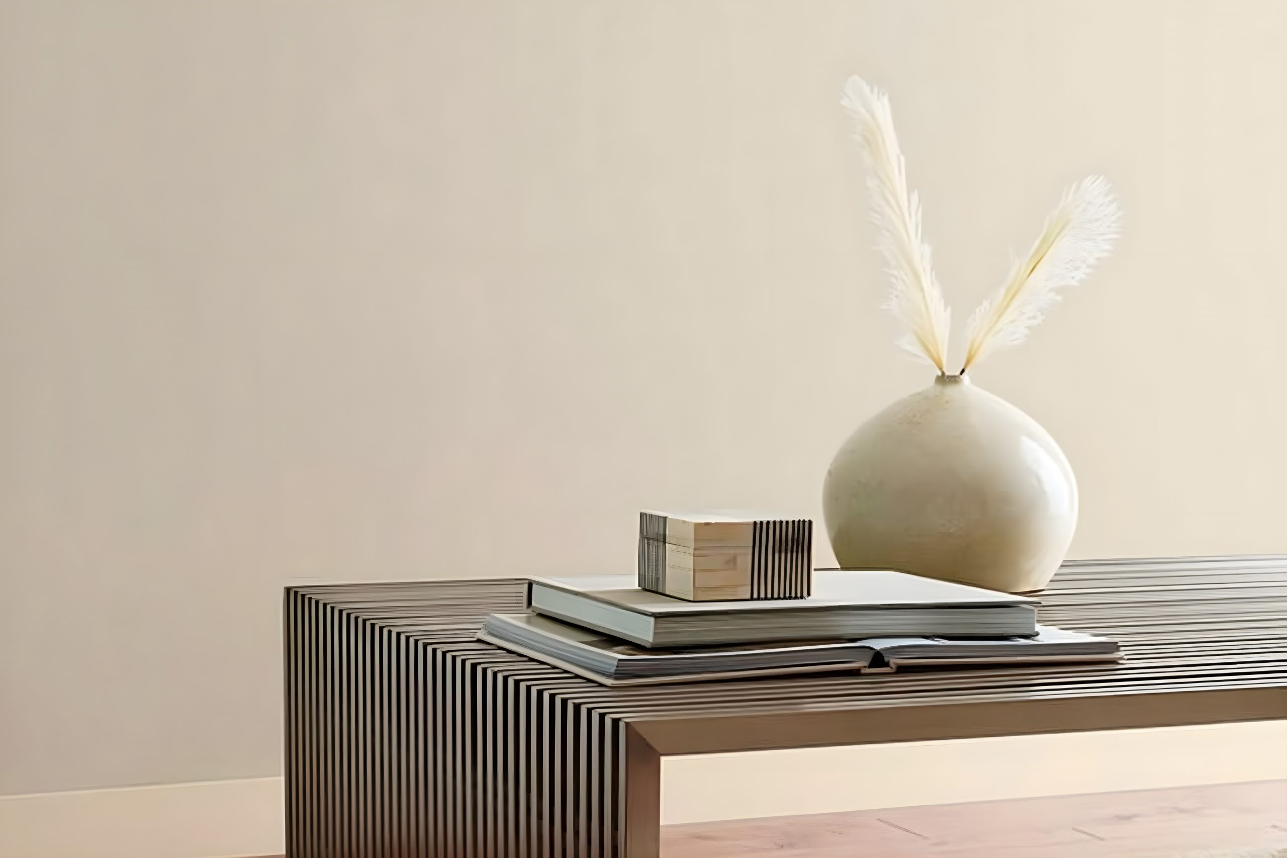
Silver Gray by Sherwin Williams, labeled SW 0049, is a versatile shade that leans towards the cooler side of the color spectrum. Adapted to embody both modern elegance and timeless charm, Silver Gray stands out for its ability to balance a room’s aesthetic.
Its light, almost ethereal quality, can brighten spaces while introducing a sense of calmness and sophisticated neutrality.
This color works wonders in various interior styles, particularly shining in minimalist, Scandinavian, and contemporary designs.
Its unassuming subtlety makes it a perfect backdrop for bolder accents or a serene base for a more muted, monochromatic palette.
When considering materials and textures to pair with Silver Gray, the options are refreshingly broad. Natural wood, with its warm tones, contrasts beautifully against this cool hue, bringing a touch of earthiness to the environment.
Metallic finishes like brushed nickel or stainless steel echo the color’s namesake, enhancing its modern vibe without overwhelming it. For textures, think along the lines of soft, plush fabrics or sleek leather to add depth and interest to the space.
Light, airy fabrics can also complement Silver Gray, contributing to a relaxed and comfortable atmosphere.
Overall, Silver Gray shows its strength in adaptability, partnering well with a wide range of materials and textures while fitting seamlessly into assorted interior designs.

Ever wished paint sampling was as easy as sticking a sticker? Guess what? Now it is! Discover Samplize's unique Peel & Stick samples.
Get paint samples
Is Silver Gray SW 0049 by Sherwin Williams Warm or Cool color?
Silver Gray SW 0049 by Sherwin Williams is a beautiful, versatile paint color that adds a subtle elegance to any room. This shade of gray strikes a perfect balance between warm and cool tones, making it easily adaptable to a wide range of decorating styles and color palettes.
Its gentle hue creates a soothing atmosphere, ideal for spaces where you want to relax and unwind, like bedrooms and living areas.
In homes, Silver Gray works wonders by reflecting natural light, giving rooms a spacious and airy feel.
This is especially beneficial in smaller spaces or areas with limited natural light, as it can help make them appear larger and more welcoming. Despite its lightness, this color has enough depth to add character and sophistication to a space without overwhelming it.
Whether you’re aiming for a modern, minimalist look or something more traditional, Silver Gray proves to be incredibly versatile.
It pairs beautifully with bold colors, providing a soft backdrop that allows accent colors to shine, as well as with neutral tones, for a more cohesive and understated aesthetic.
Additionally, this color is great for creating a seamless flow throughout the home, offering a neutral base that’s both stylish and timeless.
Undertones of Silver Gray SW 0049 by Sherwin Williams
Sherwin Williams’ Silver Gray (SW 0049) is a versatile paint color that brings a unique blend of undertones to any space it adorns. The two primary undertones in this shade are pale pink and light gray.
These undertones play a significant role in how the color is perceived, adding depth and complexity that can change under different lighting conditions.
Pale pink undertones add a subtle warmth to Silver Gray, softening spaces with a gentle and inviting glow. This warmth can make rooms feel more welcoming and cozy, perfect for living areas or bedrooms seeking a touch of comfort without overpowering the senses.
On the other hand, the light gray undertones offer a neutral backdrop, making Silver Gray a flexible option for various decor styles and color schemes. This neutrality means it can easily harmonize with other colors, adding to its appeal for those seeking a versatile wall color.
When used on interior walls, Silver Gray’s undertones influence the room’s overall ambiance. Natural light can enhance the pale pink undertones, creating a soft, warm effect that shifts throughout the day.
Artificial light, depending on its color temperature, can either underscore the warmth of the pink or highlight the cooler, neutral aspects of the light gray.
This interplay of undertones with light means Silver Gray can offer a dynamic look in a space, contributing to an ever-evolving atmosphere that remains balanced and soothing.
In simpler terms, this paint color is like a chameleon, subtly shifting in hue depending on the room’s lighting, making it a smart choice for those wanting a color that can adapt and morph throughout the day.
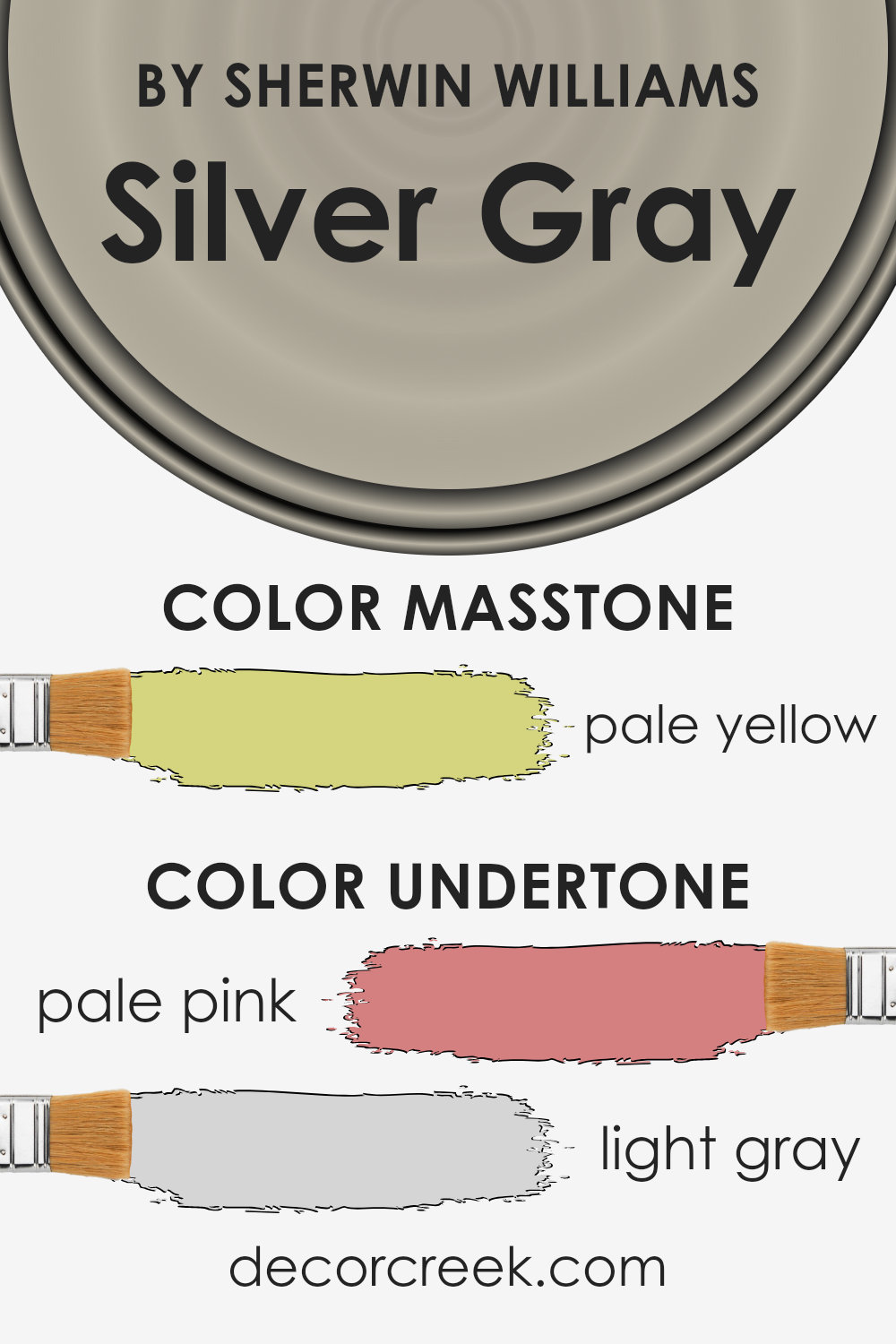
What is the Masstone of the Silver Gray SW 0049 by Sherwin Williams?
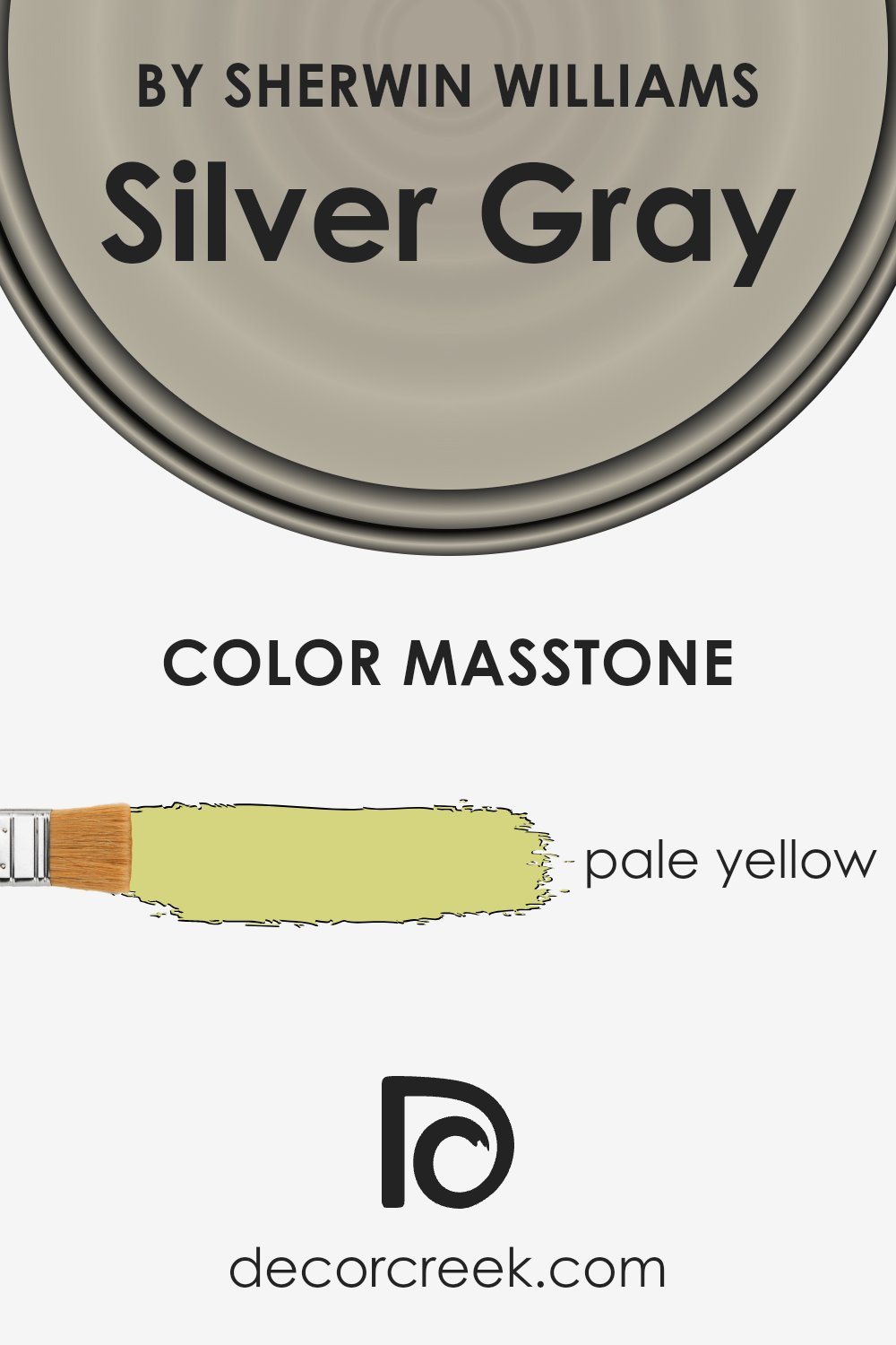
Silver Gray is a unique color with an underlying masstone of pale yellow. This masstone plays a crucial role in how the paint color appears and feels in different settings within homes.
When you look at Silver Gray, its pale yellow base adds a subtle warmth to spaces, making rooms feel welcoming and cozy.
This warmth is especially beneficial in areas that receive less natural light or in spaces where a sense of comfort and homeliness is desired.
Additionally, the pale yellow undertone can help soften sharper design elements, blending modern and traditional styles seamlessly.
It offers a versatile backdrop for various furnishings and decor, allowing you to mix and match pieces without the space feeling disjointed.
Whether used in living rooms, bedrooms, or even smaller spaces like hallways, Silver Gray brings a gentle, soothing presence that enhances the overall feel of the home, making it more inviting and pleasant to live in.
How Does Lighting Affect Silver Gray SW 0049 by Sherwin Williams?
Lighting plays a crucial role in how we perceive colors. It can change a color’s appearance dramatically, making it look completely different under various light conditions.
When it comes to painting walls, understanding this effect can help you choose the right color for your room. Let’s explore how a color like Silver Gray works under different lighting conditions.
Firstly, in natural light, colors can appear brighter and more vivid. Natural light, especially the soft, diffused kind, tends to reveal the truest form of a color.
Silver Gray, in natural light, will mostly show its calm, cool essence, providing a serene backdrop that’s both elegant and understated.
In artificial light, the type of bulb can affect how Silver Gray looks. Warm bulbs can make it appear slightly warmer, pulling out hidden beige or yellow undertones, while cool LED bulbs might enhance its gray qualities, making it look more modern and crisp.
Room orientation significantly impacts how Silver Gray displays:
- North-Faced Rooms: These rooms get less direct sunlight, meaning Silver Gray might look a bit cooler and more muted. It may even take on a slightly bluish tint, enhancing its serene qualities but making it feel cooler.
- South-Faced Rooms: Here, the abundant sunlight can warm up Silver Gray, softening its appearance. It becomes lighter, more reflective, and might reveal subtle, warm undertones during the brightest parts of the day.
- East-Faced Rooms: Morning light is warm and yellow, which means Silver Gray can look softer and warmer in the morning. As the day progresses and the natural light diminishes, it will return to a cooler, more neutral gray.
- West-Faced Rooms: In these rooms, the color will feel cooler in the morning but warm up significantly in the late afternoon and evening as the sun sets, highlighting the versatility of Silver Gray in adapting to different lighting conditions.
Understanding these dynamics can help you make informed decisions on where and how to use Silver Gray to achieve the desired effect in your space, ensuring it always looks its best.

What is the LRV of Silver Gray SW 0049 by Sherwin Williams?
LRV stands for Light Reflectance Value, which is a measure that tells us how much light a color reflects or absorbs. This value ranges from 0 to 100, with 0 being completely black, absorbing all light, and 100 being pure white, reflecting all the light it receives.
This metric is really important because it helps us understand how light or dark a color will look on our walls and how it can transform the feel of a space.
Different levels of natural and artificial light in a room can significantly affect how we perceive the color on the walls. A higher LRV means the color will look lighter and can make a room feel more spacious and airy, while a lower LRV can make a space feel cozier but smaller.
For the color Silver Gray, with an LRV of 44.517, it sits in the middle range of the LRV scale. This means it neither reflects light like lighter colors do nor absorbs light to the extent darker colors can.
As a result, this particular shade of gray will have a moderate impact on the spaciousness and brightness of a room. In spaces with plenty of natural light, Silver Gray will likely appear lighter and more vibrant, contributing to a soothing and pleasant atmosphere.
However, in rooms lacking natural light, it might seem a bit darker, highlighting its warmer, more grounding qualities.
This balanced LRV makes Silver Gray a versatile color choice, capable of adapting subtly to different lighting conditions and adding a sophisticated touch to any room.

LRV – what does it mean? Read This Before Finding Your Perfect Paint Color
Coordinating Colors of Silver Gray SW 0049 by Sherwin Williams
Coordinating colors are shades that complement each other, enhancing the overall aesthetic of a space when used together.
They work by either contrasting with each other to create a vibrant look or by harmoniously blending to achieve a more serene and cohesive appearance.
For instance, when you take a neutral base like a soft, elegant grey, you can pair it with colors that either slightly deepen the mood or add a subtle, sophisticated contrast. This approach allows for a balanced and visually appealing palette in your home.
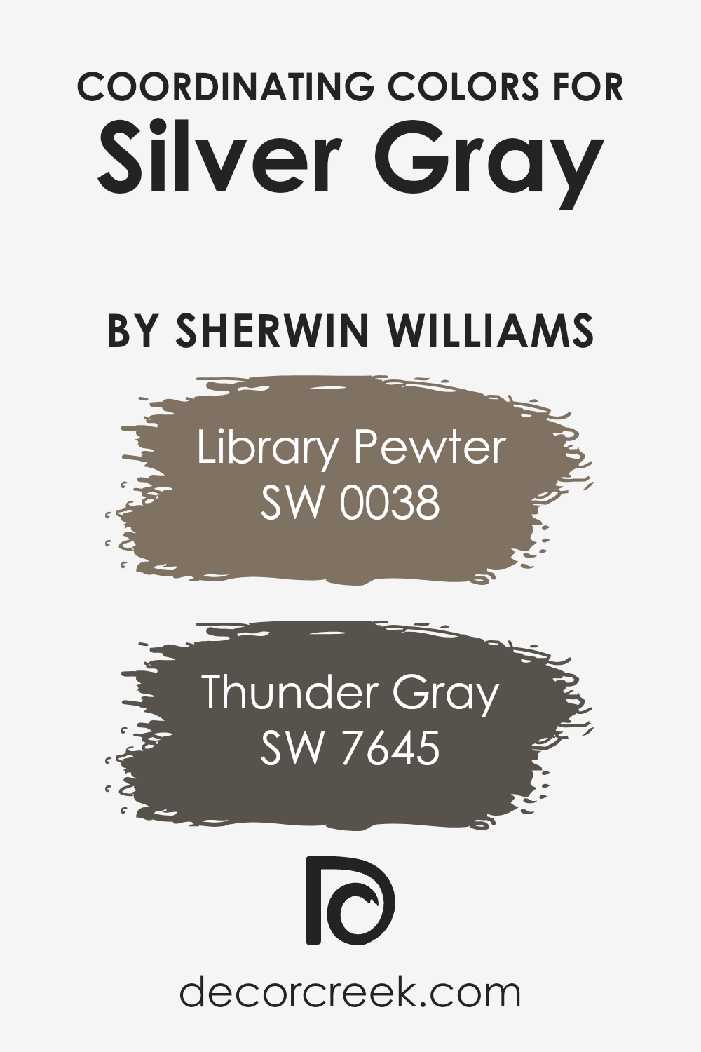
Library Pewter and Thunder Gray are two colors that coordinate well with the gentle tone of Silver Gray. Library Pewter is a deeper, almost historical grey that brings depth and solidity to the subtle lightness of Silver Gray.
Its rich undertones provide a foundation that allows Silver Gray to shine while adding a layer of sophistication. On the other hand, Thunder Gray is a dynamic shade that straddles the line between grey and a stormy blue.
It adds a dramatic flair to the room, contrasting with Silver Gray’s softness, yet it does so without overwhelming the space. Together, these colors create a palette that is both varied and unified, offering a range of possibilities for decorating with style and subtlety.
You can see recommended paint colors below:
- SW 0038 Library Pewter (CHECK A SAMPLE)
- SW 7645 Thunder Gray (CHECK A SAMPLE)
What are the Trim colors of Silver Gray SW 0049 by Sherwin Williams?
Trim colors are those accents used to highlight or frame areas of a home, such as windows, doors, and baseboards, essentially serving as a decorative enhancement.
When it comes to a versatile hue like Silver Gray by Sherwin Williams, selecting the right trim color becomes paramount in achieving a cohesive look.
The right trim can either subtly complement the main color, adding depth and sophistication, or create a striking contrast that draws the eye and adds visual interest.
For a color as adaptable as Silver Gray, trim choices play a crucial role in either softening the overall aesthetic for a more serene space or defining architectural details for a more dynamic effect.
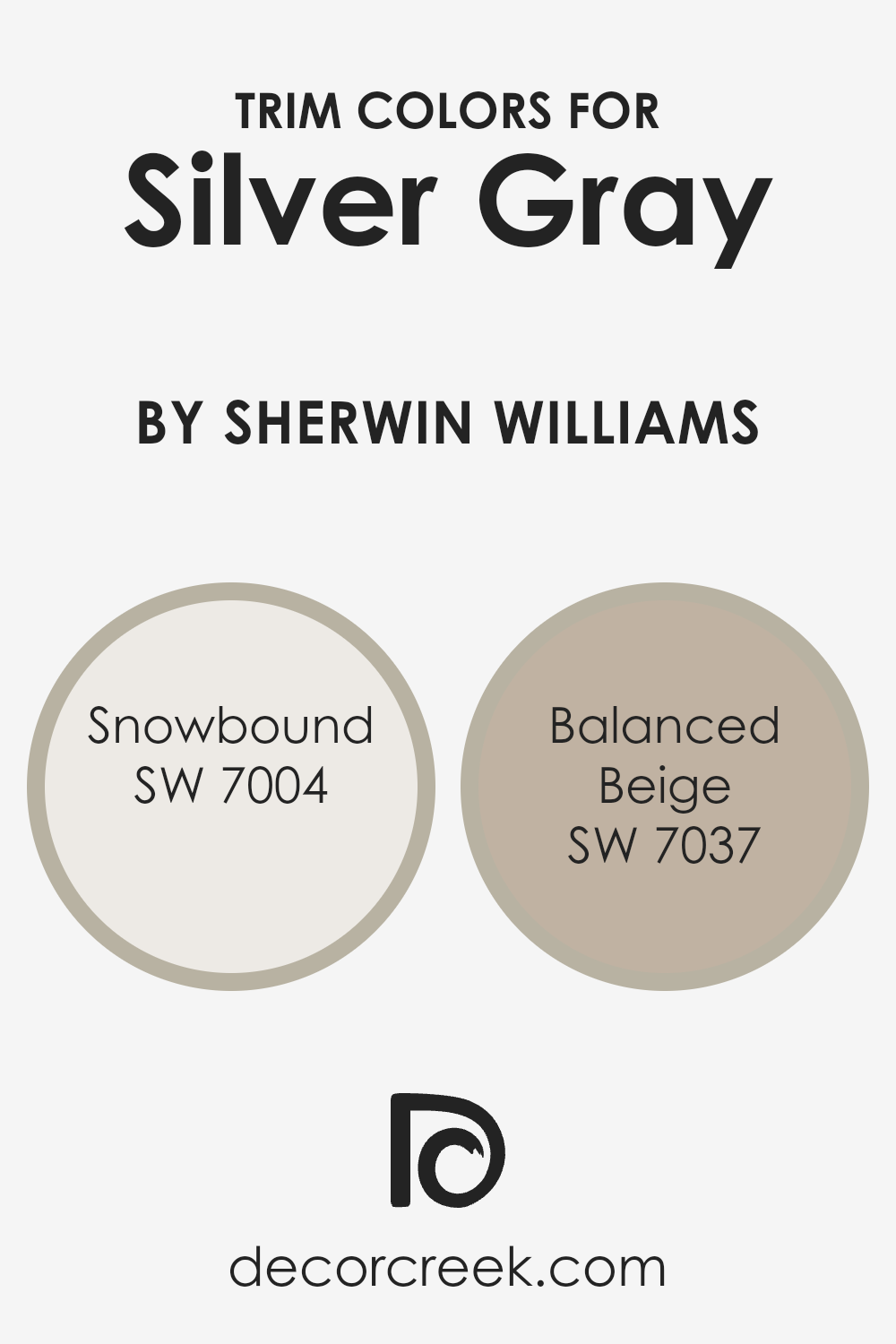
Snowbound (SW 7004) and Balanced Beige (SW 7037) are excellent choices for trim when paired with Silver Gray.
Snowbound is a light, almost ethereal white with a touch of warmth that prevents it from feeling cold, making it perfect for creating a crisp, clean contrast against the cooler undertones of Silver Gray.
This helps in brightening and refreshing the space, adding a layer of sophistication without overwhelming. On the other hand, Balanced Beige stands out as a warm, inviting neutral that offers a soft, complementary contrast to Silver Gray.
Its earthy undertones bring a cozy, grounded feel to the space, seamlessly connecting Silver Gray walls with natural elements and textures within the room.
Both trim colors enhance the versatility of Silver Gray, allowing it to adapt to various styles and preferences while maintaining its elegant appeal.
You can see recommended paint colors below:
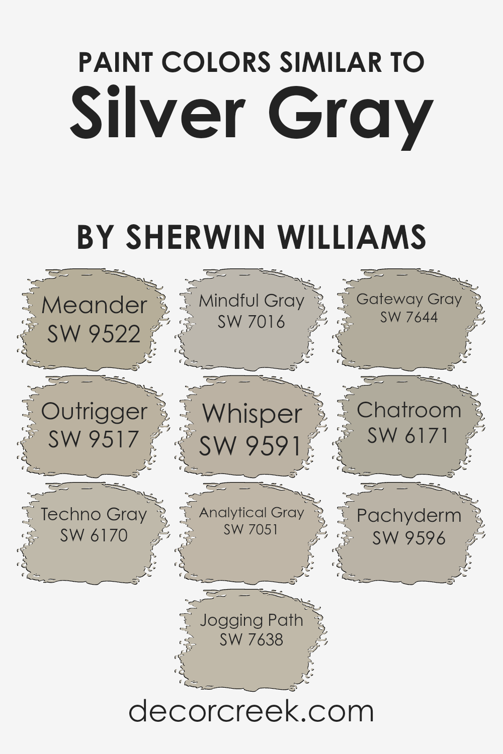
Colors Similar to Silver Gray SW 0049 by Sherwin Williams
In the world of interior design, selecting the right color palette plays a key role in creating the desired ambiance in a space. Similar colors, such as shades that closely resemble Silver Gray by Sherwin Williams, are essential because they offer a harmonious and cohesive look.
These colors work together seamlessly, providing a subtle contrast that adds depth and complexity to interiors without overwhelming the senses.
For example, Meander presents a gentle, soothing tone, akin to a serene sky, offering a tranquil backdrop. Outrigger, on the other hand, brings a slightly deeper hue that hints at the mystery of twilight, adding a layer of sophistication.
Techno Gray and Jogging Path stand out as nuanced choices that blend modernity with nature, where Techno Gray offers a sleek, contemporary feel, while Jogging Path evokes the grounded, earthy paths of a serene, natural landscape.
Mindful Gray and Whisper play on the lighter spectrum, providing a soft, airy feel that amplifies the sense of space and light. In comparison, Analytical Gray and Gateway Gray introduce a bit more weight, grounding the space with their steadiness and depth.
Lastly, Chatroom and Pachyderm add character and dimension; Chatroom’s conversational tone invites warmth and openness, whereas Pachyderm’s robust presence brings a sense of stability and reassurance.
Through these similar colors, designers can weave a visual tapestry that is both engaging and restful, creating spaces that feel put together and thoroughly thought out.
You can see recommended paint colors below:
- SW 9522 Meander (CHECK A SAMPLE)
- SW 9517 Outrigger (CHECK A SAMPLE)
- SW 6170 Techno Gray (CHECK A SAMPLE)
- SW 7638 Jogging Path (CHECK A SAMPLE)
- SW 7016 Mindful Gray (CHECK A SAMPLE)
- SW 9591 Whisper (CHECK A SAMPLE)
- SW 7051 Analytical Gray (CHECK A SAMPLE)
- SW 7644 Gateway Gray (CHECK A SAMPLE)
- SW 6171 Chatroom (CHECK A SAMPLE)
- SW 9596 Pachyderm (CHECK A SAMPLE)
How to Use Silver Gray SW 0049 by Sherwin Williams In Your Home?
Silver Gray by Sherwin Williams is a beautiful color that you can use to give your home a fresh and relaxing vibe. Think of it as a subtle way to add elegance without overwhelming a space.
This shade works great in bedrooms, where you want to create a peaceful sanctuary for rest. It has a soothing effect that can help you relax.
In living areas, Silver Gray offers a neutral backdrop, allowing your furniture and decor to stand out. It’s versatile, so whether you have a modern or traditional style, this color fits right in.
If you’re not ready to commit to painting entire walls, consider using Silver Gray for accent pieces like a bookshelf or cabinets.
It’s also an excellent choice for the exterior, giving your home a stylish look from the outside. Pair it with white trim for a classic, timeless appearance.
Remember, Silver Gray can help make small spaces appear larger and more open, thanks to its light-reflecting properties, making it a smart choice for hallways and bathrooms too.
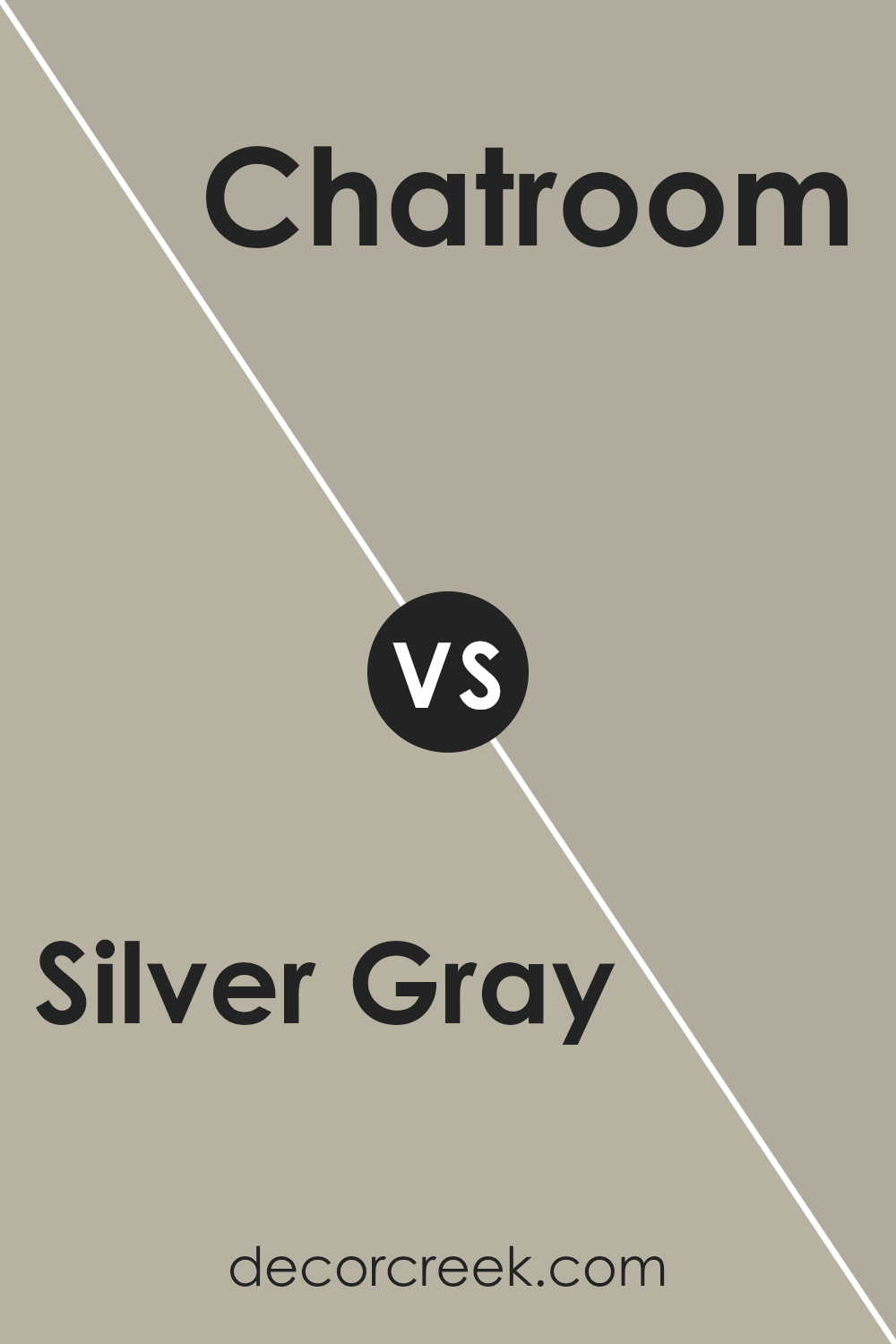
Silver Gray SW 0049 by Sherwin Williams vs Chatroom SW 6171 by Sherwin Williams
Sherwin Williams’ Silver Gray and Chatroom are two unique colors that create different moods in a space. Silver Gray is a light, airy color that brings a breezy and refreshing feel to any room.
It has a subtle metallic vibe, without being too flashy, making it perfect for a sleek and modern look. On the other hand, Chatroom is a deeper, more grounded shade that leans towards green and gray.
This color gives off a cozy and inviting atmosphere, ideal for spaces where you want to relax and unwind. While Silver Gray reflects more light, making a room look larger and more open, Chatroom absorbs light, offering a more intimate and snug vibe.
Both colors are versatile, but Silver Gray works best in spaces that aim for a minimalist and contemporary feel, whereas Chatroom suits areas meant for relaxation and conversation. Each color has its charm, depending on the mood you want to create.
You can see recommended paint color below:
- SW 6171 Chatroom (CHECK A SAMPLE)
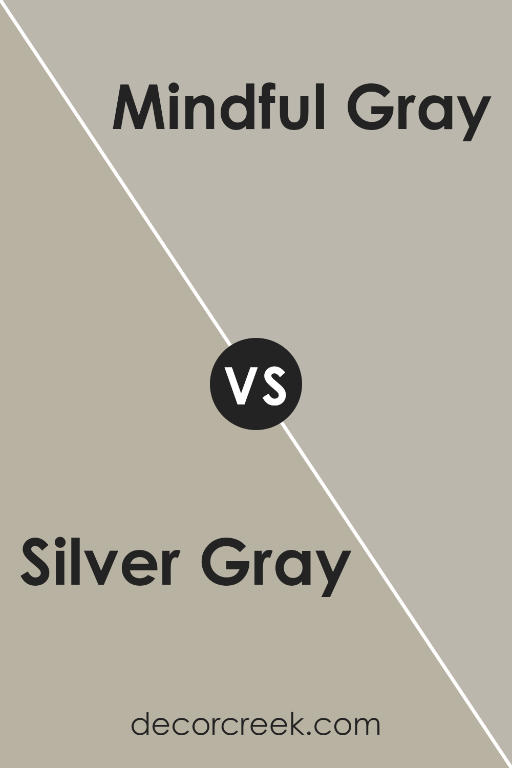
Silver Gray SW 0049 by Sherwin Williams vs Mindful Gray SW 7016 by Sherwin Williams
Silver Gray and Mindful Gray, both from Sherwin Williams, are two distinct shades, each with its unique charm. Starting with Silver Gray, this color has a light, almost ethereal look to it, bringing brightness to any room.
It leans towards a cooler palette, giving off a serene and fresh vibe, perfect for spaces meant to soothe and calm.
On the other hand, Mindful Gray sits deeper on the color spectrum. It’s a warmer shade, nestled comfortably between gray and beige, often referred to as “greige.”
This color exudes elegance and versatility, fitting beautifully in almost any setting – from modern to traditional. Its warmth makes a space feel welcoming and cozy, an ideal backdrop for both vibrant and subdued decor.
While Silver Gray reflects light, making spaces feel larger and more open, Mindful Gray offers a grounding effect, anchoring the room with its richer hue.
Each color serves different aesthetic and mood purposes, proving their suitability for a variety of spaces and designs.
You can see recommended paint color below:
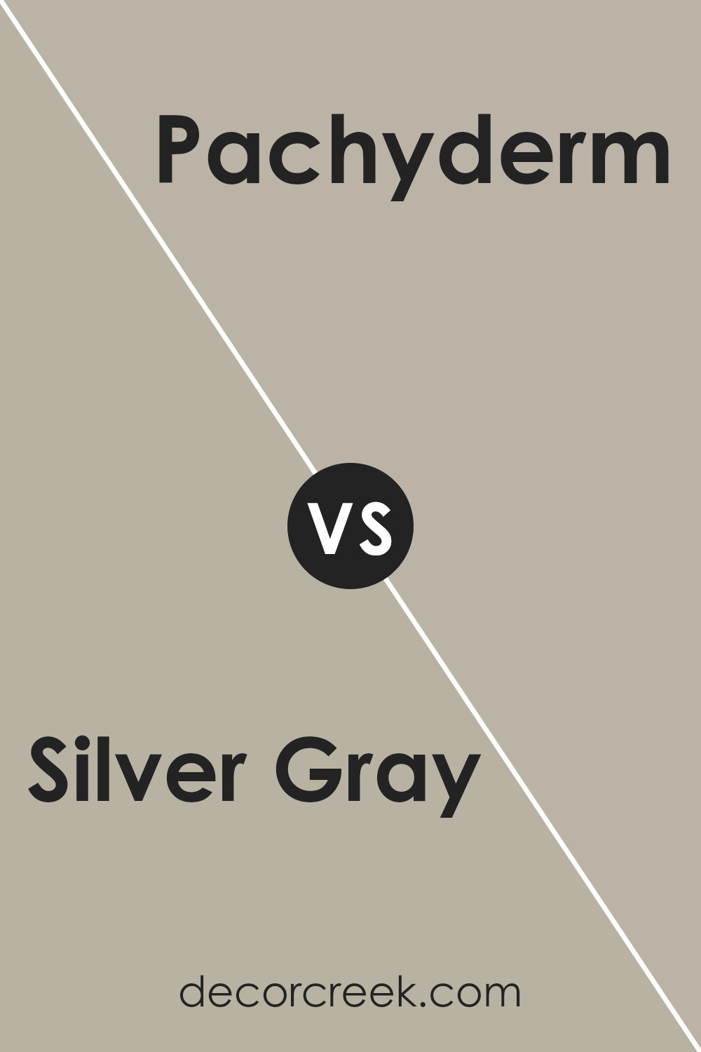
Silver Gray SW 0049 by Sherwin Williams vs Pachyderm SW 9596 by Sherwin Williams
The main color, Silver Gray, and the second color, Pachyderm, offer contrasting vibes for any space. Silver Gray brings a light, almost airy feel.
It’s that kind of color that makes a room feel open and bright, perfect for someone looking to create a calm and soothing environment. On the other hand, Pachyderm steps in with a stronger, more grounded presence.
It’s a deeper, more solid shade that can give a sense of stability and comfort to a space.
While Silver Gray might be ideal for a modern, minimalist look with its subtle elegance, Pachyderm could offer a cozy, inviting atmosphere, perfect for spaces meant to relax and unwind in.
Both colors, although different in tone and mood, provide unique opportunities to beautify a room, depending on what you’re aiming for: airy and light, or cozy and grounded.
You can see recommended paint color below:
- SW 9596 Pachyderm (CHECK A SAMPLE)
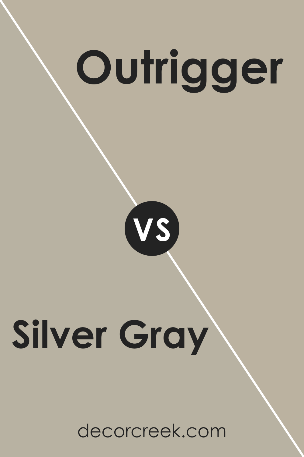
Silver Gray SW 0049 by Sherwin Williams vs Outrigger SW 9517 by Sherwin Williams
Silver Gray is a light, airy color that brings a feeling of calm and simplicity to any space.
It has a subtle brightness that can make a room feel more open and clean. Its gentle hue works well in many settings, adding a touch of elegance without being too bold.
Outrigger, on the other hand, is a darker, more grounding color. It has a richness that can add depth and warmth to an area.
This color is perfect for creating a cozy atmosphere, making it an excellent choice for spaces where you want to relax and feel comfortable.
Comparing the two, Silver Gray offers a lighter, more refreshing look, while Outrigger provides a deeper, cozier vibe. Silver Gray is best for those looking to brighten up a space and give it a sleek, modern feel.
Outrigger is ideal for adding a sense of comfort and warmth, creating a welcoming environment. Both colors have their unique appeal, making them versatile choices depending on the ambiance you’re aiming to achieve.
You can see recommended paint color below:
Silver Gray SW 0049 by Sherwin Williams vs Meander SW 9522 by Sherwin Williams
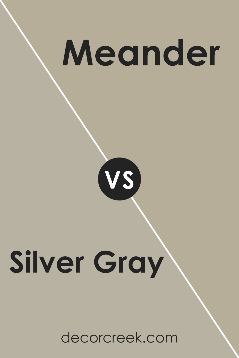
Silver Gray and Meander are both unique colors from Sherwin Williams, but they tell different stories. Silver Gray is a cool, muted color that looks like the sleek side of modern metallics.
It’s subtle, not too loud, making it perfect for creating a calm, sophisticated vibe in a room. It works like a charm in spaces that aim for a minimalist or industrial look, providing a clean backdrop that’s not overpowering.
On the other hand, Meander introduces a warmer, earthier tone to the mix. It’s like a breath of fresh air in a forest, offering a touch of natural beauty and comfort.
This color has a way of making a room feel more inviting and cozy, perfect for areas where you want to relax or gather with loved ones.
In essence, while Silver Gray offers a sleek, modern elegance, Meander leans more towards a cozy, earth-inspired ambiance. Both colors have their unique appeal, depending on the mood and style you wish to create.
You can see recommended paint color below:
Silver Gray SW 0049 by Sherwin Williams vs Gateway Gray SW 7644 by Sherwin Williams
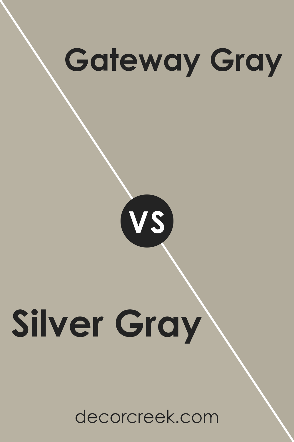
Silver Gray and Gateway Gray from Sherwin Williams are two distinct shades of gray, each offering a unique feel to any space. Silver Gray is a light and airy color, resembling the soft glow of morning light.
It’s subtle, providing a calm and serene backdrop, ideal for creating a peaceful and inviting environment. Its lightness brings a sense of openness, making it perfect for smaller rooms or spaces where you want to enhance the feeling of space.
On the other hand, Gateway Gray stands out with a deeper, more pronounced gray tone. It evokes a sense of sophistication and warmth, making it a fantastic choice for areas where a cozy, welcoming atmosphere is desired.
This color has a stronger presence, adding character and depth to walls, and works well in larger spaces or rooms that can handle a bold statement.
In summary, while both colors share the common ground of being gray, Silver Gray leans towards the lighter end of the spectrum, offering a breezy and luminous feel, whereas Gateway Gray brings a richer, more enveloping warmth to interiors.
Whether looking for a hint of tranquility or depth, these colors offer versatile options for various decorating needs.
You can see recommended paint color below:
- SW 7644 Gateway Gray (CHECK A SAMPLE)
Silver Gray SW 0049 by Sherwin Williams vs Techno Gray SW 6170 by Sherwin Williams
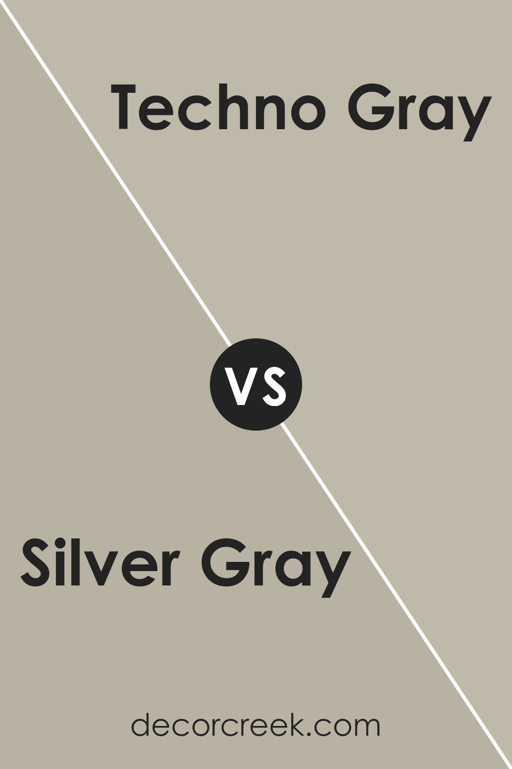
When you look at Silver Gray by Sherwin Williams, it presents a gentle, light gray tone that brings an airy and subtle elegance to a space.
It’s the kind of color that can make a room feel larger and more open, perfect for creating a serene and inviting atmosphere. Its softness allows it to blend effortlessly with a variety of decor styles, making it a versatile choice for any room.
On the other hand, Techno Gray is a deeper, more pronounced gray. This color adds a bit of drama and depth to spaces without overwhelming them.
It’s a fantastic choice if you’re aiming to add a modern touch or an element of sophistication to your environment.
Techno Gray can anchor a room with its stronger presence, providing a striking contrast when used with lighter colors or serving as a cohesive backdrop for bolder hues.
In a nutshell, Silver Gray is your go-to for a light, refreshing feel, while Techno Gray offers a richer, more impactful vibe.
Whether you’re looking for a subtle enhancement or a bold statement, these grays can transform your space in their unique ways.
You can see recommended paint color below:
- SW 6170 Techno Gray (CHECK A SAMPLE)
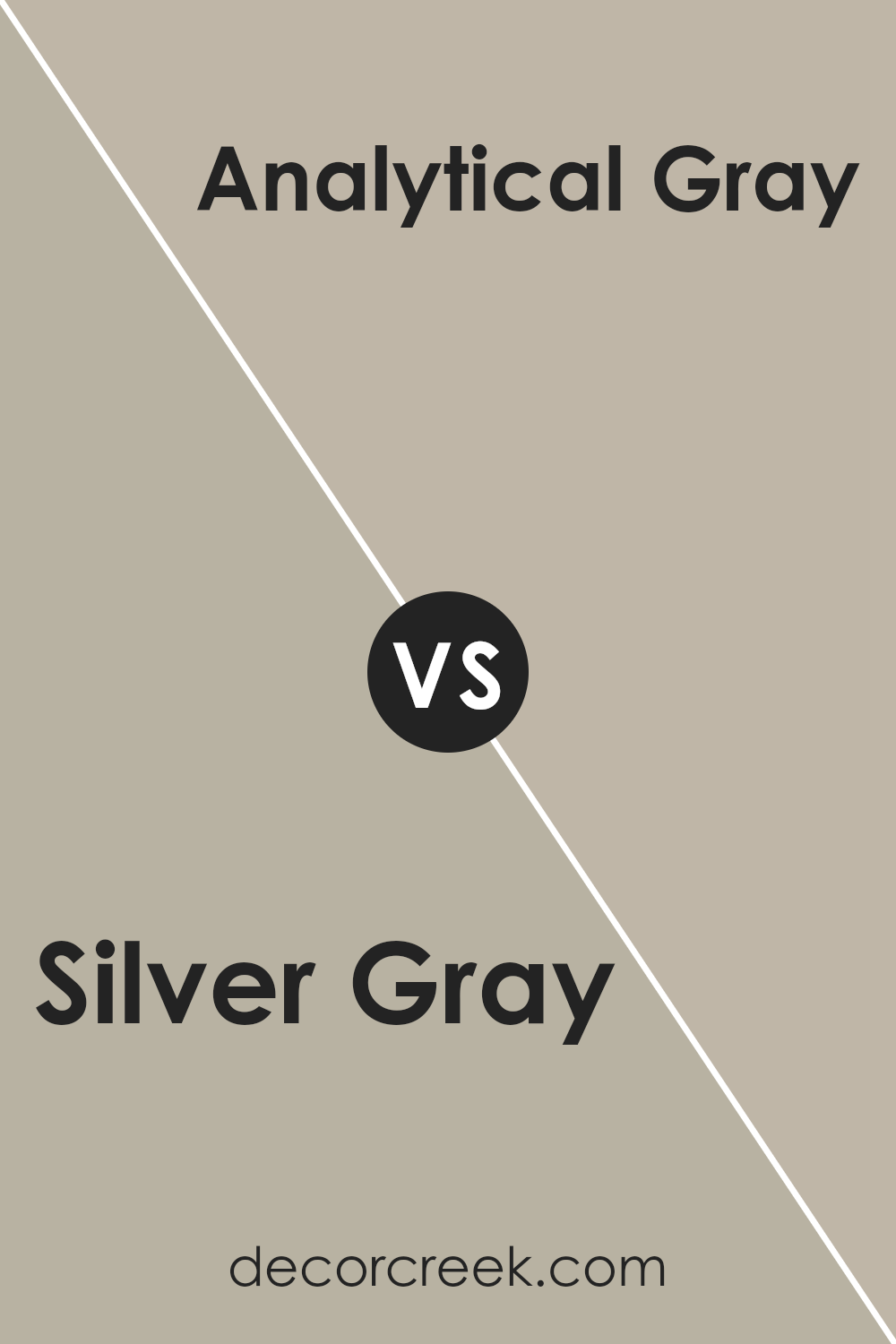
Silver Gray SW 0049 by Sherwin Williams vs Analytical Gray SW 7051 by Sherwin Williams
Silver Gray and Analytical Gray by Sherwin Williams are two distinct shades that can add unique vibes to any space. Silver Gray is lighter, offering a soft, airy feel that can make a room appear more spacious and inviting.
It’s great for creating a serene, peaceful environment. Think of it as a gentle whisper of color, subtle yet impactful, perfect for a minimalist or a modern aesthetic.
On the other hand, Analytical Gray has a warmer undertone, leaning toward a more grounded, earthy feel. This color brings a sense of warmth and coziness to a room, making it ideal for spaces where comfort and relaxation are key.
It’s like a warm hug for your walls, providing a comforting backdrop that still maintains a chic and sophisticated look.
While both colors are versatile and can blend well with various décor styles, Silver Gray works best in spaces aimed at achieving a breezy and open atmosphere.
Analytical Gray, with its cozier vibe, is suited for areas where a welcoming and snug ambiance is desired. Choosing between them depends on the mood you want to set for your room.
You can see recommended paint color below:
- SW 7051 Analytical Gray (CHECK A SAMPLE)
Silver Gray SW 0049 by Sherwin Williams vs Jogging Path SW 7638 by Sherwin Williams
Silver Gray and Jogging Path, both by Sherwin Williams, are two distinct colors that bring unique vibes to any space. Silver Gray is a light, airy color with a subtle metallic hint, akin to morning mist.
It’s perfect for a sleek, modern look or to brighten rooms with a soft, elegant touch. Think of a serene, peaceful environment, and Silver Gray fits right in, giving off a clean and refreshing atmosphere.
On the other hand, Jogging Path is a warm, inviting shade of taupe. It carries a stronger, earthier tone compared to Silver Gray, leaning towards a cozy, comforting feel.
It’s like wrapping yourself in a soft blanket on a chilly morning. This color works well in spaces where you want to add warmth and a sense of welcome without overwhelming the senses.
While Silver Gray lights up a room with its understated charm, Jogging Path grounds a space with its solid, reassuring presence.
Depending on what you’re going for – brightness and airiness or warmth and comfort – each color has its place in creating the perfect mood for your room.
You can see recommended paint color below:
- SW 7638 Jogging Path (CHECK A SAMPLE)

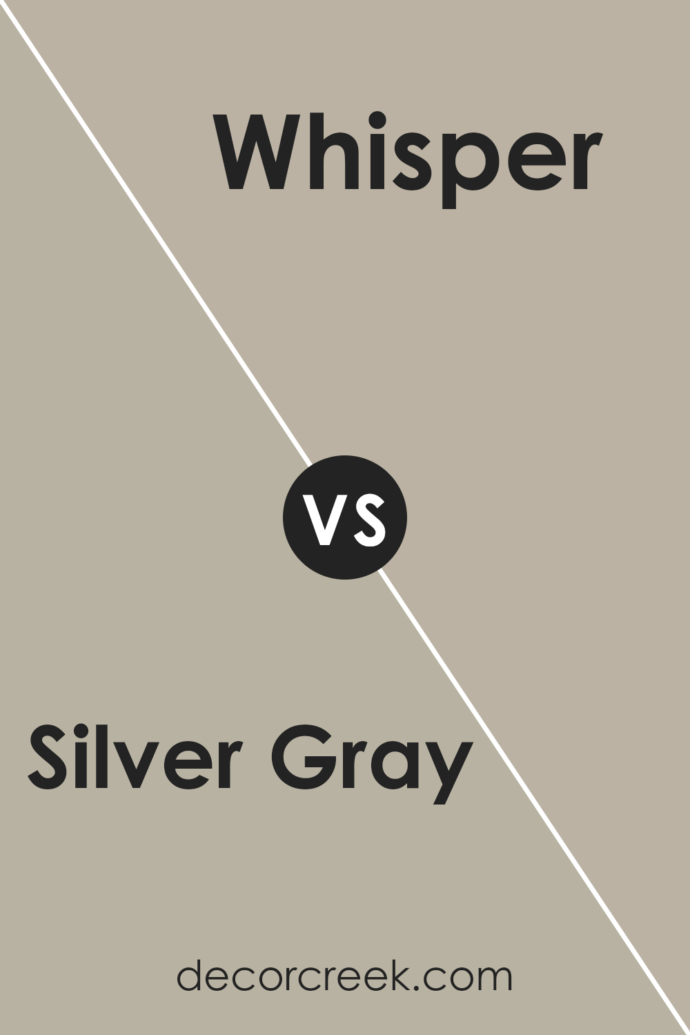
Silver Gray SW 0049 by Sherwin Williams vs Whisper SW 9591 by Sherwin Williams
Silver Gray and Whisper by Sherwin Williams are two elegant colors, yet they serve different moods and settings.
Silver Gray is a sophisticated hue that bridges the gap between a light gray and a subtle hint of silver, offering a metallic sheen that reflects light beautifully, creating an illusion of more space. It’s versatile, working well in modern and industrial designs to add a sleek, polished look.
On the other hand, Whisper is much softer and more understated. It’s a pale, almost ethereal color that exudes tranquility and calmness, making it perfect for creating a serene space.
While both colors are on the cooler side of the spectrum, Whisper leans towards creating a cozier, more inviting atmosphere, akin to a gentle, muted blanket covering a room.
When choosing between Silver Gray and Whisper, consider the mood you want to set. For a bold, dynamic aesthetic, Silver Gray is your go-to.
If you’re aiming for a softer, more peaceful vibe, then Whisper will beautifully fit the bill. Both offer unique aesthetics, but your choice should align with the ambiance you wish to achieve.
You can see recommended paint color below:
- SW 9591 Whisper (CHECK A SAMPLE)
Conclusion
The Sherwin Williams Silver Gray color offers a subtle elegance that can transform any space into a serene and inviting area. Its versatility allows it to be a perfect choice for varying design styles, from modern minimalism to cozy traditional.
As a neutral shade, it pairs beautifully with both vibrant and muted tones, giving homeowners the flexibility to play with different accents and decorations.
This color stands out for its ability to create a calm and relaxed atmosphere in a room, making it an excellent option for bedrooms, living rooms, and even home offices where a touch of tranquility is desired.
In conclusion, Silver Gray by Sherwin Williams is more than just a paint color; it’s a design solution that brings sophistication and comfort to interiors.
Its adaptability in matching with diverse decor elements makes it a go-to choice for those looking to refresh their space without overwhelming it.
Additionally, its inherent tranquility makes it ideal for creating spaces that are not only beautiful but also conducive to relaxation and peace. Whether looking to update a single room or revamp an entire home, this color proves to be both a stylish and practical selection.

Ever wished paint sampling was as easy as sticking a sticker? Guess what? Now it is! Discover Samplize's unique Peel & Stick samples.
Get paint samples


