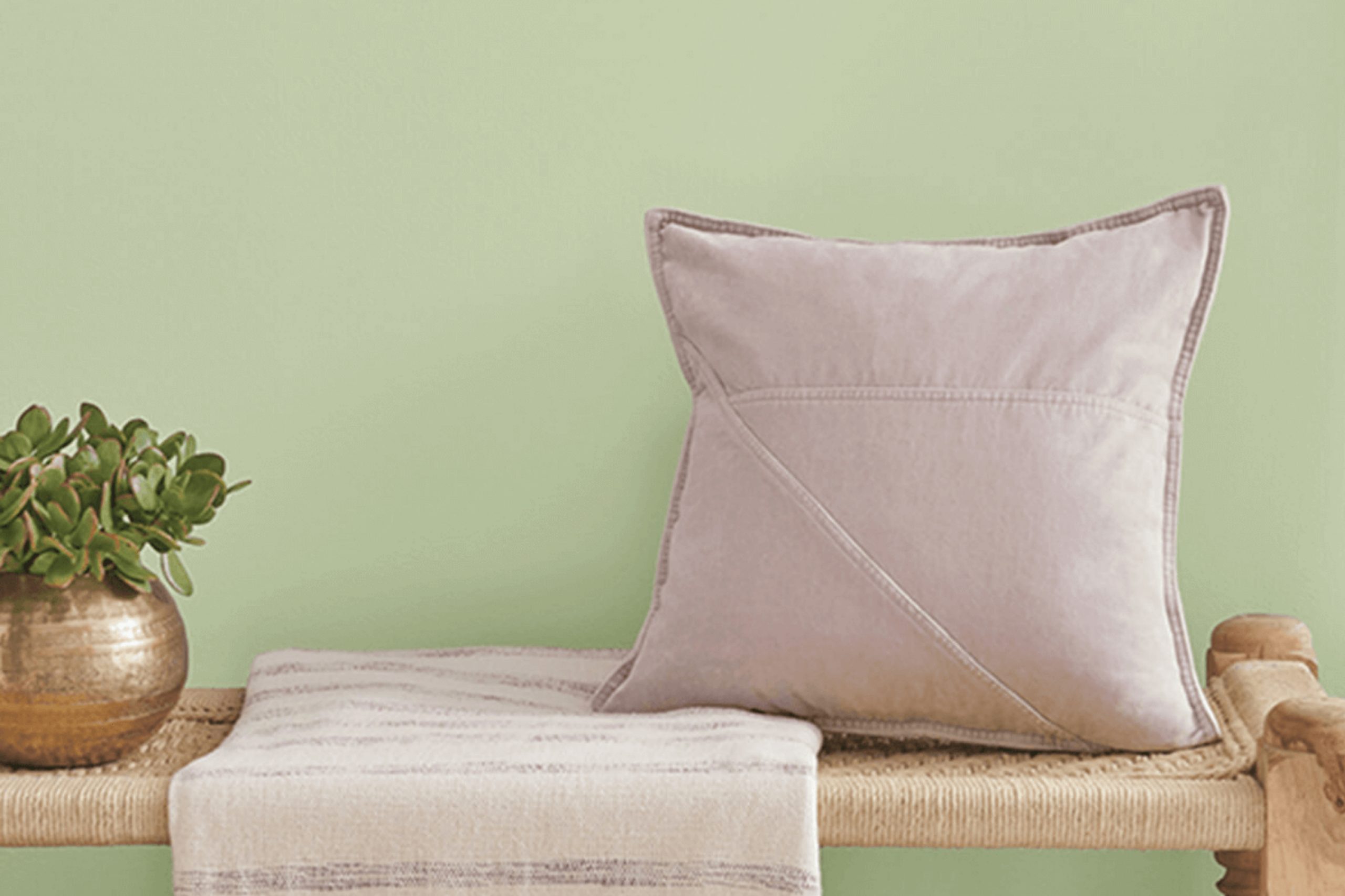
Think about standing in a light-filled room that immediately makes you feel at ease. The walls are painted in a shade that brings the freshness of the outdoors inside, making the space feel more open and inviting. This is what SW 9673 Valleyview by Sherwin Williams does for a home.
The color’s soft, muted green offers a sense of calm and connection to nature without stepping outside. It’s like having a breath of fresh air painted right onto the walls.
You can sense the gentle balance this color strikes, sitting perfectly between subtle elegance and natural simplicity. It’s not just a color but a backdrop that lets you breathe easier and think more clearly.
From the first moment you see it, you feel like it brings new life into the room, transforming it into a sanctuary where you can relax and recharge.
Valleyview’s versatility gives you room to design without constraints. Whether paired with natural woods, crisp whites, or bold accents, it adapts beautifully. You can easily see it fitting in any room of the house, offering that same sense of restful retreat, no matter where it is used.
Its charm lies in how effortlessly it enhances the mood of a space.
What Color Is Valleyview SW 9673 by Sherwin Williams?
Valleyview by Sherwin Williams is a gentle, muted green that reflects the soothing tones of nature. It feels like a breath of fresh air, with a hint of warmth, making it an inviting choice for a wide array of spaces. This color can create a harmonious environment in your home, ideal for living rooms, bedrooms, or even kitchens.
Its soft and natural hue works exceptionally well in modern, Scandinavian, and rustic interior styles. In modern designs, this green can soften sleek lines and add a touch of color without being overwhelming.
In Scandinavian interiors, it pairs beautifully with whites and light woods, contributing to the clean and airy feel that characterizes this style. Rustic rooms benefit from its earthy vibe, enhancing the warm, cozy atmosphere that defines such spaces.
Valleyview pairs wonderfully with materials like natural wood, linen, and wicker.
The gentle green tone meshes well with the grain and texture of wood, whether it’s light oak or darker walnut. Linen textiles in neutral or muted shades complement its peaceful vibe, offering a relaxed and comfortable atmosphere. Wicker elements harmonize beautifully, adding texture and interest, perfect for boho-inspired rooms. Use Valleyview to create a connected and natural feel throughout your home.
Is Valleyview SW 9673 by Sherwin Williams Warm or Cool color?
Valleyview SW 9673 by Sherwin-Williams is a warm, earthy color that works beautifully in homes. It has a rich, natural tone that feels inviting and comfortable. This color can easily fit into various spaces, whether it’s a cozy living room or a calming bedroom.
When used on walls, Valleyview SW 9673 creates a welcoming atmosphere that feels connected to nature. It pairs well with other neutrals and even brighter colors, making it a versatile choice for different design styles.
In the living room, it provides a warm backdrop that complements wooden furniture and natural textiles. In a bedroom, it adds a sense of coziness and calm, ideal for relaxation.
It’s a great choice for accent walls or even the entire room, depending on how bold you want the space to feel. Accessories like throw pillows or artwork can stand out nicely against this shade, adding a touch of style. Overall, Valleyview SW 9673 adds warmth and comfort to any home.
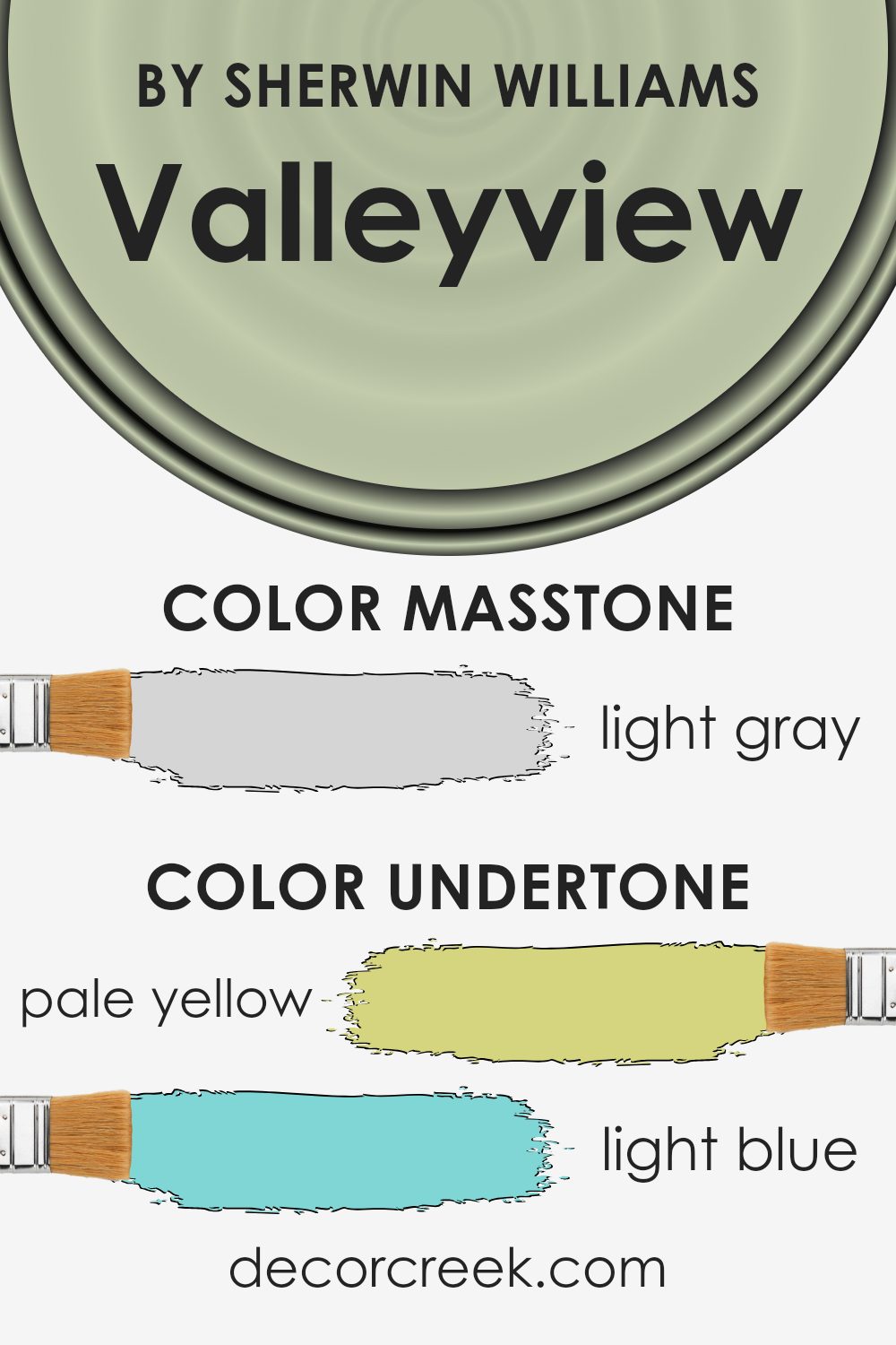
Undertones of Valleyview SW 9673 by Sherwin Williams
Valleyview SW 9673 by Sherwin Williams carries several undertones that significantly affect how the color is perceived in a room. The main undertone is a pale yellow (#D5D580), which adds warmth and brightness to the space. This warmth can make a room feel more welcoming and cheerful. The light blue (#80D5D5) undertone brings a sense of calmness, making the space feel more relaxing and open.
The mint undertone (#80D580) adds a touch of freshness and can create a lively yet soothing environment. The light purple (#D580D5) and pale pink (#D58080) tones add subtle hints of sophistication and softness, providing a gentle, cozy atmosphere.
Meanwhile, the lilac (#8080D5) undertone introduces a hint of coolness, balancing out the brighter, warmer tones with a bit of elegance.
Finally, the grey undertone (#808080) helps ground the color, adding neutrality and ensuring it doesn’t become overwhelming.
Grey also allows Valleyview to blend well with other colors and decor in a room, making it quite versatile. Overall, these undertones work together to make Valleyview a balanced color choice for interior walls, offering both warmth and subtlety.
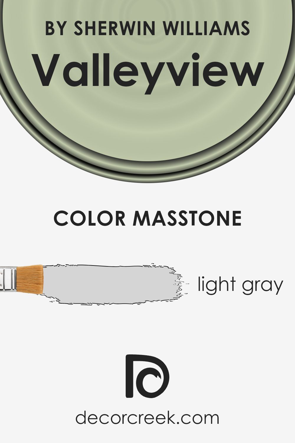
What is the Masstone of the Valleyview SW 9673 by Sherwin Williams?
Valleyview SW 9673 by Sherwin Williams is a light gray color (#D5D5D5) that works well in homes. The light gray masstone gives it a soft, neutral appearance, making it a versatile choice for different spaces. This hue is subtle and provides a gentle backdrop, allowing other elements in the room to stand out without clashing.
Light gray is known for adding a sense of calmness and openness to rooms, which can be especially beneficial in areas where you want to relax, like living rooms or bedrooms.
Because it is a neutral color, it pairs well with a wide range of other colors. You can combine it with vibrant accents to create contrast or keep it with other neutrals for a minimalist look. This makes light gray suitable for both modern and traditional styles. Additionally, its brightness helps make rooms appear larger and more welcoming by reflecting light effectively.
How Does Lighting Affect Valleyview SW 9673 by Sherwin Williams?
Lighting plays a significant role in how we perceive colors. The same color can look very different under various lighting conditions. Natural light changes throughout the day and is influenced by the direction a room faces. Artificial lighting, on the other hand, can vary depending on the type of bulbs and their placement.
Valleyview SW 9673 by Sherwin Williams is a soft green paint color. Let’s explore how it appears under different lighting conditions.
In north-facing rooms, natural light is usually cooler and dimmer. This can make colors appear more muted. Valleyview SW 9673 might look slightly grayer or more subdued in these rooms. To combat this, consider using warm artificial lighting to bring out the warmth in the green.
South-facing rooms, on the other hand, benefit from warm, bright natural light throughout the day. This light has a yellowish hue and can make Valleyview SW 9673 appear warmer and more vibrant. The color will seem lively and rich in these rooms.
You may not need as much artificial light here, but if you do, choose bulbs that don’t overpower the natural warmth.
East-facing rooms get bright sunlight in the morning, which can give Valleyview SW 9673 a lively and fresh look. As the day progresses and the light softens, the color may take on a slightly cooler tone. In the evening, under artificial light, it might appear more subdued.
West-facing rooms catch the warm, golden light in the late afternoon and evening.
In these conditions, Valleyview SW 9673 can look particularly warm and inviting. During the morning, the light is softer and can make the color look cooler, but as the day goes on, the color’s warmth returns. When using artificial light, choose a warmth that complements the natural light’s changes throughout the day.
In summary, lighting greatly influences the appearance of Valleyview SW 9673, and understanding these effects can help achieve the desired look in any space. Adjusting artificial lighting is key to balancing natural light variances.
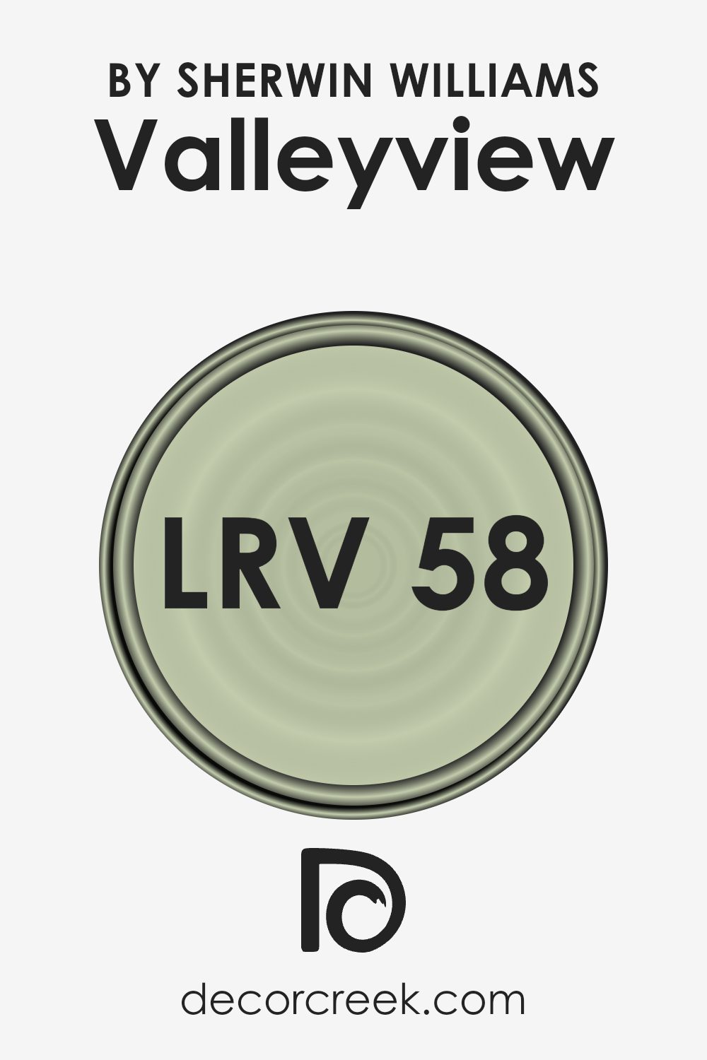
What is the LRV of Valleyview SW 9673 by Sherwin Williams?
LRV stands for Light Reflectance Value, which is a measurement that tells you how much light a color will reflect when it’s painted on a surface. On a scale from 0 to 100, 0 means the color absorbs all light (like black), and 100 means it reflects all light (like pure white).
The LRV of a paint color helps predict how bright or dark a color will look on your walls. It’s an important factor for designers and homeowners who want to understand how a paint color will interact with the lighting in a room.
A higher LRV means the color is lighter and reflects more light, making the room feel brighter and more open. On the other hand, a lower LRV means the color absorbs more light, which can make a room feel cozy or even smaller.
For the color Valleyview with an LRV of 57.885, it means this color reflects a moderate amount of light.
It’s neither too dark nor too light, making it a versatile choice for various spaces. This middle-range LRV indicates that Valleyview can provide a balanced look on the walls, offering enough brightness to keep a room from feeling too dark, while still providing richness and depth in its color.
Rooms painted in this color would feel comfortably bright during the day when natural light is abundant, yet still maintain a warm and inviting atmosphere when lit by artificial lighting in the evening.
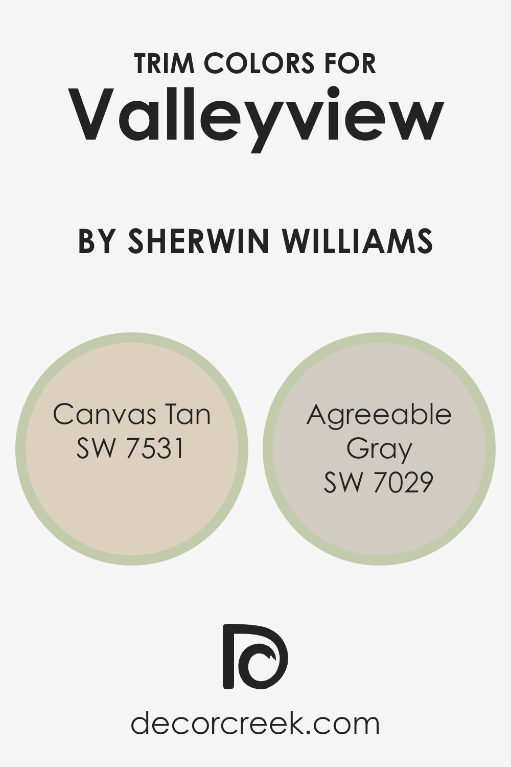
What are the Trim colors of Valleyview SW 9673 by Sherwin Williams?
Trim colors are the shades used on the edges of walls, windows, doors, and other architectural features to add definition and highlight certain areas of a space. Choosing the right trim color enhances the overall look of a room and provides contrast or complement to the main wall color.
For Valleyview by Sherwin Williams, using SW 7531 – Canvas Tan or SW 7029 – Agreeable Gray as trim colors can create a warm and inviting atmosphere. These shades keep the design grounded and cohesive, accentuating the main color without overwhelming the space.
Canvas Tan is a soft, neutral shade with a hint of warmth, making it ideal for rooms where a subtle contrast is desired. It gives a gentle touch to the walls, adding depth without taking away from the central hue of Valleyview.
Meanwhile, Agreeable Gray is a versatile tone that blends beige and gray, offering a muted, modern feel.
It harmonizes with various color schemes, making it a flexible choice for trim work. By using these colors for trim, Valleyview is supported in a way that enhances the room’s aesthetic, creating a balanced and harmonious look.
You can see recommended paint colors below:
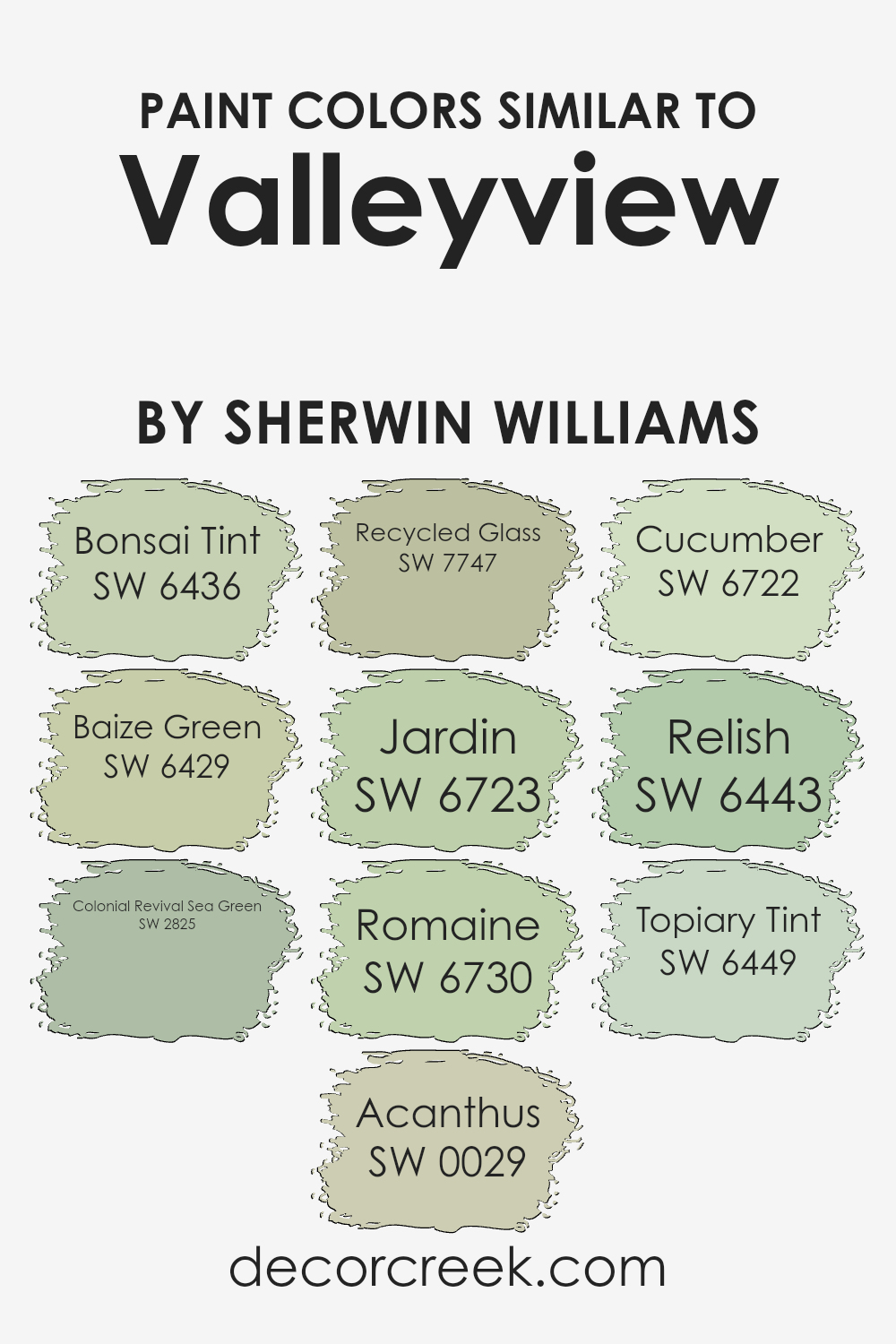
Colors Similar to Valleyview SW 9673 by Sherwin Williams
Similar colors play a crucial role in design and decor as they create harmony and balance in a space. When using colors like Valleyview from Sherwin Williams and its similar shades, the subtle variations of green can bring about a soothing and cohesive environment.
SW 6436 Bonsai Tint is a gentle, muted green that brings a sense of calm, while SW 6429 Baize Green offers a slightly more vibrant touch to energize a room. SW 2825 Colonial Revival Sea Green adds a classic, timeless feel with its muted gray-green tones.
SW 0029 Acanthus provides a warm, earthy green reminiscent of nature’s embrace.
Incorporating SW 7747 Recycled Glass adds a fresh, airy vibe, akin to bringing the outside in.
Move to SW 6723 Jardin and you’ll find a brighter, cheerful green that can lift spirits, contrasted by SW 6730 Romaine, which gives off a crisp, clean appearance. SW 6722 Cucumber is a refreshing, light green perfect for creating a bright and welcoming ambience.
For a touch of richness, SW 6443 Relish offers a deep olive hue, adding depth to any palette. Lastly, SW 6449 Topiary Tint provides a pale, soft green that can subtly enhance and support the other shades, creating an overall unified aesthetic.
You can see recommended paint colors below:
- SW 6436 Bonsai Tint
- SW 6429 Baize Green
- SW 2825 Colonial Revival Sea Green
- SW 0029 Acanthus
- SW 7747 Recycled Glass
- SW 6723 Jardin
- SW 6730 Romaine
- SW 6722 Cucumber
- SW 6443 Relish
- SW 6449 Topiary Tint
How to Use Valleyview SW 9673 by Sherwin Williams In Your Home?
Valleyview SW 9673 by Sherwin Williams is a beautiful, earthy green paint color that brings a touch of nature indoors. It’s a versatile choice that works well in many areas of the home. In the living room, Valleyview creates a cozy and welcoming atmosphere, perfect for relaxation or social gatherings.
You can pair it with neutral colors like beige or cream to keep the room feeling light and airy. In the kitchen, it can add a fresh, lively vibe, especially when combined with white cabinets and natural wood accents.
For a calming effect in the bedroom, consider using Valleyview as an accent wall color, complemented by soft linens in light grays or whites. This shade also works beautifully in a home office, where it can promote a sense of calm and focus. Overall, Valleyview SW 9673 is a great choice for those looking to add a natural and inviting touch to their home décor.
Valleyview SW 9673 by Sherwin Williams vs Relish SW 6443 by Sherwin Williams
Valleyview SW 9673 by Sherwin Williams is a soft and versatile neutral shade, perfect for those who appreciate a subtle touch in their home. It’s a gentle color, often described as having a slightly green undertone, which can create a calm and inviting atmosphere in any room.
Relish SW 6443, on the other hand, is a vibrant and lively green. It brings a burst of energy and is great for making a bold statement. This shade is more pronounced and adds a lively, fresh feel to spaces.
When comparing the two, Valleyview fits well in spaces where a calm and understated look is desired. It pairs effortlessly with other neutrals and softer shades. Relish, being more vibrant, is ideal for accent walls or areas where you want to draw attention and add a playful touch. Both colors can work together beautifully, with Valleyview serving as a backdrop and Relish as an accent.
You can see recommended paint color below:
- SW 6443 Relish
Valleyview SW 9673 by Sherwin Williams vs Romaine SW 6730 by Sherwin Williams
Valleyview SW 9673 and Romaine SW 6730 are two different colors by Sherwin Williams, each offering a unique feel. Valleyview is a warm, earthy hue, reminiscent of beige or light taupe, making it versatile for various settings. It provides a neutral backdrop, perfect for living rooms or bedrooms, where a calming and inviting atmosphere is desired.
On the other hand, Romaine SW 6730 is a lively, refreshing shade of green. It brings a touch of nature into any space, ideal for kitchens or bathrooms. This color exudes energy and a sense of renewal, making a room feel fresh and vibrant.
While Valleyview is subtle and understated, Romaine stands out with its rich, green tone. Both colors reflect their own individual charm, with Valleyview offering warmth and neutrality, and Romaine delivering brightness and an outdoor feel.
These differences make them suitable for different rooms depending on the mood you want to create.
You can see recommended paint color below:
- SW 6730 Romaine
Valleyview SW 9673 by Sherwin Williams vs Jardin SW 6723 by Sherwin Williams
Valleyview SW 9673 and Jardin SW 6723 by Sherwin Williams are both green shades but with different vibes. Valleyview is a muted, earthy green that feels calming and natural. It’s perfect for a relaxed setting, perhaps in a living room or a bedroom, because it brings a sense of the outdoors without being overpowering.
On the other hand, Jardin is a brighter, more lively green with a hint of yellow. It has an energetic and fresh feel, ideal for spaces where you want a cheerful and vibrant atmosphere, like a kitchen or a playroom.
While Valleyview’s subtle tone can blend easily into different styles, Jardin stands out more and gives a pop of color. Both colors can work well depending on the mood you want to set in your space, but they definitely cater to different tastes and purposes.
You can see recommended paint color below:
Valleyview SW 9673 by Sherwin Williams vs Topiary Tint SW 6449 by Sherwin Williams
Valleyview SW 9673 and Topiary Tint SW 6449 are two different shades by Sherwin Williams. Valleyview is a warm, earthy color that feels grounded and natural. It reminds you of a quiet landscape, perfect for creating a cozy and inviting atmosphere in a room. It works well in living rooms or bedrooms where you want a calming vibe.
On the other hand, Topiary Tint is a softer, muted green. It has a fresh, garden-like feel that brings a touch of the outdoors inside. This color is great for kitchens or bathrooms where you want a bit of nature and freshness.
While Valleyview leans more towards a comforting earth tone, Topiary Tint is lighter and airier, offering a gentle splash of color. These two colors can complement each other well, with Valleyview offering warmth and depth, while Topiary Tint adds a touch of lightness.
You can see recommended paint color below:
- SW 6449 Topiary Tint
Valleyview SW 9673 by Sherwin Williams vs Recycled Glass SW 7747 by Sherwin Williams
Valleyview and Recycled Glass are two distinct colors offered by Sherwin Williams. Valleyview is a warm, earthy shade, reminiscent of natural landscapes and adds a cozy, inviting feel to spaces. It works well in living rooms or any area where you want to create a comfortable atmosphere.
In contrast, Recycled Glass is a soft, muted green. This color brings a fresh, crisp feeling that’s perfect for kitchens or bathrooms where you want to introduce a touch of nature and calmness. While Valleyview is more subdued and grounding, Recycled Glass is light and refreshing.
Pairing them could create a balanced look, with Valleyview bringing warmth and Recycled Glass adding an air of coolness. Both colors have their unique charm, allowing for versatile use in various settings depending on the mood you wish to create.
You can see recommended paint color below:
- SW 7747 Recycled Glass
Valleyview SW 9673 by Sherwin Williams vs Cucumber SW 6722 by Sherwin Williams
Valleyview and Cucumber are two distinct colors from Sherwin Williams that offer unique vibes for any space. Valleyview is a warm, earthy color with a blend of yellow and green undertones. It brings a sense of warmth and coziness, making it ideal for living rooms or bedrooms where comfort is key. Its soft, muted tone can create a relaxing atmosphere.
On the other hand, Cucumber is a brighter, more vibrant green. It is fresh and lively, making it a great choice for kitchens or bathrooms. Cucumber has a crisp, clean appeal that can invigorate a room and bring a sense of freshness.
While Valleyview offers a soothing, nature-inspired feel, Cucumber infuses spaces with energy and life. Both colors are versatile in their own ways, but choosing one depends largely on the mood and ambiance you wish to create in your home.
You can see recommended paint color below:
- SW 6722 Cucumber
Valleyview SW 9673 by Sherwin Williams vs Bonsai Tint SW 6436 by Sherwin Williams
Valleyview (SW 9673) by Sherwin Williams is a soothing yet vibrant shade of green that exudes freshness and energy. It can bring a lively atmosphere to a room while maintaining a calm and inviting vibe. It’s a great choice for those who want to incorporate a hint of nature into their space.
Bonsai Tint (SW 6436), also by Sherwin Williams, is a softer and more muted green. It offers a subtle and calming effect, making it ideal for creating a peaceful and relaxing environment. The gentle tone of Bonsai Tint is perfect for spaces where you want to unwind, such as bedrooms or reading nooks.
When comparing these two colors, Valleyview stands out as bold and invigorating, while Bonsai Tint leans toward a quiet and understated presence. Choosing between them will depend on whether you want a vibrant space or a more muted, tranquil setting. Both offer unique ways to incorporate green into your decor.
You can see recommended paint color below:
Valleyview SW 9673 by Sherwin Williams vs Colonial Revival Sea Green SW 2825 by Sherwin Williams
Valleyview SW 9673 is a soft, warm green that brings to mind fresh spring leaves or peaceful meadows. It’s a subtle and calming shade, perfect for creating a refreshing and light atmosphere in any room. Valleyview provides a sense of comfort and works well in spaces where you want a gentle, natural feel.
On the other hand, Colonial Revival Sea Green SW 2825 is a deeper, more traditional green, reminiscent of classic, historical interiors. This rich green has blue undertones, giving it a cooler, more sophisticated look compared to Valleyview.
It’s ideal for adding depth and a touch of elegance to a space.
While Valleyview offers a modern, airy vibe, Colonial Revival Sea Green provides a more timeless and stately presence. Both greens work well in a variety of settings, but choosing between them depends on whether you prefer a light and fresh look or a deep, more dramatic appearance.
You can see recommended paint color below:
- SW 2825 Colonial Revival Sea Green
Valleyview SW 9673 by Sherwin Williams vs Baize Green SW 6429 by Sherwin Williams
Valleyview SW 9673 and Baize Green SW 6429 are two distinct colors by Sherwin Williams. Valleyview is a soft, muted green with gray undertones. It’s a versatile color that works well in many settings, providing a subtle and calming backdrop. It feels modern and understated, perfect for those who prefer a more neutral palette with just a hint of color.
On the other hand, Baize Green is a richer, more saturated green. It has warm, earthy tones that make it feel more vibrant compared to Valleyview. This color can add energy and warmth to a space, making it a good choice for areas where you want a bit more character and intensity.
While Valleyview offers a gentle and calming presence, Baize Green brings a bold and lively atmosphere. Both colors suit different tastes and settings, depending on whether you want a quiet or more pronounced look in your space.
You can see recommended paint color below:
- SW 6429 Baize Green
Valleyview SW 9673 by Sherwin Williams vs Acanthus SW 0029 by Sherwin Williams
Valleyview SW 9673 by Sherwin Williams is a fresh and vibrant green with a hint of softness. It resembles young leaves in spring, bringing a lively and cheerful mood to any space. This shade is perfect for creating an uplifting and energetic environment, ideal for areas where you want a boost of liveliness.
In contrast, Acanthus SW 0029 by Sherwin Williams is a rich, muted green with a touch of gray. This color has an earthy and classic appeal, reminiscent of mature foliage or a deep forest scene. It brings a sense of calm and stability, making it suitable for spaces where relaxation and comfort are the focus.
While Valleyview is bright and fresh, Acanthus offers a more subdued and sophisticated appearance. Choosing between them depends on whether you prefer a more vibrant and lively setting or a calm and classic ambiance. Both colors offer unique atmospheres, tailored to different tastes and settings.
You can see recommended paint color below:
- SW 0029 Acanthus
Conclusion
Wrapping up, I’ve had a delightful time getting to know SW 9673 Valleyview by Sherwin Williams. This paint color is like a gentle hug for the home. When I look at it, I see a soft and cozy green that makes any room feel welcoming.
It’s not too bright or too dark, which makes it a comfortable color for many places. Whether it’s a bedroom or a living room, Valleyview has a way of making things look fresh and calm.
In my opinion, Valleyview is perfect for anyone who wants a nice change without going too bold. It’s like bringing a bit of nature indoors, reminding me of leaves or gentle hills.
Plus, it matches well with lots of other colors, so you don’t have to worry about it clashing with your furniture or decorations. It’s like a friendly color that gets along with others nicely.
Using Valleyview, I think you can make your home look lovely and a bit more peaceful. It’s amazing how one color can add warmth and charm to a room. So, if you’re thinking about painting or just want a bit of a fresh feel in your house, give Valleyview a try.
It’s a beautiful choice that brings a little bit of the outside world in, making everything cozier.
Ever wished paint sampling was as easy as sticking a sticker? Guess what? Now it is! Discover Samplize's unique Peel & Stick samples.
Get paint samples

