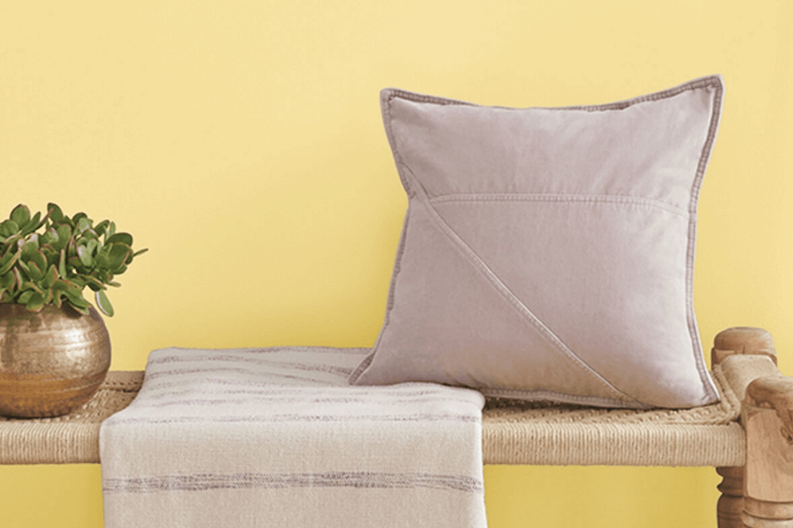
When you look at Sherwin Williams SW 1666, known as Venetian Yellow, you’re greeted with a shade that brightens any space. This color brings warmth and a cheerful vibe to your surroundings. It’s like the morning sun peeking through after a rainy day, promising warmth and light. As you consider updating your home’s color scheme, think about the impact Venetian Yellow can have.
Perfect for kitchens, living rooms, or even an entryway, this pleasant hue adds a welcoming touch. Its versatility goes beyond just the walls; consider it for cabinets or accents to add a subtle yet cheerful burst of color.
Especially when contrasting with darker tones or natural wood finishes, Venetian Yellow shines, making your furniture and décor pop.
So if you’re considering a fresh look for your interiors, Venetian Yellow could be just what you need to create a bright and inviting atmosphere.
What Color Is Venetian Yellow SW 1666 by Sherwin Williams?
Venetian Yellow is a warm, inviting shade of yellow that brings a bright and cheerful ambiance to any space. This vibrant color has a hint of mustard, making it rich and cozy rather than sharp and overpowering. It works exceptionally well in creating a sunny atmosphere in kitchens and dining rooms, where it adds a splash of energy and positivity. Additionally, it’s an excellent choice for living areas or entryways where a welcoming feel is desired.
This shade is versatile and fits well with various interior styles, particularly rustic, cottage, and casual contemporary decors. The warmth of Venetian Yellow pairs beautifully with natural materials like wood and leather, enhancing their earthy qualities. Think wooden floorboards, leather furniture, or wicker baskets, which all contribute to a grounded, homey feel.
Texturally, Venetian Yellow goes well with soft, plush fabrics like cotton and linen, which help to soften its brightness while maintaining a cozy vibe. Matte finishes on walls or fabrics work better with this color than high gloss, as they reduce glare and keep the look soft.
Overall, incorporating this cheerful yellow can easily brighten up your home and create a lively, yet cozy environment.
Is Venetian Yellow SW 1666 by Sherwin Williams Warm or Cool color?
Venetian Yellow is a paint color offered by Sherwin Williams that brings a vivid, cheerful warmth to any room. As a shade closer to a classic sunflower yellow, it has a vibrant yet inviting feel which makes it perfect for kitchens, dining areas, or spaces where you want to add a sense of brightness.
This particular yellow works well in homes because it pairs easily with various decor styles and colors. For instance, it can complement both dark woods in traditional settings and whites or greys in more modern spaces, making it versatile.
Using Venetian Yellow on walls can also make spaces look bigger and more open because lighter colors tend to create an illusion of more space. Moreover, in rooms with less natural light, this cheerful yellow can add a sunny vibe, reducing the gloominess of poorly lit spaces. It’s a great choice for anyone looking to add a touch of warmth and energy to their home without overwhelming the senses.
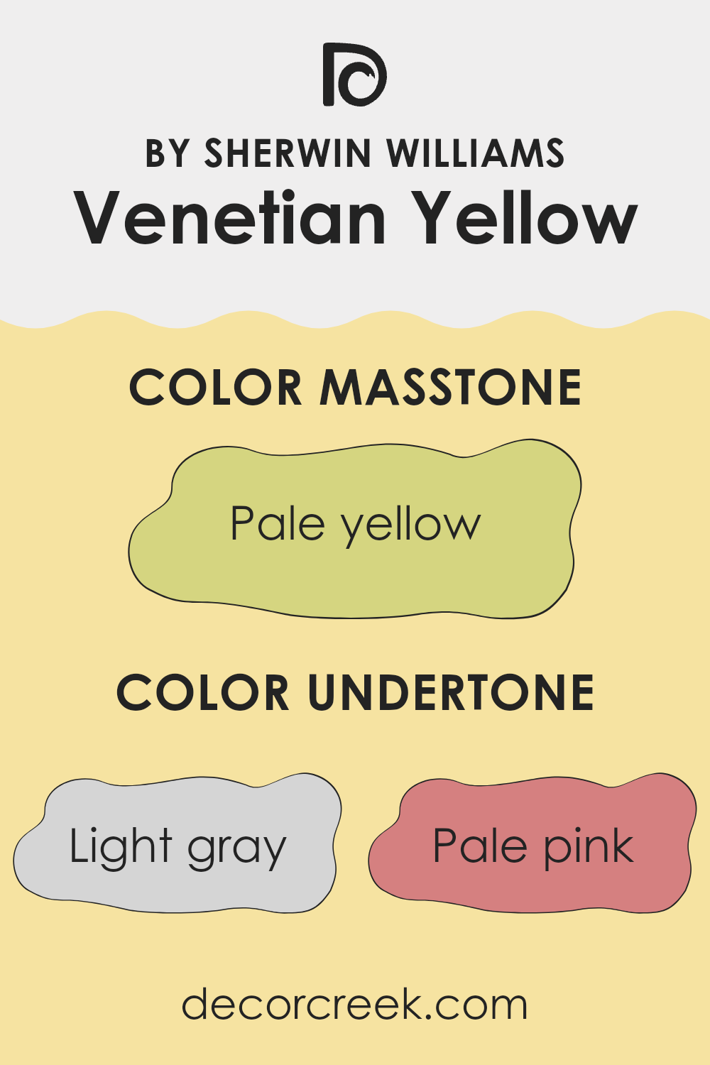
Undertones of Venetian Yellow SW 1666 by Sherwin Williams
Venetian Yellow is a unique color that blends warmth and vibrancy, making it a popular choice for interior walls. Undertones play a crucial role in how we perceive the main hue, subtly influencing the color’s character and how it interacts with light and surrounding elements.
For Venetian Yellow, the blend of undertones includes light gray, pale pink, light purple, mint, yellow, light blue, grey, orange, lilac, light green, and olive. These undertones add depth and complexity, affecting the paint’s appearance under different lighting conditions.
For instance, light gray and grey undertones can tone down the brightness, giving the yellow a more muted, gentle appearance. On the other hand, undertones of pale pink and light purple bring a soft, almost whimsical flair to the color, enhancing its warmth. The presence of yellow and orange undertones reinforces the vibrancy of the hue, making it feel more lively and energetic.
When used on interior walls, Venetian Yellow with these undertones can create a welcoming atmosphere. In bright light, the yellow and orange undertones may become more pronounced, making the room feel sunny and cheerful. In dimmer lighting, the cooler undertones like light gray and mint might emerge, lending a more subdued and calming feel to the space.
Overall, the clever blend of undertones in this color can make a room feel both cozy and dynamic, adapting subtly to changes in natural and artificial lighting. This versatility makes it an excellent choice for areas like living rooms or kitchens, where the mood can shift from active and bright to relaxed and cozy.
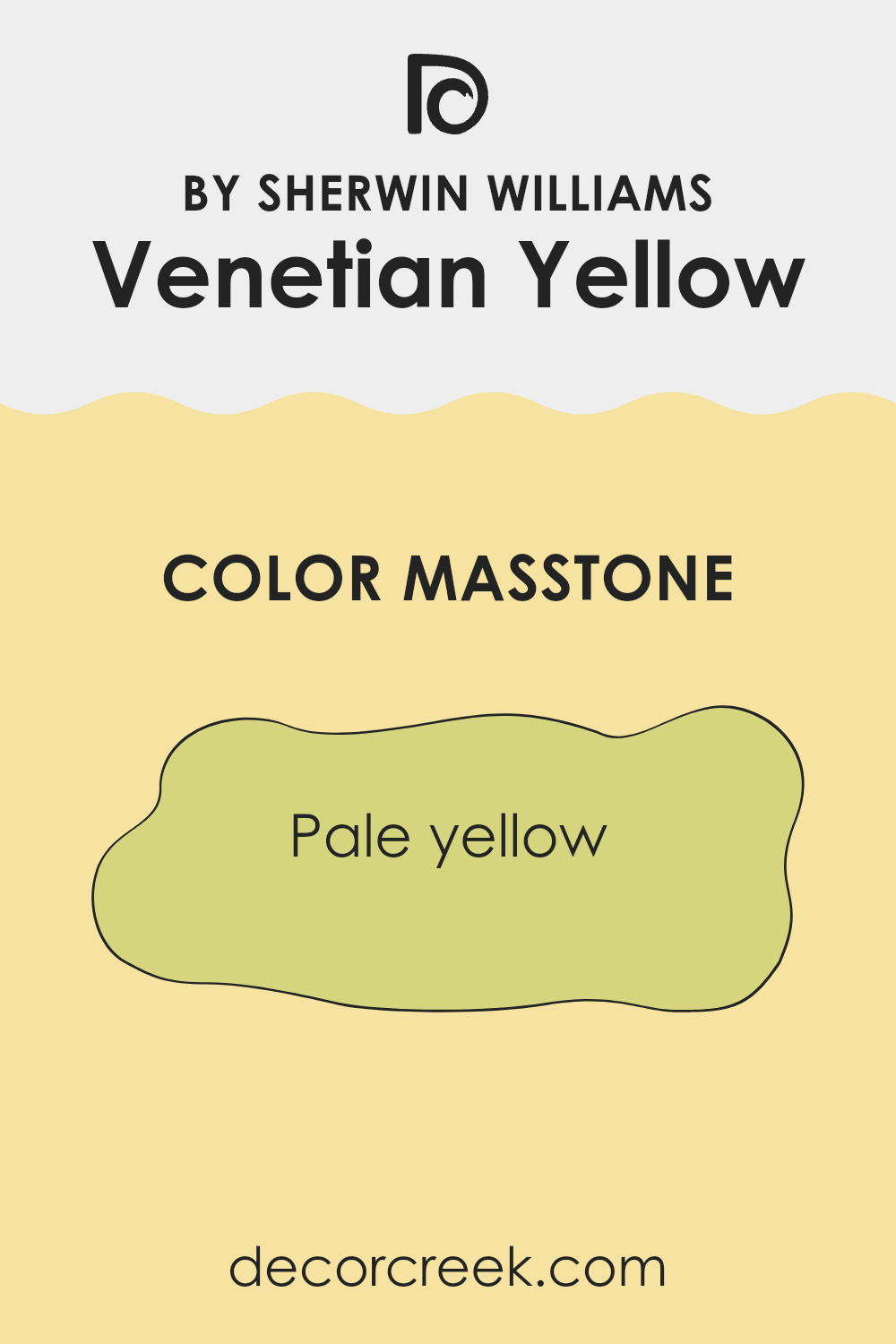
What is the Masstone of the Venetian Yellow SW 1666 by Sherwin Williams?
Venetian Yellow, coded as SW 1666, is a gentle shade of pale yellow, similar to the muted light seen on a sunny afternoon. This color’s soft tone has a welcoming warmth, making it a solid choice for living rooms and kitchens where a cozy, inviting atmosphere is desired. The masstone, being pale yellow, naturally brings light and airiness to a space. This can make smaller or dimmer rooms feel more spacious and lively.
Moreover, the subtlety of Venetian Yellow means it pairs easily with other colors. It can work seamlessly with neutral tones like whites and grays, creating a balanced look, or be teamed with vibrant blues or greens to add a cheerful contrast without overwhelming the senses.
In homes, this practical color also has the advantage of hiding small marks or smudges better than brighter, more intense yellows. Thus, it is both aesthetically pleasing and practical for everyday living.
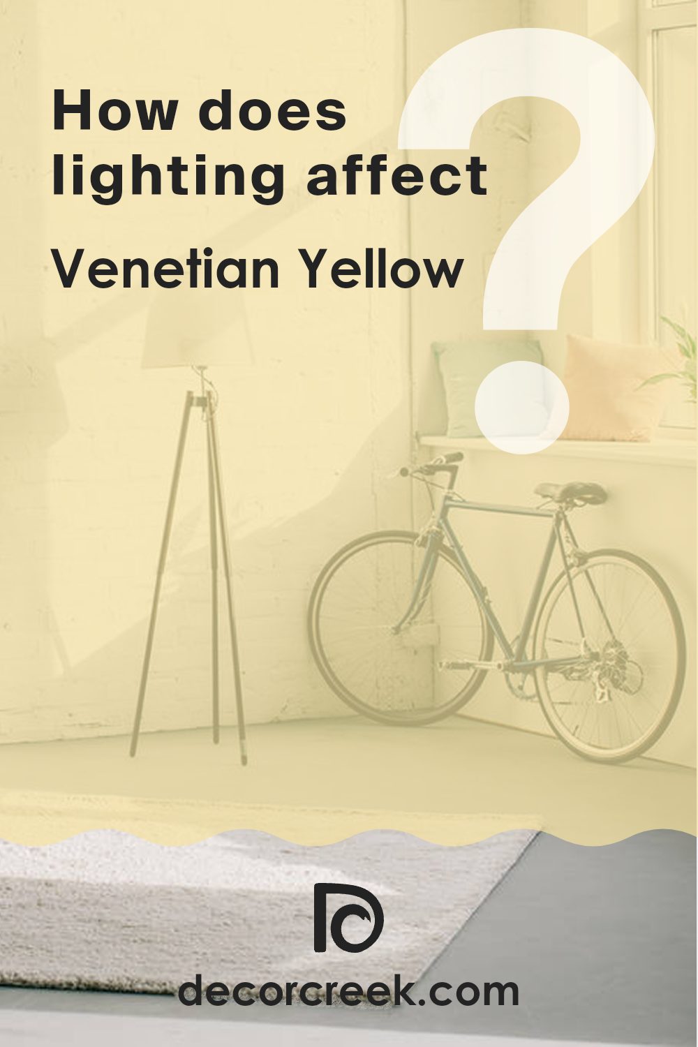
How Does Lighting Affect Venetian Yellow SW 1666 by Sherwin Williams?
Lighting has a profound effect on how we perceive colors. The color, known as Venetian Yellow by Sherwin Williams, is no exception. It appears differently under various lighting conditions and room orientations due to the color’s undertones and brightness.
Firstly, in artificial light, depending on the type of bulb (warm or cool), this warm yellow can either look more vivid or subdued. Warm lighting tends to enhance the richness of Venetian Yellow, making it appear more vibrant and cozy. In contrast, cool artificial light can make it look slightly muted, bringing out a lighter, more neutral hue.
Natural light, on the other hand, shifts in appearance throughout the day and depending on the season. In natural light, Venetian Yellow generally looks bright and cheerful, capturing the sun’s rays in a way that amplifies its warmth.
In rooms facing different directions:
– North-faced rooms: These rooms often get less direct sunlight, which can make colors look cooler and sometimes a bit darker. In such rooms, Venetian Yellow might appear more muted and less intense, giving a softer look.
– South-faced rooms: These receive abundant sunlight, brightening Venetian Yellow to its most vibrant and energetic. It keeps the room feeling lively and warm throughout the day.
– East-faced rooms: Here, the morning light can make Venetian Yellow look exceptionally warm and welcoming in the morning, fading to a gentle glow as the day progresses.
– West-faced rooms: In these rooms, the color will stay relatively neutral or subdued during the morning but become warmer and more dynamic in the afternoon and evening as the sun sets.
Understanding these variances can help in deciding paint colors for a space, ensuring the chosen hue meets expectations at different times of the day and under different lighting conditions. Venetian Yellow, with its warm tones, generally provides a sunny ambiance, making spaces feel inviting.
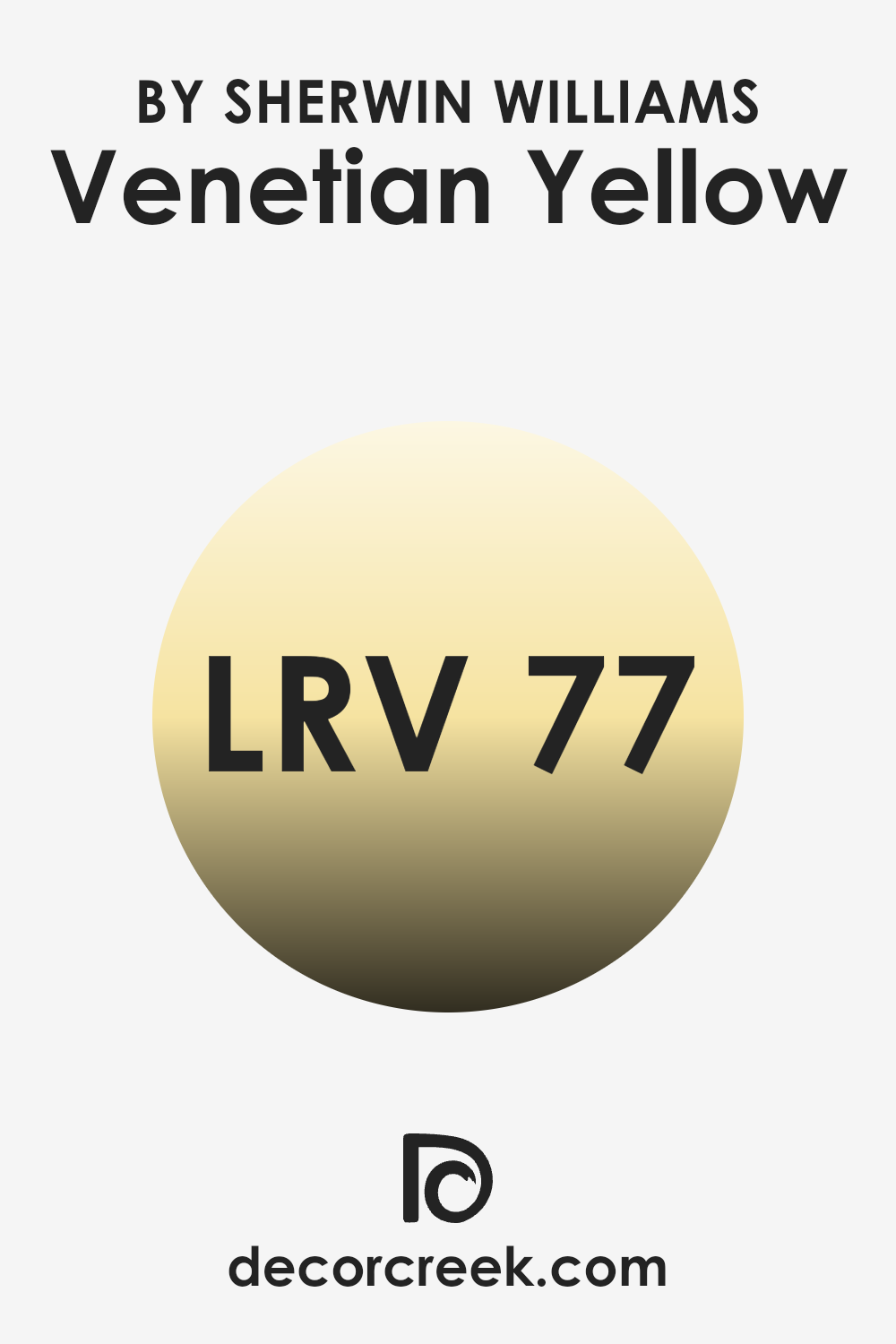
What is the LRV of Venetian Yellow SW 1666 by Sherwin Williams?
Light Reflectance Value (LRV) is a measure of the amount of visible and usable light that a color reflects from or absorbs into a surface when light shines on it. Measured on a scale typically from zero, representing pure black, which absorbs all light, to one hundred, denoting pure white, which reflects all light, LRV helps in determining how light or dark a color will look on your walls.
The higher the LRV number, the lighter the color appears, and the more it will reflect light around the room. For the color with an LRV of 77.351, like Venetian Yellow, this means it is on the lighter end of the spectrum and will reflect a considerable amount of light, making the room look brighter.
Such a high LRV makes this color a good choice for spaces that need to feel more open and airy. Using it in small or dimly lit spaces can help make the area feel larger and more welcoming. However, the brightness also means that it might be overwhelming in a room that gets a lot of natural sunlight, as it may create a space that feels too bright or glaring during peak hours.
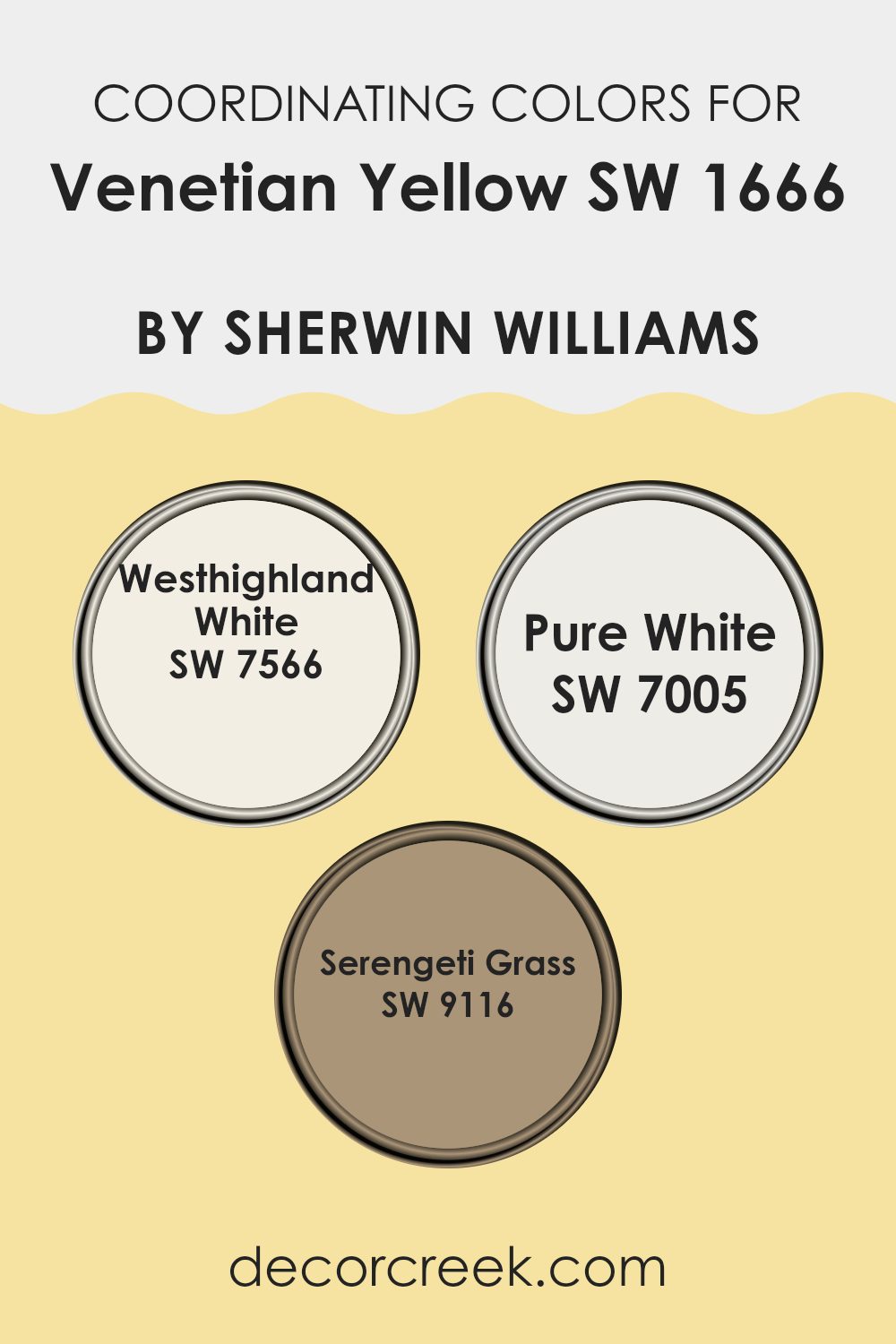
Coordinating Colors of Venetian Yellow SW 1666 by Sherwin Williams
Coordinating colors are those which complement each other well when used together, either to create a harmonious look or to provide a striking contrast. Specifically, the colors chosen to coordinate with Venetian Yellow by Sherwin Williams are designed to either enhance its warm yellow tone or provide a subtle balance.
By selecting coordinating colors such as Westhighland White, Pure White, and Serengeti Grass, you can achieve different effects in a space, whether aiming for a softened, neutral background or adding a touch of nature-inspired energy.
Westhighland White is a soft, creamy white with a hint of warmth that makes it a perfect backdrop for the richer tones of Venetian Yellow. It doesn’t compete for attention but instead provides a calm, supportive base that allows yellow hues to stand out. Pure White, on the other hand, is a crisp and clean white that offers a stark, fresh contrast to the vibrancy of Venetian Yellow, giving any space a more modern feel.
Lastly, Serengeti Grass is a muted green shade reminiscent of natural landscapes, bringing an organic and grounding element to the palette. This color can help to offset the brightness of Venetian Yellow with its earthy, subdued presence. By combining these colors, one can tailor the atmosphere of a room to personal tastes and desired ambiance.
You can see recommended paint colors below:
- SW 7566 Westhighland White
- SW 7005 Pure White
- SW 9116 Serengeti Grass
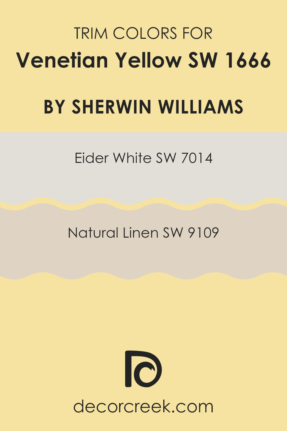
What are the Trim colors of Venetian Yellow SW 1666 by Sherwin Williams?
Trim colors play a crucial role in defining and accentuating the architectural features of a room, such as door frames, skirting boards, and moldings. Specifically, choosing the right trim colors can enhance the overall aesthetic of a main wall color. For instance, when working with a vibrant shade like Venetian Yellow, selecting complementary trim colors can help balance the brightness while adding a polished finish to the space. Eider White and Natural Linen are two trim colors that work well with Venetian Yellow by creating a harmonious palette.
Eider White is a gentle shade of off-white that brings a subtle contrast against the boldness of Venetian Yellow. It offers a fresh and clean look, giving a neat border that helps the primary color stand out without overwhelming the senses.
On the other hand, Natural Linen provides a warm, neutral tone, which complements the yellow by adding depth and warmth to the space. This color pairing is particularly effective in creating a welcoming and refined atmosphere, perfect for rooms needing a touch of brightness balanced with soothing neutral accents.
You can see recommended paint colors below:
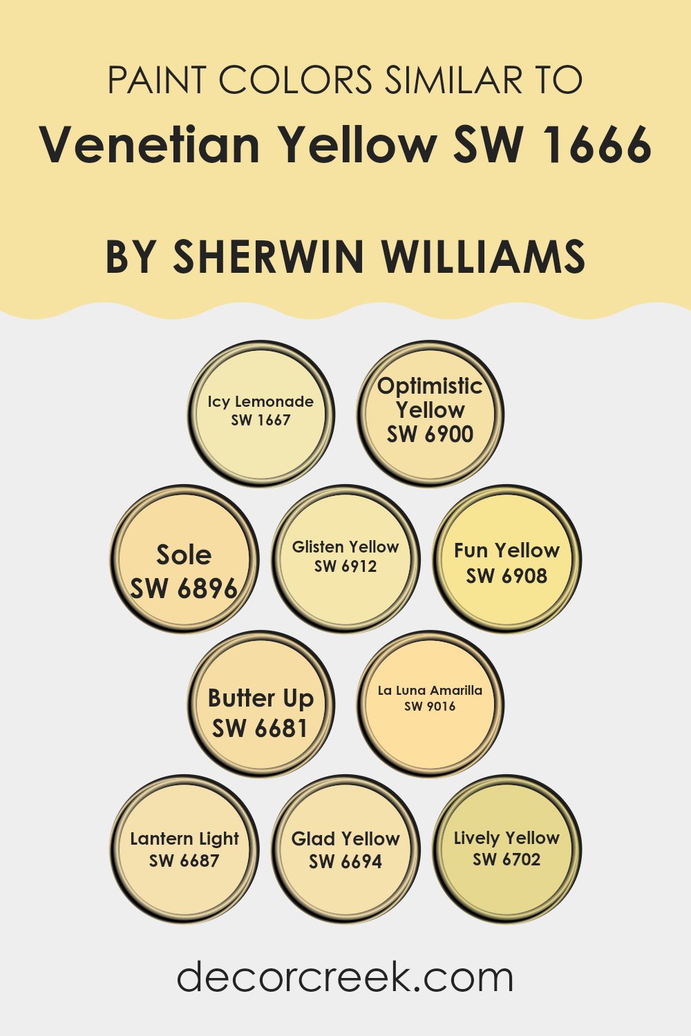
Colors Similar to Venetian Yellow SW 1666 by Sherwin Williams
Choosing similar colors can be crucial in design because they create a cohesive and harmonious look in any space. When colors, such as shades similar to Venetian Yellow by Sherwin Williams, are grouped together, they enhance each other without creating a stark contrast. This can make a room feel more cohesive and harmoniously themed. Moreover, using shades within the same color family can make mixing and matching decor elements simpler, ensuring that everything in a room works well together.
Starting with SW 1667 – Icy Lemonade, this is a fresh, crisp yellow that brings to mind the refreshing nature of its namesake drink. SW 6900 – Optimistic Yellow has a vibrant, sunny quality that can instantly brighten and enliven any space. In contrast, SW 6896 – Sole is a deeper, golden hue, which can add a rich layer of warmth and coziness to interiors.
SW 6912 – Glisten Yellow offers a soft, gentle yellow that shines subtly and complements natural light beautifully. SW 6908 – Fun Yellow lives up to its name with an energetic, playful tone that’s great for spaces used for creativity and fun. SW 6681 – Butter Up has a smooth, creamy feel that works well in more subdued or elegant settings.
SW 9016 – La Luna Amarilla exudes a soft, muted glow reminiscent of a moonlit sky. SW 6687 – Lantern Light is another gentle hue that evokes the soft glow of a lantern, suitable for creating a comforting ambiance. SW 6694 – Glad Yellow has a cheerful, welcoming presence that makes it perfect for lively settings.
Lastly, SW 6702 – Lively Yellow, as the name suggests, is full of life and energy, ideal for areas that require a dynamic atmosphere. All these colors collectively provide a wide palette for creating varied yet visually interconnected spaces.
You can see recommended paint colors below:
- SW 1667 Icy Lemonade
- SW 6900 Optimistic Yellow
- SW 6896 Sole
- SW 6912 Glisten Yellow
- SW 6908 Fun Yellow
- SW 6681 Butter Up
- SW 9016 La Luna Amarilla
- SW 6687 Lantern Light
- SW 6694 Glad Yellow
- SW 6702 Lively Yellow
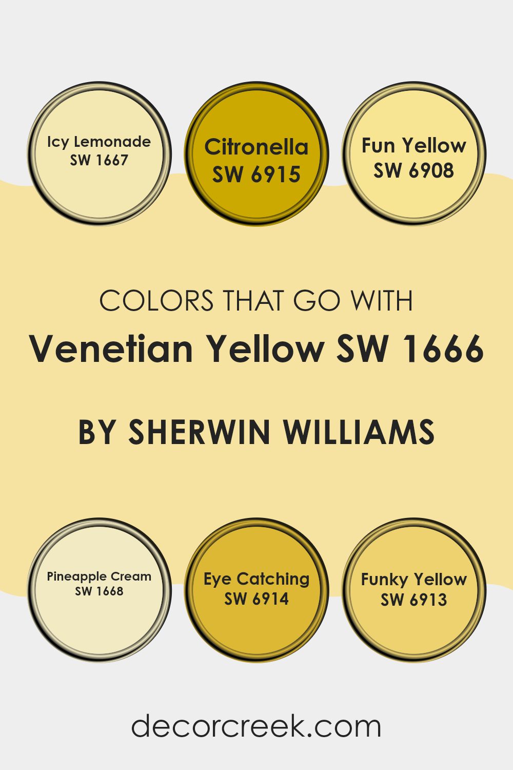
Colors that Go With Venetian Yellow SW 1666 by Sherwin Williams
Choosing the right colors to complement Venetian Yellow SW 1666 by Sherwin Williams is essential in creating a visually appealing space. Combining shades effectively enhances the mood and aesthetic of a room, ensuring that the colors do not clash but instead, bring out the best in each other. Colors like Icy Lemonade, Citronella, and Fun Yellow, along with others, add character and vibrancy when paired with Venetian Yellow, making them vital for a balanced and attractive color scheme.
Icy Lemonade SW 1667 is a light and refreshing yellow that breathes life into spaces, creating a cheerful and bright atmosphere. It works beautifully in spaces needing a subtle pop. Citronella SW 6915 is a bold, lemon-like yellow that injects energy and freshness, perfect for kitchens and playrooms where high spirit is appreciated.
Fun Yellow SW 6908 has a playful tone, apt for areas where creativity and fun are encouraged. Pineapple Cream SW 1668 offers a softer, creamier version of yellow which pairs wonderfully in rooms that aim for a gentle yet warm ambiance.
Eye Catching SW 6914 presents a dramatic flair with its deep yellow tones, making it ideal for focal points. Lastly, Funky Yellow SW 6913 has a unique zest that works nicely in modern spaces that aim to make a statement with a vibrant, noticeable look. Together, these colors form a palette that supports Venetian Yellow by adding depth and enthusiasm to its sunny disposition.
You can see recommended paint colors below:
- SW 1667 Icy Lemonade
- SW 6915 Citronella
- SW 6908 Fun Yellow
- SW 1668 Pineapple Cream
- SW 6914 Eye Catching
- SW 6913 Funky Yellow
How to Use Venetian Yellow SW 1666 by Sherwin Williams In Your Home?
Venetian Yellow is a vibrant and warm shade that breathes new life into any space. This color, by Sherwin Williams, is perfect for adding a cheerful splash to your home. If you want to create a welcoming atmosphere, think about using it in areas where family and friends gather. The kitchen or a breakfast nook are ideal since these spaces benefit from its sunny and energizing hues.
In addition to common areas, Venetian Yellow works well in a home office or study space. The color’s brightness helps keep you alert and focused, which can boost productivity. You can balance it with neutral tones like white, gray, or light wood textures to ensure it’s not overwhelming.
For those open to bold choices, consider pairing Venetian Yellow with contrasting colors like deep blues or greens for a striking effect in your living room or dining area. Accessories in these darker shades can help balance the brightness while maintaining a fresh look.
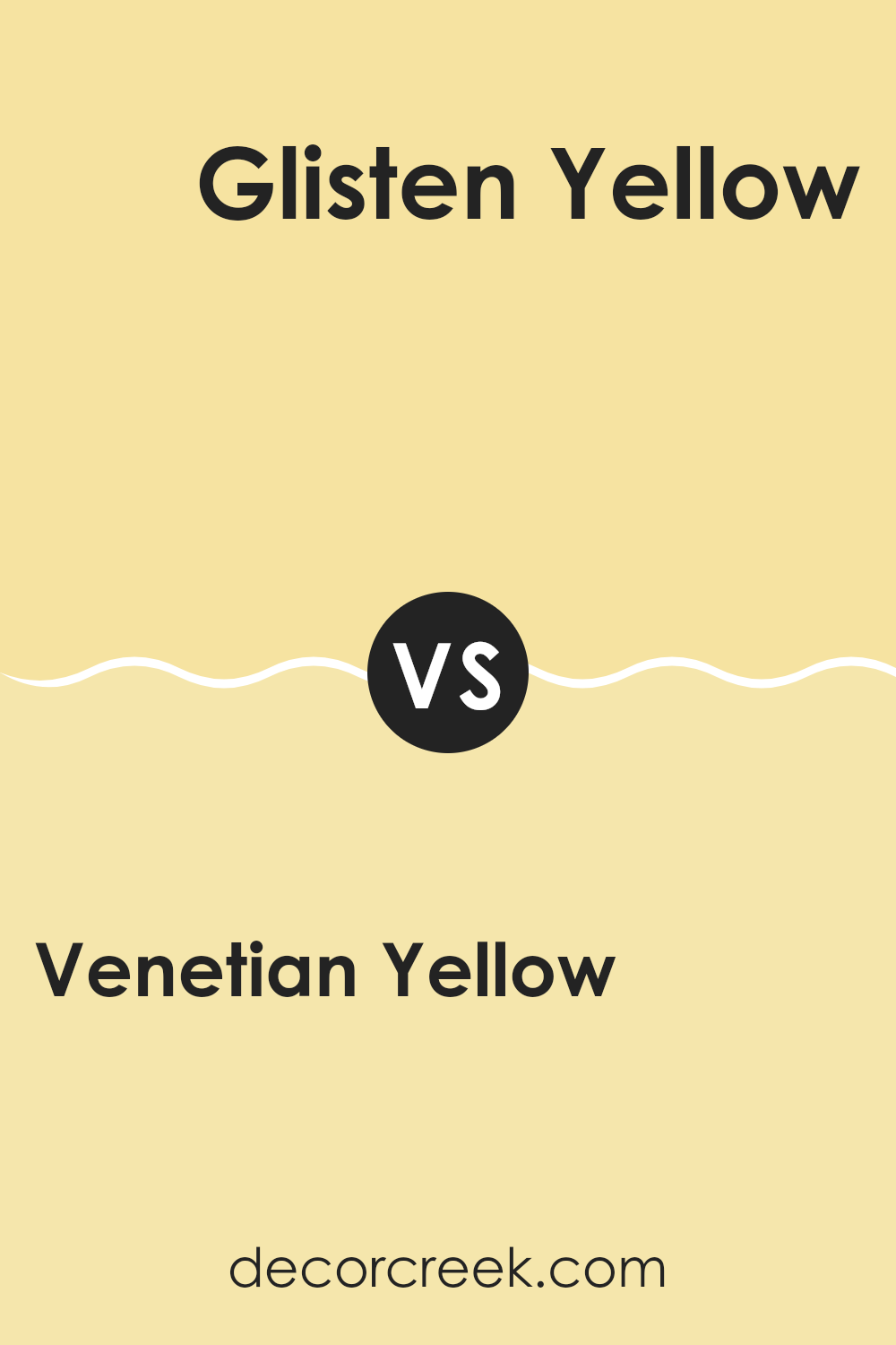
Venetian Yellow SW 1666 by Sherwin Williams vs Glisten Yellow SW 6912 by Sherwin Williams
Venetian Yellow is a rich and creamy shade, softer and more muted compared to the bright and vibrant Glisten Yellow. While Venetian Yellow offers a gentle, warm glow that subtly brightens up a room, Glisten Yellow stands out with its bold and energetic vibe, making it a striking choice for spaces that benefit from a lively pop of color.
Venetian Yellow works well in traditional or classic settings due to its understated elegance, whereas Glisten Yellow is ideal for more modern or playful spaces where a punchier color can really make a statement.
Depending on the mood you want to set and the style of the decor, each color has its unique appeal and can set a different tone in the space it’s used in.
You can see recommended paint color below:
- SW 6912 Glisten Yellow
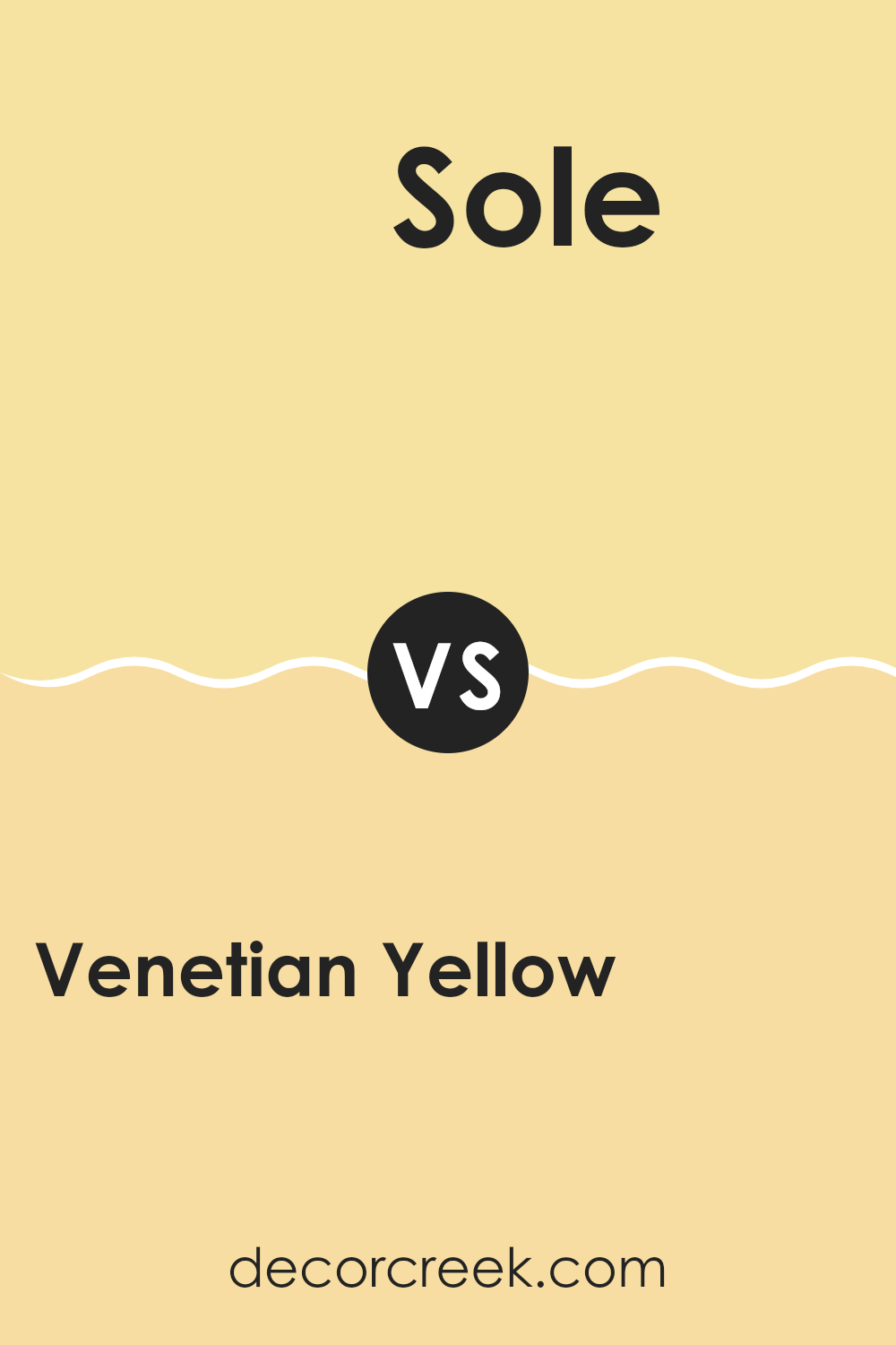
Venetian Yellow SW 1666 by Sherwin Williams vs Sole SW 6896 by Sherwin Williams
Venetian Yellow and Sole, both from Sherwin Williams, offer unique tones that can liven up any space. Venetian Yellow is a bright, creamy shade with a warm base that makes it vibrant yet inviting.
This hue is great in spaces that could use a cheerful boost, like kitchens or playrooms. On the other hand, Sole is a bolder, more vivid yellow. It packs a punch and is perfect for creating strong visual interest.
It’s richer and can serve as a strong focal point in areas meant to impress, like entryways or dining rooms. While Venetian Yellow is soft and cozy, Sole stands out with its deeper saturation. Mixing these two can add a dynamic layer to a home’s palette, using Venetian Yellow for a gentle background and Sole to highlight key areas.
You can see recommended paint color below:
- SW 6896 Sole
Venetian Yellow SW 1666 by Sherwin Williams vs Fun Yellow SW 6908 by Sherwin Williams
Venetian Yellow is a rich, creamy shade with a deep, warm undertone that brings a cozy feel to any room. This color has a touch of earthiness that makes it ideal for spaces where you desire a comforting and inviting aura.
In contrast, Fun Yellow is brighter and more vibrant, radiating energy and cheerfulness. This shade is perfect for areas where you want to add a pop of brightness, as it stands out and can liven up a space considerably.
While both colors are shades of yellow, Venetian Yellow offers a more muted, subdued look, making it suitable for larger areas or spaces where you want color without overwhelming brightness. Fun Yellow, on the other hand, is bolder and more impactful, great for accent walls or decor elements where you want to make a strong visual statement. Both can create joyful and warm environments, but their effects differ dramatically depending on their use.
You can see recommended paint color below:
- SW 6908 Fun Yellow
Venetian Yellow SW 1666 by Sherwin Williams vs Optimistic Yellow SW 6900 by Sherwin Williams
Venetian Yellow and Optimistic Yellow, both by Sherwin Williams, are two distinct shades of yellow, each with its own unique character. Venetian Yellow is a muted, creamy yellow that gives off a soft and warm feeling, perfect for creating a cozy and inviting atmosphere in a room.
It complements spaces that aim for a subtle, yet cheerful appearance. On the other hand, Optimistic Yellow is a vibrant, bright yellow. It’s much bolder and can instantly brighten up a space, making it feel more energetic and lively.
This shade works well in areas where you want to add a pop of color or cheer, especially in spaces that could use a boost of brightness. When comparing these two, Venetian Yellow is more understated and gentle, while Optimistic Yellow stands out more and is more striking. Both can add personality to a room, but the choice depends on the mood you want to set.
You can see recommended paint color below:
- SW 6900 Optimistic Yellow
Venetian Yellow SW 1666 by Sherwin Williams vs Lantern Light SW 6687 by Sherwin Williams
Venetian Yellow and Lantern Light are two appealing paint colors by Sherwin Williams that both offer a vibrant touch to any space but in quite distinct ways.
Venetian Yellow has a rich, creamy quality that infuses warmth into a room. It carries a more subdued, golden tone, making it great for creating a cozy, inviting atmosphere. This shade works well in living areas and bedrooms where you want a soft yet cheerful ambiance.
On the other hand, Lantern Light is a brighter, more vivid yellow. It’s especially good for spaces where maximum visibility and cheer are desired, like kitchens and bathrooms. This color stands out more distinctly, adding a lively burst of energy wherever applied.
Both colors are versatile and can definitely brighten up any interior with their different tones of yellow, but the choice between them depends on the kind of mood and energy level you want to achieve in your space. Lantern Light, being the brighter of the two, feels more energetic, while Venetian Yellow offers a gentler touch of warmth.
You can see recommended paint color below:
- SW 6687 Lantern Light
Venetian Yellow SW 1666 by Sherwin Williams vs Lively Yellow SW 6702 by Sherwin Williams
Venetian Yellow and Lively Yellow, both by Sherwin Williams, are two vibrant shades that can add cheer and brightness to any space. Venetian Yellow is a soft, creamy yellow that gives a subtle, understated warmth. This color is ideal for creating a cozy and welcoming atmosphere without being too bold or overpowering. It’s perfect for spaces where you want a touch of color but prefer to keep the overall feel light and airy.
On the other hand, Lively Yellow is a brighter, more vivid shade. It’s a true yellow that stands out more and brings a lively energy to a room. This hue is great if you’re looking to make a statement or add a focal point to your space. It works well in areas that receive a lot of light, where the color can really shine and brighten up the surroundings.
Choosing between the two depends on the mood you want to set and how much you want the color to pop. Venetian is subtle and gentle, while Lively is bold and energetic.
You can see recommended paint color below:
- SW 6702 Lively Yellow
Venetian Yellow SW 1666 by Sherwin Williams vs La Luna Amarilla SW 9016 by Sherwin Williams
Sure! When looking at Venetian Yellow and La Luna Amarilla, both colors are forms of yellow offered by Sherwin Williams, but they have subtle differences. Venetian Yellow is a bright and bold hue, closely resembling the sunny, cheerful shades seen in a classic crayon box. It really stands out, making it a good choice if you want to add a lively splash of color to a room to make it lighter and more inviting.
On the other hand, La Luna Amarilla is a bit more muted. It’s a softer yellow that leans slightly towards a creamy, pastel shade. This color is great for those who prefer something gentle and less intense; it can help soften a space while still bringing in warmth and brightness.
Both colors can warm up a room, but Venetian Yellow does it with more punch, whereas La Luna Amarilla does it in a more subdued, understated way. Choosing between them depends on the kind of mood or atmosphere you want to create in your space.
You can see recommended paint color below:
- SW 9016 La Luna Amarilla
Venetian Yellow SW 1666 by Sherwin Williams vs Butter Up SW 6681 by Sherwin Williams
Venetian Yellow and Butter Up, both by Sherwin Williams, offer distinct tones that can brighten any space. Venetian Yellow has a deep, vivid quality that seems to reflect a richer, slightly more orange hue. This makes it an excellent choice for spaces where a bold, welcoming feel is desired. It pairs well with natural light, giving rooms a sunlit ambiance.
On the other hand, Butter Up is lighter and creamier, providing a softer look. This color appears more subdued compared to Venetian Yellow, lending a gentle warmth to areas without overwhelming them with brightness. Butter Up is ideal for creating a cozy atmosphere in spaces meant for relaxation and comfort.
In summary, Venetian Yellow stands out with its vibrant depth, while Butter Up offers a soothing, muted option. Both colors can effectively enhance a room but cater to different aesthetic preferences and uses.
You can see recommended paint color below:
Venetian Yellow SW 1666 by Sherwin Williams vs Glad Yellow SW 6694 by Sherwin Williams
Venetian Yellow and Glad Yellow are both vibrant hues by Sherwin Williams that brighten up spaces with their sunny appeal. Venetian Yellow has a more muted, creamy undertone, making it a great choice for those who prefer a subtle yet warm atmosphere. It’s ideal for living rooms or kitchens where you want a cozy, welcoming feel without overwhelming the space with brightness.
Glad Yellow, on the other hand, is brighter and more vivid. It packs a punch and is perfect for adding a cheerful splash of color. This shade works well in areas like playrooms or creative spaces where energy and inspiration are a must. It’s also a good pick for accent walls or furniture if you’re looking to make a statement.
Both colors bring warmth and light to any room but serve different purposes based on their intensity and depth. Choosing between them depends on how bold or soft you want your space to feel.
You can see recommended paint color below:
- SW 6694 Glad Yellow
Venetian Yellow SW 1666 by Sherwin Williams vs Icy Lemonade SW 1667 by Sherwin Williams
Venetian Yellow and Icy Lemonade are both vibrant colors that light up any space but have distinct tones. Venetian Yellow is a deep, golden hue that gives a warm and welcoming feel, perfect for cozy and inviting spaces like living rooms or dining areas. It feels like a sunny day in a room, thanks to its depth that aligns more with a classic yellow.
On the other hand, Icy Lemonade has a lighter, more refreshing tone. This color resembles the subtle, pale yellow of a fresh lemonade, and it works great in spaces that aim for a bright and airy feel, such as bathrooms or small kitchens. It lends an open, clean look to walls without overwhelming the senses.
Both colors are yellow, but Venetian Yellow offers richness and warmth, while Icy Lemonade provides a gentle, refreshing splash. Depending on the room’s purpose and the atmosphere you want to create, you could choose the fuller, sunnier Venetian Yellow or the quiet, subtle hint of Icy Lemonade.
You can see recommended paint color below:
- SW 1667 Icy Lemonade
In summing up, SW 1666 Venetian Yellow by Sherwin Williams is a really pleasant paint color that makes any room feel sunny and cheerful. It’s like having a little bit of sunshine indoors, which can make you feel happier, especially on dull days. This color works well in lots of different rooms, whether you want a lively living room, a welcoming kitchen, or a cozy bedroom.
From what I’ve learned, SW 1666 Venetian Yellow isn’t just a bright color; it’s also smooth to apply and lasts a long time. This means you won’t have to repaint often, which saves effort and money. Plus, it doesn’t get dirty easily, so it keeps looking fresh and clean.
This paint color can really help to make your home a nicer place to live. It brings a warm and friendly feeling that turns your house into a home. After learning about this paint, I think it’s a great choice if you want to add a bit of cheer to your home. If I were painting my room or helping someone choose a color, I’d definitely think about using Venetian Yellow.
Ever wished paint sampling was as easy as sticking a sticker? Guess what? Now it is! Discover Samplize's unique Peel & Stick samples.
Get paint samples

