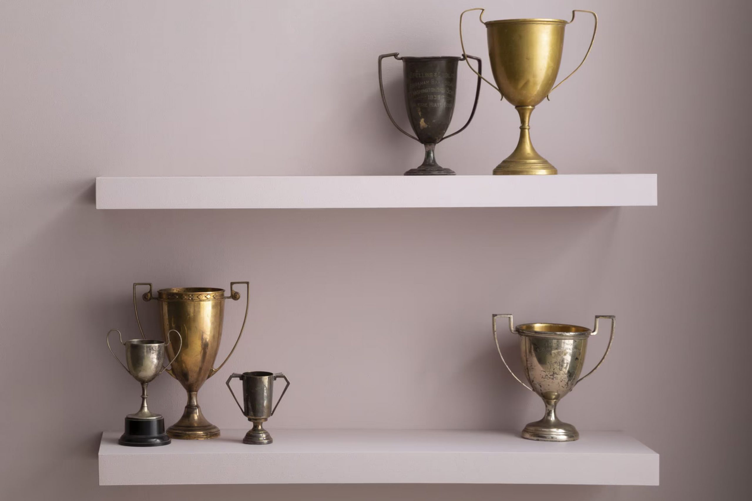
I recently painted a room using the color 2114-50 Victorian Mauve from Benjamin Moore, and I want to share my experience with you. If you’re considering a new shade for your home that adds both warmth and a touch of elegance, let me tell you, Victorian Mauve might just be what you’re looking for. This unique color strikes a beautiful balance between being subtly rich yet pleasantly soft, making it adaptable for various rooms, whether in a bedroom or a living area.
What stands out about Victorian Mauve is how it changes with the light. During the day, it has a gentle, calm hue that brings a cozy feel to the room. As the evening sets in and the lighting shifts, you’ll notice it takes on a deeper, more enveloping charm that changes the ambiance entirely. It’s not just a paint color; it’s a dynamic backdrop that shifts and reacts beautifully throughout the day.
Choosing the right paint can make all the difference in your home, and with Victorian Mauve, you’re not only choosing a color but an atmosphere that is peaceful, yet refined, perfect for fostering both relaxation and conversation.
If these qualities resonate with your taste, Victorian Mauve might just be the color that brings that special character to your home.
What Color Is Victorian Mauve 2114-50 by Benjamin Moore?
Victorian Mauve by Benjamin Moore is a rich, soft purple with a hint of gray that gives it a muted, elegant tone. This color is highly adaptable, ideal for adding a touch of warmth to any room without feeling too strong. The subtle gray undertones help ground the purple, making it more flexible and less intense than brighter purples.
This shade works exceptionally well in various interior styles, particularly in traditional, shabby chic, and bohemian décor. It can also complement a modern or minimalist room by adding a pop of color that is not too bold or distracting. Because it has a vintage feel, it looks beautiful in settings that include antique or distressed furniture and décor items.
When it comes to pairing materials and textures, Victorian Mauve harmonizes wonderfully with natural wood tones, from light pine to rich walnut. It also looks stunning against metallic finishes like gold or brass, which bring out its warm undertones.
For a more textured look, pairing it with materials like velvet or silk adds a subtle richness, while knitted throws or rough linen provide a pleasing contrast to its smoother qualities. Overall, Victorian Mauve is a beautiful, flexible color that can help create a warm, inviting atmosphere in many different interiors.
Is Victorian Mauve 2114-50 by Benjamin Moore Warm or Cool color?
Victorian Mauve2114-50 by Benjamin Moore is a unique shade that adds warmth and personality to any room. This color, a blend of gray and soft purple, offers a gentle and welcoming feel, making it perfect for living areas where comfort is key.
When used in a home, Victorian Mauve can make small rooms look bigger and more open because of its lighter tone. It pairs well with crisp whites or darker furniture, allowing for a range of decorating styles from modern to classic.
It’s also flexible enough to work in different rooms, whether it’s a cozy bedroom or a stylish living room. This color can refresh old rooms and give them a more modern look without feeling too strong or heavy. Overall, Victorian Mauve2114-50 is great for anyone looking to add a touch of softness and warmth to their home.
Undertones of Victorian Mauve 2114-50 by Benjamin Moore
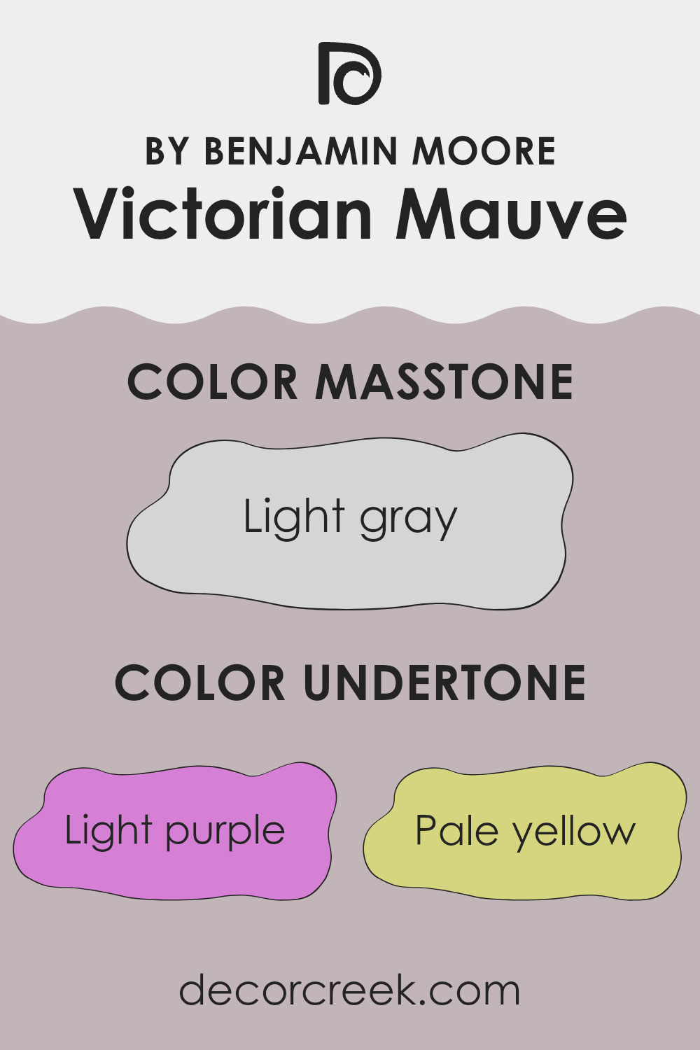
Victorian Mauve is a unique paint color with a complex blend of undertones that subtly influence its appearance. By understanding these undertones—light purple, pale yellow, light blue, pale pink, lilac, mint, and grey—we get insight into how the color behaves in different lighting conditions and settings.
Undertones are the underlying hues that may not be immediately noticeable but become apparent under certain lighting or when placed next to other colors. They can make a color shift in appearance, sometimes looking cooler or warmer depending on the dominant undertone. For example, light purple and lilac give Victorian Mauve a soft, gentle vibe, making it lean slightly cooler. On the other hand, pale yellow and mint can warm it up, adding a subtle vibrancy.
When used on interior walls, the complexity of Victorian Mauve’s undertones allows it to adapt to various decor styles and pair well with many colors. In bright, natural light, lighter undertones like pale yellow and light blue might make the walls seem more lively. In dimmer light, cooler undertones like grey and lilac might become more pronounced, giving the room a more muted feel.
The choice of furnishings and decor can also highlight different undertones in the paint. For instance, warm-colored woods and fabrics can bring out the yellow and pink tones, whereas metallic or cool-colored accents may highlight the greys and purples. This adaptability makes Victorian Mauve a flexible choice that can help achieve a wide range of looks and moods in a room.
What is the Masstone of the Victorian Mauve 2114-50 by Benjamin Moore?
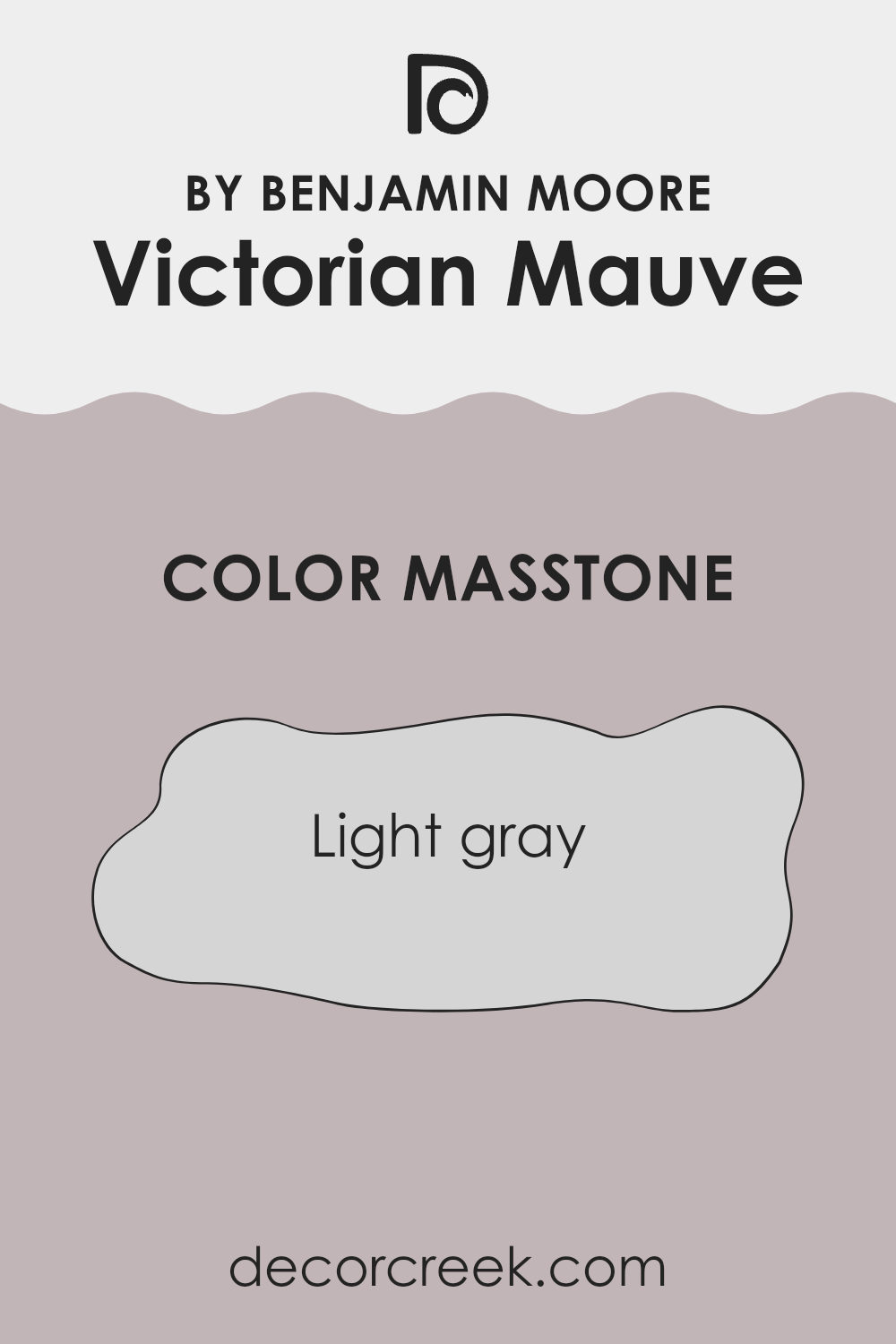
Victorian Mauve, color code 2114-50, is a subtle shade of light gray that offers a soft and neutral backdrop for any room. This specific Benjamin Moore paint is adaptable and easy to match with a wide range of decor styles and colors.
Using this particular hue in a home can create a calm and welcoming atmosphere. Its light gray tone helps make rooms appear bigger and brighter, which is a big plus for small rooms or areas with limited natural light.
Because it’s so gentle on the eyes, this shade is great for areas where you want to relax, like bedrooms or living areas. It doesn’t clash with bold colors, so you can use vibrant accessories or artwork without worry. Additionally, its neutrality means that it doesn’t quickly go out of style. Overall, this color is a practical choice that works well in many different settings, helping to make any home feel cozy and inviting.
How Does Lighting Affect Victorian Mauve 2114-50 by Benjamin Moore?
Lighting plays a crucial role in how we perceive colors. The same color can look different depending on whether it is under natural or artificial light. Victorian Mauve, a subtle shade from Benjamin Moore, is a great example of how light can influence color perception.
In artificial light, Victorian Mauve tends to appear warmer and richer. This can make a room feel cozy and welcoming, ideal for living areas where comfort is key. The golden tones in most household lamps complement this color by enhancing its deeper hues, making the walls look more vibrant.
Natural light, however, can change Victorian Mauve’s appearance dramatically. Under the bright, clear light of the sun, this color might look lighter and more muted. This can help a room feel lighter and more airy, which is perfect during the day when a fresh and calm atmosphere is often desired.
The orientation of the room also affects the appearance of Victorian Mauve. North-facing rooms typically receive less direct sunlight, which can make colors appear slightly cooler and shadowed. In such rooms, Victorian Mauve might look a bit more muted and subtle, which could make a small room seem larger.
South-facing rooms get a lot of sunlight, which tends to brighten and warm up colors. Here, Victorian Mauve will look more vibrant and lively, especially during the sunniest parts of the day. This makes it a great choice for rooms where you want a cheerful and inviting atmosphere.
East-facing rooms receive light in the morning when the sun is rising. In these rooms, Victorian Mauve will have a soft, warm glow in the morning, transitioning to a cooler tone as the day progresses. This natural transition provides a dynamic experience of the color through the day.
West-facing rooms get afternoon and evening light, which can cast a warm glow, making Victorian Mauve look more intense and rich toward the end of the day. This can create a relaxed, cozy setting, perfect for bedrooms or dining areas.
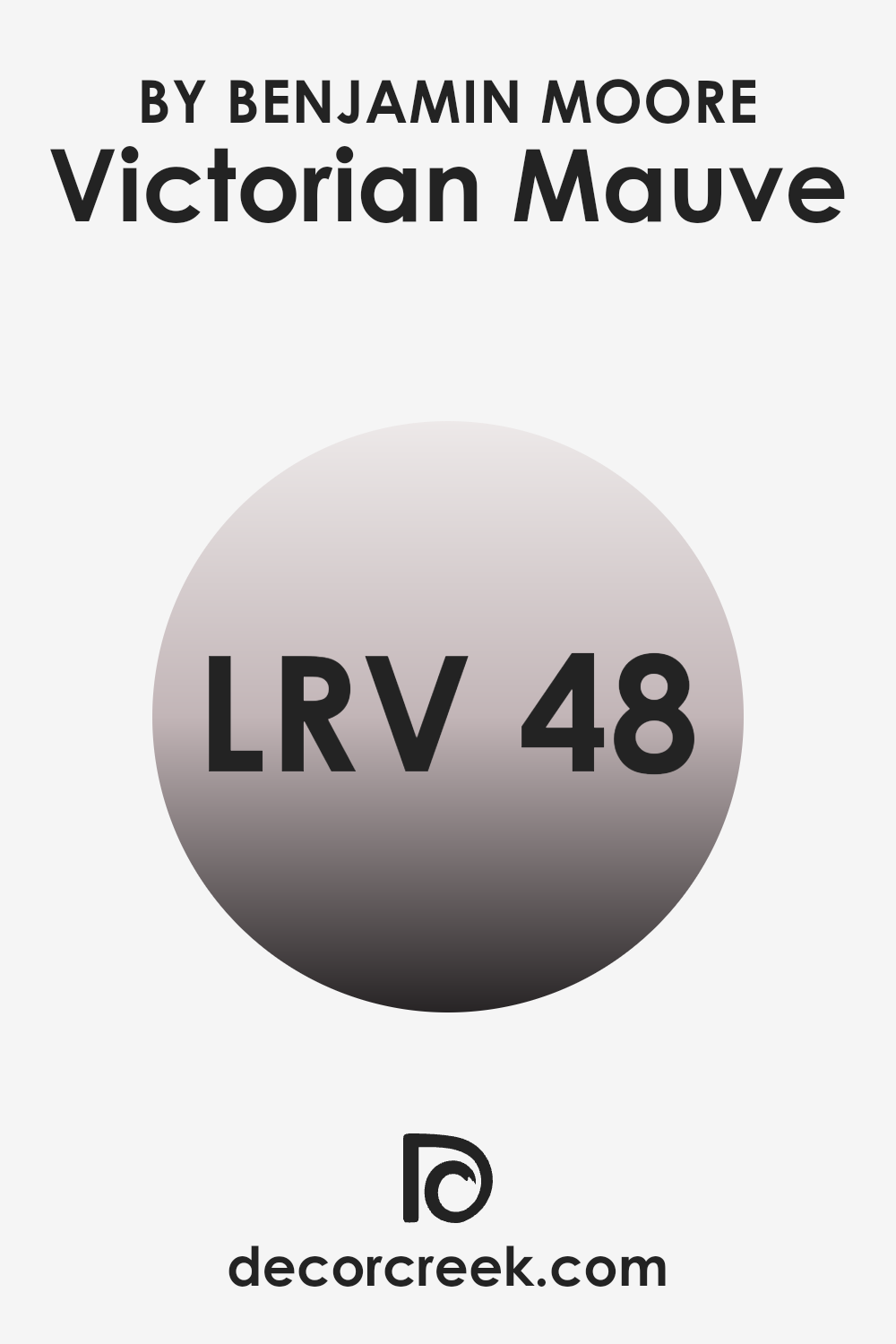
What is the LRV of Victorian Mauve 2114-50 by Benjamin Moore?
LRV stands for Light Reflectance Value, and it measures the percentage of light a paint color reflects from or absorbs into a painted surface. Essentially, it indicates how light or dark a color will appear once it’s on your walls.
A higher LRV means the color reflects more light, making it appear lighter and can make a room feel more open and airy. Conversely, a lower LRV means the color absorbs more light, which can make an area appear cozier and smaller.
The LRV of the Victorian Mauve by Benjamin Moore is 48.07, placing it in the middle range. This means it neither reflects nor absorbs light excessively, providing a balanced hue that works well in various lighting conditions. This flexibility makes it a good choice for rooms without a lot of natural light, as it won’t appear too dark, and in well-lit areas, it won’t look overly bright. It ensures the color maintains a steady appearance, regardless of the changing light throughout the day.
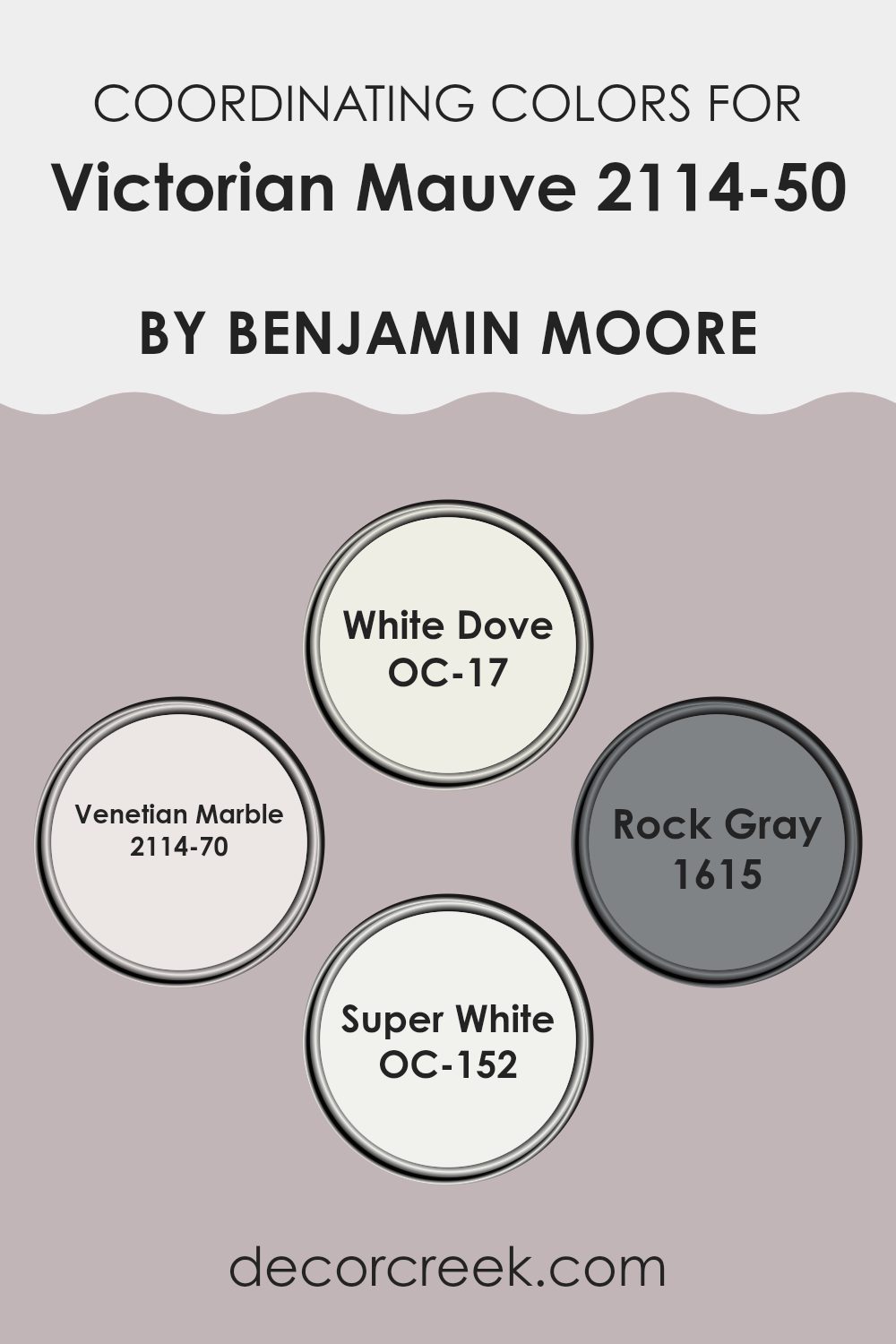
Coordinating Colors of Victorian Mauve 2114-50 by Benjamin Moore
Coordinating colors are selected hues that complement the base color, enhancing its visual appeal and setting a specific mood in the room. In the case of Victorian Mauve by Benjamin Moore, a set of coordinating colors has been thoughtfully chosen to harmonize beautifully with this distinctive shade. Each coordinating color supports Victorian Mauve in creating a cohesive and appealing palette, catering to various tastes and preferences for interior decorating.
White Dove (OC-17) is a soft, warm white that offers a gentle contrast and helps make the mauve stand out, adding brightness to rooms without feeling too intense. Venetian Marble (2114-70) is a very light purple-gray, less intense than Victorian Mauve, providing a subtle variance that maintains the room’s color continuity while softening the overall look.
Rock Gray (1615) is a deeper gray that offers a strong visual anchor, enriching the color scheme with a solid, grounding effect that complements the mauve without competing for attention. Lastly, Super White (OC-152) is crisp and clean, offering a refreshing clarity that can make the colors around it appear more vibrant and clear, serving as an excellent choice for trim or accent elements.
You can see recommended paint colors below:
- OC-17 White Dove
- 2114-70 Venetian Marble
- 1615 Rock Gray
- OC-152 Super White
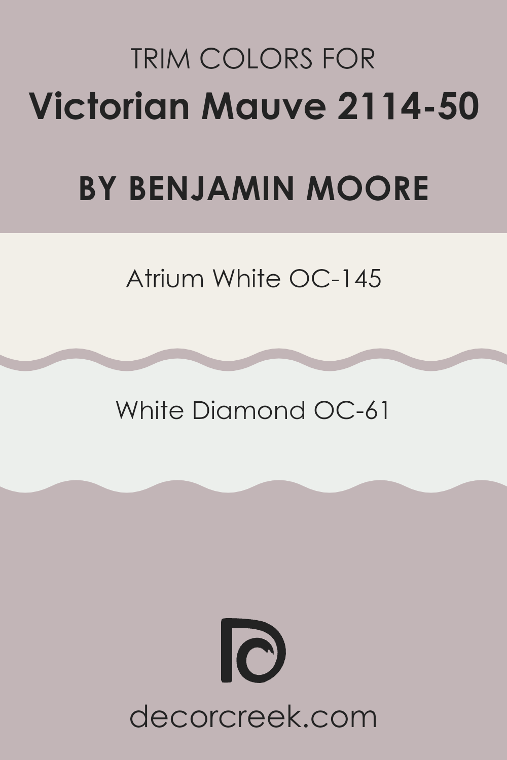
What are the Trim colors of Victorian Mauve 2114-50 by Benjamin Moore?
Trim colors are specifically selected to complement or contrast the main color on a wall, bringing definition and coherence to a room’s overall aesthetic. In the case of a rich and distinctive shade like Victorian Mauve by Benjamin Moore, choosing the right trim colors can enhance the visual appeal and create a polished look.
Atrium White OC-145 and White Diamond OC-61 are excellent choices for trims when paired with Victorian Mauve, as they offer subtle variations in brightness and undertones that can highlight the depth and richness of the mauve without overpowering it.
Atrium White OC-145 is a clean, bright white with a slightly warm undertone that provides a crisp border that can make the mauve stand out distinctly. This color is perfect for creating a fresh and inviting contrast, especially in well-lit rooms.
On the other hand, White Diamond OC-61 has a cooler tone and offers a more subtle contrast against Victorian Mauve, delivering a refined edge to rooms that aim for a softer distinction. Together, these trim colors work harmoniously with Victorian Mauve to refine the overall look of a room, enhancing the architectural details of the interior.
You can see recommended paint colors below:
- OC-145 Atrium White
- OC-61 White Diamond
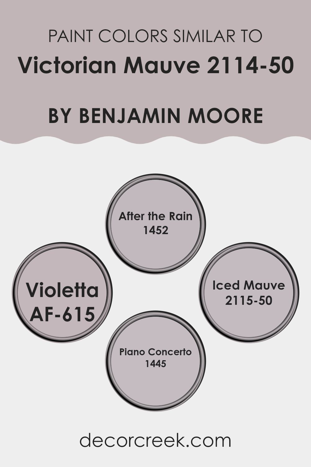
Colors Similar to Victorian Mauve 2114-50 by Benjamin Moore
Choosing similar colors in your decorating scheme can create a subtle and harmonious aesthetic, making rooms feel cohesive and inviting. When colors like Victorian Mauve by Benjamin Moore are used alongside closely related hues, they tend to enhance each other, offering a refined sense of continuity without stark contrasts.
This can be especially effective in rooms where you want a calm and collected atmosphere. For instance, the gentle blend of colors in a palette ensures that no single shade feels too strong, but each complements the other, promoting a smooth visual flow from one area to another.
In considering similar colors to Victorian Mauve, there are several related options. After the Rain is a soft, muted color that evokes the freshness of a rain-washed sky, adding a light, airy feel to any room. Violetta, on the other hand, offers a slightly deeper tone, hinting at elegance and depth, yet still aligning closely with the airy quality of mauve.
Iced Mauve provides a cooler take, bringing a contemporary edge with its frostier hue, ideal for more modern rooms or as a contrasting background for warmer accents. Piano Concerto complements this group with its understated and refined greyish tone, grounding the lighter mauves and preventing them from washing out. Together, these shades work harmoniously to create rooms that are pleasant and visually pleasing, adding a touch of color without feeling too strong on the senses.
You can see recommended paint colors below:
- 1452 After the Rain
- AF-615 Violetta
- 2115-50 Iced Mauve
- 1445 Piano Concerto
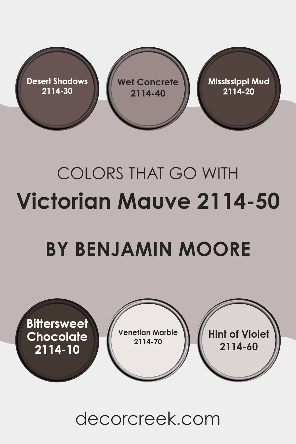
Colors that Go With Victorian Mauve 2114-50 by Benjamin Moore
Choosing colors that complement Victorian Mauve 2114-50 by Benjamin Moore is crucial for creating harmonious interiors. When these colors work together, they can make a room feel coherent and appealing. For instance, if you combine Victorian Mauve with Desert Shadows, a deep, earthy taupe, the harmony between the subtle purple of the mauve and the muted taupe sets a relaxed and welcoming mood. Similarly, Wet Concrete, a solid mid-tone grey, provides a neutral backdrop that allows the Victorian Mauve to stand out without feeling too strong, creating a balanced look.
Pairing Victorian Mauve with Mississippi Mud, which is a rich, dark brown, gives a room a grounded feeling with a hint of warmth, which can make the room cozy and inviting. Bittersweet Chocolate, a darker, almost black-brown, adds depth and contrast to the softer mauve, ideal for accent walls or furniture pieces.
For a lighter touch, Venetian Marble offers a soft, almost ethereal light gray that can brighten rooms while maintaining a gentle flow with the Victorian Mauve. Hint of Violet, a delicate light violet, subtly enhances the mauve tones, promoting a soft, cohesive aesthetic throughout the room. Incorporating these colors thoughtfully can help achieve a pleasant, well-rounded environment.
You can see recommended paint colors below:
- 2114-30 Desert Shadows
- 2114-40 Wet Concrete
- 2114-20 Mississippi Mud
- 2114-10 Bittersweet Chocolate
- 2114-70 Venetian Marble
- 2114-60 Hint of Violet
How to Use Victorian Mauve 2114-50 by Benjamin Moore In Your Home?
Victorian Mauve 2114-50 by Benjamin Moore is a rich and warm shade of purple that can bring a cozy and inviting atmosphere to any room in your home. Perfect for creating a welcoming feel, this color can be used in different ways to enhance your home’s decor.
For example, painting all the walls in a smaller room like a powder room or an accent wall in a larger living area can add depth and warmth. It pairs beautifully with neutral tones such as soft whites or light grays, which can help balance its richness.
Victorian Mauve can also be a great choice for textile elements like throw pillows or curtains, adding a gentle pop of color without feeling too strong in the room. Furniture pieces painted in this shade can become stunning focal points in light-colored rooms. Additionally, it works well in art frames or on lampshades to provide subtle color splashes that make your living area cozy and inviting.
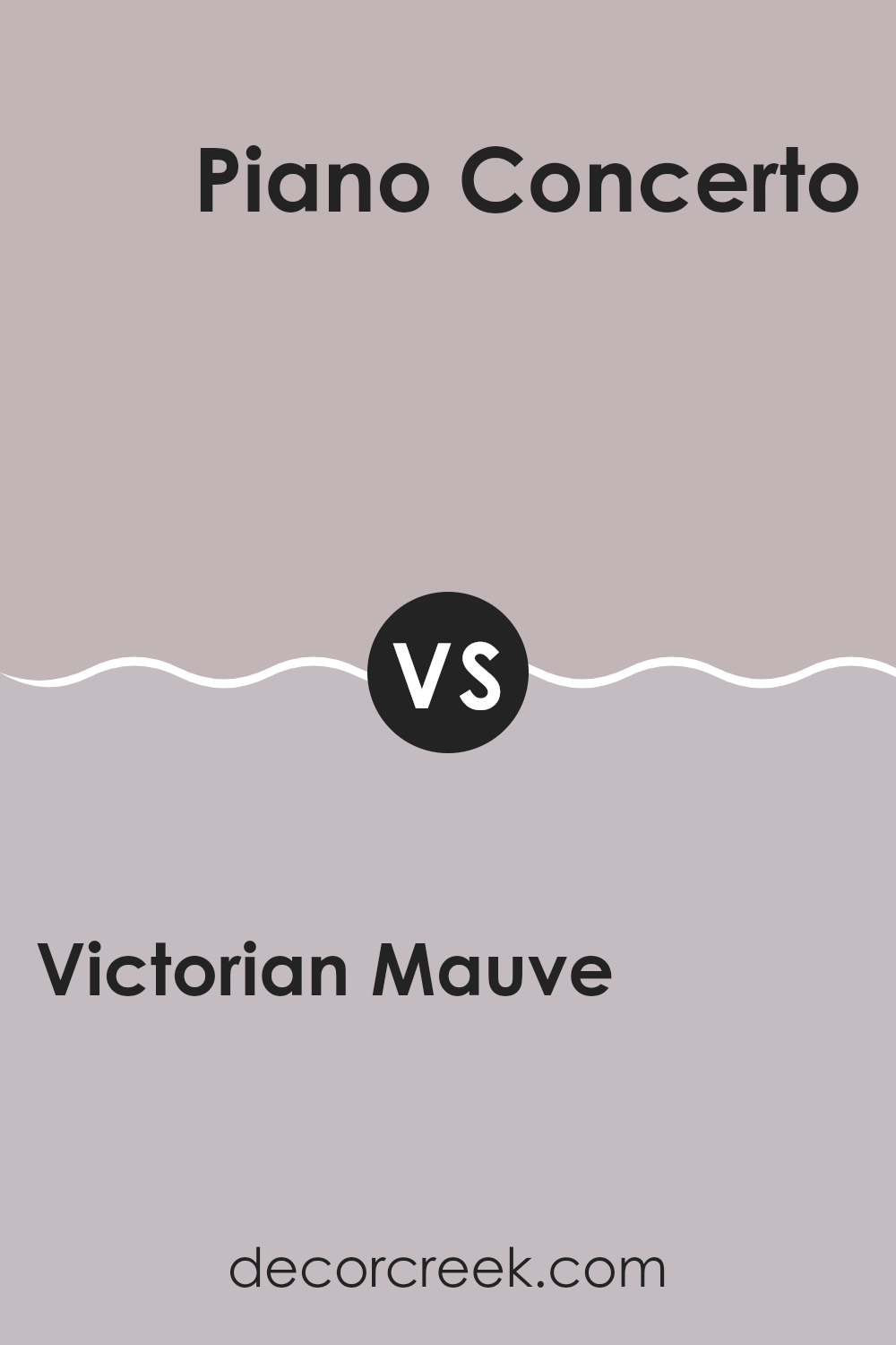
Victorian Mauve 2114-50 by Benjamin Moore vs Piano Concerto 1445 by Benjamin Moore
Victorian Mauve and Piano Concerto by Benjamin Moore are both unique, yet they convey different moods and styles. Victorian Mauve is a subtle pink with hints of gray, giving it a muted yet warm feel. It’s soft and gentle, making it perfect for creating a cozy and inviting atmosphere in areas like bedrooms or living rooms.
On the other hand, Piano Concerto is a darker, more defined gray with blue undertones. This color is great for adding a touch of elegance and calm to a room without being too bold. It works well in areas that you want to feel more grounded and focused, like home offices or studies.
Both colors are adaptable, but while Victorian Mauve adds a touch of light warmth, Piano Concerto offers a cooler, more understated vibe. Depending on the ambiance you’re trying to achieve, each color has its merits, complementing different decor styles and personal tastes.
You can see recommended paint color below:
- 1445 Piano Concerto
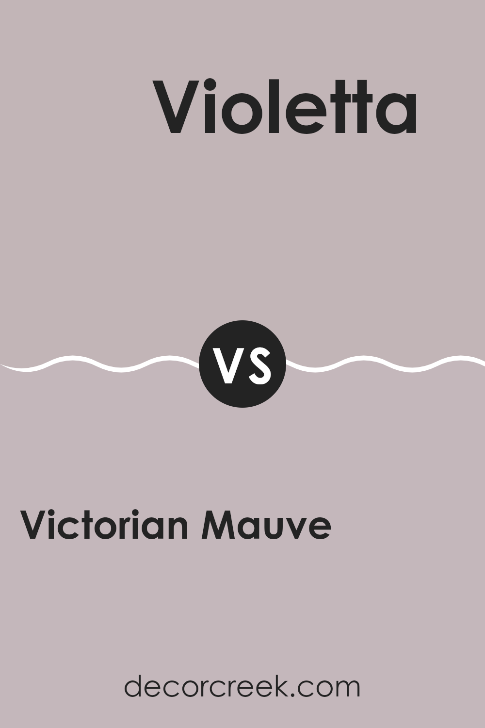
Victorian Mauve 2114-50 by Benjamin Moore vs Violetta AF-615 by Benjamin Moore
The main color, Victorian Mauve, is a soft, muted pink with subtle gray undertones, giving it a calm and gentle feel. It fits well in rooms aiming for a cozy or subdued look. In contrast, Violetta is a deeper, more intense color.
It has a richer purple hue, which stands out more vividly against other colors. Violetta offers a dramatic flair and could be used as a statement wall or in decorative accents to add depth and interest to a room.
When comparing the two, Victorian Mauve lends itself to broader use across walls due to its lighter, more neutral tone, while Violetta is better suited for targeted applications which benefit from a stronger color presence.
You can see recommended paint color below:
- AF-615 Violetta
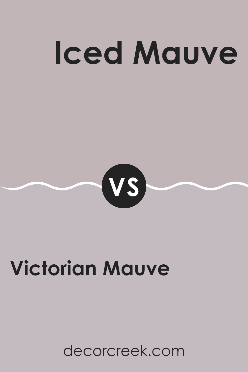
Victorian Mauve 2114-50 by Benjamin Moore vs Iced Mauve 2115-50 by Benjamin Moore
The main color, Victorian Mauve by Benjamin Moore, is a soft, muted hue that offers a gentle touch of warmth. This shade leans more towards a subdued pink with subtle gray undertones, making it cozy and inviting. Its depth provides a historical charm that suits areas meant to feel welcoming yet subtly rich.
On the other hand, Iced Mauve carries a cooler tone, leaning more towards a lilac or light purple. It is distinctly lighter and brighter than Victorian Mauve, offering a fresher, more airy feel. This color is great for rooms that aim to feel more open and light-filled.
Both colors provide a sense of calm and are flexible enough for many settings, from bedrooms to living rooms. However, Victorian Mauve’s warmer undertones might make it a better choice for those seeking a snug, comforting vibe, while Iced Mauve is ideal for creating a more open and refreshing environment.
You can see recommended paint color below:
- 2115-50 Iced Mauve
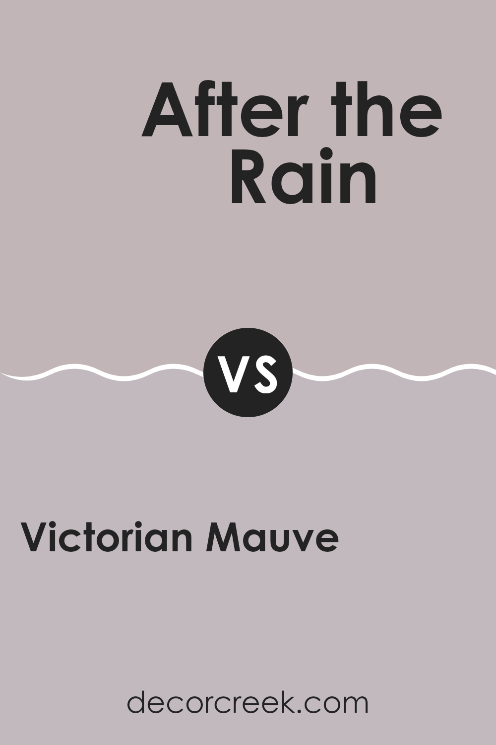
Victorian Mauve 2114-50 by Benjamin Moore vs After the Rain 1452 by Benjamin Moore
Victorian Mauve is a gentle, muted shade of purple with a hint of gray, giving it a subdued yet warm appearance. It’s a color that pairs well with soft whites and other neutrals, making it a great choice for rooms where you want a touch of color without feeling too intense.
On the other hand, After the Rain is a soft, light blue with a gray undertone that might remind you of the sky just after a rainstorm. It’s a fresh and calm color, perfect for creating a relaxing environment. It also goes well with white trims and can brighten up darker rooms effectively.
While both colors are muted and have gray undertones, Victorian Mauve leans toward a warm purple, creating a cozy feel. In contrast, After the Rain, with its cooler blue tones, has a more airy and open vibe. Depending on the mood you want to set in your room, either color could be the right choice, but they offer distinctly different atmospheres.
You can see recommended paint color below:
- 1452 After the Rain
After looking closely at the paint color 2114-50 Victorian Mauve by Benjamin Moore, I’ve learned a lot about its unique shade. This color is not just simple pink; it has a special hint of gray that makes it look very soft and calming.
It’s a great choice if you want to make a room feel cozy and warm without using a very bright color. Victorian Mauve goes well in bedrooms or living rooms where you spend a lot of time relaxing. It is also nice because it doesn’t clash with other colors, making it easy to use with different furniture and decorations.
Many people might think this color is only for old-fashioned styles, but it actually looks very nice in modern homes too, adding a gentle touch to sleek designs. All in all, Victorian Mauve is a great option for anyone looking to refresh their walls with a color that is pretty, calming, and easy to match with various styles.
Ever wished paint sampling was as easy as sticking a sticker? Guess what? Now it is! Discover Samplize's unique Peel & Stick samples.
Get paint samples

