I recently stumbled upon Sherwin Williams SW 6838 Vigorous Violet, and I must say, it’s an intriguing shade! As someone who loves experimenting with colors in my home, finding a violet that stands out, yet feels warm and inviting, was a delightful surprise. This particular tint strikes a beautiful balance between vibrancy and subtlety, making it a perfect choice if you’re looking to introduce a pop of color without overwhelming your space.
Incorporating Vigorous Violet into your décor can refresh the look of any room. Whether you’re considering a feature wall in your living room or maybe adding a splash of color to your bedroom, this shade can offer a fresh twist to conventional spaces.
It pairs well with a range of complementary colors, from soft neutrals to bold shades, allowing you to tailor the ambiance to match your personal style.
If you’re curious about how Vigorous Violet might transform your home environment, why not consider testing it in a small area?
A color this unique has the potential to elevate the mood and style of your living space, providing a modern yet timeless aesthetic.
What Color Is Vigorous Violet SW 6838 by Sherwin Williams?
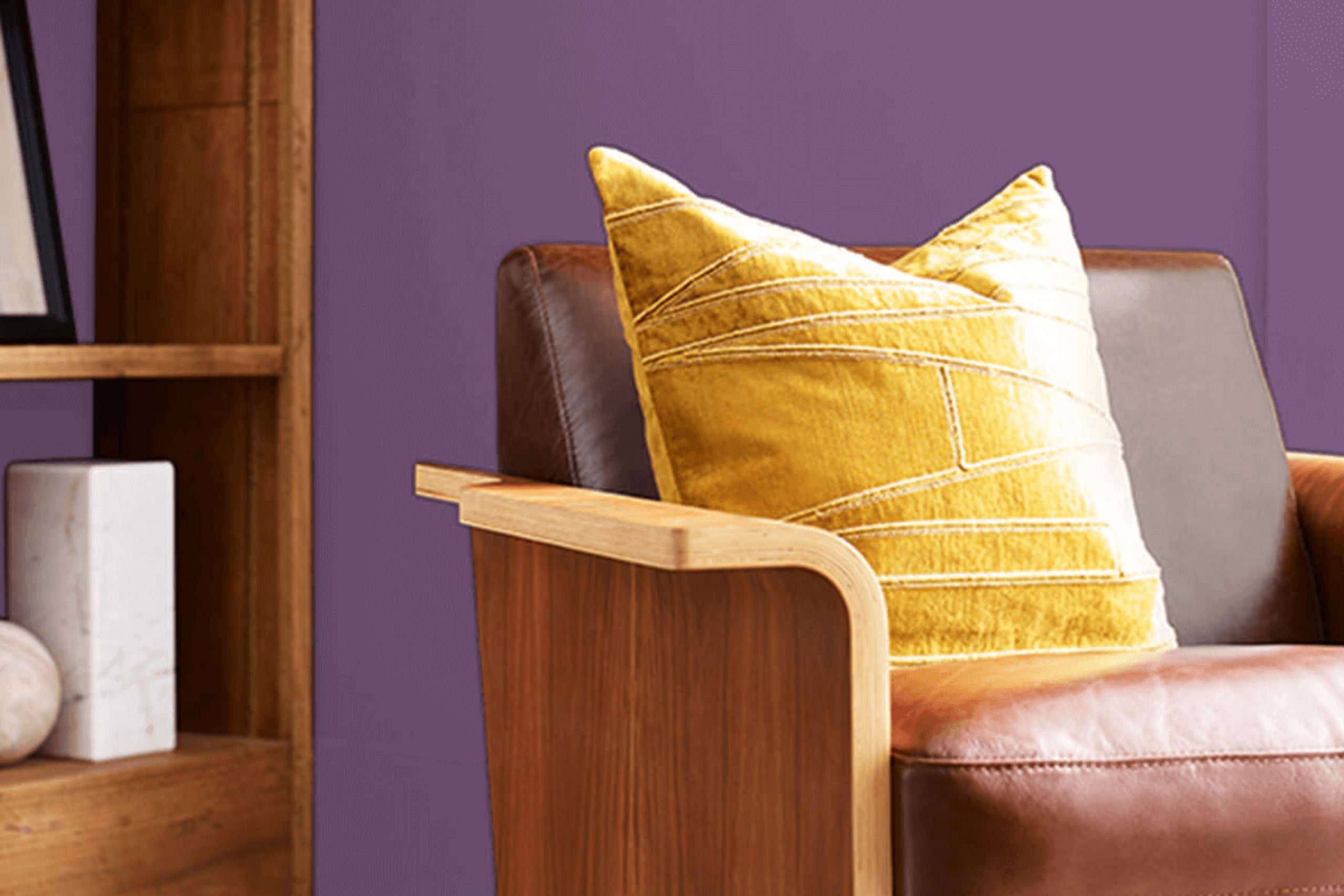
Vigorous Violet by Sherwin Williams is a bold and expressive shade, perfect for adding a splash of energy to any space. This vibrant purple hue has a lively presence that can make walls pop or accentuate specific areas within a room. It pairs exceptionally well with most neutrals, especially warm grays and rich tans, which help balance its intensity.
This color works well in contemporary and eclectic interior styles where it can be used to create a sense of excitement and creativity. It’s also a great choice for modern bedrooms when used as an accent wall, infusing the room with personality without overwhelming it.
When considering materials and textures, Vigorous Violet pairs beautifully with glossy finishes and metallic accents such as silver, gold, or brushed nickel, which add a touch of luxury and contrast nicely with the depth of the purple. Soft textures like velvet or silk in cushions, curtains, and upholstery complement its rich tone, enhancing the overall feel of plushness and comfort in the space.
Overall, Vigorous Violet is versatile and dynamic, making it an excellent choice for anyone looking to add a vivid splash of color to their home that is both playful and stylish.
Is Vigorous Violet SW 6838 by Sherwin Williams Warm or Cool color?
Vigorous Violet by Sherwin Williams is a bold and dynamic color that can make a strong impact in any home. The paint’s rich violet tone provides an immediate sense of personality and warmth, making it perfect for those looking to add a pop of color to their space.
The deep violet shade can work well in living rooms or bedrooms, giving them a cozy yet vibrant feel. When used on a feature wall, it creates a focal point that draws attention and can set the mood of the room.
this color with lighter shades like soft whites or complementary pastels can balance out its intensity, making the space feel lively but not overwhelming. Additionally, this color works well with natural light, enhancing its vibrancy throughout the day. Using it in areas with good lighting or large windows can maximize its effect, bringing out the depth and richness of the hue.
Undertones of Vigorous Violet SW 6838 by Sherwin Williams
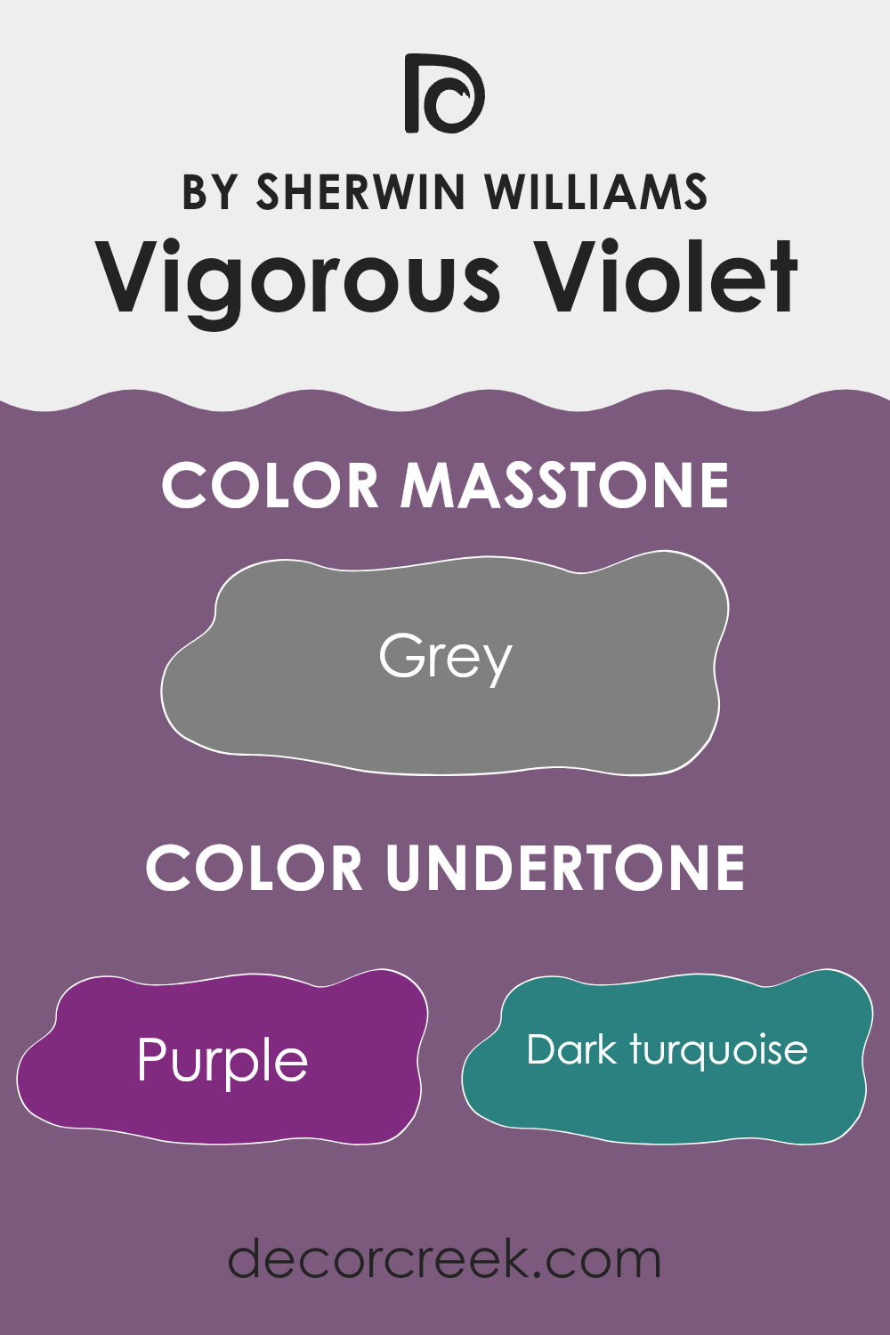
Vigorous Violet is a unique paint color that can appear differently depending on its undertones, which are subtle hues mixed into the main color. With undertones ranging from different shades of purple and blue to more unexpected colors like olive and pale pink, Vigorous Violet presents an intriguing complexity. These underlying tones can influence the main violet color to lean more towards cool or warm, affecting the mood and feel of a room.
When applied to interior walls, the abundance of undertones in Vigorous Violet adds depth and variety. In a brightly lit room, lighter undertones like pale pink and lilac might become more pronounced, giving the walls a softer and gentler appearance.
Conversely, in a room with less natural light, darker undertones like navy or dark grey might stand out, giving the space a more grounded feel. This diversity of undertones also means the color can interact with furniture and decor in various ways. For example, pairing the walls with dark green accents can highlight the olive undertones, while setting it against something orange could draw out the purple hues more strongly.
Overall, the varied undertones of Vigorous Violet make it a flexible choice for painting interior walls, as it can adapt to different lighting and decorating styles, shifting subtly to complement the surrounding environment. This adaptability makes it an interesting option for those who enjoy a dynamic and visually engaging space.
What is the Masstone of the Vigorous Violet SW 6838 by Sherwin Williams?
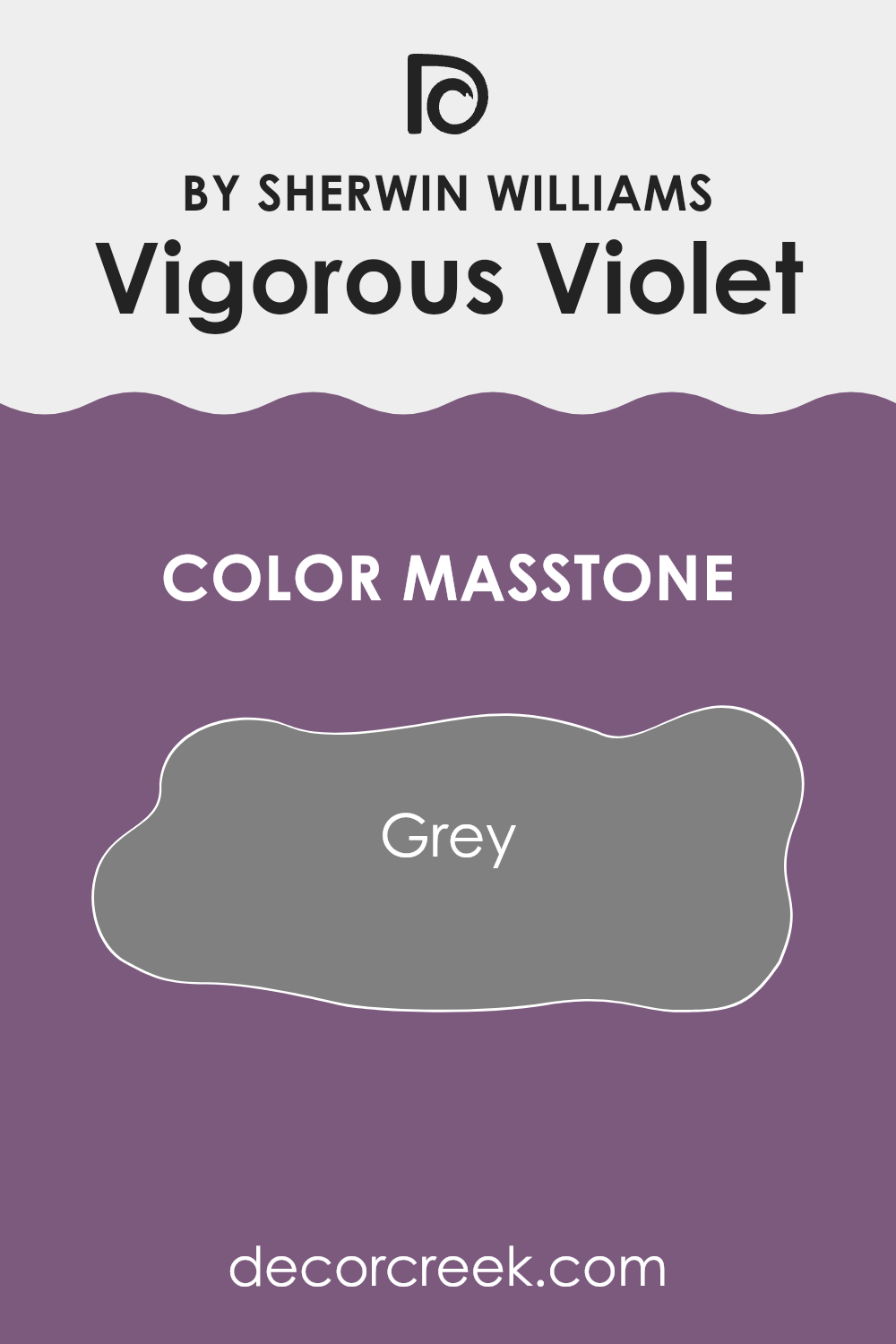
Vigorous VioletSW 6838 by Sherwin Williams has a masstone of grey, resembling the shade with the hex code #808080. This neutral grey aspect affects how the color appears and functions in home interiors.
Since grey is a balanced and versatile shade, it works well in many spaces without overwhelming the room. It provides a subtle backdrop that can blend easily with various decor styles, whether modern, traditional, or eclectic. The grey masstone in Vigorous Violet helps in creating a calm and understated ambiance, making it suitable for spaces like living rooms, bedrooms, and home offices.
It also works well with other colors, either by complementing softer hues or providing a contrast to brighter shades. This adaptability makes it a practical choice for homeowners looking to have a reliable color that can sustain different decorating changes over time.
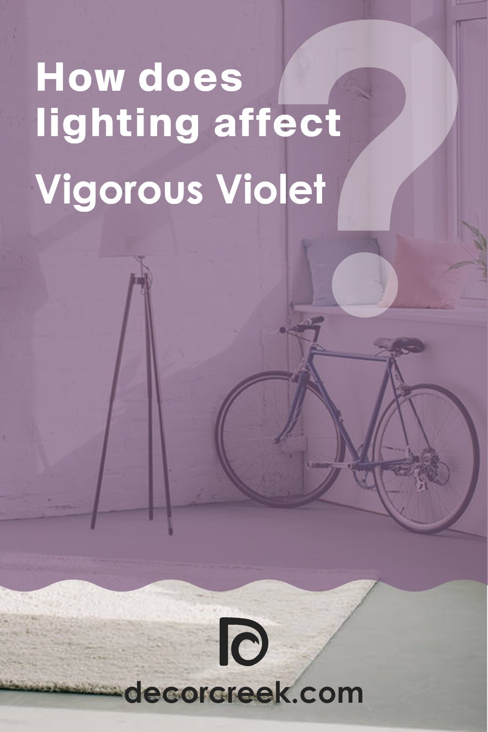
How Does Lighting Affect Vigorous Violet SW 6838 by Sherwin Williams?
Lighting has a significant impact on how colors appear, and understanding this can help you make the best choices when decorating your space. Different types of light can change the way colors look in a room, affecting their intensity and hue. Take the color Vigorous Violet, for example.
In natural light, which is the light that comes from the sun, colors can appear brighter and truer to their palette.
For Vigorous Violet, natural daylight helps bring out its rich and dynamic tones, making the color lively and more vivid.
In contrast, artificial light, such as light bulbs, can alter how colors are perceived. Typically, LED or fluorescent lighting might make Vigorous Violet appear slightly bluer or cooler than it does in natural light.
This is because artificial lighting can have different color temperatures and may not showcase the color’s depth as sunlight does.
The orientation of the room also plays a role in how Vigorous Violet will look. In north-facing rooms, which often get less direct sunlight, this color might appear somewhat darker and less vibrant, possibly taking on a more subtle and muted quality. This could make the space feel cozy but might require additional lighting to enhance the color’s richness.
In south-facing rooms, where sunlight is abundant and warmer for the majority of the day, Vigorous Violet will likely look very vibrant and bright. This can make the room feel lively and energetic, perfect for spaces used during the day. In east-facing rooms, morning light can make Vigorous Violet look very warm and welcoming in the mornings but might lose some vibrancy in the afternoon and evening.
Conversely, in west-facing rooms, the color might appear softer during the day and become dramatically vibrant and warm in the evening as the sun sets. Each direction alters the perception of the color, influencing the mood and feel of the room throughout the day.
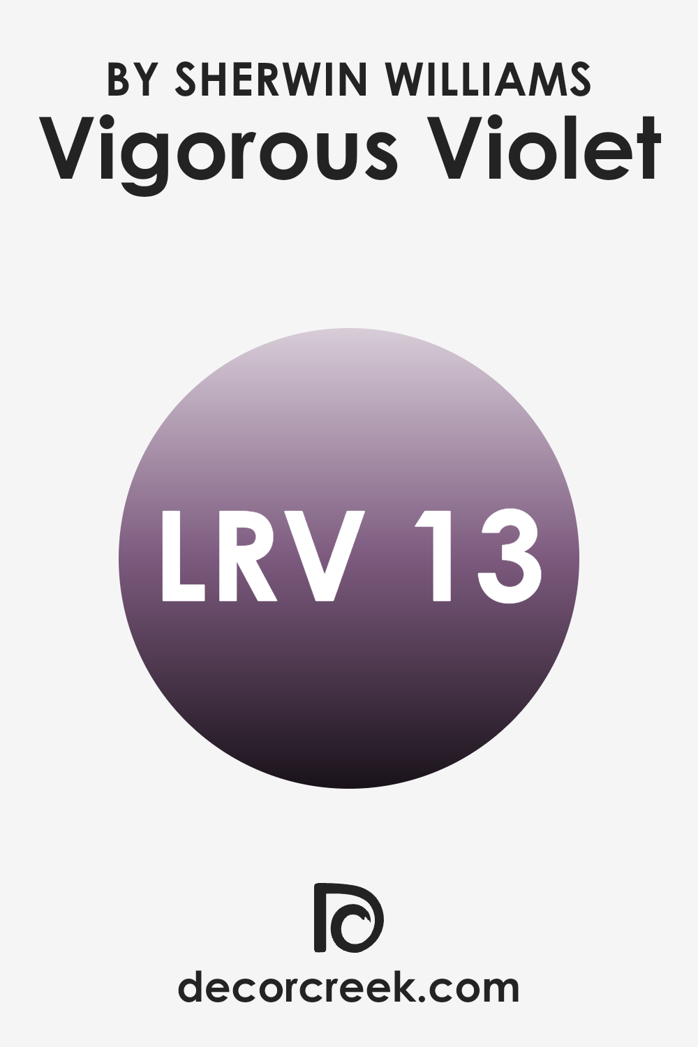
What is the LRV of Vigorous Violet SW 6838 by Sherwin Williams?
LRV stands for Light Reflectance Value, which measures the amount of light a paint color reflects back into a room. It’s given as a percentage of the light that hits the surface, with higher values meaning the color reflects more light and appears lighter, and lower values meaning it absorbs more light and appears darker.
This metric is particularly helpful when choosing paint colors, as it can greatly influence the mood and brightness of a space. Lighter colors make a small or dark room feel larger and brighter, while darker colors can make a space feel more cozy and enclosed.
The LRV for Vigorous Violet, which is around 13.115, indicates that it is a darker shade. This lower LRV means it will absorb more light than it reflects, which can make spaces painted in this color look smaller and less illuminated. When using a color with such a low LRV, lighting becomes crucial.
You may need to add more light sources to the room to counteract the darkness of the walls. This deep hue can be a bold choice, creating a striking impact in a room, but it’s important to consider the room’s natural and artificial lighting to ensure the space doesn’t become too dim.
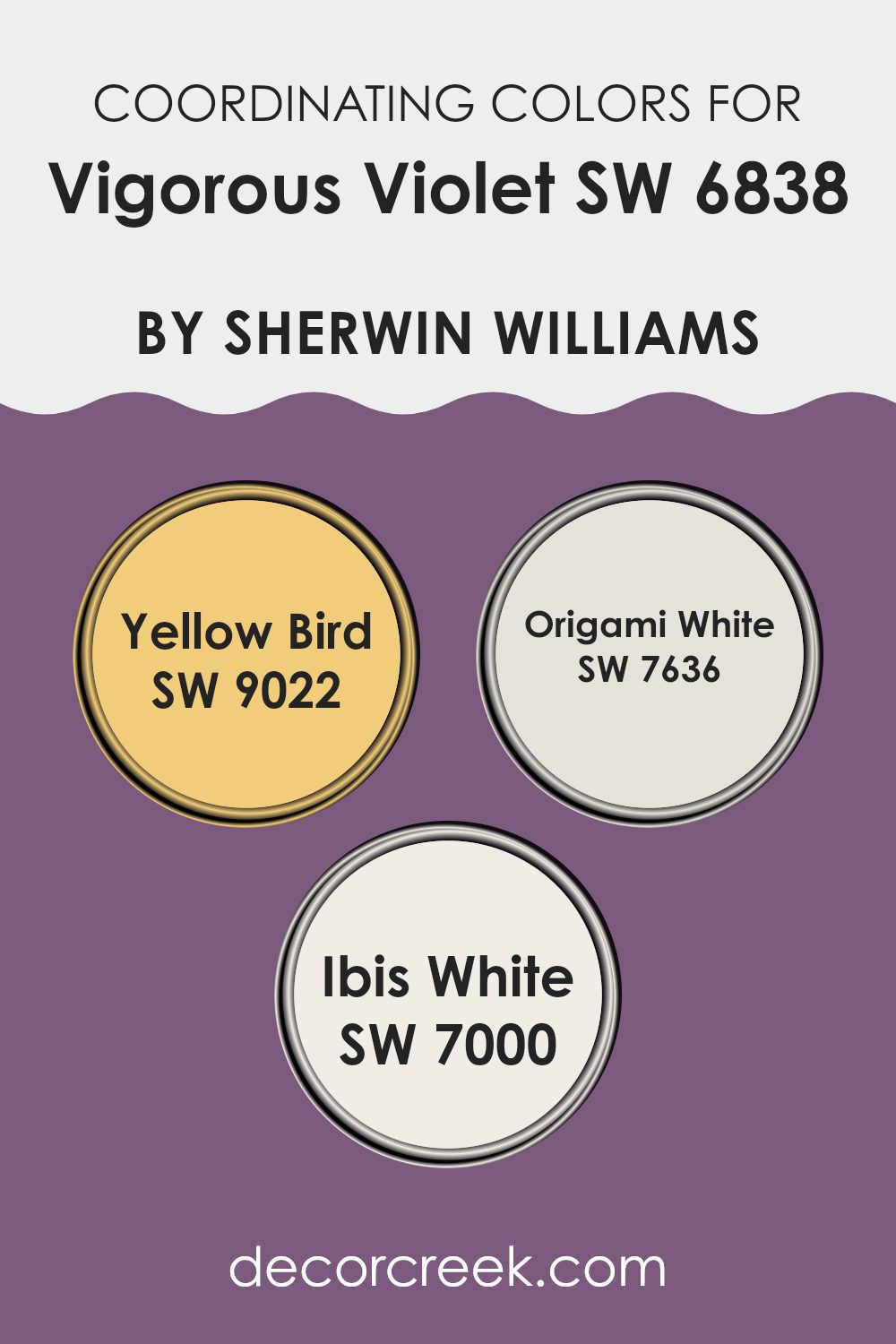
Coordinating Colors of Vigorous Violet SW 6838 by Sherwin Williams
Coordinating colors are those shades that complement and enhance the overall aesthetic when used alongside a primary color. In the case of a vivid color like Vigorous Violet by Sherwin-Williams, selecting the right coordinating colors ensures that the design feels balanced and harmonious. Coordinating colors can share similar undertones or contrast in a way that highlights the best features of the main color.
For Vigorous Violet, a good match is Yellow Bird, a bright and cheerful yellow. This color brings a vibrant pop that can lighten the mood and add a playful dynamic to the strong personality of violet. It creates a striking contrast that can make each color stand out more vividly.
Another coordinating color is Origami White, which is a soft and clean white with a subtle warmth. This neutral is perfect for softening the intensity of Vigorous Violet and providing a calm backdrop that allows the violet to shine without overwhelming the space. Similarly, Ibis White is another excellent match.
It’s a bit more pronounced than Origami White, with a warm tone that supports a welcoming and cozy atmosphere. When paired with Vigorous Violet, Ibis White serves as a gentle yet impactful companion color that helps in maintaining a bright and airy space.
You can see recommended paint colors below:
- SW 9022 Yellow Bird
- SW 7636 Origami White
- SW 7000 Ibis White
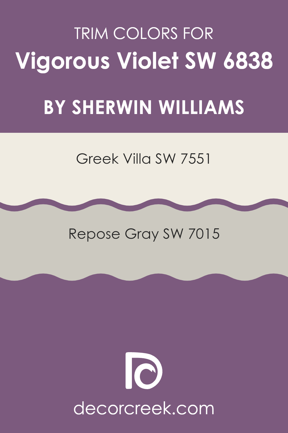
What are the Trim colors of Vigorous Violet SW 6838 by Sherwin Williams?
Trim colors are integral in accentuating the main color used on walls, providing a neat finish and highlighting architectural elements. By selecting the right trim color, the main color can either stand out more vividly or blend smoothly with the overall design scheme. For Vigorous Violet, a rich and vibrant tone, trim colors like Greek Villa and Repose Gray are excellent choices.
Greek Villa offers a subtle contrast, not overpowering the strong hue of Vigorous Violet but rather complementing it with a soft, warm white that ensures the violet pops without overwhelming the space. Repose Gray, on the other hand, provides a cooler contrast, bringing a gentle balance that can make Vigorous Violet look more grounded and visually appealing.
Greek Villa, with its warm undertones, is a creamy white that works well to soften the intense hues it borders, making it a great buffer between a vivid wall color and the surroundings. Its light-reflective properties can make small rooms appear more spacious and airy.
Repose Gray, a mild and neutral gray, acts as a subtle frame that enhances the depth and intensity of more saturated colors. It’s versatile enough to blend seamlessly with various decor styles and other hues, ensuring a harmonious look throughout the space.
You can see recommended paint colors below:
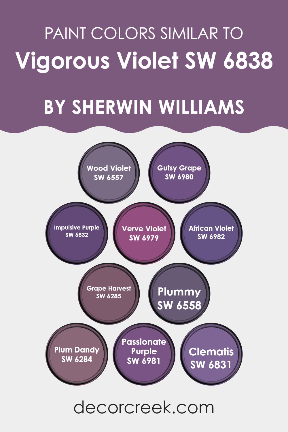
Colors Similar to Vigorous Violet SW 6838 by Sherwin Williams
Choosing similar colors can be essential for creating a harmonious and pleasing aesthetic in any space. Colors like Wood Violet SW 6557 offer a subtle, toned-down shade of purple that blends seamlessly with more vibrant hues.
For those looking to add a bit of drama, Gutsy Grape SW 6980 provides a deep, berry-infused variant that still maintains visual coherence with surrounding purples. Impulsive Purple SW 6832 introduces a playful touch, with a brighter, more upbeat purple that keeps the color scheme lively yet cohesive.
On the other hand, Verve Violet SW 6979 strikes a good balance with its rich yet muted tone, making it ideal for providing depth without overwhelming the senses. African Violet SW 6982 leans toward a more mysterious shade, perfect for adding a touch of intrigue.
For a more earthy and subdued feel, Grape Harvest SW 6285 presents a dusky purple that complements both lighter and darker purples. Plummy SW 6558 has a warm, almost cozy appeal, making it great for spaces needing a soft yet inviting atmosphere.
Further lending to the diversity of purples, Plum Dandy SW 6284, with its lighter, nearly whimsical lavender shade, fits beautifully with deeper, more intense purples. For a rich and powerful expression, Passionate Purple SW 6981 saturates the space with its robust presence.
Lastly, Clematis SW 6831, offering a fresh floral purple, ties the whole palette together, reminding one of a blossoming spring garden. Each of these colors provides a unique way to maintain a cohesive look while allowing for personal expression and style continuity.
You can see recommended paint colors below:
- SW 6557 Wood Violet
- SW 6980 Gutsy Grape
- SW 6832 Impulsive Purple
- SW 6979 Verve Violet
- SW 6982 African Violet
- SW 6285 Grape Harvest
- SW 6558 Plummy
- SW 6284 Plum Dandy
- SW 6981 Passionate Purple
- SW 6831 Clematis
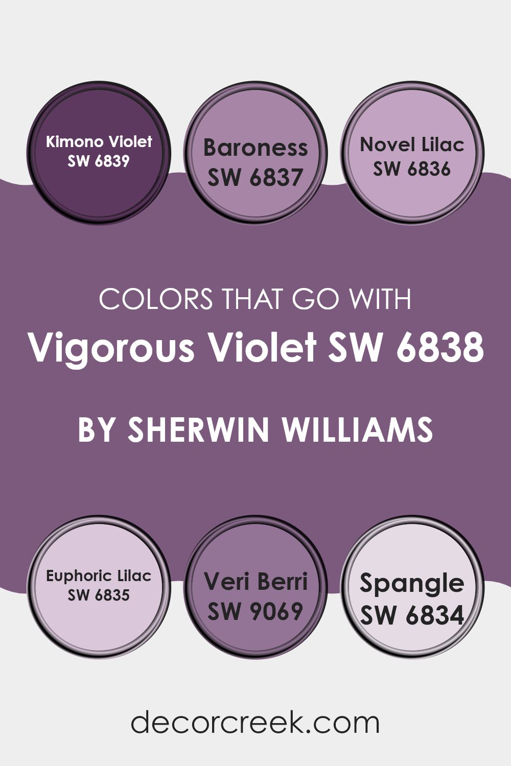
Colors that Go With Vigorous Violet SW 6838 by Sherwin Williams
Choosing the right colors to complement Vigorous Violet SW 6838 by Sherwin Williams can significantly enhance the feel and aesthetic of a space. When combined thoughtfully, these colors can create a harmonious palette that enhances the main shade without overpowering it. For instance, pairing it with Kimono Violet SW 6839, which is a deeper and slightly more intense purple, can add a rich depth to the decor, making the environment feel cozy and welcoming.
Baroness SW 6837 is a beautiful muted plum that provides a subtle contrast, bringing an understated elegance to a room when used alongside Vigorous Violet. Novel Lilac SW 6836, on the other hand, is lighter and brings a fresh, airy feel to the palette, perfect for brightening up spaces that need a touch of lightness.
Euphoric Lilac SW 6835 has a playful, cheerful lilac tone that injects vibrancy and fun into interiors, making it ideal for areas like children’s rooms or creative spaces. Veri Berri SW 9069 is a bold berry color that adds a splash of energy and personality.
Finally, Spangle SW 6834 is a soft, silvery lavender that works wonderfully as an accent color, providing a gentle contrast that highlights the more robust tones of Vigorous Violet. Together, these shades create a rich tapestry of purples and lilacs that can make any space lively and visually striking.
You can see recommended paint colors below:
- SW 6839 Kimono Violet
- SW 6837 Baroness
- SW 6836 Novel Lilac
- SW 6835 Euphoric Lilac
- SW 9069 Veri Berri
- SW 6834 Spangle
How to Use Vigorous Violet SW 6838 by Sherwin Williams In Your Home?
Vigororous Violet SW 6838 by Sherwin Williams is a rich and striking shade of purple that can bring a lively pop of color to any room in your home. If you’re thinking about refreshing your living space, consider using this vibrant color. It’s perfect for adding a bold statement to areas like a feature wall in the living room or dining area. This particular shade also works well in a bedroom, where it can create a cozy and inviting atmosphere.
For those who prefer subtler design changes, incorporating Vigorous Violet through accents like cushions, curtains, or a single piece of furniture can add a touch of warmth without overwhelming the space.
Pair it with neutral colors like white, gray, or beige to keep the balance and let the purple stand out. This color is also great for craft rooms or creative spaces, inspiring energy and creativity. Whatever way you choose to use it, this vibrant hue can make your home feel more lively and personalized.
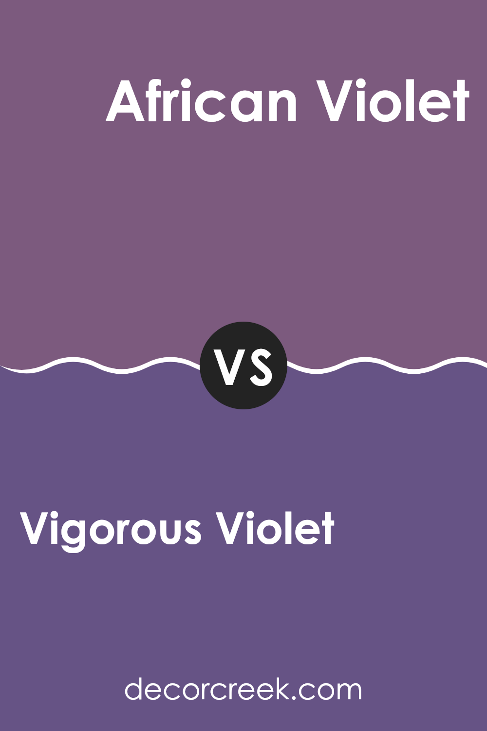
Vigorous Violet SW 6838 by Sherwin Williams vs African Violet SW 6982 by Sherwin Williams
Vigorous Violet and African Violet, both by Sherwin Williams, offer distinctive shades of purple, each with its own charm. Vigorous Violet is a bold and bright purple. It stands out with its lively and energetic vibe, perfect for making a statement in spaces like playrooms or creative studios.
On the other hand, African Violet leans towards a softer, more subdued shade. This color has a gentle richness that works well in bedrooms or lounges where you want a touch of elegance without overwhelming the space.
While Vigorous Violet is more in-your-face, African Violet provides a subtle hint of color, making it versatile for pairing with various decors. Together, these two purples cover a wide spectrum from vibrant to plush.
You can see recommended paint color below:
- SW 6982 African Violet
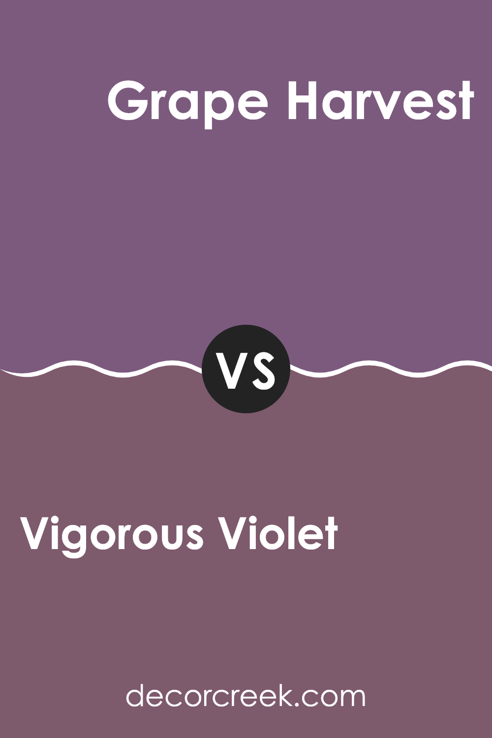
Vigorous Violet SW 6838 by Sherwin Williams vs Grape Harvest SW 6285 by Sherwin Williams
Vigorous Violet and Grape Harvest, both by Sherwin Williams, are distinct takes on purple, each offering a unique vibe for your space. Vigorous Violet is a bold and vivid purple. It stands out with a deep, intense hue that really pops in a room, making it great for an accent wall or to add a playful splash of color.
In contrast, Grape Harvest presents a softer and more subdued purple. It has a muted tone that feels more relaxed and is easier to blend into a variety of decors.
This color works well in spaces where you prefer a more understated yet still colorful atmosphere. While Vigorous Violet adds drama and flair, Grape Harvest offers a gentle touch of color, ideal for creating a cozy and inviting environment without overwhelming the senses.
You can see recommended paint color below:
- SW 6285 Grape Harvest
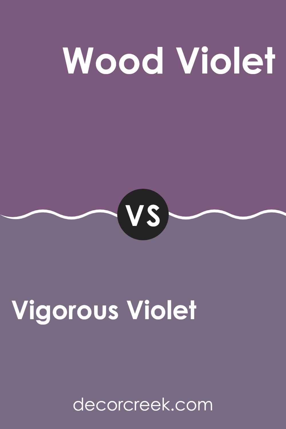
Vigorous Violet SW 6838 by Sherwin Williams vs Wood Violet SW 6557 by Sherwin Williams
Vigorous Violet and Wood Violet are both vibrant choices from Sherwin Williams, but they have their unique differences. Vigorous Violet has a bold and bright character, leaning towards a vivid purple that can make a strong statement in a room.
It’s the sort of color that stands out and can energize a space effectively. On the other hand, Wood Violet has a slightly softer presence. While still unmistakably purple, it has hints of blue which give it a cooler, more subtle appearance compared to Vigorous Violet.
This makes Wood Violet a great option for creating a calming effect in bedrooms or bathrooms without overpowering the area. When choosing between them, consider the mood and function of the room – Vigorous Violet for something lively and engaging, Wood Violet for a gentler, more understated vibe.
You can see recommended paint color below:
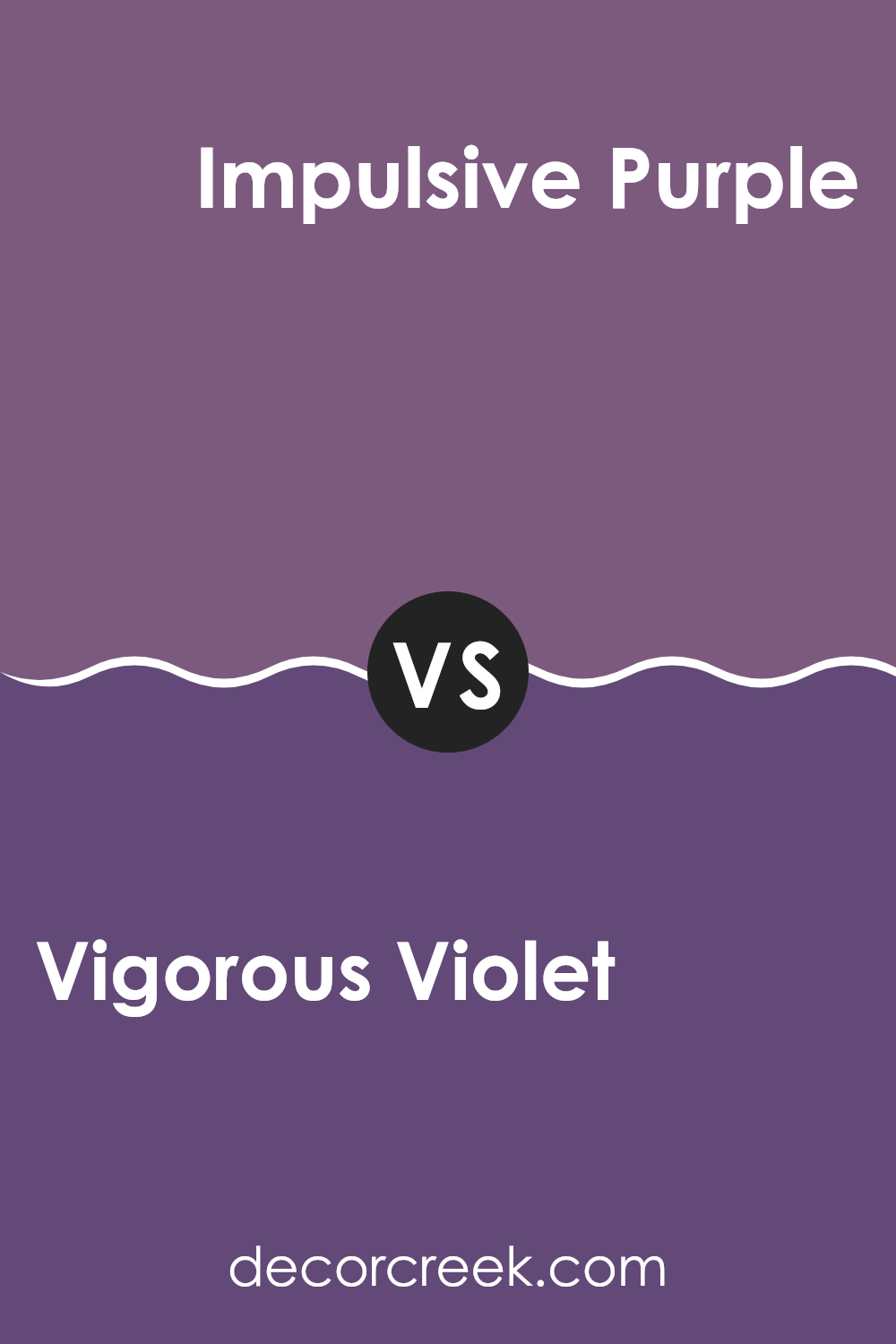
Vigorous Violet SW 6838 by Sherwin Williams vs Impulsive Purple SW 6832 by Sherwin Williams
Vigorous Violet and Impulsive Purple are both lively and bold colors from Sherwin Williams, but they differ in their shades and the moods they create. Vigorous Violet is a deep, robust shade that leans more towards a traditional purple, making it a strong choice for spaces that you want to feel cozy and inviting.
On the other hand, Impulsive Purple is a brighter, more vibrant shade. This color has a more playful vibe, suitable for areas where you want to inject energy and fun. While both colors are in the purple family, Vigorous Violet offers a more classical purple feel, which can be seen as more grounded and calm.
Impulsive Purple, with its vividness, tends to stand out more, making it perfect for accent walls or decor elements where you want to make a bold statement. Both colors work well in creative spaces or as unique touches to otherwise neutral color schemes.
You can see recommended paint color below:
- SW 6832 Impulsive Purple
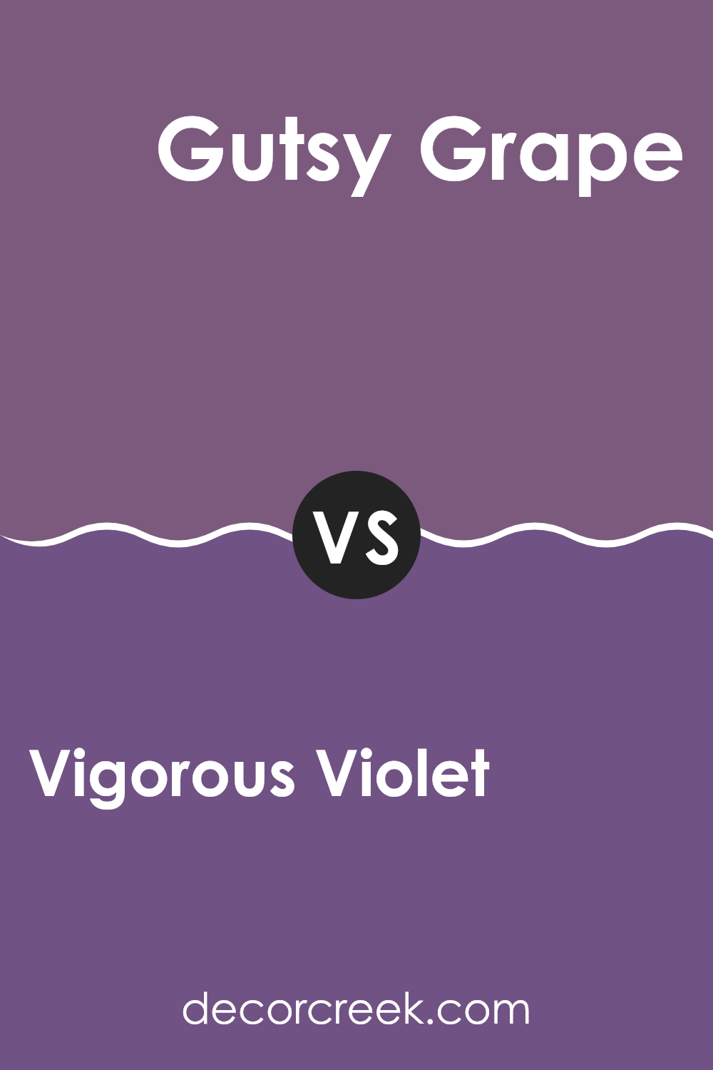
Vigorous Violet SW 6838 by Sherwin Williams vs Gutsy Grape SW 6980 by Sherwin Williams
Vigorous Violet and Gutsy Grape, both from Sherwin Williams, have distinct personalities despite their shared purple base. Vigorous Violet is a lighter, more subtle purple with a soft and gentle feel. It’s perfect if you’re looking for a purple that’s not too overwhelming and maintains a friendly, inviting vibe. It’s great for spaces where you want a hint of color without dominating the room’s aesthetic.
On the other hand, Gutsy Grape is a deeper, bolder purple. This color stands out more and can make a strong statement in a space. It’s ideal for areas where you want to draw attention or create a focal point, giving the room a feel of depth and richness. Gutsy Grape can add a lot of personality to a space, making it feel more lively and dynamic.
Both colors provide a way to incorporate purple into your decor, but the choice between a soft presence and a bold statement depends on what you’re aiming for in your space.
You can see recommended paint color below:
- SW 6980 Gutsy Grape
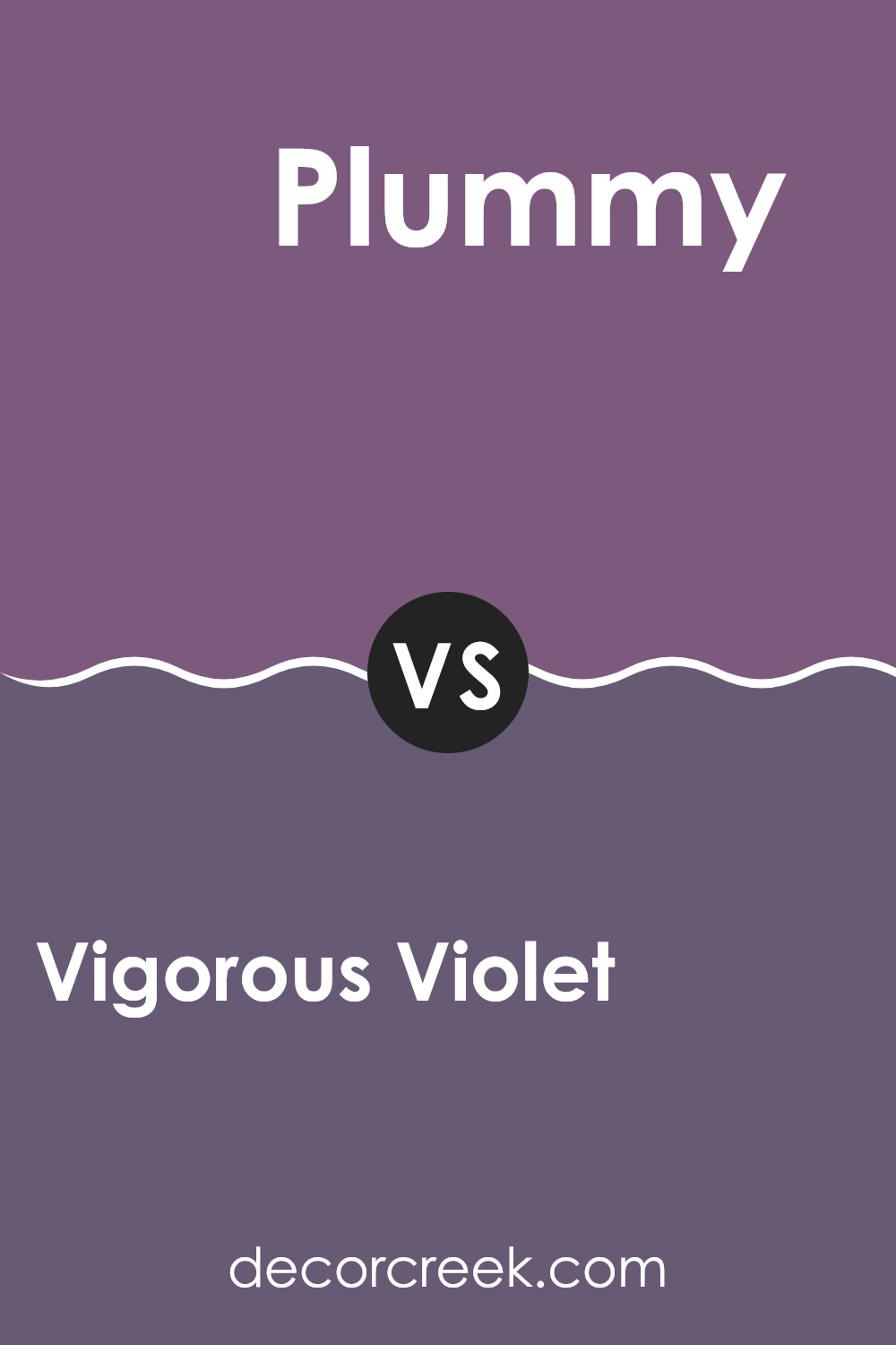
Vigorous Violet SW 6838 by Sherwin Williams vs Plummy SW 6558 by Sherwin Williams
Vigorous Violet and Plummy are both vibrant shades offered by Sherwin Williams. Vigorous Violet has a deep, bold purple hue that commands attention in any space. It’s a dynamic color that can make a real statement whether used on a wall or as an accent feature in a room.
On the other hand, Plummy carries a slightly redder tone, giving it a warmer feel compared to the cooler undertones of Vigorous Violet. This color brings a cozy and inviting atmosphere, perfect for spaces where you want to feel relaxed and at ease.
Both colors share a richness that can create a striking impact in interior design, but their varying undertones mean they set quite different moods. While Vigorous Violet is more about strength and boldness, Plummy leans towards a comforting and welcoming vibe. Depending on your room’s purpose and the ambience you want to achieve, either of these colors could be an excellent choice.
You can see recommended paint color below:
- SW 6558 Plummy
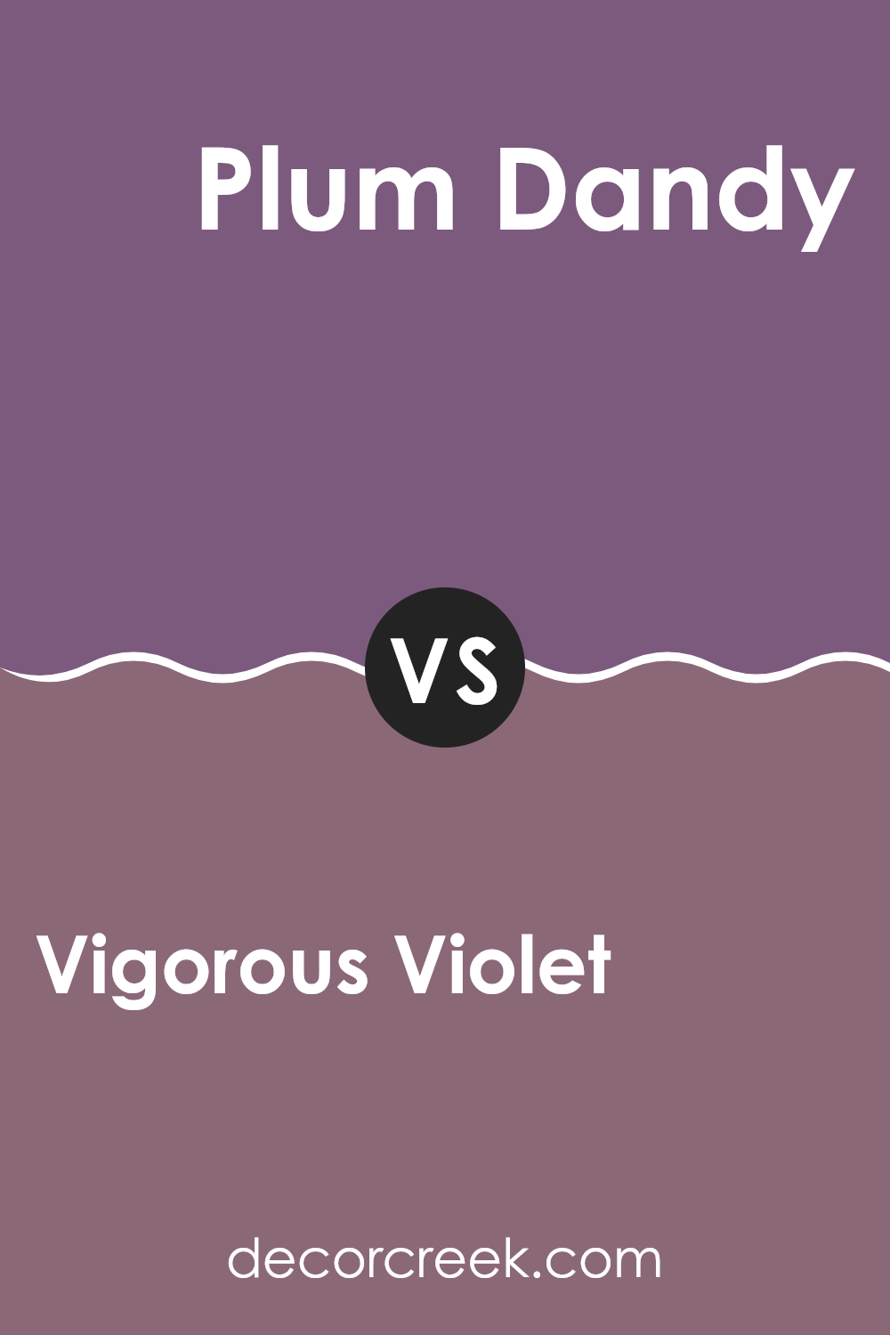
Vigorous Violet SW 6838 by Sherwin Williams vs Plum Dandy SW 6284 by Sherwin Williams
Vigorous Violet and Plum Dandy are both rich, deep colors with a lot to offer in terms of style and mood. Vigorous Violet stands out with its vivid blend of blue and red tones, giving it a lively and dynamic vibe that can really liven up a space. It’s bold and can be the star of a room, whether on an accent wall or in decorative touches.
On the other hand, Plum Dandy leans towards a warmer, more subtle purple with hints of red. This color is cozy and welcoming, making it great for spaces where you want to relax and feel comfortable, like living rooms or bedrooms. It’s less intense than Vigorous Violet, offering a softer and more understated look.
Both colors are great choices for adding depth and interest to your decor, but your choice will depend on the atmosphere you want to create. Vigorous Violet is more vibrant and energetic, while Plum Dandy offers a gentler, calmer feel.
You can see recommended paint color below:
- SW 6284 Plum Dandy
Vigorous Violet SW 6838 by Sherwin Williams vs Passionate Purple SW 6981 by Sherwin Williams
Vigorous Violet and Passionate Purple are two distinctive shades offered by Sherwin Williams. Vigorous Violet presents a bright and energetic shade, leaning towards a true violet that brings a sense of boldness to any space. It’s the kind of color that stands out and can make a statement when used on walls or accents.
On the other hand, Passionate Purple is a deeper, richer hue that pulls in elements of a darker plum. This color tends to add a more dramatic flair and can create a cozy, inviting environment. It works well in areas where you want to set a strong, confident tone without overwhelming the space.
Both colors share a base purple but approach it from different angles. While Vigorous Violet lights up a room with its vibrancy, Passionate Purple offers depth and intensity, making each suitable for different spaces depending on the atmosphere you want to achieve.
You can see recommended paint color below:
- SW 6981 Passionate Purple

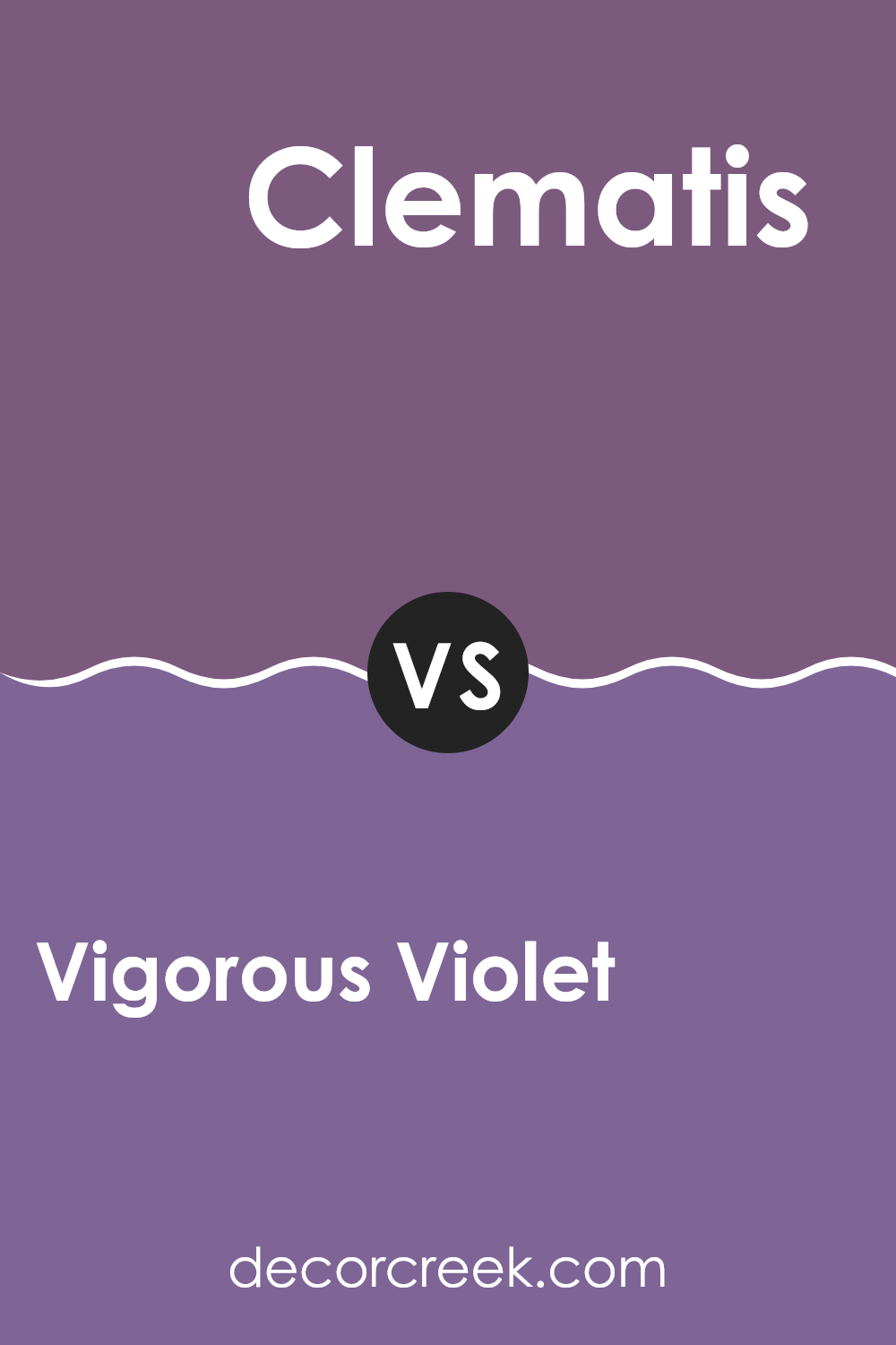
Vigorous Violet SW 6838 by Sherwin Williams vs Clematis SW 6831 by Sherwin Williams
Vigorous Violet is a bold and vivid shade that stands out with its deep, rich purple tones. This color is perfect for adding a strong and energetic feel to a space, making it ideal for accent walls or areas where you want to make a statement. It has a certain warmth that can make a room feel cozy and inviting.
On the other hand, Clematis is a lighter and more subdued purple. It leans towards a lavender hue, giving it a softer, more gentle appearance compared to Vigorous Violet. Clematis works well in spaces where you want to add a touch of color without overwhelming the area. It’s great for bedrooms or bathrooms where a calm and gentle atmosphere is desired.
Overall, while both colors are varieties of purple, Vigorous Violet is much deeper and more intense, while Clematis offers a lighter, calming alternative. Each brings its own unique mood and can be chosen based on the desired impact in the decorating space.
You can see recommended paint color below:
- SW 6831 Clematis
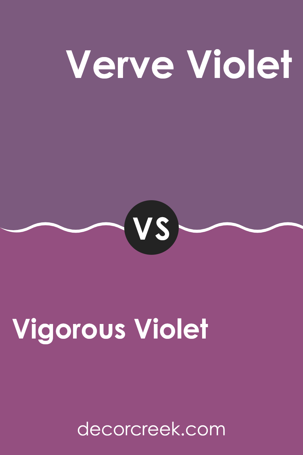
Vigorous Violet SW 6838 by Sherwin Williams vs Verve Violet SW 6979 by Sherwin Williams
Vigorous Violet and Verve Violet are two distinct shades from Sherwin Williams, each with its unique charm. Vigorous Violet is a deep, rich purple that has a strong presence. This color is perfect for adding a sense of depth and boldness to a space. It works well in areas where you want to make a statement, such as an accent wall or a cozy nook.
On the other hand, Verve Violet is lighter and carries a more playful and vibrant energy. It’s still in the purple family but leans slightly towards a pinkish tone, making it softer and more inviting. This color is suitable for spaces that aim to be bright and lively, such as a child’s bedroom or a creative space.
Both colors offer a wonderful way to bring the personality of purple into your home, but the choice depends on the mood and atmosphere you want to create. Vigorous Violet leans towards a dramatic and bold feeling, while Verve Violet is more about lightness and fun.
You can see recommended paint color below:
- SW 6979 Verve Violet
Conclusion
After learning all about SW 6838 Vigorous Violet by Sherwin Williams, I can say it’s a really interesting color for painting walls! This bold purple shade is fun and can make any room look more lively. It’s not just for kids’ rooms—adults can use it in their spaces too, like a home office or a reading corner, to add some energy and joy.
Vigorous Violet is great because it can make a big change without needing to redo the whole room. Just painting one wall or even a piece of furniture this color can brighten things up. Plus, it works well with lots of other colors. You can pair it with light colors like white or grey to keep things calm, or go bold with yellow or green for a super fun look.
Overall, I think SW 6838 Vigorous Violet by Sherwin Williams is a perfect choice if you want to add a splash of fun to your home. It’s energetic, it goes well with many different designs, and it really makes a statement wherever you use it!
Ever wished paint sampling was as easy as sticking a sticker? Guess what? Now it is! Discover Samplize's unique Peel & Stick samples.
Get paint samples

