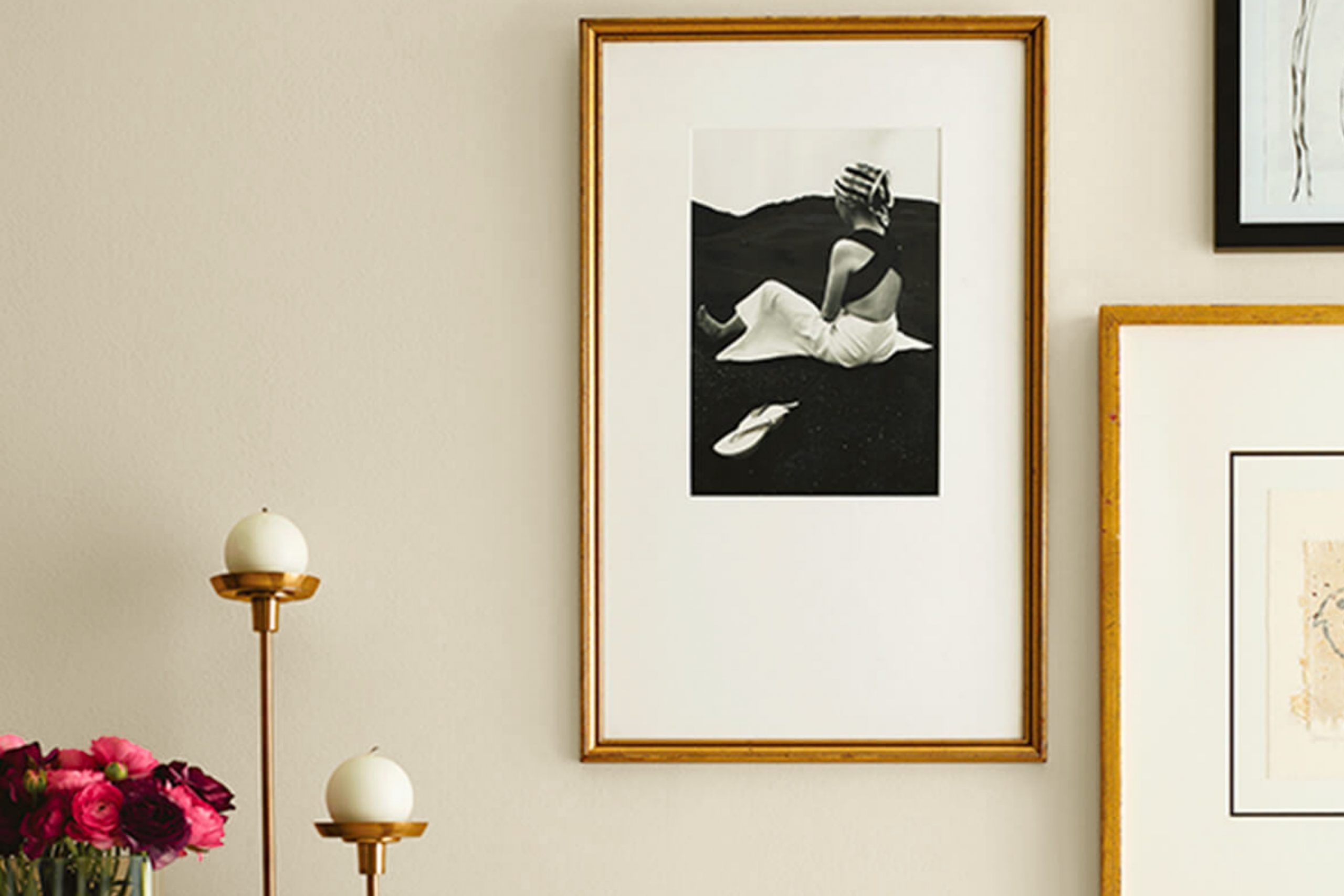
Imagine walking into a room bathed in the warmth of SW 9511 Warm Oats by Sherwin Williams. As you look around, you can’t help but feel a sense of calm and comfort enveloping you. This color, a soft and inviting beige, has the unique ability to make a space feel both cozy and expansive. The subtle richness of Warm Oats lends itself beautifully to various decor styles, effortlessly enhancing wood tones and complementing a wide range of accent colors.
You might wonder how a single paint color can have such a versatile impact. It’s all about its understated elegance and the way it plays with light, casting a gentle glow that transforms the ambiance from ordinary to subtly sophisticated.
Whether you’re looking to refresh your living room, bedroom, or even your kitchen, Warm Oats provides a perfect backdrop. It supports other colors, allowing your furniture and art pieces to shine, all while maintaining a soothing presence that ties everything together.
As you think about the next steps for your home makeover, consider how Warm Oats could elevate your everyday living spaces with its soft charm and warm undertones.
What Color Is Warm Oats SW 9511 by Sherwin Williams?
The color Warm Oats by Sherwin Williams is a soft, inviting beige that conveys a sense of coziness and warmth in any space. This neutral shade is versatile and can act as a soothing backdrop in various interior styles, particularly in rustic, modern farmhouse, or traditional settings. Its subtle warmth works well in living rooms, bedrooms, and kitchens, providing a welcoming atmosphere that’s not overly stark or sterile.
Warm Oats pairs beautifully with a variety of materials and textures, enhancing its adaptability. In a room with hardwood floors, it complements the natural wood grain, creating a seamless flow that’s both calming and aesthetically pleasing. When matched with soft, plush fabrics like cotton or linen in upholstered furniture or window treatments, it generates a comfortable, lived-in feel.
This color also goes well with decorative accents in earth tones, such as terracotta, sandy browns, and muted greens, which help in pulling together a cohesive look. Metallic finishes, like bronze or copper, add a gentle contrast and bring a touch of warmth that is harmonious with the soft nature of Warm Oats.
Overall, this color is excellent for anyone looking to create a gentle, welcoming space that feels like home.
Is Warm Oats SW 9511 by Sherwin Williams Warm or Cool color?
Warm Oats by Sherwin Williams is a gentle, soft beige that brings a cozy and comforting vibe to any room. This color has a natural warmth that makes spaces feel welcoming and lived-in, which is perfect for creating a relaxing environment at home.
Because it’s a neutral shade, Warm Oats pairs well with a wide range of other colors, from bold and bright tones to more subdued hues. This versatility makes it a reliable choice for walls in living rooms, bedrooms, and even kitchens.
It’s particularly effective in areas with natural light, as the sunlight enhances the color’s warm undertones, giving a room a brighter, airier feel. In smaller or dimly lit spaces, Warm Oats can help to make the area appear larger and more open. This color is also great for those looking to sell their home, as its appealing neutrality helps potential buyers envision their own decor in the space.
Undertones of Warm Oats SW 9511 by Sherwin Williams
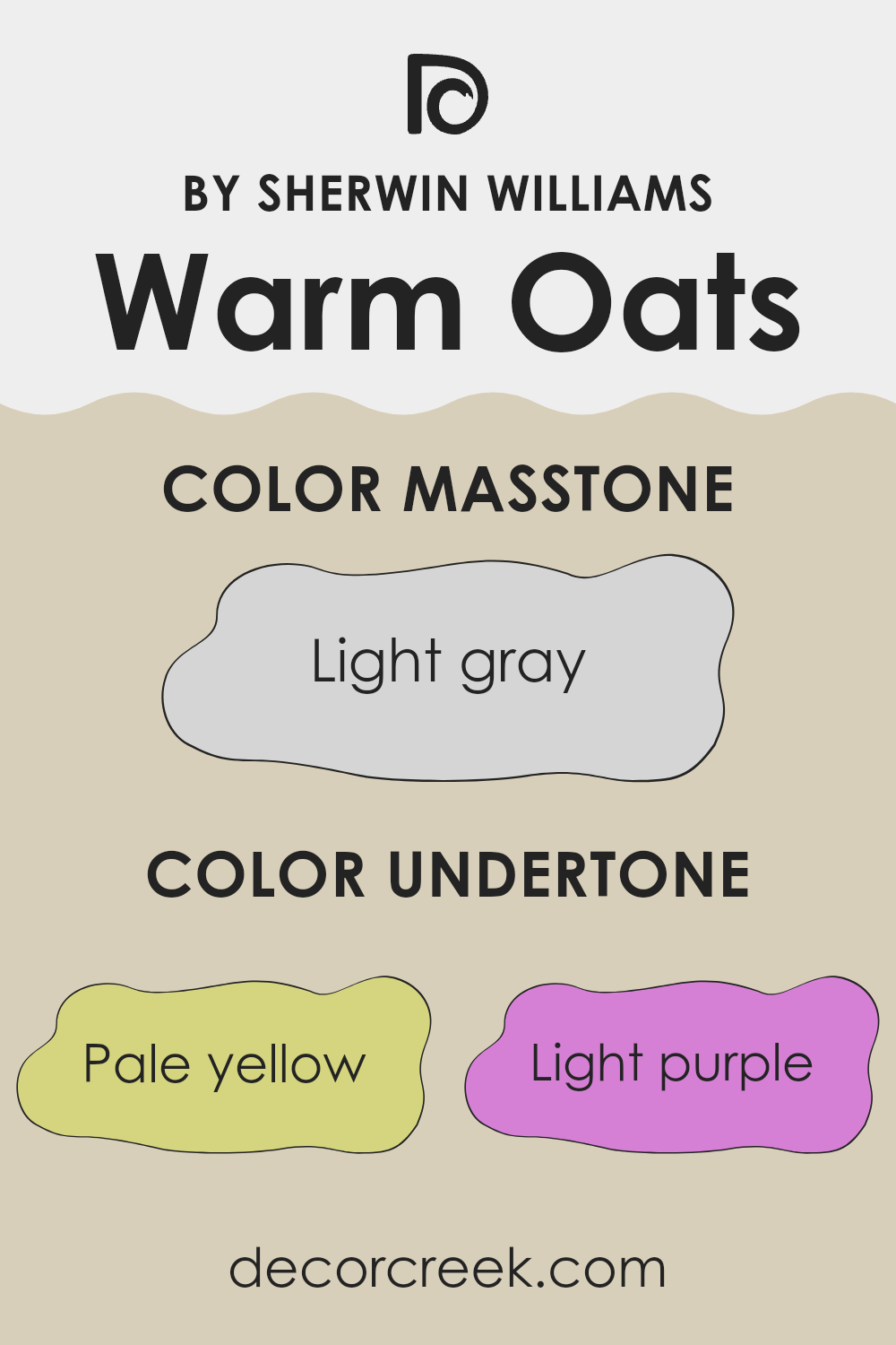
Warm Oats by Sherwin Williams is a versatile color that creates a cozy and welcoming feel in any room. The color has a complex palette of undertones, including pale yellow, light purple, light blue, pale pink, mint, lilac, and grey. These undertones play a significant role in how the color appears under different lighting conditions and can subtly influence the overall ambiance of a space.
Undertones are the hues that lay under the surface of the primary color, affecting its depth and warmth. For instance, when pale yellow or mint undertones in Warm Oats are hit by sunlight, the walls can appear softer and slightly more vibrant, adding a touch of brightness to the room.
On cloudy days or in dim lighting, the grey or lilac undertones might become more pronounced, giving the paint a more muted, cooler feel.
When applied to interior walls, Warm Oats with its range of undertones, adapts well to various styles and furnishings. The pale yellow and mint undertones can make a room feel more lively and fresh, ideal for living rooms or kitchens. In contrast, the light purple and lilac undertones can bring a subtle hint of sophistication to spaces like bedrooms, where a calm, restful atmosphere is often desired.
Overall, the variety of undertones in Warm Oats makes it a flexible choice for home interiors, harmonizing with different decors and changing its character depending on the available light and surrounding colors.
What is the Masstone of the Warm Oats SW 9511 by Sherwin Williams?
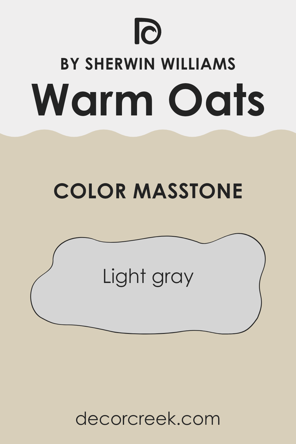
Warm OatsSW 9511 by Sherwin Williams has a masstone of light gray, which is a soft and subtle shade that can work wonders in any home. This color is perfect for those looking to create a fresh and clean look in their rooms.
The light gray tone helps small spaces appear larger, as it reflects light well, adding a sense of openness and airiness. This makes Warm OatsSW particularly suited for living rooms, bedrooms, and even bathrooms, where you want a calm, but not dull, atmosphere.
Since it doesn’t lean too heavily towards any stark colors, Warm OatsSW 9511 pairs beautifully with a wide range of decor styles and colors. Whether you have modern furniture or classic pieces, this shade can integrate seamlessly without overpowering other elements in the room. It also acts as a refined backdrop for brighter colors and patterns, allowing artwork or vividly colored furnishings to stand out.
Overall, it’s a flexible and appealing choice for any home looking for a gentle uplift.
How Does Lighting Affect Warm Oats SW 9511 by Sherwin Williams?
Lighting significantly impacts how we perceive colors. The color of the light (ranging from warm to cool) and its intensity can make a wall color look very different depending on the type of light exposure it gets.
Taking the color Warm Oats as an example, its appearance changes under different lighting conditions due to its subtle tones.
In artificial light, such as that from LED or incandescent bulbs, Warm Oats might appear slightly yellower or richer, depending on whether the bulbs cast a warm or cool light.
Artificial warm lights tend to bring out the cozy and creamy aspects of Warm Oats, making spaces feel more welcoming.
In natural light, the appearance of Warm Oats can vary throughout the day.
In the early morning or late afternoon, when natural light is warmer and softer, Warm Oats may look especially rich and warm. During the midday, when sunlight is brighter and more neutral, the color may appear lighter and truer to its swatch.
Room orientation affects how colors are perceived as well. In north-facing rooms, which receive less direct sunlight and have cooler light, Warm Oats might look slightly more muted and cooler, potentially requiring additional warm lighting to enhance its cozy qualities.
In south-facing rooms, the abundant direct sunlight can intensify the color, making it feel warmer and brighter, perfect for creating a lively and inviting space.
Rooms facing east will find Warm Oats feeling warm and bright in the morning light but could look duller in the evening. Conversely, in west-facing rooms, the color may appear softer in the morning and gain warmth and vibrancy in the late afternoon sun.
These shifts show how dynamic and flexible Warm Oats can be, adapting to different lighting scenarios to maintain a pleasant aesthetic throughout the day.

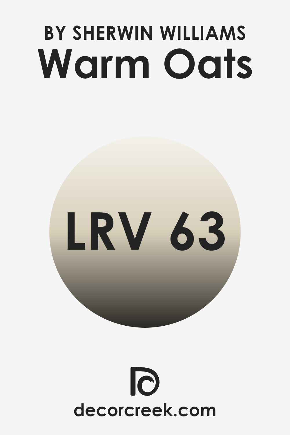
What is the LRV of Warm Oats SW 9511 by Sherwin Williams?
LRV stands for Light Reflectance Value, which measures the percentage of light a paint color reflects back into a room compared to the light it absorbs. When you decide to paint a room, the LRV can help you understand how light or dark a color will appear once on your walls.
It ranges from a low value, indicating the color absorbs more light, making the room feel darker, to a high value, where the color reflects more light, brightening the space. This value is crucial when choosing paint colors since it influences the mood and atmosphere of the room.
With an LRV of 62.648, the color Warm Oats by Sherwin Williams is closer to the lighter end of the scale, which means it will reflect a decent amount of light back into the room. This makes it a good choice for spaces that you want to feel more open and airy.
In a room with less natural light, using a color with a higher LRV like this can help make the space feel brighter and more welcoming without the need for excessive artificial lighting. Conversely, in a very bright room, this color will help maintain a light, friendly environment without becoming overwhelmingly bright.
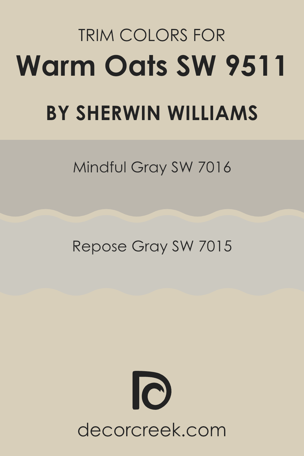
What are the Trim colors of Warm Oats SW 9511 by Sherwin Williams?
Trim colors are specific shades used to accentuate and frame the main color on walls, such as Warm Oats by Sherwin Williams. These colors, often applied to molding, door frames, and baseboards, highlight architectural details, add contrast, and create visual boundaries that enhance the overall aesthetic of a room. Choosing the right trim color can significantly affect how the main wall color is perceived, providing balance and cohesion to the space.
For Warm Oats, a warm and welcoming color, using Mindful Gray and Repose Gray as trim colors works exceptionally well. Mindful Gray is a gentle gray that bridges the gap between beige and gray, imbuing spaces with a calm and collected atmosphere.
It’s a versatile color that pairs beautifully with the comforting warmth of Warm Oats, adding a subtle, contemporary edge. Repose Gray, slightly lighter, offers a soft and airy feel that complements the soothing nature of Warm Oats. This color helps to create a clean and inviting finish, making it ideal for modern and traditional spaces alike.
You can see recommended paint colors below:
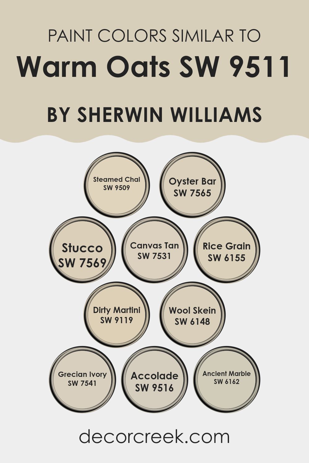
Colors Similar to Warm Oats SW 9511 by Sherwin Williams
Similar colors are crucial in painting and decorating because they help create a harmonious and cohesive look. These colors, being variations of each other, can seamlessly blend into various aspects of a room, enhancing both its aesthetic appeal and atmosphere without overpowering the space with too much contrast. For instance, using shades like Steamed Chai, Oyster Bar, and Stucco together can produce a subtle yet impactful effect that adds depth and continuity to the design.
Steamed Chai is a light, creamy beige that exudes a soft warmth, perfect for a cozy, inviting feel. Nearby on the palette, Oyster Bar is slightly darker, offering a comforting hint of gray that balances warmer tones beautifully. Stucco is a muted, sandy hue that draws from earthy inspirations, grounding the spaces it colors.
Canvas Tan brings in a touch of sun-kissed warmth, ideal for spaces that aim for a bright, yet understated background. Rice Grain adds a touch of gentle yellow, soft and subtle, infusing spaces with a quiet cheer.
Dirty Martini, a unique blend of green and gray, provides a neutral that hints at nature’s influence. Wool Skein, a slightly green-tinged beige, harmonizes effortlessly with various décors. Grecian Ivory offers a dash of creamy delight, enhancing rooms with a classic, understated elegance.
Accolade, not to be outdone, is a deeper beige that anchors lighter tones around it, whereas Ancient Marble provides an almost ethereal quality with its faint green undertones. Together, these colors offer a palette that can easily translate into a design that’s cohesive and beautifully balanced.
You can see recommended paint colors below:
- SW 9509 Steamed Chai
- SW 7565 Oyster Bar
- SW 7569 Stucco
- SW 7531 Canvas Tan
- SW 6155 Rice Grain
- SW 9119 Dirty Martini
- SW 6148 Wool Skein
- SW 7541 Grecian Ivory
- SW 9516 Accolade
- SW 6162 Ancient Marble
How to Use Warm Oats SW 9511 by Sherwin Williams In Your Home?
Warm Oats SW 9511 by Sherwin Williams is a comforting and versatile beige paint color that can create a cozy and inviting atmosphere in any home. This neutral shade is perfect for those looking to add a touch of warmth to their living spaces. You can use Warm Oats in various rooms such as the living room, kitchen, or bedroom.
It pairs well with both bright colors for a lively vibe and darker hues for a more grounded feel. For example, in a living room, painting the walls with Warm Oats can set a relaxed and welcoming tone, making it a great backdrop for furniture and decor in blues, greens, or even more vibrant colors.
In a kitchen, cabinets painted in this color can give a clean and open feel, especially when contrasted with dark countertops or stainless steel appliances. For a calming bedroom environment, combine Warm Oats with soft linens and natural wood accents. This color keeps things simple yet stylish, making any space feel like home.
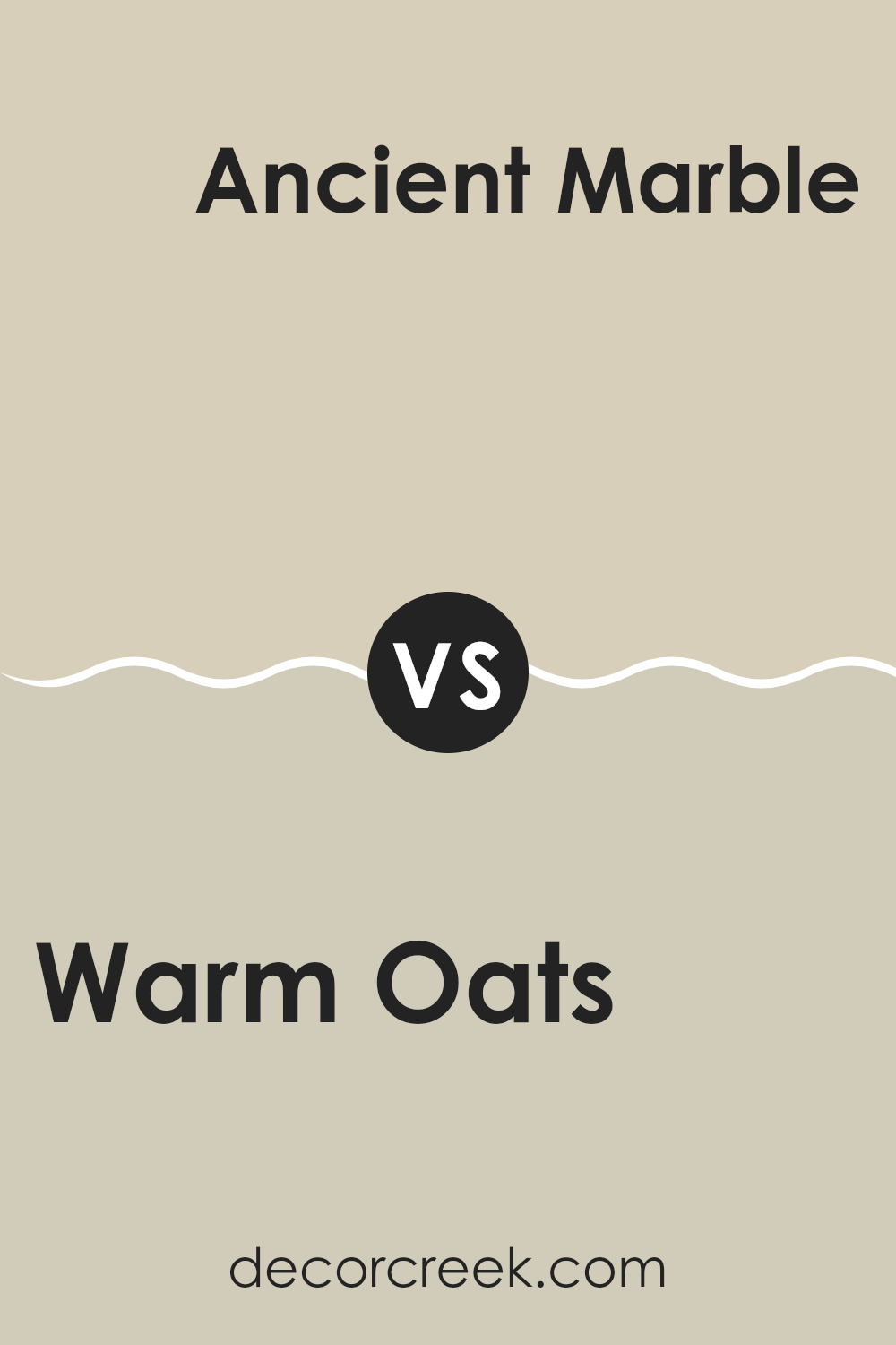
Warm Oats SW 9511 by Sherwin Williams vs Ancient Marble SW 6162 by Sherwin Williams
The color Warm Oats by Sherwin Williams is a cozy, soft beige with a gentle hint of warmth, making it very versatile for interiors. It’s the kind of neutral that provides a subtle backdrop to various decor styles, from modern to classic, without overpowering a room.
In contrast, Ancient Marble is also a neutral, but it leans towards a cooler, green-gray shade. This color has a freshness to it that can make spaces feel more open and airy. Both Warm Oats and Ancient Marble create a calm and inviting atmosphere in any room.
However, Warm Oats has a warmer tone that makes the space feel snug and welcoming, while Ancient Marble gives a cleaner, crisper look. Choosing between the two depends on the mood you want to set and the other colors in your room.
You can see recommended paint color below:
Warm Oats SW 9511 by Sherwin Williams vs Accolade SW 9516 by Sherwin Williams
Warm Oats and Accolade, both by Sherwin Williams, offer distinct tones that can significantly influence the mood of a room. Warm Oats is a soft, creamy beige with a cozy, welcoming feel. It radiates a gentle warmth, making it perfect for creating a relaxed and comforting atmosphere in living spaces or bedrooms.
On the other hand, Accolade leans towards a darker taupe, providing a stronger, more grounded presence. This color is ideal for adding depth and a touch of elegance to a space without overwhelming it with darkness.
Both colors work well in various lighting conditions and complement a wide range of decor styles, making them versatile choices for home interiors. Where Warm Oats brings light and airiness, Accolade offers a rich, understated backdrop, ideal for highlighting other design elements in the room.
You can see recommended paint color below:
Warm Oats SW 9511 by Sherwin Williams vs Steamed Chai SW 9509 by Sherwin Williams
Warm Oats and Steamed Chai are two inviting paint colors from Sherwin Williams that both offer a sense of warmth and comfort, perfect for creating cozy spaces. Warm Oats is a slightly lighter and warmer shade that brings a soft, creamy feel to a room.
This color is versatile and works well in spaces that need a subtle brightness without overwhelming the senses. On the other hand, Steamed Chai has a richer, more grounded appearance.
This color leans slightly more towards a darker, cozier tone, perfect for adding a touch of elegance and warmth to any space. Both colors pair beautifully with a range of decor styles, from modern to rustic, making them excellent choices for someone looking to refresh their home with a warm and welcoming vibe.
You can see recommended paint color below:
Warm Oats SW 9511 by Sherwin Williams vs Rice Grain SW 6155 by Sherwin Williams
Warm Oats and Rice Grain by Sherwin Williams are two neutral paint colors with their own unique appeal. Warm Oats has a cozy, welcoming vibe because it tends to be slightly richer and creamier than Rice Grain.
This makes it perfect for spaces where you want to create a soft, inviting atmosphere. On the other hand, Rice Grain is a bit lighter and offers a subtle, understated look. It has a hint of yellow, giving it a slightly warmer tone compared to the more balanced hue of Warm Oats.
Rice Grain works well in areas that get plenty of natural light, as the light brings out its warm undertones. Both colors are versatile and can work beautifully in various settings, from living rooms to bedrooms, depending on the mood you want to set and the amount of natural light available. Choosing between them depends on whether you prefer a color that feels slightly richer or one that is airier.
You can see recommended paint color below:
- SW 6155 Rice Grain
Warm Oats SW 9511 by Sherwin Williams vs Oyster Bar SW 7565 by Sherwin Williams
Warm Oats and Oyster Bar are two paint colors from Sherwin Williams that can add a subtle touch of elegance to any room. Warm Oats has a creamy, inviting tone that resembles the smooth, comforting shade of oatmeal. It’s light enough to make small rooms appear larger and has a cozy vibe that works well in living areas or bedrooms.
On the other hand, Oyster Bar is a bit darker and leans towards a soft gray with a touch of brown. This color offers a neutral backdrop that is very versatile, perfect for creating a peaceful environment. It’s great for spaces where you want a hint of warmth without overwhelming the room with too much color.
Both colors pair well with a variety of decor styles and can blend seamlessly with other hues. Whether you’re looking for a gentle warmth with Warm Oats or a more grounded feel with Oyster Bar, either choice provides a stylish and welcoming atmosphere.
You can see recommended paint color below:
- SW 7565 Oyster Bar
Warm Oats SW 9511 by Sherwin Williams vs Canvas Tan SW 7531 by Sherwin Williams
The two colors from Sherwin Williams, Warm Oats and Canvas Tan, offer subtle yet differing tones that can influence the ambiance of a room. Warm Oats is a slightly lighter and warmer color, presenting a cozy and inviting beige that suits almost any space seeking a calm, neutral backdrop.
On the other hand, Canvas Tan leans towards a richer, slightly deeper beige, offering a hint more saturation which can add a bit more presence to a room without overwhelming it.Both colors are versatile and combine well with a wide range of decor styles, yet the choice between them can depend on the desired effect.
If you aim for a softer and slightly airier atmosphere, Warm Oats is likely the better choice. Conversely, for those looking for a tad more depth that still maintains a neutral palette, Canvas Tan is ideal. When deciding between them, consider the natural lighting of your room as it can affect the final appearance of these colors.
You can see recommended paint color below:

Warm Oats SW 9511 by Sherwin Williams vs Wool Skein SW 6148 by Sherwin Williams
Warm Oats and Wool Skein, both colors by Sherwin Williams, offer a subtle and soft palette but bring their unique tones to spaces. Warm Oats, as the name suggests, has a cozy, inviting feel with its beige hue that leans slightly towards a warm cream. This color gives a comforting sensation to any room, making it a perfect fit for living areas or bedrooms where a touch of warmth is desired.
On the other hand, Wool Skein features a grayish undertone that infuses a bit more neutrality compared to Warm Oats. This color resembles the natural tone of undyed wool and offers a versatile backdrop for various decor styles, from modern to classic. It’s great for creating a light and airy feel, effectively cooling down spaces that receive a lot of sunlight.
Both colors provide a muted, understated elegance but Warm Oats adds more warmth to interiors, while Wool Skein steps in as a cooler, more subtle option fitting for various color schemes and design aesthetics.
You can see recommended paint color below:
Warm Oats SW 9511 by Sherwin Williams vs Grecian Ivory SW 7541 by Sherwin Williams
Warm Oats and Grecian Ivory are both neutral paint colors from Sherwin Williams with their own unique appeal. Warm Oats is a cozy shade that exudes warmth and calm, making it perfect for creating a welcoming atmosphere in spaces like living rooms or bedrooms. Its creamy undertone gives a soft, comforting feel to the walls.
On the other hand, Grecian Ivory leans towards a softer, more subtle hue. It has a slight yellow undertone that brightens up a room without overpowering it. This color works beautifully in smaller spaces or rooms that don’t get a lot of natural light, as it helps to make the area appear larger and more open.
Both colors are versatile and can complement various decor styles, from modern to traditional. Warm Oats can add a touch of warmth to a room, while Grecian Ivory can keep a space feeling light and airy. Depending on the mood you want to set and the natural lighting in your room, either choice offers a lovely backdrop for your furnishings and decorations.
You can see recommended paint color below:
Warm Oats SW 9511 by Sherwin Williams vs Stucco SW 7569 by Sherwin Williams
The two colors, Warm Oats and Stucco by Sherwin Williams, both offer neutral tones but with distinct differences. Warm Oats is a lighter, beige color that gives off a cozy and welcoming feel. It’s perfect for making small spaces appear larger and brighter.
On the other hand, Stucco is a deeper tan shade with a slight gray undertone. This color is excellent for creating a sense of warmth in a room, making it feel more settled and grounded. Both colors are versatile and can work well in various settings like living rooms, kitchens, or bedrooms.
However, Warm Oats might be better for someone looking for a subtle enhancement to their space, while Stucco could be preferred by those wanting a stronger presence of color without overwhelming the senses. In essence, Warm Oats offers a light, airy vibe, while Stucco provides a richer, more grounded atmosphere.
You can see recommended paint color below:
- SW 7569 Stucco
Warm Oats SW 9511 by Sherwin Williams vs Dirty Martini SW 9119 by Sherwin Williams
Warm Oats and Dirty Martini are two distinct colors by Sherwin Williams that can create different vibes in a space. Warm Oats is a light, creamy beige that brings a cozy, inviting feel to any room. It’s a neutral shade that goes well with various decor styles, from rustic to modern. The warmth of the color can make a space feel snug and welcoming.
On the other hand, Dirty Martini is a deeper, olive green color with a natural feel. It’s perfect for those looking to add a touch of earthiness to their environment. This color works well in spaces that aim for a more grounded, nature-inspired look. It pairs nicely with wood finishes and can make a room feel more connected to the outdoors.
Both colors offer a way to freshen up a space, but while Warm Oats lightens a room with a soft glow, Dirty Martini brings a richer, deeper tone. Depending on the mood you want to set, either could be a great choice.
You can see recommended paint color below:
- SW 9119 Dirty Martini
Wrapping up thoughts on SW 9511 Warm Oats by Sherwin Williams, I want to share how this color makes me feel and what it looks like. Imagine the cozy feeling of a warm, sunny spot on a cool day, or hugging your favorite soft blanket. That’s what Warm Oats reminds me of. It’s like a gentle, comforting color that can make any room feel more welcoming.
When I look at Warm Oats on the walls, it’s like having a mild, creamy oatmeal—it’s simple yet feels just right. This color goes really well with many other colors, making it easy for you to mix it with things you already have at home. Whether you put it in a bedroom to make it cozy, a living room to make it more inviting, or even a kitchen, it always looks good.
In conclusion, Warm Oats by Sherwin Williams isn’t just any paint; it’s like a friend that makes any room feel happier and cozier. So, if you’re thinking about adding a new touch to your room that’s mild and friendly, Warm Oats could be a perfect choice. It surely makes my favorite spaces feel just a bit more like “home.”
Ever wished paint sampling was as easy as sticking a sticker? Guess what? Now it is! Discover Samplize's unique Peel & Stick samples.
Get paint samples

