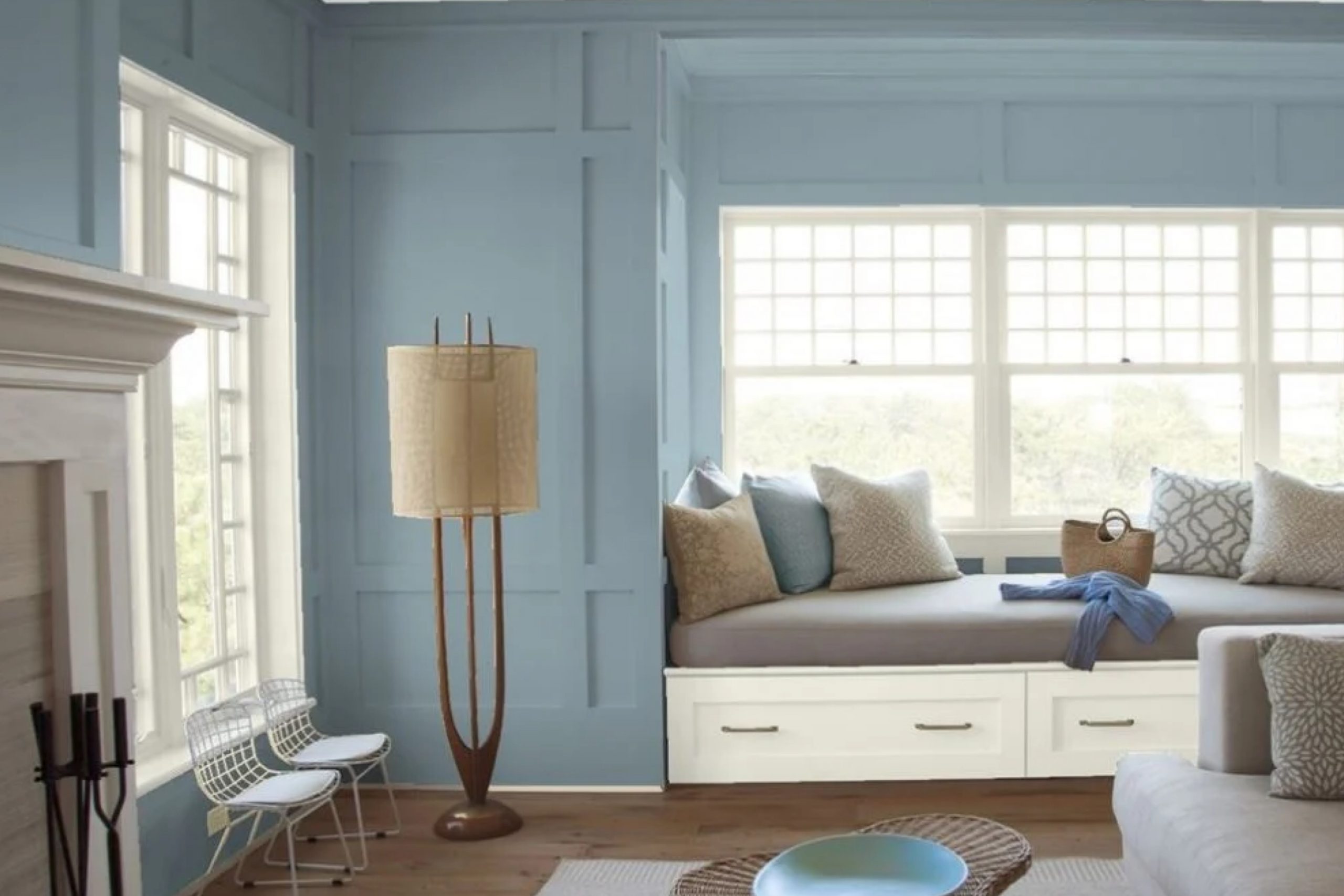
The first time I saw 1635 Water’s Edge by Benjamin Moore, it just felt calm and inspiring. It’s a soft, muted blue that reminds me of gentle ocean waves on a quiet morning. Perfect for any space where you want to unwind and feel at ease.
I’ve found that 1635 Water’s Edge pairs brilliantly with natural textures, such as wood and stone, enhancing its calming effect. When used alongside crisp whites or warm neutrals, it offers a balanced and harmonious look.
The gentle undertone ensures it never overwhelms, but instead adds a subtle yet refreshing touch to your home.
In my own space, using this color transformed the atmosphere. It made my room feel more open, airy, and inviting.
Whether you want to refresh a living area or create a tranquil bedroom retreat, this color offers the perfect backdrop.
It feels timeless and versatile, making it a reliable choice for those who appreciate elegance and subtlety in their surroundings. I truly enjoyed bringing 1635 Water’s Edge into my home and experiencing its calming presence each day.
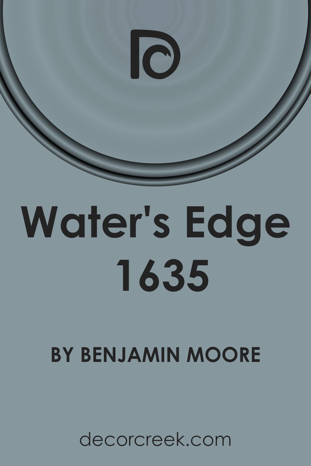
What Color Is Water’s Edge 1635 by Benjamin Moore?
Water’s Edge by Benjamin Moore is a soft, muted blue with a touch of gray, reminiscent of the gentle hue you’d see at the ocean’s edge. It has a calming and peaceful quality that makes it versatile for various spaces. This shade makes rooms feel airy and open while maintaining a cozy and inviting atmosphere.
Water’s Edge works well in coastal, minimalist, and modern interior styles. In a coastal setting, it complements sandy tones and nautical elements. For minimalist interiors, its subtle color adds interest without overwhelming the space.
In modern homes, it pairs nicely with sleek metals and clean lines, adding a hint of color to balance sharp edges.
This color harmonizes beautifully with natural materials like light wood, rattan, and stone. Textiles in white or cream, such as linen or cotton, provide a crisp, clean contrast. Soft, woven textures and metallic accents enhance the overall feel of tranquility and balance.
For those who appreciate a soothing environment, integrating Water’s Edge with plush throws and cushions in complementary colors like seafoam green or muted beige can enhance the room’s comfort and style.
Overall, this color invites a sense of calm and elegance, making it a popular choice for both bedrooms and living spaces.
Is Water’s Edge 1635 by Benjamin Moore Warm or Cool color?
Water’s Edge by Benjamin Moore is a popular paint color that can add a fresh and calming effect to any home. Its soft blue hue has a subtle gray undertone, making it a versatile choice for different styles and spaces. This color can create a peaceful atmosphere in bedrooms or living areas, offering a sense of relaxation. It’s a great choice for coastal-themed interiors, as it evokes images of the sea and sky.
When used in kitchens or bathrooms, Water’s Edge can give a clean and crisp look, pairing well with white cabinets or tiles. It also complements natural wood tones, adding warmth to the space. This color is perfect for those who love a gentle touch of color without it being too overpowering.
It can make spaces feel more open and airy, bringing lightness to darker corners. Whether used on a feature wall or throughout a room, Water’s Edge provides a cool, inviting backdrop.
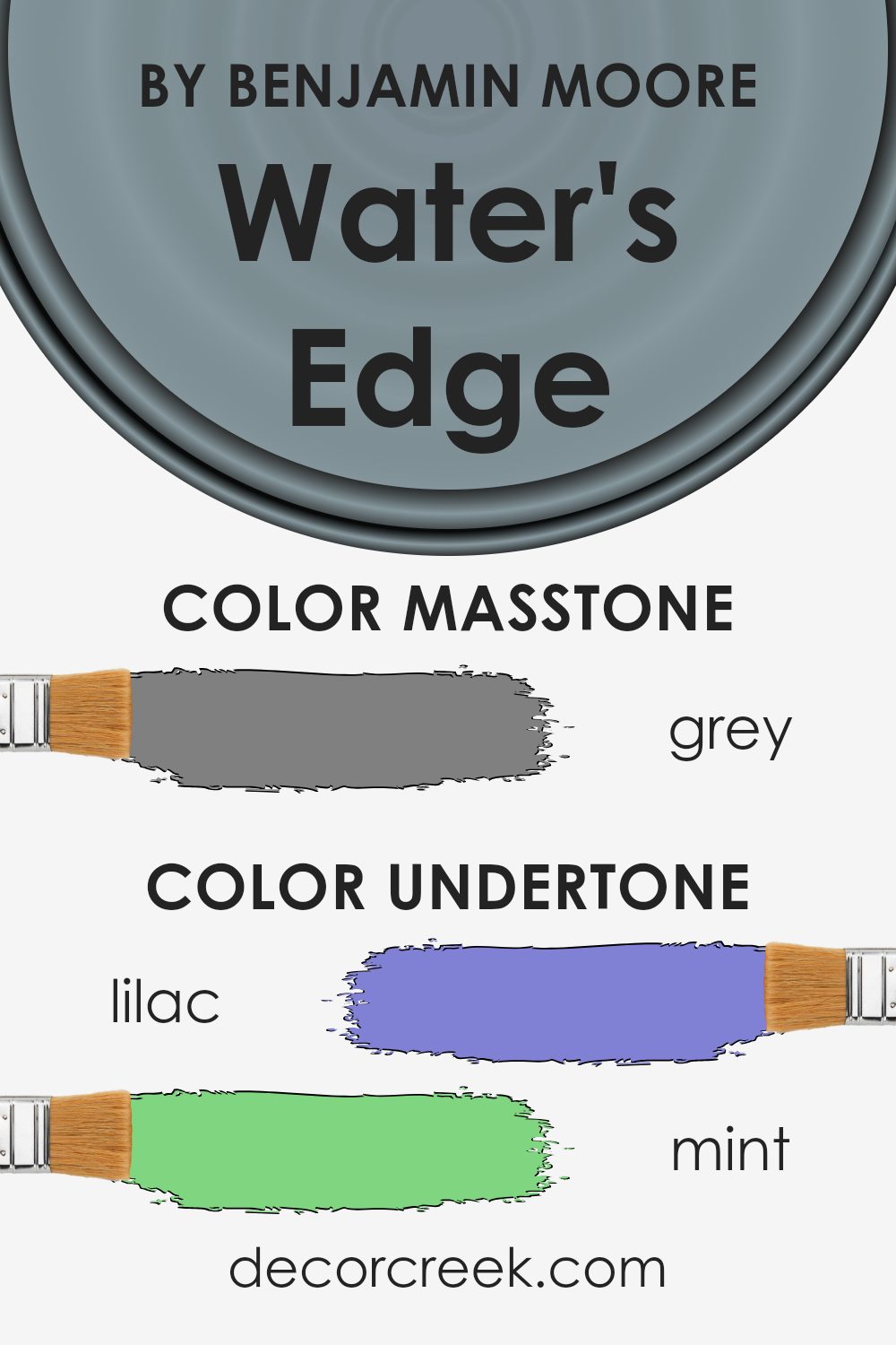
Undertones of Water’s Edge 1635 by Benjamin Moore
Water’s Edge by Benjamin Moore is a color that brings together a wide array of subtle undertones, giving it a unique and complex appearance. These undertones, such as lilac, mint, light blue, pale pink, and light purple, influence how the color appears on walls in different lighting conditions. Undertones are the subtle hues that exist beneath the main color and can shift the overall perception of the paint.
When used on interior walls, Water’s Edge can reflect different hues depending on the room’s lighting and surrounding decor. For example, natural sunlight might highlight its light blue and turquoise undertones, creating a refreshing and airy feel.
Conversely, in dimmer lighting, the color might showcase its darker tones like navy, dark turquoise, or even hints of violet, adding depth and warmth.
These undertones can make Water’s Edge a versatile choice for interior design, as it can appear soft and soothing with its pale pink or light green hints in a well-lit space, or it can take on a rich and cozy appearance with its darker hues.
Understanding these undertones helps homeowners choose complementary decor that enhances the overall atmosphere of the room, making Water’s Edge a fitting color for various settings.
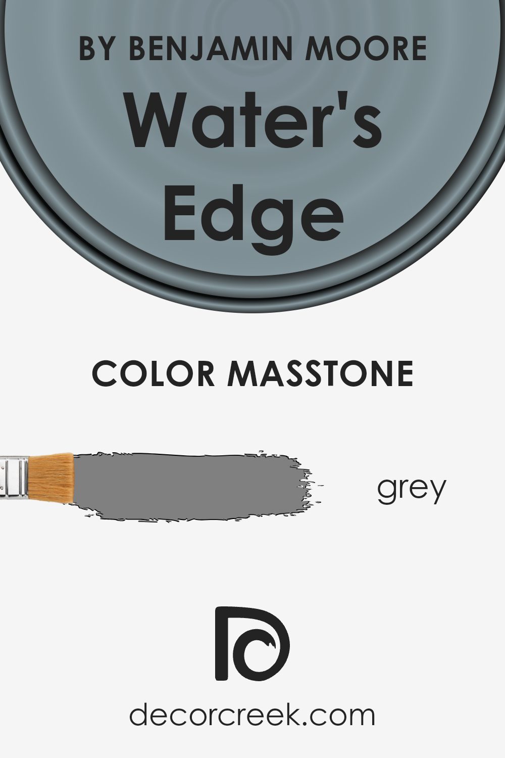
What is the Masstone of the Water’s Edge 1635 by Benjamin Moore?
Water’s Edge by Benjamin Moore, known as color 1635, is a calming and versatile shade with a soft gray masstone (#808080). This gentle hue works well in many home settings due to its neutral and adaptable nature. The gray undertone helps to create a sense of balance and peace in any room. Because it is not too dark or too light, it can be used in various spaces such as living rooms, bedrooms, or kitchens without dominating the decor.
This color pairs nicely with both warm and cool color palettes, making it easy to coordinate with existing furniture and decor. For instance, using Water’s Edge on the walls can highlight wooden furniture and other natural textures.
Its understated presence provides a perfect backdrop for artwork and other colorful elements in a room. This flexibility makes Water’s Edge a popular choice for those looking to create a welcoming and harmonious home environment.
How Does Lighting Affect Water’s Edge 1635 by Benjamin Moore?
Lighting plays a crucial role in how we perceive colors. Different lighting conditions, whether natural or artificial, can change the appearance of a color significantly. For example, a color might look vibrant and lively under natural sunlight but appear dull or muted under artificial light. This is why it’s important to consider lighting when choosing paint colors for different rooms in your home.
The color Water’s Edge by Benjamin Moore is a soft, muted blue with gray undertones that can change depending on the light. Under natural light, Water’s Edge can appear brighter and more open, making spaces feel airy.
In artificial light, such as warm, incandescent bulbs, Water’s Edge might take on a slightly warmer or denser tone. Under cooler, LED light, it could seem crisper and more gray.
In a north-facing room, which often receives cooler and less intense natural light, Water’s Edge can become more subdued and exhibit more of its gray undertones. This effect can make the room feel calm and restrained.
Conversely, in a south-facing room with lots of direct sunlight throughout the day, Water’s Edge might look brighter and more vibrant, bringing out the blue tones and making the room feel lively and warm.
East-facing rooms receive bright, direct sunlight in the morning, which can enhance the blue tones of Water’s Edge, giving it a fresh and clean look. This light can add a cheerful tone in the morning, but as the day progresses, the light can become softer, allowing the gray undertones to emerge.
West-facing rooms get warm, golden light in the afternoon and evening. During these times, Water’s Edge can develop a warm and cozy feel, with the evening light bringing out a soothing balance of its blue and gray characteristics.
When choosing Water’s Edge, observe how it looks at different times of the day in the space you are considering, to ensure it fits your desired atmosphere.
What is the LRV of Water’s Edge 1635 by Benjamin Moore?
Light Reflectance Value (LRV) is a measure of how much light a color reflects. It is expressed as a percentage ranging from 0 to 100, where 0 means the color absorbs all light (completely black) and 100 means the color reflects all light (completely white).
This value helps people understand how light or dark a color will appear in a room. Higher LRV values in a room can make it feel open and airy, while lower LRV values can create a more intimate or cozy feel.
The LRV is important to consider when choosing paint because it impacts not only how bright and inviting a room appears but also how a color interacts with other elements like furniture and lighting in the space.
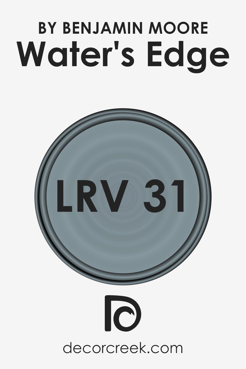
The color Water’s Edge by Benjamin Moore has an LRV of 31.48. This indicates it is on the darker side of the spectrum, as it reflects a moderate amount of light.
With an LRV of 31.48, Water’s Edge will add a sense of depth to your walls, making it a good choice for providing contrast with lighter colors or creating a restful environment.
The color won’t reflect much natural or artificial light, so it can help a space feel cozy without being too dark. When using Water’s Edge, consider pairing it with lighter colors or ensuring adequate lighting to prevent the room from feeling too enclosed.
Coordinating Colors of Water’s Edge 1635 by Benjamin Moore
Coordinating colors are shades that work well together in a space, creating a cohesive and pleasing look. When paired with Water’s Edge by Benjamin Moore, specific colors can enhance its appeal and create a harmonious environment.
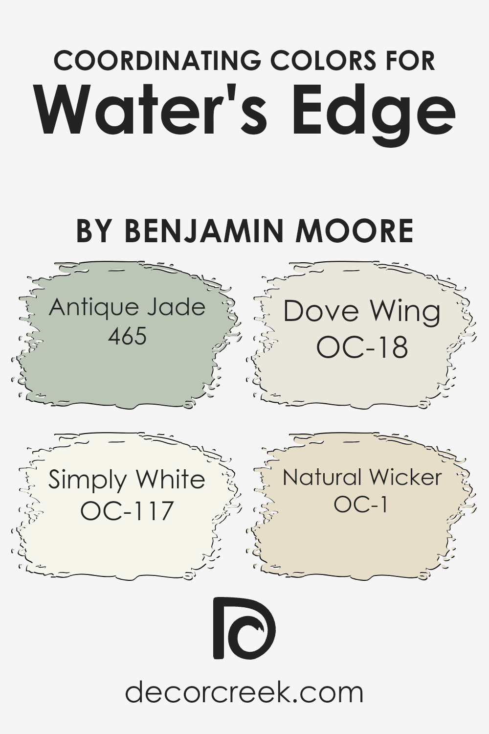
Antique Jade, with its soft green tone, brings a touch of nature’s calmness, complementing the gentle blue of Water’s Edge seamlessly. Simply White offers a crisp, clean look that can highlight brighter or cooler tones, providing a refreshing contrast and making spaces feel airy and open.
Dove Wing is a versatile, warm off-white that adds subtle depth and can soften the overall appearance of a room. It’s perfect for creating a cozy, inviting ambiance without overpowering other colors. Meanwhile, Natural Wicker, with its muted beige undertones, introduces a hint of warmth that blends well with blues and greens, balancing the cool nature of Water’s Edge.
Together, these colors create a balanced palette, where each complements and enhances one another, offering a gentle transition from one shade to the next, creating spaces that feel cohesive and welcoming.
You can see recommended paint colors below:
- 465 Antique Jade
- OC-117 Simply White
- OC-18 Dove Wing
- OC-1 Natural Wicker
What are the Trim colors of Water’s Edge 1635 by Benjamin Moore?
Trim colors are the colors used on the borders and edges of walls, doors, and windows, and they play a crucial role in giving a space its complete look. For Water’s Edge by Benjamin Moore, which is a soothing and slightly muted blue reminiscent of the ocean, the right trim color can enhance its beauty.
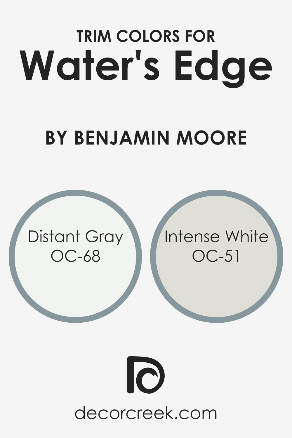
Choosing the right trim helps define the architectural details of a room and creates a crisp, finished appearance. Distant Gray (OC-68) and Intense White (OC-51) are both excellent for trim because they provide a subtle contrast without overshadowing the main wall color.
These colors add clarity and make the blue appear more vivid and clean by comparison.
Distant Gray is a very pale, almost imperceptible gray that appears virtually white, adding a touch of elegance and cleanliness to any space. It doesn’t overpower but instead complements Water’s Edge by creating a balanced and refreshing look.
On the other hand, Intense White is a soft white with a hint of warmth that reflects light beautifully, enhancing the overall brightness and openness of the room.
It pairs well with Water’s Edge by providing a warm undertone that keeps the room inviting and comfortable. Both colors work as perfect partners to Water’s Edge, enhancing the peaceful ambiance it brings to a space.
You can see recommended paint colors below:
- OC-68 Distant Gray
- OC-51 Intense White
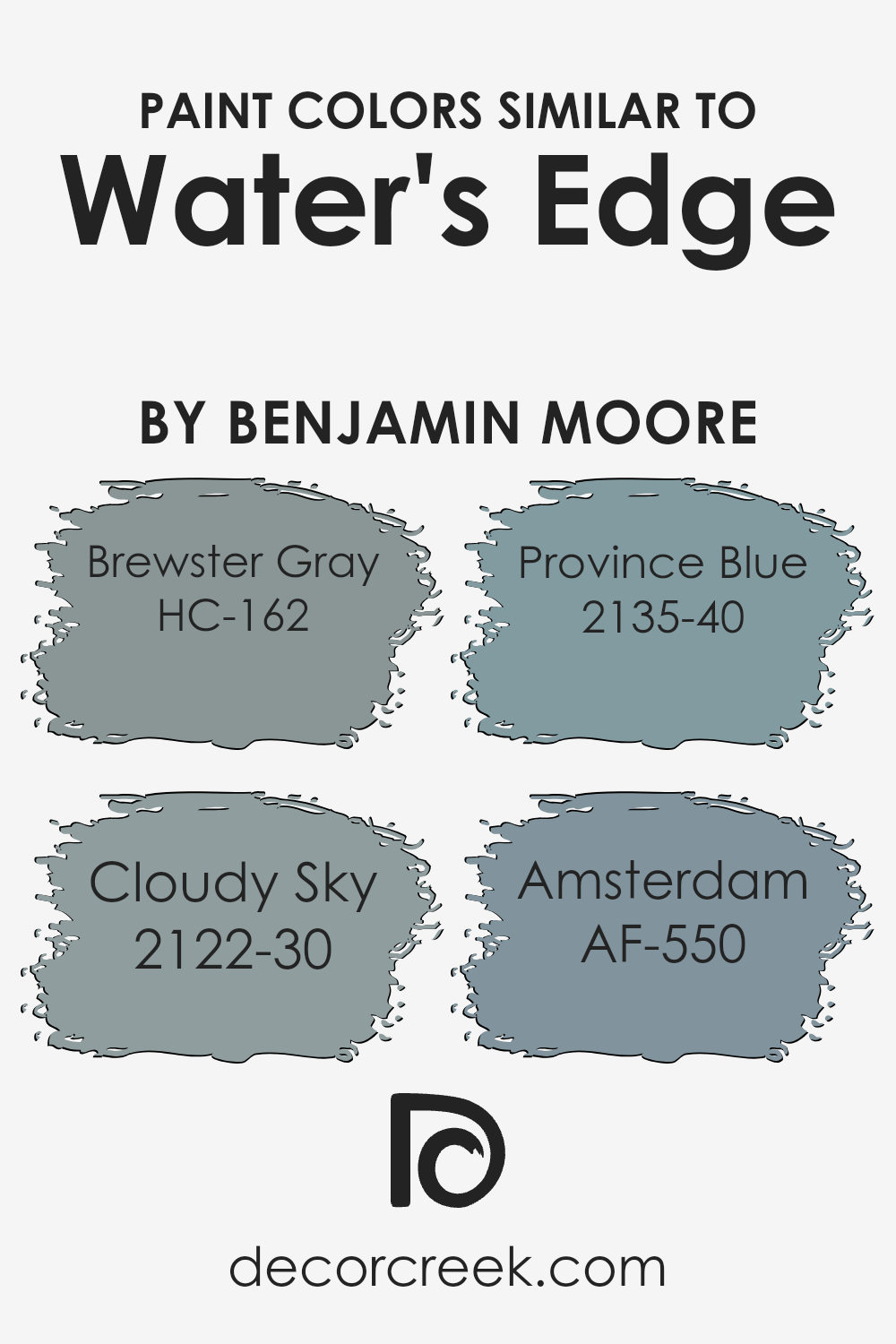
Colors Similar to Water’s Edge 1635 by Benjamin Moore
Similar colors play a crucial role in design because they create harmony and continuity within a space. They effortlessly complement each other, offering a feeling of balance and unity. With Water’s Edge by Benjamin Moore as a starting point, selecting similar colors such as Brewster Gray, Cloudy Sky, Province Blue, and Amsterdam can add depth and character to a room.
These shades work together because they share a common hue while slightly differing in tone and intensity, allowing them to seamlessly blend and support each other. This makes such combinations perfect for creating a relaxing and cohesive environment in any living space.
Brewster Gray, a warm and welcoming shade, brings a touch of classic elegance with its blend of soft blue and gray undertones. Cloudy Sky evokes the calm after a storm, with its steely blue-gray reflecting deep thoughtfulness and calmness. Province Blue is reminiscent of the beautiful colors found on the coast, offering a gentle yet refreshing breeze of blue that can liven up any room.
Amsterdam exudes a sense of charm with its dark and moody bluish hue, perfect for adding a touch of sophistication. Together, these colors work harmoniously to create spaces that feel both soothing and stylish.
You can see recommended paint colors below:
- HC-162 Brewster Gray
- 2122-30 Cloudy Sky
- 2135-40 Province Blue
- AF-550 Amsterdam
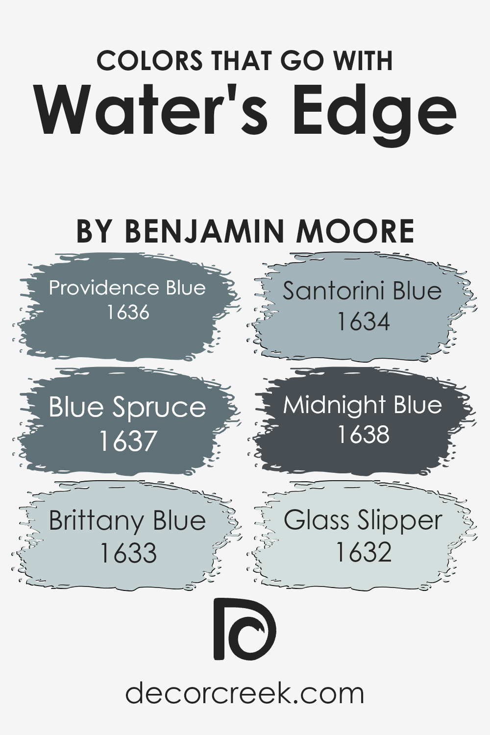
Colors that Go With Water’s Edge 1635 by Benjamin Moore
Colors that go well with Water’s Edge 1635 by Benjamin Moore create a harmonious and pleasing atmosphere. For instance, Providence Blue 1636 is a soft and gentle blue-green, providing a calming and fresh touch to any space. Blue Spruce 1637 is a deep and rich blue with a touch of green, adding depth and a hint of nature to the palette.
These colors enhance Water’s Edge by offering complementary tones that bring out its subtle and cool qualities, making a room feel balanced and inviting. Brittany Blue 1633, on the other hand, is a light, airy blue that pairs beautifully, offering a refreshing and open feel.
This combination helps create spaces that are both vibrant and cohesive without overwhelming the senses.
Santorini Blue 1634 stands out as a slightly more vivid option, inspired by the bright blues found in the Mediterranean, perfect for adding a pop of color. Meanwhile, Midnight Blue 1638 offers a darker, more dramatic tone, contributing sophistication and elegance to the mix, ideal for creating a cozy and intimate setting.
Glass Slipper 1632 brings a hint of gray to a soft blue, offering a versatile, neutral backdrop. These colors work together by enhancing the cool tones of Water’s Edge and can be mixed and matched to suit different moods and styles within your home, ensuring a perfect balance and flow throughout any space.
You can see recommended paint colors below:
- 1636 Providence Blue
- 1637 Blue Spruce
- 1633 Brittany Blue
- 1634 Santorini Blue
- 1638 Midnight Blue
- 1632 Glass Slipper
How to Use Water’s Edge 1635 by Benjamin Moore In Your Home?
Water’s Edge by Benjamin Moore is a soft, calming blue that brings a sense of peace to any room. This versatile color works well in various spaces around your home. For a relaxing bedroom, you can use Water’s Edge on all the walls and pair it with white or light gray bedding to create a soothing atmosphere.
In the living room, consider an accent wall painted in this shade to add a pop of color without overwhelming the space. It complements neutral furniture and decor, allowing you to experiment with colorful cushions or throws.
This blue can also refresh a bathroom; paint the walls and pair them with white tiles for a crisp, clean look.
If you have a home office, using Water’s Edge can help create a calm environment, making it easier to focus and work efficiently. Its subtle hue adapts to different lighting, making it a great choice for any room.
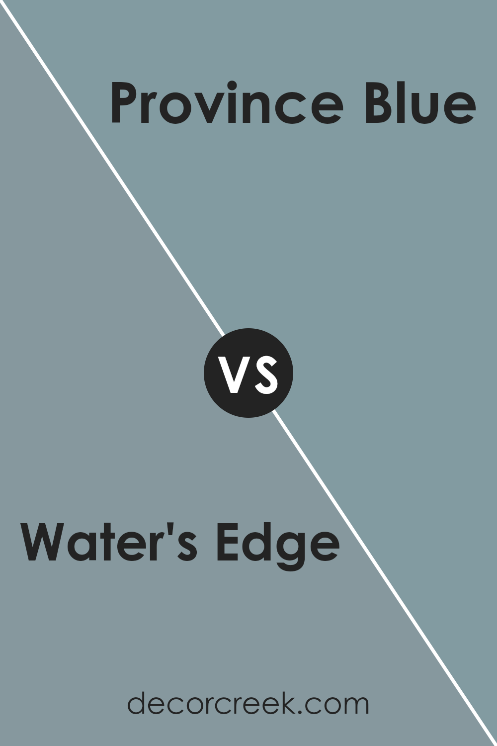
Water’s Edge 1635 by Benjamin Moore vs Province Blue 2135-40 by Benjamin Moore
Water’s Edge, a soft and calming blue-gray by Benjamin Moore, offers a sense of peace and relaxation. It is subtle and works well in spaces where you seek a soothing atmosphere, like a bedroom or living room. The hue has a gentle touch that feels almost neutral, making it versatile for pairing with other colors or various decor styles.
In comparison, Province Blue is a richer and more vibrant shade of blue, also from Benjamin Moore. It brings more intensity and depth, making it ideal for spaces where you want to make a bolder statement.
This color has a lively presence that adds character and can energize a room like a study or kitchen.
While Water’s Edge promotes calmness, Province Blue adds energy. Both offer their own unique feel and can be chosen based on the mood or look you want to create in your space. They can even complement each other nicely when used together.
You can see recommended paint color below:
- 2135-40 Province Blue
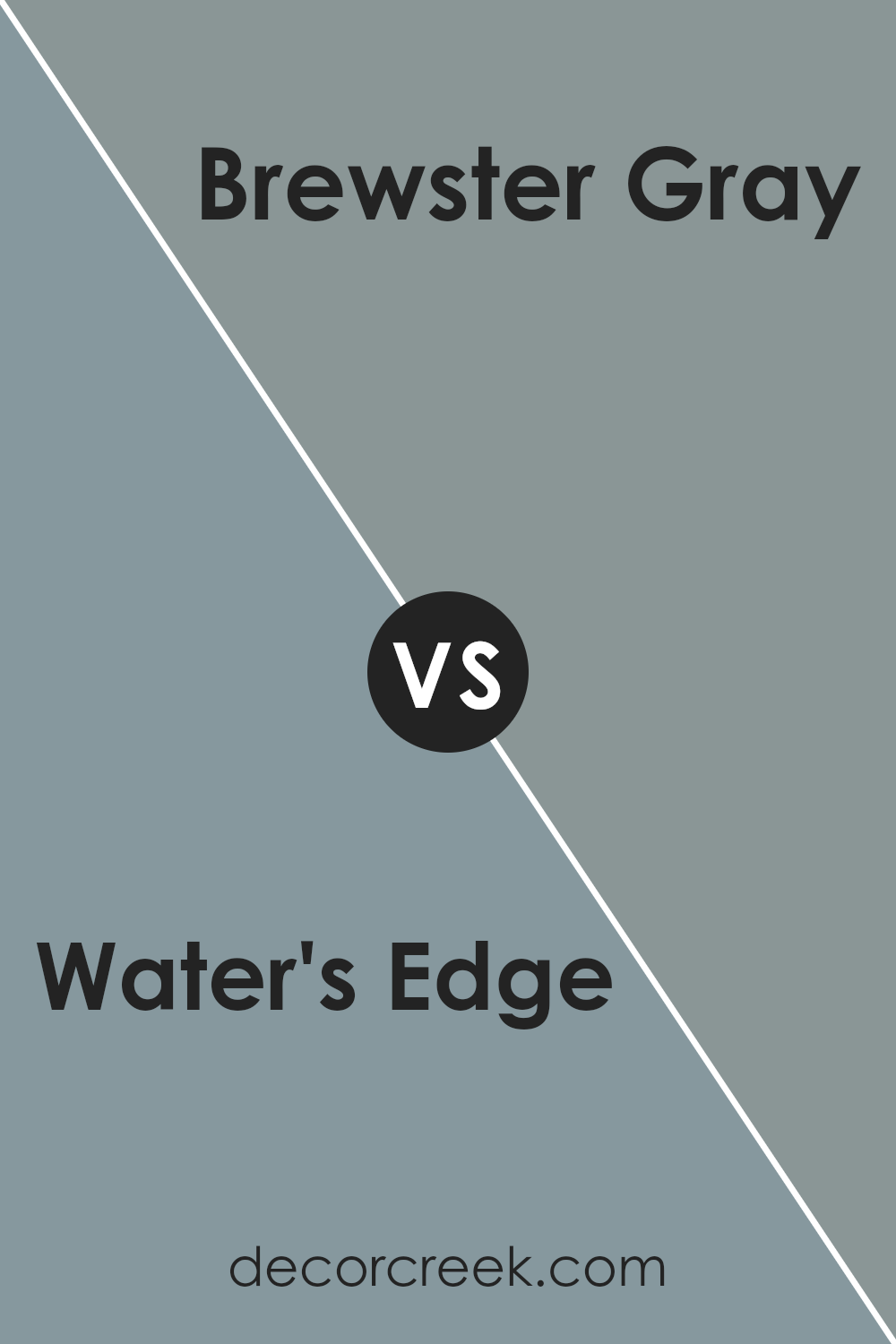
Water’s Edge 1635 by Benjamin Moore vs Brewster Gray HC-162 by Benjamin Moore
Water’s Edge 1635 and Brewster Gray HC-162 by Benjamin Moore are both soft, calming colors but differ in their undertones and overall vibe. Water’s Edge is a gentle, cool blue with hints of gray, giving it a breezy and light feel, almost like a misty shoreline in the morning. It can bring a sense of openness and airiness to a space.
In contrast, Brewster Gray is a deeper, more muted blue-gray with stronger gray undertones. It feels a bit more grounded and solid, carrying a touch of elegance without being too dark. This color is versatile and can work well in both modern and traditional settings.
While Water’s Edge feels fresh and light, Brewster Gray offers a cozier, more intimate atmosphere. Both colors are versatile, but the choice between them might come down to whether you prefer a brighter or moodier look for your space.
You can see recommended paint color below:
Water’s Edge 1635 by Benjamin Moore vs Cloudy Sky 2122-30 by Benjamin Moore
Water’s Edge 1635 by Benjamin Moore is a soft, calming blue with subtle gray undertones, evoking a sense of peace akin to a quiet lakeside. It’s gentle enough to be used as a neutral in certain settings, pairing well with both warm and cool tones.
Cloudy Sky 2122-30 by Benjamin Moore, on the other hand, carries a bit more weight with its deeper, stormier blue-gray hue. It feels more dramatic and moody compared to Water’s Edge, adding a touch of sophistication and depth to any space.
While Water’s Edge might be ideal for creating a relaxed, airy atmosphere, Cloudy Sky offers a more intense ambiance, suitable for rooms where a cozy, enveloping feel is desired. Both colors bring out different emotions and are versatile enough to complement a variety of home decor styles, from modern to traditional.
You can see recommended paint color below:
- 2122-30 Cloudy Sky
Water’s Edge 1635 by Benjamin Moore vs Amsterdam AF-550 by Benjamin Moore
Water’s Edge 1635 by Benjamin Moore is a calming blue-gray color that feels fresh and airy. It brings to mind the soothing qualities of water, making it ideal for spaces where relaxation is important, like bedrooms or bathrooms. The soft, muted tone fits well in both modern and traditional settings, adding a gentle touch of color without overwhelming the space.
In contrast, Amsterdam AF-550 by Benjamin Moore is a deeper and more intense blue. This color has a rich, bold presence that commands attention and can add a sense of drama to a room.
It’s a great choice for creating a focal point, such as an accent wall, or for spaces where you want to add depth and coziness.
While Water’s Edge is light and breezy, Amsterdam brings strength and richness, both offering their unique touch to a home. Choosing between them depends on whether you prefer a softer, more open feel or a bold, impactful look.
You can see recommended paint color below:
- AF-550 Amsterdam
Conclusion
This color is not too bright and not too dark; it’s just right to make a room feel calm and cozy. When you paint walls with this color, it’s like bringing a bit of the sea inside your home. It makes you think of soft breezes and clear skies. It’s a color that can make you feel peaceful and happy at the same time.
When you use it in your house, it can help make stressful days seem easier because it’s very calming.
Blue is a color many people like, but 1635 Water’s Edge is special because it can fit in lots of different rooms. Whether it’s a bedroom where you sleep or a living room where you hang out, this shade of blue mixes with other colors nicely.
So if you have bright or soft colors in your home, this blue can match with them.
In the end, 1635 Water’s Edge is more than just a color. It’s a way to bring comfort and happiness into your home by simply using paint. It can make you feel like you’re on a relaxing beach vacation every day.
Ever wished paint sampling was as easy as sticking a sticker? Guess what? Now it is! Discover Samplize's unique Peel & Stick samples.
Get paint samples

