Willow Creek by Benjamin Moore isn’t just a color; it’s an experience that’s both calming and elegant. Imagine standing in a forest with a gentle breeze rustling through the trees. That soothing feeling you get is what Willow Creek brings into your room.
It’s a medium-toned gray with subtle green undertones, making it flexible and easy on the eyes. When I first painted my room with it, I noticed how it seemed to change with the light—from a soft, cozy hue during the day to a rich, elegant shade in the evening.
This color works well in many settings, whether you’re looking to create a peaceful bedroom or a polished living room. It pairs beautifully with both warm and cool colors, making it a great choice no matter what your style is. If you’re like me and enjoy a calm vibe in your home, Willow Creek might just be the perfect shade for you.
Whether you use it on all four walls or as an accent, it brings a balance and a subtle touch of nature indoors.

What Color Is Willow Creek 1468 by Benjamin Moore?
Willow Creek by Benjamin Moore is a soft, muted gray with subtle green undertones, giving it an earth-toned quality that adds warmth and depth to any room. This color is flexible and works well in various interior styles, especially contemporary, modern farmhouse, and coastal designs. Its understated elegance allows it to act as a neutral base while still providing character and charm.
In a contemporary setting, Willow Creek adds a natural touch that complements clean lines and minimalist decor. It balances out bold or vibrant furnishings, allowing them to stand out without clashing. For a modern farmhouse look, pair it with wooden accents, like oak or walnut, and textured fabrics such as linen or cotton.
Coastal styles benefit from pairing Willow Creek with cool blues or crisp whites, enhancing the feeling of being near the sea. Materials and textures that complement this color include natural wood, rattan, jute, and matte metals like brushed nickel or blackened steel. Soft textiles such as wool or velvet in neutral tones also blend well, adding layers of interest and comfort.
Willow Creek provides a soft backdrop that is easy to style with both warm and cool tones, making it a great choice for creating a cozy, inviting room.
Is Willow Creek 1468 by Benjamin Moore Warm or Cool color?
Willow Creek by Benjamin Moore is a flexible paint color that fits well in various home settings. This warm, neutral shade offers a mix of gray and brown undertones, creating a cozy and inviting atmosphere. It’s a great choice for living rooms, bedrooms, and even kitchens, as it pairs well with both traditional and modern furniture styles.
The soft and understated nature of Willow Creek allows it to complement a wide range of accent colors. You can easily add touches of brighter hues through decor, furniture, or artwork, which stand out against the muted backdrop.
It also works well with both natural and artificial lighting, maintaining its warmth and subtlety throughout different times of the day. Whether applied to all walls or used as an accent, Willow Creek brings a sense of balance and comfort to any room. Its adaptability makes it a popular choice for those seeking an elegant yet relaxed vibe for their home.
Undertones of Willow Creek 1468 by Benjamin Moore
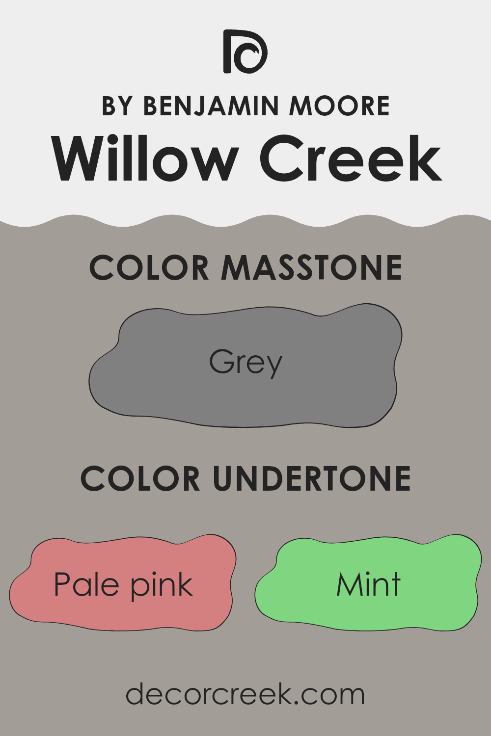
Willow Creek by Benjamin Moore has a mix of undertones that affect how the paint appears on walls. Undertones are subtle hints of color that are present beneath the main color. They influence how a color looks under different lighting and with other colors in a room.
For Willow Creek, these undertones range from pale pink and mint to deep shades like dark blue and gray. The presence of pale pink and mint adds a touch of warmth and refreshing brightness, making the color feel light and airy. Mint undertones can bring a bit of a cool touch that balances out the warmth, while lilac and light purple contribute a gentle, almost ethereal quality.
When you bring in darker undertones like navy or dark gray, Willow Creek gains a sense of richness and depth. Olive and dark green bring in an earthy, natural feel, grounding the color and allowing it to work well with wooden finishes or plants.
On a typical wall, these varied undertones can make Willow Creek look different throughout the day. In the morning, with natural light, it may seem brighter and more vibrant, while in the evening under artificial lighting, it could appear more muted and cozy. The blend of undertones ensures that the paint color remains interesting and adaptable to various settings.
What is the Masstone of the Willow Creek 1468 by Benjamin Moore?
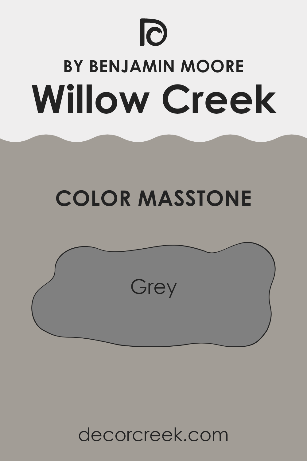
Willow Creek by Benjamin Moore is a soft, muted gray with a masstone of #808080. This color offers a neutral base that’s perfect for creating a calm and balanced atmosphere in any room. Because of its neutral tone, it can easily blend with a variety of other colors, making it highly flexible for home decor.
In living rooms, Willow Creek can create a cozy and inviting room when paired with warm accents like wooden furniture or soft, plush fabrics. In kitchens and bathrooms, it provides a clean and modern look that works well with both traditional and contemporary furnishings.
The understated elegance of this gray shade makes it a great choice for bedrooms as well, offering a relaxing environment that promotes restful sleep. Willow Creek’s subtlety ensures it will not overpower the room, allowing other design elements to shine while maintaining a cohesive and harmonious look throughout the home.
How Does Lighting Affect Willow Creek 1468 by Benjamin Moore?
Lighting plays a significant role in how we perceive color. Different types of light can change the way a color appears. For instance, natural sunlight shows colors most accurately. Artificial lighting, on the other hand, can alter a color’s appearance based on whether the light is warm or cool.
The color Willow Creek by Benjamin Moore is a light, muted gray with subtle green undertones. Under natural light, this color tends to appear more neutral and balanced. However, the direction in which a room faces can affect how it looks.
In north-facing rooms, light is often cooler and indirect, which can make colors appear darker and more muted. Willow Creek might look cooler and grayer in these conditions, as the green undertones are less pronounced.
In south-facing rooms, natural light is warmer and more direct, especially in the afternoon. Here, Willow Creek will likely appear a bit warmer and its green undertones might be slightly more visible, giving the color a more lively appearance.
East-facing rooms get warm, soft light in the morning and cooler light later in the day. In the morning, Willow Creek can appear brighter and more welcoming, with a touch of warmth. As the day progresses, the color may seem a bit cooler.
West-facing rooms receive warm light in the late afternoon and evening. During these times, Willow Creek can take on a warmer, more inviting tone, with its subtle green undertones showing up a little more.
Under artificial lighting, the appearance of Willow Creek will depend on the type of bulbs used. Warm incandescent or LED bulbs can enhance the green undertones, making the color cozier and softer. Cooler fluorescent or LED lights might emphasize the gray aspect of the color, making it appear more subdued.

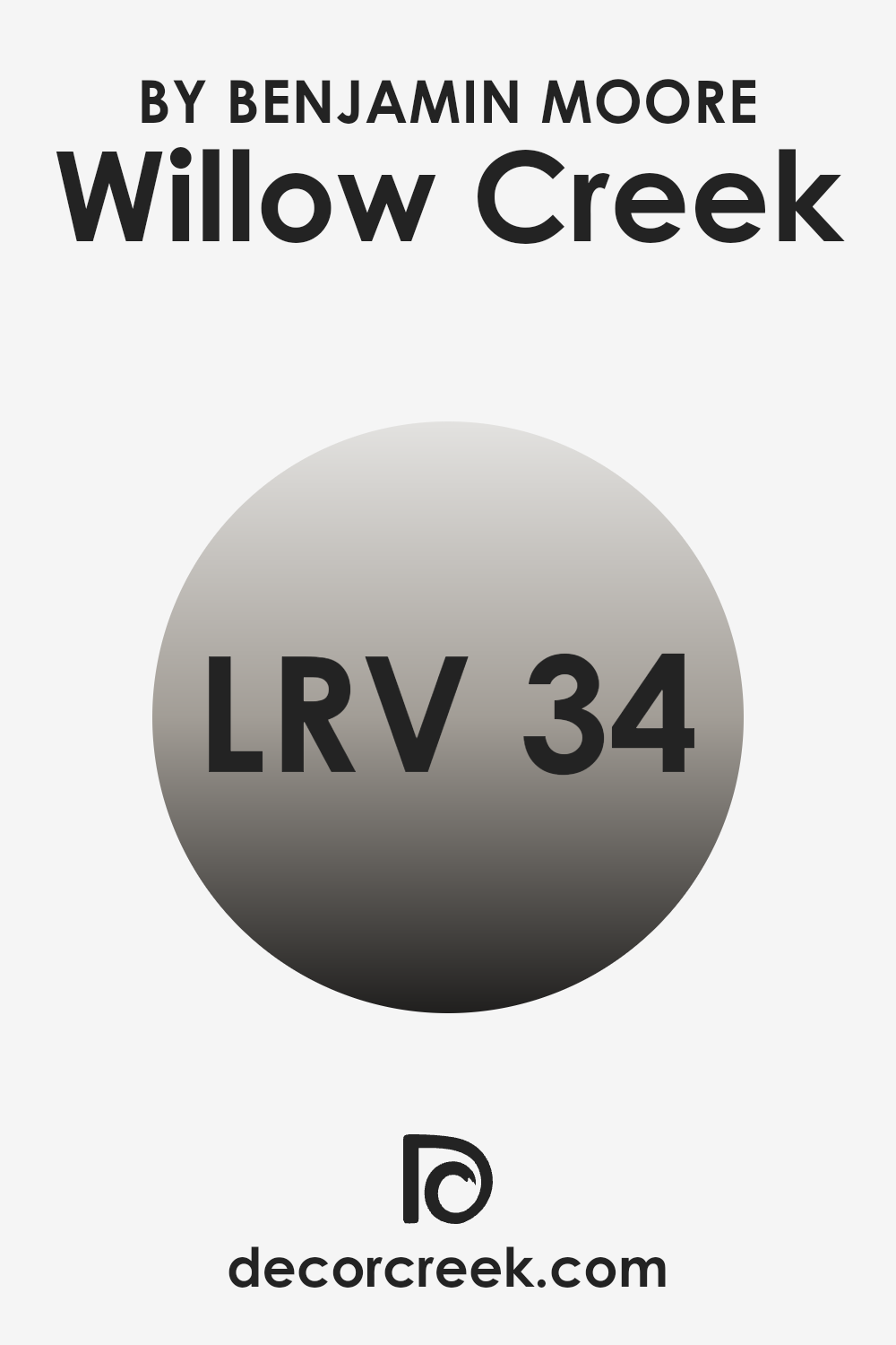
What is the LRV of Willow Creek 1468 by Benjamin Moore?
Light Reflectance Value, or LRV, is a measurement that tells us how much light a color reflects or absorbs. The scale goes from 0 to 100, with 0 being absolute black, which absorbs all light, and 100 being pure white, which reflects all light. A higher LRV means a color will reflect more light, often making a room feel brighter and more open.
Conversely, lower LRV values mean the color absorbs more light, which can make a room feel cozier and more intimate. LRV is an important consideration when choosing wall colors because it influences how a color will look in different lighting conditions. It helps homeowners understand how a color will interact with natural and artificial light in their areas.
For Willow Creek by Benjamin Moore, the LRV of 34.48 indicates that it is a mid-tone color. This value suggests that the color will absorb more light than it reflects, which can make a room feel warm and inviting.
In areas with lots of natural light, Willow Creek will have an enriched, slightly softer appearance, balancing light absorption without making the room feel too dark. In a room with less natural light, this color can create a cozy atmosphere, though it might require additional lighting to avoid making the room feel too enclosed. Overall, Willow Creek’s LRV makes it a flexible choice for those looking to add a touch of depth and warmth to their interiors.
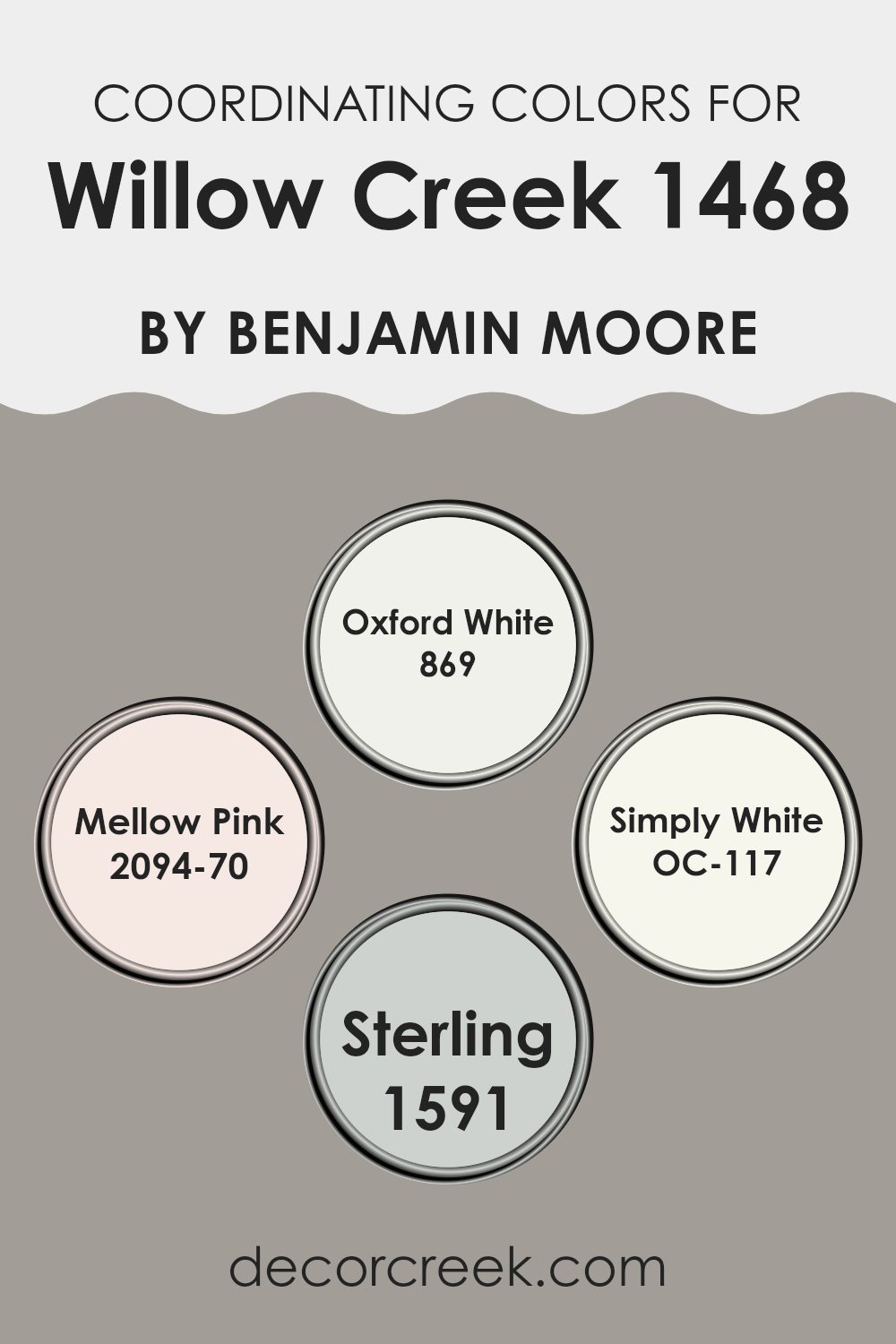
Coordinating Colors of Willow Creek 1468 by Benjamin Moore
Coordinating colors are those that complement a primary color, creating a balanced and harmonious palette. They are carefully chosen to bring out the best in each other, enhancing the look of a room or any design project. For the soft, comforting hue of Willow Creek by Benjamin Moore, the coordinating colors Oxford White, Mellow Pink, Simply White, and Sterling offer a stylish blend. These colors work together to bring depth and contrast to the room while maintaining a cohesive look.
Oxford White is a clean, crisp white that brightens up any room and pairs effortlessly with other colors. Mellow Pink brings a touch of warmth and softness, offering a gentle and welcoming feel.
Simply White is pure and bright, providing a neutral backdrop that highlights the features of Willow Creek without clashing. Meanwhile, Sterling introduces a cool, silvery tone, adding a modern edge to the overall palette. Together, these colors create a balanced environment, enhancing the subtle elegance of Willow Creek and creating a pleasant atmosphere.
You can see recommended paint colors below:
- 869 Oxford White
- 2094-70 Mellow Pink
- OC-117 Simply White
- 1591 Sterling
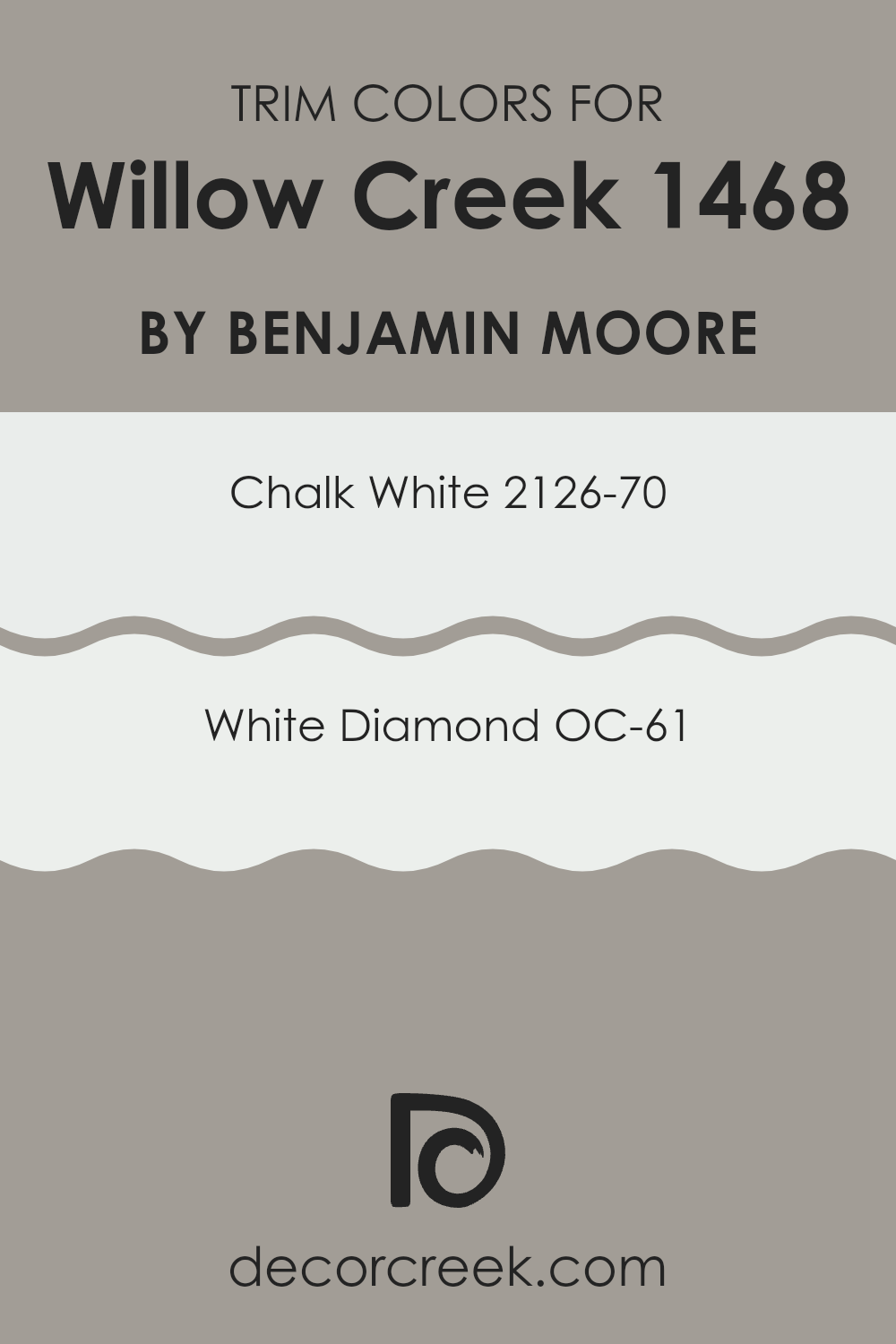
What are the Trim colors of Willow Creek 1468 by Benjamin Moore?
Trim colors are the shades used to accentuate the edges and lines in a room, such as along the baseboards, moldings, and window frames. These colors hold the responsibility of framing the room’s main color, giving everything a clean and polished appearance. When choosing a main wall color like Willow Creek by Benjamin Moore, selecting the right trim colors is essential to make the overall look cohesive.
Willow Creek is a flexible and cool-toned gray that provides a subtle yet stylish backdrop to any room. The right trim colors enhance the way Willow Creek can appear either warmer or cooler, depending on the light, bringing out its best features. Using light and fresh trim, you can give a room an airy feel, and it highlights the elegance of the walls without stealing the show.
When considering trim colors like Chalk White and White Diamond, you’re looking at options that provide both clarity and contrast. Chalk White, labeled as 2126-70, offers a gentle warmth that is not too stark nor too creamy, lending a touch of softness against the cooler undertones of Willow Creek. This color comes across as a classic white with a hint of warmth, perfect for those who enjoy a comfortably bright environment.
On the other hand, White Diamond, known as OC-61, is a crisp and cool white that adds a fresh and clean outline to the room’s architecture. It exudes a purer brightness, making it an excellent choice for those who prefer sleek and modern finishes. Both colors serve to highlight the subtle nuances of Willow Creek, ensuring the room feels balanced and harmonious.
You can see recommended paint colors below:
- 2126-70 Chalk White
- OC-61 White Diamond
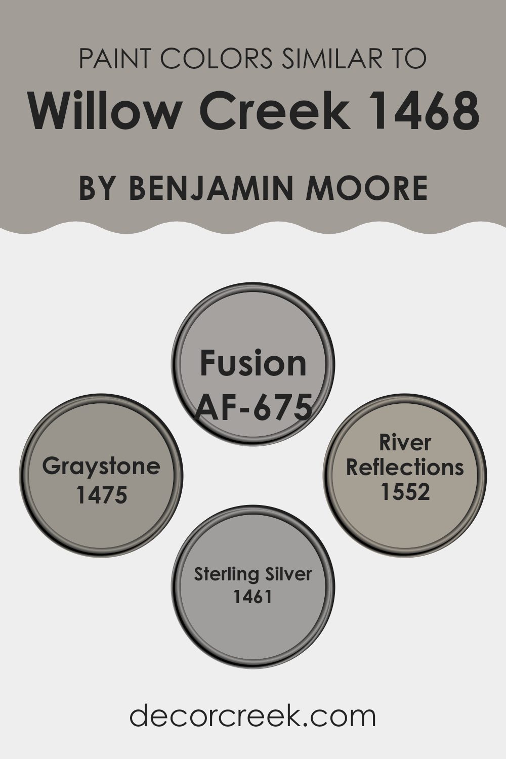
Colors Similar to Willow Creek 1468 by Benjamin Moore
Similar colors play a crucial role in design because they create harmony and a sense of cohesion in a room. When colors are closely related, such as shades of gray and muted greens, they blend seamlessly to form a unified look that is pleasing to the eyes.
Using these shades together can make a room feel balanced and comfortable, allowing the subtle differences in hue to create depth and interest without making the senses feel too intense. For instance, in the case of the color Willow Creek, finding similar tones can help enhance its calming and soothing qualities without stark contrasts.
Consider the color Fusion (AF-675), which offers a subtle green hue that mirrors nature, providing warmth and a touch of earthiness. Graystone (1475), on the other hand, incorporates a gentle mix of gray and beige, achieving a refined neutrality that’s flexible in many areas.
River Reflections (1552) evokes the calm flow of a gentle stream with its soft blue undertones, creating a cooling and relaxing atmosphere. Finally, Sterling Silver (1461) delivers a light, airy feel with its pale gray tint, adding a crisp and fresh look to any room. Together, these colors work beautifully to maintain an understated elegance that is both peaceful and appealing.
You can see recommended paint colors below:
- AF-675 Fusion
- 1475 Graystone
- 1552 River Reflections
- 1461 Sterling Silver
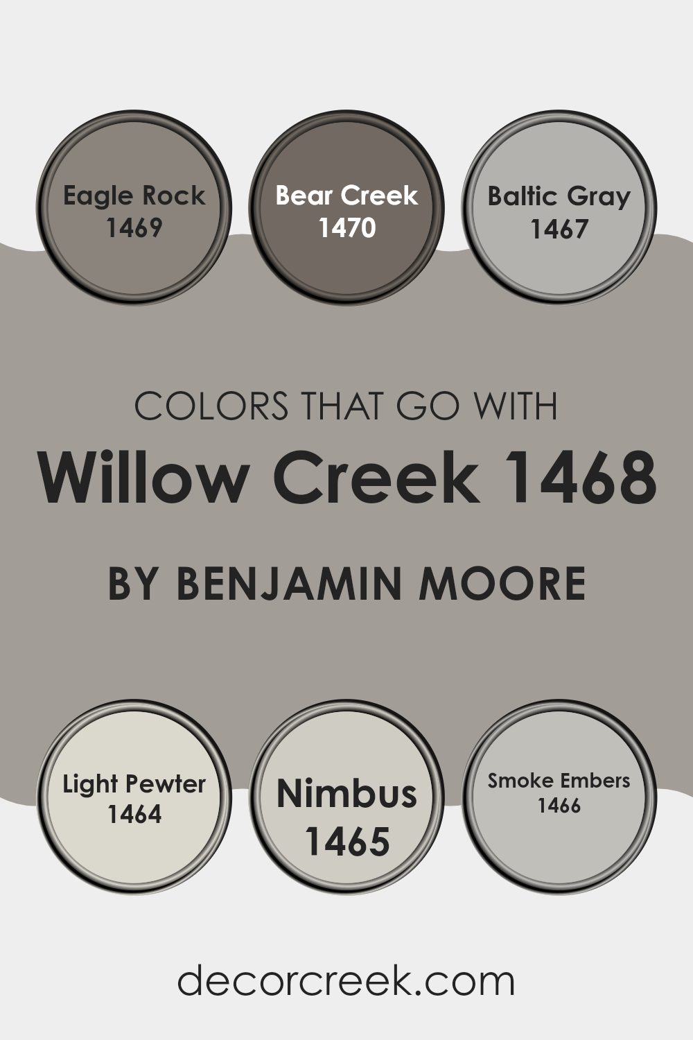
Colors that Go With Willow Creek 1468 by Benjamin Moore
Choosing colors that complement Willow Creek 1468 by Benjamin Moore can make a room feel cohesive and inviting. Willow Creek is a subtle and soft gray with warm undertones, making it a flexible backdrop for various color combinations. Eagle Rock 1469 pairs well with it, as it is a slightly deeper and richer gray that provides contrast without being overpowering.
Bear Creek 1470, a deeper shade still, brings warmth and depth, adding dimension to the scheme. On the lighter side, Baltic Gray 1467 offers a soft, cool tone that balances the warmth of Willow Creek, creating an airy and relaxed atmosphere.
Light Pewter 1464 is a classic light gray that brightens the room and works well with natural and neutral furnishings. Nimbus 1465 introduces a gentle and soft gray with a touch of blue, adding a calming effect. Finally, Smoke Embers 1466 is a light and airy gray which adds a touch of elegance and cleanliness.
These colors work together to create a harmonious environment, enhancing the overall aesthetic without overpowering the room. They provide a balanced palette that can be adjusted to fit any decor style, making each room both functional and pleasing to the eye.
You can see recommended paint colors below:
- 1469 Eagle Rock
- 1470 Bear Creek
- 1467 Baltic Gray
- 1464 Light Pewter
- 1465 Nimbus
- 1466 Smoke Embers
How to Use Willow Creek 1468 by Benjamin Moore In Your Home?
Willow Creek 1468 by Benjamin Moore is a warm and inviting paint color that fits well in various home settings. This soft, taupe shade has a balanced mix of gray and beige tones, making it adaptable to different decor styles.
It’s an excellent choice for living rooms or bedrooms, creating a cozy and welcoming atmosphere. Pair it with white trim for a clean, crisp look, or complement it with darker woods for a more traditional feel.
In kitchens, Willow Creek 1468 can add a touch of warmth, especially when matched with stainless steel appliances and natural stone countertops. It also works well in hallways and entryways, providing a subtle backdrop that allows artwork or family photos to stand out. Overall, Willow Creek 1468 is a flexible color that adds a sense of comfort and elegance to any room in the house without overpowering the room.
Willow Creek 1468 by Benjamin Moore vs Graystone 1475 by Benjamin Moore
Willow Creek 1468 by Benjamin Moore is a soft, muted green with hints of gray, giving it an earthy and calming feel. It’s a flexible shade that works well in different environments because it pairs nicely with both warm and cool colors. This makes it a great choice for living rooms, bedrooms, or any room that needs a touch of nature.
On the other hand, Graystone 1475 is a cool, medium gray with a touch of warmth, which prevents it from appearing too cold. It’s a solid, grounding color that can make a room feel more spacious and airy. Graystone is a fantastic backdrop for bolder colors and can add a modern feel to any room.
While both colors are muted and refined in their subtleness, Willow Creek brings warmth with its green undertones, creating a cozy atmosphere, whereas Graystone provides a sleek, neutral backdrop that feels more contemporary.
You can see recommended paint color below:
- 1475 Graystone
Willow Creek 1468 by Benjamin Moore vs Fusion AF-675 by Benjamin Moore
Willow Creek 1468 by Benjamin Moore is a soft, muted green with gray undertones, offering a calming and neutral vibe. It’s a flexible color that fits well in various rooms, providing a natural and earthy feel. Fusion AF-675, on the other hand, is a deeper, more intense green. It feels richer and can add a touch of drama to a room without being too intense.
While both colors belong to the green family, Willow Creek is more subdued and leans toward gray, making it more of a background color that quietly complements other design elements. Fusion has a stronger presence, with more warmth and depth, standing out more and possibly serving as a focal point in a room.
In summary, if you’re aiming for a soft, quiet ambiance, Willow Creek might be the choice. For a bolder, richer green, Fusion provides a more striking option.
You can see recommended paint color below:
- AF-675 Fusion
Willow Creek 1468 by Benjamin Moore vs River Reflections 1552 by Benjamin Moore
Willow Creek 1468 and River Reflections 1552 by Benjamin Moore are both soft, muted colors, yet they differ in tone and feel. Willow Creek is a gentle gray with subtle green undertones, making it flexible and calming. It has a natural, earthy quality that can work well in a variety of settings.
On the other hand, River Reflections is a cooler, more traditional gray with slight blue hints, adding a crisp and clean vibe to areas. While both colors present a neutral backdrop, Willow Creek is warmer, making it feel more organic, whereas River Reflections feels cooler and more modern.
Willow Creek pairs nicely with natural materials, adding warmth to a room, while River Reflections can highlight sleek, contemporary furnishings. Depending on the ambiance you want, choose Willow Creek for a cozy feel or River Reflections for a fresh, modern look.
You can see recommended paint color below:
- 1552 River Reflections
Willow Creek 1468 by Benjamin Moore vs Sterling Silver 1461 by Benjamin Moore
Willow Creek is a soft, muted green with gray undertones, creating a calm and natural look. It feels like a gentle touch of nature, making it perfect for cozy and relaxed areas. On the other hand, Sterling Silver is a light, cool gray with hints of blue.
It’s crisp and clean, offering a modern and airy feel to rooms. While Willow Creek brings warmth and an earthy vibe, Sterling Silver gives a sense of openness and freshness. Both colors are flexible, but Willow Creek is great for creating a soothing and comfortable environment, feeling almost like a gentle hug.
In contrast, Sterling Silver is ideal for areas where you want a crisp, contemporary aura. They can complement each other well; use Willow Creek for an inviting atmosphere and Sterling Silver for a sleek, elegant touch. Both options work beautifully for different moods and settings.
You can see recommended paint color below:
- 1461 Sterling Silver

Sure, here’s a conclusion for the article “1468 Willow Creek by Benjamin Moore” written in a simple and clear way: After learning about 1468 Willow Creek by Benjamin Moore, I think it’s a really interesting color choice for our homes.
It’s a soft gray color that can make any room feel cozy and welcoming. I like how it works well in different rooms, like the living room, bedroom, or even the kitchen. The color isn’t too dark or too light, so it can make the walls look nice without being boring.
What I find most appealing is how this color can match with different styles. It can go well with bright colors if you add some colorful pillows or rugs, or it can fit with other neutral colors for a calm look. It’s a great color if you want your home to feel inviting and comfortable.
I believe 1468 Willow Creek would be a great choice for anyone thinking about painting their room or house. It seems like a color that many people would enjoy and find easy to live with. Overall, this paint color by Benjamin Moore seems like a wonderful option for making our rooms feel just right.

Ever wished paint sampling was as easy as sticking a sticker? Guess what? Now it is! Discover Samplize's unique Peel & Stick samples.
Get paint samples

