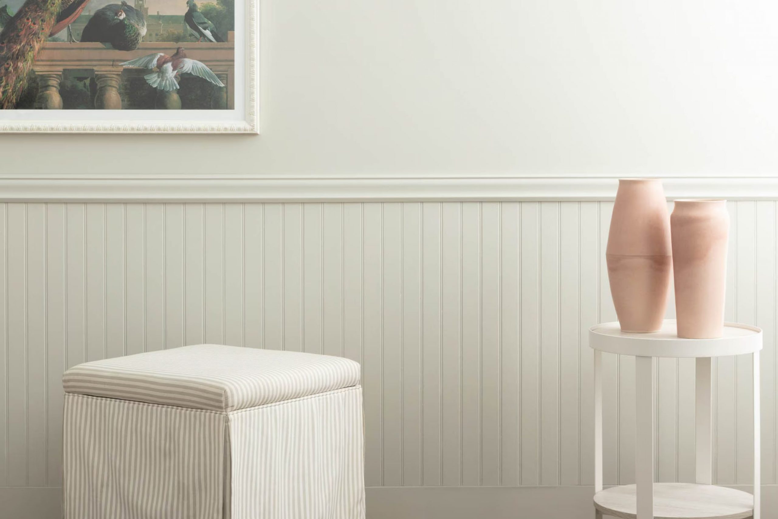
If you’re thinking of refreshing your room and considering a fresh coat of paint, let me tell you about my experience with 1555 Winter Orchard by Benjamin Moore. This subtle and soothing color changed the feel of my living room, creating a calm atmosphere that makes coming home the best part of my day.
When you enter a room painted with 1555 Winter Orchard, you’ll notice how this particular shade has a knack for making rooms feel calm yet alive. It’s a light grey hue with just a hint of green, providing a natural, almost earthy feel that’s pleasant and inviting. Applying this color to my walls was straightforward—Benjamin Moore paints are known for their quality and coverage.
Whether your furniture is modern or traditional, this paint color adapts beautifully, acting as a neutral backdrop that highlights your decor. It’s rare to find a color that works in different lighting conditions and still looks great with various decorating styles, but Winter Orchard does all that wonderfully.
So if you are looking for a paint color that adds a peaceful atmosphere to your rooms without being overpowering, 1555 Winter Orchard is definitely worth considering. It brings a fresh feeling to your home while maintaining an understated refined look.
What Color Is Winter Orchard 1555 by Benjamin Moore?
Winter Orchard by Benjamin Moore is a subtle and gentle gray with a touch of warmth that makes rooms feel cozy and inviting. This color has an understated refined look that works beautifully in a variety of settings. It’s especially great for creating a soft, neutral backdrop that complements a wide range of decor styles and elements.
In terms of interior styles, Winter Orchard is a flexible choice that especially shines in minimalist, contemporary, and Scandinavian designs. Its neutral tone provides a clean, fresh look that isn’t overpowering, making it ideal for these understated styles. It also fits well in modern farmhouse and traditional interiors, where its warmth adds a homey, welcoming feel.
When it comes to pairing with materials and textures, Winter Orchard works wonderfully with natural wood, helping to highlight its rich textures. It also complements metallic finishes like brass or copper, adding a subtle touch of luxury. For textiles, think of soft linens, plush velvets, or chunky knits, which can add depth and interest to the calm background provided by Winter Orchard.
In rooms with plenty of natural light, this color looks particularly beautiful as it changes subtly with the shifting light, adding to the room’s dynamic feel.
decorcreek.com
Is Winter Orchard 1555 by Benjamin Moore Warm or Cool color?
Winter Orchard (1555) by Benjamin Moore is a flexible and calming paint color, fitting nicely into many areas of a home. Its subtle gray undertones make it a practical choice for those who want a hint of color without overpowering a room.
This gentle shade can make small rooms appear larger and brighter because it naturally reflects light. It’s also soft enough that it won’t clash with existing decor, making it an excellent option for refreshing living rooms, bedrooms, and even kitchens.
Because of its neutral base, Winter Orchard can work with various accent colors, from bold blues to gentle yellows, offering flexibility in changing decor styles without the need to repaint. It’s a particularly good match for natural wood elements, highlighting their warmth. This color provides a calm and inviting atmosphere, ideal for interiors where comfort and simplicity are key.
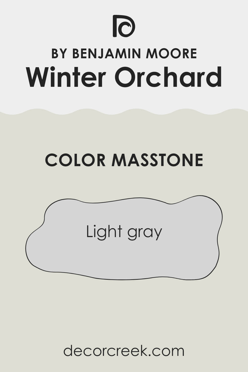
What is the Masstone of the Winter Orchard 1555 by Benjamin Moore?
Winter Orchard 1555 by Benjamin Moore is a light gray color with a masstone that looks like #D5D5D5. This particular shade of gray is clear and soft, making it a great choice for homes. It is very neutral, so it goes well with almost any other color you might want to use in your furniture or decorations. This makes it really easy to use in most rooms, from kitchens to bedrooms.
The light tone of this gray can help make smaller rooms appear a bit larger and more open. It reflects light nicely, which can brighten up a room, especially one that doesn’t get a lot of natural sunlight. This can make your home feel more lively and inviting.
Also, because it’s a calm and gentle color, it can help create a peaceful atmosphere, making it ideal for areas where you relax, like the living room or bedroom. This choice is practical as well, since light grays don’t show wear and tear or dirt as much as darker colors.
decorcreek.com
How Does Lighting Affect Winter Orchard 1555 by Benjamin Moore?
Lighting significantly impacts how colors appear in different environments. Depending on the light, a color can look lively or muted. For instance, the shade Winter Orchard by Benjamin Moore can show a range of appearances under various lighting conditions.
Under artificial light, like incandescent bulbs which emit a warm yellow glow, Winter Orchard takes on a warmer and more welcoming tone, making rooms feel cozy and comfortable. In contrast, fluorescent lighting, which is cooler, might make the same color appear slightly more clinical and less inviting. LED lighting offers the most consistent white light, allowing Winter Orchard to maintain its true, neutral tone, which balances between warm and cool.
In natural light, the appearance of Winter Orchard varies throughout the day and depends on the direction the room faces:
- North-facing rooms – These rooms get less direct sunlight, which can make light colors appear more shadowy and subdued. Winter Orchard might look cooler and more reserved in north-facing rooms, giving a calm and gentle feel.
- South-facing rooms – These rooms benefit from plentiful light for most of the day. Here, Winter Orchard can appear brighter and more lively, bringing a light and airy feeling to the room.
- East-facing rooms – With the morning sunlight, Winter Orchard will look soft and gently illuminated in the morning, making the room feel fresh at the start of the day. As the day progresses, it may lose some of its brightness due to the dimmer afternoon light.
- West-facing rooms – Evening light in these rooms means Winter Orchard will be more intensely illuminated with a warm glow toward the end of the day. During the morning, however, it can appear cooler and somewhat muted.
Overall, Winter Orchard is a flexible color that adapts to various lighting situations, each bringing out a different charm of this subtle hue. To choose what’s best, consider the primary use of the room and the mood you want to set, influenced by lighting and direction.
decorcreek.com
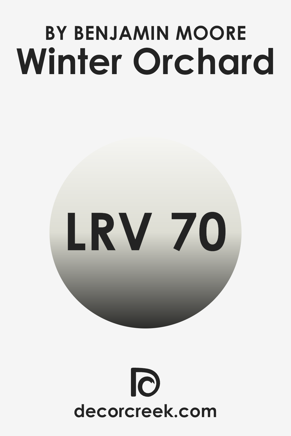
What is the LRV of Winter Orchard 1555 by Benjamin Moore?
LRV stands for Light Reflectance Value, which is a measure of how much light a paint color reflects back into a room as opposed to absorbing it. This value is expressed on a scale where lower numbers mean the color absorbs more light and appears darker, while higher numbers indicate that the color reflects more light, making it appear lighter.
The scale is important in choosing paint colors because it helps you understand how bright or dark a color will look once it’s on your walls. Good lighting can improve the LRV, making the room feel more open and airy, whereas poor lighting can make even a high-LRV color look dull.
With a LRV of 70.26, the color Winter Orchard is fairly light, meaning it has the ability to reflect a good amount of light, brightening up a room effectively. This makes it a great option for rooms that are smaller or have limited natural light, as it can help make the area feel larger and more welcoming. In well-lit rooms, this high LRV will make the walls lively and bright, improving the overall atmosphere. However, in a dimly lit room, while it might still feel quite light, the full effect of the LRV might not be noticeable, and the color could appear slightly muted.
decorcreek.com
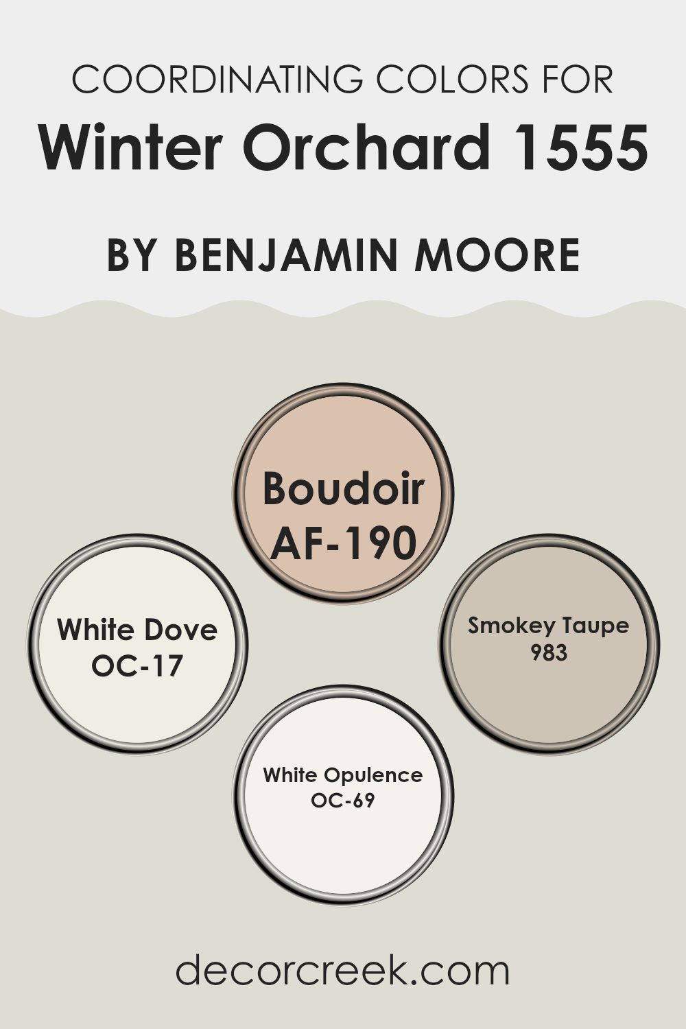
Coordinating Colors of Winter Orchard 1555 by Benjamin Moore
Coordinating colors are shades that complement each other visually, improving the overall aesthetic of a room without overpowering any single element. When these colors are paired thoughtfully, they create a cohesive and harmonious look. This principle is beautifully illustrated through the coordinating colors recommended for Winter Orchard 1555 by Benjamin Moore, offering flexibility and subtle refined style to any decor.
AF-190 – Boudoir is a rich, velvety color that adds a hint of depth and allure, ideal for creating an intimate atmosphere in a room. It pairs wonderfully with the neutral base of Winter Orchard, providing a striking contrast. OC-17 – White Dove is a soft, warm white that brightens rooms gently without overpowering, making it a fantastic choice for trim and ceiling accents to complement richer hues.
983 – Smokey Taupe is a balanced, medium taupe that brings warmth and understated refined style, working well in living areas or as a calming backdrop in bedrooms. Finally, OC-69 – White Opulence is a crisp, clean white with a subtle luminosity, perfect for creating a fresh, airy feel when used alongside deeper or mid-tone colors like those of Winter Orchard and its coordinating shades. Together, these colors allow for beautiful layering and depth within a room, improving the visual texture and giving any room a polished look.
You can see recommended paint colors below:
- AF-190 Boudoir
- OC-17 White Dove
- 983 Smokey Taupe
- OC-69 White Opulence
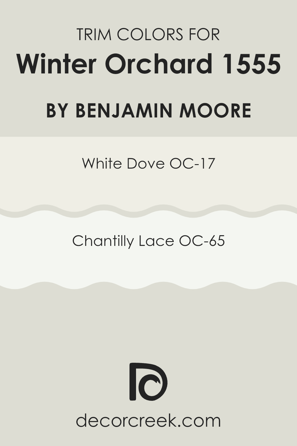
What are the Trim colors of Winter Orchard 1555 by Benjamin Moore?
Trim colors refer to the hues selected for the architectural features and accents such as door frames, window frames, moldings, and skirting boards. These colors are important as they can define and accentuate the details and proportions of a room, helping to highlight the structural beauty of a room.
When using a base color like Winter Orchard by Benjamin Moore, choosing the right trim color becomes essential to create a balanced and harmonious look. In this context, White Dove (OC-17) and Chantilly Lace (OC-65) are particularly well suited because they offer a clean, clear contrast without overpowering the subtle tone of Winter Orchard.
White Dove is a soft yet warm white that carries a hint of cream, lending a gentle richness to trim that complements the cooler undertone of Winter Orchard. This color is flexible and ideal for creating a smooth transition between wall colors and trim, making the architectural elements subtly stand out. On the other hand, Chantilly Lace presents a crisper and brighter white, offering a more striking contrast that can make the design elements in a room stand out.
This shade is perfect for those who wish to add a more pronounced definition to their room, while still maintaining a harmonious flow with the calming hue of Winter Orchard. By carefully selecting White Dove or Chantilly Lace as trim colors, one can achieve a well-coordinated palette that improves both the atmosphere and the aesthetic of the room.
You can see recommended paint colors below:
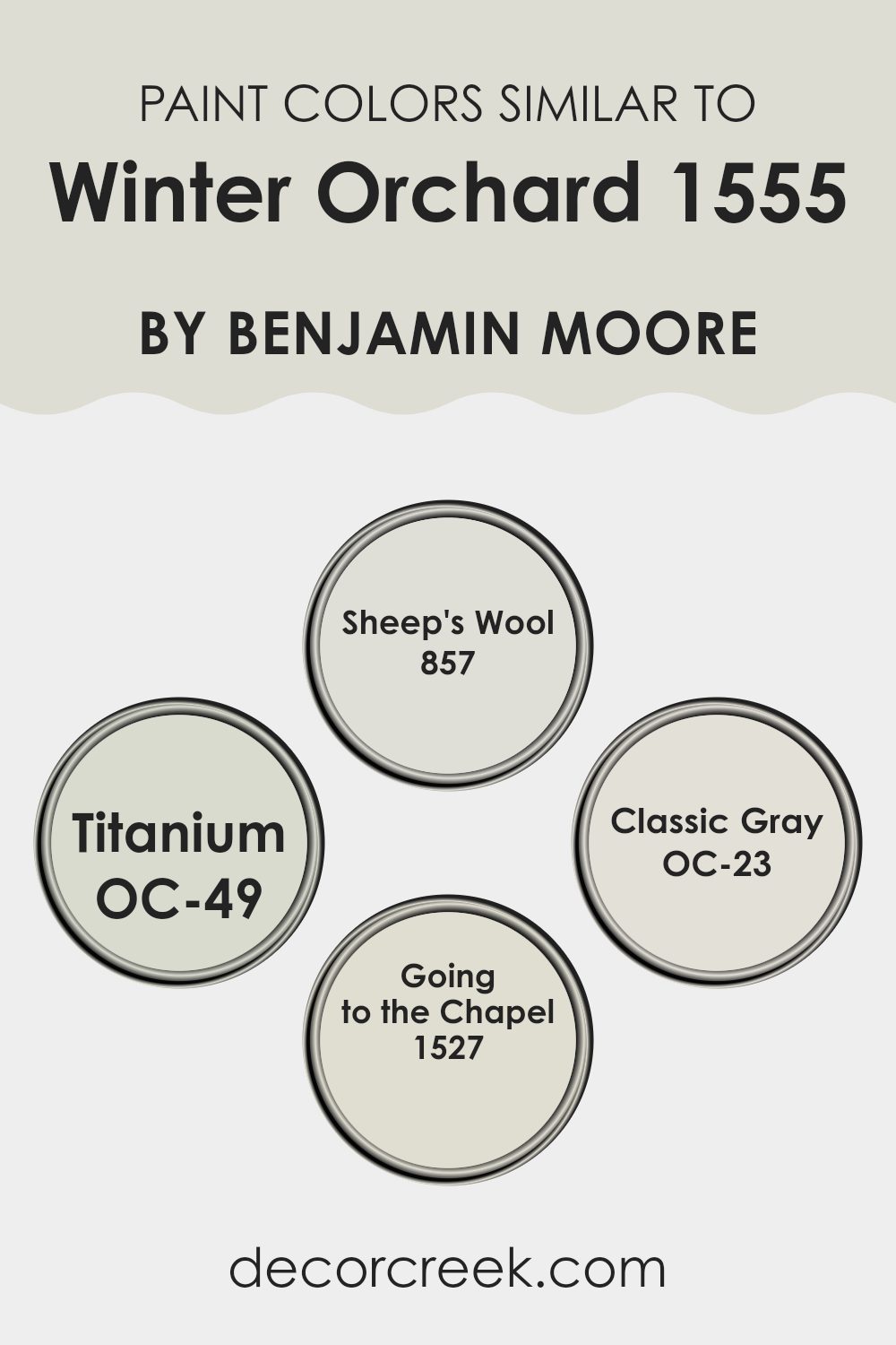
Colors Similar to Winter Orchard 1555 by Benjamin Moore
Choosing similar colors can have a significant impact on the atmosphere and continuity of a room. When colors like Sheep’s Wool, Titanium, Classic Gray, and Going to the Chapel are used alongside or in close relation to each other, they create a cohesive and harmonious look.
This is particularly effective in open-plan rooms or homes with a flowing layout, where walls painted in coordinating hues help to naturally connect different areas or rooms. These shades, which closely relate to the tones of Winter Orchard by Benjamin Moore, also provide a gentle and easy transition for the eye, creating a calming visual experience without harsh contrasts.
Sheep’s Wool is a soft, warm hue that radiates calmness and provides a comforting touch that can make rooms feel inviting and cozy. Titanium, slightly bolder, offers a hint of depth with its grey undertones, working well in areas that benefit from a more defined color without overpowering the senses.
Classic Gray is understated and neutral, perfect for achieving a light, airy feel that doesn’t compete with other elements in a room. Going to the Chapel brings a subtle brightness, like a soft glow, improving rooms with its soft, almost delicate quality. Together, these colors support each other, improving the overall aesthetic without causing visual disruption.
You can see recommended paint colors below:
- 857 Sheep’s Wool
- OC-49 Titanium
- OC-23 Classic Gray
- 1527 Going to the Chapel
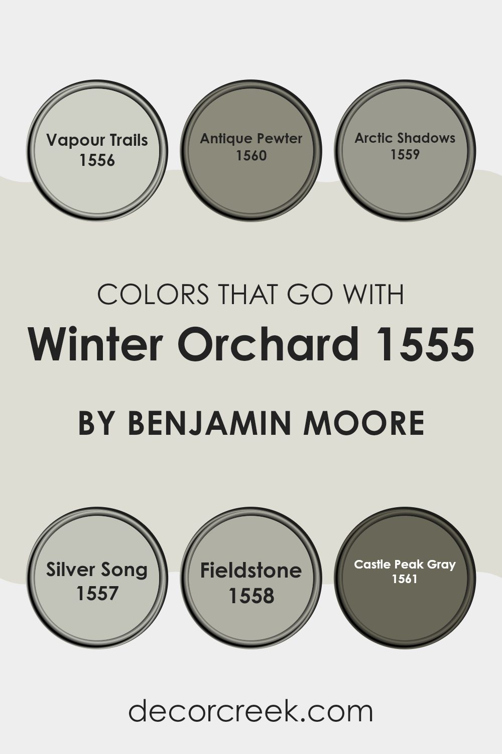
Colors that Go With Winter Orchard 1555 by Benjamin Moore
When considering color schemes for a room, particularly around a subtle and soft hue like Winter Orchard 1555 by Benjamin Moore, it’s important to select complementary colors that can improve the overall mood and aesthetic of the room, allowing for a cohesive and harmonious design.
Colors like Vapour Trails, Antique Pewter, Arctic Shadows, Silver Song, Fieldstone, and Castle Peak Gray are ideal partners for Winter Orchard because they belong to a similar cool and muted palette that works naturally to create a gentle, visually comforting environment.
Vapour Trails is a light gray with a soft hint of blue, giving it a fresh and airy feel that pairs beautifully with the delicate nature of Winter Orchard. Antique Pewter is a deeper gray that offers a subtle contrast, adding depth and interest to the color scheme without overpowering it.
Arctic Shadows stands out as a deeper, bold gray with a hint of blue, providing a striking balance that improves the quieter tones of Winter Orchard. Silver Song, another calming shade, mixes gray with light blue to echo the calm and inviting atmosphere that Winter Orchard creates.
Fieldstone offers a unique blend of gray and brown, adding warmth into the color palette, and finally, Castle Peak Gray brings a rich, steely gray to the mix, grounding the lighter shades and adding a modern touch to the overall look. Together, these colors create a fluid and adaptable palette that works well in any room, improving the beauty of Winter Orchard and offering stylish flexibility.
You can see recommended paint colors below:
- 1556 Vapour Trails
- 1560 Antique Pewter
- 1559 Arctic Shadows
- 1557 Silver Song
- 1558 Fieldstone
- 1561 Castle Peak Gray
How to Use Winter Orchard 1555 by Benjamin Moore In Your Home?
Winter Orchard 1555 by Benjamin Moore is a delicate grey-green paint color that brings a touch of nature indoors. This shade is perfect for creating a calm and cozy atmosphere in any room of your home. It works particularly well in living areas and bedrooms where you want to encourage relaxation. The subtle green undertone in Winter Orchard also makes it ideal for bathrooms to add a fresh, clean look.
Pairing this paint with whites or light woods can improve its natural qualities, making your room feel open and airy. It’s also flexible enough to be used in accent areas, like a single wall or on kitchen cabinets, for a gentle splash of color that is not too overpowering.
Because of its soft and neutral hue, Winter Orchard can be easily matched with various decor styles and colors, allowing for flexibility in design choices. Whether you’re looking to refresh a single room or repaint your entire home, this color is a practical and stylish option.
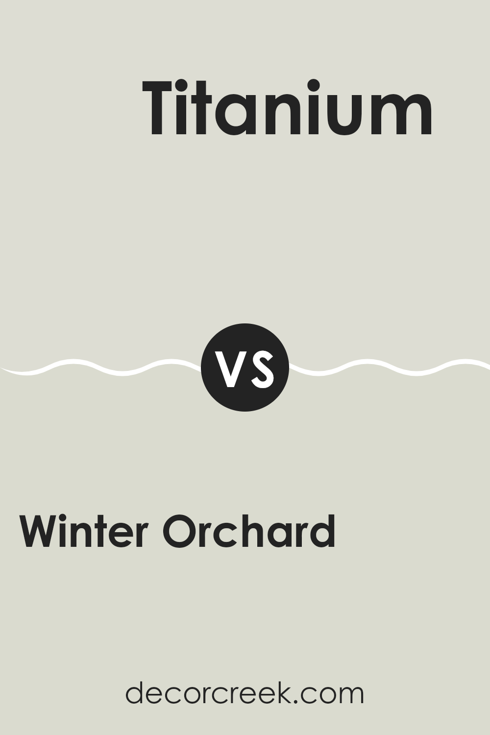
Winter Orchard 1555 by Benjamin Moore vs Titanium OC-49 by Benjamin Moore
The main color, Winter Orchard, is a soft beige with a warm undertone, giving it a cozy and inviting feel. It’s perfect for creating a calm and welcoming atmosphere in any room, making rooms feel light and airy but still with a hint of warmth to maintain a homely feel.
On the other hand, Titanium is a cooler, more neutral gray. It’s a flexible color that pairs well with both bright and subdued shades, offering a clean and uncluttered look. This makes it ideal for modern interiors that aim for a minimalist aesthetic.
Comparing the two, Winter Orchard adds a warmer touch, which can make a room feel more intimate, whereas Titanium offers a sleek, modern appearance that can make a room feel more open and refined. Each color has its unique appeal, depending on the mood and style you want to achieve in your room.
You can see recommended paint color below:
- OC-49 Titanium
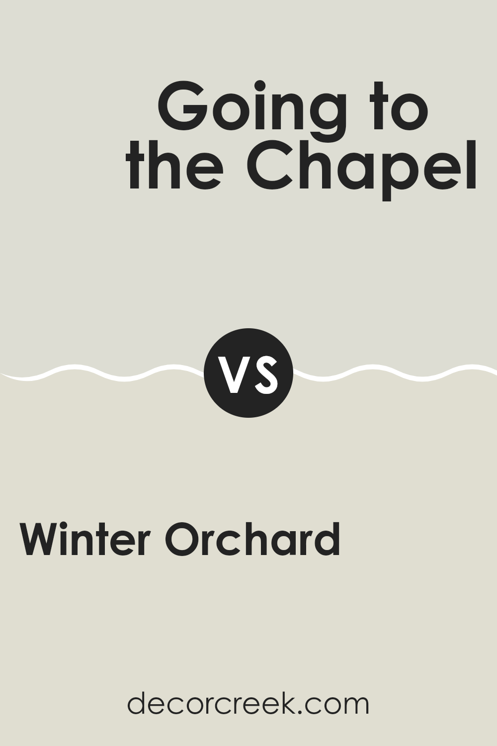
Winter Orchard 1555 by Benjamin Moore vs Going to the Chapel 1527 by Benjamin Moore
Winter Orchard and Going to the Chapel, both by Benjamin Moore, are subtle yet distinct shades that carry their unique characteristics. Winter Orchard has a mellow, warm tone that feels inviting, similar to the gentle color you might find on the surface of a vintage woolen blanket. This color lends a cozy, comforting feel to the room it occupies, making it suitable for areas where calmness and rest are desired.
On the other hand, Going to the Chapel has a clearer, more defined presence. It’s a bit cooler compared to Winter Orchard, reminding one of a misty morning. This color comes off as fresh and clean, making it an excellent choice for creating a bright and airy environment. It has the ability to refresh a room without overpowering it with brightness.
Both colors offer a soft backdrop for various interiors, but they create distinctly different moods tailored to personal preferences and the intended feel of a room.
You can see recommended paint color below:
- 1527 Going to the Chapel
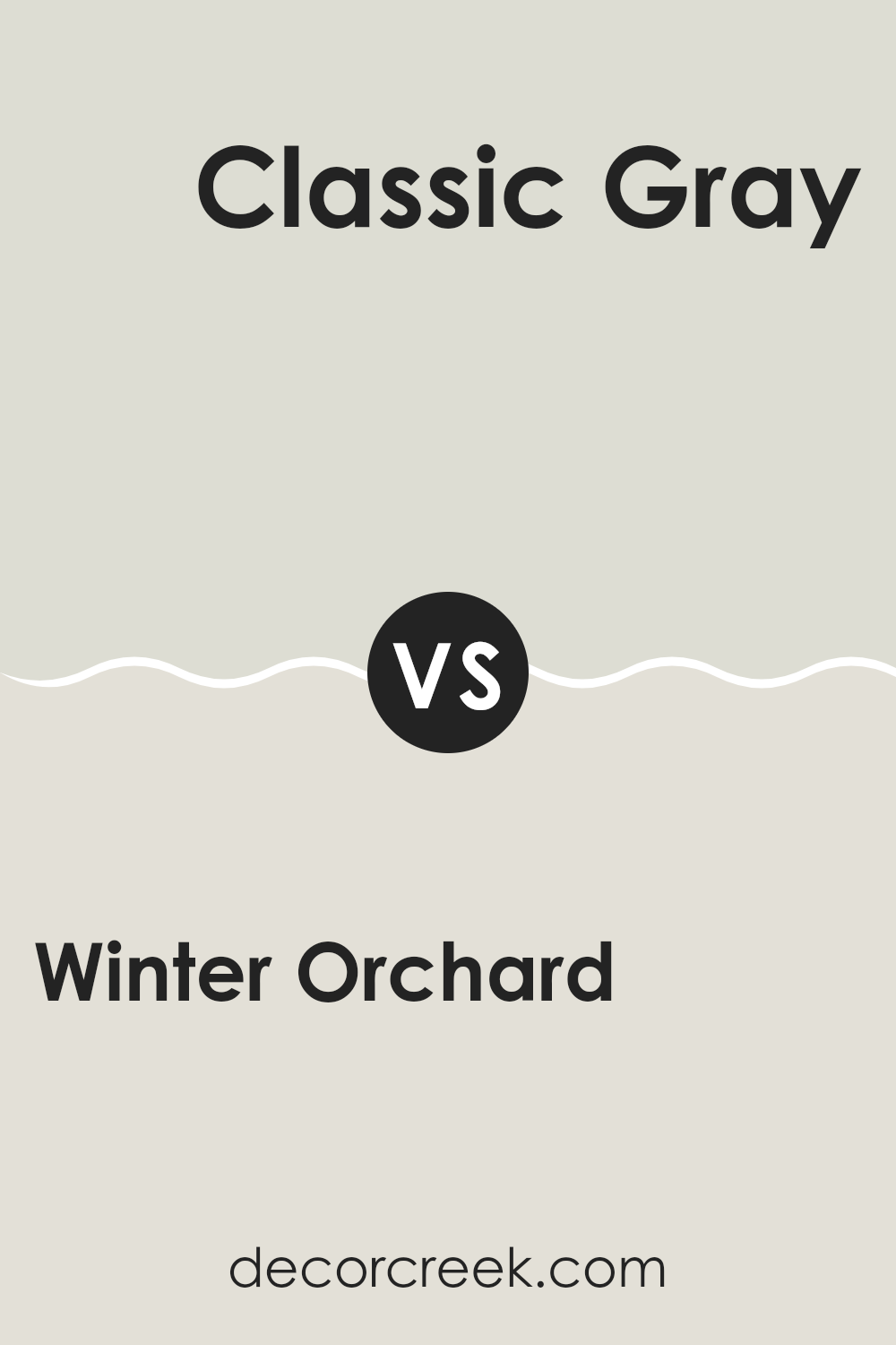
Winter Orchard 1555 by Benjamin Moore vs Classic Gray OC-23 by Benjamin Moore
Winter Orchard and Classic Gray are two paint colors from Benjamin Moore that share some similarities but also have distinct differences. Winter Orchard is a soft, muted beige with a warm undertone, making it a cozy and welcoming color for any room. It creates a subtle, calming backdrop, ideal for interiors where you want a touch of warmth without overpowering the senses.
On the other hand, Classic Gray is a light gray shade that leans toward a neutral palette, offering a clean and airy feel. This color is excellent for achieving a modern and minimalist look, as it provides a fresh and open atmosphere. It pairs well with a wide range of decor styles, from contemporary to traditional.
Both colors are flexible and can be used in various settings, such as living rooms, bedrooms, and kitchens. However, Winter Orchard tends to add a hint of warmth to rooms, while Classic Gray gives a crisper, more neutral appearance. This makes Classic Gray a better choice for those who prefer a more understated and classic aesthetic.
You can see recommended paint color below:
Winter Orchard 1555 by Benjamin Moore vs Sheep’s Wool 857 by Benjamin Moore
Winter Orchard and Sheep’s Wool, both by Benjamin Moore, offer a calming palette for any room, though they differ subtly in tone and warmth. Winter Orchard is a light neutral with a hint of beige, giving it a warm, welcoming feel. It’s a flexible color that works well in interiors that aim for a cozy and soft appearance.
On the other hand, Sheep’s Wool is also a neutral but has a deeper, creamier base, almost hinting at a soft gray. This color can add a slightly richer, yet still gentle touch to a room, providing a slightly more noticeable contrast against white trims or furniture than Winter Orchard.
Both colors lend themselves well to creating a relaxed atmosphere. Winter Orchard might be slightly brighter, making it ideal for smaller or darker rooms to give an illusion of lightness. Sheep’s Wool, being a tad darker, is great for adding a bit of depth and warmth to larger, well-lit rooms. Together, these colors could also complement each other in a single room, blending beautifully in a layered look.
You can see recommended paint color below:
- 857 Sheep’s Wool
After reading about the paint color 1555 Winter Orchard by Benjamin Moore, I’ve learned quite a lot about how this particular shade can affect the look and feel of a room. Winter Orchard is a soft gray with a hint of green, which makes it really calm and pleasant to look at. It reminds me of a quiet, peaceful day outside.
I found out that this color works really well in almost any room, whether it’s a living room, a bedroom, or even a bathroom. It’s especially good for places where you want to relax because it’s so gentle on the eyes. Also, it pairs nicely with many other colors, like whites, blues, and even some soft pinks, which means it’s pretty easy to find furniture and decorations that go with this paint.
Another cool thing about 1555 Winter Orchard is that it changes a bit depending on the light. During the day, it might look more gray, and at night, it could appear a bit more green. This keeps it interesting because the room can feel a bit different at different times.
In conclusion, using the paint color 1555 Winter Orchard by Benjamin Moore is a great choice if you’re looking for something simple yet effective. It’s calm, easy to match with other colors, and has a playful quality with its shifting shades. It’s certainly a neat option for making any room feel more comfortable and welcoming.
decorcreek.com
Ever wished paint sampling was as easy as sticking a sticker? Guess what? Now it is! Discover Samplize's unique Peel & Stick samples.
Get paint samples

