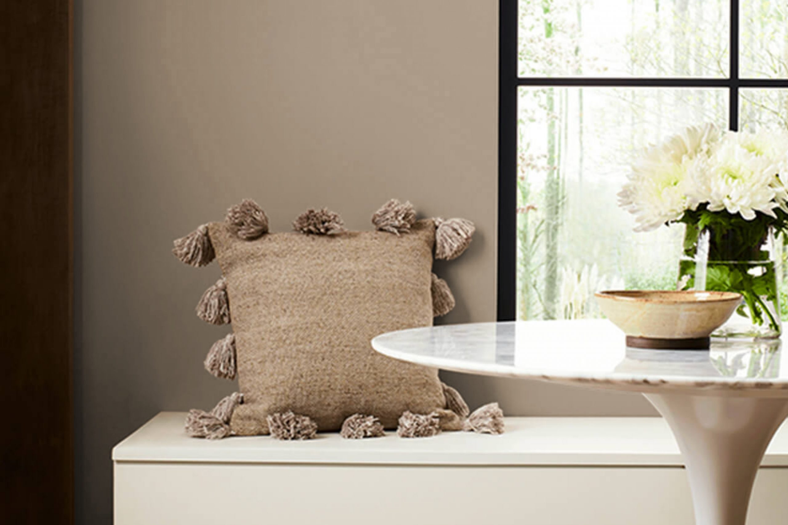
If you’re looking to refresh your space with a new paint color, SW 9618 Woodbridge by Sherwin Williams might just be the option you’re searching for. From my experience, this hue offers a timeless appeal, blending warmth and richness that can truly enhance the aesthetic of any room. Whether you’re aiming to repaint your living room, bedroom, or even a kitchen, Woodbridge provides a versatile backdrop that pairs well with various decor styles and furniture.
One of the remarkable qualities of Woodbridge is its ability to create a cozy, inviting atmosphere. Its earthy tones can help make a large room feel more intimate or give a small space a welcoming vibe.
For me, using this color in spaces where I spend a lot of time has had a calming effect, making it easier to unwind after a busy day.
Furthermore, if you’re interested in selling your home or just updating it, Woodbridge’s universally appealing color can work wonders in appealing to potential buyers or just refreshing your living space.
So, if you’re considering a change, Woodbridge could very well offer the solution you need to bring new energy into your home.
What Color Is Woodbridge SW 9618 by Sherwin Williams?
The color Woodbridge is a rich, deep brown with a warm, welcoming undertone, often likened to dark chocolate or a well-worn leather. This color emits a cozy, comfortable vibe, making it a great choice for creating a snug, inviting space. It’s particularly effective in living rooms, dining areas, and bedrooms where warmth is key to fostering a relaxed atmosphere.
Woodbridge works exceptionally well with a range of interior styles, especially rustic, traditional, and eclectic. In rustic settings, it complements natural materials like wood, stone, and linen, enhancing their inherent earthy qualities.
For traditional interiors, it pairs beautifully with classic materials such as polished wood furniture, rich velvet fabrics, and detailed trimmings that echo an old-world charm.
In eclectic rooms, this color can ground more vibrant and varied textures and elements, providing a solid visual anchor in the space.
Its versatility extends to its ability to work well with various textures. Smooth leather, chunky knits, heavy drapes, or sleek metallic finishes can all look fantastic against a Woodbridge backdrop. Soft lighting will also help to highlight its depth and warmth, making the overall feel of the room cozy and inviting.
Is Woodbridge SW 9618 by Sherwin Williams Warm or Cool color?
Woodbridge by Sherwin Williams is a warm, deep green paint color that creates a cozy and inviting atmosphere in any home. With its rich hue, it’s excellent for making large spaces feel more intimate and smaller rooms appear filled with character.
When used on walls, this color works great as a backdrop for both modern and traditional decor. Since it is a darker shade, it pairs well with light-colored furniture and accents like whites or creams, helping these elements to stand out. It also matches well with natural wood finishes, metals, and earthy tones, which can bring a balanced and grounded feeling to a room.
It can be used in various rooms such as living rooms, bedrooms, or even home offices for a striking effect. Additionally, its calming effect makes it a good choice for zones where you want to relax and unwind.
Undertones of Woodbridge SW 9618 by Sherwin Williams
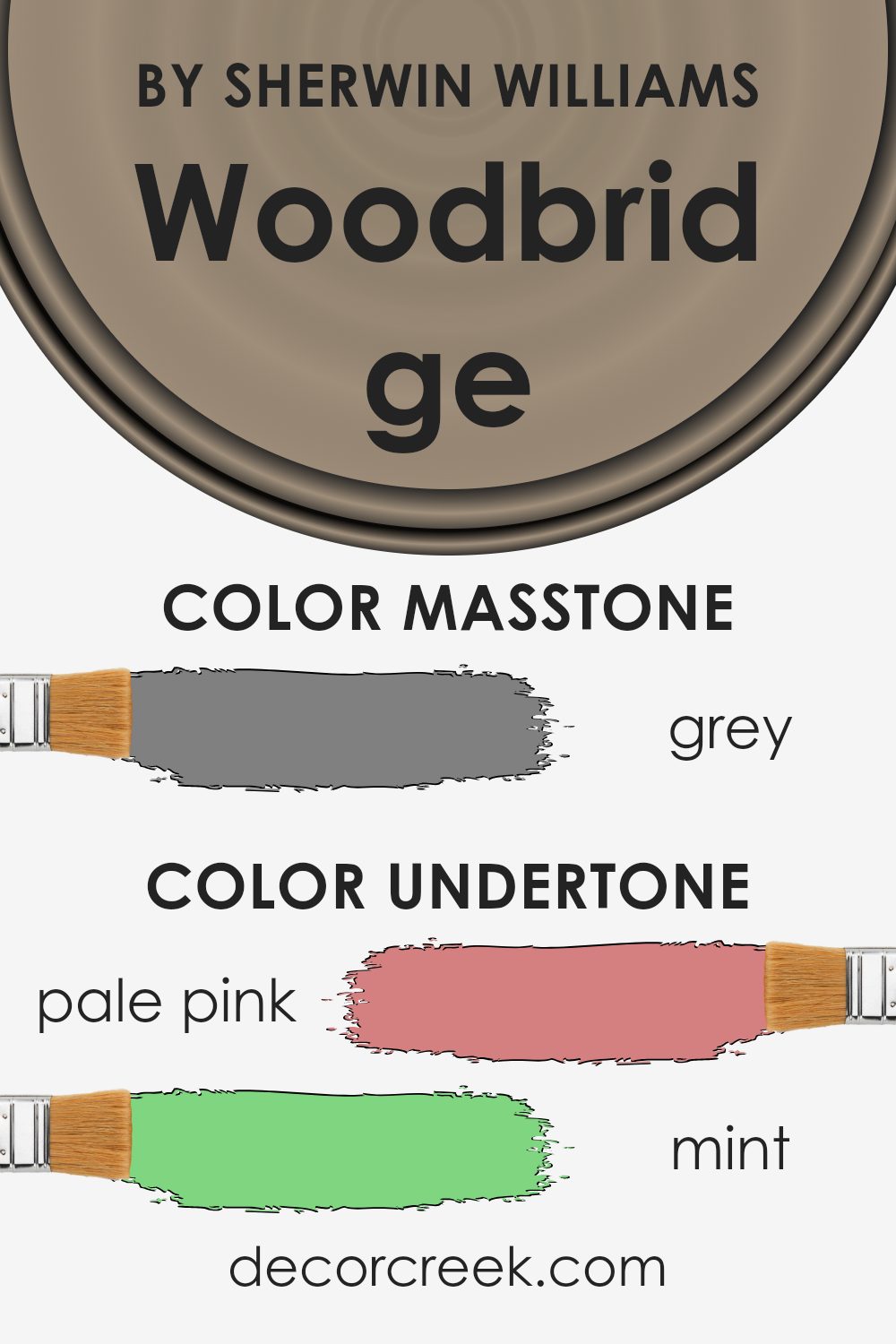
Woodbridge is a paint color that comes with a complex mixture of undertones. Instead of being just one flat color, it possesses hints of various other colors like pale pink, mint, lilac, and many more. These undertones play a crucial role in how the color is perceived under different lighting conditions and when paired with different decor elements.
When a color like Woodbridge is used on interior walls, the influence of its undertones becomes quite evident. For example, in a room with a lot of natural light, the pale yellow or light blue undertones might become more noticeable, giving the room a brighter and more airy feel. In contrast, in a room with less natural light, darker undertones such as olive or brown might stand out, giving the walls a richer and deeper look.
The variety of undertones also means that Woodbridge is a very versatile paint color. It can adapt and blend well with different furniture colors and styles. For instance, mint and light turquoise undertones can enhance the freshness of a space when matched with similar or complimentary decor elements, making the room feel coherent and pleasing.
Understanding these undertones can help in making informed decisions about paint choices, ensuring that the final look of the room aligns with the desired ambiance and style. Whether you want a cozy nook or a bright, lively living space, knowing how these undertones interact with light and space can greatly influence your decorating success.
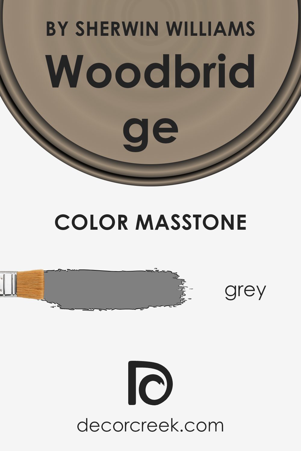
What is the Masstone of the Woodbridge SW 9618 by Sherwin Williams?
The color Grey, with code #808080, forms the base for the paint shade Woodbridge. When it’s used in homes, this grey gives any room a neutral, balanced look. It’s a middle-ground color, which means it’s not too dark or too light, making it a versatile choice for various spaces.
Whether in a busy kitchen, a cozy bedroom, or a lively living room, this particular grey can fit seamlessly. It’s great if you want to create a clean, simple look without making the space feel too stark or cold. Grey also acts as a backdrop to other colors, allowing bolder furniture or decor elements to stand out.
So, homes can keep their unique features in the spotlight, with the grey supporting by blending quietly in the background. This makes it easy to update or switch out accents without having to reconsider the wall color.
How Does Lighting Affect Woodbridge SW 9618 by Sherwin Williams?
Lighting plays a crucial role in how colors appear in different environments. It can significantly affect the mood in a room and even the appearance of the paint on the walls. Woodbridge is a warm paint color, which means it has tones that lean towards reds, oranges, or yellows, as opposed to cooler blues and greens.
When we talk about Woodbridge in artificial light, the type of bulb used has a big impact. Warm-toned bulbs enhance the coziness of Woodbridge, making it seem richer and more vibrant. Conversely, cooler bulbs might make the color look slightly muted, as they don’t reinforce the warm tones in the paint.
In natural light, the appearance of Woodbridge can change throughout the day. Morning light tends to be bluer, which could make the walls appear slightly more neutral. As the sun moves higher, the full warmth of Woodbridge will shine through, especially during the golden hours near sunset, making the space feel warm and welcoming.
The orientation of the room also matters. North-facing rooms get less direct sunlight, which might make Woodbridge appear more subdued and neutral, lacking the intensity seen in brighter lighting.
South-facing rooms, on the other hand, receive more intense light, bringing out the warmth and vibrancy of the color, making it appear lively and dynamic.
East-facing rooms enjoy bright morning light, which can make Woodbridge feel fresh and lively early in the day before becoming more neutral as the light fades.
West-facing rooms will experience the opposite, with the color feeling more subdued in the morning and becoming warmer and more vibrant in the afternoon and evening as it catches the sunset.
Overall, Woodbridge’s warm hue is versatile but reacts differently depending on the quality and direction of light, influencing the atmosphere and feel of the space. It’s crucial to consider the lighting when choosing this or any color for your walls.

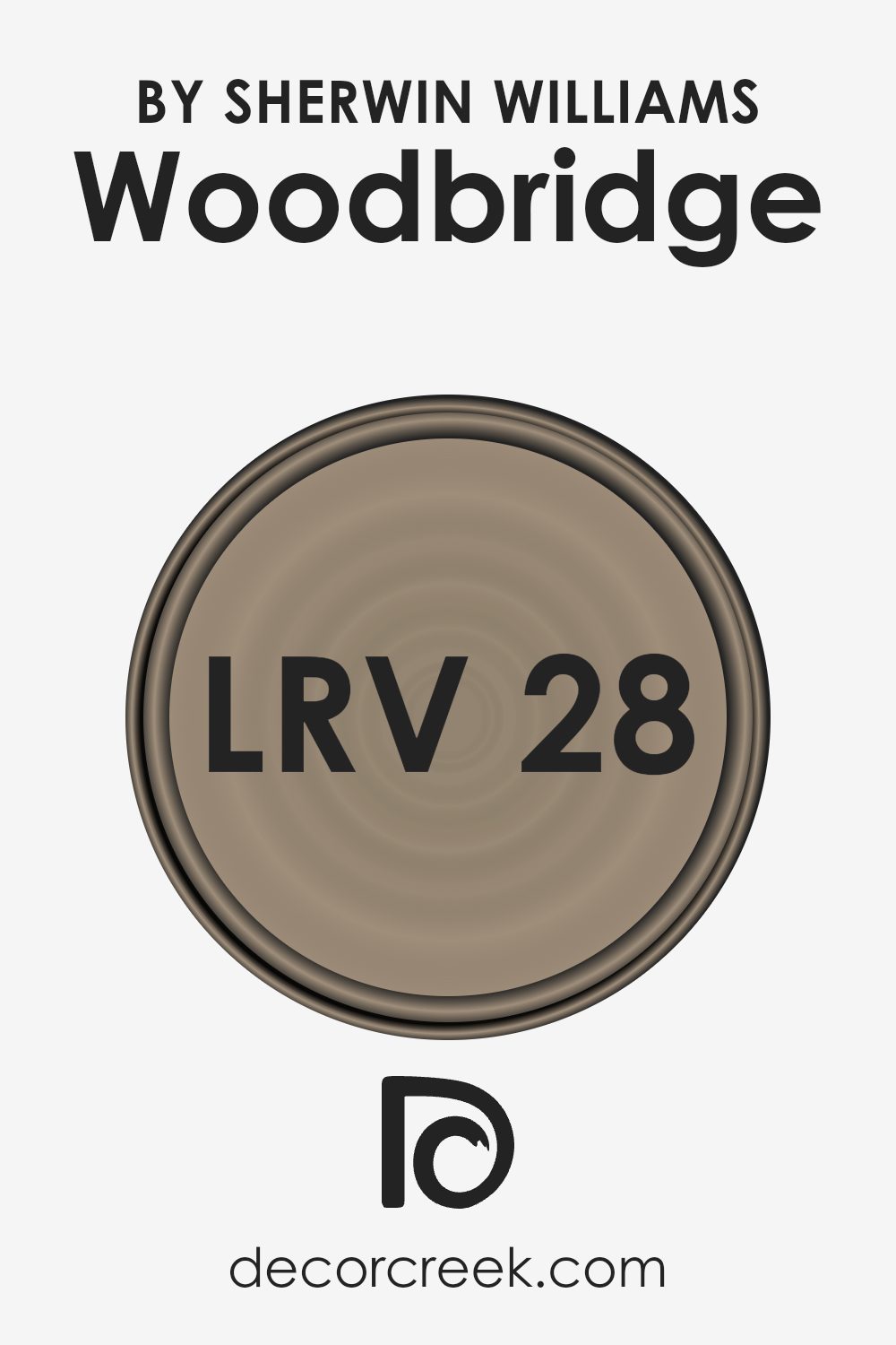
What is the LRV of Woodbridge SW 9618 by Sherwin Williams?
LRV stands for Light Reflectance Value, which is a measure of the amount of visible and usable light that gets reflected by a surface when light shines on it. The scale to measure LRV runs from a lowest value of 1% to a highest of 99%, where the higher the number, the more light the color reflects.
This measurement is very useful when choosing paint colors because it helps determine how light or dark a color will look on your walls once applied. A higher LRV means the color will appear lighter and can make a room feel more open and airy. Conversely, a lower LRV indicates that the color will look darker, which might make a space feel smaller but also cozier.
Sherwin Williams’ Woodbridge, with an LRV of 28.22, falls on the darker side of the spectrum. This means it won’t reflect a lot of light back into the room. As a result, if used in a small or poorly lit room, it could make the space appear even smaller and dimmer.
However, in a well-lit or larger room, this color can add a deep, rich tone to the walls, providing a warm and inviting atmosphere. It’s ideal for spaces where a darker color can enhance the aesthetic, like in a study or a cozy living area. Selecting the right lighting will be key to bring out the true beauty of this shade without it overpowering the space.
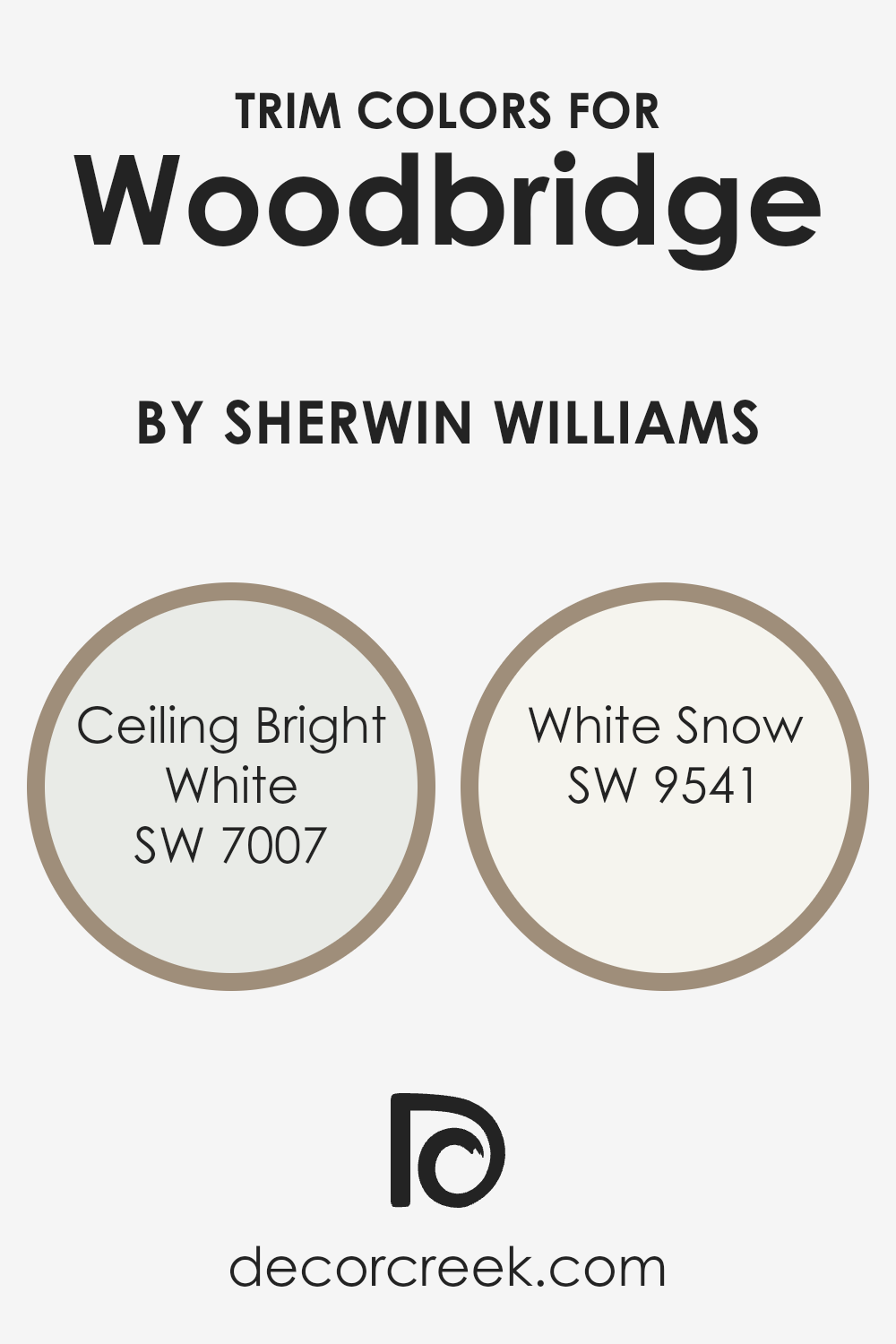
What are the Trim colors of Woodbridge SW 9618 by Sherwin Williams?
Trim colors are used to highlight the architectural features of a room such as baseboards, moldings, window and door frames, creating an attractive visual contrast with the primary wall colors. For a rich, warm hue like Woodbridge by Sherwin-Williams, choosing the right trim colors can subtly complement the overarching color scheme of the room without overwhelming it.
White trim colors, such as SW 7007 – Ceiling Bright White and SW 9541 – White Snow, provide a crisp, clean look that can help in defining the space more clearly, optimizing the impact of the main color by providing a refreshing visual boundary that enhances both appearance and dimension in a space.
SW 7007 – Ceiling Bright White is a bright and fresh shade of white that reflects light beautifully, making it an excellent choice for ceilings and trims to give a sense of greater height and space. SW 9541 – White Snow has a slightly softer tone, offering a gentle contrast against deeper, richer wall colors, and is perfect for creating a smooth, cohesive look in rooms where a stark contrast might be too striking. Together, these trim colors work harmoniously to complement a main color like Woodbridge, ensuring that the room feels welcoming and beautifully arranged.
You can see recommended paint colors below:
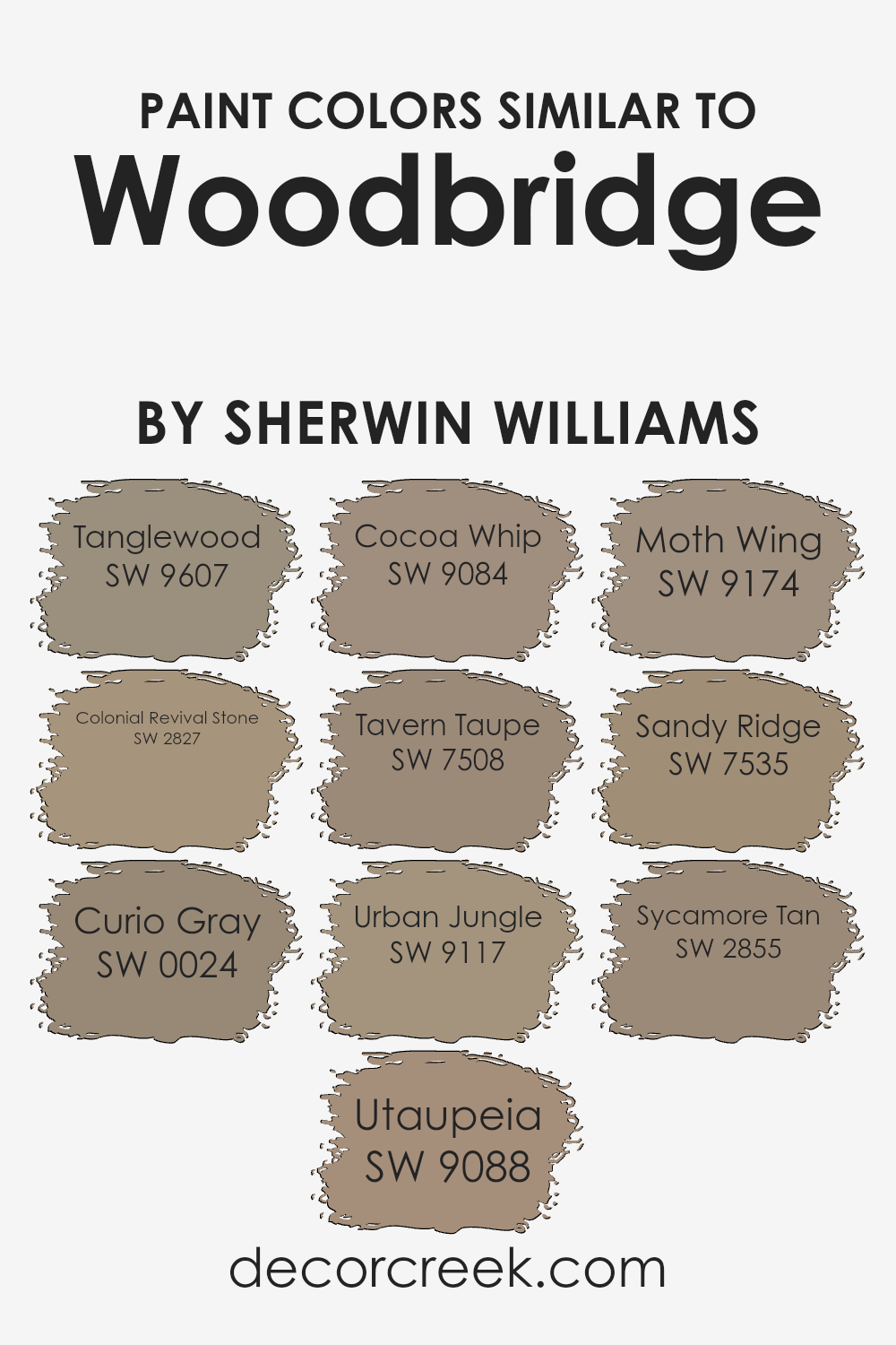
Colors Similar to Woodbridge SW 9618 by Sherwin Williams
In home decor, using similar colors like those associated with WoodbridgeSW 9618 by Sherwin Williams helps to create a cohesive and harmonious atmosphere. Such colors subtly relate to each other, easing the visual flow from one space to another.
For instance, SW 9607 – Tanglewood offers a warm beige that sets a cozy tone, much like the gentle hue of SW 2827 – Colonial Revival Stone, which exudes historical charm with its soft, sandy undertone. SW 0024 – Curio Gray provides a versatile, dusky gray with hints of lavender, pairing well with the deeper, earthy tones of SW 9088 – Utaupeia and SW 9084 – Cocoa Whip, both of which lend a soothing, neutral palette marked by hints of taupe.
These colors are excellent for spaces aiming for a unified yet varied palette, where subtle differences add interest without stark contrasts. SW 7508 – Tavern Taupe injects warmth with its red-brown undertone, similar to the jungle-inspired SW 9117 – Urban Jungle which brings a dark, leafy feel.
The dusty, gray-brown of SW 9174 – Moth Wing and the sandy warmth of SW 7535 – Sandy Ridge both enhance environments by adding understated, natural elements. Finally, SW 2855 – Sycamore Tan stands out with its golden tan shade that gives rooms a sunlit aspect, promoting a light, airy feel throughout the home. Each of these shades works together to instill a sense of unity within decor while still offering unique attributes that make each room distinct.
You can see recommended paint colors below:
- SW 9607 Tanglewood
- SW 2827 Colonial Revival Stone
- SW 0024 Curio Gray
- SW 9088 Utaupeia
- SW 9084 Cocoa Whip
- SW 7508 Tavern Taupe
- SW 9117 Urban Jungle
- SW 9174 Moth Wing
- SW 7535 Sandy Ridge
- SW 2855 Sycamore Tan
How to Use Woodbridge SW 9618 by Sherwin Williams In Your Home?
Woodbridge SW 9618 by Sherwin Williams is a versatile paint color that can bring a fresh, stylish look to your home. It has a crisp, neutral tone that makes it a good choice for many different spaces. If you’re considering using this shade, here are some ideas.
In the living room, Woodbridge can create a comforting, neutral background that goes well with both modern and traditional furniture. It’s great for larger areas and can make small spaces appear bigger. In the kitchen, use it on cabinets for a clean and updated look. It pairs nicely with wood tones and metallic finishes like stainless steel or brass.
Bedrooms also benefit from this color, providing a calm atmosphere conducive to relaxation. You can also think about using it in bathrooms to complement white fixtures. Overall, Woodbridge is a practical color that can fit a variety of design styles and personal tastes, making it a smart choice for refreshing your home’s look.
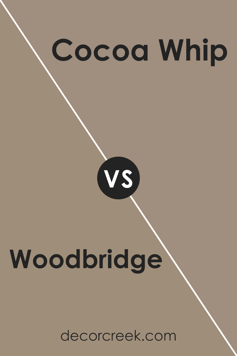
Woodbridge SW 9618 by Sherwin Williams vs Cocoa Whip SW 9084 by Sherwin Williams
Woodbridge and Cocoa Whip from Sherwin Williams are distinct yet harmonious colors. Woodbridge has a deep, warm brown tone that brings to mind dark chocolate or rich soil, offering a cozy and grounded feel to any space. It is darker and more pronounced, making it ideal for creating a strong presence or accent wall in a room.
On the other hand, Cocoa Whip is significantly lighter, leaning towards a soft, creamy beige. This color is much more subtle and versatile, providing a gentle backdrop that can easily blend with various decor styles and colors. Cocoa Whip could be the perfect choice for larger areas or entire rooms, as its lightness helps make spaces appear larger and more open.
When used together, these two colors can complement each other beautifully, with Cocoa Whip lightening the atmosphere and Woodbridge adding depth and warmth, creating a balanced and inviting environment.
You can see recommended paint color below:
- SW 9084 Cocoa Whip
Woodbridge SW 9618 by Sherwin Williams vs Curio Gray SW 0024 by Sherwin Williams
Woodbridge by Sherwin Williams is a deep and warm taupe shade that provides a sturdy and comforting presence in any space. It has a rich brown undertone that makes it cozy, perfect for living areas or bedrooms where you want to create a snug, inviting atmosphere.
On the other hand, Curio Gray by Sherwin Williams is lighter and leans more towards a true neutral gray. This color is versatile and subdued, making it easy to pair with a wide range of decor styles and colors. It works well in spaces that need a calm and unassuming backdrop, such as offices or modern living rooms.
While Woodbridge has a stronger presence with its darker, earthier tones suitable for cozy settings, Curio Gray offers a cleaner, more understated look that can help to open up a space and give it a fresh, airy feel. Both colors have their unique appeal depending on what you want to achieve in a room.
You can see recommended paint color below:
Woodbridge SW 9618 by Sherwin Williams vs Urban Jungle SW 9117 by Sherwin Williams
Woodbridge and Urban Jungle, both by Sherwin Williams, offer distinct moods through their hues. Woodbridge is a deep, rich green, somewhat reminiscent of forest shadows. It gives off an earthy and grounding feel, perfect for spaces where you want a feel of calm and natural comfort, such as living rooms or study areas.
On the other side, Urban Jungle is a lighter, more vibrant green. It has a freshness to it that can brighten up a room. This color could be a great choice for kitchens or any space that benefits from a lively and refreshing atmosphere.
In essence, while both colors belong to the green family, Woodbridge delivers a deeper, traditional tone that helps create a cozy, secure space. Urban Jungle, in contrast, offers a brighter, energizing touch that can make any space feel more alive. Ultimately, your choice between the two would hinge on whether you want your room to feel more secluded and cozy, or fresh and vibrant.
You can see recommended paint color below:
- SW 9117 Urban Jungle
Woodbridge SW 9618 by Sherwin Williams vs Tavern Taupe SW 7508 by Sherwin Williams
Woodbridge and Tavern Taupe are two distinct neutral shades from Sherwin Williams. Woodbridge has a robust, rich brown tone that feels warm and cozy, making it a great choice for spaces where you want a comforting and inviting atmosphere. It works well in living rooms or dining areas where its depth can make the space feel more welcoming.
On the other hand, Tavern Taupe is a lighter, softer brown with a beige undertone. This color is more versatile and can easily fit into various parts of a home, including bedrooms and common areas. Its lighter shade can make a room feel larger and brighter, offering a subtle warmth that isn’t overwhelming.
Both colors can work beautifully in homes that aim for a natural, earthy vibe, but the choice between them depends on how bold or subtle you want to go. Woodbridge, being darker, may hide marks and wear better, whereas Tavern Taupe offers a more neutral backdrop that pairs easily with other hues.
You can see recommended paint color below:

Woodbridge SW 9618 by Sherwin Williams vs Tanglewood SW 9607 by Sherwin Williams
Woodbridge and Tanglewood by Sherwin Williams are both welcoming, warm tones, yet they hold distinct characters. Woodbridge is a deep, rich brown that brings to mind the natural darkness of well-aged wood or fertile earth.
It has a grounded feel, making it excellent for creating a cozy and comfortable atmosphere in spaces like living rooms or studies. On the other hand, Tanglewood is lighter, bearing a resemblance to sandy beaches or light caramel. This color feels softer and airier, ideal for brightening up a space or adding a gentle, soothing touch to interiors. While Woodbridge provides depth and warmth, Tanglewood offers a lighter, more relaxed vibe.
Together, they can complement each other well in a room, using Tanglewood for walls and Woodbridge for trim or accent features to create a balanced look.
You can see recommended paint color below:
Woodbridge SW 9618 by Sherwin Williams vs Sycamore Tan SW 2855 by Sherwin Williams
Woodbridge and Sycamore Tan are two interesting colors offered by Sherwin Williams. Woodbridge is a dark, rich brown with hints of gray, giving it a solid and grounding presence. It works well in spaces where you want a strong, defining base color that adds depth without overpowering the room.
On the other hand, Sycamore Tan is a lighter, more subdued shade. It leans towards a warm beige color, offering a softer look that is easy to match with various decor styles. This color is especially useful in smaller rooms or spaces where you wish to enhance the feeling of spaciousness and light.
While both colors can create a cozy and welcoming atmosphere, Woodbridge offers a more dramatic effect due to its deeper tone. Sycamore Tan, with its lighter and warmer tones, provides a calmer, airy feel, making it adaptable and widely appealing for different spaces and lighting conditions. These two colors can also complement each other well when used together in a color scheme.
You can see recommended paint color below:
- SW 2855 Sycamore Tan
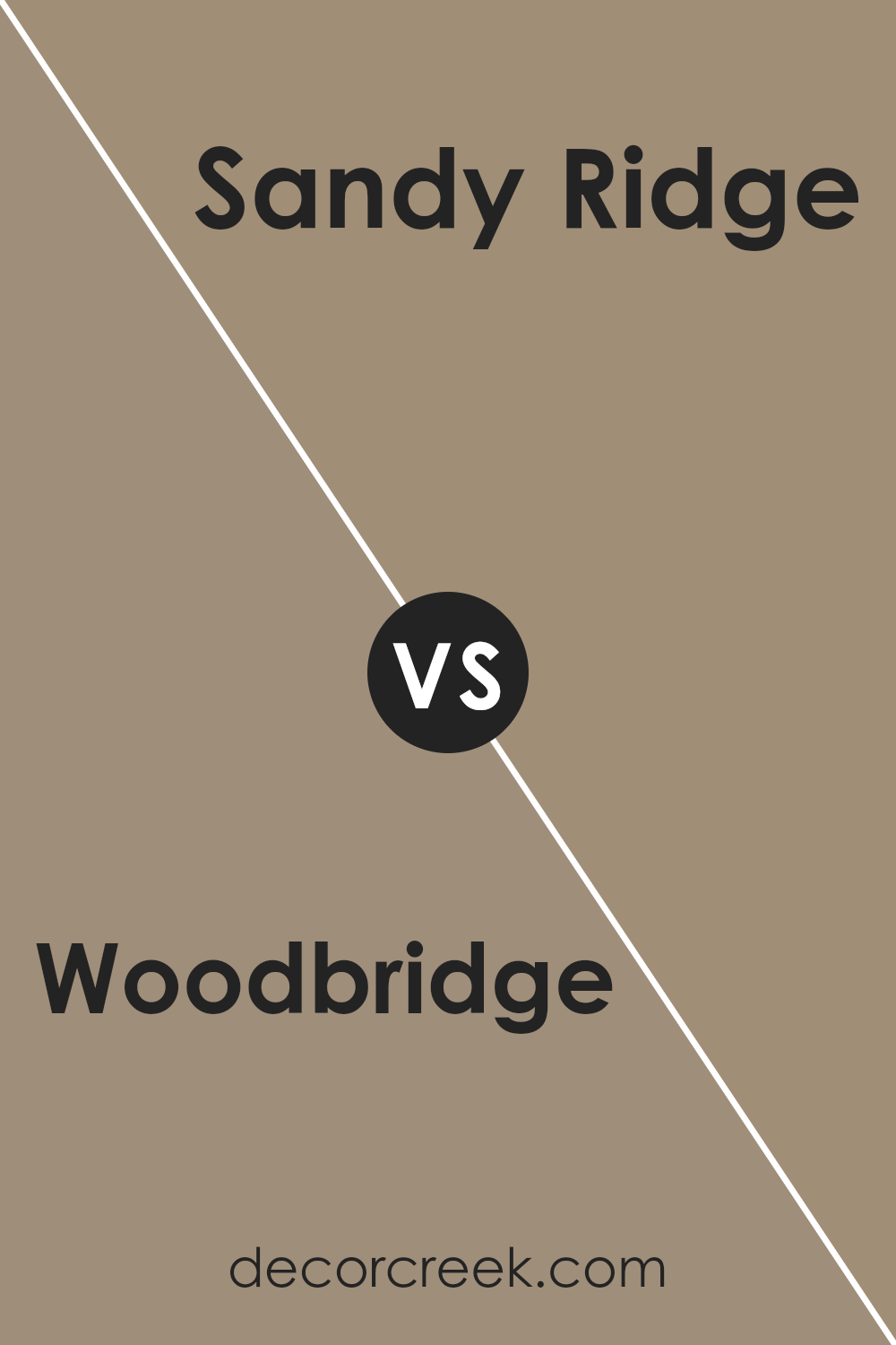
Woodbridge SW 9618 by Sherwin Williams vs Sandy Ridge SW 7535 by Sherwin Williams
The main color, Woodbridge, is a deep, warm brown with a cozy feel, and it adds a comforting presence to any room. On the other hand, Sandy Ridge is lighter, leaning towards a soft taupe that has hints of gray. This second color feels airy and can make a space look larger and more open.
comparing the two, Woodbridge provides a strong, anchoring effect that works well in areas where you want a sense of warmth and richness, like in a study or living room. Sandy Ridge, with its lighter tone, is versatile for various spaces, bringing a gentle, welcoming vibe that pairs well with a wider range of décor.
If you want to create a more grounded, intimate setting, Woodbridge is the better choice. If you aim to keep a room feeling light and spacious, Sandy Ridge would be the preferable option. Both colors work harmoniously together, allowing for a blend of light and dark tones in your decorating scheme.
You can see recommended paint color below:
- SW 7535 Sandy Ridge
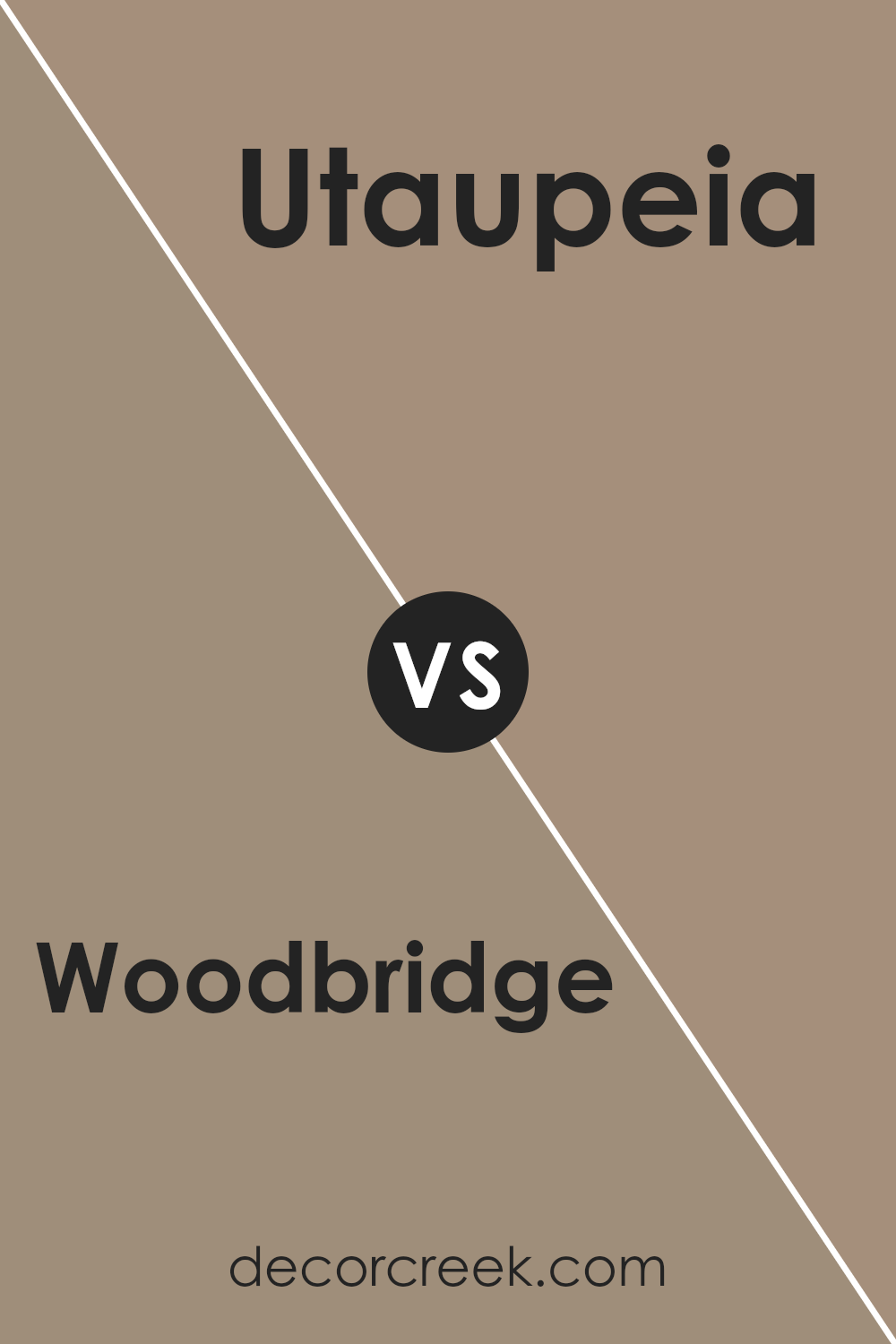
Woodbridge SW 9618 by Sherwin Williams vs Utaupeia SW 9088 by Sherwin Williams
The color Woodbridge is a deep brown shade with warm undertones, giving it a natural and cozy feel, ideal for creating a welcoming environment. It works well in spaces that aim for a traditional or rustic aesthetic. This color pairs nicely with lighter tones to provide a balanced contrast.
On the other hand, Utaupeia is a unique blend of gray and brown, offering a more subdued and neutral option. This versatility makes Utaupeia a useful choice for various decorating styles, as it can easily complement brighter colors or serve as a main color scheme in minimalist designs.
Both Woodbridge and Utaupeia are suitable for those who prefer earthy tones, but the former leans towards a richer, more pronounced appearance while the latter maintains a lighter, more understated vibe. Each color has its distinct personality, making them suitable for different tastes and design objectives.
You can see recommended paint color below:
- SW 9088 Utaupeia
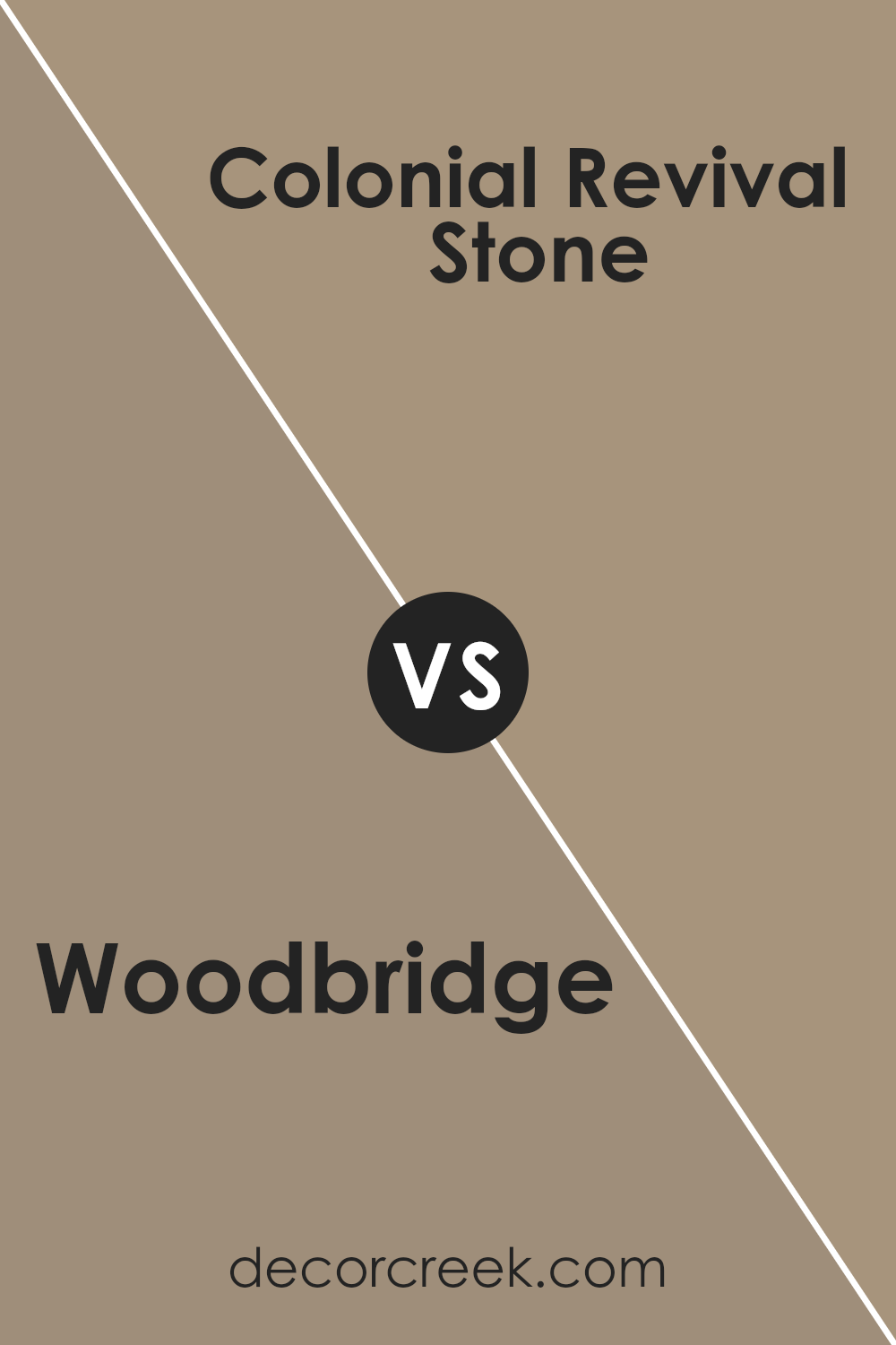
Woodbridge SW 9618 by Sherwin Williams vs Colonial Revival Stone SW 2827 by Sherwin Williams
Woodbridge and Colonial Revival Stone, both by Sherwin Williams, offer distinct tones for decorating spaces. Woodbridge is a darker, earthy hue, resembling the rich, deep color of fertile soil.
It brings a warm and cozy feel to a room, making it ideal for spaces where you want a comforting and inviting atmosphere, such as living rooms or bedrooms. On the other hand, Colonial Revival Stone is a lighter, more neutral beige. It has a versatile character that works well in various settings, offering a clean and calm background that can match easily with different decors and styles.
This color is especially good for areas where you want to highlight other design elements. When used together, these two colors can create a balanced look, with Colonial Revival Stone brightening spaces and Woodbridge adding depth and warmth.
You can see recommended paint color below:
- SW 2827 Colonial Revival Stone
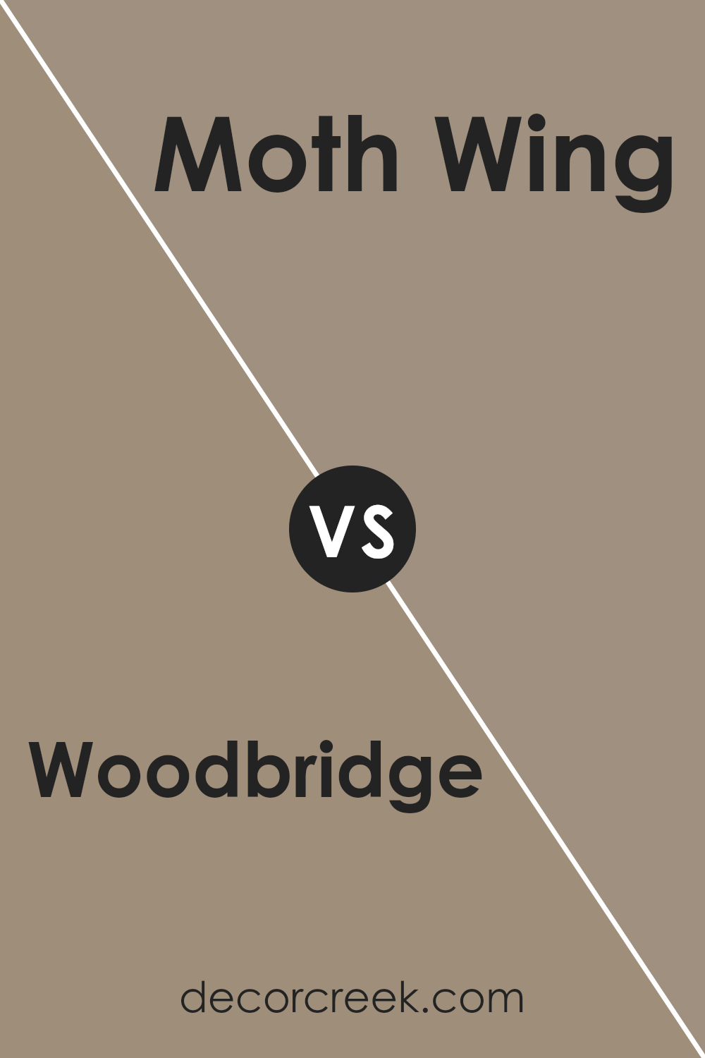
Woodbridge SW 9618 by Sherwin Williams vs Moth Wing SW 9174 by Sherwin Williams
Woodbridge is a warm, rich brown color that gives a cozy and inviting atmosphere to any space. It mirrors the natural hues of earth and wood, making it perfect for creating a welcoming environment. On the other hand, Moth Wing is a lighter, softer shade of brown with gray undertones.
This color is subtle yet adds a quiet warmth to rooms, ideal for achieving a gentle and relaxed feel. When comparing the two, Woodbridge stands out as a stronger and darker color, which can make a room feel smaller but more snug.
Moth Wing, lighter in tone, can make a space look more open and airy. Both colors work well in a variety of settings but serve different moods: Woodbridge suits a bold, cozy aesthetic, while Moth Wing is better for a softer, minimalist look.
You can see recommended paint color below:
Conclusion
This shade of brown has a cozy feel to it, which can make a room feel like a comfy place to relax. Whether you want to paint a living room, a bedroom, or even a reading nook, Woodbridge seems like a smart pick because it’s not too dark or too light, just the perfect tone to make a room feel welcoming.
What’s also nice about this color is that it works well with other colors, so you can pair it with light colors like beige or with bold colors like navy, and it will still look good. This makes it easy for decorating because you won’t have to worry too much about things clashing.
In conclusion, SW 9618 Woodbridge by Sherwin Williams is a solid choice for anyone looking to paint their room in a color that makes it feel warm and cozy. It’s flexible enough to fit with different styles and easy enough to match with other colors, making decorating a breeze.
If you want a color that makes your space feel welcoming and warm, Woodbridge is the way to go.

Ever wished paint sampling was as easy as sticking a sticker? Guess what? Now it is! Discover Samplize's unique Peel & Stick samples.
Get paint samples

