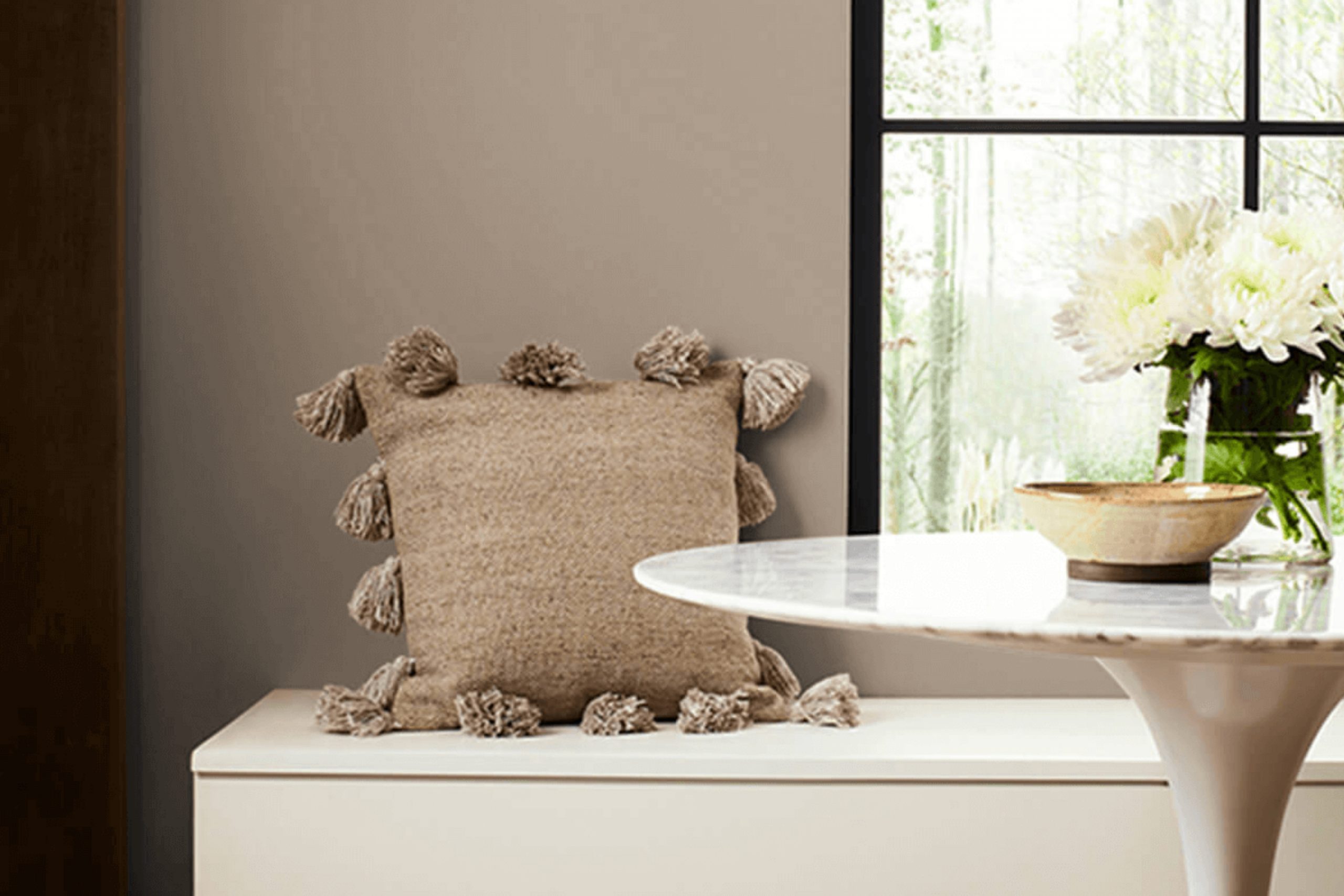
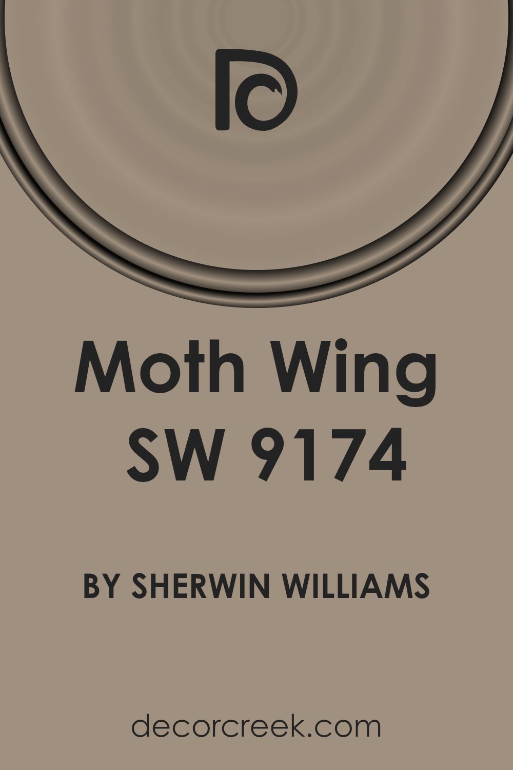
In exploring the perfect paint color for your home, you might find SW 9174 Moth Wing by Sherwin Williams to be a fantastic choice. This shade effortlessly brings warmth and sophistication to any space. As a soft, muted gray with a touch of brown, Moth Wing offers versatility, working wonderfully in various settings, whether you’re aiming to enhance a cozy bedroom or add a refined touch to your living area.
The beauty of Moth Wing lies in its subtle ability to shift under different lighting conditions, displaying unique tones that add depth and interest to your walls. This adaptability makes it a reliable option for those who appreciate a color that can integrate seamlessly into various decor styles and color schemes.
If you’re considering a new look for your home, Moth Wing provides a solid and soothing backdrop that complements both contemporary and traditional designs.
You’ll appreciate how this color supports a wide range of decorative choices, from bold and vibrant accessories to more understated, classic pieces.
As you plan your space, consider how lighting and accompanying colors can interact with Moth Wing to create the ideal atmosphere you’re aiming for in your home.
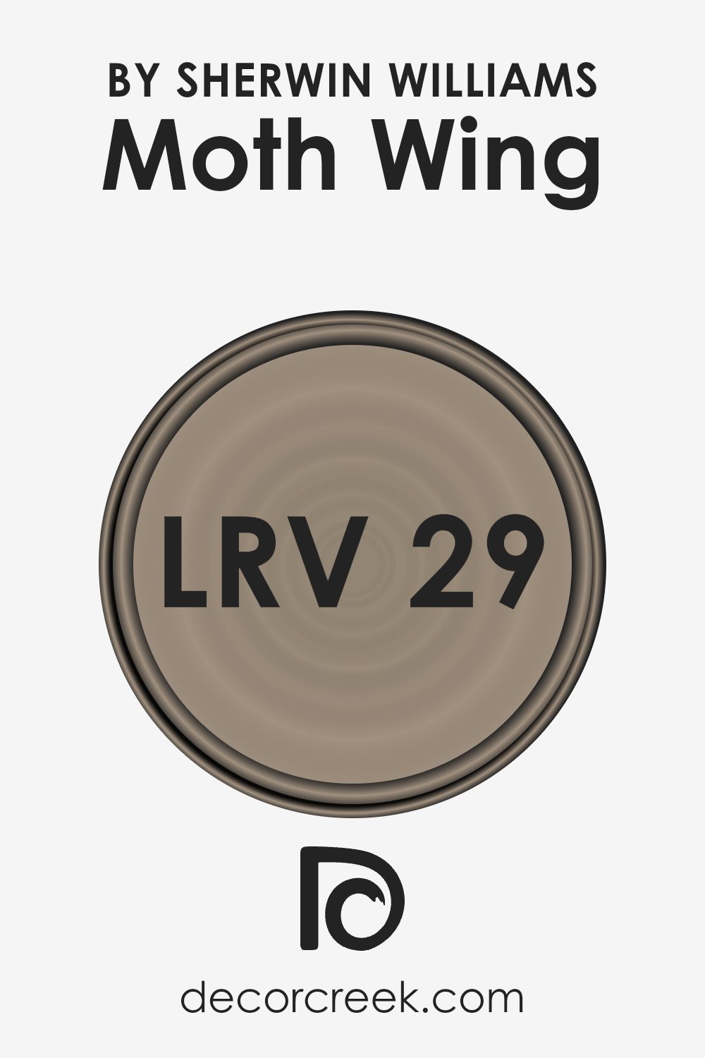
What Color Is Moth Wing SW 9174 by Sherwin Williams?
Moth Wing by Sherwin Williams is a warm, inviting beige color that brings a sense of calm and coziness to any room. With its muted undertones, this shade acts as a perfect neutral backdrop, allowing other colors to pop while maintaining a harmonious overall look. The color is versatile, making it an ideal choice for a variety of interior styles, including rustic, contemporary, and traditional decor.
Moth Wing pairs exceptionally well with natural materials like wood, contributing to a grounded, earthy aesthetic. When combined with wooden furniture or flooring, it enhances the space with a rustic charm.
In a contemporary setting, this color works beautifully with metallic accents such as copper or brass, offering a subtle contrast and a touch of elegance.
When thinking of textures, Moth Wing complements soft, luxurious fabrics like velvet or silk, adding a layer of warmth to the environment. It also matches well with heavier textures like burlap and linen, providing a tactile element that enriches the space.
This color can be used in various areas of the home, from living rooms and bedrooms to kitchens and bathrooms. Its adaptability and warm undertone make it a reliable choice for anyone looking to create a welcoming and stylish interior.
Is Moth Wing SW 9174 by Sherwin Williams Warm or Cool color?
Moth Wing by Sherwin Williams is a warm, welcoming brown shade that brings a cozy and comfortable atmosphere to any home. Its earthy tone pairs beautifully with a variety of other colors, from soft creams to bold blues, making it quite versatile for decorating. This color works especially well in living rooms and bedrooms where a calm and relaxed environment is desirable.
The muted quality of Moth Wing ensures that it complements natural materials, like wood and leather, enhancing the aesthetic without overpowering spaces. It’s an excellent choice for those looking to add a gentle touch of warmth to their home without going too dark or overwhelming.
Additionally, this color can help to hide small imperfections on walls, making maintenance simpler. Overall, Moth Wing is perfect for creating a cozy and inviting space with minimal effort.
Undertones of Moth Wing SW 9174 by Sherwin Williams
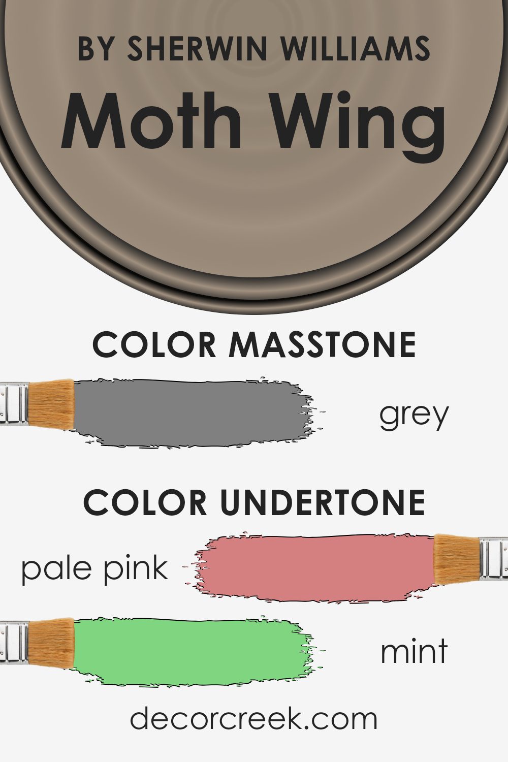
Moth Wing is a nuanced paint color with a blend of subtle undertones that can significantly affect its appearance on interior walls. This color contains hints of various shades such as pale pink, mint, pale yellow, and others. These undertones impact how Moth Wing looks under different lighting conditions and when paired with various decor elements.
Undertones are essentially subtle colors that lie beneath the surface of the main color. They can enhance or mute the main color depending on the lighting and surrounding colors.
For example, in a room with ample natural light, Moth Wing might reveal its pale yellow or light green undertones, giving the space a slightly warmer and more inviting feel.
Conversely, in a space with less natural light, darker undertones like olive or dark grey might become more prominent, making the color appear more muted and cooler.
When used on interior walls, Moth Wing’s complexity allows it to adapt beautifully to various styles and themes. The undertones can either recede or come to the foreground based on the room’s furnishings and other color elements. For instance, pairing Moth Wing with soft furnishings in mint or pale pink can draw out its warmer undertones, making the room feel cozy. On the other hand, using accents in dark turquoise or navy can highlight its cooler, more reserved side.
Overall, the unique mix of undertones in Moth Wing makes it a versatile choice for interior spaces, enabling it to harmonize with a wide range of designs and preferences.
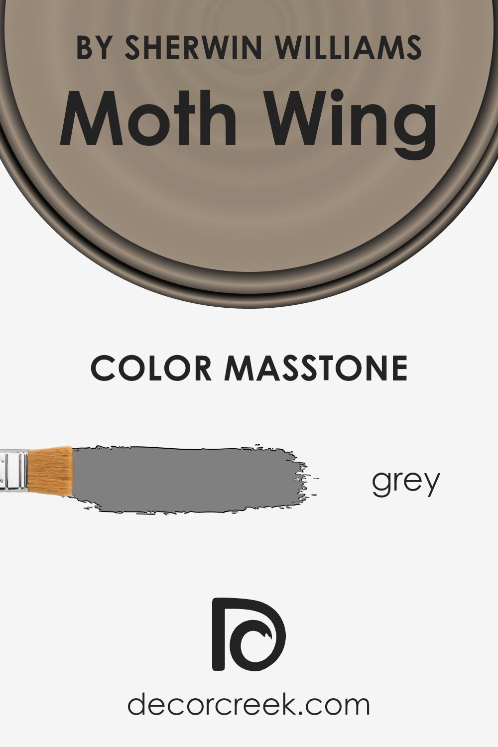
What is the Masstone of the Moth Wing SW 9174 by Sherwin Williams?
Moth Wing SW 9174 by Sherwin Williams has a masstone of grey, specifically Grey(#808080). This base shade plays a crucial role in how the color interacts with home environments. Being a middle ground between black and white, this grey masstone makes Moth Wing versatile and harmonious.
It can easily blend with various decor elements and works well in spaces that seek a neutral, balanced backdrop. This adaptability means it complements different styles and colors without overwhelming the space.
Whether in a living room, bedroom, or kitchen, the neutral grey base helps maintain a calm and collected atmosphere, making it easier for homeowners to match furniture and accessories.
It also provides a subtle depth that can enhance the room’s aesthetics without being the center of attention, which is ideal for creating a cohesive look throughout the home.
How Does Lighting Affect Moth Wing SW 9174 by Sherwin Williams?
Lighting plays a crucial role in how we perceive colors. A color might appear vibrant and lively under one lighting condition and dull or different under another. This is because light sources vary in their color temperatures and intensities which can alter the appearance of colors.
Take the color Moth Wing by Sherwin Williams, for instance. It’s a muted shade that can look quite different depending on the lighting. Under artificial light, such as incandescent bulbs, this color tends to appear warmer and richer. The yellowish tint of these bulbs adds a cozy and inviting feel to the room.
In contrast, under natural daylight, Moth Wing appears truer to its original shade. Daylight, generally being cooler, can make this color look more neutral and calm, showing off its true gray-beige tone without the influence of color-adding light bulbs.
The orientation of a room also affects how Moth Wing looks. In north-facing rooms, which receive less direct sunlight and tend to have cooler light, this color might appear slightly more gray and subdued.
It can give the room a calm and steady feel. In south-facing rooms, however, with abundant sunlight throughout the day, Moth Wing will warm up significantly, looking lighter and more welcoming.
Similarly, in east-facing rooms, Moth Wing will catch the morning light, appearing softer and warmer in the mornings but returning to its truer shade as the day progresses and the natural light diminishes. West-facing rooms reveal a reverse pattern, with the color staying more neutral during the day and warming up in the late afternoon to evening as sunlight fills the room.
Hence, depending on where it is used and the kind of light it is exposed to, Moth Wing by Sherwin Williams can offer a range of atmospheres from a single paint color.

What is the LRV of Moth Wing SW 9174 by Sherwin Williams?
LRV stands for Light Reflectance Value, which is a measurement used to determine how much light a paint color reflects or absorbs. This scale measures from 0 on the lower end up to 100 on the higher end, indicating the highest reflectiveness possible.
A high LRV means the color reflects more light, making spaces feel larger and more open, while a lower LRV indicates that the color absorbs more light, which can make a room feel cozier and slightly smaller.
This value is particularly useful to consider when selecting paint colors for different environments, as it helps to predict how light or dark a color will look on the walls once applied.
Considering the LRV of 29.104 for Moth Wing, it is on the lower side of the scale. This means it doesn’t reflect as much light, which could make this color a good choice for a room that aims for a more intimate and enclosed atmosphere. This particular shade might appear quite deep and rich, enhancing its presence in a space.
For rooms with less natural light or smaller spaces, integrating light-colored furnishings or decor could help balance the ambiance, preventing the room from feeling too dim. Conversely, in well-lit, spacious rooms, this color could add a touch of warmth and grounding.
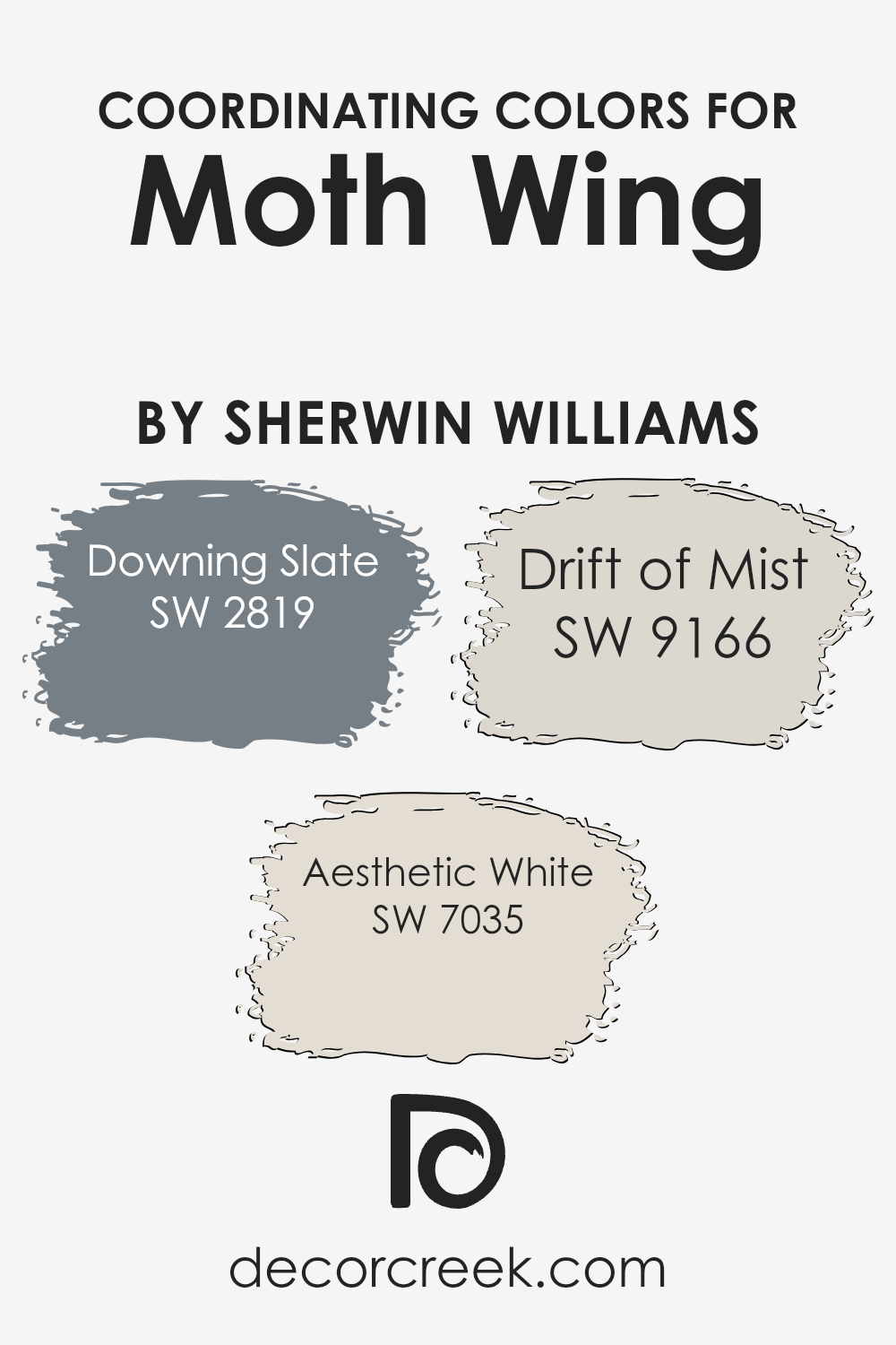
Coordinating Colors of Moth Wing SW 9174 by Sherwin Williams
Coordinating colors are selected hues that harmonize well together to create a balanced and aesthetically pleasing palette, enhancing the main color without overpowering it. For Moth Wing by Sherwin Williams, a rich, muted color inspired by the natural shade of a moth’s wing, there are specific coordinating colors that complement it. These tones help to bring out Moth Wing’s unique qualities, ensuring the room has a cohesive look.
Downing Slate, a deep slate blue, adds a strong but balanced contrast to Moth Wing, perfect for creating depth in a space when used on accent pieces or feature walls.
Aesthetic White is a soft, off-white shade that brightens spaces subtly, providing a gentle lift to the muddy warmth of Moth Wing without clashing.
It works well on trim or moldings to delineate surfaces cleanly. Lastly, Drift of Mist offers a light, airy gray that bridges the darker tones of Moth Wing and the lightness of Aesthetic White, ideal for adjacent walls or as a backdrop in multi-colored rooms.
These coordinating colors, when used together, ensure a harmonious environment that looks well-planned and pleasing to the eye.
You can see recommended paint colors below:
- SW 2819 Downing Slate
- SW 7035 Aesthetic White
- SW 9166 Drift of Mist
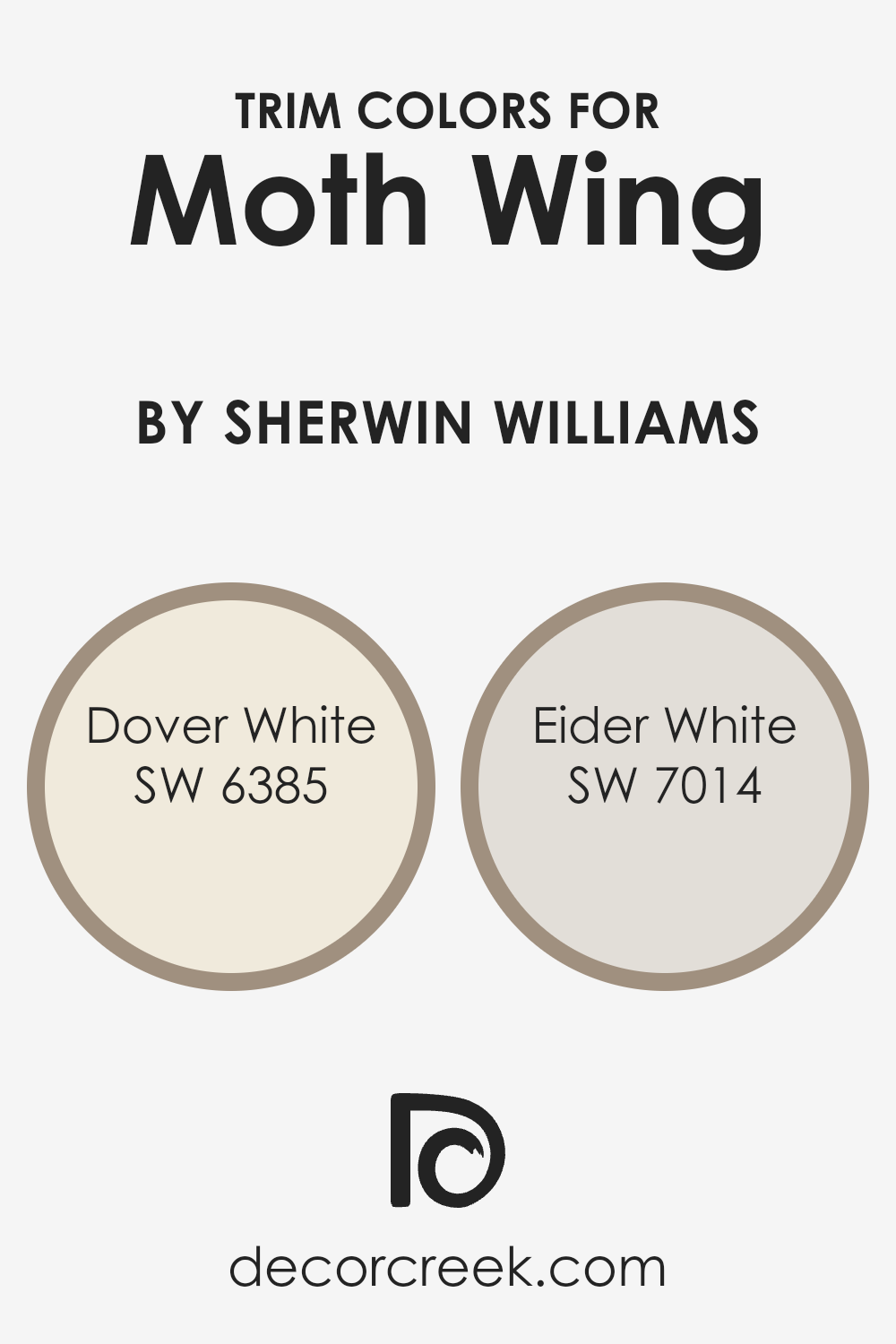
What are the Trim colors of Moth Wing SW 9174 by Sherwin Williams?
Trim colors are specific shades used to accentuate or complement the main colors on walls or exteriors, highlighting architectural details such as doors, windows frames, and baseboards. Choosing the right trim color can enhance the overall aesthetics of a space, making it appear more finished and cohesive.
For Moth Wing by Sherwin Williams, a deep and neutral tone, using lighter trim colors like Dover White or Eider White can create a pleasing contrast that allows the richness of Moth Wing to stand out, making the room feel more balanced and inviting.
Dover White SW 6385 is a warm, creamy white that brings a soft and welcoming feel to any space. It pairs beautifully with darker shades, providing a gentle contrast that is easy on the eyes.
Eider White SW 7014, on the other hand, is a cooler shade of white with a hint of gray, offering a subtle, fresh contrast that can make darker colors like Moth Wing appear more distinct and refined.
Together, these trim colors work wonderfully to highlight and complement the depth and character of Moth Wing, enhancing the visual appeal of an interior.
You can see recommended paint colors below:
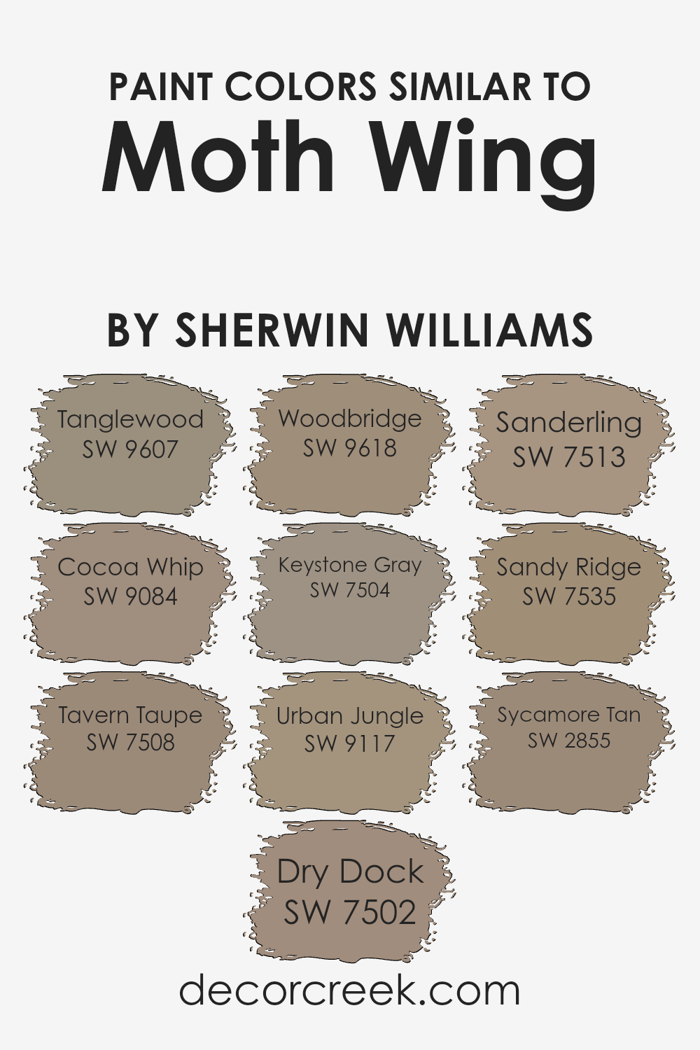
Colors Similar to Moth Wing SW 9174 by Sherwin Williams
Using similar colors in a design can create a harmonious and coherent visual experience, effectively setting a mood or accentuating architectural details without overwhelming the senses. These hues share a common color intensity and undertone that make them easy to mix, yet different enough to add visual interest and depth. A good example of how this works can be seen in colors related to Moth Wing by Sherwin Williams, which all share a warm, neutral base.
Tanglewood is a soft, earthy beige that brings a gentle warmth to any space, making it feel cozy and welcoming.
Cocoa Whip has a slightly richer, creamier tone that adds a subtle depth, perfect for creating a soothing backdrop.
Tavern Taupe and Dry Dock both offer deeper taupe shades that give a bit of gravity and anchor the lighter tones beautifully. Woodbridge is another warm hue, but with a woodsy touch that lends a natural, grounded feel to interiors. Keystone Gray strikes a balance, adding a hint of coolness that complements the warmer tones around it.
Urban Jungle introduces a gray-green that calls to mind lush foliage, adding an organic touch to the palette.
Sanderling is a lighter, sandy color that brightens spaces effortlessly.
Sandy Ridge, a bit deeper than Sanderling, offers a dusky tan that works well in creating a soft transition from dark to light shades. Lastly, Sycamore Tan has a golden glow that enriches the overall palette, perfect for adding a pinch of sunny warmth.
These colors work together seamlessly, offering a palette that is coherent and accessible, making it easy for anyone to create professional-looking and aesthetically pleasing interior spaces.
You can see recommended paint colors below:
- SW 9607 Tanglewood
- SW 9084 Cocoa Whip
- SW 7508 Tavern Taupe
- SW 7502 Dry Dock
- SW 9618 Woodbridge
- SW 7504 Keystone Gray
- SW 9117 Urban Jungle
- SW 7513 Sanderling
- SW 7535 Sandy Ridge
- SW 2855 Sycamore Tan
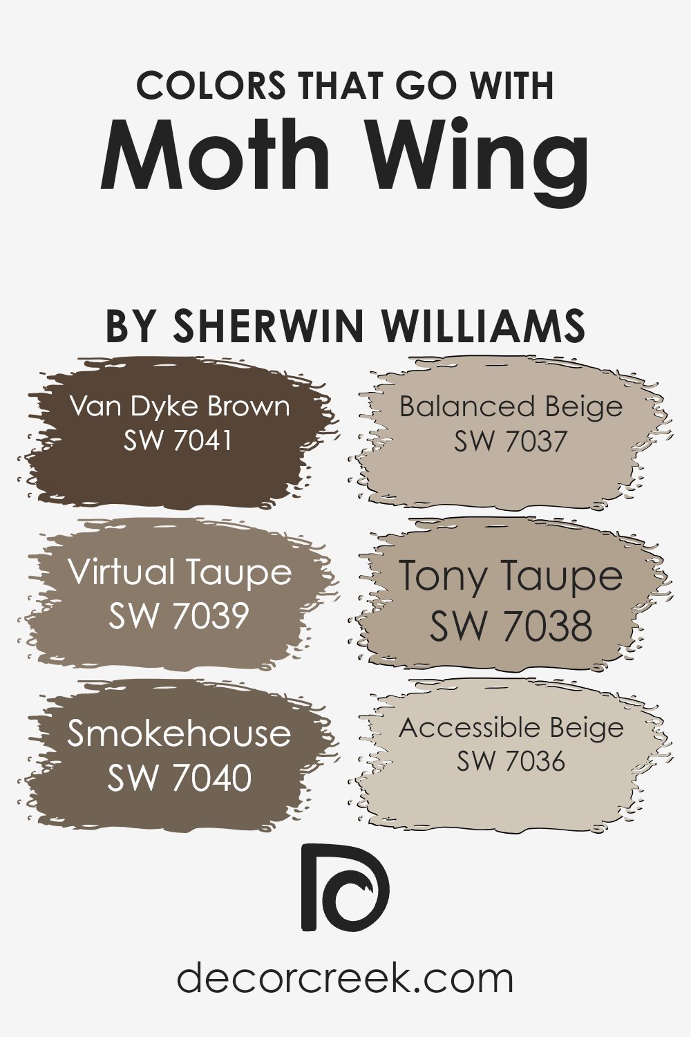
Colors that Go With Moth Wing SW 9174 by Sherwin Williams
Choosing the right colors to complement Moth Wing SW 9174 by Sherwin Williams is essential for creating a harmonious and inviting atmosphere in any space. The colors that pair well with Moth Wing highlight its versatility and allow for a variety of design styles.
Van Dyke Brown SW 7041 is a deep, rich brown that provides a strong foundation in a room, setting a warm, inviting tone. Virtual Taupe SW 7039 brings a softer, gentler brown to the mix, offering a more subtle contrast that’s easy on the eyes.
Smokehouse SW 7040 adds a bit of a smoky, mysterious vibe without overpowering the other elements in the room. It’s a great choice for adding depth and interest. Balanced Beige SW 7037 is highly flexible and works wonderfully to brighten spaces while maintaining a cozy feel.
Furthermore, Tony Taupe SW 7038 offers a slightly more intense hue than its beige counterparts, giving just enough color to enrich the overall palette. Lastly, Accessible Beige SW 7036 is incredibly user-friendly and works well in almost any light, providing a clean and open look that isn’t stark or cold.
Together, these colors create a balanced and appealing color scheme that enhances the understated elegance of Moth Wing.
You can see recommended paint colors below:
- SW 7041 Van Dyke Brown
- SW 7039 Virtual Taupe
- SW 7040 Smokehouse
- SW 7037 Balanced Beige
- SW 7038 Tony Taupe
- SW 7036 Accessible Beige
How to Use Moth Wing SW 9174 by Sherwin Williams In Your Home?
Moth Wing SW 9174 by Sherwin Williams is a versatile paint color that brings a warm and inviting feel to any room. Its earthy, taupe-like hue makes it an excellent choice for spaces where you want a cozy atmosphere without going too dark. You can use Moth Wing in various parts of your home, such as living rooms, bedrooms, and kitchens.
For living rooms, pairing Moth Wing with lighter colors like creams or soft whites can create a balanced look. In bedrooms, it works well as a main wall color, providing a gentle backdrop that complements different decor styles, from modern to rustic.
If you’re looking to add some warmth to your kitchen, consider using Moth Wing on the cabinets or as an accent wall, which can pair nicely with wooden features or metallic fixtures.
Overall, Moth Wing SW 9174 is a fantastic choice if you’re seeking a paint color that adds warmth and character while maintaining a neutral and easy-to-coordinate palette.
Moth Wing SW 9174 by Sherwin Williams vs Cocoa Whip SW 9084 by Sherwin Williams
Moth Wing and Cocoa Whip are both neutral colors from Sherwin Williams, but they bring different vibes to a space. Moth Wing is a darker gray that has some warm undertones, making it cozy yet strong enough to make a statement on walls. It’s a versatile shade that can suit various rooms, especially areas where you want a grounded, inviting atmosphere.
On the other hand, Cocoa Whip is lighter, leaning towards a soft beige with just a hint of gray. This color is excellent for spaces where you want to add brightness without going too bold. It’s a great choice if you’re looking to lighten up a room while keeping things warm and neutral.
Both colors work well with a range of decorating styles and pair nicely with bolder colors or other neutrals. While Moth Wing sets a more pronounced, warmer tone, Cocoa Whip keeps things light and airy.
You can see recommended paint color below:
- SW 9084 Cocoa Whip
Moth Wing SW 9174 by Sherwin Williams vs Woodbridge SW 9618 by Sherwin Williams
Moth Wing and Woodbridge are two interesting paint colors from Sherwin Williams, each carrying its own unique vibe. Moth Wing has a warm, grayish-brown tone that feels cozy and welcoming, making it perfect for living spaces or bedrooms where comfort is key.
It pairs well with a variety of decor styles and brings a soft, neutral base to the room. On the other hand, Woodbridge is a deeper, richer brown that offers a bit more boldness and warmth. It’s great for creating a statement wall or adding depth to a space.
While Moth Wing has a lighter, more muted feel, Woodbridge stands out with its rich intensity. Both colors work well in various settings, but your choice depends on the mood you want to create – lighter and more subtle with Moth Wing, or strong and warm with Woodbridge.
You can see recommended paint color below:
- SW 9618 Woodbridge
Moth Wing SW 9174 by Sherwin Williams vs Tavern Taupe SW 7508 by Sherwin Williams
Moth Wing and Tavern Taupe are two warm, welcoming colors by Sherwin Williams, but they have distinct tones and feelings. Moth Wing is a soft, muted gray-brown that creates a cozy and comfortable atmosphere in any room. It’s like the smooth, gentle color of a moth’s wing, hence the name. It pairs well with both bright and dark colors, adding a subtle elegance to spaces.
On the other hand, Tavern Taupe is a deeper, richer brown. It has a stronger presence due to its depth, making it ideal for areas where you want a bit of a more grounded, robust feel.
Tavern Taupe works well in spaces with ample natural light or as an accent wall, where it can make a room feel more anchored and substantial.
Both colors are versatile and can harmonize with various decor styles, but Moth Wing leans more towards a lighter, airier feel, while Tavern Taupe brings warmth and a sense of solidity to interiors.
You can see recommended paint color below:
- SW 7508 Tavern Taupe
Moth Wing SW 9174 by Sherwin Williams vs Tanglewood SW 9607 by Sherwin Williams
Moth Wing and Tanglewood, both by Sherwin Williams, are warm, inviting shades perfect for creating a cozy atmosphere in any room. Moth Wing is a soft gray with hints of brown, making it a versatile neutral color. This subtle gray has a soothing, gentle presence, works well in spaces like living rooms or bedrooms where you want a peaceful feel.
On the other hand, Tanglewood is a much lighter color, more aligned with beige, and carries a soft, warm undertone. It’s a fantastic choice for those who prefer a bit lighter and airier feel in their spaces. Tanglewood can make small rooms appear larger and brighter due to its light-reflective properties.
Both colors coordinate well with other hues and are effective in creating a harmonious space. Whether chosen as main colors or subtle accents, Moth Wing and Tanglewood can provide a fresh, warm backdrop for a variety of decor styles.
You can see recommended paint color below:
Moth Wing SW 9174 by Sherwin Williams vs Urban Jungle SW 9117 by Sherwin Williams
Moth Wing is a warm, grayish-brown shade that gives a cozy and inviting feeling to any space. It’s subtle and neutral, making it a versatile option for various interior styles. On the other hand, Urban Jungle is a darker, more earthy color with green undertones. It offers a stronger presence and can make a bold statement in a room.
While Moth Wing works well in areas where you want a soft and soothing background, Urban Jungle is ideal for creating a focal point or adding a touch of nature-inspired drama.
Both colors can beautifully complement each other, with Moth Wing providing a light backdrop that allows the depth of Urban Jungle to stand out, especially in a setting that incorporates natural materials and plants.
You can see recommended paint color below:
- SW 9117 Urban Jungle
Moth Wing SW 9174 by Sherwin Williams vs Keystone Gray SW 7504 by Sherwin Williams
Moth Wing and Keystone Gray are two paints from Sherwin Williams and have their unique shades. Moth Wing is a soft, muted brown with a hint of grey, making it versatile for spaces where you want a calm, neutral backdrop. It holds a warmth that feels natural and understated, suitable for living rooms or bedrooms where comfort is key.
On the other hand, Keystone Gray is a deeper taupe that leans towards a stronger grey tone with an earthy base. It’s bolder than Moth Wing but still maintains a certain neutrality. Keystone Gray works well in areas that require a bit more depth and definition, such as an office or a dining room.
Both colors offer a subtle, organic feel to interiors, but Moth Wing is lighter and softer, giving spaces an open and airy feel, while Keystone Gray provides a more grounded, anchoring effect. Choosing between them depends on the specific mood and style you want to achieve in your space.
You can see recommended paint color below:
- SW 7504 Keystone Gray
Moth Wing SW 9174 by Sherwin Williams vs Sycamore Tan SW 2855 by Sherwin Williams
Moth Wing and Sycamore Tan are both neutral shades by Sherwin Williams, but they provide different moods and visual impact when used in decor. Moth Wing is a darker, grayish-brown tone that offers a cozy and warm feeling to any room. It pairs well with various colors, making it versatile for spaces seeking depth and warmth.
On the other hand, Sycamore Tan has a lighter, more golden-brown hue, which makes spaces feel open and airy. It is excellent for rooms needing a subtle touch of warmth without the heaviness that darker colors might bring. This color tends to brighten up spaces and works especially well in areas with a lot of natural light.
Both colors have their unique appeals and can be used in diverse settings, from modern to rustic, depending on what atmosphere you want to create. Selecting between them depends on how light or dark you want your room to appear and the specific ambience you aim to achieve.
You can see recommended paint color below:
- SW 2855 Sycamore Tan
Moth Wing SW 9174 by Sherwin Williams vs Sandy Ridge SW 7535 by Sherwin Williams
Moth Wing and Sandy Ridge by Sherwin Williams are two distinct paint colors, each offering a unique ambiance to a room. Moth Wing is a darker, muted shade, resembling the color of a moth’s wing. It brings a cozy, warm feeling to a space, making it ideal for creating a comforting and welcoming atmosphere in areas like living rooms or bedrooms.
On the other hand, Sandy Ridge is a lighter, soft beige that mimics the color of sandy beaches. This color is great for spaces where you want to add brightness and a sense of airiness. It works well in kitchens, bathrooms, or any area that you want to feel open and light.
The contrast between the two colors is their brightness and mood setting. Moth Wing, being darker, lends a more enclosed, snug feel whereas Sandy Ridge, with its lighter tone, makes rooms appear larger and more open. Depending on what you want from a space—coziness or spaciousness—you might choose one over the other.
You can see recommended paint color below:
- SW 7535 Sandy Ridge
Moth Wing SW 9174 by Sherwin Williams vs Dry Dock SW 7502 by Sherwin Williams
Moth Wing and Dry Dock are two shades provided by Sherwin Williams that each offer a unique look for interior spaces. Moth Wing is a softer, subtler color, leaning towards a grayish taupe. It provides a warm and cozy atmosphere, making it excellent for relaxed, comfortable settings like living rooms or bedrooms. It naturally complements brighter colors or can smoothly blend with neutrals to create a balanced look.
On the other hand, Dry Dock is a darker, richer taupe that commands more attention due to its deeper tone. It’s perfect for adding a touch of drama or grounding in spaces, useful in areas that benefit from a more defined color presence like dining rooms or home offices.
When paired with lighter shades, Dry Dock can stand out as a feature color, or it can be used in a monochromatic scheme to create a more unified, cohesive feel.
You can see recommended paint color below:
- SW 7502 Dry Dock
Moth Wing SW 9174 by Sherwin Williams vs Sanderling SW 7513 by Sherwin Williams
Moth Wing is a warm, medium-dark taupe that feels cozy and grounded. It has a perfect mix of gray and brown, making it a versatile choice for spaces where you want a soothing and welcoming atmosphere. It works well in living rooms and bedrooms to create a soft, neutral background.
On the other hand, Sanderling is slightly lighter and leans more towards a beige tone with a gentle gray undertone. This color is excellent for brightening up spaces while still keeping things calm and neutral. It’s particularly good in smaller rooms or areas with less natural light, as it can help make the space feel more open and airy.
Both colors are understated and work well with a variety of decor styles, from modern to rustic. However, Moth Wing has a richer depth, making it a bit cozier, while Sanderling offers a cleaner look that can make a room feel larger.
They can also complement each other nicely in different rooms of a house or even as coordinating colors within the same space.
You can see recommended paint color below:
- SW 7513 Sanderling
Conclusion
It’s like the soft color of a moth’s wing, which is a mix of brown and gray. This color can make any room look warm and welcoming, just like a cozy blanket.
Moth Wing can fit well in a lot of places in your home. Whether you want to paint a whole room, just one wall, or even some furniture, it can make your space look nicer.
It is also a good color because it matches with many other colors. So, you can use it with colors you already have at home, and it will still look good.
I would suggest Moth Wing to anyone who wants to change up their room without making it look too bright or too dark. It’s just right and feels very calming. If you are thinking about painting something new in your house, Moth Wing is a color you might want to think about because it’s pretty and not too flashy.
It just makes everything feel just right and comfortable.
Ever wished paint sampling was as easy as sticking a sticker? Guess what? Now it is! Discover Samplize's unique Peel & Stick samples.
Get paint samples

