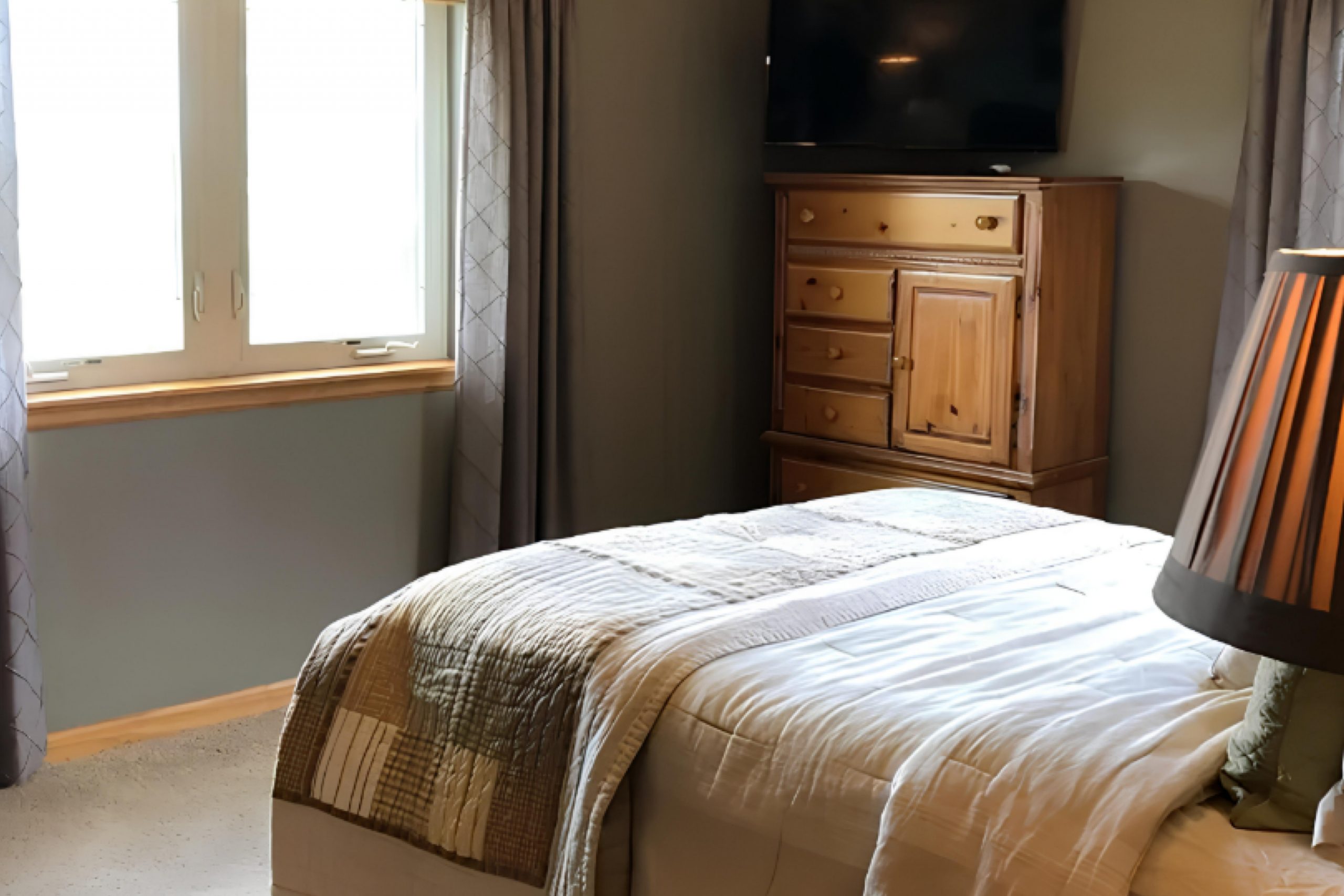
I recently had the chance to use SW 7508 Tavern Taupe by Sherwin Williams for a room makeover, and I’d love to share my thoughts on it. Tavern Taupe stands out as a versatile neutral shade that can add a subtle elegance to any space. Despite its simplicity, it brings warmth to rooms that might otherwise feel cold or impersonal. This color can easily blend with various decor styles, whether you’re aiming for a modern look or something more traditional.
In my experience painting with Tavern Taupe, I noticed it works exceptionally well with natural light, shifting its tone throughout the day to offer different aspects of its beauty.
If you’re considering a new color for your living area, bedroom, or even a feature wall, you might find this shade meets your needs wonderfully. It pairs nicely with both bold and subdued accents, giving you plenty of room to experiment with your interior design ideas.
Whether you’re a first-time DIYer or a seasoned decorator, Tavern Taupe could be the right choice for your next project.
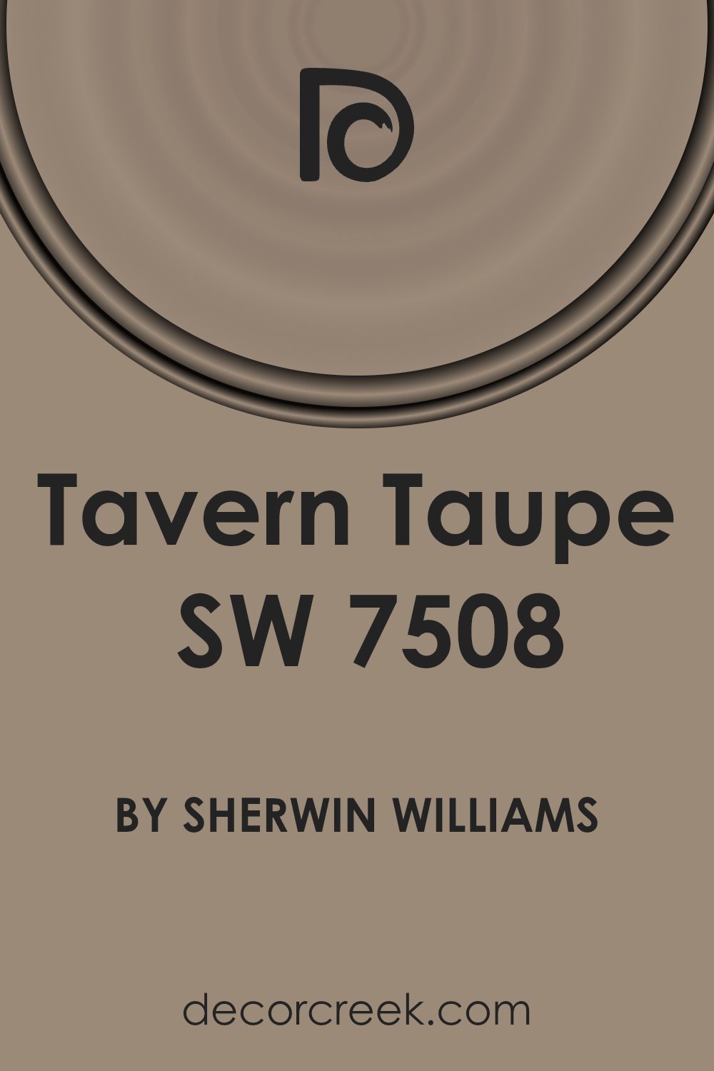
What Color Is Tavern Taupe SW 7508 by Sherwin Williams?
Tavern Taupe is a warm, inviting shade of brown with subtle gray undertones, making it an incredibly versatile color for interior decorating. It offers a cozy feel to any room, ideal for creating a welcoming atmosphere. This hue works exceptionally well in classic decor styles such as traditional, rustic, and country, owing to its earthy base that echoes natural elements.
In terms of materials, Tavern Taupe pairs beautifully with rich woods such as oak or walnut, enhancing the depth and character of the wood grains. When matched with leather, it emphasizes a look of timeless comfort.
For those who prefer soft furnishings, combining this color with fabrics like wool or linen in lighter shades such as cream or soft beige can add a touch of warmth to the interior without overpowering it.
Texture also plays a key role in bringing out the best in Tavern Taupe. Soft, plush textures like velvet or faux fur throw blankets and cushions provide a delightful contrast to the solidity of this shade, giving a room a more layered and inviting look.
When used on walls, pairing it with elements like a rough-hewn wooden coffee table or a sleek, contemporary metal lamp can make a room feel well-rounded and thoughtfully put together, making it suitable for a variety of living spaces.
Is Tavern Taupe SW 7508 by Sherwin Williams Warm or Cool color?
Tavern Taupe by Sherwin Williams is a warm, neutral color that brings a cozy and welcoming feel to any room. Its rich taupe shade makes it versatile, allowing it to blend well with various decor styles and color schemes. This paint color is particularly effective in living areas and bedrooms where a calm, relaxed atmosphere is desirable.
Because it is a neutral tone, Tavern Taupe works as a fantastic background color. It can pair nicely with brighter colors like blues and greens for a lively contrast, or with other neutrals for a more subdued look. In rooms with less natural light, it helps to warm up the space without darkening it, reflecting light better than deeper browns or grays.
Furniture in both dark and light woods looks great against Tavern Taupe, as do accessories in metallic tones like gold, bronze, and silver. This flexibility makes it a go-to choice for those wanting a color that’s easy to style around and remains timeless.
Undertones of Tavern Taupe SW 7508 by Sherwin Williams
Tavern Taupe is a versatile paint color with a complex mix of undertones that can subtly influence the atmosphere of a room. Undertones are the colors that lurk beneath the surface of the paint, affecting how the main color is perceived under different lighting conditions and when coordinated with various furnishings and textiles.
For Tavern Taupe, these undertones range widely from pale pinks to dark blues, including mint, olive, and pale yellow. Such a spectrum allows the taupe to appear warmer or cooler depending on its surroundings and the light it’s exposed to.
For instance, in a room with ample sunlight, the pale yellow or light green undertones might make the taupe feel warmer and more welcoming. In contrast, in a space with less natural light, the darker undertones like navy or dark grey may make it appear more grounded and subdued.
The presence of such diverse undertones also means that Tavern Taupe is exceptionally adaptive. It can harmonize with a wide array of decor styles and colors. If the room has lots of greens and blues, for example, the light blue or mint undertones in Tavern Taupe can create a gentle, cohesive look.
Conversely, if the room features reds and oranges, this taupe can counterbalance those warmer tones with its cooler, subtler lilac or light purple undertones.
Overall, the complexity of Tavern Taupe’s undertones makes it a valuable choice for interior walls, giving decorators a flexible base that can shift in mood as per the room’s design and the changing light throughout the day.
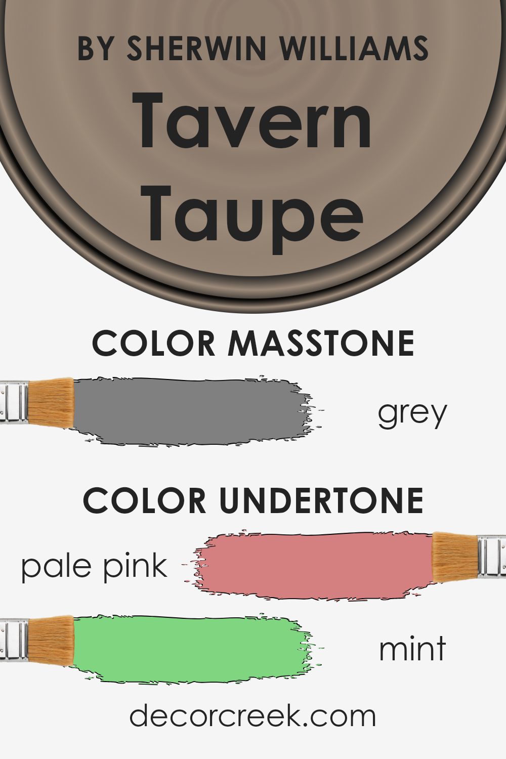
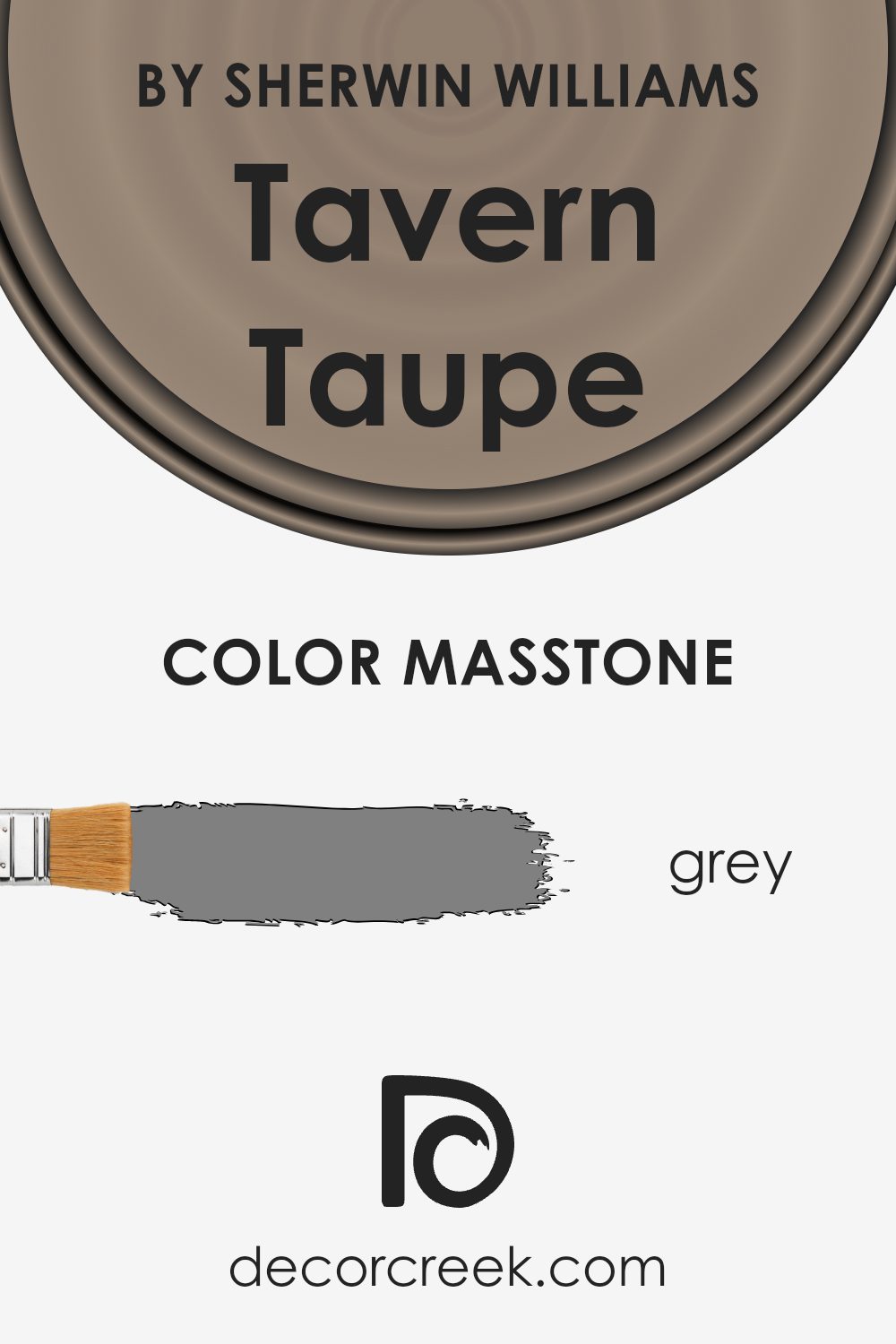
What is the Masstone of the Tavern Taupe SW 7508 by Sherwin Williams?
Tavern Taupe SW 7508 by Sherwin Williams has a masstone of grey, specifically the shade “#808080”. This neutral grey tone makes it a very adaptable color for use in homes.
Because it’s a mid-range grey, it doesn’t lean too dark or too light, making it perfect for creating a balanced and welcoming atmosphere in any room. It pairs well with a wide range of colors and textures, allowing for flexibility in decorating styles.
Whether you’re looking to paint walls, trim, or even cabinets, this shade of grey provides a steady base that complements both bold colors and softer hues. This versatility means it can fit effortlessly into most interior designs, from modern minimalistic to cozy traditional. Utilizing a neutral like this can help in tying together different elements and textures in a room, making it easier to achieve a cohesive look.
How Does Lighting Affect Tavern Taupe SW 7508 by Sherwin Williams?
Lighting plays a crucial role in how we perceive colors, and it can make a significant impact on the appearance of paint colors in different environments. Various types of light, whether natural or artificial, can make paint colors look different from how they appear on a sample card.
Tavern Taupe is a warm, versatile neutral shade that blends beige with a hint of gray. In artificial light, such as from LED or incandescent bulbs, this color tends to look slightly warmer due to the yellow or warm white tones emitted by most indoor lighting. This creates a cozy and inviting atmosphere in the room.
Under natural light, the color can shift appearance depending on the time of day and the weather conditions. On a sunny day, Tavern Taupe might appear lighter and more beige, while on a cloudy day, it might show its gray undertones more.
The orientation of a room also affects how Tavern Taupe looks. In north-facing rooms, which receive less direct sunlight and typically have cooler light, this color might look more muted and show more of its gray qualities. This could make the room feel slightly less warm.
In south-facing rooms, which are bathed in more direct and warm sunlight throughout the day, Tavern Taupe tends to reveal its warmer, beige undertones, enhancing the welcoming and cozy feel of the room.
East-facing rooms get bright sunlight in the morning, which means Tavern Taupe will appear lighter and warmer in the morning but could turn cooler and more muted as the day progresses and the natural light diminishes.
West-facing rooms receive more intense light in the afternoons. Here, during the afternoon when the sunlight is the strongest, Tavern Taupe can cast a warm, inviting glow but will appear cooler in the morning and under artificial light at night.
Thus, when choosing this color or any color, considering the room’s exposure and the primary light sources is important to achieve the desired effect.
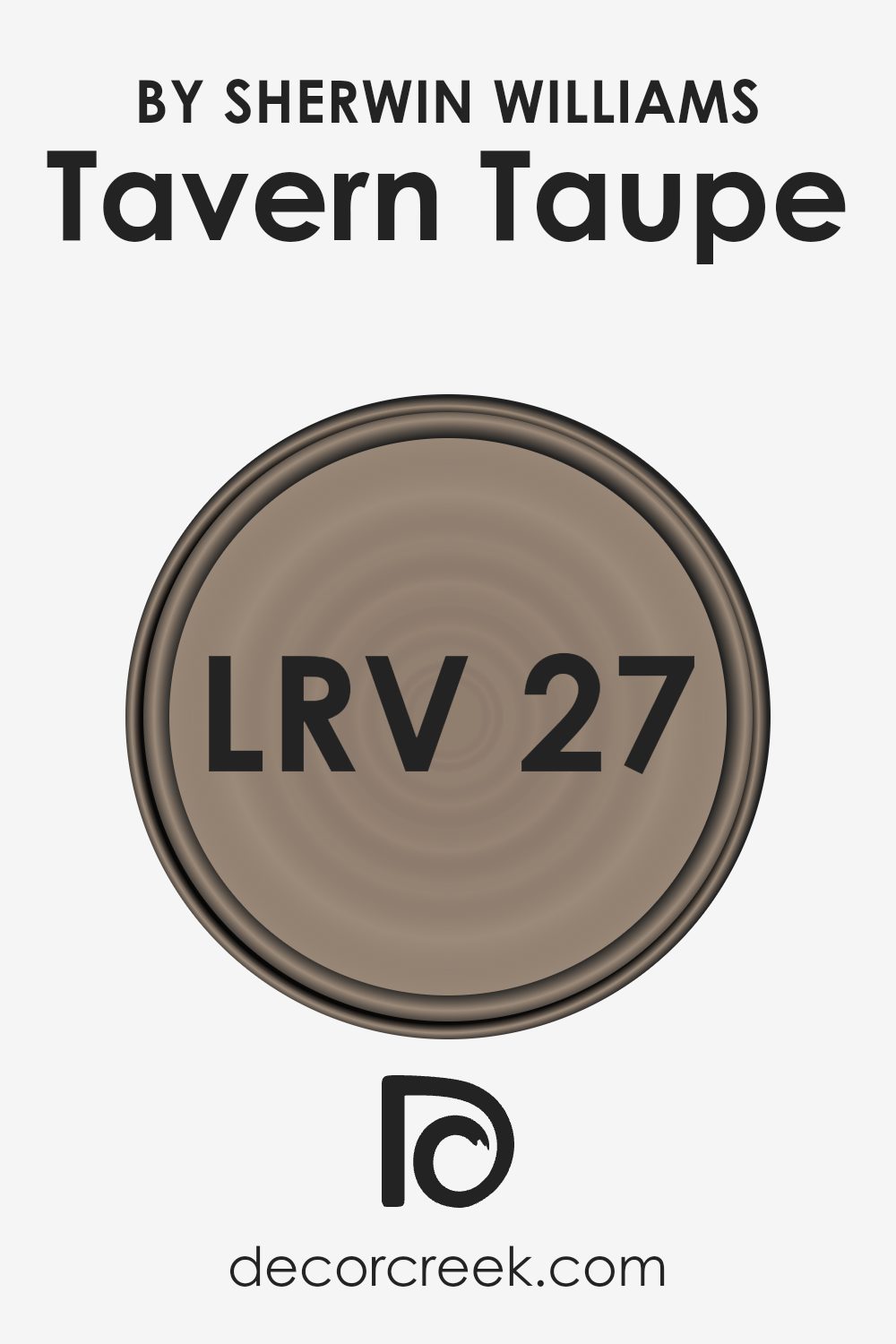
What is the LRV of Tavern Taupe SW 7508 by Sherwin Williams?
LRV stands for Light Reflectance Value, and it is a measure used to determine how much light a color will reflect. It is expressed as a percentage, ranging from total black, which absorbs all light, to pure white, which reflects all light. Each shade will have an LRV number that helps in understanding how light or dark it is.
This measurement is crucial when choosing paint colors because it directly impacts how bright or dark a room will appear once it’s painted. For example, colors with a high LRV make a room look lighter and can make small spaces appear larger. In contrast, colors with a low LRV can make spaces appear cozier and more enclosed.
The color Tavern Taupe has an LRV of 26.74, which places it on the darker side of the scale. This means it absorbs more light than it reflects, resulting in a color that can add a sense of warmth and depth to a room. When used on walls, Tavern Taupe can make a large space feel more intimate and welcoming.
However, if used in a small or poorly-lit room, it might make the space appear smaller or even cramped. Therefore, it’s best used in rooms with adequate lighting, where its rich tone can create an inviting atmosphere without overpowering the space. Understanding the LRV helps in making informed decisions about where and how to use different colors effectively in home decor.
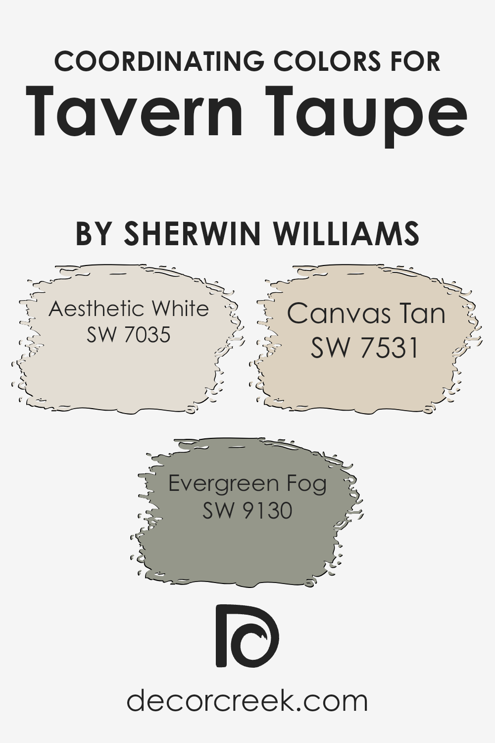
Coordinating Colors of Tavern Taupe SW 7508 by Sherwin Williams
Coordinating colors are chosen to complement and enhance the main color in a color scheme, providing balance and harmony in a room’s decor. For example, if the primary wall color is a rich shade like Tavern Taupe by Sherwin Williams, coordinating colors such as Aesthetic White, Evergreen Fog, and Canvas Tan can be used to enrich the overall ambiance. These colors work together to create a cohesive look, making each room feel well-designed and thoughtfully curated.
Aesthetic White is a soft, pale hue, perfect for creating a light and airy feel in contrast to the deeper Tavern Taupe. It’s ideal for trim, ceilings, or as an accent wall to offer a breath of fresh air in a space.
Evergreen Fog brings a subtle touch of green, imparting a natural, earthy vibe that complements the warmth of Tavern Taupe without overwhelming it.
This color works well in spaces that could benefit from a touch of nature. Finally, Canvas Tan offers a gentle, neutral backdrop that pairs effortlessly with Tavern Taupe, ensuring the space remains grounded and inviting, suitable for rooms where continuity and calm are desired. These coordinating colors help to draw the room together, providing visual interest and comfort.
You can see recommended paint colors below:
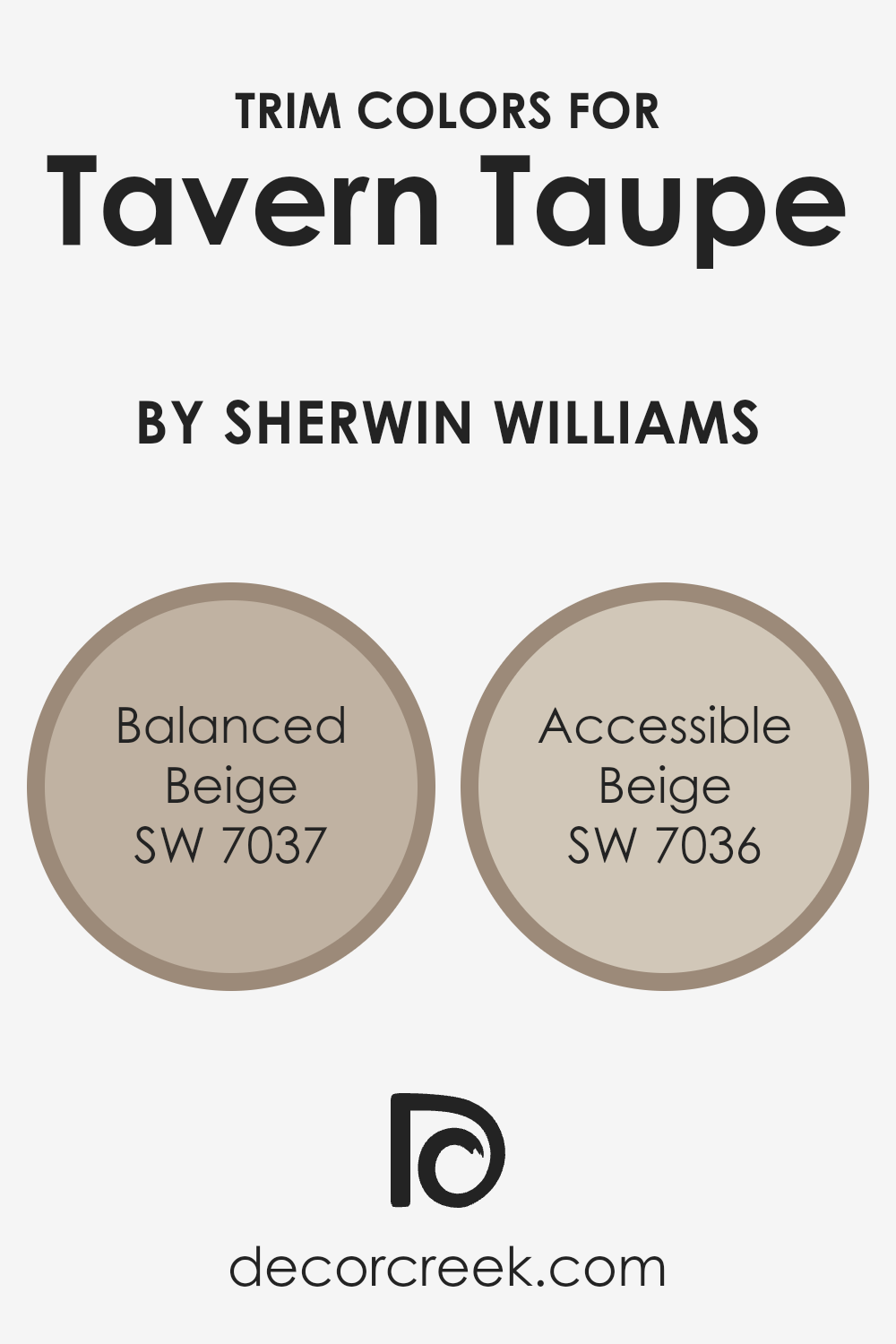
What are the Trim colors of Tavern Taupe SW 7508 by Sherwin Williams?
Trim colors play a crucial role in enhancing the overall look of a space, especially when paired with primary wall colors like Sherwin Williams’s Tavern Taupe. Selecting the right trim color can create a subtle yet effective contrast that helps define the architectural features and lines of a room, making spaces feel more defined and polished.
Balanced Beige and Accessible Beige are excellent options for trims when used with Tavern Taupe as they provide gentle contrast without overwhelming the primary color, ensuring a harmonious and pleasing aesthetic.
Balanced Beige is a warm neutral that offers a soft contrast to Tavern Taupe, lending a cozy and welcoming feel to any space. It subtly highlights the details and trims, adding depth without creating too harsh of a divide.
On the other hand, Accessible Beige is slightly lighter and brings a refreshing lift to the surroundings. It’s perfect for making the trim stand out more distinctly against Tavern Taupe, giving an airy and open effect that enhances the overall ambiance of a room. Together, these trim colors ensure that the environment remains appealing and cohesive, supporting a refined and pleasant look.
You can see recommended paint colors below:
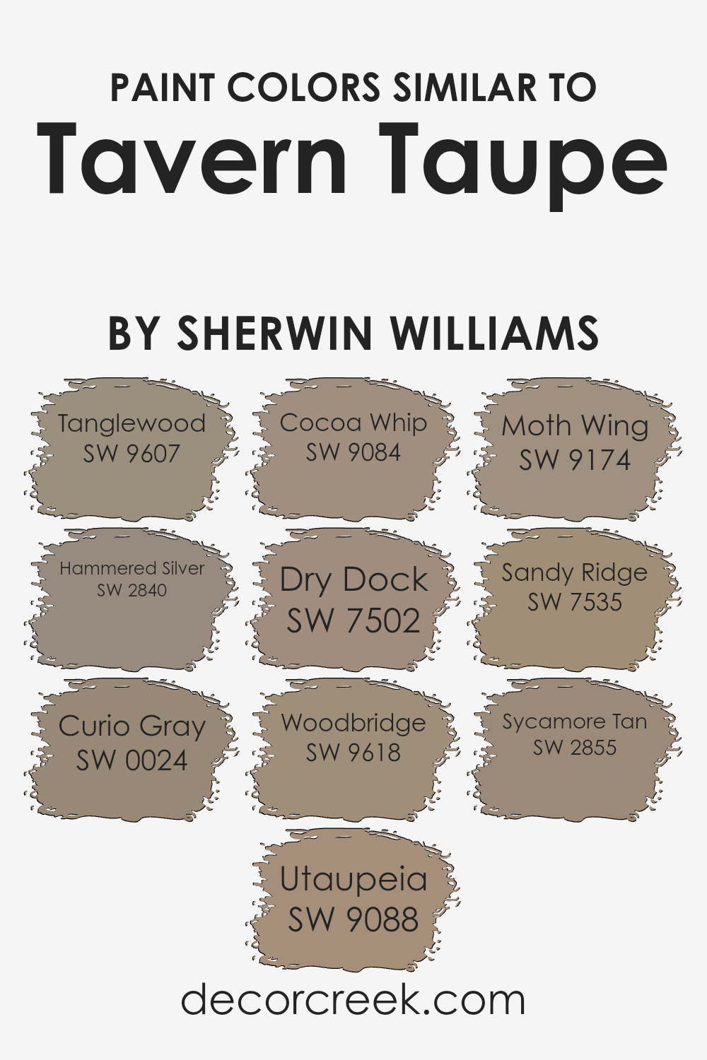
Colors Similar to Tavern Taupe SW 7508 by Sherwin Williams
In home decor, using similar colors has a beneficial impact by creating a cohesive and harmonious environment. These subtle color shifts help in seamlessly blending different elements of a room, making the space feel unified and soothing without stark contrasts. The use of closely related colors like those similar to a warm, earthy base can add depth and texture while maintaining a calm and cohesive atmosphere.
For example, SW 9607 – Tanglewood is a gentle beige that softly complements neutral themes, offering a touch of warmth to any space. Nearby in tone, SW 2840 – Hammered Silver introduces a muted, metallic sheen, giving a subtle nod to industrial chic.
SW 0024 – Curio Gray infuses a cooler hue, ideal for those looking to introduce a soft shadow without overwhelming the room. Similarly, SW 9088 – Utaupeia and SW 9084 – Cocoa Whip both enrich the palette with deeper, creamy browns, perfect for adding richness. The color SW 7502 – Dry Dock bridges the gap between beige and gray, offering versatility.
SW 9618 – Woodbridge adds an earthy, grounded feel, reminiscent of natural wood. SW 9174 – Moth Wing presents a darker, dustier variation, providing an elegant contrast within the same color family. Moving deeper, SW 7535 – Sandy Ridge has a dusky, sandy quality, perfect for creating a soft, welcoming ambiance.
Lastly, SW 2855 – Sycamore Tan lends itself to spaces that favor a stronger, yet still soft earth tone, enhancing the warmth in the overall decor. By selecting these shades, one can achieve a layered look that ties together different elements and textures of a room, creating a well-rounded and inviting atmosphere.
You can see recommended paint colors below:
- SW 9607 Tanglewood
- SW 2840 Hammered Silver
- SW 0024 Curio Gray
- SW 9088 Utaupeia
- SW 9084 Cocoa Whip
- SW 7502 Dry Dock
- SW 9618 Woodbridge
- SW 9174 Moth Wing
- SW 7535 Sandy Ridge
- SW 2855 Sycamore Tan
Colors that Go With Tavern Taupe SW 7508 by Sherwin Williams
Choosing the right complementary colors for Tavern Taupe SW 7508 by Sherwin Williams is crucial as it enhances the overall aesthetic of any space. Tavern Taupe is a versatile shade that serves as a warm neutral, providing a solid foundation for layering different hues.
Colors like Taupe Tone SW 7633, Foothills SW 7514, Loggia SW 7506, Stone Lion SW 7507, Shiitake SW 9173, and Sanderling SW 7513 each offer unique undertones that harmonize well with Tavern Taupe, creating a cohesive and appealing look.
For instance, Taupe Tone SW 7633 is a darker shade that adds depth and contrast, making it ideal for accent walls or furniture. Foothills SW 7514 is slightly richer and brings a cozy feel to the room. On the other hand, Loggia SW 7506 is lighter and works well to brighten spaces while maintaining warmth.
Stone Lion SW 7507 adds a subtle earthy touch with its mid-tone gray, perfect for creating a grounded atmosphere. Shiitake SW 9173 offers a unique blend of gray and brown, enriching the space without overpowering it.
Lastly, Sanderling SW 7513 is the lightest among these selections, ideal for opening up smaller spaces or introducing a subtle variation to the setting. Together, these colors support and enhance the natural charm of Tavern Taupe, making any room look cozy and inviting.
You can see recommended paint colors below:
- SW 7633 Taupe Tone
- SW 7514 Foothills
- SW 7506 Loggia
- SW 7507 Stone Lion
- SW 9173 Shiitake
- SW 7513 Sanderling

How to Use Tavern Taupe SW 7508 by Sherwin Williams In Your Home?
Tavern Taupe by Sherwin Williams is a warm, neutral paint color that brings a cozy and inviting feel to any room. This versatile shade can work wonders in various spaces in your home. For example, it’s an excellent choice for living rooms or dens where you want a comfortable atmosphere for relaxing and gathering with family and friends. The earthy tones of Tavern Taupe make it ideal for pairing with natural materials like wood, leather, and linen, enhancing the welcoming vibe of the area.
In bedrooms, using Tavern Taupe can create a cozy and calming backdrop, perfect for winding down at the end of the day. It can also help make small spaces appear more open and airy when paired with light-colored furniture and decor.
Additionally, Tavern Taupe works well in hallways or entryways, setting a warm tone as soon as you step into your home. Combining Tavern Taupe walls with crisp white trim can keep your spaces looking fresh yet cozy. Overall, it’s a flexible color that can help make your home feel homely and stylish.
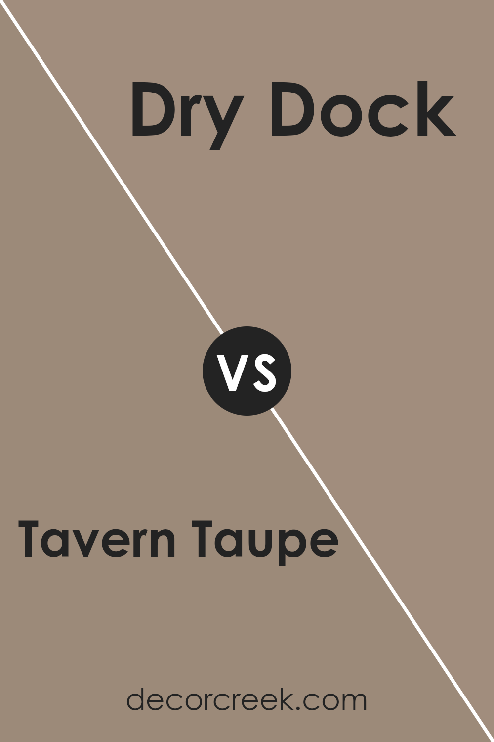
Tavern Taupe SW 7508 by Sherwin Williams vs Dry Dock SW 7502 by Sherwin Williams
The main color, Tavern Taupe, and the second color, Dry Dock, are both subtle and warm tones. Tavern Taupe has a richer, beige-brown shade that brings a cozy and welcoming feel to any space. It pairs well with a variety of colors and enriches a room with depth and warmth.
On the other hand, Dry Dock is lighter with gray undertones. This color gives a soft and subtle background that is very adaptable, making it great for rooms where you want to relax and feel comfortable.
used together, these colors complement each other: the richness of Tavern Taupe contrasted by the lighter, soothing hue of Dry Dock can create a balanced and harmonious look.
You can see recommended paint color below:
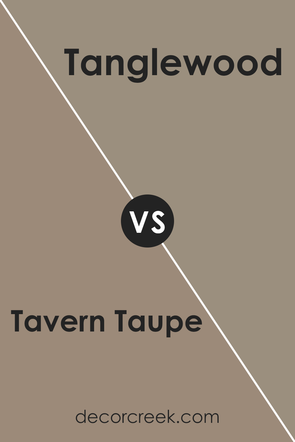
Tavern Taupe SW 7508 by Sherwin Williams vs Tanglewood SW 9607 by Sherwin Williams
Tavern Taupe and Tanglewood by Sherwin Williams are two neutral colors that offer a warm and inviting feel to any space. Tavern Taupe is a deeper, richer shade that resembles a blend of beige and gray with a hint of warmth.
It provides a solid, earthy base that can make a room feel grounded and cozy. Compared to Tavern Taupe, Tanglewood is lighter and leans more towards a beige tone with a touch of softness. This color brightens up a space while still keeping things calm and relaxed.
While Tavern Taupe works well in areas where you want to add depth and a sense of comfort, Tanglewood is ideal for spaces that need a lighter touch to make them appear more open and airy. Both colors work well with a variety of decor styles and can complement each other when used in the same color scheme.
You can see recommended paint color below:
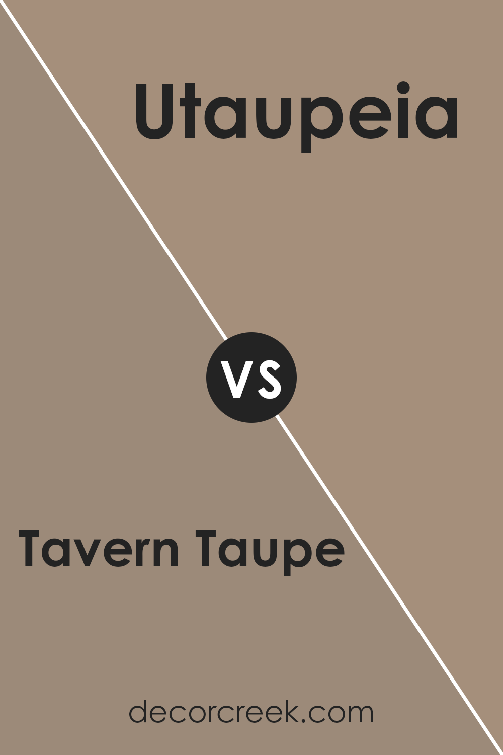
Tavern Taupe SW 7508 by Sherwin Williams vs Utaupeia SW 9088 by Sherwin Williams
Tavern Taupe and Utaupeia, both from Sherwin Williams, offer unique takes on the taupe color family. Tavern Taupe leans towards a warm, welcoming beige with a hint of gray, making it versatile for various decorating styles.
It’s a soft backdrop that pairs well with rich colors like deep blues or earthy greens. On the other hand, Utaupeia is a darker shade that blends deeper gray tones into its composition, providing a stronger presence in a room. This makes it ideal for creating a cozy, intimate atmosphere, suitable for spaces where you might want to relax or have a deep conversation.
While Tavern Taupe is lighter and more neutral, making it easier to integrate into numerous decor themes, Utaupeia’s bolder, moodier quality suits specific tastes and design needs. Both colors offer their unique charm and can significantly enhance a room’s aesthetic depending on what you’re looking for.
You can see recommended paint color below:
- SW 9088 Utaupeia
Tavern Taupe SW 7508 by Sherwin Williams vs Woodbridge SW 9618 by Sherwin Williams
Tavern Taupe and Woodbridge are two shades offered by Sherwin Williams, each bringing its unique vibe to interiors. Tavern Taupe is a warm, welcoming beige that offers a calm, comfortable backdrop, perfect for almost any space. It’s a versatile color that pairs well with a variety of furnishings and decor styles.
On the other hand, Woodbridge is a deeper, woodsy brown that provides a richer and cozier feel, making it ideal for spaces where you want to add a bit of drama or a rustic touch. This color works great in larger rooms or on accent walls, as it can make a space feel more intimate.
Both colors are great choices, but their impact is different based on the mood you’re trying to create. Tavern Taupe keeps things light and airy, while Woodbridge tends to create a more enclosed, snug environment. Depending on the room’s function and existing elements, either could be the perfect pick.
You can see recommended paint color below:
- SW 9618 Woodbridge
Tavern Taupe SW 7508 by Sherwin Williams vs Curio Gray SW 0024 by Sherwin Williams
Tavern Taupe and Curio Gray are both warm, inviting colors from Sherwin Williams, but they bring different vibes to a space. Tavern Taupe is a soft, mid-tone beige that adds a cozy, welcoming feel, making rooms look comfortable and lived-in. It’s a versatile color that pairs well with many decor styles and adds a touch of warmth without dominating the space.
On the other hand, Curio Gray is a deeper, more muted gray with a hint of brown. This color is deeper and can make a bold statement when used, providing a strong foundation that allows other colors in the decor to stand out. It’s particularly good for creating a focal point or adding depth to a room.
Both colors are great choices for those wanting to create a warm, inviting space, but your choice between them might depend on how bold you want your color scheme to be. Tavern Taupe keeps things light and airy, while Curio Gray offers a bit more drama.
You can see recommended paint color below:
Tavern Taupe SW 7508 by Sherwin Williams vs Moth Wing SW 9174 by Sherwin Williams
Tavern Taupe and Moth Wing by Sherwin Williams are both neutral colors but they have distinct tones. Tavern Taupe is a warm, welcoming beige with a light brown undertone, making it cozy and versatile for any room. It pairs well with various decor styles, especially helpful in spaces where you want a timeless look.
On the other hand, Moth Wing is a darker shade, hovering between gray and brown. This color offers a slightly more muted appearance, which can make a space feel grounded and calm without drawing too much attention. It’s perfect for areas where you want the focus on other elements of your room, such as artwork or furniture.
Both colors work well in different settings depending on the mood you’re aiming for: Tavern Taupe for a lighter, airier feel and Moth Wing for a more anchored, subtle ambiance. When deciding between the two, consider the size of your room and the amount of natural light it receives, as these factors can influence how the colors appear.
You can see recommended paint color below:
Tavern Taupe SW 7508 by Sherwin Williams vs Cocoa Whip SW 9084 by Sherwin Williams
Tavern Taupe and Cocoa Whip, both by Sherwin Williams, are warm, neutral colors, though they differ slightly in their tones and depths. Tavern Taupe is a mid-tone beige with a hearty, earthy quality that leans slightly towards gray.
This makes it a sturdy, reliable choice for rooms where you want a neutral backdrop that’s not too light nor too dark. On the other hand, Cocoa Whip is lighter with a soft tan shade that exudes a creamy, inviting feel. It’s perfect for spaces that need to feel cozy yet light and airy.
The choice between the two colors would depend on the mood and space you’re looking to paint. Tavern Taupe works well in high-traffic areas like living rooms or hallways, offering depth without overwhelming the space.
Cocoa Whip is ideal for smaller areas or rooms that would benefit from seeming more spacious and bright, like bathrooms or small bedrooms. Together, these hues can create a seamless flow in a home, with Tavern Taupe grounding the spaces and Cocoa Whip lighting them up.You can see recommended paint color below:
- SW 9084 Cocoa Whip
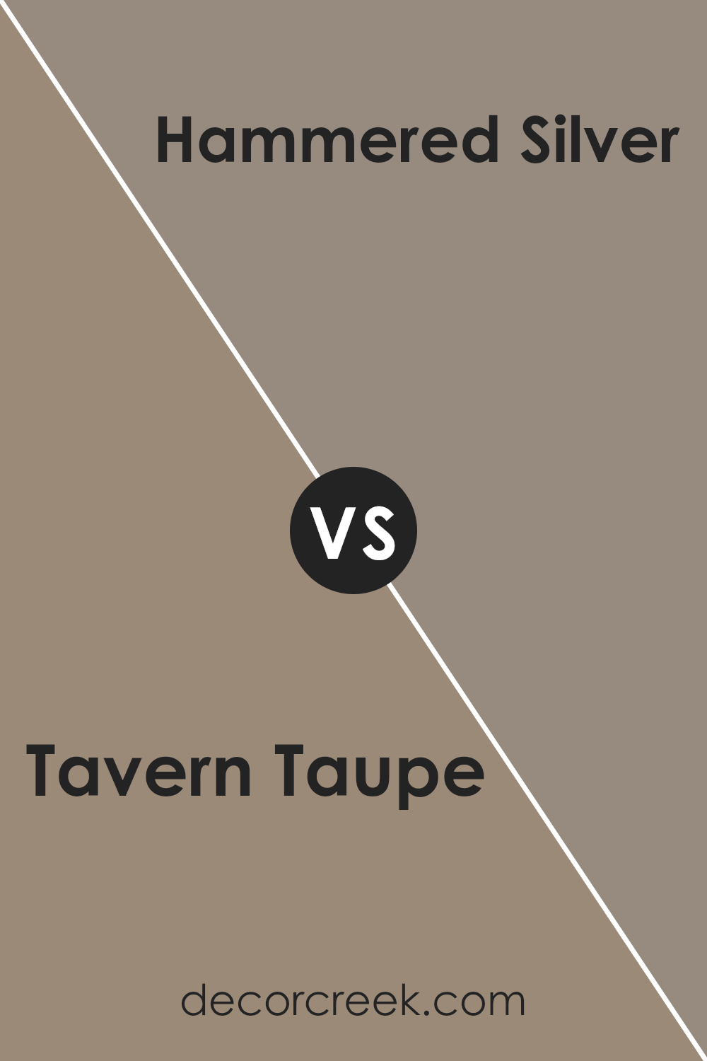
Tavern Taupe SW 7508 by Sherwin Williams vs Hammered Silver SW 2840 by Sherwin Williams
Tavern Taupe and Hammered Silver are two distinct paint colors from Sherwin Williams. Tavern Taupe is a warm, welcoming beige. It has a cozy vibe, making it perfect for living spaces or bedrooms where a calm atmosphere is desired. Its earthy tones pair well with various decor styles, from rustic to modern.
On the other hand, Hammered Silver is a cooler, deeper gray. This color has a bold, striking presence, giving spaces a more dramatic look. It works well in kitchens, bathrooms, or any room where a modern, sleek appearance is preferred.
Both colors are versatile and offer a neutral palette, but they inspire different moods. Tavern Taupe brings a soft, gentle warmth, while Hammered Silver offers a chic and powerful aesthetic. Whether used alone or together, they can complement a wide range of interior designs.
You can see recommended paint color below:
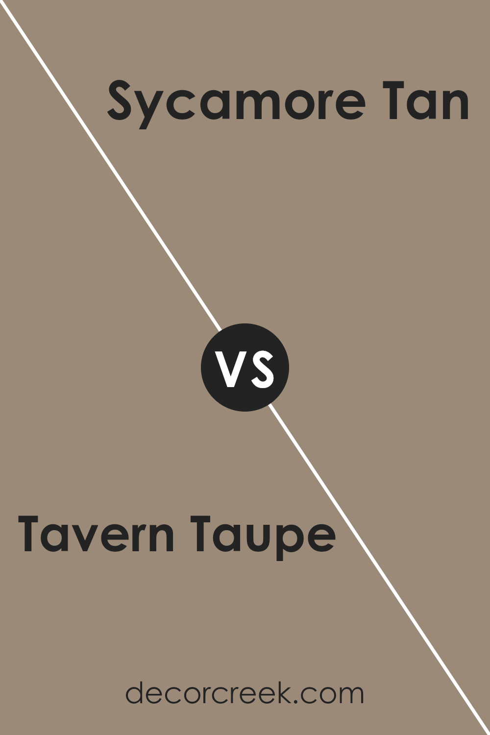
Tavern Taupe SW 7508 by Sherwin Williams vs Sycamore Tan SW 2855 by Sherwin Williams
Tavern Taupe and Sycamore Tan are both warm, welcoming colors but have some subtle differences. Tavern Taupe leans more towards a grey-brown, which makes it a versatile base that can easily fit into many design styles and spaces. It’s a bit more muted, providing a calm and collected feel to a room without being too dark or overwhelming.
On the other hand, Sycamore Tan has a more pronounced golden hue, giving it a warmer and slightly brighter appearance. This color evokes a cozy, inviting atmosphere, making it great for spaces where you want to add a touch of warmth and comfort, like living rooms or bedrooms.
While both colors are in the neutral family, Tavern Taupe is generally cooler, making it a good choice for a modern look. Sycamore Tan, with its warmer tones, is ideal for creating a traditional or rustic vibe. The choice between the two would depend on the mood you want to set and the existing colors in your space.
You can see recommended paint color below:
- SW 2855 Sycamore Tan
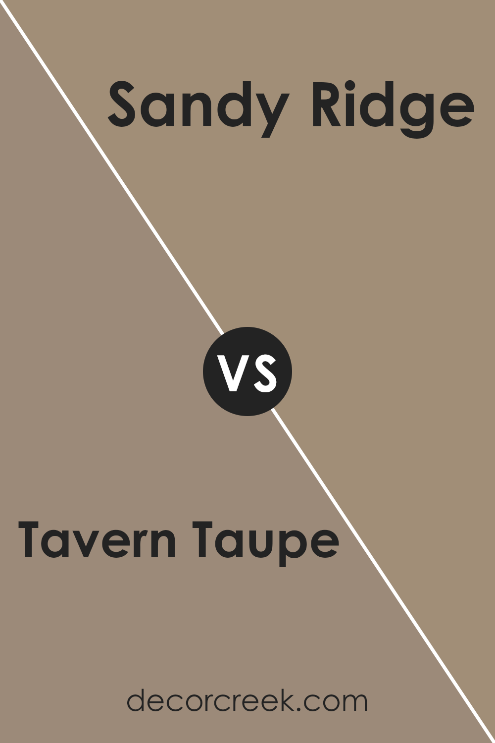
Tavern Taupe SW 7508 by Sherwin Williams vs Sandy Ridge SW 7535 by Sherwin Williams
Tavern Taupe and Sandy Ridge, both by Sherwin Williams, are warm and welcoming colors, though they convey different moods and aesthetics. Tavern Taupe has a deeper, richer tone that feels cozy and solid.
It’s a versatile brown that can ground a room, providing a strong base for a variety of decor styles. On the other hand, Sandy Ridge stands out as a lighter, softer beige. It carries a hint of gray, making it ideal for creating a gentle, calming atmosphere in spaces aiming for a more subtle or airy feel.
These colors could complement each other well in a space, with Sandy Ridge serving as a soothing backdrop and Tavern Taupe adding depth and focus in accent areas. Both colors work well with a range of complementary shades, from soft whites to bold blues, allowing for flexible design choices.
Their earthy tones can help to create a warm environment that’s easy on the eyes and inviting. If you’re deciding between the two, consider the size of your room and the amount of natural light it gets; lighter shades like Sandy Ridge can make a small or dim room feel bigger and brighter.
You can see recommended paint color below:
- SW 7535 Sandy Ridge
Wrapping up my thoughts on SW 7508 Tavern Taupe by Sherwin Williams, I truly appreciate how this color adds warmth and a welcoming feel to any room. Tavern Taupe works well in many parts of the house whether you’re painting the living room, bedroom, or the kitchen. It’s a kind of brown that doesn’t feel too dark or too light, making it just right for places where you spend a lot of time.
This color has a special way of fitting in with different styles and furniture, which means you won’t have a hard time matching it with your home’s existing decorations. Whether you have a modern style with lots of cool gadgets or a classic style with comfy, old-school furniture, Tavern Taupe will look nice.
Also, it’s important to note that this color can help make a room feel more calm and cozy. Whether you’re curling up with a good book or having friends over for a movie night, a room painted with Tavern Taupe makes these moments more enjoyable.
In conclusion, if you’re thinking about giving a room a new look, SW 7508 Tavern Taupe is a great choice. It’s pleasant, easy on the eyes, and can help make any room a little nicer to hang out in.
Ever wished paint sampling was as easy as sticking a sticker? Guess what? Now it is! Discover Samplize's unique Peel & Stick samples.
Get paint samples

