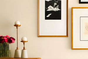
Introducing SW 9607 Tanglewood by Sherwin Williams, a paint color that’s quickly gaining popularity for its unique charm and versatility. This shade is a part of Sherwin Williams’ carefully curated palette, designed to bring warmth and elegance to any space it graces.
Tanglewood stands out with its subtle blend of earthy tones, offering a perfect middle ground for those looking to add a touch of coziness without overwhelming a room’s natural light.
SW 9607 Tanglewood is more than just a paint color; it’s a gateway to creating inviting spaces that feel like home. Whether you’re looking to refresh your living room, bedroom, or even your kitchen, Tanglewood brings a sense of calm and sophistication.
Its adaptability allows it to pair beautifully with various decor styles, from rustic to modern minimalism, making it a go-to choice for designers and homeowners alike.
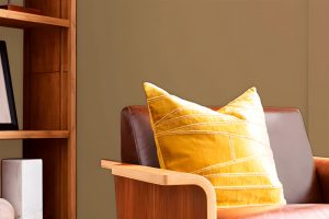
One of the best things about Tanglewood is its ability to complement a wide range of materials and textures. From natural wood and stone to sleek metal finishes, this color supports an array of interior design elements, helping to unify the look of a space.
For those aiming to create a serene and welcoming atmosphere, SW 9607 Tanglewood by Sherwin Williams is a compelling choice that promises to enhance your home’s aesthetic appeal effortlessly.
What Color Is Tanglewood SW 9607 by Sherwin Williams?
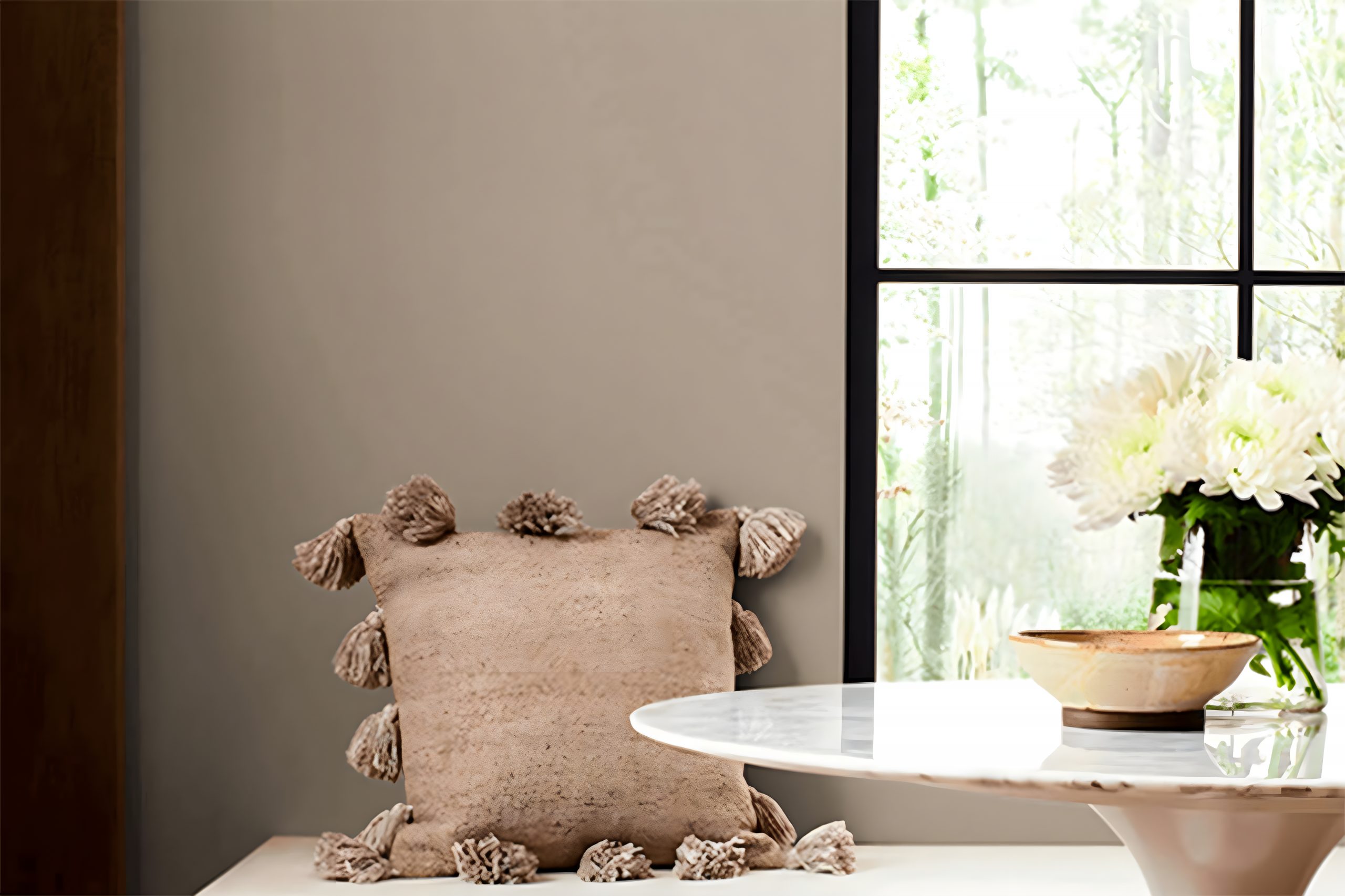
Tanglewood by Sherwin Williams, coded SW 9607, is a warm, inviting paint color that brings a sense of calmness and sophistication to any space. This rich hue blurs the lines between beige and soft brown, making it versatile for various interior styles and settings.
It exudes natural earthiness, perfect for those who appreciate timeless elegance in their surroundings.
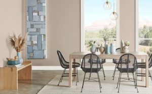
When it comes to interior styles, Tanglewood shines in environments that lean towards rustic chic, modern farmhouse, and even transitional decor. Its warm undertones pair beautifully with natural light, making spaces feel cozy yet bright.
For a harmonious look, combining it with creams and soft whites can enhance its warmth, creating a comforting and welcoming ambiance.
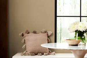
Pairing Tanglewood with different materials and textures can bring a room to life. It goes hand in hand with natural wood, from light oak to richer walnut shades, highlighting wood’s organic beauty.
Leather furniture or accents in caramel or chocolate tones can also complement this color, adding a layer of richness and depth to the decor. Textures like linen or cotton in neutral shades work wonderfully, providing contrast while keeping the overall look cohesive and grounded. With the right balance, Tanglewood can transform any room into a serene and stylish retreat.
Ever wished paint sampling was as easy as sticking a sticker? Guess what? Now it is! Discover Samplize's unique Peel & Stick samples.
Get paint samples

Is Tanglewood SW 9607 by Sherwin Williams Warm or Cool color?
Tanglewood (SW 9607) by Sherwin Williams is a warm and versatile shade that has a unique ability to transform spaces within homes.
This particular color strikes a perfect balance between providing warmth and maintaining a subtle neutrality, making it an ideal choice for numerous decorating styles and various rooms within a house.
When applied to walls, Tanglewood brings a cozy and inviting atmosphere to living spaces. Its warm undertones can make large, open rooms feel more intimate, while still maintaining a sense of airiness and space.
This makes it a fantastic option for living rooms or dining areas, where a welcoming ambiance is often desired.
In smaller spaces like bedrooms or studies, Tanglewood works well to create a soothing backdrop that enhances relaxation and focus. Its neutrality allows for easy pairing with a wide range of furniture colors and textures, offering flexibility in interior design.
Moreover, its adaptability extends to lighting. Tanglewood interacts beautifully with natural light, showcasing different shades as the day progresses, while under artificial lighting, it retains its warmth, contributing to a pleasant and comfortable environment regardless of the time of day.
In conclusion, Tanglewood is more than just a paint color; it’s a design tool that can significantly influence the mood and style of a home.
Its ability to blend warmth with neutrality means it can effortlessly enhance the aesthetic and feel of various spaces, making a home feel more welcoming and beautifully cohesive.
Undertones of Tanglewood SW 9607 by Sherwin Williams
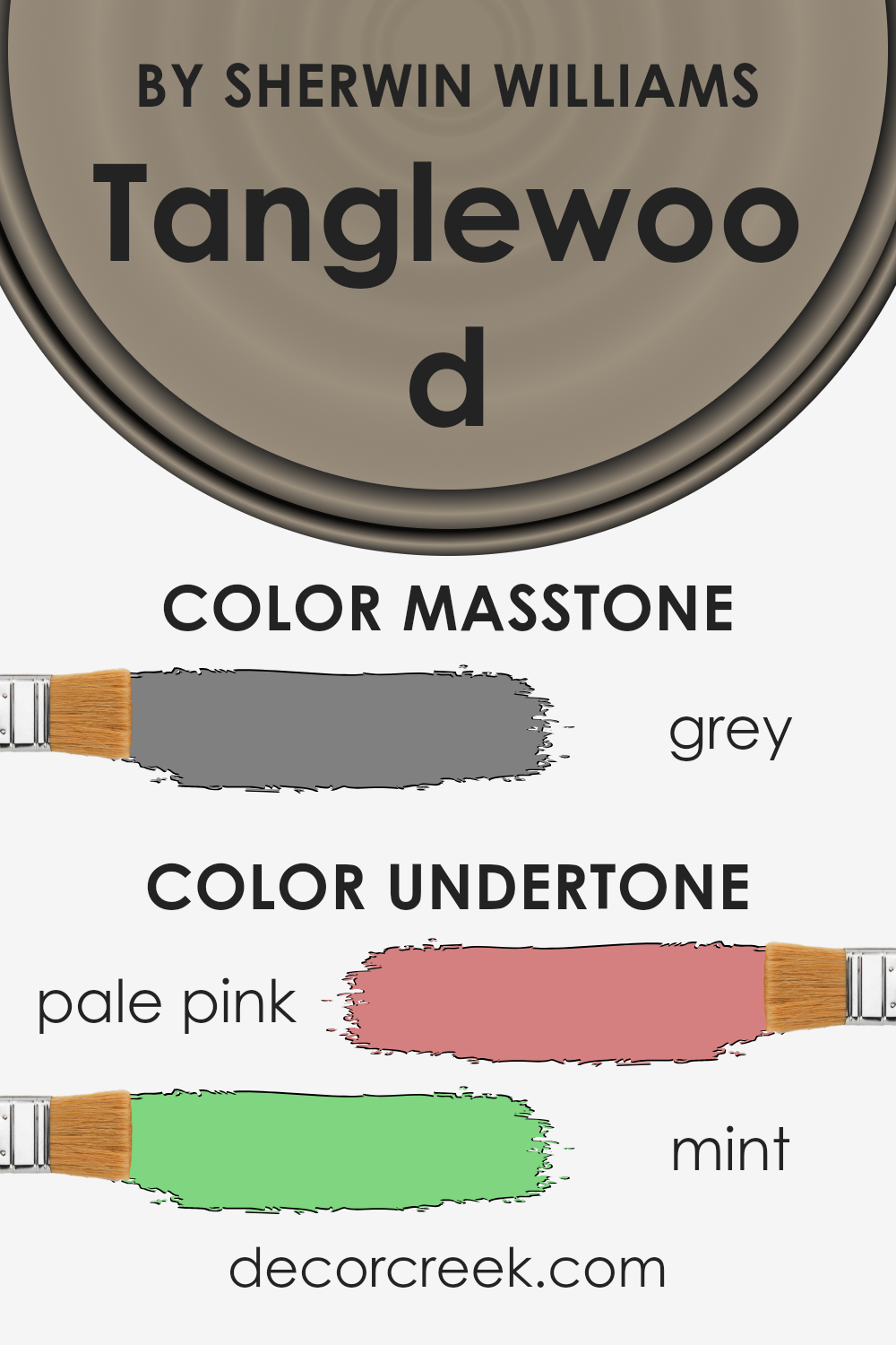
Tanglewood by Sherwin Williams is a unique paint color that carries subtle undertones, making it rather special. The hidden shades beneath its surface are pale pink and mint, which are not immediately obvious but influence how we perceive the color.
Undertones play a crucial role in how colors look and feel in a space. They can make a color appear cooler or warmer, depending on the lighting and what other colors are used alongside.
For example, a color with pink undertones might look warmer and more inviting under natural light, while the same color can seem cooler in a room with less light.
In the case of this particular paint, its pale pink and mint undertones add a layer of softness and versatility. On interior walls, these undertones allow the paint to adapt to different lighting conditions and decor styles.
During the day, under abundant natural light, the walls might hint at a warm, cozy atmosphere thanks to the pink undertones.
Meanwhile, in artificial light or during the evening, the mint undertones could bring a fresh and calm feeling to the space.
This adaptability makes Tanglewood a great choice for various rooms, from bedrooms to living spaces, offering a foundation that complements a wide range of furnishings and decor accents. The subtle undertones ensure the walls remain dynamic and engaging, reacting to changes in light and decoration.
What is the Masstone of the Tanglewood SW 9607 by Sherwin Williams?
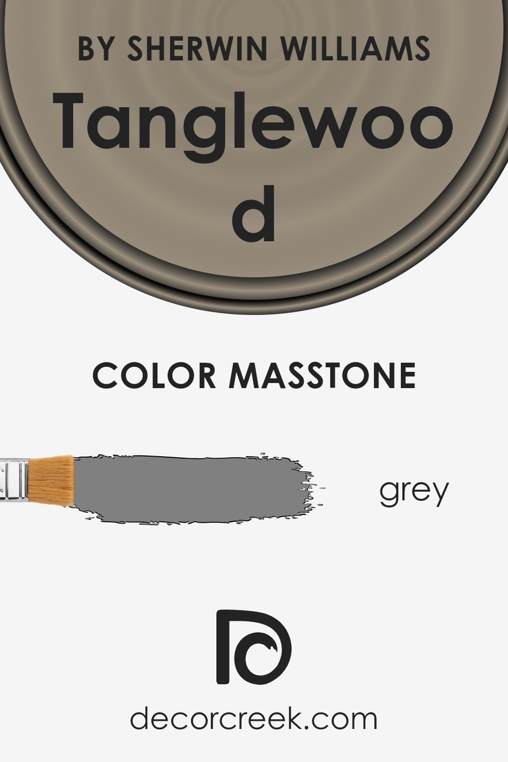
Tanglewood SW 9607 by Sherwin Williams has a masstone, or the color you see when the paint is undiluted, that is grey (#808080). This neutral hue plays a significant role in its functionality in home decor.
The grey tone ensures that Tanglewood is incredibly versatile, fitting well within a wide range of interior styles from modern to rustic.
Its neutrality means it can act as a subtle backdrop that allows other colors to shine or as a standalone shade that brings a sense of calm and sophistication.
In homes, this grey masstone helps create a balanced atmosphere. It does not overpower spaces but instead, aids in crafting a cohesive look.
Whether you’re aiming for a warm, inviting living room or a cool, serene bedroom, Tanglewood can adapt to these environments, providing a solid foundation for various design elements. Its versatility also means it pairs well with both bold accents and soft, muted tones, making it a go-to choice for homeowners looking to achieve a balanced and aesthetically pleasing space.
How Does Lighting Affect Tanglewood SW 9607 by Sherwin Williams?
Lighting plays a crucial role in how we perceive colors. When it comes to painting a room, choosing the right color is important, but understanding how lighting will affect that color is equally vital. Let’s look at how different lighting conditions change the way colors appear, using a specific color example.
Consider a warm and inviting color like Tanglewood, which carries a unique blend of warmth that can transform spaces into cozy, welcoming areas. In artificial light and natural light, this color’s true essence can shift significantly.
In artificial light, such as LED or fluorescent lighting, Tanglewood can lean towards its warmer, richer tones. Artificial light, especially warmer-toned bulbs, can enhance the coziness of the color, making it appear more vibrant and lively.
This can make rooms feel snug and inviting, especially during the evening or in rooms with limited natural light.
Under the glow of natural light, the perception of this color can vary dramatically throughout the day. Morning light tends to be cooler, which could make Tanglewood look a bit more muted, highlighting its subtle cooler undertones.
As the day progresses and the light becomes warmer, the color may appear brighter and more dynamic.
The orientation of the room also has a significant impact:
- North-faced rooms generally receive cooler, more consistent light, which might make the color appear slightly more subdued, emphasizing its soothing qualities without losing its warmth.
- South-faced rooms are bathed in warm light for most of the day, which will enhance the color’s natural warmth, making the space feel vibrant and energetic.
- East-faced rooms enjoy bright morning light, making the color appear lively and warm in the mornings, gradually transitioning to a softer tone as the day goes on.
- West-faced rooms get the evening light, which can make this color glow warmly, creating a cozy and inviting atmosphere in the afternoons and evenings.
Understanding these nuances helps in choosing the right room and lighting conditions to paint, ensuring that the color not only matches your vision but also performs beautifully under varying lighting conditions.
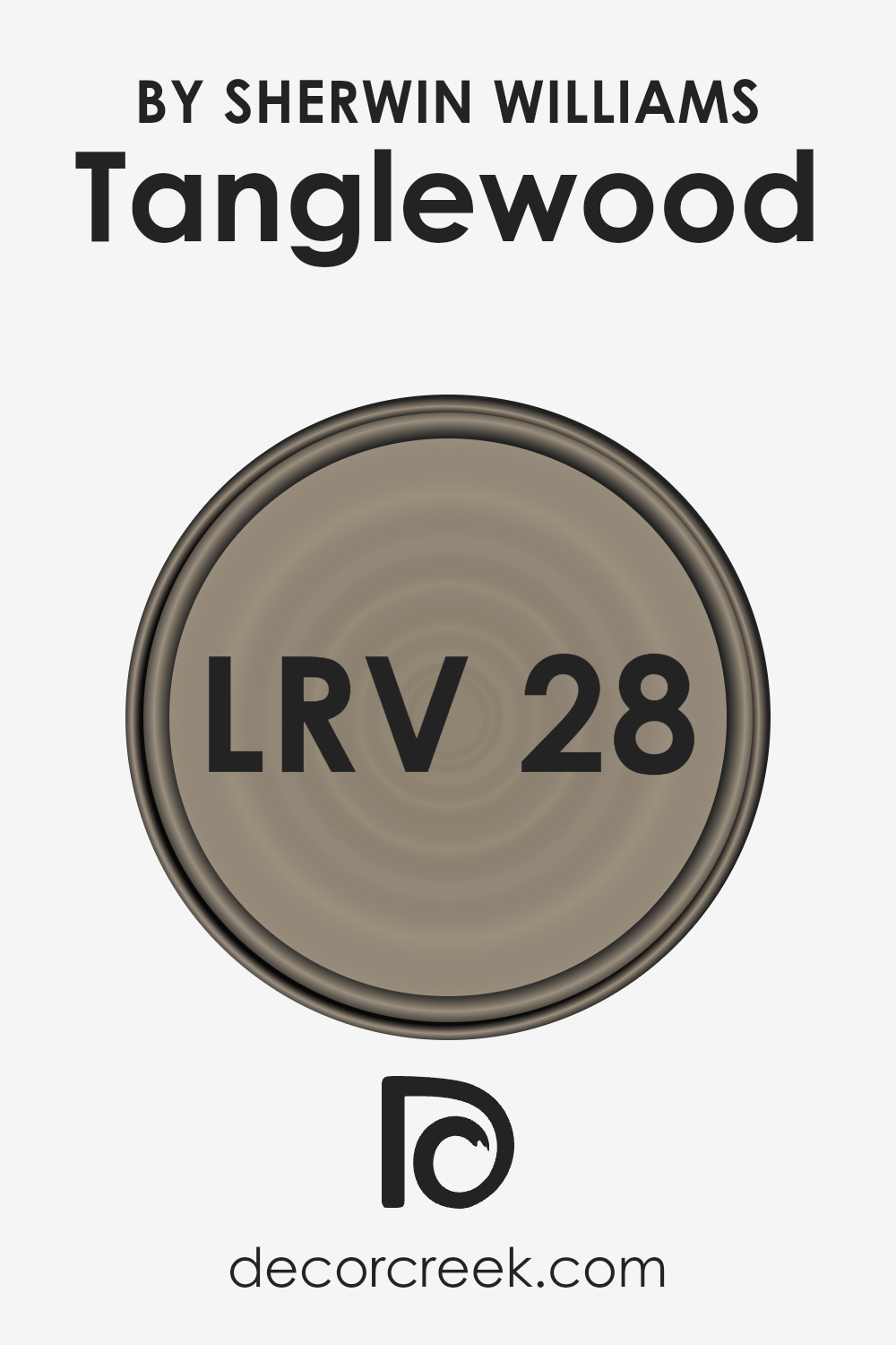
What is the LRV of Tanglewood SW 9607 by Sherwin Williams?
LRV stands for Light Reflectance Value, which is a measurement used to describe the amount of visible and usable light that a paint color reflects or absorbs when light shines on it. This value is given on a scale of 0 to 100, where 0 means the color absorbs all light, appearing very dark, and 100 means it reflects all light, appearing very bright.
This number is crucial because it helps people understand how light or dark a color will look on their walls. Light colors can make a room feel more open and airy, while dark colors can make a space feel cozier or smaller.
The light in a room, both natural and artificial, can significantly impact how a color looks, with changes occurring throughout the day as the intensity and source of light change.
For the specific color with an LRV of 27.974, it’s on the darker side of the scale, meaning it doesn’t reflect a lot of light. In practical terms, this color will absorb more light than it reflects, which can make a room feel more intimate or smaller.
This doesn’t mean it’s a bad choice; it’s just better suited for spaces where a cozy, more enveloping atmosphere is desired. When using a color like this, lighting becomes very important.
Sufficient lighting, whether through large windows or well-placed artificial lights, will ensure the space doesn’t feel too dark.
Additionally, this color can add character and depth to a room, making it ideal for creating accent walls or for use in spaces where a strong, sophisticated look is wanted.
LRV – what does it mean? Read This Before Finding Your Perfect Paint Color
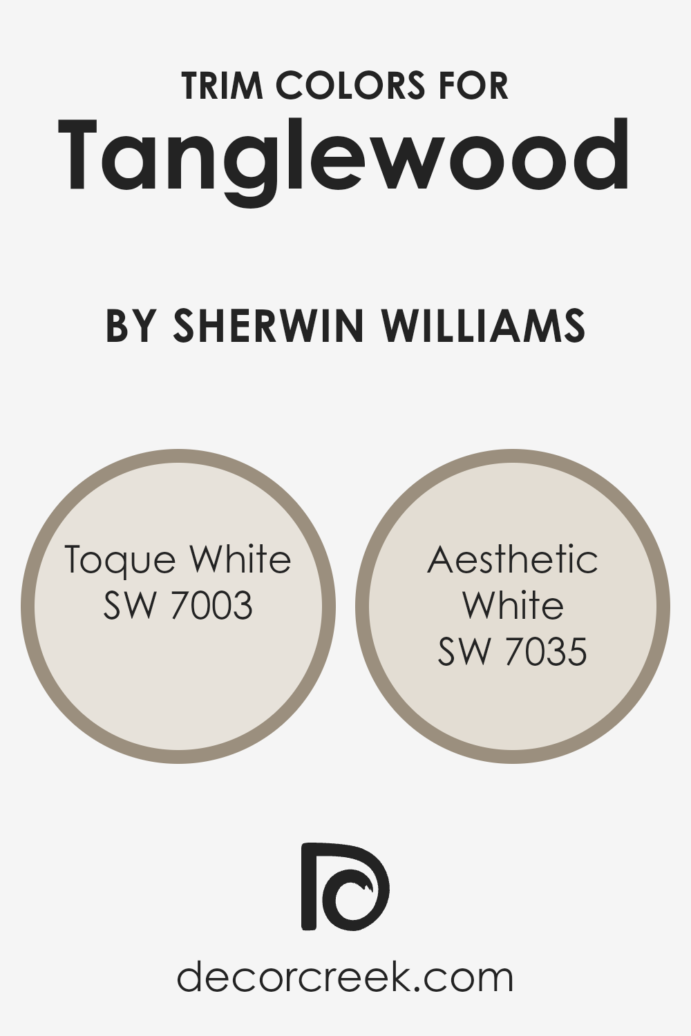
What are the Trim colors of Tanglewood SW 9607 by Sherwin Williams?
Trim colors are the hues selected for the finishing touches on various surfaces such as door frames, window frames, skirtings, and moldings in a room or on a building’s exterior. The right trim color can beautifully frame spaces, creating contrast that highlights architectural details or enhances the cohesion between walls and trims.
When considering Tanglewood, a warm and inviting shade, choosing the perfect trim color is crucial for achieving a balanced and harmonious look. Trim colors can either subtly blend with the main color or stand out, offering a crisp, defined boundary that enriches the overall appearance.
For a color like Tanglewood, SW 7003 – Toque White, with its soft and airy vibe, provides a gentle contrast, giving a clean and fresh look without overwhelming the senses. It’s like having a lightly clouded sky against a warm landscape, softening the transitions between spaces.
On the other hand, SW 7035 – Aesthetic White is a bit warmer, bringing a cozy and inviting feel to the room. It works well to create a seamless flow when used as a trim, ensuring that spaces feel connected yet distinct.
This color nestles comfortably next to Tanglewood, enhancing its warmth without causing a stark contrast, perfect for those seeking a harmonious and subtly enriched environment.
You can see recommended paint colors below:
- SW 7003 Toque White
- SW 7035 Aesthetic White
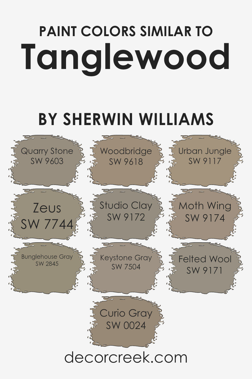
Colors Similar to Tanglewood SW 9607 by Sherwin Williams
Choosing similar colors for a project can significantly enhance the visual appeal and coherence of a space. When colors closely resemble one another, like the shades similar to Tanglewood by Sherwin Williams, they create a seamless transition between spaces, fostering a sense of unity and balance.
These colors, ranging from the subtle depth of Quarry Stone to the soothing neutrality of Felted Wool, work together harmoniously, offering decorators a palette that can easily be mixed and matched for varied yet cohesive interior schemes.
Quarry Stone brings a soft, earthy essence that grounds a room without overwhelming it, making spaces feel more inviting. Zeus, slightly bolder, introduces a touch of sophistication and depth, perfect for creating focal points without stark contrast.
Bunglehouse Gray offers a mid-tone option that bridges lighter and darker shades, ensuring fluidity in design transitions. Curio Gray, with its muted undertone, acts as a versatile backdrop for both vibrant and subtle accents.
Woodbridge adds warmth with its rich hue, enhancing coziness in any setting. Studio Clay has a unique, almost chameleon-like quality, adapting and complementing various decor styles.
Keystone Gray strikes a balance between warm and cool tones, providing flexibility in color theme choices. Urban Jungle brings a fresh, contemporary spin, infusing spaces with a dynamic, yet understated energy.
Moth Wing and Felted Wool, with their subtle, earthy notes, offer a serene, calming atmosphere, rounding out the palette with a gentle, soothing finish. By selecting from these similar shades, creating a polished, integrated look becomes effortlessly achievable, offering endless possibilities for creating inviting, harmonious spaces.
You can see recommended paint colors below:
- SW 9603 Quarry Stone
- SW 7744 Zeus
- SW 2845 Bunglehouse Gray
- SW 0024 Curio Gray
- SW 9618 Woodbridge
- SW 9172 Studio Clay
- SW 7504 Keystone Gray
- SW 9117 Urban Jungle
- SW 9174 Moth Wing
- SW 9171 Felted Wool
How to Use Tanglewood SW 9607 by Sherwin Williams In Your Home?
Tanglewood SW 9607 by Sherwin Williams is a beautiful paint color that can add warmth and coziness to any room in your home. This shade is part of the Sherwin Williams color collection, known for its quality and wide range of colors.
Tanglewood has a natural, earthy tone that works well in living rooms, bedrooms, or even kitchens, creating a comfortable and welcoming atmosphere.
Using Tanglewood in your home is pretty straightforward. It’s a versatile color, so you can apply it to walls as the main color scheme or use it for accent walls to add depth and interest to your space.
This color pairs nicely with light furniture and decor to maintain a bright and airy feel or with darker pieces to create a more grounded, cozy vibe.
Consider Tanglewood for cabinets or woodwork as well. It adds a subtle, sophisticated touch to these areas, enhancing the overall feel of a room without overwhelming it.
Whether you’re updating a single room or renovating your entire home, Tanglewood can bring a sense of calm and nature indoors, making your living spaces more enjoyable and inviting.
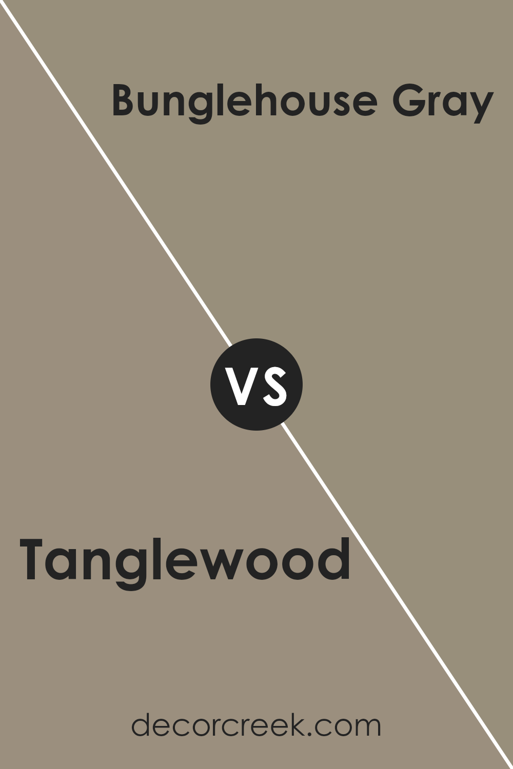
Tanglewood SW 9607 by Sherwin Williams vs Bunglehouse Gray SW 2845 by Sherwin Williams
Tanglewood by Sherwin Williams is a warm and inviting color that brings a cozy feel to any space. It has a soft, almost earthy tone that makes rooms feel welcoming and comfortable. This color works great in living areas or bedrooms where you want to create a relaxed atmosphere.
On the other hand, Bunglehouse Gray by Sherwin Williams offers a different vibe. It’s a cooler, more neutral gray that provides a sleek and modern look.
This color is versatile and can make a space feel more spacious and open, making it a good choice for kitchens, bathrooms, or any room that you want to give a clean and contemporary feeling.
While Tanglewood adds warmth and a touch of nature, Bunglehouse Gray brings a modern sophistication.
Depending on what feel you’re going for in your space, both colors offer unique qualities that can enhance the aesthetic of your home. Whether you’re looking for coziness or a crisp look, these colors offer great options.
You can see recommended paint color below:
- SW 2845 Bunglehouse Gray
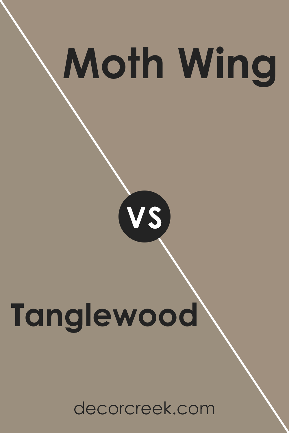
Tanglewood SW 9607 by Sherwin Williams vs Moth Wing SW 9174 by Sherwin Williams
Tanglewood and Moth Wing, both from Sherwin Williams, offer unique yet complementing tones for interior spaces. Tanglewood, with its warm, light brown hue, carries a sense of coziness and soft, inviting warmth.
It’s a color that feels like a snug, comfortable blanket, perfect for spaces where relaxation and comfort are key. On the other hand, Moth Wing presents a darker, more muted brown with gray undertones, providing a soothing, understated elegance.
This color suits areas needing a touch of sophistication without overwhelming brightness. Together, these colors could create a harmonious balance in a room, with Tanglewood brightening the space and Moth Wing adding depth and grounding elements.
While distinct, their shared warmth and earthiness mean they can easily complement each other or stand alone, depending on the desired atmosphere of the room.
You can see recommended paint color below:
- SW 9174 Moth Wing
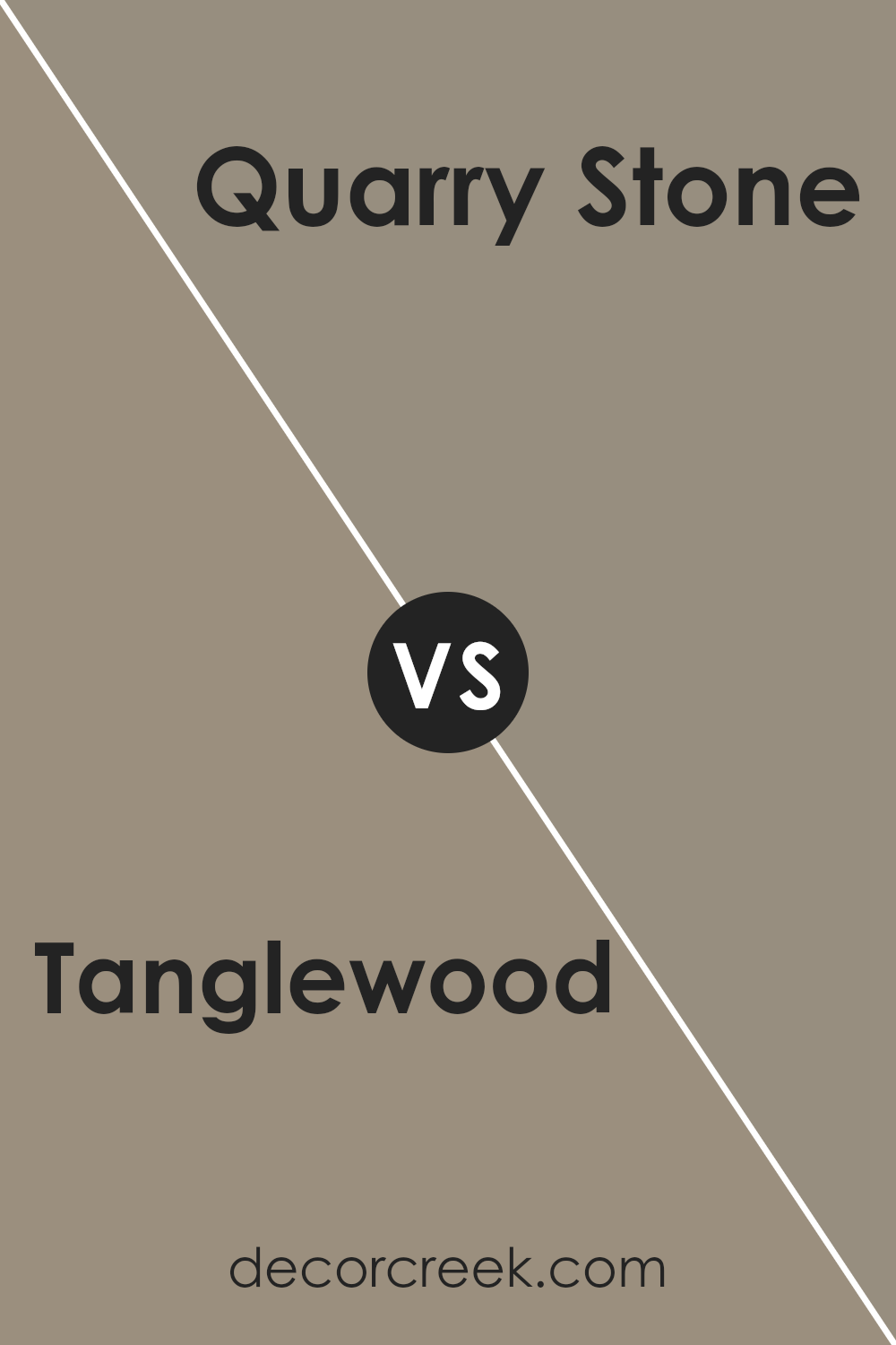
Tanglewood SW 9607 by Sherwin Williams vs Quarry Stone SW 9603 by Sherwin Williams
The main color, Tanglewood, and the second color, Quarry Stone, both from Sherwin Williams, offer unique tones for any space. Tanglewood has a warmer, beige-like appearance. It’s a cozy color that can make a room feel more inviting, perfect for living areas or bedrooms where comfort is key.
On the other hand, Quarry Stone comes across as a cooler, grayish shade, giving off a more modern and sleek vibe. This makes it ideal for spaces that aim for a contemporary look, like kitchens or bathrooms.
When comparing these two, the most noticeable difference lies in their temperature undertones. Tanglewood leans towards a softer, earthy look, while Quarry Stone brings a sharper, more defined feel.
Whether one prefers the warmth of Tanglewood or the coolness of Quarry Stone depends on the atmosphere they wish to create. Both colors are versatile, though, and can blend well with various decor styles, from rustic to modern.
Choosing between them comes down to the desired mood and the specific character you want to give a space.
You can see recommended paint color below:
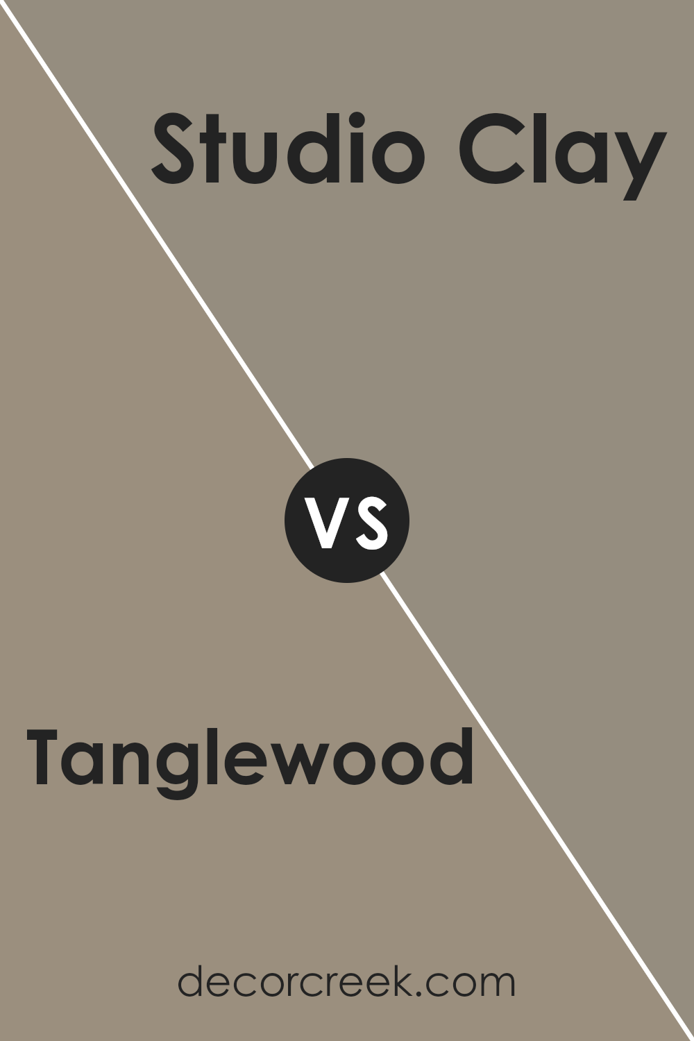
Tanglewood SW 9607 by Sherwin Williams vs Studio Clay SW 9172 by Sherwin Williams
Tanglewood and Studio Clay, both by Sherwin Williams, offer unique ambiances for any space. Tanglewood has a warm, gentle beige tone that brings a cozy and inviting atmosphere. It’s a great choice for rooms where you want to add a touch of warmth without overpowering the space.
It works well in living areas and bedrooms, offering a soothing backdrop.
On the other hand, Studio Clay sports a deeper, more grounded taupe. It’s a bit bolder than Tanglewood, giving off an earthy vibe that can make a room feel more anchored and sophisticated.
This color is fantastic for those looking to add a bit of drama or depth to their space without going too dark.
While both colors share a warmth, Tanglewood leans towards the lighter side, offering a soft embrace, whereas Studio Clay holds a stronger presence with its richer, deeper tone.
Their uses can intersect, but choosing between them depends on the level of warmth and depth you’re aiming to achieve in your space.
You can see recommended paint color below:
- SW 9172 Studio Clay
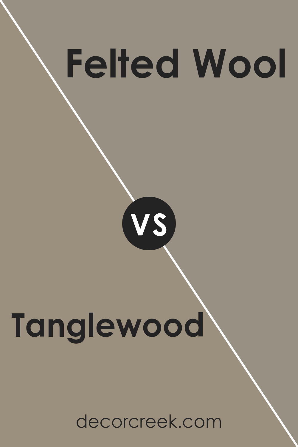
Tanglewood SW 9607 by Sherwin Williams vs Felted Wool SW 9171 by Sherwin Williams
Tanglewood and Felted Wool by Sherwin Williams are both unique colors that offer different vibes for rooms. Tanglewood is a warm, light beige that brings a cozy and inviting atmosphere to any space.
Its lightness can make small rooms feel bigger and brighter, perfect for living rooms or bedrooms seeking a calm and comfortable feel.
On the other hand, Felted Wool is a deeper, richer grey that has a touch of warmth, making it versatile for spaces where you want a bit more depth and sophistication. It’s an ideal choice for creating a modern, yet cozy, feel in a room.
This color can add an elegant backdrop to interiors, working well in areas that benefit from a stronger color presence like dining rooms or home offices.
While both colors offer warmth, Tanglewood leans towards a lighter, airier feel, and Felted Wool offers a snugger, more enclosed ambiance. Depending on the room’s purpose and size, each color has its charm, with Tanglewood brightening spaces and Felted Wool adding a touch of refinement.
You can see recommended paint color below:
- SW 9171 Felted Wool
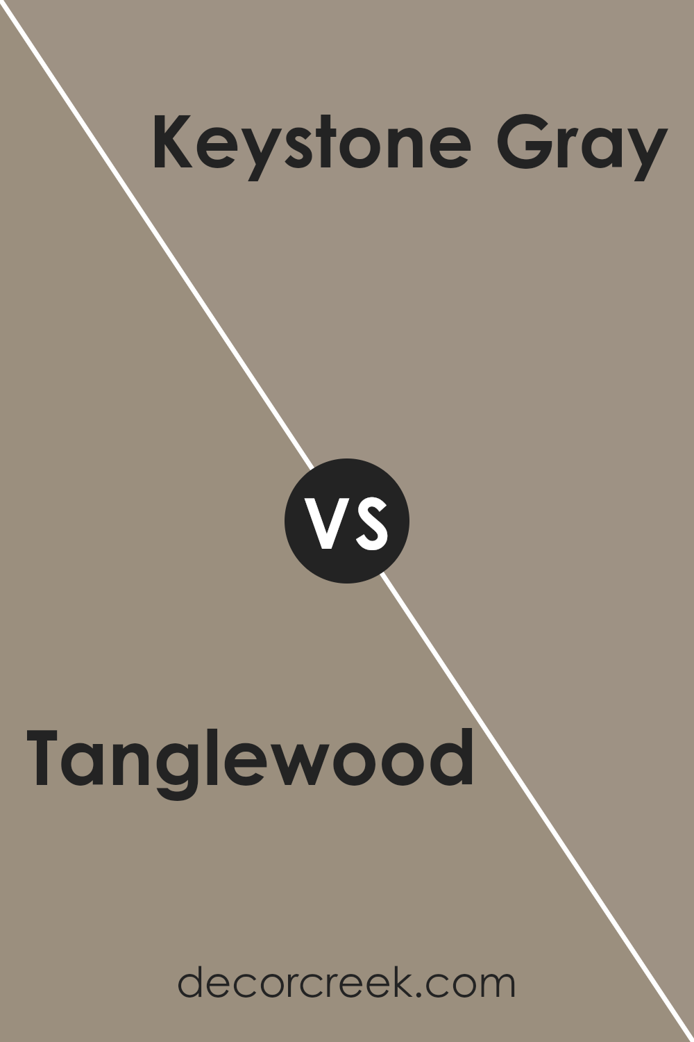
Tanglewood SW 9607 by Sherwin Williams vs Keystone Gray SW 7504 by Sherwin Williams
Tanglewood and Keystone Gray are two paint colors by Sherwin Williams that bring different vibes to a space. Tanglewood has a lighter, more natural feel. It’s a bit like the warm shade you might see on a well-loved piece of wooden furniture or the soft highlight in a bundle of wheat.
It’s cozy and welcoming, making rooms feel open and airy without being too bright.
Keystone Gray, on the other hand, is deeper and more muted. It’s like the color of stones you’d find along a shady riverbank. This gray has a solid, grounding effect, adding a sense of sophistication and strength to a space.
It works well in areas where you want more of an elegant, anchored look without going too dark.
When you put them side by side, Tanglewood brings a lighter, earthier touch, while Keystone Gray offers a more reserved, classic feel. They could complement each other nicely in a home, with Tanglewood in bright, sunny rooms and Keystone Gray in more intimate, formal areas.
You can see recommended paint color below:
- SW 7504 Keystone Gray
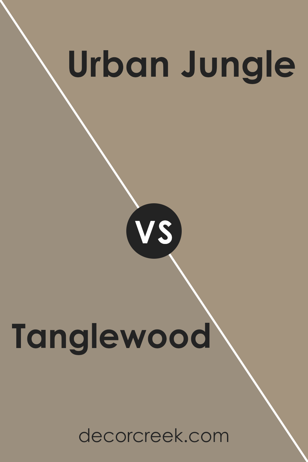
Tanglewood SW 9607 by Sherwin Williams vs Urban Jungle SW 9117 by Sherwin Williams
Tanglewood and Urban Jungle are both colors by Sherwin Williams but they have their own unique vibes. Tanglewood is like a cozy, light brown that feels warm and welcoming, kind of like a hug from a friend. It’s perfect for spaces where you want to relax and feel at home.
On the other hand, Urban Jungle has a greenish touch that makes you think of nature right inside your city apartment. It’s a bit darker than Tanglewood, suggesting a rich, lush look that can make any space feel more alive and connected to the outdoors.
Putting them side by side, Tanglewood offers a soft, soothing presence with its beige-brown tone, making rooms feel more open and airy. Urban Jungle, with its deeper, green-infused color, brings in a bit of the outside world, making it great for those who love a bit of nature in their surroundings.
So, while Tanglewood sets up a cozy, warm atmosphere, Urban Jungle adds depth and a natural vibe to a space. Both are beautiful, but they serve different moods and preferences.
You can see recommended paint color below:
- SW 9117 Urban Jungle
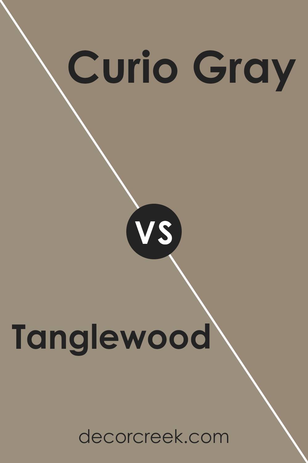
Tanglewood SW 9607 by Sherwin Williams vs Curio Gray SW 0024 by Sherwin Williams
When comparing Tanglewood and Curio Gray from Sherwin Williams, it’s like looking at two shades from a cozy, warm palette but with distinct vibes. Tanglewood has a gentle, beige warmth to it, reminding one of soft, sunlit afternoons.
It’s subtle and has an inviting feel, perfect for creating a snug and relaxing space. Its earthy tones can make any room feel grounded yet airy.
On the other hand, Curio Gray steps in with a bit more sophistication. While still in the realm of warm tones, it leans towards a muted, elegant gray that brings a sense of calmness and refinement.
It’s the kind of color that works beautifully in spaces aiming for a modern yet timeless look, providing a sleek backdrop that doesn’t overpower.
In essence, Tanglewood offers a soft, warm hug, making spaces feel homey and comfortable. Curio Gray, while also warm, delivers a more polished and serene ambiance, making it ideal for those looking to strike a balance between cozy and chic.
Both colors serve different moods and spaces with their unique charm.
You can see recommended paint color below:
- SW 0024 Curio Gray
Tanglewood SW 9607 by Sherwin Williams vs Woodbridge SW 9618 by Sherwin Williams
Tanglewood and Woodbridge, both from Sherwin Williams, are two distinct colors. Tanglewood is like a gentle caress of light brown, soft and subtle. It’s the kind of color that reminds you of a warm, cozy blanket or the soft, earthy tones of a well-loved wooden piece.
Its muted tone makes it versatile for any room, adding a touch of warmth without overpowering the space.
On the other hand, Woodbridge goes deeper into the realm of browns. It’s like the dark, rich soil of a fertile earth, strong and more pronounced. This color speaks of stability and grounding, offering a bolder statement while still keeping the warmth.
It’s perfect for spaces that aim to feel more anchored and enveloped in a sense of comfort and robustness.
While Tanglewood whispers of gentle mornings, Woodbridge tells the story of the deep, comforting night. Both bring their unique charm to spaces, yet their distinct shades mean they cater to different tastes and interior moods.
Whether you lean towards the soft hug of Tanglewood or the embracing depth of Woodbridge, each color brings its own beauty to your home.
You can see recommended paint color below:
- SW 9618 Woodbridge
Tanglewood SW 9607 by Sherwin Williams vs Zeus SW 7744 by Sherwin Williams
The main color, Tanglewood, and the second color, Zeus, from Sherwin Williams offer contrasting vibes for any interior or exterior. Tanglewood is a soft, warm beige with a cozy, inviting feel. It’s like sunlight gently streaming through a window, creating a calm, nurturing environment.
This color works well in spaces where relaxation and ease are key, making rooms look more spacious and welcoming.
On the other side, Zeus is a strong, deep, gray-green, giving off a more grounded, earthy look. It’s the kind of color that brings a bit of nature’s serenity indoors, but with a bold twist.
Perfect for creating a statement wall or for spaces that aim for a more modern, edgy aesthetic, Zeus adds depth and drama without overpowering.
Together, Tanglewood and Zeus could create a beautiful contrast, marrying warmth with boldness, and softness with strength. Applying these colors in the same space could balance out the ambiance, offering a unique blend of coziness and contemporary flair.
You can see recommended paint color below:
- SW 7744 Zeus
Conclusion
In summary, the article showcases Tanglewood SW 9607 by Sherwin-Williams, emphasizing its flexible appeal that has attracted a wide range of users. It highlights the color’s versatility, which allows it to fit into various interior themes, from minimalist to more vibrant setups.
The color’s unique shade offers a cozy and welcoming vibe to any space, making it a popular choice for those looking to add a touch of warmth to their homes or offices.
Its adaptability and the calming effect it brings to spaces are key points noted, suggesting it’s not just a trend but a timeless choice for decorators and homeowners alike.
Furthermore, the article points out that Tanglewood SW 9607 possesses a charming quality that enhances the aesthetics of a room without overpowering other design elements. It has been praised for its ability to complement different materials and textures, making it easy to incorporate into various decor styles.
Whether used as a main color scheme or as an accent, it adds a sophisticated and inviting touch, proving its worth as a top choice from Sherwin-Williams’ color palette.
The blend of utility and beauty this color offers underscores its growing popularity and the positive reception it has received from those who have chosen it for their spaces.
Ever wished paint sampling was as easy as sticking a sticker? Guess what? Now it is! Discover Samplize's unique Peel & Stick samples.
Get paint samples