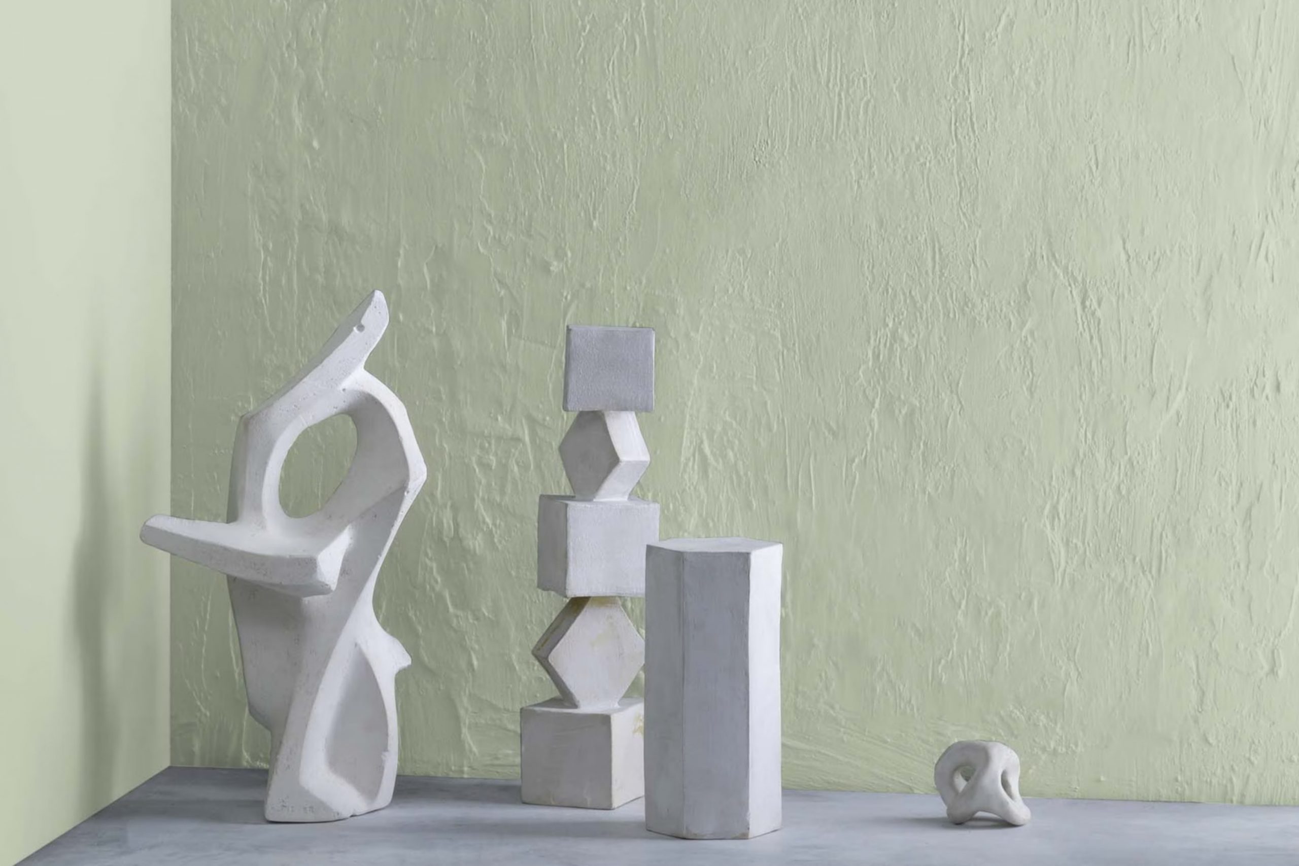
When you first paint a wall in your home with 472 Aganthus Green by Benjamin Moore, you might be surprised by the subtle yet significant change it brings to your room. Known for its understated elegance, this color has a softness that can make any area feel more inviting and comfortable.
What sets Aganthus Green apart is its ability to blend seamlessly with various decor styles, from modern to rustic, making it a flexible choice for reviving your living area. Painting with such a distinctive shade allows you to create a unique ambiance in your home.
It can serve as a calm backdrop for bolder colors or act as the main attraction in a neutrally themed room. Whether you’re looking to freshen up your living room, bedroom, or even your kitchen, Aganthus Green offers a gentle nudge towards a more personalized and refined interior without overpowering your senses.
Through my experience, I can say it’s a color that quietly changes a room, providing a fresh look while maintaining a warm, welcoming atmosphere.
What Color Is Aganthus Green 472 by Benjamin Moore?
Aganthus Green 472 by Benjamin Moore is a rich, earthy green hue that brings a sense of natural calmness to any room. It’s a flexible color with a balanced tone that isn’t too bright or too subdued, making it fantastic for adding a touch of nature-inspired depth to your decor. This shade effectively captures the essence of lush greenery, perfect for those looking to add a natural vibe to their living environment.
Aganthus Green works particularly well in a variety of interior styles. It’s a great match for rustic themes, where its earthy qualities complement natural wood textures, linen fabrics, and handcrafted pottery.
It can also look stunning in a more traditional setting when paired with dark woods, rich leathers, and classic patterns, adding a pop of color that is both enduring and fresh. This color pairs beautifully with a wide range of materials and textures. Natural elements like wood and stone bring out its earthiness, while metals like bronze or copper add a touch of warmth that enhances its depth.
Soft textiles, such as wool or cotton, in neutral shades can balance its boldness, creating a cozy, inviting room. Overall, Aganthus Green 472 is a dynamic and adaptable choice that can create a cozy yet lively atmosphere in any home.
Is Aganthus Green 472 by Benjamin Moore Warm or Cool color?
Aganthus Green 472 by Benjamin Moore is a unique shade of green that brings a refreshing vibe to any room. This color has a natural feel that reminds you of lush gardens and peaceful outdoor areas. It’s a softer green, which means it can work well in both bright and dimly lit rooms, adapting to different styles of home décor.
Whether you’re painting a bedroom, living room, or even a kitchen, Aganthus Green 472 adds a touch of nature without overpowering the room. This color pairs well with wood finishes and neutral colors, making it adaptable for various home styles. It’s especially great if you want to create a relaxed atmosphere.
For instance, using it in a bedroom can help make the room feel calming, helping you wind down after a long day. In the living room, it can help make the place look lively yet comforting, which is great for gatherings or just hanging out. Overall, Aganthus Green 472 adds a breath of fresh air to homes.
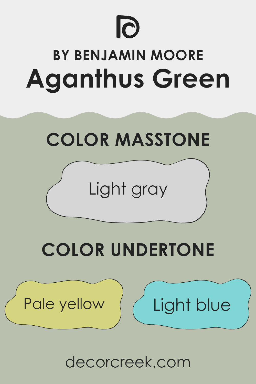
Undertones of Aganthus Green 472 by Benjamin Moore
Aganthus Green is a unique paint color offered by Benjamin Moore, distinguished by its complex blend of undertones. This color contains hints of pale yellow, light blue, mint, light purple, pale pink, lilac, and grey. These undertones are subtle colors that influence the main hue, adding depth and complexity to the paint.
Understanding undertones is crucial because they can significantly affect how a color appears in different lighting conditions and surroundings. For example, pale yellow can bring a subtle warmth to the color, making it feel cozy in sunlight. Light blue and mint add a fresh coolness, which might make the room feel more airy and light.
Light purple and pale pink introduce a touch of softness, potentially giving the walls a gentle, soothing vibe. The lilac undertone can contribute a hint of refinement without being too overpowering. Lastly, grey helps balance out the brightness, ensuring the color remains muted and easy to blend with various decor styles.
When Aganthus Green is applied to interior walls, these undertones collectively influence the room’s atmosphere. Depending on the lighting and surrounding colors, different undertones might become more noticeable, thus changing the perceived main color of the paint.
In a well-lit room, for instance, the yellow and pink might make the room feel warmer, while in a room with cooler light, the blue and mint might dominate, creating a calmer, more refreshed look. This makes Aganthus Green a flexible choice for decorating, as it can adapt to both vibrant and subdued settings.
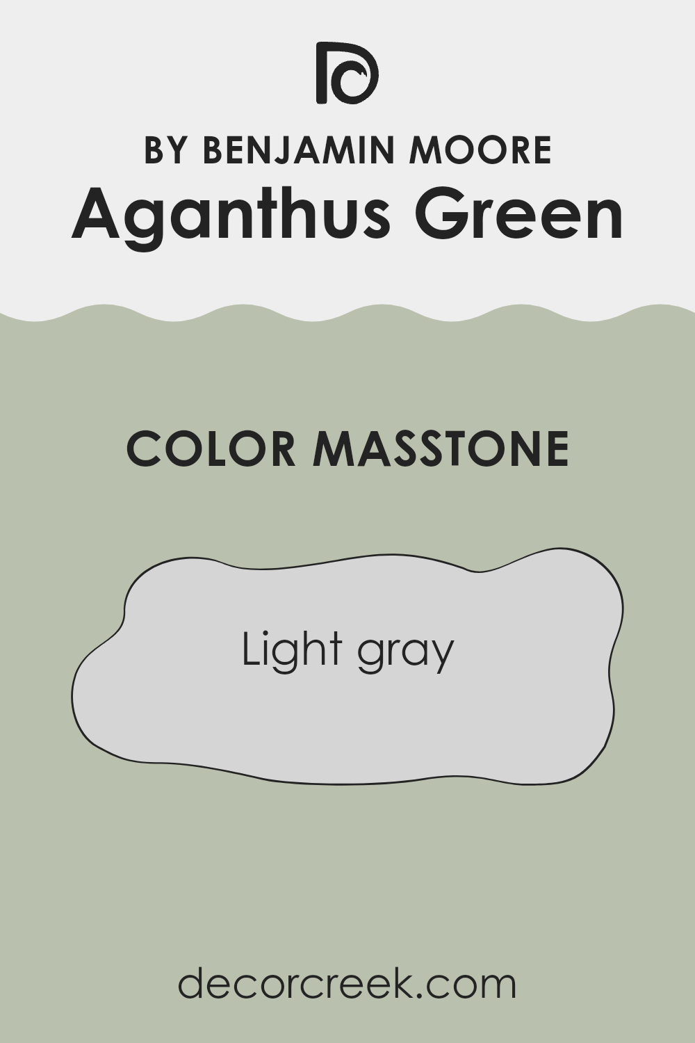
What is the Masstone of the Aganthus Green 472 by Benjamin Moore?
The masstone of Light gray (#D5D5D5), used in Aganthus Green 472 by Benjamin Moore, provides a bright and soft backdrop in any room. This particular shade of gray works well in homes because it is very neutral, making it easy to combine with other colors.
Whether you have bright furniture or more subdued decor, Light gray blends seamlessly. It’s especially good in rooms that may not get a lot of natural light, as its lightness helps to make areas appear larger and more open.
This color can be a great choice for living rooms or bedrooms where you want a calm, neat atmosphere without the starkness that sometimes comes with pure white. Because it doesn’t lean too warm or too cool, Light gray is adaptable and can be used in various styles of interior design, from modern to traditional. It helps create a clean and orderly room, setting a pleasant tone without dominating the decor.
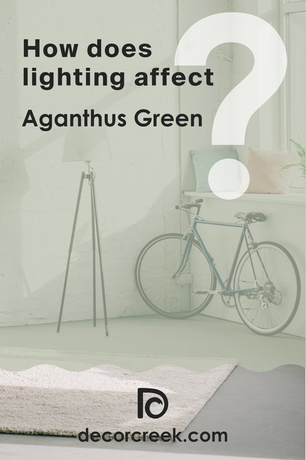
How Does Lighting Affect Aganthus Green 472 by Benjamin Moore?
Consider the color Aganthus Green by Benjamin Moore. This particular shade, a subtle, soothing green, can look quite different depending on the light source. In artificial light, such as from incandescent bulbs, this color tends to appear warmer and more muted, often bringing out more of its yellow undertones. In contrast, under fluorescent lighting, Aganthus Green might look sharper and slightly bluish, as these lights typically cast a cooler tone.
In rooms with natural light, the appearance of Aganthus Green changes throughout the day. In north-facing rooms, which receive less direct sunlight, the color might appear more shadowy and cooler, making the room feel more enclosed but calm.
South-facing rooms are bathed in abundant light for most of the day; here, Aganthus Green will appear brighter and more lively, potentially highlighting its more vibrant green qualities, which can make the room feel more energetic.
In east-facing rooms, the color will catch the morning sun. This means it will look very bright and cheerful in the morning, potentially showing a very true representation of the color, but will grow progressively cooler as the day advances. Conversely, in west-facing rooms, the color will feel softer in the morning light and gain intensity towards the evening, potentially bringing out deeper and richer tones in the paint as the sun sets.
Overall, the way Aganthus Green by Benjamin Moore is perceived can dramatically shift based on the type of light and the direction from which it comes, affecting the overall feel and character of the room.
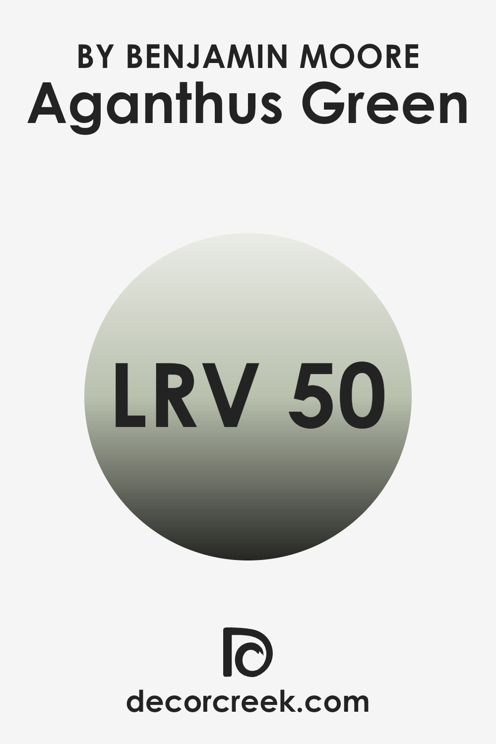
What is the LRV of Aganthus Green 472 by Benjamin Moore?
LRV stands for Light Reflectance Value, a measurement that shows how much light a paint color reflects or absorbs. Think of it like a scale from 0 to 100, where 0 means it’s very dark, absorbing most of the light, and 100 means it’s very bright, reflecting almost all the light.
LRV is really handy when choosing paint because it helps predict how light or dark a color will look on your walls. If a color has a high LRV, it will make a room feel brighter and more open since it reflects more light around the room.
Taking the color Aganthus Green by Benjamin Moore with an LRV of 50.37 as an example, it’s in the middle of the LRV scale. This means it neither reflects nor absorbs light excessively, offering a balanced appearance under most lighting conditions.
In a room with decent natural light or good artificial lighting, Aganthus Green will appear true to its color without leaning too dark or too light. It’s a flexible choice that will maintain its unique green shade under various lighting situations, making it quite practical for different rooms in a home.
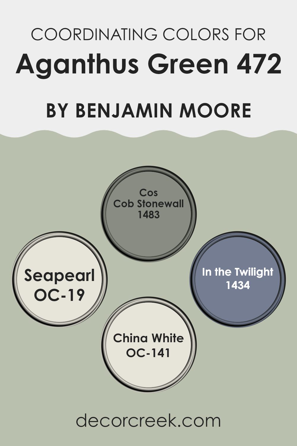
Coordinating Colors of Aganthus Green 472 by Benjamin Moore
Coordinating colors are hues that complement each other when used together in decorating a room. These colors are often chosen to create a harmonious and pleasant aesthetic, enhancing the overall appeal of a room. By selecting colors that sit well together, such as those coordinated with Aganthus Green by Benjamin Moore, you can achieve a balanced and inviting atmosphere.
Cos Cob Stonewall 1483 is a hearty stone gray that offers a strong, grounded feeling to any room, making it a perfect complement to the calm vibe of Aganthus Green. Seapearl OC-19 is a soft white with a hint of warmth, providing a subtle contrast that highlights the richness of greener tones.
In the Twilight 1434 is a deep, muted blue that adds a mysterious depth, pairing well to add a dramatic flair without overpowering. Lastly, China White OC-141 is a creamy, off-white shade that brings softness and light, easing the intensity of darker shades and ensuring the room feels open and airy. Together, these colors work alongside Aganthus Green to create a cohesive look that’s pleasing to the eye.
You can see recommended paint colors below:
- 1483 Cos Cob Stonewall
- OC-19 Seapearl
- 1434 In the Twilight
- OC-141 China White
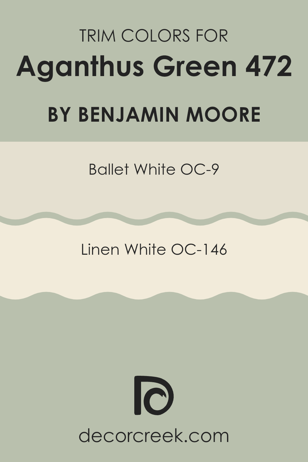
What are the Trim colors of Aganthus Green 472 by Benjamin Moore?
Trim colors are specifically chosen hues used to accentuate or complement the primary wall color in a room or on an exterior. For example, when using a rich shade like Aganthus Green by Benjamin Moore, trim colors like OC-9 Ballet White and OC-146 Linen White are essential in highlighting architectural details and framing the main color, making it stand out more prominently.
These trim colors provide a crisp, clean contrast to the depth of Aganthus Green, helping to define edges and features such as moldings, door frames, and baseboards. This method enhances the overall look by adding depth and interest to the room.
OC-9 Ballet White is a soft, creamy white that offers a gentle contrast, allowing the vibrant tones of Aganthus Green to shine without overpowering the senses. It’s an adaptable shade that can soften sharp lines and blend seamlessly with various décor styles.
On the other hand, OC-146 Linen White has a slightly warmer tone, creating a cozier feel in a room. It pairs well with the earthy undertones of Aganthus Green, providing a harmonious transition between colors that invites a welcoming atmosphere. Both choices are excellent for creating a fresh and appealing environment.
You can see recommended paint colors below:
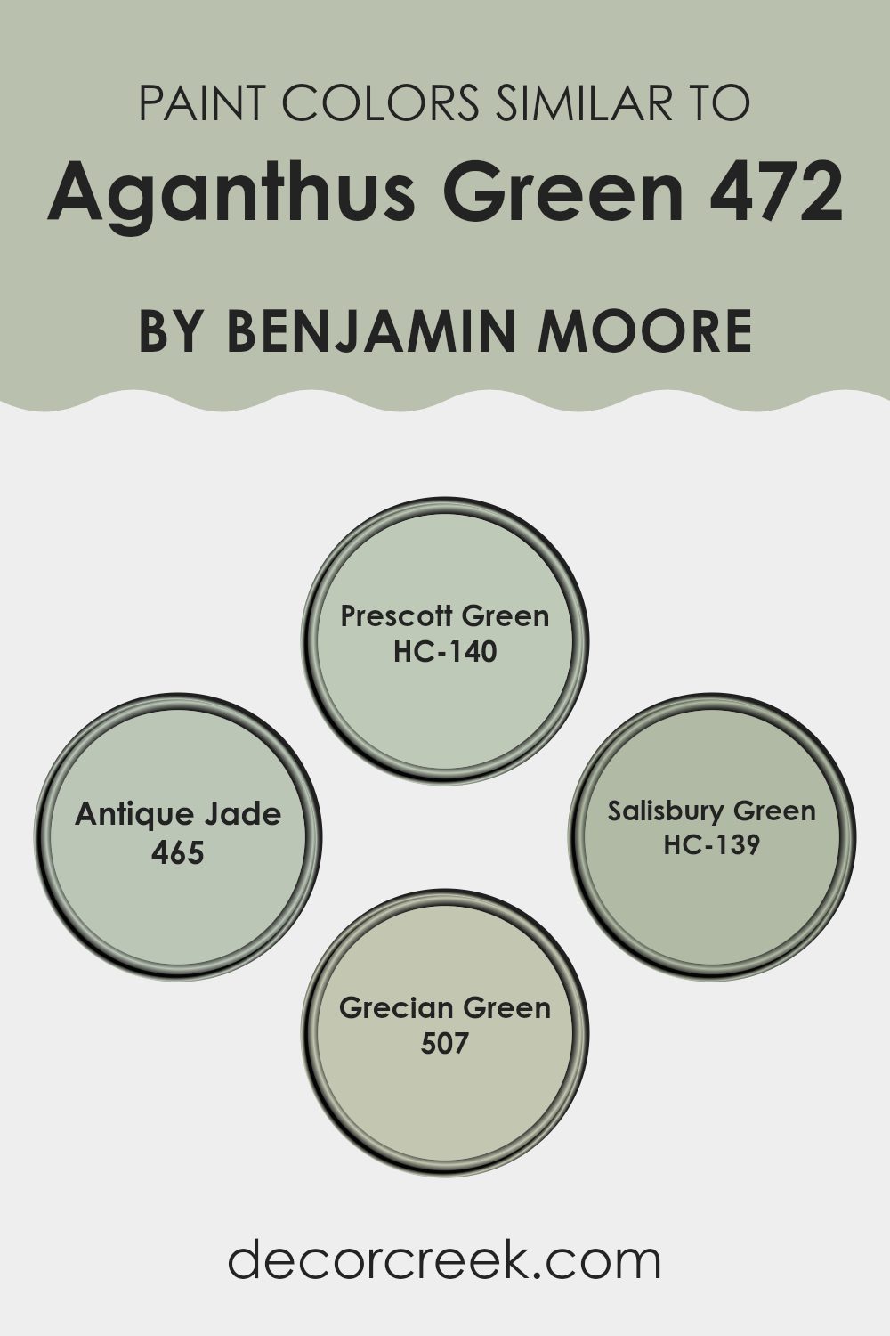
Colors Similar to Aganthus Green 472 by Benjamin Moore
Choosing similar colors like Prescott Green, Antique Jade, Salisbury Green, and Grecian Green can create a harmonious and aesthetic look because they all share a common base with Acanthus Green by Benjamin Moore. These colors provide a sense of cohesion, allowing for a seamless transition from one room to another or from one design element to the next.
Their close relationship in hue makes it easy to combine them in various design elements throughout a room, whether for walls, trims, or accents, resulting in a unified visual experience. By using similar colors, you can achieve a professional and polished look without the stark contrasts that often come with combining widely differing colors.
Prescott Green (HC-140) offers a refreshing touch, somewhat lighter and with a hint of freshness that makes it ideal for creating a bright and airy ambiance. Antique Jade (465) has a deeper, richer tone that is perfect for adding a touch of depth to any room without overpowering with too dark a shade.
Salisbury Green (HC-139) brings a balanced, muted vibe, great for lending a subtle complexity to interiors. Lastly, Grecian Green (507) stands out with its vibrant yet earthy feel, perfect for rooms that require a natural but lively color scheme. Together, these greens weave through a room beautifully, enhancing one another while maintaining a gentle flow of color.
You can see recommended paint colors below:
- HC-140 Prescott Green
- 465 Antique Jade
- HC-139 Salisbury Green
- 507 Grecian Green
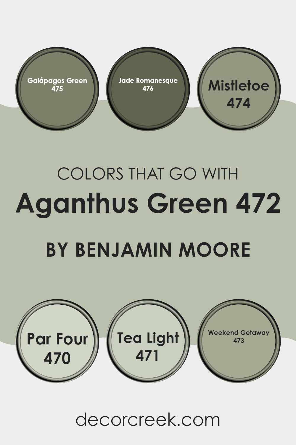
Colors that Go With Aganthus Green 472 by Benjamin Moore
Selecting colors that pair well with Aganthus Green 472 by Benjamin Moore is vital to creating a harmonious atmosphere in any room. These chosen shades help to soften or enrich the atmosphere depending on what mood or style you aim to achieve.
Galápagos Green 475 presents a slightly darker tone of green which can offer a grounded feeling to a room, providing a sense of nature and growth. Another tone that can deepen the aesthetic is Jade Romanesque 476, which adds a sense of old-world charm with its richer, deeper green, evoking the look of lush, ancient tapestries.
On the lighter side, Mistletoe 474 has a fresher, more subdued green that brings brightness without overpowering, making it ideal for a calm and inviting room. Par Four 470 offers a hint of green with a more neutral, softened edge, perfect for creating a subtle backdrop that allows other elements in a room to stand out.
Tea Light 471 is even milder, almost moving towards creamy tones, providing a sturdy base that pairs smoothly with more vibrant accents. Lastly, Weekend Getaway 473 uses a gentle, muted green which sets a relaxed tone, perfect for rooms meant for unwinding. By combining Aganthus Green with these companion colors, you can effortlessly achieve a balanced, aesthetic coherence in your decorating projects.
You can see recommended paint colors below:
- 475 Galápagos Green
- 476 Jade Romanesque
- 474 Mistletoe
- 470 Par Four
- 471 Tea Light
- 473 Weekend Getaway
How to Use Aganthus Green 472 by Benjamin Moore In Your Home?
Aganthus Green 472 by Benjamin Moore is a unique shade of paint that can add a fresh touch to any room in your house. This color is a peaceful green that resembles the shades you might see in a lush garden. It’s not too bright but has enough vibrancy to make rooms feel lively and welcoming.
You can use Aganthus Green 472 in various ways around your home. It’s perfect for bedrooms where you want a calm atmosphere to help you relax and get a good night’s sleep. It also works well in bathrooms, paired with white trim and natural elements like wood or bamboo, to create a clean and fresh look.
In living areas, such as the living room or the kitchen, Aganthus Green can brighten the room and make it feel more inviting. You can also consider painting just one wall with this color for a stylish accent that draws the eye without overpowering your decor. Pair it with soft creams or light browns for a harmonious look.
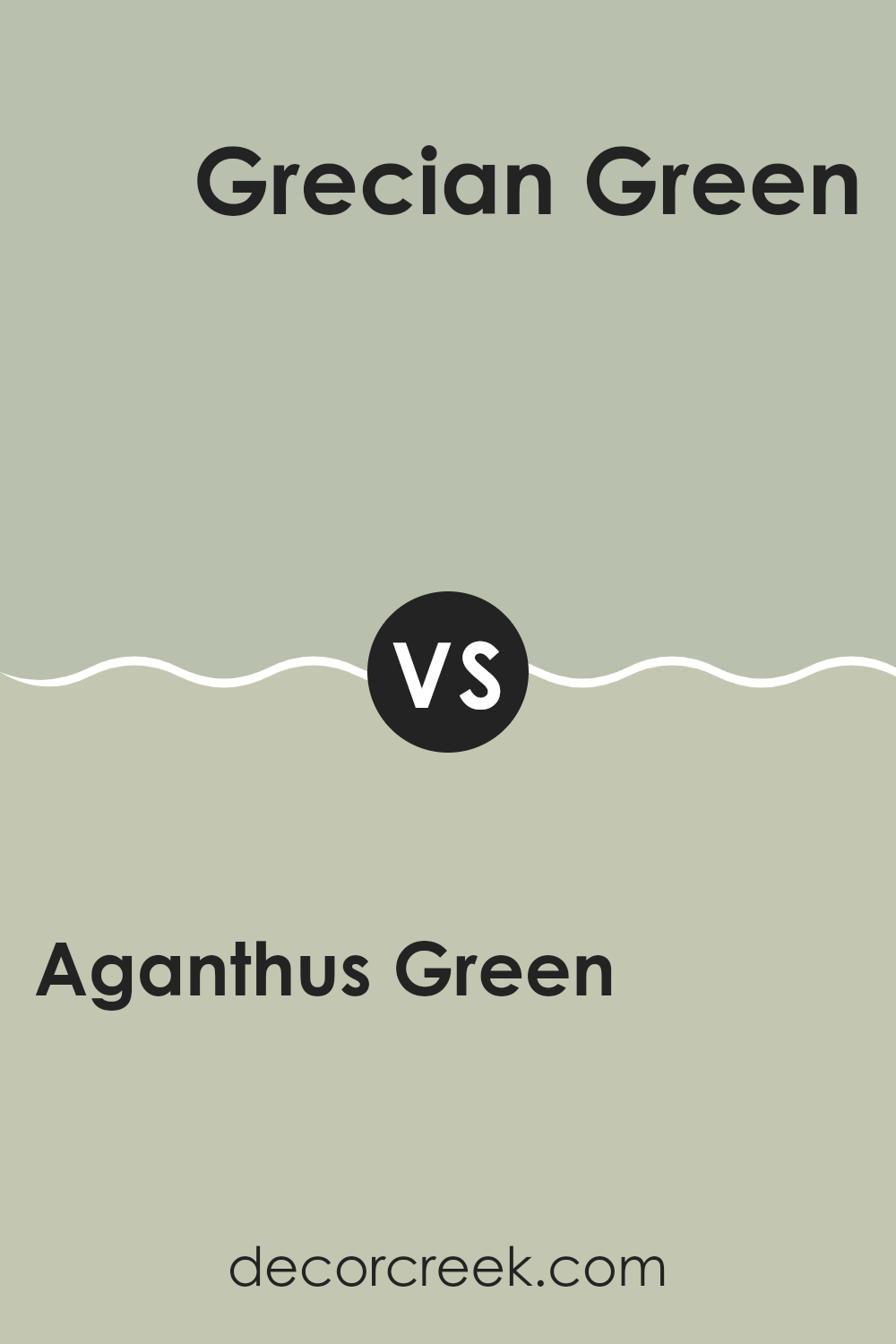
Aganthus Green 472 by Benjamin Moore vs Grecian Green 507 by Benjamin Moore
Aganthus Green and Grecian Green by Benjamin Moore are two distinct shades, both unique while remaining true to an earthy palette. Aganthus Green presents a softer, muted tone, leaning towards a subtle sage.
This color is ideal if you’re aiming for a background hue that doesn’t overpower but still adds character to the room. In contrast, Grecian Green stands out with a deeper, more traditional green that suggests the lushness of dense foliage. It’s a stronger color that commands more attention, yet balances well in environments where a touch of nature is desired.
Despite both being greens, their individual hues affect how light plays in a room, with Aganthus imparting a lighter feel, and Grecian creating a sense of depth. Either option brings a natural vibe to decor, but choosing between them would depend on how bold or muted you want your green accents to be.
You can see recommended paint color below:
- 507 Grecian Green
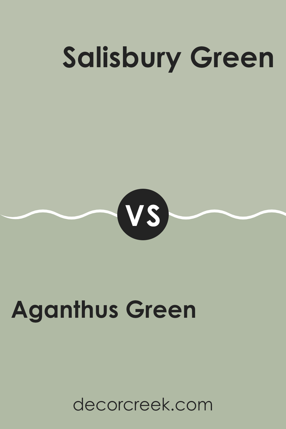
Aganthus Green 472 by Benjamin Moore vs Salisbury Green HC-139 by Benjamin Moore
Aganthus Green and Salisbury Green are two shades by Benjamin Moore but have distinct characteristics. Aganthus Green is a lighter, more muted hue that brings a calm, fresh feel to a room. This color is great for making a room seem more airy and spacious as it’s closer to a pale gray-green.
On the other hand, Salisbury Green possesses a deeper, richer tone. It’s a mid-tone green that leans towards earthiness, giving a warmer and more traditional look. This makes it ideal for areas that aim to feel more grounded and cozy.
These greens could complement each other well in a setting where Salisbury Green can be used for an accent wall or lower wall panels, with Aganthus Green covering larger areas to maintain a sense of openness. The choice between them can depend on the desired mood and ambience, with Aganthus suited to lighter, breezier environments and Salisbury fitting more classic, intimate rooms.
You can see recommended paint color below:
Aganthus Green 472 by Benjamin Moore vs Antique Jade 465 by Benjamin Moore
Aganthus Green and Antique Jade are both green hues by Benjamin Moore, but they have different tones that set them apart. Aganthus Green is a softer, lighter green with a subtle gray undertone that makes it soothing and perfect for creating a calm environment.
It works well in rooms where you want a touch of nature without overpowering brightness. On the other hand, Antique Jade is slightly darker and has more depth, which brings a richer, more traditional green look to any room.
This color is ideal if you’re aiming for a more classic or grounded feel in your décor. Both colors are adaptable and can be used in a variety of settings, from bedrooms to living areas, enhancing the room with their natural green shades. Whether you lean towards the understated elegance of Aganthus Green or the more pronounced presence of Antique Jade, both provide beautiful backdrops for interiors.
You can see recommended paint color below:
- 465 Antique Jade
Aganthus Green 472 by Benjamin Moore vs Prescott Green HC-140 by Benjamin Moore
Aganthus Green is a soft, muted green with a significant gray base, giving it a subdued, calming feel suitable for rooms where you want a touch of nature without overpowering brightness. It pairs well with natural materials like wood and stone and works nicely in living rooms or bedrooms where a gentle green can soothe and relax.
Prescott Green, on the other hand, has a sharper, more vibrant tone compared to Aganthus Green. It leans slightly towards a traditional green hue, offering a fresh and lively look while still maintaining an air of calm. Prescott Green works well in rooms that receive a lot of natural light, enhancing the brightness of the room and making it feel more open and airy.
Both colors bring a sense of the outdoors into any room but achieve it in distinctly different ways. Aganthus Green’s subtler tones are great for a low-key vibe, whereas Prescott Green’s brighter touch can lift the spirits of a room, making it feel lively and welcoming.
You can see recommended paint color below:
In wrapping up my thoughts on the color 472 Aganthus Green by Benjamin Moore, I must say that it’s a truly special shade of green. When I first painted my room with it, I noticed how calming and comfy it made my room feel. It’s like a soft hug from Mother Nature herself! This tone of green has a fresh, lively vibe that makes my room feel more cheerful and inviting.
What’s great about Aganthus Green is how nicely it pairs with other colors. My white trim and brown wooden furniture look amazing with it! It’s a perfect choice if someone wants to add some lively spirit to their room without making it too loud. Also, it’s gentle on the eyes, which is a big plus if you spend a lot of time in your room like I do.
To sum up, if you’re thinking about giving your room a new look and want a color that’s calming yet joyful, 472 Aganthus Green should definitely be on your list.
It changed my room for the better, and I think it could do the same for yours! It is not just a paint; it’s a simple way to make your room feel new and exciting every day.
Ever wished paint sampling was as easy as sticking a sticker? Guess what? Now it is! Discover Samplize's unique Peel & Stick samples.
Get paint samples

