Choosing the right paint color for your room can be challenging, but I’m here to help you understand SW 6241 Aleutian by Sherwin Williams. This color brings a unique blend of subtlety and depth to any room, perfect for those looking to create a calm yet refined atmosphere.
From the subtle undertones to the way it interacts with different lighting, Aleutian offers a flexible palette that works well in various rooms. When I was deciding on a new color for my living room, I considered various shades, and Aleutian stood out due to its peaceful and inviting nature.
It pairs beautifully with diverse decor styles and complements a wide range of furniture finishes. In the following paragraphs, you’ll get insights on how to best utilize SW 6241 Aleutian, ensuring it enhances the aesthetic of your home effectively.
Whether you’re painting a cozy bedroom or refreshing your living room, this shade can provide the soothing backdrop you’re looking for.
Is Aleutian SW 6241 Right for My Home?
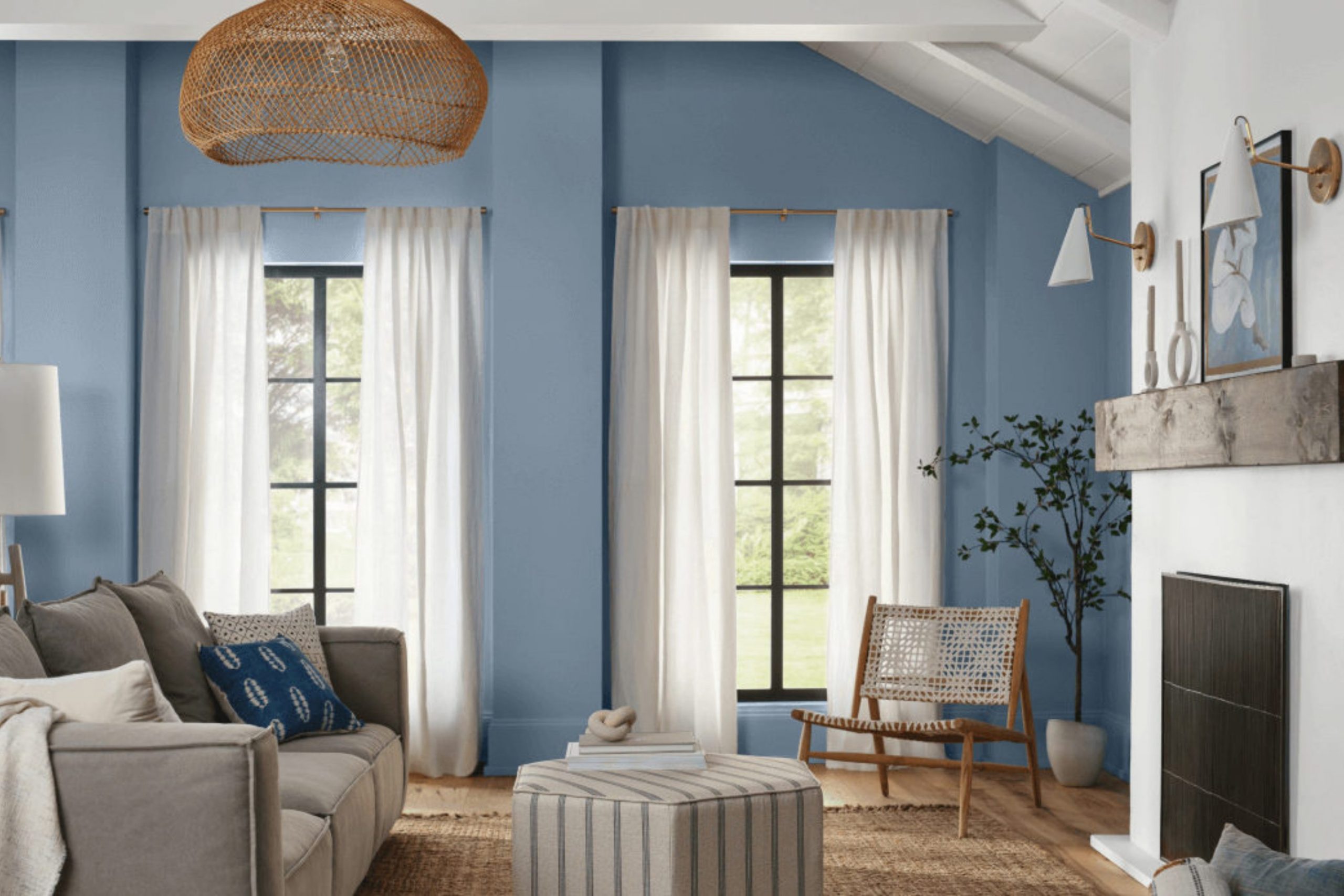
I recently came across the color Aleutian by Sherwin Williams, and it’s quickly become one of my favorites for interior rooms. It’s a gentle, soft blue with just a hint of gray, making it incredibly soothing and perfect for creating a restful environment. It’s not overly bright, which helps in setting a relaxed mood without being too intense.
I find that Aleutian works exceptionally well in rooms that aim for a classic, coastal, or even farmhouse style. Its subtle tones blend beautifully with natural materials, such as light wood, linen, and cotton, enhancing the organic feel of the room. I also love pairing it with matte finishes and textured elements like wicker or knitted throws to add a touch of coziness.
When I use this color in my projects, I like to think about balance. Aleutian pairs well with soft whites and neutral beige tones, creating a clean and airy look. If I want to introduce a bit more contrast, I combine it with darker elements like navy or charcoal, which highlights its calmness without overpowering the room.
This color is perfect for bedrooms or living areas where I want to promote a sense of calm and relaxation. It has a way of making rooms feel more open and inviting, which is always an added bonus in my book!
decorcreek.com
What are the right undertones of Aleutian SW 6241 ?
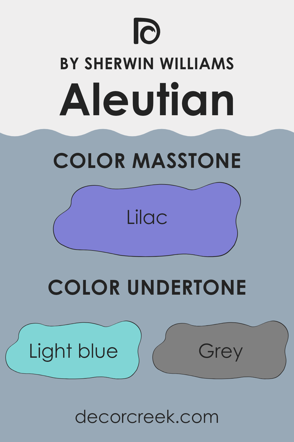
Aleutian by Sherwin Williams is flexible due to its blend of various undertones. Undertones are subtle colors that influence a paint’s main shade, affecting how it appears in different lighting or alongside other colors.
Aleutian, though primarily a soft, soothing hue, carries undertones of light blue, gray, and mint, which can lend a fresh, cool feel to a room. It also has hints of light purple and pale pink, adding a touch of warmth and softness that can make rooms feel more welcoming.
In interior rooms, the range of undertones in Aleutian can have a significant impact on the atmosphere. The light blue and mint undertones can make a room feel airier and more open, while the gray can bring a modern, clean look. When used on walls, Aleutian can either cool down a room that gets a lot of sunlight or add warmth to a room with less natural light, thanks to its adaptable undertones.
The presence of light purple and pale pink undertones adds an interesting dynamic. These hints can complement natural materials like wood or work well with metallic finishes and pastel accents. Depending on the furnishings and decor, Aleutian can show more of one undertone than another, highlighting its adaptability and how it can subtly coordinate with various interior styles and preferences.
decorcreek.com
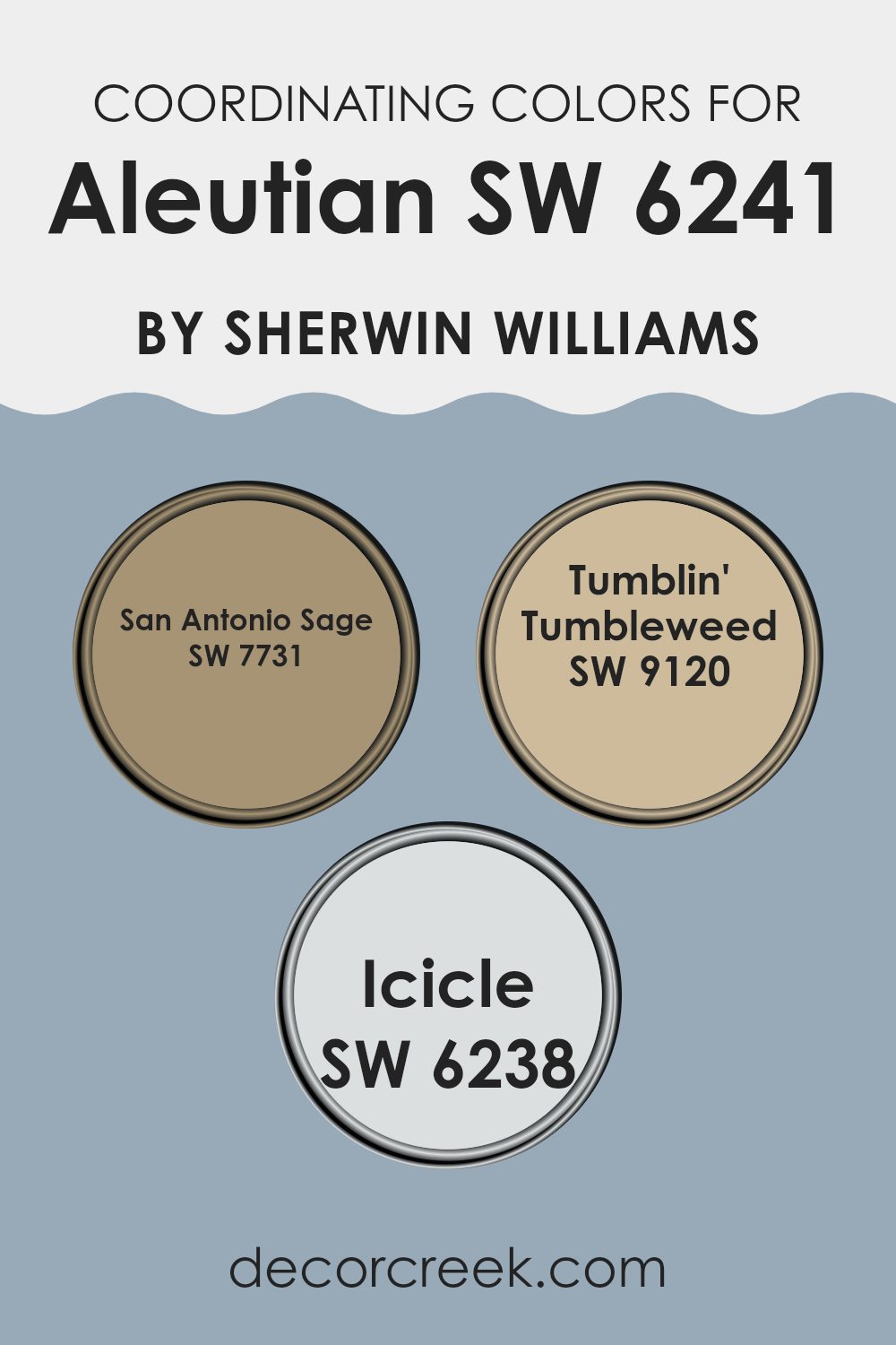
Best Coordinating Colors to use with Aleutian SW 6241 by Sherwin Williams this year.
Coordinating colors are hues that complement each other and create a harmonious look when used together in a room. These coordinating shades work together to enhance the overall aesthetic without dominating one another.
When chosen carefully, coordinating colors can enrich the main color, in this case, Aleutian by Sherwin Williams, by providing depth and contrast. Coordinating colors such as San Antonio Sage, Tumblin’ Tumbleweed, and Icicle have been specifically selected to work smoothly with Aleutian, ensuring a balanced and pleasant palette.
San Antonio Sage is a subtle and gentle green that creates a calm and grounded vibe, making it an excellent counterbalance to the cooler tones of Aleutian. It acts as a natural element that brings a sense of freshness to the setting.
On the other hand, Tumblin’ Tumbleweed is a warm, creamy beige that offers a comforting and cozy feel, perfect for creating a welcoming atmosphere. It pairs beautifully with the softness of Aleutian, adding warmth to the color scheme. Icicle is a light, crisp gray that provides a clean and airy feel, bringing a sense of lightness to the room. Its neutral tone makes it incredibly adaptable, complementing both Aleutian and its coordinating colors with ease.
You can see recommended paint colors below:
- SW 7731 San Antonio Sage
- SW 9120 Tumblin’ Tumbleweed
- SW 6238 Icicle
Trendy Trim Colors of Aleutian SW 6241 by Sherwin Williams to use this year.
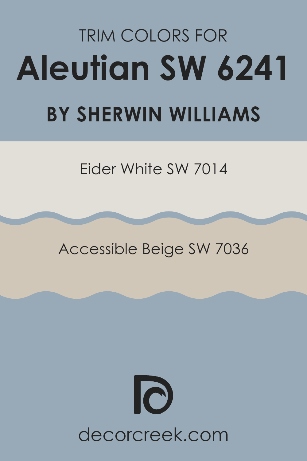
Trim colors serve a functional and aesthetic role in painting, often used to highlight the architectural features of a room such as door frames, moldings, and skirtings. For the soothing blue shade of Sherwin Williams’ Aleutian, selecting the right trim color enhances the overall look. Eider White (SW 7014) and Accessible Beige (SW 7036) are both excellent choices for trims, creating a subtle yet effective contrast that allows the main wall color to stand out.
Eider White is a soft, very light shade of gray with a hint of warmth, making it a great option for trims as it can gently frame Aleutian without dominating it.
Accessible Beige, on the other hand, is a light beige that offers a slightly richer contrast against the blue tones of Aleutian, giving a room a calm and cohesive look. Both these trim colors have the flexibility to blend beautifully with Aleutian, ensuring the room remains inviting and visually appealing.
You can see recommended paint colors below:
- SW 7014 Eider White
- SW 7036 Accessible Beige
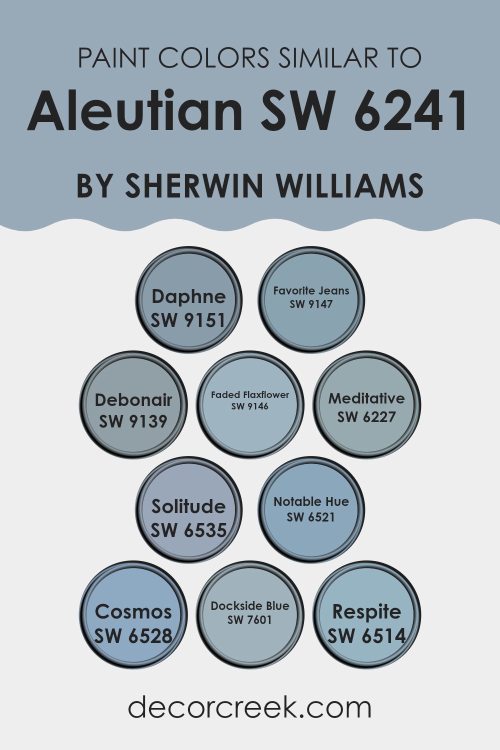
Evergreen Colors Similar to Aleutian SW 6241 by Sherwin Williams
Similar colors play a crucial role in interior design by creating a cohesive and harmonious environment, enhancing the aesthetic continuity of a room. When shades are closely related on the color spectrum, they naturally complement each other, allowing for a design that feels balanced and pleasing to the eye.
This can be particularly useful in achieving a subtle yet impactful visual effect, ideal for rooms intended to promote a calm and relaxed atmosphere. For example, colors like Favorite Jeans and Faded Flaxflower offer a gentle blend of blues that reflect quiet and restful themes, commonly sought in bedrooms and bathrooms.
Let’s consider how colors close to Aleutian might influence mood and a room. Daphne is a deep, mysterious blue, adding a touch of depth to any room it graces, while Debonair offers a lighter teal that’s both refreshing and cozy. Solitude and Notable Hue are excellent for those seeking a bolder blue with a sense of confidence, and Cosmos adds an intriguing hint of the celestial.
For a soothing effect, Meditative brings a soft and calming hue of blue, supporting rooms where stress reduction is key. If you’re looking for a slightly livelier but still gentle setting, Respite and Dockside Blue provide uplifting yet peaceful blues, perfect for energizing a study room or a casual living area. These similar colors each bring their own character while maintaining a cohesive look with Aleutian, making them adaptable for various decorating styles and preferences.
You can see recommended paint colors below:
- SW 9151 Daphne
- SW 9147 Favorite Jeans
- SW 9139 Debonair
- SW 9146 Faded Flaxflower
- SW 6227 Meditative
- SW 6535 Solitude
- SW 6521 Notable Hue
- SW 6528 Cosmos
- SW 7601 Dockside Blue
- SW 6514 Respite
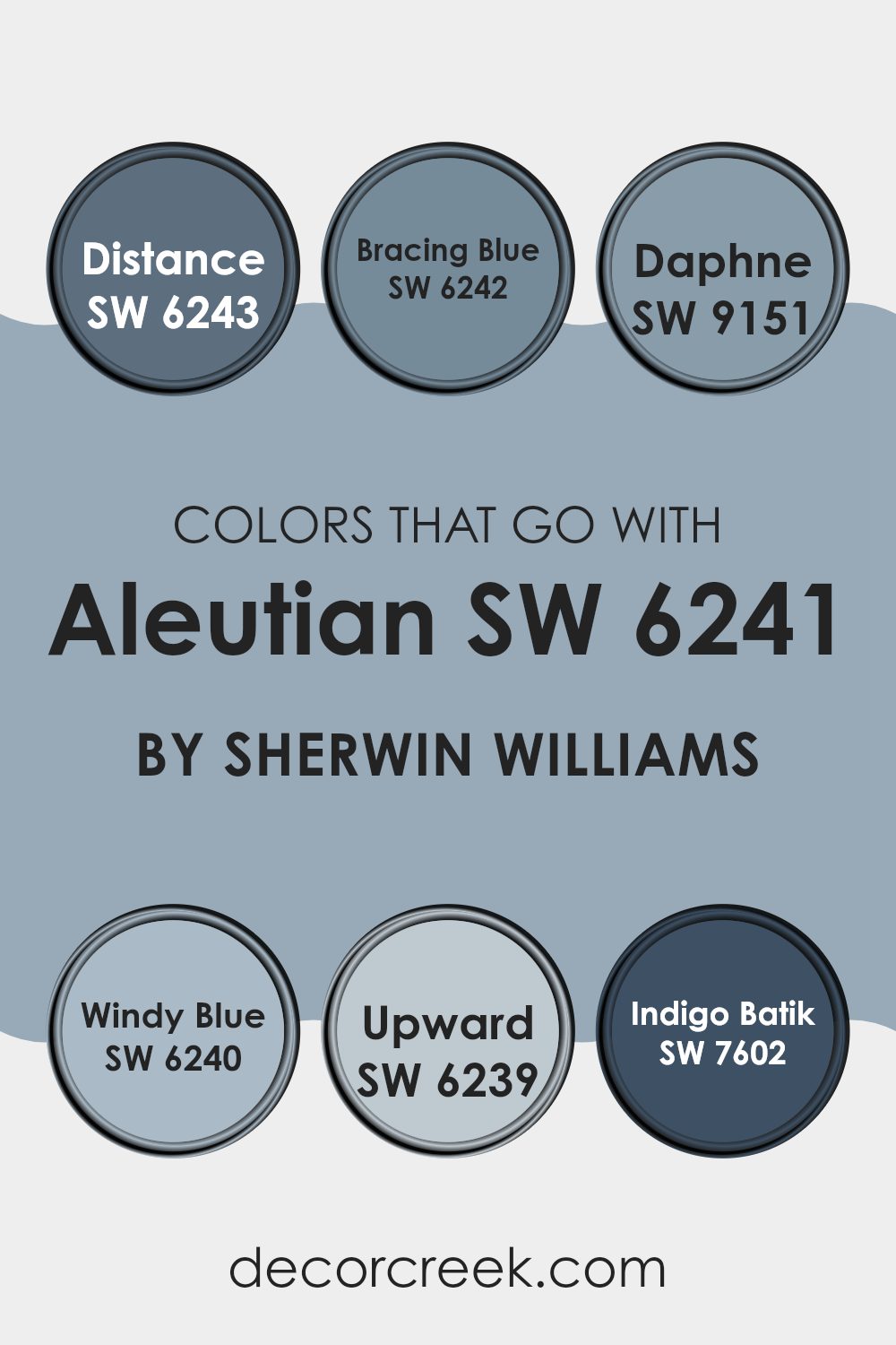
Colors that Go With Aleutian SW 6241 by Sherwin Williams
Choosing the right colors to pair with Aleutian SW 6241 by Sherwin Williams enhances the ambiance and mood of any room. When coordinating with shades like Distance SW 6243 or Bracing Blue SW 6242, attention is given to creating a harmonious and soothing environment.
This allows for a pleasant visual flow, as these cooler tones can create a peaceful yet engaging atmosphere. Colors like Daphne SW 9151 add a lively touch that can be used effectively to provide energetic contrast without overpowering the calmness of Aleutian.
In addition, incorporating Windy Blue SW 6240 and Upward SW 6239 presents a subtle and gentle backdrop that is ideal for promoting a relaxed setting. These colors are excellent for areas where calmness is important, such as bedrooms or study rooms.
Moreover, a darker tone such as Indigo Batik SW 7602 works brilliantly to anchor the color scheme, adding depth and interest, making it perfect for accent walls or furniture pieces. Overall, these color combinations help achieve a balanced and visually appealing decor that works well across different types of rooms and styles.
You can see recommended paint colors below:
- SW 6243 Distance
- SW 6242 Bracing Blue
- SW 9151 Daphne
- SW 6240 Windy Blue
- SW 6239 Upward
- SW 7602 Indigo Batik
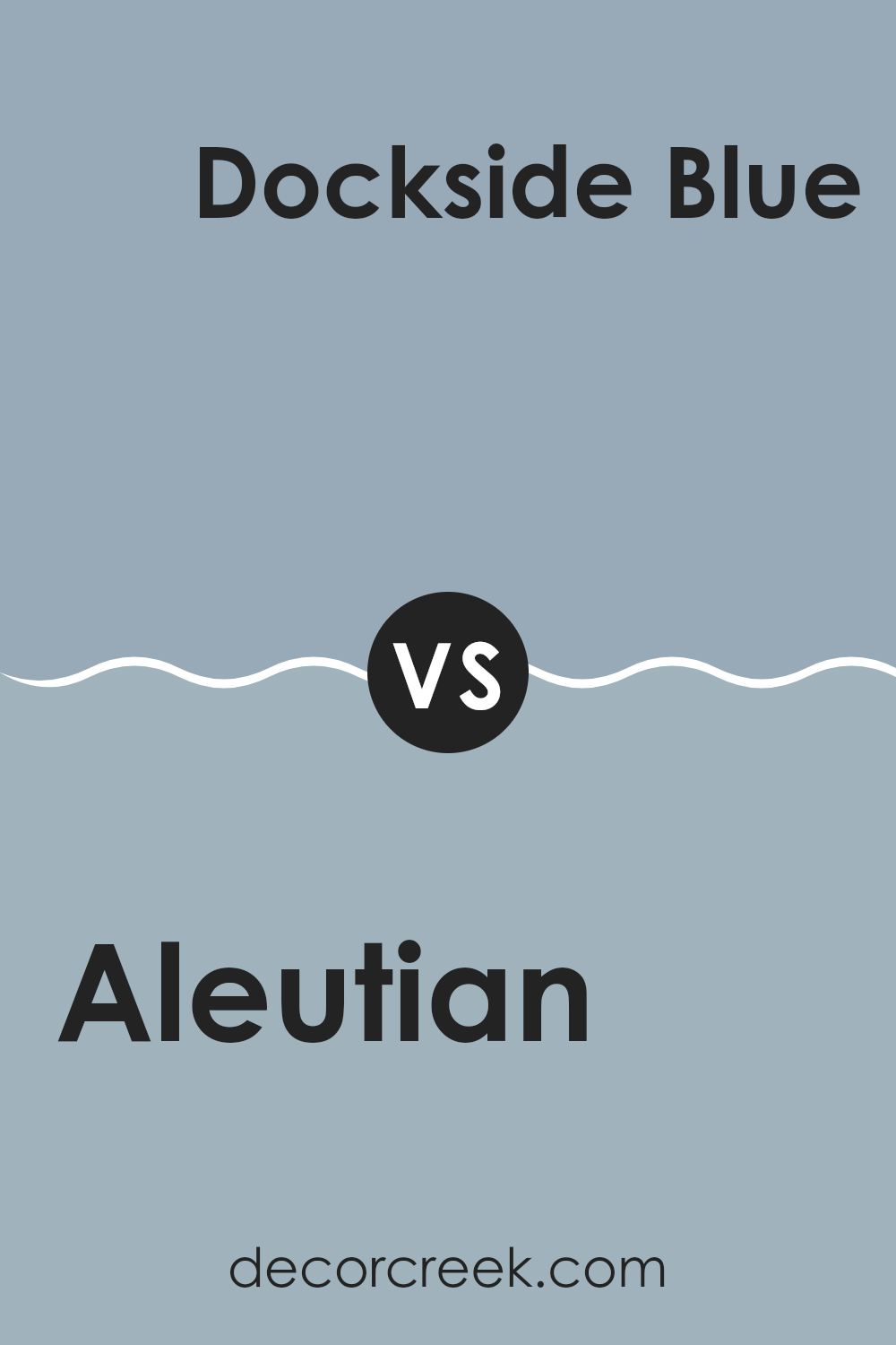
Aleutian SW 6241 by Sherwin Williams vs Dockside Blue SW 7601 by Sherwin Williams
Aleutian and Dockside Blue are two colors by Sherwin Williams, each offering a unique mood for room decor. Aleutian is a soft, muted blue-gray shade that gives a calming feel to interiors, making it perfect for a cozy, relaxed setting like a bedroom or living room. It reflects light gently, enhancing smaller rooms without dominating them with dark tones.
Dockside Blue, on the other hand, leans more toward a medium blue with gray undertones. It is a stronger color compared to Aleutian, suitable for those looking to add a bit more personality and depth to their room. Dockside Blue works well in areas that benefit from a richer hue, such as bathrooms or study areas where a touch of formality is appreciated.
Both colors are adaptable, but Aleutian’s lighter, airier feel contrasts with Dockside Blue’s bolder, more pronounced presence. Depending on the atmosphere you want to create, each can be appealing in its own way.
You can see recommended paint color below:
- SW 7601 Dockside Blue
Aleutian SW 6241 by Sherwin Williams vs Faded Flaxflower SW 9146 by Sherwin Williams
Aleutian and Faded Flaxflower are two distinct paint colors from Sherwin Williams. Aleutian is a deeper, calming blue with a hint of gray that brings a cozy, stable feel to any room. It works well in areas where a touch of formality is desired, like dining rooms or home offices.
On the other hand, Faded Flaxflower is much lighter and leans toward a soft, muted green-blue. This color is great for creating a light, airy feel, ideal for bedrooms or bathrooms where a fresh and clean look is preferred.
Together, these colors can complement each other nicely. Aleutian can anchor a room with its depth, while Faded Flaxflower can be used to brighten or highlight smaller areas or features within the room. Both colors share a cool undertone, making them a good pair for a harmonious color scheme.
You can see recommended paint color below:
- SW 9146 Faded Flaxflower
Aleutian SW 6241 by Sherwin Williams vs Debonair SW 9139 by Sherwin Williams
Aleutian and Debonair by Sherwin Williams are two distinctive shades that bring unique character to any room. Aleutian is a soothing gray-blue that feels calm and composed, perfect for creating a peaceful atmosphere in rooms like bedrooms or bathrooms. It’s a color that pairs well with soft whites and other neutrals, giving a clean and airy feel.
On the other hand, Debonair is a darker, more intense gray-blue. It carries a sense of richness and depth, making it ideal for more formal areas or statement walls where you want to add a bit of drama. Despite being darker, Debonair still maintains a certain softness, ensuring the room remains welcoming.
Both colors work well with a variety of decor styles, from contemporary to traditional, depending on the accompanying accents and furniture. Aleutian tends to brighten rooms, while Debonair creates a more intimate feel, offering a stronger visual impact.
You can see recommended paint color below:
- SW 9139 Debonair
Aleutian SW 6241 by Sherwin Williams vs Notable Hue SW 6521 by Sherwin Williams
Aleutian SW 6241 by Sherwin Williams is a soothing shade of blue with a gray undertone that gives it a calm, muted appearance. It’s an ideal choice for creating a peaceful and welcoming atmosphere in rooms like bedrooms or living areas.
On the other hand, Notable Hue SW 6521 by Sherwin Williams is a vibrant and fresh shade of blue. This color is brighter and more energetic, making it suitable for rooms where you want to add a splash of cheerfulness.
While both colors are variations of blue, Aleutian is more subdued and blends easily with neutral tones, providing a gentle backdrop. Notable Hue, in contrast, stands out more and can serve as a focal point in a room or highlight specific areas. Depending on the mood you want to set or the specific function of a room, each color offers unique advantages. Aleutian works well in relaxing environments, and Notable Hue is better for lively, dynamic interiors.
You can see recommended paint color below:
- SW 6521 Notable Hue
Aleutian SW 6241 by Sherwin Williams vs Cosmos SW 6528 by Sherwin Williams
Aleutian and Cosmos by Sherwin Williams are two distinct colors that create completely different moods. Aleutian is a soft, muted blue with a hint of gray, giving it a calm and gentle feel perfect for creating a relaxed atmosphere.
This makes it a great choice for living areas and bedrooms where comfort is important. On the other hand, Cosmos is a vibrant, lively blue that makes a strong impression and is sure to stand out. Its brighter tone can energize a room, making it well-suited for places where activity and energy are desired, like a kitchen or an exercise room.
Both colors are adaptable in their own way but serve different purposes depending on the feel you want to achieve in your room.
You can see recommended paint color below:
- SW 6528 Cosmos
Aleutian SW 6241 by Sherwin Williams vs Meditative SW 6227 by Sherwin Williams
Aleutian and Meditative by Sherwin Williams are two distinct shades of blue, each offering a unique feel for interiors. Aleutian leans more toward a soft, muted blue with gray undertones, making it calm and gentle.
It’s a flexible color that fits well in bedrooms or living rooms where you want a relaxed atmosphere. On the other hand, Meditative is a deeper blue, resembling a slightly stormy sky. It’s a bit bolder than Aleutian and works beautifully in areas where a more distinct, yet still peaceful, mood is desired.
Meditative, with its more pronounced blue hue, brings a touch of drama while maintaining an air of welcoming coolness. Both colors are excellent for creating a peaceful environment, but Meditative offers a stronger statement whereas Aleutian is more understated. Choosing between them depends on how much you want the color to stand out in your room.
You can see recommended paint color below:
- SW 6227 Meditative
Aleutian SW 6241 by Sherwin Williams vs Daphne SW 9151 by Sherwin Williams
Aleutian and Daphne, both from Sherwin Williams, present unique tones that can significantly affect the mood of a room. Aleutian is a cooler, soft blue shade with gray undertones, creating a calm and soothing atmosphere. It’s quite flexible and works well in various rooms, particularly in areas designed for relaxation, like bedrooms or bathrooms.
On the other hand, Daphne is a deeper, more intense blue with a hint of purple. This richness makes it an excellent choice for adding a dramatic flair to an area. It suits rooms where a striking, bold color is needed to make a visual statement, such as dining rooms or accent walls.
Overall, while both colors carry the essence of blue, Aleutian leans toward a muted, neutral palette, making it easier to blend with a variety of decor styles. Daphne, with its bolder, more vibrant purplish-blue tone, tends to stand out more and can define the style and feel of a room more strongly.
You can see recommended paint color below:
- SW 9151 Daphne
Aleutian SW 6241 by Sherwin Williams vs Solitude SW 6535 by Sherwin Williams
Aleutian and Solitude are both calming shades of blue from Sherwin Williams, but they carry distinct vibes and can serve different purposes in home decor. Aleutian is a softer, more muted blue that leans toward a subtle grayish tone.
It’s a great choice for creating a cozy and relaxed atmosphere in rooms like bedrooms or living rooms. This color pairs nicely with soft whites and natural wood textures, making it very adaptable for various design styles.
On the other hand, Solitude stands out with a brighter, crisper blue hue. It brings a more energetic yet still calming feel to a room, making it suitable for bathrooms or kitchens where you want a clean and refreshing look. Compared to Aleutian, Solitude may feel slightly more uplifting due to its clearer blue tone. It works well with sharp whites, grays, and even some metallic finishes for a more modern appeal. These differences make Aleutian and Solitude suitable for varied aesthetic preferences and room functions.
You can see recommended paint color below:
- SW 6535 Solitude
Aleutian SW 6241 by Sherwin Williams vs Respite SW 6514 by Sherwin Williams
Aleutian and Respite, both by Sherwin Williams, are unique shades of blue with distinct vibes. Aleutian is a deeper, moodier blue that lends a sense of solidity and calm to rooms. It’s perfect for creating a cozy and grounded atmosphere in areas like living rooms or bedrooms. This color pairs well with soft neutrals and rich wood tones, enhancing a classic and inviting feel.
On the other hand, Respite is a lighter, more airy shade of blue. It has a refreshing and calming effect, making it ideal for bathrooms or smaller rooms where you want to create an illusion of more light and openness. It matches well with white trim and soft pastels for a gentle, uplifting palette.
Both colors offer a peaceful backdrop but differ in their depth and the moods they bring to a room. Aleutian feels more mature and warm, while Respite keeps things light and fresh.
You can see recommended paint color below:
- SW 6514 Respite
Aleutian SW 6241 by Sherwin Williams vs Favorite Jeans SW 9147 by Sherwin Williams
Aleutian and Favorite Jeans are both colors by Sherwin Williams, offering distinct vibes for any room. Aleutian presents a soft, muted blue with hints of gray, making it a subtle and calming choice, perfect for creating a peaceful atmosphere. It’s gentle enough to use extensively, whether in a bedroom or a living area, complementing a wide range of decor styles.
On the other hand, Favorite Jeans is a deeper, more vibrant blue. It resembles the classic tone of well-worn denim and brings a more energetic and cheerful feel to a room. This color works great as an accent wall or in a room that aims to feel more lively and inviting.
Both colors are adaptable, but while Aleutian leans toward a quieter, more understated charm, Favorite Jeans stands out with a bolder expression. Depending on the mood you want to create, either can be a great choice, but for different reasons. Aleutian is better for a soft backdrop, and Favorite Jeans is ideal for making a statement.
You can see recommended paint color below:
- SW 9147 Favorite Jeans
After reading about SW 6241 Aleutian by Sherwin Williams, I think it’s a really nice paint color that can make rooms in your home feel warm and welcoming. This color is like a light blue with hints of gray, kind of like the color you see in the sky during a storm. It’s not too bright and not too dark, which makes it a great choice for places like living rooms or bedrooms where you want to feel relaxed.
I learned that Aleutian works well with many other colors. For example, it looks great with whites, creams, and even darker blues. This is really helpful because it means you can use it in many different ways in your home without worrying about it clashing with your furniture or decorations.
Overall, SW 6241 Aleutian by Sherwin Williams seems like a smart choice if you’re thinking about updating a room or just adding a fresh coat of paint. It’s a beautiful color that can make your room feel cozy and calm. If you like light blues or want something a bit different but not too bold, Aleutian might be the perfect color to try.
decorcreek.com
Ever wished paint sampling was as easy as sticking a sticker? Guess what? Now it is! Discover Samplize's unique Peel & Stick samples.
Get paint samples

