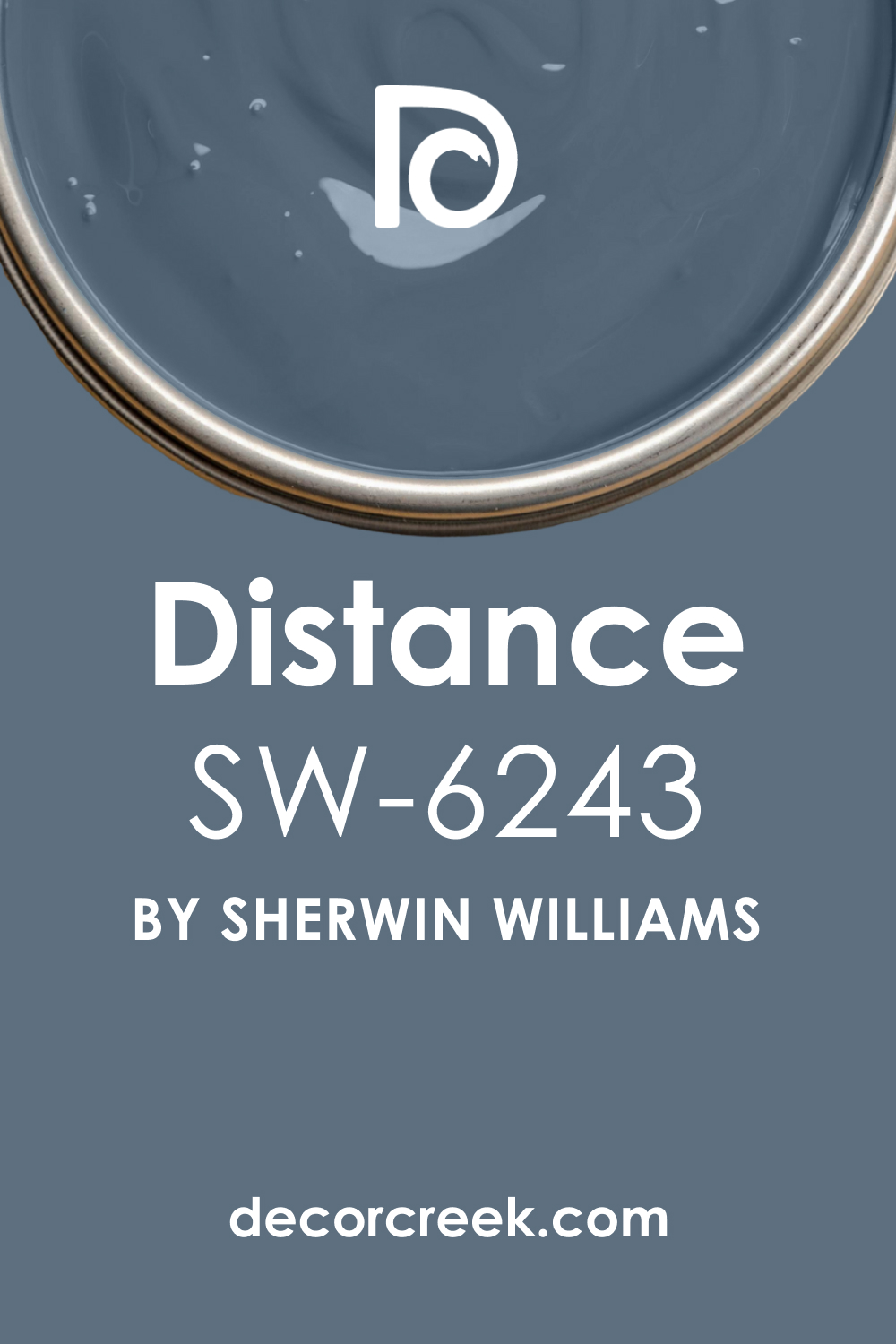
Sherwin-Williams’ SW 6243 Distance is a unique, intriguing color that can transform any space into an inviting, atmospheric environment. As part of the Sherwin-Williams collection, it offers excellent coverage and a broad range of coordinating options.
In this article, you will find more information about this color, as well as helpful tips and recommendations on its use in your home.
We will tell you how to coordinate it, what trim colors work best with it, and how this color may work in different rooms.
What Color Is SW 6243 Distance? Is It a Warm Or Cool Color?
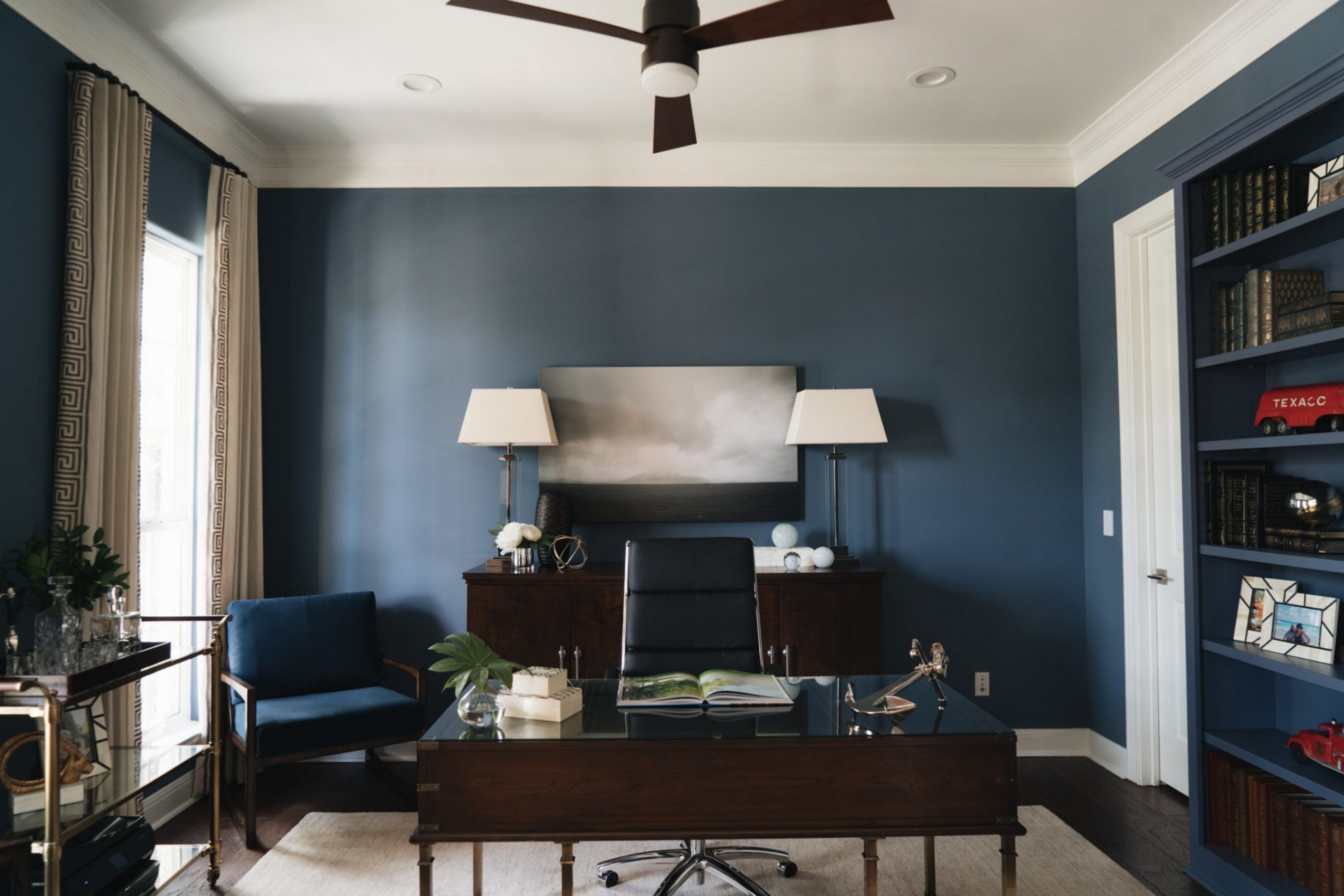
SW 6243 Distance is a deep, intense navy blue color that embodies the stillness and depth of the evening sky. As a part of the blue family, this color is inherently cool in temperature. Its cool undertones provide a serene and calming effect, making it a perfect color for creating tranquil, peaceful spaces.
While it’s deep and rich, it carries with it the cool tranquility that many of us associate with a quiet, moonlit night or the serene depths of the ocean. It’s this balance between intensity and calm that makes SW 6243 Distance a beautifully versatile color.
The depth and richness of this medium-dark blue color can bring a calm serenity or a dramatic touch, depending on the surrounding decor and lighting.
Ever wished paint sampling was as easy as sticking a sticker? Guess what? Now it is! Discover Samplize's unique Peel & Stick samples.
Get paint samples

Undertones of SW 6243 Distance
When discussing undertones of SW 6243 Distance, we’re referring to the subtle hues that are present beneath the dominant navy color, which can become more noticeable in different lighting conditions or when paired with other colors. For SW 6243 Distance, there are three main undertones to consider:
- Blue Undertone: The primary undertone in SW Distance is blue. This cool undertone gives the color its deep richness and serene vibe, making it a perfect choice for creating a calming, tranquil atmosphere.
- Gray Undertone: The second undertone in SW 6243 Distance is gray, which lends a sophisticated and muted quality to the color. This gray undertone can become more noticeable in low-light conditions, softening the overall look of SW Distance and making it a bit more neutral and versatile.
- Slight Green Undertone: Lastly, there’s a slight green undertone present in SW 6243 Distance. This undertone isn’t as dominant as the blue and gray ones, but it can subtly emerge depending on the lighting conditions and surrounding colors. This slight green undertone can help to cool down the color further and connect it with natural elements, making it an excellent choice for rooms with lots of natural light or outdoor views.

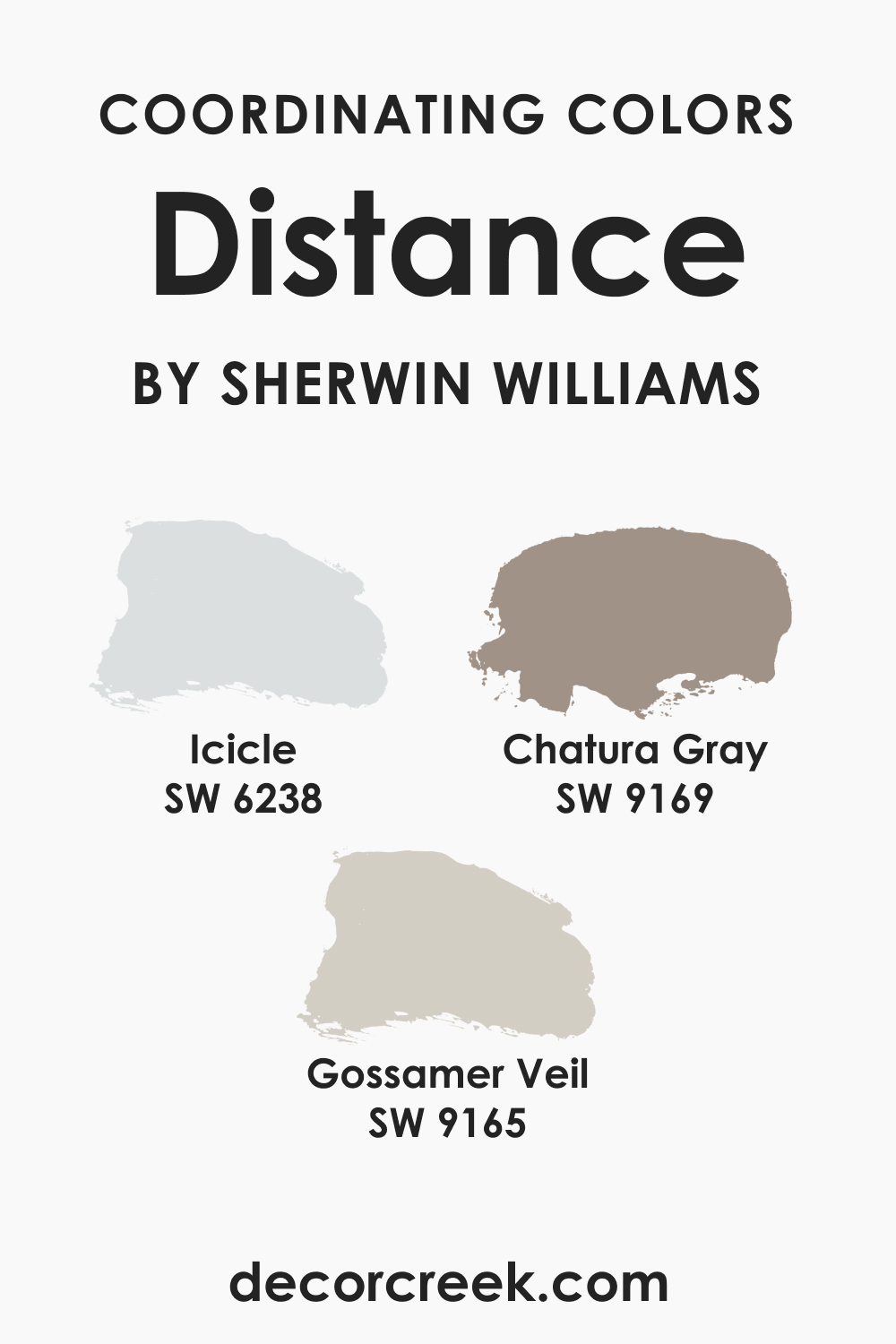
Coordinating Colors of SW 6243 Distance
Coordinating colors are vital to creating a harmonious color palette in your space. They work well together and can either enhance or balance out the main color, depending on what you aim to achieve. Here are three coordinating colors for SW 6243 Distance:
- SW 6238 Icicle: This is a muted light gray color with a cool undertone. It works well with SW Distance by providing a soft and neutral backdrop that allows the deep, rich hue of SW Distance to really pop. Additionally, the cool undertone of Icicle complements the cool undertones of SW Distance, maintaining a consistent color temperature across your space.
- SW 9165 Gossamer Veil: Gossamer Veil is a warm gray color with slight beige undertones. When paired with SW Distance, it provides a warm and inviting contrast to the cool and deep tones of SW Distance. The beige undertone in Gossamer Veil adds a touch of warmth, which can be great for balancing out the coolness of SW Distance, especially in rooms where you want to create a cozy atmosphere.
- SW 9169 Chatura Gray: Chatura Gray is a mid-tone gray with a balanced mix of warm and cool undertones. It acts as a versatile neutral when paired with Distance, being neither warm nor cool. This makes SW Chatura Gray a fantastic choice for any room, irrespective of the amount of light or the kind of vibe you want to create. It can subtly complement SW Distance without stealing the spotlight, making it an excellent option for trim, furniture, or even an accent wall.
Choosing the right coordinating colors for SW 6243 Distance will depend on the overall aesthetic you’re aiming for, the amount and type of light the room gets, and your personal preference.
The choices above are just a start and can work harmoniously with SW Distance in many different room settings and styles.
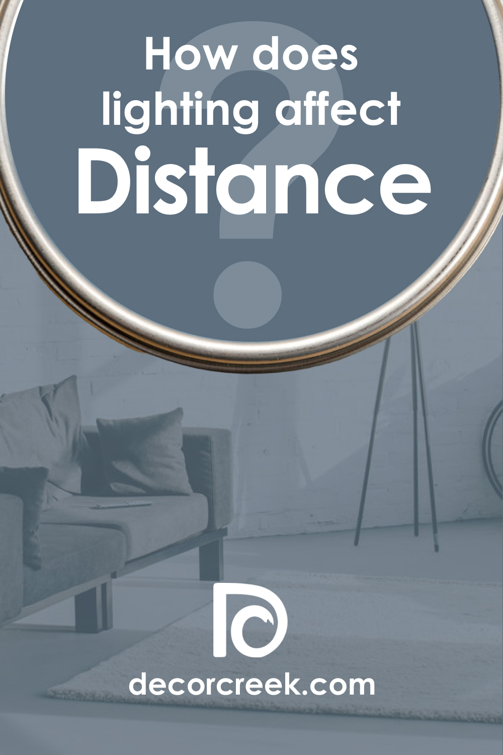
How Does Lighting Affect SW 6243 Distance?
Lighting plays a critical role in how we perceive colors, and SW 6243 Distance is no exception to this. The interaction between light and color can significantly change the appearance of your painted walls, ceilings, or furniture.
Natural daylight reveals the truest color of SW 6243 Distance. Under the clear, bright daylight, SW Distance will present itself as a saturated medium to dark blue, showcasing its cool undertones. If the room receives ample sunlight, SW Distance will retain its vibrant blue hue, providing a fresh and lively atmosphere.
Artificial lighting, on the other hand, can vary the perception of SW Distance. Incandescent lighting, which gives off a warm, yellowish light, can potentially soften the coolness of SW Distance, making it appear slightly warmer and potentially even more muted. This lighting condition may highlight the subtle gray undertones and suppress the blue, transforming it into a more tranquil hue.
Fluorescent lighting, usually cooler in nature, may enhance the blue in SW Distance, making it appear more vibrant and cooler. LED lights, depending on their temperature (warm or cool), can either highlight the blue or gray undertones of SW Distance.
Keep in mind that the strength and direction of the light source will also impact the color. A strong light from a certain angle can create shadows or highlight textures, and this can add depth to the color. A weaker light source may make the color appear darker than it actually is.
To get a more accurate idea of how SW 6243 Distance will look in your specific setting, it’s always a good idea to paint a small test patch on different walls in the room. Observe how the color changes throughout the day and under different lighting conditions before making a final decision.
LRV of SW 6243 Distance Paint Color
The Light Reflectance Value (LRV) of paint color is a measurement of how much light a color reflects compared to a white surface, which is given a value of 100. At the other end of the scale, pure black has an LRV of 0. In essence, LRV gives us a clue about the perceived lightness or darkness of a color.
SW 6243 Distance has an LRV of 15, placing it on the darker end of the scale. With this lower LRV, SW Distance is a medium-dark color that will absorb rather than reflect light. This doesn’t mean it can’t be used in smaller spaces, but it does mean you need to consider your lighting more carefully.
Rooms painted in colors with lower LRVs like SW Distance can feel cozy, intimate, and cocoon-like. The hue can bring depth and drama to a space, making it an excellent choice for creating a focused, calming atmosphere, which can be ideal for home offices or bedrooms.
The lower LRV also means that SW Distance can help reduce glare in brightly lit rooms. It can create a striking contrast when paired with lighter colors, especially on trim or furniture.
However, in rooms with limited natural light, SW Distance may appear even darker. In these cases, proper artificial lighting can help balance the room and prevent it from feeling too dim or enclosed. You might also consider using Distance as an accent rather than the main wall color in smaller or darker spaces.
Remember, LRV is only one factor in choosing the perfect paint color for your space. It’s essential to consider the overall design, including furniture, flooring, lighting, and the room’s function, when selecting a color.

LRV – what does it mean? Read This Before Finding Your Perfect Paint Color
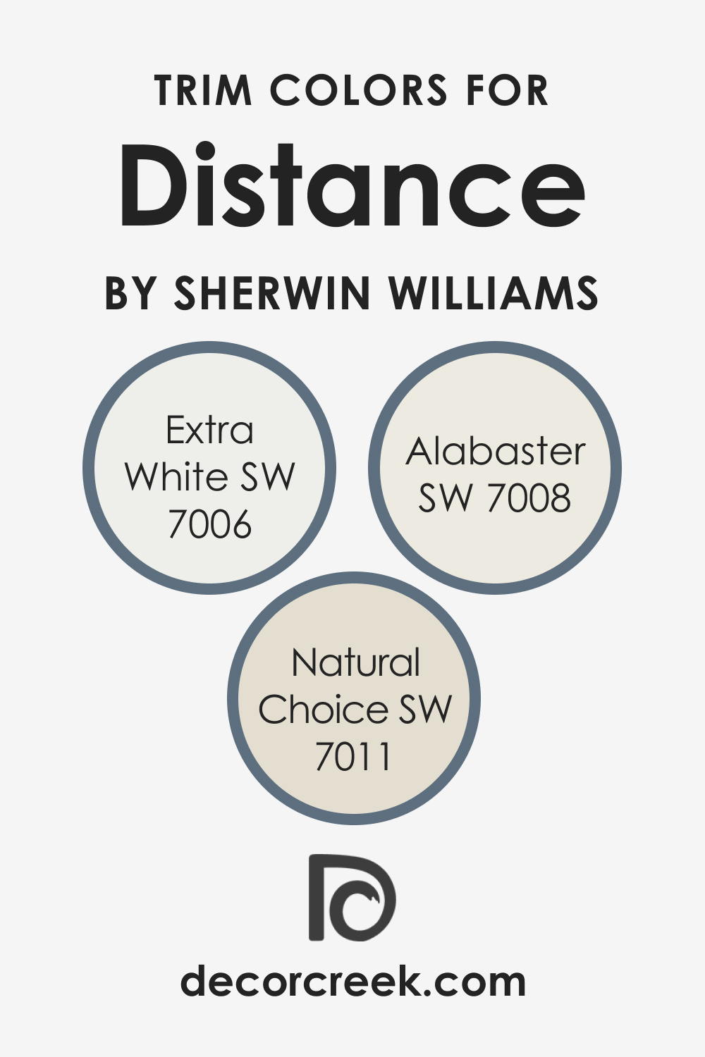
Trim Colors of SW 6243 Distance
When selecting trim colors for SW 6243 Distance, it’s best to choose a hue that will provide a clean and balanced contrast, accentuating the rich tones of Distance. Here are three excellent Sherwin-Williams options:
- SW 7006 Extra White: As one of the purest whites offered by Sherwin-Williams, Extra White provides a sharp, clear contrast to SW 6243 Distance. The stark difference between the two colors can create a modern, sleek look that highlights architectural features beautifully. This is especially effective in rooms with lots of natural light, where the contrast will be most apparent.
- SW 7008 Alabaster: Slightly off-white with subtle, warm undertones, Alabaster is an ideal choice if you want to soften the contrast with SW Distance. It provides a subtle, elegant contrast without being as stark as Extra White. Alabaster would pair well with SW Distance in spaces aiming for a more traditional, rustic, or cozy aesthetic.
- SW 7011 Natural Choice: This color is a warm, beige-tinted white that pairs wonderfully with SW Distance for a more nuanced, complex contrast. Natural Choice can add a touch of warmth and complexity, helping to create a sophisticated and calming atmosphere when used as a trim color with SW Distance.
Each of these whites can contribute differently to your overall room aesthetic, so choose the one that best suits the vibe and functionality you’re aiming for. Consider other elements in your room, like flooring, furniture, and decor, when deciding on the best trim color to coordinate with SW 6243 Distance.
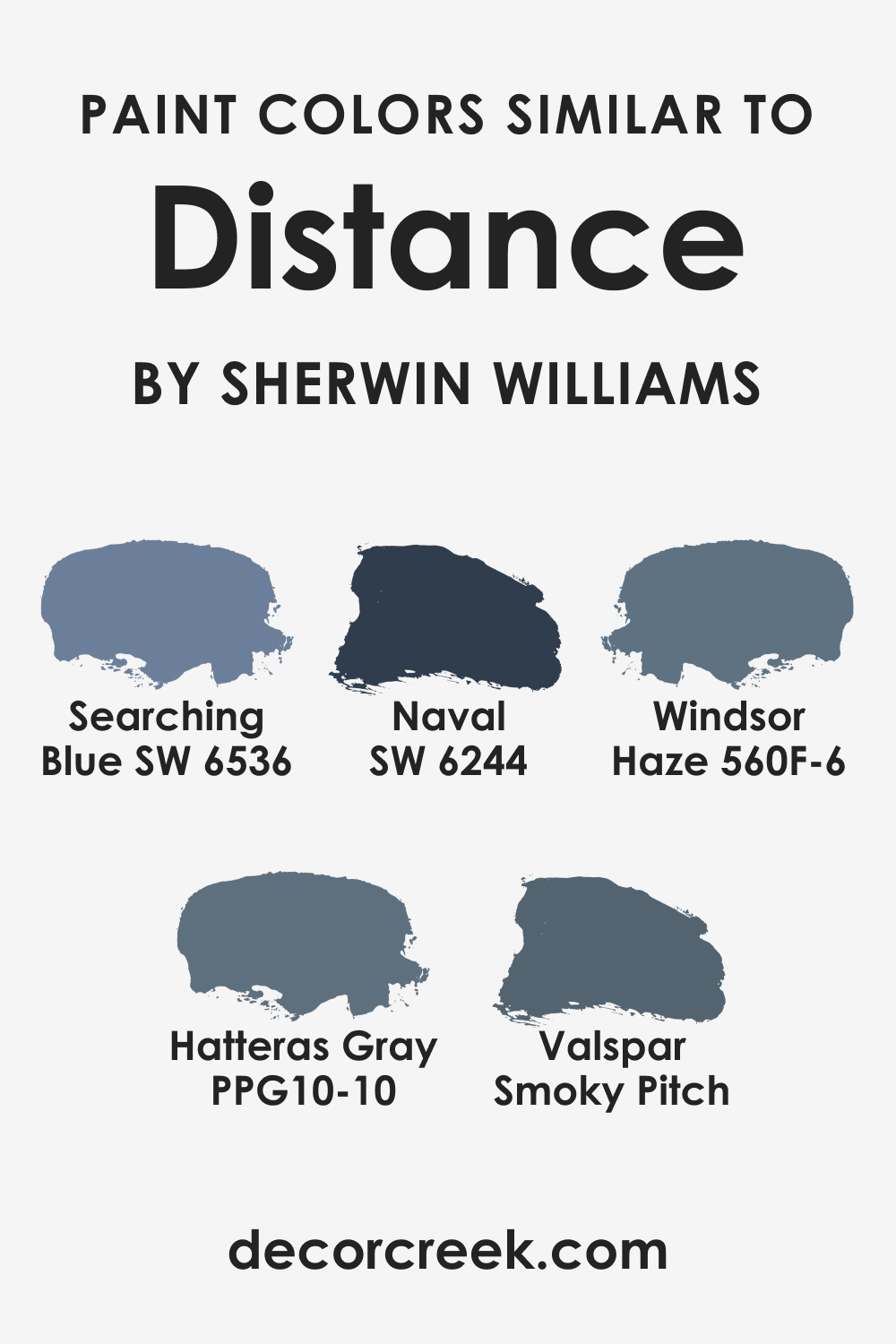
Colors Similar to SW 6243 Distance
There is a wide range of blue hues that are similar to the intriguing SW 6243 Distance. While each color is unique in its own way, these six are particularly close in tone and might be considered ‘siblings’ to SW Distance:
- SW 6244 Naval
- SW 6536 Searching Blue
- Behr Windsor Haze
- PPG Hatteras Gray
- Valspar Smoky Pitch
Remember, color appearance can change depending on the lighting conditions and other colors in the space, so it’s a good idea to get samples and see how they look in your specific environment before committing.
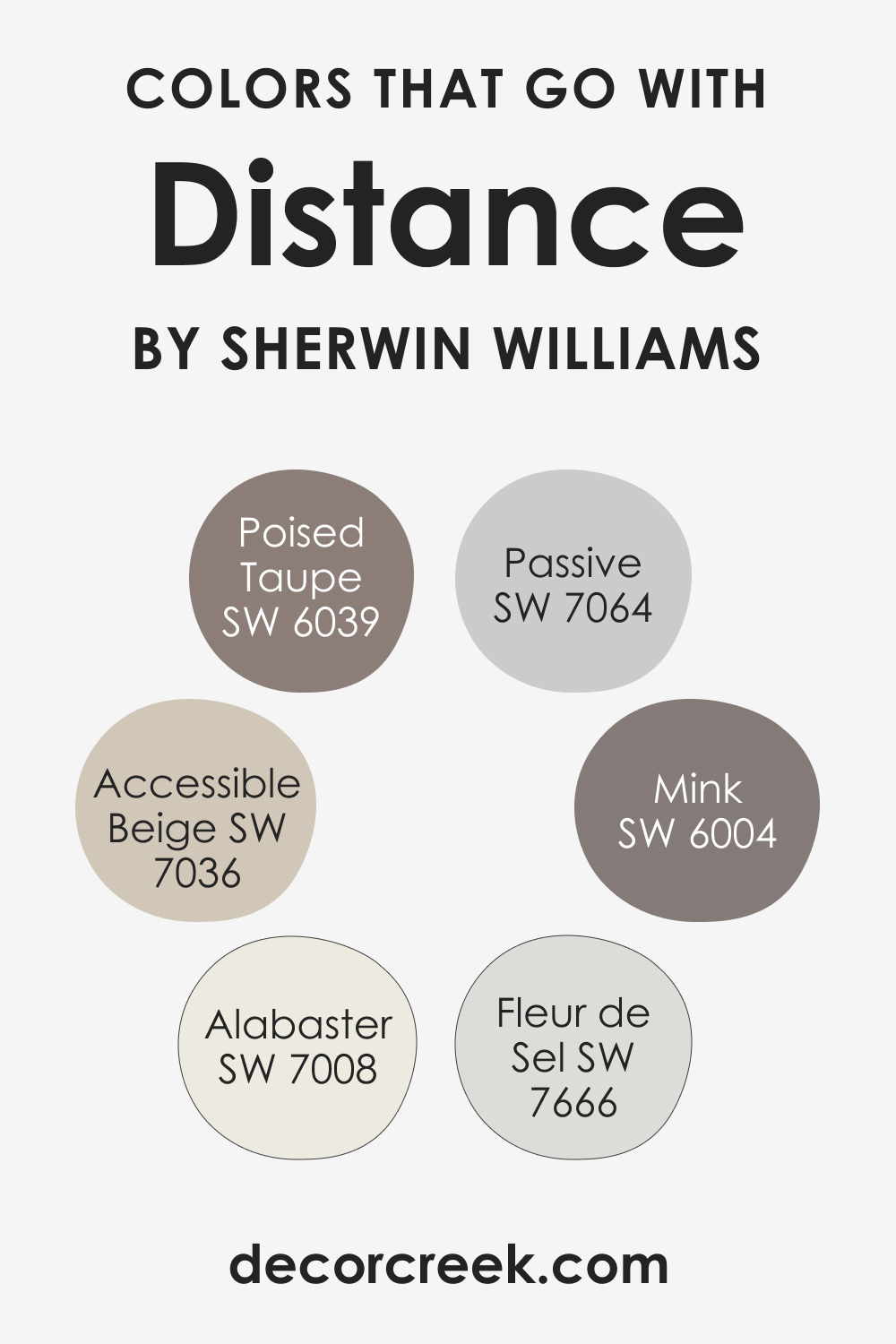
Colors That Go With SW Distance
Pairing Sherwin-Williams’ SW 6243 Distance with other colors can create a diverse range of moods, from soothing and tranquil to lively and vibrant. Here are six colors that harmonize beautifully with SW Distance:
- SW 7036 Accessible Beige: This neutral beige color offers a warm and subtle contrast to the cool tone of SW Distance. It’s an excellent choice for furniture or flooring to create a balanced and inviting space.
- SW 7666 Fleur de Sel: This crisp, clean white can serve as a perfect trim color for SW Distance, highlighting its depth and providing a fresh, modern feel to your space.
- SW 7008 Alabaster: Another white, but with a warmer, creamier tone. SW Alabaster can be used to create a more traditional or rustic feel when paired with SW Distance.
- SW 7064 Passive: As a light cool gray, SW Passive pairs well with SW Distance by providing a muted contrast that enhances the depth and richness of the blue.
- SW 6004 Mink: This deep, warm brown can provide a striking contrast against SW Distance, adding richness and warmth to your space.
- SW 6039 Poised Taupe: This color blends brown and gray with a touch of green, providing an earthy, natural contrast to the cool blue of SW Distance. It works well in a room where you want to bring in elements of the outdoors.
These color pairings offer a starting point to create a beautiful and harmonious space using SW 6243 Distance. It’s important to remember that individual preferences, as well as other factors like lighting and existing furniture, can greatly influence what colors will work best in your space.
Always consider sampling colors in your own home before making your final decision.
How to Use SW 6243 Distance In Your Home?
SW 6243 Distance is a versatile color that can be used in a variety of rooms and styles. It’s perfect for creating a calm, serene atmosphere in bedrooms and bathrooms or adding a dramatic touch to living rooms and kitchens. Its richness and depth make it suitable for both modern and traditional interiors. Below, you can read how exactly this rich blue hue may work in different rooms of your home.
How to Use SW 6243 Distance in the Bedroom?
The tranquil, deep blue of SW Distance can turn a bedroom into a soothing retreat. Whether used on all walls or as an accent, this color promotes a sense of calm and relaxation, ideal for winding down at the end of the day. Pair it with lighter blues and soft neutrals for a serene and harmonious look.
Using SW Distance in a bedroom also offers the opportunity to experiment with contrasting textures and colors. Luxurious white bedding, curtains, or rugs can create a striking contrast and add a touch of sophistication to the room.

How to Use SW 6243 Distance in the Bathroom?
SW Distance can add an unexpected touch of elegance and luxury to a bathroom. Its cool undertones can create a spa-like ambiance, turning your bathroom into a tranquil oasis. For a harmonious look, combine Distance with white tiles, marble countertops, or chrome fixtures.
In a larger bathroom, consider using SW Distance on a feature wall or around a vanity for a bold, dramatic statement. This deep blue color pairs beautifully with lighter blues or grays, helping to create a balanced and harmonious look in the bathroom.

How to Use SW 6243 Distance in the Living Room?
The living room is an ideal space to showcase the drama and sophistication of SW Distance. Used on all walls, it can create a cozy, intimate setting for gathering with friends and family. Alternatively, use it on a feature wall to draw attention to a fireplace or piece of artwork.
The deep, complex navy of SW 6243 Distance pairs well with traditional furniture, such as Chesterfield sofas or antique wooden tables. Try pairing this navy color with gold or brass accents for a truly classic and elegant look. These metallic touches will stand out brilliantly against the dark navy backdrop, adding a touch of luxury to your space.
For a more modern aesthetic, you could pair SW Distance with lighter neutrals like SW 7036 Accessible Beige or SW 7008 Alabaster. This creates a striking contrast that highlights the contemporary lines and forms of modern furniture. A navy feature wall behind a sleek white or light gray sofa, for example, could create a bold and dynamic focal point in your living room.
If painting an entire room SW Distance feels too overwhelming, consider using it on an accent wall or to highlight architectural features like built-in bookcases or a fireplace. This allows you to take advantage of the depth and richness of this color without it overpowering the room.

How to Use SW 6243 Distance for an Exterior?
SW 6243 Distance can make a bold statement when used on the exterior of a home. Its deep, rich color stands out beautifully against white or cream trim, and it can bring a touch of sophistication to any style of home, from modern to traditional.
SW Distance’s rich, dark navy tone can create a bold and distinguished facade when used as the primary color for your home’s exterior. This color stands out beautifully against a lush green lawn or a crisp, white snowfall, offering a visual feast regardless of the season.
Pair it with white trim (like SW 7005 Pure White) to highlight your home’s architectural details and add a touch of classic elegance. A red front door could offer a vibrant contrast and add an unexpected pop of color.
For a contemporary look, consider pairing SW Distance with other cool tones, such as light grays (like SW 9165 Gossamer Veil) or icy blues (like SW 6238 Icicle). This creates a harmonious palette that feels fresh and modern. Use SW Distance on the main body of the house, with lighter shades for trim and architectural features.

How to Use SW 6243 Distance for the Kitchen?
The kitchen is another great place to use SW 6243 Distance since it can add depth and interest to the room. Paired with white countertops and backsplashes, SW Distance can give your kitchen a stylish, contemporary look.
Consider making a statement by painting your kitchen walls with SW Distance. This shade of navy blue can act as a striking contrast to white or light-colored kitchen cabinets, creating a timeless and elegant design.
Paired with stainless steel appliances and chrome fixtures, this color combination can create a clean, contemporary aesthetic. If your kitchen receives ample natural light, SW Distance can add depth and dimension without making the space feel too dark.
If you’re hesitant about covering all your cabinets or walls in such a deep hue, consider using SW Distance on your kitchen island as an accent. It can become a striking focal point and is an excellent way to introduce a darker color without overwhelming the space.

Comparing SW 6243 Distance With Other Colors
Here you can see what makes SW Distance distinct from other blue colors of the same brand. This will help you get a better idea of how LRVs and undertones of seemingly related colors work.
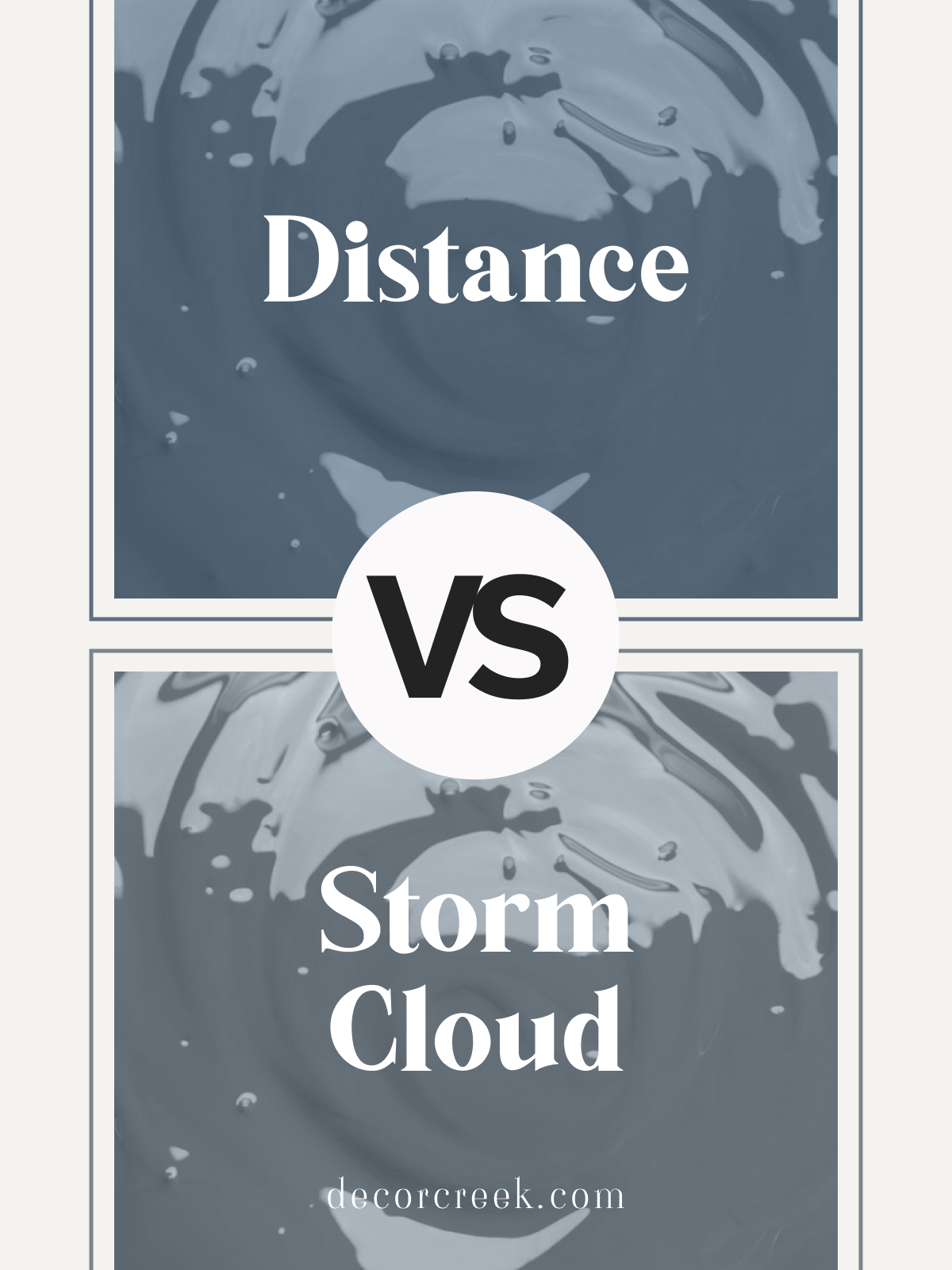
Sherwin Williams Distance SW 6243 vs Storm Cloud SW 6249
Distance SW 6243 and Storm Cloud SW 6249 by Sherwin Williams are two sophisticated blue-grays with distinct undertones. Distance is a darker, richer blue-gray with a hint of warmth, giving it a cozy, grounded feel. Storm Cloud leans a bit lighter and cooler, offering a relaxed vibe that’s both modern and versatile.
Choose Distance for accent walls or larger spaces needing a bold, refined look. Storm Cloud works well in open areas or rooms with natural light, where its softer tone adds a subtle depth.
Both shades pair beautifully with white trim and light neutrals, creating a calming and inviting atmosphere.
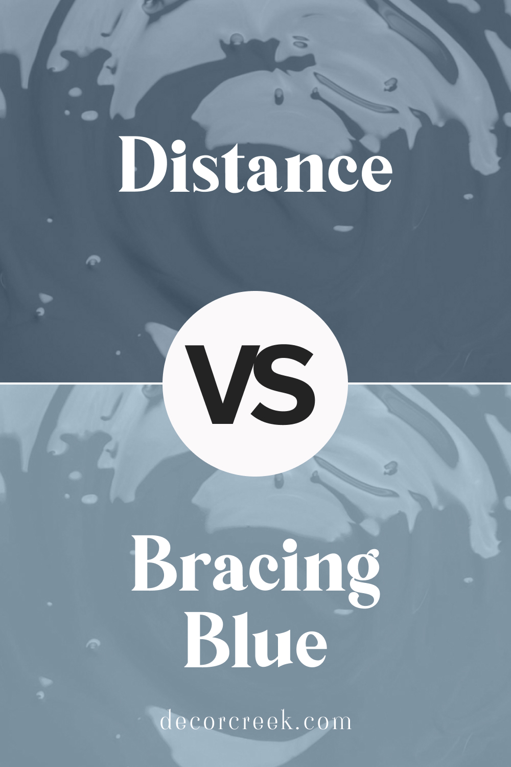
Bracing Blue SW 6242 vs Distance SW 6243 by Sherwin Williams
Bracing Blue SW 6242 and Distance SW 6243 from Sherwin Williams are two rich, dark blues with unique qualities. Bracing Blue has a bright, vibrant undertone that brings energy and a bold presence to rooms. Distance is a slightly darker, moodier blue-gray with a cozy, calming feel.
For a more vibrant accent, Bracing Blue is perfect for focal walls or areas where a pop of color is desired. Distance is ideal for spaces needing a softer, more grounded color. Both shades pair wonderfully with white and neutral accents, adding a sophisticated touch to any decor.
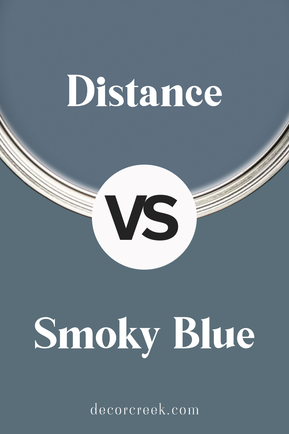
Sherwin Williams Distance SW 6243 vs Smoky Blue SW 7604
Distance SW 6243 and Smoky Blue SW 7604 are two deep, elegant blue shades by Sherwin Williams. Distance is a darker, moodier blue-gray that brings a cozy and grounded feel. Smoky Blue is a lighter, softer blue with warm undertones, adding a refreshing yet relaxed vibe to spaces.
Choose Distance for creating a bold accent wall or for larger rooms that benefit from a rich, calming color. Smoky Blue works well in bathrooms, kitchens, or spaces needing a lighter, uplifting touch. Both colors look stunning with whites and soft wood tones, providing a balanced, stylish finish.
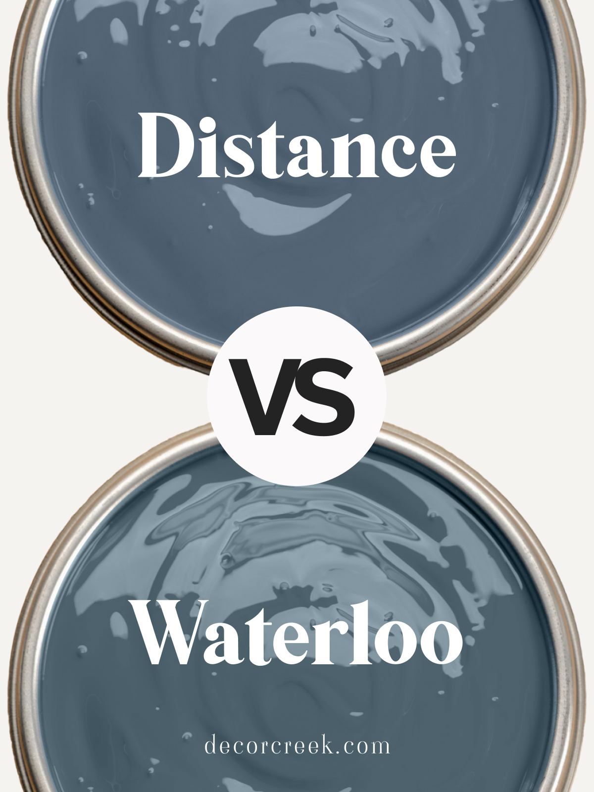
Sherwin Williams Distance SW 6243 vs Waterloo SW 9141
Distance SW 6243 and Waterloo SW 9141 by Sherwin Williams are rich blue-grays, each with a different undertone. Distance is a deep blue with hints of gray, offering a grounded and slightly moody feel. Waterloo is softer and more balanced, with a blue tone that adds warmth and coziness to spaces.
Distance is ideal for accent walls or modern rooms needing depth, while Waterloo suits bedrooms or living areas with a warm, inviting feel. Both shades pair beautifully with white trim or neutral accents, creating a cohesive, calming atmosphere in any home.
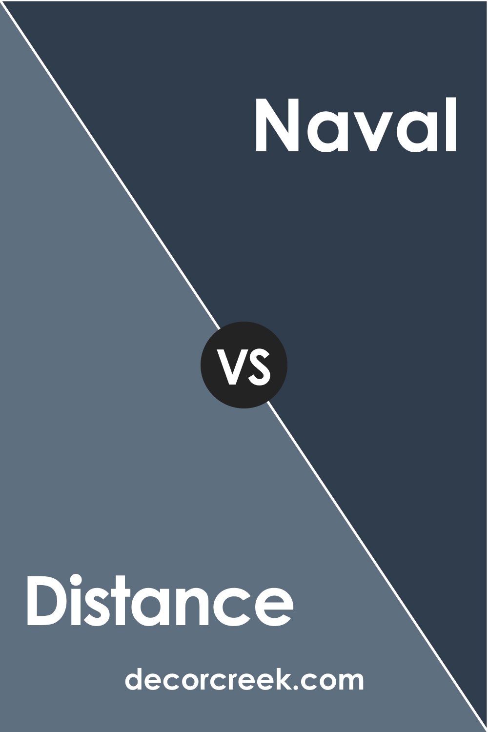
SW 6243 Distance vs SW 6244 Naval
Sherwin-Williams’ SW 6244 Naval is another navy blue shade, but it’s not quite as deep or intense as SW 6243 Distance. While Distance is an incredibly rich and bold hue with hints of teal, SW Naval is a slightly brighter, more traditional navy blue.
Both colors have a cool undertone, making them a great fit for modern and contemporary spaces. However, the richer intensity of Distance makes it a stand-out choice for dramatic spaces, while SW Naval might be more suited to spaces where a slightly less overwhelming shade is preferred.
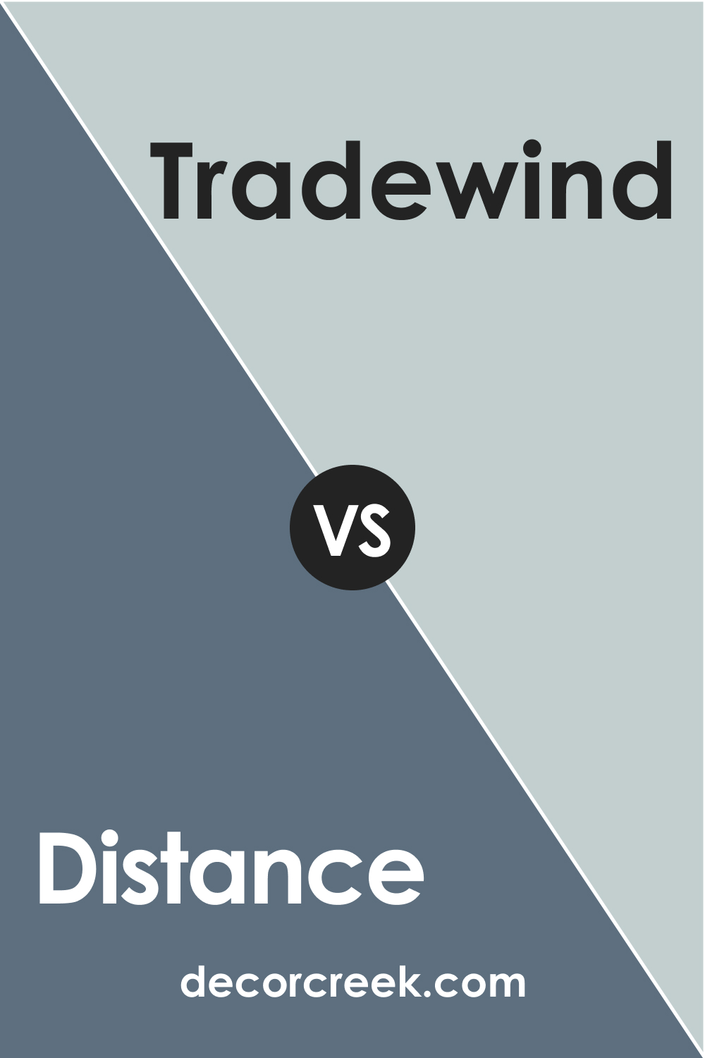
SW 6243 Distance vs SW 6218 Tradewind
SW 6218 Tradewind is a much softer and lighter color than SW 6243 Distance. It’s a soothing, muted sky blue with a touch of grey, making it a great choice for creating a calming and tranquil environment.
On the other hand, SW Distance’s bold and deep navy can create a dramatic and striking interior. Depending on the vibe you’re trying to achieve, either could be a great choice, with Distance being more suited to creating a striking impact and Tradewind creating a peaceful atmosphere.
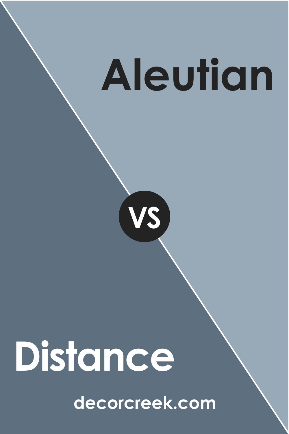
SW 6243 Distance vs SW 6241 Aleutian
SW 6241 Aleutian is a muted blue-gray color with a hint of green undertone. While it has a similar coolness to Distance, it is significantly lighter and less intense. Aleutian is an excellent choice for those seeking a subtler, more laid-back atmosphere, while Distance, with its deeper, more profound navy tone, provides a much more striking and bold impact.
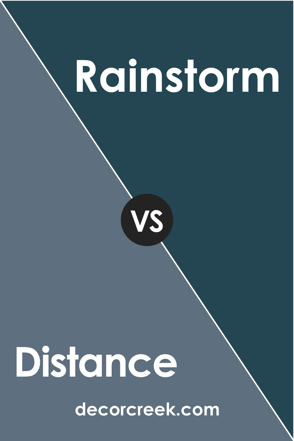
SW 6243 Distance vs SW 6230 Rainstorm
SW Rainstorm is a dark blue with a grey undertone and a slight hint of green, it’s also dark but not as deep as SW Distance. While SW Rainstorm leans more towards teal because of its green undertone, SW Distance is a truer navy. SW Rainstorm might be the right choice if you’re looking for a color slightly less dramatic than SW Distance but still dark and moody.
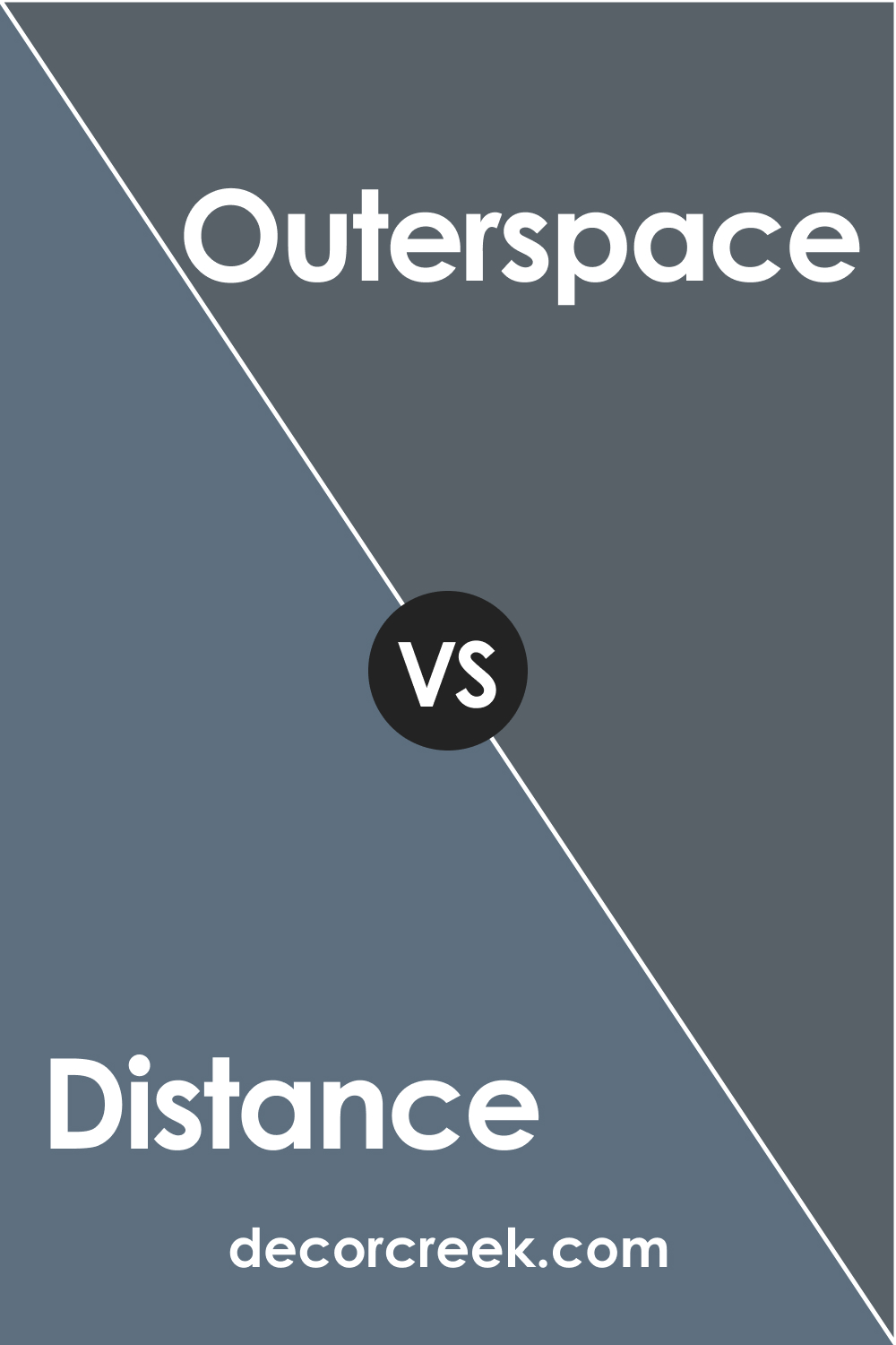
SW 6243 Distance vs SW 6251 Outerspace
SW Outerspace is a very dark, almost charcoal-gray color with a slight blue undertone. In comparison, SW Distance is a deep, rich navy blue. Both shades are quite dark, but Outerspace leans more towards a neutral, while SW Distance is distinctly blue. They both create a moody and dramatic ambiance but in different ways – SW Distance with a bold splash of color and SW Outerspace with a more muted, neutral approach.
SW 6243 Distance vs SW 6224 Mountain Air
SW Mountain Air is a light, airy blue with a hint of green undertone, quite the opposite of the deep, intense navy of SW Distance. If you are looking for a light, soothing blue for a calm and relaxed atmosphere, SW Mountain Air would be the way to go. On the other hand, if you prefer a bold, dramatic statement, SW Distance would be your color.
Conclusion
Sherwin-Williams SW 6243 Distance is a dynamic and bold color choice that can make a significant impact in any space. Its deep, rich navy blue hue is perfect for creating dramatic and sophisticated interiors, whether it’s in a kitchen, bathroom, living room, or even exterior spaces.
The cool undertones of SW Distance lend it a versatile quality, allowing it to pair beautifully with a range of colors, from soft neutrals and bright whites to earthy browns and grays. Its low Light Reflectance Value (LRV) of 15 also means it absorbs light, making it an excellent choice for rooms where you want to create a cozy and intimate atmosphere.
While SW Distance can be intense and dramatic, it can also be balanced with lighter trim colors, such as SW Extra White, SW Alabaster, and SW Natural Choice. Moreover, its similarity with other navy blue shades like SW 6244 Naval and SW 6230 Rainstorm, and its contrast with lighter blues like SW 6218 Tradewind and SW 6224 Mountain Air, give you options to create varied moods and effects in your spaces.
In essence, if you’re looking for a color that exudes elegance, sophistication, and a touch of drama, SW 6243 Distance is a color well worth considering.

Ever wished paint sampling was as easy as sticking a sticker? Guess what? Now it is! Discover Samplize's unique Peel & Stick samples.
Get paint samples
Frequently Asked Questions
⭐What type of color is SW 6243 Distance?
SW 6243 Distance is a deep, rich navy blue color. This color has cool undertones and adds a sense of sophistication and drama to any room it's applied in.
⭐Is SW 6243 Distance a warm or cool color?
SW 6243 Distance is a cool color. Its deep, dark blue hue and cool undertones give it a calm, serene feel.
⭐How does lighting affect SW 6243 Distance?
The perception of SW 6243 Distance can change significantly under different lighting conditions. In bright, natural light, the color may appear brighter and more vibrant. In contrast, in dimmer, artificial light, it may appear deeper and more intense.
⭐What colors go well with SW 6243 Distance?
SW 6243 Distance pairs beautifully with a variety of colors. It works well with soft neutrals, bright whites, and even earthy browns and grays. For a harmonious look, consider pairing it with colors like SW 6238 Icicle, SW 9165 Gossamer Veil, and SW 9169 Chatura Gray.
⭐What are some similar colors to SW 6243 Distance?
Several colors are similar to SW 6243 Distance. Some of these include SW 6244 Naval, SW 6230 Rainstorm, and SW 6251 Outerspace. All of these colors are navy blues, though they may have slightly different undertones and intensities.


