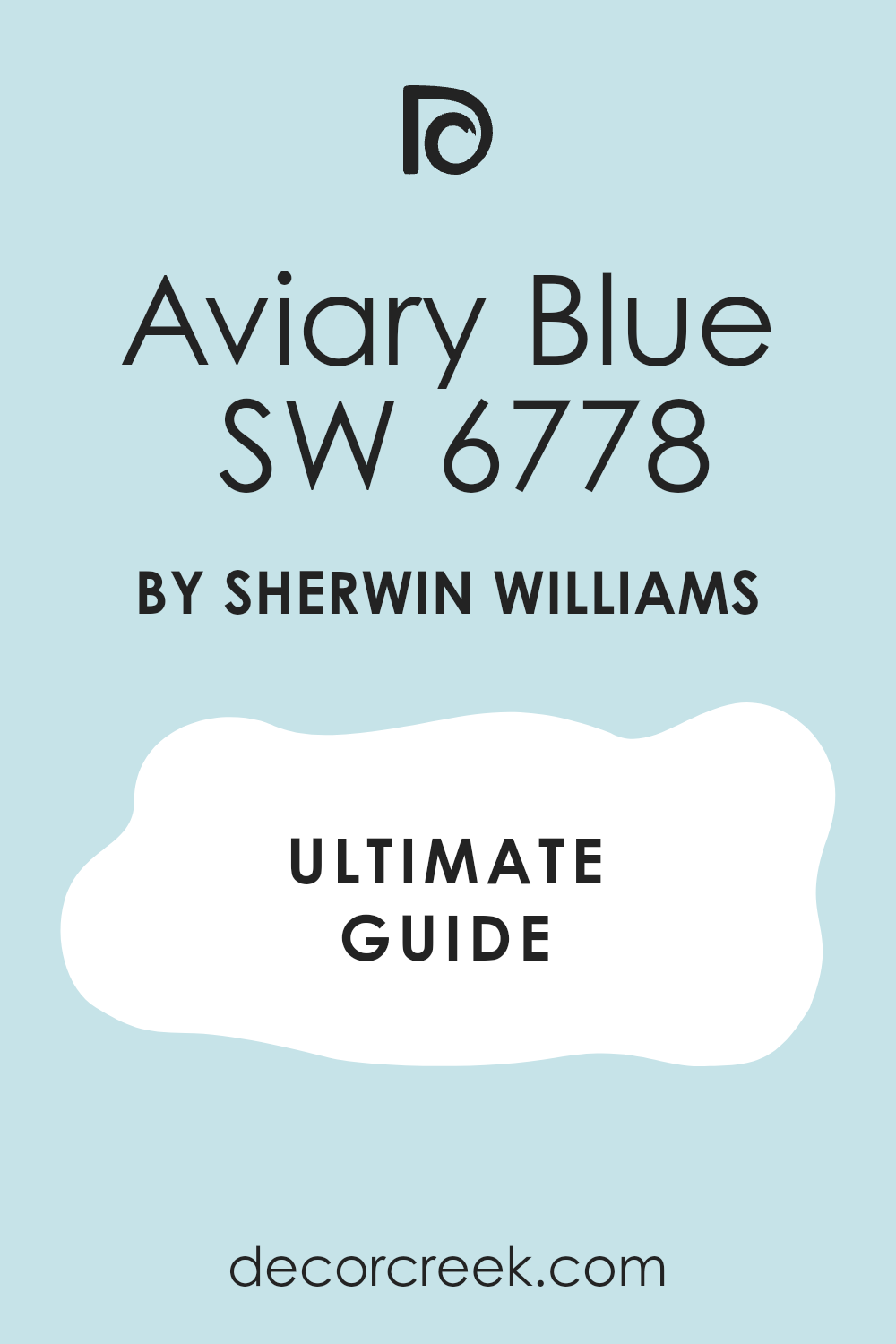
SW 6778 Aviary Blue by Sherwin Williams immediately invites a sense of calm and stillness. As I observed this shade, I felt a soothing wave wash over me. The gentle blue hue effortlessly captures the essence of a clear sky on a peaceful day, bringing a breath of fresh air into any area. It’s a color that speaks softly yet confidently, making it a perfect choice for those looking to create an oasis of relaxation in their home.
This color transitions beautifully from morning light to evening, constantly revealing new nuances. In the day, it might feel invigorating and fresh, while at night, it takes on a more mellow and cozy tone. I’ve noticed that Aviary Blue works well in any room—be it a tranquil bedroom, a refreshing bathroom, or a welcoming living room.
The adaptability of this shade makes it easy to pair with a variety of other colors and materials, allowing for endless design possibilities. Choosing Aviary Blue offered me a unique opportunity to reflect my personality through color, crafting an area with a sense of balance and calm.
It’s a choice that highlights both style and comfort, ensuring an atmosphere that’s both inviting and peaceful.
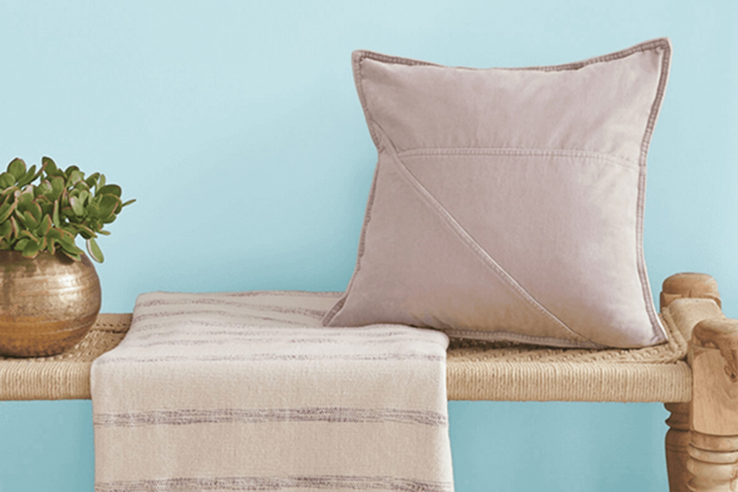
What Color Is Aviary Blue SW 6778 by Sherwin Williams?
Aviary Blue by Sherwin Williams is a light, fresh blue with subtle hints of green. It’s a soft and airy color that brings brightness to any room. This particular shade works beautifully in coastal or beach-themed interiors, where a calm and refreshing atmosphere is desired. It’s also well-suited for modern, Scandinavian, or minimalist styles, thanks to its clean and simple appearance.
In a coastal setting, Aviary Blue pairs well with whitewashed woods, natural fibers like jute or sisal, and light-colored linens. These materials highlight the breezy feel of the color. In a modern or minimalist environment, this blue can complement sleek furniture pieces, stainless steel, or glass, creating a balance between warmth and modernity.
Textured materials such as light, natural wool throws or soft cotton can add depth and coziness to rooms painted in Aviary Blue. Additionally, brushed metals and matte black accents can provide striking contrasts, allowing the color to stand out even more.
Overall, Aviary Blue brings a sense of lightness and airiness to a room. It’s a flexible shade that can adapt to various styles and materials while maintaining its refreshing quality.
Is Aviary Blue SW 6778 by Sherwin Williams Warm or Cool color?
Aviary Blue by Sherwin Williams is a soft, fresh shade of blue that brings a light and airy feel to any room. This color adds a calm and inviting touch, making it an excellent choice for rooms like bedrooms or living rooms where relaxation is key. Its gentle hue works well in both modern and traditional settings, allowing it to complement a variety of decor styles.
In smaller rooms, Aviary Blue can help make the room feel larger and more open due to its light tone. When paired with whites and neutrals, it creates a crisp, clean look, while adding darker accents can offer a pleasing contrast that highlights the color’s understated beauty.
Natural light can enhance its brightness, giving the room a fresh and welcoming atmosphere. Whether used on every wall or as an accent, this color works harmoniously to create an environment that feels both peaceful and refreshing.
Undertones of Aviary Blue SW 6778 by Sherwin Williams
Aviary Blue by Sherwin Williams is an intriguing paint color that carries a mix of various undertones influencing how it looks on interior walls. This color’s primary character is a medium blue, but hidden within it are subtle shades of light blue, light purple, pale yellow, lilac, mint, pale pink, and grey.
The undertones in a paint color play a crucial role in its presentation because they can slightly shift the color’s look depending on lighting conditions and surrounding colors in a room. For instance, the light purple and lilac undertones can add a soft, gentle touch, making the blue seem calmer and cooler.
The mint undertone can introduce a fresh, invigorating hint, while pale yellow and pale pink infuse warmth, ensuring the blue doesn’t feel too cold or stark. On interior walls, these undertones give Aviary Blue a flexible character. During daylight, the room might feel airy and open, with the light blue and mint hues shining through.
As the day transitions to evening, the grey undertone can come forward, providing a more neutral, balanced atmosphere. This adaptability makes the color an excellent choice for various rooms, seamlessly adjusting its tone to create a cozy, light, and welcoming environment throughout different times of the day.
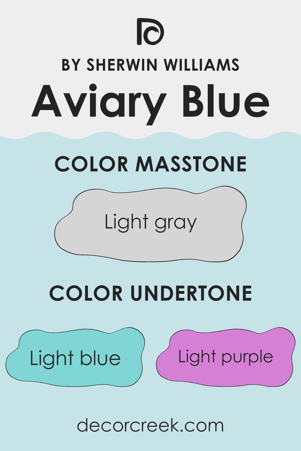
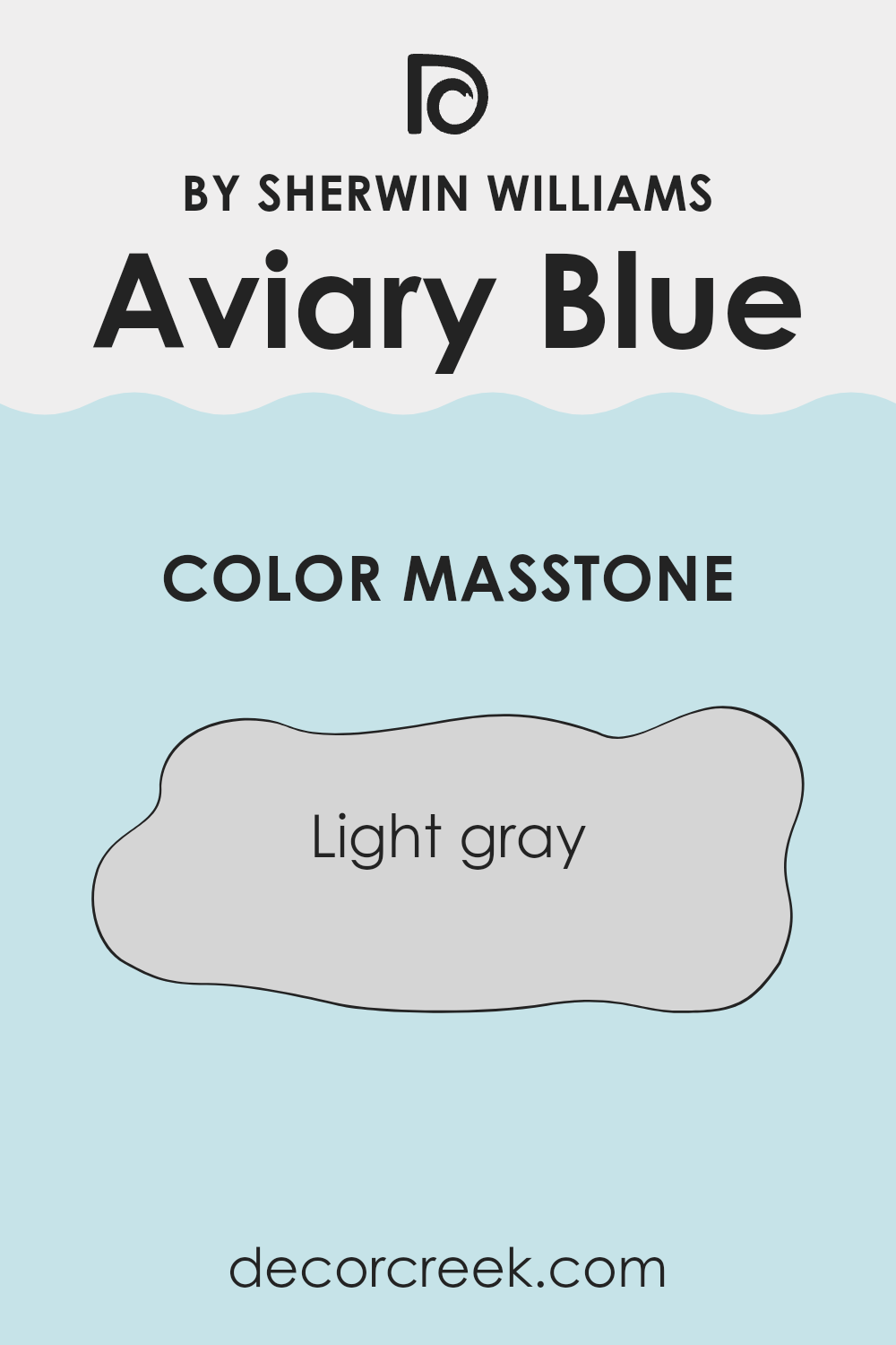
What is the Masstone of the Aviary Blue SW 6778 by Sherwin Williams?
Aviary Blue (SW 6778) by Sherwin Williams is a soft, calming blue that pairs well with a variety of home settings. Its masstone is a light gray (#D5D5D5), which gives it a subtle and neutral quality. This gray undertone helps the color blend seamlessly into any room, making it an adaptable choice for both modern and traditional interiors.
The light gray masstone helps soften the blue, keeping it from feeling too bright or overpowering. Instead, the color offers a gentle backdrop that makes rooms feel larger and more open.
This quality is particularly useful in smaller rooms or areas that don’t receive a lot of natural light, as it can help brighten the area without being overstimulating. The neutral aspects of the gray also make it an excellent partner for a wide range of accent colors and materials, allowing homeowners to personalize their interiors easily.
How Does Lighting Affect Aviary Blue SW 6778 by Sherwin Williams?
Lighting plays a big role in how we perceive colors in a room. The color Aviary Blue (SW 6778) by Sherwin Williams, like any color, can appear different under various lighting conditions.
In natural light, the direction a room faces affects how you see Aviary Blue. In north-facing rooms, which usually get cooler and more muted light, this blue can appear cooler and more subdued. It might seem a bit more gray than it does in brighter rooms. In south-facing rooms, which get a lot of direct sunlight throughout the day, colors tend to appear warmer and more vivid. Here, Aviary Blue might look brighter and more cheerful.
East-facing rooms receive warm, soft light in the morning that can make colors look warmer and brighter early in the day. As the sun moves, the light becomes cooler, and the blue might lose a bit of its warmth. In west-facing rooms, the light is cooler in the morning and becomes warmer and more intense in the afternoon and evening. Aviary Blue may start the day appearing softer and become more vibrant in the afternoon.
Artificial lighting also affects how we see colors. Incandescent light bulbs tend to give off a warm, yellow light, which can make Aviary Blue look a bit greener or duller. Fluorescent lights can be cooler and can sometimes make a color appear more blue or harsh. LED lights come in various shades, from warm to cool, and can therefore alter the mood of the color.
It’s important to test paint swatches in different lighting conditions before committing to a color. This helps to see how Aviary Blue changes throughout the day and with different artificial lights, ensuring you get the look you want for your room.
What is the LRV of Aviary Blue SW 6778 by Sherwin Williams?
Light Reflectance Value, or LRV, is a measurement that tells us how much light a color will reflect or absorb. It’s a scale that ranges from 0, which reflects no light and is completely black, to 100, which reflects all light and is completely white. In practical terms, the LRV of a paint color helps you understand how it will behave under different lighting conditions.
Colors with higher LRVs, like pastel shades or whites, can make a room feel brighter and more spacious because they reflect more light. On the other hand, colors with lower LRVs tend to create a cozier, more intimate atmosphere, as they absorb more light.
Aviary Blue by Sherwin Williams has an LRV of 72.654. This means it is on the lighter side of the scale, reflecting a significant amount of light. As a result, using this color on your walls will likely make the room feel airy and open, which can be especially beneficial in smaller rooms or rooms without much natural light.
Its high LRV helps it to maintain its color vibrancy in various lighting conditions, ensuring that it remains a lively, refreshing shade of blue throughout the day. Whether you’re painting a living room or a bedroom, this color’s ability to reflect light well can create an uplifting and welcoming environment.
Coordinating Colors of Aviary Blue SW 6778 by Sherwin Williams
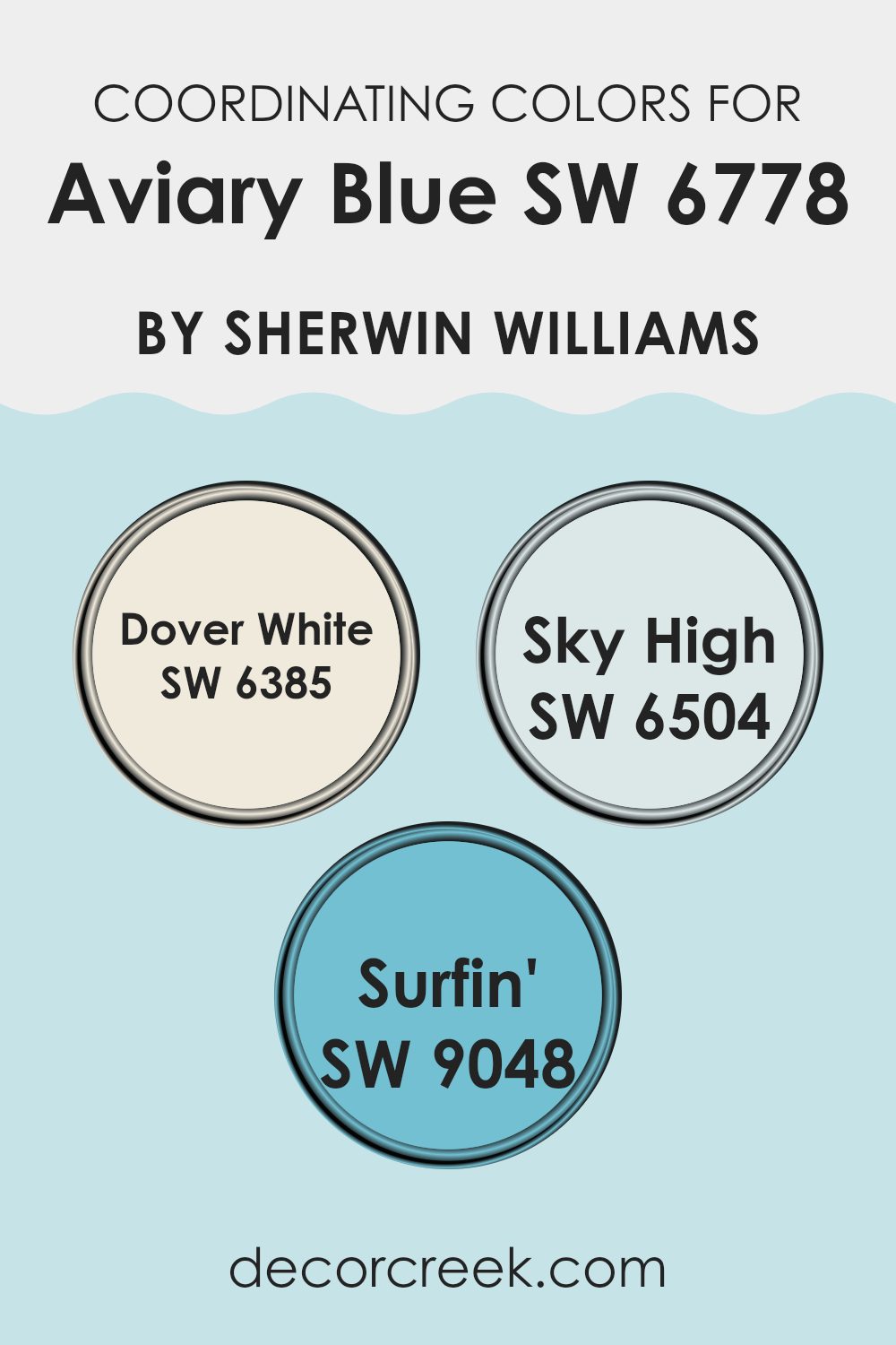
Coordinating colors are hues that work well together to create a pleasing and balanced visual effect. These colors enhance each other by sharing common undertones or complementing each other’s tones, making them ideal choices for home décor and design.
Aviary Blue, with its soothing, nature-inspired shade, can be perfectly complemented by well-chosen coordinating colors. For instance, Sherwin Williams’ “Dover White” (SW 6385) pairs beautifully with Aviary Blue. It is a warm, creamy white that provides a soft and inviting backdrop, adding brightness without overpowering.
On the other hand, Sky High (SW 6504) is a light and delicate blue that flows effortlessly with Aviary Blue, creating a smooth transition within rooms. This soft shade reinforces the calming mood and adds a bright, breathable quality to the environment. Surfin’ (SW 9048) offers a cheerful, deeper aqua tone, injecting a playful burst of energy into the palette when paired with Aviary Blue. Together, these colors work in harmony, building a cohesive and inviting look that makes each room feel thoughtfully linked and naturally uplifting.
You can see recommended paint colors below:
- SW 6385 Dover White (CHECK A SAMPLE)
- SW 6504 Sky High (CHECK A SAMPLE)
- SW 9048 Surfin’ (CHECK A SAMPLE)
What are the Trim colors of Aviary Blue SW 6778 by Sherwin Williams?
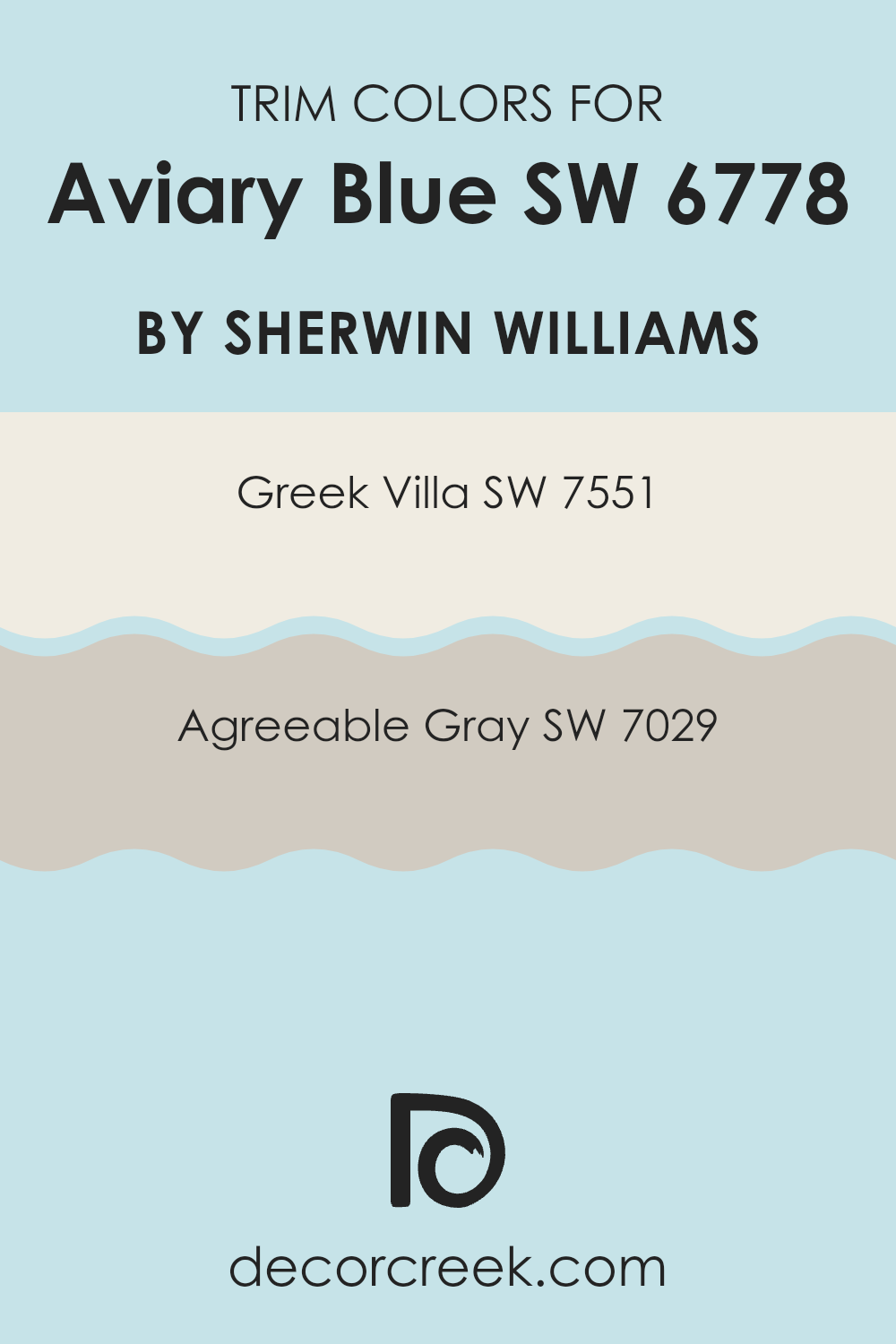
Trim colors are crucial in interior design because they can highlight architectural details, frame views, and add depth and contrast to the walls. When pairing trim colors with Aviary Blue by Sherwin Williams, which is a fresh and uplifting shade of blue, the choice of trim can significantly affect the overall atmosphere of a room. Using SW 7551 – Greek Villa as a trim color provides a creamy white tone that complements Aviary Blue by adding warmth and soft elegance.
Greek Villa is a flexible shade that balances the coolness of blue and creates a cozy yet airy feel. On the other hand, SW 7029 – Agreeable Gray offers a warm, soft gray that pairs wonderfully with blues, bringing a touch of contemporary style and subtle contrast without overpowering the main color.
The selection of these trim colors is important because it can define the character of a room. Greek Villa enhances Aviary Blue’s brightness with its creamy, inviting presence, creating a harmonious and welcoming environment. Its delicate warmth works well for areas where a gentle, fresh look is desired. Meanwhile, Agreeable Gray offers a comforting, neutral approach. It’s understated but enriching, making it an excellent choice for those who want a bit of contrast without heavily weighing the room down.
This gray trim can help add depth and sophistication to rooms, ensuring the blue can shine without stark interruptions. Both these color choices support Aviary Blue effectively by providing balance and harmony, allowing the main color to stand out while maintaining a cohesive look.
You can see recommended paint colors below:
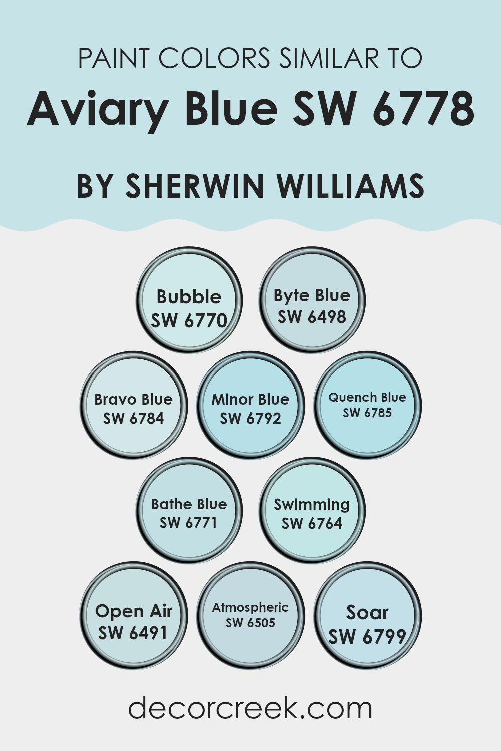
Colors Similar to Aviary Blue SW 6778 by Sherwin Williams
Colors that are similar to Aviary Blue play an important role in design and decoration. They provide a sense of harmony and balance that can make a room feel both cohesive and inviting. In areas where Aviary Blue is the focus, incorporating shades like Bubble (SW 6770) and Byte Blue (SW 6498) can create a softer, more flowing look, as these light and airy tones complement the main hue beautifully.
Bravo Blue (SW 6784) adds a bit of depth with its slightly richer hue, while Minor Blue (SW 6792) introduces a calm, gentle feel. Quench Blue (SW 6785) brings a brighter, more vibrant note that can add energy to a room, while Bathe Blue (SW 6771) is a perfect choice for creating a refreshing atmosphere.
Swimming (SW 6764) is adaptable, offering a balanced medium tone that’s neither too light nor too dark. Open Air (SW 6491) sits on the lighter spectrum, providing a breezy, open feel that’s great for compact interiors. Atmospheric (SW 6505) brings a muted quality, ideal for crafting an understated, cozy look. Soar (SW 6799), meanwhile, feels upbeat and lively—perfect for injecting a bit of motion into the palette. By coordinating these similar shades, you can create an environment that feels unified and comfortable.
You can see recommended paint colors below:
- SW 6770 Bubble
- SW 6498 Byte Blue (CHECK A SAMPLE)
- SW 6784 Bravo Blue (CHECK A SAMPLE)
- SW 6792 Minor Blue (CHECK A SAMPLE)
- SW 6785 Quench Blue (CHECK A SAMPLE)
- SW 6771 Bathe Blue (CHECK A SAMPLE)
- SW 6764 Swimming (CHECK A SAMPLE)
- SW 6491 Open Air (CHECK A SAMPLE)
- SW 6505 Atmospheric (CHECK A SAMPLE)
- SW 6799 Soar (CHECK A SAMPLE)
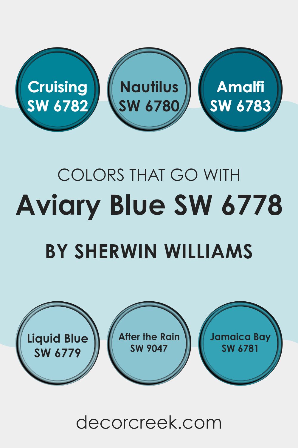
Colors that Go With Aviary Blue SW 6778 by Sherwin Williams
Aviary Blue SW 6778 by Sherwin Williams is a soft, calming blue that brings a refreshing feel to any setting. When choosing hues to coordinate with it, it’s helpful to select shades that support and enrich its bright, airy quality. SW 6782 – Cruising is a slightly deeper blue that introduces depth and contrast, making it a strong candidate for accent walls or trim.
Meanwhile, SW 6780 – Nautilus brings a hint of green into the mix, adding a touch of earthiness that works well with Aviary Blue. This combination creates a breezy, coastal atmosphere perfect for any room.
For a bit more vibrancy, SW 6783 – Amalfi offers a bolder, more pronounced blue that pairs seamlessly with Aviary Blue while giving the room a lively touch. If you prefer a transition with subtlety, SW 6779 – Liquid Blue leans towards turquoise and adds elegance without being too stark.
SW 9047 – After the Rain presents a slightly muted blue, harmonizing with Aviary Blue’s soothing nature, and is perfect for creating a cohesive look. Finally, SW 6781 – Jamaica Bay, with its rich teal undertones, provides an appealing contrast and helps balance the lightness of Aviary Blue, resulting in a balanced and inviting color scheme.
You can see recommended paint colors below:
- SW 6782 Cruising (CHECK A SAMPLE)
- SW 6780 Nautilus (CHECK A SAMPLE)
- SW 6783 Amalfi (CHECK A SAMPLE)
- SW 6779 Liquid Blue (CHECK A SAMPLE)
- SW 9047 After the Rain (CHECK A SAMPLE)
- SW 6781 Jamaica Bay (CHECK A SAMPLE)
How to Use Aviary Blue SW 6778 by Sherwin Williams In Your Home?
Aviary Blue SW 6778 by Sherwin Williams is a soft, calming shade of blue that can create a peaceful atmosphere in any home. This color is adaptable and works well in a variety of rooms. It’s perfect for bedrooms because it brings a sense of calm, helping to create a relaxing environment for sleep. Pair it with white furniture or light wood accents to enhance its gentle feel.
In living rooms, Aviary Blue can be used on all walls or just as an accent to add a touch of color. It works well with both modern and classic styles, providing a fresh yet enduring look. Kitchens and bathrooms can benefit from its clean and crisp appearance, especially when paired with white cabinets or tile.
In nurseries or kids’ rooms, this blue offers a soothing backdrop without feeling too intense. Overall, Aviary Blue is a beautiful color choice that can add comfort and style to any room.
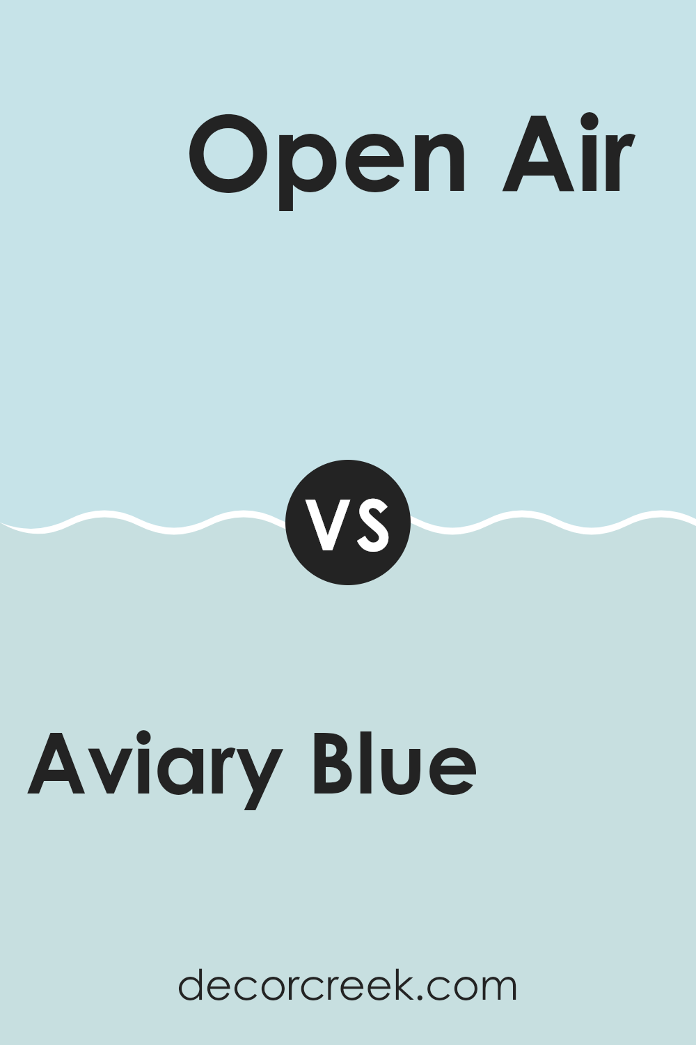
Aviary Blue SW 6778 by Sherwin Williams vs Open Air SW 6491 by Sherwin Williams
Aviary Blue SW 6778 and Open Air SW 6491 are both soft blue colors by Sherwin Williams, but they have different vibes. Aviary Blue SW 6778 is a gentle blue with green undertones, making it feel fresh and lively. It’s a great choice if you want to add a bit of nature-inspired color to a room.
On the other hand, Open Air SW 6491 is a lighter and more airy blue. It’s almost sky-like, bringing a sense of openness and room to any room. This color works well if you’re looking to create a calm, spacious atmosphere.
Both colors are adaptable and can be used in various settings, but Aviary Blue adds a hint of energy and nature, while Open Air is more about creating a peaceful, open feel. Choose based on whether you want a bit more vibrancy or a breezy, calm environment.
You can see recommended paint color below:
- SW 6491 Open Air (CHECK A SAMPLE)
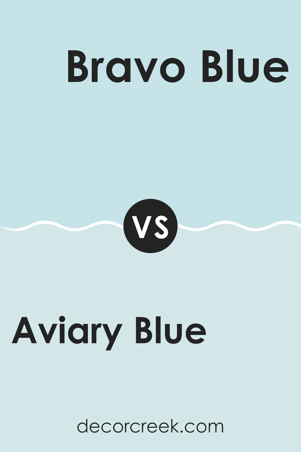
Aviary Blue SW 6778 by Sherwin Williams vs Bravo Blue SW 6784 by Sherwin Williams
Aviary Blue SW 6778 and Bravo Blue SW 6784 are both refreshing blues from Sherwin Williams. Aviary Blue is a softer, more muted blue that has a hint of green, giving it a slightly teal appearance. It’s perfect for creating a calming atmosphere in a room, making it suitable for bedrooms or living areas.
On the other hand, Bravo Blue is a livelier shade, with a brighter and more vibrant tone. It leans more towards a true blue, providing a cool and energetic feel. This makes Bravo Blue a great choice for areas where you want to inspire motivation or creativity, like a home office or playroom.
While both colors bring a sense of freshness, Aviary Blue’s subtlety offers a gentle and soothing vibe, whereas Bravo Blue’s intensity adds a lively and dynamic touch. Choosing between them depends on the mood you want to set in your room.
You can see recommended paint color below:
- SW 6784 Bravo Blue (CHECK A SAMPLE)
Aviary Blue SW 6778 by Sherwin Williams vs Bathe Blue SW 6771 by Sherwin Williams
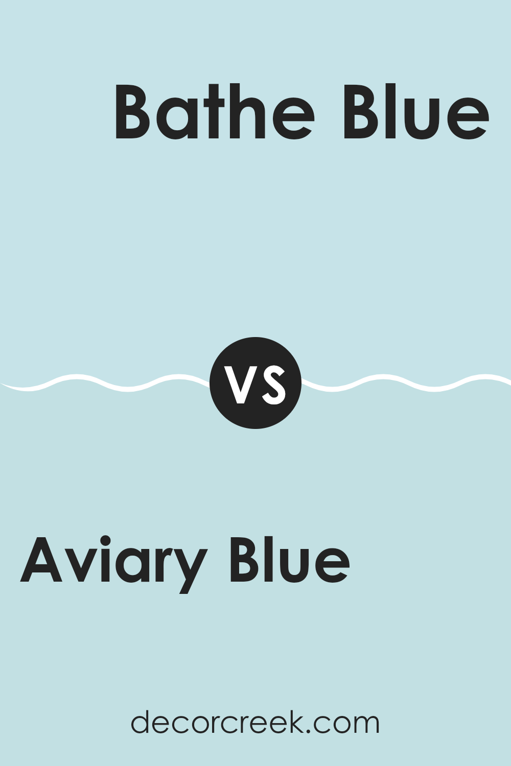
Aviary Blue and Bathe Blue by Sherwin Williams are two shades of blue that offer different feels for a room. Aviary Blue is more vibrant and lively. It’s a bright, cheerful blue that can bring energy and a sense of openness to an environment. It’s great for areas where you want to feel awake and alert, like a children’s room or kitchen.
On the other hand, Bathe Blue is a softer, muted shade. It’s more subtle and relaxing, making it a good choice for a bedroom or bathroom where you want a calming atmosphere. Bathe Blue can make a room feel more soothing without being overpowering.
While both colors are blues and can be used in similar environments, Aviary Blue stands out with its brightness, while Bathe Blue works quietly in the background, offering peace and calmness. The choice between them depends on the mood you want to create.
You can see recommended paint color below:
- SW 6771 Bathe Blue (CHECK A SAMPLE)
Aviary Blue SW 6778 by Sherwin Williams vs Byte Blue SW 6498 by Sherwin Williams
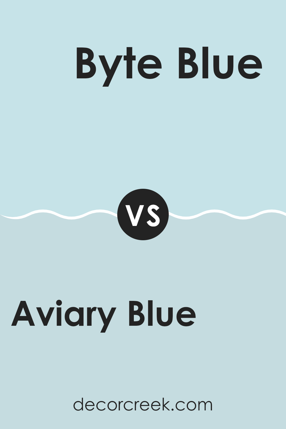
Aviary Blue SW 6778 and Byte Blue SW 6498 by Sherwin Williams are both shades of blue, but they have distinct characteristics. Aviary Blue is a lighter, softer shade with a touch of green, giving it a fresh and airy feel. It’s reminiscent of a clear sky or the delicate hues you might find in nature, making it suitable for rooms where you want a light and open atmosphere.
On the other hand, Byte Blue is a bit darker, with more depth and a slightly more muted tone. This color leans slightly toward a teal, offering a more modern and bold look. Byte Blue can add a sense of calm confidence to a room, making it a great choice for accent walls or areas where a stronger presence is desired.
While both colors are adaptable, Aviary Blue creates a light and breezy vibe, whereas Byte Blue offers a deeper, more grounded feel.
You can see recommended paint color below:
Aviary Blue SW 6778 by Sherwin Williams vs Quench Blue SW 6785 by Sherwin Williams
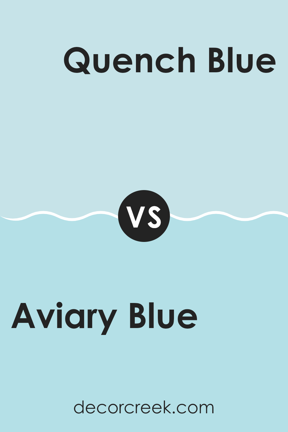
Aviary Blue and Quench Blue, both by Sherwin Williams, are two shades of blue that bring a fresh touch to any setting but offer distinct qualities. Aviary Blue is a soft, light tone with a touch of gray, lending it a calming, airy presence. It blends easily into bedrooms or living rooms where a laid-back mood is preferred.
In contrast, Quench Blue is a brighter shade with a more vibrant, energetic quality. It carries a lively undertone that can invigorate a room and create a cheerful environment. Quench Blue is ideal for rooms where you want to add a pop of color or make a bold statement.
While both colors belong to the blue family, Aviary Blue leans toward a subtle, muted palette, whereas Quench Blue offers a splash of brightness. Choosing between them depends on whether you prefer a calm or dynamic ambiance in your setting.
You can see recommended paint color below:
- SW 6785 Quench Blue (CHECK A SAMPLE)
Aviary Blue SW 6778 by Sherwin Williams vs Atmospheric SW 6505 by Sherwin Williams
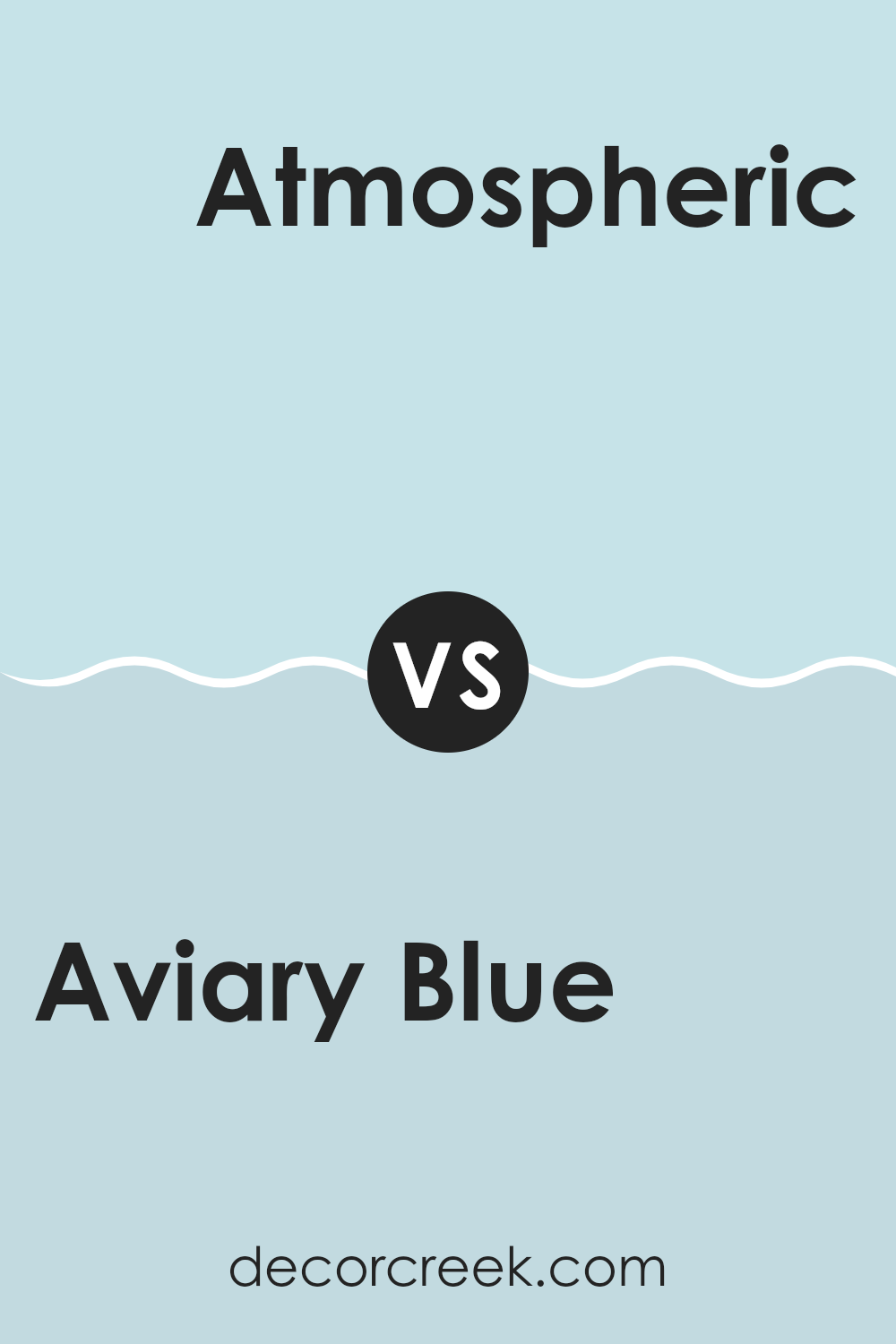
Aviary Blue and Atmospheric are two lovely shades from Sherwin Williams, yet they offer different vibes. Aviary Blue is a medium blue with a hint of green, reminiscent of a bright summer sky or the feathers of a tropical bird. It brings a sense of freshness and energy to a room.
On the other hand, Atmospheric is a softer, muted blue with subtle gray undertones, similar to a calm, overcast day. It creates a more relaxed and calming environment. When choosing between these colors, consider the mood you want to set.
Aviary Blue is perfect for areas where you want a lively feel, making it great for a child’s room or a creative workspace. Atmospheric suits zones where you seek peace, like a bedroom or reading nook. Both colors are adaptable, but the right choice depends on the atmosphere you’re aiming for.
You can see recommended paint color below:
Aviary Blue SW 6778 by Sherwin Williams vs Swimming SW 6764 by Sherwin Williams
Aviary Blue and Swimming are two popular paint colors by Sherwin Williams that offer distinct feels while being in the same color family. Aviary Blue is a soft, muted blue that brings a calming, airy vibe, making it great for creating relaxing environments.
It’s light but with enough depth to add character to a room. On the other hand, Swimming is a brighter, more vibrant blue, reminiscent of clear skies on a sunny day. It adds energy and brightness to any room without being too intense.
When choosing between the two, consider the mood you want to create. Aviary Blue can be ideal for bedrooms or reading nooks where a peaceful atmosphere is desired. Swimming, with its lively and refreshing hue, could work well in a kitchen or a family room where a more dynamic atmosphere is preferred. Both colors are adaptable and can pair well with a variety of accents and furnishings.
You can see recommended paint color below:
- SW 6764 Swimming (CHECK A SAMPLE)
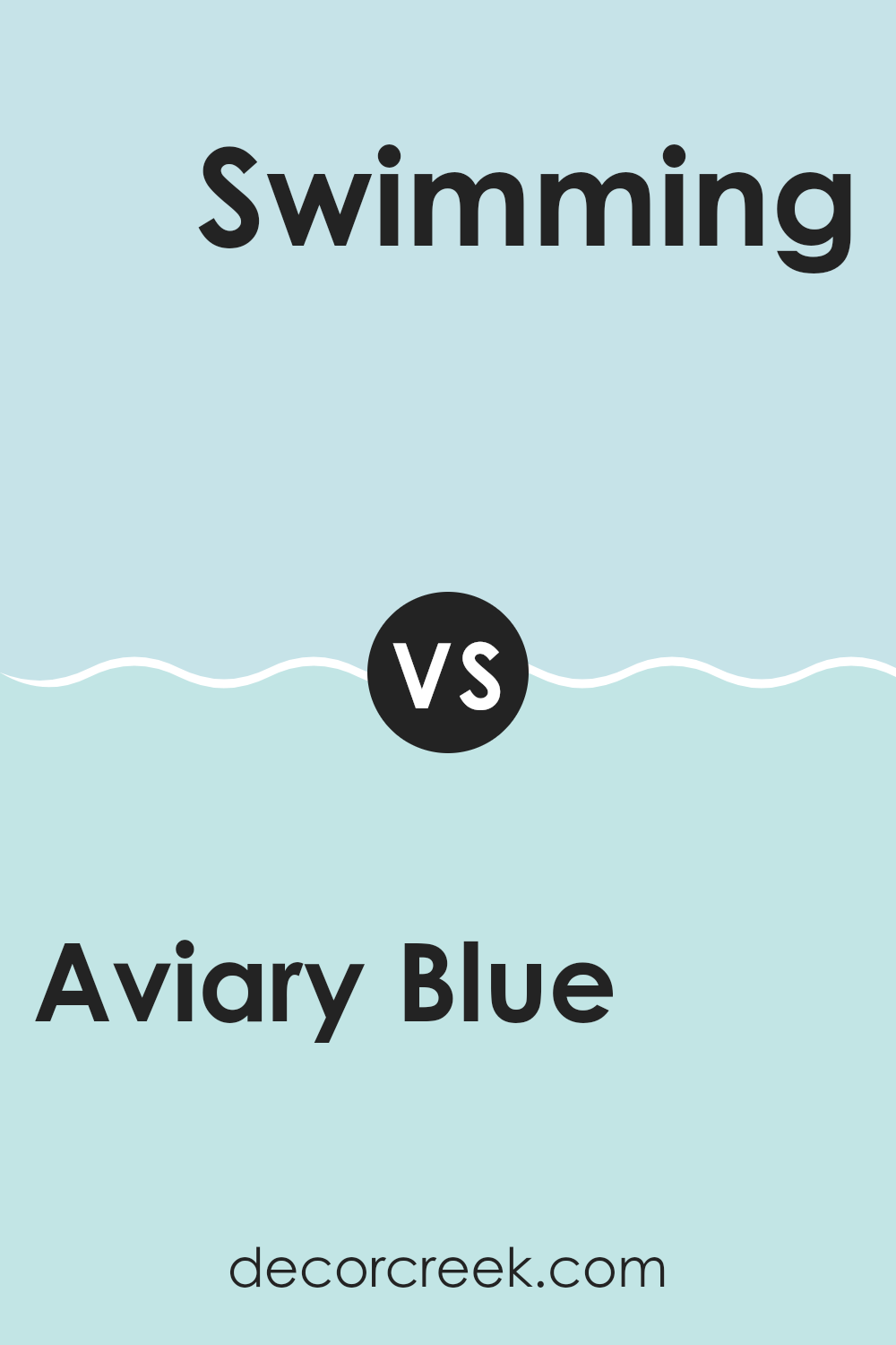
Aviary Blue SW 6778 by Sherwin Williams vs Soar SW 6799 by Sherwin Williams
Aviary Blue (SW 6778) and Soar (SW 6799) by Sherwin Williams are two different shades of blue that can bring distinct moods to an area. Aviary Blue is softer and slightly muted, bringing a gentle and calming feel. It’s an adaptable color that pairs well with neutral tones and natural materials, making it a good choice for bedrooms or living rooms where a soothing atmosphere is desired.
On the other hand, Soar is a brighter, more vivid blue. It has a vibrant and energetic feel, perfect for rooms where you want a lively and cheerful ambiance.
This shade of blue works well in playrooms, kitchens, or any area that could benefit from a splash of energy. When comparing the two, Aviary Blue is more subtle and understated, while Soar is bold and eye-catching. Depending on the mood you wish to create, each color offers its own unique charm.
You can see recommended paint color below:
- SW 6799 Soar (CHECK A SAMPLE)
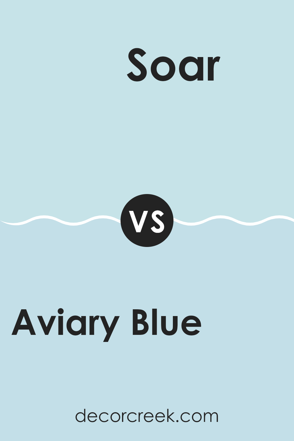
Aviary Blue SW 6778 by Sherwin Williams vs Bubble SW 6770 by Sherwin Williams
Aviary Blue SW 6778 and Bubble SW 6770, both by Sherwin Williams, are two shades of blue that offer distinct feels. Aviary Blue is a soft, muted blue with hints of gray, making it calming and adaptable. It can fit well in areas aiming for a cozy or relaxed atmosphere. This color can bring a touch of nature indoors, reminiscent of gentle skies.
On the other hand, Bubble SW 6770 is a brighter and lighter shade compared to Aviary Blue. It feels more lively and fresh, making it suitable for energizing a room. Bubble can add a pop of cheerful color to rooms, often used in areas where more light or a playful vibe is desired.
While Aviary Blue may suit more subdued and classic settings, Bubble works well in modern and youthful interiors. The choice between these blues can greatly shape the mood of a room, depending on the atmosphere you want to establish.
You can see recommended paint color below:
- SW 6770 Bubble
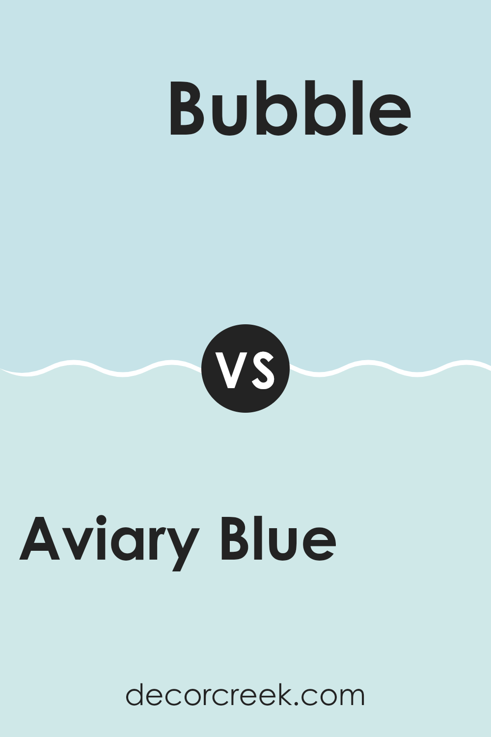
Aviary Blue SW 6778 by Sherwin Williams vs Minor Blue SW 6792 by Sherwin Williams
Aviary Blue SW 6778 and Minor Blue SW 6792 are two beautiful colors by Sherwin Williams. Aviary Blue is a soft, airy shade of blue with a hint of green. It feels light and fresh, perfect for creating a calming and open atmosphere in a room.
On the other hand, Minor Blue is a slightly deeper shade with a more pronounced green undertone. It carries a bit more weight, making it feel cozier and more grounded. While both colors are blue, Aviary Blue leans more pastel and is ideal for rooms where you want a gentle, breezy feel.
Minor Blue, being darker, can add a bit more character and warmth to a room. They can be used in different settings depending on the mood you want to create; Aviary Blue for lightness and airiness, and Minor Blue for depth and comfort. Both colors are adaptable, but their subtle differences make each unique.
You can see recommended paint color below:
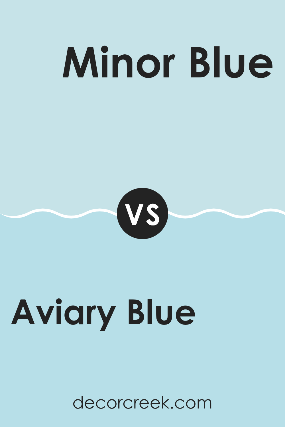
I remember learning about SW 6778 Aviary Blue from Sherwin Williams and feeling like I’d stumbled upon something special. It’s this lovely and calm bluish color that reminds me of a peaceful day outdoors. When you paint a room with this shade, it’s as if you’ve invited a bit of the sky inside.
Visualizing this hue on walls makes me think about how it can change the way a room feels. It can make rooms look bright, happy, and comforting. Rooms painted in Aviary Blue seem to tell you it’s okay to relax and have fun there. For kids who enjoy creative projects or want a room that feels fresh and inviting, this color is like a buddy always ready to help.
I’ve also thought this color might work well in lots of rooms, from bedrooms to living rooms, maybe even in the kitchen. It has a way of making everything feel just right, not too flashy or dull. When I picture rooms in Aviary Blue, I see a perfect balance, like a cool breeze on a sunny day.
So every time I look at this color, I imagine how it livens up a room, knowing there’s a color that can make days feel a little brighter and rooms a lot more fun.
Ever wished paint sampling was as easy as sticking a sticker? Guess what? Now it is! Discover Samplize's unique Peel & Stick samples.
Get paint samples


