This shade immediately caught my attention with its rich and earthy tone. It’s a color that seems to bring the warmth and comfort of the great outdoors right into your space, creating a cozy and welcoming atmosphere.
What I love about 469 Backwoods is its versatility. Whether you’re looking to paint a living room, a kitchen, or even a bedroom, this color manages to adapt beautifully to different settings. It has this unique ability to make a room feel both sophisticated and approachable at the same time.
When paired with natural elements like wood or stone, 469 Backwoods harmonizes effortlessly, enhancing the beauty of these materials. I’ve also found that it works well with a variety of accent colors, allowing you to personalize and make your space feel uniquely yours.
Choosing the right paint color can truly change the ambiance of a room.
With 469 Backwoods, I felt a sense of calm and balance, a little slice of peace from the outside world. It’s a choice that combines style and comfort, making every corner feel just a bit more special.
What Color Is Backwoods 469 by Benjamin Moore?
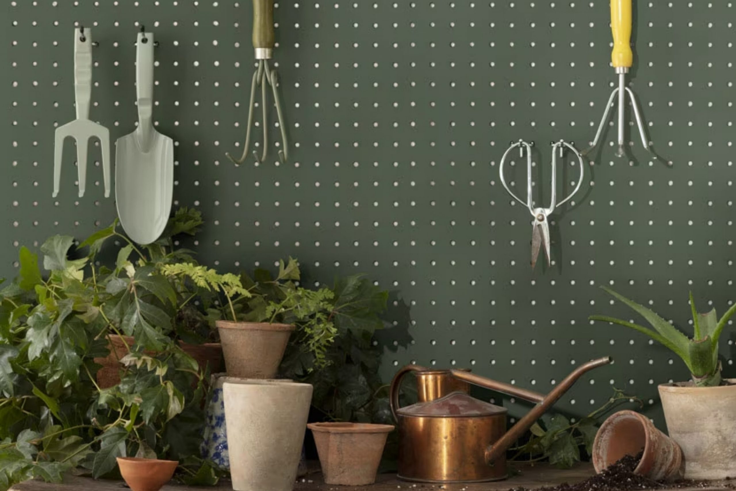
Backwoods by Benjamin Moore is a deep, muted green that adds richness and depth to any space. This color has an earthy tone reminiscent of lush forests, making it perfect for creating a cozy and inviting atmosphere. It works exceptionally well in various interior styles, from traditional to modern.
In a traditional setting, it can complement rich wood furnishings and classic decor, while in a modern style, it provides a bold yet natural touch that contrasts beautifully with sleeker lines and neutral backgrounds.
This green pairs wonderfully with materials such as natural wood, whether in darker walnut shades or lighter oak finishes. It enhances the warmth and texture of the wood, creating a harmonious and grounded look. Backwoods also works well with soft fabrics like linen and velvet, adding a touch of luxury and comfort.
Textures like woven baskets or jute rugs can provide an additional layer of interest, highlighting the organic aspect of the color.
In creating color schemes, Backwoods can be paired with warm whites and creams for a balanced and soothing palette. Accents of brass or gold in light fixtures and accessories can add warmth and a touch of elegance. This color brings a touch of the outdoors inside, making spaces feel connected to nature.
Is Backwoods 469 by Benjamin Moore Warm or Cool color?
Backwoods by Benjamin Moore is a deep, earthy green that brings a touch of nature into any home. This color works beautifully in a variety of spaces, adding warmth and depth. Its rich hue makes it a great choice for living rooms or bedrooms, where it can create a cozy and inviting atmosphere.
With its natural undertones, Backwoods complements wood furniture and plants, enhancing their organic feel.
In spaces like kitchens or dining areas, this green can make for a striking accent wall, offering a lively contrast to whites and neutrals. It pairs well with lighter shades, helping to keep rooms from feeling too dark while still providing a sense of comfort. Additionally, Backwoods can be used on cabinetry to give a fresh, yet grounded look.
Overall, its versatile nature and connection to the outdoors make it a color that feels both timeless and current in home design.
Undertones of Backwoods 469 by Benjamin Moore
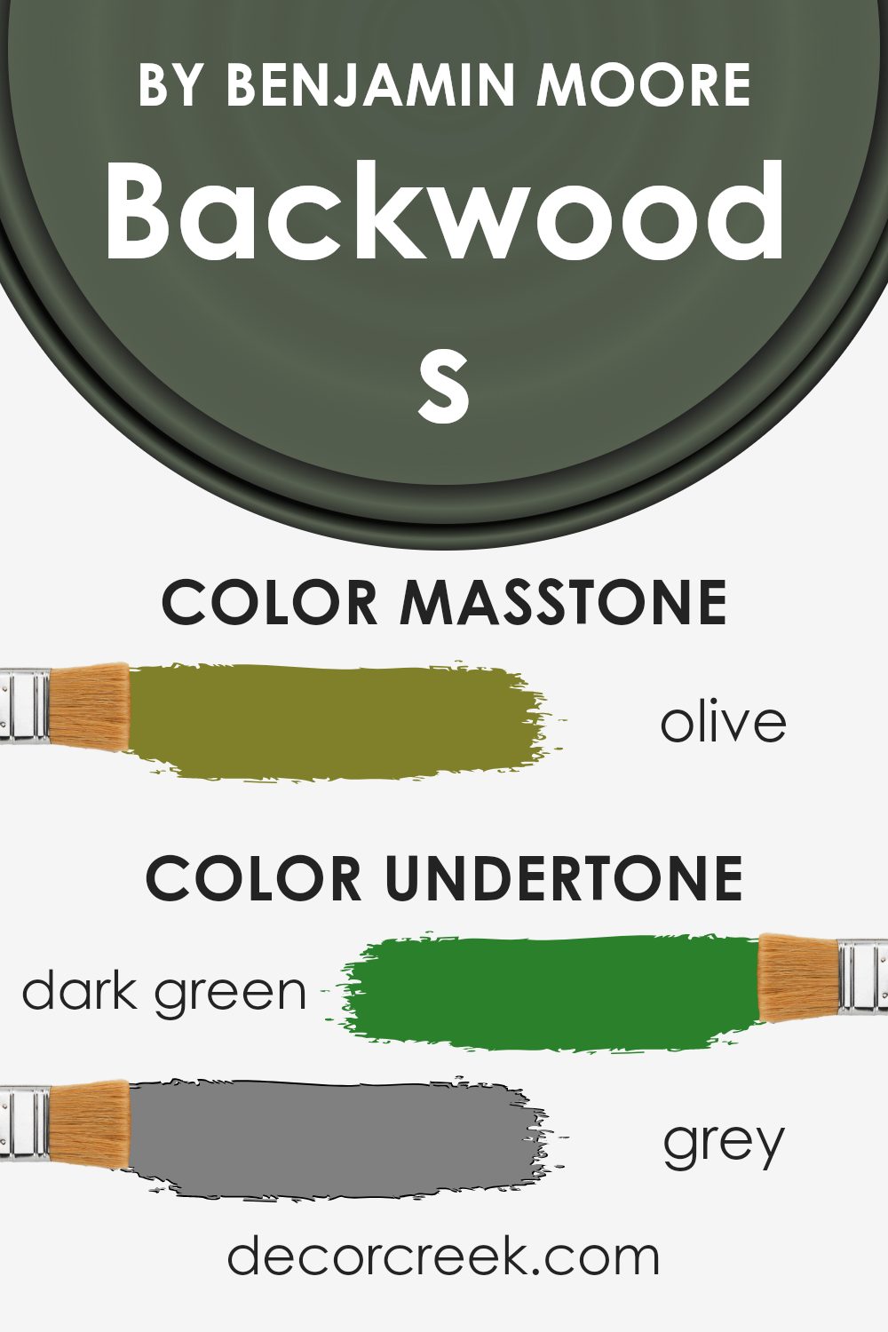
Backwoods by Benjamin Moore is a rich color that blends earthy and cool tones, making it unique and versatile. Its primary shade is a woodsy green with a strong influence from its many undertones. These undertones subtly shift how the overall color appears in different settings.
The dark green undertone gives Backwoods a natural and organic feel, reminiscent of thick forests, while the dark turquoise adds a hint of sophistication and richness. Grey undertones provide a balance, making the color feel more muted and suitable for various design styles.
The brown undertones add warmth and earthiness, creating a cozy and inviting atmosphere.
On interior walls, Backwoods can take on different characteristics depending on the lighting and surrounding colors. In a well-lit room, the lighter green or mint undertones might become more prominent, giving the space a fresh, lively feel.
In contrast, in dimmer lighting, the dark grey and navy undertones can create a more intimate or dramatic effect, while hints of orange or yellow may emerge, adding a subtle warmth.
Overall, the effect of these undertones means that Backwoods can suit a variety of moods and settings, from calm and peaceful to bold and energetic, making it an excellent choice for diverse interior designs.
What is the Masstone of the Backwoods 469 by Benjamin Moore?
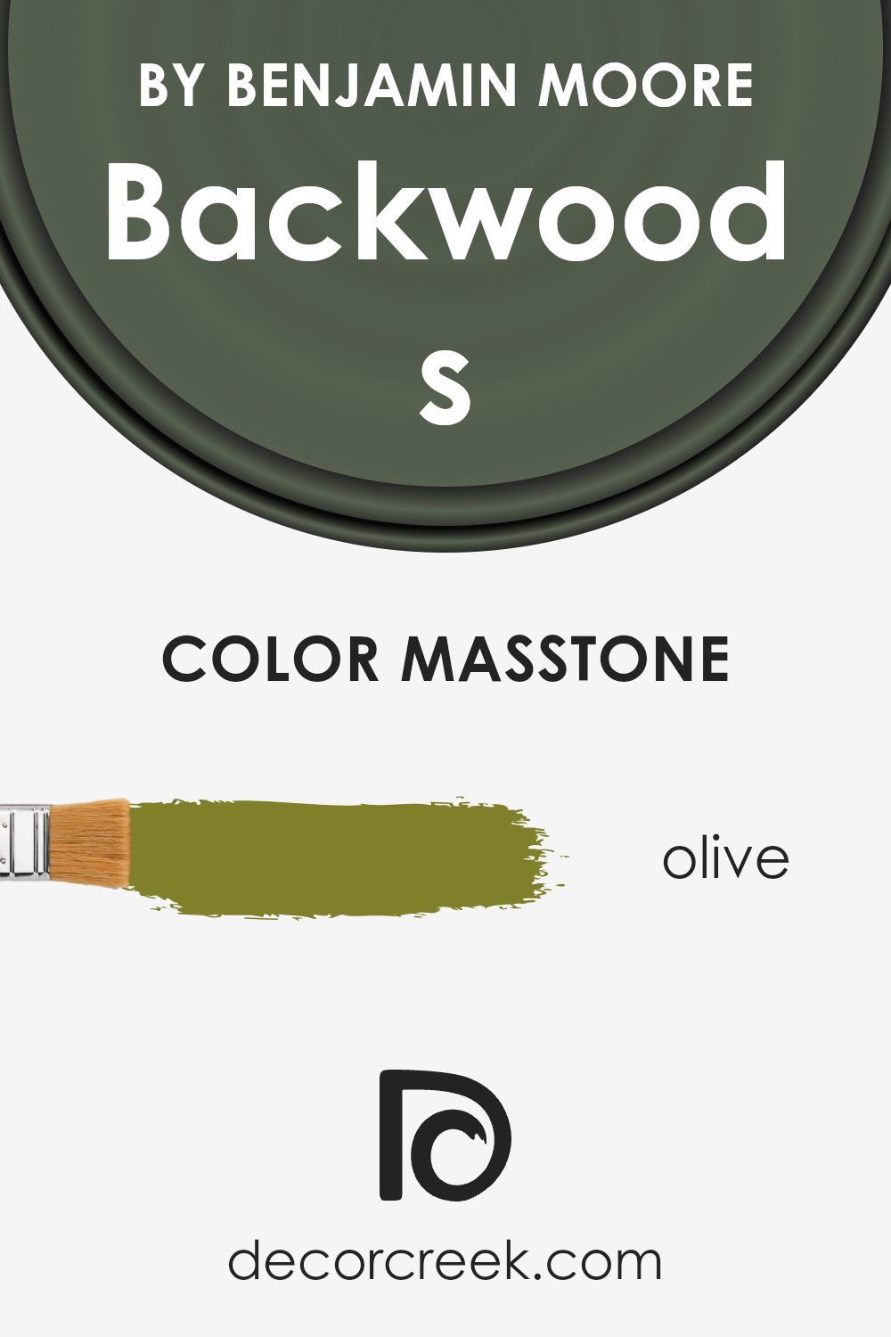
Backwoods by Benjamin Moore, with its Olive (#80802B) masstone, brings a warm and earthy feel to any home. The masstone is the base color you primarily notice, giving Backwoods its strong, grounded appearance. Olive green, the core of this shade, makes spaces feel cozy and inviting.
It works well in living rooms or bedrooms, creating an area where you can relax and feel comfortable. The rich green tones connect well with natural elements, making it a great choice for homes that incorporate wood, stone, or plants in their décor.
In rooms with a lot of natural light, this color can make the space feel like a peaceful retreat, while in dimmer settings, it adds depth and warmth. It’s versatile enough to pair with neutrals like beige or cream, or even with deep browns and golds, enhancing its welcoming vibe. Perfect for those who want a color that feels both grounded and lively.
How Does Lighting Affect Backwoods 469 by Benjamin Moore?
Lighting has a significant impact on how colors appear in our spaces. Essentially, the same color can look different depending on the type of light it is exposed to. Natural light changes throughout the day, and artificial light can vary based on the type of bulb used. For the color Backwoods by Benjamin Moore, these differences in lighting can alter how the color appears in a room.
In natural light, Backwoods can take on varying shades throughout the day. In a north-facing room, this color may appear cooler and muted, as these rooms receive less direct sunlight and tend to have a consistent, soft, and indirect light all day. The green of Backwoods might seem more subdued here.
In south-facing rooms, which enjoy the most intense and direct sunlight, Backwoods may appear warmer and more vibrant. The strong light can bring out the rich, deep qualities of this green, making it feel more lively.
East-facing rooms catch the bright, strong light of the morning sun. In these rooms, Backwoods might appear brighter and more cheerful in the mornings but tend to take on a softer, more muted tone as the day progresses and the light moves away.
West-facing rooms have the opposite pattern of lighting throughout the day. In the afternoon and evening, they receive warm, golden light, enhancing the depth and richness of Backwoods. Earlier in the day, the color may look less intense and softer.
Artificial lighting also plays a role. Warm bulbs can enhance the warmth of Backwoods, making it feel cozier and more inviting. On the other hand, cooler artificial lighting might cause the color to appear more reserved and muted.
Therefore, when using Backwoods in a specific space, considering the type of lighting in the room is essential to achieve the desired effect.
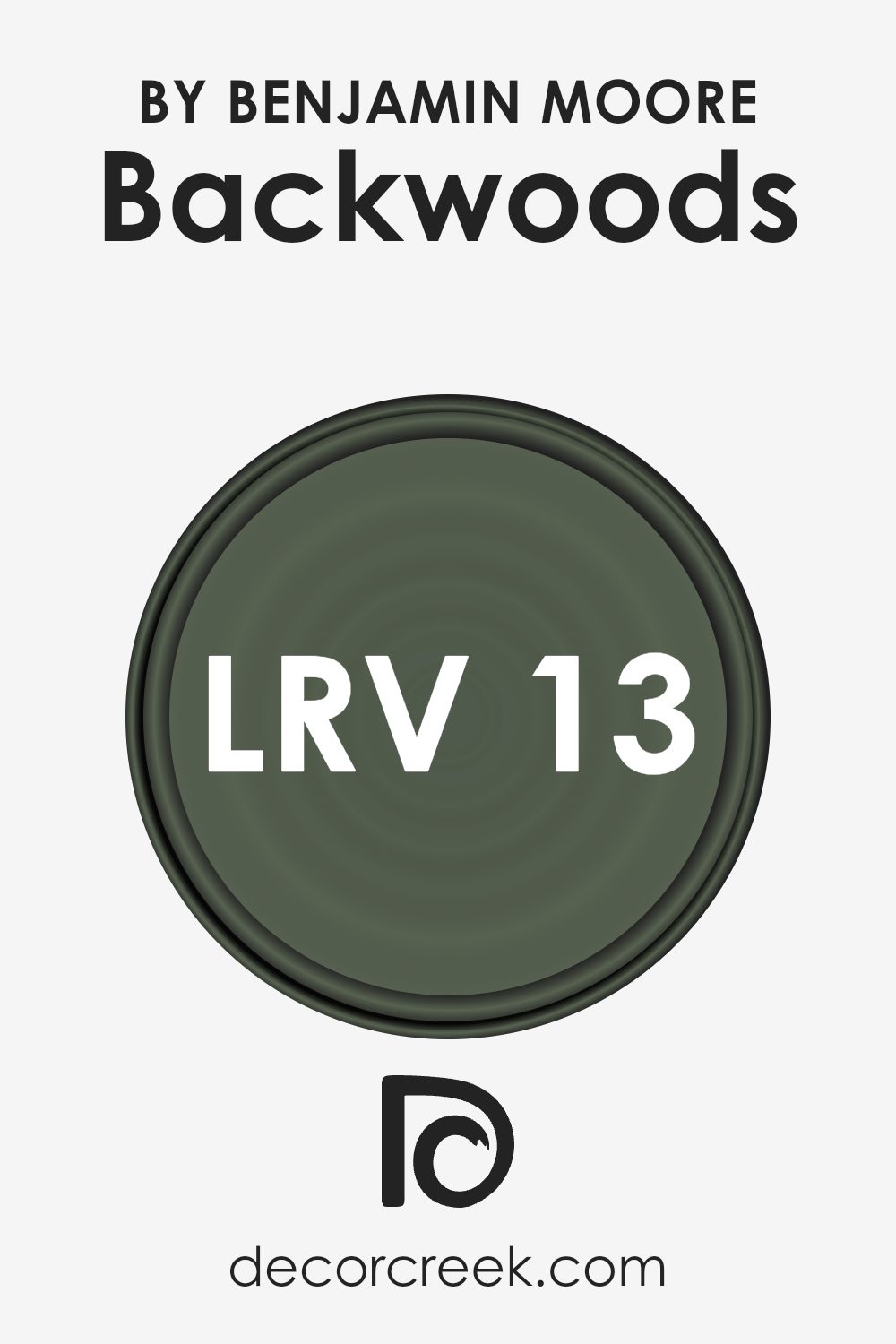
What is the LRV of Backwoods 469 by Benjamin Moore?
LRV stands for Light Reflectance Value, which is a measure of how much light a color reflects. It is given as a value between 0 and 100, with 0 being completely black and 100 being completely white. The higher the LRV, the lighter the color and the more light it reflects back into the room.
Conversely, the lower the LRV, the darker the color and the less light it reflects. Understanding LRV is important when choosing paint colors because it affects how bright or dark a room will feel, depending on how much natural or artificial light is present.
Backwoods by Benjamin Moore has an LRV of 12.68, which makes it a dark color. This means it will absorb a lot of light rather than reflecting it back into the room. In spaces with limited natural light, Backwoods can create a cozy and intimate setting, but it may make the room feel smaller and dimmer. In a well-lit area, it adds depth and can create a rich and sophisticated atmosphere.
When deciding to use a color like Backwoods, it’s important to consider the amount of light your room gets and whether you’re looking to create a more intimate space or need to keep the room feeling bright with a higher LRV color.
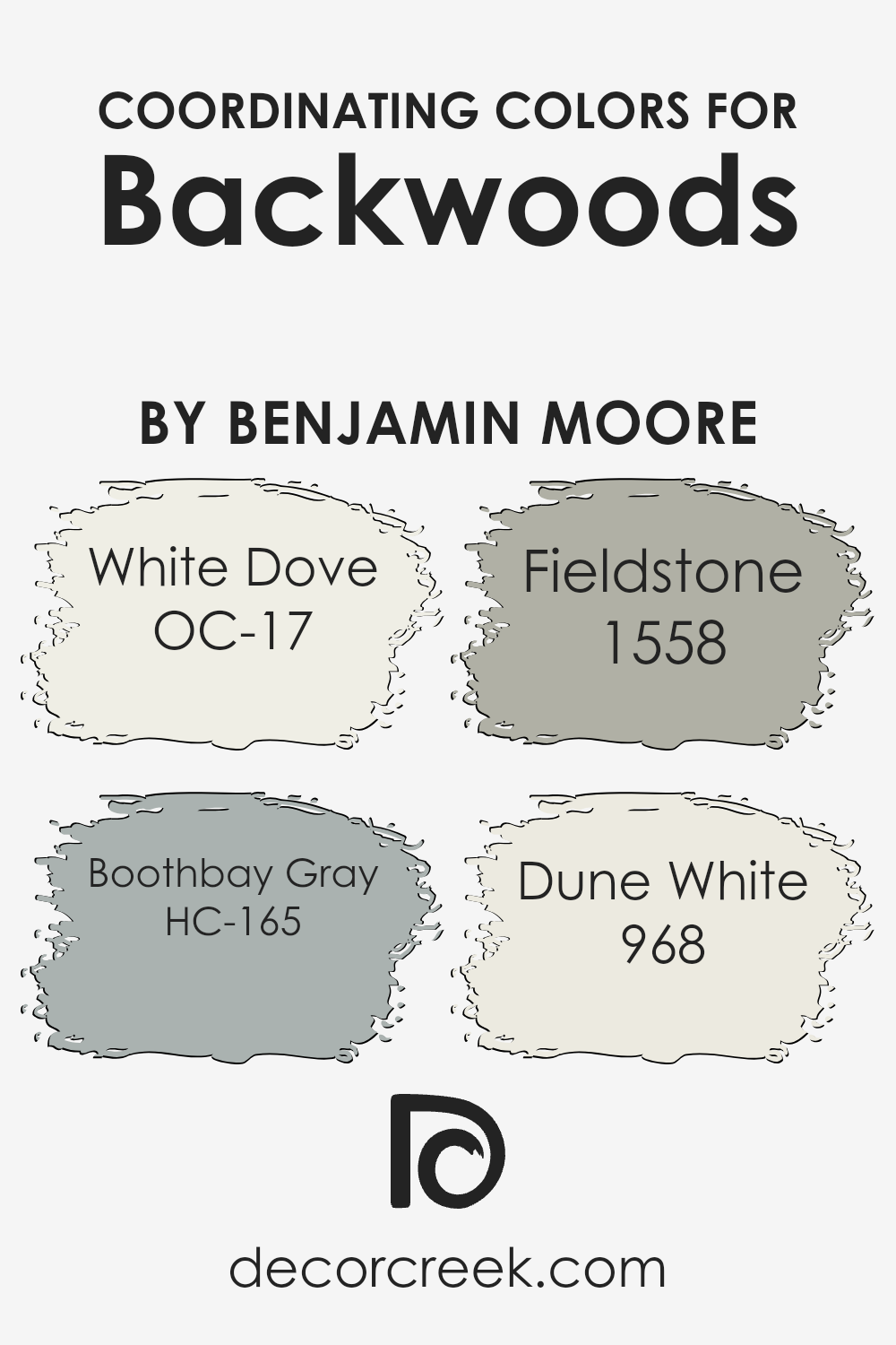
Coordinating Colors of Backwoods 469 by Benjamin Moore
Coordinating colors are chosen to work well together, creating a harmonious look in a space. They are selected to complement or enhance the main color, ensuring a balanced and aesthetic appearance. For example, Backwoods by Benjamin Moore pairs beautifully with a set of these coordinating colors: OC-17 White Dove, HC-165 Boothbay Gray, 1558 Fieldstone, and 968 Dune White.
Together, these colors offer a range of shades that can make any room feel cohesive and well-designed.
White Dove is a soft, warm white that provides a gentle backdrop or an accent, allowing for a clean and fresh look without being too stark. Boothbay Gray introduces a cool, muted blue-gray tone that adds a calming dimension and pairs perfectly with more earthy shades. Fieldstone offers a neutral, taupe-gray that grounds the palette, bringing a sense of understated warmth and depth.
Dune White delivers a light creamy touch that can brighten spaces while maintaining a subtle, comfortable ambiance. When used together, these colors can balance each other out, ensuring a space feels complete and pleasing to the eye.
They work in harmony with Backwoods, highlighting the natural beauty of its main greenish hue.
You can see recommended paint colors below:
- OC-17 White Dove
- HC-165 Boothbay Gray
- 1558 Fieldstone
- 968 Dune White
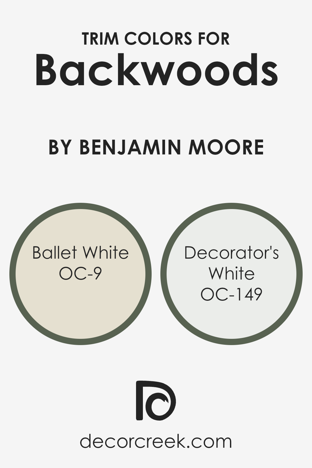
What are the Trim colors of Backwoods 469 by Benjamin Moore?
Trim colors are the shades used to highlight the edges of walls, doors, windows, and other features in a room. They play a crucial role in framing a space, making it look neat, and helping define the architectural details.
Choosing the right trim color can also complement the main wall color, giving the room a balanced and harmonious look. In the case of using trim colors for Backwoods by Benjamin Moore, a deep and earthy green, these accents can either soften or sharpen the mood of a room, depending on your desired interior style.
Ballet White (OC-9) is a soft and warm white with a hint of creaminess, providing a gentle and cozy touch to a room.
It creates a subtle contrast with richer wall colors, like the earthy green of Backwoods. Decorator’s White (OC-149) is a cool, crisp white that offers a clean and sharp look, ideal for an elegant and modern touch.
As a trim color, it brightens up a room and adds a sleek, tidy finish to darker shades like Backwoods, making features stand out beautifully.
You can see recommended paint colors below:
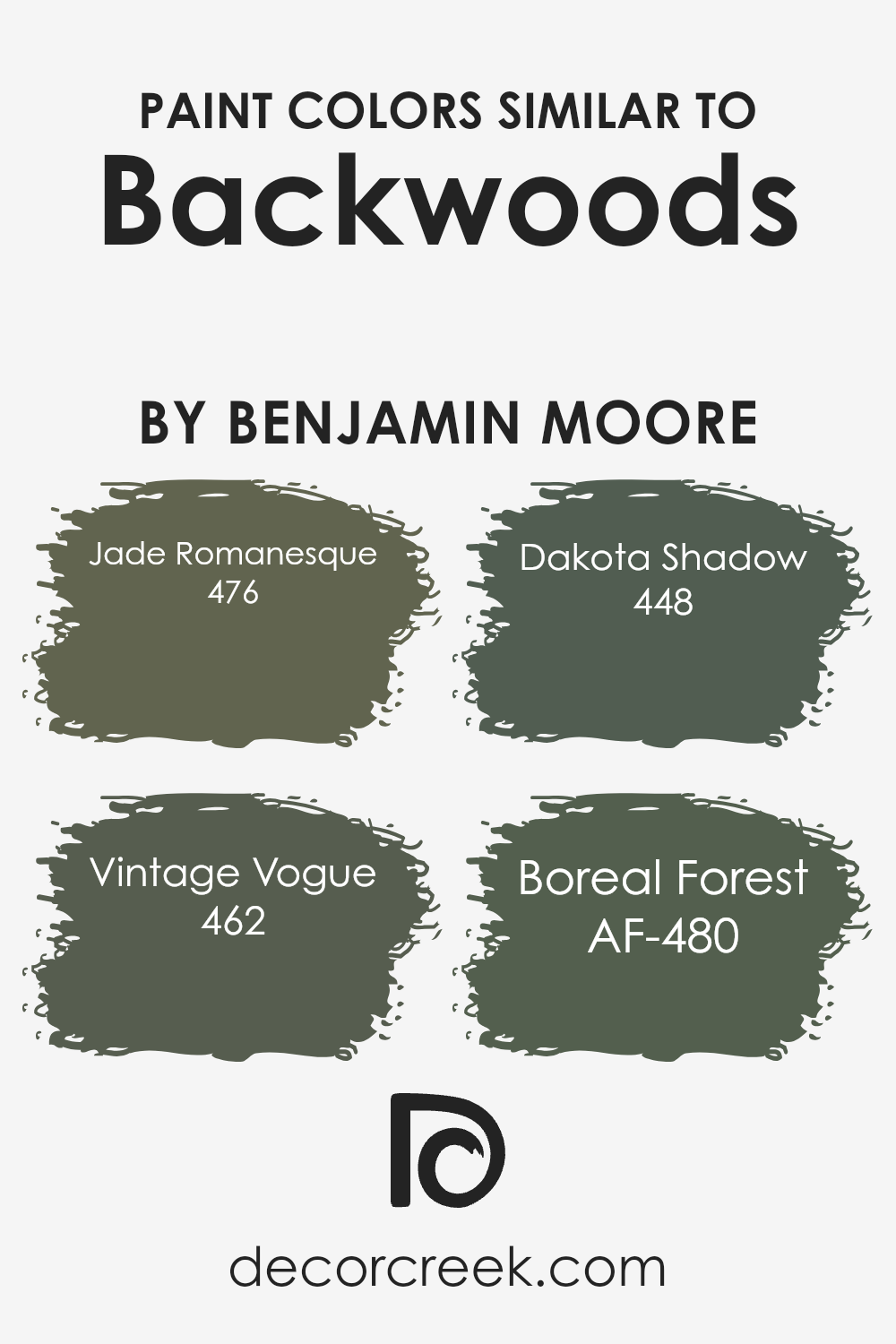
Colors Similar to Backwoods 469 by Benjamin Moore
Similar colors play a crucial role in creating harmonious designs and environments. When you use colors that are close in tone, like those similar to Backwoods by Benjamin Moore, it helps to create a balanced and cohesive look.
These colors work well together because they share certain undertones, making them blend seamlessly. The subtle differences among them allow for visual interest while still maintaining a unified appearance.
Such color schemes are often chosen to evoke a sense of calmness and unity in a space, ensuring that every element feels connected.
This is particularly beneficial in interior design, where consistency and flow can greatly impact the overall mood of a room or house.
One such similar color is Jade Romanesque (476), with its rich green tone that feels warm yet grounding. It has a certain depth to it, making it both comforting and versatile. Vintage Vogue (462) offers a darker, more subdued green, bringing a timeless feel to any space it fills. Unlike the brighter greens, it carries a softer presence.
Dakota Shadow (448) features a darker, earthy shade that can add a touch of mystery and coziness to a room. Boreal Forest (AF-480), with its lush green hue, provides a refreshing yet muted green that feels fresh and natural.
Each of these colors, while distinct, complements Backwoods beautifully, providing various options for creating an inviting and consistent environment.
You can see recommended paint colors below:
- 476 Jade Romanesque
- 462 Vintage Vogue
- 448 Dakota Shadow
- AF-480 Boreal Forest
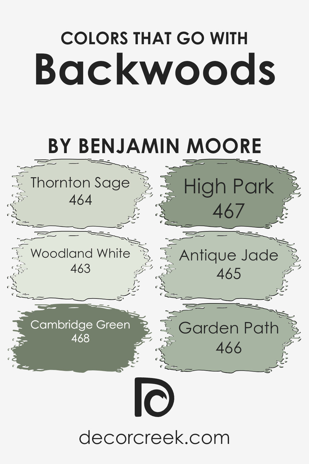
Colors that Go With Backwoods 469 by Benjamin Moore
Backwoods 469 by Benjamin Moore is a deep, rich green that brings the beauty of nature indoors. Choosing colors that complement Backwoods 469 enhances its impact and creates a harmonious space. Thornton Sage, with its muted green tones, is a perfect partner, adding a subtle touch that balances the depth of Backwoods 469.
Woodland White provides a gentle contrast with its warm, creamy hue, which enhances the bold green without overpowering it. Cambridge Green introduces a slightly brighter shade of green that energizes the room while still keeping the earthy feel.
High Park, another lovely green, adds depth with its darker tones, providing a layered look when paired with Backwoods 469. Antique Jade brings in a hint of sophistication with its soft, bluish-green shade, adding variety while maintaining a calming atmosphere.
Finally, Garden Path, with its dark, earthy undertones, grounds the palette and ties all the colors together. Together, these colors create an inviting environment that is both lively and relaxing, perfect for any room where warmth and comfort are desired.
Each supporting color enhances the primary hue, but they all tell a cohesive story of nature-inspired beauty.
You can see recommended paint colors below:
- 464 Thornton Sage
- 463 Woodland White
- 468 Cambridge Green
- 467 High Park
- 465 Antique Jade
- 466 Garden Path
How to Use Backwoods 469 by Benjamin Moore In Your Home?
Backwoods 469 by Benjamin Moore is a rich, deep green paint color that can bring a sense of nature and calmness into your home. Its earthy tone can work well in various spaces, making it versatile for different rooms. You might consider using it in a living room to create a warm and inviting atmosphere.
Its deep hue pairs well with natural wood furniture, adding a cozy feel to the space. In a bedroom, Backwoods can provide a restful environment, especially when paired with soft, neutral bedding and accents.
This color is also a great choice for an accent wall, adding depth and interest without overwhelming the room.
In a kitchen or dining area, Backwoods can add a bit of drama while still feeling grounded. To complete the look, you can combine it with lighter colors or whites to balance its boldness and create a harmonious look in your home.
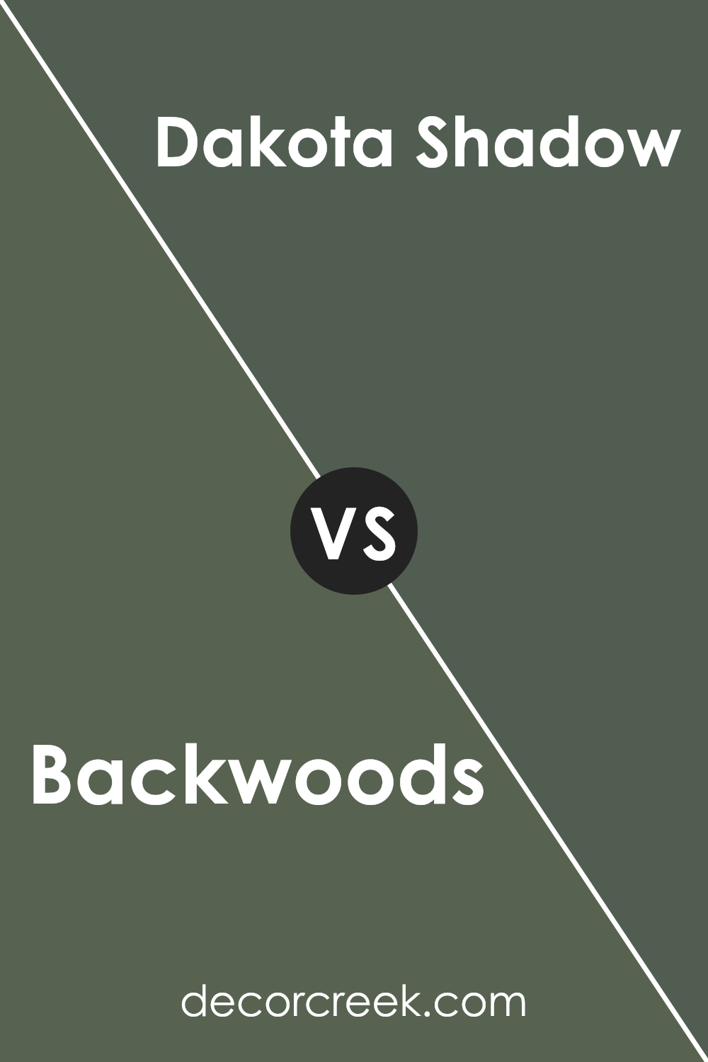
Backwoods 469 by Benjamin Moore vs Dakota Shadow 448 by Benjamin Moore
Backwoods 469 by Benjamin Moore is a deep, earthy green that brings a sense of nature indoors. It has a rich, forest-like quality that can make a room feel cozy and inviting. This color works well in areas where you want a warm, enveloping atmosphere, like a study or a living room.
On the other hand, Dakota Shadow 448 by Benjamin Moore is a strong, dark brown with undertones of gray. This color has a grounding effect and can add sophistication to a space. It’s perfect if you’re aiming for a more dramatic or moody setting, such as a dining room or bedroom.
While both colors are deep and rich, Backwoods leans towards green, infusing spaces with an organic feel, while Dakota Shadow provides a more neutral, stable backdrop. Both can serve as excellent main colors, depending on whether you prefer a nature-inspired green or a classic, dark brown.
You can see recommended paint color below:
- 448 Dakota Shadow
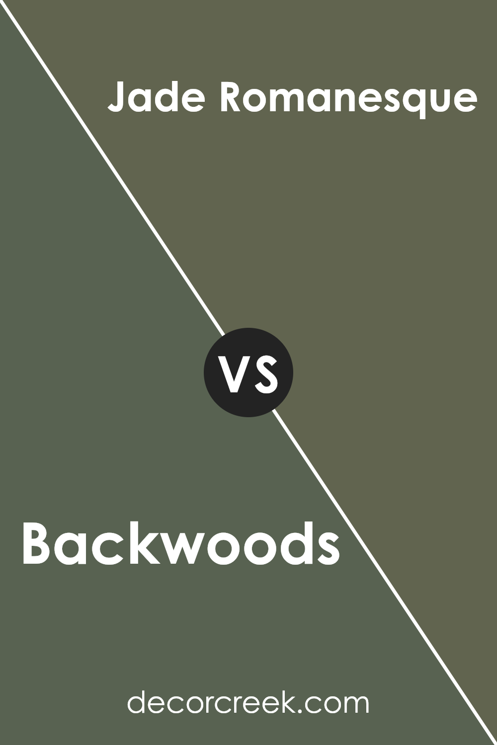
Backwoods 469 by Benjamin Moore vs Jade Romanesque 476 by Benjamin Moore
Backwoods 469 by Benjamin Moore is a rich, earthy green that brings a sense of nature and warmth to a space. It’s a color that feels cozy and grounded, like the deep, dense forests its name suggests. This shade works well in living rooms or bedrooms where a calming, intimate atmosphere is desired.
Jade Romanesque 476, also by Benjamin Moore, is a lighter, more vibrant green. It has a freshness and energy that can brighten up a room, making it feel more open and lively.
This color is reminiscent of springtime and rejuvenation, ideal for spaces where an uplifting and invigorating feel is wanted, such as kitchens or bathrooms.
While Backwoods provides a deep and comforting setting, Jade Romanesque offers a brighter, more spirited vibe. Both colors can beautifully complement each other when used together, achieving a balance between depth and light.You can see recommended paint color below:
- 476 Jade Romanesque
Backwoods 469 by Benjamin Moore vs Vintage Vogue 462 by Benjamin Moore
Backwoods 469 by Benjamin Moore is a deep, earthy green color that gives a room a natural and cozy feel. It has an outdoorsy look, reminiscent of lush forests and nature, making it perfect for spaces where you want a calm and grounded atmosphere.
In contrast, Vintage Vogue 462 by Benjamin Moore is also a dark green shade but carries a slightly more muted, elegant tone. It feels a bit more refined and can add a touch of class to any room. Vintage Vogue has hints of grey, which softens the green and makes it versatile for different styles.
While both colors offer a rich green base, Backwoods leans more towards a fresh, nature-inspired vibe, whereas Vintage Vogue feels a little more controlled and classic.
If you love green and are deciding between them, think about the mood you want: natural and inviting or stylish and composed. Both colors work well in various settings, depending on personal taste.
You can see recommended paint color below:
Backwoods 469 by Benjamin Moore vs Boreal Forest AF-480 by Benjamin Moore
Backwoods (469) and Boreal Forest (AF-480) by Benjamin Moore are both shades of green, but they differ in tone and feel. Backwoods is a deep, muted green with earthy undertones that give it a grounded and cozy vibe. It’s a versatile color that works well in various spaces, adding warmth and depth without being overpowering.
On the other hand, Boreal Forest is a slightly lighter and more vibrant green with cooler undertones. This shade brings a fresh and natural feel to a room, reminiscent of lush forest scenery. It reflects more light than Backwoods, making it suitable for spaces where you want a bit more brightness and energy.
While both colors can create an inviting atmosphere, Backwoods leans towards darker, more subdued aesthetics, and Boreal Forest introduces a lively and refreshing ambiance. The choice between them depends on the mood and light you wish to achieve in your space.
You can see recommended paint color below:
- AF-480 Boreal Forest
Conclusion
When I think about 469 Backwoods by Benjamin Moore, I feel like I’m visiting a special place that makes me feel calm and happy. The colors in this story remind me of walking through a forest, where the trees and leaves are so green and peaceful. It’s like bringing a little piece of nature into our homes.
This color is perfect for people who love nature but can’t always be outside. It makes a room feel cozy and fresh, like a hidden cabin deep in the woods. When I imagine having this color on the walls, I think of sitting with a good book or playing games with my friends and family.
It’s a friendly and welcoming color that makes any room feel like a place where you want to relax and have fun.
What I like most about Backwoods is how it can make any room feel like it’s part of nature. Whether you’re in a city or far away in a small village, this color brings a bit of the forest into your life. It’s a reminder of how nice and calming nature can be, even when we’re inside.
So, if you’re looking to make your home feel more cozy and friendly, I think “469 Backwoods” could be just right for you.
Ever wished paint sampling was as easy as sticking a sticker? Guess what? Now it is! Discover Samplize's unique Peel & Stick samples.
Get paint samples

