I recently came across SW 9617 Beachcomber by Sherwin Williams—a name that instantly hints at a feeling of seaside adventure and relaxed coastal charm. If you’re looking to refresh a space in your home with a vibe that’s calm and composed, this color might be just what you need. I was seeking a palette that could give my living room a serene, beachy feel without being too cliché or overpowering, and Beachcomber struck the perfect balance.
This shade of paint has a unique ability to blend seamlessly into various styles, whether you’re leaning towards a modern minimalist look or a more rustic, shabby chic decor. In my experience, this color consistently complements soft creams and natural wood tones very well, creating a space that feels both airy and cozy.
I found that it acts as an excellent base for layering textures and adding pops of more vibrant colors through accessories or furniture pieces. Using Beachcomber could be a smart choice if you’re looking to create an inviting atmosphere in your home that feels both refreshed and restful.
It’s subtle enough not to take over the room, yet distinctive enough to make a difference. In my use, it has certainly added a gentle, soothing touch to the spaces where I’ve applied it.
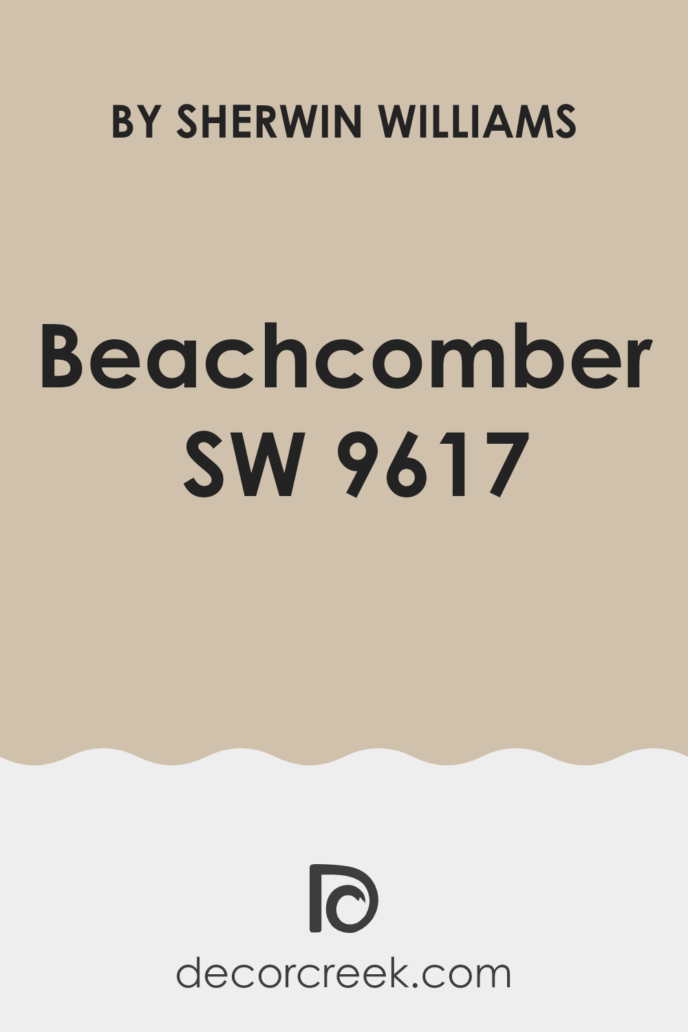
What Color Is Beachcomber SW 9617 by Sherwin Williams?
The color Beachcomber by Sherwin Williams is a soft, pale blue with subtle green undertones. This lightweight, airy shade evokes the feel of a gentle sea breeze and the softness of early morning skies. It brings a fresh and clean look to any room, making it perfect for creating a calm and inviting atmosphere.
Beachcomber is incredibly versatile and can seamlessly align with various interior styles. It shines in coastal or nautical-themed decor, where its maritime vibes feel at home among whites, creams, and sandy beiges. This color also works beautifully in a Scandinavian setting due to its simplicity and the way it pairs with natural light wood, minimalistic designs, and textured fabrics like wool or linen.
In terms of materials, Beachcomber coordinates well with light, unfinished woods, glass, and woven materials like wicker or rattan, enhancing its organic, beachy feel. Textiles in white or neutral tones, as well as soft pastels, complement this color perfectly. For a fresh, cohesive look, consider pairing it with soft grays or other pale blues to keep the space light and open.
Overall, Beachcomber is a fantastic choice for anyone looking to inject a breath of fresh air into their living space with a color that’s easy to work with and pleasing to the eye. Its calming effect is suitable for areas like bedrooms, bathrooms, or any place where relaxation is key.
Is Beachcomber SW 9617 by Sherwin Williams Warm or Cool color?
Beachcomber by Sherwin Williams is a versatile shade that brings a fresh and welcoming feel to any room. This particular paint choice works well in homes due to its subtle and natural look, making spaces feel open and bright. When used in smaller rooms, it can help make the area appear larger and more airy. Meanwhile, in larger spaces, it offers a cohesive look that ties different elements together.
This color is great for living areas and bedrooms where you want to create a relaxing atmosphere without making it too dull. It pairs well with both modern and traditional decor, showing its adaptability. You can match it with bolder accents like navy or warm tones like terracotta for a stunning effect.
Overall, Beachcomber is ideal for anyone looking to refresh their home in a simple yet effective way. It maintains a sense of calm without being too overpowering, making it an excellent choice for your walls.
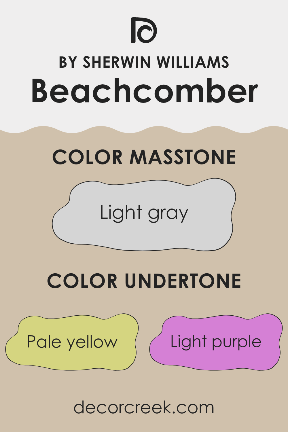
Undertones of Beachcomber SW 9617 by Sherwin Williams
Beachcomber is a unique paint color that combines subtle undertones to create a dynamic and adaptable appearance for any room. Understanding the undertones of a paint color is crucial because they can influence how the color looks under different lighting conditions and when paired with other hues in room decor.
The undertones of Beachcomber include pale yellow, which adds a soft warmth to the color, making it feel welcoming and cozy. Light purple and lilac tones bring a touch of freshness, which can help to open up a space visually, making it appear larger.
Pale pink adds a gentle, soothing aspect that can make the room feel more relaxed, ideal for areas like bedrooms. Light blue and mint provide a hint of crisp coolness, which can balance warmer colors in furniture or decor items, making the overall room feel balanced and harmonious. Grey acts as a neutral base, pulling all the different undertones together and allowing the color to complement a wide range of decor styles. When used on interior walls, Beachcomber’s unique mix of undertones can greatly affect the mood and feeling of a space.
In a well-lit room, the lighter undertones might be more pronounced, creating a bright and airy feel. In contrast, in lower light, the grey and deeper lilac tones could become more dominant, giving the room a more grounded, cozy atmosphere. This adaptability makes Beachcomber an excellent choice for anyone wanting to add both color and versatility to their home.
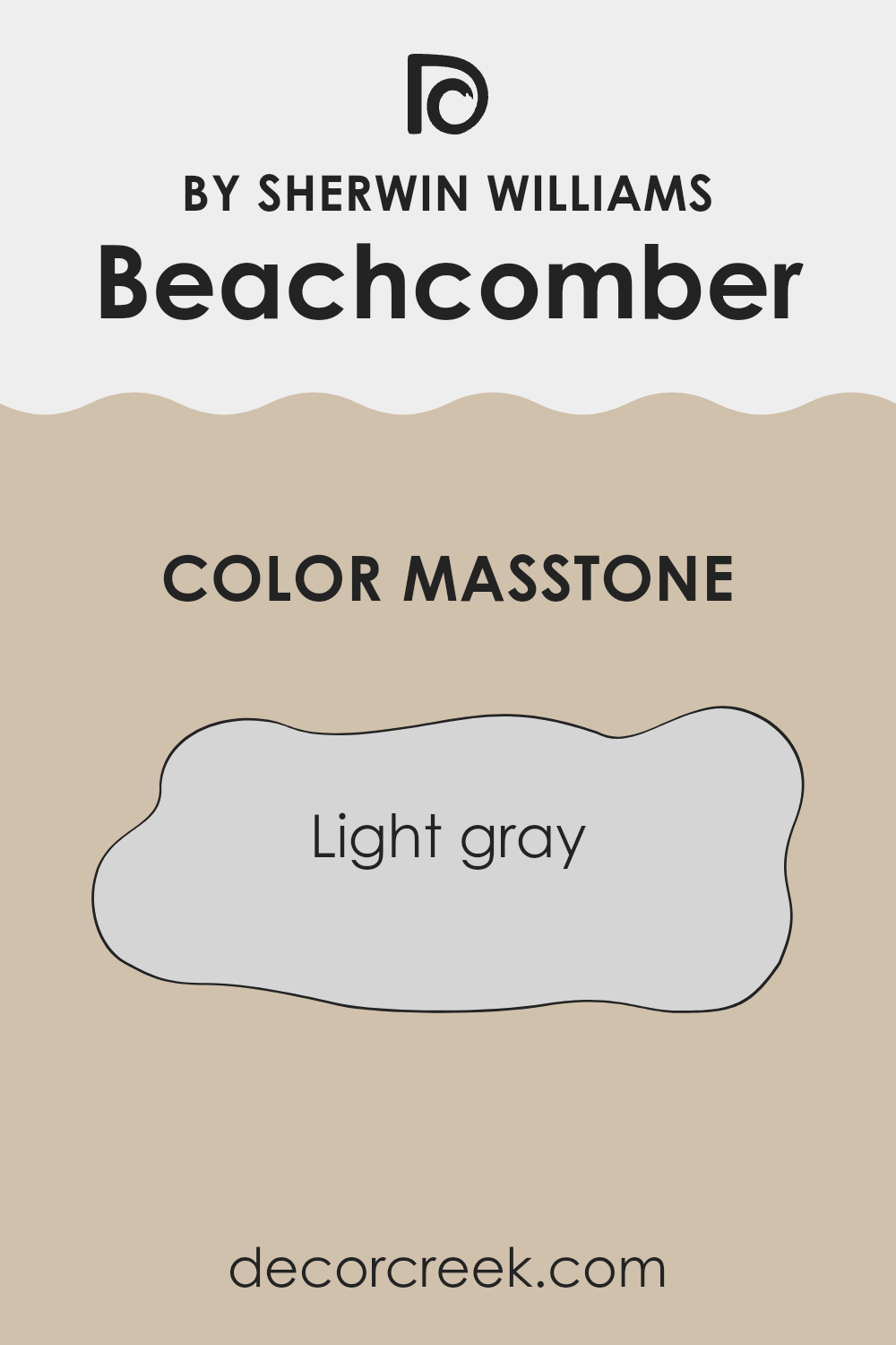
What is the Masstone of the Beachcomber SW 9617 by Sherwin Williams?
BeachcomberSW 9617 by Sherwin Williams has a masstone of light gray, a shade that’s soft and subtle. This color works well in homes because it provides a neutral backdrop that goes with almost anything. It can make small rooms feel bigger and light up spaces that don’t get much sunlight. This light gray doesn’t overpower other colors, so it’s easy to pair with brighter furniture or accent pieces.
This color can suit any room, whether it’s a peaceful bedroom environment or a lively living room. Its versatility also extends to various design styles, from modern minimalism to cozy cottage. Because it’s so understated, it helps other elements in the room stand out, like artwork or bold rugs.
Additionally, it hides small imperfections on walls better than darker shades, making maintenance easier. Overall, this light gray from Sherwin Williams offers a simple yet effective way to freshen up a home’s interior.
How Does Lighting Affect Beachcomber SW 9617 by Sherwin Williams?
Lighting plays a crucial role in how colors appear in any space. Different light sources can dramatically alter the way a color looks, affecting both its brightness and hue. Understanding this can help in choosing the right paint color for a room based on its lighting conditions.
Take, for example, the color Beachcomber SW 9617 by Sherwin Williams. It’s a subtle shade that can vary depending on the lighting. In artificial light, such as that from LED or incandescent bulbs, this color might look slightly warmer or have a richer tone. This is because artificial light, particularly warmer yellow light, can add a cozy and inviting feel to the paint.
In natural light, the appearance of the color can change throughout the day. Morning light tends to be softer and can make Beachcomber SW 9617 look bright and fresh, whereas the harsher midday sun might wash it out slightly, making it appear less vibrant. In the gentle light of the late afternoon, the color may gain depth, showing more of its underlying warm tones.
Room orientation also affects how this color is perceived:
– North-facing rooms: These rooms get less direct sunlight, which can make colors appear slightly cooler and bluer. Here, Beachcomber SW 9617 might seem more muted and subtle, potentially needing more artificial light to warm it up.
– South-facing rooms: With ample sunlight, south-facing rooms make colors look brighter and more vivid. Beachcomber SW 9617 will appear lively and vibrant in these conditions, especially during the day.
– East-facing rooms: Morning light will make Beachcomber SW 9617 look warm and welcoming early in the day, but it might lose some of its vibrancy by the afternoon as natural light fades.
– West-facing rooms: This color will be more neutral during the morning and become warmer and richer towards sunset due to the intense evening light.
By considering these lighting factors, you can better predict how Beachcomber SW 9617 will look in various rooms of your home and choose accordingly based on your aesthetic preferences and the room’s function.
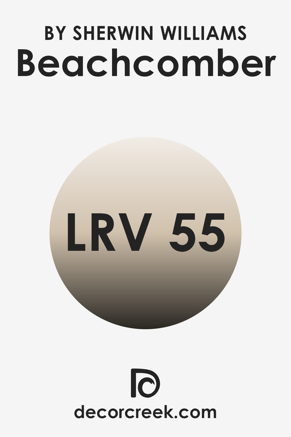
What is the LRV of Beachcomber SW 9617 by Sherwin Williams?
LRV stands for Light Reflectance Value, a scale that measures the percentage of light a paint color reflects back into a room. The higher the LRV, the more light the paint reflects. This feature is crucial for understanding how light or dark a color will appear once it’s on your walls.
Paints with higher LRVs are generally used to make rooms feel brighter and more open because they reflect more light. Conversely, colors with lower LRVs absorb more light, making them appear darker and can make a room feel smaller or cozier.
Beachcomber SW 9617 has an LRV of 54.735, which places it in the mid-range category on the LRV scale. This means it doesn’t reflect as much light as lighter colors but isn’t too dark either. In a practical sense, this color is versatile; it can help create a balanced look, making it neither too bright nor too gloomy. Depending on the lighting in the room, Beachcomber can look significantly different. In a well-lit room, it will appear more lively and vibrant, while in a room with less natural light, it may give a more subdued and calming effect.
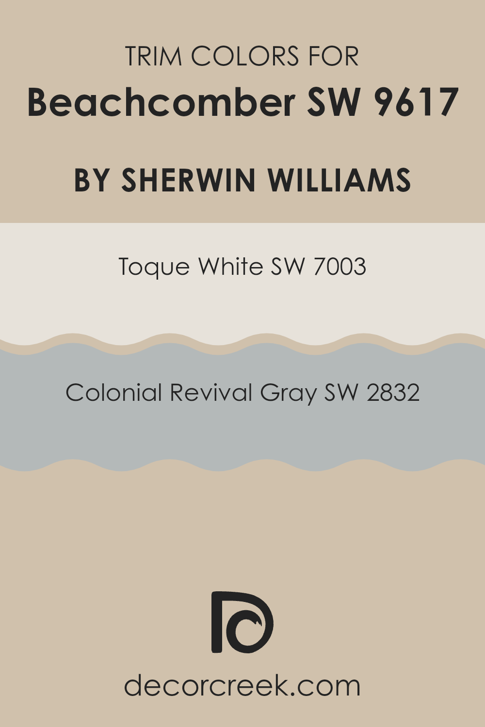
What are the Trim colors of Beachcomber SW 9617 by Sherwin Williams?
Trim colors are specific shades used to highlight the architectural details of a home, such as moldings, window frames, and doors. These colors are essential because they help define and accentuate the lines and craftsmanship of a building, making architectural features stand out or blend harmoniously with the main wall colors. For a beachy shade like Beachcomber, choosing the right trim color can enhance the overall aesthetic and ensure a clean, well-maintained look.
Using SW 7003 – Toque White, a light and airy white with a subtle warmth, as a trim color provides a crisp, clean border that energizes the calming nature of a color like Beachcomber. It can lighten up the space and provide a delicate contrast without overpowering the main hue.
On the other hand, SW 2832 – Colonial Revival Gray offers a slightly deeper, more defined frame for the Beachcomber, adding a classic touch with its understated elegance. This mid-tone gray provides a richer boundary that harmonizes beautifully with the cooler undertones of the beachy main color, ensuring a refined but still inviting look.
You can see recommended paint colors below:
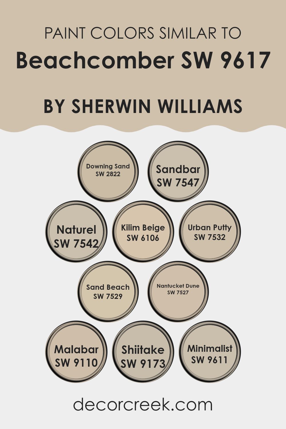
Colors Similar to Beachcomber SW 9617 by Sherwin Williams
Similar colors play a crucial role in interior design by creating a harmonious and cohesive look within a space. When colors such as those similar to Beachcomber by Sherwin Williams are used together, they help unify the design without stark contrasts that can sometimes be jarring. These similar colors, all falling into warm, neutral tones, have subtle differences that add depth and interest while maintaining a soothing overall effect.
Downing Sand is a sandy beige with a comforting, soft presence, which makes it versatile for any room. Sandbar brings a slightly darker, earthier tone that gives a grounded feeling to spaces. Naturel, with its understated elegance, skews slightly towards a grayish tint, offering an excellent backdrop for more vibrant accents.
Kilim Beige is known for its warm undertones that radiate a welcoming vibe, perfect for creating inviting spaces. Urban Putty has a richer, deeper quality that works well to highlight architectural features. Sand Beach exudes a lighter, breezier feel, ideal for infusing a touch of lightness into darker rooms.
Nantucket Dune is a more muted, sophisticated sand shade that suits tranquil, reflective spaces. Malabar offers a beige tinged with gray, lending itself to contemporary or traditional settings. Shiitake adds a dash of slightly darker, mushroom-inspired color, perfect for adding a natural touch.
Lastly, Minimalist is the lightest, almost off-white, providing a clean slate for any decor. All these colors, while similar, offer unique tones that allow for creative design continuity with subtle differentiation.
You can see recommended paint colors below:
- SW 2822 Downing Sand
- SW 7547 Sandbar
- SW 7542 Naturel
- SW 6106 Kilim Beige
- SW 7532 Urban Putty
- SW 7529 Sand Beach
- SW 7527 Nantucket Dune
- SW 9110 Malabar
- SW 9173 Shiitake
- SW 9611 Minimalist
How to Use Beachcomber SW 9617 by Sherwin Williams In Your Home?
Beachcomber SW 9617 by Sherwin Williams is a gentle and soft shade of paint that can add a warm and welcoming touch to any home. This color is like a warm beige with hints of gray, making it versatile and easy to pair with other colors and decor styles.
You can use Beachcomber SW 9617 in various rooms such as living rooms, bedrooms, or hallways to create a cozy and inviting atmosphere. Its subtle hue works well with natural materials like wood and stone, enhancing the homey feel of a space.
If you’re looking to freshen up your kitchen or bathroom, this color also works nicely on cabinets or walls, providing a light, clean look. It pairs beautifully with both bright accents and darker tones, giving you lots of options for decorating. Overall, Beachcomber SW 9617 is a flexible color choice that can make your home look fresh and pleasant.
Beachcomber SW 9617 by Sherwin Williams vs Nantucket Dune SW 7527 by Sherwin Williams
Beachcomber and Nantucket Dune are two distinct neutral shades from Sherwin Williams. Beachcomber is a light, sandy beige that gives a subtle, warm feel to a room, much like a sunny day at the beach. It pairs well with brighter colors and natural materials such as wood or stone, creating a cozy and inviting atmosphere.
On the other hand, Nantucket Dune is a deeper, taupe-like color. This shade leans more towards a grayish tone, offering a slightly cooler appearance. It is excellent for spaces where you want a neutral backdrop that’s strong enough to stand alone or support darker furnishings and decor items.
Both colors are versatile and can be used in various settings, from living rooms to bedrooms, but the choice between them depends on the desired warmth and depth of the space. Beachcomber adds brightness and warmth, while Nantucket Dune provides a more subdued, grounding effect.
You can see recommended paint color below:
- SW 7527 Nantucket Dune
Beachcomber SW 9617 by Sherwin Williams vs Sandbar SW 7547 by Sherwin Williams
Beachcomber and Sandbar, both by Sherwin Williams, provide subtly different nuances suitable for creating warm and inviting spaces. Beachcomber is a deeper, more saturated hue resembling creamy latte with a hint of golden undertone.
It offers a cozy vibe and seems perfect for areas where a touch of warmth is desired without overwhelming brightness. In contrast, Sandbar is lighter, leaning towards a classic beige with grayish undertones, making it an ideal backdrop for a variety of decor styles and colors.
This color can make small spaces appear larger and more open, reflecting light gently around the room. While both colors share a base warmth, Beachcomber’s richer depth brings a more pronounced cozy feel, whereas Sandbar provides a neutral canvas that’s versatile across various settings and lighting conditions.
You can see recommended paint color below:
Beachcomber SW 9617 by Sherwin Williams vs Naturel SW 7542 by Sherwin Williams
Beachcomber and Naturel, both by Sherwin Williams, present themselves in nuanced ways. Beachcomber leans towards a warm, soft tan with a sandy feel, reminiscent of a calm beach and easy-going coastal vibes. This color tends to emit a cozy, inviting aura, ideal for spaces where relaxation is key.
On the other hand, Naturel shifts towards a greyish taupe, offering a more neutral and versatile backdrop. This hue can serve as a subtle base, allowing other colors in a room to stand out or blend harmoniously for a quiet, understated elegance. Naturel works well in areas that demand a balance between warmth and formality.
Both colors provide a natural, earthy palette but serve different aesthetic goals. Beachcomber might be better suited for casual, light-filled rooms, while Naturel fits seamlessly into a more reserved or professionally styled space.
You can see recommended paint color below:
- SW 7542 Naturel
Beachcomber SW 9617 by Sherwin Williams vs Kilim Beige SW 6106 by Sherwin Williams
Beachcomber and Kilim Beige are two paint colors from Sherwin Williams that offer subtle yet distinct tones for interior spaces. Beachcomber is a soft, muted yellow with warm undertones, creating a cozy and welcoming atmosphere. This color is light and airy, making it great for living rooms and kitchens where you want a calm, inviting vibe.
On the other hand, Kilim Beige is a warmer neutral with a mix of beige and light brown tones, providing a more grounded feeling. It pairs well with a wide range of colors, offering a versatile backdrop ideal for areas such as bedrooms or dining areas.
Compared to Beachcomber, Kilim Beige feels richer and slightly deeper, which can help in spaces that require a more sophisticated look without using intense colors.
Both colors are excellent choices for those looking to freshen up their space with neutrals, but the choice between a lighter yellow or a richer beige will depend on the specific mood you wish to create.
You can see recommended paint color below:
Beachcomber SW 9617 by Sherwin Williams vs Downing Sand SW 2822 by Sherwin Williams
Beachcomber and Downing Sand, both from Sherwin Williams, offer distinct atmospheres primarily due to their color tones. Beachcomber is a light taupe that leans towards gray. Its subtle hints of brown make it warm and welcoming, yet it retains a neutral, versatile character that works well in spaces that aim for a soft, muted feel.
Downing Sand, on the other hand, is a deeper beige. It exudes a slightly richer and earthier tone compared to Beachcomber. This color is excellent when a room needs a cozy, warm ambiance without venturing too far into darker shades. It’s particularly effective in areas where a comforting presence is desired, like living rooms or bedrooms.
Although both colors share a neutral palette, Beachcomber’s gray undertones give it a cooler presence, whereas Downing Sand, with its beige and warm undertones, feels inherently warmer. These characteristics allow them to suit different decorative styles and preferences, adapting well to various furnishings and textiles.
You can see recommended paint color below:
Beachcomber SW 9617 by Sherwin Williams vs Minimalist SW 9611 by Sherwin Williams
The color Beachcomber is a soft, pale beige with warm undertones, providing a cozy and welcoming feel to any room. In different lighting, it might look slightly more sandy, giving off a gentle and muted vibe. This color works well in spaces where you aim for a relaxed and airy atmosphere, as it pairs nicely with both bold and soft decor.
On the other hand, Minimalist is a lighter shade that leans more towards a true neutral or off-white. This color is extremely versatile and acts as a clean backdrop for any interior, allowing other elements in the room to stand out. It’s particularly effective in smaller spaces, as it helps to make them appear larger and brighter.
Both Beachcomber and Minimalist are quite adaptable but serve different purposes based on their depth and warmth. Where Beachcomber lends warmth to a room, Minimalist offers a crisp, fresh look, making each suitable for different aesthetic goals and room functions.
You can see recommended paint color below:
Beachcomber SW 9617 by Sherwin Williams vs Urban Putty SW 7532 by Sherwin Williams
Beachcomber and Urban Putty are two distinctive paint colors by Sherwin Williams, each bringing its unique vibe to a room. Beachcomber is a muted beige with a warm, inviting tone. It’s perfect for creating a cozy, relaxed atmosphere in any space, closely resembling the light colors of warm beach sand, thus providing a soft and welcoming ambiance.
On the other hand, Urban Putty is a shade darker, offering a more pronounced color selection for rooms that aim for a grounding, yet light neutral presence. This color has a grayish-brown tone, standing out a bit more against white trim and contributing to a modern and stylish feel.
Both colors are versatile in their application, making them suitable for different rooms and styles. While Beachcomber works well in a space seeking a subtle, natural look, Urban Putty is excellent for those wanting a touch more definition without overwhelming the senses. Together, they can even complement each other nicely in a color scheme.
You can see recommended paint color below:
- SW 7532 Urban Putty
Beachcomber SW 9617 by Sherwin Williams vs Shiitake SW 9173 by Sherwin Williams
Beachcomber and Shiitake by Sherwin Williams are two distinct colors with their unique charm. Beachcomber is a soft, creamy beige that has a hint of warmth, making it cozy and inviting. This color is perfect for creating a light, airy feel in a room, uplifting the space without overwhelming it.
Shiitake, on the other hand, stands out with its deeper, earthier tone. It’s a rich taupe that blends brown and gray, offering a more grounded feeling. Shiitake is excellent for adding a sense of sturdiness and warmth to spaces, making them feel secure and comfortable.
Together, these colors can complement each other well in a space. Beachcomber can be used on walls to expand the perception of space with its lightness, while Shiitake can serve as an accent, providing depth and contrast. This pairing would work well in a living room or bedroom, where the combination of light and dark can create a balanced, welcoming atmosphere.
You can see recommended paint color below:
Beachcomber SW 9617 by Sherwin Williams vs Malabar SW 9110 by Sherwin Williams
Beachcomber and Malabar by Sherwin Williams are two distinct shades that offer unique vibes for any space. Beachcomber is a soft, pale gray that has a very light and airy feel, often reminiscent of a calm, cloudy day at the seashore. It’s a gentle color that brings a sense of lightness to a room, making spaces appear larger and more open.
On the other hand, Malabar is a darker taupe, which combines hints of brown and gray to create a warm, inviting hue. This color is excellent for adding a cozy touch to any area, encouraging a welcoming, comfortable atmosphere. Malabar is particularly suited to spaces where you want to promote relaxation and warmth, like living rooms or bedrooms.
Both colors work well in a variety of decorating styles, but while Beachcomber tends to brighten spaces and pair well with cooler tones, Malabar provides a richer backdrop that pairs nicely with warmer hues and natural materials. Depending on the mood you want to create, either of these colors would be a great choice.
You can see recommended paint color below:
- SW 9110 Malabar
Beachcomber SW 9617 by Sherwin Williams vs Sand Beach SW 7529 by Sherwin Williams
Beachcomber and Sand Beach are two paint colors by Sherwin Williams. Beachcomber is a lighter shade, closer to a soft beige with a slightly grey undertone. It gives off a calm, cozy vibe, making it perfect for living spaces or bedrooms where a gentle, relaxing atmosphere is desired.
On the other hand, Sand Beach has a warmer tone, leaning towards a deeper taupe. This color, with its richer earthy quality, can lend a room a welcoming feel, suitable for areas frequented by guests or family gatherings.
Although both colors are neutral, Beachcomber reflects more light, potentially making a room look more spacious. Sand Beach, with its denser appearance, might suit larger rooms well as it can add depth and warmth without overpowering the space. Both colors are versatile, easy to match with various decors, and can help create a comfortable, inviting home environment.
You can see recommended paint color below:
- SW 7529 Sand Beach
Conclusion
After studying SW 9617 Beachcomber by Sherwin Williams, I’ve learned quite a bit about what makes this paint color special. Beachcomber is a unique shade of blue that really makes a room feel calm and relaxed. It’s like looking at the sky on a clear day or staring out at a gentle sea.
This color works really well in places where you want to relax, like your bedroom or living room. It has a softness that isn’t too bright but still keeps the room feeling light and airy. Lots of people might choose it because it makes them think of the beach and creates a peaceful mood.
Using Beachcomber can also make your home look very pretty and up-to-date. It goes well with many other colors, so it’s easy to use when you want to redecorate without changing too much. Whether you’re putting it on just one wall as an accent or covering the whole room, it’s sure to look great.
So to wrap it up, SW 9617 Beachcomber by Sherwin Williams is a fantastic paint color choice if you want to make your room calm and inviting. It’s a lovely shade of blue that makes you think of peaceful places and helps make your home a nicer place to be. I’m really impressed with how versatile it is and how beautifully it can change the feel of a room.

Ever wished paint sampling was as easy as sticking a sticker? Guess what? Now it is! Discover Samplize's unique Peel & Stick samples.
Get paint samples

