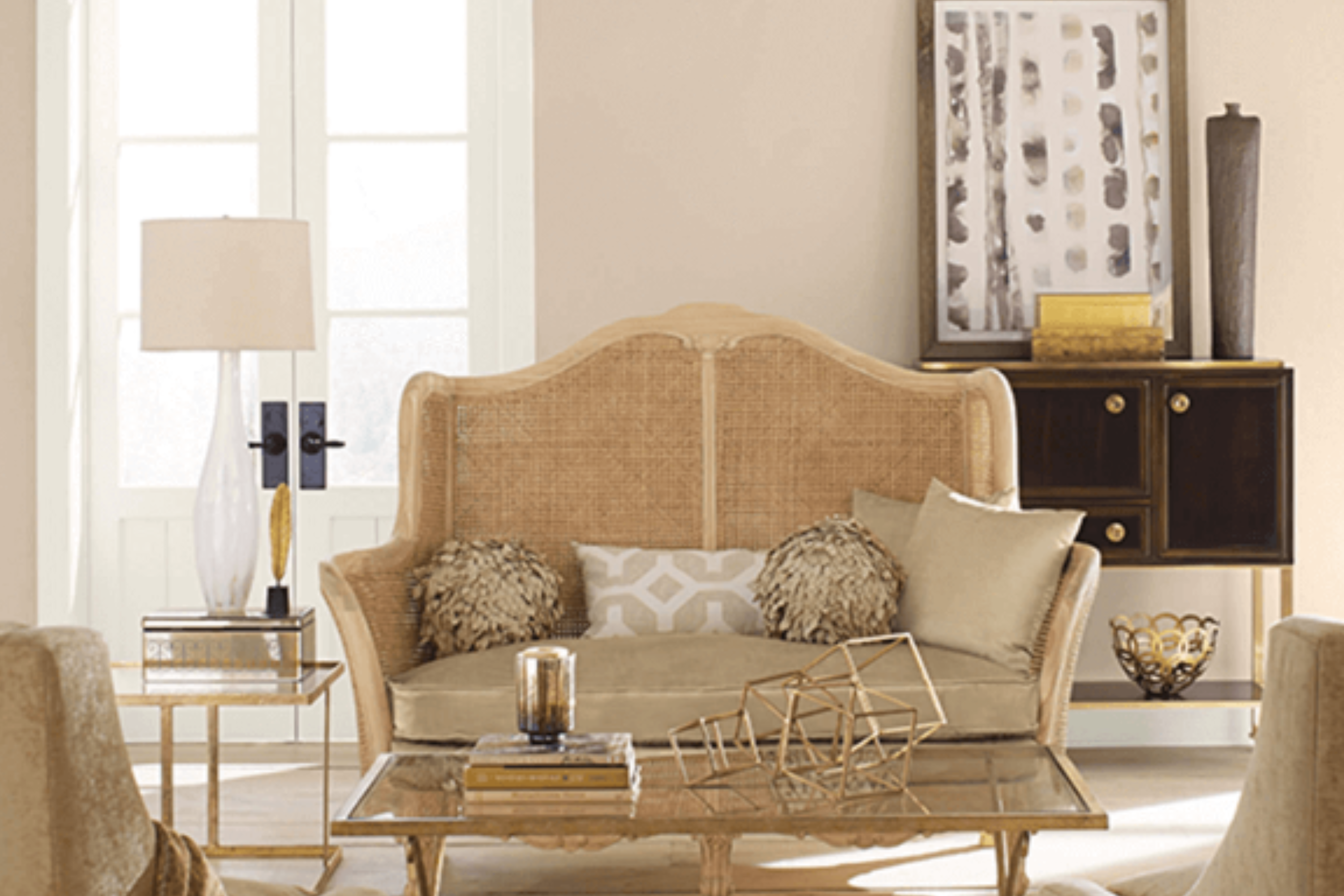
Discovering the perfect paint color for your home can feel overwhelming with countless options out there. Today, let’s focus on a delightful shade that has won over many hearts, SW 6106 Kilim Beige by Sherwin Williams. This charming beige hue offers a warm and inviting atmosphere to any space, delivering just the right balance of coziness and sophistication.
Kilim Beige has a unique quality of blending seamlessly with various decor styles, from modern to rustic, making it a versatile choice for homeowners.
Whether you’re looking to refresh your living room, bedroom, or any other area of your home, this paint color provides a neutral backdrop that complements a wide range of furnishings and accent colors.
One of the aspects homeowners appreciate most about Kilim Beige is its ability to create a sense of brightness and openness in a room, without feeling stark or cold like some lighter shades can. It’s a soft, muted beige that plays well with natural light, enhancing spaces in a subtle yet significant way.
As you consider your next painting project, thinking about the mood and aesthetic you want to achieve is essential. If a warm, inviting, and adaptable color is what you’re after, SW 6106 Kilim Beige by Sherwin Williams might just be the perfect match. Let’s explore how this shade can transform your space into a comforting haven you’ll love to come home to.
What Color Is Kilim Beige SW 6106 by Sherwin Williams?
Kilim Beige by Sherwin Williams is a warm, welcoming neutral color with earthy undertones, making it a perfect choice for creating a cozy and inviting atmosphere in any room. This beautiful shade strikes a fine balance between a light beige and a soft, creamy hue, enabling it to blend seamlessly with a wide range of interior styles and color schemes.
Kilim Beige works exceptionally well in traditional and modern farmhouse interiors, lending a subtle touch of warmth and rustic charm without overwhelming the space. Its versatility also makes it a popular choice for contemporary and minimalist designs, where it adds depth and warmth to clean lines and simple aesthetics.
When it comes to pairing materials and textures, Kilim Beige is remarkably accommodating. It complements natural wood beautifully, from dark, rich tones to lighter, washed finishes, enhancing the texture and grain of wooden furniture and flooring.
Fabrics in earth tones, like terracotta, deep greens, and browns, or softer cream and white shades, blend effortlessly with Kilim Beige, creating a harmonious and balanced look. Textured materials such as wool, linen, and cotton add further dimension to spaces painted in this color, enhancing the overall sense of comfort and warmth.
In summary, Kilim Beige is a warm, neutral color that works well across various interior styles and pairs beautifully with a wide range of materials and textures, making it a fantastic choice for anyone looking to create a cozy, welcoming space.
Ever wished paint sampling was as easy as sticking a sticker? Guess what? Now it is! Discover Samplize's unique Peel & Stick samples.
Get paint samples

Is Kilim Beige SW 6106 by Sherwin Williams Warm or Cool color?
Kilim Beige is a warm and inviting paint color from Sherwin Williams that creates a cozy and comfortable atmosphere in any home. Its soft, neutral tone makes it highly versatile, allowing it to fit seamlessly into various decorating styles and spaces.
Whether you’re sprucing up a living room, bedroom, or kitchen, Kilim Beige provides a perfect backdrop. It pairs beautifully with a wide range of colors, from bold and vibrant hues to subtle and muted tones, giving you the flexibility to express your personal style.
The beauty of Kilim Beige lies in its ability to bring a sense of calm and warmth to spaces, making rooms feel more welcoming and open. It’s particularly effective in areas with natural light, where it can enhance the brightness and airiness of the space. However, even in dimly lit rooms, Kilim Beige can help to lighten the mood and create a perception of more space.
For homeowners looking for a color that combines versatility with coziness, Kilim Beige is a top choice. It’s easy to see why it’s become a favorite for creating inviting homes.
Undertones of Kilim Beige SW 6106 by Sherwin Williams
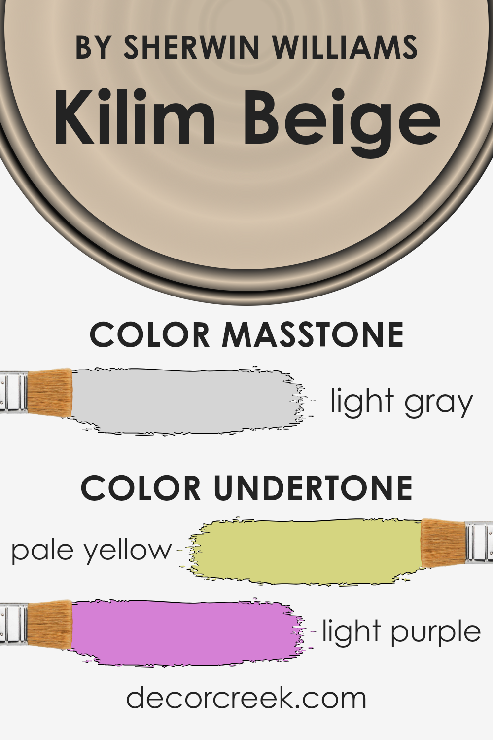
Kilim Beige is a versatile paint color by Sherwin Williams that carries subtle undertones of pale yellow and light purple. These undertones play a crucial role in how we perceive the color. Generally, undertones can subtly shift a color closer to one part of the color spectrum or another, depending on lighting and surrounding colors.
The pale yellow undertone in Kilim Beige adds a warm and cozy feel. It gives the paint a soft glow that can make spaces feel more inviting and comfortable. This warm undertone can also help brighten up a room, especially in natural light, making the space appear more vibrant and airy.
On the other hand, the light purple undertone introduces a hint of sophistication and depth. It’s not overly noticeable but contributes to the richness of the color, preventing it from feeling flat or dull.
In certain lighting, especially artificial light, this undertone can become slightly more apparent, adding an interesting layer to the room’s ambiance.
When applied to interior walls, Kilim Beige adapts remarkably well, influenced heavily by these undertones. In brighter environments, the yellowish tone becomes more pronounced, creating a warm, sunny effect. In contrast, in spaces with less natural light or during the evening, the purplish undertone might subtly emerge, offering a quiet elegance. The blend of these undertones makes Kilim Beige a highly adaptable color that can complement various styles and settings, ensuring the walls contribute to a room’s overall mood and character without overwhelming it.
What is the Masstone of the Kilim Beige SW 6106 by Sherwin Williams?
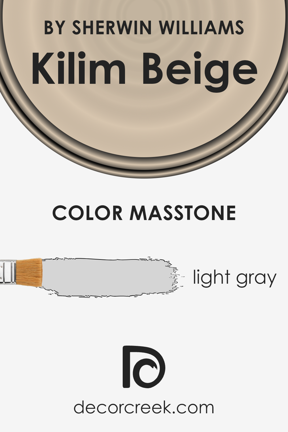
Kilim Beige SW 6106 by Sherwin Williams has a masstone, or the color it appears when seen straight on, that’s a light gray (#D5D5D5). This soft, gentle hue has a way of bringing a calm, relaxing feel into any home. Its light gray undertone can make small rooms seem larger and brighter, as it reflects light beautifully. This color works well in various parts of a home, from living rooms to bedrooms, creating a cozy, welcoming vibe without being too bold or overpowering.
The light gray shade of Kilim Beige is also super flexible when it comes to matching with other colors. It pairs nicely with both warm and cool tones, allowing for a wide range of decorating options.
So, whether someone prefers earth tones, pastels, or even bolder colors, Kilim Beige acts as a perfect backdrop, helping other colors to stand out without clashing. Its versatility makes it a fantastic choice for those looking to give their space an update without committing to a very strong color scheme.
How Does Lighting Affect Kilim Beige SW 6106 by Sherwin Williams?
Lighting plays a crucial role in how we perceive colors. The same color can look vastly different under various light sources. This is especially true for interior paint colors, where the type of light can change the ambiance of a room.
Take Kilim Beige for example. In artificial light, this warm and cozy beige tone can appear more inviting and snug, making it perfect for living rooms or bedrooms where you want a calm and relaxing atmosphere. The artificial lighting amplifies the warmth of Kilim Beige, making spaces feel more intimate.
- In natural light, Kilim Beige unveils its true warmth and versatility. Under the bright sun, it can appear lighter and airier, adding a fresh and uplifting vibe to a space. This quality makes it an excellent choice for areas where a natural, soft, and open feel is desired.
- The direction your room faces also significantly impacts how Kilim Beige looks. In north-facing rooms, which often get cooler, softer light, this color may appear slightly muted and cooler, leaning towards its subtle earthy tones. It still maintains its warm base but doesn’t shine as brightly as in rooms with plentiful sunlight.
- South-faced rooms bathe Kilim Beige in warm, golden sunlight throughout the day, highlighting its warm, welcoming essence. Here, the color will look its most vibrant and inviting, making the space feel cozy and bright.
- East-faced rooms enjoy the morning sun, meaning Kilim Beige will appear warm and lively in the morning but might lose some of its brightness and warmth as the day goes on, transitioning to a softer, more neutral beige in the evening.
- West-faced rooms present the opposite effect; Kilim Beige may appear cooler during the morning and then be bathed in intense, warm light in the late afternoon and evening, bringing out the color’s depth and warmth.
Understanding how Kilim Beige reacts to different lighting conditions is key to utilizing it effectively in your space, ensuring it always presents its best self.
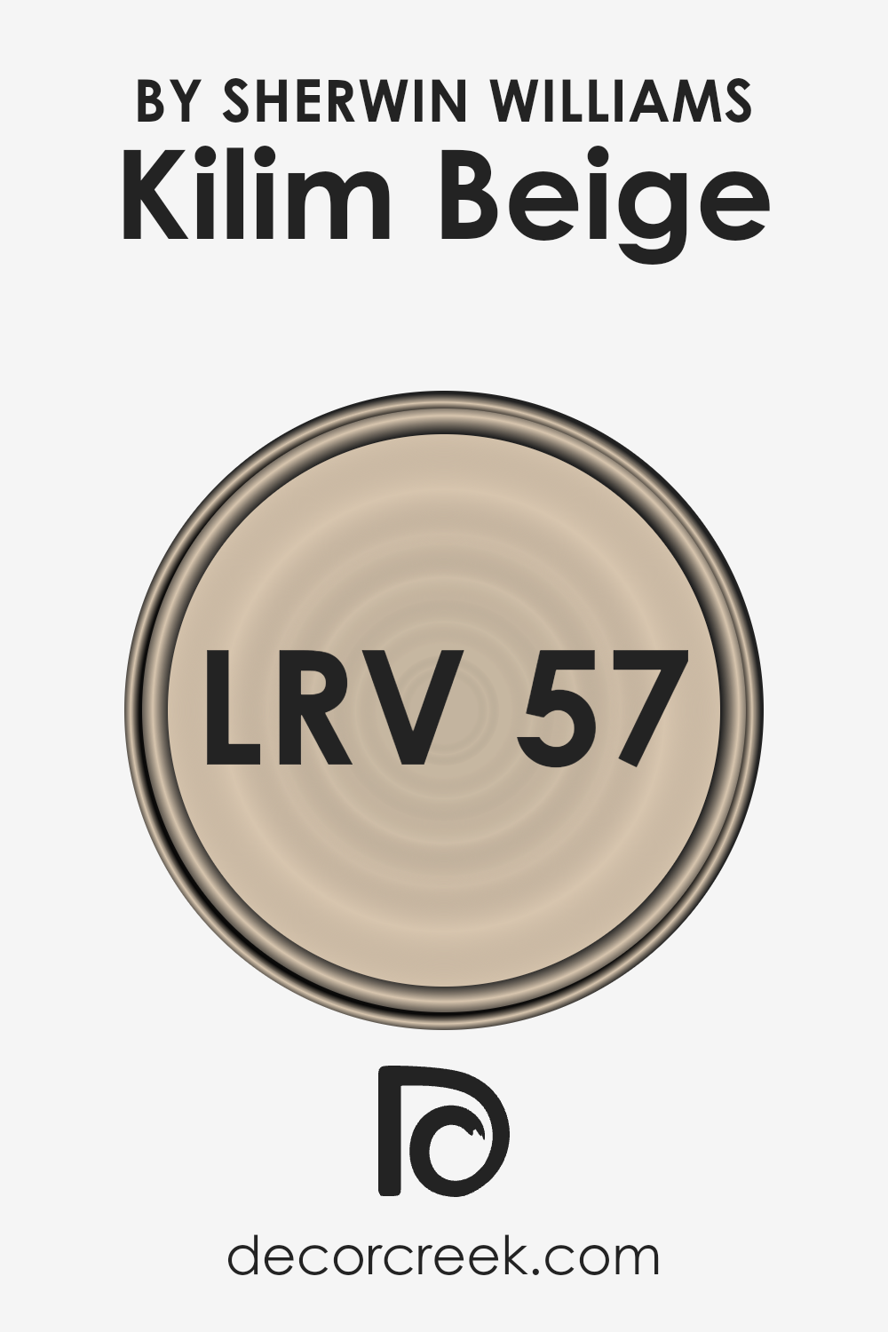
What is the LRV of Kilim Beige SW 6106 by Sherwin Williams?
LRV stands for Light Reflectance Value, a measure that tells you how much light a color reflects or absorbs. Think of it as a scale from 0 to 100, where 0 is completely black, absorbing all the light, and 100 is pure white, reflecting all the light back. This is super important when choosing a paint color for your room because it affects how light or dark the color appears once it’s on your walls.
A color with a higher LRV will make a room feel brighter and more open since it reflects more light around the space. On the other hand, colors with lower LRVs can make a space feel cozier or smaller because they absorb more light.
The LRV of Kilim Beige, at 57.191, means it’s somewhat in the middle but leaning towards the lighter side. This makes it a versatile option for any room, reflecting a decent amount of light without being too overpowering. In spaces with less natural light, Kilim Beige will help brighten the area without the need for much artificial lighting. In well-lit rooms, it will look even more vibrant and create a warm, inviting ambiance.
Its LRV is perfect for those who want a balance between a cozy atmosphere and maintaining a sense of brightness and openness in their space.
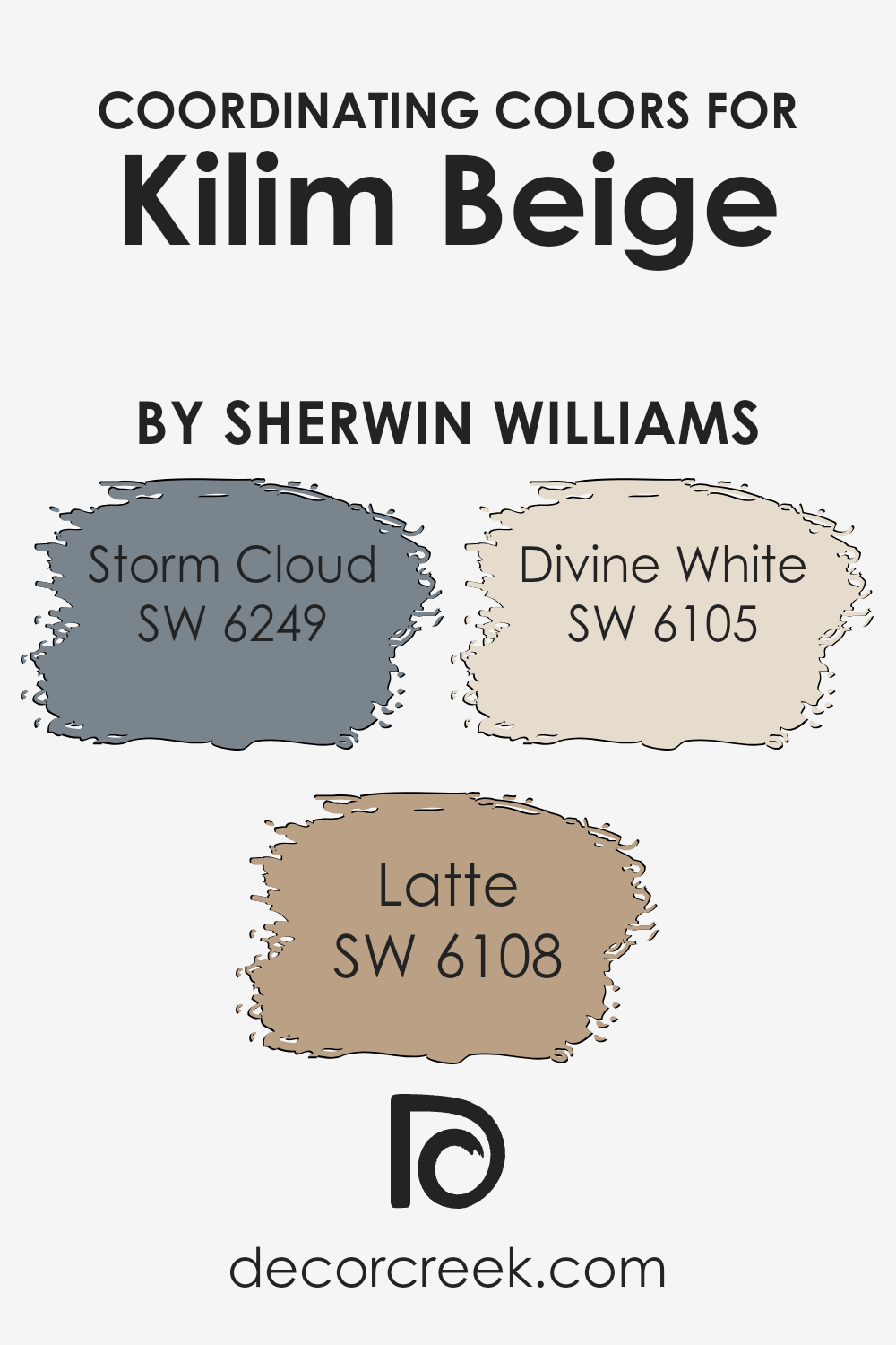
Coordinating Colors of Kilim Beige SW 6106 by Sherwin Williams
Coordinating colors are hues that harmoniously work together within a design or color scheme, creating a balanced and visually appealing look. When selecting coordinating colors, it’s essential to consider how each color complements or contrasts with the others to create a cohesive design.
For example, when working with a versatile base color like Kilim Beige by Sherwin Williams, choosing coordinating colors involves selecting shades that enhance its warm undertones and adapt to various settings and design styles.
Storm Cloud SW 6249, Latte SW 6108, and Divine White SW 6105 are excellent examples of coordinating colors that work well with Kilim Beige, each bringing its unique appeal to the mix.
Storm Cloud is a deep, moody gray with blue undertones, offering a striking contrast that can add depth and drama to spaces. It works particularly well in areas where a bold statement is desired.
On the other hand, Latte is a warmer, comforting shade akin to the rich color of coffee with milk. It pairs beautifully with Kilim Beige to create a cozy, inviting atmosphere. Lastly, Divine White is a soft, slightly off-white hue that offers a subtle contrast, perfect for creating a serene and light space. This shade complements the warmth of Kilim Beige, providing a soft transition between colors in a room.
Together, these coordinating colors offer a range of possibilities for designing harmonious spaces that reflect personal style while maintaining aesthetic cohesion.
You can see recommended paint colors below:
- SW 6249 Storm Cloud
- SW 6108 Latte
- SW 6105 Divine White
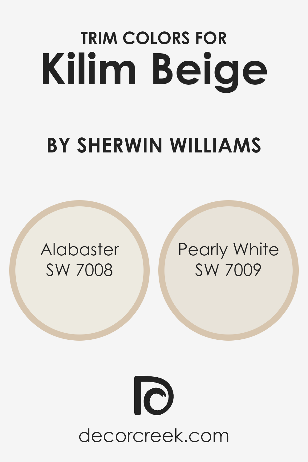
What are the Trim colors of Kilim Beige SW 6106 by Sherwin Williams?
Trim colors are essentially the hues selected for the architectural details of a room—think door frames, moldings, and skirting boards. These colors play a crucial role in interior design as they can either complement or contrast with the wall colors to add depth and character to a space. For a warm and inviting color like Kilim Beige by Sherwin Williams, choosing the right trim color can enhance its cozy appeal.
Kilim Beige is a neutral, versatile shade that offers a perfect backdrop for various design styles, from modern to classic. When paired with the correct trim colors, it creates a cohesive and polished look.
Alabaster SW 7008 is a soft, creamy white with a hint of warmth, making it an excellent choice for trims when you want to achieve a subtle, yet inviting contrast against Kilim Beige. It’s light enough to brighten the space while bringing a soft transition between the wall color and the trim. Pearly White SW 7009, on the other hand, has a touch of gray, giving it a slightly cooler tone compared to Alabaster.
This color is ideal for those looking to introduce a slight contrast that’s neither too stark nor too muted alongside Kilim Beige. Both Alabaster and Pearly White help in framing the wall color, adding dimension and interest to the room without overwhelming the senses, ensuring the space feels harmonious and thoughtfully curated.
You can see recommended paint colors below:
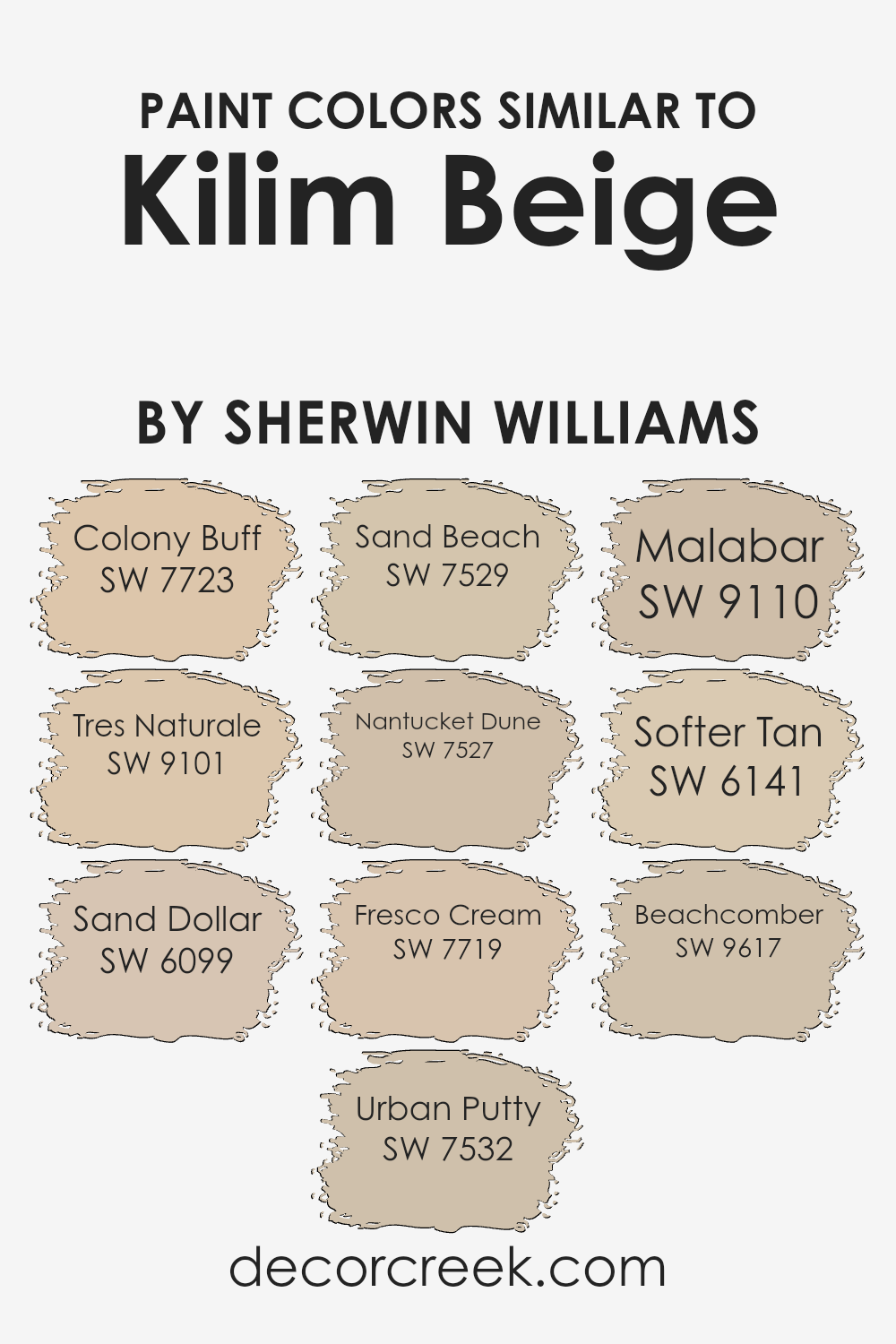
Colors Similar to Kilim Beige SW 6106 by Sherwin Williams
Similar colors play a vital role in creating harmonious and coherent visual experiences. They possess the ability to subtly tie spaces together without the stark contrasts that can sometimes disrupt the flow of design.
For example, hues similar to Kilim Beige by Sherwin Williams, such as Colony Buff, Tres Naturale, and Sand Dollar, offer a spectrum of warmth that blends effortlessly into a variety of decor themes. These tones, with their soft and inviting nature, can serve as a serene backdrop or as gentle complements to bolder accents.
Urban Putty and Sand Beach introduce a slightly more grounded element, providing a sturdy yet unobtrusive base for both traditional and contemporary settings.
Nantucket Dune and Fresco Cream, with their light, airy qualities, infuse spaces with a breath of freshness, amplifying the natural light and contributing to a feeling of spaciousness.
Moving towards the deeper end of this palette, Malabar, Softer Tan, and Beachcomber offer richer, more pronounced warmth, injecting a cozy ambiance into any space. These colors maintain a close relationship with the original Kilim Beige, ensuring that even when opting for a bit of contrast, there remains a seamless flow within the color scheme. Each shade, from the subtle whisper of Nantucket Dune to the gentle depth of Malabar, works together to create a cohesive and inviting environment.
They exemplify how utilizing similar colors can craft a unified aesthetic, where the transitions between walls and accents feel fluid and natural. This careful selection of tones enhances the overall sense of balance and beauty in a space, proving that sometimes, the power of color lies in the subtle ties that bind them.
You can see recommended paint colors below:
- SW 7723 Colony Buff
- SW 9101 Tres Naturale
- SW 6099 Sand Dollar
- SW 7532 Urban Putty
- SW 7529 Sand Beach
- SW 7527 Nantucket Dune
- SW 7719 Fresco Cream
- SW 9110 Malabar
- SW 6141 Softer Tan
- SW 9617 Beachcomber
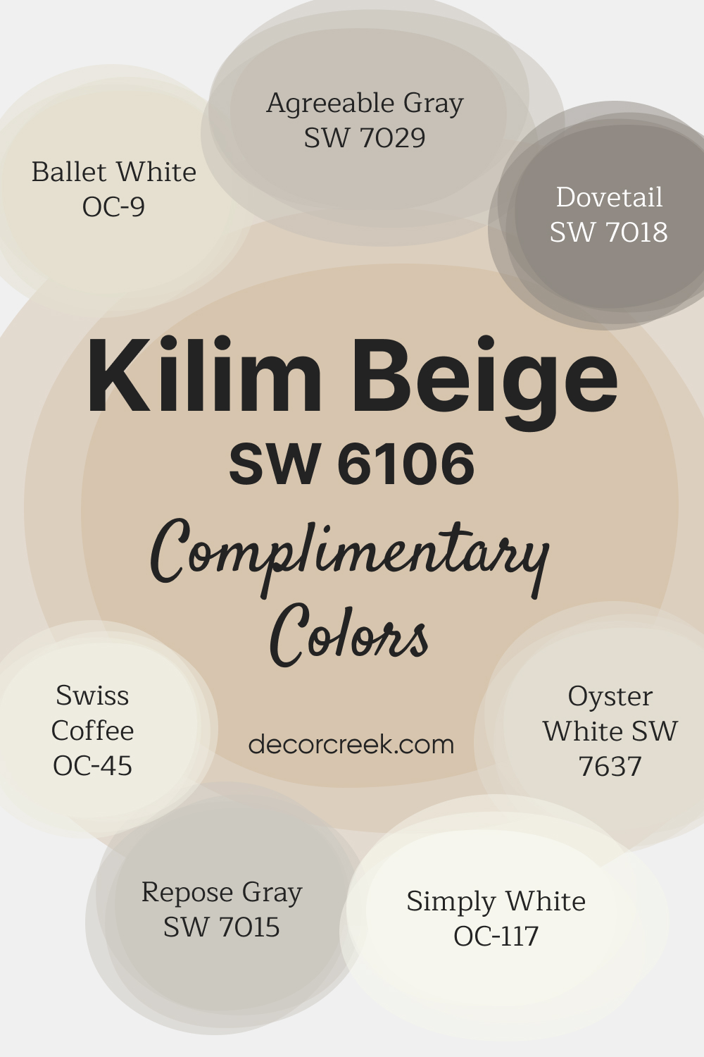
Complimentary Colors for Kilim Beige SW 6106 Paint Color by Sherwin Williams
Kilim Beige SW 6106 by Sherwin-Williams is a classic warm beige that brings a welcoming, cozy feel to your home. Ideal for living spaces, bedrooms, or even hallways, this shade provides a neutral yet inviting backdrop that works beautifully with both modern and traditional styles.
It pairs effortlessly with a range of whites and neutrals to create a harmonious palette. For a fresh and soft contrast, consider and Simply White OC-117.
Gentle neutrals like Agreeable Gray SW 7029 and Repose Gray SW 7015 add balance, while Dovetail SW 7018 introduces a touch of depth.
Swiss Coffee OC-45 and Oyster White SW 7637 round out the palette, enhancing the warm, cozy aesthetic of Kilim Beige.
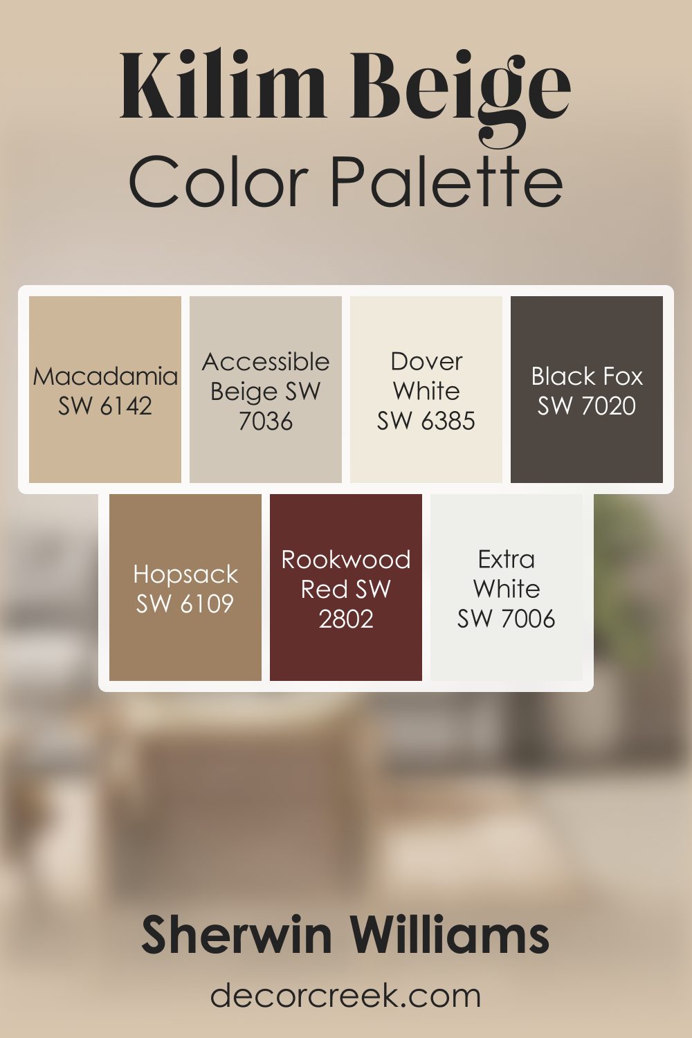
Kilim Beige SW 6106 by Sherwin Williams Color Palette
Kilim Beige always gives me a warm, cozy feeling the moment it goes on the wall. It has this earthy softness that makes any room feel welcoming and relaxed. I love pairing it with Dover White or Accessible Beige for a smooth, natural flow of warm tones. Macadamia and Hopsack add richness that feels comforting and full of character.
When I want to brighten the palette, Extra White gives it a clean lift without losing warmth. And for contrast, Black Fox brings a deep, grounding note that makes the palette feel steady and complete.
Rookwood Red adds a warm, classic touch that gives Kilim Beige a sense of personality.
This palette feels inviting and grounded, with each shade enhancing Kilim Beige’s warm, earthy charm.
How to Use Kilim Beige SW 6106 by Sherwin Williams In Your Home?
Kilim Beige from Sherwin Williams is a warm, inviting neutral color that brings a cozy atmosphere to any room in your home. This soft beige has a hint of warmth that makes spaces feel more welcoming and comfortable. Perfect for those looking to create a serene and understated look, it works well in living rooms, bedrooms, and even kitchens, offering a versatile backdrop that compleates a wide range of decor styles.
One of the best things about Kilim Beige is its ability to blend seamlessly with other colors. Whether you’re pairing it with bold accents or sticking to a more muted palette, this shade will support your vision without overpowering the space. It’s especially great for those looking to refresh their walls without making a dramatic color statement.
Furthermore, Kilim Beige can help small rooms appear larger and more open, thanks to its light-reflecting properties. It’s also a smart pick for creating a cohesive look throughout your home, providing a neutral foundation that allows your furniture and decor to stand out. So, whether you’re updating a single room or looking for a color that can flow throughout your entire house, Kilim Beige is a practical and stylish choice.
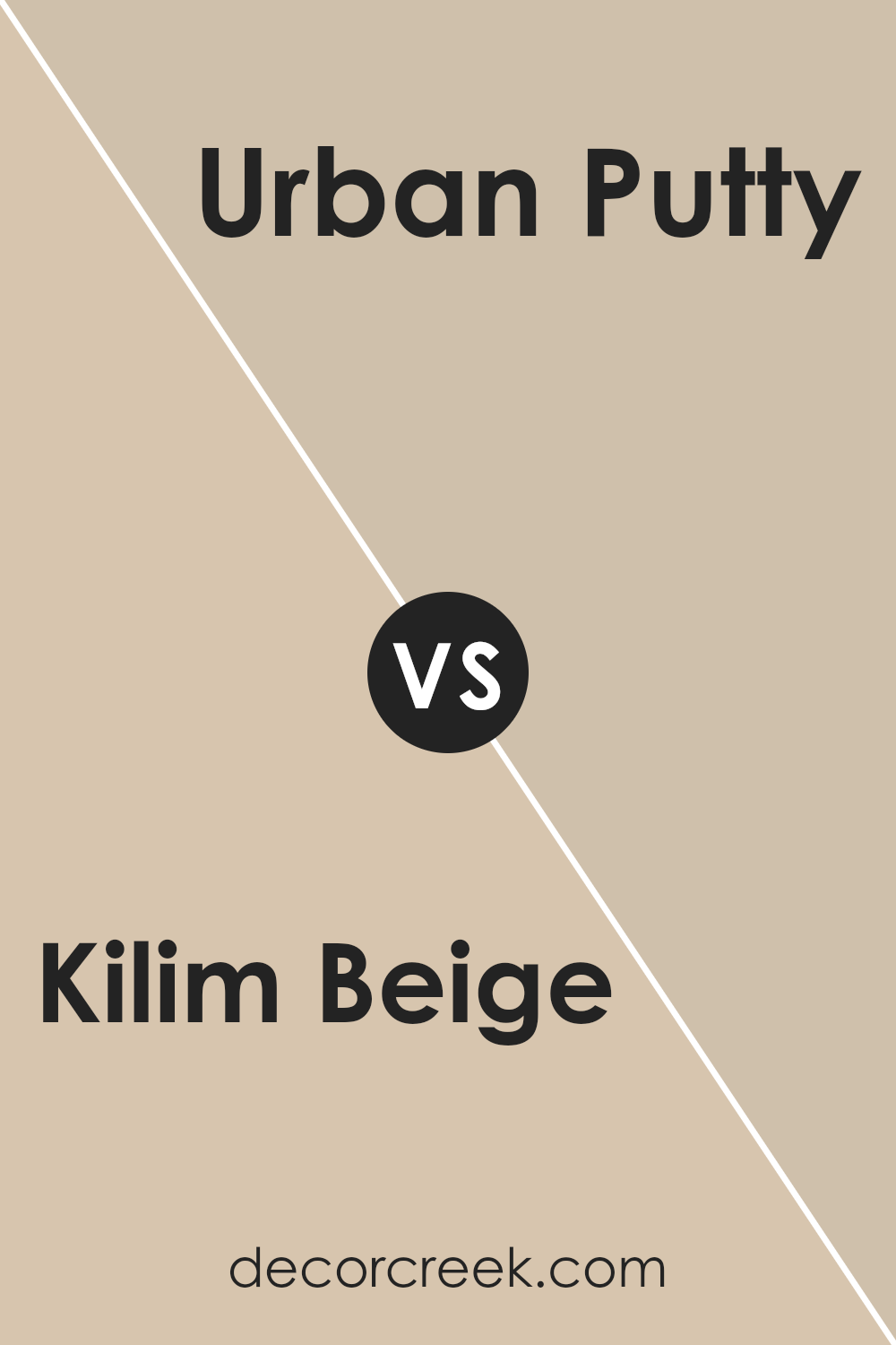
Kilim Beige SW 6106 by Sherwin Williams vs Urban Putty SW 7532 by Sherwin Williams
Kilim Beige and Urban Putty by Sherwin Williams are two popular shades, but they bring different vibes to a space. Kilim Beige is a warm, welcoming color that feels like a cozy hug for any room.
It has a soft, light tone that makes spaces feel airy and light. It’s perfect for anyone wanting to create a calm and inviting atmosphere. On the other hand, Urban Putty has a deeper, richer look. It’s also warm but brings in more of an earthy feel, adding a bit of sophistication and grounding to a room.
While Kilim Beige opens up a space with its lighter hue, Urban Putty adds depth and character, making it a great choice for accent walls or rooms where you want more impact. Both colors work well in many settings, but your choice between them depends on what mood you’re looking to create. Do you want the light and airy feel of Kilim Beige or the grounded, sophisticated vibe of Urban Putty?
You can see recommended paint color below:
- SW 7532 Urban Putty
Kilim Beige SW 6106 by Sherwin Williams vs Colony Buff SW 7723 by Sherwin Williams
Kilim Beige and Colony Buff are two popular paint colors from Sherwin Williams, each offering a unique yet harmonious option for home interiors. Kilim Beige stands out for its warm, cozy feel that brings a soothing and inviting atmosphere to any room. Its soft, neutral beige tone pairs well with a wide range of decor, making it a versatile choice for living areas, bedrooms, or any space seeking a touch of warmth.
On the other hand, Colony Buff leans toward a slightly lighter and warmer hue. This color brings a sense of brightness and airiness to a space without overwhelming it. It’s an excellent option for spaces where natural light is abundant, as it can enhance the light-filled quality of the room.
Colony Buff works well in kitchens, bathrooms, or any area where a light, cheerful ambiance is desired.
While both colors share a base in the beige family, Kilim Beige offers depth and warmth, making it ideal for creating a cozy, welcoming environment. Colony Buff, with its lighter, airier quality, is perfect for adding a touch of brightness to a room. Depending on the mood you’re aiming to achieve, either color could be the right choice for your next home project.
You can see recommended paint color below:
- SW 7723 Colony Buff
Kilim Beige SW 6106 by Sherwin Williams vs Malabar SW 9110 by Sherwin Williams
Kilim Beige and Malabar are two colors by Sherwin Williams that offer subtle yet distinct vibes to any space. Kilim Beige is a warm, welcoming beige with a soft, cozy feel. It has a neutral base that leans slightly towards yellow, giving it a sunny brightness. This color works well in rooms where you want a hint of warmth without overpowering the space.
On the other hand, Malabar is a deeper, more grounded color. It’s a shade that mixes hints of beige with gray, producing a taupe-like effect. This color brings a sense of calm and sophistication, making it perfect for creating a serene, elegant atmosphere.
Unlike Kilim Beige, Malabar can make a statement without being too bold, offering depth to rooms in a subtle way.
When comparing these two, think of Kilim Beige as the light, airy choice that brightens up a room, while Malabar serves as the rich, understated choice that adds a layer of refined elegance. Both offer versatility and warmth, but their impact on the mood and style of a room can be quite different.
You can see recommended paint color below:
- SW 9110 Malabar
Kilim Beige SW 6106 by Sherwin Williams vs Sand Beach SW 7529 by Sherwin Williams
Kilim Beige and Sand Beach are two colors by Sherwin Williams with their own unique appeal. Kilim Beige leans towards a warm, cozy feel, perfect for creating a welcoming and comfortable space.
It’s a versatile beige that pairs well with a variety of decors, making it a great pick for almost any room in your house. On the other hand, Sand Beach offers a lighter, softer touch.
It brings to mind the gentle hues of a sandy shore, offering a sense of calm and relaxation. Sand Beach is slightly cooler compared to Kilim Beige, giving it a fresh and serene vibe. Both colors can brighten a room but in different ways; Kilim Beige adds warmth, while Sand Beach creates an airy, open feel. Choosing between them depends on the mood you want to set for your space—cozy and inviting with Kilim Beige or calm and peaceful with Sand Beach.
You can see recommended paint color below:
- SW 7529 Sand Beach
Kilim Beige SW 6106 by Sherwin Williams vs Fresco Cream SW 7719 by Sherwin Williams
Kilim Beige and Fresco Cream by Sherwin Williams are two warm, inviting colors, each with its own unique vibe. Kilim Beige leans towards a soft, sandy tone, giving a cozy, comfortable feel to any room. It’s subtle enough to work as a neutral backdrop but has enough depth to add character to your space. On the other hand, Fresco Cream brings a slightly lighter and warmer touch.
It’s like the color of soft sunlight in the morning, offering a brighter, more uplifting feel. While both colors are great for creating a welcoming atmosphere, Kilim Beige adds a bit of earthiness, making spaces feel grounded and secure.
Fresco Cream, conversely, lights up the room a tad more, potentially making small spaces seem bigger and more open. Choosing between the two depends on the mood you want to set: for a snug, intimate setting, Kilim Beige is perfect; for a cheerier, airier feel, Fresco Cream is the way to go.
You can see recommended paint color below:
- SW 7719 Fresco Cream
Kilim Beige SW 6106 by Sherwin Williams vs Sand Dollar SW 6099 by Sherwin Williams
Kilim Beige and Sand Dollar are both neutral colors from Sherwin Williams, but they have nuances that set them apart. Kilim Beige leans more towards a warm beige, with a hint of coziness that makes spaces inviting. It’s like a soft hug for your walls, offering a sense of warmth and comfort. This color pairs beautifully with a wide range of decor, making it quite versatile for any room.
On the other hand, Sand Dollar takes a step towards a lighter, almost creamy side of neutrals. It’s a tad softer and more subtle compared to Kilim Beige, giving off a serene and peaceful vibe. Sand Dollar is perfect for creating a calm and relaxing atmosphere in your home, ideal for spaces where you want to unwind.
While both colors share a neutral base, Kilim Beige adds warmth to a room, making it feel cozy and welcoming, whereas Sand Dollar provides a lighter, soothing backdrop, ideal for a more tranquil setting. Choosing between them boils down to the mood you’re aiming to create in your space.
You can see recommended paint color below:
- SW 6099 Sand Dollar
Kilim Beige SW 6106 by Sherwin Williams vs Beachcomber SW 9617 by Sherwin Williams
Kilim Beige and Beachcomber, both by Sherwin Williams, are quite different when you look closely. Kilim Beige is this warm, cozy shade that feels like sunshine on a comfy sofa. It’s soft and inviting, making rooms feel open yet snug. It’s perfect for spaces where you want to relax but also keep things light and airy.
On the other hand, Beachcomber steps in with a cooler, laid-back vibe. It’s like walking on the beach early in the morning, with the cool sand beneath your feet. Beachcomber is lighter, leaning towards the softness of faded seashells.
It brings a fresh, breezy feel to any space, making it great for creating a calm and serene environment.
When comparing them, Kilim Beige tends to warm up a room, making it feel welcoming, while Beachcomber offers a calming touch, perfect for a peaceful retreat. Depending on what feeling you want in your space, both colors offer unique qualities.
You can see recommended paint color below:
- SW 9617 Beachcomber
Kilim Beige SW 6106 by Sherwin Williams vs Tres Naturale SW 9101 by Sherwin Williams
Kilim Beige and Tres Naturale by Sherwin Williams are two appealing colors, each bringing its own unique vibe to a space. Kilim Beige is a warm, welcoming beige that’s soft and cozy, perfect for creating a snug and inviting atmosphere in any room. It’s a versatile color that can easily complement various decor styles and themes, making it a popular choice for living rooms and bedrooms.
Tres Naturale, on the other hand, leans more towards the neutral side, offering a subtle, earthy look. It’s a serene and calming color that can make a room feel more spacious and airy.
Ideal for those seeking a minimalist or modern aesthetic, it works well in areas that get plenty of natural light, enhancing the sense of tranquility.
While both colors share a base in the neutral palette, Kilim Beige adds warmth and coziness, whereas Tres Naturale offers a cleaner, more muted backdrop. Choosing between them depends on the desired mood and style for your space.
You can see recommended paint color below:
- SW 9101 Tres Naturale
Kilim Beige SW 6106 by Sherwin Williams vs Softer Tan SW 6141 by Sherwin Williams
Kilim Beige and Softer Tan, both from Sherwin Williams, offer unique yet harmonious options for those looking to add a warm touch to their spaces. Kilim Beige provides a slightly richer tone, leaning more towards a classic beige that radiates a cozy feel. It’s a color that pairs well in rooms that seek a slightly more pronounced warmth without overwhelming the senses.
On the other hand, Softer Tan is just as its name suggests – a gentler version of tan. It’s lighter and brings a softer warmth to a room, offering a subtle elegance that can make small spaces appear larger and inviting. This color works beautifully in well-lit areas, enhancing natural light to create a tranquil and airy atmosphere.
While both colors share a similar base, the main distinction lies in their intensity and the ambiance they create. Kilim Beige suits those looking for a bit of depth and warmth, making it perfect for common areas and bedrooms.
Softer Tan, with its lighter approach, is ideal for creating a serene and open space, suitable for offices and kitchens. Selecting between the two depends on the desired impact on the room’s atmosphere.
You can see recommended paint color below:
- SW 6141 Softer Tan
Kilim Beige SW 6106 by Sherwin Williams vs Nantucket Dune SW 7527 by Sherwin Williams
Kilim Beige and Nantucket Dune are two popular colors from Sherwin Williams, but they each have their own unique character. Kilim Beige is a warm, welcoming color. It’s soft and slightly creamy, making it a great choice for creating a cozy and inviting atmosphere in any room. Think of it as a hug for your walls, offering a sense of comfort and calm.
On the other hand, Nantucket Dune takes a step towards a darker, more grounded tone. It’s still warm, but it carries a depth that adds a sophisticated richness to spaces. It’s the kind of color that can make a room feel more anchored and mature, without losing the warmth that makes a space feel like home.
Both colors are versatile and can blend well with various decor styles, but Kilim Beige works best when you want to lighten up a room and give it a soft glow, while Nantucket Dune is your go-to for adding a bit of drama and elegance.
Whether you’re decorating a living room, bedroom, or any part of your home, choosing between these two depends on the mood you want to set.
You can see recommended paint color below:
- SW 7527 Nantucket Dune
Kilim Beige SW 6106 by Sherwin Williams is a versatile and warm neutral paint color that has gained popularity for its ability to bring a cozy and inviting atmosphere to any space. Its subtle undertones make it an excellent choice for those looking to add a touch of warmth to their interiors without overwhelming the room with color.
The beauty of Kilim Beige lies in its flexibility, seamlessly fitting into a wide range of decor styles and settings, from traditional to modern. Its compatibility with various textures and complementary colors allows for easy integration into any design scheme, making it a go-to choice for both homeowners and professional designers.
This paint color shines best when used in well-lit areas, where its richness and depth can be fully appreciated, enhancing the overall aesthetic appeal of the room. Whether applied in living rooms, bedrooms, or hallways, Kilim Beige provides a solid foundation for layering decor, offering a subtle backdrop that complements furnishings and accessories.
Its enduring popularity underscores its ability to adapt to changing trends and personal tastes, ensuring that spaces painted with Kilim Beige remain stylish and welcoming over time. This characteristic makes it not just a paint color but a long-term investment in the beauty and comfort of a home.

Ever wished paint sampling was as easy as sticking a sticker? Guess what? Now it is! Discover Samplize's unique Peel & Stick samples.
Get paint samples
