When I came across SW 7547 Sandbar by Sherwin Williams, I felt an instant connection. This paint color isn’t just a hue; it brings a sense of calm and warmth into any space. Think of it as a comforting, neutral backdrop that pairs effortlessly with a wide range of decor styles. It offers a blend of beige and gray that doesn’t overpower, making it versatile for both modern and traditional settings.
I noticed how Sandbar can create an inviting atmosphere, whether used in living rooms, bedrooms, or even kitchens. Its muted tone helps to soften strong elements and adds a touch of elegance without shouting for attention.
When natural light hits this color, it reveals subtle shifts that add interest and depth to walls. It works well with various other colors, allowing for easy coordination of accents and furnishings.
If you’re considering a change that refreshes your space without overwhelming it, Sandbar might just be the perfect choice. It balances warmth and neutrality, offering a welcoming feel that’s easy to appreciate every day.
With this color, your home can feel both peaceful and stylish, creating a comfortable haven for you and your loved ones.
What Color Is Sandbar SW 7547 by Sherwin Williams?
Sandbar by Sherwin Williams is a warm, neutral color that brings a cozy feel to any space. It has subtle undertones that blend beige and gray, making it a versatile choice for various styles. This color works particularly well in interiors that favor a natural or earthy vibe, such as modern farmhouse, rustic, or coastal styles.
In modern farmhouse settings, Sandbar’s warmth pairs beautifully with natural wood tones and white accents, creating a welcoming and relaxed atmosphere. In a coastal style, it complements soft blues, whites, and sandy hues, enhancing the breezy, laid-back feeling of a beach house.
Sandbar also works great with different materials and textures. It looks stunning against natural materials like wood, providing a soft contrast that allows the wood’s richness to stand out. It pairs nicely with woven textures such as baskets or textiles, enhancing the organic feel. In addition, metal finishes like brushed nickel or aged bronze can add an elegant touch when paired with this color.
Overall, Sandbar is an adaptable color that fits well in spaces designed to feel comfortable and inviting. It brings a soft, muted backdrop that allows furnishings and decor to shine without overpowering them.
Is Sandbar SW 7547 by Sherwin Williams Warm or Cool color?
Sandbar SW 7547 by Sherwin Williams is a versatile and warm neutral color. It lends a cozy and inviting feel to homes. This shade is a mix of beige and gray, which makes it suitable for various settings and styles. It works well in living rooms, bedrooms, and even kitchens, providing a soft backdrop that complements many decor styles.
In living rooms, Sandbar adds warmth without overwhelming the space. Paired with white trim, it creates a clean look while maintaining comfort. In bedrooms, it fosters a calming atmosphere that supports relaxation.
Its neutral tone allows homeowners to easily change accent colors through decor or furnishings.
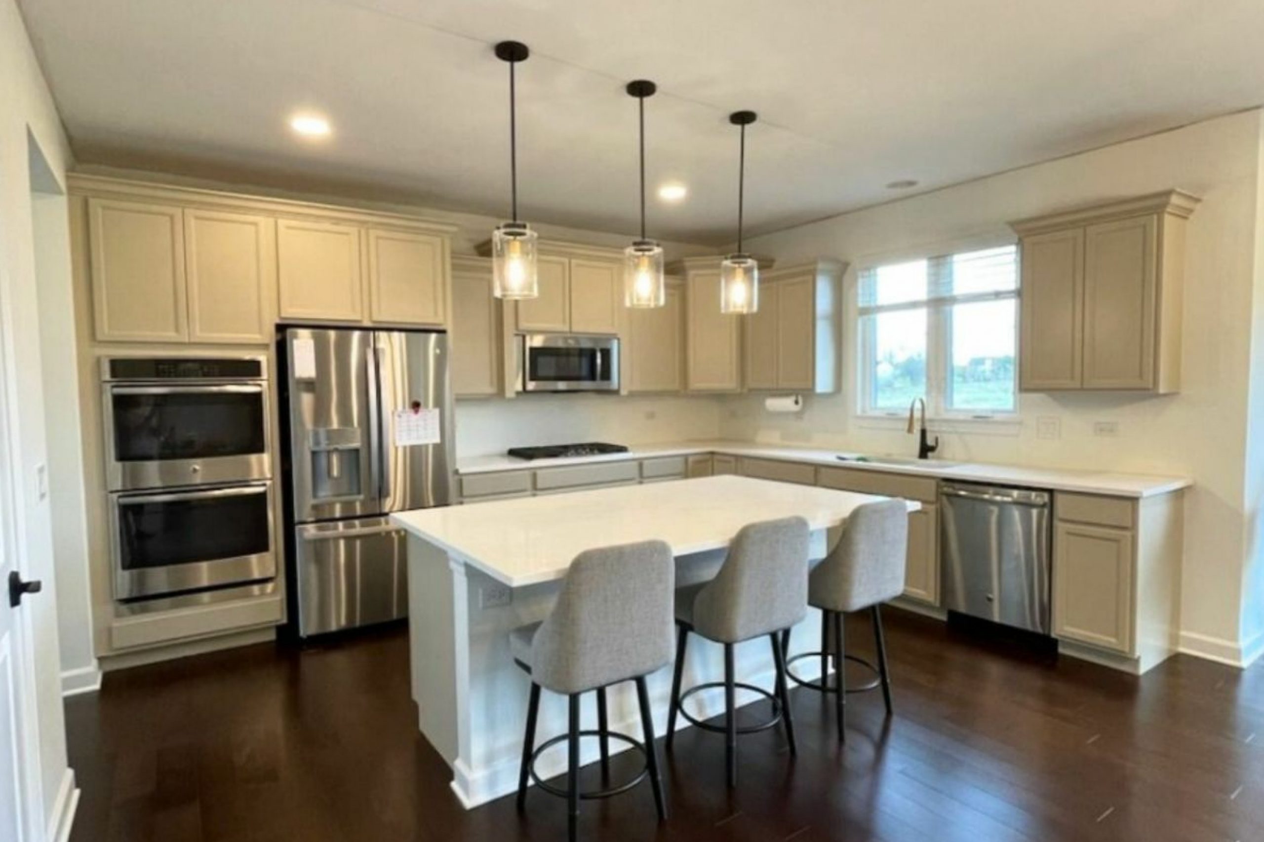
In kitchens, Sandbar can be paired with cabinets in darker shades for contrast or lighter ones for a fresh appearance. Its adaptability means it can fit into both traditional and modern designs. Overall, Sandbar SW 7547 provides a pleasing and flexible foundation for interior spaces.
Undertones of Sandbar SW 7547 by Sherwin Williams
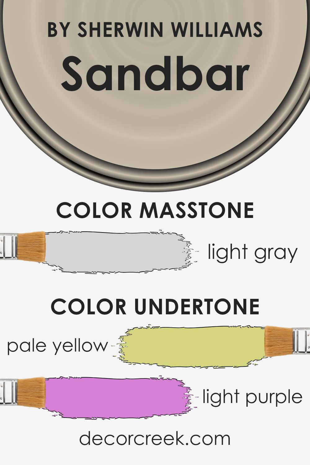
Sandbar SW 7547 by Sherwin Williams is a warm, neutral color with subtle undertones. Undertones are the hints of color that appear beneath the main color, affecting how it is perceived in different lighting conditions and alongside other colors. Sandbar has a beige base with undertones of pale yellow, light purple, pale pink, light blue, mint, lilac, and grey. These undertones give it versatility.
The pale yellow and mint undertones add warmth to the paint, making it feel inviting and cozy. Ideal for living rooms or bedrooms, they can create a comforting atmosphere.
In contrast, the light purple, pale pink, and lilac undertones bring a gentle touch that adds a soft and welcoming element to a room, suggesting slight hints of elegance without being overwhelming.
The light blue undertone can bring a sense of calmness, complementing the other shades by providing a balanced feel.
Meanwhile, the grey undertone grounds the color, giving it depth and sophistication. It helps Sandbar blend seamlessly with various design elements, whether you prefer contemporary or traditional styles.
The interplay of these undertones means Sandbar can pair well with a range of other colors, from whites to bolder shades, adapting easily to different settings and light conditions.
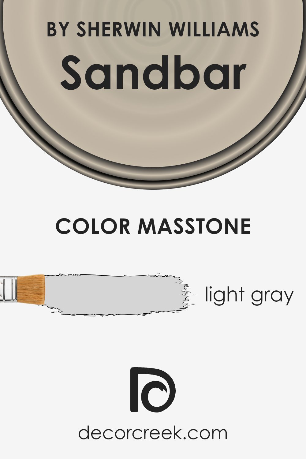
What is the Masstone of the Sandbar SW 7547 by Sherwin Williams?
Sandbar (SW 7547) by Sherwin-Williams presents as a light gray color with a masstone of #D5D5D5. This subtle hue is highly versatile in home decor due to its neutral character. Light gray is often associated with calmness and simplicity, making Sandbar a great choice for creating a peaceful atmosphere in rooms.
Its understated tone allows it to blend seamlessly with a variety of other colors and styles, from modern to traditional.
In living rooms, Sandbar can act as a soothing backdrop that enhances the appearance of furniture and decorative elements without overwhelming the space. In kitchens and bathrooms, it can provide a clean, fresh look that pairs well with stainless steel appliances or white fixtures.
Sandbar’s lightness also helps reflect natural light, making spaces appear larger and more welcoming. Whether used on walls, ceilings, or woodwork, this gentle gray brings warmth and harmony to any space.
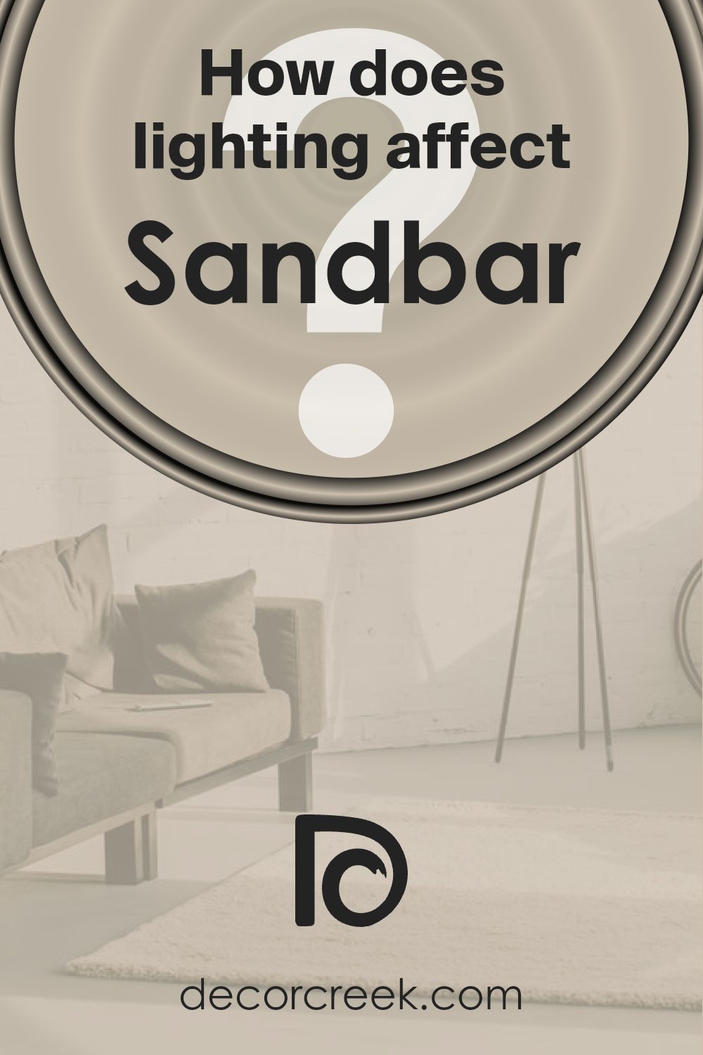
How Does Lighting Affect Sandbar SW 7547 by Sherwin Williams?
Lighting plays a big role in how we see colors in a room. Different kinds of light can make colors look different. The color Sandbar (SW 7547) by Sherwin Williams is a warm, neutral shade. How it looks depends on the type of light and where the light comes from.
In natural light, which is sunlight, Sandbar changes with the sun’s position. In a north-facing room, there is usually cooler and softer light, which can make Sandbar appear a bit grayer and less warm. The color might look subtler and more muted, as north-facing rooms often don’t get direct sunlight.
In a south-facing room, the light is usually warm and bright for most of the day. This can bring out the warm tones in Sandbar, making it look more beige or creamy. The color might seem more vibrant and alive because it gets more sunlight throughout the day.
East-facing rooms get the most light in the morning. In these rooms, Sandbar can have a warm and inviting look during the morning hours, but as the day goes on and the light fades, it might become softer and more muted.
By afternoon, the room will have less natural light, and Sandbar might look cooler.
West-facing rooms get the most light in the late afternoon and evening. In these rooms, Sandbar can look quite warm in the afternoon because of the setting sun’s warm glow. In the morning, when there is less light, the color might not look as bright.
Under artificial light, like lamps and ceiling lights, Sandbar can change too. If the light bulbs have a warm tint, Sandbar will look warmer. If the bulbs are cool, the color might look more gray. Always consider the lighting before choosing a paint color to see how it looks in different settings.
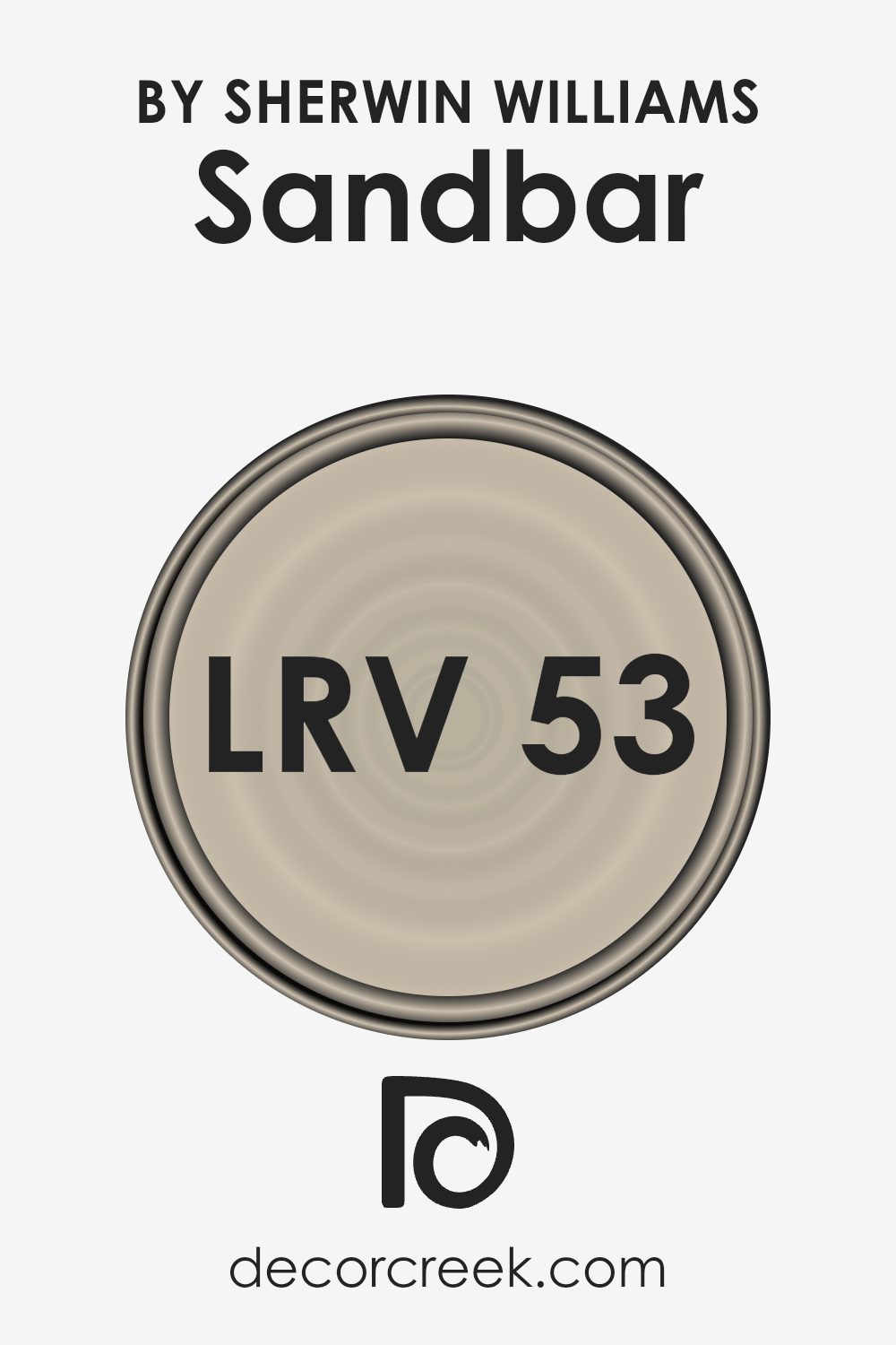
What is the LRV of Sandbar SW 7547 by Sherwin Williams?
The Light Reflectance Value (LRV) is a measurement that tells you how much light a color on a surface reflects. It is expressed as a percentage, ranging from 0%, which is completely black and absorbs all light, to 100%, which is pure white and reflects all light.
When you choose a paint color, the LRV helps you understand how light or dark that color will appear in a space. A higher LRV means the color will reflect more light and seem brighter, while a lower LRV indicates the color will absorb more light, making it appear darker.
This is particularly useful when planning the lighting and mood of a room, as you’ll want to consider how the color interacts with both natural and artificial light sources.
For Sandbar, with an LRV of 52.958, the color reflects a moderate amount of light and sits comfortably in the middle range.
This means it’s balanced and will neither absorb too much light nor appear too bright. In a room with lots of natural sunlight, Sandbar will appear lighter and more vibrant, whereas in a dimly lit space, it may take on a cozier and slightly darker tone.
Its LRV makes it versatile for different settings, providing a neutral backdrop that complements various interior styles and lighting conditions without being too overpowering or faded.
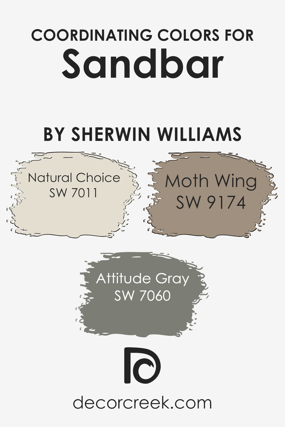
Coordinating Colors of Sandbar SW 7547 by Sherwin Williams
Coordinating colors are hues selected to complement each other, creating a harmonious and balanced look. When you use coordinating colors with Sandbar by Sherwin Williams, you can create a cohesive design that feels both stylish and welcoming.
For example, Natural Choice SW 7011 is a soft, warm off-white that adds a sense of calmness and provides a versatile backdrop for Sandbar. It enhances the neutral character of Sandbar without overpowering it, making a room feel fresh and open.
Attitude Gray SW 7060 is a medium gray with cool undertones, adding depth and contrast to the warmer tones of Sandbar. This color provides a modern and bold accent, enriching the palette. Moth Wing SW 9174 is a deeper, earthy brown that works perfectly to ground the lighter shades in the arrangement.
Its rich tone creates a feeling of warmth and coziness, complementing the subtle sophistication of Sandbar. By using these colors together, you can achieve a balanced space that feels both inviting and visually interesting.
Each color in the mix serves its purpose, whether as a background, an accent, or a grounding element, enhancing the overall aesthetic of the room.
You can see recommended paint colors below:
- SW 7011 Natural Choice
- SW 7060 Attitude Gray
- SW 9174 Moth Wing
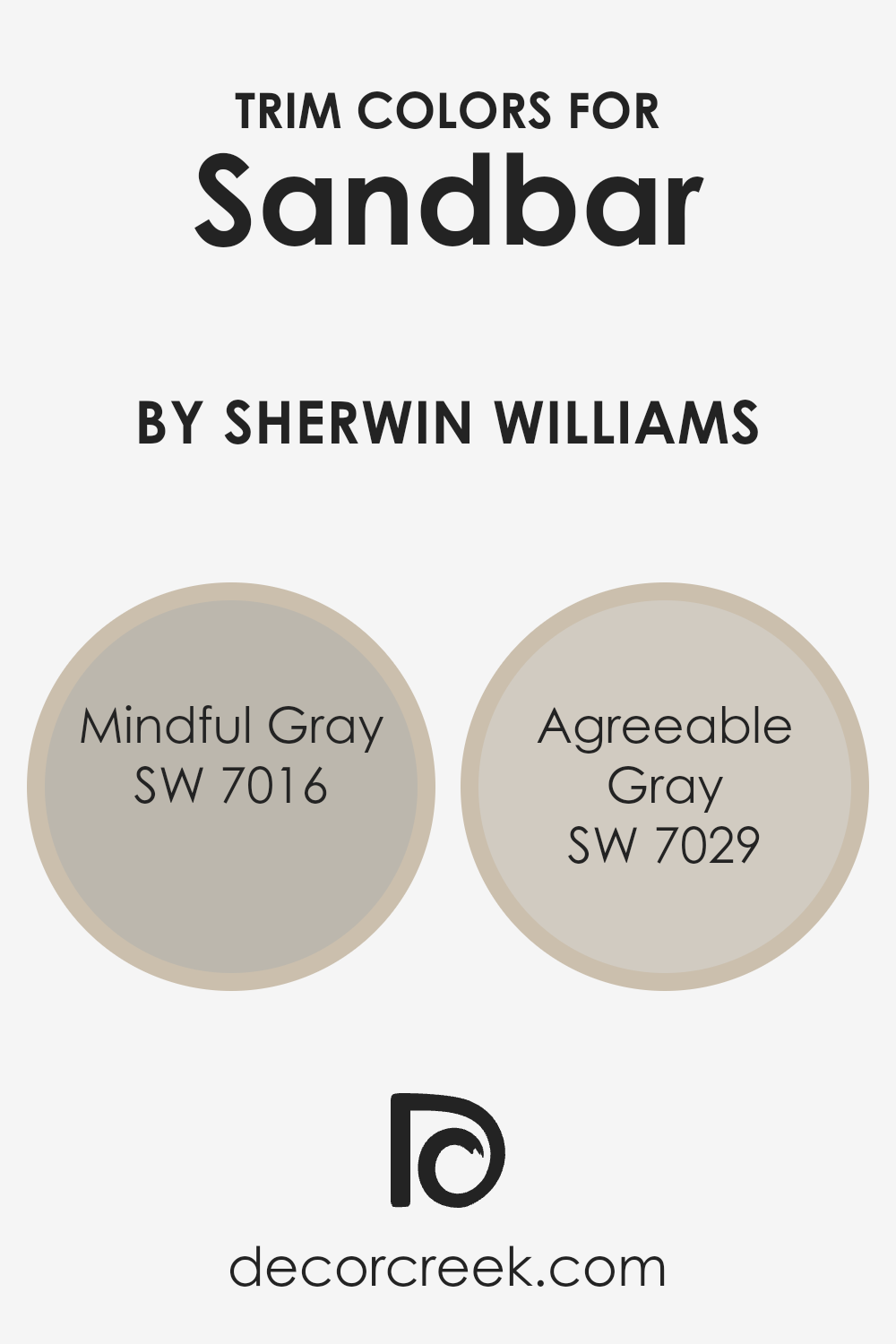
What are the Trim colors of Sandbar SW 7547 by Sherwin Williams?
Trim colors are the paint colors used for the borders or accents in a room, such as on the baseboards, door frames, or window frames. They help define the architectural details and provide a contrasting or complementary finish to the main wall color.
For Sandbar by Sherwin Williams, trim colors play an important role in bringing out the warmth and subtle undertones of the main paint. Choosing the right trim color can enhance the overall look and feel of a room.
Mindful Gray and Agreeable Gray are great options as trim colors for Sandbar as they offer balance and add a touch of contrast without overwhelming the main color.
Mindful Gray is a soft gray with a hint of warmth, which pairs nicely with Sandbar’s cozy tones. It adds depth while staying neutral enough to work in harmony with the primary color.
Agreeable Gray, on the other hand, is a light greige that leans slightly towards beige but maintains its gray essence. It is a versatile and widely loved shade that can complement Sandbar by providing a seamless, gentle border to the painted walls. Both colors are subtle yet effective, ensuring they highlight Sandbar’s qualities while maintaining an inviting atmosphere in the room.
You can see recommended paint colors below:
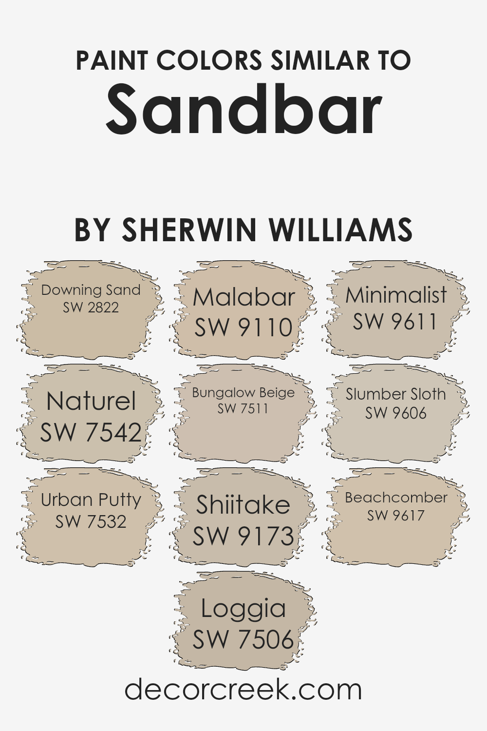
Colors Similar to Sandbar SW 7547 by Sherwin Williams
Similar colors play a crucial role in creating a cohesive and harmonious design. They are colors that are close to each other on the color wheel and can make spaces feel unified and balanced. In the case of Sherwin Williams’ Sandbar, the use of similar colors helps to accentuate its earthy warmth while offering subtle variations for depth and interest.
SW 2822 – Downing Sand has a historical appeal, offering a mellow beige tone that pairs wonderfully with Sandbar. SW 7542 – Naturel provides a slightly cooler undertone, adding a touch of elegance. Urban Putty, with its SW 7532 code, is a versatile neutral that offers a grounding effect.
Loggia, SW 7506, brings in a gentle warmth that complements the Sandbar’s earthiness, making it a perfect accent choice. SW 9110 – Malabar gives a deeper, richer feel, adding depth and intrigue. Bungalow Beige, labeled as SW 7511, offers a classic look with a hint of tradition
. Meanwhile, SW 9173 – Shiitake introduces a warm gray tone, offering a modern twist. For a touch of subtlety, Minimalist (SW 9611) provides a soft, understated presence.
Slumber Sloth, SW 9606, adds a cozy, slightly muted vibe, and SW 9617 – Beachcomber offers a light, airy feel reminiscent of sandy shores, rounding out a harmonious palette.
You can see recommended paint colors below:
- SW 2822 Downing Sand
- SW 7542 Naturel
- SW 7532 Urban Putty
- SW 7506 Loggia
- SW 9110 Malabar
- SW 7511 Bungalow Beige
- SW 9173 Shiitake
- SW 9611 Minimalist
- SW 9606 Slumber Sloth
- SW 9617 Beachcomber
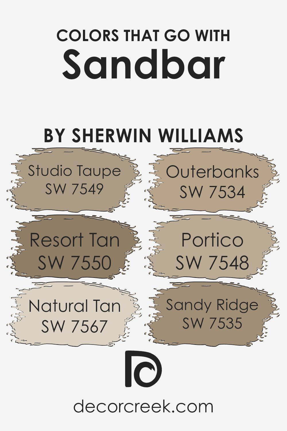
Colors that Go With Sandbar SW 7547 by Sherwin Williams
Choosing colors that go well with Sherwin Williams’ Sandbar (SW 7547) can greatly enhance the overall look of a space. Sandbar is a warm, neutral color that sets the stage for a cozy and welcoming atmosphere. Pairing it with complementary colors can highlight its earthy tones and create a harmonious feel in any room.
Imagine combining Sandbar with the soothing hue of SW 7549 Studio Taupe, which adds a soft, subtle contrast. Resort Tan (SW 7550) introduces a touch of richness, making it perfect for spaces where you want a more pronounced warmth.
Natural Tan (SW 7567), on the other hand, offers a light and airy feel that can brighten up the surroundings without overpowering the main color.
Outerbanks (SW 7534) is another excellent choice, bringing in a slightly darker tone that can create depth and interest in a room. For a touch of classic elegance, Portico (SW 7548) provides a muted backdrop that works beautifully with Sandbar to offer a timeless look.
Lastly, Sandy Ridge (SW 7535) mirrors the hue of soft, sunlit beaches, enhancing the natural warmth of Sandbar. Using these colors together can create a balanced environment that feels both inviting and uniquely personal.
You can see recommended paint colors below:
- SW 7549 Studio Taupe
- SW 7550 Resort Tan
- SW 7567 Natural Tan
- SW 7534 Outerbanks
- SW 7548 Portico
- SW 7535 Sandy Ridge
How to Use Sandbar SW 7547 by Sherwin Williams In Your Home?
Sandbar SW 7547 by Sherwin Williams is a warm, neutral paint color, perfect for creating a cozy atmosphere in your home. Its subtle beige tone can make a room feel comfortable and inviting without being overpowering. You can use Sandbar on the walls of a living room to create a welcoming space for family and friends.
Pair it with natural wood furniture and soft, textured fabrics to enhance its warmth. In the bedroom, Sandbar can provide a soothing backdrop, helping you relax and unwind at the end of the day. It also works well in a hallway or entryway, setting a gentle and pleasant tone as you move from room to room.
Adding crisp white trim can provide a clean contrast, highlighting architectural features. Sandbar pairs nicely with both dark and light accessories, giving you flexibility in choosing decor. This makes it a highly versatile choice for any home.
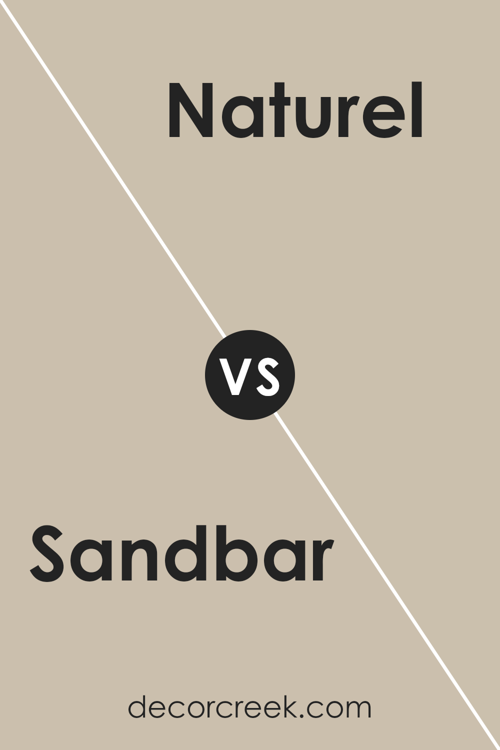
Sandbar SW 7547 by Sherwin Williams vs Naturel SW 7542 by Sherwin Williams
Sandbar SW 7547 and Naturel SW 7542 by Sherwin Williams are both warm, neutral colors that can complement a variety of spaces, but they differ subtly in their undertones and overall effect. Sandbar is a light beige with a hint of gray, giving it a soft, earthy feel.
It works well in spaces where you want to create a cozy and inviting atmosphere. Naturel, on the other hand, is a slightly warmer color with more yellow and brown undertones. This gives Naturel a richer, more golden look compared to the cooler Sandbar.
While both colors can be used as versatile backdrops, Sandbar offers a more muted appearance, suitable for understated elegance. In contrast, Naturel provides a bit more warmth and can add a touch of sunny brightness to a room. Depending on the lighting and decor, each color can create a unique and comfortable environment.
You can see recommended paint color below:
- SW 7542 Naturel
Sandbar SW 7547 by Sherwin Williams vs Minimalist SW 9611 by Sherwin Williams
Sandbar SW 7547 and Minimalist SW 9611 are both neutral shades by Sherwin Williams, but they offer distinct vibes. Sandbar is a warm, beige tone with earthy undertones. It provides a cozy and inviting feel, making it a great choice for living spaces that aim for warmth and comfort. It pairs well with natural wood accents and other warm colors, creating a harmonious atmosphere.
On the other hand, Minimalist is a cooler, light gray shade that exudes simplicity and lightness. It’s more modern and clean, offering a crisp look that’s perfect for spaces meant to feel airy and open. It works well with metallic finishes and cooler colors, adding a contemporary touch to any room.
While Sandbar grounds a room with its warmth, Minimalist uplifts it with its freshness. Choosing between them depends on whether you prefer a snug, welcoming feel or a sleek, modern aesthetic. Both can complement a variety of styles beautifully.
You can see recommended paint color below:
Sandbar SW 7547 by Sherwin Williams vs Malabar SW 9110 by Sherwin Williams
Sandbar (SW 7547) and Malabar (SW 9110) are two distinct colors from Sherwin Williams, each offering a different feel. Sandbar is a warm, sandy beige with subtle undertones that can create a cozy and inviting atmosphere. It often works well in spaces where a neutral backdrop is desired, adding warmth without overwhelming other design elements.
On the other hand, Malabar is a deeper and richer shade. It has more pronounced brown undertones, giving it a slightly darker appearance compared to Sandbar. Malabar can add a touch of sophistication and is great for creating a more intimate and cozy setting. It pairs well with other warm colors and can bring depth to a room.
Both colors are versatile and can be used in various settings, but the choice between them depends on the desired ambiance. Sandbar is lighter and softer, while Malabar offers a bit more depth and richness.
You can see recommended paint color below:
- SW 9110 Malabar
Sandbar SW 7547 by Sherwin Williams vs Loggia SW 7506 by Sherwin Williams
Sandbar SW 7547 and Loggia SW 7506, both by Sherwin Williams, are soft, neutral tones that bring warmth and versatility to a space. Sandbar SW 7547 is a light, sandy beige that has a subtle warmth, making it perfect for creating a cozy and inviting atmosphere. It pairs well with both contemporary and traditional decor.
On the other hand, Loggia SW 7506 is a bit darker and richer. It’s a blend of beige and gray, giving it a taupe-like quality. Loggia can add a touch of sophistication with its depth, making it suitable for larger spaces or as an accent wall.
Both colors are versatile and can be paired with various colors and materials. Sandbar suits spaces needing a gentle, light feel, while Loggia works well for those wanting a slightly bolder, yet still neutral, backdrop. Both are excellent choices for a range of interiors.
You can see recommended paint color below:
Sandbar SW 7547 by Sherwin Williams vs Beachcomber SW 9617 by Sherwin Williams
Sandbar (SW 7547) and Beachcomber (SW 9617) are two distinct colors by Sherwin Williams. Sandbar is a warm, muted beige with subtle gray undertones, lending itself well to creating cozy and inviting spaces. It works excellently in living areas, providing a neutral backdrop that pairs nicely with both bright and muted colors.
Beachcomber, on the other hand, is a soft, creamy off-white. It brings a light and airy feel, making spaces look open and fresh. While Sandbar offers a grounded and comforting base, Beachcomber brightens a space, making it feel more expansive.
Both colors can complement each other when used together; Sandbar adds warmth and depth, while Beachcomber provides brightness and simplicity. These colors are versatile choices, ideal for different moods—whether you want a snug environment or a fresh, breezy atmosphere.
You can see recommended paint color below:
- SW 9617 Beachcomber
Sandbar SW 7547 by Sherwin Williams vs Downing Sand SW 2822 by Sherwin Williams
Sandbar (SW 7547) and Downing Sand (SW 2822) are two warm, neutral colors by Sherwin Williams. Sandbar is a soft beige with a hint of gray, giving it a modern appearance. It’s versatile and works well in various spaces, providing a calm backdrop without overpowering the room.
Downing Sand, on the other hand, has more warmth and depth, leaning towards a golden undertone. It feels cozier and is well-suited for traditional or classic settings. Both colors pair nicely with earthy tones and muted pastels, but Sandbar might be better if you prefer a more contemporary look. Downing Sand is great if you want a touch of comfort and timelessness.
In summary, Sandbar is a bit cooler and more modern, while Downing Sand is warmer and a bit more traditional, offering two different vibes for your space.
You can see recommended paint color below:
Sandbar SW 7547 by Sherwin Williams vs Slumber Sloth SW 9606 by Sherwin Williams
Sandbar SW 7547 is a warm, neutral beige with subtle hints of gray, making it a versatile choice for various spaces. It’s a great backdrop because it pairs nicely with many colors and styles, adding a cozy and inviting feel to rooms.
On the other hand, Slumber Sloth SW 9606 is a soothing, muted blue-green. It brings a touch of calmness and relaxation, reminiscent of a soft, cloudy day. This color works well in bedrooms or areas where you want to create a peaceful atmosphere.
Both colors are excellent in their own right but serve different purposes. Sandbar provides a warm base for earthy and vibrant accents, while Slumber Sloth enriches the space with its tranquil tones, perfect for setting a relaxed mood. Combining them could bring warmth and calmness to a room, balancing each other beautifully.
You can see recommended paint color below:
- SW 9606 Slumber Sloth
Sandbar SW 7547 by Sherwin Williams vs Shiitake SW 9173 by Sherwin Williams
Sandbar (SW 7547) and Shiitake (SW 9173) are both warm, neutral colors from Sherwin Williams, but they have distinct differences. Sandbar is a soft, beige hue with subtle gray undertones, making it versatile and easy to pair with both warm and cool accents. It works well as a backdrop in living rooms or bedrooms, providing a calm and comforting atmosphere.
Shiitake, on the other hand, is slightly deeper and richer. It leans more towards a taupe shade with more pronounced brown undertones. This gives Shiitake a cozier feel, which is perfect for spaces where you want a touch of warmth and depth, like dining rooms or dens.
Both colors are excellent choices for creating a neutral palette, but if you prefer a lighter, more airy space, Sandbar is the way to go. For those who want a bit more warmth, Shiitake is a great option.
You can see recommended paint color below:
- SW 9173 Shiitake
Sandbar SW 7547 by Sherwin Williams vs Urban Putty SW 7532 by Sherwin Williams
Sandbar (SW 7547) and Urban Putty (SW 7532), both by Sherwin Williams, are warm and inviting neutral colors. Sandbar is a calming beige shade, reminiscent of sandy beaches, offering a soft and cozy look. It works well in spaces where a relaxed, welcoming atmosphere is desired. This color complements natural elements like wood and earthy textiles.
On the other hand, Urban Putty is a light taupe with subtle gray undertones. It is slightly cooler than Sandbar, making it a versatile and modern choice.
Urban Putty fits nicely in contemporary settings and pairs beautifully with various accent colors, offering a touch of understated sophistication without overpowering the space.
Overall, while both colors provide warmth, Sandbar leans more towards a neutral beige, while Urban Putty has a hint of gray, giving it a modern edge. They are great for creating comfortable yet stylish interiors, but the choice depends on whether you prefer more warmth or a chic, cool vibe.
You can see recommended paint color below:
- SW 7532 Urban Putty
Sandbar SW 7547 by Sherwin Williams vs Bungalow Beige SW 7511 by Sherwin Williams
Sandbar SW 7547 and Bungalow Beige SW 7511 by Sherwin Williams are both warm, neutral colors, but they have some differences. Sandbar is a light beige with subtle gray undertones, giving it a slightly cooler feel compared to traditional beige tones. It’s versatile and works well in various settings, from living rooms to bedrooms.
On the other hand, Bungalow Beige is a bit warmer and more classic. It has stronger beige and brown undertones, which can create a cozy and inviting atmosphere. This color is ideal for spaces where warmth is desired, like family rooms and dining areas.
Both colors are great for creating a neutral backdrop, but Sandbar is better if you prefer a hint of coolness, while Bungalow Beige is the right choice if you want a warmer, traditional feel. They can both be paired well with other colors, including whites, browns, and even some blues or greens, depending on the desired mood.
You can see recommended paint color below:
It’s a kind of warm, light brown that reminds me of the shore where sand meets water. Sandbar is not too dark or too light, making it a great choice if you want a cozy feeling at home.
What I find interesting is how Sandbar works well with many other colors. Whether you have bright furniture or dark curtains, this shade fits in nicely. It acts like a good friend that gets along with everyone.
You can use it in your living room, bedroom, or even the hallway, and it will make the area feel comfortable.
Another thing I like about Sandbar is that it’s a friendly color for both modern and classic styles. Whether your home has lots of modern bits or looks more old-fashioned, Sandbar feels right. It’s also a neat way to make a room look clean and calm without being boring.
In the end, Sandbar is a color that can help make a house feel like a warm hug. It’s easy to like, fits many styles, and helps create a place where people feel at ease. That’s why I think it’s such a good choice for anyone dreaming about changing up their place.
Ever wished paint sampling was as easy as sticking a sticker? Guess what? Now it is! Discover Samplize's unique Peel & Stick samples.
Get paint samples

