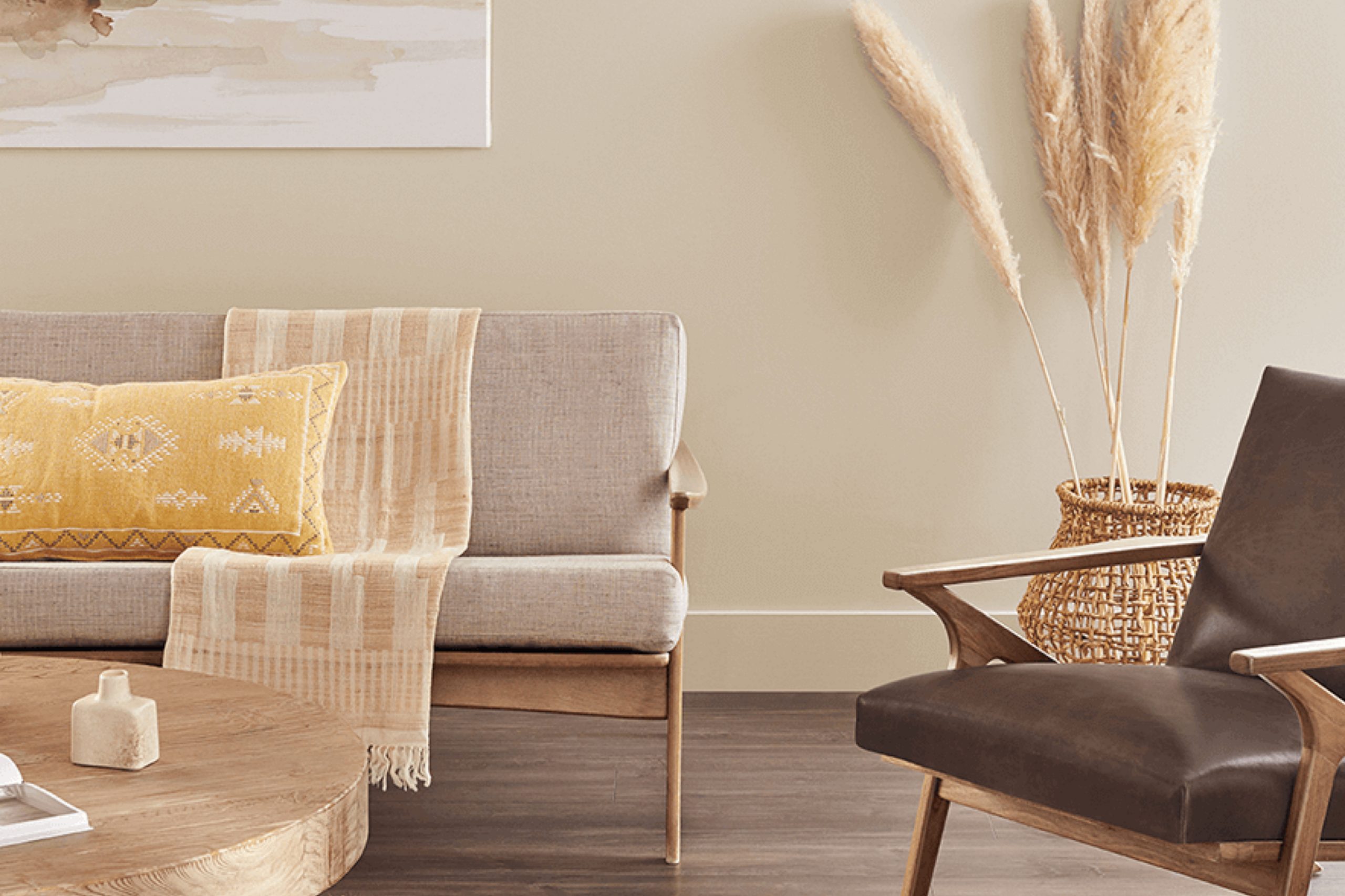
I recently came across SW 9173 Shiitake by Sherwin Williams and was instantly drawn to its unique blend of colors. At first glance, Shiitake presents as a warm, earthy taupe that comfortably fits into a variety of spaces and aesthetics. It has an understated elegance that works particularly well in rooms where you want to create a soothing ambiance without overwhelming the senses.
This color has a versatility that appeals to me as it bridges the gap between beige and gray, providing a cozy, inviting feel that complements both modern and traditional decor. In using Shiitake in my own home, I found it particularly effective in the living room where natural light plays off the walls, highlighting the subtle undertones of the color.
The hue shifts gently from morning to evening, adapting to different lighting conditions which adds a dynamic charm to the environment. Whether paired with soft whites for a fresh, airy look or rich darks for a bit more drama, Shiitake holds its ground, making it a reliable choice for anyone looking to refresh their space.
It’s a color that doesn’t demand attention but rather, sets a tone of calm and warmth that makes any room feel more inviting.
What Color Is Shiitake SW 9173 by Sherwin Williams?
The color Shiitake by Sherwin Williams is a warm, inviting taupe that brings a cozy, earthy tone to any space. This versatile shade is perfect for creating a welcoming atmosphere, blending beautifully with natural materials and soft textures. Its understated elegance makes it a superb choice for those who appreciate timeless style without overwhelming the senses.
Shiitake works exceptionally well in interior styles such as rustic, modern farmhouse, and Scandinavian, where its ability to act as a neutral backdrop is greatly valued. In these settings, it pairs wonderfully with materials like raw wood, linen, and wool, enhancing the organic feel of the space. This color also complements leather and stone, adding depth and warmth, making it ideal for living rooms, bedrooms, and kitchens.
For those looking to create a peaceful yet stylish environment, this color is an excellent choice for walls, cabinetry, or even as an accent color in textiles and decor. Its subtle presence promotes a sense of comfort and stability, making any room feel more inviting and homely.
Overall, Shiitake is a flexible color that works well across various applications, making it both practical and stylish for contemporary homes.
Is Shiitake SW 9173 by Sherwin Williams Warm or Cool color?
Shiitake by Sherwin Williams is a warm, earthy color that brings a cozy and welcoming feel to any room. This shade of beige has a hint of gray, making it versatile enough to work in various spaces and with different decorating styles.
Whether you’re painting a living room, bedroom, or kitchen, Shiitake can provide a neutral backdrop that complements both bright colors and muted tones. It’s particularly effective in areas where you want to create a calm, comfortable environment.
This color works well with natural elements like wooden furniture and green plants, enhancing the earthy vibe. It’s also great for spaces that receive a lot of natural light, as the color’s depth can change subtly throughout the day, adding interest and warmth to the room. Shiitake is perfect for anyone looking to update their home with a color that is both practical and pleasing to the eye.
Undertones of Shiitake SW 9173 by Sherwin Williams
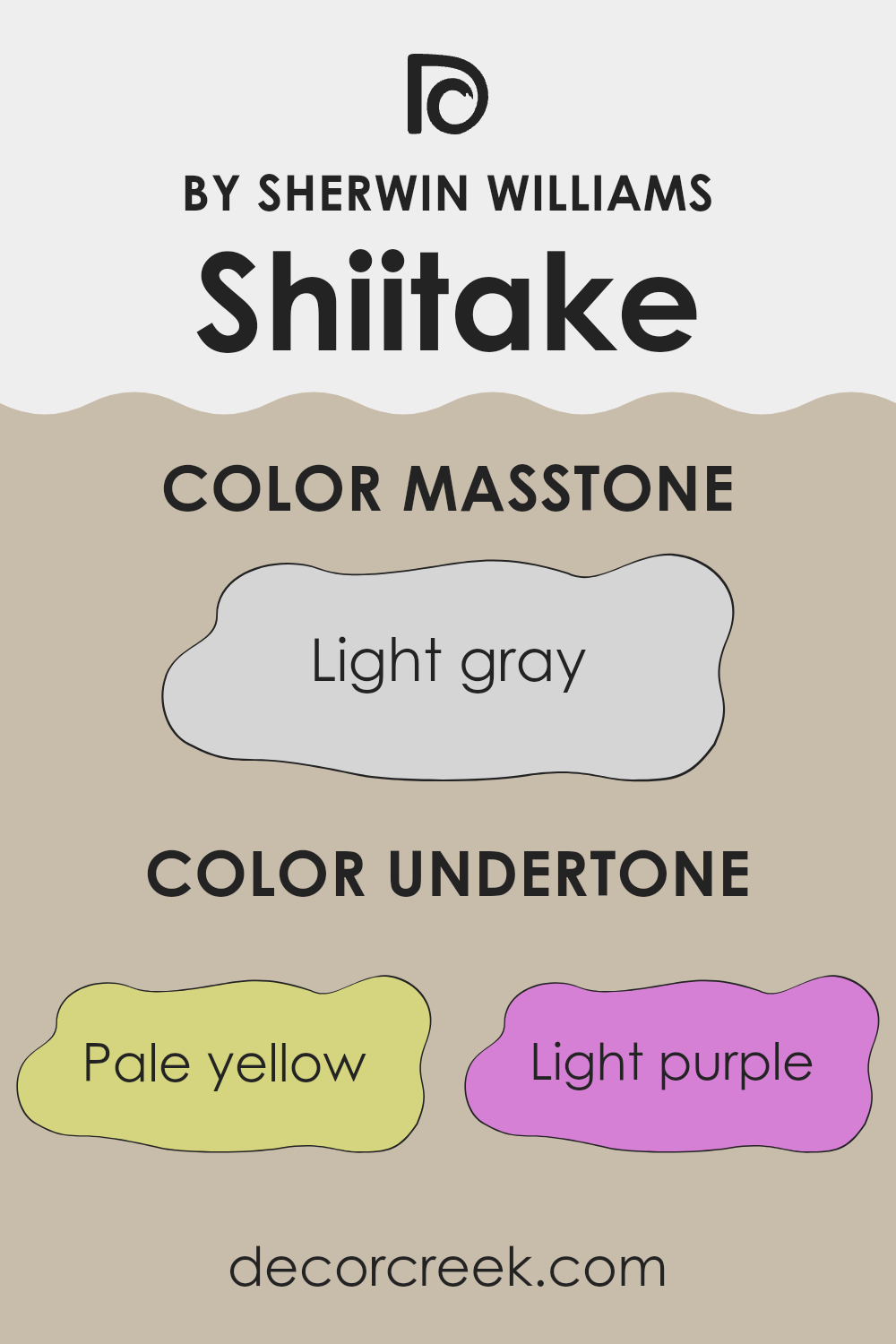
Shiitake is a neutral color that works well in various spaces, offering a versatile backdrop for any interior. Defined by a balance of warm and cool tones, this paint color contains complex undertones such as pale yellow, light purple, pale pink, light blue, mint, lilac, and grey.
Understanding undertones is crucial when choosing paint colors as they can significantly impact how the color appears in different lighting conditions and in combination with other colors in a room. For instance, a color like pale yellow as an undertone might make the primary color appear warmer and more welcoming under certain lights. Similarly, light blue and mint undertones can infuse a subtle freshness into the main hue.
When applied to interior walls, the varied undertones of Shiitake create a dynamic yet subtle interplay of colors that can enhance the visual appeal of a space. In rooms with ample natural light, the lighter undertones such as mint and pale yellow might become more pronounced, giving the walls a vibrant yet soft glow. Conversely, in dimmer settings, the deeper undertones like lilac and grey can offer a sense of depth, making the space feel cozy.
Overall, the complexity of Shiitake’s undertones allows it to adapt smoothly within a wide range of decorative styles and color schemes, making it an excellent choice for those looking to refresh their living environment without committing to a bold color change.
What is the Masstone of the Shiitake SW 9173 by Sherwin Williams?
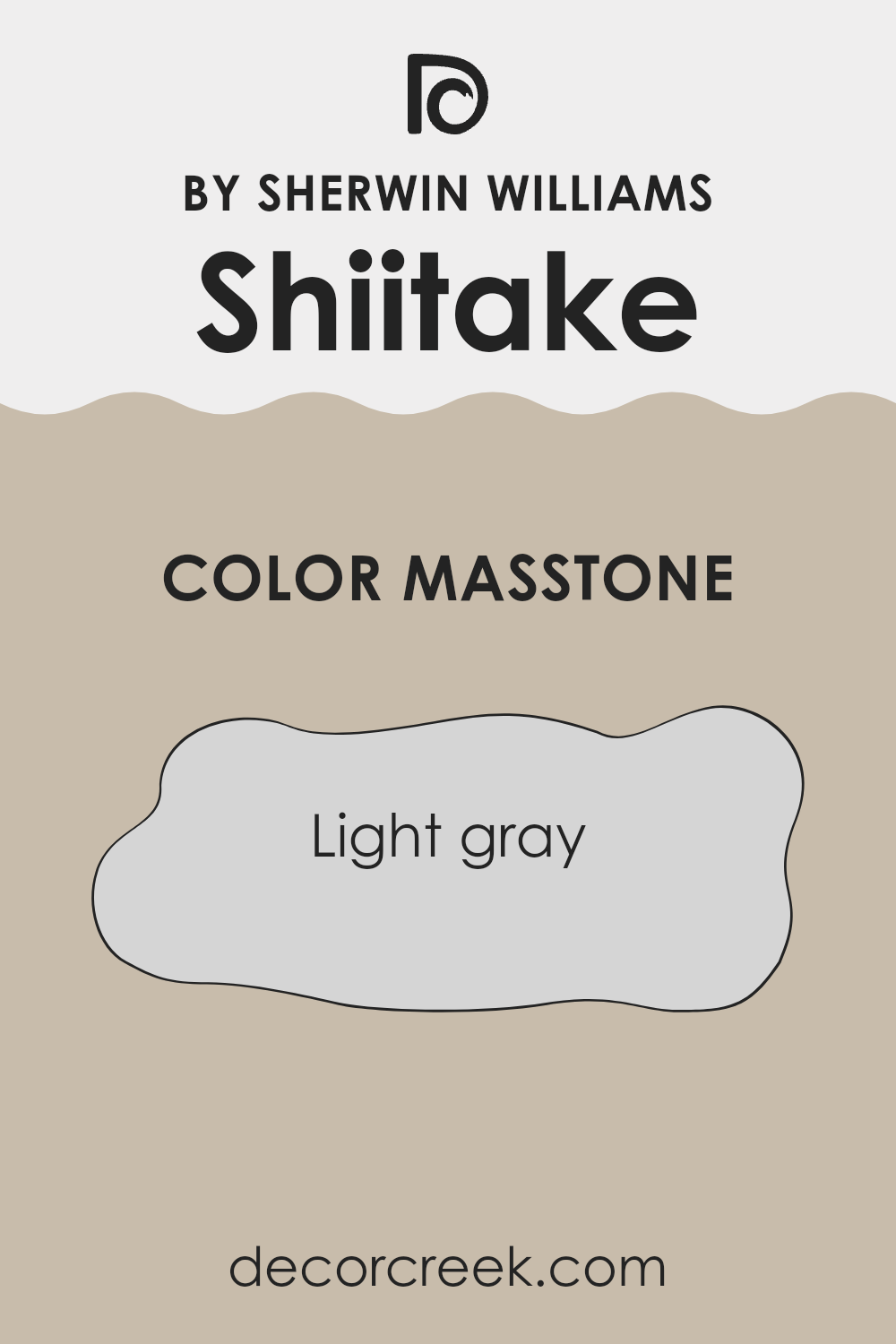
ShiitakeSW 9173 by Sherwin Williams has a masstone of light gray (#D5D5D5), offering a clean and subtle backdrop for any room. Its light gray shade easily blends with various decor styles, which makes it a versatile choice for homes.
This color works well in spaces that get a lot of sunlight, as it can help maintain a cool, calm feel without making the room feel dark. It’s also ideal for smaller spaces as light gray can make areas appear larger and more open.
In rooms with less natural light, this shade still performs well by providing a soft neutral tone that doesn’t overwhelm the senses. Pairing it with brighter colors in furniture or accents can add a lively contrast, while sticking to a monochromatic gray scheme can create a seamless and clean look. Overall, this light gray color is a practical choice for creating a fresh and inviting atmosphere in a home.
How Does Lighting Affect Shiitake SW 9173 by Sherwin Williams?
Lighting plays a crucial role in how colors appear in an environment. Depending on the type of light and its intensity, the same color can look different under various lighting conditions. For example, artificial light and natural light can significantly alter the appearance of paint colors on your walls. Considering a neutral color like Shiitake from Sherwin Williams, its appearance changes under different lighting sources.
In artificial light, such as that from LED bulbs or fluorescent lamps, this color may appear slightly warmer, bringing out more of its brown undertones.
This makes the room feel cozy and welcoming, especially in the evenings or in spaces without natural sunlight.
On the other hand, when viewed in natural light, Shiitake takes on a lighter, more subtle hue due to the broader spectrum of light colors found in sunlight.
This might make the color look less intense and more balanced, perfect for areas that receive a lot of daylight.
The orientation of rooms in a house also affects how colors like Shiitake look:
- North-facing rooms – These rooms receive less direct sunlight, which can make colors appear cooler and slightly muted. Shiitake might look more subdued and somewhat grayish in a north-facing room.
- South-facing rooms are bathed in plenty of sunlight throughout the day, which can enhance the warmth and richness of Shiitake, making it appear more vibrant and lively.
- East-facing rooms – In these rooms, morning light can make Shiitake look soft and warm in the early hours, though the color may become cooler as the day progresses and natural light diminishes.
- West-facing rooms – Here, the late afternoon and evening sun can cast a golden glow, intensifying Shiitake’s warm undertones and making the room feel cozy and inviting as the day ends.
It’s essential to consider these factors when choosing paint colors according to how much light your room will receive at different times of the day. This ensures you get the desired effect and atmosphere in each room.
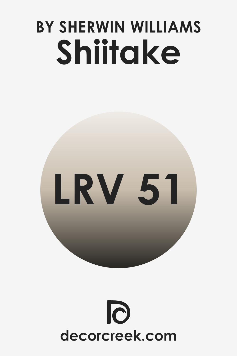
What is the LRV of Shiitake SW 9173 by Sherwin Williams?
LRV stands for Light Reflectance Value, which measures the percentage of light a paint color reflects back into the room compared to the amount of light it absorbs. An LRV can range from 1 to 99, indicating how much light the color can reflect. High LRV paints are lighter, making rooms feel more open and airy as they reflect more light.
On the other hand, colors with lower LRVs are darker and absorb more light, which can make a space feel more enclosed. In essence, the LRV helps you determine how light or dark a color will appear on your walls and how it might affect the mood and perception of your space.
For Shiitake, the LRV is 51.212, meaning it’s in the middle of the scale. This moderate LRV suggests that Shiitake is a versatile color that isn’t too light or too dark. It reflects a fair amount of light, helping to brighten up a space, but still has enough absorbing quality to give a sense of warmth and coziness.
In different lighting conditions, this color could appear slightly lighter during the day and turn a bit warmer at night. It’s a good choice if you’re looking for a color that balances light reflection with a cozy feeling without leaning too heavily in either direction.
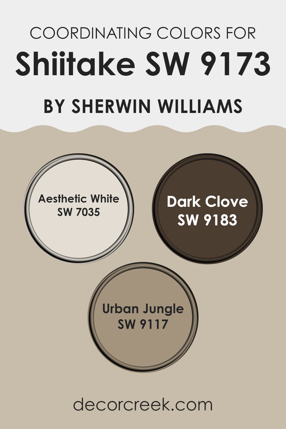
Coordinating Colors of Shiitake SW 9173 by Sherwin Williams
Coordinating colors are selected to complement and enhance the appearance of a main color by creating a harmonious color scheme in a space. These colors can either be contrasting to provide a pop of difference or similar in tone for a subtle effect. The goal is to achieve a balanced look that is pleasing to the eye, without overpowering any single element. For instance, when using a primary color like Shiitake by Sherwin Williams, choosing the right coordinating colors can underscore the warmth and natural mood it conveys.
One of the coordinating colors for Shiitake is Aesthetic White (SW 7035), a soft and gentle white that adds a bright but calm touch. It creates a light background that allows darker tones to stand out without clashing.
Another coordinating shade, Dark Clove (SW 9183), is a deep brown that provides a rich and earthy contrast, enhancing the warmer undertones of Shiitake. Lastly, Urban Jungle (SW 9117) is a vibrant green, providing a dash of natural color that complements the organic feel of Shiitake. These colors together work to provide a balanced, harmonious palette that can suit various decor styles and settings.
You can see recommended paint colors below:
- SW 7035 Aesthetic White
- SW 9183 Dark Clove
- SW 9117 Urban Jungle
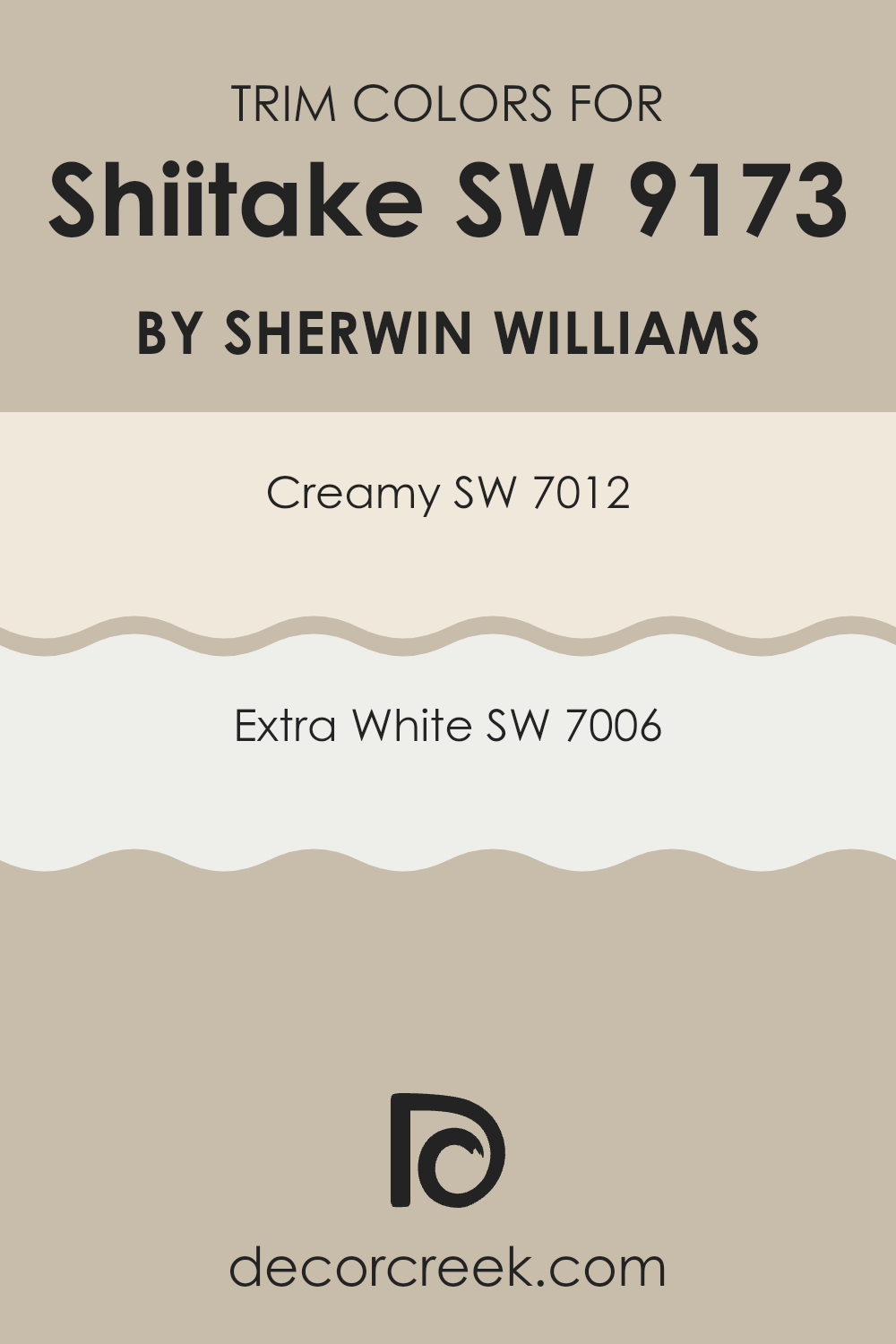
What are the Trim colors of Shiitake SW 9173 by Sherwin Williams?
Trim colors, such as Creamy (SW 7012) and Extra White (SW 7006) by Sherwin Williams, serve a crucial role in enhancing the aesthetic appeal of a space. When paired as trim colors with a primary color like Shiitake (SW 9173), they provide a clean and distinct boundary that subtly highlights architectural details and shapes of the room.
This choice brings about a finished look that can make the wall color stand out more distinctly, adding depth and dimension to the space. Creamy (SW 7012) is a warm, gentle off-white with a welcoming vibe that can soften the edges of a room painted in stronger tones.
On the other hand, Extra White (SW 7006) is a crisp and clear white, offering a striking contrast that can make color schemes pop and give the space a fresh and clean feel. Whether opting for the warmth of Creamy or the sharpness of Extra White, both options act as excellent boundaries that define and refine the look of a room.
You can see recommended paint colors below:
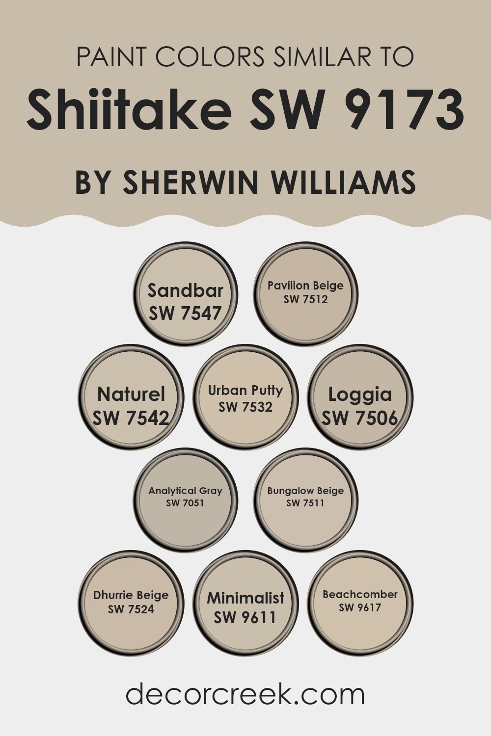
Colors Similar to Shiitake SW 9173 by Sherwin Williams
Using similar colors in decorating can create a harmonious and seamless look, enhancing the overall aesthetic without overpowering the senses. Similar colors, like those related to Shiitake by Sherwin Williams, work well together because they share common undertones that make the environment feel cohesive and pleasing.
Colors such as Sandbar and Pavilion Beige lend a subtle warmth to spaces, setting a welcoming tone that is neither too stark nor too bold. Naturel and Urban Putty follow this trend, offering a slightly more earthy touch that complements natural materials like wood and stone superbly.
Continuing with similar hues, Loggia and Analytical Gray provide a neutral backdrop that allows for flexibility in decor choices, adapting easily to both contemporary and traditional designs. Bungalow Beige and Dhurrie Beige brighten rooms effectively, reflecting light and making the spaces appear larger.
On the lighter side, Minimalist and Beachcomber provide a fresh, airy feel, ideal for creating a light and breezy atmosphere. All these colors work together effortlessly, ensuring a smooth visual transition from room to room, which can make a home feel more connected and fluid, contributing to a visually satisfying environment.
You can see recommended paint colors below:
- SW 7547 Sandbar
- SW 7512 Pavilion Beige
- SW 7542 Naturel
- SW 7532 Urban Putty
- SW 7506 Loggia
- SW 7051 Analytical Gray
- SW 7511 Bungalow Beige
- SW 7524 Dhurrie Beige
- SW 9611 Minimalist
- SW 9617 Beachcomber
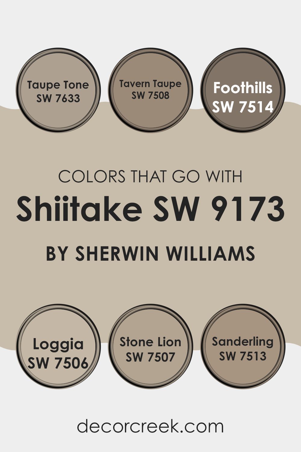
Colors that Go With Shiitake SW 9173 by Sherwin Williams
Choosing complementary colors for Shiitake SW 9173 by Sherwin Williams is crucial as it ensures that the surroundings enhance the base color’s warm and inviting nature. For instance, colors like Taupe Tone SW 7633 and Tavern Taupe SW 7508 work seamlessly with Shiitake as they share a similar earthy palette, helping to create a cohesive and cozy atmosphere. By pairing it with slightly darker or lighter shades such as these, the room can achieve a subtle yet visually appealing contrast that’s very pleasing to the eye.
Colors like Foothills SW 7514 and Loggia SW 7506 are also excellent choices as they introduce a deeper tone to the mix, providing a rich backdrop that allows Shiitake to stand out.
On the other hand, Stone Lion SW 7507 and Sanderling SW 7513 offer lighter options that can brighten a space while still complementing the overall warmth of Shiitake. Integrating these colors can generate a balanced and harmonious visual experience in any room, ensuring that the environment feels welcoming and well put together.
You can see recommended paint colors below:
- SW 7633 Taupe Tone
- SW 7508 Tavern Taupe
- SW 7514 Foothills
- SW 7506 Loggia
- SW 7507 Stone Lion
- SW 7513 Sanderling
How to Use Shiitake SW 9173 by Sherwin Williams In Your Home?
Shiitake SW 9173 by Sherwin Williams is a warm, earthy paint color reminiscent of the rich, brown hues of Shiitake mushrooms. This versatile shade works well in a variety of spaces in your home, bringing a cozy and inviting atmosphere wherever it is applied.
If you’re thinking of refreshing the look of your living room, Shiitake can help create a relaxing and comfortable setting, perfect for family gatherings or unwinding after a long day. In bedrooms, its soothing tone can set a calm, restful mood, helping you relax and sleep better.
This color also looks great in kitchens and dining areas, adding a touch of warmth that enhances the welcoming feel of spaces where people come together to eat and chat. Additionally, pairing Shiitake with lighter colors like creams or soft whites can make smaller rooms feel larger and brighter, while using it alongside darker furniture or accents can create a pleasing contrast. Whether you want a new look for a single room or an update for your entire house, Shiitake SW 9173 offers a lovely, flexible option that can suit various decorating styles.
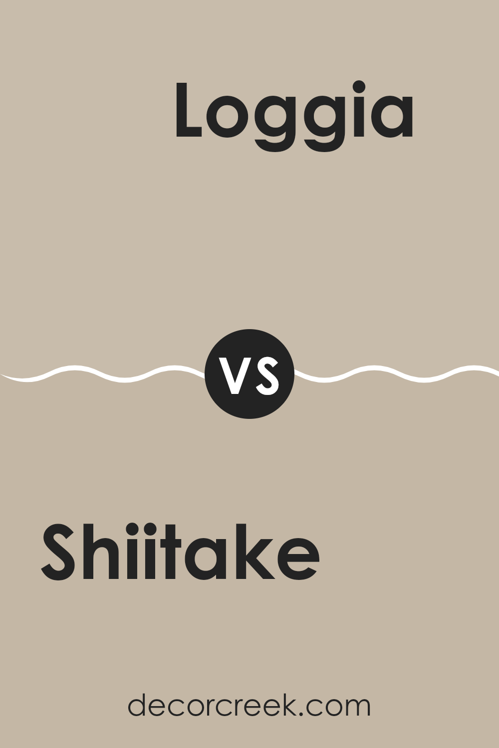
Shiitake SW 9173 by Sherwin Williams vs Loggia SW 7506 by Sherwin Williams
Shiitake SW 9173 and Loggia SW 7506 are two paint colors by Sherwin Williams that offer subtle differences for neutral color schemes. Shiitake has a slightly lighter and warmer tone, resembling the color of the mushroom it’s named after. It gives off a cozy, welcoming vibe and can make small spaces appear larger due to its lighter hue. On the other hand, Loggia SW 7506 is a bit deeper, bringing in a hint of earthy richness that adds a touch of groundedness without overpowering a room. Both colors are versatile and work well in various settings, whether you want to freshen up a living room or add a calm feel to a bedroom. Loggia, being a tad darker, might be more forgiving in high-traffic areas, hiding marks and scuffs a bit better than Shiitake.
You can see recommended paint color below:
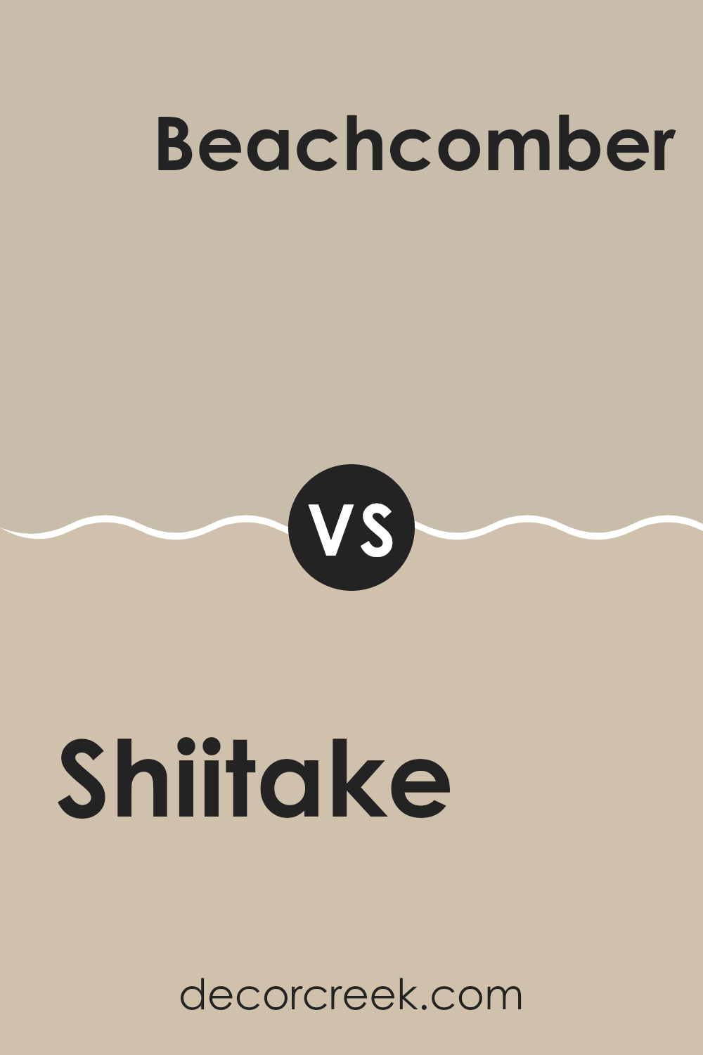
Shiitake SW 9173 by Sherwin Williams vs Beachcomber SW 9617 by Sherwin Williams
Shiitake and Beachcomber by Sherwin Williams are two neutral paint colors, but they offer different vibes for a space. Shiitake is a warm, earthy beige with a cozy, welcoming feel. It tends to create a soothing background that pairs well with a wide range of colors and décor styles, making it quite versatile for various rooms, from living areas to bedrooms.
On the other hand, Beachcomber is a lighter beige with slightly cooler undertones. It gives a room a fresh, open look, often making small spaces appear brighter and larger. This color suits areas that get plenty of natural light, enhancing the airy quality of the room.
While both colors are neutral, Shiitake leans toward a richer, more grounding hue, whereas Beachcomber offers a lighter, cleaner look, making each suitable for different tastes and styles in home decor.
You can see recommended paint color below:
- SW 9617 Beachcomber
Shiitake SW 9173 by Sherwin Williams vs Analytical Gray SW 7051 by Sherwin Williams
**Comparison of Shiitake SW 9173 and Analytical Gray SW 7051 by Sherwin Williams**
Shiitake SW 9173 and Analytical Gray SW 7051 are both neutral paint colors by Sherwin Williams, but they offer unique tones that can affect the feel of a room differently. Shiitake is a warm, cozy beige that has a subtle hint of gray, making it versatile for spaces where a soft, inviting ambiance is desired. It pairs well with natural materials like wood and stone, enhancing earthy interiors.
On the other hand, Analytical Gray is a cooler gray that leans towards taupe. This shade is neutral but with a slightly more pronounced gray tone that gives it a modern and clean look. It is excellent for contemporary spaces as it provides a neutral backdrop that complements bold and bright accents well.
Overall, Shiitake offers warmth and coziness, ideal for a comfortable, relaxed setting, while Analytical Gray works well in more streamlined, modern designs due to its cooler and slightly more detached presence.
You can see recommended paint color below:
Shiitake SW 9173 by Sherwin Williams vs Urban Putty SW 7532 by Sherwin Williams
Shiitake SW 9173 and Urban Putty SW 7532, both from Sherwin Williams, are subtle, warm neutral colors with distinct tones that set them apart. Shiitake leans towards a soft brown with a hint of gray, creating a cozy and inviting feeling in a room. It beautifully complements a variety of decor styles, making it versatile for many spaces.
Urban Putty, on the other hand, has a lighter, beige-gray tone. Its lighter shade can make small spaces appear larger and is perfect for areas that need a bright, airy feel. This color works well in rooms that get a lot of natural light, enhancing a clean and open atmosphere.
Both colors work well as bases, allowing for versatility in decorating with brighter colors or deeper tones for contrast. While Shiitake provides a richer, earthier base, Urban Putty offers a softer backdrop, great for a more subtle or minimalist style.
You can see recommended paint color below:
- SW 7532 Urban Putty
Shiitake SW 9173 by Sherwin Williams vs Bungalow Beige SW 7511 by Sherwin Williams
Shiitake and Bungalow Beige by Sherwin Williams are two neutral colors that have their unique characteristics. Shiitake has a dusky, earthy appeal that resembles the color of the mushroom it’s named after. It’s a bit darker and gives a warmer and cozier feeling to spaces. You might find it perfect for creating a more enclosed, snug environment, like in a study or a den.
On the other hand, Bungalow Beige is lighter and feels more open and airy. It’s based on the classic warm beige tone that works beautifully in a variety of settings. This color can make small rooms appear bigger and more welcoming, making it a great choice for living rooms or entryways.
While both colors are essentially neutral, Shiitake leans towards a richer, deeper earth tone, whereas Bungalow Beige offers a clean and calm background. Each brings its own sense of style and can be very useful depending on what atmosphere you want to create in your space.
You can see recommended paint color below:
Shiitake SW 9173 by Sherwin Williams vs Pavilion Beige SW 7512 by Sherwin Williams
Shiitake and Pavilion Beige, both from Sherwin Williams, are two neutral shades that offer distinct vibes for room decor. Shiitake is a warmer, richer beige with hints of grey, creating a cozy and inviting atmosphere. It feels like the color can blend smoothly with various furnishings, enhancing wood elements and textiles seamlessly.
Pavilion Beige, on the other hand, is lighter and leans more towards a classic beige. This color offers a brighter feel, reflecting more light and making spaces appear larger. It’s very versatile, effectively complementing both modern and traditional interiors.
In summary, if you’re going for a denser, warm feel, Shiitake is the better choice. It’s great for creating a snug and homelike space. However, if you prefer something that feels airier and helps spaces seem more open, Pavilion Beige is ideal. Both colors work well in various settings but offer slightly different tones and impressions.
You can see recommended paint color below:
Shiitake SW 9173 by Sherwin Williams vs Naturel SW 7542 by Sherwin Williams
Shiitake (SW 9173) and Naturel (SW 7542) by Sherwin Williams are both neutral colors, but they have distinct tones that set them apart. Shiitake leans towards a deeper, warmer brown with a hint of gray, giving it a cozy and inviting feel. It’s perfect for spaces where you want a touch of warmth without overwhelming the room with a dark color.
On the other hand, Naturel is lighter and appears more as a beige-gray. This color is excellent for brightening up a space while maintaining a subtle, understated look. It offers a clean and airy vibe, making it ideal for smaller rooms or areas with less natural light.
Both colors work well in a variety of decorating styles and can be paired with many different accent colors, from vibrant to muted. Whether you choose Shiitake or Naturel depends on the mood and aesthetic you want to create in your space.
You can see recommended paint color below:
- SW 7542 Naturel
Shiitake SW 9173 by Sherwin Williams vs Sandbar SW 7547 by Sherwin Williams
Shiitake and Sandbar by Sherwin Williams are two neutral paint colors that have distinct tones and uses for interior spaces. Shiitake is a deeper, warmer brown that adds a cozy, grounding effect to the room. It’s similar to the color of the mushroom it’s named after and works well in areas where you want a touch of richness without overwhelming the space with dark colors.
On the other hand, Sandbar is a lighter, softer beige with a very subtle gray undertone. It’s excellent for creating a bright and airy feel in a room, making spaces seem larger and more open. This color is especially good for small rooms or spaces with limited natural light.
Both colors offer a neutral palette, but each sets a different mood. Shiitake brings warmth and depth, making it ideal for living areas or bedrooms, while Sandbar offers a clean and calm background, perfect for modern living spaces and kitchens. When choosing between the two, consider the amount of light in your room and the atmosphere you want to create.
You can see recommended paint color below:
Shiitake SW 9173 by Sherwin Williams vs Dhurrie Beige SW 7524 by Sherwin Williams
Shiitake SW 9173 and Dhurrie Beige SW 7524 by Sherwin Williams are both neutral colors, but they bring different vibes to a space. Shiitake is a deeper, warmer beige with grayish undertones. It gives off a cozy and inviting feeling, making it a great choice for living rooms or bedrooms where comfort is key.
On the other hand, Dhurrie Beige is lighter and has a more straightforward beige tone that’s bright and airy. This color works well in areas where you want to add a touch of lightness without making the space feel too stark.
When deciding between these two, consider the natural light in your room and the kind of atmosphere you want to create. Shiitake might be better for larger, well-lit areas, while Dhurrie Beige is ideal for smaller spaces or rooms with less natural light. Both colors are versatile and pair well with a variety of decor styles, from traditional to modern.
You can see recommended paint color below:
- SW 7524 Dhurrie Beige
Shiitake SW 9173 by Sherwin Williams vs Minimalist SW 9611 by Sherwin Williams
Shiitake SW 9173 and Minimalist SW 9611, both by Sherwin Williams, offer unique tones that can give any room a fresh look. Shiitake is a warm, rich beige with a hint of gray. This color provides a cozy, inviting feel to spaces, making it perfect for living rooms or bedrooms where comfort is key. It complements wood furnishings and natural fabrics beautifully, enhancing their natural qualities.
On the other hand, Minimalist is lighter, pulling towards a gentle off-white with subtle gray undertones. This color is ideal for modern spaces or small rooms that you want to appear larger and more open. It works well in high-light areas, reflecting brightness and making the space feel airy.
When choosing between these two, think about the mood you want to set. Shiitake offers warmth and coziness, while Minimalist gives a clean, open, and airy feel. Both colors stand well on their own but also pair nicely together for those looking to balance depth and lightness in their décor.
You can see recommended paint color below:
Conclusion
Shiitake is a paint color that looks a bit like the color of mushrooms. It’s not too bright or too dark, which makes it really good for painting walls in places like the living room or the bedroom. This color can make a room feel warm and cozy, kind of like when you’re wrapped up in a warm blanket.
Sherwin Williams did a good job of showing how this color can mix well with other colors. You can use it with dark colors like brown or lighter colors like cream. This can help make any room look nice and welcoming. What’s great about Shiitake is that it’s a calm color, but it also has enough warmth that it can make a place feel inviting.
So, if someone was thinking about choosing a new color for their room, I would tell them to consider Shiitake. It’s simple, pretty, and creates a nice background that lets other colors or decorations stand out.
It’s especially good for someone who wants to change their room a bit but still wants it to feel like a cozy, friendly place.

Ever wished paint sampling was as easy as sticking a sticker? Guess what? Now it is! Discover Samplize's unique Peel & Stick samples.
Get paint samples

