When I first encountered 2128-60 Beacon Gray by Benjamin Moore, I felt a sense of calm and adaptability that this particular shade offers. Striking the perfect balance between a neutral that can coexist with virtually any style and a distinct hue that stands out subtly, Beacon Gray proves to be more than just a basic gray.
It has a unique ability to adjust to various lighting conditions, appearing as a gentle whisper of color in bright sunlight and a deeper, more reflective shade in dimmer, cozier settings. This color is particularly ideal for someone looking to refine the aesthetic of a room without overpowering it with bold color.
Suitable for living rooms, bedrooms, or even a home office, Beacon Gray offers a clean, professional, yet approachable backdrop. Whether you’re thinking about a complete room makeover or simply want to refresh a single wall, Beacon Gray provides a solid foundation to build upon with decor and furniture.
It pairs beautifully with crisp whites and rich blues, allowing for flexible design choices that reflect your personal taste and functional needs.
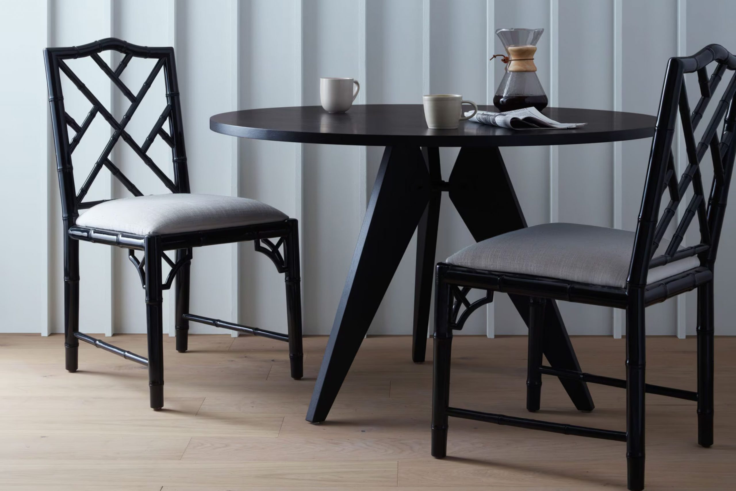
What Color Is Beacon Gray 2128-60 by Benjamin Moore?
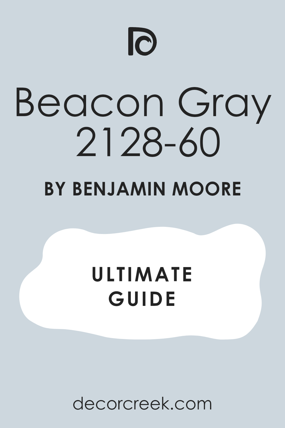
Beacon Gray by Benjamin Moore is an adaptable light gray color with soft blue undertones that give it a clean and airy feel. This makes it an excellent choice for creating a peaceful and welcoming environment in any room. The color is light enough to make small rooms appear larger and has the unique ability to adjust to different lighting conditions, subtly shifting its hue from cool to slightly warmer tones throughout the day.
Beacon Gray works exceptionally well in modern and minimalist interior designs due to its understated elegance. It also fits beautifully in coastal and Scandinavian styles, where a light, breezy palette is often favored. This color is effective in rooms that aim for a calm and collected atmosphere, such as bedrooms and living rooms, as well as in bathrooms and kitchens for a clean look.
When it comes to pairing with materials and textures, Beacon Gray goes well with natural wood, which can warm up its cool tones. It also looks stunning with metallic accents like silver or brushed nickel, enhancing the modern vibe.
Textiles in white, cream, or even pastel colors can soften the overall décor, while rich textures like velvet or wool add a cozy touch to the elegant background that Beacon Gray provides.
Is Beacon Gray 2128-60 by Benjamin Moore Warm or Cool color?
Beacon Gray 2128-60 by Benjamin Moore is a soft, light gray paint that has a subtle cool undertone, making it an adaptable choice for home interiors. Its gentleness makes it easy to combine with other colors, whether you’re pairing it with bright accents or other neutral tones.
Being a light shade, it can help small rooms feel larger and more open, as it reflects natural light well. This makes it especially good for areas like small bathrooms or hallways that can feel cramped with darker colors.
Beacon Gray is also gentle enough not to overpower rooms with a lot of wall art or bold furniture, providing a calm background. It’s durable and washable, ideal for families who need easy-to-maintain surfaces. Lastly, its lasting appeal means it won’t quickly go out of style, making it a smart choice for those who don’t frequently repaint.
What is the Masstone of the Beacon Gray 2128-60 by Benjamin Moore?
Beacon Gray from Benjamin Moore is a light gray that has a fresh, clean look. When used in homes, this color is adaptable and subtle, making it easy to pair with a wide range of decor styles and color schemes. Since it is a light shade, it helps make rooms feel larger and brighter.
This is especially useful in smaller areas or rooms with limited natural light. It provides a neutral backdrop that allows furniture and art to stand out, making it an excellent choice for living rooms, bedrooms, and even kitchens.
Additionally, this light gray tends to hide minor wall imperfections well, making it a practical choice for busy households. Its calming effect also makes it suitable for areas where you want to relax, like bathrooms or reading nooks. Overall, Beacon Gray is a functional and appealing choice for anyone looking to refresh their home.
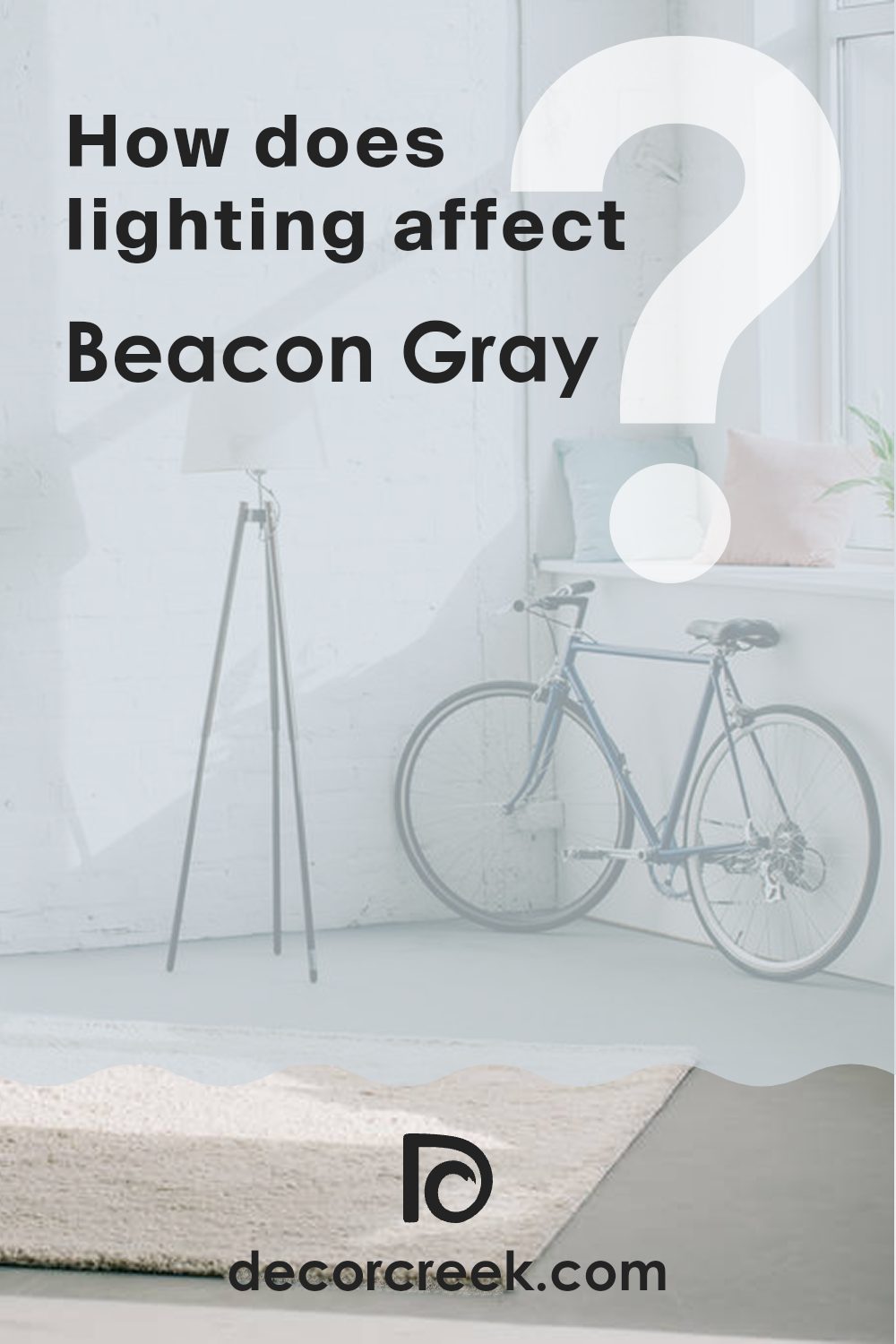
How Does Lighting Affect Beacon Gray 2128-60 by Benjamin Moore?
Lighting plays a crucial role in how we perceive colors in our environment, and understanding this interaction can help create rooms that feel just right. Essentially, different types of light can change the way a color looks. Beacon Gray by Benjamin Moore is an adaptable shade that can appear differently depending on the light it’s in.
In natural light, colors tend to show their truest form. Beacon Gray will typically look crisp and accurate to its swatch in natural light, revealing its subtle blend of gray tones. This makes it dependable for rooms that get plenty of sunlight, such as those with south-facing windows. South-facing rooms benefit from bright sunlight for most of the day, which means Beacon Gray will consistently appear lighter and more vibrant here.
However, in north-facing rooms, the situation changes. These rooms get less direct sunlight, and the light is often cooler, making colors appear slightly darker and bluer. Beacon Gray might look a bit more shadowed and subdued in these settings, possibly pulling out more of its cooler undertones.
For rooms with east-facing windows, Beacon Gray will shift throughout the day. In the morning, it will be bright and softly lit, presenting a very true version of the color as the sun rises. As the day progresses and the natural light diminishes, the color might look cooler and slightly muted.
West-facing rooms offer a similar but reversed effect. During the afternoon and evening, when the sun is setting, the room fills with warm light, causing Beacon Gray to look warmer and more welcoming. This warming effect fades as the sun sets, leaving the room looking cooler and more reserved at night.
Artificial lighting also influences how Beacon Gray appears. In warm, yellow-toned artificial light, it will look softer and slightly warmer, while in cooler, blue-toned light, it may appear sharper and crisper. Choosing the right lighting can truly help achieve the desired mood with this color across different room orientations and settings.
What is the LRV of Beacon Gray 2128-60 by Benjamin Moore?
LRV stands for Light Reflectance Value, which is a measure of how much light a color reflects compared to how much it absorbs. A higher LRV means that the color reflects more light, making a room feel brighter and more open. Conversely, colors with a lower LRV can make a room feel cozier and smaller because they absorb more light.
This value is important when choosing paint colors because it helps predict how light or dark a color will appear once it’s on the walls and how it changes under different lighting conditions.
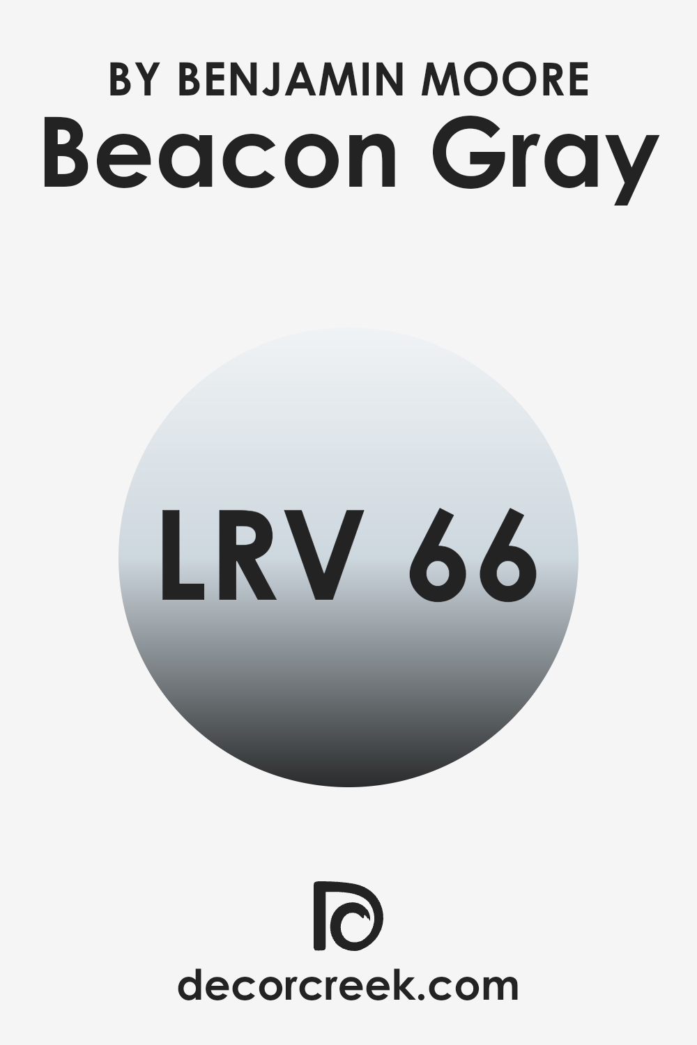
Beacon Gray has an LRV of 65.92, meaning it’s on the lighter side of the scale. It reflects a good amount of light, making it a great choice for rooms where you want to create a bright and airy feel.
It’s especially useful in smaller areas or those with limited natural light, as it can help make the room appear larger and more inviting. The lightness of Beacon Gray can also serve as a gentle backdrop, allowing furniture and decor to stand out, enhancing the overall aesthetic without overpowering the senses.
Coordinating Colors of Beacon Gray 2128-60 by Benjamin Moore
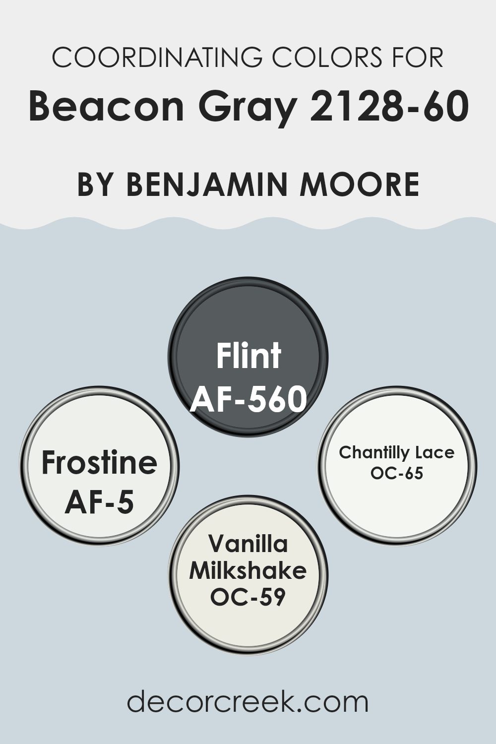
Coordinating colors are specific shades and hues selected to harmoniously complement a primary color. In the case of Beacon Gray by Benjamin Moore, coordinating colors like Flint, Frostine, Chantilly Lace, and Vanilla Milkshake are chosen to create a cohesive color scheme that enhances the overall aesthetic of a room.
These colors work together to provide balance and interest, ensuring that the primary color, in this case, the subtle gray, stands out without overpowering the senses. Coordinating colors can be used in various elements such as walls, trims, fabrics, and accessories, allowing for a unified look.
Flint is a deeper, charcoal-like color that adds a nice contrast against the lighter, softer Beacon Gray, giving depth and definition to rooms. Frostine is an airy, almost ethereal white, offering a fresh and clean look that energizes the quiet coolness of Beacon Gray.
On the brighter side, Chantilly Lace is a crisp white with slight undertones that bring out a vibrant, pure feel, perfect for trims and ceilings to create a lifted atmosphere.
Vanilla Milkshake has a creamy richness that pairs wonderfully with Beacon Gray, providing warmth and a subtle hint of coziness to any room, making it an ideal choice for creating a welcoming environment.
You can see recommended paint colors below:
- AF-560 Flint (CHECK A SAMPLE)
- AF-5 Frostine (CHECK A SAMPLE)
- OC-65 Chantilly Lace
- OC-59 Vanilla Milkshake
What are the Trim colors of Beacon Gray 2128-60 by Benjamin Moore?
Trim colors are specific shades used to accentuate or complement the primary color applied on the main surfaces like walls. When paired with a neutral shade like Beacon Gray, choosing the right trim color can enhance the overall aesthetic beautifully, making the architectural details stand out and giving a polished look to the room.
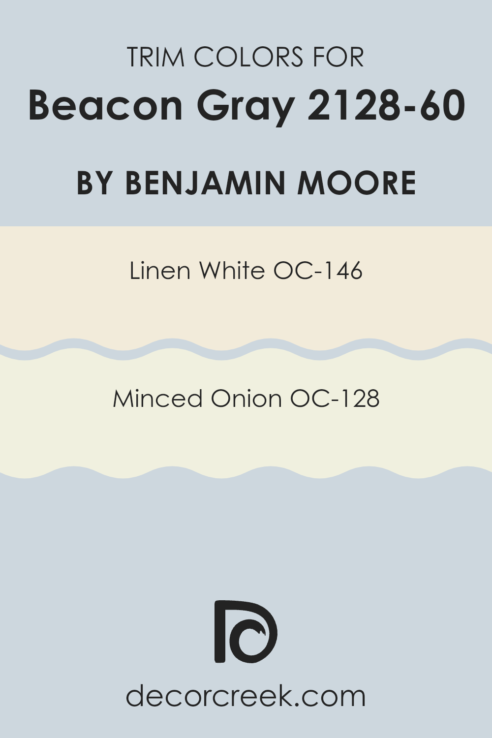
For Beacon Gray, a light and subtle trim color like OC-146 (Linen White) or a warmth-enhancing hue like OC-128 (Minced Onion) can truly enhance its appearance.
Linen White OC-146 is a soft and creamy white that provides a gentle contrast when used as a trim with Beacon Gray, brightening the room without overpowering it. This color is perfect for creating a clean and inviting look around windows and doors.
On the other hand, Minced Onion OC-128 offers a warmer option with its light, creamy tan tone that can add a touch of warmth to rooms, harmonizing beautifully with the cool tones of Beacon Gray. This combination creates a welcoming atmosphere that feels both comfortable and aesthetically pleasing.
You can see recommended paint colors below:
- OC-146 Linen White
- OC-128 Minced Onion
Colors Similar to Beacon Gray 2128-60 by Benjamin Moore
Choosing similar colors for a room is crucial in creating a cohesive and harmonious atmosphere. Colors that are close to Beacon Gray by Benjamin Moore, such as Mt. Rainier Gray, Silver Mist, Violet Mist, and Lake Placid, work together seamlessly because they share common undertones that help them blend smoothly without sharp contrasts. These shades are ideal for achieving a consistent theme throughout a home while still allowing each room to have its own distinct feel.
Mt. Rainier Gray presents a slightly cooler tone, akin to a misty morning sky, adding a calm, gentle vibe to any room. Meanwhile, Silver Mist offers a soft, muted silver hue that reflects light beautifully, creating subtle depth and a refreshing ambiance.
Violet Mist leans toward a dreamier, softly purple-tinted gray that can add a touch of charm and softness, perfect for rooms meant for relaxation or creativity. Lake Placid is a deeper shade that resembles calm waters, providing a stronger color presence while still maintaining the airy quality of the lighter grays. These variations allow decorators and homeowners to select precise hues that match their personal style and the functional needs of each room while maintaining a visually unified look.
You can see recommended paint colors below:
- 2129-60 Mt. Rainier Gray (CHECK A SAMPLE)
- 1619 Silver Mist
- 1437 Violet Mist (CHECK A SAMPLE)
- 827 Lake Placid (CHECK A SAMPLE)

Colors that Go With Beacon Gray 2128-60 by Benjamin Moore
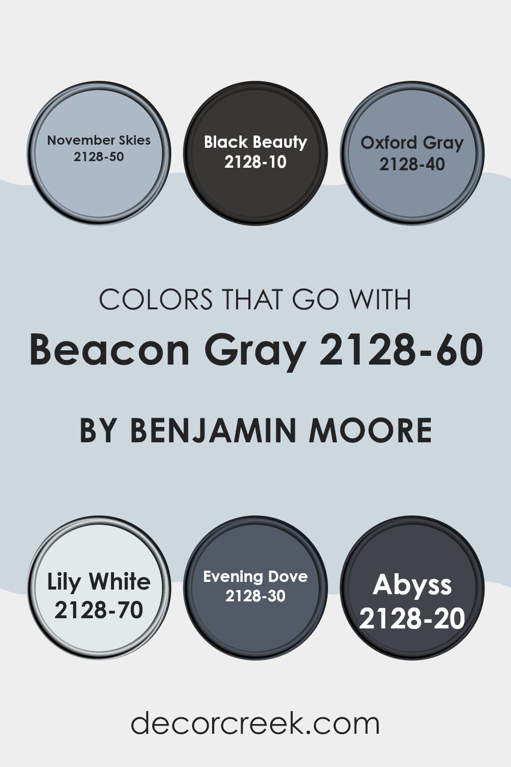
Choosing the right colors to pair with Benjamin Moore’s Beacon Gray 2128-60 is key to creating a harmonious and appealing room. This particular shade of gray serves as an adaptable neutral that pairs exceptionally well with other colors for a stylish and cohesive look. For instance, November Skies 2128-50 is a subtle blue that evokes the calmness of a cloudy, late autumn sky, offering a gentle complement to Beacon Gray.
Black Beauty 2128-10, as the name suggests, is a deep, bold black that provides a striking contrast, perfect for accent walls or furniture, adding a strong visual element to the calm gray.
Similarly, Oxford Gray 2128-40 offers a darker, more muted blue-gray tone that works seamlessly with Beacon Gray, ensuring a cohesive and understated elegance in any room. To brighten rooms, Lily White 2128-70 can be used; it’s a crisp, clean white that highlights the softness of Beacon Gray, making areas appear larger and more inviting.
For those wanting to add a hint of color, Evening Dove 2128-30, a dark bluish-gray, provides a more saturated option that enriches the palette without overpowering it.
Lastly, Abyss 2128-20 is a deep blue that anchors the soothing gray, ideal for creating a focal point or using in accessories to tie the look together. By selecting these complementary shades, you can achieve a beautifully balanced and visually appealing design.
You can see recommended paint colors below:
- 2128-50 November Skies (CHECK A SAMPLE)
- 2128-10 Black Beauty (CHECK A SAMPLE)
- 2128-40 Oxford Gray (CHECK A SAMPLE)
- 2128-70 Lily White (CHECK A SAMPLE)
- 2128-30 Evening Dove (CHECK A SAMPLE)
- 2128-20 Abyss (CHECK A SAMPLE)
How to Use Beacon Gray 2128-60 by Benjamin Moore In Your Home?
Beacon Gray 2128-60 by Benjamin Moore is an adaptable paint color that brings a light and airy feel to any room. Its unique shade falls between gray and blue, making it a great choice for those looking to add a subtle touch of color without overpowering a room.
You can use Beacon Gray in various areas of your home. It works beautifully in living rooms or bedrooms where you want to create a calm and inviting atmosphere. It’s also an excellent option for bathrooms, turning the room into a relaxing retreat.
Beacon Gray pairs well with white trim and hardwood floors, giving rooms a clean and cohesive look. Additionally, you can use it in home offices or study areas, as its gentle hue helps maintain focus and minimizes distractions. Whether you’re painting all the walls or creating an accent wall, this color is flexible enough to suit different styles and preferences.
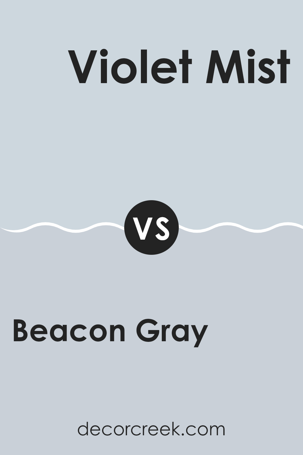
Beacon Gray 2128-60 by Benjamin Moore vs Violet Mist 1437 by Benjamin Moore
Beacon Gray by Benjamin Moore is a light, soft gray with a hint of warmth, making it adaptable for use in various rooms. It reflects light well, creating a bright and airy feel, perfect for making small areas appear larger.
On the other hand, Violet Mist is a gentle, pale purple with a subtle bluish tint, offering a fresh and soothing look that’s ideal for a calming bedroom or a peaceful bathroom.
While Beacon Gray is neutral and pairs easily with different decors, Violet Mist adds a touch of gentle color, bringing a unique but subtle vibrancy to a room. Both colors have their own distinct appeal but serve different purposes based on the mood or style you want to achieve.
You can see recommended paint color below:
- 1437 Violet Mist (CHECK A SAMPLE)
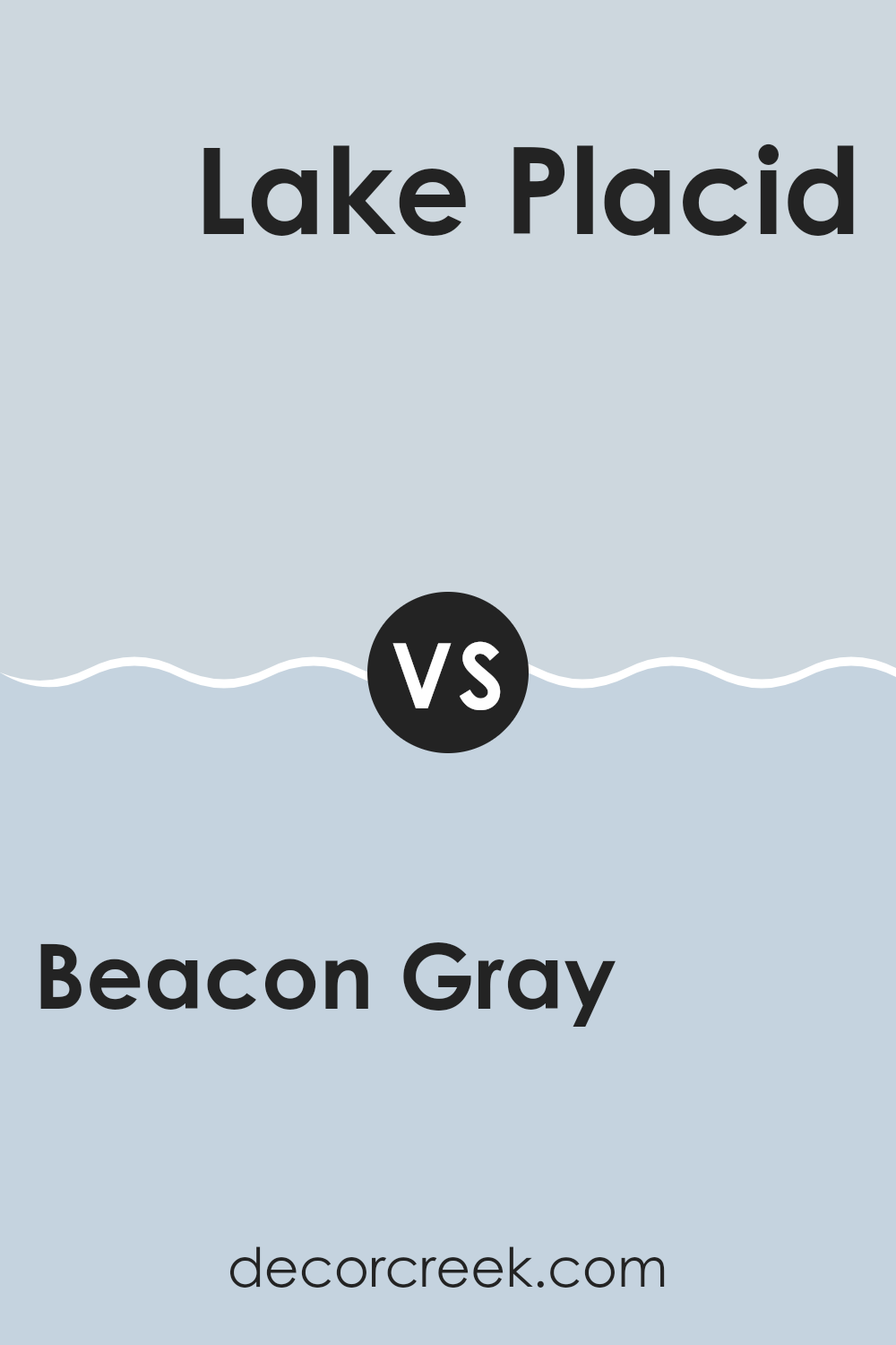
Beacon Gray 2128-60 by Benjamin Moore vs Lake Placid 827 by Benjamin Moore
Beacon Gray by Benjamin Moore is a soft, light gray color with a hint of blue, creating a calm, soothing vibe in any room. It’s understated yet fresh, perfect for living areas or bedrooms where you want a gentle, neutral backdrop.
On the other hand, Lake Placid is a deeper, more vibrant shade. This color reflects the subtle green hues of natural scenery, reminiscent of a peaceful lakeside retreat.
Lake Placid stands out more than Beacon Gray, bringing a touch of liveliness and richness to the room. While Beacon Gray provides a gentle, muted presence, Lake Placid offers a bolder statement with its richer tone. Both colors work beautifully in different settings, whether aiming for a soft wash of color with Beacon Gray or a more striking effect with Lake Placid.
You can see recommended paint color below:
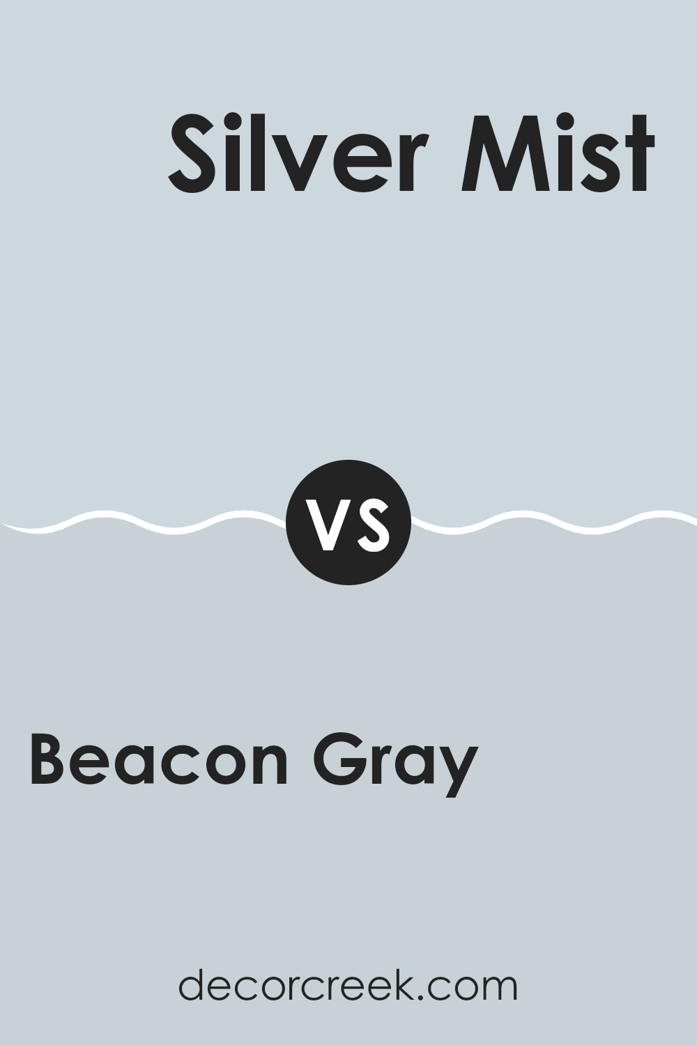
Beacon Gray 2128-60 by Benjamin Moore vs Silver Mist 1619 by Benjamin Moore
Beacon Gray and Silver Mist by Benjamin Moore are both beautiful colors, but they offer different moods for your room. Beacon Gray is a light neutral gray with a soft, warm tone. It’s perfect if you want a hint of coziness without making your room feel too dark. This color works well in rooms where you want a touch of warmth while keeping a light and open atmosphere.
On the other hand, Silver Mist offers a slightly cooler tone. It’s a gentle silver-gray that reflects light beautifully, making it ideal for creating a bright and airy feel in a room. This shade is great for areas such as bathrooms and kitchens or any room that benefits from a clean, crisp look.
Both colors are adaptable and can pair well with various decor styles, but Beacon Gray leans toward a warmer, more inviting feel, while Silver Mist provides a fresher, cooler ambiance.
You can see recommended paint color below:
- 1619 Silver Mist
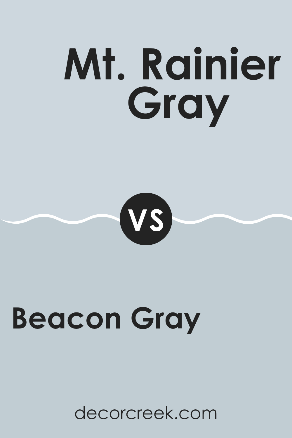
Beacon Gray 2128-60 by Benjamin Moore vs Mt. Rainier Gray 2129-60 by Benjamin Moore
Beacon Gray and Mt. Rainier Gray by Benjamin Moore are two subtle yet distinct colors. Beacon Gray has a gentle, light gray tone that gives off a soft and clean vibe, making it a great choice for a calming atmosphere in rooms like the bedroom or living room. It pairs well with both bright accents and neutral tones, offering flexibility in decor choices.
On the other hand, Mt. Rainier Gray, which is just one shade darker on the same color strip, presents a slightly deeper gray. This color still maintains a light feel but with a hint more depth, making it stand out a bit more against white trim or furniture. It’s ideal for those looking for a touch of contrast while keeping the overall softness of gray.
Both colors are quite subtle, making them easy to fit into most home styles without overpowering the room. They provide a lovely neutral backdrop, allowing other elements in the decor to stand out. Whether you go for Beacon Gray’s slightly lighter touch or Mt. Rainier Gray’s richer tone, both offer a fresh, clean look, enhancing the modern character of your room.
You can see recommended paint color below:
- 2129-60 Mt. Rainier Gray (CHECK A SAMPLE)
After reading all about 2128-60 Beacon Gray by Benjamin Moore, I think I’ve learned quite a bit about this paint color. Beacon Gray is not just any gray; it has a special brightness that can make a room feel light and airy. It’s perfect for anyone wanting to refresh their room without making it too bold or loud. This color can fit in almost anywhere in a house, from the kitchen and living room to bedrooms and bathrooms.
What I also found interesting is how different types of lighting in a room can change the way Beacon Gray looks. In natural light, it appears soft and welcoming, but under artificial light, it can look a bit cooler and crisper. This is interesting because it’s like having a color that subtly shifts throughout the day.
I would recommend Beacon Gray to someone who wants to make their home feel fresh and clean without using a strong or dark color. It’s a safe choice for anyone who likes to change up their home decorations often because it pairs well with many other colors and styles.
So, if you’re thinking about giving your room a new look, Beacon Gray might just be the perfect starting point!
Ever wished paint sampling was as easy as sticking a sticker? Guess what? Now it is! Discover Samplize's unique Peel & Stick samples.
Get paint samples


