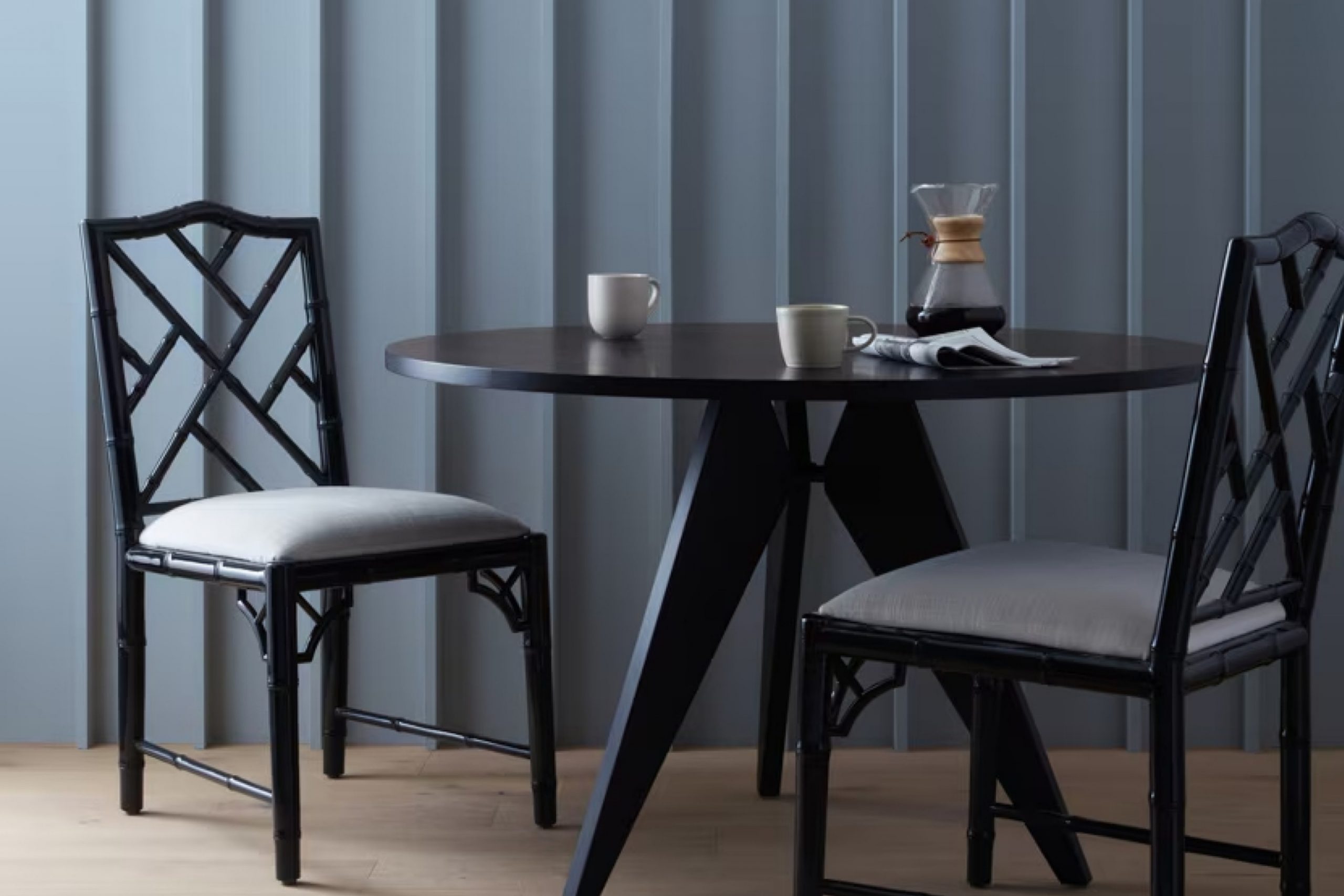
This color, a deep shade of blue-gray, holds a timeless appeal and provides a perfect balance between boldness and subtlety. It’s one of those shades that can completely change the atmosphere of a room.
Oxford Gray has a unique ability to create a cozy and calming environment. Whether I’m looking to refresh my living room or add a touch of elegance to my bedroom, this color seems to fit the bill perfectly.
It feels like a classic choice that doesn’t overpower the space but lends it a quiet elegance.
What I really appreciate about Oxford Gray is its versatility. It pairs beautifully with a wide range of colors, from crisp whites to warmer neutrals, allowing me to experiment with different accents and textures. This makes it an ideal choice for both modern and traditional settings.
Choosing Oxford Gray feels like making a statement without being too loud. It’s a shade that has subtly worked its way into my life, making each space I apply it in feel sophisticated and inviting.
Whether I’m entertaining guests or simply enjoying a quiet evening at home, this color always seems to set the perfect tone.
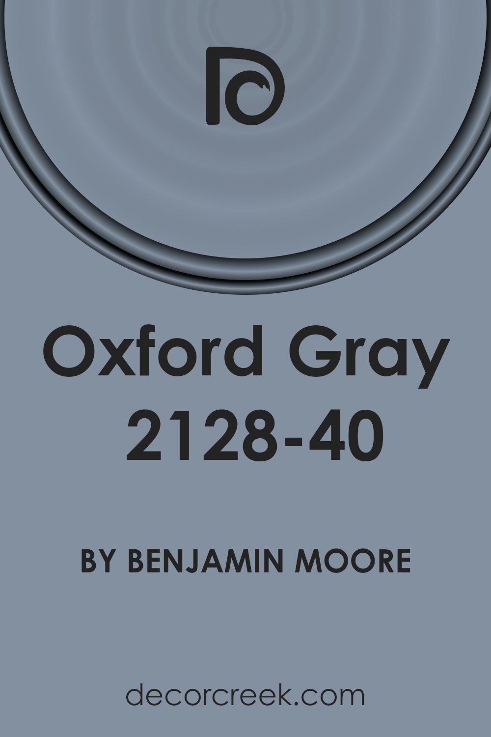
What Color Is Oxford Gray 2128-40 by Benjamin Moore?
Oxford Gray by Benjamin Moore is a deep, muted blue-gray color with hints of green, creating a balanced and sophisticated look. This shade is versatile, making it suitable for various interior styles. In traditional settings, it offers a classic touch, perfectly complementing darker wood finishes and antique furniture.
For contemporary spaces, Oxford Gray adds depth and can be paired with sleek metal and glass elements to create a modern vibe.
In terms of textures, Oxford Gray works beautifully with both soft and rustic materials. Velvet or linen upholstery in complementary colors like cream or soft beige can enhance its elegance in living rooms or bedrooms.
Natural materials like jute, rattan, or reclaimed wood can bring a cozy warmth to the space, making it ideal for a rustic or farmhouse decor.
Oxford Gray is also an excellent choice for accent walls or cabinetry, where its richness can create a focal point without overwhelming the room. The color pairs well with crisp white trim, bringing out its subtle undertones.
It also blends nicely with soft greens and earth tones, allowing for a harmonious palette throughout the home. This adaptable color can add depth and character to a variety of spaces.
Is Oxford Gray 2128-40 by Benjamin Moore Warm or Cool color?
Oxford Gray by Benjamin Moore is a versatile and timeless choice for home interiors. It is a shade of blue-gray that strikes a perfect balance between warm and cool undertones, making it adaptable to various design styles. In living rooms, it can create a calm and inviting atmosphere, providing a subtle backdrop that allows furniture and décor to stand out. In bedrooms, Oxford Gray promotes a restful and soothing environment, perfect for relaxation.
The color pairs well with both lighter and darker accents, offering flexibility in choosing accompanying colors. It complements natural materials like wood and stone, enhancing the overall ambiance of a space.
In well-lit rooms, Oxford Gray appears more vibrant, while in dimmer areas, it takes on a softer, cozier look.
Its adaptability makes it an excellent choice for those who want a reliable color that can harmonize with different elements in a home.
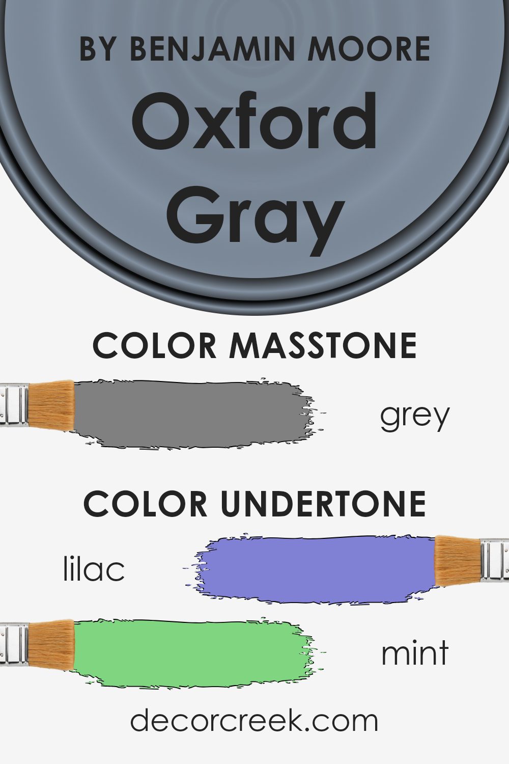
Undertones of Oxford Gray 2128-40 by Benjamin Moore
Oxford Gray by Benjamin Moore is a rich and complex color, and its undertones influence how we perceive it. With a primary dark gray base, it carries whispers of many colors, subtly impacting its final appearance on walls.
Undertones like lilac, mint, light blue, and pale pink make it more versatile, allowing it to adapt to different lighting and surroundings. For instance, in a room with ample natural light, these lighter undertones can become more visible, giving a soft, calming feel.
In contrast, undertones like dark turquoise, navy, or dark green offer depth and richness, making the color feel warmer and more enveloping. This can make a space feel cozy and intimate.
Oxford Gray can appear more blue or green depending on adjacent colors and lighting conditions. The presence of a subtle blue undertone means that under certain lights, it might lean more towards blue, especially in north-facing rooms.
Meanwhile, its pink or purple hints soften the color, adding a gentle touch that can make a room feel more inviting. The interplay of these undertones ensures that Oxford Gray is never flat or one-dimensional, and its nuanced character can add a layer of interest to interiors, making any space feel dynamic and thoughtfully curated.
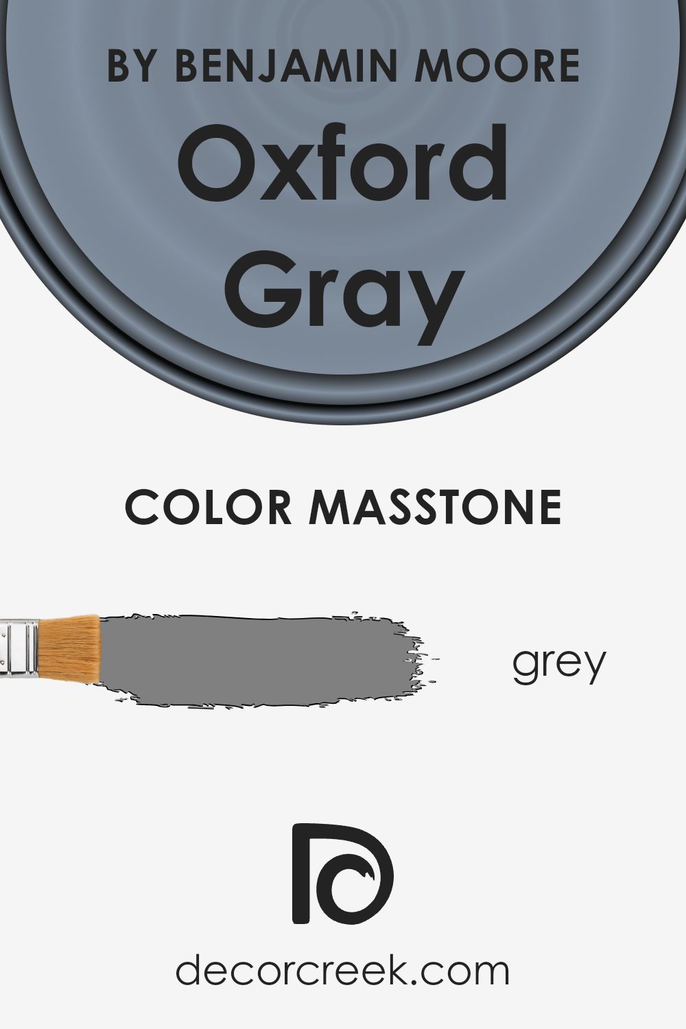
What is the Masstone of the Oxford Gray 2128-40 by Benjamin Moore?
Oxford Gray by Benjamin Moore is a versatile color with a masstone of gray (#808080). This shade is a balanced blend of blue and gray, which can give a calming and sophisticated look to any room. It has a subtle undertone that adds depth without overwhelming the space. This makes it a great choice for both modern and traditional interiors.
When used on walls, Oxford Gray can create a cozy and inviting atmosphere. It’s particularly effective in living rooms or bedrooms where a relaxed mood is desired.
In spaces with natural light, this color can appear lighter and more airy, while in darker rooms, it might seem a bit more intense and dramatic. The color pairs beautifully with both warm and cool accents, allowing flexibility in design.
Whether used as a primary wall color or as an accent, Oxford Gray brings a sense of balance and harmony to home interiors.
How Does Lighting Affect Oxford Gray 2128-40 by Benjamin Moore?
Lighting plays a crucial role in how we perceive colors. A paint color swatch might look different under various lighting conditions. The color Oxford Gray by Benjamin Moore can show these shifts, depending on whether you’re looking at it in artificial light or natural light.
In artificial light, Oxford Gray can appear warmer or cooler based on the type of bulbs you use. Incandescent bulbs can give it a warmer, slightly yellowish hue, while fluorescent lighting might bring out cooler tones, sometimes making it appear a bit bluer.
LED lights can vary widely, so it’s important to check how Oxford Gray looks under whatever specific lighting you have.
Natural light significantly affects the appearance of Oxford Gray, too. North-facing rooms usually have less direct sunlight, so colors can seem cooler and a bit darker. In these rooms, Oxford Gray can appear deeper and moodier, with its blue undertones being more prominent.
In south-facing rooms, there’s an abundance of natural light throughout the day, which tends to warm up colors. In these sunny rooms, Oxford Gray may appear lighter and more neutral, showing its true balance between gray and blue.
East-facing rooms get bright, crisp light in the morning, but this changes as the day progresses. Early in the day, Oxford Gray might look brighter and slightly cooler. By the afternoon, when the light fades, it will take on a more muted, shadowed appearance.
West-facing rooms are the opposite. They receive warm, soft light in the evening. Here, Oxford Gray will appear warmer and potentially more subdued during midday but may glow softer with the sunset.
Overall, Oxford Gray is versatile, but its look varies significantly with lighting. Always test this color in your home’s specific lighting conditions to see how it will truly appear.
What is the LRV of Oxford Gray 2128-40 by Benjamin Moore?
Light Reflectance Value, or LRV, is a measurement that tells us how much light a paint color will reflect. It’s a number on a scale from 0 to 100, where 0 means the color absorbs all light (like black), and 100 means it reflects all light (like white). LRV helps in understanding how light or dark a color will look when applied to a wall.
Colors with a high LRV, close to 100, are brighter and can make rooms feel more open and airy. Conversely, colors with a low LRV, closer to 0, are darker and can make spaces feel more intimate or smaller.
LRV can be especially useful when selecting colors for rooms with little natural light or aiming for a specific ambiance.
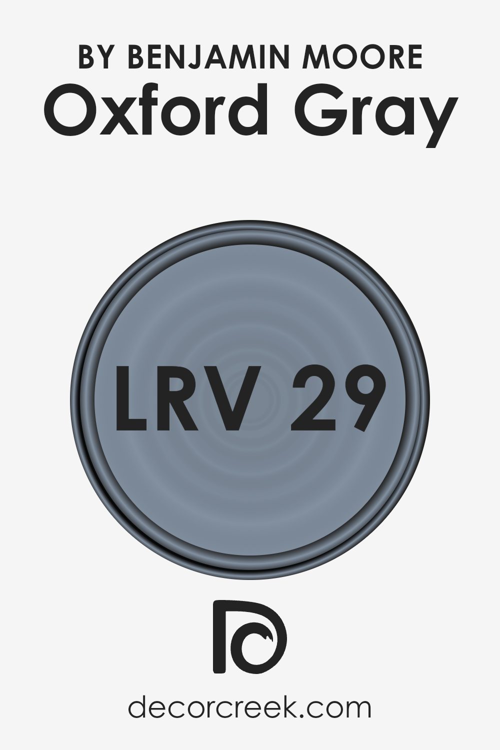
Oxford Gray by Benjamin Moore, with an LRV of 28.78, is a fairly dark color. This means it absorbs more light than it reflects. When you paint a wall with this shade, it will look darker, and it can make a room feel cozy or more enclosed depending on the lighting and room size.
Because it’s not a very high LRV, Oxford Gray can add depth and richness to a space but might not be the best choice if you’re trying to make a room appear larger or more open.
In north-facing rooms that naturally have cooler light, this gray might appear even darker, whereas it might feel a bit lighter in a room that receives a lot of sunlight.
Coordinating Colors of Oxford Gray 2128-40 by Benjamin Moore
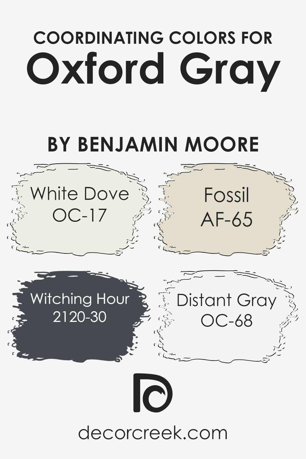
Coordinating colors are hues that complement and enhance the primary shade, creating a balanced and harmonious look. When paired with Oxford Gray by Benjamin Moore, the selected colors help bring out its rich, deep tone. White Dove (OC-17) offers a soft, warm white that provides a gentle contrast and brightness, perfect for trim and ceilings.
Witching Hour (2120-30) is a dark and moody blue-black, adding depth and interest, ideal for accent walls or smaller spaces where dramatic flair is desired.
Fossil (AF-65) is a muted beige that provides a neutral foundation, lending warmth and earthiness to the room.
Lastly, Distant Gray (OC-68) is a light, cool gray that offers a subtle, refreshing touch, making it apt for larger open spaces where you wish to maintain a light and airy feel.
Together, these colors create a cohesive and inviting color palette. The combination allows for flexibility, whether you are looking to create a classic, modern, or even transitional style in your space. White Dove and Distant Gray can keep things bright and open, while Witching Hour adds boldness and drama. Fossil acts as a grounding neutral, tying everything together effortlessly with Oxford Gray.
You can see recommended paint colors below:
- OC-17 White Dove
- 2120-30 Witching Hour
- AF-65 Fossil
- OC-68 Distant Gray
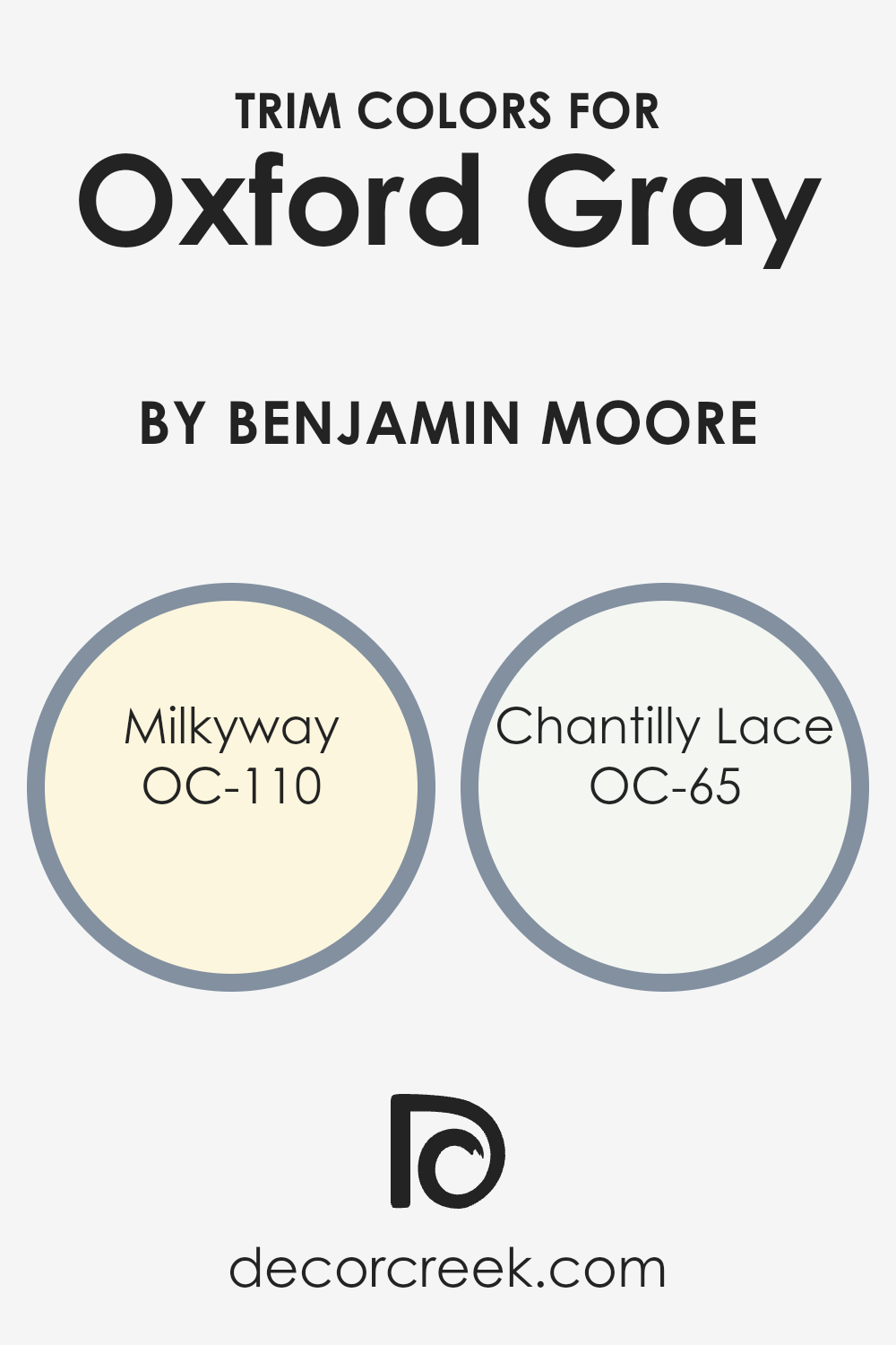
What are the Trim colors of Oxford Gray 2128-40 by Benjamin Moore?
Trim colors are the accent hues used around the edges of walls, doors, and windows to add contrast and definition to a room. They are essential because they help to highlight the primary color, creating depth and interest within the space.
For a color like Oxford Gray, a deep and muted shade from Benjamin Moore, choosing the right trim colors can enhance its rich, calming effect. The right trim can make the wall color stand out while ensuring that it doesn’t overpower the room.
OC-110 Milkyway, with its soft and creamy appearance, can add a warm touch to the cool tones of Oxford Gray. Meanwhile, OC-65 Chantilly Lace offers a crisp and clean white that brightens the edges and makes the gray feel more pronounced yet crisp.
Both of these trim colors can effectively complement Oxford Gray, creating a balanced and visually appealing environment.
They ensure that the room feels inviting and well-coordinated without overwhelming the primary color choice.
You can see recommended paint colors below:
- OC-110 Milkyway
- OC-65 Chantilly Lace
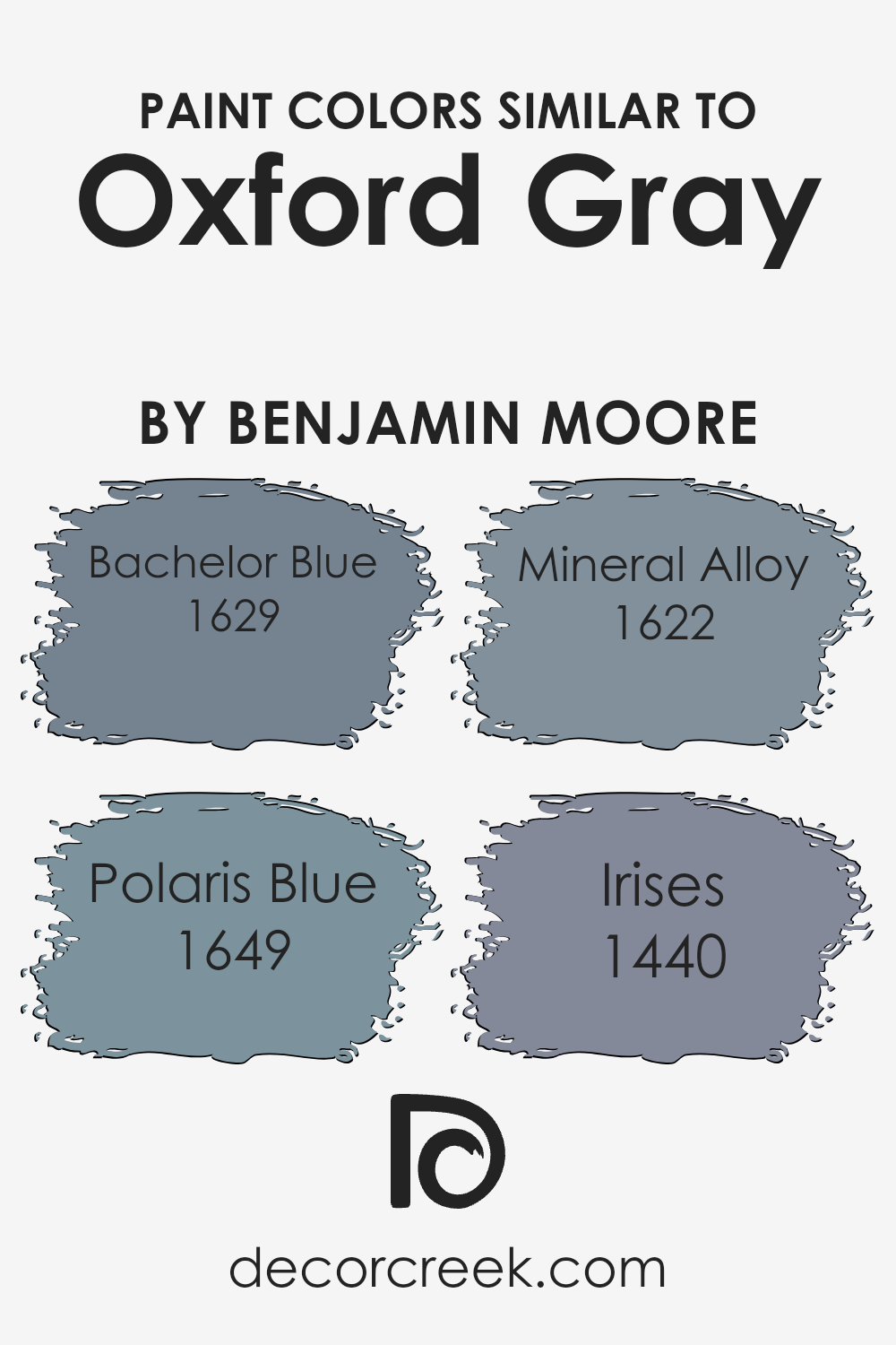
Colors Similar to Oxford Gray 2128-40 by Benjamin Moore
Similar colors are important in design and decor because they create a harmonious and visually pleasing environment. Colors like Bachelor Blue, Polaris Blue, Mineral Alloy, and Irises work well with Oxford Gray by Benjamin Moore to achieve cohesion in a space.
These shades complement each other by sharing undertones and intensity, which allows them to blend seamlessly and create a sense of unity. When similar colors are used together, they can subtly enhance the mood of a room, evoking calmness and comfort while maintaining interest through their slight differences.
Bachelor Blue, for instance, offers a soft, muted blue tone that pairs well with the deeper, slate-like Oxford Gray, providing an ideal balance of light and dark. Polaris Blue, with its cool and crisp nature, adds a refreshing touch that brightens and livens up the setting without overpowering the other shades.
Mineral Alloy presents a more neutral option, with subtle blue-gray hints that anchor the palette with their understated elegance.
Irises brings in a touch of purple-blue, adding depth and a hint of color variation that enriches the overall aesthetic. Together, these colors harmonize beautifully, enhancing the atmosphere and making any room feel inviting and visually appealing.
You can see recommended paint colors below:
- 1629 Bachelor Blue
- 1649 Polaris Blue
- 1622 Mineral Alloy
- 1440 Irises
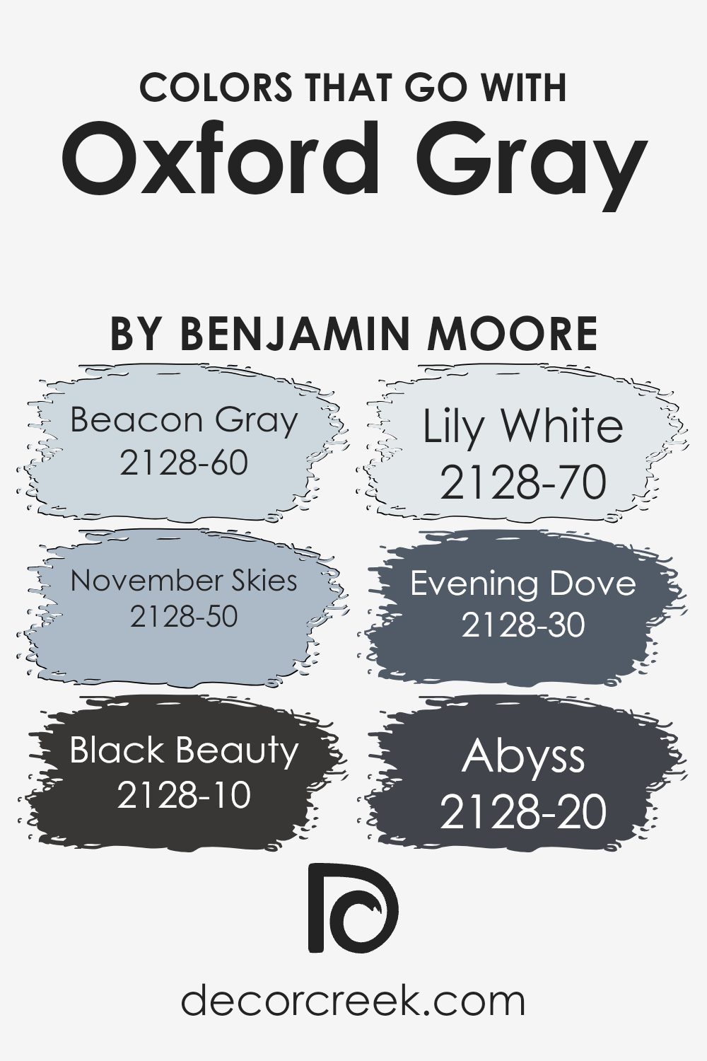
Colors that Go With Oxford Gray 2128-40 by Benjamin Moore
Colors that go with Oxford Gray by Benjamin Moore play an important role in creating a balanced and harmonious space. Oxford Gray itself is a versatile, medium-toned gray with a cool undertone, making it a great backdrop for various hues.
Beacon Gray adds a touch of lightness with its soft and subtle tone, offering a gentle contrast that complements Oxford Gray. Meanwhile, November Skies, with its cooler and slightly bolder vibe, brings a hint of sky to the palette, enhancing the overall cool theme.
Black Beauty, on the other hand, serves as a stunning accent with its deep, rich black, providing a striking contrast that makes other colors pop.
Lily White brings a touch of crispness and clarity, brightening up the space and adding a refreshing element that balances the deeper tones. Evening Dove offers a moody and deep shade, with its rich navy undertones, enhancing the depth and richness of Oxford Gray.
Abyss is another dark hue that complements the palette with its deep, intense blue, adding drama and interest. Together, these colors ensure that the environment feels cohesive and visually appealing, each contributing their unique characteristics to support and highlight Oxford Gray’s charm.
You can see recommended paint colors below:
- 2128-60 Beacon Gray
- 2128-50 November Skies
- 2128-10 Black Beauty
- 2128-70 Lily White
- 2128-30 Evening Dove
- 2128-20 Abyss
How to Use Oxford Gray 2128-40 by Benjamin Moore In Your Home?
Oxford Gray by Benjamin Moore is a rich, deep blue-gray color that adds a touch of elegance to any space. This versatile hue works well in various rooms, making it a great choice for anyone looking to refresh their home. In a living room, Oxford Gray can create a cozy and inviting atmosphere, especially when paired with soft cream or white accents.
It also works beautifully in a bedroom, providing a calming backdrop that is perfect for relaxation.
In the kitchen, this color can be used for cabinetry, giving the space a modern and chic look. If you’re considering an accent wall, Oxford Gray can provide depth and interest without overwhelming the room. Additionally, it pairs well with both warm and cool color schemes, making it easy to incorporate into existing décor.
Whether used in large or small doses, Oxford Gray adds a stylish and timeless touch to any home.
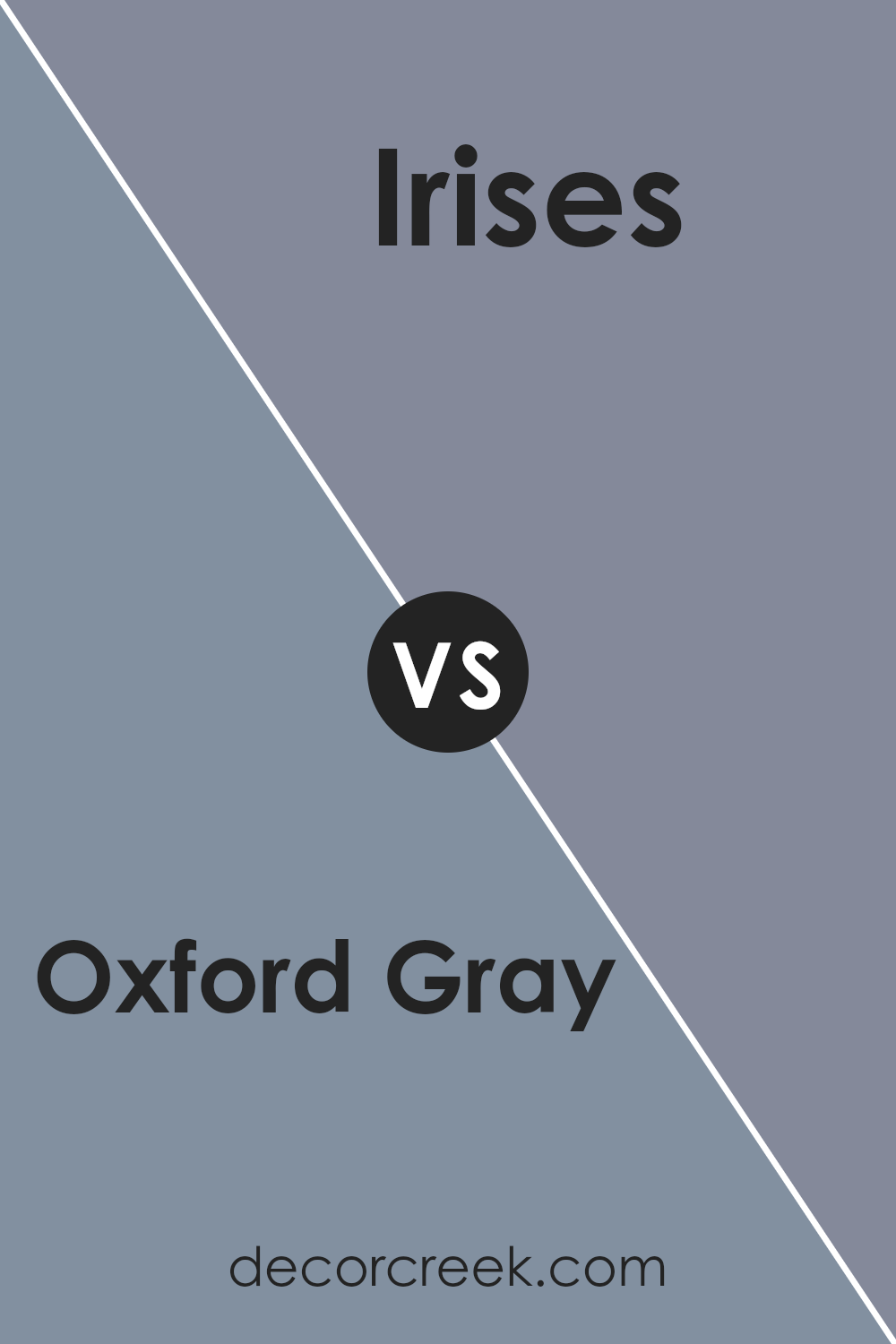
Oxford Gray 2128-40 by Benjamin Moore vs Irises 1440 by Benjamin Moore
Oxford Gray by Benjamin Moore is a deep, muted blue with gray undertones. It gives off a calm and classic feel, making it a versatile choice for many spaces. This color would work well in a study or bedroom, providing a soothing and neutral backdrop.
In contrast, Irises by Benjamin Moore is a softer, lighter blue with a hint of green. It brings a refreshing and airy vibe to any room. This color can make a space feel larger and is perfect for living areas or kitchens where you want a more open and bright atmosphere.
While Oxford Gray offers a more traditional and strong presence, Irises adds a touch of freshness and light. When choosing between these colors, consider the mood you want to create and the natural light in your room. Both are beautiful choices that can suit different design styles.
You can see recommended paint color below:
- 1440 Irises
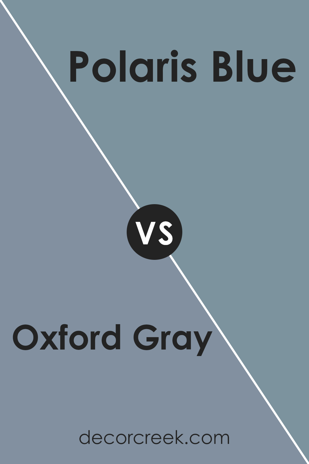
Oxford Gray 2128-40 by Benjamin Moore vs Polaris Blue 1649 by Benjamin Moore
Oxford Gray 2128-40 by Benjamin Moore is a rich, deep gray with blue undertones. It provides a dark and bold look that can make a room feel cozy and grounded. This color works well in spaces where a more dramatic and moody atmosphere is desired, like a living room or study.
Polaris Blue 1649 by Benjamin Moore, on the other hand, is a lighter and softer blue. It brings a calm and airy feel to a space, making it suitable for bedrooms or bathrooms where a relaxing environment is preferred. The lighter shade can make a room appear larger and more open.
In comparison, Oxford Gray has a heavier presence due to its depth and intensity, while Polaris Blue offers a breezier and more refreshing vibe. Both shades incorporate blue tones, but their differing intensities suit different moods and settings.
You can see recommended paint color below:
- 1649 Polaris Blue
Oxford Gray 2128-40 by Benjamin Moore vs Bachelor Blue 1629 by Benjamin Moore
Oxford Gray 2128-40 and Bachelor Blue 1629 by Benjamin Moore are both cool, muted colors, but they have distinct differences. Oxford Gray is a dark, moody shade that resembles a deep blue with gray undertones. It has a strong presence and can create a cozy, introspective atmosphere in a room.
On the other hand, Bachelor Blue is a lighter blue with a softer and more welcoming feel. It carries a hint of gray but is more vibrant than Oxford Gray, making it suitable for spaces that need a touch of color without being overwhelming.
While Oxford Gray can add depth and drama to a space, Bachelor Blue offers a lighter, more approachable look. Both colors work well in modern and traditional spaces but choosing between them will depend on whether you prefer a more dramatic or softer aesthetic in your design.
You can see recommended paint color below:
- 1629 Bachelor Blue

Oxford Gray 2128-40 by Benjamin Moore vs Mineral Alloy 1622 by Benjamin Moore
Oxford Gray 2128-40 is a deep, muted blue-gray with cool undertones. It often gives a space a cozy, moody feel, making it suitable for creating a calm and intimate atmosphere. It works well in bedrooms or living areas where a soothing environment is desired.
On the other hand, Mineral Alloy 1622 is a lighter, more neutral gray. It has a subtle warmth to it, which can make it a versatile choice for different styles and spaces. This color can brighten a room while still providing a sense of calmness.
It’s a great option for open areas like living rooms or kitchens, where a neutral and inviting tone is preferred.
While Oxford Gray provides more intensity and mood, Mineral Alloy offers a lighter, more versatile approach.
Both colors can complement a range of other shades, allowing for creative and harmonious design choices in various settings.
You can see recommended paint color below:
- 1622 Mineral Alloy
It has this cool mix of blue in it, which makes it feel fresh and calming at the same time.
It’s like the color you’d see if you looked up at the sky when it’s almost about to rain, but still bright.
I think Oxford Gray is neat because it works well in almost any room. Imagine painting a bedroom with this color. It would feel nice and cozy, giving you a snug place to rest. And if you used it in a living room, it would be stylish and relaxing, making it a nice spot to hang out with family or friends.
What’s also great is how Oxford Gray matches other colors. You can add bright colors like white or yellow with it, and they look great together. It’s like how peanut butter is awesome with jelly.
So, if you want a color that feels calming and looks cool, Oxford Gray might be perfect. It’s simple and pretty without being boring, and that’s what makes it special.
Ever wished paint sampling was as easy as sticking a sticker? Guess what? Now it is! Discover Samplize's unique Peel & Stick samples.
Get paint samples

