If you’re considering a fresh color for a room in your house or maybe a special project, you might want to pay attention to SW 6599 Begonia by Sherwin Williams. I stumbled upon this shade while searching for something unique and instantly felt its strong presence.
This paint isn’t just any ordinary color; it’s a vibrant, cheerful pink that can instantly perk up any room. The brightness of Begonia adds a playful yet refined touch to walls, turning them into focal points of conversation and admiration.
Unlike some bold colors that take over a room, Begonia manages to bring energy without feeling too intense. Its adaptability is clear, as it works wonderfully in different lighting conditions, shifting subtly from dawn to dusk. Give it a try if you’re looking for a color that brings both warmth and a hint of playfulness into your life.
What Color Is Begonia SW 6599 by Sherwin Williams?
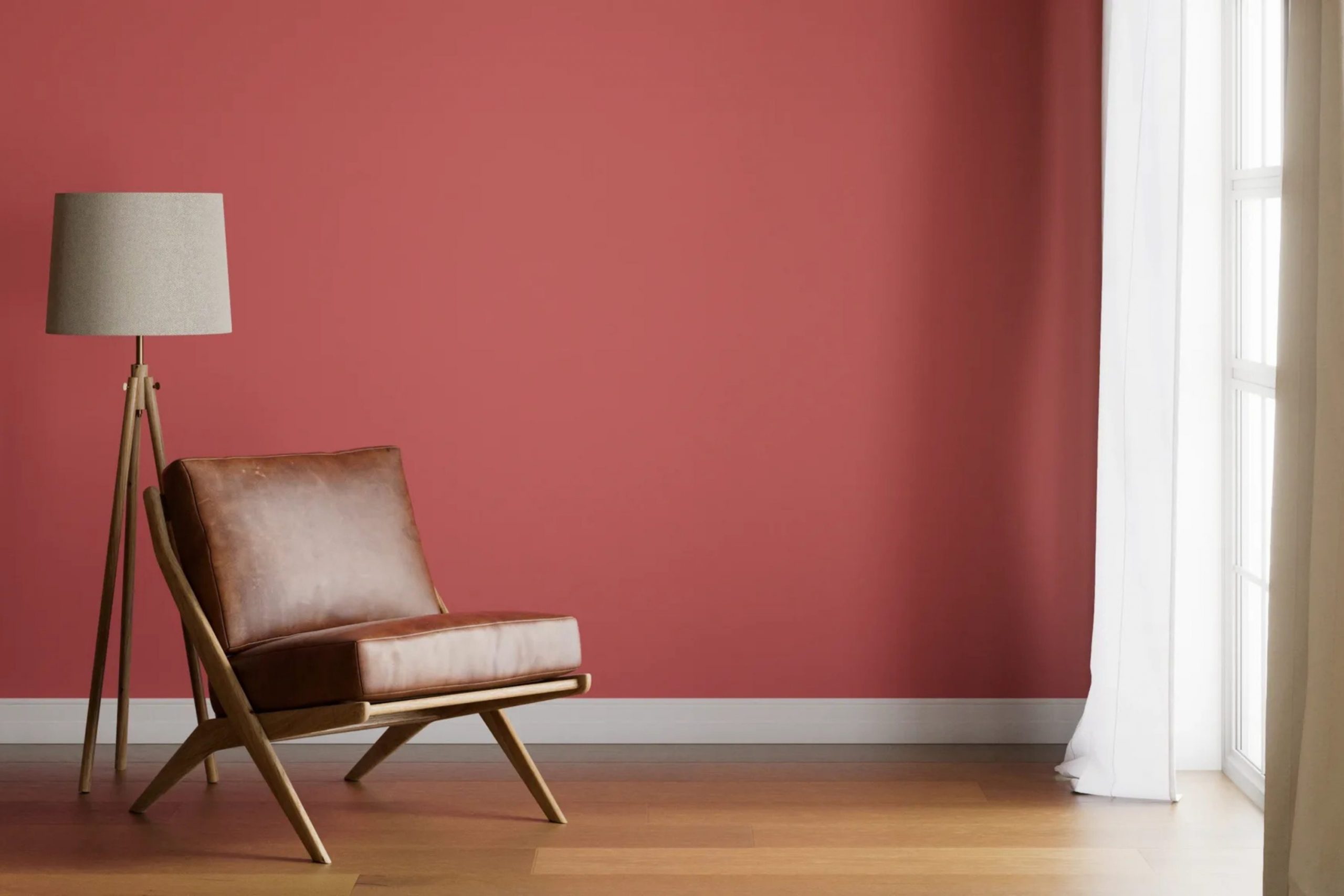
The color Begonia by Sherwin Williams is a vibrant and cheerful shade of pink. This warm, inviting hue has a slightly coral undertone, making it a perfect choice to add a pop of personality to any room. It’s a striking color that stands out, yet it has enough softness to prevent it from feeling too intense.
Begonia works exceptionally well in interior styles that lean toward the playful and creative, such as eclectic or bohemian decor. It’s also an excellent choice for more modern and contemporary interiors that aim to include bright colors in a balanced way. This color is particularly suitable for areas that benefit from a lively atmosphere, like living rooms, kitchens, or children’s play areas.
When it comes to materials and textures, Begonia pairs beautifully with natural wood finishes, which help ground its brightness and create a more harmonious look. It also looks stunning with metallic accents, such as brass or gold, which bring out its warm undertones. For textiles, consider soft, tactile fabrics like velvet or silk that can contrast nicely with its vibrant nature.
Combining it with light linens or cozy wool textures also allows the color to stand out without taking over, supporting a balanced yet striking aesthetic.
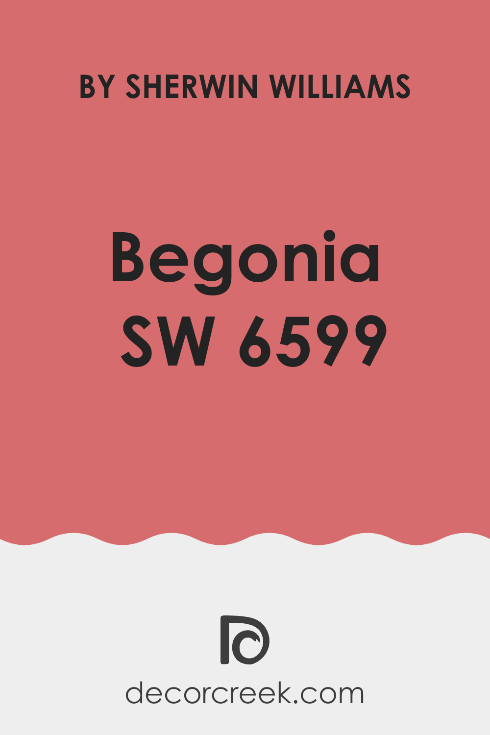
Is Begonia SW 6599 by Sherwin Williams Warm or Cool color?
Begonia by Sherwin Williams (SW 6599) is a vibrant and warm color that brings a cheerful and welcoming vibe to any room. This shade of pink has a playful yet gentle presence, making it perfect for rooms that need a touch of brightness. Its richness works well in living areas and bedrooms where a cozy, inviting atmosphere is desirable.
When painted on the walls, Begonia can make the room feel more intimate and lively. It pairs beautifully with neutral tones like whites, grays, and light browns, which help balance its brightness. Adding this color to a home’s decor can also give the interior a modern and fresh look. Because it’s such a bold color, using it on a feature wall or in decorative accents can refresh a room without feeling too intense.
In summary, Begonia by Sherwin Williams is an excellent choice for anyone looking to add a pop of cheer and warmth to their living area. Its ability to pair well with soft neutrals allows for flexible design options.
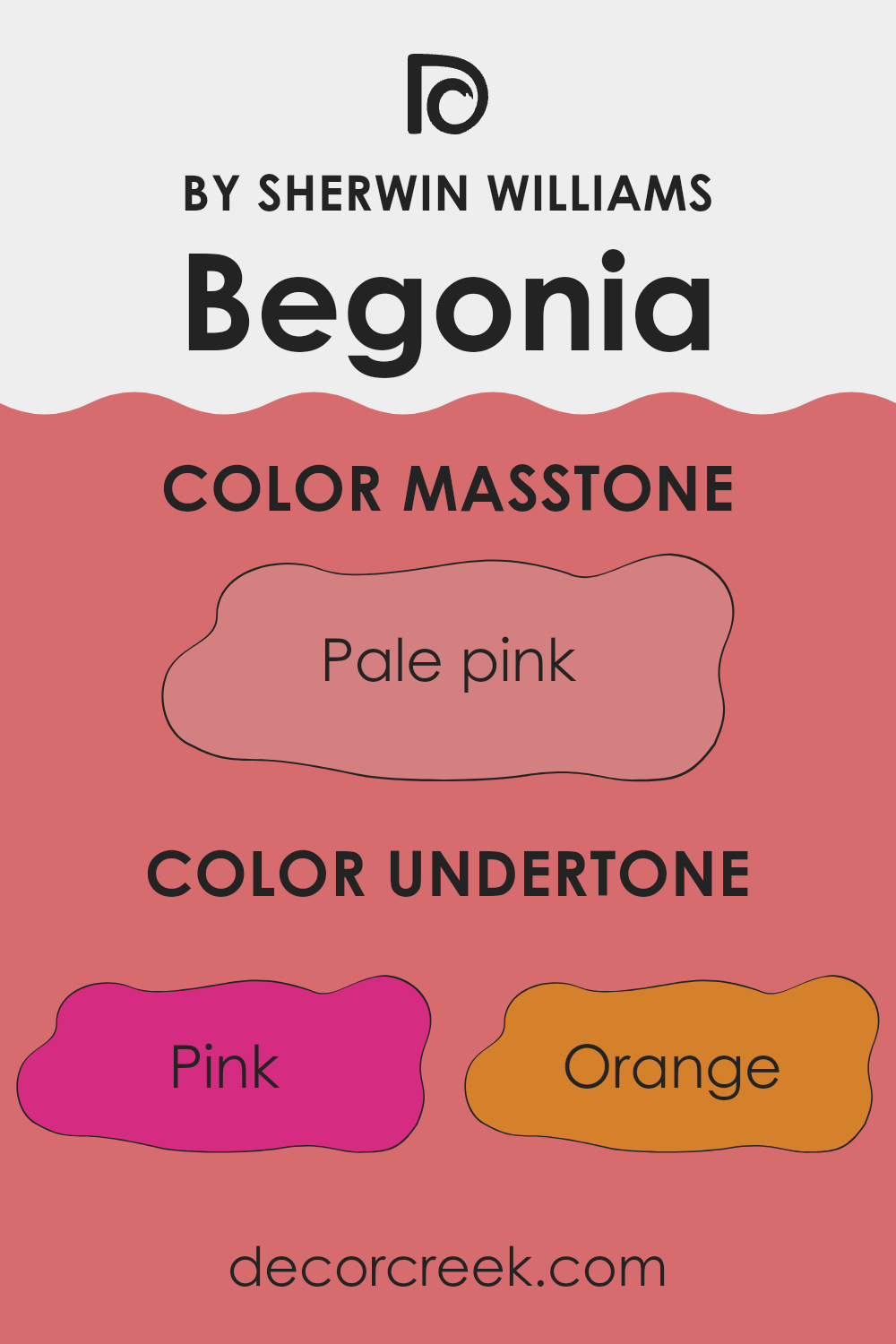
Undertones of Begonia SW 6599 by Sherwin Williams
Begonia SW 6599 is a vibrant hue that can really brighten up a room, but understanding its undertones is key to using it effectively. Undertones are subtle colors hidden within the main color. They can influence how the color looks depending on the lighting and what other colors are nearby.
This particular shade has a variety of undertones, including pink, orange, grey, and more. Each undertone brings its own effect. For instance, pink and orange undertones give a warm feel, making a room feel cozy. Grey and light grey, on the other hand, can add a bit of neutrality to the vibrancy, helping the color blend better with modern decor.
When used on interior walls, these undertones play a big role in how the color is perceived. In natural light, the pink and orange may stand out, creating a lively environment. In artificial lighting, the grey or brown tones might become more noticeable, giving the room a more grounded feel.
Always consider the room’s lighting and the colors of furniture and decorations. For example, pairing this paint with soft whites or dark furniture can highlight different undertones, either cooling down the warmth of the orange or supporting the energy of the pink.
Understanding these undertones helps when choosing accessories and additional colors for the room, ensuring everything works together in a balanced and pleasing way.
decorcreek.com
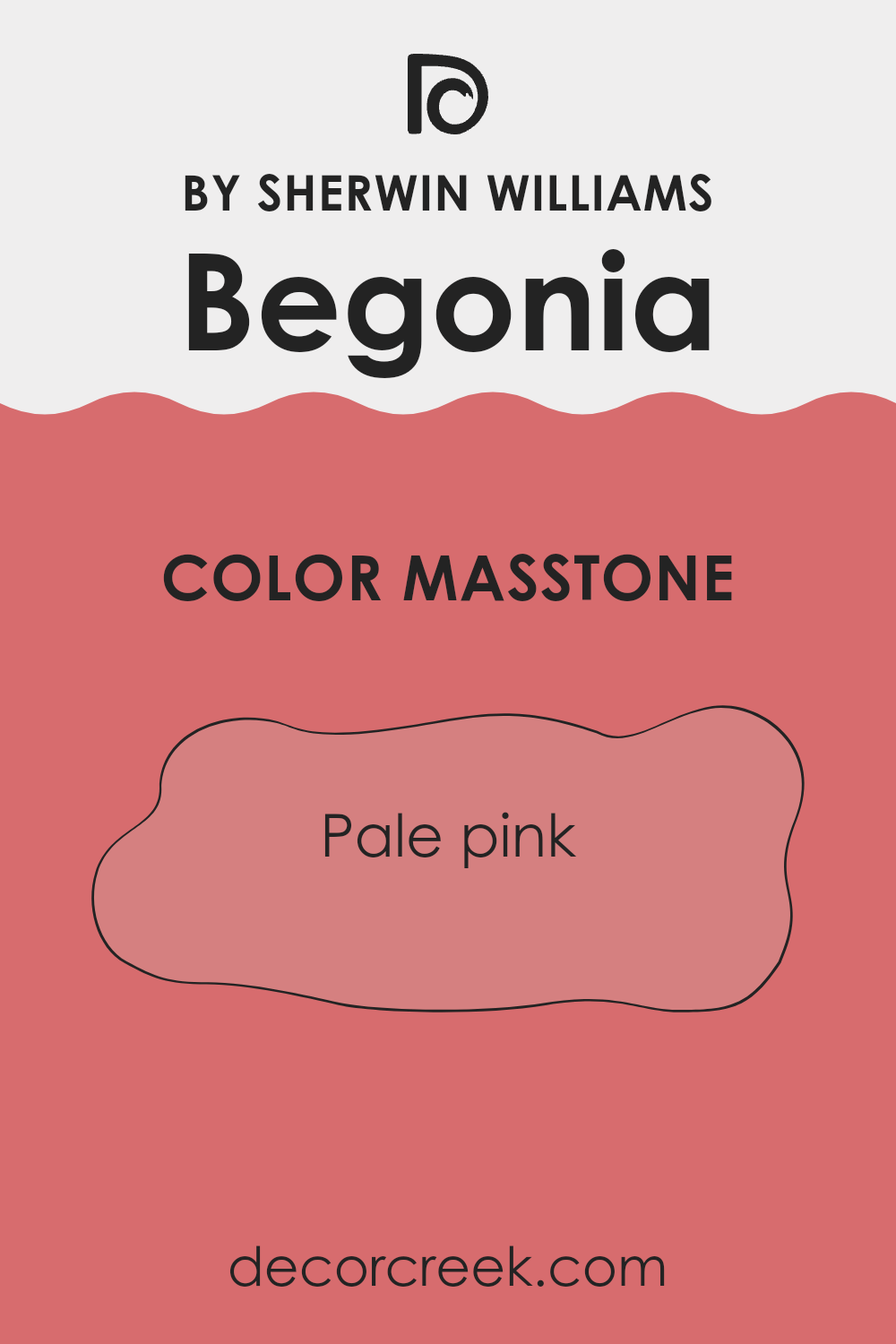
What is the Masstone of the Begonia SW 6599 by Sherwin Williams?
Begonia SW 6599 by Sherwin Williams has a masstone of pale pink, which is represented by the color code #D58080. This soft, gentle pink is flexible and can fit beautifully into many settings in homes.
Its warm tone makes it welcoming, which is ideal for living rooms where creating a cozy and inviting atmosphere is often a priority. Because it’s a pale shade, it doesn’t feel too intense, which helps it blend easily with other colors, making it a great choice for a background wall color.
In bedrooms, this pale pink can add a subtle touch of warmth, often supporting a relaxing vibe. It’s also helpful for smaller rooms, as light colors like this tend to make interiors appear bigger. Additionally, this shade of pink works well in well-lit areas; natural light tends to enhance its soft qualities, giving rooms a brighter, airy feel. Overall, its subtle elegance allows for creativity in decorating without taking over the room.
How Does Lighting Affect Begonia SW 6599 by Sherwin Williams?
Lighting plays a crucial role in how we perceive colors, significantly affecting their appearance and the mood they create in a room. Different light sources can change how a color looks, whether it’s lit by artificial light or natural sunlight.
When considering a color like Begonia by Sherwin Williams, it’s noticeable how this vibrant, warm shade can vary under different lighting conditions. Under artificial light, such as LED or fluorescent bulbs, Begonia might appear slightly more intense and richer. Artificial lighting tends to enhance the warm tones of red or pink, making this color feel cosier and more inviting in the evenings or in rooms without natural sunlight.
In natural light, the same color can look quite different depending on the time of day and the direction your room faces. North-facing rooms tend to receive less direct sunlight, and the light can often be cooler. Here, Begonia might lose a bit of its warmth and appear slightly muted, giving a softer look. South-facing rooms, on the other hand, get ample sunlight, making Begonia appear brighter and more vivid, truly popping and bringing a lively vibe to the room.
Rooms facing east enjoy bright morning light, which can make this color look very dynamic and fresh early in the day while turning softer as the hours pass. West-facing rooms experience the opposite; the color might look more neutral during the day and will gain intensity in the afternoon and evening as they catch the warmer, setting sun.
Overall, the appearance and effect of the color Begonia by Sherwin Williams can shift dramatically based on lighting and room orientation. This variability highlights the importance of testing paint colors in different lighting conditions and at different times of day before making a final decision for your room.
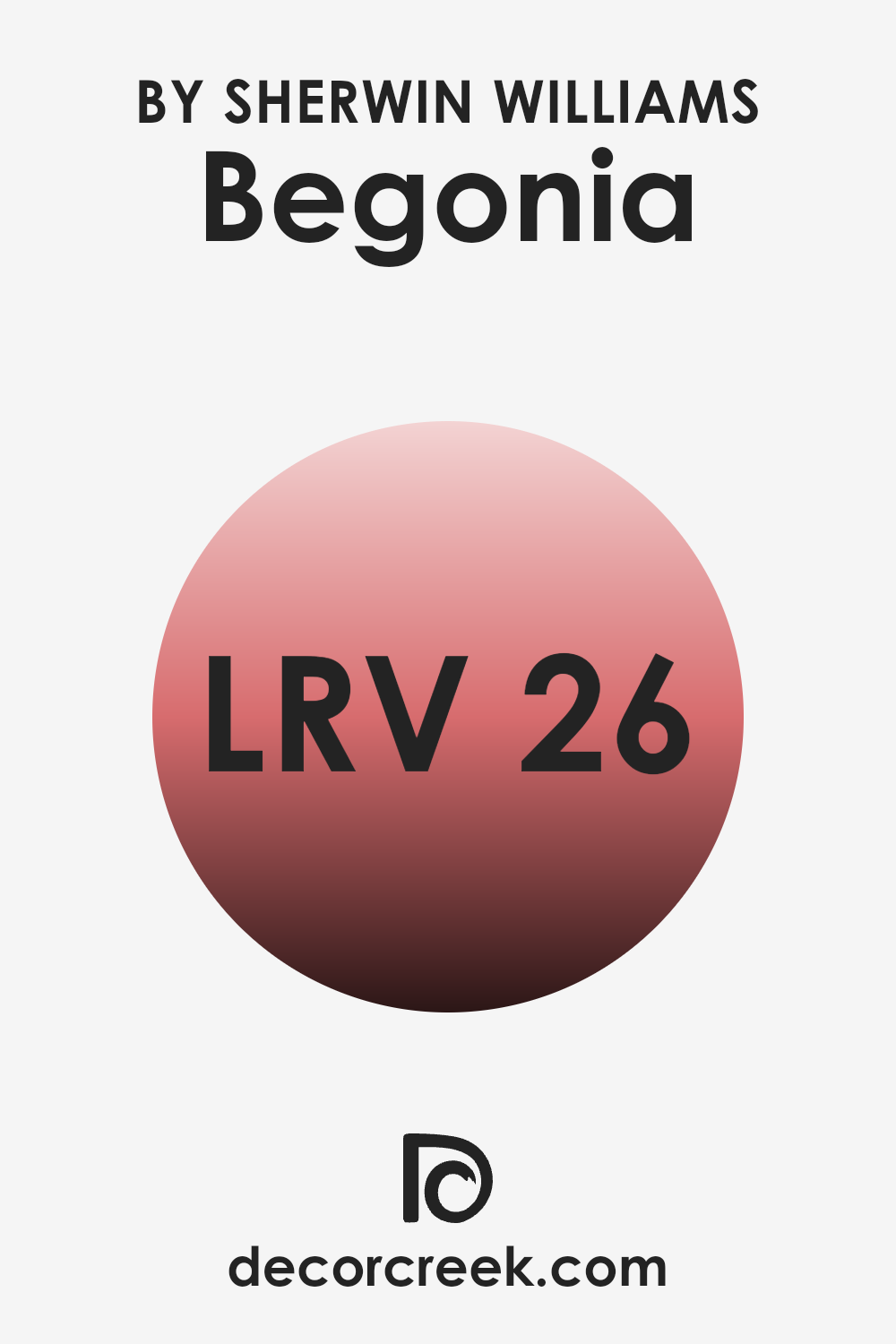
What is the LRV of Begonia SW 6599 by Sherwin Williams?
LRV stands for Light Reflectance Value, which is a measure used to indicate how much light a paint color will reflect when it is applied to a wall. It is expressed numerically, ranging from a very low number, indicating that the color absorbs more light, to a higher number, showing that it reflects more light.
This value is important when choosing the right paint color for your room because it helps you understand how bright or dark a color will appear once it is on your walls. A higher LRV can make a room feel more open and airy as it reflects more light around the area, while a lower LRV can make a room feel cozier and more enclosed as it absorbs light.
The LRV for the color Begonia is 26.238, which is on the lower end of the scale. This means it will absorb a good amount of light rather than reflecting it. In practical terms, if you paint your walls with this color, they will appear darker, and the room might feel smaller or more enclosed. This can be ideal for creating a more intimate atmosphere in a room. However, if the room is already lacking in natural light, using a color with such a low LRV can make it feel even darker.
To balance this effect, you might consider using additional lighting or pairing it with lighter colors in decor elements and furniture.
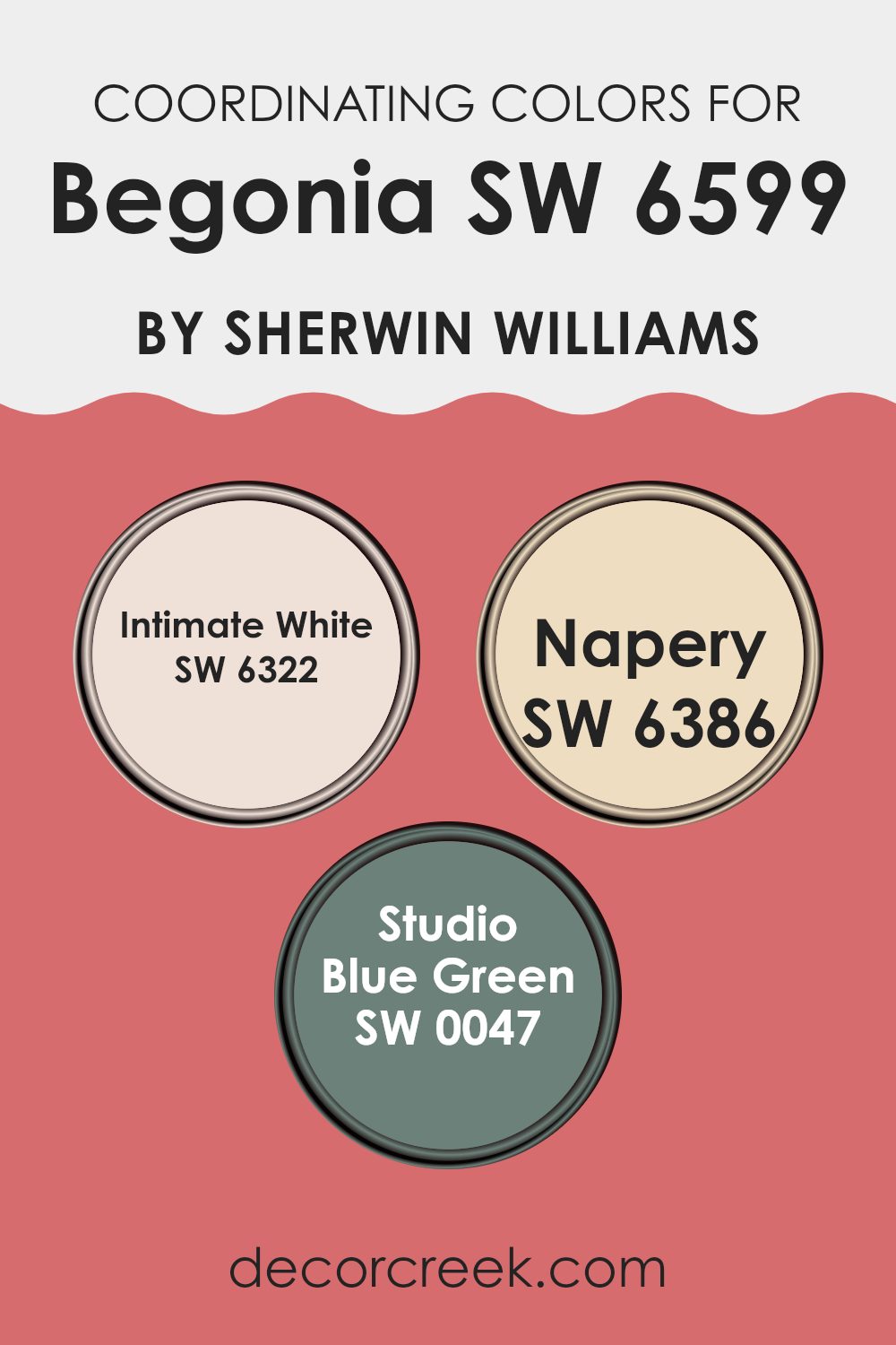
Coordinating Colors of Begonia SW 6599 by Sherwin Williams
Coordinating colors are chosen to complement the main shade in a color scheme, improving the overall aesthetic and bringing harmony to a room. When colors coordinate well, they create a balanced look, with each hue supporting the others rather than competing for attention.
For Begonia by Sherwin Williams, a vivid and cheerful color, the coordinating colors of Intimate White, Napery, and Studio Blue Green work smoothly to provide a well-rounded palette.
Intimate White is a soft, delicate shade that offers a subtle contrast to the brightness of Begonia. It’s perfect for those wanting a gentle and light background that allows bolder colors to stand out. Napery brings a warm, cozy feel with its earthy, soothing tone; it works well in rooms meant to feel calming and welcoming. Lastly, Studio Blue Green adds a touch of creativity and uniqueness to the mix. Its cool undertones offer a fresh vibe that complements the warmth of Begonia and Napery, completing a diverse but cohesive color story for any living area. These shades together make decorating simple while offering enough variety to suit different tastes and styles.
You can see recommended paint colors below:
- SW 6322 Intimate White (CHECK A SAMPLE)
- SW 6386 Napery (CHECK A SAMPLE)
- SW 0047 Studio Blue Green (CHECK A SAMPLE)
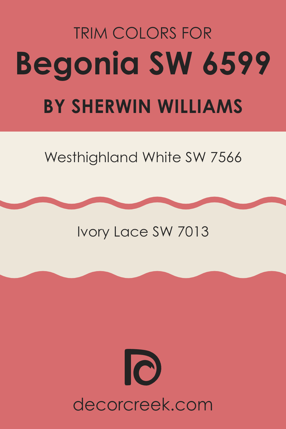
What are the Trim colors of Begonia SW 6599 by Sherwin Williams?
Trim colors, such as those used to complement Sherwin Williams’ paint color Begonia (SW 6599), play an important role in defining the overall look of a room. They enhance and frame the main wall color, adding contrast and interest that help the primary hue stand out.
For instance, trim colors can outline doorways, windows, and moldings, creating sharp, distinct lines that highlight architectural features of a room. By using trim colors effectively, one can add depth and character to interior design, making the main color—like the vibrant Begonia—stand out beautifully.
In the case of Begonia, a lively and playful pink, two recommended trim colors are Westhighland White (SW 7566) and Ivory Lace (SW 7013). Westhighland White is a clean, bright white that provides a crisp, refreshing contrast against deeper or more vivid colors, allowing them to shine without feeling too strong.
Ivory Lace offers a slightly warmer touch, with its soft, creamy tone providing a gentle contrast that can soften the overall look while still keeping the energy of the main color. Both of these shades work as excellent companions to lively Begonia, either by offering a clear boundary or a smooth transition that improves the room’s overall appearance.
You can see recommended paint colors below:
Colors Similar to Begonia SW 6599 by Sherwin Williams
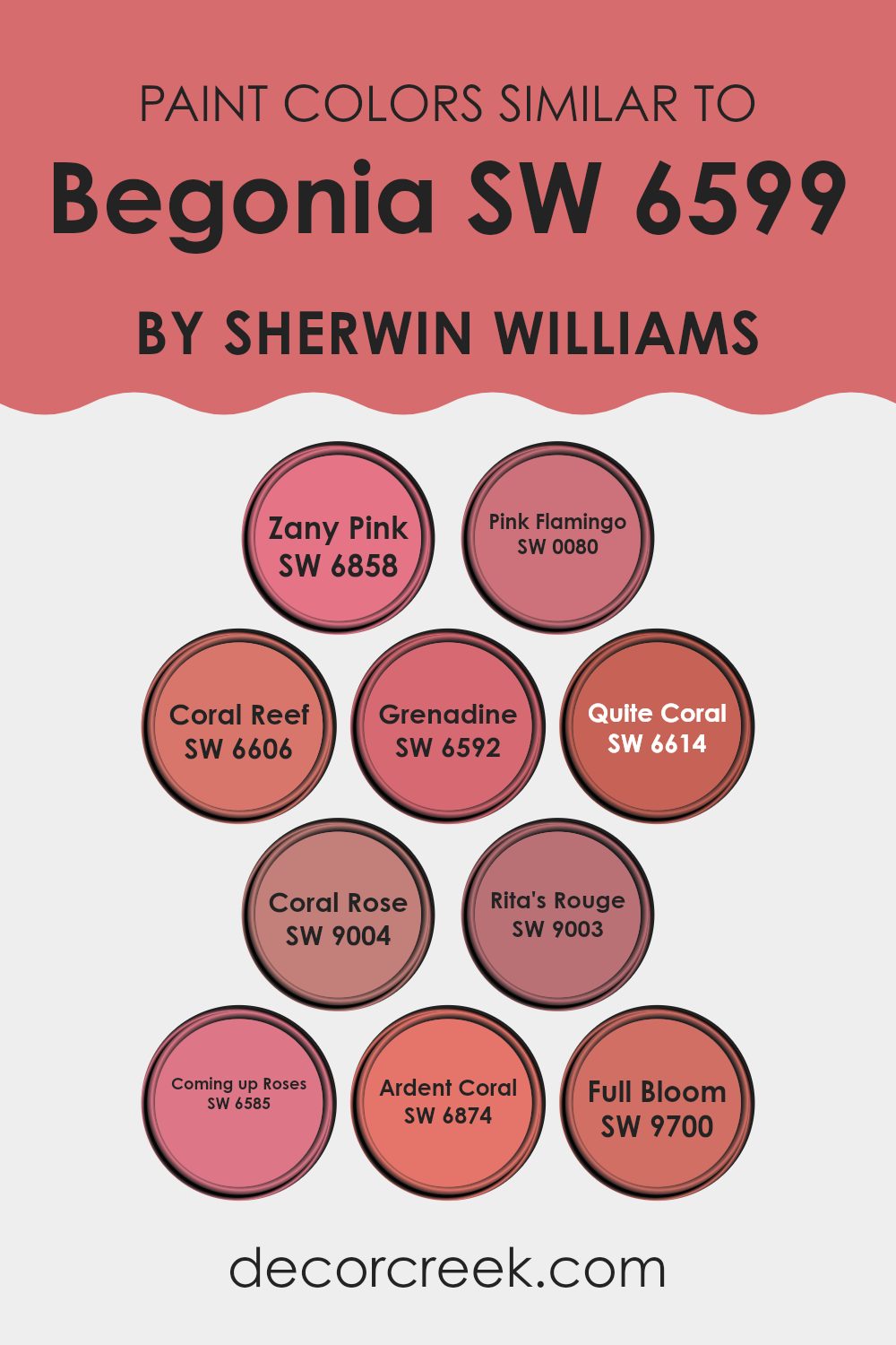
Similar colors play an important role in design by creating a harmonious and pleasing visual experience. By using shades that sit close to each other on the color spectrum, designers can create a cohesive look that subtly shifts while keeping a unified aesthetic. For instance, colors similar to Begonia by Sherwin Williams, such as Zany Pink, Pink Flamingo, and Coral Reef, allow for a smooth transition within rooms, highlighting a warm and vibrant atmosphere. These subtle variations help accent details without feeling too intense, providing balance and a gentle flow from one visual point to another.
Zany Pink and Pink Flamingo offer a lively pop of color with their bright and cheerful hues, ideal for rooms that aim to feel energetic and inviting. Coral Reef, on the other hand, brings a softer touch of warmth that feels welcoming and comforting, perfect for living areas or bedrooms. Similarly, Grenadine adds a dash of boldness with its deeper tone, offering a strong focal point within a room.
Quite Coral and Coral Rose are less intense but equally warm, making them great for creating a nurturing and positive vibe. Rita’s Rouge and Coming Up Roses introduce a richer, more mature palette, suitable for elegant rooms that need a touch of drama without feeling too strong. Lastly, Ardent Coral and Full Bloom are fantastic options when looking to bring in life and energy, as their vibrant yet soft qualities provide a balanced backdrop for lively interiors. Each of these colors supports the next, ensuring a smooth connection that improves the overall aesthetic while highlighting personal style.
You can see recommended paint colors below:
- SW 6858 Zany Pink
- SW 0080 Pink Flamingo (CHECK A SAMPLE)
- SW 6606 Coral Reef (CHECK A SAMPLE)
- SW 6592 Grenadine (CHECK A SAMPLE)
- SW 6614 Quite Coral (CHECK A SAMPLE)
- SW 9004 Coral Rose (CHECK A SAMPLE)
- SW 9003 Rita’s Rouge (CHECK A SAMPLE)
- SW 6585 Coming up Roses (CHECK A SAMPLE)
- SW 6874 Ardent Coral
- SW 9700 Full Bloom (CHECK A SAMPLE)
Colors that Go With Begonia SW 6599 by Sherwin Williams
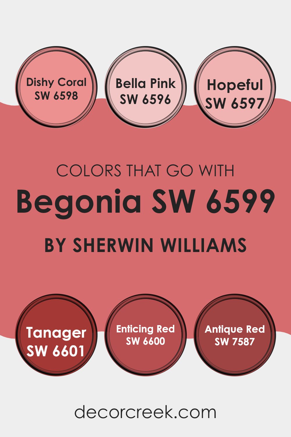
Choosing colors that complement Begonia SW 6599 by Sherwin Williams is crucial for creating a harmonious and visually appealing room. When paired thoughtfully, these colors enhance the ambient charm and set a mood that resonates with the room’s purpose. For example, colors like Dishy Coral SW 6598, a lively coral hue, inject vibrancy into the room, making it feel more dynamic and cheerful. Meanwhile, Bella Pink SW 6596 offers a softer, more gentle touch of pink that tenderly softens the overall look, perfect for creating a nurturing and warm atmosphere.
Colors like Hopeful SW 6597, a light and airy pink, add a sense of gentle optimism to the environment, making it ideal for places meant to soothe and calm. Tanager SW 6601, on the other hand, is a bold red that provides a strong focal point, commanding attention and drawing the eye. This makes it excellent for areas where you want to generate excitement or a sense of awe.
Similarly, Enticing Red SW 6600 offers a deep, rich red that adds depth and passion to the room, suitable for areas of intimate interactions or where a deeper connection is desired. Finally, Antique Red SW 7587, with its muted, deep red, offers a classic appeal, giving the room a refined look that never goes out of style, ideal for elegant settings or traditional decor themes. Understanding how these colors work together can help create rooms that are not only beautiful but also tailored to evoke the desired emotional responses.
You can see recommended paint colors below:
- SW 6598 Dishy Coral (CHECK A SAMPLE)
- SW 6596 Bella Pink
- SW 6597 Hopeful
- SW 6601 Tanager (CHECK A SAMPLE)
- SW 6600 Enticing Red (CHECK A SAMPLE)
- SW 7587 Antique Red (CHECK A SAMPLE)
How to Use Begonia SW 6599 by Sherwin Williams In Your Home?
Begonia SW 6599 by Sherwin Williams is a vibrant and warm shade of pink that can add a lively touch to any room in your home. If you enjoy colors that add a cheerful feel, Begonia is a perfect choice. You can use this color to paint a feature wall in your living room or bedroom to create a focal point. It pairs well with soft whites or light greys for a balanced look.
In smaller rooms like a bathroom or hallway, using Begonia can make the area feel inviting and cozy. This color also works wonderfully in a child’s room, bringing a playful and joyful atmosphere. For those who like a bit of creativity, you can mix it with contrasting colors like teal or soft lime green for a unique and fun look.
Furniture and home decor in neutral colors like beige, cream, or light wood tones will stand out against a Begonia background, making your home feel warm and welcoming.
Begonia SW 6599 by Sherwin Williams vs Ardent Coral SW 6874 by Sherwin Williams
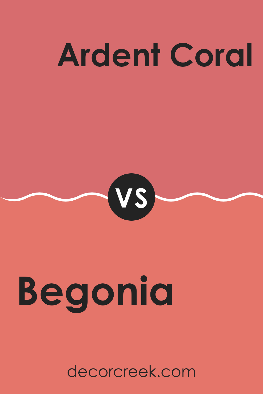
Begonia and Ardent Coral are both vibrant and warm colors from Sherwin Williams but have different tones and moods. Begonia is a soft pink with a subtle hint of peach, giving it a gentle and inviting feel. It’s perfect for creating a cozy and light atmosphere in a room, making it ideal for living rooms or bedrooms where you want a calm, cheerful vibe.
On the other hand, Ardent Coral is a bolder, more intense color. It leans more toward orange with a strong, lively presence. This color can really spice up an area, making it great for an accent wall or for rooms where you want to add some energy and fun.
Both colors are great for adding warmth to your home but serve different purposes depending on the energy and impact you want in your room. Begonia is more subdued and gentle, while Ardent Coral is vibrant and full of life.
You can see recommended paint color below:
- SW 6874 Ardent Coral
Begonia SW 6599 by Sherwin Williams vs Coral Reef SW 6606 by Sherwin Williams
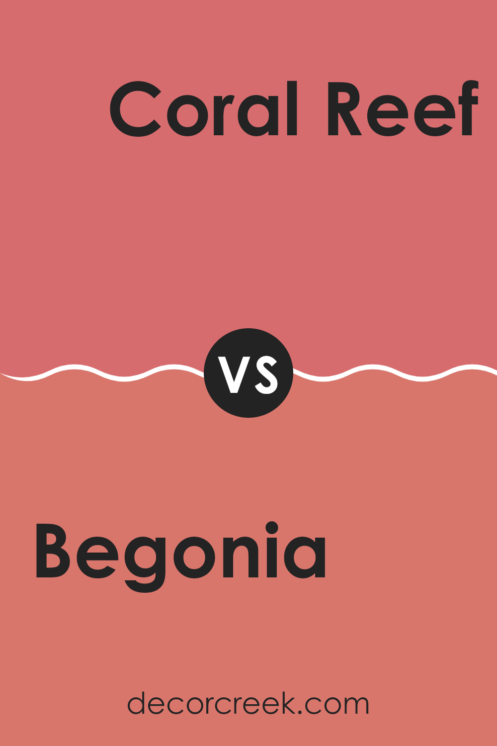
Begonia SW 6599 by Sherwin Williams and Coral Reef SW 6606, both from Sherwin Williams, offer unique yet similarly vibrant aesthetics. Begonia presents a soft, muted pink with a slightly cool undertone, giving it a gentle and calming look. This color is perfect for rooms where you want to create a soothing, welcoming atmosphere without feeling too strong. It pairs well with neutral shades and can add a delicate touch to any room.
On the other hand, Coral Reef is a brighter, more vivid shade that leans toward orange with a warm undertone. This color is bolder and more energetic, perfect for adding a splash of cheerfulness to any room. It works great in areas that benefit from a lively burst of color, such as kitchens or living rooms. Coral Reef stands out more dramatically against other colors compared to the more subdued Begonia.
Both colors offer their distinct charms and can noticeably improve the look of a room depending on the mood or style you’re aiming for.
You can see recommended paint color below:
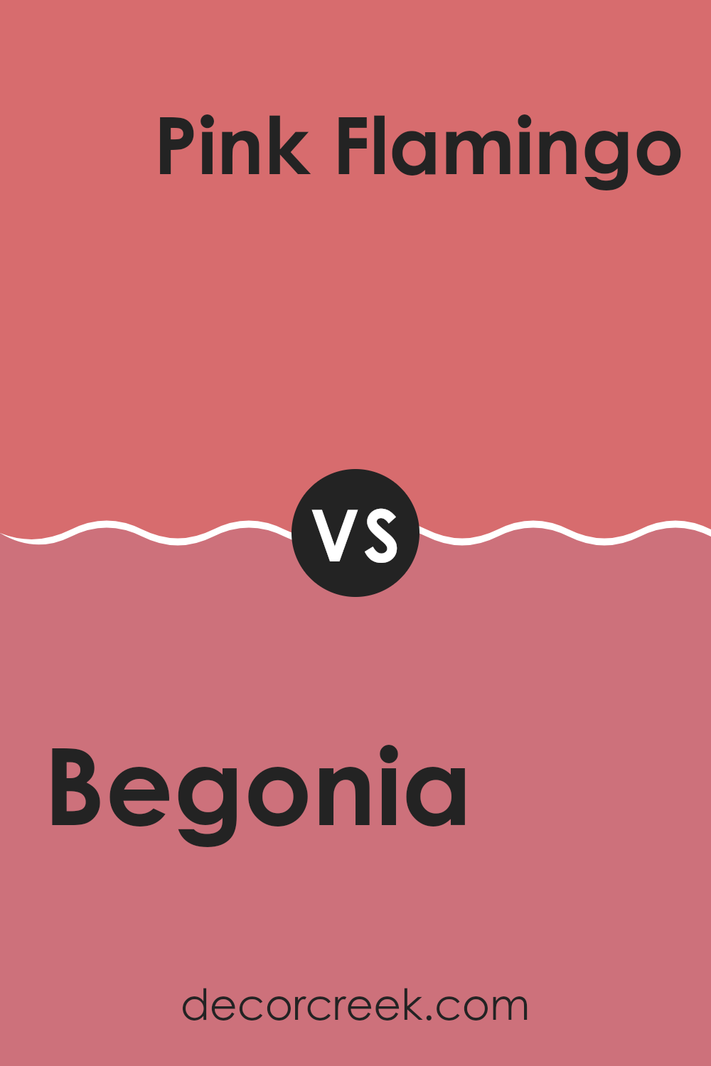
Begonia SW 6599 by Sherwin Williams vs Pink Flamingo SW 0080 by Sherwin Williams
Begonia SW 6599 and Pink Flamingo SW 0080 are both vibrant colors from Sherwin Williams, but they have distinct tones. Begonia is a deep, intense pink with a hint of red, making it pop in any room where it’s used.
It gives off a warm and inviting feeling, perfect for adding a splash of energy to a room. On the other hand, Pink Flamingo is a brighter, more pure shade of pink. It’s lighter than Begonia and has a more playful and cheerful vibe.
This color would work well in rooms meant to have a fun and light-hearted atmosphere. Overall, Begonia is richer and more grounded, while Pink Flamingo stands out for its lively and spirited presence.
You can see recommended paint color below:
- SW 0080 Pink Flamingo (CHECK A SAMPLE)
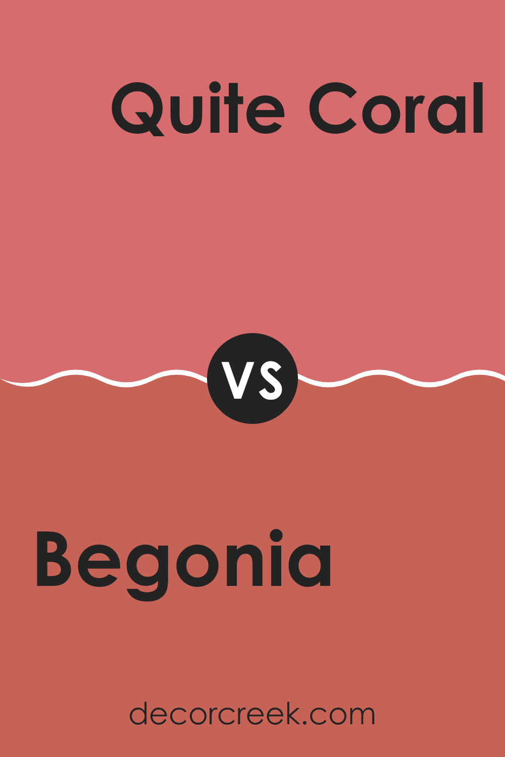
Begonia SW 6599 by Sherwin Williams vs Quite Coral SW 6614 by Sherwin Williams
Begonia and Quite Coral, both by Sherwin Williams, offer unique shades that can really improve a room. Begonia is a vibrant, deep pink with a hint of raspberry. This bold color can make a strong statement in an area, particularly well suited for a focal point in a room.
On the other hand, Quite Coral is a softer, more subdued shade. It leans more toward an orange-pink, reminiscent of a gentle sunset. This color is perfect for creating a warm, welcoming atmosphere in any living area.
When choosing between the two, consider the mood you want to set. Begonia’s vividness adds energy and a dash of fun, making it ideal for lively rooms or accent walls. Quite Coral’s milder tone is great for those looking for a more relaxed vibe, suitable for bedrooms or cozy corners. Each color has its charm, so your preference will depend on your desired aesthetic and the room’s function.
You can see recommended paint color below:
- SW 6614 Quite Coral (CHECK A SAMPLE)
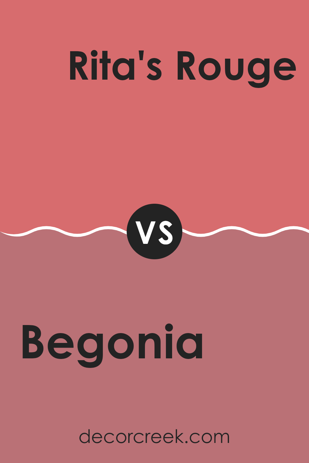
Begonia SW 6599 by Sherwin Williams vs Rita’s Rouge SW 9003 by Sherwin Williams
Begonia and Rita’s Rouge are two vivid shades by Sherwin Williams, but they have some distinct differences. Begonia leans into a bright, fresh pink with a playful vibe, perfect for rooms that want to feel open and energetic. It’s a color that pops, making it a fun choice for a child’s room or a creative area.
Rita’s Rouge, on the other hand, is a deeper, more subdued red. This shade carries a hint of refined character without being overly bold, making it suitable for areas where you might want a touch of warmth and richness without feeling too intense. It works well in living rooms or dining areas where you want a cozy, inviting atmosphere.
Overall, while both colors are in the red family, Begonia is lighter and more vibrant, whereas Rita’s Rouge is richer and subtler, offering a more relaxed feel. Each brings its own unique mood to a room, depending on what you’re looking for.
You can see recommended paint color below:
- SW 9003 Rita’s Rouge (CHECK A SAMPLE)
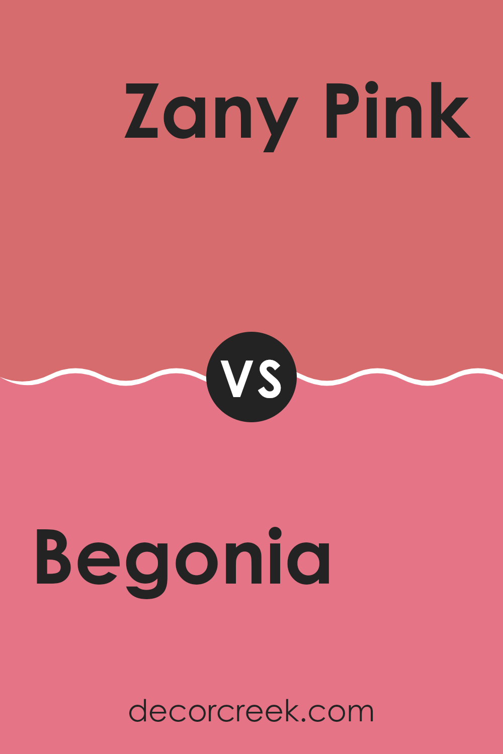
Begonia SW 6599 by Sherwin Williams vs Zany Pink SW 6858 by Sherwin Williams
Begonia and Zany Pink are two distinct pink shades from Sherwin Williams. Begonia is a soft, muted pink that carries a gentle and warm feeling, making it perfect for creating a cozy and inviting ambiance in any room.
It pairs well with soft whites and creams for a subtle, soothing palette. On the other hand, Zany Pink is a much bolder and brighter pink. It stands out and brings a vibrant, playful energy to a room. This shade is great for areas where you want to add a pop of color or make a strong visual statement.
It works well with other vivid colors or can be balanced with neutrals for a more grounded look. Both colors offer their own unique appeal, with Begonia leaning toward a delicate charm and Zany Pink toward a lively, cheerful vibe.
You can see recommended paint color below:
- SW 6858 Zany Pink
Begonia SW 6599 by Sherwin Williams vs Grenadine SW 6592 by Sherwin Williams
Begonia SW 6599 and Grenadine SW 6592 are both vibrant hues from Sherwin Williams with distinct tones that set them apart. Begonia SW 6599 is a soft, gentle pink with a subtle warmth that makes any room feel welcoming and calm. It’s perfect for creating a cozy, inviting atmosphere in areas like living rooms or bedrooms.
On the other hand, Grenadine SW 6592 is a bold, vivid red with a slight pink undertone. This color packs a punch and is ideal for adding a statement or dramatic flair to an area. It works well when used as an accent wall or in decorative touches throughout a room to draw the eye and add some energy.
While both colors are bright and cheery, Begonia leans toward a lighter, more muted palette, making it easier to pair with various decor styles. Grenadine, with its deeper saturation, is better suited for those looking to make a more striking impact. These colors could even complement each other in a single room, with Begonia balancing out the intensity of Grenadine.
You can see recommended paint color below:
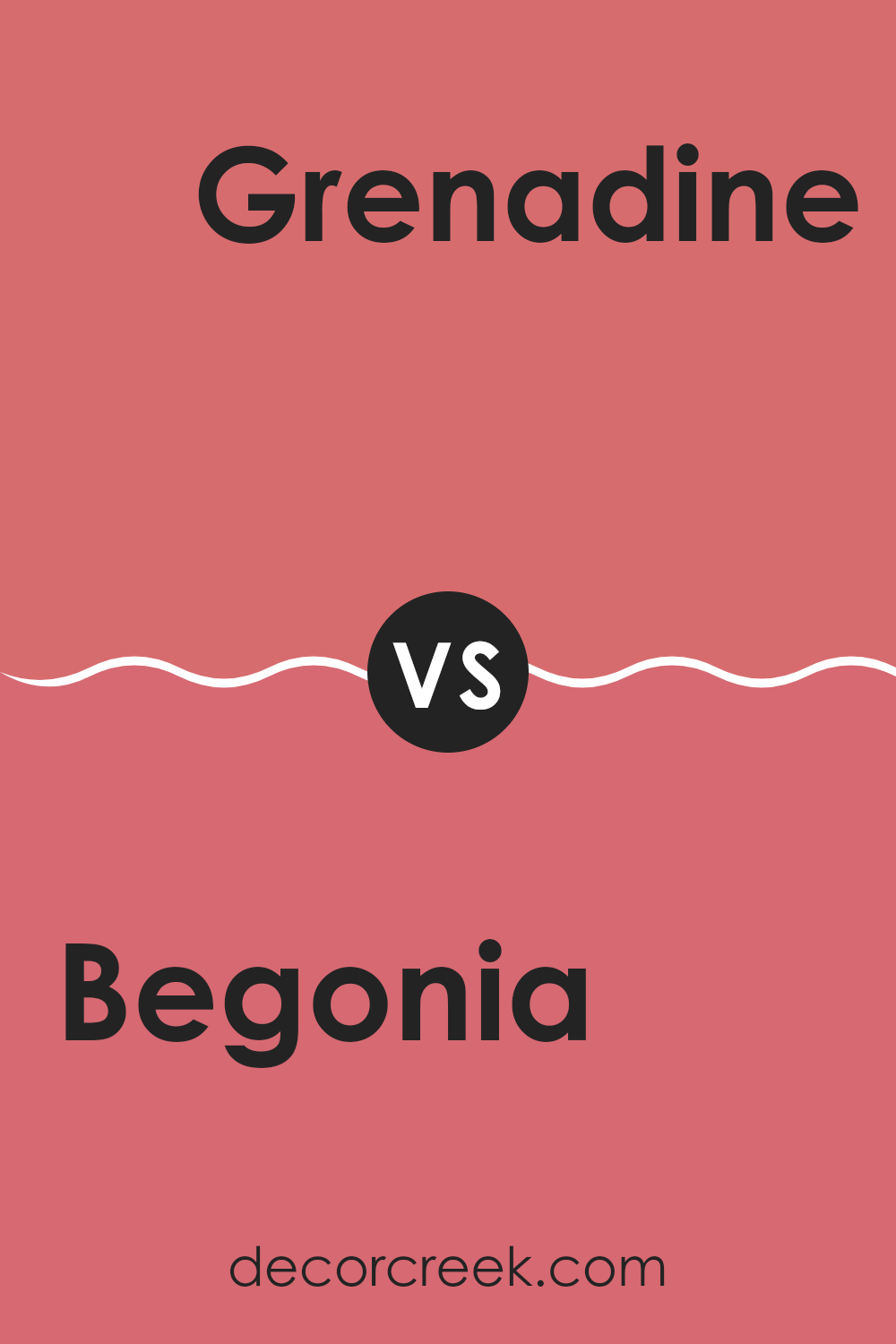
Begonia SW 6599 by Sherwin Williams vs Coral Rose SW 9004 by Sherwin Williams
Begonia SW 6599 by Sherwin Williams is a vibrant, rich pink with a lively feel, perfect for adding a cheerful touch to any room. It’s a bold color that really stands out and can make a statement when used on walls or accent pieces.
On the other hand, Coral Rose SW 9004 is a softer, more subtle shade of coral. It has a gentle warmth to it that feels very soothing, making it ideal for creating a cozy and inviting atmosphere in rooms like living areas or bedrooms.
While both colors share a base in the red-pink family, Begonia leans more toward a vivid pink, whereas Coral Rose offers a muted coral tone. Each brings its own unique mood to interiors, with Begonia being more striking and Coral Rose providing a soft, warm backdrop.
You can see recommended paint color below:
- SW 9004 Coral Rose (CHECK A SAMPLE)
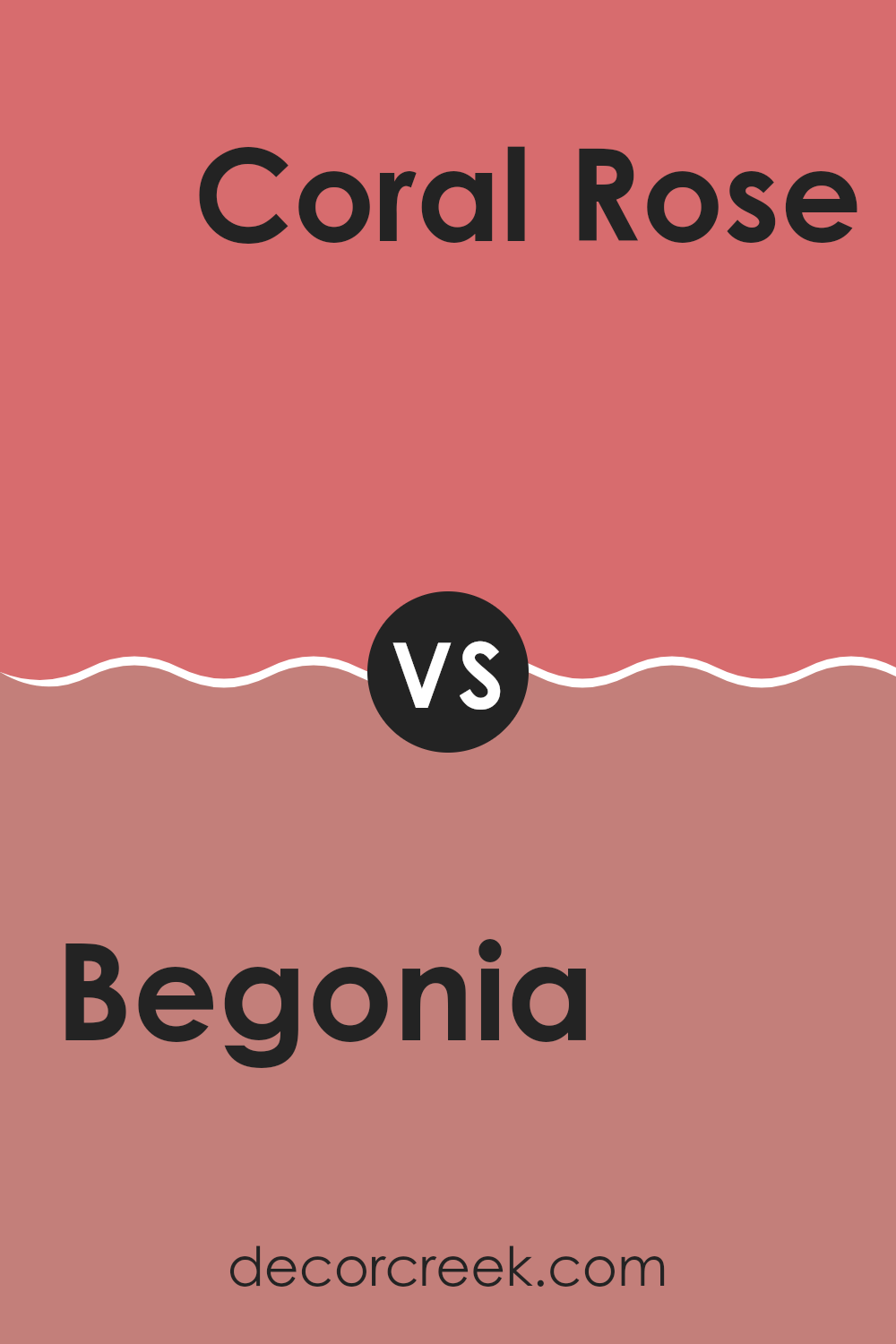
Begonia SW 6599 by Sherwin Williams vs Full Bloom SW 9700 by Sherwin Williams
The main color, Begonia, and the second color, Full Bloom, both from Sherwin Williams, present vibrant yet distinctly different hues. Begonia is a deep, rich pink with a bold presence that really stands out in a room. This color can make a strong statement on a wall or as an accent in a room, lending a cozy and warm feel despite its vividness.
On the other hand, Full Bloom is a lighter shade, more aligned with a classic pink. It’s softer and more subtle, offering a fresh and airy vibe that can brighten up a room effortlessly. Full Bloom works wonderfully in areas that benefit from a gentle, uplifting color to enhance a sense of lightness.
Both colors, while sharing a pink base, serve different moods and settings. Begonia suits rooms where a touch of drama and warmth is desired, whereas Full Bloom is perfect for creating a soothing, light atmosphere. When choosing between them, consider the impact you want the color to have in your room.
You can see recommended paint color below:
- SW 9700 Full Bloom (CHECK A SAMPLE)
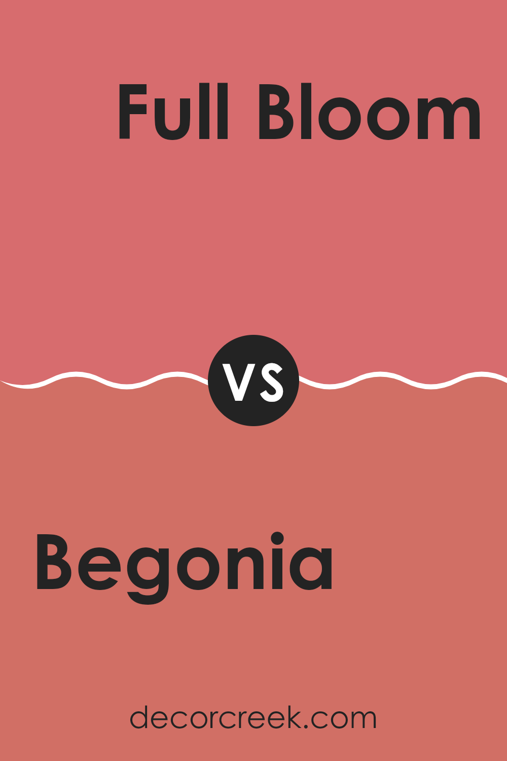
Begonia SW 6599 by Sherwin Williams vs Coming up Roses SW 6585 by Sherwin Williams
Begonia SW 6599 and Coming up Roses SW 6585, both by Sherwin Williams, are lively shades of pink, each offering a unique vibe. Begonia is a bright and vibrant pink with a hint of coral undertones, making it a cheerful choice that adds a pop of freshness to any room. It has a youthful energy, perfect for a playful room or a creative area.
On the other hand, Coming up Roses is a deeper, more muted pink. It leans toward a traditional rose shade, providing a sense of warmth and comfort. This color is ideal for creating a cozy atmosphere, suitable for areas like living rooms or bedrooms where a calming yet rich hue is desired.
Each color has its charm and ideal use, with Begonia feeling more energetic and Coming up Roses offering a cozier feel. Both bring life and personality to interiors in distinct ways.
You can see recommended paint color below:
- SW 6585 Coming up Roses (CHECK A SAMPLE)
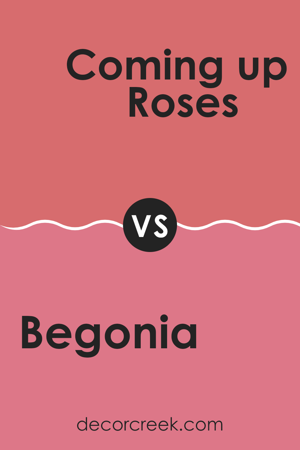
Wrapping up my thoughts on SW 6599 Begonia by Sherwin Williams, I have to say that it’s a fantastic paint color if you’re looking to make your room feel warm and welcoming. This color reminds me of a bright flower, bringing a cheerful and lively vibe to any room. I think it’s perfect for places where your family spends a lot of time together like living rooms or kitchens because it has a way of making you feel happy.
The pink hue of Begonia isn’t too bold, but it’s vibrant enough to give your walls an interesting splash of color. It’s especially great if you want something a little different but not too daring. Plus, kids would probably love the bright color in their rooms!
After trying it out, I noticed that this color goes well with lots of other colors. You can pair it with light colors like whites and grays to keep things calm or match it with dark greens or blues for a more energetic feel.
All in all, SW 6599 Begonia by Sherwin Williams is a strong choice if you’re thinking about changing up a room. It’s friendly, fun, and can make your home feel just the right amount of lively. So, if you’re ready to add some cheer to your walls, Begonia might just be the way to go!
decorcreek.com
Ever wished paint sampling was as easy as sticking a sticker? Guess what? Now it is! Discover Samplize's unique Peel & Stick samples.
Get paint samples
