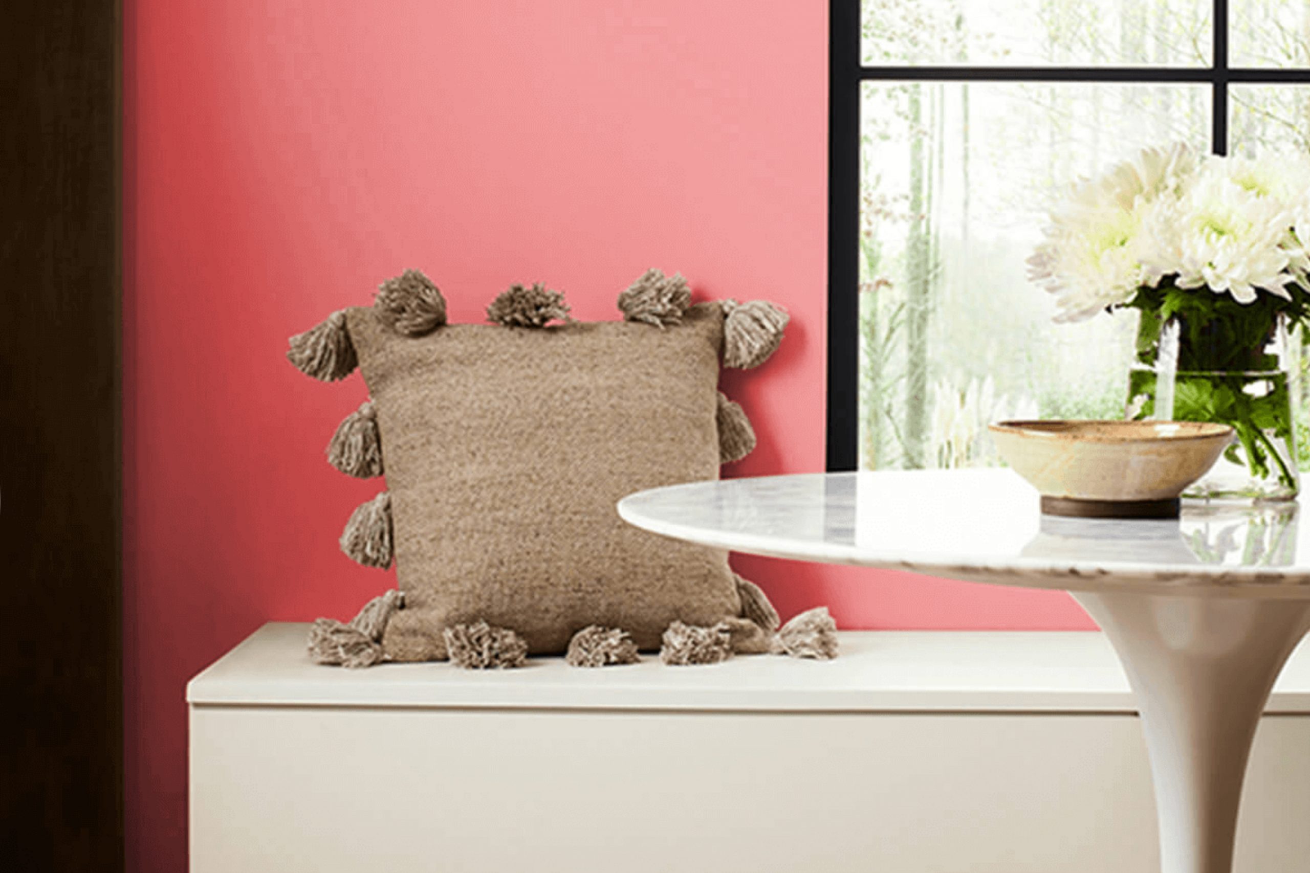
As I hold a fresh swatch of SW 6598 Dishy Coral, I’m instantly drawn to its warmth and vibrancy. This color exudes a sense of confidence and energy, yet it feels welcoming and familiar. It strikes a perfect balance between boldness and comfort, making it a delightful choice for any room. Envisioning Dishy Coral on a living room wall or as an accent in a bedroom fills me with the kind of joy that only a truly special color can bring.
Its lively hue has a way of sparking creativity. I imagine pairing it with crisp whites or soft grays to highlight its unique charm. Regardless of the setting, Dishy Coral has an uncanny ability to enliven its surroundings without being too intense. It feels like a friend who knows how to light up a room just by walking in.
As I contemplate its potential, I am impressed by how Dishy Coral manages to be both invigorating and soothing. The mood it sets is playful yet refined, making it adaptable to a variety of styles and preferences.
It’s clear to me that this color can refresh a home into a vibrant, inviting sanctuary—one that will be remembered not just for its looks, but for the warmth it radiates.
What Color Is Dishy Coral SW 6598 by Sherwin Williams?
Dishy Coral, a vibrant and warm shade by Sherwin Williams, is an inviting coral hue with a blend of pink and orange tones. This color can add a cheerful and energizing atmosphere to any room. It’s perfect for those who want to create a lively and welcoming environment. Dishy Coral works exceptionally well in interiors where pops of color are desired, such as bohemian, eclectic, or coastal styles. Its warmth and brightness can make any room feel more inviting and lively.
This color pairs beautifully with natural materials like light woods and rattan, adding to a sunny and relaxed vibe. In combination with white or light gray, Dishy Coral can stand out, making it great for feature walls or accent pieces. Additionally, it works well with soft textures, such as cotton or linen fabrics, which can enhance its warm and approachable feel.
Metals like gold or brass can complement Dishy Coral’s warmth, bringing out its rich undertones, while plants and greenery provide a refreshing contrast. Overall, Dishy Coral is a flexible color that can brighten up a room and infuse it with a sense of warmth and happiness without overpowering the room.
Is Dishy Coral SW 6598 by Sherwin Williams Warm or Cool color?
Dishy Coral SW 6598 by Sherwin-Williams is a warm, vibrant color that brings a lively energy to any room. This shade combines elements of pink and orange to create a cheerful, inviting atmosphere. When used in a home, Dishy Coral can liven up living rooms, making them feel cozy and welcoming. It’s a great choice for accent walls, adding a pop of color that stands out without being too intense.
In living rooms, Dishy Coral creates a pleasant area for conversation and relaxation. It pairs well with neutral tones like beige or cream, allowing the color to shine while maintaining balance. In bedrooms, this color brings warmth, making a room feel snug and uplifting.
Dishy Coral can also be used in dining areas to add a sense of fun and enjoyment, inspiring pleasant gatherings. Overall, Dishy Coral SW 6598 is a flexible shade that brings warmth and life into any home setting.
Undertones of Dishy Coral SW 6598 by Sherwin Williams
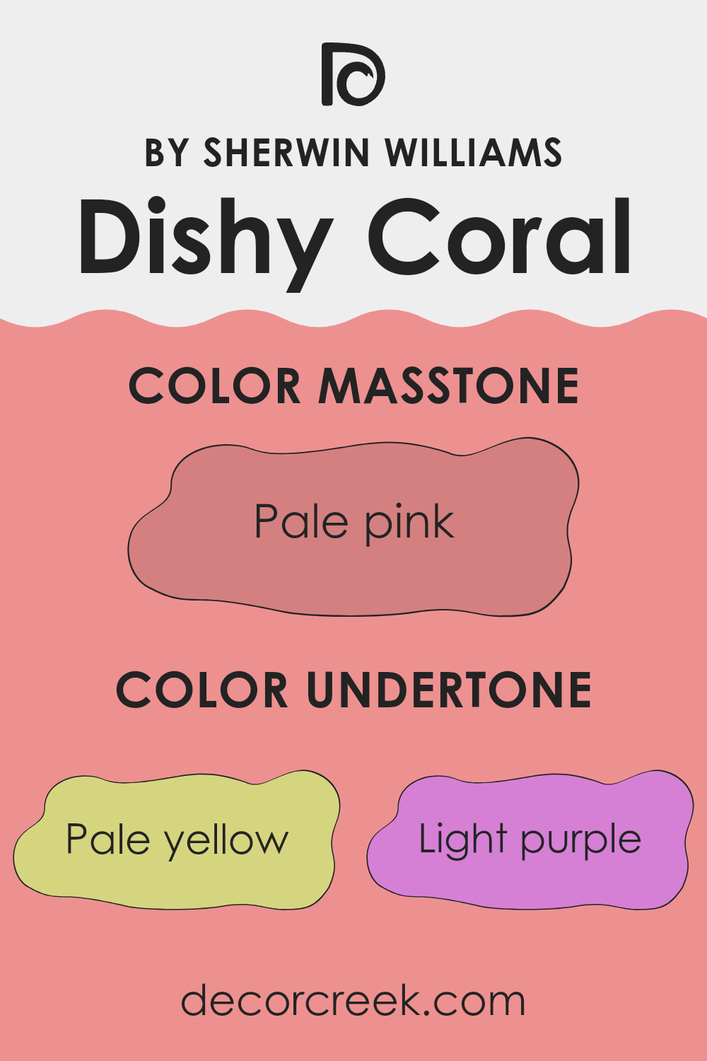
Dishy Coral by Sherwin Williams is a vibrant and lively color, and its undertones give it depth and complexity. When we’re looking at any color, undertones—those subtle hints of other colors present—can significantly influence how the main color appears. Depending on lighting and surrounding colors, these undertones can make the primary color seem warmer, cooler, subdued, or more vivid.
For Dishy Coral, the undertones of pale yellow, light purple, and pink can add warmth, making it feel more inviting and energetic. The presence of gray and light gray might lend a balancing effect, ensuring the coral doesn’t become too intense.
Undertones like light purple, lilac, purple, and fuchsia introduce coolness, offering a subtle, soft contrast. Meanwhile, hints of orange and red play up the color’s fiery side, adding to its brightness and cheerfulness.
On interior walls, these undertones can affect how Dishy Coral changes throughout the day. The walls might feel more lively and cheerful in the morning sun or appear soothing and richer in the evening light. Depending on the furnishings and room decor, these undertones can cause the color to lean into its warm or cool family, making it flexible for various styles and moods.
What is the Masstone of the Dishy Coral SW 6598 by Sherwin Williams?
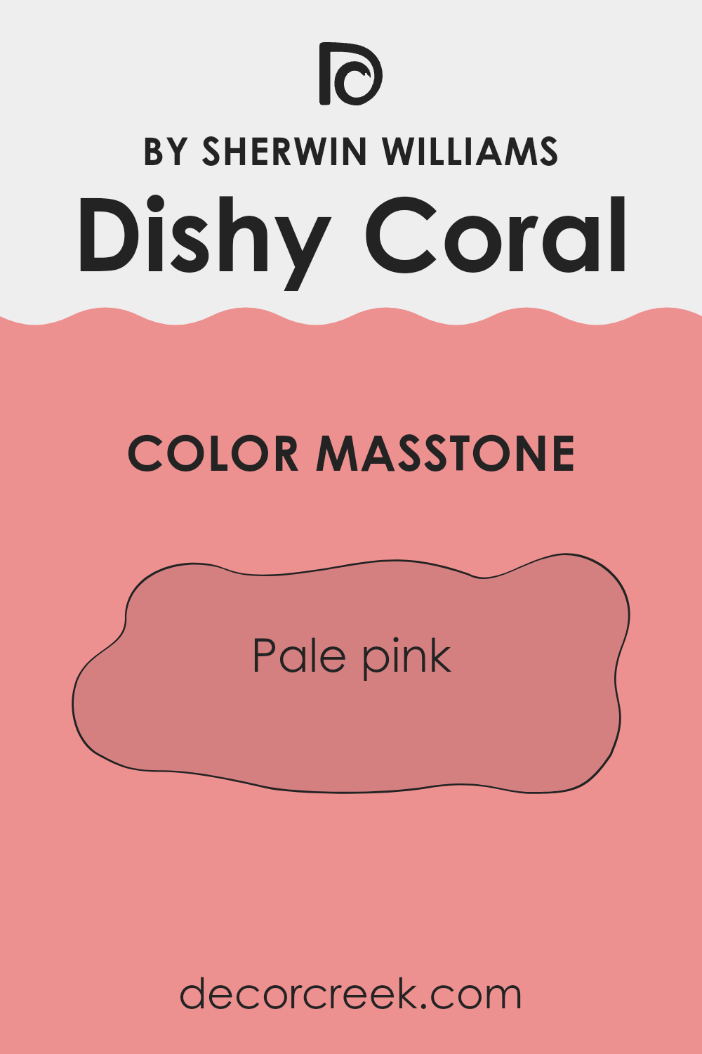
Dishy Coral (SW 6598) by Sherwin Williams is a charming pale pink color, resembling the appearance of blushing coral. Its masstone, which is the primary hue you see at first glance, is a delightful shade of pale pink (#D58080).
This color has a warm and inviting quality, perfect for adding a gentle touch of warmth to your home. In living areas, this cheerful color can create a cozy and welcoming atmosphere. It’s particularly effective in smaller areas or rooms with limited natural light, as the soft pink hue can reflect light and create an uplifting feel.
Bedrooms and nurseries benefit from this light, calming shade, fostering a peaceful environment. Its subtle warmth allows it to pair well with neutral tones like whites, grays, and beiges, providing a balanced contrast. Using Dishy Coral as an accent wall or in decor elements can brighten a room and make it feel more inviting.
How Does Lighting Affect Dishy Coral SW 6598 by Sherwin Williams?
Lighting plays a crucial role in how we perceive colors. The same paint color can look different depending on the type and amount of light it receives. Dishy Coral SW 6598 by Sherwin Williams is no exception. It’s a warm, coral hue that can change in appearance under different lighting conditions.
In artificial light, the color’s look can vary. Warm incandescent bulbs can enhance its cozy, coral tone, making it feel more inviting and vibrant. On the other hand, cool fluorescent lights might make it appear muted or slightly dull, as these lights emphasize cooler tones.
In natural light, Dishy Coral will also appear different based on the direction of the room and the time of day. In north-facing rooms, which generally receive cooler and less direct light, Dishy Coral might appear slightly more subdued. The lack of direct sunlight means the color won’t shine as brightly, so it might feel a bit softer or more muted than in other areas.
In south-facing rooms, where sunlight is usually more direct and warm, Dishy Coral can look lively and rich. The warmth of the sunlight intensifies the coral tones, making the room feel cozy and energized.
East-facing rooms receive warm light in the morning and cooler light in the afternoon. So, Dishy Coral may look brighter and more vibrant early in the day, when the warm morning light highlights its coral characteristics. Later, it might take on a softer tone.
West-facing rooms catch the afternoon and evening light, which is warmer. The coral color can glow beautifully in the late afternoon and evening sunlight, enhancing its warm and inviting nature.
Overall, when choosing a paint color like Dishy Coral, it’s important to test it in different lighting conditions to see how it will interact with the natural and artificial light in your room.
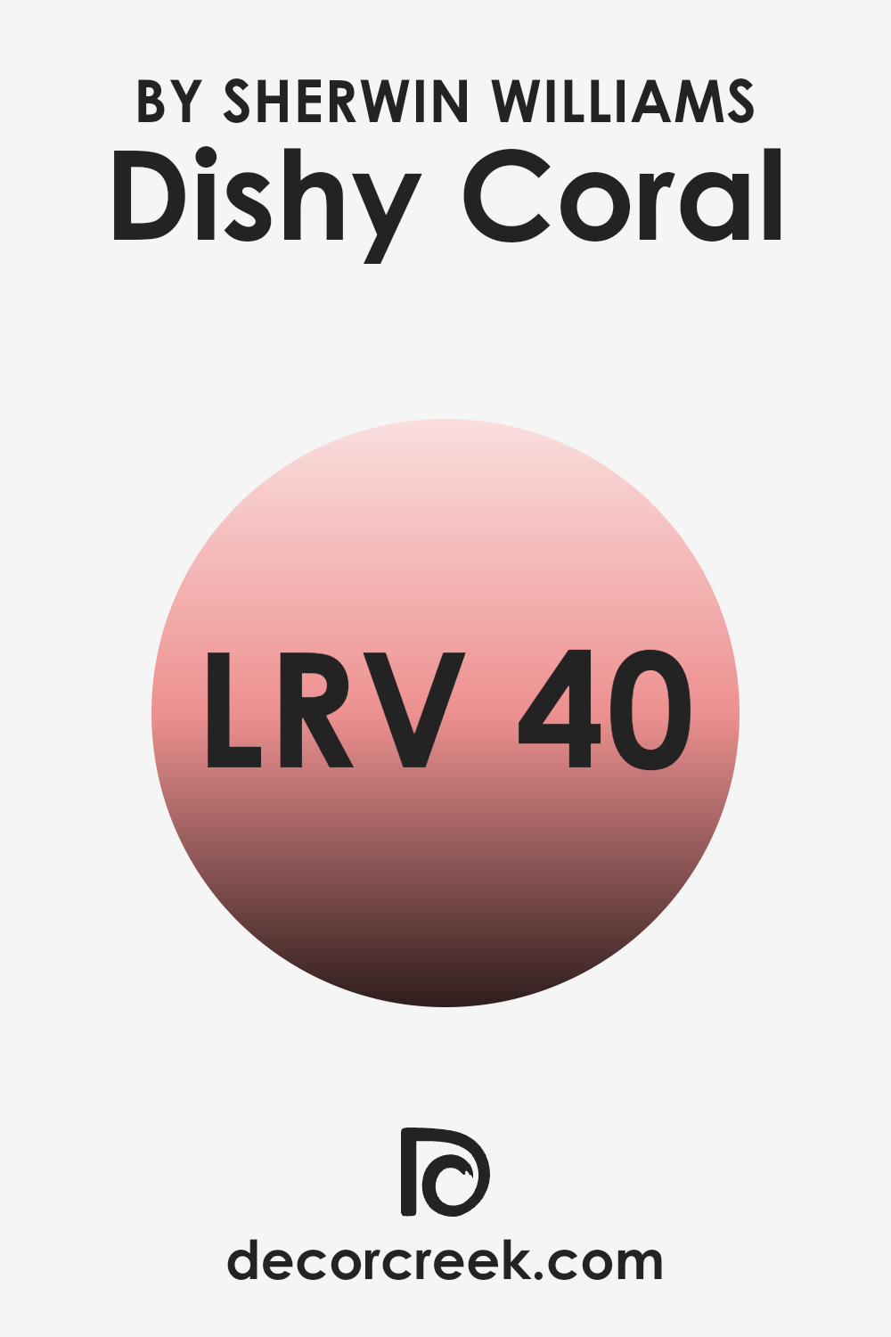
What is the LRV of Dishy Coral SW 6598 by Sherwin Williams?
Light Reflectance Value, or LRV, is a measurement that tells us how much light a color reflects or absorbs. It’s a scale that ranges from 0 to 100, where 0 means the paint absorbs all light (black), and 100 means it reflects all light (white). A higher LRV value means the color will reflect more light, making it appear lighter and brighter in a room.
Conversely, a lower LRV means the color absorbs more light, making it look darker. When choosing paint colors for a room, considering the LRV is important because it can influence how spacious or cozy the room feels. A color with a high LRV can make a room feel more open and airy, while a color with a lower LRV can create a warm and intimate atmosphere.
For the color Dishy Coral by Sherwin Williams, with an LRV of 40.249, it sits in the middle range of the scale. This means it absorbs more light than it reflects, but it still has enough brightness to prevent a room from feeling too dark. Dishy Coral’s LRV of around 40 suggests that it’s a medium-toned shade. In a room with good natural or artificial lighting, this coral hue can add a sense of warmth and comfort without being too intense.
However, in a dimly lit room, it might appear a bit more muted and subdued. If you’re using this color in a small area, it can create a cozy, inviting vibe.
In larger areas with plenty of light, it retains its lively and warm appearance, adding vibrancy to the room.
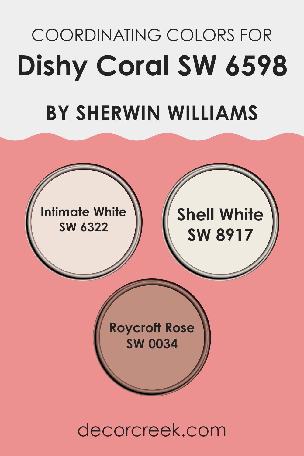
Coordinating Colors of Dishy Coral SW 6598 by Sherwin Williams
Coordinating colors are hues that work well together to create a harmonious look in a room. When you have a vibrant color like Dishy Coral, you can choose coordinating colors that complement and balance its boldness. These colors help in creating a cohesive and unified atmosphere. For instance, Intimate White is a soft, warm white that can tone down the brightness of coral while adding warmth and depth to a room.
It is a gentle hue that works beautifully as a backdrop, inviting other colors to shine. Shell White offers a similar warmth but with a hint of peach, providing a subtle connection to coral shades while keeping the overall palette light and airy.
Roycroft Rose, on the other hand, adds a touch of historical richness to the mix. It is a muted pink that carries weight and elegance, offering a deeper color that pairs nicely with the vibrant coral without overpowering it. Together, these colors complement the lively nature of coral, providing a balanced look that is both inviting and refined. When used together, they create a room that feels both dynamic and comfortable, with each color enhancing the overall aesthetic in its unique way.
You can see recommended paint colors below:
- SW 6322 Intimate White
- SW 8917 Shell White
- SW 0034 Roycroft Rose
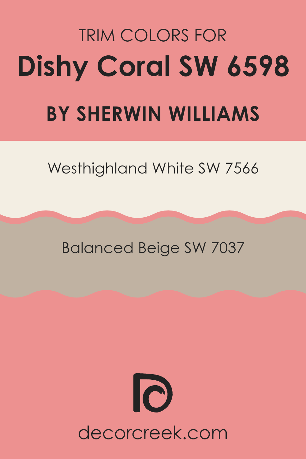
What are the Trim colors of Dishy Coral SW 6598 by Sherwin Williams?
Trim colors are the accent colors used on window sills, baseboards, doors, and molding to complement or contrast the main wall color. Choosing the right trim color can make a bold wall color stand out and add definition to a room. For Sherwin Williams’ Dishy Coral, a vibrant and warm hue, selecting a suitable trim color is key to achieving a harmonious look. Trim colors such as Westhighland White (SW 7566) and Balanced Beige (SW 7037) can enhance Dishy Coral’s look in different ways.
Westhighland White, a soft, creamy white, provides a clean, classic framing that brightens the room and complements the coral’s brightness. Balanced Beige, on the other hand, offers a warm, neutral tone that adds subtle contrast and warmth, grounding the vividness of Dishy Coral without clashing.
Westhighland White is a warm, creamy white with a touch of softness that adds warmth and cleanliness to any room. It works well as a trim color, providing a subtle backdrop that allows vibrant colors like Dishy Coral to pop. Balanced Beige is a flexible neutral with earthy undertones that creates a cozy and calming effect. It provides a contrasting yet harmonious pairing with Dishy Coral, bringing out its warmth while adding depth to the room.
Using either of these trim colors with Dishy Coral can result in a beautifully balanced living area, where the vibrant walls are enhanced by carefully selected accents.
You can see recommended paint colors below:
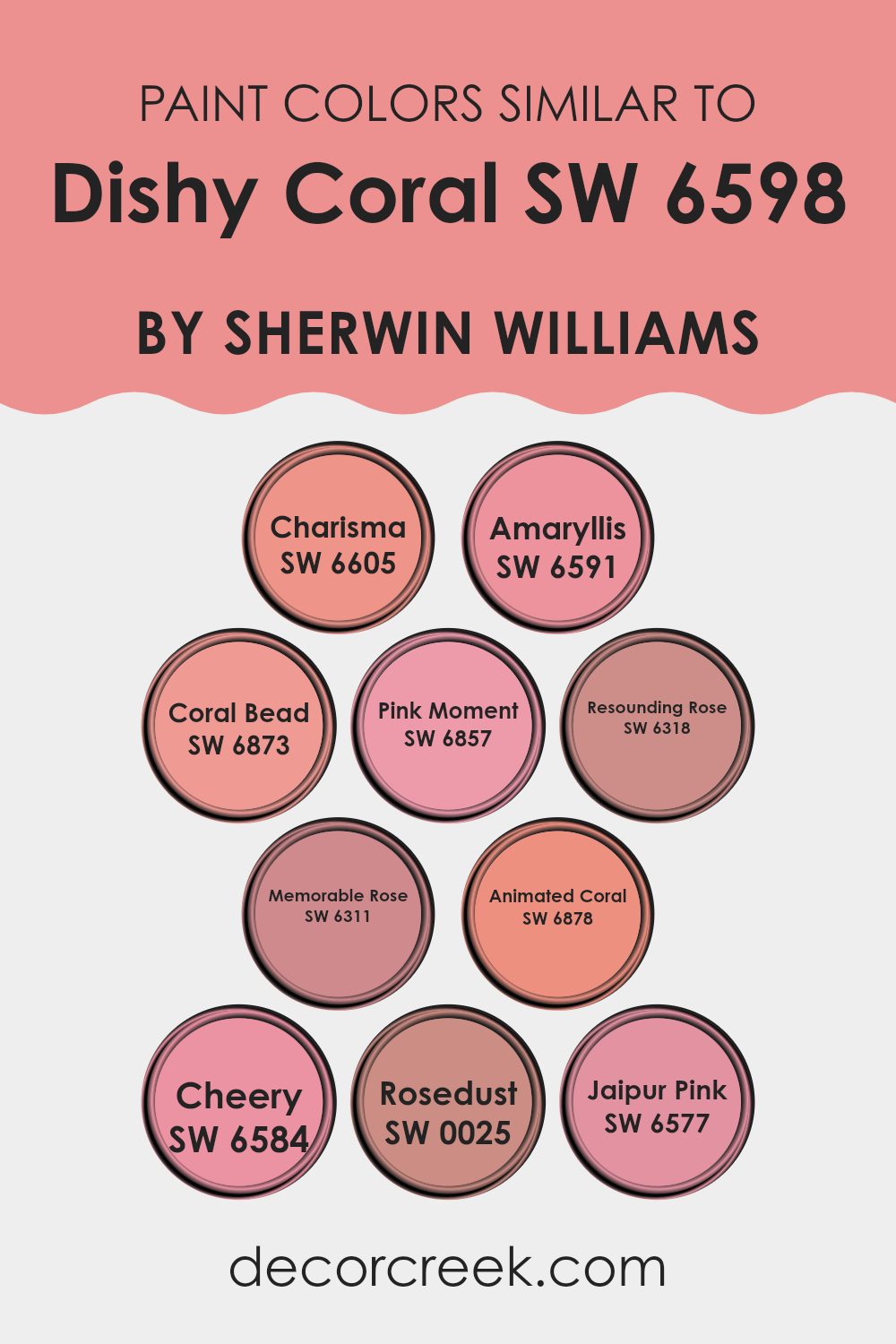
Colors Similar to Dishy Coral SW 6598 by Sherwin Williams
Similar colors to Dishy Coral, such as Charisma, Amaryllis, Coral Bead, Pink Moment, Resounding Rose, Memorable Rose, Animated Coral, Cheery, Rosedust, and Jaipur Pink, play an important role in creating cohesive aesthetics. These shades instantly harmonize with Dishy Coral as they share a warm, vibrant undertone, forming a unified palette.
Charisma offers a lively, uplifting appearance that pairs effortlessly with other warm tones. Amaryllis shines with a vibrant and bold presence that makes any room stand out. Coral Bead brings energy and excitement, adding a dynamic touch to any room. Pink Moment is softer, providing a gentle, warm glow.
Resounding Rose adds depth with a rich and alluring hue that complements Dishy Coral perfectly. Memorable Rose embodies elegance with its soft and nuanced pinkish tones that bring a subtle warmth. Animated Coral, true to its name, is bright and cheerful, perfect for adding a pop of color. Cheery, appropriately named, brings joy and lightness with its fresh and lively tone.
Rosedust offers a more muted and refined pink, adding a touch of class and subtlety.
Jaipur Pink is rich and deep, providing a stunning complement to Dishy Coral. Together, these colors create an inviting and balanced environment.
You can see recommended paint colors below:
- SW 6605 Charisma
- SW 6591 Amaryllis
- SW 6873 Coral Bead
- SW 6857 Pink Moment
- SW 6318 Resounding Rose
- SW 6311 Memorable Rose
- SW 6878 Animated Coral
- SW 6584 Cheery
- SW 0025 Rosedust
- SW 6577 Jaipur Pink
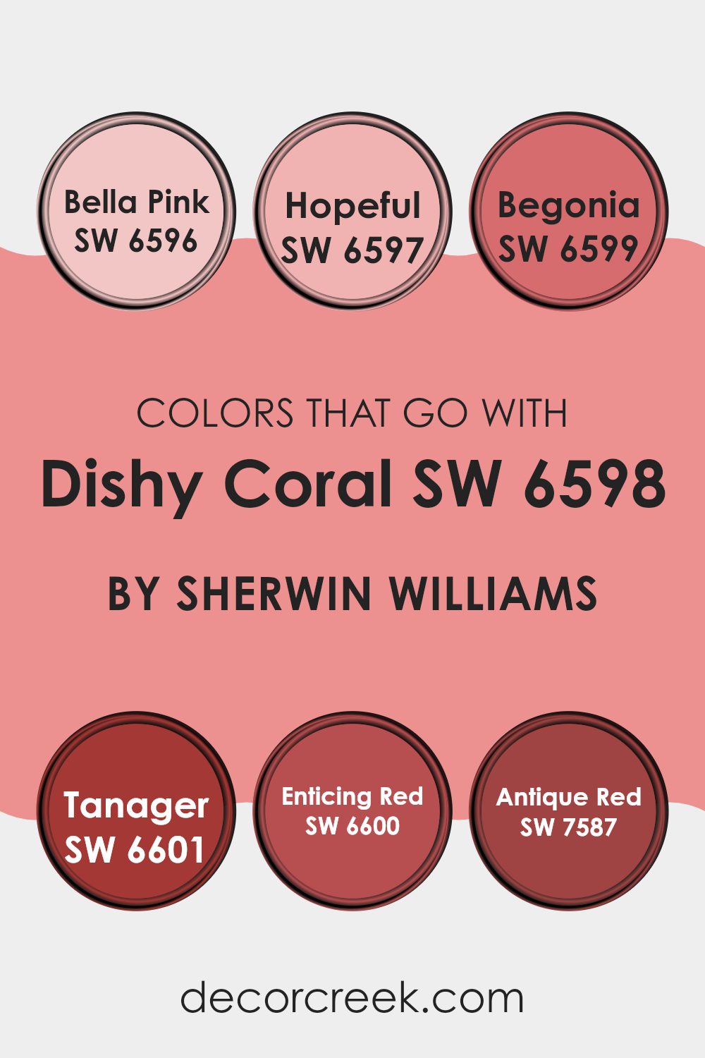
Colors that Go With Dishy Coral SW 6598 by Sherwin Williams
When decorating with Dishy Coral SW 6598 by Sherwin Williams, the colors that accompany it play a key role in creating a balanced and harmonious look. Colors like Bella Pink SW 6596 and Hopeful SW 6597 bring out the softer, more delicate side of Dishy Coral. Bella Pink is a gentle shade that adds a sweet touch, while Hopeful feels fresh and light-hearted, ideal for creating a cheerful atmosphere. These shades can help soften the vibrant energy of Dishy Coral, making a room feel inviting and comfortable.
On the other hand, pairing Dishy Coral with colors like Begonia SW 6599, Tanager SW 6601, Enticing Red SW 6600, and Antique Red SW 7587 can bring warmth and depth to a room. Begonia is lively, adding a rich, almost playful, layer to any setting.
Tanager offers a bold warm tone that pairs perfectly, creating a strong, vivid look. Enticing Red adds a sense of excitement and boldness, while Antique Red provides a classic, lasting feel. Together, these colors help to ground Dishy Coral, adding richness without overpowering the room. The combination of these colors can guide the overall mood and feel of a room, creating areas that are both lively and welcoming.
You can see recommended paint colors below:
- SW 6596 Bella Pink
- SW 6597 Hopeful
- SW 6599 Begonia
- SW 6601 Tanager
- SW 6600 Enticing Red
- SW 7587 Antique Red
How to Use Dishy Coral SW 6598 by Sherwin Williams In Your Home?
Dishy Coral SW 6598 by Sherwin Williams is a warm and inviting color that adds a splash of energy to any room. Its vibrant coral hue can make areas feel cheerful and welcoming. You might consider using this color in areas where you want to create an uplifting atmosphere, such as living rooms or kitchens.
Pair it with neutral tones like whites or grays to balance its brightness, making it stand out without overpowering the room. Dishy Coral can also be an excellent choice for accent walls, helping to draw attention to specific areas or features in a room.
In bedrooms, it can provide a cozy, intimate vibe when used in softer lighting. For those hesitant to use bold colors, incorporating Dishy Coral through smaller elements like pillows, throws, or artwork can add just the right amount of color without committing to full walls. This flexible color can breathe life into any home.
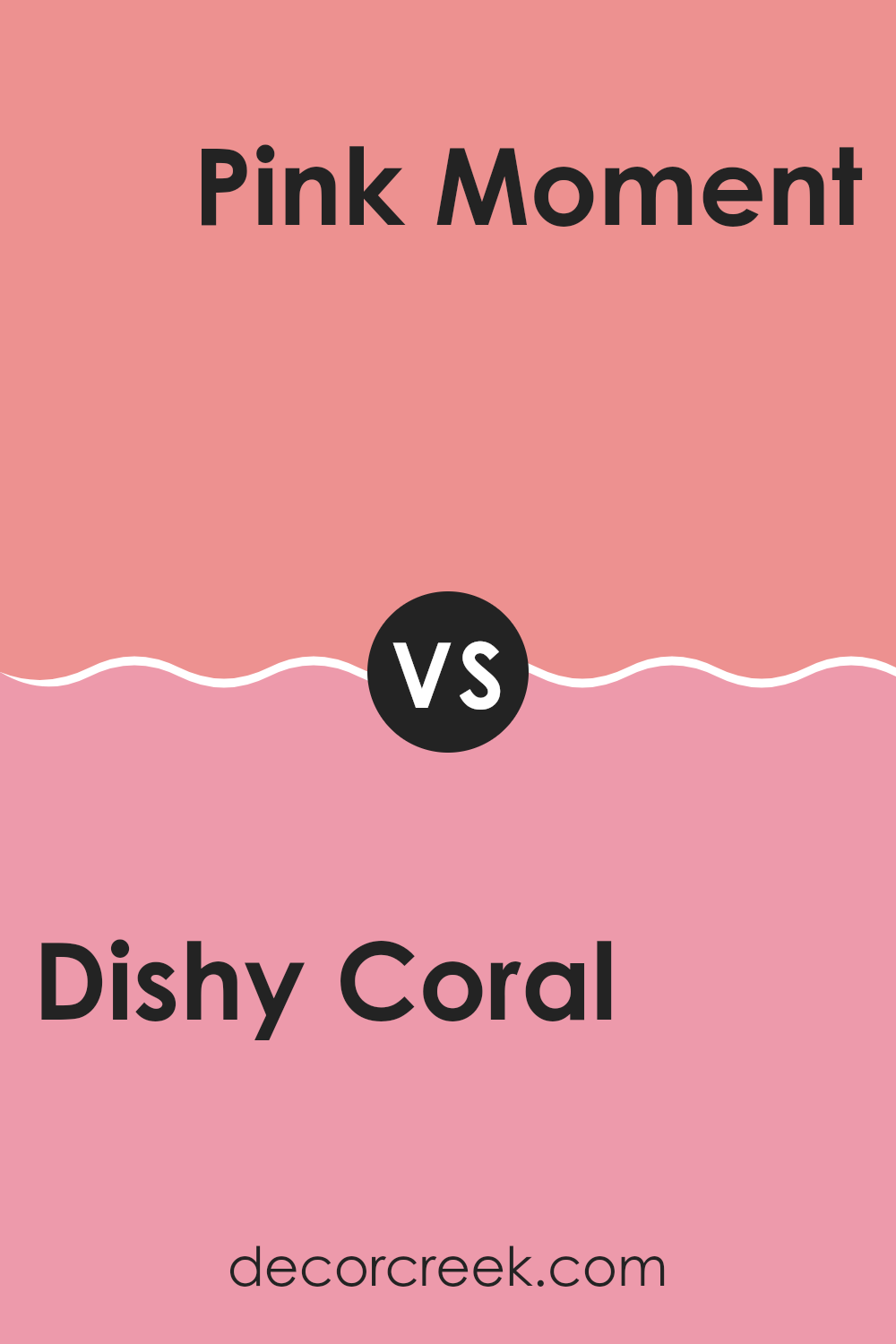
Dishy Coral SW 6598 by Sherwin Williams vs Pink Moment SW 6857 by Sherwin Williams
Dishy Coral SW 6598 and Pink Moment SW 6857 by Sherwin Williams are both lively colors, but they give different vibes. Dishy Coral is a vibrant coral with a mix of pink and orange tones. It brings energy and warmth to a room, making it feel cheerful and inviting.
It’s a great choice for areas where you want to add some brightness and fun. On the other hand, Pink Moment is a softer, more muted shade of pink. It has a gentle and calming feel, which can make it ideal for bedrooms or living rooms where a soothing atmosphere is desired.
While Dishy Coral stands out with its boldness, Pink Moment offers a more subtle and comforting presence. Both colors can be used to create different moods, with one being more vivid and spirited, and the other bringing a touch of gentle warmth.
You can see recommended paint color below:
- SW 6857 Pink Moment
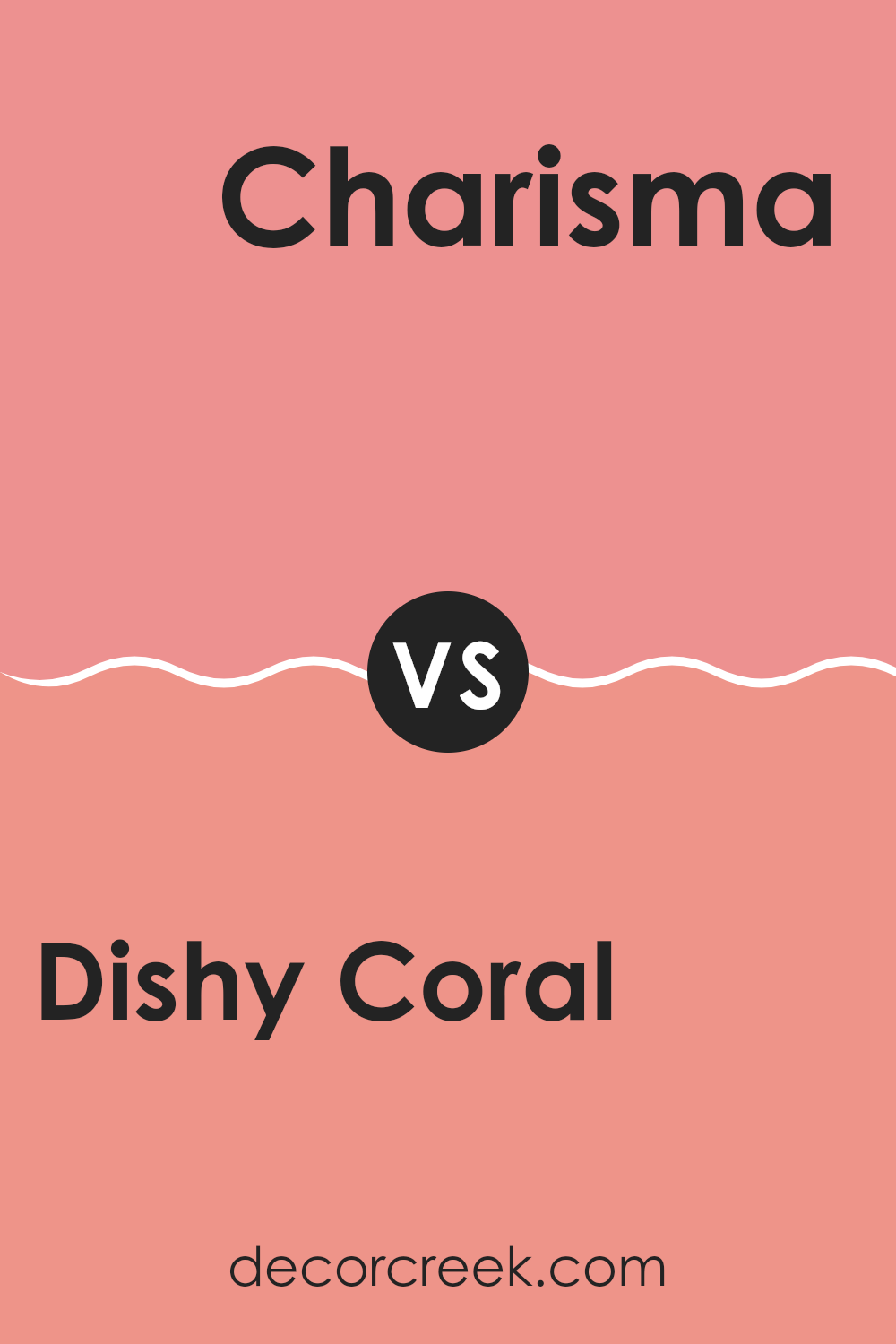
Dishy Coral SW 6598 by Sherwin Williams vs Charisma SW 6605 by Sherwin Williams
Dishy Coral (SW 6598) by Sherwin Williams is a vibrant, energetic coral shade with a hint of pink that makes it an excellent choice for areas needing a lively touch. It’s bright and cheerful, ideal for areas where you want to create a fun and dynamic atmosphere.
On the other hand, Charisma (SW 6605) is a softer, more muted coral with a peachy undertone. This color has a warm, inviting feel, making it suitable for rooms where you want a cozy and welcoming environment.
While Dishy Coral stands out with its bright, bold presence, Charisma offers a more subdued approach to coral, bringing warmth without overpowering the senses. Both colors add a sense of warmth and positivity, but Dishy Coral is perfect for making a statement, while Charisma works well for a more relaxed and harmonious look.
You can see recommended paint color below:
Dishy Coral SW 6598 by Sherwin Williams vs Cheery SW 6584 by Sherwin Williams
Dishy Coral SW 6598 and Cheery SW 6584 by Sherwin Williams are both vibrant colors, but they have distinct personalities. Dishy Coral is a lively and energetic hue, combining elements of pink and orange. It brings warmth and a sense of fun to any room. This color is great for making a strong, cheerful statement in a room, and works well in settings where you want to encourage social interaction and positivity.
On the other hand, Cheery is a more straightforward, bright pink. It is bold and playful, representing joy and optimism. This color can be used to inject a sense of youthful energy and fun into a room, making it a good choice for areas like children’s rooms or creative areas.
Both colors can be great for adding a pop of brightness, but while Dishy Coral leans more coral with hints of orange, Cheery is a vivid pink that stands on its own.
You can see recommended paint color below:
- SW 6584 Cheery
Dishy Coral SW 6598 by Sherwin Williams vs Jaipur Pink SW 6577 by Sherwin Williams
Dishy Coral SW 6598 and Jaipur Pink SW 6577 by Sherwin Williams are both vibrant colors, yet each has its own unique feel. Dishy Coral is a lively color that blends pink and orange tones, creating a warm, energetic vibe. It’s perfect for areas that want to feel cheerful and inviting.
On the other hand, Jaipur Pink is a softer, more muted shade. It’s a deeper pink, almost resembling a dusty rose, which can add a touch of elegance and coziness to a room. While both colors have pink in their palette, Dishy Coral leans more towards an energizing coral, whereas Jaipur Pink offers a calm and graceful appearance.
Using either of these colors can significantly change the mood of a room. Dishy Coral works well in dynamic areas like living rooms, while Jaipur Pink might be better suited for calm settings such as bedrooms or reading nooks.
You can see recommended paint color below:
- SW 6577 Jaipur Pink
Dishy Coral SW 6598 by Sherwin Williams vs Coral Bead SW 6873 by Sherwin Williams
Dishy Coral (SW 6598) and Coral Bead (SW 6873) are both vibrant colors from Sherwin Williams, but they have distinct characteristics. Dishy Coral is a lively, peachy-pink shade that adds warmth and a cheerful vibe to any room. It’s like a burst of sunshine, making rooms feel bright and inviting.
On the other hand, Coral Bead is also in the coral family but has a deeper, more saturated tone with hints of red, making it appear bolder. It can create dramatic accents and often stands out as a statement color.
While Dishy Coral is softer and more playful, Coral Bead commands attention with its richness. Both colors share an energetic nature but offer different moods: Dishy Coral for a softer, uplifting feel, and Coral Bead for a stronger, more dynamic look. Whether used in living areas or creative areas, these colors bring personality to interiors.
You can see recommended paint color below:
- SW 6873 Coral Bead
Dishy Coral SW 6598 by Sherwin Williams vs Resounding Rose SW 6318 by Sherwin Williams
Dishy Coral SW 6598 by Sherwin Williams is a lively, vibrant shade of coral that has a warm and energetic feel. It has an orange-pink hue that makes it feel fun and inviting. On the other hand, Resounding Rose SW 6318 is deeper and more on the pink side.
It has a rich, rosy tone that feels warm and comforting. When you put the two colors side by side, Dishy Coral stands out with its brighter and more playful character, while Resounding Rose feels slightly more mature and soothing.
Dishy Coral is suitable for areas where you want to bring in energy and cheer, such as a living room or a playful bedroom. Resounding Rose can work well in areas where a cozy and warm ambience is desired, such as a dining room or a romantic room. Both colors are warm but differ in their depth and the mood they set.
You can see recommended paint color below:
- SW 6318 Resounding Rose
Dishy Coral SW 6598 by Sherwin Williams vs Amaryllis SW 6591 by Sherwin Williams
Dishy Coral SW 6598 and Amaryllis SW 6591 by Sherwin Williams are two shades of red with distinct personalities. Dishy Coral is a vibrant, eye-catching hue, perfect for creating a lively and energetic atmosphere in any room. It leans slightly towards orange, giving it a warm and inviting feel. This makes it ideal for areas such as living rooms or kitchens where you want to encourage social interaction and warmth.
On the other hand, Amaryllis is a deeper, more traditional red. It feels rich and classic, making it suitable for areas where a more dramatic effect is desired, such as dining rooms or feature walls. Amaryllis pairs well with neutrals like grays and whites, providing a refined backdrop.
While both colors bring energy to a room, Dishy Coral has a playful and bright character, whereas Amaryllis offers a bolder, more intense experience.
You can see recommended paint color below:
- SW 6591 Amaryllis
Dishy Coral SW 6598 by Sherwin Williams vs Animated Coral SW 6878 by Sherwin Williams
Dishy Coral SW 6598 is a vibrant coral hue with a blend of pink and orange tones, giving it a warm and lively appearance. It’s a cheerful and energetic color that can brighten up any room, making it ideal for lively living areas or playful bedrooms.
In contrast, Animated Coral SW 6878 has a deeper and more intense coral shade that leans slightly more towards the red side. This color is bold and striking, making it perfect for feature walls or accent pieces.
Both colors fall within the coral family but offer different impacts. Dishy Coral is lighter with a softer, more pastel feel, while Animated Coral is bolder and more vivid. When choosing between the two, consider the ambiance you want: Dishy Coral for a softer, more easygoing mood, and Animated Coral for a more dramatic and intense effect. Both add warmth and vibrancy to any room.
You can see recommended paint color below:
- SW 6878 Animated Coral
Dishy Coral SW 6598 by Sherwin Williams vs Rosedust SW 0025 by Sherwin Williams
Dishy Coral SW 6598 and Rosedust SW 0025 are two beautiful colors from Sherwin Williams. Dishy Coral is a lively and warm shade of coral that is vibrant and energetic. It adds a bold splash of color to any room, making areas feel lively and cheerful.
On the other hand, Rosedust is a softer, muted pink with a more subtle and gentle feel. It provides a calm and cozy ambiance, perfect for creating a relaxed and inviting environment. While Dishy Coral jumps out with its bright and eye-catching hue, Rosedust softly whispers elegance and comfort.
Pairing them together can create a nice balance in a room, with Dishy Coral accentuating certain areas and Rosedust bringing in warmth and softness. Whether you’re looking for bold and bright or soft and understated, these two colors offer unique choices for different moods and styles.
You can see recommended paint color below:
- SW 0025 Rosedust
Dishy Coral SW 6598 by Sherwin Williams vs Memorable Rose SW 6311 by Sherwin Williams
Dishy Coral SW 6598 and Memorable Rose SW 6311, both by Sherwin Williams, offer warm, inviting vibes but with distinct characteristics. Dishy Coral is a vibrant and energetic hue, combining peachy-orange tones with a hint of red. It’s perfect for rooms that aim to be lively and uplifting, like a sunlit living room or a cheerful kitchen.
On the other hand, Memorable Rose leans more towards a pinkish shade. It has a softer, more subdued appearance compared to Dishy Coral. This makes it suitable for rooms intended to feel cozy and comforting, such as a bedroom or a cozy nook.
While Dishy Coral can make a bold statement, Memorable Rose offers a gentle, enveloping effect. Pairing them in one room could create an interesting balance, with the coral bringing energy and the rose adding a touch of softness. Both colors manage to create an inviting atmosphere in their unique ways.
You can see recommended paint color below:
- SW 6311 Memorable Rose
As I come to the end of talking about the color SW 6598 Dishy Coral by Sherwin Williams, I realize just how fun and exciting this shade can be for any room. It’s a bright coral color that can make a room feel lively and cheerful. When I see Dishy Coral, it reminds me of a sunny day or a happy moment, making me smile.
I think this color is perfect for anyone who wants to add a splash of happiness to their room. Maybe your bedroom walls need a bit of cheering up, or perhaps you have a playroom that could use a burst of energy. Dishy Coral can do just that.
What I love most about Dishy Coral is its ability to make other colors pop. It goes well with whites, blues, and even greens. This means you can pair it with your favorite things and colors around your home.
Overall, I find SW 6598 Dishy Coral to be a delightful choice for anyone looking to brighten up their home. It’s a joy to look at and brings a sense of happiness to any place it touches. So, if you’re thinking about painting and want something cheerful, Dishy Coral might just be the answer!

Ever wished paint sampling was as easy as sticking a sticker? Guess what? Now it is! Discover Samplize's unique Peel & Stick samples.
Get paint samples

