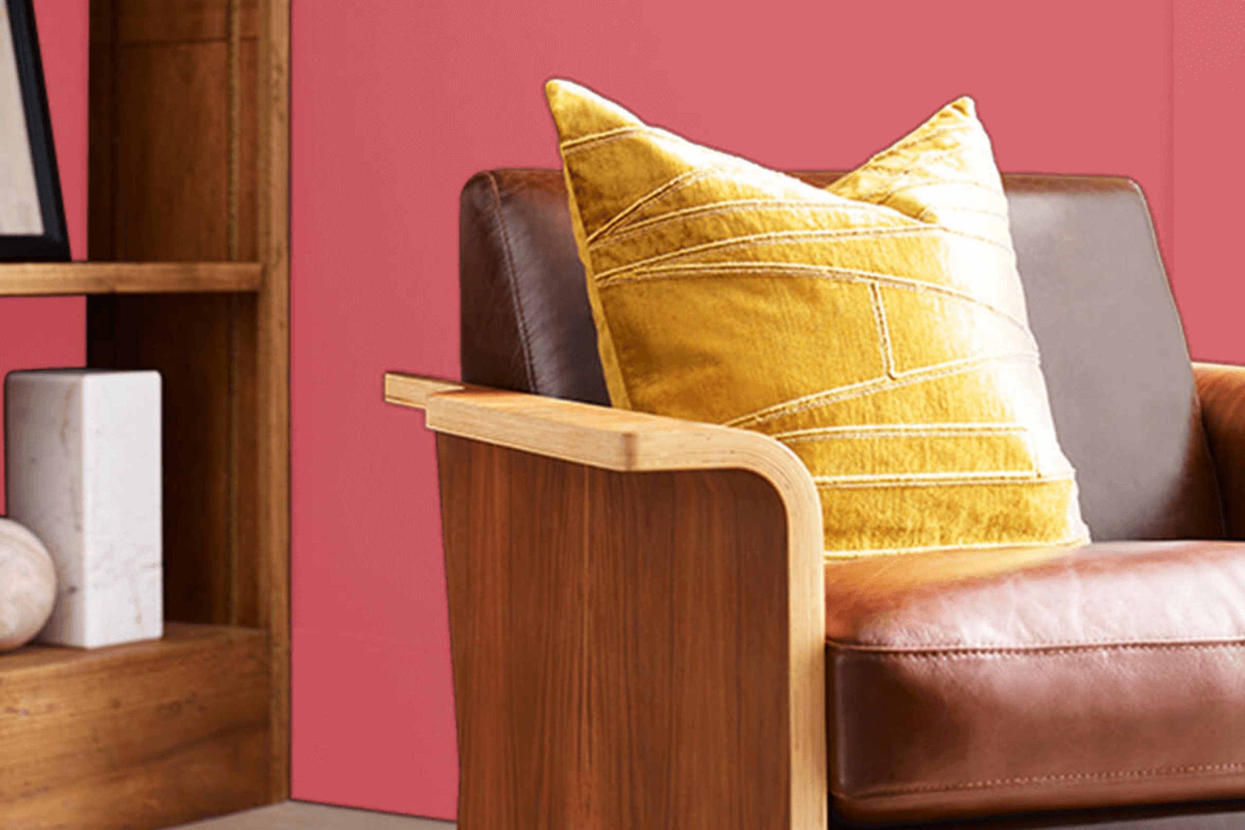
If you’re searching for a vibrant color to liven up your space, let me introduce you to SW 6592 Grenadine by Sherwin Williams. I recently used this bold, striking shade of red in a project and found it remarkably versatile. Whether you’re aiming to add a splash of energy to a kitchen or create a cozy, inviting atmosphere in your living room, Grenadine offers a delightful mix of warmth and enthusiasm.
Throughout my experience, I’ve noticed that this shade pairs beautifully with neutral tones, providing a perfect backdrop for both modern and traditional designs. Its undeniable charm enhances decorations and furnishings, making them stand out.
Additionally, the vivacious character of Grenadine makes it an excellent choice for accent walls or even to highlight key pieces of furniture. If you’re looking for a color that brings life to your home and reflects a sense of joy, consider giving Grenadine a try.
Its ability to transform a regular room into a lively, dynamic space is truly impressive.
What Color Is Grenadine SW 6592 by Sherwin Williams?
Grenadine by Sherwin Williams is a vivid, energetic red hue that instantly adds warmth and enthusiasm to any space. This dynamic color’s boldness makes it a fantastic choice for creating a striking focal point in a room. Imagine it on an accent wall, where it can attract attention and set a cheerful tone without overwhelming the senses.
This vibrant red works exceptionally well in interior styles that benefit from a touch of drama and warmth. It’s perfect for eclectic and bohemian settings that celebrate bold colors and textures, or in a modern farmhouse style where it can add a rustic yet fresh twist.
When it comes to pairing materials, Grenadine looks stunning with natural wood tones, from light pine to rich, dark walnut. These earthy materials help balance its intensity. Additionally, incorporating metals like brushed nickel or aged bronze can lend a touch of glam without detracting from the color’s warmth.
As for textures, think about soft, plush fabrics like velvet or suede to create a cozy feel or glossy finishes to mirror its energy in a subtler way. Linen and lighter textiles keep the space feeling airy. Grenadine pairs well with neutrals such as soft whites or grays, which help to soften the overall impact, making the space more inviting.
Is Grenadine SW 6592 by Sherwin Williams Warm or Cool color?
Grenadine SW 6592 by Sherwin Williams is a vibrant, deep red hue that brings warmth and energy to any room where it’s applied. This shade can create a strong statement wall or liven up smaller decor pieces. In home environments, its rich color can make large rooms feel cozier, adding a sense of comfort and liveliness. In smaller spaces, using Grenadine on an accent wall can draw the eye without overwhelming the entire area.
The color works well in living rooms or dining areas where a cozy, welcoming atmosphere is desirable. It pairs nicely with neutral tones like whites and grays, which help balance its intensity. Wood furniture and earthy elements complement its warmth, making interiors feel grounded and inviting.
Lighting plays a crucial role in how Grenadine impacts a space. Under bright light, it can appear more energetic, while in dimmer, softer lighting, it provides a more subdued, warm feel. This versatility makes it suitable for various home styles and tastes.
Undertones of Grenadine SW 6592 by Sherwin Williams
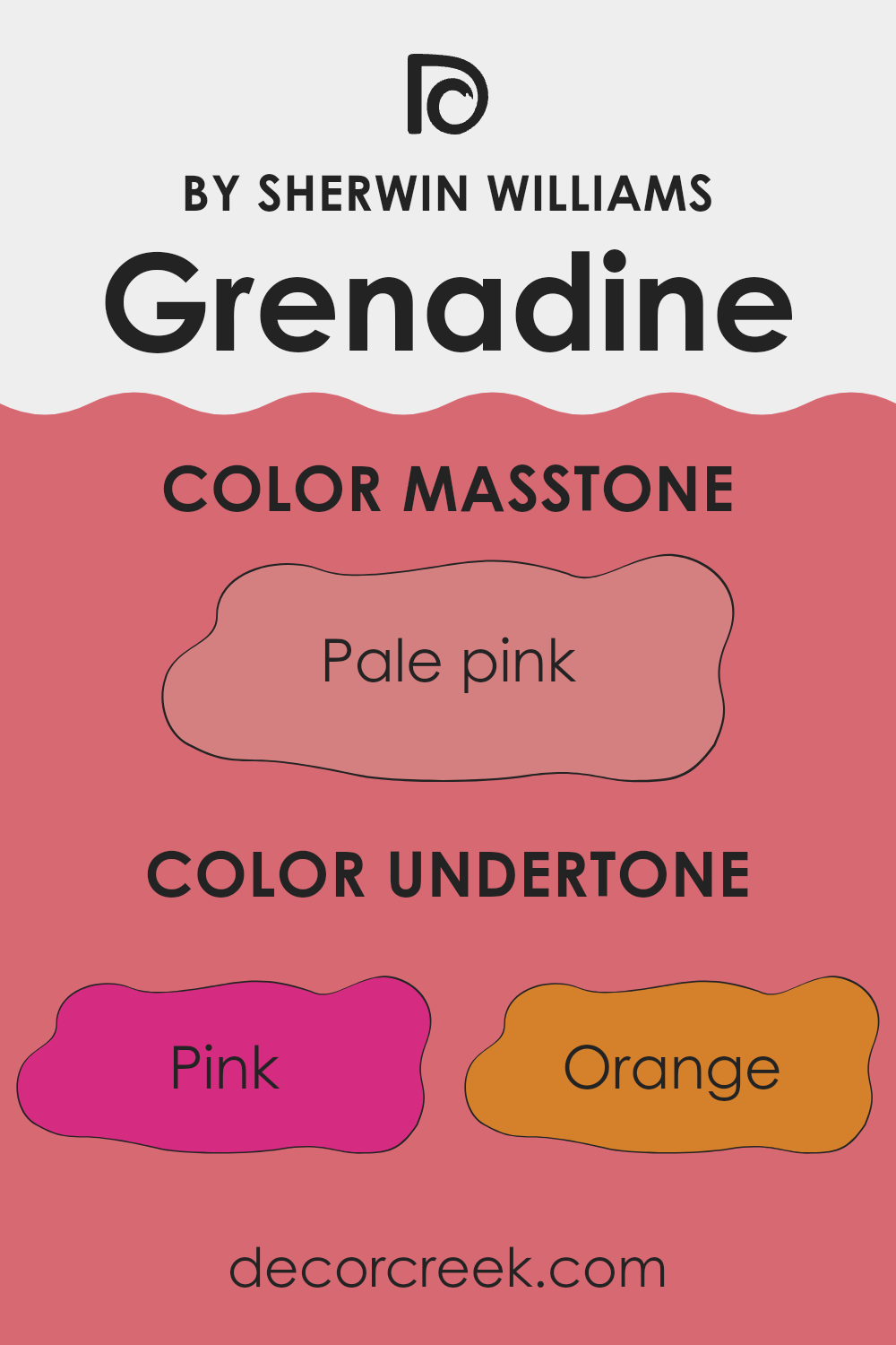
Grenadine, a vibrant and rich color, carries a variety of undertones that subtly influence its appearance and impact when used on interior walls. Undertones are the underlying qualities of a color that may emerge in different lighting conditions, affecting how the color is perceived. For Grenadine, these undertones range from pink and orange to more complex tones like purple and grey.
When used in interior design, Grenadine’s undertones can enhance the ambiance of a room. Pink and red undertones offer a warm and cozy feel, making a space more inviting. Orange undertones add a cheerful and energizing touch, ideal for spaces where creativity or activity flourishes. Grey and light grey undertones bring a balance, softening the intensity of Grenadine while maintaining its lively character.
Other undertones such as purple, lilac, and violet introduce a touch of flair and unexpected vibes, which can make a room look unique and stylish. In contrast, undertones like brown and olive contribute to a more grounded and stable atmosphere, which can be perfect for creating a nurturing and comforting environment.
The effect of these undertones is that they can subtly change the look of Grenadine under different types of light or when paired with various décor elements. For example, in natural sunlight, yellow and pale yellow undertones might make the color look brighter and more vibrant.
Under artificial lighting, the cooler undertones like mint and light blue might become more apparent, giving the walls a slightly different feel. Choosing Grenadine for interior walls means considering how its undertones will react in your specific environment to create the desired mood or effect in the space. This blend of undertones in Grenadine offers a versatile range of possibilities for enhancing the aesthetic and experience of any room.
What is the Masstone of the Grenadine SW 6592 by Sherwin Williams?
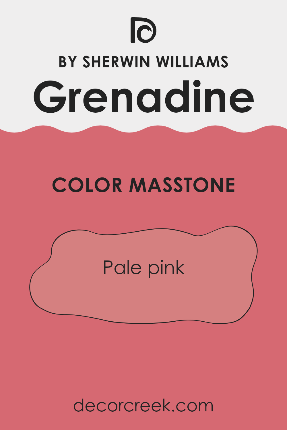
GrenadineSW 6592 by Sherwin Williams is a pale pink that brings a fresh and cheerful vibe to any room. Known by its specific shade code as Pale Pink (#D58080), this color is soft enough to work well in various spaces without overwhelming them with brightness. When used in homes, this shade lends a subtle touch of color, making it perfect for creating a welcoming and cozy atmosphere.
Pale pink can be particularly effective in bedrooms where a calming effect is desired, yet with a hint of warmth to keep the space inviting. In living rooms, accessories or accent walls featuring this hue add a light, playful essence.
The gentle nature of this color also makes it ideal for bathrooms and nurseries, places where softness and a hint of cheer are often appreciated. Additionally, its versatility allows it to blend well with grays, creams, and whites, providing flexibility in color schemes and decor styles.
How Does Lighting Affect Grenadine SW 6592 by Sherwin Williams?
Lighting plays a crucial role in how we perceive colors, notably impacting their appearance and vibrancy. Every light source, whether natural or artificial, has its own color temperature and intensity, which can dramatically change how a color looks within a space. Taking the color Grenadine as an example, it’s a rich, hearty shade of red.
Under artificial light, particularly warm incandescent bulbs, Grenadine tends to appear deeper and more intense. This warmth enhances the red’s richness, making it feel cozy and inviting. In contrast, fluorescent lighting, which is cooler, might make Grenadine look slightly more subdued, pulling out its cooler undertones and making it appear less vibrant.
In the context of natural light, the appearance of Grenadine can vary significantly throughout the day. In north-faced rooms, which receive less direct sunlight and generally have cooler, softer light, Grenadine may appear somewhat muted and less dynamic. The cooler light can diminish its warmth, making it important to balance the room with warm accents if a vibrant look is desired.
Conversely, in south-faced rooms where light is abundant and warmer for the majority of the day, Grenadine can truly come alive. The ample sunlight accentuates its warmth, making the color appear bright and energetic. This can make the room feel lively and stimulating.
In east-faced rooms, where sunlight is warmest in the morning, Grenadine will look very vibrant in the morning, gradually fading in intensity throughout the day. This natural progression can create a welcoming environment in the morning that transitions to a calmer, softer vibe by the afternoon.
Similarly, in west-faced rooms, the color will have a more subdued look in the morning but regain strength in the evening with the setting sun. The late afternoon and evening light can reinvigorate Grenadine, making it glow warm and bright.
Overall, when choosing colors for a room, it’s essential to consider the type of light the room receives to ensure the color appears as intended throughout the day.
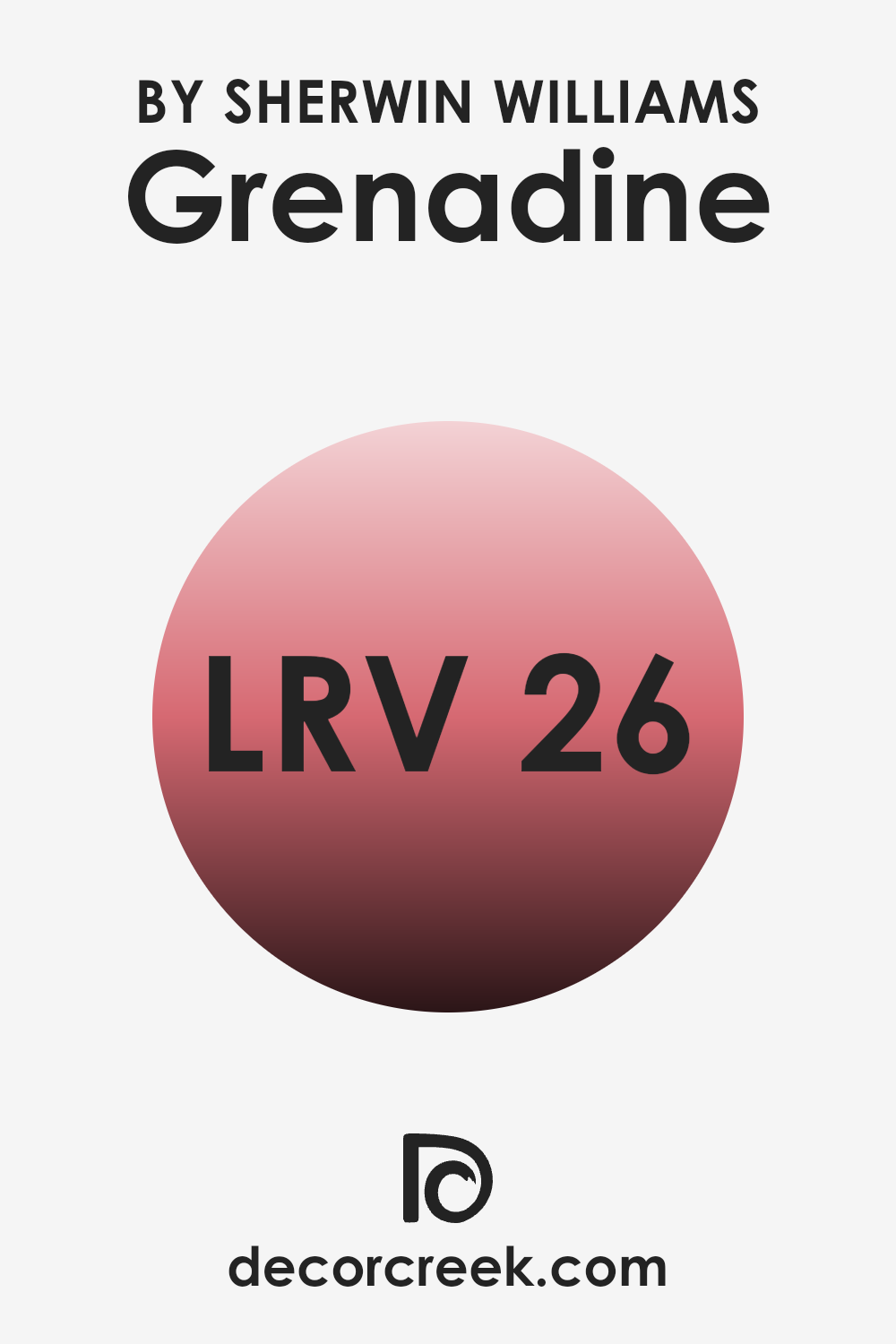
What is the LRV of Grenadine SW 6592 by Sherwin Williams?
LRV stands for Light Reflectance Value, which is a measurement used to determine how much light a paint color will reflect or absorb when it is applied to a surface. This value is given on a scale where lower numbers mean that the color absorbs more light and appears darker, while higher numbers indicate that the color reflects more light and appears lighter.
LRV is important because it helps you understand how a paint color will look under different lighting conditions. A color with a low LRV might make a small room feel even smaller or darker, while a color with a high LRV can make a space feel more open and airy.
For the color with an LRV of 25.73, such as the mentioned Grenadine paint, this means that the color is on the darker side, as it absorbs more light than it reflects. Such a value suggests that this color would best suit a space that’s designed to have a cozy or intimate feeling.
It might not be the ideal choice for a small, poorly-lit room as it could make the space feel cramped and dark. However, in a well-lit area or a larger room, this hue can add a sense of warmth and depth, enhancing the ambiance without making the room feel too confined.
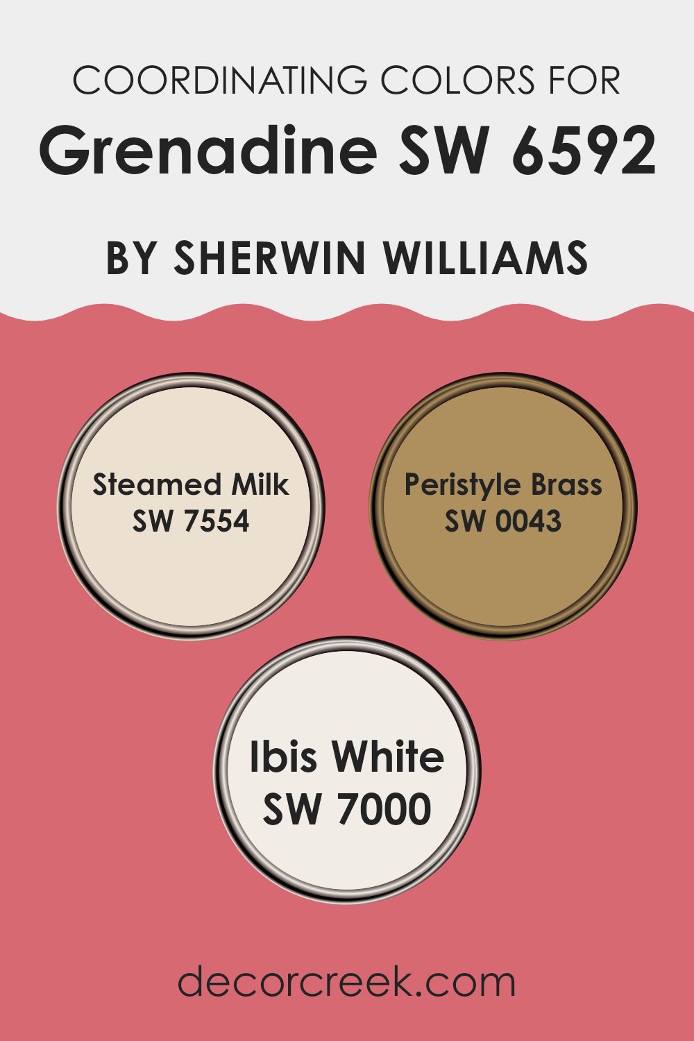
Coordinating Colors of Grenadine SW 6592 by Sherwin Williams
Coordinating colors are complementary shades that pair well with a primary color to enhance the overall aesthetic of a space. When dealing with a vibrant primary color like Grenadine by Sherwin Williams, it’s essential to choose coordinating colors that balance its intensity while harmonizing with its undertones. For Grenadine, colors like Steamed Milk, Peristyle Brass, and Ibis White are smart choices. These shades work together to provide a balanced palette, ensuring that the boldness of Grenadine is neither overwhelming nor subdued.
Steamed Milk is a warm and cozy off-white that brings a soft, calming presence. It acts as a neutral backdrop, making it a versatile companion for the more striking Grenadine. It’s a perfect match for creating a relaxed yet cheerful environment.
Peristyle Brass has a muted golden tone that offers a subtle touch of elegance and warmth. It complements the vibrancy of Grenadine by adding a rich, yet understated element to the decor. Finally, Ibis White is a clean and crisp white that provides a fresh contrast to the deep tones of Grenadine. It helps in brightening spaces and gives a refreshing lift to the overall color scheme. Together, these coordinating colors create a cohesive and inviting atmosphere when paired with Grenadine.
You can see recommended paint colors below:
- SW 7554 Steamed Milk
- SW 0043 Peristyle Brass
- SW 7000 Ibis White
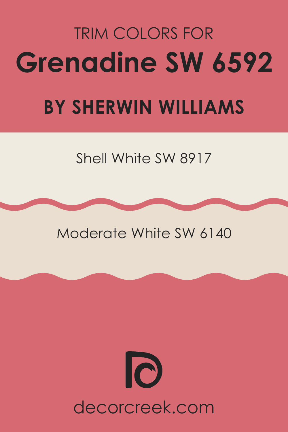
What are the Trim colors of Grenadine SW 6592 by Sherwin Williams?
Trim colors are secondary hues used to accentuate or complement the main color applied on walls or other large surface areas. For a vivid hue like Grenadine by Sherwin Williams, choosing an appropriate trim color can greatly enhance the overall aesthetic of a room, defining architectural details and breaking the monotony of a single color scheme. Trim colors also help in creating visual lines that can make spaces appear well-finished and more distinct, which is crucial in achieving a coherent home design.
Shell White SW 8917 offers a soft, neutral backdrop that can subtly highlight the boldness of Grenadine without competing for attention. It’s a gentle white with just enough warmth to create a soothing contrast, making it an ideal choice for trims, particularly in spaces that command a fresh and inviting atmosphere.
On the other hand, Moderate White SW 6140, which leans slightly towards gray, offers a cooler contrast that can enhance the perceived brightness of Grenadine, giving the room a balanced, clean look. This shade may be particularly effective in spaces that aim for a modern feel with clear distinctions between wall and trim elements.
You can see recommended paint colors below:
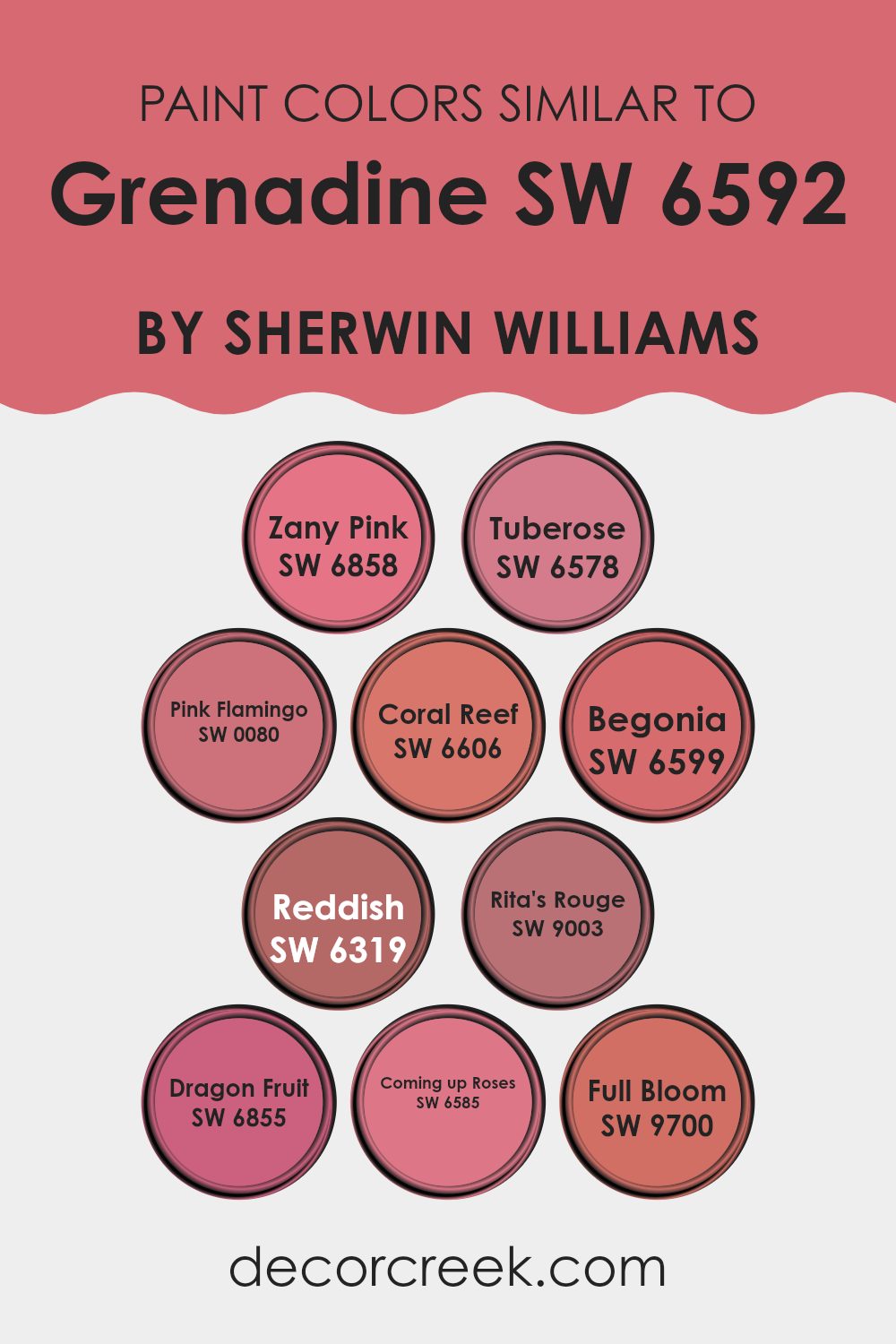
Colors Similar to Grenadine SW 6592 by Sherwin Williams
Choosing colors that are similar can greatly enhance the aesthetic harmony in a design, making the space feel cohesive and thoughtfully put together. Similar colors, such as various shades of pink and red offered by Sherwin Williams that correspond to Grenadine, create a seamless visual experience.
This palette includes options like Zany Pink, a bold and lively pink which adds a playful touch, and Tuberose, a soft, muted pink that brings a gentle warmth to interiors. Pink Flamingo is a bit more intense, giving a vibrant punch that can liven up any area, while Coral Reef offers a softer, peachy option that blends beautifully with other tones in the red family.
Other colors like Begonia provide a subtle, more understated pink which works well for creating a soft background or for quaint accents. Reddish is a deeper, more muted shade that leans towards a rich burgundy, making it perfect for accent walls or cozy nooks. Rita’s Rouge has a charming brick tone that adds a traditional and cozy feel. Dragon Fruit is an exuberant pink with a hint of deep red that can add a spunky flair.
Coming up Roses and Full Bloom both offer variations of vivid pinks, with the former being slightly deeper and more mature, and the latter including a hint of coral, ideal for a lively and fresh atmosphere. Using these similar hues allows for a flexible yet coordinated color scheme that can be adapted to various styles and spaces.
You can see recommended paint colors below:
- SW 6858 Zany Pink
- SW 6578 Tuberose
- SW 0080 Pink Flamingo
- SW 6606 Coral Reef
- SW 6599 Begonia
- SW 6319 Reddish
- SW 9003 Rita’s Rouge
- SW 6855 Dragon Fruit
- SW 6585 Coming up Roses
- SW 9700 Full Bloom
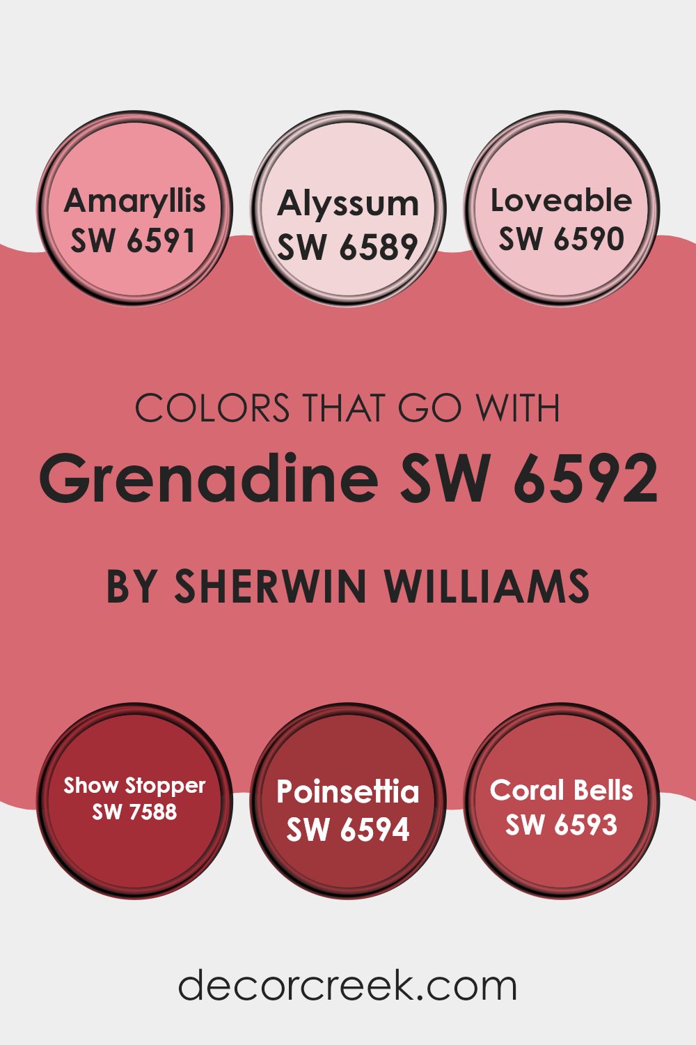
Colors that Go With Grenadine SW 6592 by Sherwin Williams
The colors that harmonize with Grenadine SW 6592 by Sherwin Williams are essential because they help create a cohesive and appealing look in any space. Grenadine, a bold and vibrant red, sets a lively tone that can be balanced and enhanced with the right complementary colors. Choosing colors like Amaryllis, Alyssum, Loveable, Show Stopper, Poinsettia, and Coral Bells allows for a range of combinations that can warm up a room or add a touch of dramatic flair.
Amaryllis SW 6591 is a deep, rich red that mirrors the intensity of Grenadine but with a slightly more subdued hue, making it perfect for creating a cozy and inviting environment. Alyssum SW 6589 offers a contrast with its soft, almost white shade with a hint of pink, providing a light, airy feel that can soften the impact of more intense reds.
Loveable SW 6590 is a cheerful, bright pink that injects a playful and sweet vibe into interiors. Show Stopper SW 7588 is another intense red, contributing to a dynamic and energetic atmosphere when paired with Grenadine. Poinsettia SW 6594, similar to Amaryllis, boasts a robust red that complements Grenadine and intensifies the warmth of the space. Lastly, Coral Bells SW 6593 is a soft coral pink that offers a gentler alternative to the strong reds, perfect for balancing out the boldness with a soothing touch. By cleverly using these colors, one can achieve a well-rounded and visually appealing palette that enhances the overall aesthetics of any room.
You can see recommended paint colors below:
- SW 6591 Amaryllis
- SW 6589 Alyssum
- SW 6590 Loveable
- SW 7588 Show Stopper
- SW 6594 Poinsettia
- SW 6593 Coral Bells
How to Use Grenadine SW 6592 by Sherwin Williams In Your Home?
Grenadine SW 6592 is a vibrant and warm red paint color from Sherwin Williams. It’s perfect for adding a splash of energy and personality to any space in your home. This bold shade can create a welcoming atmosphere in living areas when used on one accent wall, balancing it with neutral colors like white or gray on other walls for a grounded feel.
In the kitchen, Grenadine can bring cabinets to life, offering a cheerful burst that invigorates the room. It also works great in dining areas, where it adds a festive touch, making dinners feel special.
For those looking to introduce a little drama without overwhelming a room, consider painting interior doors or window frames with Grenadine. This adds a unique contrast without dominating the space. Additionally, incorporating accessories like cushions or artwork in this shade can help tie the room’s look together while maintaining a lively, yet harmonious environment.
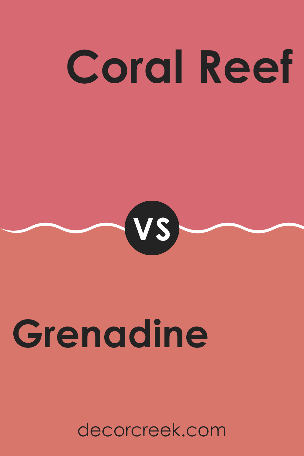
Grenadine SW 6592 by Sherwin Williams vs Coral Reef SW 6606 by Sherwin Williams
Grenadine and Coral Reef by Sherwin Williams are two distinct shades that can add vibrant pops of color to any space. Grenadine is a deep, bold red that resembles the rich color of pomegranate seeds.
It’s a striking hue that can make a dramatic statement in a room, perfect for accent walls or decor items. In contrast, Coral Reef leans towards a cheerful mix of pink and orange, resembling the lively coral found in ocean reefs.
This color is lighter and tends to brighten spaces, making it great for living areas or bedrooms where a warm, inviting atmosphere is desired. Both colors are quite lively and can effectively enhance different moods and settings depending on what you want to achieve in a space.
You can see recommended paint color below:
- SW 6606 Coral Reef
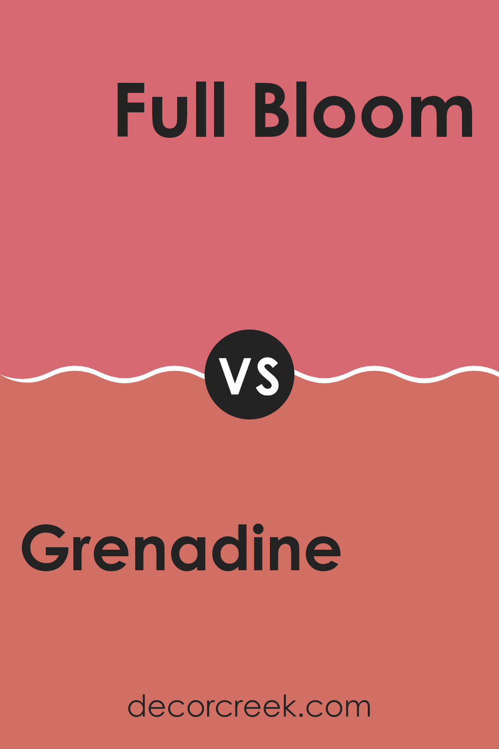
Grenadine SW 6592 by Sherwin Williams vs Full Bloom SW 9700 by Sherwin Williams
The color Grenadine is a vibrant, warm red that’s bold and energetic, perfect for adding a pop of color to any space. It’s an inviting and lively shade that can make a strong statement, whether used on a wall or for accent pieces.
On the other hand, Full Bloom is a bright and cheerful pink that radiates positive vibes and playful charm. This shade is softer and more subtle compared to the intense hue of Grenadine, making it ideal for creating a light and airy feel in a room.
While Grenadine draws attention and serves as a focal point, Full Bloom offers a gentler approach that can lighten up a space without overwhelming it. Together, these colors can work beautifully if you’re aiming for a dynamic and cheerful environment.
You can see recommended paint color below:
- SW 9700 Full Bloom
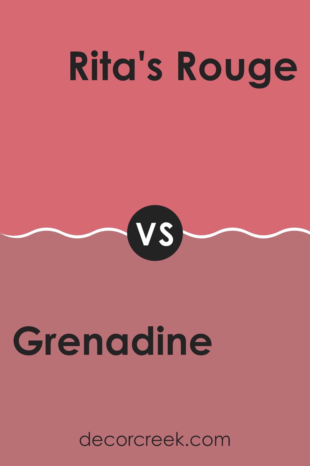
Grenadine SW 6592 by Sherwin Williams vs Rita’s Rouge SW 9003 by Sherwin Williams
Grenadine and Rita’s Rouge are both vibrant colors by Sherwin Williams, each with their unique charm. Grenadine is a bold, bright red that has a vivid, almost electric quality. It stands out in any space, bringing a lively and energetic feel that’s perfect for areas that need a pop of color.
On the other hand, Rita’s Rouge has a deeper, more muted tone, leaning towards a sophisticated burgundy. This color suggests a sense of warmth and comfort, making it ideal for cozy, intimate spaces like living rooms or bedrooms.
While both shades are red, Grenadine offers a more intense, eye-catching look, whereas Rita’s Rouge provides a quieter, more understated elegance. Depending on the mood or atmosphere you want to create, either color can be a great choice.
You can see recommended paint color below:
- SW 9003 Rita’s Rouge
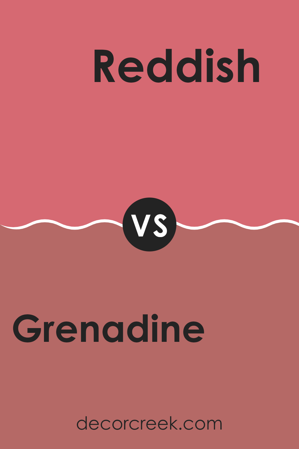
Grenadine SW 6592 by Sherwin Williams vs Reddish SW 6319 by Sherwin Williams
Grenadine by Sherwin Williams is a vibrant, energetic red that really pops in any space. It has a bright, bold feel that makes a statement. On the other hand, Reddish, another Sherwin Williams color, is also a shade of red but with a more subdued, muted tone.
This color is softer and less intense compared to Grenadine, providing a more understated look that’s still warm and inviting. While Grenadine is perfect for adding a splash of excitement to a room, Reddish is ideal for creating a cozy, welcoming atmosphere.
Both colors offer a red hue, but their impact and mood setting are quite distinct. Grenadine is great for lively, dynamic spaces, whereas Reddish works well in areas where you want a softer red that’s still rich and warm.
You can see recommended paint color below:
- SW 6319 Reddish
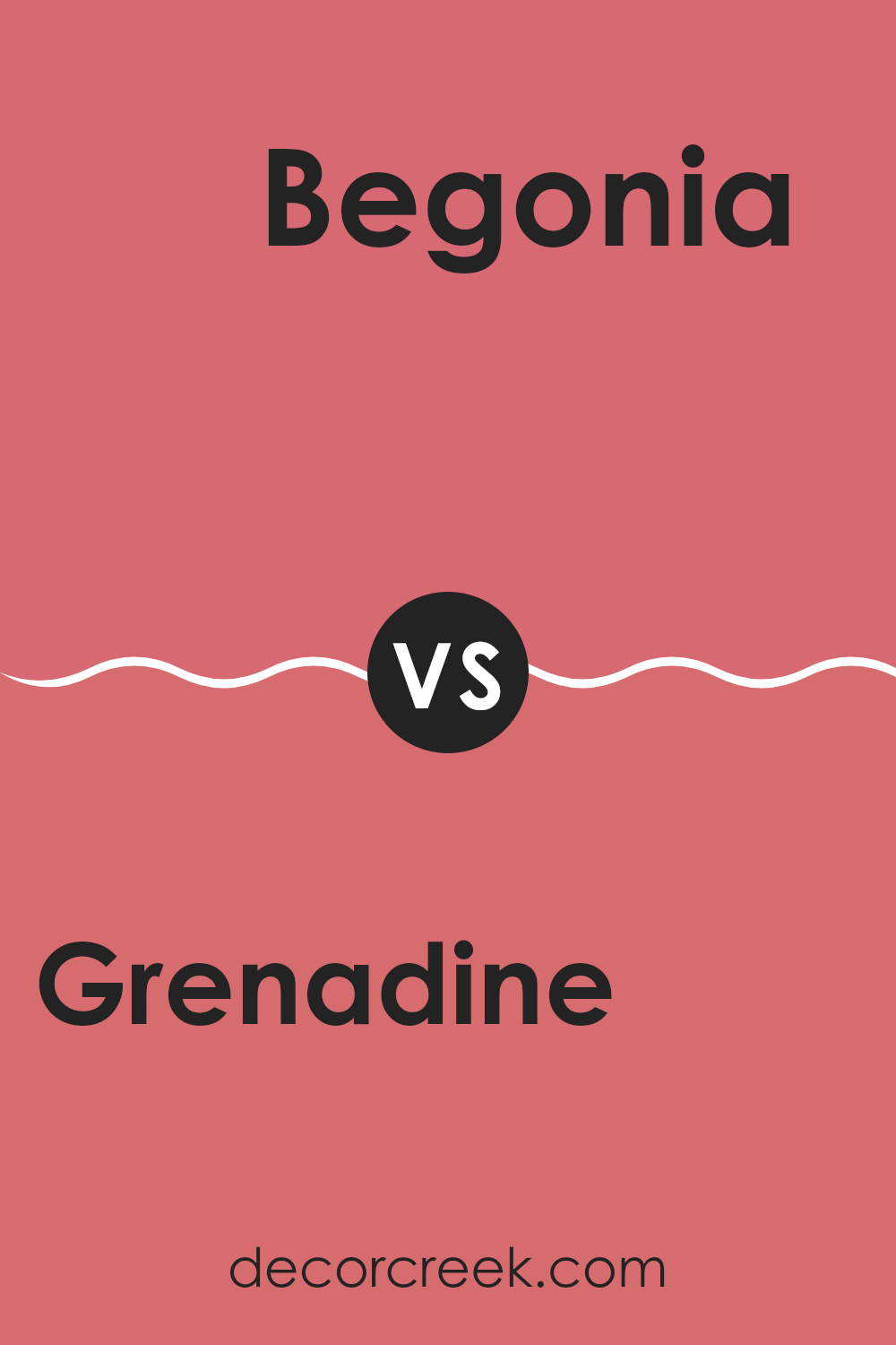
Grenadine SW 6592 by Sherwin Williams vs Begonia SW 6599 by Sherwin Williams
Grenadine and Begonia are both vibrant colors offered by Sherwin Williams, each providing a distinct feel to any space. Grenadine is a deep, bold red with a slight hint of pink, making it a strong choice for creating a striking accent wall or energizing a room. It’s the kind of color that draws the eye and makes a confident statement in your decor.
On the other hand, Begonia is a lighter, more playful pink. It has a cheerful and inviting tone that is softer compared to Grenadine. Begonia works wonderfully in spaces that aim for a gentle and warm atmosphere, like living rooms or bedrooms, where a soothing yet joyful touch is desired.
Together, these colors could create a dynamic and attractive contrast if used in the same space, with Grenadine offering intensity and Begonia providing a softer balance. Each has its unique charm, whether you want the boldness of a rich red or the softness of a calming pink.
You can see recommended paint color below:
- SW 6599 Begonia
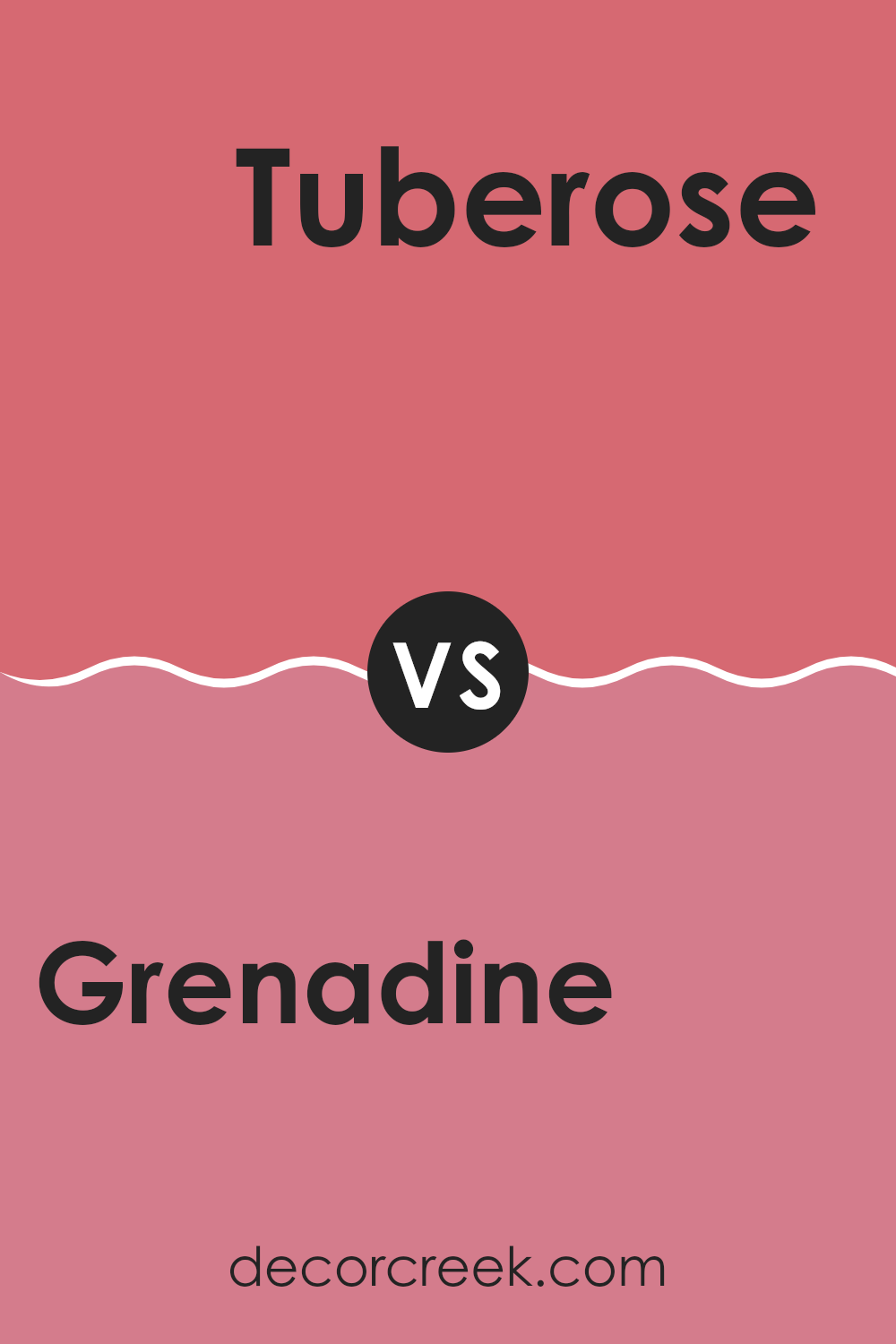
Grenadine SW 6592 by Sherwin Williams vs Tuberose SW 6578 by Sherwin Williams
Grenadine and Tuberose by Sherwin Williams are both vibrant, lively colors, but they have distinct tones that set them apart. Grenadine is a deep, rich red that brings a warm, energetic vibe to a space. It’s the kind of color that can make a statement wall pop or add a cozy, inviting feel to a room.
On the other hand, Tuberose is a lighter, softer pink with a cheerful and bright quality that can brighten up a space effortlessly. It carries a youthful and refreshing feel that is perfect for creating a friendly and welcoming atmosphere.
While Grenadine offers depth and warmth, Tuberose provides a light-hearted and fresh ambiance. Whether you’re looking to add a bold splash of color or a gentle touch of brightness, these colors offer great possibilities for different moods and settings.
You can see recommended paint color below:
- SW 6578 Tuberose
Grenadine SW 6592 by Sherwin Williams vs Coming up Roses SW 6585 by Sherwin Williams
Grenadine and Coming up Roses are two vibrant colors from Sherwin Williams that offer distinct yet harmonious tones. Grenadine is a bold, deep red that resembles the color of pomegranate seeds. It gives a room a strong and energetic feel, ideal for making a statement or accenting a space.
On the other hand, Coming up Roses is a softer, lighter red, tinged with hints of pink. This color is warmer and lends a more gentle and inviting atmosphere to spaces, making it perfect for creating a cozy environment.
Both colors can be used to add personality and warmth to a room, but Grenadine makes more of a dramatic impact, while Coming up Roses is better suited for a subtle touch of charm. Each color offers its unique flair, allowing you to choose based on the mood and style you want to achieve.
You can see recommended paint color below:
- SW 6585 Coming up Roses

Grenadine SW 6592 by Sherwin Williams vs Zany Pink SW 6858 by Sherwin Williams
Grenadine and Zany Pink, both by Sherwin Williams, present vibrant options for adding a touch of color to any space. Grenadine is a deep, rich red that has a bold and energetic feel, perfect for making a statement in a room. It works well in areas where you want to stimulate conversation, like dining rooms or living areas.
On the other hand, Zany Pink is a bright and playful pink shade. It has a lighter, more whimsical quality to it, making it ideal for spaces meant to be fun and inviting, such as a child’s bedroom or a creative space.
While both colors are lively, Grenadine offers a more classic warmth due to its red tones, whereas Zany Pink brings a youthful and cheerful vibe with its vivid pink hue. Choosing between them depends on the atmosphere you’re aiming to create and the other colors you plan to use in your decor.
You can see recommended paint color below:
- SW 6858 Zany Pink
Grenadine SW 6592 by Sherwin Williams vs Pink Flamingo SW 0080 by Sherwin Williams
Grenadine SW 6592 and Pink Flamingo SW 0080 from Sherwin Williams are both vibrant colors but they show their zest in unique ways. Grenadine is a deep, rich red that has a bold and powerful feel. It’s the sort of color that stands out in a room and draws attention, full of energy and warmth.
On the other hand, Pink Flamingo is a lighter, cheerful pink with a playful vibe. It’s less intense than Grenadine, offering a softer and more inviting atmosphere. This color works great in spaces where you want a happy, relaxed mood without the overwhelming strength of a darker red.
Both colors are great for adding a splash of vivacity to a space, but they serve different moods and settings. Grenadine suits areas where a strong statement or a touch of drama is desired, while Pink Flamingo fits well in casual, light-hearted spaces wishing for a gentle yet lively color boost.
You can see recommended paint color below:
- SW 0080 Pink Flamingo
Grenadine SW 6592 by Sherwin Williams vs Dragon Fruit SW 6855 by Sherwin Williams
Grenadine and Dragon Fruit are two vibrant shades offered by Sherwin Williams that both bring a lively splash of color, but they have distinct tones that set them apart. Grenadine is a deep, rich red that suggests a classic feel, perfect for adding a touch of warmth to spaces. This color has an inviting quality, making it excellent for living areas or a dining room where you want a cozy and slightly formal atmosphere.
On the other hand, Dragon Fruit is a bright and bold pink with a punchy vibe that can instantly brighten up a space. It’s a playful color that works well in creative spaces or a child’s room to add a fun and cheerful touch.
Both colors are strong and can dominate a space, so they are often best when used as accent colors rather than the main color scheme in a room. Depending on the mood you want to create, either Grenadine’s warmth or Dragon Fruit’s energetic tone could be the perfect choice.
You can see recommended paint color below:
- SW 6855 Dragon Fruit
In wrapping up, I must say, SW 6592 Grenadine by Sherwin Williams is quite impressive! This paint color is a lively red that can really brighten up any room and make it cheerful. It’s sort of like how you feel on a sunny day or when you eat a sweet cherry.
When you paint your room with Grenadine, it creates a fun and energetic vibe. Whether you’re putting it on one wall as an accent or covering the whole room, it seems to add a dash of joy wherever it goes. This color would be perfect for places where everyone hangs out, like the living room or the kitchen, making them feel more welcoming.
What’s also great is that it’s not just a pretty color, but it’s also very practical. It hides smudges well, which is handy especially if you have younger siblings or pets. Plus, it goes on smoothly and stays looking good for a long time, so you won’t have to worry about repainting often.
Overall, Grenadine by Sherwin Williams is more than just a paint; it’s a way to make your home feel warmer and more lively. It’s amazing how a can of paint can make such a big difference in making a house feel like a joyful home.
Ever wished paint sampling was as easy as sticking a sticker? Guess what? Now it is! Discover Samplize's unique Peel & Stick samples.
Get paint samples

