If you’re looking for a paint color that brings a calm and soothing atmosphere to any room, you’ll want to check out SW 7563 Restful White by Sherwin Williams. I found this color to be a fantastic choice when I wanted to freshen up my living space without overwhelming it with bold color.
Restful White is a soft, warm white that feels cozy and inviting. I noticed it has just the right balance of creaminess to add a touch of warmth, making it perfect for creating a relaxed environment.
Whether you’re painting a bedroom, living room, or even a small space like a hallway or bathroom, this color works beautifully.
One thing I really appreciate about Restful White is how versatile it is. It pairs well with a wide range of decor styles and other colors. Whether you have modern, minimalist furniture or more traditional pieces, this shade complements them perfectly.
So, if you’re trying to give a room a fresh look while keeping things calm and serene, consider giving SW 7563 Restful White a try. From my experience, it’s a choice you wouldn’t regret—it transforms your space into a soothing retreat.
What Color Is Restful White SW 7563 by Sherwin Williams?
Restful White by Sherwin Williams is a soothing and versatile shade of white that leans towards a soft, warm tone. This color exudes a gentle warmth, making it perfect for creating a cozy and inviting atmosphere in any room. It is particularly effective in spaces that aim for a calm and welcoming vibe, such as living rooms, bedrooms, and kitchens.
This shade pairs beautifully with a variety of materials and textures. It works well with natural wood, adding a touch of rustic charm to the space. When combined with metal finishes, like brushed nickel or stainless steel, Restful White helps to achieve a clean and modern look.
For textures, it complements both soft textiles like cotton and wool, as well as more rugged materials like burlap or linen, balancing texture and color seamlessly.
Restful White fits a range of interior styles but is particularly apt for farmhouse, Scandinavian, and minimalist décor. Its unobtrusive nature allows it to serve as a background, letting furniture and art pieces stand out.
In minimalist settings, it helps in achieving a sense of openness and light, while in Scandinavian and farmhouse styles, it enhances the earthy and natural elements typical of these themes.
Is Restful White SW 7563 by Sherwin Williams Warm or Cool color?
Restful White is a paint color by Sherwin Williams, known for its soothing and subtle tone. It’s often used in homes to create a light and airy feel, making small spaces appear larger and more open. This color is particularly effective in rooms that get a lot of sunlight, as it reflects light well, enhancing the natural brightness of the space.
In living rooms, Restful White can set a calm and welcoming atmosphere, ideal for relaxation and social gatherings. In bedrooms, it helps promote a restful sleep environment.
Because it’s a neutral color, it works with various decor styles and color schemes, from modern to traditional, allowing homeowners to add their personal touch without clashing with the wall color.
Additionally, Restful White can be a practical choice for high-traffic areas like hallways and kitchens, as it can make spaces feel clean and maintained. Its versatility, combined with its ability to make other colors in a room stand out, makes it a popular choice among homeowners.
Undertones of Restful White SW 7563 by Sherwin Williams
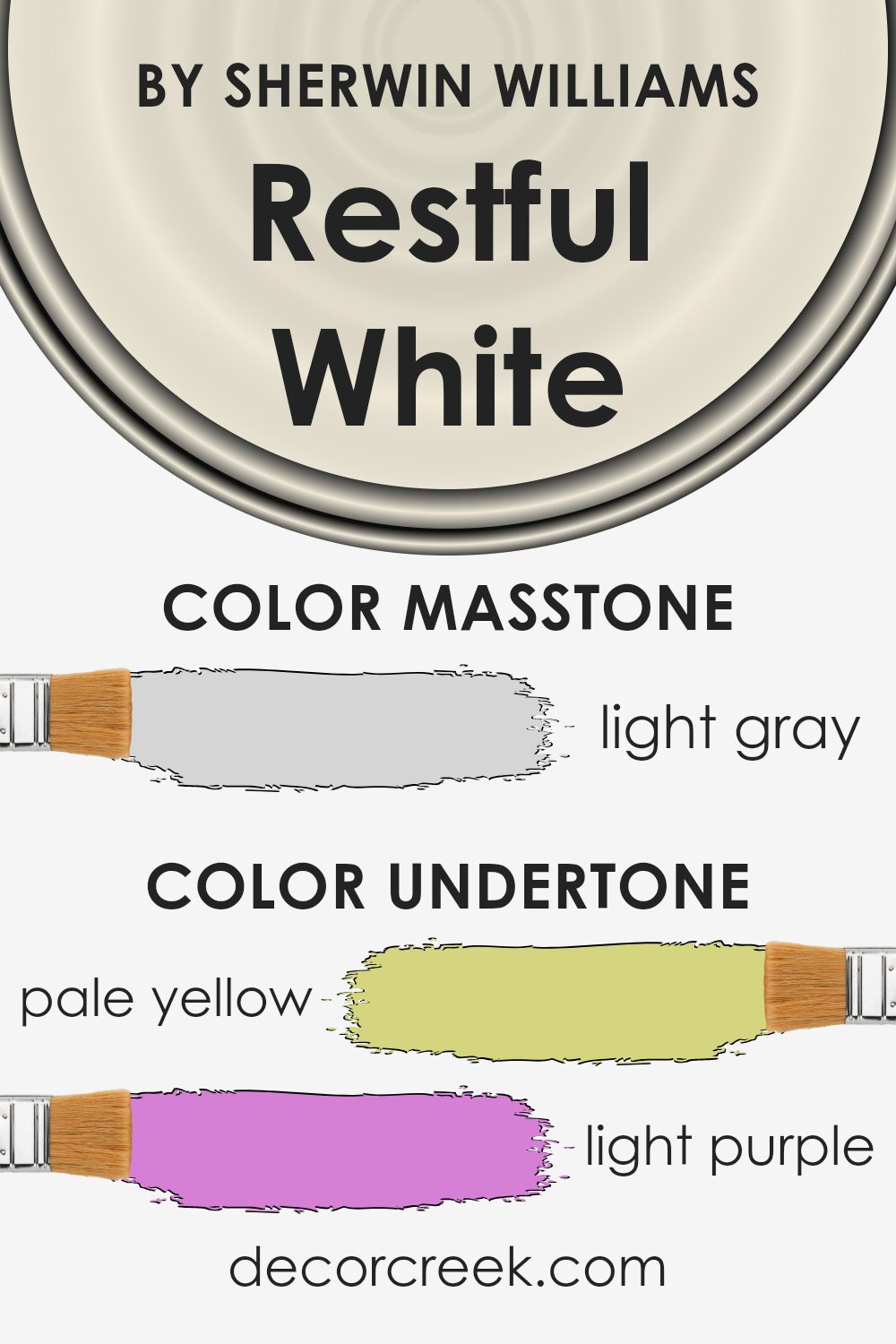
Restful White is a versatile paint color known for its subtle and neutral appearance. This color can look different depending on the light and surrounding elements because it has a range of undertones, including pale yellow, light purple, light blue, pale pink, mint, lilac, and grey.
Undertones are slight hints of colors that are mixed into the main hue, which influence how the paint looks under different lighting conditions. For example, in a room with a lot of natural light, the pale yellow or light blue undertones of Restful White might make the walls appear brighter and slightly cooler.
On the other hand, in a space with less natural light, the grey or lilac undertones could make the room feel cozier and warmer.
The undertones of Restful White can subtly complement various elements in a room. Furniture, decorations, and even the floor can bring out different aspects of these undertones.
If the room has a lot of greens and blues, for instance, the mint and light blue undertones might become more noticeable, creating a calm and cohesive look.
On the other hand, warmer colors like reds and oranges might highlight the pale pink and pale yellow undertones, adding a soft, welcoming glow to the space.
Using Restful White on interior walls offers flexibility, allowing you to shift the style and mood of the room with different decor and lighting without needing a complete repaint. This makes it an advantageous choice for anyone looking to create a neutral but adaptable space.
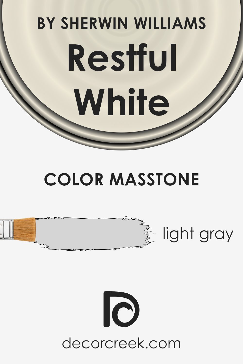
What is the Masstone of the Restful White SW 7563 by Sherwin Williams?
The color Restful White, with its masstone labeled as Light Gray (#D5D5D5), offers a versatile option for home interiors. Its light gray hue provides a neutral backdrop that is easy on the eyes, making it suitable for various room styles and sizes. This color can make small spaces appear larger and brighter, as it naturally reflects light. In larger rooms, it helps maintain a clean and open feel without adding visual clutter.
This shade is particularly effective in areas where calmness is appreciated, like bedrooms and living rooms, as it doesn’t overpower the senses. It pairs well with both bold and subtle color palettes, allowing for flexibility in decorating.
Furniture and art pieces stand out against this light gray, giving homeowners the freedom to showcase their personal style without worrying about color clashes.
Overall, this color is a practical choice for those who want a fresh, airy feel in their home while keeping things simple and stylish.
How Does Lighting Affect Restful White SW 7563 by Sherwin Williams?
Lighting has a significant impact on how we perceive colors. The type of light and its intensity can change the appearance of a color, making it look different under various lighting conditions.
The color Restful White is a subtle shade that can look different depending on the lighting. In artificial light, such as that from LED or incandescent bulbs, this color tends to appear warmer. The yellow or warm tones in the artificial light enhance the creamy aspects of Restful White, giving it a cozy and inviting feel.
This makes it an excellent choice for living rooms and bedrooms where a soft, welcoming atmosphere is desired.
In natural light, Restful White reflects the light’s true color, showing its pure and clean characteristics. Under bright sunlight, it looks crisp and vibrant, making spaces feel airy and more spacious. This is particularly beneficial in smaller rooms or spaces without much natural light.
The direction a room faces also affects how Restful White is perceived:
– North-faced rooms: These rooms get less direct sunlight, which can make colors appear slightly cooler and more shadowed. Restful White in a north-facing room will look more muted and subtle, providing a calm and gentle background.
– South-faced rooms: These rooms receive plenty of sunlight, brightening and enhancing the color. Here, Restful White looks brighter and more vibrant, making the room feel lively and fresh.
– East-faced rooms: In these rooms, the color will catch the morning sun, making it look very bright and warm in the morning but cooler and more neutral as the day progresses.
– West-faced rooms: Here, the afternoon and evening light can make Restful White appear warmer and softer, perfect for rooms used more during the latter part of the day.
Overall, Restful White’s adaptability in different lighting and directions makes it a versatile color choice for any space.
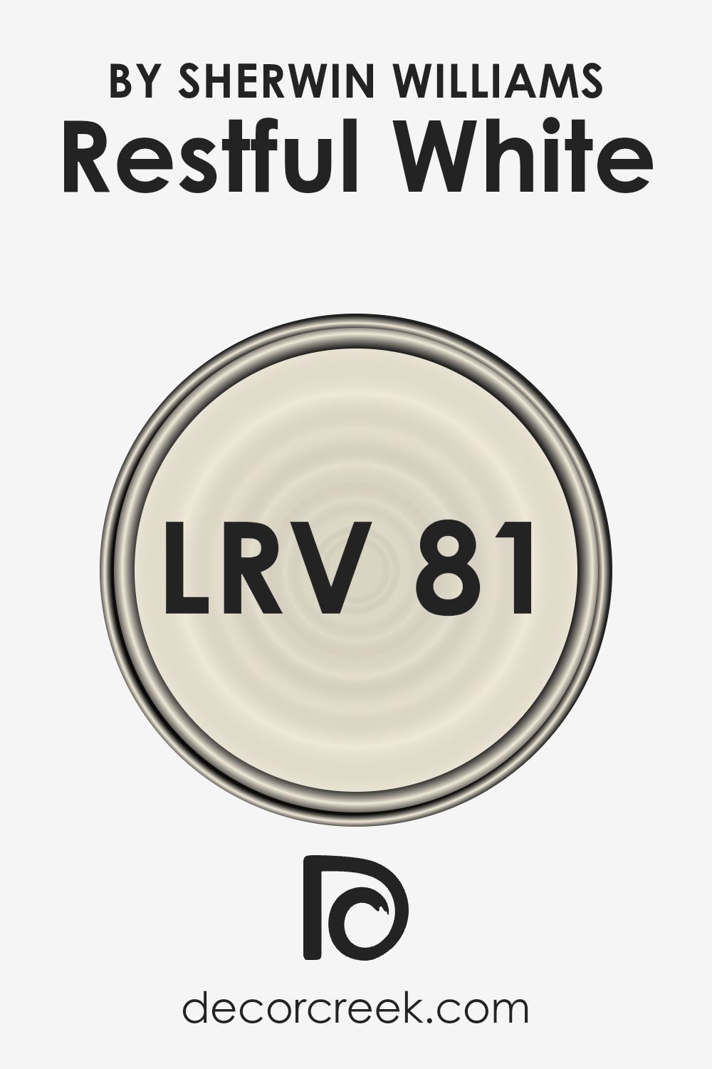
What is the LRV of Restful White SW 7563 by Sherwin Williams?
LRV stands for Light Reflectance Value, which is a measure of the amount of light a paint color reflects or absorbs. Think of it as a scale where higher numbers mean the paint reflects more light, making the room brighter. Conversely, lower numbers indicate the paint absorbs more light, making the room appear darker.
This value is important when choosing paint colors because it helps you understand how the color will look in your specific room under different lighting conditions.
For the color Restful White with an LRV of 80.586, it means that the color is quite bright as it reflects a lot of light. Rooms painted in this shade will appear light and airy, making it an excellent choice for spaces that are either small or do not receive much natural sunlight.
The high LRV allows for the color to make the room feel more open and bright, even in areas with limited light sources. This can be particularly useful in creating a pleasant and welcoming atmosphere in various spaces within a home or office.
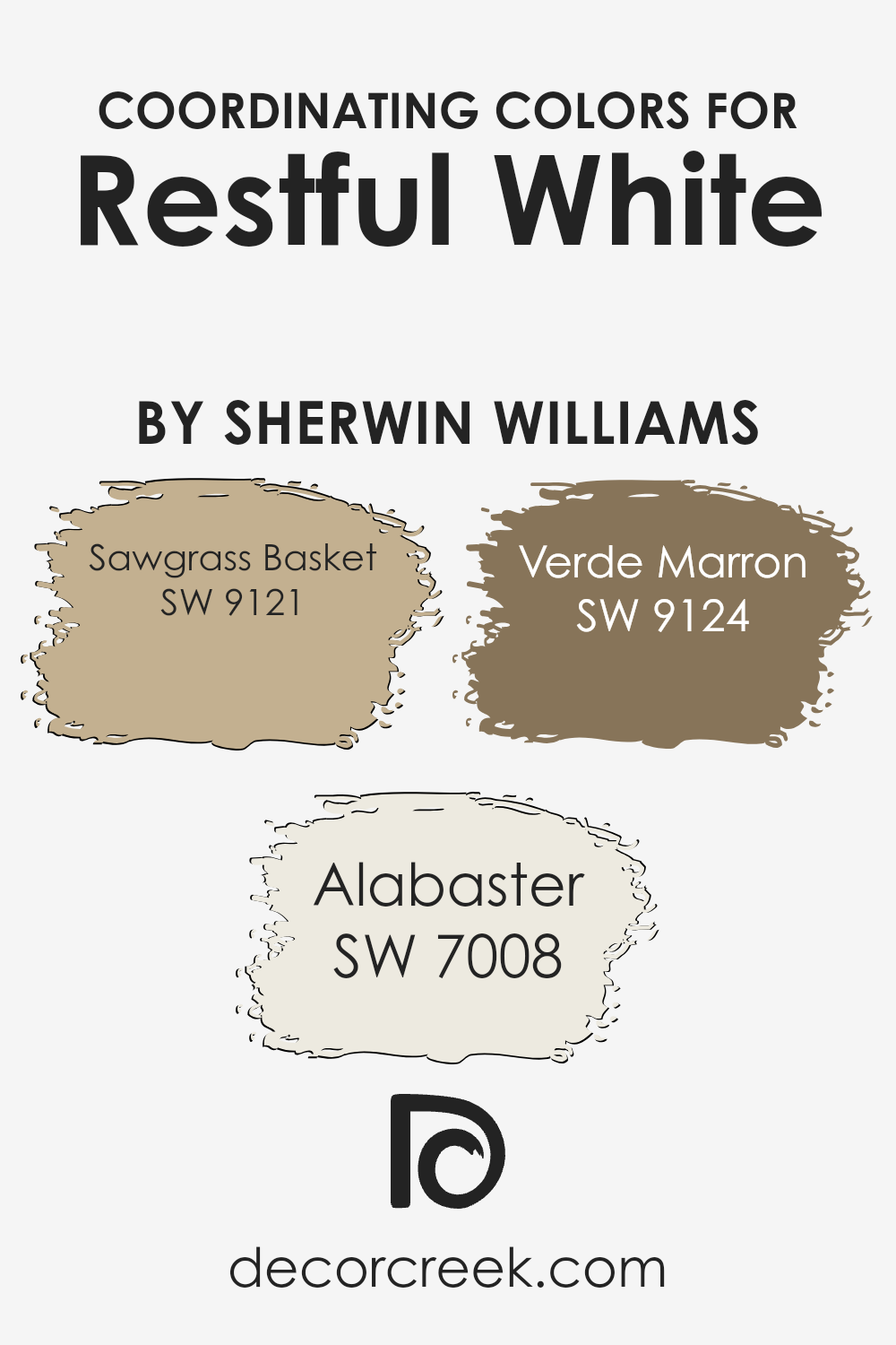
Coordinating Colors of Restful White SW 7563 by Sherwin Williams
Coordinating colors are those that complement each other well when used together in a design scheme. For example, when working with a subtle hue like Restful White from Sherwin Williams, designers often select additional colors that enhance and balance the main shade’s aesthetic without overpowering it. This process involves choosing hues that either contrast nicely or blend seamlessly with the main color.
Starting with SW 9121 – Sawgrass Basket, this is a deeper, rustic shade that pairs nicely with the light and airy feel of Restful White. It works well in creating a grounding effect in spaces that aim for a warm and cozy ambiance.
Then there’s SW 7008 – Alabaster, a soft, almost creamy white that closely resembles Restful White but adds a subtle distinction that can help define architectural details or highlight specific areas without stark contrasts. Lastly, SW 9124 – Verde Marron adds a unique touch with its rich, earthy green that brings a natural, outdoor element into the space, contrasting beautifully against the cleaner backdrop of Restful White for a refreshing visual dynamic. Together, these colors create a harmonious palette that enhances the space’s overall aesthetic.
You can see recommended paint colors below:
- SW 9121 Sawgrass Basket
- SW 7008 Alabaster
- SW 9124 Verde Marron
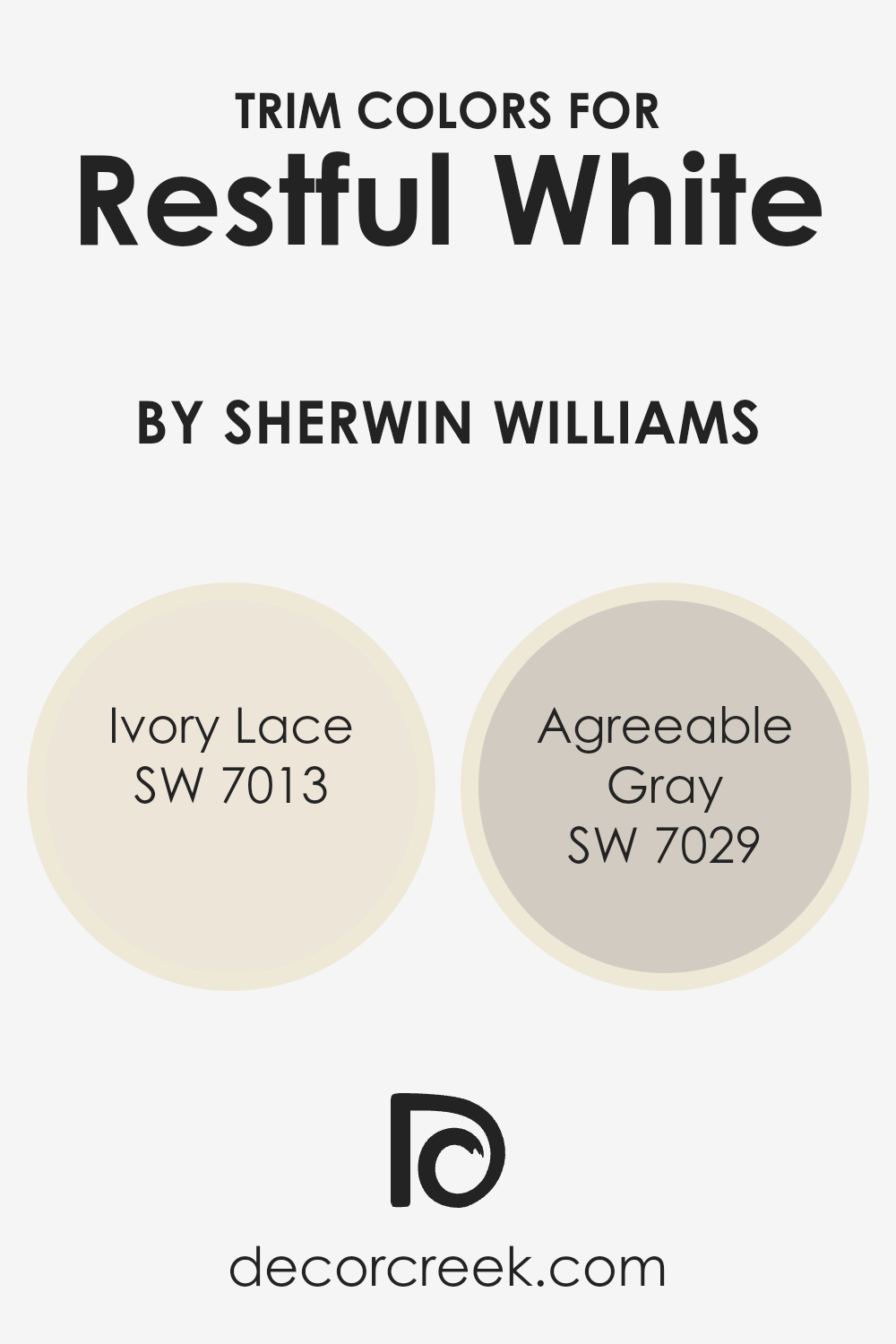
What are the Trim colors of Restful White SW 7563 by Sherwin Williams?
Trim colors refer to the hues used for the decorative outline around door frames, window frames, and skirting in a room. Choosing the right trim color is crucial as it complements the main wall color, in this case, SW 7563 – Restful White by Sherwin Williams.
Using a trim color like SW 7013 – Ivory Lace or SW 7029 – Agreeable Gray can define the boundaries of a space and highlight architectural details, making the room appear neat and well-finished. The right trim color not only adds contrast but also brings a sense of completeness and polish to the overall look of the room.
SW 7013 – Ivory Lace is a gentle, off-white shade that can soften the edges of a room painted in Restful White, providing a subtle distinction that enhances the space without overwhelming it. On the other hand, SW 7029 – Agreeable Gray offers a slightly bolder contrast, its warm gray tone creating a gentle yet distinct boundary that can make the main wall color pop beautifully.
Both choices are suitable for bringing out the best in Restful White, depending on whether a softer or a sharper contrast is desired.
You can see recommended paint colors below:
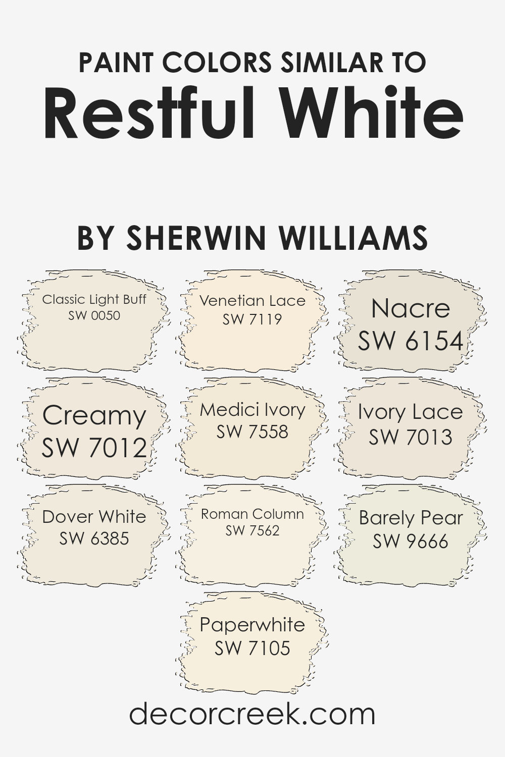
Colors Similar to Restful White SW 7563 by Sherwin Williams
Using similar colors in a design can create a cohesive and harmonious look, making it visually pleasing and comfortable. These colors, akin to Restful White by Sherwin Williams, share subtle differences that might affect the mood and feel of a space. Classic Light Buff brings a soft, sandy, and warm tone that can make spaces feel inviting and cozy.
Creamy is another warm hue, slightly richer, adding a touch of brightness that enhances natural light in a room. Dover White has a touch of creaminess but leans towards a lighter, airy feel, perfect for making smaller spaces appear larger.
Paperwhite is a fresh and clean color, reflecting a lot of light which makes it ideal for a crisp look. Venetian Lace offers a hint of vanilla, providing a soft backdrop that works well with richer colors or textured elements in a room. Medici Ivory adds a subtle yellow undertone, imparting a warm and gentle ambiance that pairs well with darker woods or autumnal colors.
Roman Column offers a neutral base with a touch of warmth, versatile for varying decor styles. Nacre, with its pearly finish, provides a subtle elegance that can enhance a sophisticated yet understated look. Ivory Lace resembles a softer, lighter version of classic ivory, ideal for a delicate and refined atmosphere.
Lastly, Barely Pear introduces a very slight green undertone, refreshing a traditional neutral palette without overwhelming it. Each of these colors supports a different aspect of creating a versatile yet unified space, adaptable to both modern and traditional interiors.
You can see recommended paint colors below:
- SW 0050 Classic Light Buff
- SW 7012 Creamy
- SW 6385 Dover White
- SW 7105 Paperwhite
- SW 7119 Venetian Lace
- SW 7558 Medici Ivory
- SW 7562 Roman Column
- SW 6154 Nacre
- SW 7013 Ivory Lace
- SW 9666 Barely Pear
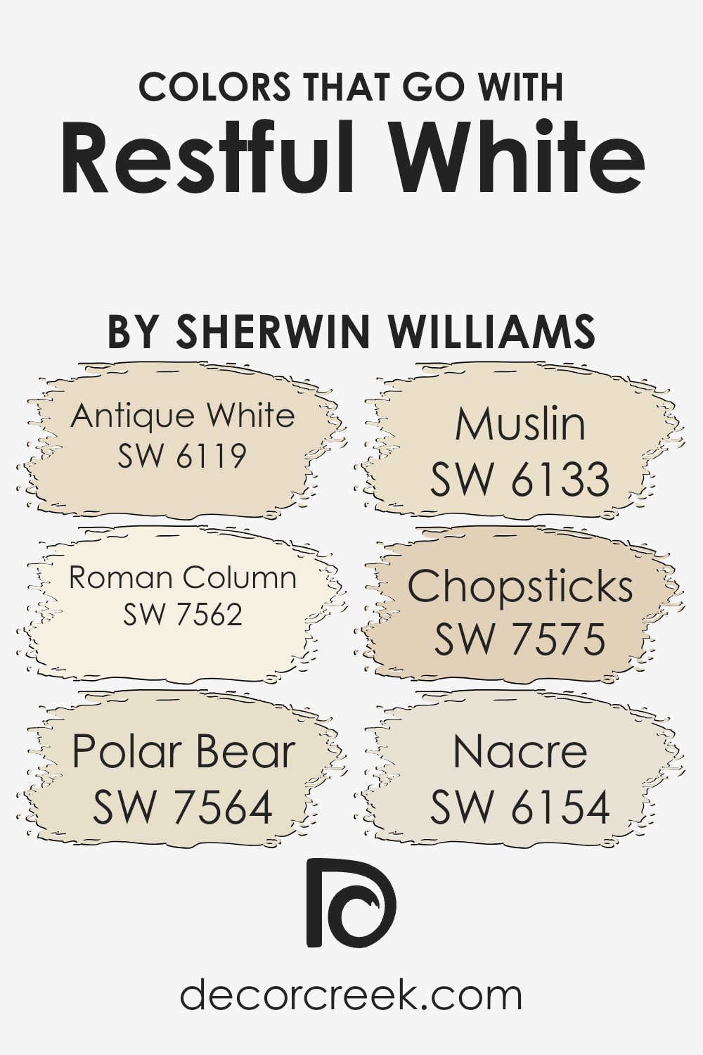
Colors that Go With Restful White SW 7563 by Sherwin Williams
Colors that complement Restful White SW 7563 by Sherwin Williams play a vital role in interior design because they create a harmonious palette that enhances the sense of spaciousness and light in a room. By selecting colors such as Antique White, Roman Column, Polar Bear, Muslin, Chopsticks, and Nacre, you can achieve a subtle yet visually appealing environment.
These colors work well as they subtly bring warmth or coolness, maintaining a balanced aesthetic without overpowering the soft neutrality of Restful White.
Antique White SW 6119 is a warm, slightly creamy color that gives a cozy feel, ideal for creating a welcoming atmosphere in living areas and bedrooms. Roman Column SW 7562 offers a bit more depth, a warm off-white that works beautifully for adding a hint of sophistication without overwhelming the space.
Polar Bear SW 7564 is a clean and bright white, perfect for making smaller spaces appear larger and more open. Muslin SW 6133 provides a touch of warmth with its understated beige tone, excellent for areas where you want a gentle enhancement of Restful White.
Chopsticks SW 7575 is a deeper beige that adds dimension and warmth, useful in areas that benefit from a richer backdrop. Lastly, Nacre SW 6154 is a soft pearl-like hue that brings a gentle refinement to the color scheme, making it great for blending with other neutral furnishings and decor.
Together, these colors support and enhance the beauty of Restful White, creating a cohesive and inviting atmosphere.
You can see recommended paint colors below:
- SW 6119 Antique White
- SW 7562 Roman Column
- SW 7564 Polar Bear
- SW 6133 Muslin
- SW 7575 Chopsticks
- SW 6154 Nacre
How to Use Restful White SW 7563 by Sherwin Williams In Your Home?
Restful White by Sherwin Williams is a gentle, soft white paint that brings a clean and fresh feel to any space. This color is perfect for creating a calm atmosphere in your home, making it ideal for bedrooms, living rooms, or any area where you want a soothing vibe. Its subtlety allows it to blend seamlessly with different styles and color palettes, enhancing existing décor without overwhelming it.
Using Restful White can also make small rooms appear larger and more open because light colors generally make spaces feel more expansive. It’s also a great choice for kitchens and bathrooms for a bright and clean look.
Pair it with bold colors like navy or charcoal for a striking contrast, or keep things light with pastels for a soft and inviting environment.
Overall, Restful White is versatile and easy to use in various decorating styles, ensuring it works well in just about any setting in your home.
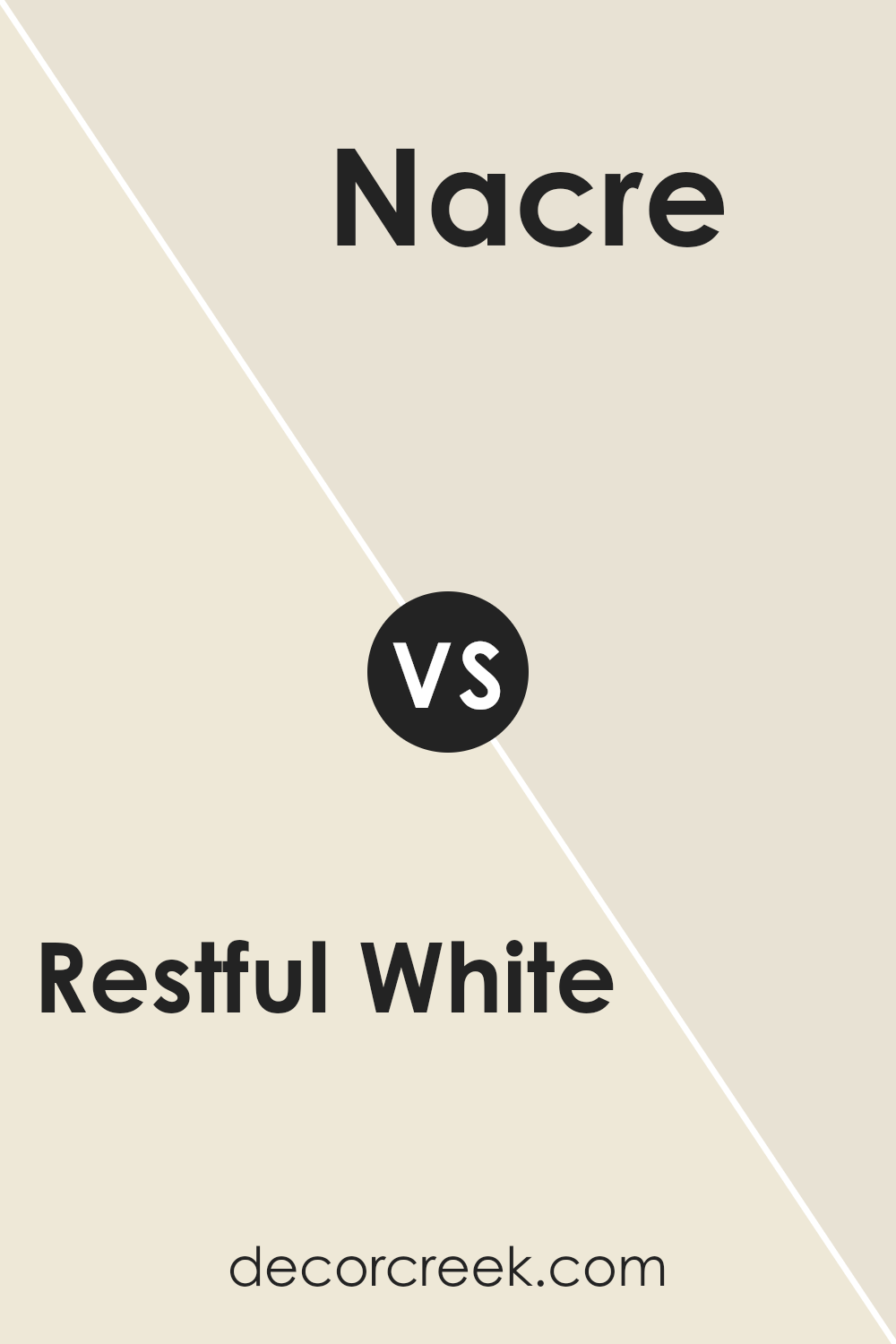
Restful White SW 7563 by Sherwin Williams vs Nacre SW 6154 by Sherwin Williams
Restful White and Nacre by Sherwin Williams are both light and airy colors, but they have subtle differences. Restful White is a clean, pure white that gives a crisp look to any room. It’s great for creating a bright and open feel, making spaces appear larger.
On the other hand, Nacre has a hint of beige, giving it a warmer tone. This makes it ideal for spaces where you want a cozy and welcoming atmosphere. Nacre can help soften the edges of a room more than Restful White due to its warmer undertones.
Both colors work well in various settings and help in brightening spaces, but the choice between a cooler or warmer white depends on the mood you want to set and the existing colors in your furniture and decor.
You can see recommended paint color below:
- SW 6154 Nacre
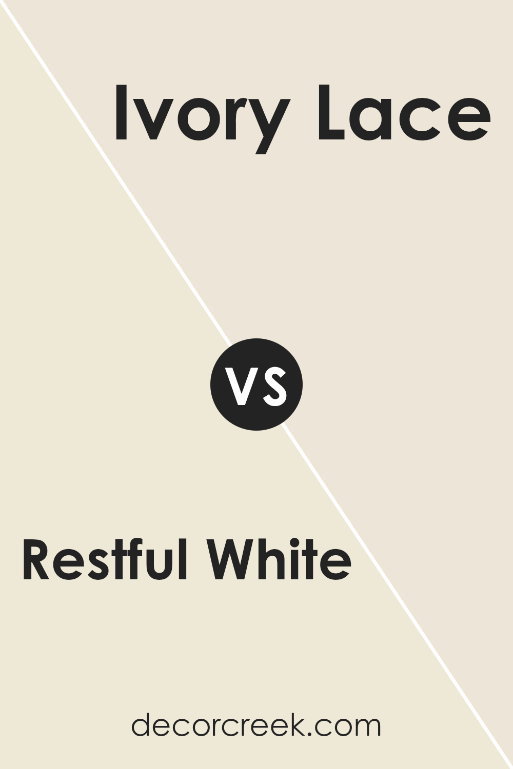
Restful White SW 7563 by Sherwin Williams vs Ivory Lace SW 7013 by Sherwin Williams
Restful White and Ivory Lace are both neutral colors from Sherwin Williams, yet they bring different vibes to a space. Restful White is a pure, clean white that offers a fresh and clear appearance. It’s great for making a room feel open and airy.
On the other hand, Ivory Lace leans slightly towards a creamy tone, giving it a warmer feel compared to Restful White. This warmth makes Ivory Lace ideal for spaces where you want a cozy and inviting atmosphere. Both colors are versatile and can be used in various settings like living rooms, bedrooms, and kitchens.
Whether you choose Restful White for its crispness or Ivory Lace for its soft warmth, both shades are excellent for creating a calming environment.
You can see recommended paint color below:
Restful White SW 7563 by Sherwin Williams vs Medici Ivory SW 7558 by Sherwin Williams
Restful White and Medici Ivory by Sherwin Williams are two distinct yet subtly different shades. Restful White is a clean, soft white with a slightly warm undertone that makes it a versatile choice for any space aiming for a fresh and airy feel. It pairs beautifully with various decor styles and can make small spaces appear larger and more open.
Comparatively, Medici Ivory has more depth due to its creamy, almost beige undertones. This color offers a warmer and cozier vibe, making it ideal for spaces where a comforting and welcoming atmosphere is desired.
While both colors provide a neutral backdrop, Medici Ivory’s richness allows it to stand out more against bolder colors and can add a gentle warmth to rooms without overwhelming them.
Both colors are excellent choices for those looking to create a peaceful and inviting environment. Restful White leans towards purity and simplicity, while Medici Ivory offers warmth and softness, making each suitable for different preferences and room functions.
You can see recommended paint color below:
- SW 7558 Medici Ivory
Restful White SW 7563 by Sherwin Williams vs Dover White SW 6385 by Sherwin Williams
Restful White and Dover White by Sherwin Williams are two popular white paints, though they have different tones and uses. Restful White is a soft and muted white. It has a hint of gray, which gives it a calm and soothing feel. This color works well in spaces where you want a clean look without starkness, perfect for a cozy living area or a peaceful bedroom.
On the other hand, Dover White has a warmer tone, leaning slightly towards a creamy white. This warmth makes it ideal for spaces that need a more inviting and friendly feel. It’s great in kitchens or living rooms where you want a hint of coziness without going too yellow or beige.
Both colors are versatile, but your choice would depend on the mood you want to set and the natural light in your space. Restful White is better for a modern look, while Dover White suits a traditional or warm-themed room.
You can see recommended paint color below:
Restful White SW 7563 by Sherwin Williams vs Classic Light Buff SW 0050 by Sherwin Williams
Restful White and Classic Light Buff are two paint colors by Sherwin Williams that both offer a calm and airy feel but in different ways. Restful White is a clean, pure white that has a refreshing and simple characteristic. It doesn’t lean too much towards any warm or cool tones, which makes it very versatile for any space. It’s particularly great for creating a bright and open feeling in small or dark rooms.
On the other hand, Classic Light Buff is a soft beige with a warm undertone that adds a bit more coziness compared to Restful White. The warmth of Classic Light Buff is inviting and can make large, open spaces feel more intimate and cozy. It works well in living areas or bedrooms where a gentle, welcoming look is desired.
Both colors are subtle and neutral, but Classic Light Buff offers a touch of warmth that is especially suitable for creating a comfy atmosphere while keeping the space light and relaxed.
You can see recommended paint color below:
Restful White SW 7563 by Sherwin Williams vs Barely Pear SW 9666 by Sherwin Williams
Restful White is a clean and crisp shade, offering a refreshing and neutral backdrop suitable for any area in your home. Its subtle warmth makes it quite versatile, pairing well with various decor styles and colors. In contrast, Barely Pear is a gentle off-white with a hint of green, giving it a soft and organic feel.
This color can also be used in different spaces, adding a subtle touch of earthiness that is both soothing and inviting. While Restful White is more straightforward in its application, acting almost like a pure white, Barely Pear offers a hint of color that can enhance the room with a unique, yet understated, character.
Both colors are light and airy, providing a sense of openness and brightening up spaces effectively. However, the choice between them depends on whether you prefer a classic neutral or a hint of color.
You can see recommended paint color below:
- SW 9666 Barely Pear
Restful White SW 7563 by Sherwin Williams vs Creamy SW 7012 by Sherwin Williams
Both “Restful White” and “Creamy” by Sherwin Williams are gentle, warm hues that create welcoming spaces, yet they have distinct differences. “Restful White” is a soft, clean white with a hint of warmth, making it perfect for a calm and cozy atmosphere in any room. It doesn’t carry stark or cold undertones, which helps in making spaces feel more inviting.
On the other hand, “Creamy” is slightly richer and deeper than “Restful White.” It has a buttery tone that adds a touch of coziness and comfort, ideal for areas where you want a more welcoming and soft ambiance without going too bright. “Creamy” works well in lighting that is less direct, as it helps soften the shadows that might be cast, providing a consistent and smooth appearance across walls.
In summary, while both paints lend a touch of warmth, “Creamy” offers a slightly deeper, butter-like color, providing a stronger sense of coziness compared to the lighter, softer feel of “Restful White.”
You can see recommended paint color below:
Restful White SW 7563 by Sherwin Williams vs Paperwhite SW 7105 by Sherwin Williams
Restful White and Paperwhite are both colors by Sherwin Williams that share a calm, understated vibe, but they have subtle differences. Restful White has a warm undertone, giving it a cozy and inviting feel. This makes it a great choice for living spaces, as it tends to make rooms feel welcoming and homey.
In contrast, Paperwhite leans towards a cooler tone. This slight bluish tint makes it feel fresher and crisper, which can be particularly striking in bathrooms and kitchens for a clean look.
Paperwhite is excellent for spaces that aim for a sharp, modern aesthetic, while Restful White fits beautifully in settings where a softer, more lived-in atmosphere is desired.
Both colors reflect light well, creating airy and open spaces, but the warmth of Restful White offers a gentle hug of color, whereas Paperwhite provides a clearer, brighter approach.
You can see recommended paint color below:
- SW 7105 Paperwhite
Restful White SW 7563 by Sherwin Williams vs Roman Column SW 7562 by Sherwin Williams
Restful White and Roman Column by Sherwin Williams are two similar yet subtly distinct shades. Restful White is a gentle, soothing white with just a hint of warmth, making it a great choice for creating a calm and welcoming space. It pairs well with almost any decor, adding a clean and fresh look.
Roman Column, on the other hand, is slightly warmer and creamier than Restful White. This color has a softness that can make a room feel cozy and inviting. It’s excellent for spaces where you want a bit more warmth without moving away from a predominantly white palette.
Both colors reflect light beautifully, which can help to make a small room appear bigger and brighter. When deciding between the two, consider the lighting in your room and the mood you want to set. Restful White leans more towards a pure white, while Roman Column offers a touch of creaminess for a cozier feel
You can see recommended paint color below:
Restful White SW 7563 by Sherwin Williams vs Venetian Lace SW 7119 by Sherwin Williams
Restful White and Venetian Lace, both by Sherwin Williams, offer subtle differences that affect their use in decorating spaces. Restful White, a soft and light white, provides a clean and airy feel to rooms, making it ideal for creating a sense of openness and light. It’s a perfect choice for anyone looking to freshen up their space without making it feel too stark or cold.
Venetian Lace, on the other hand, has a slightly warmer tone, bringing a cozy and inviting atmosphere to any room. Its creamy undertone adds a hint of richness, making it suitable for spaces where a touch of warmth is desired without overpowering with color.
Both colors work well in various settings, but the choice between them depends on the mood you want to set. Restful White is better for achieving a bright and open feel, while Venetian Lace is excellent for a softer, more comforting environment.
You can see recommended paint color below:
- SW 7119 Venetian Lace
Conclusion
In conclusion, SW 7563 Restful White by Sherwin Williams is a fantastic paint color for anyone looking to brighten up their room. It’s like a superhero for walls, making small places look bigger and giving a clean, peaceful feeling.
Whether you’re fixing up a tiny bathroom or giving a makeover to a big living room, this shade of white works just right. It plays well with all sorts of colors, so no matter what your favorite color is—blue, pink, green, or even yellow—Restful White makes those colors pop even more.
Plus, it’s kind on the eyes and doesn’t make you feel boxed in; instead, it brings a light, fresh vibe to the room. For kids, it’s perfect for making playrooms friendly and bright. For adults, it adds a neat, tidy look to any area of the home.
So, if you’re thinking about picking a new color for your walls, Restful White is a trusty choice that can make your home feel new and welcoming without lots of fuss.
Ever wished paint sampling was as easy as sticking a sticker? Guess what? Now it is! Discover Samplize's unique Peel & Stick samples.
Get paint samples

