When I think about SW 7033 Brainstorm Bronze by Sherwin Williams, the image that comes to mind is one of warmth and richness. It’s a color that brings a unique blend of depth and subtlety to any space. Imagine a cozy room that feels welcoming and grounded; that’s what Brainstorm Bronze offers.
It strikes a balance between being bold and understated, making it a versatile choice for various settings.
This color has a way of adding an earthy yet sophisticated touch to the environment. It’s not just about painting a wall; it’s about creating a mood, a sense of comfort, and a hint of elegance. Whether you’re looking to highlight a modern aesthetic or add a touch of classic charm, Brainstorm Bronze works effortlessly.
It pairs wonderfully with natural textures and materials, from wood to metal, enhancing their character and bringing harmony to the room.
Using Brainstorm Bronze in your home or workspace means choosing a color that doesn’t shout for attention but still commands respect. It’s a color that complements other hues and designs beautifully, making it easy to incorporate into your existing style.
Think of it not just as a color choice but as a statement of taste and refinement, setting the tone for a relaxed yet polished atmosphere.

What Color Is Brainstorm Bronze SW 7033 by Sherwin Williams?
Brainstorm Bronze by Sherwin Williams is a rich and warm brown with subtle golden undertones. This inviting shade brings a cozy and earthy feel to any space, making it a versatile choice for various interior styles. Its warm hue pairs exceptionally well with rustic, traditional, and transitional designs, adding depth and character to rooms.
In a rustic setting, Brainstorm Bronze can complement exposed wooden beams and stone fireplaces, enhancing the room’s natural elements. It works beautifully with traditional furnishings, adding a touch of warmth and elegance.
In transitional spaces, this color can serve as a grounding backdrop for a mix of contemporary and classic elements.
Materials and textures that pair well with Brainstorm Bronze include natural wood, leather, and woven textiles.
Think of it alongside wooden floors or leather furniture, both of which highlight its warm tones. Textured fabrics like linen or burlap will also harmonize well with this color, adding layers of texture and comfort.
In terms of accent colors, Brainstorm Bronze looks great with soft creams, muted greens, and deep burgundies. These color combinations create a soothing and cohesive palette that can work throughout any space, whether it’s a cozy living room, a warm dining area, or a relaxing bedroom.

Is Brainstorm Bronze SW 7033 by Sherwin Williams Warm or Cool color?
Brainstorm Bronze by Sherwin-Williams is a warm, earthy color that can add a cozy atmosphere to any home. This shade combines brown and gray tones, creating a versatile hue that fits well with various styles, from traditional to contemporary. In living rooms, this color offers a comforting backdrop, enhancing wood furniture and soft textiles.
It pairs nicely with natural elements like stone and wood, bringing out their rich textures. In kitchens, Brainstorm Bronze can create an inviting space when combined with lighter countertops and wooden cabinets.
It works well as an accent wall or as the main color in a room to create a grounded and cohesive look.
The color can also change slightly with different lighting, appearing warmer in sunlight and more muted in dimmer settings. Overall, Brainstorm Bronze is a practical choice for adding warmth and a subtle touch of sophistication to any room without being overpowering.
Undertones of Brainstorm Bronze SW 7033 by Sherwin Williams
Brainstorm Bronze by Sherwin Williams is a complex color because of its many undertones, which affect how it looks in different settings. These undertones can subtly change the mood of a room. For example, the olive and dark green undertones can give a natural, earthy feel. This makes the color comforting and grounding, perfect for a living room or study.
The purple, lilac, and violet undertones add a touch of richness and depth, creating a warm, cozy atmosphere. This can be inviting in a bedroom or reading nook.
Meanwhile, undertones like dark turquoise, mint, and light turquoise introduce a refreshing vibe, which can make spaces feel more open and airy.
Pink and light purple bring a soft, playful touch, giving the color a light-hearted feel, suitable for a nursery or a children’s room. On the other hand, the brown and dark grey undertones provide a solid, stable base, helping the color feel elegant and timeless in common areas like hallways or dining rooms.
Finally, the subtle hints of red, orange, and yellow can add warmth, making rooms feel more vibrant and energetic. The undertones in Brainstorm Bronze help it adapt to various spaces, creating different moods based on the room’s lighting and furnishings.
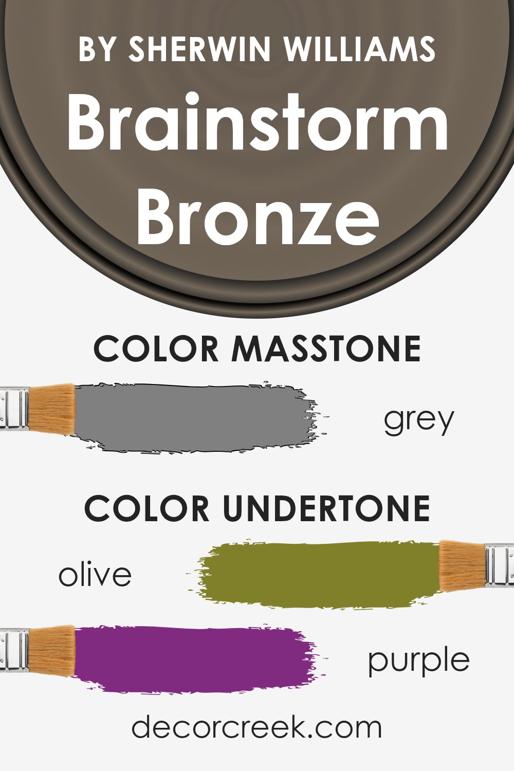
What is the Masstone of the Brainstorm Bronze SW 7033 by Sherwin Williams?
Brainstorm Bronze (SW 7033) by Sherwin Williams, with its grey masstone (#808080), offers a warm, earthy tone that fits well in various home settings. This color combines elements of brown and grey, which allows it to blend seamlessly with both modern and traditional styles.
The grey undertone gives the color a balanced appearance, making it less intense and more adaptable to different lighting conditions.
In rooms with plenty of natural light, Brainstorm Bronze can appear warmer, enhancing cozy vibes. In dimly lit spaces, the grey masstone becomes more evident, providing a neutral backdrop that complements a wide range of decor styles and accent colors. This versatility makes it a suitable choice for living rooms or bedrooms where you want an inviting and calming appearance.
Additionally, its subtle tone works well on larger surfaces like walls, adding depth and interest without overwhelming the space.
How Does Lighting Affect Brainstorm Bronze SW 7033 by Sherwin Williams?
Lighting plays a significant role in how colors appear, and Brainstorm Bronze SW 7033 by Sherwin Williams is no exception. This paint color can change dramatically based on the lighting conditions in a room.
In natural light, Brainstorm Bronze can appear warm and inviting. Natural daylight tends to enhance the earthy undertones of the color, making it look more vibrant. However, the effect of natural light varies throughout the day.
In the morning light of an east-facing room, Brainstorm Bronze can appear brighter and more golden as the sunlight enhances its warmth. As the day progresses, the color might seem toned down. In a west-facing room, the afternoon and evening sunlight brings out its depth, giving it a richer appearance.
Artificial lighting also affects how this color is perceived. Under cool fluorescent lights, Brainstorm Bronze might seem a bit duller or flatter, as these lights often wash out warm tones. In contrast, warm incandescent or LED lights can enhance its natural warmth, making it feel cozier.
The direction a room faces also influences how Brainstorm Bronze appears. In north-facing rooms, which typically have cooler and softer natural light, the color might take on a slightly muted tone, emphasizing any grayish undertones. This can make the room feel more subdued and cool.
Conversely, south-facing rooms generally receive the most consistent and warm natural light throughout the day. This can make Brainstorm Bronze appear at its warmest and most inviting, as the light brings out its inherent warmth and depth.
Understanding how lighting affects paint colors like Brainstorm Bronze is crucial when choosing paint for your space. By considering the natural light direction and the type of artificial lighting used, you can better predict how the paint will look and create the desired atmosphere in each room.

What is the LRV of Brainstorm Bronze SW 7033 by Sherwin Williams?
LRV stands for Light Reflectance Value, which is a measure of how much light a paint color reflects. It is a scale from 0 to 100, where 0 is absolute black (which absorbs all light) and 100 is pure white (which reflects all light). In simpler terms, LRV tells you how light or dark a color will appear once applied to a surface.
A lower LRV means the color will absorb more light, making it appear darker, while a higher LRV indicates it will reflect more light and appear lighter. When choosing paint colors, understanding LRV is crucial because it affects how colors look in different lighting conditions and on different walls.
For the color Brainstorm Bronze, which has an LRV of 14.45, this value indicates that it is a relatively dark color.
Such a color will absorb a lot of light rather than reflecting it, which means it will appear quite intense and bold on walls, especially in rooms without much natural light.
If used in a small or dimly lit space, it might make the room feel cozier but potentially more enclosed or smaller. In contrast, with enough lighting or in larger spaces, it can provide a warm, rich atmosphere. So, when using a color like this, consider the size of the room and the available lighting to achieve the desired effect.

Coordinating Colors of Brainstorm Bronze SW 7033 by Sherwin Williams
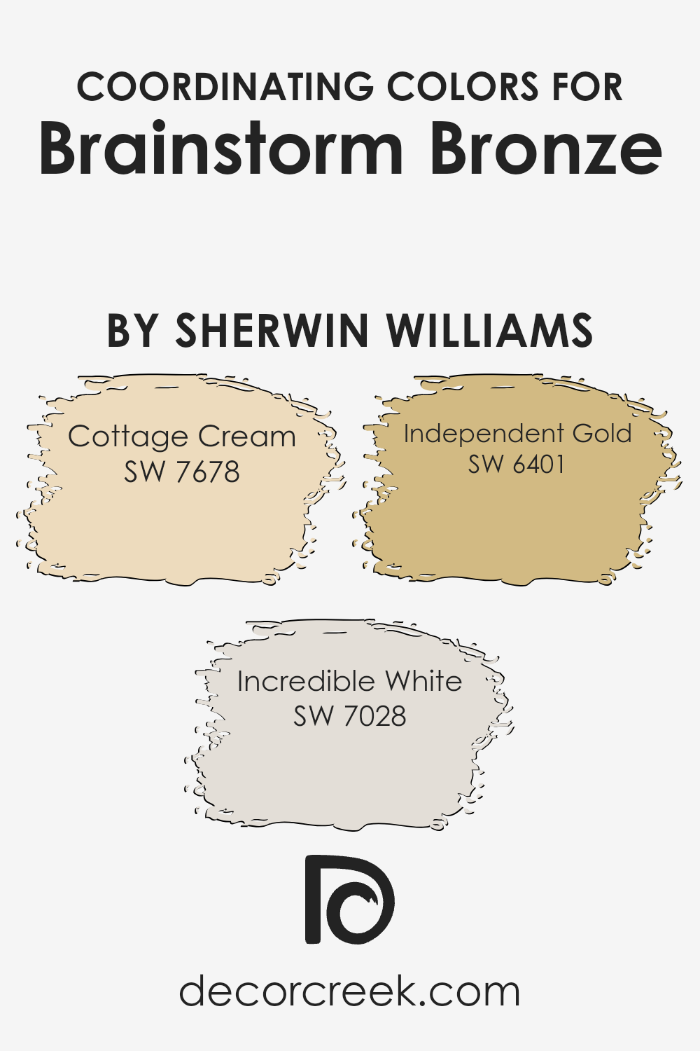
Coordinating colors are different shades that complement and enhance each other, creating a harmonious look when used together in a space. They work by matching or contrasting with a main color, such as Brainstorm Bronze by Sherwin Williams, to create a balanced and appealing atmosphere.
Coordinating colors can either echo subtle tones from the main color or offer a striking contrast, helping to create visual interest and depth in a room’s design.
For Brainstorm Bronze, a rich, earthy tone, colors like Cottage Cream, Incredible White, and Independent Gold serve to enhance its warm undertones. Cottage Cream is a soft, warm ivory that provides a light and airy balance to the deeper hues of Brainstorm Bronze, keeping the room feeling open and spacious.
Incredible White offers a neutral backdrop with its subtle gray undertone, which blends well with the bronze while keeping the palette neutral and clean.
Independent Gold, a vibrant and warm mustard, complements the richness of Brainstorm Bronze by adding a touch of brightness and depth, creating a lively yet cohesive look. Together, these colors work seamlessly to create a space that feels inviting and well put together.
You can see recommended paint colors below:
- SW 7678 Cottage Cream (CHECK A SAMPLE)
- SW 7028 Incredible White (CHECK A SAMPLE)
- SW 6401 Independent Gold (CHECK A SAMPLE)
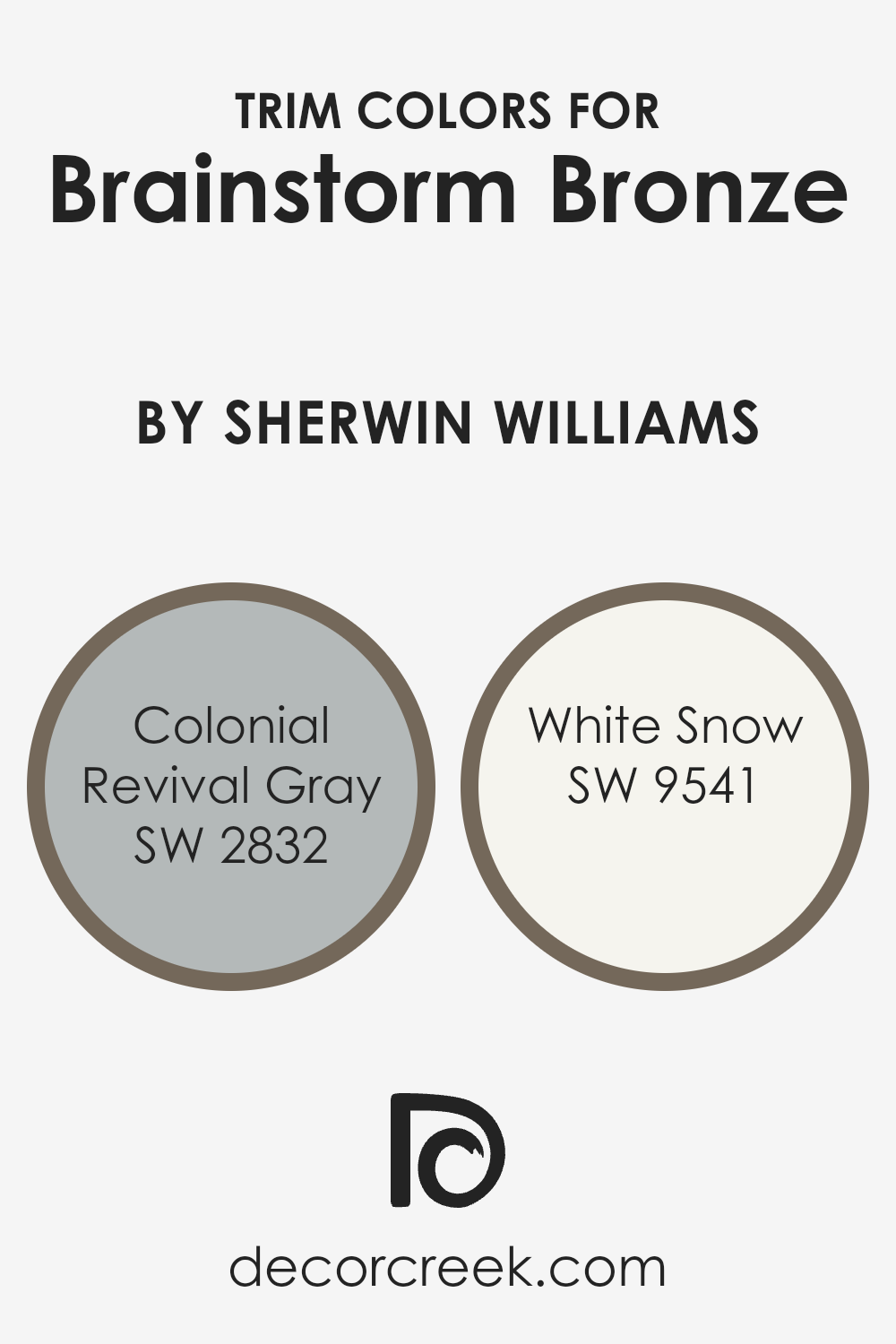
What are the Trim colors of Brainstorm Bronze SW 7033 by Sherwin Williams?
Trim colors are the paints you use for the edges or borders in a room, like around windows, doors, and baseboards, to create a finished and polished look. These colors are important because they complement the main wall color, Brainstorm Bronze by Sherwin Williams, and can make a big difference in how the entire space feels.
Using the right trim color can highlight certain features and make the room more visually interesting. When paired well, trim colors provide contrast to the main color, allowing each color to stand out while ensuring a harmonious appearance.
Brainstorm Bronze is a rich, warm color, so finding trims that balance or enhance its strong tone is key.
Colonial Revival Gray, a subtle and sophisticated shade of gray, acts as a timeless and neutral option. It provides a calm backdrop that enhances Brainstorm Bronze without overpowering its warmth.
White Snow, on the other hand, is a crisp white shade that brings freshness and brightness to the space. It offers a clean, clear boundary against the warmth of Brainstorm Bronze, making the color pop while giving a neat and orderly look.
Together, these trim colors can enhance Brainstorm Bronze by creating a layered and dynamic visual effect that enriches the room’s ambiance.
You can see recommended paint colors below:
- SW 2832 Colonial Revival Gray
- SW 9541 White Snow (CHECK A SAMPLE)
Colors Similar to Brainstorm Bronze SW 7033 by Sherwin Williams
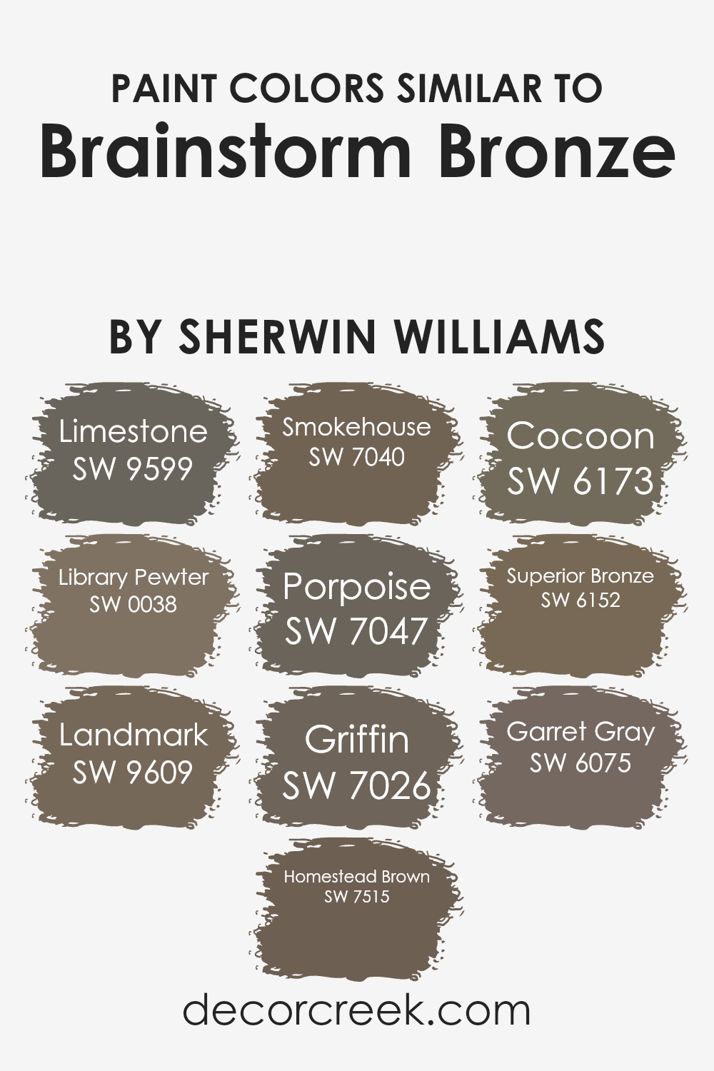
Similar colors are essential in design because they create a harmonious and cohesive look. When working with Brainstorm Bronze, shades like Limestone, Library Pewter, Landmark, Homestead Brown, Smokehouse, Porpoise, Griffin, Cocoon, Superior Bronze, and Garret Gray, can complement and enhance the warmth and depth of this base color.
These shades work well together because they share similar undertones, allowing them to blend without clashing. This unity is pleasing to the eye, making spaces appear more inviting and unified. It also provides flexibility, allowing a designer to add variety and interest without straying from an established color palette.
Limestone offers a muted and earthy tone, perfect for pairing with other neutrals. Library Pewter has a rich depth, adding a subtle contrast to lighter shades. Landmark brings a grounded, warm hue, while Homestead Brown offers an inviting, deep brown that can anchor a room.
Smokehouse has a subtle smokey undertone, adding a sense of coziness, and Porpoise brings in soft, muted elegance.
Griffin introduces a strong and warm gray, enhancing the palette’s depth. Cocoon provides a nurturing, soft feel, while Superior Bronze adds an aged, vintage touch. Finally, Garret Gray brings richness with its deeper, more pronounced tone, balancing the other colors. These shades, when used together, enrich a space with a balanced and unified feel.
You can see recommended paint colors below:
- SW 9599 Limestone (CHECK A SAMPLE)
- SW 0038 Library Pewter (CHECK A SAMPLE)
- SW 9609 Landmark (CHECK A SAMPLE)
- SW 7515 Homestead Brown (CHECK A SAMPLE)
- SW 7040 Smokehouse (CHECK A SAMPLE)
- SW 7047 Porpoise (CHECK A SAMPLE)
- SW 7026 Griffin (CHECK A SAMPLE)
- SW 6173 Cocoon (CHECK A SAMPLE)
- SW 6152 Superior Bronze (CHECK A SAMPLE)
- SW 6075 Garret Gray (CHECK A SAMPLE)
Colors that Go With Brainstorm Bronze SW 7033 by Sherwin Williams
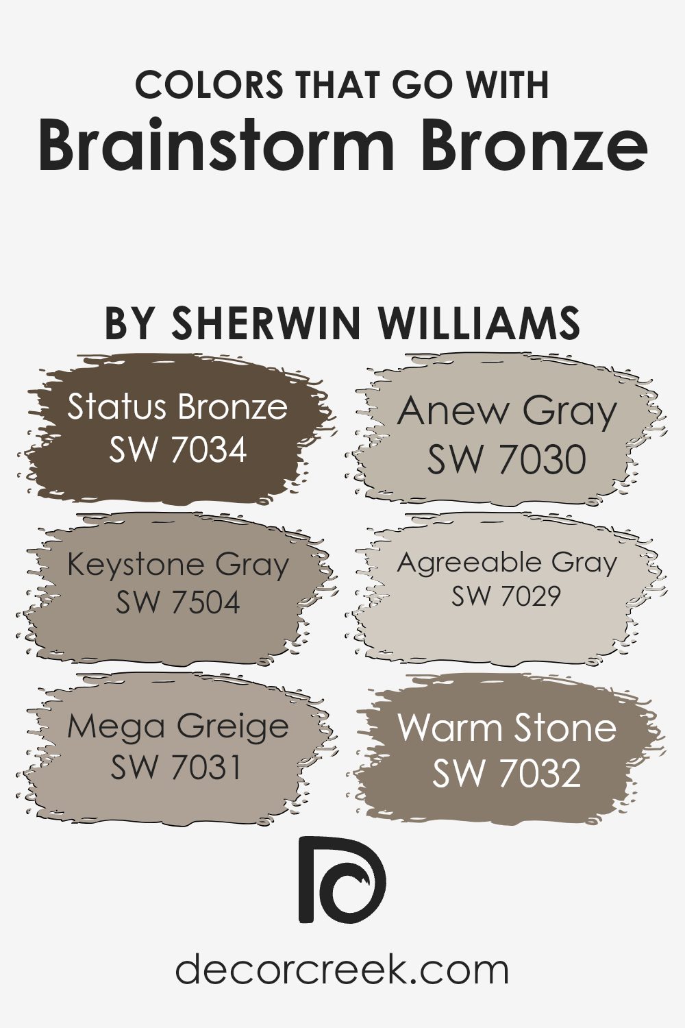
Colors that go with Brainstorm Bronze SW 7033 by Sherwin Williams help create a harmonious and pleasing environment. When paired with Brainstorm Bronze, SW 7034 – Status Bronze adds warmth, making spaces feel cozy and welcoming.
On the other hand, SW 7504 – Keystone Gray is a stable, neutral color that balances well with the deeper tones of Brainstorm Bronze, adding depth and structure. SW 7031 – Mega Greige offers a cooler undertone that complements warmer colors by adding contrast without being overwhelming.
Meanwhile, SW 7030 – Anew Gray provides a slightly warmer alternative, creating a friendly and inviting atmosphere that works well in living spaces.
Furthermore, SW 7029 – Agreeable Gray is a popular choice for its versatile, neutral tone that matches beautifully with Brainstorm Bronze, providing a soft backdrop that allows the bronze to shine.
Lastly, SW 7032 – Warm Stone is a richer earth tone that grounds the color scheme, providing a natural and relaxed vibe.
Each of these colors interacts with Brainstorm Bronze to create a balanced palette that can suit a variety of styles, enhancing the overall aesthetic of your home while maintaining a natural and comfortable feel.
You can see recommended paint colors below:
- SW 7034 Status Bronze (CHECK A SAMPLE)
- SW 7504 Keystone Gray (CHECK A SAMPLE)
- SW 7031 Mega Greige (CHECK A SAMPLE)
- SW 7030 Anew Gray (CHECK A SAMPLE)
- SW 7029 Agreeable Gray (CHECK A SAMPLE)
- SW 7032 Warm Stone (CHECK A SAMPLE)
How to Use Brainstorm Bronze SW 7033 by Sherwin Williams In Your Home?
Brainstorm Bronze SW 7033 by Sherwin Williams is a warm, earthy shade that can bring a cozy feel to any home. This color works well in various settings, adding a touch of comfort and a hint of richness. If you’re looking to refresh a living room, Brainstorm Bronze pairs beautifully with natural wood tones and creams, creating a welcoming atmosphere.
In a dining room, you can combine it with deep blues or burgundy accents for a dramatic look. It’s also a great choice for a home office or study, as it provides a grounded backdrop that helps with focus.
If you have an open floor plan, using Brainstorm Bronze can help define different spaces while maintaining a harmonious flow.
For a more adventurous touch, consider using it in a powder room with some metallic accents. Its versatility makes it an ideal choice for those looking to add warmth to their spaces.
Brainstorm Bronze SW 7033 by Sherwin Williams vs Landmark SW 9609 by Sherwin Williams
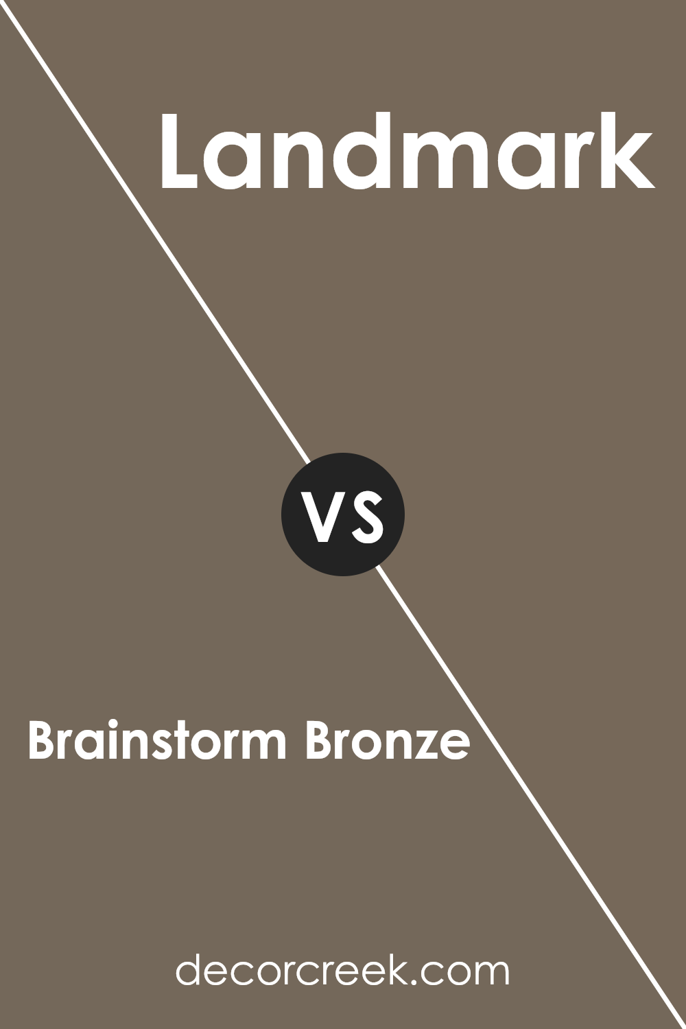
Brainstorm Bronze (Sherwin Williams SW 7033) and Landmark (Sherwin Williams SW 9609) are two distinct colors that offer unique vibes for spaces. Brainstorm Bronze is a warm, earthy shade with undertones that create a cozy and inviting atmosphere.
It works wonderfully in living rooms or spaces where you aim for comfort and relaxation. It’s an excellent choice for those who enjoy a classic and grounded look. On the other hand, Landmark is a lighter, more subdued color.
It has a softer presence, making it ideal for creating a calm and airy environment.
Its gentle hue is perfect for bedrooms or small spaces, adding a subtle touch of color without being overpowering.
While Brainstorm Bronze is grounding and rich, Landmark provides a lighter, more refreshing feel. Both colors can enhance a room’s personality, but the choice depends on whether you prefer warmth or lightness.
You can see recommended paint color below:
- SW 9609 Landmark (CHECK A SAMPLE)
Brainstorm Bronze SW 7033 by Sherwin Williams vs Garret Gray SW 6075 by Sherwin Williams
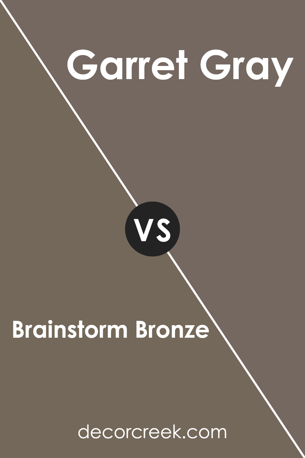
Brainstorm Bronze SW 7033 and Garret Gray SW 6075 by Sherwin Williams are both rich, earthy colors, but they offer different moods and uses. Brainstorm Bronze is a deep, warm brown with a touch of copper, which makes it feel cozy and inviting.
It’s a great color for creating a comfortable atmosphere in living rooms, studies, or any space where a warm, welcoming vibe is desired.
On the other hand, Garret Gray is a softer, more muted gray with subtle brown undertones. It offers a neutral backdrop that works well in various settings and can complement many other colors.
While Brainstorm Bronze draws you in with its warmth, Garret Gray provides a calm, balanced look that suits modern and classic spaces alike.
When choosing between these colors, consider the desired mood and how the colors will interact with other elements in the room.
You can see recommended paint color below:
- SW 6075 Garret Gray (CHECK A SAMPLE)
Brainstorm Bronze SW 7033 by Sherwin Williams vs Griffin SW 7026 by Sherwin Williams
Brainstorm Bronze (SW 7033) and Griffin (SW 7026) by Sherwin Williams are both warm, earthy shades with distinct qualities. Brainstorm Bronze is a rich, deep brown with a bronze undertone. It brings warmth and can create a cozy atmosphere in a room. This color pairs well with neutral colors and adds depth to a space.
On the other hand, Griffin is a slightly darker brown, with cooler undertones compared to Brainstorm Bronze. It is more muted and has a subtle sophistication. Griffin can be used to add elegance and is perfect for creating a more traditional look.
Both colors work well in living rooms or studies, providing an inviting environment. While Brainstorm Bronze is more warm and energetic, Griffin offers a more subdued and calm feel. They complement each other nicely when used together, with Brainstorm Bronze adding warmth and Griffin providing an anchoring balance.
You can see recommended paint color below:
- SW 7026 Griffin (CHECK A SAMPLE)
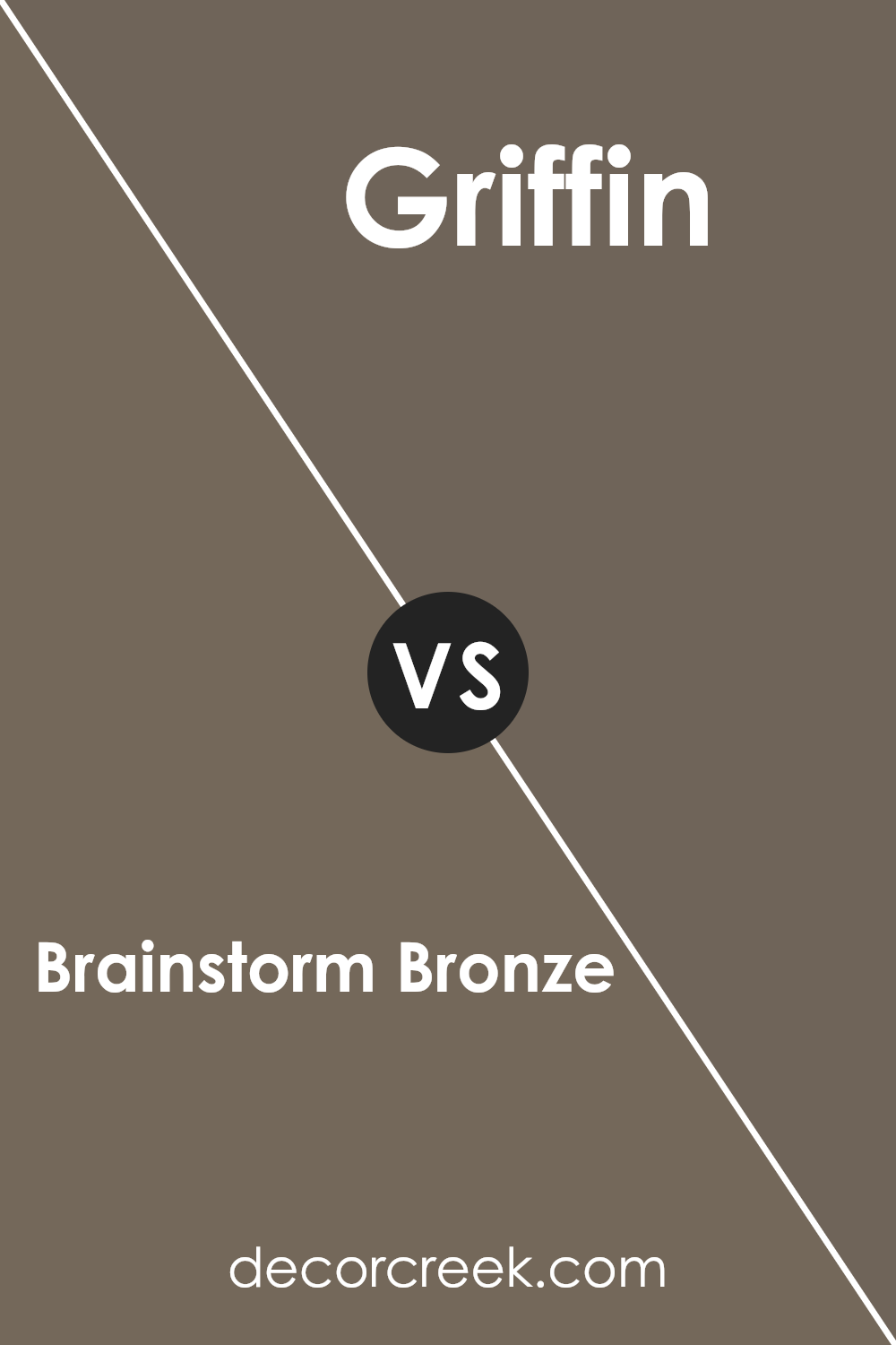
Brainstorm Bronze SW 7033 by Sherwin Williams vs Porpoise SW 7047 by Sherwin Williams
Brainstorm Bronze (SW 7033) and Porpoise (SW 7047) are two distinctive colors by Sherwin Williams that offer different aesthetics. Brainstorm Bronze is a warm, medium-dark brown with a subtle earthy tone. It’s a comfortable and inviting color, adding a cozy feel to any room.
It’s great for living spaces where you want an inviting atmosphere. Porpoise, on the other hand, is a cool, deep gray with subtle brown undertones. It’s a versatile and modern shade that works well in contemporary settings. Porpoise can add a touch of elegance to your space while maintaining a neutral backdrop.
While Brainstorm Bronze has a more traditional warmth, Porpoise provides a sleek and modern vibe. Both colors can complement various design styles but bring different moods: Brainstorm Bronze offers warmth and coziness, while Porpoise delivers a cool edge with a clean, sophisticated look.
You can see recommended paint color below:
- SW 7047 Porpoise (CHECK A SAMPLE)
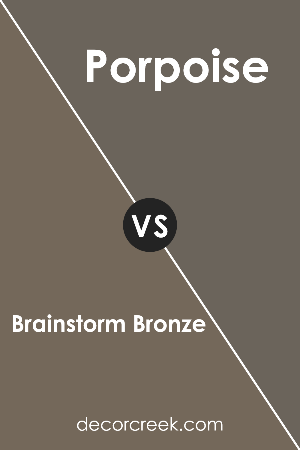
Brainstorm Bronze SW 7033 by Sherwin Williams vs Homestead Brown SW 7515 by Sherwin Williams
Brainstorm Bronze SW 7033 and Homestead Brown SW 7515 are both rich, earthy colors from Sherwin Williams, but they have their differences. Brainstorm Bronze is a medium to dark brown with a warm undertone, providing a grounded and cozy feel to a room.
It works well as a neutral backdrop that complements various design styles and color schemes. On the other hand, Homestead Brown is a slightly lighter shade with more pronounced red undertones. This gives it a warm and inviting appearance, making spaces feel open and welcoming.
While both colors offer warmth, Brainstorm Bronze leans more toward a subtle, muted tone, whereas Homestead Brown introduces a bit more color and vibrancy. Choosing between these colors depends on whether you want a more subdued look or something with a hint of warmth and depth. Both are excellent choices for creating comfortable and inviting spaces.
You can see recommended paint color below:
- SW 7515 Homestead Brown (CHECK A SAMPLE)
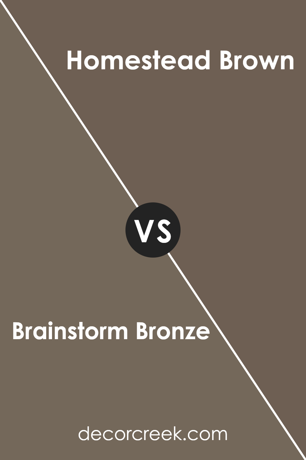
Brainstorm Bronze SW 7033 by Sherwin Williams vs Limestone SW 9599 by Sherwin Williams
Brainstorm Bronze and Limestone are two distinct colors by Sherwin Williams. Brainstorm Bronze is a warm, earthy brown that brings a sense of coziness and comfort to a space. It’s a versatile color that works well in living rooms or any area where you want to create a warm atmosphere.
Limestone, on the other hand, is a light, soft off-white with subtle neutral undertones. It offers a clean and fresh look, making it ideal for spaces where you want a bright and airy feel.
When paired together, Brainstorm Bronze can serve as an accent to the more neutral Limestone, adding depth and warmth. Limestone provides a subtle and understated backdrop that allows Brainstorm Bronze to stand out without overwhelming the space. These two colors combined can create a balanced look, with Limestone offering light and openness, while Brainstorm Bronze adds warmth and grounding.
You can see recommended paint color below:
- SW 9599 Limestone (CHECK A SAMPLE)
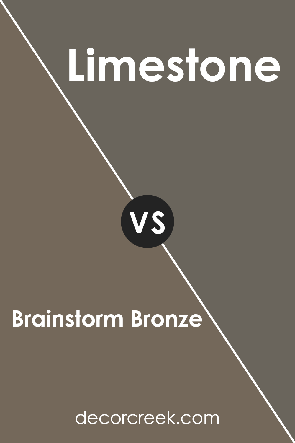
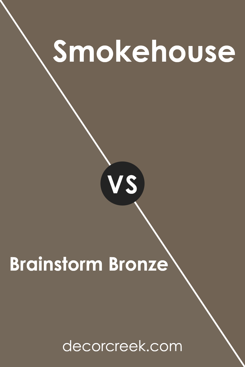
Brainstorm Bronze SW 7033 by Sherwin Williams vs Smokehouse SW 7040 by Sherwin Williams
Brainstorm Bronze (SW 7033) by Sherwin Williams is a warm, earthy shade that leans towards a medium brown with hints of gray. It’s a comforting color that adds a cozy feel to a room. On the other hand, Smokehouse (SW 7040) is a slightly darker and richer brown, with more pronounced gray undertones.
While both colors can add warmth and depth to a space, Brainstorm Bronze is softer and more muted, making it ideal for creating a comfortable and inviting atmosphere. Smokehouse, with its deeper tone, can add a touch of drama and sophistication, making it perfect for accent walls or spaces needing a bit more intensity.
Both colors work well with neutral palettes, but Smokehouse might command more attention due to its depth. These colors can both bring a sense of stability and warmth to a home, with Brainstorm Bronze offering a gentle, soothing presence and Smokehouse providing a bold yet cozy vibe.
You can see recommended paint color below:
- SW 7040 Smokehouse (CHECK A SAMPLE)
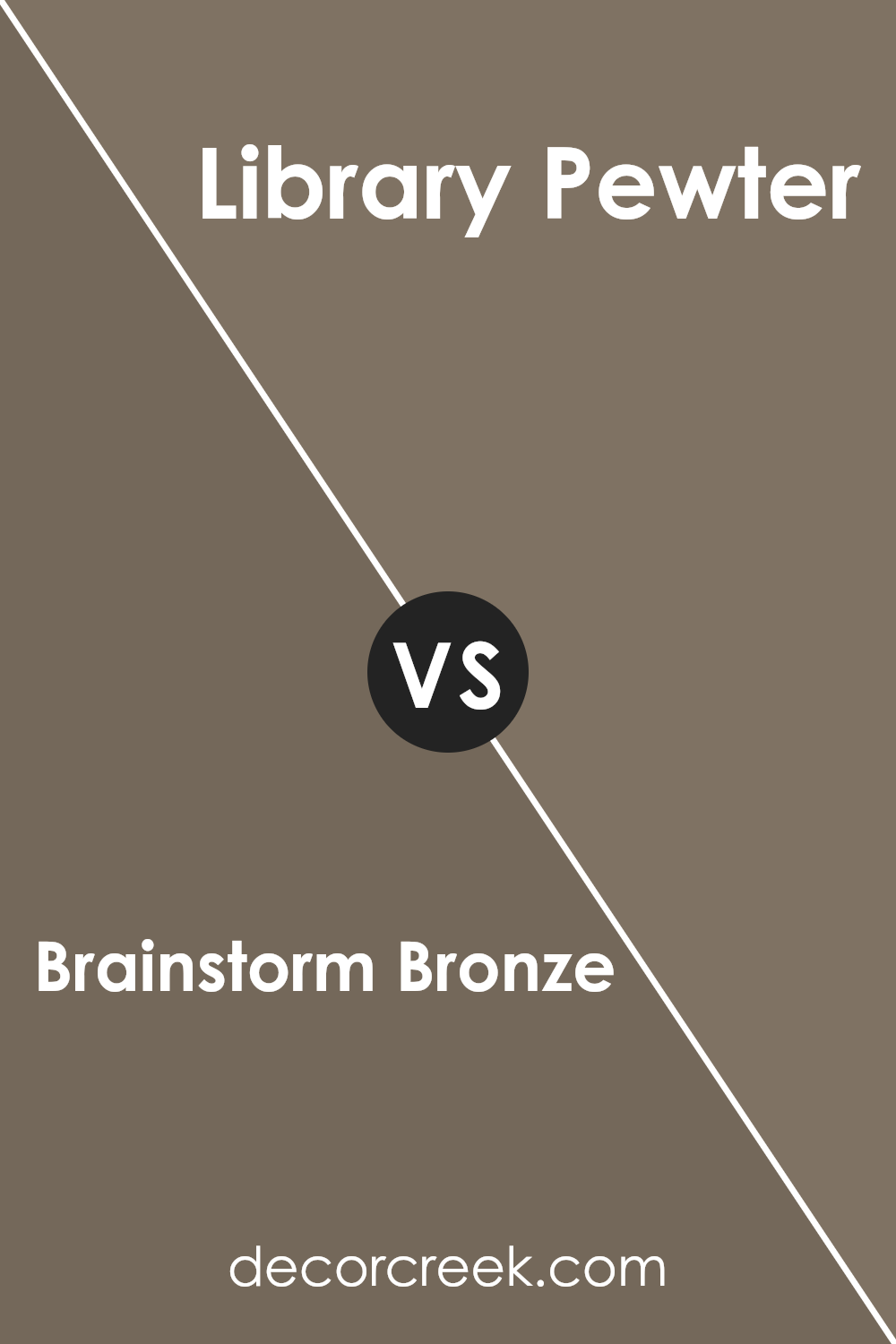
Brainstorm Bronze SW 7033 by Sherwin Williams vs Library Pewter SW 0038 by Sherwin Williams
Brainstorm Bronze (SW 7033) and Library Pewter (SW 0038) are both muted, neutral colors from Sherwin Williams that offer different vibes for a space. Brainstorm Bronze is a warm, earthy color with hints of brown and gray, giving it a comforting, grounded feel. This color works well in living rooms or workspaces where you want to create a cozy, inviting atmosphere.
On the other hand, Library Pewter is a cooler, soft gray color. It leans towards a more classic, clean look, making it ideal for a library or reading nook, as its name suggests. Library Pewter can make a room feel more open and calm, with a touch of elegance.
When comparing these two, Brainstorm Bronze is better suited for spaces where warmth and comfort are priorities, while Library Pewter offers simplicity and a classic feel, perfect for areas you want to keep light and airy.
You can see recommended paint color below:
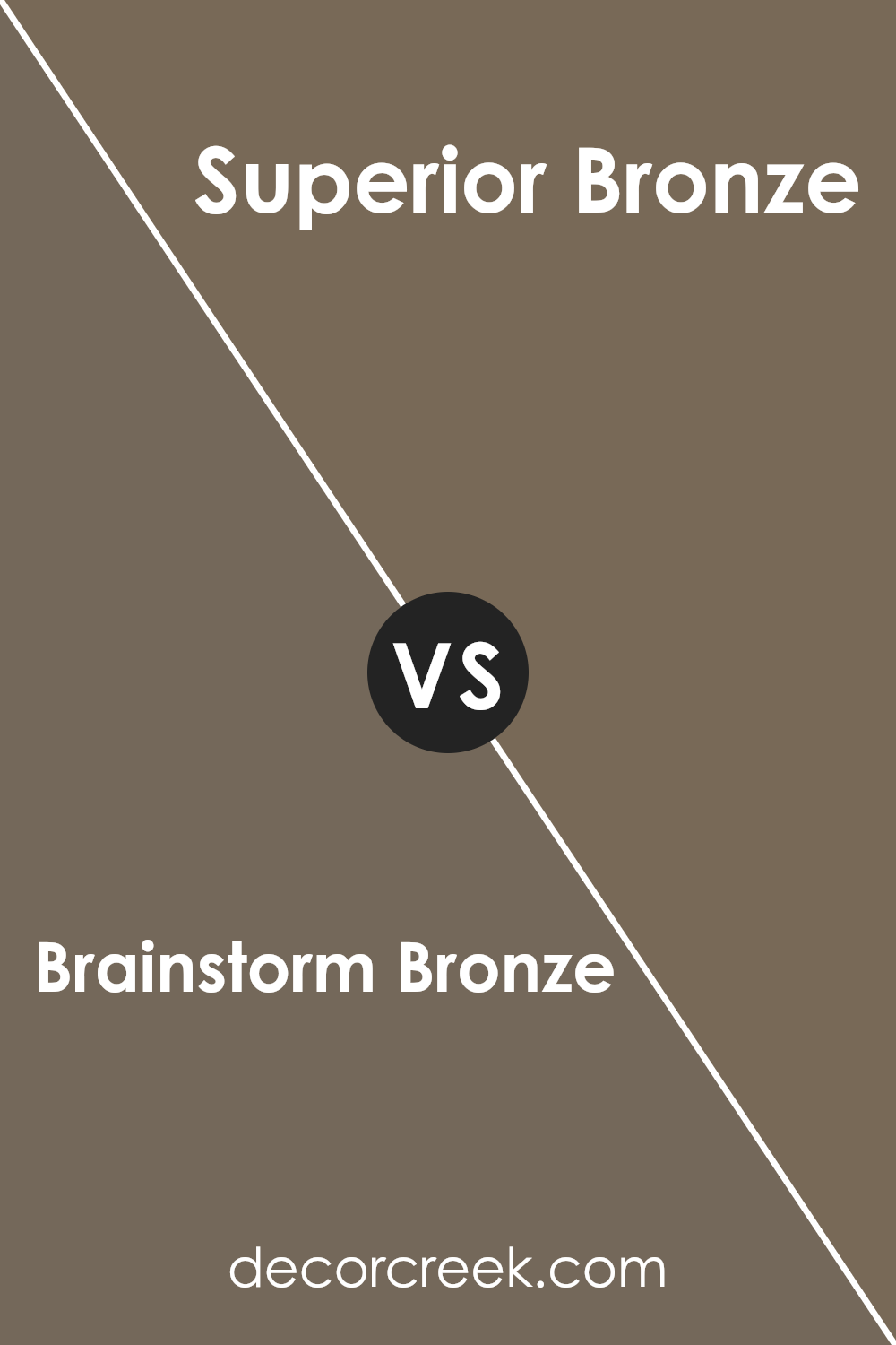
Brainstorm Bronze SW 7033 by Sherwin Williams vs Superior Bronze SW 6152 by Sherwin Williams
Brainstorm Bronze (SW 7033) and Superior Bronze (SW 6152) are both warm, earthy colors by Sherwin Williams, but they have distinct differences. Brainstorm Bronze is a medium-toned brown with a hint of gray, giving it a mushroom-like look. It’s versatile and can work well in various settings, offering a neutral backdrop without being too dark.
On the other hand, Superior Bronze is slightly lighter and leans more towards a true brown. It’s warmer, with a subtle golden undertone that brings a cozy vibe to a space. This makes Superior Bronze great for creating an inviting, comfortable atmosphere in rooms like living areas or bedrooms.
While both colors belong to the bronze family, Brainstorm Bronze is more muted and modern, whereas Superior Bronze is richer and cozier. Depending on the desired mood and natural light in a room, each color can provide a different feel, from a calm and understated setting to a warm and inviting one.
You can see recommended paint color below:
- SW 6152 Superior Bronze (CHECK A SAMPLE)
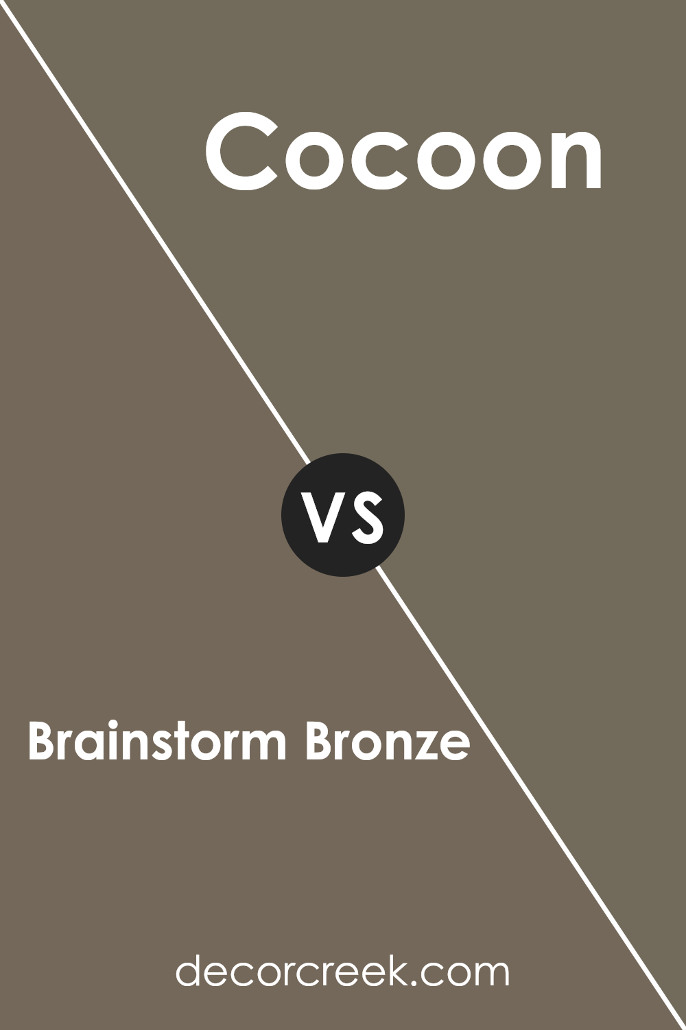
Brainstorm Bronze SW 7033 by Sherwin Williams vs Cocoon SW 6173 by Sherwin Williams
Brainstorm Bronze and Cocoon are both colors from Sherwin Williams that create warm and inviting spaces, yet they offer different moods and styles. Brainstorm Bronze is a rich, medium brown with a hint of gray, giving it a solid, earthy feel.
It works well as a neutral backdrop and can create a cozy atmosphere in living rooms or dens. Cocoon, on the other hand, is a soft, muted green with subtle undertones of gray. It brings a sense of calm and nature into a room, making it perfect for bedrooms or areas meant for relaxation.
While Brainstorm Bronze tends to ground a space with its warmth and depth, Cocoon provides a gentle and soothing effect.
When used together, these colors can complement each other beautifully—the richness of Brainstorm Bronze can make Cocoon feel richer, and Cocoon can add a touch of freshness and lightness to Brainstorm Bronze.
You can see recommended paint color below:
- SW 6173 Cocoon (CHECK A SAMPLE)
In conclusion, SW 7033 Brainstorm Bronze by Sherwin Williams is a great color choice for anyone looking to warm up their rooms. This color is like a cozy, soft blanket for your walls. It’s not too loud or too bright; it’s just right.
When I look at Brainstorm Bronze, I think of a warm cup of cocoa on a chilly day.
This color goes well with many other colors. Imagine pairing it with a nice cream or off-white, or even a soft blue for a pop. It can even look good with wood furniture, like a nice brown table or a comfortable couch. Brainstorm Bronze makes any room feel more inviting and pleasant.
What I love about this color is that it can fit in many rooms. Whether it’s a living room where we watch movies as a family or a bedroom where we rest, this color does the job. It’s kind of like having a reliable friend around.
It doesn’t change too much in different lights, so you always know what you’re getting.
I feel confident recommending this color for those who want a simple yet warm environment. It’s an excellent choice for anyone looking to add a touch of comfort to their home.

Ever wished paint sampling was as easy as sticking a sticker? Guess what? Now it is! Discover Samplize's unique Peel & Stick samples.
Get paint samples
