Discover the charm of SW 0038 Library Pewter, a sophisticated color option brought to you by Sherwin Williams. This shade stands out as a blend of elegance and versatility, making it a fantastic choice for anyone looking to refresh their space.
Whether you’re planning to give your home office a studious vibe or bring a refined look to your living room, Library Pewter offers a unique balance that can complement a range of decor styles.
Its muted tones provide a solid foundation for both bold and subtle themes, allowing for a wide array of design possibilities. This article is your go-to guide for uncovering the potential of Library Pewter in your home.
From tips on color pairing to advice on which rooms to transform, you’ll find everything you need to know to make the most out of this timeless shade.
Join us as we explore the various ways SW 0038 Library Pewter can elevate your interior design, providing a backdrop that’s both stylish and serene.
What Color Is Library Pewter SW 0038 by Sherwin Williams?
Library Pewter by Sherwin Williams is a rich, deep gray that boasts a hint of warmth, making it a versatile and inviting choice for a wide range of spaces.
This particular shade is perfect for those looking to add a touch of sophistication and depth to their room without overwhelming it with a color that’s too dark or intense.
Its unique balance allows it to stand out as both a modern and timeless choice, fitting seamlessly into various interior design styles.
This color works exceptionally well in contemporary, minimalist, and industrial styles, thanks to its clean and subtle elegance.
However, its warm undertones also make it a great match for more traditional or rustic decors, where it can add a modern twist without straying too far from the classic comfort these styles evoke.
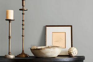
Library Pewter pairs wonderfully with natural materials such as wood, leather, and metal, bringing out their textures and enhancing their natural beauty.
The color also complements soft textiles like wool or cotton, which can help to soften its appearance and add layers of texture to the space. When combined with metallic accents in silver, gold, or brass, Library Pewter can create a striking balance between luxurious and grounded, perfect for creating spaces that feel both refined and welcoming.
Ever wished paint sampling was as easy as sticking a sticker? Guess what? Now it is! Discover Samplize's unique Peel & Stick samples.
Get paint samples

Is Library Pewter SW 0038 by Sherwin Williams Warm or Cool color?
Library Pewter SW 0038 by Sherwin Williams is a versatile and deeply rich color that brings a unique blend of sophistication and warmth to any room in a home.
This shade falls into the gray family but has undercurrents that suggest a certain depth and complexity not always found in pure grays.
Its ability to adapt to different lighting conditions means it can look slightly different from one moment to the next, offering an ever-evolving backdrop to your decor.
In a home, Library Pewter works well in spaces where you want to create a sense of comfort and focus. It’s particularly suited for home offices, libraries, or cozy living rooms, where its calming effect supports concentration and relaxation.
Because of its neutral yet deep tone, it pairs beautifully with a wide range of colors, from soft whites to bold hues, allowing for flexibility in decorating styles. Furniture and artwork stand out against this color, making each room feel thoughtfully curated.
Additionally, its timeless nature ensures that it won’t quickly go out of style, making it a smart choice for those looking to invest in their home’s aesthetic for the long term.
Whether aiming for a modern, classic, or eclectic feel, Library Pewter provides a strong foundation to build upon.
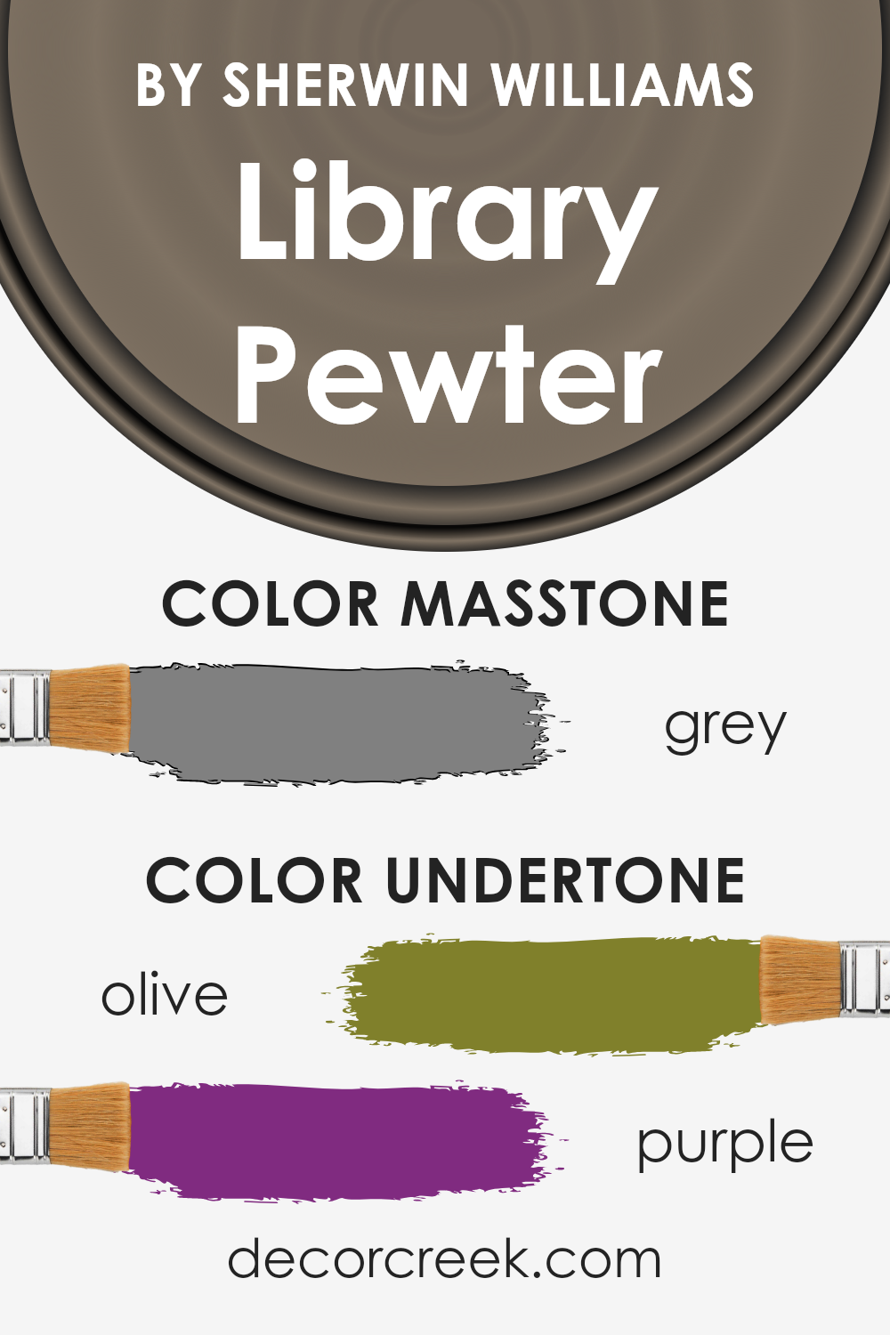
Undertones of Library Pewter SW 0038 by Sherwin Williams
Library Pewter by Sherwin Williams is a unique color with interesting undertones that make it stand out. The main undertones of this color are Olive and Purple. Undertones are subtle colors that lie beneath the surface of the main color.
They can greatly affect how a color appears in different lighting conditions and can either warm up or cool down the main color.
In the case of Library Pewter, the Olive undertone adds a natural, earthy vibe to the color, making it feel grounded and inviting. This greenish hue makes the color appear warmer and more welcoming in spaces that receive a lot of natural light.
On the other hand, the Purple undertone adds a touch of sophistication and depth, giving the color an intriguing complexity. This undertone can make the color lean slightly cooler, especially in artificial light or dimly lit rooms.
When applied to interior walls, the unique combination of Olive and Purple undertones in Library Pewter has a significant impact. In rooms with abundant daylight, the Olive undertone can make the space feel cozy and connected to nature.
In contrast, in rooms with less natural light, the Purple undertone can bring a sense of richness and elegance. This makes Library Pewter a versatile color choice for various spaces, from living rooms and bedrooms to home offices.
The color’s adaptability, influenced by its undertones, allows it to harmonize with a wide range of decor styles and color palettes.
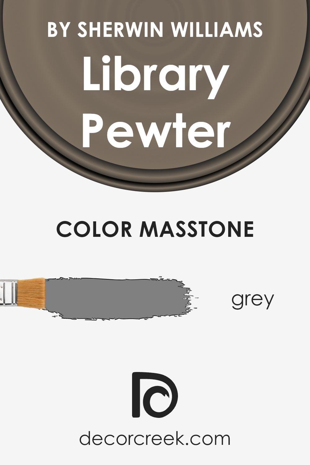
What is the Masstone of the Library Pewter SW 0038 by Sherwin Williams?
Library Pewter by Sherwin Williams is a unique paint color that really stands out because of its masstone, which is grey (#808080). This specific shade of grey brings a sophisticated and calm feeling to any room in a house.
Since grey is a neutral color, Library Pewter is super versatile. It can work well in many different spaces, no matter the style or existing decor.
It can pair nicely with brighter colors to create a lively space, or with other neutrals for a more subdued and cozy feel.
This color is especially good for places where you want to relax, like bedrooms or living rooms. Its grey tone can help make these spaces feel more peaceful and inviting.
Library Pewter isn’t too dark or too light, so it can help make a room look more spacious and airy without making it feel cold or unwelcoming. This is why it’s a great choice for anyone looking to add a touch of elegance and comfort to their home.
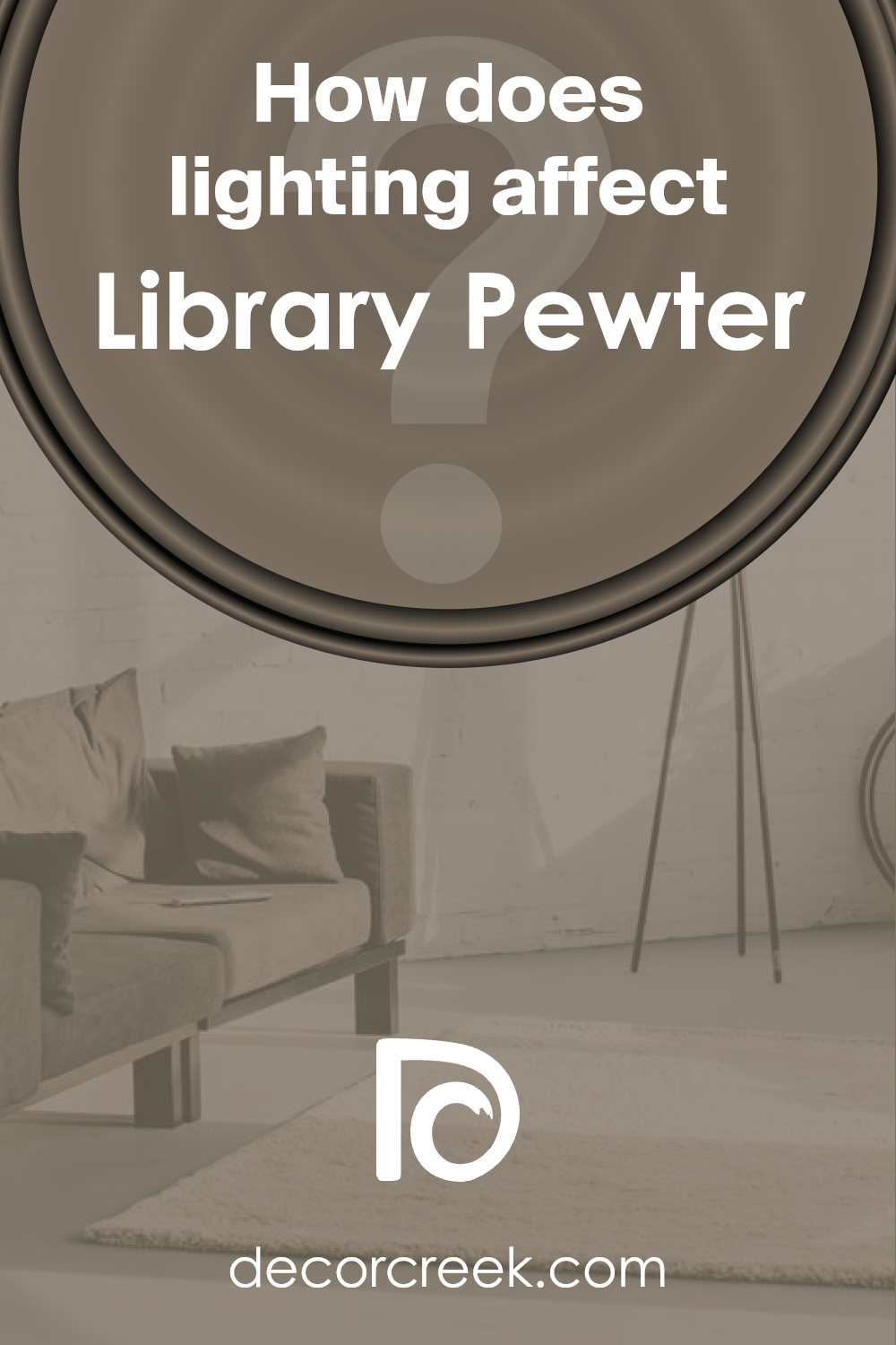
How Does Lighting Affect Library Pewter SW 0038 by Sherwin Williams?
Lighting plays a crucial role in how we perceive colors in our spaces. It can drastically change the appearance of a color from one light condition to another.
Let’s look at a specific color example, Library Pewter, from Sherwin Williams, to understand how different types of lighting can affect its appearance.
In artificial light, colors tend to shift depending on the type of lightbulb used. Warmer bulbs can make Library Pewter look more inviting and cozy, emphasizing its deeper tones.
Cooler LED lights, on the other hand, might highlight its gray aspects, giving it a more modern and crisp look. This is important to consider when deciding on the room’s purpose and the mood you want to set.
Natural light brings out the truest form of the color but changes throughout the day and depending on the room’s orientation. In north-faced rooms, where light is cooler and more diffused, Library Pewter may appear slightly softer and more muted.
These rooms get consistent light throughout the day, so the color maintains a stable appearance, leaning towards its cooler undertones.
South-faced rooms get a lot of warm light, especially during the middle of the day. This warm light can make Library Pewter seem warmer than it actually is, enhancing its richness and depth.
It can create a welcoming and lively space, perfect for social areas like living rooms.
In east-faced rooms, the color will be hit with intense morning light, making it look brighter and more vibrant in the mornings while becoming cooler and more subdued as the day progresses.
This changing character makes it versatile and dynamic, which can be fascinating for bedrooms that are used mostly in the morning.
West-faced rooms experience the opposite effect, with the color becoming warmer and more intense in the afternoon and evening.
This can make Library Pewter appear more dramatic and cozy towards the end of the day, ideal for living spaces where you relax in the evening.
Understanding how Library Pewter reacts to different lighting conditions helps in choosing the right place and purpose for it, ensuring that the color enhances the space as intended.
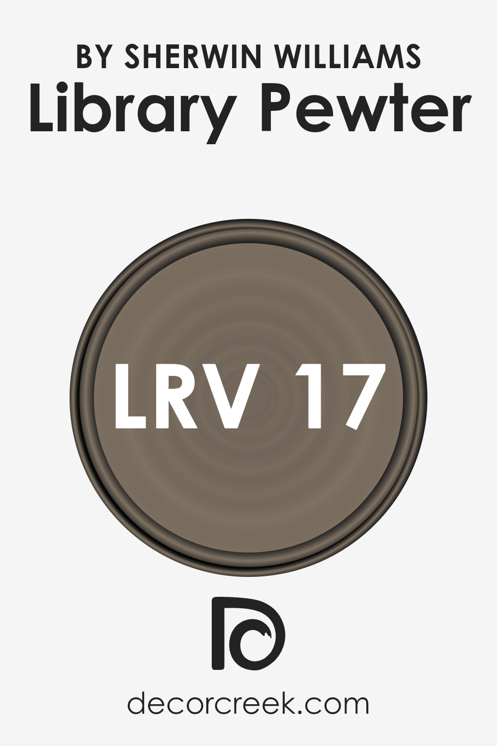
What is the LRV of Library Pewter SW 0038 by Sherwin Williams?
LRV stands for Light Reflectance Value, which is a measure of the percentage of light a paint color reflects from or absorbs into a painted surface.
It’s on a scale from 0 to 100, where 0 is completely black, absorbing all light, and 100 is pure white, reflecting all light back. This measurement helps in understanding how light or dark a color will look on your walls and can significantly impact the feel of a room.
Higher LRV values reflect more light, making spaces appear brighter and larger, while lower LRV values create a cozier, more intimate atmosphere by absorbing more light.
In the case of the specific color with an LRV of 17.469, it’s on the darker side of the spectrum. This means it will absorb more light than it reflects, contributing to a rich, deep color impression on the walls.
Such a low LRV suggests that the color will significantly influence the room’s ambiance, making it feel more enclosed and intimate.
It’s important for spaces that receive a good amount of natural light if you want to maintain some sense of brightness within the room, otherwise, it might make poorly lit rooms appear even darker.
Understanding the LRV can help you make better decisions about painting, ensuring the color behaves as expected in your specific space.
LRV – what does it mean? Read This Before Finding Your Perfect Paint Color
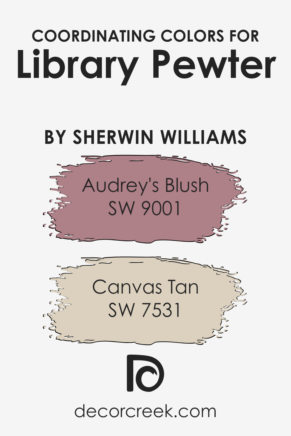
Coordinating Colors of Library Pewter SW 0038 by Sherwin Williams
Coordinating colors are hues that work harmoniously together in a space, creating a cohesive look and feel.
When you choose a primary color for a room, like Library Pewter, finding coordinating colors involves selecting shades that complement or enhance the base color without clashing.
For example, when working with a sophisticated neutral like Library Pewter, you can create a balanced and inviting palette by choosing colors that fall in line with its tone and mood.
It’s like picking friends for your favorite color, ensuring they get along well to make the space feel put together.
Audrey’s Blush is a soft, gentle pink that adds a touch of warmth and subtlety to the mix. It stands out as a complementary color by bringing a slight, refreshing contrast to the deeper, muted tones of the primary color, adding layers to the visual experience.
On the other hand, Canvas Tan is a cozy, welcoming neutral that leans towards the warmer side of the spectrum. It plays well with the base color by reinforcing the serene and grounded feel of a space, acting as a solid bridge between the more defined colors, ensuring the overall look is harmonious and pleasing to the eye.
These coordinating colors work together to create a dynamic yet unified color scheme.
You can see recommended paint colors below:
- SW 9001 Audrey’s Blush
- SW 7531 Canvas Tan
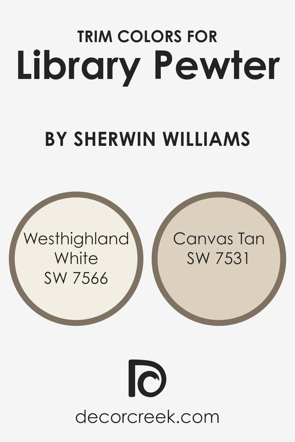
What are the Trim colors of Library Pewter SW 0038 by Sherwin Williams?
Trim colors play a vital role in defining the overall aesthetic of a room, especially when paired with a distinct base color like SW 0038 Library Pewter by Sherwin Williams.
Trim colors, such as SW 7566 Westhighland White and SW 7531 Canvas Tan, are used on elements like door frames, baseboards, moldings, and sometimes ceilings, to accentuate and complement the primary wall color.
These trim colors can either subtly blend with the primary color to create a soft, cohesive look or contrast sharply to frame the room and highlight architectural details, adding depth and dimension.
SW 7566 Westhighland White is a clean, bright white that brings a crisp freshness to the room, illuminating the surrounding surfaces without overwhelming them, making it an excellent choice for trim, providing a stark, clean contrast to the deep tones of Library Pewter.
Meanwhile, SW 7531 Canvas Tan offers a warmer, neutral option that gently softens the transition between the walls and trim, enriching the space with a natural, understated elegance.
Utilizing these trim colors with Library Pewter establishes a harmonious balance, enhancing the room’s character and mood through strategic color coordination.
You can see recommended paint colors below:
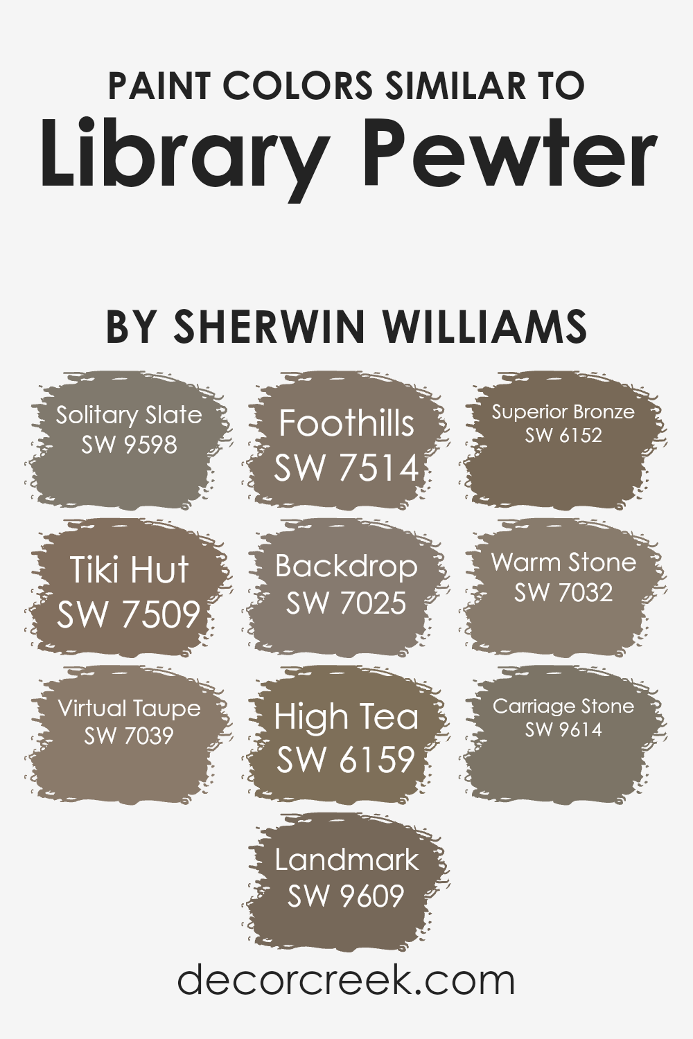
Colors Similar to Library Pewter SW 0038 by Sherwin Williams
Choosing similar colors when designing a space is crucial because it creates a seamless and harmonious look.
Similar colors can either subtly blend together for a soft, monochromatic appearance or offer a slight contrast to introduce depth and interest without overwhelming the senses.
For a color like Library Pewter by Sherwin Williams, finding colors that complement its deep, muted tone can enhance the overall aesthetic of a room, making it feel more cohesive and put together.
Solitary Slate is a serene shade that introduces a calm, grounding effect to spaces, resembling the quietude of a dusky evening sky. Tiki Hut offers a warmer, inviting ambiance with its earthy, sun-touched hue, reminiscent of wooden beachside retreats.
Virtual Taupe brings sophistication with its versatile, deeper beige appearance, acting as a solid foundation for any design theme.
Landmark and Foothills share an earthy essence, with Landmark presenting a sturdier, stone-inspired look, and Foothills providing a softer, hillside meadow appeal.
Backdrop, with its slightly darker allure, anchors spaces, creating a statement without overpowering, while High Tea brightens with a lighter, creamy perspective, offering a refreshing contrast.
Superior Bronze glows with a subtle, amber-like warmth, enriching environments with its cozy glow. Warm Stone and Carriage Stone, both have a robust presence; the former brings a sunnier disposition, and the latter, a more reserved, classic elegance, rounding off the selections to offer a versatile palette that can transform and elevate spaces alongside Library Pewter.
You can see recommended paint colors below:
- SW 9598 Solitary Slate
- SW 7509 Tiki Hut
- SW 7039 Virtual Taupe
- SW 9609 Landmark
- SW 7514 Foothills
- SW 7025 Backdrop
- SW 6159 High Tea
- SW 6152 Superior Bronze
- SW 7032 Warm Stone
- SW 9614 Carriage Stone
How to Use Library Pewter SW 0038 by Sherwin Williams In Your Home?
Library Pewter SW 0038 by Sherwin Williams is a unique paint color that can really make a space feel special. This shade is a deep, warm gray that brings a cozy and elegant touch to any room. I
t’s perfect for someone wanting to add a bit of sophistication without making the space feel too dark or heavy.
You can use Library Pewter in various ways at home. For instance, it works great on walls in rooms where you want a cozy vibe, like living rooms or bedrooms.
It can also make for a stylish background for bookshelves or create a focal point by painting it on an accent wall.
This color pairs well with bright whites, which can help trim or ceilings pop, adding a beautiful contrast.
It’s also ideal for bringing a sense of calm to a home office or study area. Because of its warm undertones, rooms painted with Library Pewter feel inviting, making it easier to relax or concentrate.
Adding this color to your home can transform a space, giving it a rich and warm atmosphere.
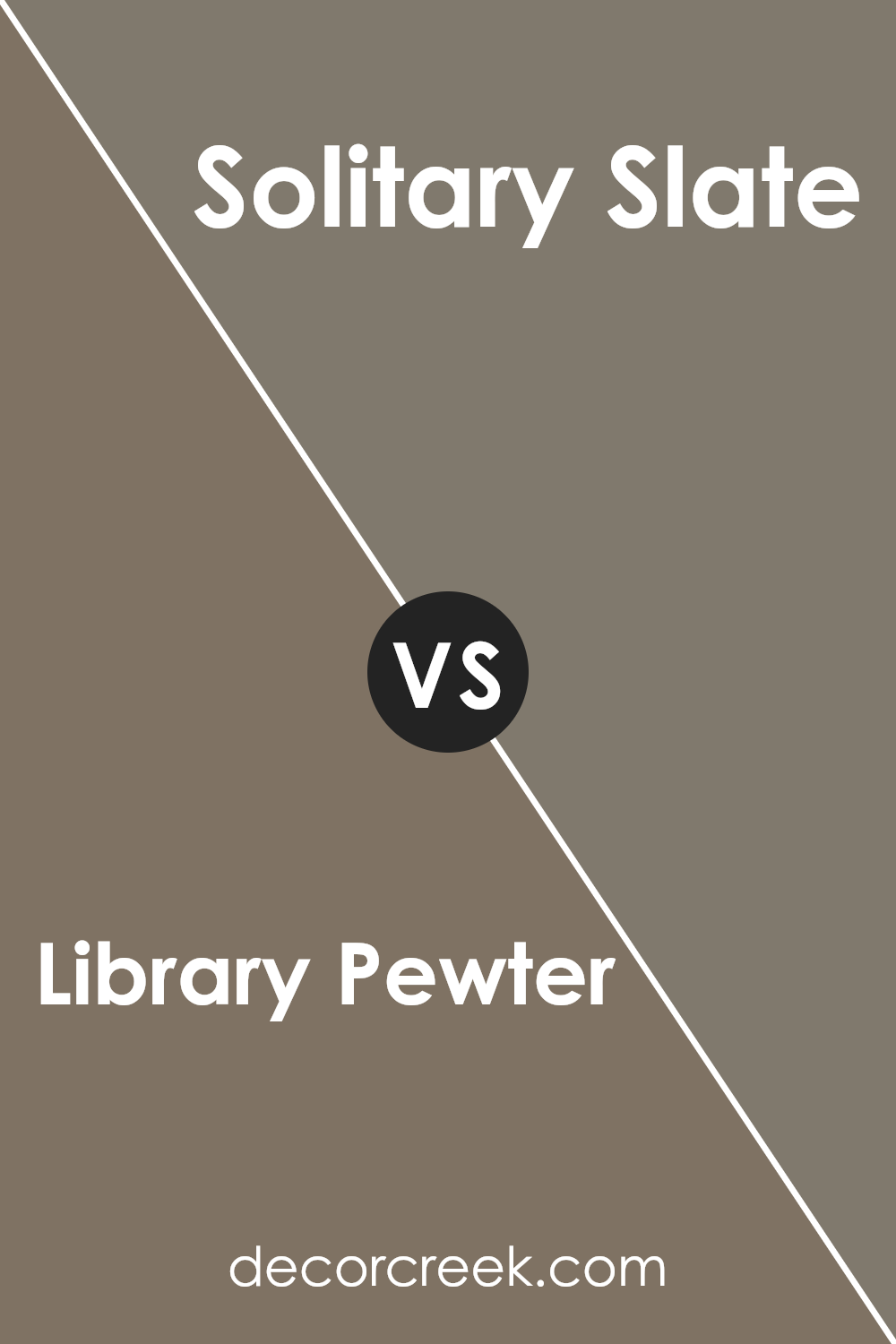
Library Pewter SW 0038 by Sherwin Williams vs Solitary Slate SW 9598 by Sherwin Williams
Okay, let’s look at two colors from Sherwin Williams and see how they compare.
First, we have Library Pewter. This color is like a cozy, dark gray that has a bit of warmth to it. It’s the kind of color you might see in a comfortable, stylish room, making everything look sophisticated without being too overpowering.
Then, there’s Solitary Slate. This one is also a gray, but it’s lighter and feels a bit cooler.
It’s like the color of a cloudy sky that’s about to clear up. Solitary Slate is great for making a space feel open and airy while still adding some character.
So, when you put these two side-by-side, Library Pewter is the darker, warmer one, perfect for a cozy vibe. Solitary Slate, on the other hand, is lighter and cooler, making rooms feel spacious and calm.
Both are great choices, but your pick really depends on the mood you’re aiming for in your space.
You can see recommended paint color below:
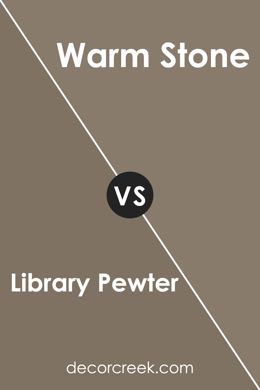
Library Pewter SW 0038 by Sherwin Williams vs Warm Stone SW 7032 by Sherwin Williams
Library Pewter and Warm Stone, both from Sherwin Williams, offer distinct vibes for any room. Library Pewter has a richer, deeper feel, almost like the color of a stormy sky, giving a solid, grounded atmosphere.
It’s great for creating a sense of sophistication and quiet elegance, making spaces feel more intimate and cozy.
On the other hand, Warm Stone leans towards a softer, more comforting tone. It resembles the natural color of sandy beaches or light earth, bringing a warm, welcoming feel to any area.
It’s perfect for those looking to create a serene, inviting environment without overwhelming the senses.
When comparing the two, Library Pewter adds depth and drama, ideal for accent walls or spaces where you want to make a statement.
Warm Stone, conversely, works beautifully as a background hue, supporting a wide range of decor styles with its versatility and gentle warmth.
Whether you’re looking to add a touch of sophistication or cozy warmth, your choice between these two colors can significantly influence the ambiance of your room.
You can see recommended paint color below:
- SW 7032 Warm Stone
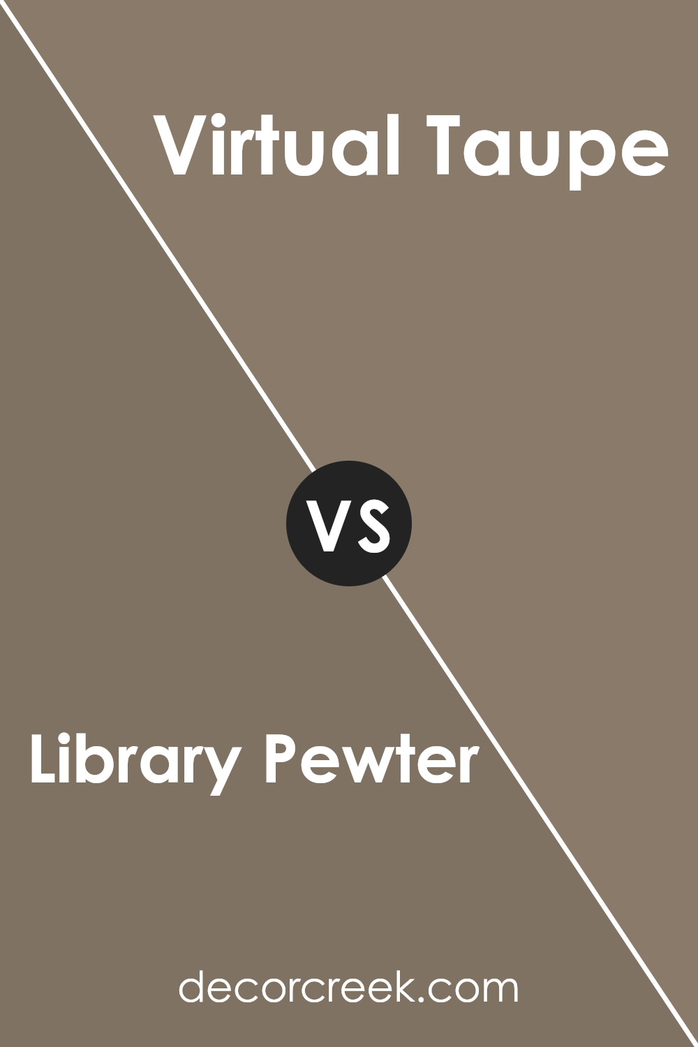
Library Pewter SW 0038 by Sherwin Williams vs Virtual Taupe SW 7039 by Sherwin Williams
When you look at Library Pewter and Virtual Taupe by Sherwin Williams, you can see they belong to the same color family but have distinct vibes.
Library Pewter is a deeper, almost mystical gray that brings a sense of calm and seriousness, perfect for spaces where focus or a touch of formality is desired.
Imagine it in a home office or a cozy reading nook, where it adds depth without making the space feel closed in.
Virtual Taupe, on the other hand, is lighter, with a warm, welcoming feel. It’s like a friendly hug for your walls, offering a perfect backdrop for a variety of decor styles.
This color works exceptionally well in living areas or bedrooms, where you want a peaceful, inviting atmosphere without going too dark or too light.
Both colors are versatile and sophisticated, but the choice between them depends on the mood you’re aiming for. Do you want the rich, deep tones of Library Pewter, or the softer, warmer hues of Virtual Taupe?
Your decision will shape the character of your space.
You can see recommended paint color below:
- SW 7039 Virtual Taupe
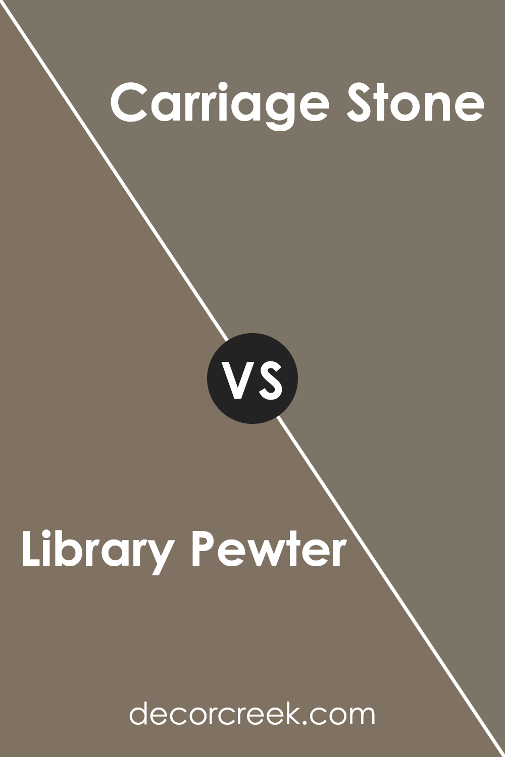
Library Pewter SW 0038 by Sherwin Williams vs Carriage Stone SW 9614 by Sherwin Williams
Library Pewter and Carriage Stone, both from Sherwin Williams, are two distinctive colors that offer unique vibes to any space. Library Pewter is a deeper, rich gray with subtle warm undertones, giving a sense of sophistication and calmness.
It’s perfect for creating a cozy and inviting atmosphere, making rooms feel more grounded and serene. On the other hand, Carriage Stone steps a bit lighter, leaning toward a soft, neutral beige with a hint of gray.
This color is incredibly versatile, providing a fresh and airy feel to spaces, thus making it easier to blend with various decor styles and color palettes.
While Library Pewter might be the go-to for adding depth and drama, Carriage Stone is your choice for a breezy, open look. Together, they could complement each other wonderfully, offering a balanced mix of warmth and elegance to any home.
You can see recommended paint color below:
- SW 9614 Carriage Stone
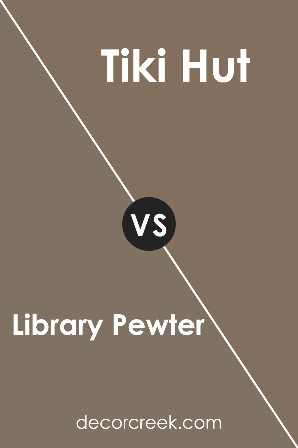
Library Pewter SW 0038 by Sherwin Williams vs Tiki Hut SW 7509 by Sherwin Williams
Library Pewter and Tiki Hut, both by Sherwin Williams, are two distinct colors that stand out for their unique appeal. Library Pewter is a soft, muted gray with a hint of warmth, making it versatile for various spaces.
It’s sophisticated yet cozy, perfect for creating a neutral backdrop that’s neither too dark nor too light. On the other hand, Tiki Hut is a warm, inviting beige with a touch of earthiness.
This color radiates a comfortable, welcoming vibe, ideal for rooms where you want to feel relaxed and at ease. While Library Pewter leans towards a cool, understated elegance, Tiki Hut offers a warm embrace, making spaces feel homey and grounded.
Both colors work beautifully in their own right, whether you’re looking to create a serene retreat or a cozy haven.
You can see recommended paint color below:
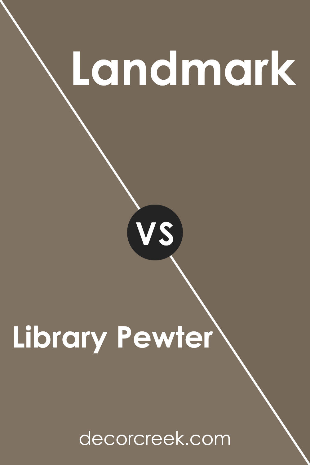
Library Pewter SW 0038 by Sherwin Williams vs Landmark SW 9609 by Sherwin Williams
Library Pewter and Landmark by Sherwin Williams are two distinct shades that each bring a unique vibe. Library Pewter is a deep, rich gray with a subtle hint of warmth, making it perfect for creating an elegant and sophisticated space.
It works well in areas where you want a touch of formality without going too dark. On the other hand, Landmark presents itself as a more distinct, warmer hue, leaning towards a brownish-gray.
It’s ideal for those who prefer a cozy and inviting atmosphere, as it tends to make rooms feel more intimate and comfortable.
While Library Pewter might come across as more refined and polished, Landmark offers a sense of homeliness and warmth, making it great for family rooms or bedrooms.
Both colors have their charm, allowing them to serve different moods and preferences in interior design.
You can see recommended paint color below:
- SW 9609 Landmark
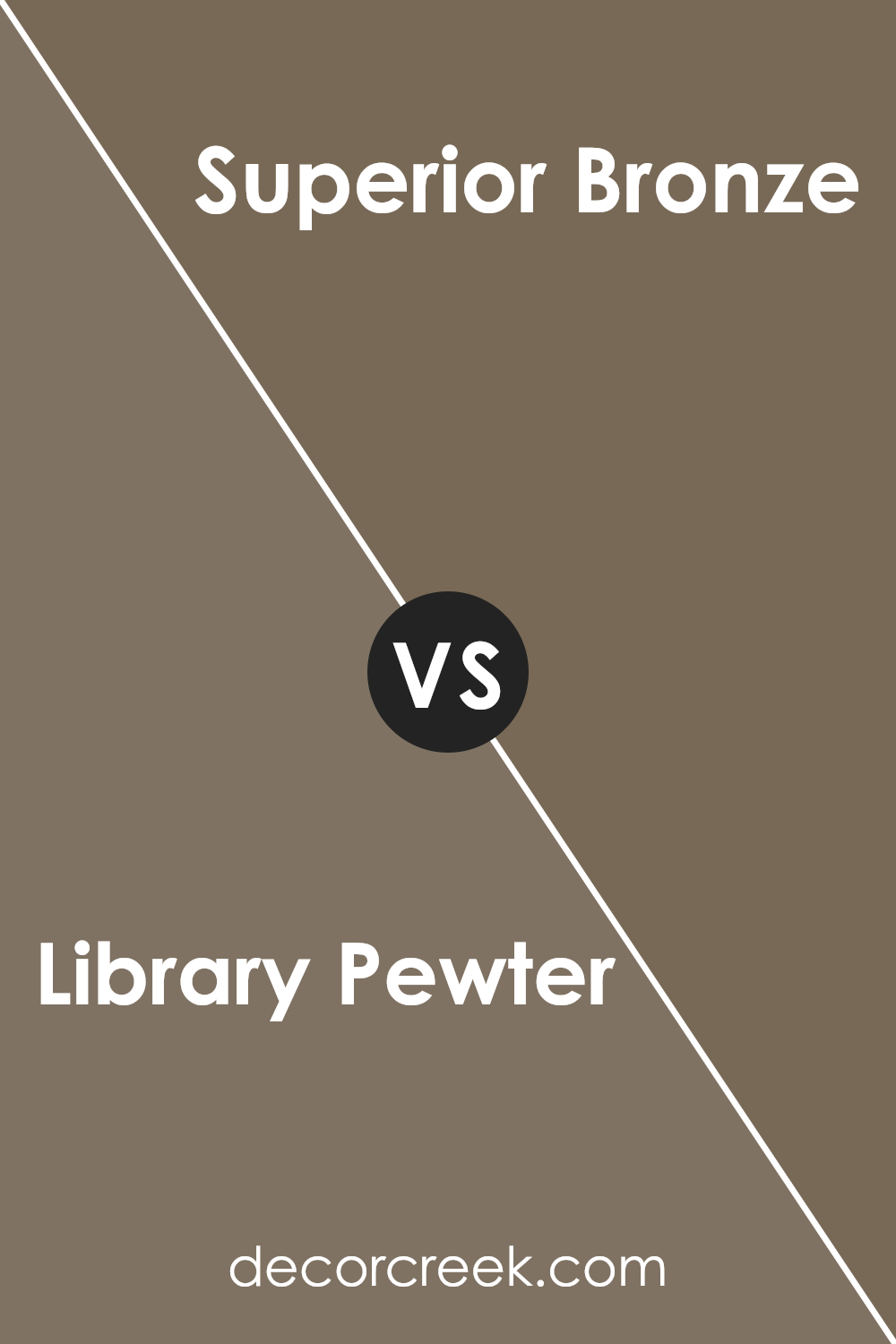
Library Pewter SW 0038 by Sherwin Williams vs Superior Bronze SW 6152 by Sherwin Williams
Library Pewter and Superior Bronze, both by Sherwin Williams, are distinct yet harmonious colors.
Library Pewter is a deep, rich gray with a subtle hint of warmth, making it versatile for spaces seeking sophistication without the starkness often associated with grays. It’s perfect for creating a cozy, understated elegance in any room.
In contrast, Superior Bronze has a stronger presence, boasting a warm, inviting bronze hue that leans towards the earthier, more rustic side of the color spectrum.
This color adds a touch of natural charm and warmth, ideal for spaces aiming for a welcoming and comforting vibe.
While Library Pewter provides a solid foundation that can complement a wide range of decor elements, Superior Bronze brings a lively yet grounded energy, ideal for adding character.
Together, these colors offer an appealing palette for those looking to combine modern sophistication with classic warmth.
You can see recommended paint color below:
- SW 6152 Superior Bronze
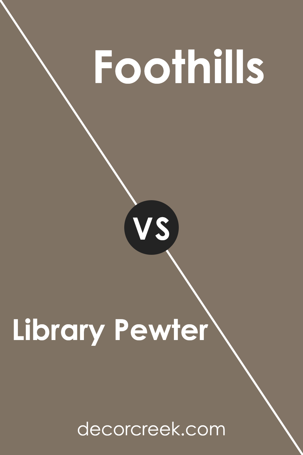
Library Pewter SW 0038 by Sherwin Williams vs Foothills SW 7514 by Sherwin Williams
Comparing Library Pewter and Foothills, both by Sherwin Williams, gives us a peek into two distinctive shades.
Library Pewter is a unique blend between a deep gray and a hint of warmth, making it versatile for spaces needing a cozy yet sophisticated vibe.
It’s like a soft, comfy blanket in color form, offering a sense of calm and elegance wherever applied.
On the flip side, Foothills stands out as a warmer, beige-brown that carries its own rustic charm. It’s the kind of color that makes you think of a snug cabin or a cozy, well-loved living room.
Foothills brings an inviting warmth, suggesting it’s ideal for areas where you want to create a welcoming, homely atmosphere.
When placed side by side, Library Pewter can come off as more formal and refined, while Foothills leans towards a casual, comforting feel.
So, whether you’re aiming for a chic, polished look or a laid-back, inviting space, your choice between these two can dramatically influence your room’s character.
You can see recommended paint color below:
Library Pewter SW 0038 by Sherwin Williams vs High Tea SW 6159 by Sherwin Williams
Library Pewter and High Tea, both from Sherwin Williams, are unique colors, each bringing its own vibe to a room. Library Pewter is a deep, muted gray with a touch of warmth, making it perfect for creating a cozy and inviting atmosphere without making the space feel too dark.
It’s versatile, fitting well in many areas, including living rooms or studies, where it adds sophistication.
On the other hand, High Tea has a lighter, softer approach. This color is a subtle, greenish-gray that introduces a calm and soothing feel to any space.
It’s great for rooms where you want a hint of color without overwhelming the senses, like in a bedroom or bathroom. High Tea reflects more light, giving a room a more spacious and airy feeling.
While both colors belong to the gray family, Library Pewter skews towards a deeper and warmer hue, making a strong statement.
High Tea, meanwhile, leans on the lighter, more understated side, promoting tranquility. Each color has its special charm, whether you’re looking for depth and boldness or softness and calm.
You can see recommended paint color below:
- SW 6159 High Tea
Library Pewter SW 0038 by Sherwin Williams vs Backdrop SW 7025 by Sherwin Williams
Library Pewter and Backdrop are two colors by Sherwin Williams that offer unique yet versatile options for home decor. Library Pewter is a rich, deep hue that can make spaces feel cozy and sophisticated.
It’s perfect for creating an elegant backdrop or for adding a bit of drama to a room. This color has a certain depth that can make wall art and furniture stand out. On the other hand, Backdrop is a lighter, more neutral color.
It’s incredibly versatile and works well in almost any space, giving rooms a fresh and airy feel. While Library Pewter adds warmth and character, Backdrop provides a clean canvas that can be easily paired with various decor styles and colors.
Both colors offer something special, but your choice would depend on the mood you’re looking to create in your space. Library Pewter is ideal for a bold, dramatic feel, while Backdrop is perfect for a calm and serene environment.
You can see recommended paint color below:

Conclusion
In conclusion, the color Pewter SW 0038 from Sherwin Williams is a versatile and sophisticated shade that offers a blend of modernity and timelessness. It stands out as a practical choice for those looking to add a touch of elegance to any space without overwhelming it.
Its ability to complement a wide range of decor styles and settings makes it a go-to color for interior designers and homeowners alike.
Choosing Pewter SW 0038 is ideal for creating a cozy yet refined ambiance in any room. Whether it’s applied in living spaces, bedrooms, or offices, this shade brings a balanced, calming effect that works well with various color schemes and furnishings. I
ts adaptability and understated beauty ensure that spaces not only look stylish but also feel welcoming and comfortable.
Ever wished paint sampling was as easy as sticking a sticker? Guess what? Now it is! Discover Samplize's unique Peel & Stick samples.
Get paint samples