When you’re looking to give your space a fresh feel, choosing the right paint color is crucial. I found that SW 7032 Warm Stone by Sherwin Williams offers a cozy and inviting atmosphere that might suit your needs perfectly. This shade is a versatile neutral that pairs well with various decor styles, providing a solid foundation for both bold and subtle interior designs.
Warm Stone stands out because it has a unique blend of taupe and gray, giving it a warm, earthy feel without overpowering the room. It works beautifully in spaces where you want to foster a sense of comfort and serenity, like living rooms or bedrooms.
The color is also incredibly adaptable, complementing natural light in spacious areas and creating depth in smaller rooms.
For my projects, I’ve used Warm Stone not just on walls but also for trim and accent pieces, which shows its flexibility in different applications. Whether you’re updating a single room or reimagining your entire home, SW 7032 Warm Stone could be the ideal backdrop for your vision.
It’s a choice that you might find refreshingly simple yet effective in achieving a warm, inviting interior.
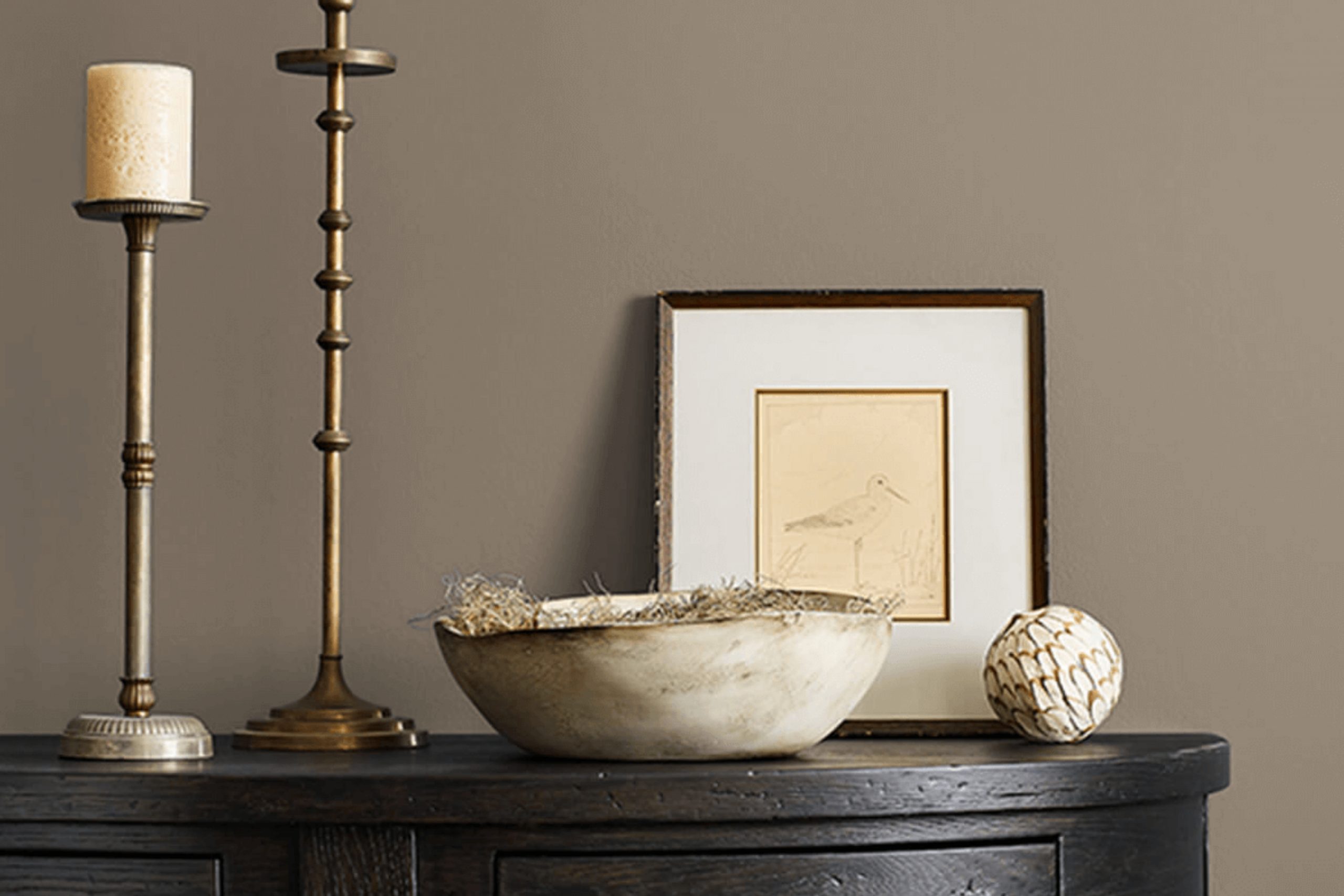
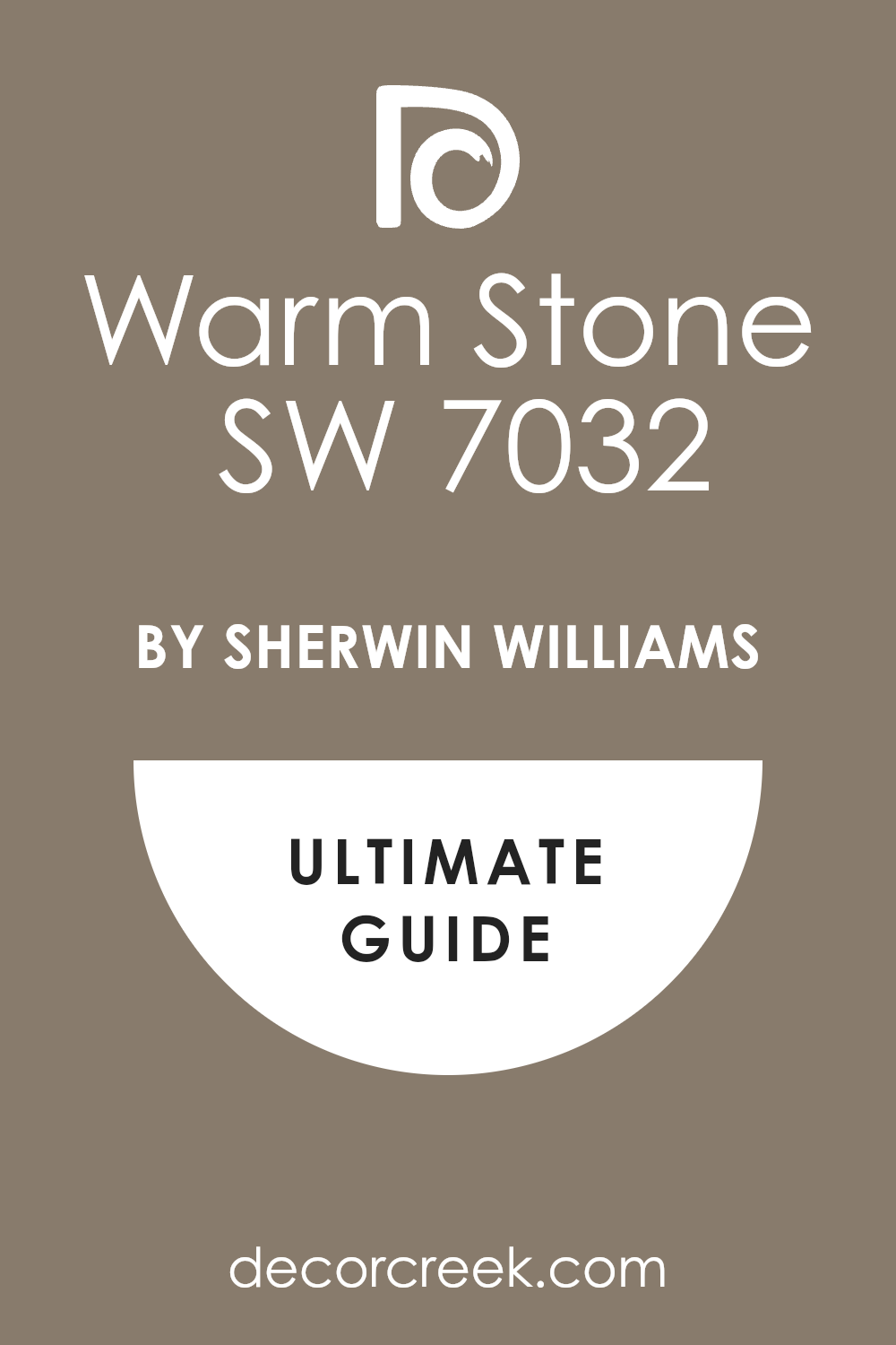
What Color Is Warm Stone SW 7032 by Sherwin Williams?
Warm Stone by Sherwin Williams is a versatile neutral paint color. Its balanced tone provides a welcoming feel, perfect for creating cozy and inviting spaces. This particular shade blends hints of brown and gray, offering a subtle earthiness that makes it ideal for various design needs. Its gentle warmth works well in communal areas such as living rooms and kitchens where creating a relaxed atmosphere is key.
In terms of interior styles, Warm Stone shines in rustic and modern farmhouse designs. Its natural tone complements exposed wooden beams, weathered wood furniture, and natural linens, enhancing the handcrafted feel of these environments. Additionally, it’s an excellent choice for minimalist and contemporary spaces due to its understated elegance, pairing beautifully with sleek furniture and metallic accents.
When it comes to materials and textures, Warm Stone pairs well with a wide range. For a layered look, combine it with soft textiles like wool or cotton in neutral tones. Natural elements like stone, wood, and leather also work seamlessly with this paint color, reinforcing a connection to the outdoors.
For a hint of contrast, incorporate materials with a slight sheen, such as satin or silk, to add depth and interest to the room. Combining these elements creates a harmonious and visually appealing space.
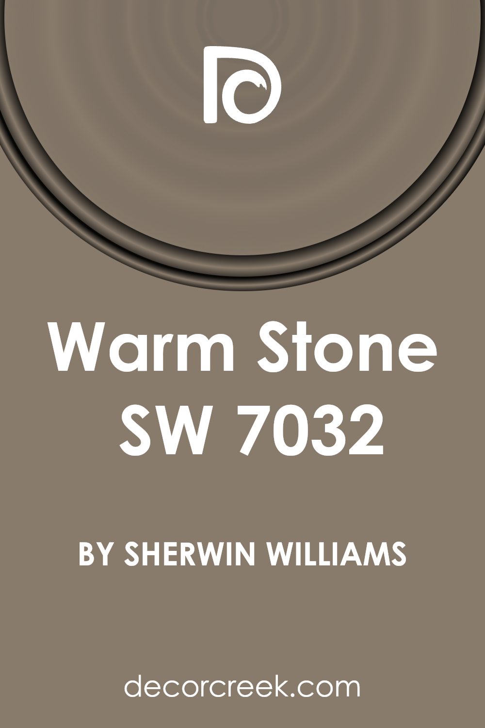
Is Warm Stone SW 7032 by Sherwin Williams Warm or Cool color?
Warm Stone by Sherwin Williams is a versatile paint color that can work wonders in various spaces in a home. This shade is a mix of beige and gray, often described as a “greige,” combining the best of both neutrals. It’s particularly effective in rooms where you want a cozy, welcoming feel, such as living rooms, bedrooms, or entryways.
This color pairs well with both bright and subdued accent colors, making it easy to incorporate into existing decor. It’s excellent for spaces with natural wood elements or white trim, as it complements these features without overshadowing them.
Warm Stone can also help in making a small room appear more spacious because of its light-reflecting qualities, and it maintains a clean, fresh look even in areas with lots of natural light.
For homeowners looking for a reliable neutral that adds warmth to their space without being too bold, Warm Stone is a great choice. It creates a calm backdrop that lets your furniture and decor stand out.
Undertones of Warm Stone SW 7032 by Sherwin Williams
Warm Stone is a complex paint color that subtly incorporates a mix of many different undertones, ranging from subtle greens and soft pinks to deep blues and vibrant oranges. Understanding these undertones is crucial as they can significantly impact the color’s appearance in various lights and environments.
Undertones are subtle colors that lie beneath the surface of what we initially perceive. For example, Warm Stone might look like a simple gray or beige at first glance, but it’s the undertones that give it depth and character. They modify the base color depending on lighting conditions; natural daylight brings out different undertones compared to artificial light.
In the case of Warm Stone, undertones like olive, pale pink, purple, and dark turquoise add a unique complexity, making the color versatile in its use. On interior walls, these undertones can make the space feel warm and welcoming if the lighting enhances the softer, warmer undertones like pale pink or orange.
In rooms with less natural light, darker undertones like navy or dark grey may become more pronounced, giving the room a more grounded, cozy feel.
Choosing furniture and décor that complement these undertones can enhance the overall aesthetics of your room. Light wood furniture and soft colored textiles can highlight Warm Stone’s warmer, softer undertones, while metallic or richly colored pieces might draw out its cooler, darker shades.
Knowing the undertones helps in making informed decisions about decorating and pairing with other colors to achieve a coherent look.
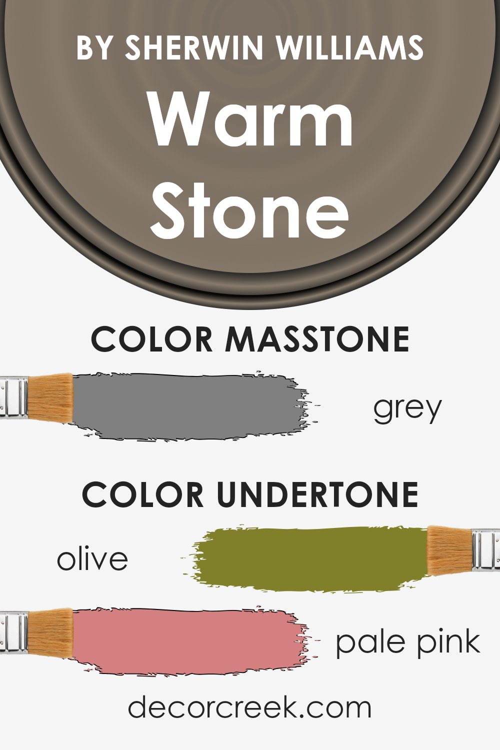
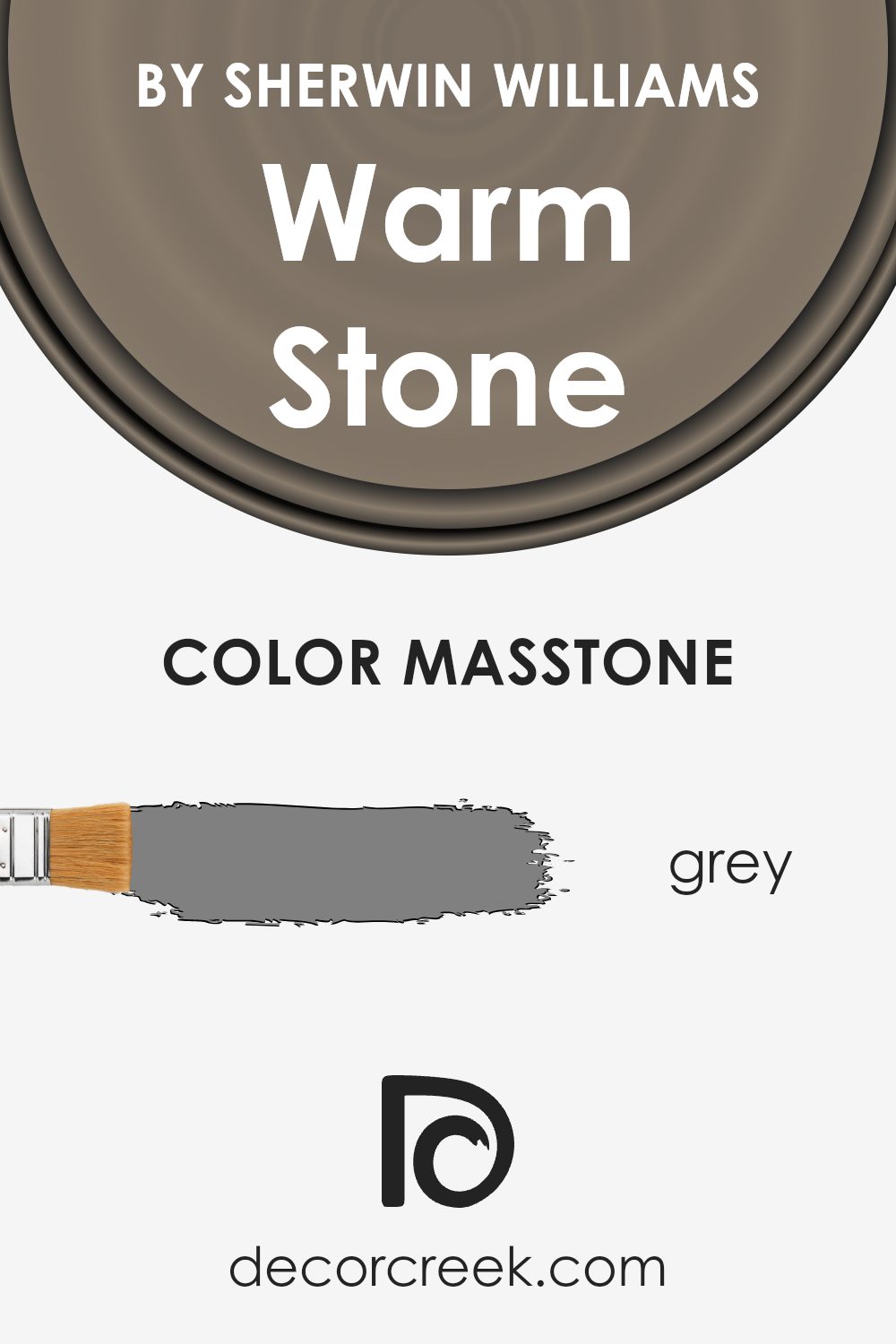
What is the Masstone of the Warm Stone SW 7032 by Sherwin Williams?
Warm Stone SW 7032 by Sherwin Williams is a versatile grey color that brings a neutral and balanced feel to any room. When painted on walls, its grey masstone helps to create a calm and cozy atmosphere, making it an excellent choice for living spaces and bedrooms.
This shade has the unique ability to act as a backdrop, allowing furniture and decor to stand out. It pairs well with a variety of color schemes, from bright and vibrant to more subdued tones. One of the biggest advantages of using Warm Stone is its adaptability.
It fits well in modern homes as a sleek, minimalist tone yet retains enough warmth to complement traditional settings with a comforting, familiar air. Because of its neutral base, it also has the benefit of making spaces appear larger and more open, a useful trait for small apartments or rooms.
Whether aiming for a chic or a homely environment, Warm Stone adds a refreshing yet unobtrusive character to homes.
How Does Lighting Affect Warm Stone SW 7032 by Sherwin Williams?
Lighting plays a crucial role in how we perceive the colors around us. The color of a wall, for instance, can look dramatically different depending on the type of light it’s exposed to, be it natural sunlight or artificial lighting.
Let’s consider how a particular shade like Warm Stone by Sherwin Williams, a gentle beige with gray undertones, behaves under different lighting conditions. In artificial light, such as that from incandescent bulbs, this color will likely appear warmer and more inviting due to the yellowish hue these lights cast.
Under fluorescent lights, however, Warm Stone might lean towards its cooler, grayer side as these lights tend to emit a bluish tone.
When it comes to natural light, the direction your room faces significantly impacts how colors like Warm Stone look:
- North-faced rooms: These rooms receive less direct sunlight, which can make colors appear cooler and grayer. Warm Stone might therefore look more subdued and less beige in a north-facing room.
- South-faced rooms: Here, the color can truly shine as these rooms are flooded with plenty of natural light for most of the day, enhancing the warm, cozy feel of Warm Stone.
- East-faced rooms: In the morning, east-facing rooms get plenty of sunlight, making Warm Stone look brighter and warmer. As the day progresses and the light diminishes, the color may revert to a softer, more muted tone.
- West-faced rooms: These rooms get the evening light, which can cast a golden glow, making Warm Stone feel warmer and richer as the day ends.
Understanding these nuances can help you choose the right paint color for your space based on the quality of light it receives and the atmosphere you want to create. Warm Stone, with its versatility, can work beautifully across various rooms when paired thoughtfully with the right lighting.
What is the LRV of Warm Stone SW 7032 by Sherwin Williams?
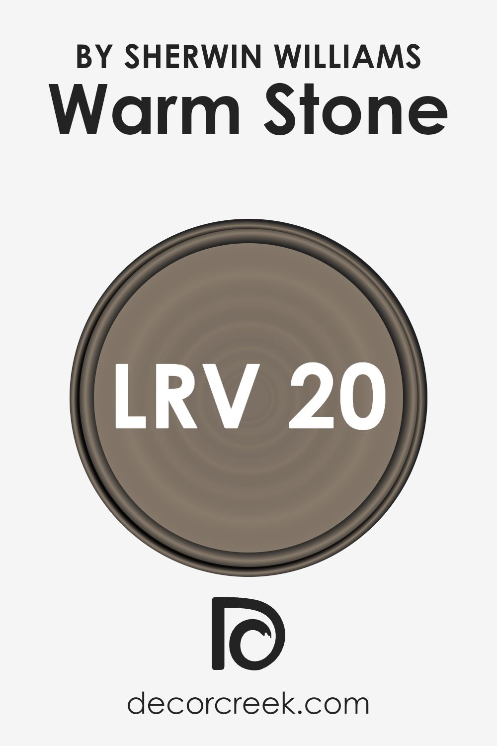
LRV stands for Light Reflectance Value, which measures the percentage of light a paint color reflects back into a room. It’s a handy scale used to understand how light or dark a color will appear once applied to the walls. LRV values range from 0 to 100, with lower numbers indicating darker shades that absorb more light and higher numbers representing lighter shades that reflect more light.
Knowing the LRV can help you choose the right paint color for your room depending on how much natural or artificial light it receives. Lighter colors can make a small space feel larger and brighter, while darker colors can give a room a more cozy and enclosed feel.
The LRV of 20.445 for the color Warm Stone means it is on the darker side, absorbing more light than it reflects. This tendency makes it a good choice for spaces where a more intimate and enclosed atmosphere is desired. It is ideal for large, well-lit areas where it won’t make the room feel too dark.
In smaller or poorly-lit rooms, however, using a color with such a low LRV might make the space feel smaller and darker. In such cases, balancing it with lighter-colored furniture or decor might help lighten the overall feel of the room.
Coordinating Colors of Warm Stone SW 7032 by Sherwin Williams
Coordinating colors are those that complement each other and work well together to create a harmonious and aesthetically pleasing color scheme in any space. These colors are chosen based on their positions on the color wheel or their undertones, ensuring that they accentuate one another without overwhelming the senses.
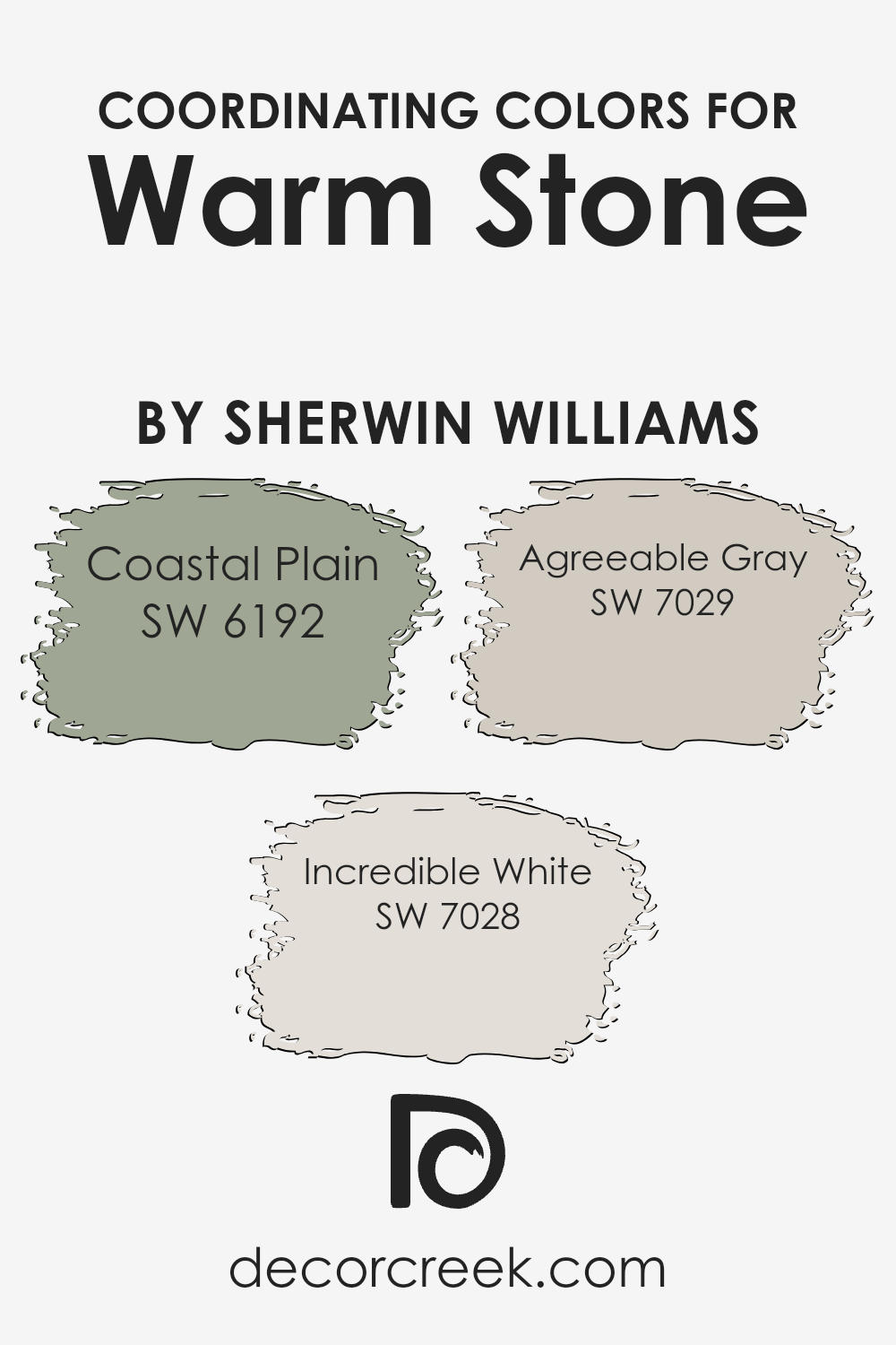
For example, when looking for colors that coordinate well with a subtle hue like Warm Stone by Sherwin Williams, designers might choose colors such as Coastal Plain, Incredible White, and Agreeable Gray to create a balanced palette.
Coastal Plain is a soothing shade of green with earthy undertones, which pairs beautifully with the neutrality of Warm Stone, providing a natural contrast that is both grounding and refreshing. Incredible White, on the other hand, is a subtle off-white that offers a clean and light background, making it perfect for creating a sense of space and openness when used alongside deeper and more defined colors like Warm Stone.
Agreeable Gray is a friendly and adaptable gray that works effortlessly with a wide range of coordinating colors, ensuring a smooth transition between the colors in your space, adding depth while maintaining a cohesive look.
These coordinating colors can help achieve a beautifully balanced look that enhances the overall appeal of your interior design.
You can see recommended paint colors below:
- SW 6192 Coastal Plain (CHECK A SAMPLE)
- SW 7028 Incredible White (CHECK A SAMPLE)
- SW 7029 Agreeable Gray (CHECK A SAMPLE)
What are the Trim colors of Warm Stone SW 7032 by Sherwin Williams?
Trim colors are chosen to complement the main color used on walls or exteriors, offering a visually appealing contrast that enhances architectural features and adds definition to spaces. Selecting the right trim color can highlight the unique design elements of a home or room, and provide a finished look that ties the overall aesthetic together.
When paired with a neutral hue like Warm Stone, trim colors need to be carefully considered to ensure they enhance, rather than overwhelm, the primary color.
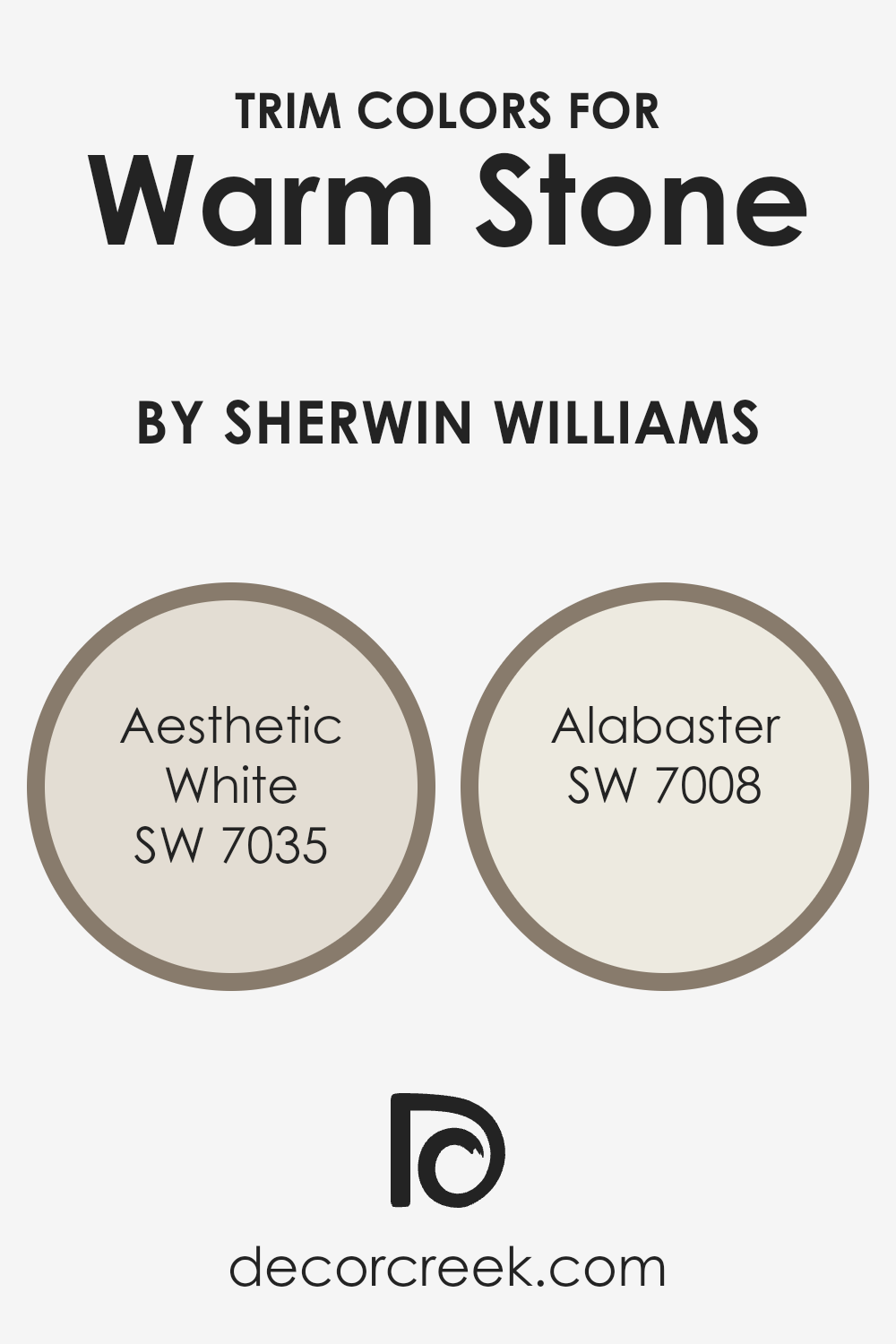
SW 7035 – Aesthetic White and SW 7008 – Alabaster are both excellent choices for trims with Warm Stone. Aesthetic White is a subtle off-white with a hint of gray, giving a clean look without stark contrast, perfect for softening the deeper tones of Warm Stone while maintaining a light and airy feel.
Alabaster, on the other hand, is a pure, creamy white that offers a slightly richer contrast, which can make the features of a room stand out more distinctly against the gentle backdrop provided by Warm Stone. Both colors can add a refreshing and neat finish to a room’s appearance, creating a welcoming atmosphere.
You can see recommended paint colors below:
Colors Similar to Warm Stone SW 7032 by Sherwin Williams
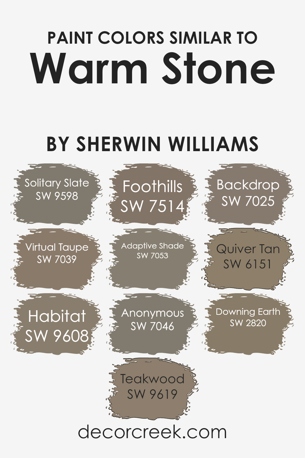
Similar colors are crucial when considering a cohesive and harmonious color scheme in any design setting. By using shades like SW 9598 – Solitary Slate, which offers a muted grey tone, and SW 7039 – Virtual Taupe, an earthy, soft brown, designers can create a soothing atmosphere.
Other close hues, such as SW 9608 – Habitat, a robust greyish-brown, and SW 9619 – Teakwood, a richer, darker brown, infuse a natural, understated elegance without overwhelming the space. These shades work smoothly together because they share a similar saturation and luminosity, making transitions between colors almost seamless.
Further contributing to this palette is SW 7514 – Foothills, a deeper brown that gives depth, and SW 7053 – Adaptive Shade, a flexible grey that complements various decor elements. SW 7046 – Anonymous is another versatile grey, while SW 7025 – Backdrop provides a slightly stronger presence with its darker tone.
For a touch of warm tan, SW 6151 – Quiver Tan brings a cosier feel, and SW 2820 – Downing Earth anchors the scheme with its solid, grounded brown. Each similar color supports one another, fostering an environment that feels thoughtfully connected and aesthetically pleasing without appearing boring or repetitive.
You can see recommended paint colors below:
- SW 9598 Solitary Slate (CHECK A SAMPLE)
- SW 7039 Virtual Taupe (CHECK A SAMPLE)
- SW 9608 Habitat (CHECK A SAMPLE)
- SW 9619 Teakwood (CHECK A SAMPLE)
- SW 7514 Foothills (CHECK A SAMPLE)
- SW 7053 Adaptive Shade (CHECK A SAMPLE)
- SW 7046 Anonymous
- SW 7025 Backdrop (CHECK A SAMPLE)
- SW 6151 Quiver Tan (CHECK A SAMPLE)
- SW 2820 Downing Earth
Colors that Go With Warm Stone SW 7032 by Sherwin Williams
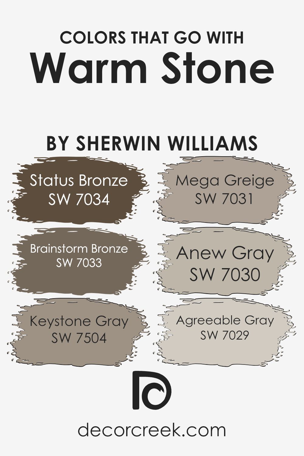
Choosing the right colors to complement Warm Stone SW 7032 by Sherwin Williams is important because they help create a cohesive and harmonious look in your space. These colors are suited for various interior settings, enhancing the beauty of architectural details and furnishings by creating a well-balanced palette.
Working with colors like Status Bronze, Brainstorm Bronze, Keystone Gray, Mega Greige, Anew Gray, and Agreeable Gray allows for flexibility in decor themes, from traditional to contemporary, ensuring the colors in the room work well together and produce an appealing aesthetic.
Status Bronze SW 7034 and Brainstorm Bronze SW 7033 both offer warm, inviting hues that add a touch of elegance and depth to rooms. Status Bronze is a dark, rich shade that immediately draws the eye, making it great for accent walls or furniture pieces.
Brainstorm Bronze is slightly lighter and offers a warm ambiance that works well in spaces that seek a touch of coziness. Keystone Gray SW 7504 provides a balanced, neutral backdrop that complements the bolder tones of Warm Stone.
Mega Greige SW 7031 blends beige and gray to offer a neutral option that pairs effortlessly with a wide range of colors. Anew Gray SW 7030 takes a lighter approach, offering subtlety and versatility in its blend, making it easy to combine with other decor elements.
Lastly, Agreeable Gray SW 7029 is highly adaptable and mild, perfect for those who prefer a softer palette. Together, these colors allow for personal expression in decorating while maintaining a cohesive environment.
You can see recommended paint colors below:
- SW 7034 Status Bronze (CHECK A SAMPLE)
- SW 7033 Brainstorm Bronze (CHECK A SAMPLE)
- SW 7504 Keystone Gray (CHECK A SAMPLE)
- SW 7031 Mega Greige (CHECK A SAMPLE)
- SW 7030 Anew Gray (CHECK A SAMPLE)
- SW 7029 Agreeable Gray (CHECK A SAMPLE)
How to Use Warm Stone SW 7032 by Sherwin Williams In Your Home?
Warm Stone by Sherwin Williams is a cozy, welcoming color that brings a gentle, earthy touch to any room. This shade is part of the beige family and offers a perfect balance that isn’t too stark or too overwhelming, making it easy to integrate into most home styles.
Whether you’re looking to paint a living room, bedroom, or hallway, Warm Stone provides a comforting backdrop that pairs beautifully with both bold and subtle decor.
For those who want a neutral canvas, painting the walls with Warm Stone can make the space feel more inviting. It works well with a variety of furniture colors, from deep browns to lighter woods and even bright whites. Adding Warm Stone to a feature wall can also enhance other elements in the room, like artwork or rugs, without overshadowing them.
In areas where natural light is plentiful, this color warms up the room further, creating a cozy, relaxing environment perfect for family gatherings or quiet evenings.
Warm Stone SW 7032 by Sherwin Williams vs Anonymous SW 7046 by Sherwin Williams
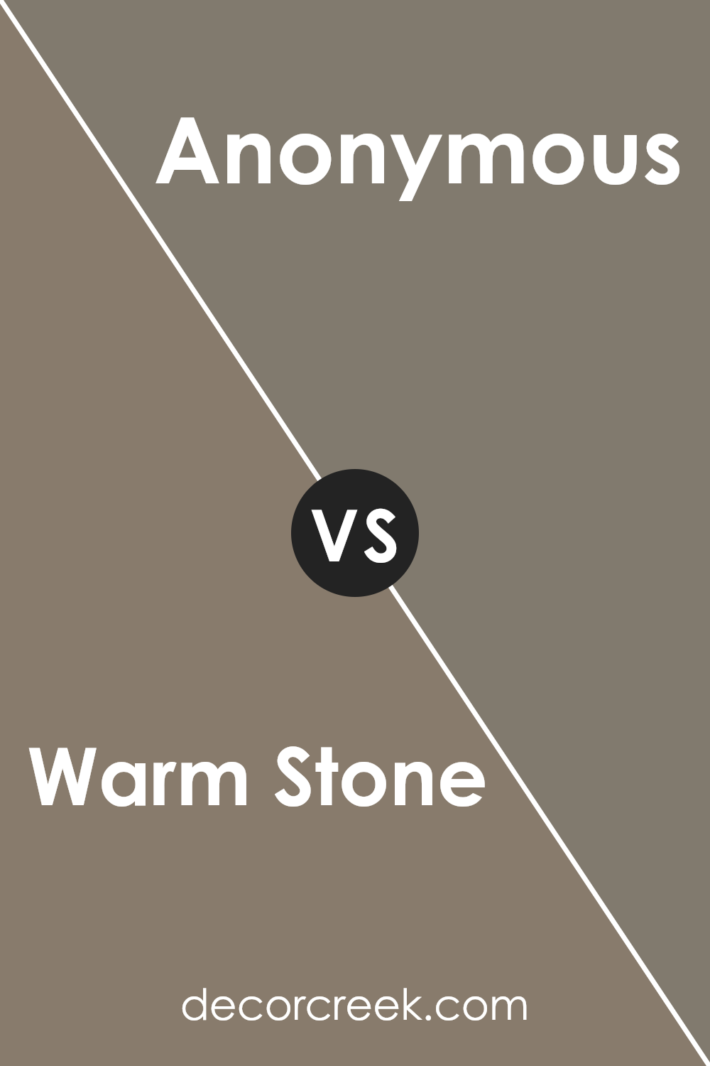
Warm Stone and Anonymous, both from Sherwin Williams, present unique yet harmonious shades. Warm Stone is a gentle, cozy beige with a soft and inviting feel. It works wonderfully in rooms where a touch of warmth is desired, making spaces feel comfortable and relaxed.
On the other hand, Anonymous stands out as a cooler gray that carries a subtle hint of green. This color is versatile and modern, great for creating a neutral backdrop that allows other design elements to stand out. While Warm Stone brings a sunny, welcoming vibe, Anonymous offers a crisp, clean look that can make any room look fresh and contemporary.
Both colors pair well with various decor styles and can be used in numerous spaces, from living rooms to bedrooms, each offering a different aesthetic appeal.
You can see recommended paint color below:
Warm Stone SW 7032 by Sherwin Williams vs Virtual Taupe SW 7039 by Sherwin Williams
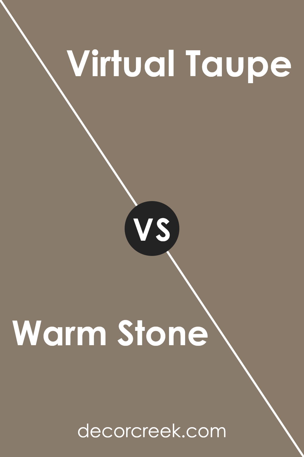
Warm Stone and Virtual Taupe are both neutral colors from Sherwin Williams, but they have distinct tones that set them apart. Warm Stone has a softer, lighter presence, making it a great choice if you want to create a cozy and inviting atmosphere. It leans towards a beige-gray, giving it a gentle and warm feel suitable for living rooms or bedrooms.
On the other hand, Virtual Taupe is darker and has more depth, making a strong statement. This color is closer to a deep brown with gray undertones, which offers a sturdy, grounded look. Virtual Taupe works well in spaces like home offices or dining areas where you might desire a more defined and robust aesthetic.
Both colors pair well with a variety of decor styles and other shades, but your choice depends on the mood you’re aiming to achieve. Warm Stone brings a lighter, airier feel; Virtual Taupe provides a sense of solidity and depth.
You can see recommended paint color below:
- SW 7039 Virtual Taupe (CHECK A SAMPLE)
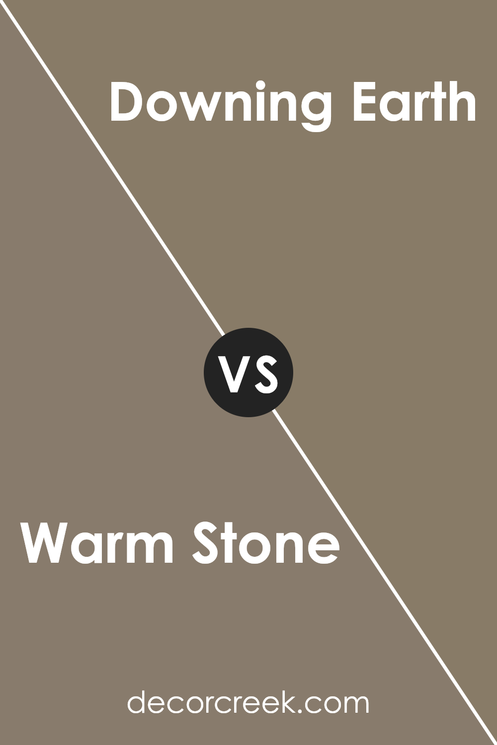
Warm Stone SW 7032 by Sherwin Williams vs Downing Earth SW 2820 by Sherwin Williams
Warm Stone and Downing Earth are two colors by Sherwin Williams that provide distinct but harmonious tones for interior spaces. Warm Stone is a light, sandy beige that offers a subtle warmth to any room, making it feel cozy and inviting.
This color works well in living spaces or bedrooms where a soft, neutral backdrop is desired. On the other hand, Downing Earth is a deeper, richer brown that suggests stability and strength. It’s an excellent choice for creating a grounded or earthy feel, suitable for areas such as studies or dining rooms where a more defined, robust aesthetic is preferred.
Together, Warm Stone and Downing Earth can create a pleasing contrast that balances light and dark tones, enhancing the overall feel of a home’s interior.
You can see recommended paint color below:
- SW 2820 Downing Earth
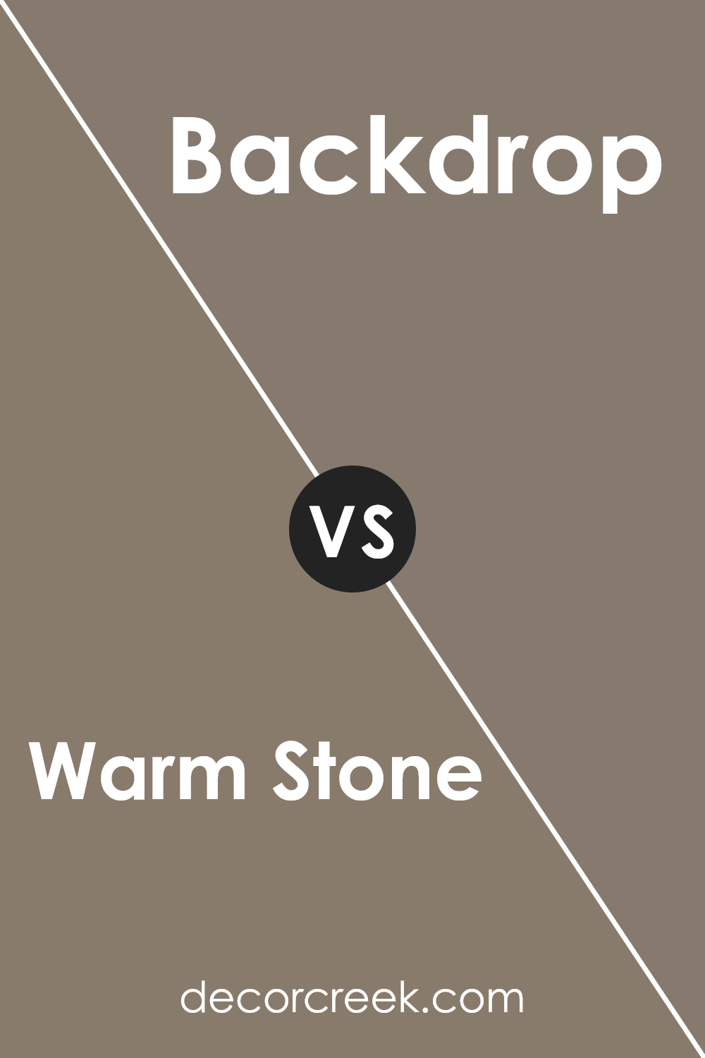
Warm Stone SW 7032 by Sherwin Williams vs Backdrop SW 7025 by Sherwin Williams
Warm Stone and Backdrop are two neutral paint colors by Sherwin Williams that offer subtle yet distinct tones for any space. Warm Stone has a slightly creamy undertone that gives it a soft and welcoming feel. It’s an excellent choice for living rooms or bedrooms where you want a cozy vibe without it feeling too dark.
On the other hand, Backdrop is a bit cooler and grayer, providing a modern and calm look, which works well in spaces that aim for a more contemporary appeal, like kitchens or home offices.
Both colors pair well with a wide range of decor, but Warm Stone tends to add warmth to a room, making it inviting, while Backdrop offers a crisper, cleaner look that can make a room appear more spacious. These shades are versatile but serve different moods and aesthetics depending on your desire to make a room feel either more snug or more streamlined.
You can see recommended paint color below:
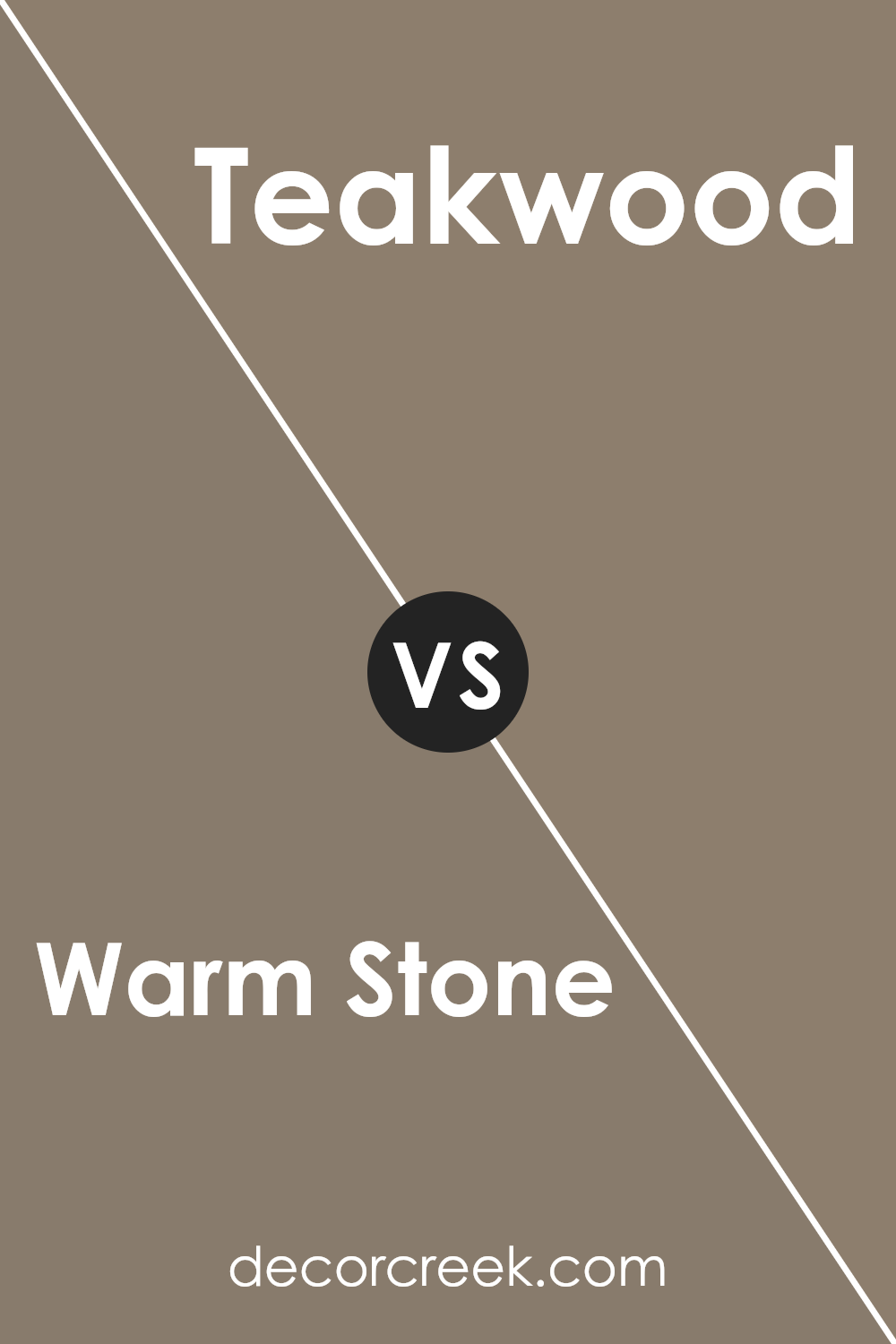
Warm Stone SW 7032 by Sherwin Williams vs Teakwood SW 9619 by Sherwin Williams
Warm Stone and Teakwood, both by Sherwin Williams, present two distinct vibes for room decor. Warm Stone is a light, soft grey that brings a gentle and comforting tone to spaces, making it a great choice for creating a calm and welcoming atmosphere in communal areas like living rooms. It pairs well with a wide range of colors, adding a touch of warmth while maintaining a neutral palette.
On the other hand, Teakwood offers a much deeper, richer brown tone that resembles the natural color of teak wood. This color is more intense and is perfect for setting a strong, cozy feel in a space. It works well in areas where you want to establish a feeling of solidity and warmth, such as in a study or dining room.
Both colors have their unique charm and serve different purposes depending on the mood and style you want to achieve in your decorating project.
You can see recommended paint color below:
- SW 9619 Teakwood (CHECK A SAMPLE)
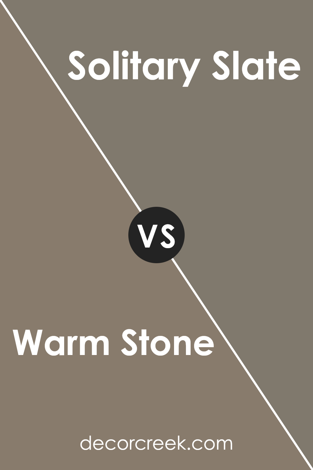
Warm Stone SW 7032 by Sherwin Williams vs Solitary Slate SW 9598 by Sherwin Williams
Warm Stone and Solitary Slate are two distinct colors by Sherwin Williams. Warm Stone is a soft, neutral beige with a cozy feeling, making spaces feel open and airy. It pairs well with a wide range of decor styles, adding a touch of warmth to any room without overpowering other colors.
On the other hand, Solitary Slate is a deep, dark gray that brings a strong presence to spaces. This color is perfect for creating dramatic accents in a room or for use in modern designs where a bold, yet refined look is desired.
While Warm Stone reflects more light and enhances the sense of space, Solitary Slate tends to absorb light, making it ideal for larger rooms or well-lit areas. Both colors provide unique opportunities to create inviting and stylish environments, but they serve different aesthetic purposes in home design.
You can see recommended paint color below:
Warm Stone SW 7032 by Sherwin Williams vs Habitat SW 9608 by Sherwin Williams
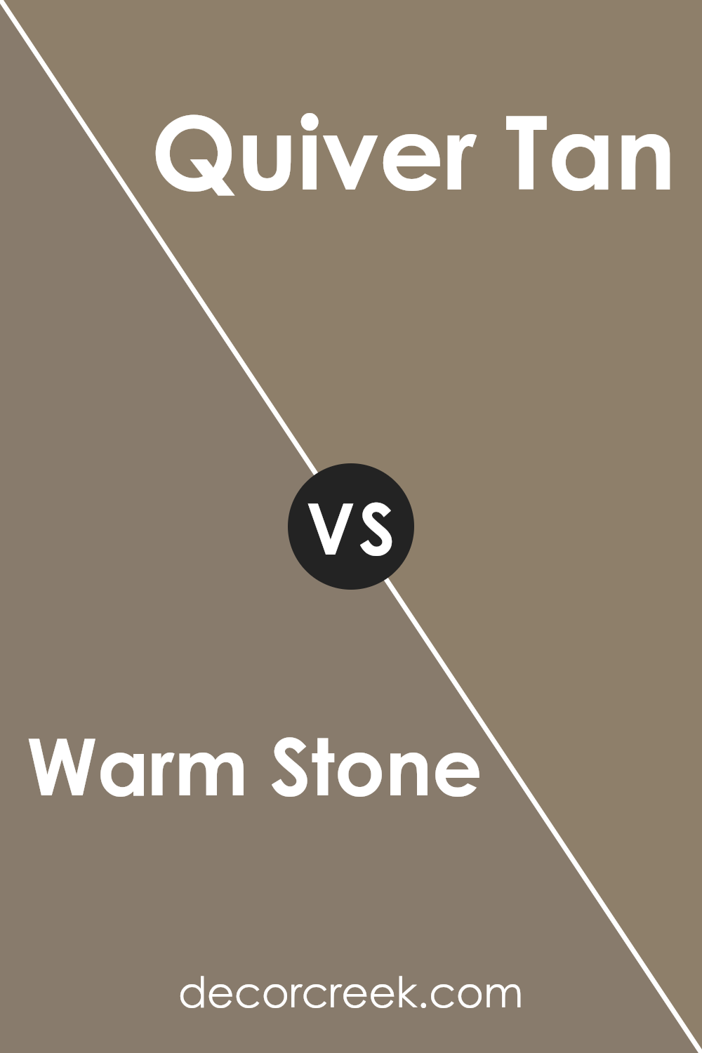
Warm Stone and Habitat, both by Sherwin Williams, offer distinct feelings for any space. Warm Stone is a soft, welcoming beige with a subtle warmth that makes it perfect for creating a cozy, inviting atmosphere. It pairs well with various decor styles and adds a gentle, comforting touch to rooms.
In contrast, Habitat is deeper and richer, a blend of gray and brown that brings an earthy, natural feel to a room. This color is versatile enough to work in both modern and traditional settings, infusing a sense of grounding and balance.
Although both colors are neutral, Warm Stone leans towards a lighter, warmer tone, promoting a soft, airy feel. Habitat, with its deeper tones, offers a robust, grounded ambiance. Both can be used effectively to enhance the aesthetic of a living space, depending on the vibe one aims to achieve. Whether aiming for light and cozy or rich and earthy, these colors have unique qualities to transform a space nicely.
You can see recommended paint color below:
- SW 9608 Habitat (CHECK A SAMPLE)
Warm Stone SW 7032 by Sherwin Williams vs Adaptive Shade SW 7053 by Sherwin Williams
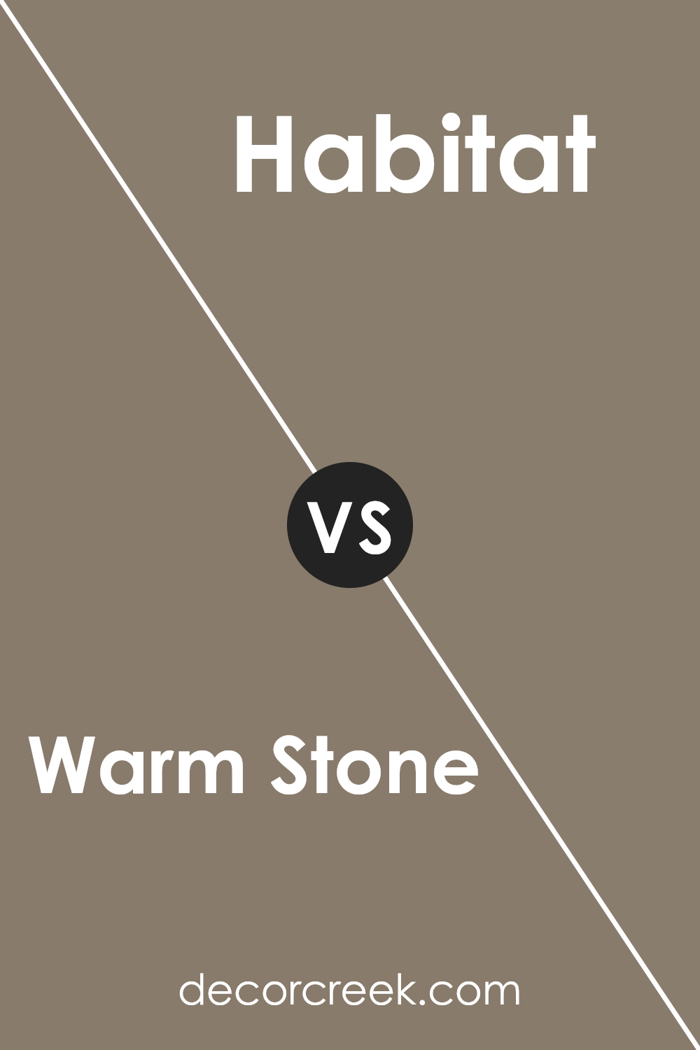
Warm Stone and Adaptive Shade, both by Sherwin Williams, offer unique tones for interior spaces but differ in their color qualities. Warm Stone has a cozy, inviting feel with its beige-brown hue, providing a soft, neutral backdrop that pairs well with various decor styles. This color lends a feel of warmth to any room, making it perfect for living areas and bedrooms where comfort is key.
On the other hand, Adaptive Shade is a cooler gray that carries a hint of blue undertone, giving it a modern and versatile look. This color works great in spaces that aim for a more contemporary and fresh feel, like kitchens and bathrooms, or any area that benefits from a clean, crisp ambiance.
The difference between the two colors lies mainly in their temperature tones; Warm Stone adds warmth due to its earthy shade, while Adaptive Shade offers a cooler touch, suitable for a minimalistic or modern aesthetic. Each color supports different design goals, making them suitable for various preferences and spaces.
You can see recommended paint color below:
- SW 7053 Adaptive Shade (CHECK A SAMPLE)
Warm Stone SW 7032 by Sherwin Williams vs Foothills SW 7514 by Sherwin Williams
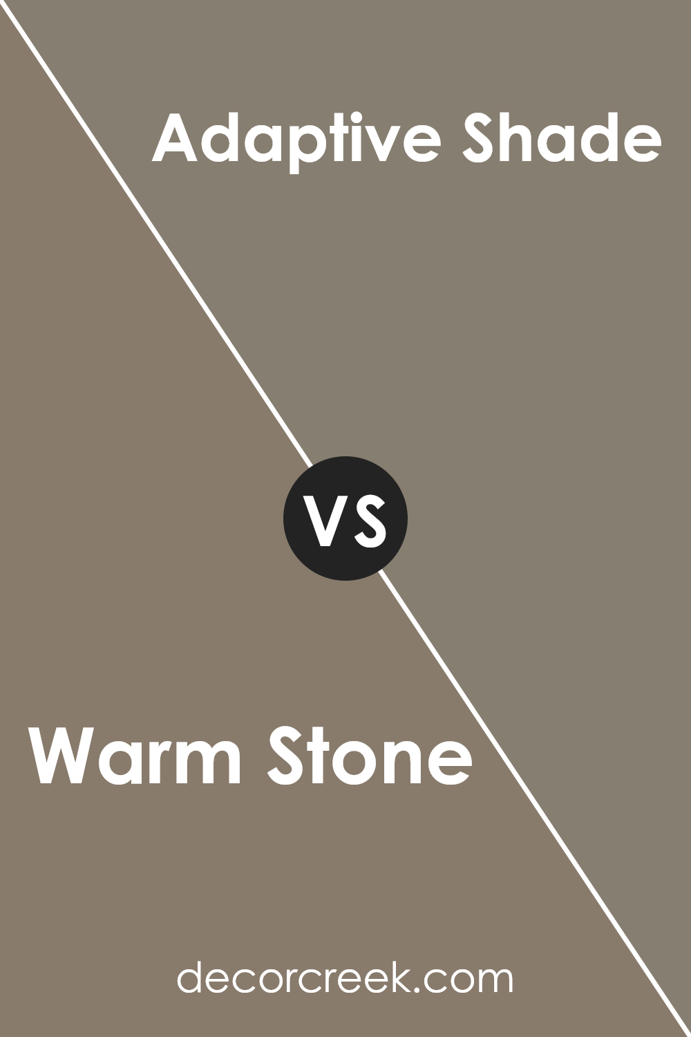
The main color, Warm Stone, is a gentle mix of beige and gray, creating a cozy and inviting atmosphere, perfect for any space that aims to be welcoming. It skips between a neutral base and a touch of warmth, making it versatile for pairing with both bright and subdued accents.
On the other hand, Foothills, the second color, is darker and leans more towards a deep taupe. This shade is rich and earthy, providing a solid grounding effect which is ideal for creating a strong, stable look in a room. It naturally tends to draw in a sense of calmness and steadiness, being slightly moodier than Warm Stone.
Both colors offer a subtle elegance and can effortlessly match a variety of decor styles. While Warm Stone is lighter and can help make a small space appear larger, Foothills, being darker, is perfect for adding depth and drama to a broader space. Whether you’re looking for a light, airy feel or a deep, grounded vibe, these colors offer lovely options.
You can see recommended paint color below:
Warm Stone SW 7032 by Sherwin Williams vs Quiver Tan SW 6151 by Sherwin Williams
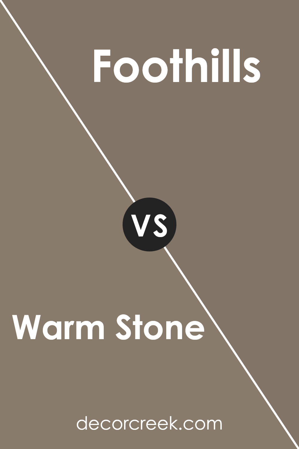
Warm Stone and Quiver Tan are two elegant colors by Sherwin Williams, each bringing a unique charm to a space. Warm Stone is a soft, muted beige with a cozy, welcoming feel, making any room feel more homely and comfortable. It naturally pairs well with various decor styles from modern to rustic.
On the other hand, Quiver Tan leans into a slightly darker, richer beige that gives off a strong sense of warmth and stability. This color is excellent for areas where you want to create a snug and secure atmosphere, such as living rooms or bedrooms.
While both shades are quite neutral, Warm Stone has a lighter, airier vibe compared to the more grounded and earthy feel of Quiver Tan. Depending on the lighting and accessories, each color could be the right choice to either brighten or enrich a space. They work well on their own and complement each other nicely when used in adjacent rooms or as accent walls.
You can see recommended paint color below:
- SW 6151 Quiver Tan (CHECK A SAMPLE)
Conclusion
I’ve shared a lot about SW 7032 Warm Stone by Sherwin Williams, a paint color that many people love for its cozy, warm feel. This color looks like a mix between grey and brown, which makes it perfect for almost any room in your home. It can make places like your living room feel extra snug, which is nice when you want to relax.
Warm Stone is also great because it goes well with so many different decorations and furniture styles. Whether your room has a modern look with sleek furniture or a classic style with wooden pieces, this color will fit right in. This makes it a smart choice if you enjoy changing your home’s look without having to repaint every time.
Overall, choosing SW 7032 Warm Stone for your walls can be a wise decision. It’s versatile, cozy, and looks good with many different things.
If you’re thinking of giving your room a new look, this color might just be the perfect pick to make your space feel warm and inviting.
Ever wished paint sampling was as easy as sticking a sticker? Guess what? Now it is! Discover Samplize's unique Peel & Stick samples.
Get paint samples


