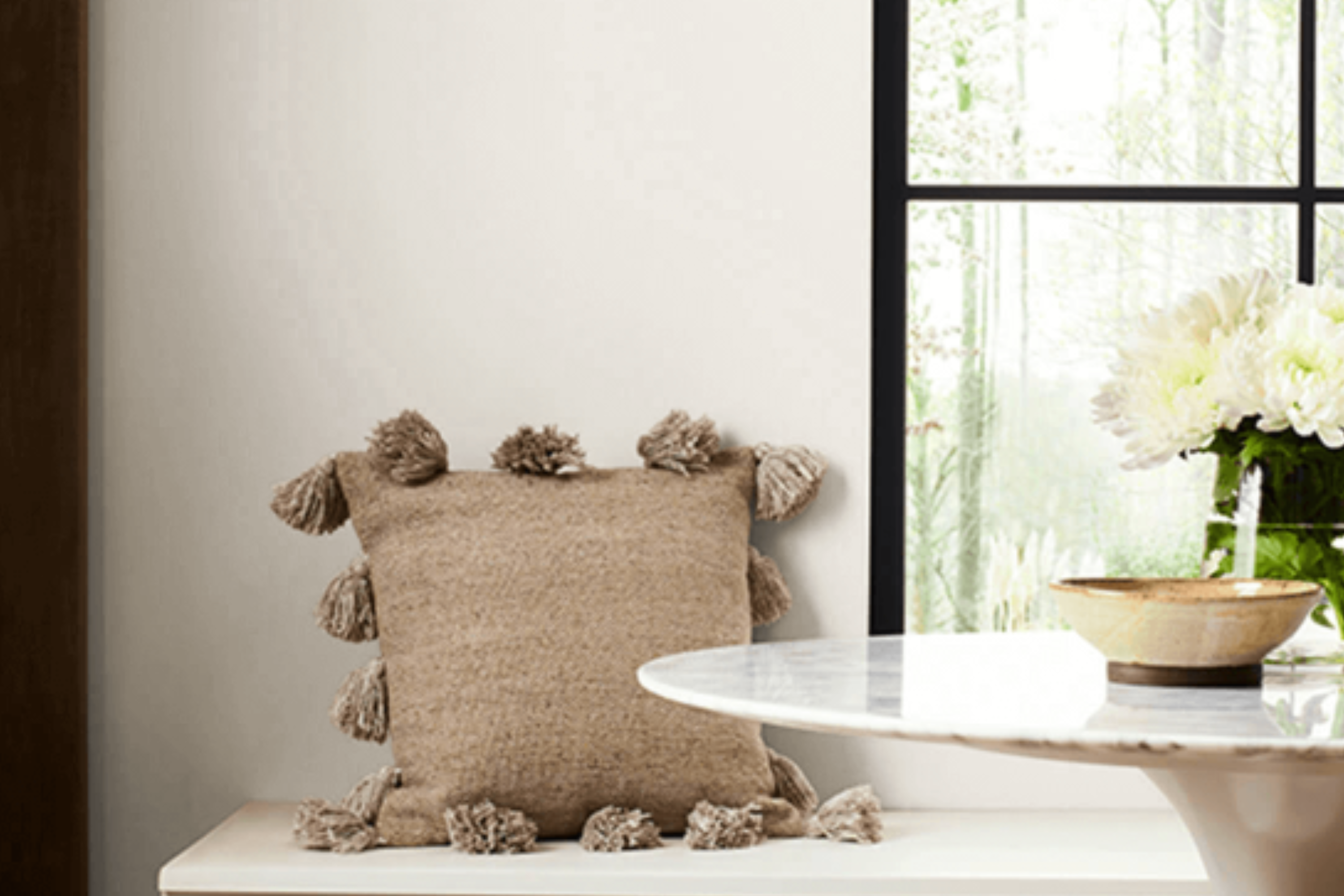
Introducing SW 7028 Incredible White by Sherwin Williams – a color that truly lives up to its name. This shade of white is far from ordinary, offering a unique blend of warmth and neutrality that makes it a go-to choice for any room in your home. Whether you’re looking to freshen up your living space, add a touch of elegance to your bedroom, or bring light into your kitchen, Incredible White has you covered.
What sets SW 7028 Incredible White apart is its versatility. It pairs beautifully with a wide range of colors and decor styles, making it a fantastic base or accent color.
Whether your home is filled with bold colors and modern furniture or more subtle tones and classic pieces, this paint can complement your existing decor seamlessly. Not only does it look great, but it also brings a sense of calm and brightness to any space, creating an inviting atmosphere that you and your guests will love.
Homeowners and interior designers alike rave about Incredible White for its ability to transform a room. It’s not just a paint color; it’s a tool for enhancing the beauty and style of your home. If you’re looking for a paint that combines beauty, simplicity, and versatility, look no further than SW 7028 Incredible White by Sherwin Williams.
What Color Is Incredible White SW 7028 by Sherwin Williams?
Incredible White by Sherwin Williams is more than just a basic white paint. It’s a soft, warm hue that brings a gentle brightness to any space, making rooms feel more open and airy. This color has a slight undertone that keeps it from feeling cold or sterile, instead offering a cozy ambiance that’s both inviting and versatile.
This shade of white works wonders in a variety of interior styles. Whether your home features a modern minimalistic look, a comfy farmhouse vibe, or even a traditional setting, Incredible White fits in seamlessly. It acts as a perfect backdrop, allowing your decor pieces and furniture to truly stand out.
When it comes to pairing with materials and textures, Incredible White shows off its flexibility. It complements natural wood tones beautifully, from light oak to richer walnuts, bringing out their warmth. In rooms with plenty of sunlight, this color pairs well with soft textiles like linen or wool, enhancing a sense of comfort.
For those incorporating metal accents or fixtures in their spaces, Incredible White balances both cool metals like chrome and warmer ones like brass or gold, ensuring the space feels balanced and put together. Whether you’re aiming for a sophisticated look or a welcoming family home, this color creates a perfect canvas for your design aspirations.
Ever wished paint sampling was as easy as sticking a sticker? Guess what? Now it is! Discover Samplize's unique Peel & Stick samples.
Get paint samples

Is Incredible White SW 7028 by Sherwin Williams Warm or Cool color?
Incredible White by Sherwin Williams is a popular paint choice for homeowners looking to add a fresh and inviting look to their interiors. This particular shade of white is soft and has a hint of warmth to it, making it very versatile and easy to work with. Unlike stark whites, Incredible White brings a cozy atmosphere to any room without feeling too cold or impersonal.
One of the reasons this color is so loved is because of how it complements various decor styles and furniture colors. Whether your home has a modern, traditional, or rustic vibe, Incredible White can seamlessly fit into the aesthetic, enhancing other elements in the room without overpowering them. Its subtle warmth means it pairs beautifully with both cool and warm tones, from soft pastels to bold accents.
Moreover, Incredible White is excellent at making spaces feel brighter and more spacious. It reflects natural light beautifully, helping to make smaller or darker rooms appear larger and more open. This quality is particularly beneficial for homeowners looking to revitalize their spaces without major renovations. Overall, Incredible White offers a perfect backdrop for creating a welcoming and stylish home.
Undertones of Incredible White SW 7028 by Sherwin Williams
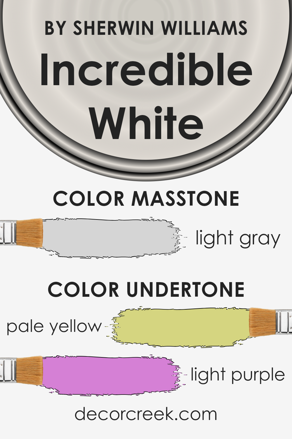
Incredible White is a unique color that might seem just white at first glance. However, it has subtle hints of pale yellow and light purple mixed in. These are not bright, flashy undertones, but they do play a big role in how we see the color.
When you look at a color, you’re not just seeing the main hue. The undertones add depth and dimension, influencing the overall appearance. For Incredible White, the pale yellow adds a warmth, making the white feel more inviting rather than cold or sterile. It’s like the color is softly whispering, “This is a cozy place,” making rooms painted with it feel more welcoming.
On the other hand, the light purple adds a touch of coolness and sophistication. It’s a fine balance that stops the warmth from the yellow undertone from taking over. This hint of coolness can make the wall color appear more neutral in spaces with a lot of natural light, ensuring the room doesn’t look too yellowish or warm.
When Incredible White is used on interior walls, these undertones work together in a subtle dance. Depending on the lighting and the time of day, the walls might lean a bit warmer or cooler. This color, thanks to its understated undertones, can adapt to different styles and furnishings, making it a versatile choice. It means you’re not just putting a simple white on your walls; you’re adding layers of warmth and sophistication without overwhelming the space.
What is the Masstone of the Incredible White SW 7028 by Sherwin Williams?
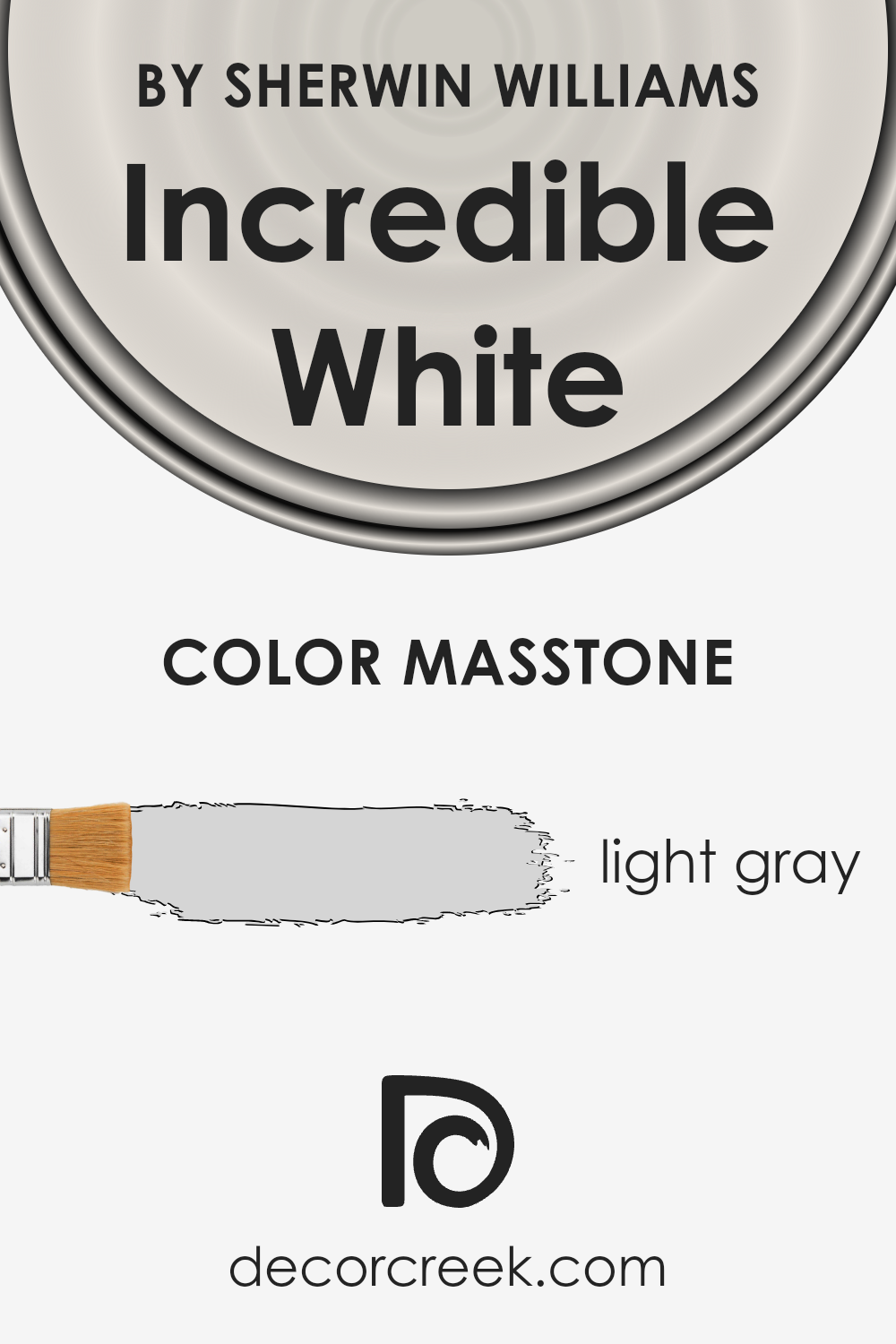
Incredible White by Sherwin Williams, with a masstone of light gray (#D5D5D5), is a nuanced color that brings a unique vibe into homes. This shade’s subtle gray essence allows it to blend smoothly with various interior designs without overpowering them.
Its lightness makes rooms feel more open and airy, making it perfect for spaces of any size. Since it’s not a stark white, it adds warmth and coziness, making spaces feel more welcoming and comfortable.
This light gray hue is especially good at enhancing natural light. In well-lit rooms, it can make the space feel even brighter and more refreshing. In rooms with less natural light, it can help in making the area feel less cramped and more inviting.
Its versatility also extends to color pairings; it can be paired with bold colors for a dynamic contrast or with softer tones for a more serene and harmonious look. Overall, this color is a great choice for creating a tranquil yet sophisticated atmosphere in homes.
How Does Lighting Affect Incredible White SW 7028 by Sherwin Williams?
Lighting plays a vital role in how we perceive colors. Imagine painting your room with a shade of color that looks perfect on the swatch, but once it’s on the wall, it seems entirely different. That’s the magic (and sometimes, the frustration) of lighting. It can change a color’s appearance drastically. The color in discussion, Incredible White, is a versatile shade, but even so, its perception shifts with different lighting conditions.
- In artificial light, this color can lean towards warmer or cooler tones depending on the type of bulb used. LED lights that mimic daylight will keep the color close to its true shade, a soft white with a slight warm undertone. However, typical incandescent bulbs, which cast a yellowish glow, can make it appear creamier.
- When bathed in natural light, Incredible White unveils its true charm, reflecting the light beautifully and maintaining its soft, tranquil vibe. However, the direction your room faces influences this interaction significantly.
- North-facing rooms receive less direct sunlight, causing colors to appear cooler. Here, Incredible White might look slightly more grayish, maintaining a crisp and serene atmosphere. This cooler light emphasizes the paint’s subtle undertones, making the room feel fresh and peaceful.
- South-facing rooms bask in warm, golden sunlight throughout the day, making colors look brighter and warmer. In these rooms, Incredible White becomes radiant, enhancing its warm undertones and creating an inviting, cozy space.
- East-facing rooms enjoy the morning sun, which brings out the color’s soft and warm qualities. As the day progresses, the light in these rooms becomes bluer, making the color appear cooler and more neutral in the afternoon and evening.
- West-facing rooms, on the other hand, get the full impact of sunset’s warm, reddish light. Here, the color softens into a gentle warm tone by evening, providing a comforting and calming effect in the space.
In each of these scenarios, Incredible White adapts, showcasing its versatility and the profound effect lighting has on color perception.
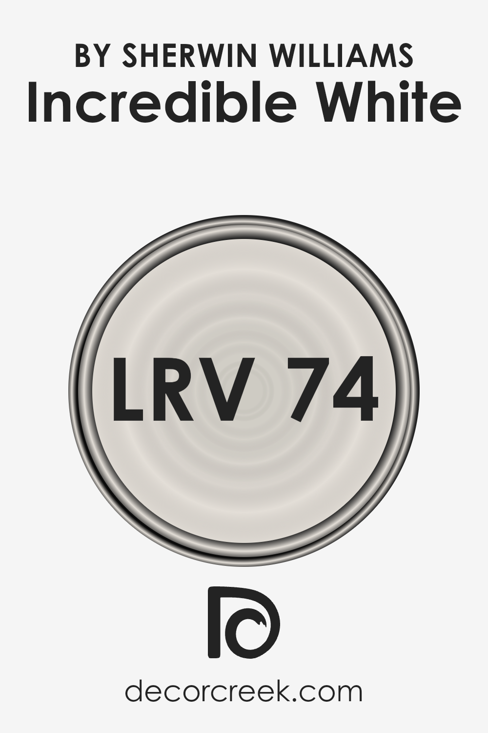
What is the LRV of Incredible White SW 7028 by Sherwin Williams?
LRV stands for Light Reflectance Value, a measurement that shows how much light a paint color reflects or absorbs. Think of it as a scale from 0 to 100, where 0 is completely black, absorbing all light, and 100 is pure white, reflecting all light back at you.
This value is super important when choosing paint colors because it can really change how a color looks in your room. High LRV colors, those closer to 100, will make rooms feel more open and airy as they reflect more light around the space. On the other hand, colors with a low LRV absorb more light, making them feel cozier but also potentially darker and smaller.
The color in question, with an LRV of 73.576, is on the higher end of the scale. This means it reflects quite a bit of light, making it a good choice for making small spaces appear larger or for rooms that don’t get a lot of natural sunlight.
It won’t feel overpowering or too bright, thanks to its not-quite-white status, offering a soft, inviting ambiance without shrinking the perception of space. In rooms with plenty of sunlight, this color will feel warm and vibrant, while in lower light, it can offer a calm and serene atmosphere.
This LRV value ensures that the color is versatile enough to work in many different spaces and lighting conditions, making it a popular choice for creating a light and refreshing interior.
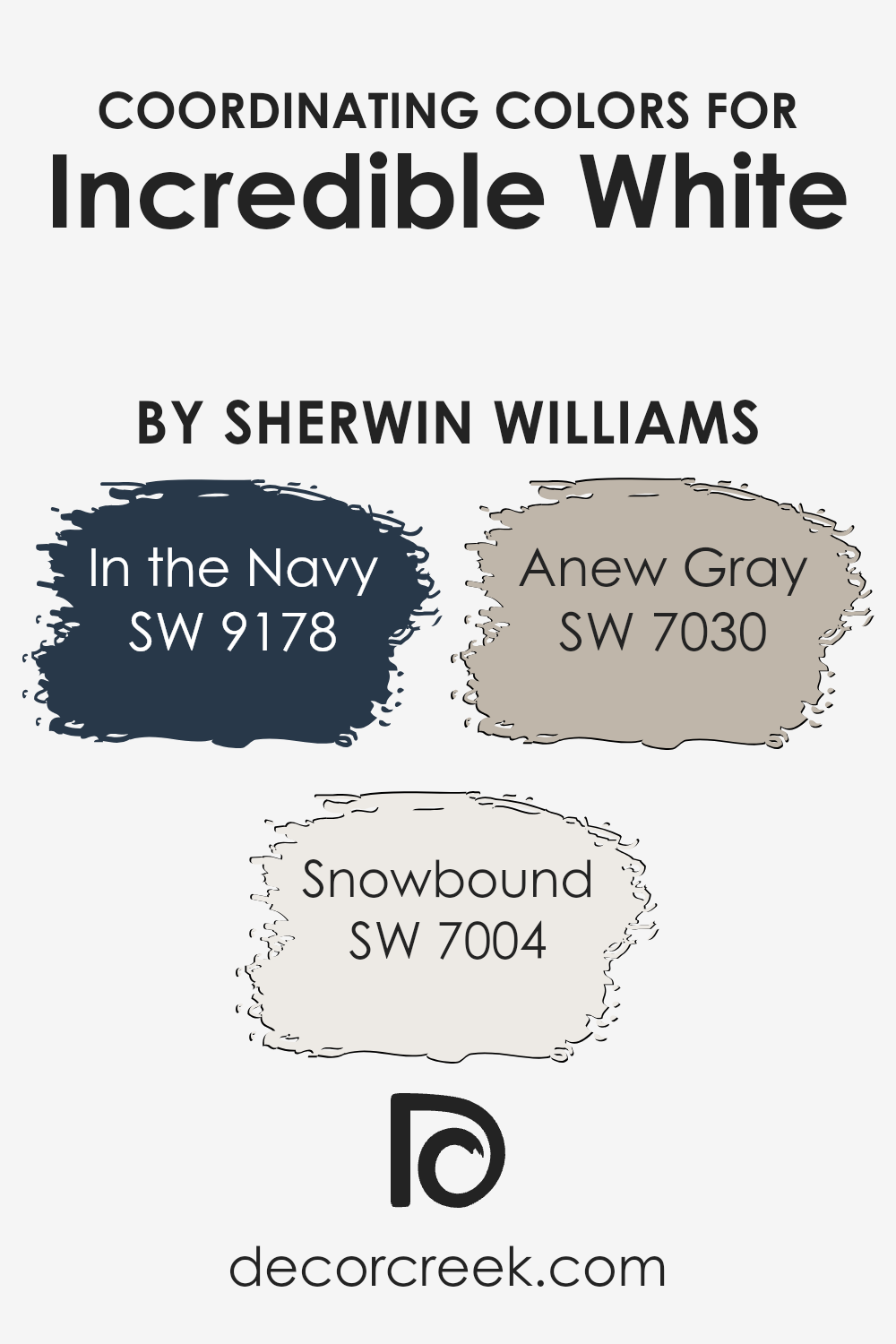
Coordinating Colors of Incredible White SW 7028 by Sherwin Williams
Coordinating colors are hues that harmonize well with a base color, creating visually appealing combinations for any space. In the context of the color Incredible White by Sherwin Williams, there are specific colors recommended by the brand to coordinate seamlessly with this base shade. These coordinating colors enhance the versatility of the mother color, allowing you to create a sophisticated and cohesive look in your interior design or exterior painting projects.
In the Navy SW 9178 is a deep, bold blue that brings a strong contrast to Incredible White, offering a rich depth that can anchor a room or act as a striking accent. Snowbound SW 7004, on the other hand, is a soft, warm white with subtle undertones that complement Incredible White by providing a slightly different temperature and texture, ideal for trims or ceilings to add dimension without overwhelming the space.
Anew Gray SW 7030 straddles the line between gray and beige, providing a neutral backdrop that bridges the gap between warm and cool tones. This versatile color works beautifully with Incredible White, allowing for a smooth transition between spaces or a complementary background for a more layered design approach.
Together, these coordinating colors offer a balanced palette to enhance the beauty of Incredible White, making it easy to design spaces that feel both cohesive and inviting.
You can see recommended paint colors below:
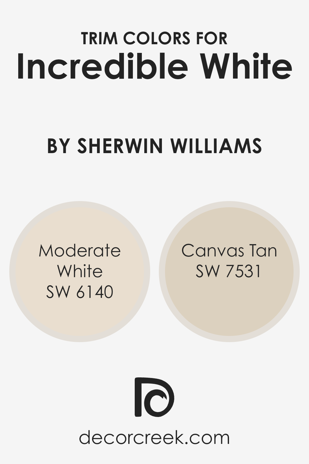
What are the Trim colors of Incredible White SW 7028 by Sherwin Williams?
Trim colors are chosen to complement or contrast with the main color on your walls, creating a cohesive or striking visual effect. When considering Incredible White by Sherwin Williams, selecting the right trim color is vital because it frames the room, accentuating its features and dimensions.
Trim, often applied to baseboards, moldings, and door frames, acts as an architectural highlight, drawing attention to the craftsmanship of your space. The right trim color can enhance the subtle tones of Incredible White, making the walls appear more vibrant or refined.
Moderate White SW 6140 is a soft, off-white with a warm undertone, making it an excellent choice for trim, giving a gentle, seamless transition that enriches the space without overwhelming it.
It’s particularly effective in spaces where a sense of continuity and calm is desired, as it softly echoes the main hue without stark contrast. Canvas Tan SW 7531, on the other hand, offers a deeper, richer contrast with its golden tan shade, grounding the airiness of Incredible White, and providing a natural, earthy boundary that subtly defines the space.
These colors give the room character and depth, subtly enhancing the overall aesthetic while ensuring the walls remain the focal point.
You can see recommended paint colors below:
- SW 6140 Moderate White
- SW 7531 Canvas Tan
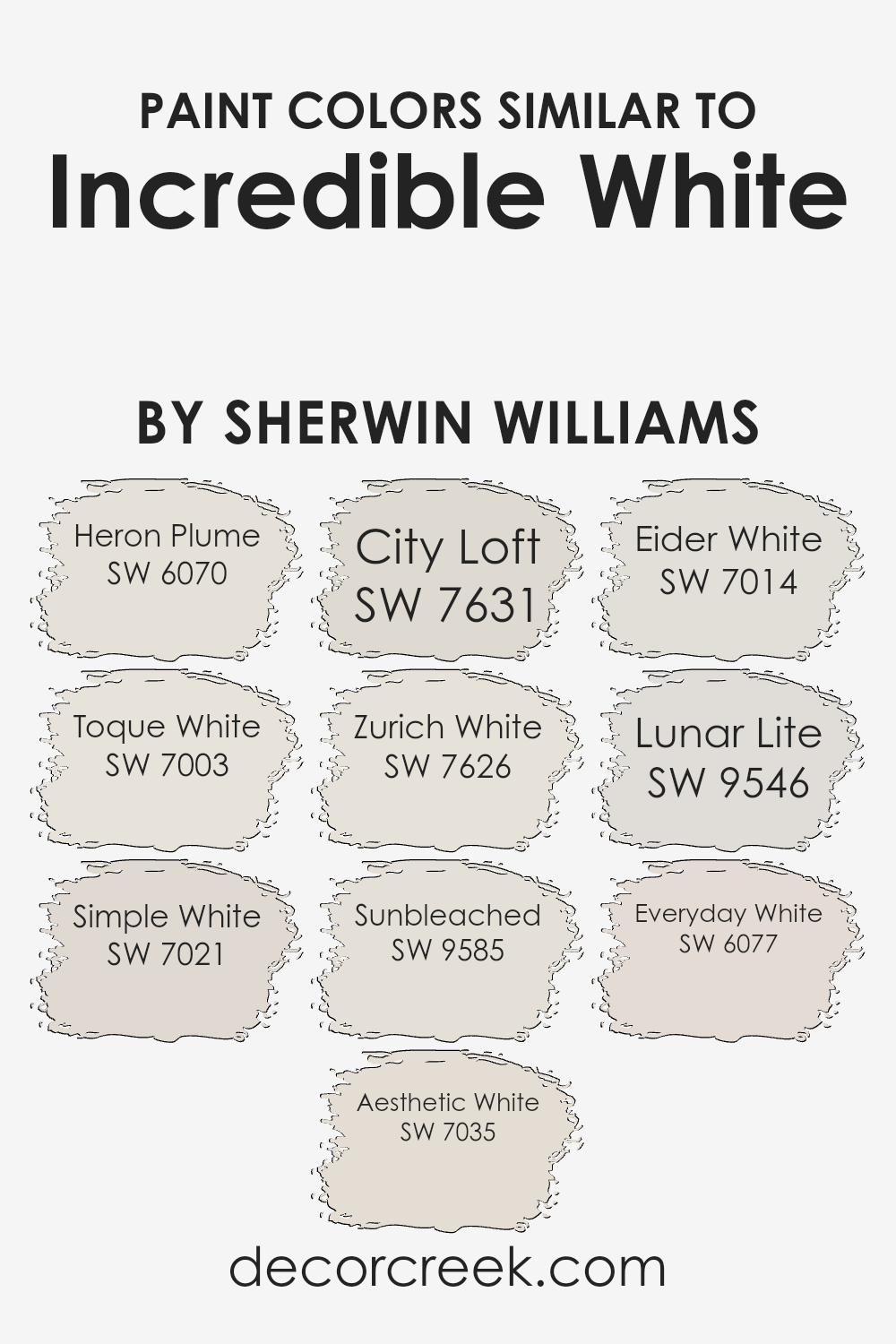
Colors Similar to Incredible White SW 7028 by Sherwin Williams
Similar colors play a vital role in the palette of home decor, providing seamless transitions and harmonious visuals that soothe the eye. They work by sharing a common hue base or by possessing subtle differences in tone and saturation, enabling decorators and homeowners to craft spaces with a unified aesthetic without the monotony of using a single color.
For instance, Heron Plume and Toque White lean towards warm, inviting tones, providing a cozy ambiance without overpowering the senses. Simple White and Aesthetic White offer a crisp, clean look, perfect for spaces aiming for a minimalist appeal or wanting to maximize the sense of light and space.
Moreover, colors like City Loft and Zurich White add just a hint of depth, making them ideal for highlighting architectural features without creating stark contrasts. Sunbleached brings a slightly weathered, natural element into spaces, invoking a sense of calmness and ease.
Eider White tends toward a cooler palette, offering freshness that can help in areas needing a subtle lift.
Lunar Lite and Everyday White further demonstrate the versatility of similar colors, with their ability to blend seamlessly into various decors, enhancing the existing elements without drawing attention away
. Overall, these subtly varied hues work together to create environments that feel thoughtfully designed and effortlessly coordinated.
You can see recommended paint colors below:
- SW 6070 Heron Plume
- SW 7003 Toque White
- SW 7021 Simple White
- SW 7035 Aesthetic White
- SW 7631 City Loft
- SW 7626 Zurich White
- SW 9585 Sunbleached
- SW 7014 Eider White
- SW 9546 Lunar Lite
- SW 6077 Everyday White
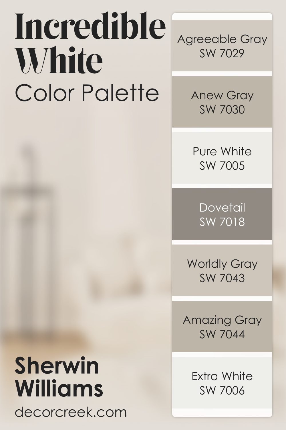
Incredible White SW 7028 by Sherwin Williams Color Palette
Incredible White feels soft and airy, giving the room a gentle brightness that settles in naturally. It has a tender, quiet quality that creates a peaceful mood. Pure White and Extra White lift the palette with clean light, helping the room feel smooth, open, and relaxed.
Agreeable Gray, Anew Gray, and Worldly Gray add smooth, restful layers that blend effortlessly, giving the palette warmth without heaviness.
Dovetail brings depth that strengthens the look, adding just enough definition to keep the palette from feeling too light. Amazing Gray adds warmth that rounds out the palette beautifully, giving it a soft, grounded finish.
Together, these shades create a calm, comfortable look that feels peaceful, warm, and gently uplifting.
How to Use Incredible White SW 7028 by Sherwin Williams In Your Home?
Incredible White SW 7028 is a paint from Sherwin Williams that offers a soft, warm, and inviting tone, perfect for creating a cozy and comfortable atmosphere in your home. This color is versatile, making it suitable for various rooms, whether you’re looking to brighten up your living room, create a serene bedroom, or even give your kitchen a fresh, clean look. Its subtlety acts as a perfect backdrop, allowing your furniture, artwork, and decorations to stand out.
Incredible White can help to make small spaces appear larger and more open, thanks to its light-reflecting qualities. It pairs well with almost any color scheme or interior design style, from modern minimalist to rustic farmhouse.
For those interested in adding a bit more character to their walls, it also works exceptionally well as a base for layering textures or for contrasting with bold accent colors.
Whether you’re updating a single room or transforming your entire home, Incredible White is an excellent choice for bringing warmth and brightness into your space.
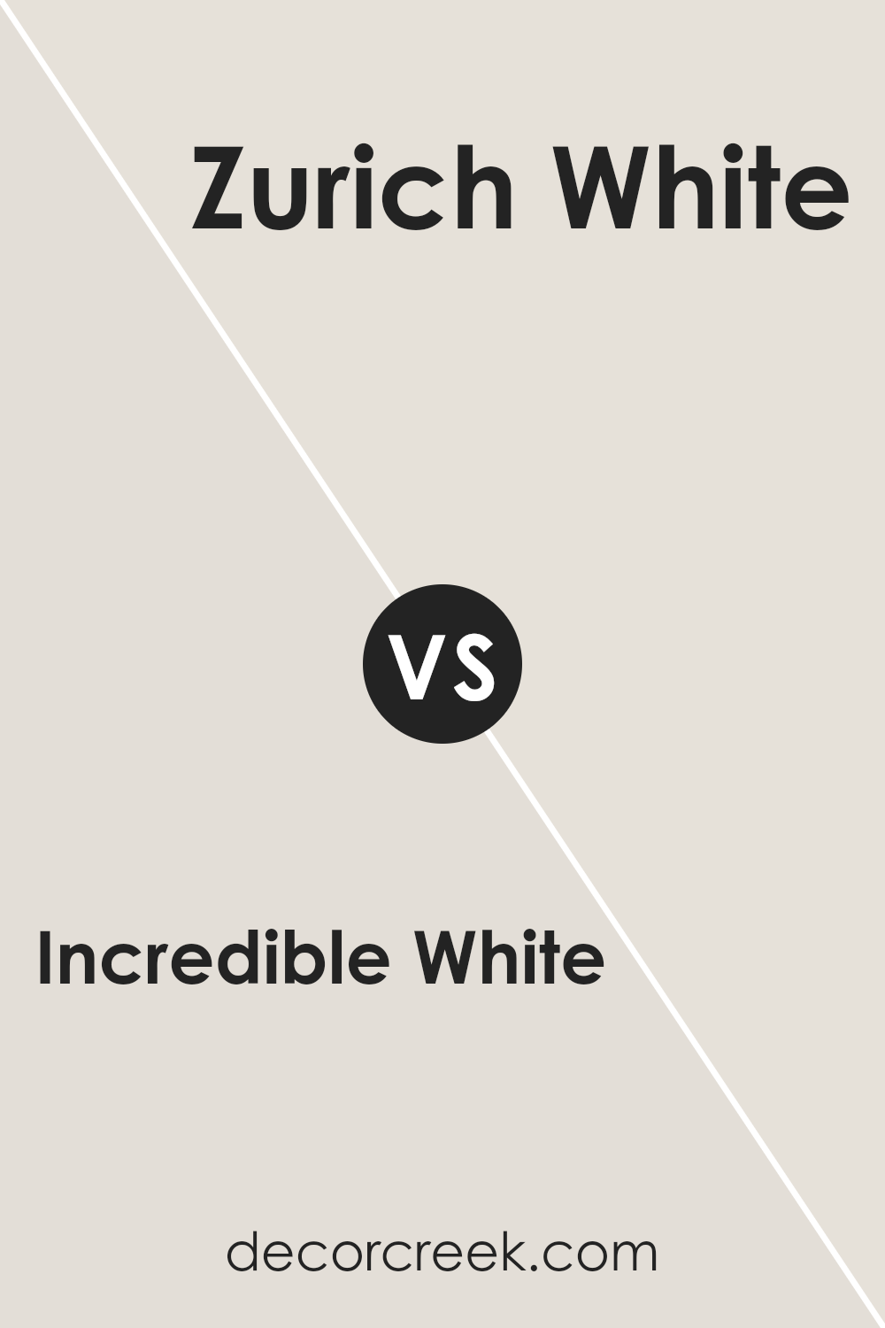
Incredible White SW 7028 by Sherwin Williams vs Zurich White SW 7626 by Sherwin Williams
Incredible White and Zurich White are both colors by Sherwin Williams that share some similarities but also hold distinct differences. Incredible White is a soft, warm white with a subtle hint of beige, making it feel cozy and inviting in a room. I
t’s versatile, working well in spaces that aim for a light, airy feel without the starkness some pure whites bring. On the other hand, Zurich White leans toward a slightly cooler palette, incorporating gray undertones that offer a crisp, clean look.
It’s great for spaces that want to achieve a modern, minimalist aesthetic. While both colors are whites, Incredible White adds warmth to a space, making it feel like home, whereas Zurich White brings a contemporary, sophisticated touch.
When choosing between them, consider the ambiance you want to create. Incredible White suits a comforting, serene environment, while Zurich White is ideal for a sleek, current vibe.
You can see recommended paint color below:
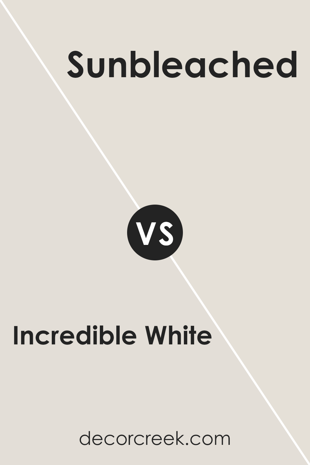
Incredible White SW 7028 by Sherwin Williams vs Sunbleached SW 9585 by Sherwin Williams
Incredible White and Sunbleached are two different shades by Sherwin Williams. Incredible White is a soft, warm white with a hint of gray. It’s perfect for creating a cozy and inviting space without being too stark. It gives a subtle backdrop that allows other decor elements to stand out.
On the other hand, Sunbleached is a light, muted shade that leans towards a sandy beige. It brings the feel of a sun-faded material, offering a neutral but warmer touch to rooms. This color adds a bit of warmth and is ideal for creating a relaxed, comfortable environment.
While Incredible White acts as a versatile base, suitable for any room, Sunbleached offers a hint of color, ideal for those wanting a bit more warmth without overpowering the space. Both colors work well in a variety of lighting conditions, adapting subtly to their surroundings.
You can see recommended paint color below:
- SW 9585 Sunbleached
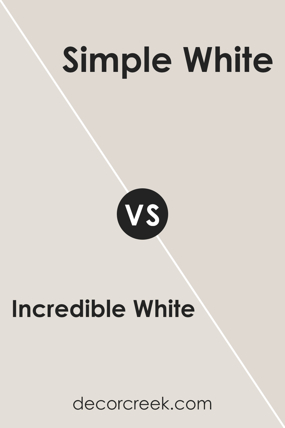
Incredible White SW 7028 by Sherwin Williams vs Simple White SW 7021 by Sherwin Williams
Comparing Incredible White and Simple White from Sherwin Williams gives us a peek into the subtle differences between two popular shades of white. Incredible White leans a tad warmer, adding a cozy and inviting feel to spaces without overwhelming the senses.
Its subtle undertones create a plush backdrop that complements various decor styles and color schemes, making rooms feel more open and airy.
On the other hand, Simple White offers a cleaner and more straightforward approach. Its slightly cooler tones provide a crisp and fresh look, ideal for creating a bright and energizing atmosphere. This color works exceptionally well in spaces that aim for a minimalist or modern aesthetic, offering a sleek and timeless canvas.
While both colors share the versatility of white, they cater to distinct preferences and moods within a living space. Incredible White wraps you in a gentle warmth, while Simple White brings clarity and sharpness to an area. Choosing between them boils down to personal taste and the ambiance one aims to achieve.
You can see recommended paint color below:
- SW 7021 Simple White
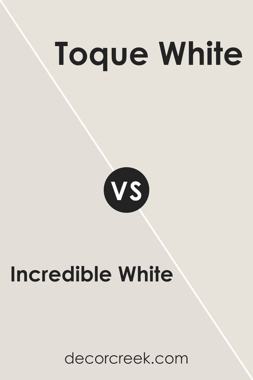
Incredible White SW 7028 by Sherwin Williams vs Toque White SW 7003 by Sherwin Williams
Incredible White and Toque White from Sherwin Williams are two popular paint colors often chosen for their subtle and soft appearance. Both share similarities in being light and almost neutral, but they have distinct differences that set them apart.
Incredible White leans towards a warmer tone, adding a cozy and welcoming feel to spaces. It’s a bit like a soft blanket in color form, providing a gentle hint of warmth without overpowering a room. On the other hand, Toque White has a cooler undertone. Think of it as the light, refreshing shade of a cloud. It’s excellent for those looking to achieve a crisp, clean look in their space.
Choosing between the two depends on the atmosphere you want to create. If you’re going for a snug, inviting vibe, Incredible White is a fantastic pick. If you prefer a more minimalist, airy feel, Toque White could be the way to go. Both colors offer a beautiful, understated backdrop for various decor styles, making them versatile choices for any home.
You can see recommended paint color below:
- SW 7003 Toque White
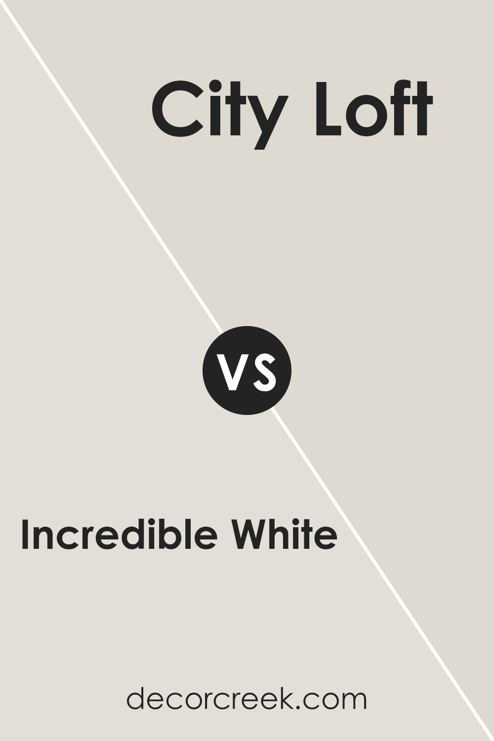
Incredible White SW 7028 by Sherwin Williams vs City Loft SW 7631 by Sherwin Williams
Incredible White and City Loft, both by Sherwin Williams, offer subtle yet distinct vibes for any space. Incredible White is a soft, warm white with a hint of a creamy undertone. It’s the kind of color that lights up a room in a gentle, soothing way, making spaces feel welcoming and airy.
On the other hand, City Loft sports a light greige – a mix of gray and beige – that presents a bit more body and depth compared to Incredible White.
This color is incredibly versatile, fitting in perfectly with modern to traditional decor, adding a touch of sophistication without overwhelming the space. While both colors can brighten a room, Incredible White leans towards a purer white experience, and City Loft offers a slightly more complex, neutral backdrop.
Choosing between them depends on the desired mood and aesthetic; Incredible White for a crisp, clean look, and City Loft for a nuanced, cozy feel.
You can see recommended paint color below:
- SW 7631 City Loft
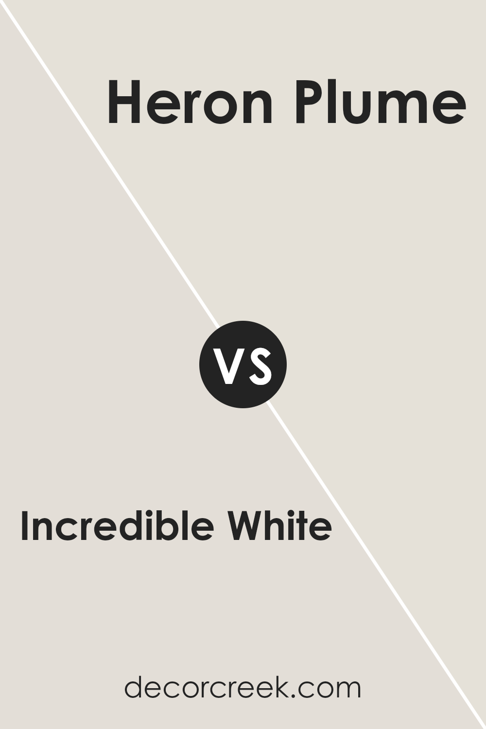
Incredible White SW 7028 by Sherwin Williams vs Heron Plume SW 6070 by Sherwin Williams
Incredible White and Heron Plume are both popular colors by Sherwin Williams, but they bring their unique feel to a space. Incredible White is known for its soft, warm tone that isn’t too stark, making it a great choice for creating a cozy and welcoming atmosphere. It’s the kind of white that can blend seamlessly into almost any decor, providing a gentle backdrop that allows other elements in the room to shine.
On the other hand, Heron Plume has a slightly cooler vibe, with a hint of gray. This color is perfect for those looking for a neutral with a bit more depth. It stands out a little more than Incredible White, offering a sophisticated and modern look to spaces.
While Herrey Plume can still be paired easily with other colors, it adds a touch of personality without overwhelming the room.
Choosing between them depends on what you’re looking for: Incredible White for a warm, inviting feel or Heron Plume for a chic, contemporary touch. Both colors are versatile and can work well in various settings, from living rooms to bedrooms.
You can see recommended paint color below:
- SW 6070 Heron Plume
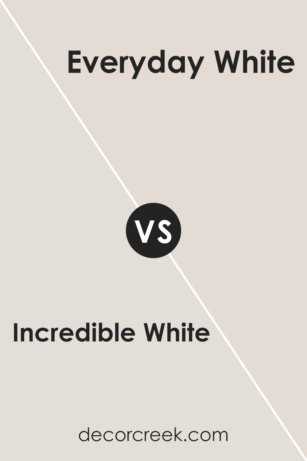
Incredible White SW 7028 by Sherwin Williams vs Everyday White SW 6077 by Sherwin Williams
Incredible White (SW 7028) and Everyday White (SW 6077) by Sherwin Williams are both popular choices for those looking to add a sense of brightness and openness to their spaces.
Incredible White is a soft, warm white with a subtle hint of gray. This makes it a versatile choice that brings a cozy feel to rooms without making them feel too stark or cold. On the other hand, Everyday White leans toward a slightly warmer tone, offering a classic and inviting atmosphere.
It’s a bit richer compared to Incredible White, creating a welcoming vibe that’s perfect for those who prefer their whites with a touch more warmth.
While both colors are great for creating light and airy spaces, your choice between them might come down to the light in your room and whether you prefer a hint of gray or a touch of warmth in your white. Either way, both options are fantastic for giving your space a fresh and clean look.
You can see recommended paint color below:
- SW 6077 Everyday White
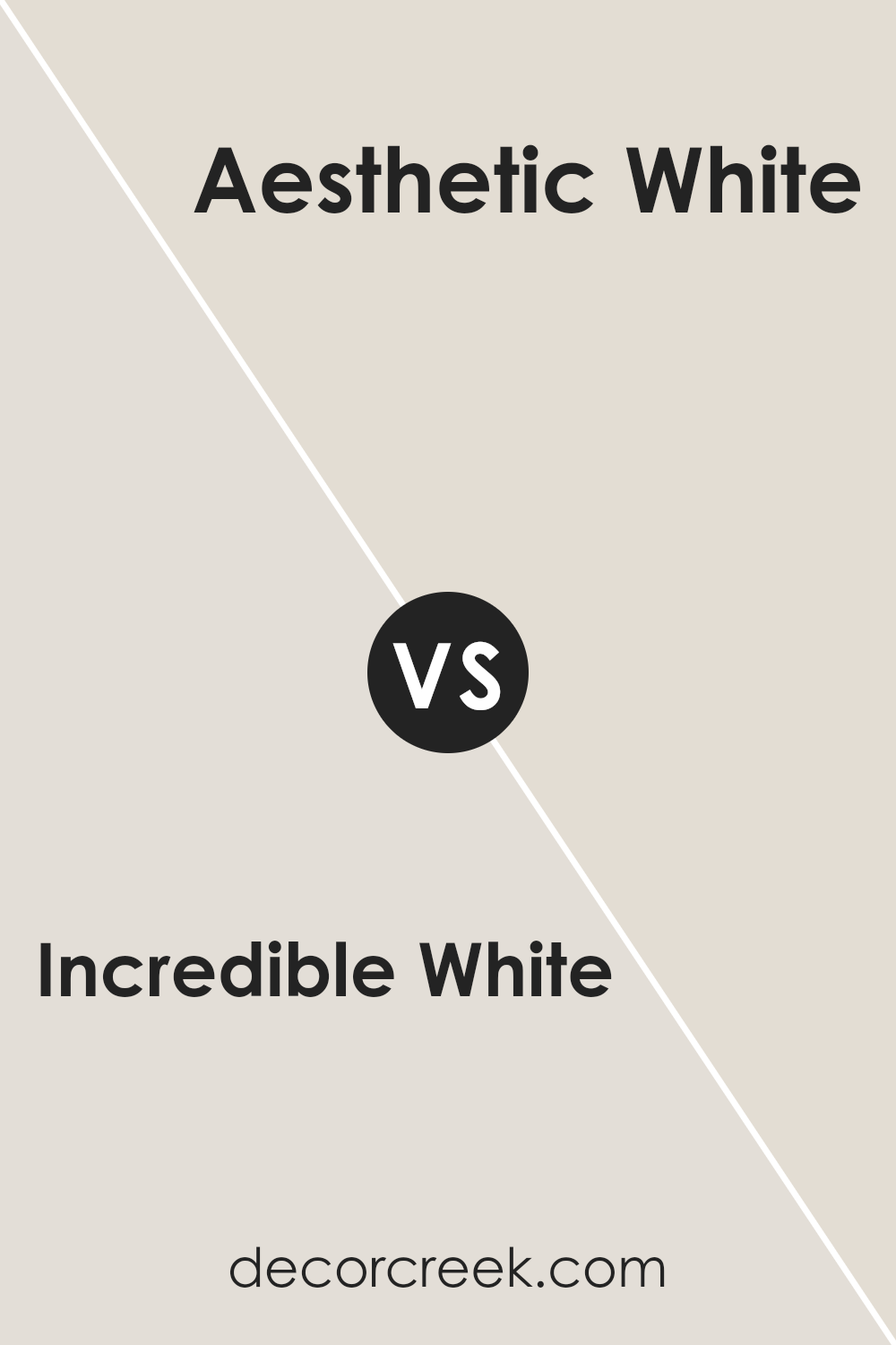
Incredible White SW 7028 by Sherwin Williams vs Aesthetic White SW 7035 by Sherwin Williams
Incredible White and Aesthetic White are two popular shades from Sherwin Williams. Both colors are subtle and sophisticated, but they bring their unique vibes to a space. Incredible White is a soft, warm white with a hint of beige. This color is great for creating a cozy and inviting look in any room. It’s particularly good in spaces where you want a warm, welcoming atmosphere without going too dark or too bold.
On the other hand, Aesthetic White is a bit different. It leans more towards a light, gentle gray with a warm undertone. This color is perfect for those looking for a neutral that’s not too stark or cold.
Aesthetic White works well in a variety of settings, offering a bit more depth than Incredible White while still maintaining a clean and airy feel.
In summary, if you’re aiming for a warmer, beige-like white, Incredible White is your go-to. For a lighter touch with a hint of gray, Aesthetic White is the better choice. Both colors are versatile, but your final pick would depend on the specific ambiance you’re aiming to create in your space.
You can see recommended paint color below:
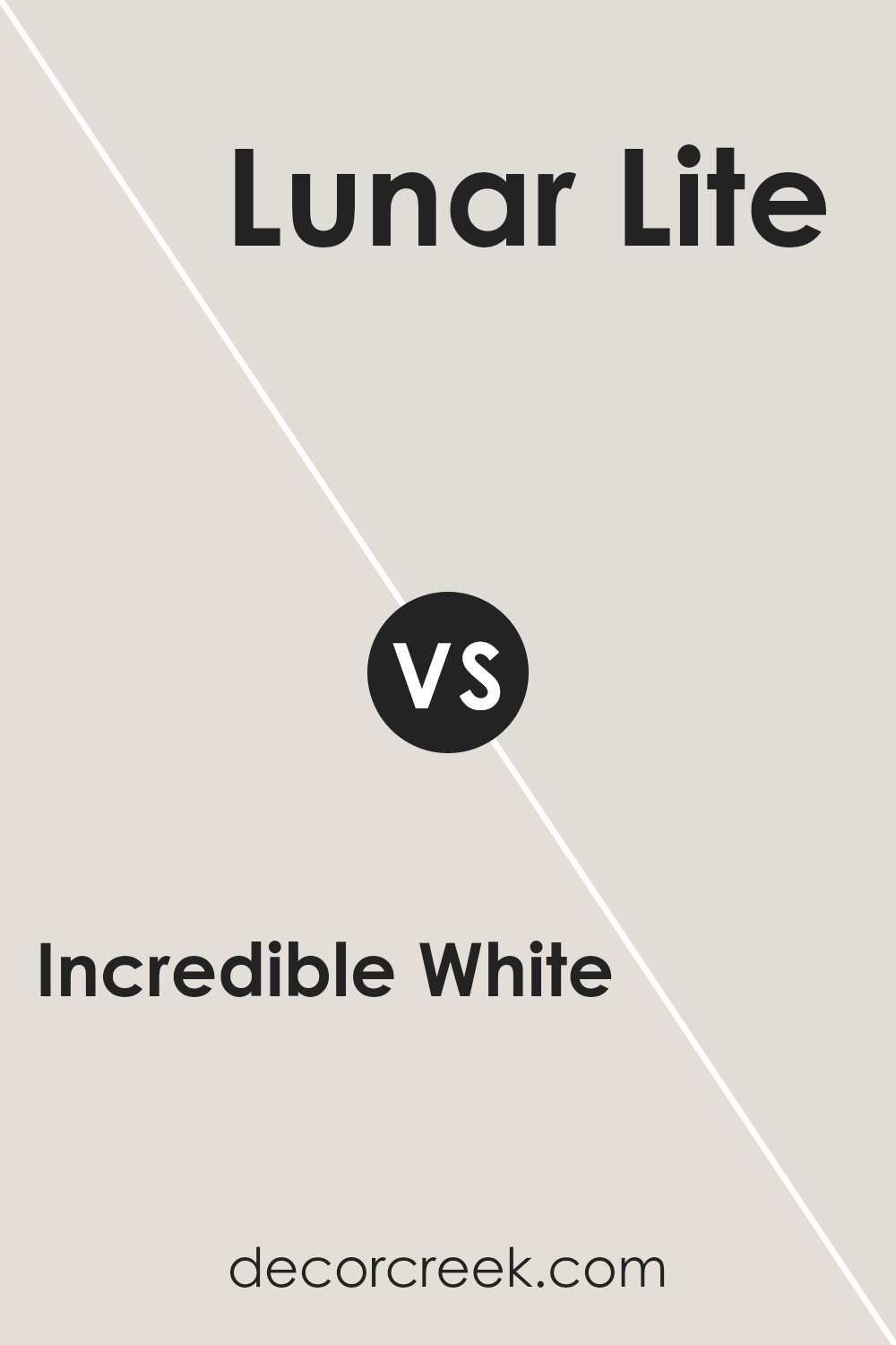
Incredible White SW 7028 by Sherwin Williams vs Lunar Lite SW 9546 by Sherwin Williams
Incredible White and Lunar Lite are both colors that come to us from Sherwin Williams. When you look at Incredible White, you get a sense of a soft, warm shade. It’s a kind of white that feels welcoming and cozy, something that can make a room feel both brighter and more inviting at the same time. It’s not just plain white; it has a hint of warmth that stops it from feeling cold or sterile.
On the other side, we have Lunar Lite, which is a lighter and cooler tone. It’s a bit more on the neutral side, giving off a calm and soothing vibe. This color is great for creating a peaceful and serene atmosphere in a space. It’s like looking at a gentle morning sky, offering a fresh and clean backdrop to any room.
In comparing them, the main difference comes down to the warmth in Incredible White versus the cooler, more neutral feeling of Lunar Lite. Incredible aces in making a space feel homely and warm, while Lunar Lite is your go-to for a calm and tranquil setting. Both have their unique charm, depending on what vibe you’re aiming for in your space.
You can see recommended paint color below:
- SW 9546 Lunar Lite
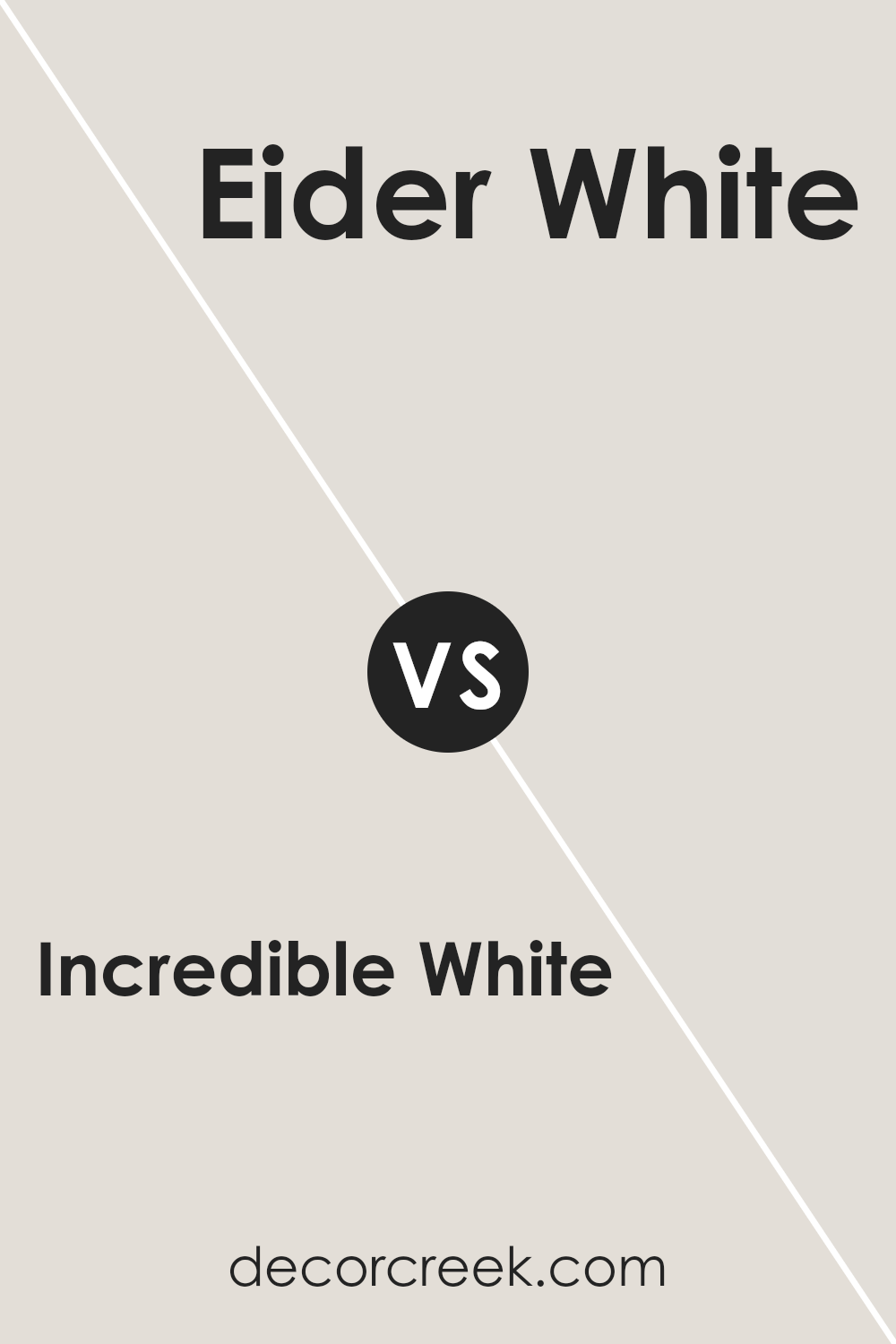
Incredible White SW 7028 by Sherwin Williams vs Eider White SW 7014 by Sherwin Williams
Incredible White and Eider White are both colors by Sherwin Williams, offering subtle yet distinct tones for those looking to add a serene and welcoming vibe to their spaces. Incredible White leans towards a warm, inviting, creamy hue. It has a softness that makes rooms feel cozy while still being bright enough to add a sense of spaciousness.
On the other hand, Eider White greets you with a cooler tone, having a hint of grey that brings a modern and sophisticated edge. This particular shade can add elegance to any room, providing a light, airy feel without the warmth that Incredible White offers. While both colors are versatile and can blend well with various décor styles, your preference might depend on the mood you’re aiming to create.
Incredible White works wonders in spaces where you want a touch of warmth without overpowering, whereas Eider White is perfect when you’re going for a sleek, contemporary look.
You can see recommended paint color below:
Conclusion
The article gives a concise overview of Incredible White SW 7028, a paint color from Sherwin Williams. It highlights the versatility and understated elegance of this shade, making it clear why it’s a popular choice for homeowners.
Its ability to seamlessly blend with various decor styles and settings, from modern minimalist to rustic charm, underscores its appeal. The shade’s soft, warm undertones provide a cozy, inviting ambiance to any room, making spaces feel more open and airy.
Furthermore, the piece outlines practical considerations for using Incredible White, such as its compatibility with natural light and its impact on room dimensions. It suggests that this color can make smaller spaces appear larger and brighter, a valuable tip for anyone looking to enhance their living environment.
The article effectively communicates the benefits of choosing Incredible White for both aesthetic and functional purposes, offering a clear, straightforward guide to anyone considering a fresh paint project.

Ever wished paint sampling was as easy as sticking a sticker? Guess what? Now it is! Discover Samplize's unique Peel & Stick samples.
Get paint samples
