If you’re considering a fresh paint color for your space, you might want to check out SW 6772 Cay by Sherwin Williams. This vibrant teal has a cheerful intensity that can brighten up any room.
Its unique blend of blue and green brings a lively splash of color, yet it’s balanced enough to not overwhelm your decor. Whether you’re aiming to revitalize your bathroom, kitchen, or maybe a cozy corner of your living room, this shade offers a playful yet sophisticated vibe.
Teal can be tricky to perfect, but SW 6772 Cay hits the mark, providing a versatile backdrop that pairs well with a variety of palettes and textures.
Try it in spaces where you and your guests spend a lot of time; it’s sure to lift everyone’s spirits and add a touch of whimsy to your everyday surroundings.

What Color Is Cay SW 6772 by Sherwin Williams?
The color CaySW 6772 by Sherwin Williams is a vibrant and refreshing shade that leans heavily on the green spectrum with a hint of blue undertones, giving it a lively and cheerful presence. This hue brings vibrancy to any space, making rooms feel more alive and inviting. It complements well with natural light, which enhances its brightness and gives it a crisp appearance.
This hue works exceptionally well in interior styles that emphasize freshness and vitality, such as coastal, modern, and contemporary designs. The lively character of this color makes it an excellent choice for kitchens, bathrooms, or any space that could benefit from a boost of energy and cheer. It pairs beautifully with materials such as light woods, which help to maintain the airy feel, and with white trim or fixtures that add a sharp, clean contrast.
To further enhance the ambiance created by this color, incorporating textures like linen or cotton in furnishings can soften the space, while glass or metallic finishes can introduce a subtle gleam that complements the color’s inherent brightness. Using this shade in home decor offers a fresh take on interior spaces and creates a welcoming environment.
Is Cay SW 6772 by Sherwin Williams Warm or Cool color?
CaySW 6772 by Sherwin Williams is a vibrant shade that brings a pop of energy into any room. This color is a type of teal that appears bright and bold, making it an ideal choice for adding some cheerfulness to a space. When used in homes, it works well when you want to make a statement, such as on an accent wall or in a bathroom where you might want the room to feel fresh and lively.
Because it’s quite a strong color, pairing it with more neutral tones like gray, white, or beige can help balance it out, ensuring the room doesn’t feel overwhelming. It’s also effective in bringing some color to more minimalistic or modern decor schemes where clean lines and simple colors dominate.
Furniture and accessories in natural wood tones or metallic finishes look particularly nice against this shade, helping to ground its brightness and add a touch of warmth to the space. Using CaySW 6772 can instantly make a room feel more inviting and full of life.
Undertones of Cay SW 6772 by Sherwin Williams
CaySW 6772 by Sherwin Williams is a dynamic color with a complex mix of undertones that can greatly influence its appearance on interior walls. The range of undertones includes shades like light gray, lilac, light purple, mint, pale yellow, turquoise, grey, pale pink, blue, light turquoise, and dark turquoise. Each undertone plays a role in how the color is perceived in different lighting and against different furnishings.
Undertones affect the way we see colors because they can subtly shift a color’s appearance under various lighting conditions. For instance, light gray and lilac undertones can make CaySW 6772 appear softer and more muted in bright daylight, while the turquoise and blue undertones might become more pronounced in artificial lighting, giving the wall a cooler feel.
When used on interior walls, these undertones can create a unique ambiance. The combination of light purple, pale pink, and mint could provide a soothing backdrop, ideal for bedrooms or relaxing spaces. Conversely, the energetic hints of blue and turquoise might invigorate a space like a bathroom or study. The light gray and grey undertones keep the color grounded, ensuring it doesn’t overwhelm the space, which makes it versatile for various rooms and decor styles.
Overall, the undertones in CaySW 6772 ensure the color maintains interest and adaptability, making it a suitable choice for many interiors.
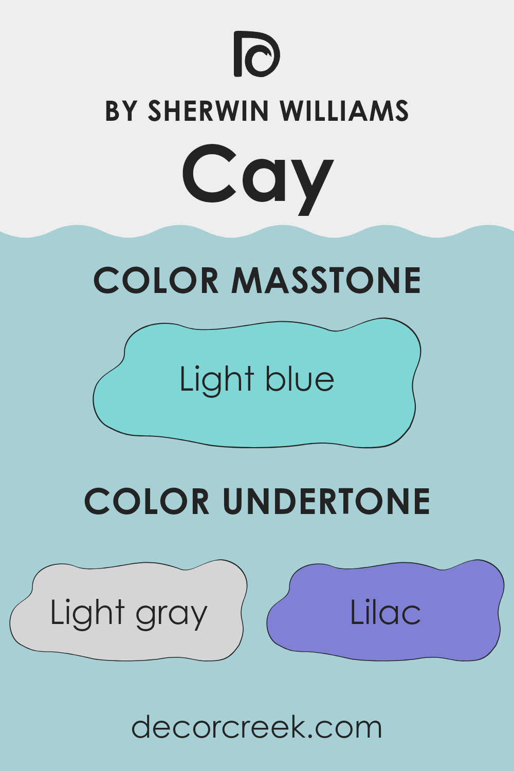
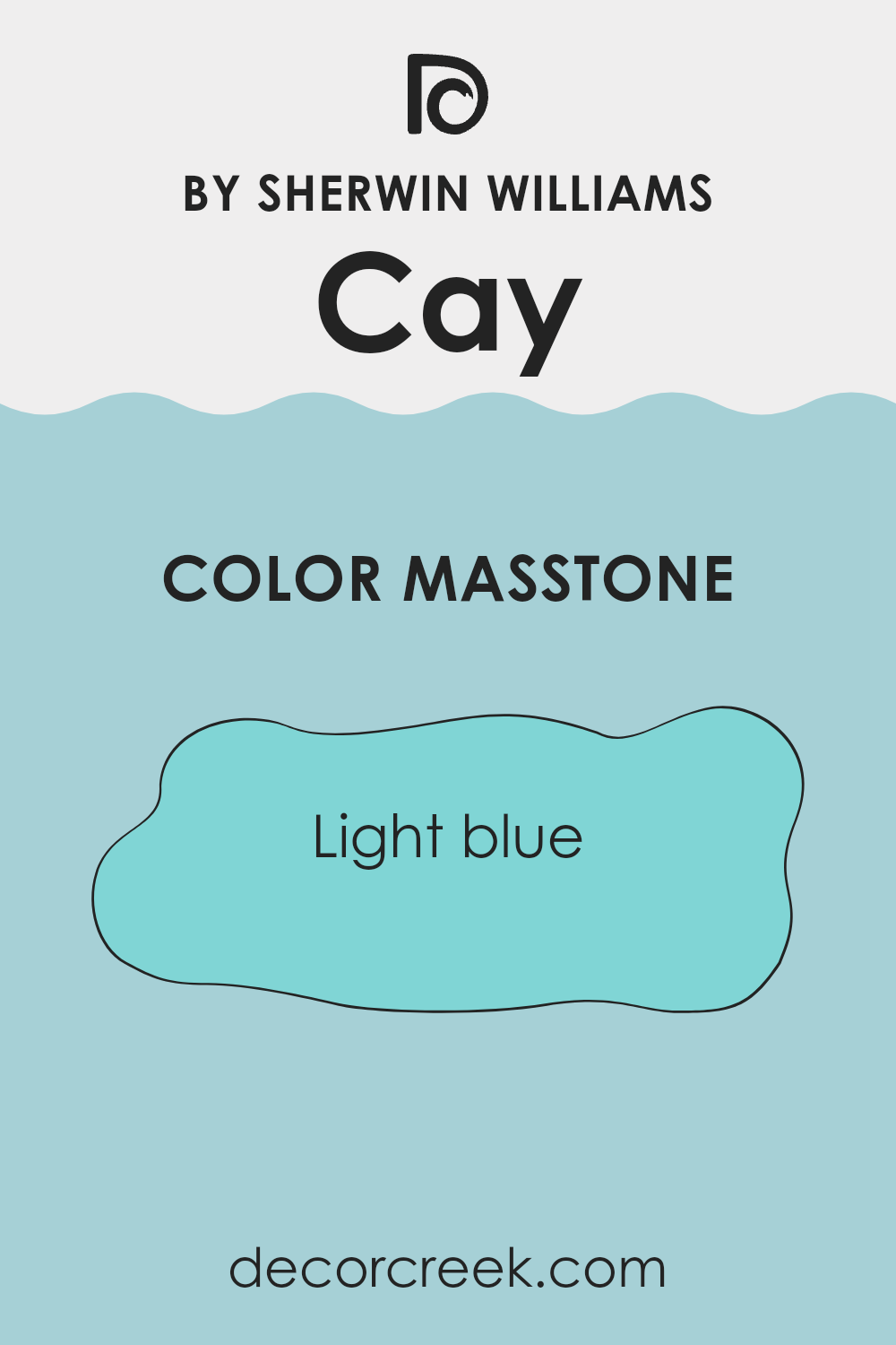
What is the Masstone of the Cay SW 6772 by Sherwin Williams?
Sherwin Williams’ Cay SW 6772 has a masstone of Light Blue (#80D5D5), a crisp and fresh hue that brightens up any space. This particular shade can make rooms appear larger and airier, creating an open feel.
It works exceptionally well in bathrooms and kitchens where you often want a clean and refreshing atmosphere. In bedrooms, the light blue masstone can add a gentle, soothing touch that helps in creating a relaxing environment, ideal for unwinding after a busy day.
This color also pairs beautifully with whites and grays, allowing for a versatile palette that can adapt to various decor styles, from modern to coastal. Using Cay SW 6772 on accent walls or for entire rooms can influence the lighting effect, reflecting more natural light and giving the room a more vibrant feel. It’s perfect for anyone looking to brighten their home with a subtle touch of color.
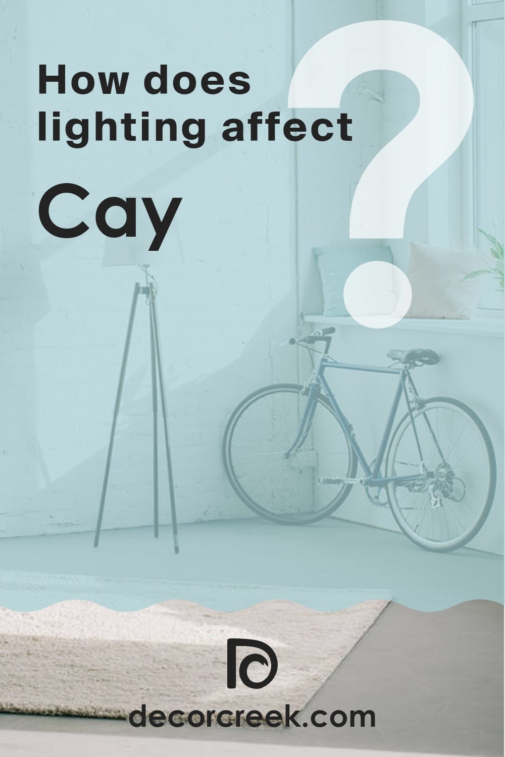
How Does Lighting Affect Cay SW 6772 by Sherwin Williams?
Lighting significantly influences how we perceive colors. Daylight and artificial light have different properties that can change how a color looks in a room. The color in question from Sherwin Williams is a good example to discuss, as its perception can shift based on the lighting environment.
In natural light, colors can appear brighter and more vivid. For this specific Sherwin Williams color, which is a soft and muted hue, natural sunlight can enhance its warm undertones, making the space feel cozy and welcoming.
In artificial light, such as from LED or fluorescent bulbs, the same color might look slightly different. Artificial lighting tends to have a narrower spectrum, so the color might appear a bit more flattened or muted, lacking the subtle depths seen in natural daylight.
Room orientation also plays a crucial role in how this color is perceived:
- North-Faced Rooms: These rooms get less direct sunlight, which can make colors appear cooler and slightly darker. The color in north-facing rooms might look more subdued and less warm, highlighting its cooler undertones.
- South-Faced Rooms: These rooms receive ample sunlight throughout the day, making colors look brighter and more vivid. Here, the color will show its warm, inviting quality, making the room feel airy and bright.
- East-Faced Rooms: Morning light is warm and yellow, making colors look soft and warm in the morning. As the day progresses, the intensity of the light decreases, and the color may lose some of its vibrancy, becoming more neutral and subdued by the evening.
- West-Faced Rooms: Evening light in these rooms can make colors look very warm and rich. During sunset, when the light is red and golden, the color will appear at its warmest, creating a cozy ambiance perfect for relaxation in the evenings.
Overall, the way this color from Sherwin Williams behaves in different lightings and room orientations shows the dynamic nature of how we perceive color in interior spaces. Choosing the right color based on the room’s orientation and the type of artificial light used can greatly affect the mood and aesthetic of a space.
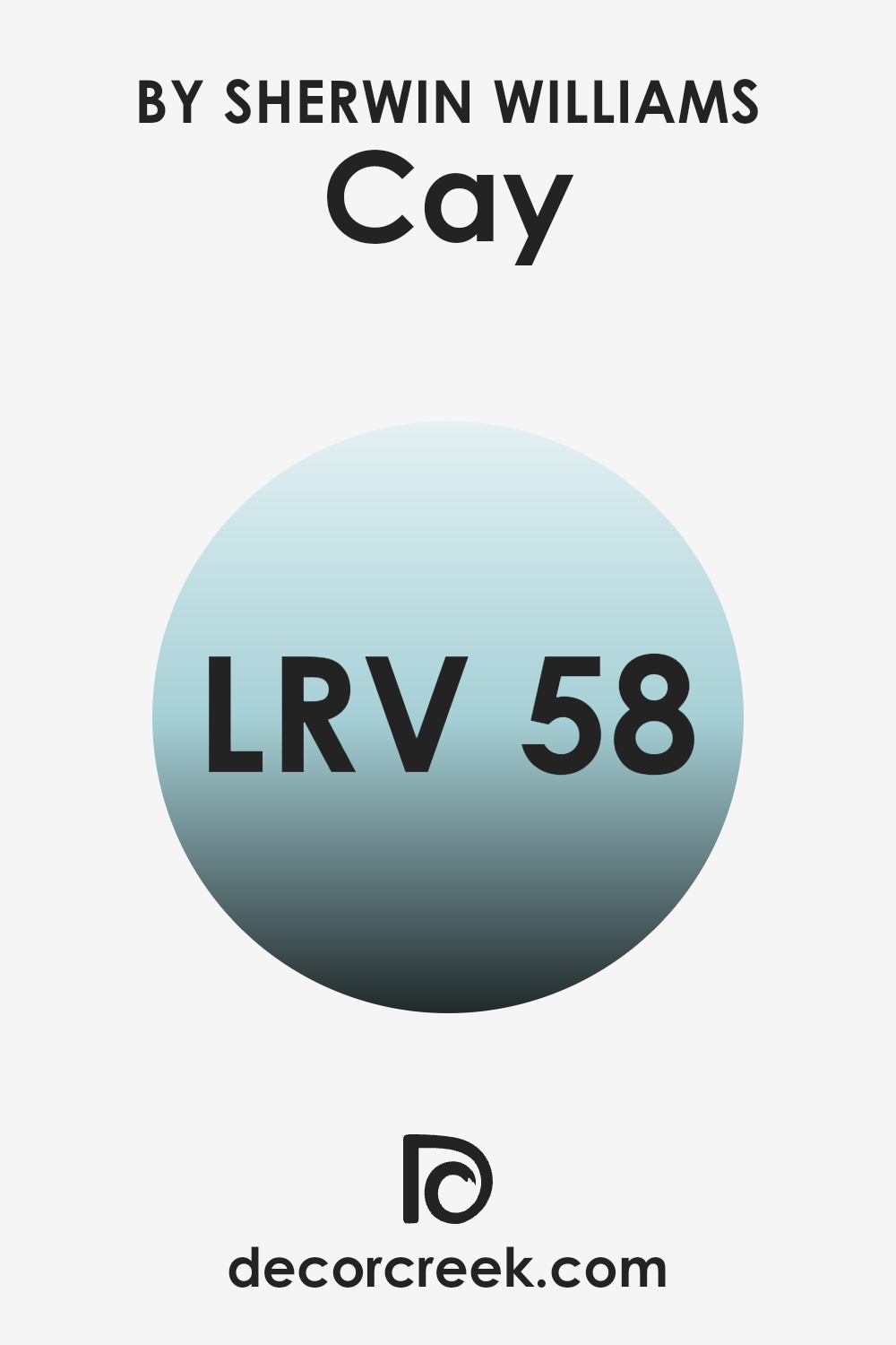
What is the LRV of Cay SW 6772 by Sherwin Williams?
LRV stands for Light Reflectance Value, which measures the percentage of light a paint color reflects back into the room compared to how much it absorbs. Essentially, it is a scale used to determine how light or dark a color will appear once it’s on your walls.
Higher LRV values indicate that the paint color reflects more light, making spaces appear brighter and larger. On the other hand, colors with lower LRV values tend to absorb more light, which can make a room feel cozier but smaller and darker.
With an LRV of 58.24, the color in question is moderately light-reflective. This means it won’t lighten a room as much as colors with higher LRVs, nor will it darken a space like hues on the lower end of the scale. In practical terms, it’s a versatile middle ground that provides some brightness without being overwhelming.
This makes it a good choice for areas where you want a balanced atmosphere that feels neither too bright during the day nor too dim in the evening. Additionally, such a mid-range LRV can help maintain the color’s true hue under various lighting conditions, making it quite reliable in appearance throughout the day.
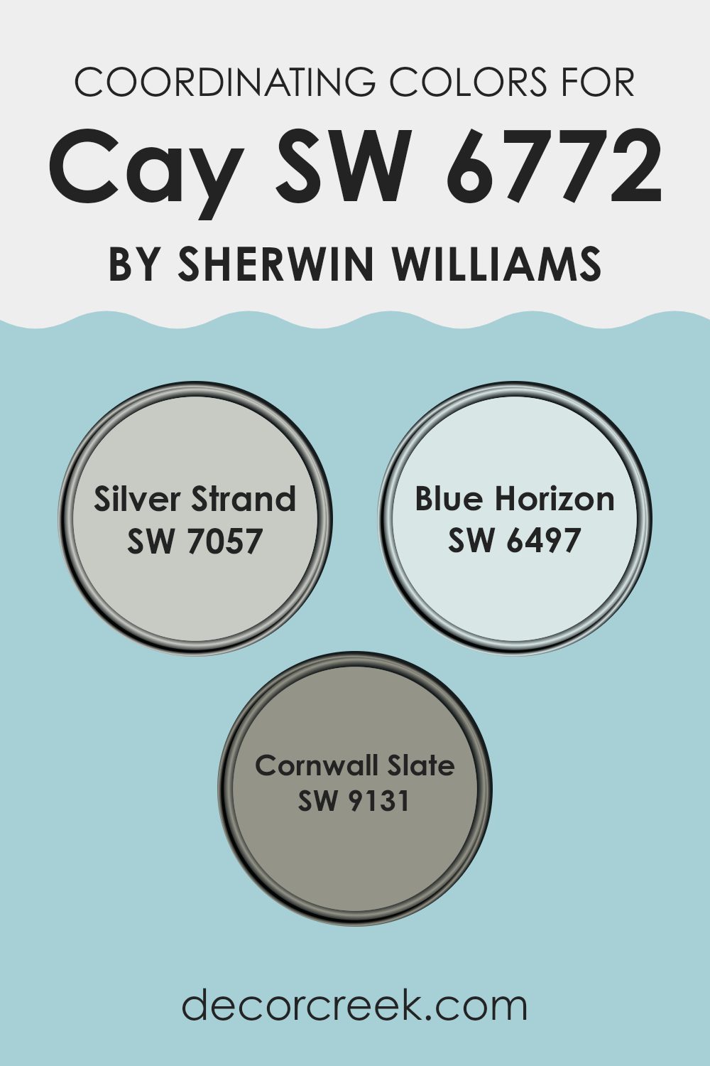
Coordinating Colors of Cay SW 6772 by Sherwin Williams
Coordinating colors are those that harmoniously blend together to enhance the overall appearance of a space. When you choose colors that coordinate well, like those that complement CaySW 6772 by Sherwin Williams, you create a visually appealing and balanced look. Coordinating colors can either be similar to the main color to provide a subtle and harmonious feel or can contrast with it to add a dynamic and interesting appeal.
For instance, using colors like SW 7057 – Silver Strand, SW 6497 – Blue Horizon, and SW 9131 – Cornwall Slate alongside CaySW 6772 allows for a mix of harmony and contrast in your color scheme.
SW 7057 – Silver Strand is a gentle gray with hints of green, offering a soft backdrop that’s easy on the eyes, making it a perfect complement to more vibrant hues. SW 6497 – Blue Horizon is a bright and cheerful blue that can add a lively pop of color to a room without overwhelming it.
On a darker note, SW 9131 – Cornwall Slate is a deep, robust gray with blue undertones, providing a strong and grounding contrast to lighter, softer colors, balancing out the overall feel of the decor. Each of these colors works together to create a cohesive look that enhances the beauty of the primary color.
You can see recommended paint colors below:
- SW 7057 Silver Strand
- SW 6497 Blue Horizon
- SW 9131 Cornwall Slate
What are the Trim colors of Cay SW 6772 by Sherwin Williams?
Trim colors are essential in painting and decorating because they help define and highlight the architectural features of a room or building. By using contrasting or complementary shades for details like door frames, window casings, and skirting boards, trim colors can enhance the overall aesthetic of a space and create a finished look. For example, pairing a unique hue like SW 6772 with suitable trim colors can significantly impact the design by providing a clean and polished appearance.
White Snow (SW 9541) is a bright white color that offers a fresh and crisp look, perfect for making other colors stand out more vividly. It’s an excellent choice for trim as it provides a stark contrast that can make wall colors pop and give spaces a clear, defined appearance.
Canvas Tan (SW 7531), on the other hand, is a soft, neutral beige that brings a warm and inviting feel to any room. Using it as a trim color adds a subtle contrast with a cozy appeal, particularly effective in spaces where a softer and more cohesive look is desired.
You can see recommended paint colors below:

Colors Similar to Cay SW 6772 by Sherwin Williams
Similar colors play a crucial role in designing and decorating because they create a sense of harmony and flow in a space. When colors like Agua Fria, Jetstream, Raindrop, Blue Click, Liquid Blue, Minor Blue, Quench Blue, Gentle Aquamarine, Stream, and Blue Bauble are used together, they can produce a cohesive look that feels intentional and soothing.
These similar hues, all varying shades of blue and aquamarine, help connect different elements of a room seamlessly, making the space feel unified. Choosing hues that complement each other makes it easier to create a visually appealing environment without the risk of color clashes, which can be jarring and disruptive.
For instance, Agua Fria is a muted aquamarine that gives the soft touch of the ocean, perfect for a calm backdrop. Jetstream offers a gentle sky blue that feels airy and light, ideal for invoking a fresh sensation. Raindrop simulates the refreshing feeling of a light rain under a clear sky, while Blue Click adds a touch of brighter, punchy blue to energize a room. Liquid Blue and Minor Blue are deeper, adding a hint of depth and focus. Quench Blue has an invigorating quality that can perk up a space, and Gentle Aquamarine offers a subtle greenish tint to the aqua blue, great for softening a room’s ambiance.
Meanwhile, Stream mirrors the clear waters of a serene brook, and Blue Bauble brings a playful note with its vibrant, deeper blue tone. Using these shades together ensures a balanced palette that can work beautifully in achieving a harmonious design scheme.
You can see recommended paint colors below:
- SW 9053 Agua Fria
- SW 6492 Jetstream
- SW 6485 Raindrop
- SW 6952 Blue Click
- SW 6779 Liquid Blue
- SW 6792 Minor Blue
- SW 6785 Quench Blue
- SW 9046 Gentle Aquamarine
- SW 6499 Stream
- SW 6948 Blue Bauble

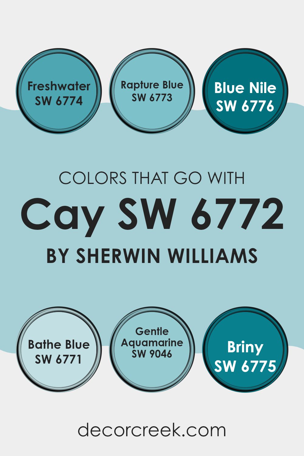
Colors that Go With Cay SW 6772 by Sherwin Williams
Choosing the right colors that match well with CaySW 6772 by Sherwin Williams can significantly impact the overall aesthetics of your space. For example, when paired with colors like SW 6774 – Freshwater or SW 6773 – Rapture Blue, CaySW 6772 can create a vibrant and lively atmosphere. Freshwater is a light and refreshing shade of blue that resembles the clear skies of a sunny day, making any room feel airy and bright. On the other hand, Rapture Blue is a deeper, more intense blue that brings a bold and energetic vibe to spaces, perfect for accent walls or furniture pieces.
Moreover, colors such as SW 6776 – Blue Nile and SW 6771 – Bathe Blue offer a dynamic range in terms of mood and tone when combined with CaySW 6772. Blue Nile has a regal and powerful blue tone that adds depth and richness, ideal for creating a focal point in a room.
Bathe Blue offers a softer approach with its calm and gentle hue, providing a soothing backdrop for relaxation areas like bedrooms or bathrooms. Additionally, SW 9046 – Gentle Aquamarine and SW 6775 – Briny extend this palette by introducing variations of aqua. Gentle Aquamarine is a subtle, muted aqua that works beautifully to create a soft and welcoming environment.
Briny, slightly more robust, infuses a splash of ocean-inspired freshness into the space, making it perfect for bathrooms or coastal-themed décor. Each of these colors complements CaySW 6772 in a way that allows for personalization while maintaining a harmonious look.
You can see recommended paint colors below:
- SW 6774 Freshwater
- SW 6773 Rapture Blue
- SW 6776 Blue Nile
- SW 6771 Bathe Blue
- SW 9046 Gentle Aquamarine
- SW 6775 Briny
How to Use Cay SW 6772 by Sherwin Williams In Your Home?
Cay SW 6772 by Sherwin Williams is a cheerful and energetic blue-green paint color. It can brighten up any room in your home. This shade is perfect for creating a fun and inviting atmosphere, ideal for rooms where you want to lift your mood or add a pop of color.
If you’re considering using Cay in your home, it works wonderfully in a variety of spaces. For example, it’s a great choice for bathrooms or kitchens, where it can bring a fresh and clean feeling. It’s also an excellent pick for a children’s playroom or bedroom, adding a playful vibe to the space.
Cay can also liven up living areas or dining rooms when used as an accent wall. Pairing it with neutral furniture and decor items can help balance its brightness. If you’re not ready to commit to painting a whole wall, consider using it for smaller projects like painting a piece of furniture or a few shelves. This can still add a lively touch to your space without overpowering it.
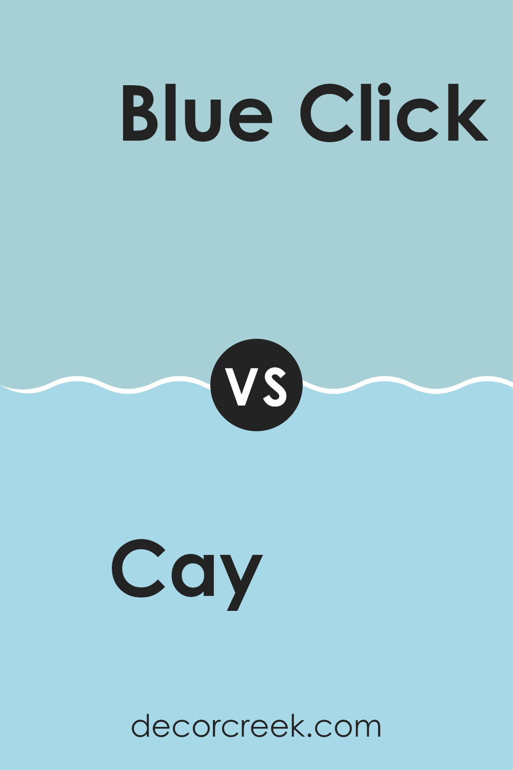
Cay SW 6772 by Sherwin Williams vs Blue Click SW 6952 by Sherwin Williams
Cay SW 6772 and Blue Click SW 6952, both by Sherwin Williams, are vibrant, eye-catching shades but they have distinct differences. Cay is a bright teal, combining the calming properties of blue with the refreshing quality of green. This color is perfect for creating a cheerful and invigorating space, making it great for lively areas like kitchens or playrooms.
On the other hand, Blue Click stands out as a bold, pure blue. It has a strong, playful vibe that can energize a room. Due to its intensity, it works well in spaces where you want to make a strong visual impact, like an accent wall in a living room or a bathroom.
Both colors are lively and can make spaces more exciting, but their different tones can set a distinct mood based on whether you prefer the green-enhanced freshness of Cay or the deep vibrancy of Blue Click.
You can see recommended paint color below:
- SW 6952 Blue Click
Cay SW 6772 by Sherwin Williams vs Agua Fria SW 9053 by Sherwin Williams
Cay SW 6772 and Agua Fria SW 9053 are both unique colors from Sherwin Williams, each with its own distinct vibe. Cay is a bright and cheerful turquoise that really pops. It’s vibrant and has a playful quality to it, which can liven up any space, giving it a fun and energetic feel. This color would be great in a kid’s room or any area meant for lively gatherings.
On the other hand, Agua Fria is a cooler, more subdued teal. It’s less intense than Cay and carries a more mature and calm appearance. This color works well in spaces where you want a more relaxed, yet still colorful atmosphere. It’s ideal for spaces like living rooms or bedrooms where you might want a touch of color without overwhelming the senses.
Together, these colors offer a nice contrast – Cay provides energy while Agua Fria offers a cooling retreat, making them great for different moods and settings.
You can see recommended paint color below:
- SW 9053 Agua Fria
Cay SW 6772 by Sherwin Williams vs Jetstream SW 6492 by Sherwin Williams
The Cay is a vibrant shade of teal from Sherwin Williams. It’s bright and lively, making it a great choice if you want a space to feel cheerful and energetic. Its vivid tone can be quite striking in a room, making it a focal point, especially when used on walls or large furniture pieces.
On the other hand, Jetstream is a much softer color, resembling a light blue with slight green undertones. This color is subtle and gently calming, ideal for creating a relaxed atmosphere in spaces like bedrooms or bathrooms. It’s less bold than Cay, offering a more understated look that easily blends with different decor styles and colors.
Comparing the two, Cay brings more drama and excitement with its deeper and richer hue, while Jetstream offers a quiet and soothing effect. Your choice between them would depend on the mood you’re looking to create in your space.
You can see recommended paint color below:
- SW 6492 Jetstream
Cay SW 6772 by Sherwin Williams vs Gentle Aquamarine SW 9046 by Sherwin Williams
Cay by Sherwin Williams and Gentle Aquamarine by Sherwin Williams are both beautiful colors, though they offer distinct vibes for decorating a space. Cay is a vibrant teal with a lively and energetic feel. It stands out in a room and can make a bold statement, perfect for an accent wall or a space where you want to add a splash of dynamic color.
On the other hand, Gentle Aquamarine is much softer and more understated. This color is a light aqua that feels fresh and calming, ideal for creating a relaxed atmosphere in places like bedrooms or bathrooms. It works well when you want a space to have a light, airy feel without overwhelming with color.
While both shades share a blue-green base, Cay is deeper and more intense, whereas Gentle Aquamarine leans towards a gentle, soothing tone. Choosing between them depends on the mood you’re looking to create in your space.
You can see recommended paint color below:
- SW 9046 Gentle Aquamarine
Cay SW 6772 by Sherwin Williams vs Liquid Blue SW 6779 by Sherwin Williams
The main color, Cay, and the second color, Liquid Blue, both from Sherwin Williams, offer unique shades that can influence the feel of a room differently. Cay is a vibrant turquoise that brings a lively and energetic feel to spaces. It’s bright enough to add a splash of cheerfulness, yet it still maintains a calming presence that isn’t overwhelming. This makes Cay ideal for areas where you want a balance of energy and restfulness, like living rooms or kitchens.
On the other hand, Liquid Blue is a softer, more subdued hue compared to Cay. It has a gentle touch that leans towards a dreamy sky blue. This color is perfect for creating a relaxed atmosphere, making it a great choice for bedrooms or bathrooms where you want to promote a sense of calm and relaxation.
In summary, while both colors share a blue foundation, Cay’s punchy turquoise offers a more energetic vibe, whereas Liquid Blue provides a quieter, more gentle ambiance.
You can see recommended paint color below:
- SW 6779 Liquid Blue
Cay SW 6772 by Sherwin Williams vs Minor Blue SW 6792 by Sherwin Williams
Cay SW 6772 by Sherwin Williams is a vibrant and cheerful teal shade with a strong presence of green. It has an energetic feel, making it perfect for spaces where you want to add a lively and fun atmosphere.
On the other hand, Minor Blue SW 6792 is a much softer color, leaning towards a light, airy blue with a calming effect. This shade is quieter and more understated compared to Cay, making it a great choice for more relaxed settings or areas where you want a gentle touch of color.
While Cay might be excellent for a playroom or creative space, Minor Blue would be suitable for a bedroom or bathroom where a more peaceful environment is desired. Minor Blue could also help in smaller spaces, making them seem bigger due to its light tone.
You can see recommended paint color below:
Cay SW 6772 by Sherwin Williams vs Raindrop SW 6485 by Sherwin Williams
The main color, Cay, is a vibrant shade of teal that brings a bright and cheerful energy to any space it adorns. It’s a lively color that stands out, making it a great choice for accent walls or areas where you want to add a punch of personality.
On the other hand, Raindrop is a softer blue with a hint of green. It’s much more subdued compared to Cay but still offers a fresh and clean look. This color works well in spaces where you want to promote a calm and relaxed atmosphere.
When comparing Cay and Raindrop, it’s clear that they serve different purposes in home décor. Cay, being bolder and more dynamic, acts as an eye-catcher. Raindrop, being gentler, is better suited for creating a soothing backdrop. Both colors can beautifully complement each other, especially in a coastal-themed palette or a space where balance between vibrancy and calm is desired.
You can see recommended paint color below:
Cay SW 6772 by Sherwin Williams vs Quench Blue SW 6785 by Sherwin Williams
Cay and Quench Blue, both by Sherwin Williams, are distinct shades of blue. Cay is a vibrant, energetic turquoise that brings a fresh, lively feel to spaces. This color pops and can brighten up a room while keeping a sense of fun.
On the other hand, Quench Blue leans towards a deeper, more saturated side of the blue spectrum. It has a rich, bold quality that makes it ideal for creating a strong presence in a space. While Cay provides a punch of brightness, Quench Blue offers depth and intensity.
Both colors are great choices but serve different moods and settings. Cay can be perfect for playful or casual areas, and Quench Blue better suits formal or focused spaces. Choosing between them depends on the atmosphere you want to achieve.
You can see recommended paint color below:
- SW 6785 Quench Blue
Cay SW 6772 by Sherwin Williams vs Stream SW 6499 by Sherwin Williams
Cay SW 6772 by Sherwin Williams is a vibrant, lively teal shade that adds a punch of bold color to any space. This shade combines the calmness of blue with the refreshing energy of green, creating a dynamic and cheerful atmosphere. It’s particularly well-suited for brightening up living areas or adding a splash of enthusiasm to a creative space.
On the other hand, Stream SW 6499 by Sherwin Williams is a lighter, more subdued blue with subtle green undertones. This color is softer and lends a more relaxed feel to a room. Stream is an excellent choice for spaces where you want to foster a lighter, airy feel, such as bathrooms or small bedrooms.
Both Cay and Stream bring their unique vibes to interiors, with Cay being more bold and vibrant, and Stream offering a gentler and calming tone. Depending on the mood you want to set in your room, you could choose the energetic Cay or the more laid-back Stream.
You can see recommended paint color below:
Cay SW 6772 by Sherwin Williams vs Blue Bauble SW 6948 by Sherwin Williams
Cay SW 6772 from Sherwin-Williams is a vibrant turquoise color that brings a fresh and lively feel to any space. It’s bright enough to add a pop of color, yet it maintains a certain softness that is easy on the eyes, perfect for creating a cheerful and inviting atmosphere.
On the other hand, Blue Bauble SW 6948 is a deeper shade. This color leans more towards a rich teal, which gives a stronger, bolder look. It’s ideal for making a statement in a room, either as an accent wall or within decorative touches.
While both colors share a blue-green palette, Cay SW 6772 is lighter and breezier, great for a more laid-back or informal setting. Blue Bauble SW 6948, being darker and more intense, works well in areas where a touch of drama or depth is desired. Depending on what mood or style you’re aiming for, each color offers its unique charm.
You can see recommended paint color below:
- SW 6948 Blue Bauble
In conclusion, the SW 6772 Cay by Sherwin Williams paint color is really great for anyone looking to make their room bright and fun. It’s a turquoise color that feels both cheerful and cool, kind of like how you feel on a sunny day at the beach. This color would work well whether you’re painting a bedroom, a bathroom, or even a kitchen. It’s vivid enough to make any room feel more lively and enjoyable.
If you’re thinking about changing up your room with a new paint color, SW 6772 Cay could be a perfect choice. It’s not too loud but has just enough pop to really liven up a room.
Plus, it’s like bringing a little piece of the ocean into your home, and who wouldn’t love that?
Remember, if you’re not sure about changing the whole room to this color, you might want to try just painting one wall or a smaller spot to see how it looks.
To sum it up, I think this paint color is really cool and it can help make your room a happier place. It works for all different rooms and can certainly be a fun addition to your home. So, if you or your family are thinking about a fresh, lively color, SW 6772 Cay is definitely worth considering!

Ever wished paint sampling was as easy as sticking a sticker? Guess what? Now it is! Discover Samplize's unique Peel & Stick samples.
Get paint samples

