Color can deeply impact the overall atmosphere and energy of a space. Paint manufacturers like Sherwin Williams offer a vast spectrum of hues, allowing homeowners, designers, and decorators the freedom to create spaces that truly reflect their style and personality.
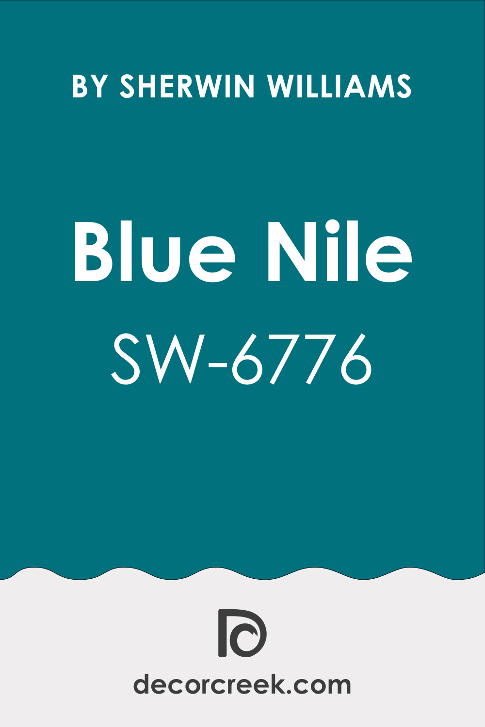
One such color is SW 6776 Blue Nile, a captivating shade that brings energy and tranquility to a space.
This article delves into the essence of this color, exploring its undertones, coordinating colors, and ways it can be incorporated into different spaces within your home.
What Color Is SW 6776 Blue Nile?
SW 6776 Blue Nile is a vivid, rich blue that is reminiscent of the color of a clear, deep river under a bright sky. It carries a certain weight and depth, capturing the awe-inspiring essence of nature’s water bodies. It’s a saturated hue but not overpowering, offering a perfect balance of intensity and subtlety that works harmoniously in various settings.
SW Blue Nile is a dynamic color, full of life and spirit. It has a certain freshness and vibrancy that can invigorate a space while simultaneously offering a soothing and calming effect. It’s a versatile color, one that can transform a room into a serene retreat or a lively gathering spot, depending on how and where it’s used.
Ever wished paint sampling was as easy as sticking a sticker? Guess what? Now it is! Discover Samplize's unique Peel & Stick samples.
Get paint samples

Is It a Warm Or Cool Color?
SW 6776 Blue Nile is a cool color. It belongs to the blue color family, which is generally considered cool on the color spectrum. Cool colors like SW Blue Nile tend to recede visually, making spaces appear larger and more spacious. They also evoke feelings of calm, relaxation, and serenity.
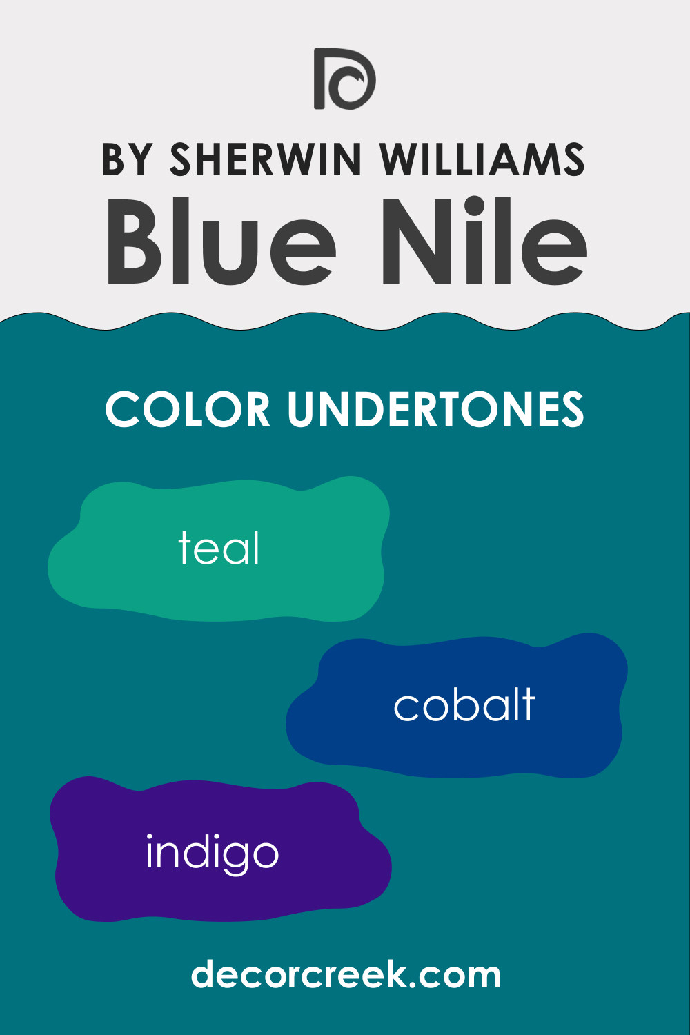
Undertones of SW 6776 Blue Nile Paint Color
The undertones of color are subtle hues that come forward under different lighting conditions or when placed against other colors. For SW 6776 Blue Nile, the undertones are:
- Teal: This undertone surfaces when SW Blue Nile is paired with warmer colors, creating a pleasing contrast.
- Cobalt: This undertone is pronounced when SW Blue Nile is placed against cooler or neutral hues, giving the color a slightly more vibrant appearance.
- Indigo: This undertone can be seen under certain artificial lights, making SW Blue Nile lean towards a richer, deeper hue.
Undertones play a crucial role in how we perceive color. They can shift the mood and aesthetic of color and influence how well it pairs with other colors. It’s important to consider a color’s undertones when planning a color scheme to ensure a harmonious palette.
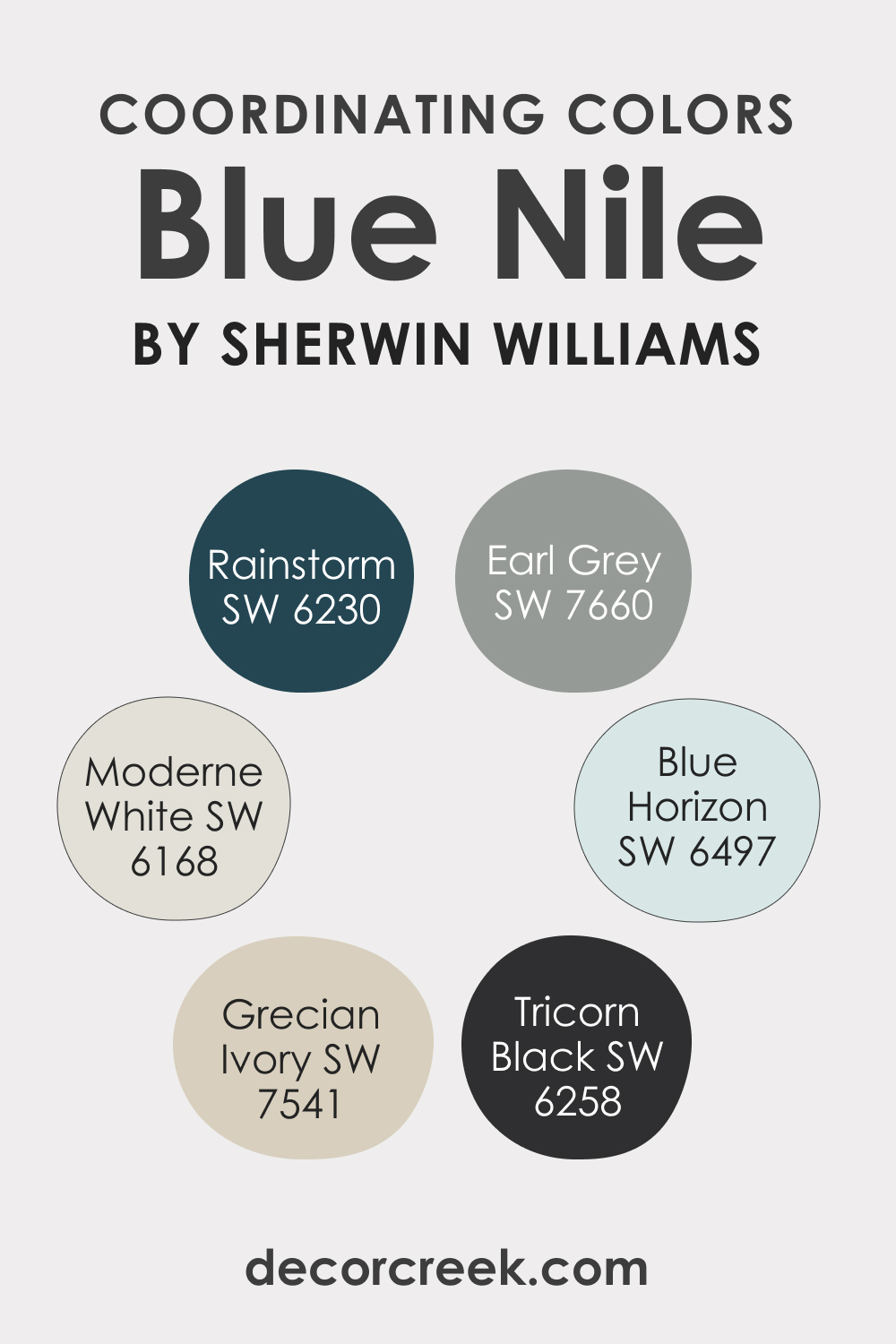
Coordinating Colors of SW 6776 Blue Nile
Coordinating colors are essential to creating a harmonious color scheme in interior design. They refer to colors that work well together, complementing and enhancing each other’s presence in the space. The goal of using coordinating colors is to create a visually appealing, balanced, and unified look.
For SW Blue Nile, we recommend you the following coordinating colors:
- SW 6497 Blue Horizon : This lighter, less saturated blue complements SW Blue Nile perfectly by offering a softer, soothing contrast.
- SW 6168 Moderne White : This cool, neutral white allows the depth of Blue Nile to shine truly.
- SW 7660 Earl Gray : This deep, sophisticated gray provides a solid, grounding contrast to SW Blue Nile.
- SW 6258 Tricorn Black : This dark black with a hint of gray contrasts dramatically with SW Blue Nile, adding a touch of modern sophistication.
- SW 7541 Grecian Ivory : This soft, creamy hue offers a gentle, warm counterpoint to the cool intensity of SW Blue Nile.
- SW 6230 Rainstorm : This darker, navy blue blends harmoniously with SW Blue Nile, enriching the overall blue palette.
How Does Lighting Affect SW Blue Nile Paint Color?
Lighting has a significant impact on how we perceive color. In natural light, SW Blue Nile appears brighter and more vibrant, with its teal undertones subtly surfacing. In artificial light, it can seem richer and deeper, with indigo undertones becoming more noticeable. It’s crucial to test color in the actual space and lighting conditions where it will be applied before making a final decision.
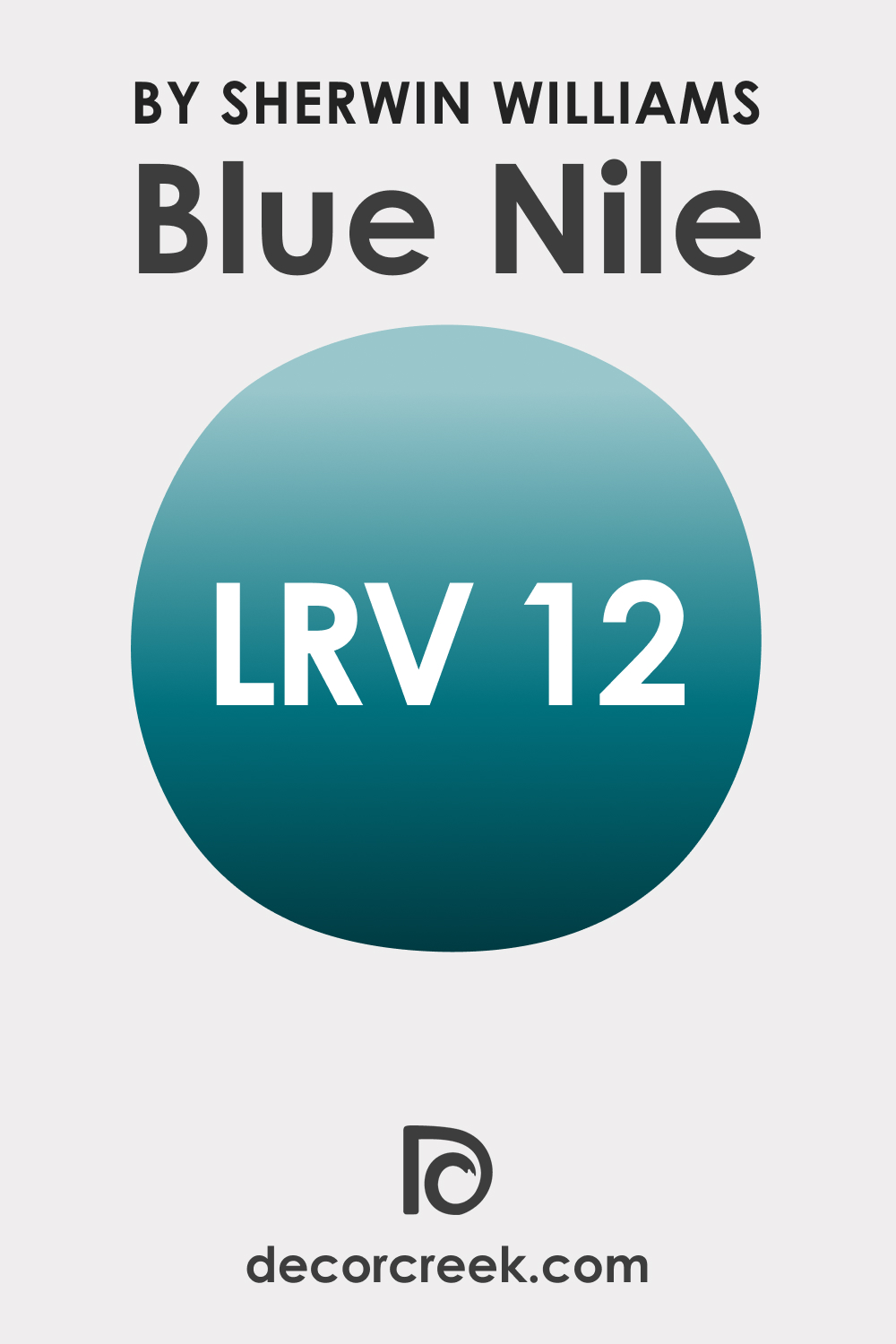
LRV of SW 6776 Blue Nile Paint Color
The Light Reflectance Value (LRV) of color indicates how much light it reflects. SW 6776 Blue Nile has an LRV of 12, meaning it’s on the darker side of the spectrum. Colors with a lower LRV absorb more light, which can make a space feel smaller and more intimate.
They also add drama and depth to a room, creating a cozy and enveloping atmosphere. Despite its lower LRV, SW Blue Nile’s vibrant hue prevents it from feeling too heavy or overpowering.
LRV – what does it mean? Read This Before Finding Your Perfect Paint Color
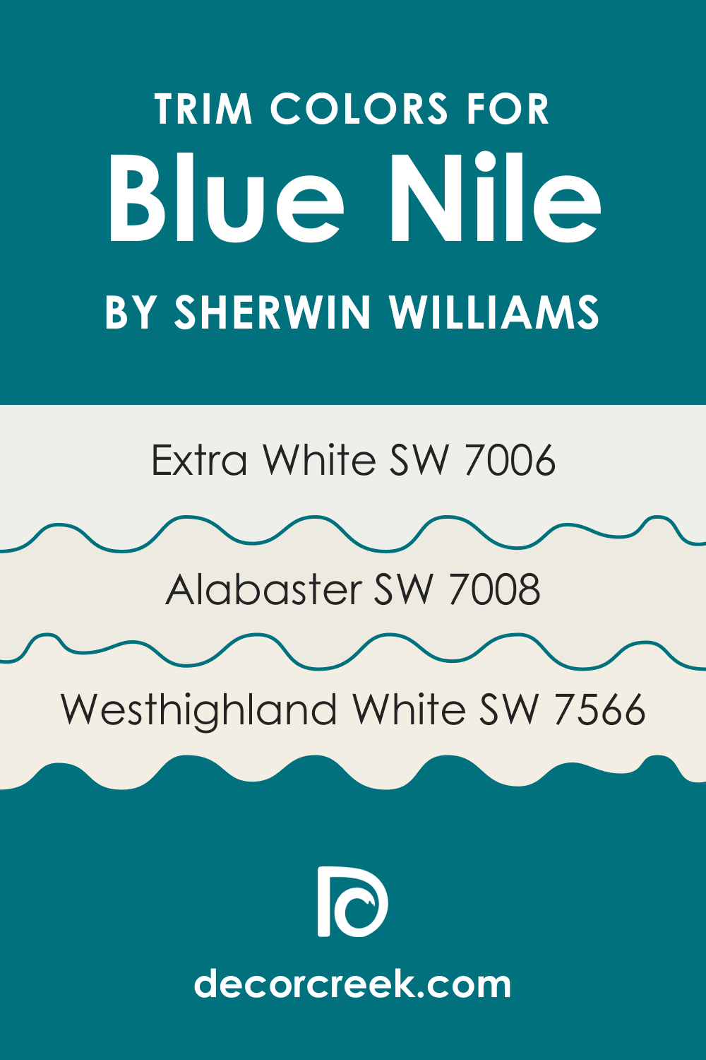
Trim Colors of SW 6776 Blue Nile
Choosing the right trim color is important as it frames a room and accentuates its architectural details. For SW 6776 Blue Nile, consider these options:
- SW 7006 Extra White : This pure white offers a crisp, clean contrast to Blue Nile, making the latter stand out beautifully.
- SW 7566 Westhighland White : This off-white hue with a slight warmth softens the contrast with SW Blue Nile, creating a smooth visual transition.
- SW 7008 Alabaster : This popular, timeless color has a subtle warmth that works well with Blue Nile, creating a balanced and cohesive look.
Trim colors add structure to a room and highlight its design features. They can either blend in for a monochromatic look or stand out for a high-contrast effect. Trim colors also help to break up the space, providing relief to the eyes and creating a well-rounded design.
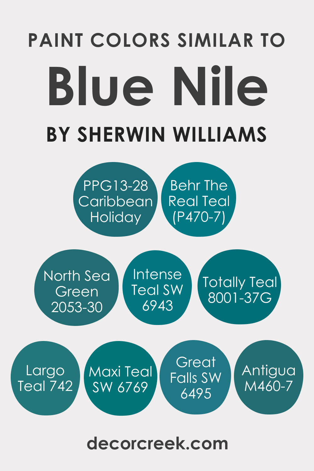
Colors Similar to SW 6776 Blue Nile
SW Blue Nile has a distinctive personality, but if you are seeking a bit different color, here are a few similar blues from Sherwin-Williams you might want to consider:
- Intense Teal (SW 6943)
- Great Falls (SW 6495)
- Maxi Teal (SW 6769)
If you want to try colors from other brands, here are a few recommendations for you too:
- Valspar Totally Teal (8001-37G)
- Behr The Real Teal (P470-7)
- Behr Antigua (M460-7)
- PPG Caribbean Holiday (PPG13-28)
- BM North Sea Green (2053-30)
- BM Largo Teal (742)
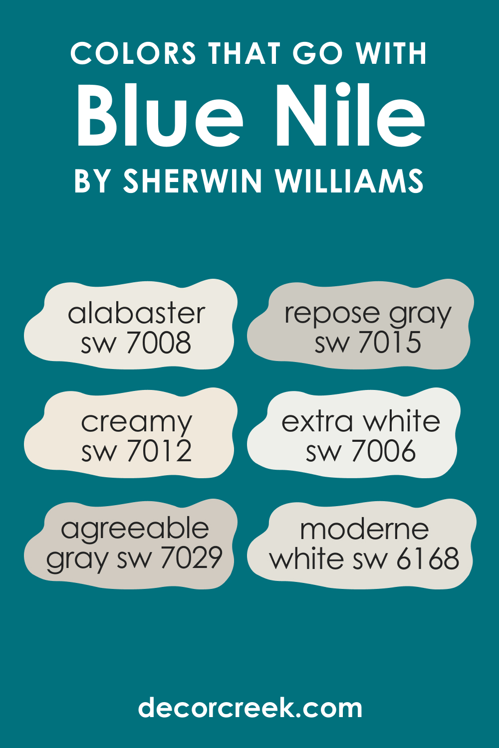
Colors That Go With SW 6776 Blue Nile
To create a harmonious color scheme, consider these colors that pair well with SW Blue Nile:
- SW 7006 Extra White : This pure white adds contrast, highlighting the intensity of Blue Nile.
- SW 7008 Alabaster : This off-white hue works well for a softer, low-contrast pairing.
- SW 7012 Creamy : This creamy white creates a warm, inviting palette with Blue Nile.
- SW 6168 Moderne White : This neutral white brings out the cool tones of Blue Nile.
- SW 7029 Agreeable Gray : This warm, versatile gray balances the cool vibrancy of Blue Nile.
- SW 7015 Repose Gray : This light gray with cool undertones complements the depth of Blue Nile.
How to Use SW 6776 Blue Nile In Your Home?
SW Blue Nile is a versatile color that can be used in any room. Its energetic yet soothing quality makes it perfect for spaces where you want to foster creativity and relaxation. Its depth and richness can bring a sense of sophistication and style to formal living spaces and dining rooms, while its bright, invigorating quality can enliven more casual spaces like kitchens, bathrooms, and playrooms.
In terms of style, SW Blue Nile can complement a variety of design aesthetics. Its natural, organic feel makes it a great choice for coastal or Mediterranean designs. Its rich depth can also lend itself well to more traditional or classical styles. In a more contemporary or modern setting, SW Blue Nile can serve as a vibrant focal point or a lively pop of color. Below, we explain how this hue may work in different rooms.
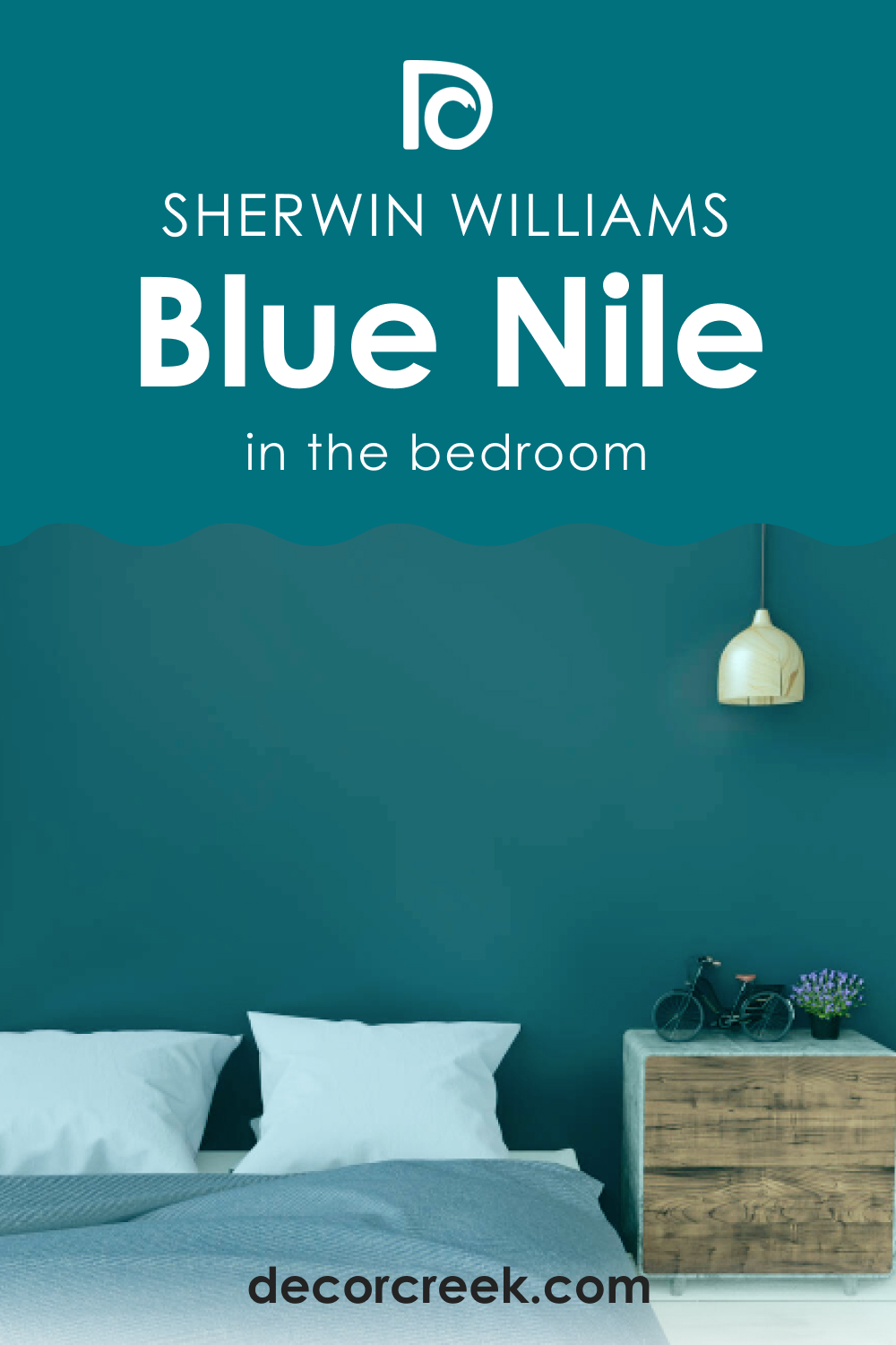
How to Use SW 6776 Blue Nile in the Bedroom?
In a bedroom, SW 6776 Blue Nile can create a tranquil and calming atmosphere conducive to relaxation and rest. Pair it with soft, light neutrals on the bedding and furniture to maintain a sense of calm, or mix it with brighter hues for a more energetic vibe. Consider using it on an accent wall behind the bed to create a dramatic focal point.
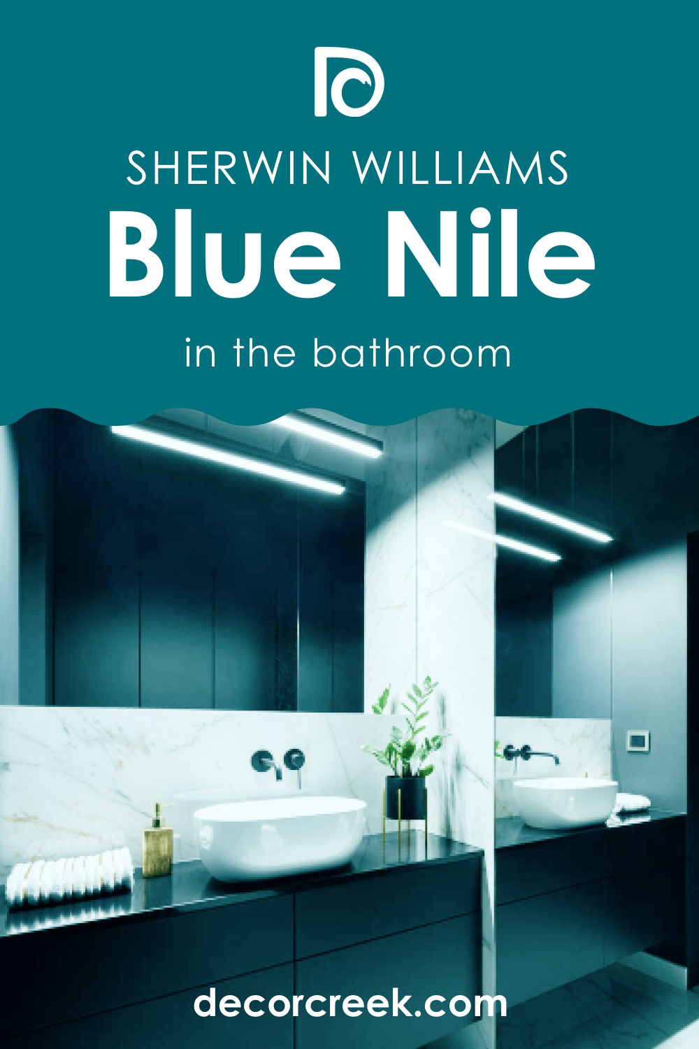
How to Use SW 6776 Blue Nile in the Bathroom?
SW Blue Nile is a great choice for a bathroom where it can evoke the soothing, refreshing qualities of water. It pairs beautifully with white fixtures for a clean, fresh look. To prevent the space from feeling too cool, incorporate warmer elements, like natural wood, through vanity or shelving.
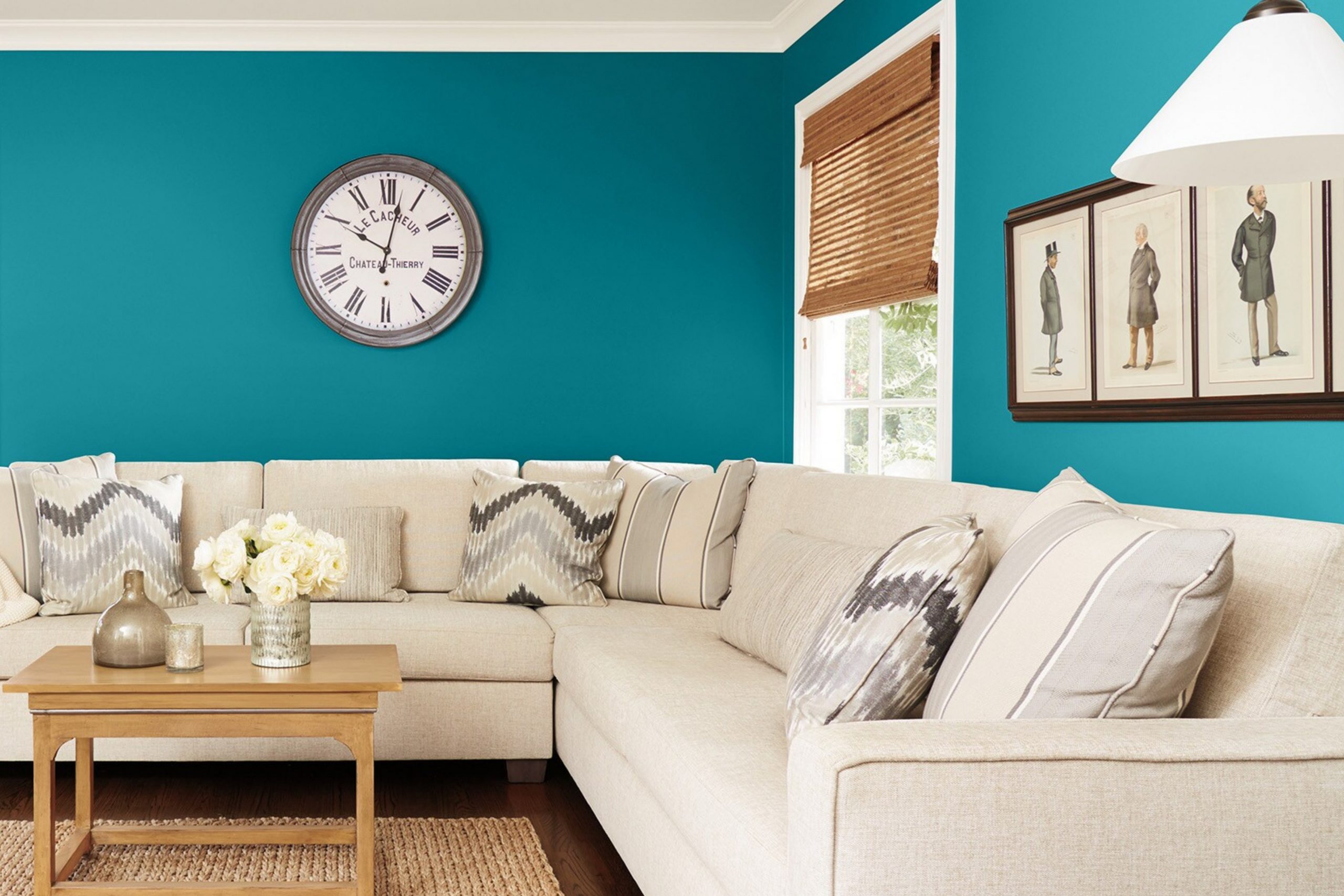
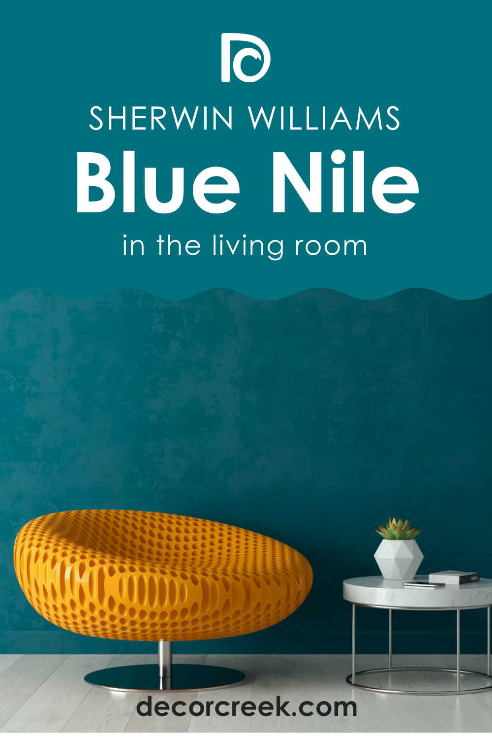
How to Use SW 6776 Blue Nile in the Living Room?
In the living room, SW Blue Nile can bring a vibrant energy that encourages conversation and engagement. Pair it with cool neutrals for a sophisticated palette or with bright, warm hues for a more playful, dynamic vibe. Use it on all walls for a bold, enveloping feel or on a single accent wall for a more subtle effect.
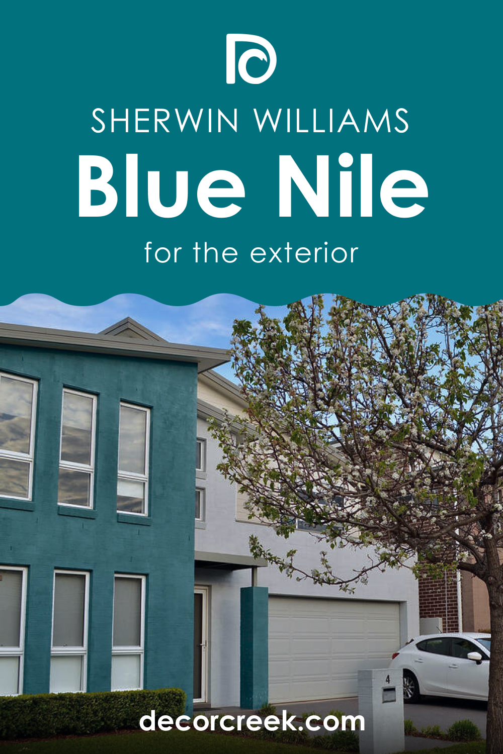
How to Use SW 6776 Blue Nile for an Exterior?
SW Blue Nile can create a striking and stylish exterior. It contrasts beautifully with white or cream trim and darker roofing. Its vibrancy stands out in lush, green landscapes and can give your home a distinctive curb appeal.
How to Use SW 6776 Blue Nile for the Kitchen?
In the kitchen, SW Blue Nile can bring a sense of freshness and vitality. Use it on the walls to create a lively backdrop for white or wooden cabinets or on the cabinets themselves for a bold, contemporary look.

How to Use SW 6776 Blue Nile for the Kitchen Cabinets?
SW Blue Nile kitchen cabinets can be a beautiful statement in a kitchen. Pair them with white or light gray walls to let the blue stand out, or with darker hues for a rich, saturated palette. Brushed nickel or brass hardware can provide a beautiful finish.
Comparing SW Blue Nile With Other Colors
To see how SW Blue Nile differs from other colors, we compared it with several hues below. Read on to see how this beautiful and rich blue color looks compared to similar shades of blue.
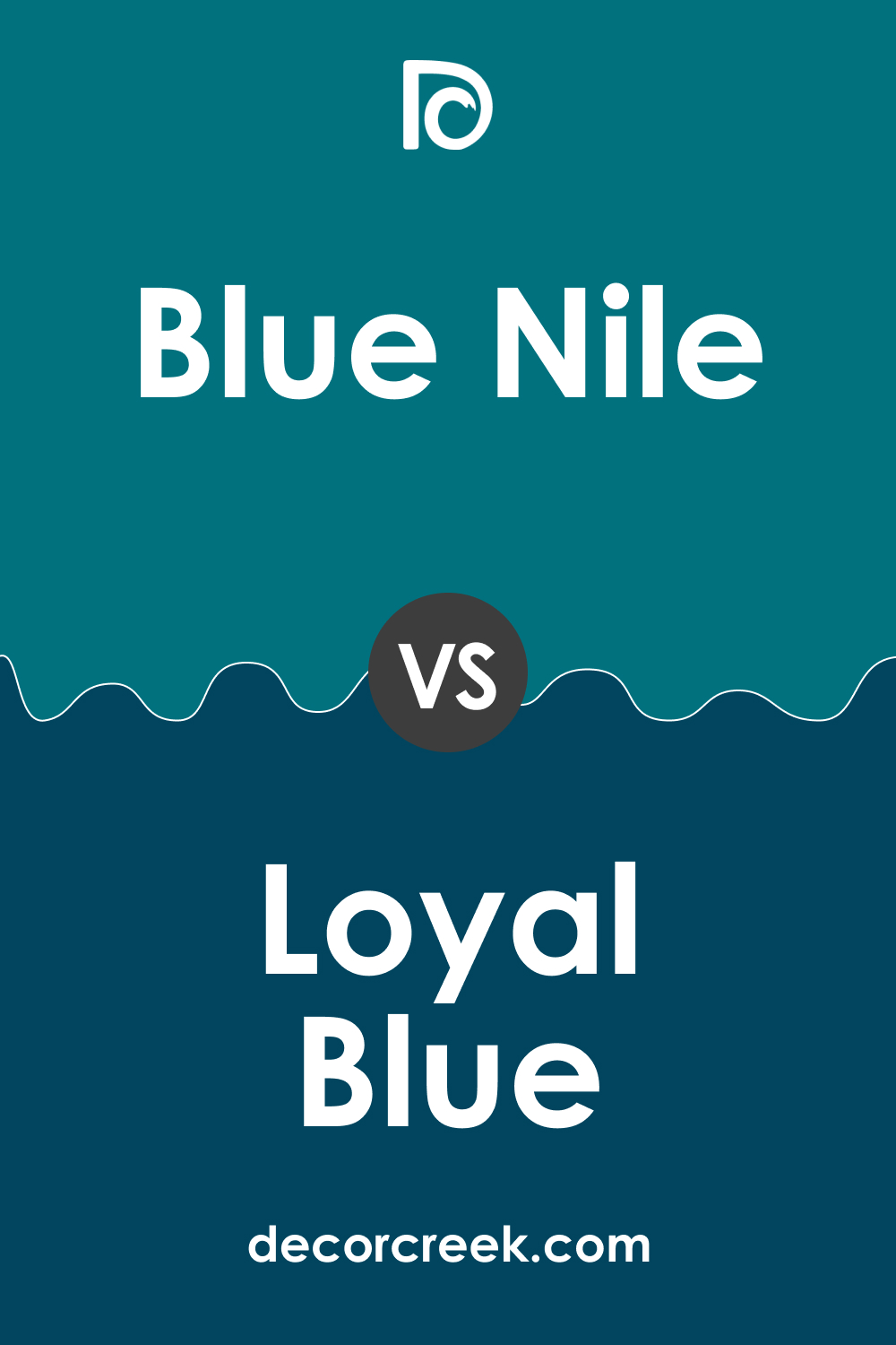
SW 6776 Blue Nile vs SW 6510 Loyal Blue
While both of these colors reside in the blue family, they each bring a different mood to a space. SW 6776 Blue Nile is a vibrant, bright blue with strong undertones of green, giving it a refreshing, energetic quality. On the other hand, SW 6510 Loyal Blue is a dark , rich navy blue that leans more towards the cooler side of the spectrum, providing a sense of sophistication and depth.
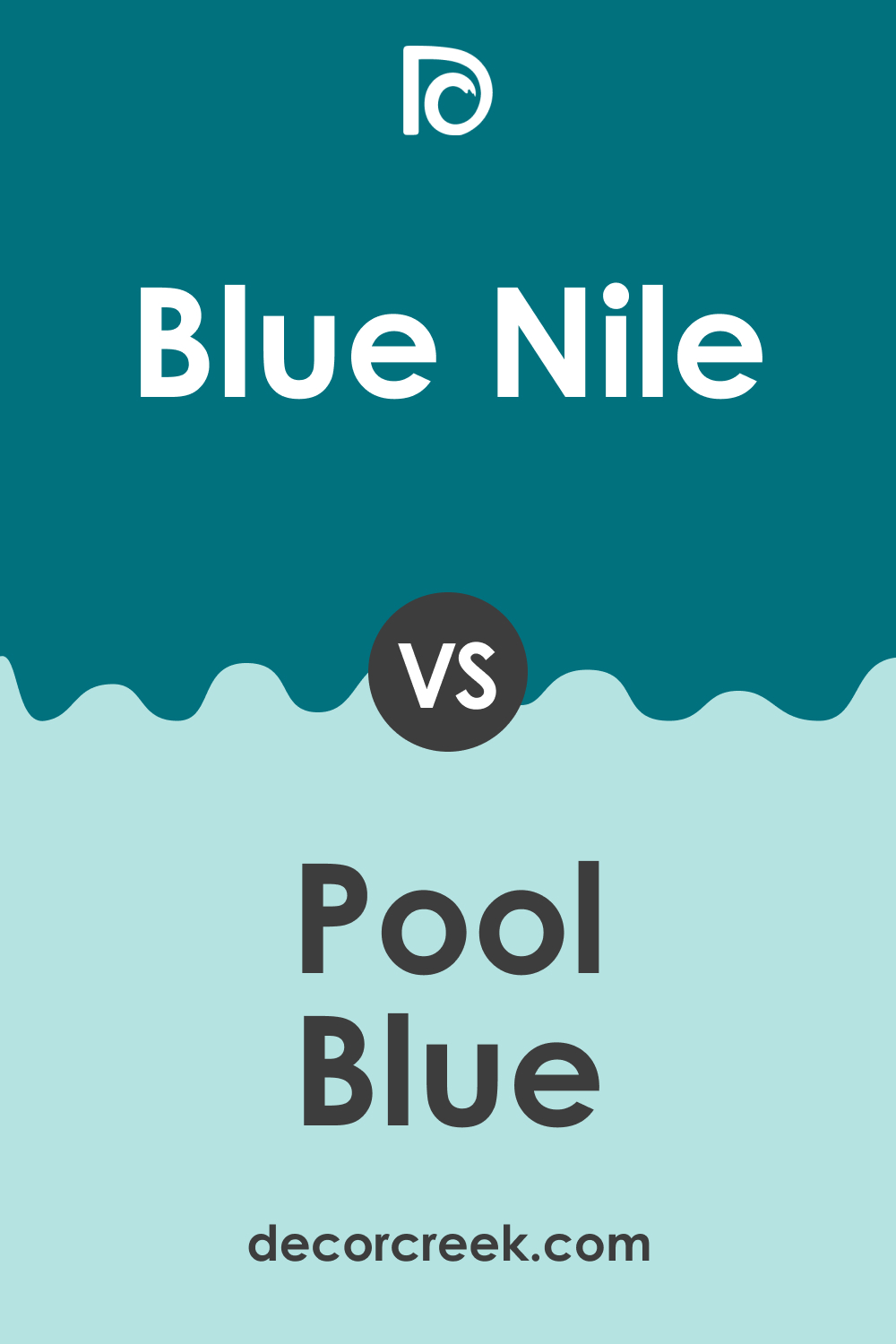
SW 6776 Blue Nile vs SW 6944 Pool Blue
Both SW 6776 Blue Nile and SW 6944 Pool Blue embody the lively , refreshing qualities of water. SW Blue Nile, however, has a more intense, saturated hue and lower light reflectance value, which can make a space feel more intimate. Pool Blue, on the other hand, is lighter and more vibrant, with a higher LRV, creating a breezier, more expansive feel.
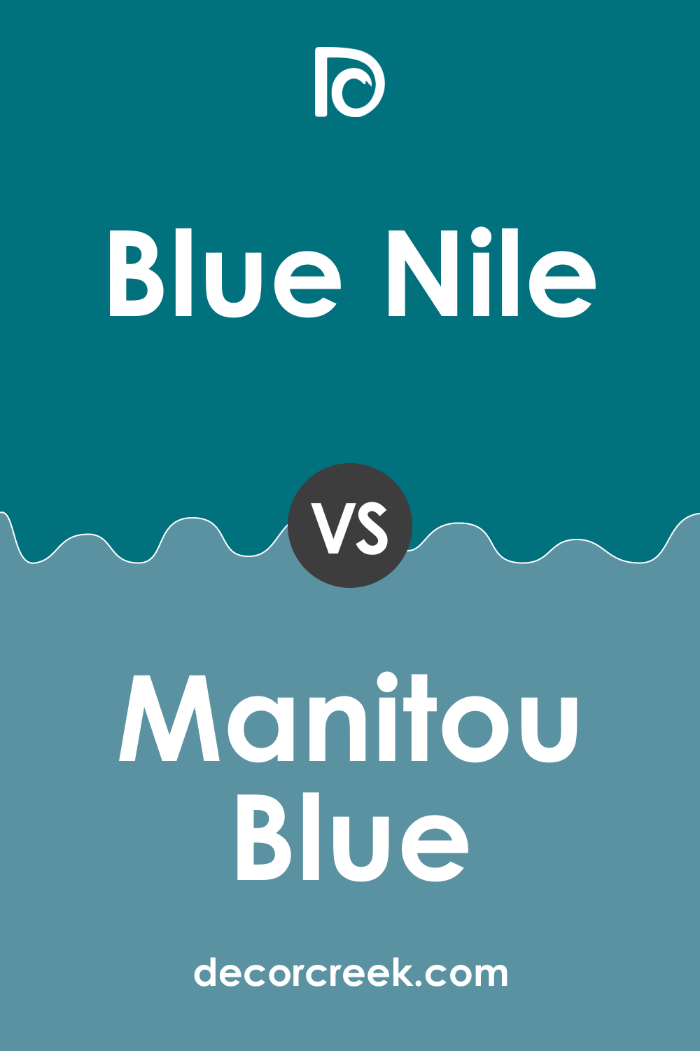
SW 6776 Blue Nile vs SW 6501 Manitou Blue
While both colors bring a cool, serene mood to a space, SW 6501 Manitou Blue is lighter and less saturated than Blue Nile, evoking a sense of airy tranquility. Blue Nile, in contrast, with its rich depth and vibrant hue, brings stronger energy and sophistication to the space.
SW 6776 Blue Nile vs SW 6219 Rain
SW 6219 Rain is a subdued, versatile gray blue that can serve as a soft, soothing backdrop in various settings. SW Blue Nile, however, with its vibrant hue and lower LRV, is a more statement-making color that commands attention and can infuse a space with liveliness and vibrancy.
SW 6776 Blue Nile vs SW 7006 Extra White
As a pure white, SW 7006 Extra White provides a stark contrast to the deep, vibrant SW Blue Nile. This contrast can be used to create dramatic, high-contrast designs, where Extra White serves to highlight and accentuate the depth and energy of SW Blue Nile.
SW 6776 Blue Nile vs SW 7641 Colonnade Gray
SW 7641 Colonnade Gray is a warm, light gray that provides a soft, neutral backdrop. Its warm undertones balance the cool vibrancy of SW Blue Nile, creating a harmonious palette. Compared to the muted subtlety of Colonnade Gray, SW Blue Nile stands out as a bold, energetic color that can serve as a focal point in a room.
Conclusion
SW 6776 Blue Nile is a vibrant, refreshing color that can add depth, energy, and serenity to a space. Its versatility makes it suitable for a variety of rooms and styles. Understanding its undertones, coordinating colors, and how light affects it can help you use this captivating hue to its full potential.
Whether you’re seeking to create a soothing retreat, a lively gathering spot, or a space that balances both, Blue Nile can deliver.
Ever wished paint sampling was as easy as sticking a sticker? Guess what? Now it is! Discover Samplize's unique Peel & Stick samples.
Get paint samples
Frequently Asked Questions
⭐What kind of mood does SW 6776 Blue Nile create in a room?
SW 6776 Blue Nile is a vibrant, energetic color that can bring a lively, upbeat mood to a room. Its bold hue can also add a touch of sophistication and drama.
⭐What are the best rooms to use SW 6776 Blue Nile in?
SW Blue Nile is a versatile color that works well in various spaces. It can bring energy to a kitchen or living room, add a playful touch to a child's bedroom, or create a relaxing vibe in a bathroom.
⭐What colors coordinate well with SW 6776 Blue Nile?
As a vibrant blue, SW Blue Nile coordinates well with various colors. Neutrals like whites and grays can provide balance, while greens can enhance its natural, refreshing feel. For a dramatic contrast, consider pairing it with bright yellows or oranges.
⭐How does lighting affect SW 6776 Blue Nile?
As with any color, lighting can have a significant impact on how SW Blue Nile appears. In natural light, its green undertones may be more noticeable, giving it a more teal appearance. Under artificial light, it might appear as a deeper, more classic blue.
⭐What are some trim colors that go well with SW 6776 Blue Nile?
Trim colors for SW Blue Nile should ideally provide a clean contrast. Shades of white, like SW 7006 Extra White or SW 7008 Alabaster, can highlight the color's vibrancy. For a more contemporary look, consider a soft gray like SW 7015 Repose Gray.


